Author: Adam Simmons
Last updated: April 21st 2023
Introduction
From our engagement with users, including on a our forum, viewing comfort is clearly a very important issue for many. It is not an exact science, as everybody’s eyes are different and which aspects of a monitor are important for individual viewing comfort will vary. Some things really bother some users, whilst other users couldn’t care less about that same factor. There are certainly some important things to focus on when it comes to your monitor, and even if they don’t affect you personally it can be good to have an awareness of them. This article takes a comprehensive look at what we see as the key factors affecting viewing comfort, confirmed by our own experience and research but also the broad range of users that we’ve engaged with.
The factors
Brightness (luminance)
Brightness is of pivotal importance when it comes to viewing comfort. The brightness you choose for your monitor will depend on individual sensitivity and the ambient lighting in your room. For example, a relatively high brightness makes more sense in a well-lit room, whereas dimmer brightness tends to suit dimmer room lighting better. If you have a colorimeter or another device that can measure brightness, you can target a specific known value. In our reviews, we tend to aim for around 160 cd/m² which makes sense in the typical (moderately bright) lighting conditions under which we do most of our daytime testing. Importantly, it suits out personal preferences. Some users would find 160 cd/m² too bright in such conditions and others would find it too dim. When viewing in dimmer conditions, we tend to favour something closer to 100 cd/m². Whether you own a colorimeter or not, the brightness regulation of each monitor varies – so 50% on one monitor could easily be significantly brighter than 50% on another monitor. Due to individual sensitivity to brightness being critically important here, your own eyes are always a good measure of brightness and more useful for proper assessment than a colorimeter. We’d recommend targeting a relatively low brightness on your monitor, perhaps 30% using the monitor’s brightness control, and then letting your eyes adjust. Depending on your preferences, ambient lighting and the initial brightness you were using, this could either look too dim or alternatively overly bright. Give your eyes a period of around half an hour to adjust to this, re-assess and then make further adjustments from there.
As an Amazon Associate I earn from qualifying purchases made using the below link. Where possible, you’ll be redirected to your nearest store. Further information on supporting our work.
Screen surface
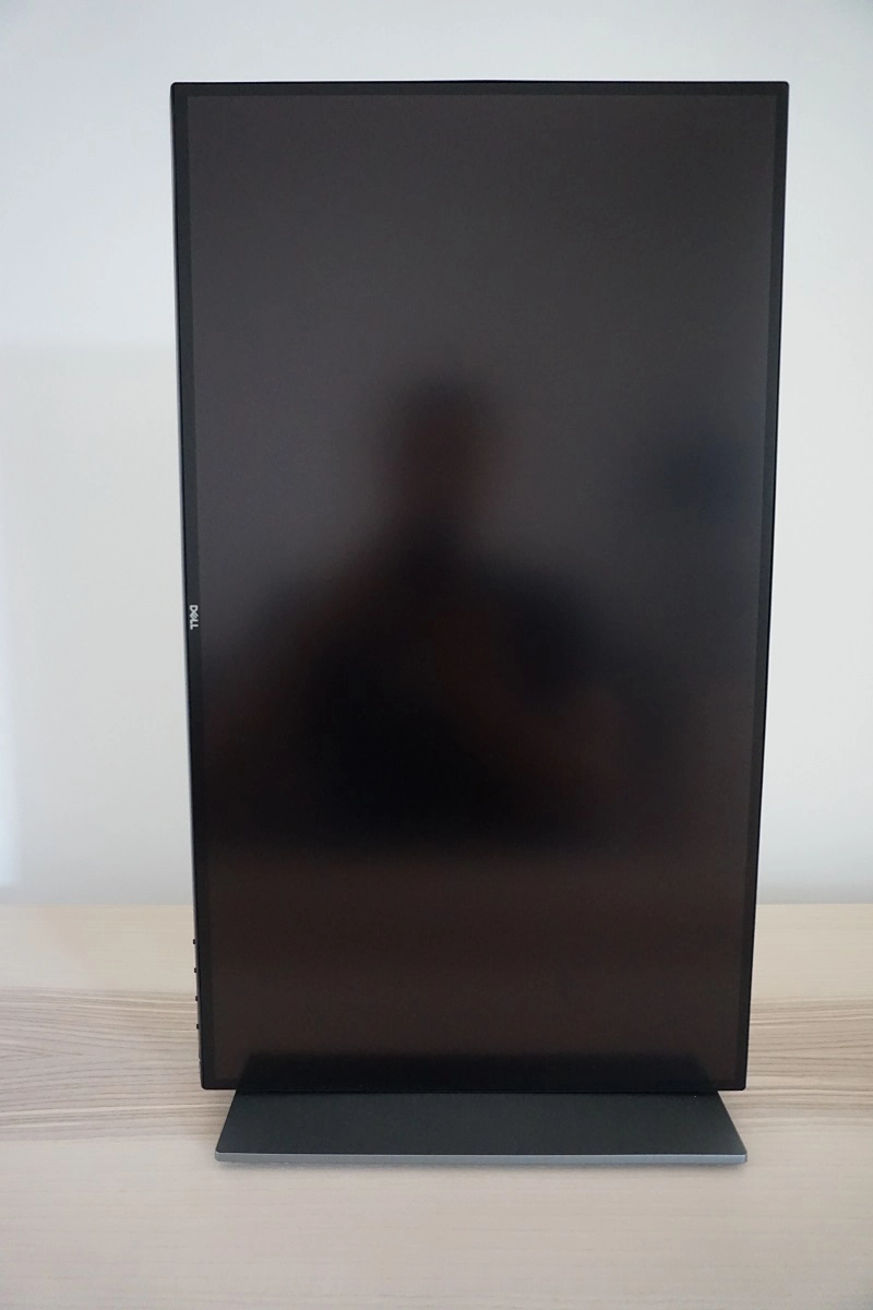
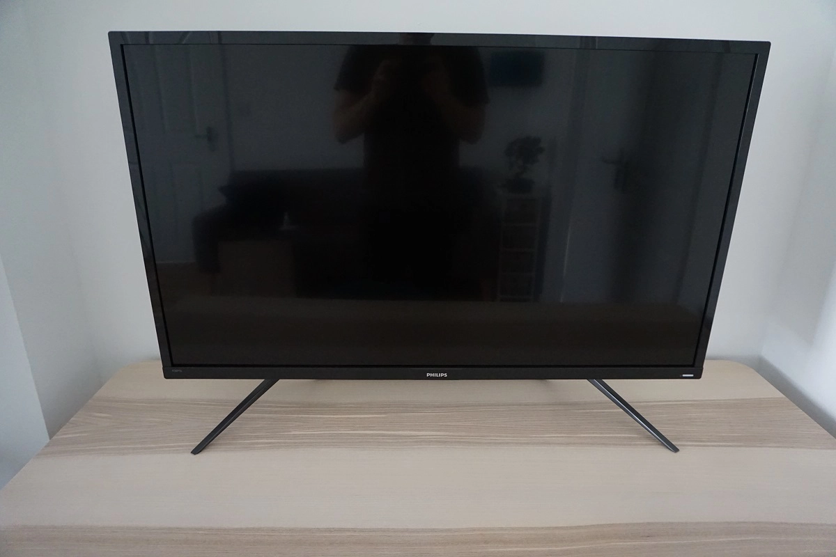
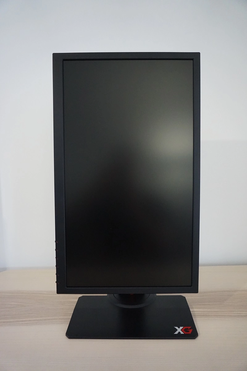
When many users think of viewing comfort and monitor screen surface, they equate glossy to being a bad choice due to possible reflections. And think that a strong matte anti-glare surface would be best for its strong glare-handling characteristics. As explored in our ‘Matte vs Glossy’ article, we explore some key advantages and disadvantages to both surface type. We also introduce the idea that not all matte (or indeed glossy) screen surfaces are equal. Matte anti-glare screen surfaces differ in how strongly they diffuse light (depending on their ‘haze value’) and also differ in how smooth (or grainy) the outer surface layer appears, particularly when viewing lighter shades. Likewise, various anti-reflective treatments exist for glossy screen surfaces (and some simply use a very mild anti-glare treatment instead) which affects their reflectivity. The images below demonstrate some different levels of glare handling capability. They show, respectively; a ViewSonic XG2402 (‘medium’ matte anti-glare), a Dell U2518D (‘very light’ matte anti-glare) and a Philips 436M6VBPAB (glossy with extremely mild anti-glare treatment).
Due to the superior clarity and more direct light transmission, some users will find glossy screen surfaces preferable to matte screen surfaces for viewing comfort. Other users would find reflections bothersome and would therefore tend to favour a matte screen surface of some description. Many users find the compromise of a relatively low haze (‘light’ or ‘very light’) matte anti-glare surface to be optimal. Stronger matte anti-glare screen surfaces can make seem like you’re viewing the image through a dirty window, with a grainy (and sometimes ‘smeary’) quality to it that you essentially have to focus through to see the image. As with reflections, it’s something that bothers some users and is therefore not good from the perspective of viewing comfort. As highlighted in the article, some ‘light’ or ‘very light’ anti-glare screen surfaces still have a grainy surface texture, whilst some surfaces with a somewhat higher haze value may appear quite smooth. So it isn’t as straightforward as you might think and given its importance in terms of viewing comfort but also general image presentation, is something we always focus on in quite some detail in our reviews. Also remember that, although a matte screen surface (particularly with relatively high haze value) will give you a bit more flexibility with your ambient lighting, you should always avoid light striking the screen directly. Or overly bright rooms. Although you may not see reflections, the ambient light is diffused across the screen surface and this can start to flood the image – not good for viewing comfort.
Panel type and subpixel layout
As explored in our panel types article, LCD monitors can broadly be categorized into three main panel types; TN (Twisted Nematic), VA (Vertical Alignment) and IPS-type (In Plane Switching and similar). There are no hard and fast rules when it comes to which panel type is best in terms of viewing comfort. TN and IPS-type panels are generally considered on par in terms of viewing comfort. Whilst some users may tend to favour one over the other, it’s not always clear that those preferences are down to the panel type itself or other intricacies such as different screen surface, screen size, backlighting, sometimes extreme responsiveness differences etc. VA panels are commonly held in high regard when it comes to viewing comfort, with the strong contrast providing a relatively inky look to text and helping bring good definition to the image with bright elements standing out nicely against darker elements. Such panels also tend to tick a lot of other boxes for viewing comfort, including having relatively smooth matte anti-glare screen surfaces.
On the flip side, though, the way that subpixels are oriented in VA panels and how this orientation changes as the shade changes means that some shades can appear very slightly in front of or behind others. This gives what some users would refer to as a ‘slight 3D effect’. It’s very subtle, especially with modern VA technologies, and most users wouldn’t actually notice this at all let alone find it uncomfortable. Additionally, sub-optimal subpixel structures which affect text and image clarity are more common on VA panels. Compare, for example, the subpixels of the ASUS XG32VQ (top image) with the BenQ EW277HDR (bottom image). Both use VA panels, but the former has squat subpixels with partial illumination. Particularly when combined with a pixel density that is not particularly high, this affects text clarity as explored in the review. And some users would find that visually uncomfortable. Other users would not find this at all bothersome in terms of viewing comfort, however.
![]()
Some IPS models have their own subpixel related issues which can impact viewing comfort. For example the Gigabyte M27Q and AORUS FI27Q-X, which use an unconventional BGR subpixel arrangement and suffer ‘fringing’ issues. A very thin border a few pixels thick that is cyan to the left and magenta to the right is more visible than it should be in places, impacting some text and fine edges. The impact of this is greatly reduced by correctly optimising ClearType as a Windows user or when viewing content that isn’t specifically optimised for the more conventional RGB layout. Because the fringing is very slender it isn’t something everybody notices or finds bothersome. And the text or straight edge itself retains strong definition – we consider this a much more minor issue than partial subpixel illumination would cause or indeed the more extreme fringing caused by the use of chroma subsampling (4:2:2). The first image below shows the BGR subpixel arrangement of the M27Q, whilst the second captures fringing around teal text on a white background. Remember that the pixels are tiny in reality and appear enlarged in this photo, so the fringe itself is also exaggerated.
As noted previously, most users find the strong contrast of VA panels and the fairly bold and inky look to the image to be pleasant in terms of viewing comfort. But high contrast can be something of a double-edged sword. Higher contrast means the eyes spend more time accommodating to changes in light from the monitor – decreased black point and elevated static contrast ratios mean that darker content (especially black or near-black) is significantly deeper and darker than it otherwise would be at a given white luminance. Indeed, cutting down on contrast is the premise of the ‘Eye Saver Mode’ that is found on some Samsung monitors. Part of what this does is to purposefully reduce contrast so that the bright and dark elements are closer together. And the eyes spend less time accommodating to changes. The contrast ratio recorded for such models with ‘Eye Saver Mode’ active can be well below 100:1. This is far more extreme than comparing your typical non-VA model (~1000:1 contrast) to VA models (~2500:1 – 5000:1 contrast) and indeed has more of a potential effect on viewing comfort. That’s the theory, at least. Users don’t tend to sit in a pitch-black room with tightly controlled (minimal to nil) ambient lighting. Their eyes will usually be exposed to moderate light levels that are far from static. In general, users will find the full native contrast of the monitor to be not only comfortable but also far preferable to purposefully leaching that away or using a panel type with lower native contrast. There’s still a minority who would find very low contrast levels more comfortable, so it’s still something to bear in mind. OLED monitors have exceptionally strong contrast which can give exceptional depth and an ‘inky’ look some will find very comfortable – but many of them also have their own fringing issues to consider.
Pixel density
Another aspect which is far from clear-cut is pixel density, because it depends on viewing distance and eyesight as well as subjective preferences. Putting the possibility of scaling to the side for a moment, some users will find monitors with a relatively low pixel density preferable. Text is relatively large and easy to read, buttons are big and everything is clear. For users with good eyesight (corrected or otherwise), though, having text look jagged and ‘blocky’ can be annoying. And the relative lack of ‘desktop real-estate’ that is forced on them by a low pixel density can simply be annoying. Whether that makes such models visually uncomfortable is debatable, but if you are always staring at the monitor wishing that things were smaller and sharper. Having a higher pixel density helps achieves superior clarity, whilst providing important secondary benefits outside of viewing comfort such as increasing the useful work space and detail levels in images and games. As explored in our article about the ‘4K’ UHD resolution (3840 x 2160), which focuses on the experience of having a relatively high pixel density, you can of course apply scaling or use application-specific zoom. It’s usually preferred to try to match the pixel density with your own preferences for text size and what you would find comfortable to read, because not all applications handle scaling properly (if at all). Where scaling is properly used or application-specific zoom is supported, though, you can benefit from the increased clarity and more neatly-blended appearance of text whilst also increasing the size and hence enhancing readability. So having a high pixel density can bring the best of both worlds in terms of viewing comfort and is a more flexible solution than you might think. In contrast, a low pixel density is something you’d be stuck with – you are physically restrained by the size and spacing of the pixels on the screen.
PWM (Pulse Width Modulation) – backlight flickering
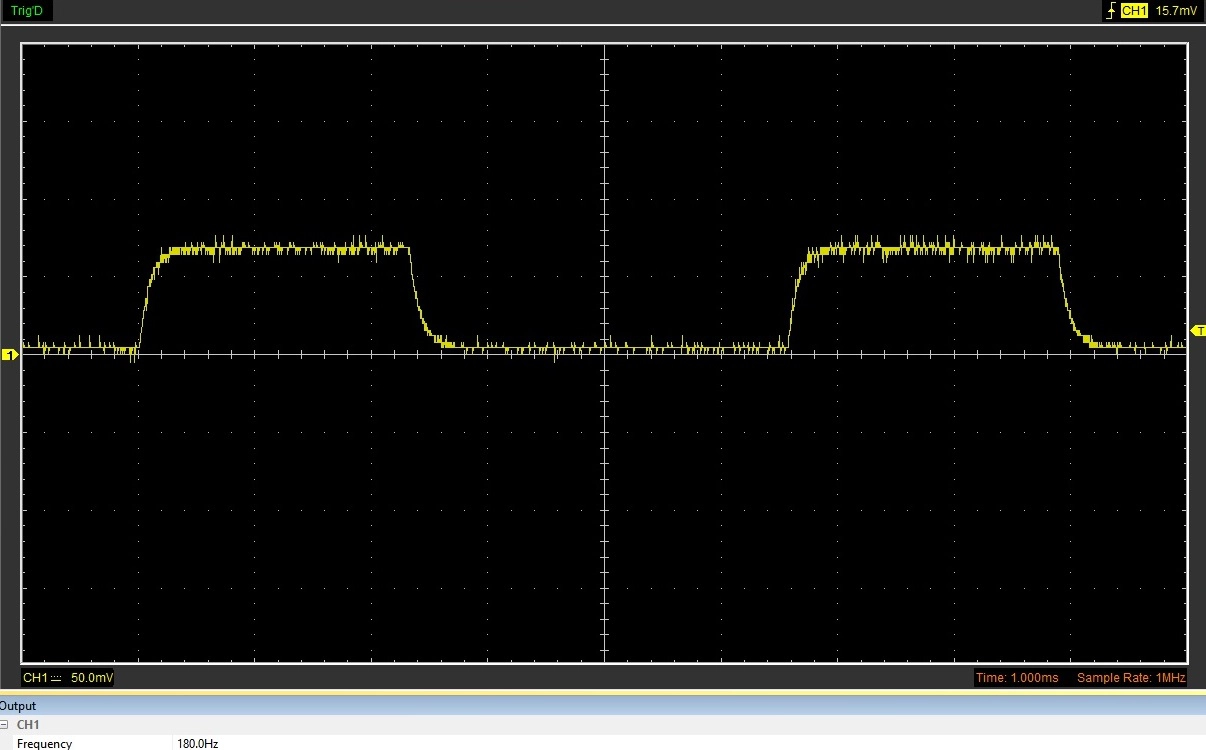
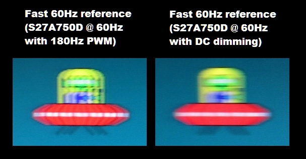
On a monitor, PWM (Pulse Width Modulation) describes a method of backlight brightness regulation which constantly cycles the backlight ‘on’ and ‘off’ at a given frequency. This frequency, known as the cycling frequency, is typically 120 – 360Hz but some models use much higher-frequency PWM. The frequency is generally fixed and kicks in when the brightness is reduced below ‘100’ on the monitor. But there is certainly some variation beyond that. Users who are particularly sensitive to flickering will find this visually uncomfortable, even after using the monitor for a relatively short period of time. Even if you aren’t conscious of the flickering and don’t notice it in isolation, it can still have a physiological effect and accelerate visual fatigue. A secondary effect of PWM usage are ‘PWM artifacts’, whereby objects (easiest to observe on straight edges) appear to fragment during motion on the screen. The first image below shows an example oscilloscope trace of a screen which uses PWM at a frequency of 180Hz. The backlight turns on (peaks of graph) and off (troughs of graph) 180 times a second. The second image is a pursuit photograph showing the effect of 180Hz PWM on motion clarity. Note that the image is fragmented into 3 separate instances (180Hz = 3 x 60Hz) – compare this to the smooth blur on the right where PWM is not used.
180Hz PWM artifacts
The good news is that the vast majority of monitors now use DC (Direct Current) instead of PWM to modulate backlight brightness. The backlight does not flicker, even as brightness is lowered, and you wouldn’t see any distinct peaks and troughs using an oscilloscope. ‘Flicker-free’ is certainly a term you will be familiar with if you’re in the market for a new monitor, and most monitors now hold this status. Even if, as in some cases, it isn’t specifically advertised. There is a video accompanying this article, and this section demonstrates some methods that can be used to highlight whether PWM is used on a monitor without using an oscilloscope or subjecting some poor flicker-sensitive soul to the monitor. It can be difficult to measure high frequency PWM (in the kHz range) without using an oscilloscope, however.
Some models use what we refer to as low amplitude oscillation, whereby the brightness will dip in a cyclical fashion. Unlike traditional PWM this is not a full ‘on’ and ‘off’ cycle and as such not everyone sensitive to PWM will necessarily find this bothersome. Some models which exhibit this behaviour (such as the ASUS PA278QV) or alternatively use a very high PWM frequency may be specifically marketed as ‘flicker-free’ and even certified as such by bodies such as TÜV Rheinland. OLED monitors will often show this cyclical dip in brightness at a frequency matching the refresh rate of the display. This oscilloscope trace shows the dimming behaviour of the ASUS PA32DC, an RGB OLED model. You can see an alternation between a small dip and a larger dip in brightness at a frequency of 60Hz (i.e. one dip every 16.67ms). Cyclical brightness dips are also observed on QD-OLEDs (175Hz example) and WOLED models (240Hz example).
Temporal dithering (FRC – Frame Rate Control)
FRC (Frame Rate Control) or temporal dithering, as explored by Lagom, describes rapid alternation between a very slightly lighter and very slightly darker variant of a given shade. This is done where the shade itself can’t be displayed, for example if the monitor does not have the necessary native bit-depth to display that shade. Dithering can be added by the panel, by the scaler of the monitor or for bandwidth reasons by the GPU. It’s commonly used in some form under HDR, as HDR10 content requires a 10-bit signal and few monitors natively support 10-bit without dithering. Dithering can be thought of as a form of flickering, although it is very different to the flickering you get from PWM whereby there are extreme brightness changes of the entire backlight. This is a minute luminance change that affects certain shades, so most users will not find this problematic even if they are sensitive to PWM usage. This is especially true for the 2-bit dithering stage on ’10-bit’ (8-bit + FRC) monitors, but for most even the dithering on a 6-bit + FRC display is too minor to be visually bothersome. Some users still take issue with dithering usage and prefer that it is taken out of the equation, or at least minimised. It should be noted that most content under SDR is 8-bit so minimal dithering would be performed by an 8-bit + FRC monitor there anyway. If you select 8-bit in the graphics driver (which is the default for Nvidia users) it should shut off the dithering stage.
Refresh rate and pixel responsiveness
Unlike CRTs, your typical LCDs are sample and hold rather than an impulse-type displays. As impulse-type displays, CRTs flicker on and off at a frequency matching the refresh rate of the display. Sample and hold displays do not flicker at a frequency matching the refresh rate of the display; assuming they are flicker-free they simply remain constantly illuminated. And on the increasingly rare occasions where PWM is used, it is not usually linked to the refresh rate. Whereas ‘good old’ 60Hz CRTs are literally headache-inducing to many people, your typical 60Hz LCD is not flickering at 60Hz. The exception would be if a strobe backlight is used, which you can read about alongside the other concepts explored in this paragraph in our dedicated article on responsiveness. The monitor then flickers at a frequency matching the refresh rate of the display, which on an LCD means the backlight pulses on and off. These would rarely be implemented at 60Hz, due to the obnoxious flickering, but some models (generally 100Hz+) do offer strobe backlight options to reduce perceived blur. Some 60Hz OLED screens flicker at 120Hz, specifically to aid motion clarity and make better use of their supremely rapid pixel responses – which are clearly overkill for 60Hz.
A significant portion of perceived blur is linked to the movement of your eyes, which is reduced as refresh rate is increased (provided frame rate is also increased). Some users, particularly when gaming, find that lower refresh rates make them feel motion sick or provide visual discomfort due to the relatively high levels of perceived blur. A smaller subset of users even find higher refresh rates more comfortable on the desktop, as it makes animations and scrolling through text and images smoother. The greatest reduction in perceived blur at a given refresh rate can be achieved using a strobe backlight (screen flickers at a frequency matching the refresh rate), but to work properly it requires that the frame rate matches this exactly. Some users find this decrease in perceived blur nice – although, in terms of viewing comfort, most users prefer the flicker-free sample and hold experience and find increased refresh rate and frame rate alone preferable. The image below shows various examples of LCDs at different refresh rates, from 60Hz up to 240Hz. You can see that the object is sharper as refresh rate is increased and even sharper still if a strobe backlight setting is used (final 2 images).
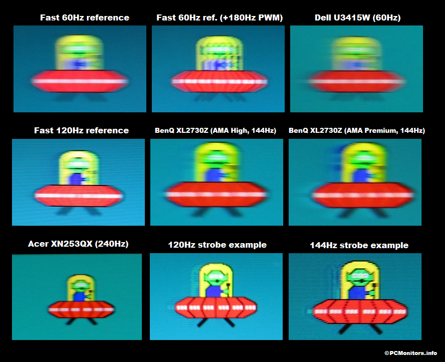
Pixel responsiveness also influences perceived blur and can therefore influence viewing comfort. In some cases, pixel responses are a bit slower than optimal and can therefore cause some trailing behind moving objects – see the third image along, above. Sometimes pixel responses are even slow enough to induce obvious ‘smeary’ trails; typical on many VA models for some pixel transitions. Equally, if pixel responses are sped up with particularly aggressive pixel overdrive then it can result in potentially rather colourful overshoot (inverse ghosting). There is a nice example of this in the sixth image in the above collage with BenQ’s notoriously aggressive AMA (Advanced Motion Acceleration) ‘Premium’ setting. Just like sensitivity to overall perceived blur, sensitivity to weaknesses in pixel responses and to overshoot varies amongst individuals. Eye movement and the influence of refresh rate are usually the dominant contributor to perceived blur on a monitor, so are more influential in terms of viewing comfort as well. But weaknesses in pixel responsiveness also play a role and can really bother some users.
Curved screens
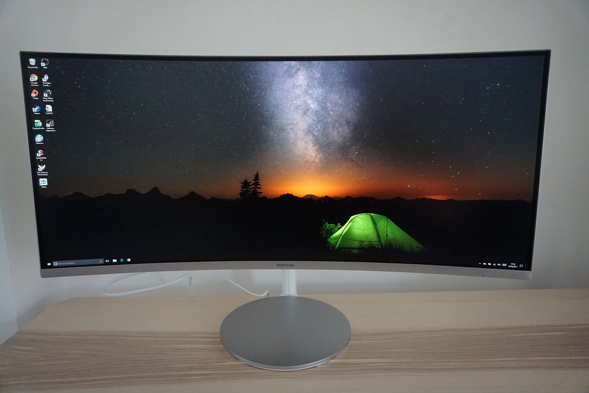
Panel manufacturers, in particular Samsung who push this quite heavily, will argue that having a curved screen is good for viewing comfort. By curving the screen, you’re bringing the edges of the screen closer to the eyes thus creating a more uniform distance comparing centre to edge of the screen. You reduce the distance that the eyes need to travel and reduce the extent of accommodation done by the eye to focus between central and peripheral sections of the screen. This is more pronounced for a screen with steeper curvature and can make the most significant difference when considering particularly large (or wide) screens. Indeed, you’ll find that most large screens with 21:9 (ultrawide) or ‘wider’ aspect ratios will have a potentially fairly steep curve to them. The Samsung C34F791 below, for example, offers a 1800R curve (where a lower number signifies a steeper curve) and uses a 34” 21:9 panel. We certainly find this and similar monitors comfortable to use and feel the curve adds to the depth and immersion. It also feels very natural and is something users readily adapt to, even if they have preconceived notions that the curve is going to be problematic.
A notable scientific study from Seoul National University in South Korea gives some weight to the notion that curving a screen can be beneficial in reducing visual fatigue and eye strain. Subjects had to perform ‘visually demanding’ tasks for 30 minutes at a time on 32” monitors of varying curvature; flat, 4000R, 3000R, 2000R and 1000R. Various objective measurements were made with respect to how their eyes responded physiologically to the different screens and a subjective questionnaire was completed. The improvements appeared quite subtle as curvature increased, with significant differences in key subjective ‘comfort factors’ only appearing when comparing a flat monitor to one with a steep curvature of 1000R. The study identified a key limitation being that one viewing session only lasted 30 minutes and that greater differences may be observed with longer viewing periods. The researchers did not feel longer periods would have been practical or reasonable for the participants, however. Looking at a broader and less scientifically rigorous assessment, we get very few viewing comfort complaints from users who have opted for curved screens. Even if they have specifically been complaining of viewing comfort issues with other screens. But it’s very difficult to isolate the curve as the reason for this – curved screens also tend to tick lots of other viewing comfort boxes. We’d say that whilst screen curvature is a factor to consider when it comes to viewing comfort, we’d put it quite low down our list of priorities. After all, there are far more flat monitors on the market and the majority of users will find some of these which tick other important viewing comfort boxes to be just fine.
Blue light and spectral sensitivity
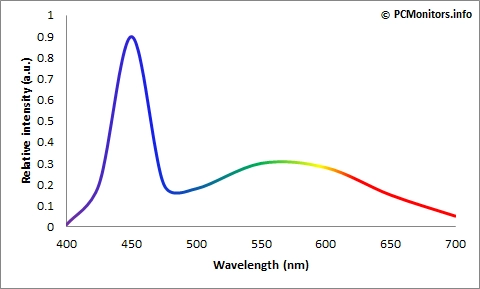
The factors raised so far in this article have presented something of a viewing comfort minefield, as everybody’s eyes are different. When you start to explore the actual spectral qualities of the screen (how the light energy emitted from the screen is composed), things can become very complex indeed. Sometimes a user can tick many of the other boxes and still find a monitor uncomfortable, because there is one important piece of the puzzle missing. An important variable can be the light emitted from the monitor itself and its spectrum, which on an LCD monitor depends on the backlight used. As explored in our article on the topic of backlighting, your typical LED backlight yields an ~sRGB colour gamut and has a spectral profile that looks something like that shown in the graph below. Note the significant peak of blue light energy (early spike in graph) and the flatter and more balanced green to red light energy.
Standard WLED spectrum
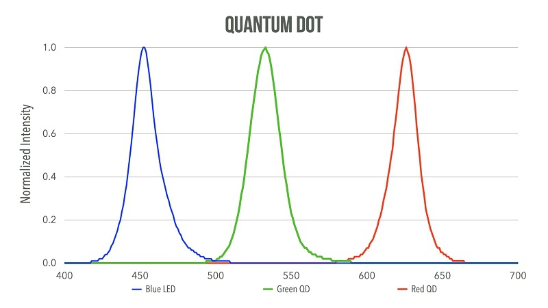
Some users find this spike of blue light (HEVL – High Energy Visible Light) to be uncomfortable. HEVL is very energetic, penetrating through the eye very efficiently and leading to fairly rapid discomfort depending on individual sensitivity and exposure. As explored in the article, which has been continuously updated to reflect evolution in the field of backlighting, there are some solutions which offer a much more balanced spectrum. Rather than there being a distinct peak of blue light energy, there is also a distinct peak of green and red. This can be beneficial in terms of viewing comfort, but it’s also the reason some models have a much more generous colour gamut than others. Some users find an untamed wide gamut unpleasant or ‘annoying’ to look at, which can override the potential physiological benefits of the more balanced spectrum. A flexible sRGB emulation setting or appropriate flexibility to tweak colour output can be beneficial in that case. As explored in our backlighting article, Quantum Dots being incorporated into the backlight are just one way of achieving a more balanced spectrum and enhanced colour gamut. Special phosphor coatings are also available to manufacturers which provide a more balanced spectrum and wider gamut than regular standard gamut WLED backlights. Rather than replacing the phosphor coating on the blue diodes with a film of Quantum Dots, a different phosphor is used instead. The spectrum below shows the well-balanced output attained using Nanosys QDEF (Quantum Dot Enhancement Film). The image has been provided by Jeff Yurek, Product Marketing Manager of Nanosys.
Nanosys QD Spectrum
By balancing the spectrum in this way, the level of blue light that a user is exposed to at a given luminance is significantly reduced. Quantum Dots solutions can also be tuned so that, at a normal white point and without extreme colour channel adjustment, the green and red peaks are even greater than the blue peak. The Acer XB323U GP being one such example. Some models also have their blue peak shifted to a less energetic (longer) wavelength, which isn’t always an advertised feature but can potentially help reduce visual fatigue compared to a blue peak at a shorter wavelength. This is a requirement for TÜV Rheinland’s ‘Eyesafe’ certification process. Whether you’re using a monitor with a more balanced spectral profile or shifted and less energetic blue light peak, it’s possible to reduce the blue light emission from a monitor by filtering it out. A popular, effective and convenient way of doing this which monitor manufacturers will often market is the use of Low Blue Light (LBL) settings. Generally, these settings will significantly reduce the strength of the blue colour channel (i.e. will filter blue light more effectively) than just using the standard settings on a monitor. The image will look significantly warmer, so they’re not recommended for colour-critical work or otherwise admiring accurate colour output. Your eyes adjust to this to some extent so the effect becomes less noticeable given some time, but even after that it significantly impacts colour output. Settings to this effect that aren’t specifically labelled as clearly as “Low Blue Light” may exist in another form (refer to our reviews as these are always explored). But if they don’t you can achieve a similar effect by manually reducing the blue colour channel in the monitor settings, by using software or via the GPU driver. Reduced brightness is also important in minimising blue light emission from the monitor and some of the most effective LBL settings on monitors will usually set the monitor to a relatively low brightness by default.
Although blue light can be fatiguing to the eyes, it is perfectly natural to be exposed to it to some degree. Going outside in the daylight, for example, will expose you to much greater levels than you’d be exposed to sitting in front of your monitor. And we’re not just talking about a bright sunny day here where you might feel compelled to wear your favourite pair of sunglasses. Where being exposed to blue light is quite unnatural, though, is in the evening and the hours leading up to bed time. HEVL is very stimulating and is an important signal to keep the body awake and alert. This is exactly what you should avoid in the hours leading up to sleep, where blue light is disruptive to ‘sleep hormones’ such as melatonin. Whether the amount of blue light you’d be exposed to from a screen can cause such direct hormonal disruption is questionable, but a warmer look to the image can still be considered more relaxing. Where possible, we like to make use of effective LBL settings on monitors in the hours leading up towards bed. Where such settings are not available, a user may wish to turn to software such as f.lux to moderate blue light output from the monitor. The potentially greater hit in contrast, impact on image quality and universal compatibility are issues to consider when using a software or GPU driver method of filtering rather than using settings on the monitor itself. Nonetheless, the fact that f.lux is designed to activate automatically at sunset and work with any screen make it an attractive option. When it comes to viewing comfort, we’d say a nice balanced spectrum without a distinct lone peak is very useful and to some users can be critical. LBL settings are also useful to reduce unnatural blue light exposure, particularly in the hours leading up to sleep. Failing all of that, software such as f.lux is a good thing to get into the habit of using.
Video article
Before this article was written, it existed as a video on our YouTube channel which is embedded below. We received a positive response to this video and decided it would be useful to expand on some of the thoughts contained within it and give something to people in written form as well. We know some people prefer to read about things, whilst some prefer to watch a video. And for total absorption and reinforcement of this knowledge – some like to do both. Note that our forum mentioned in the video is fully operational again.
Conclusion and recommendations
Viewing comfort is a surprisingly complex topic, once you delve into it properly. That’s because everybody’s eyes are unique and different users can find different aspects of a monitor visually comfortable or uncomfortable. In an ideal world you’d have your monitor set to a comfortable brightness that is suited to your own sensitivity and viewing environment. You’d be using a monitor with a flicker-free backlight that offers a good balanced spectrum and has some effective Low Blue Light settings to boot. A shifted blue peak to less energetic wavelengths is desirable, too. You’d also be using a monitor with a comfortable pixel density, one which gives you the sort of clarity you desire without text being uncomfortable to read. The screen might be curved, perhaps one that’s free from dithering. Oh, and there would be a nice clear and ungrainy screen surface that’s well-suited to your carefully controlled lighting environment. Let’s throw in a nice high refresh rate and good pixel responsiveness as well, for good measure.
Of course, in the real world it’s going to be very challenging to tick all these boxes; there’s no perfect monitor. And that goes for more than just viewing comfort and minimising eye strain. Fortunately, most users will find ticking all these boxes unnecessary. But it’s certainly good to be aware of the factors and consider what you might personally find important for viewing comfort. We’d certainly advise keeping these things in mind when you read our reviews as we do explore all of these factors where possible. Our recommendations section features a range of monitors of varying size and capability. They’re designed for a diverse range of applications. All models that we list there feature flicker-free backlights and many of them tick a lot of other viewing comfort boxes.
As an Amazon Associate and Newegg Affiliate I earn from qualifying purchases made using the below link. Where possible, you’ll be redirected to your nearest store. Further information on supporting our work.
