Author: Adam Simmons
Date published: August 16th 2017
Table of Contents
Introduction
Monitors like the AOC Q2577PWQ and Dell U2515H are popular amongst consumers wanting a mixture of strong colour reproduction, pleasing resolution and pixel density. The slightly smaller screen size (27” being more common for this ‘class’ of monitor) and generally lower price tag associated with that are also appealing. The U2518D builds on the success of its predecessor by offering slightly reworked aesthetics, tighter factory calibration and some new features. One of the most talked about new features is ‘Dell HDR’, for both the right and wrong reasons. In this review we take a look at this feature and of course the other key attributes of the monitor including its aesthetic refinements, image performance and responsiveness.
Specifications
This model features a 60Hz 25” IPS-type (In-Plane Switching type) panel. This offers true 8-bit colour reproduction (no dithering) and a 2560 x 1440 resolution. A 5ms grey to grey response time is specified, which as usual should not be taken as gospel. Some key ‘talking points’ of the specification have been highlighted in blue below, for your reading convenience.
Features and aesthetics
From the front the monitor has a simple but elegant design. The slim bezels are key to this, which use the now ubiquitous dual-stage design comprising a hard outer component as well as a slim panel border. The panel border blends in with the rest of the screen when the monitor is switched off, but is visible (as a very slim border) when the screen is on. The total bezel width including both components is ~8mm (0.31 inches~) at the top and sides and ~15mm (0.59 inches) at the bottom. All measurements include both components of the bezel – the bottom measurement includes the lowest point of the bottom bezel, where it protrudes diagonally downwards towards the rear. The screen surface used here is very light matte anti-glare, which we explore a little deeper into the review.


The OSD (On Screen Display) is controlled by pressable buttons on the underside of the bottom bezel, towards the right. These are small and rather firm compared to what we’re used to on Dell models and found they needed more force and were less comfortable to press than usual. There is a small vertical slit style power indicator integrated into the power button itself, which is the button furthest to the right. This glows white when the monitor is on or blinks white when it enters a low power state. The video below gives a run-through of the OSD.
From the side the monitor is reasonably svelte, although not super-slim due to its use of an internal power converters, VESA mounting capability and the fact the ports are featured in a normal location rather than being consigned to the stand base. It’s ~17.5mm (0.69 inches) at thinnest point but lumps out further towards the centre. At the left side there are also 2 USB 3.0 ports, the lower of which offers BC 1.2 fast-charging of connected devices. The stand design comprises a fairly low-profile base that does not take up too much valuable desk space, particularly in terms of depth. The total depth of the monitor including the stand and base is ~200mm (7.87 inches). The stand offers full ergonomic adjustment; tilt (-5° to 21°), height (130mm or 5.12 inches), swivel (45° left, 45° right) and pivot (90° clockwise, 90° anti-clockwise). At lowest height the bottom of the screen clears the desk by ~70mm (2.76 inches) with the top of the screen ~399mm (15.71 inches) above the desk surface. In portrait orientation the screen can be made to touch the stand base, so offers a very good minimum height in that orientation.

At the rear, the screen combines a satin matte silver finish with matte black plastic. This continues the theme used for the stand neck and base. The stand attaches centrally using a proprietary quick-release bracket mechanism and can be released using a button beneath the stand neck, directly under the port attachment area. This reveals 100 x 100mm VESA holes, so you can use an alternative compatible mounting solution if preferred. There is a cable-tidy loop integrated into the stand neck, whilst a K-Slot is located to the left of this region at the rear of the screen. The ports are down-firing and include; AC power input (internal power converter), HDMI 2.0 (HDCP 2.2 compliant), DP 1.2, mDP 1.2, DP 1.2 out (for MST daisy chaining), 3.5mm audio out, USB 3.0 upstream and 2 further USB 3.0 ports (2nd one supports BC 1.2). The DP 1.2 output is covered with a removable orange plug out of the box so that people don’t mistake it for an input and wonder why the monitor doesn’t display a signal when using that port alone. A power cable, mDP-DP cable and USB 3.0 cable is included as standard.


Calibration
Subpixel layout and screen surface
The image below is a macro photograph taken on Notepad with ClearType disabled. The letters ‘PCM’ are typed out to help highlight any potential text rendering issues related to unusual subpixel structure, whilst the white space more clearly shows the actual subpixel layout alongside a rough indication of screen surface. A very light matte anti-glare screen surface (some may call it ‘semi-glossy’) is used here, handling glare fairly effectively whilst keeping the image free from obvious ‘smeary’ graininess. There is only a light ‘misty’ graininess, with the screen giving quite a smooth appearance even when viewing light shades.
![]()
As shown above, the monitor uses the standard RGB (Red, Green and Blue) stripe subpixel layout. This is the default expected by modern operating systems such as Microsoft Windows and Apple MacOS. You needn’t worry about text fringing from non-standard subpixel layouts as a Mac user and don’t need to run ClearType as a Windows user – although you may wish to adjust this according to preferences. The subpixel layout is as we’ve seen on other IPS-type panels of this size and resolution, with no immediate issues identified related to text rendering. The subpixels are slightly more squat on these 25″ IPS models with relatively large vertical gaps (‘black bands’) between pixels, but this shouldn’t cause any particular issues given the pixel density and otherwise entirely normal subpixel structure.
Testing the presets
The U2518D provides a range of Preset Modes; ‘Standard’, ‘ComfortView’, ‘Movie’, ‘Game’, ‘Color Temp.’ and ‘Custom Color’. The table below details our observations and some key readings taken using a Datacolor Spyder5ELITE colorimeter, using a range of settings on the monitor. The monitor had the driver included on the disc loaded, just in case it was required for proper HDR compatibility on the monitor. No ICC profiles were specifically loaded; an ICC profile is included on the disk, but this is the same as the Windows default and is simply there to reset the profile or override any other profiles you may have active.
The monitor was connected to a Windows 10 system using an Nvidia GTX 1070, via HDMI 2.0. Connecting via DP 1.2 provided similar results, but no HDR functionality is supported via DP 1.2. Unless otherwise stated assume default settings were used elsewhere in the OSD – the exception being that ‘Dynamic Contrast’ was disabled in the ‘Game’ setting (it is enabled by default). When viewing the figures in this table, note that for most PC users ‘6500K’ for white point and ‘2.2’ for gamma are good targets to aim for. Individual targets depend on individual uses, tastes and the lighting environment, however.
| Monitor Settings | Gamma (central average) | White point (kelvins) | Notes |
| Standard (Factory Defaults) | 2.2 | 6407K | The image is quite bright, although no obnoxiously so. It is very well balanced with appropriate colour tone and an excellent variety of rich and accurately represented shades. |
| ComfortView | 2.1 | 5318K | This is a Low Blue Light (LBL) setting with quite high default brightness. It has a warm green tint with severely weakened blue channel but a strong green push. This is suitable for relaxing evening viewing in the sense that blue light output is decreased, although the green push is a bit much even after your eyes have adjusted. |
| Game | 2.0 | 6698K | Compared to the factory defaults there is a noticeably cooler tint. Some shades more muted due to the gamma handling. However; this is offset elsewhere by the increased colour gamut (this is purposefully restricted slightly in the ‘Standard’ mode as explored later) that invites a bit of extra vibrancy in places. |
| Color Temp. 6500K | 2.1 | 6700K | As above but slightly more depth due to improved gamma handling. Some shades again appear a bit more muted than factor defaults, whilst others appear with extra saturation. |
| Color Temp. 5000K | 2.1 | 4986K | This is an alternative LBL setting. We prefer this to the ‘ComfortView’ setting as it reduces blue light output even more significantly. Moreover, it doesn’t come accompanied with a strong green tint. |
| Custom Color | 2.1 | 6840K | Similar to ‘6500K’ but the image appears noticeably cooler again. It is bright – you have full access to the RGB colour channels as well as the usual brightness etc. The full native gamut is used in this and indeed all presets outside of the fully calibrated ‘Standard’ mode. |
| Test Settings | 2.2 | 6428K | Simply ‘Standard’ with lower brightness. The old adage “if it ain’t broke, don’t fix it” applies here. The image is very nicely balanced with rich but accurate shade representation. |
Out of the box the monitor came set to its ‘Standard’ setting, which is factory calibrated as shown below. This ‘Color Calibration Factory Report’ is provided with and specific to each individual unit and shows how the screen performs in terms of colour accuracy, white point and gamma measurements.

Our own testing gives us no reason to doubt the impressive results on the factory calibration report; the monitor was impressively well calibrated, providing pleasing white point balance and excellent gamma tracking. Colour accuracy in the sense of DeltaE measurements for various shades is not something we choose to cover in our reviews, but it is something we analyse for our own purposes. Again, our results were very much in-line with those on the report. Combined with the consistent colour reproduction of the IPS-type panel, shades were delivered in a rich but accurate way. The remaining preset modes invite slightly more vibrancy due to them allowing the monitor to use its full ‘unlocked’ native colour gamut – we explore this in more detail later. The gamma tracking was slacker in these remaining presets, including the fully flexible ‘Custom Color’ mode. The gamma curves below are shown for our ‘Test Settings’ (‘Standard’ with reduced brightness) and ‘Custom Color’, respectively. Note the very close adherence in the first image vs. the looser adherence in the second. Most users should stick to the ‘Standard’ mode, but some may want to access the RGB channels or simply use the full gamut of the monitor. Forgoing accuracy for a bit of extra vibrancy. You can download our ICC profile that was created on our unit in ‘Custom Color’ and all colour channels in their neutral ‘100’ position. As below, this was not used for our ‘Test Settings’. For instructions on how to use this file and some of the limitations refer to this article. In particular note that individual units vary and you can’t necessarily expect optimal results using a profile somebody else has created. Feel free to change colour channels and of course brightness according to taste, too. As a final note, we’d like to praise the inclusion of the ‘5000K’ Low Blue Light (LBL) preset. This is easy to switch to and from if, like us, you like to use an LBL setting for relaxing evening viewing but a different preset (such as ‘Standard’) for daytime usage. And in our case testing purposes. We weren’t too impressed with the ‘ComfortView’ setting, though, as this was simply too green and not even quite as affective as ‘5000K’ in terms of blue light reduction anyway. This is the sort of thing we’ve seen on some previous Dell models with a ‘Paper’ setting, and that is essentially the same thing as this – it has just been renamed. For our ‘Test Settings’ we simply stuck with the default ‘Standard’ mode and reduced brightness. Anything not mentioned here, including ‘Contrast’, was left at the default value. We have included the ‘Response Time’ setting and indeed ‘Preset Mode’ used just for reference, even though both were technically the factory defaults as well. Brightness= 40 (according to preferences and lighting) Response Time= Normal We used a BasICColor SQUID3 (X-Rite i1Display Pro) to measure the luminance of black and white using various settings. From these values, static contrast ratios were calculated. This data is presented in the table below, with blue highlights indicating the results under our test settings. Black highlights indicate the highest white luminance, lowest black luminance and highest contrast ratio recorded. Assume that any settings not mentioned here were left at default, with the exceptions already noted in the calibration section. This includes ‘Dynamic Contrast’ being disabled in ‘Game’ mode.
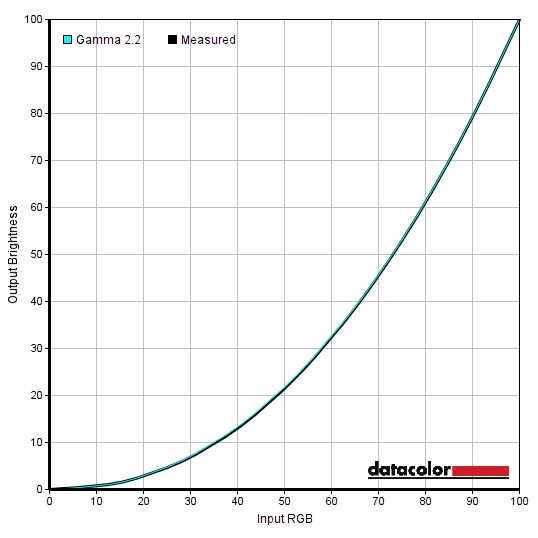
Gamma 'Test Settings'
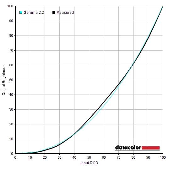
Gamma 'Custom Color'
Test Settings
Preset Mode= Standard
Contrast and brightness
Contrast ratios
Monitor Settings White luminance (cd/m²) Black luminance (cd/m²) Contrast ratio (x:1) 100% brightness 358 0.38 942 80% brightness 271 0.29 934 60% brightness 212 0.23 922 40% brightness 161 0.17 947 20% brightness 99 0.1 990 0% brightness 29 0.03 967 Factory defaults (75% brightness, ‘Standard’) 248 0.27 919 ComfortView 250 0.27 926 Game 253 0.26 973 Color Temp. 6500K 255 0.27 944 Color Temp. 5000K 213 0.26 819 Custom Color 260 0.27 963 Custom Color (100% brightness) 370 0.27 963 Test Settings 161 0.17 947
With only brightness adjusted, the contrast ratio averaged 950:1, quite as expected from the panel specifications. Our ‘Test Settings’ did not involve any adjustments to the colour channels, so contrast was remained similar at 947:1. The ‘ComfortView’ setting involved significant reduction in the blue colour channel but no such reduction in the green colour channel. The advantage of this being that contrast remained quite strong (926:1), the disadvantage being the obvious green tint we noted earlier. The alternative Low Blue Light (LBL) setting, ‘Color Temp. 5000K’ reduced the contrast slightly (819:1) but did not have an obvious green cast. The maximum luminance recorded on this table was 370 cd/m², whilst the minimum white luminance was 29 cd/m². This gave an impressive 341 cd/m² luminance adjustment range with plenty of usable values.
The monitor has a Dynamic Contrast mode that can be activated in the ‘Game’ and ‘Movie’ presets if ‘Smart HDR’ is disabled. This allows the backlight to adjust its brightness according to the level of light and dark on the screen. As usual, the whole backlight adjusts as one unit and therefore this setting can’t account for intricate mixtures of light and dark. It simply works on the average makeup of the entire scene. As usual we found this mode quite unimpressive and tended to find the brightness levels uncomfortably bright even when mixed but fairly dark content was displayed.
PWM (Pulse Width Modulation)
The Dell U2518D does not use PWM (Pulse Width Modulation) to regulate backlight brightness. DC (Direct Current) is used to regulate backlight brightness, meaning that the monitor is considered ‘flicker-free’. Users who are sensitive to flickering or other side-effects of PWM usage will appreciate this. The exception to this is with the backlight set to a very low brightness level (<10%) where high-frequency PWM is employed, with a cycling frequency of 940Hz.
Luminance uniformity
Observing a black screen in a dark room revealed some backlight bleed, specifically a spotlight of bleed towards the bottom left. Note that individual units vary when it comes to backlight bleed. The image below shows the backlight bleed on our unit, taken from a central viewing position a few metres back to eliminate ‘IPS glow’. This glow can be observed whilst viewing the screen from a normal viewing position, manifesting itself as a silver or golden sheen (depending on angle) that is most noticeable in the bottom corners of the screen. This sheen appears to ‘bloom out’ if you view the screen from a sharper angle, as demonstrated in the viewing angles video later on.

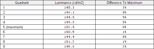
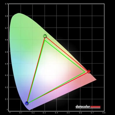
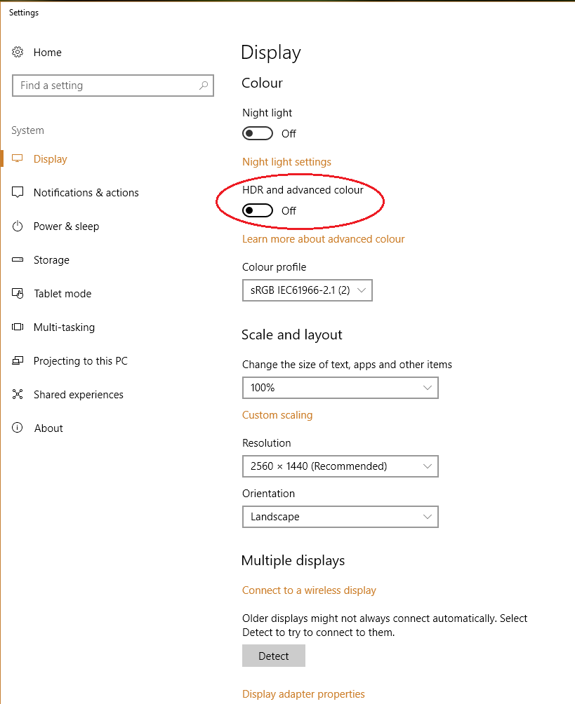
The Spyder5ELITE colorimeter was used to analyse the uniformity of lighter colours, represented by 9 equally spaced white quadrants running from top left to bottom right. The table below shows the luminance recorded at each quadrant and the deviation between a given quadrant and the brightest quadrant. The luminance uniformity of the screen was excellent. The brightness point recorded was ‘quadrant 5’ in the centre of the screen (152.5 cd/m²). The greatest deviation from this occurred at ‘quadrant 7’ towards the bottom left (144.4 cd/m², which is 5% dimmer). Elsewhere deviation was 1 – 5%, which is very pleasing. Note that individual units vary when it comes to uniformity and there can be further deviation beyond the points measured. Nonetheless, this was very good to see. The contour map below gives a graphical representation of the deviations. Darker greys represent lower luminance and therefore greater deviation from the central point than lighter greys. The colour temperature deviations for the same 9 quadrants were also analysed using the colorimeter. Deviations are assigned DeltaE values, with higher values representing greater deviation from the D65 (6500K) daylight white point target than lower values. The contour map below shows this, with stronger shades indicating greater deviation from the 6500K target. A DeltaE of <3 here is considered deviation that most users would not readily notice by eye, therefore not considered significant. The results here were very good with no significant deviations recorded. As with other aspects of uniformity, note that there can be deviation beyond the points measured. And indeed individual units vary in this respect. On Battlefield 1 (BF1) the contrast performance was decent. Some detail was lost in the bottom corners of screen in particular, due to ‘IPS glow’. This was a bit weaker and less extensive than you might expect from a model of this size, though, eating away at detail near the corners but not reaching as far into the centre of the screen. The overall level of detail in dark areas was appropriate, although some minor details such as cracks and crevices in building stonework and wooden barrels could have been a bit more distinct. Brighter shades contrasted well with darker surroundings, with only a light misty graininess from the screen surface and a relatively smooth look overall. Dirt Rally also showcased decent contrast performance. The level of detail in dark areas was mostly quite good. ‘IPS glow’ did eat away at some subtle details on the vehicle grills, tire tread patterns and suchlike but was a bit less extensive than you might expect from this size of IPS-type monitor. The deep dark nights on this game did not have the same depth to them as on a VA model with much stronger contrast, but in a reasonably well-lit room perceived depth was still good here. Bright elements such as car headlights and other light sources around dimly lit tracks stood out nicely. Lighter shades such as lights and the daylight sky appeared with only a light and misty graininess rather than anything smeary or heavy, thanks to the very light matte screen surface. We also used the Blu-ray of Star Wars: The Force Awakens to assess contrast performance. Dark areas were shown with appropriate detail levels overall, with the black bars at the top and bottom (16:9 letterbox format) rather than the film itself covering most of the ‘IPS glow’. Bright elements such as light sabers and explosions contrasted well. Not with the same pop as on models with lighter screen surfaces and significantly stronger contrast, but still quite well. Such brighter elements were free from obvious smeary graininess. The Lagom tests for contrast allow specific weaknesses in contrast performance to be identified. The following observations were made. The Dell U2518D’s colour gamut (red triangle) was compared to the sRGB reference colour space (green triangle), as shown below. The first image shows the colour gamut using our ‘Test Settings’, which uses the factory calibrated ‘Standard’ mode as a base. Here you can see comprehensive sRGB colour space coverage (99%) with a small amount of extension beyond for the green region of this diagram. This offers the potential for excellent accuracy within the sRGB colour space. The second image shows the colour gamut under ‘Custom Color’ – it is similar in any preset mode other than ‘Standard’. This is the unrestricted native colour gamut of the monitor, offering complete (100%) sRGB coverage and a fair bit of extension beyond this in the green and red regions of this diagram. That invites extra vibrancy at the expense of sRGB accuracy, which some users may prefer but others would find counter-productive. Battlefield 1 (BF1) was displayed much as its creators would have intended. Colours were rich and varied, bringing the natural environments to life with a nice palette of rich and more muted greens, good neutral earthy browns and a good range of more vibrant shades such as yellows and reds for flora. Red poppies stood out in quite a nice way, without appearing either faded or oversaturated – just the intended amount of ‘pop’, really. Glowing amber fires also appeared suitably vibrant but not overdone, with yellows and oranges appearing appropriate and distinct from one another. There were good neutral greys and browns without unwanted tints as well, with the colour consistency aiding subtle shade variety. This helped give identity to different types of wood and different stonework on buildings as well. Dirt Rally also looked very much as it should. There were plenty of vibrant but not ‘overdone’ shades displayed for car liveries and advertising around the track. There were some particularly impressive deep reds, which tend to verge on looking an inappropriate cherry shade on models with a wider colour gamut or simply too muted on models with a weaker colour gamut. On this model they looked much as they should – a good rich and fairly deep shade. The natural environments showcased a nice variety of minty greens and some good lush shades. Some of the greens were not quite as lush and vibrant looking as on models with slightly more generous colour gamuts, but looked very much as they should rather than ‘extra vibrant’. The range and neutrality of earthy browns was also pleasing, as was the consistency of such shades across the screen. Finally, we tested the Blu-ray of Futurama: Into the Wild Green Yonder. As with the game content we tested, things looked much as they should here. There was an excellent variety of pastel shades, allowing individual characters to be given their own unique identity. Even if their skin tone or clothing varied just slightly from that of other characters, for example. The strong colour consistency was key to this. There were plenty of good eye-catching neon shades such as electric blues, pinks and highlighter greens. Deep shades also appeared with appropriate depth and saturation, rather than appearing faded or overly bright. Lagom’s tests for viewing angle tests help explore the idea of colour consistency and viewing angle performance. The following observations were made from a normal viewing position, eyes around 70cm from the screen. On some monitors faint interlace patterns can be seen during certain transitions, particularly noticeable where light shades (muzzle flashes, explosions etc.) briefly pop up on the screen. These are sometimes referred to as ‘inversions artifacts’. Alternatively, static interlace patterns can be seen with some shades appearing as faint horizontal bands of a slightly lighter and slightly darker version of the intended shade. We did not observe any such artifacts on this monitor. We used a small program called SMTT 2.0 alongside a sensitive camera to compare the latency of the U2518D with a range of monitors of known input lag. We took over 30 repeat readings to maximise accuracy. Using this method, we measured 5.18ms (under 1/3 of a frame) of input lag. This is influenced both by the element you see (pixel responsiveness) and that which you feel (signal delay). It indicates a very low signal delay that shouldn’t be bothersome even to sensitive users. Rather peculiarly we measured ~16ms of input lag using the ‘Game’ preset, even with Dynamic Contrast disabled. We have no way to accurately measure the input lag with ‘Smart HDR’ active on this display. In our responsiveness article, we take a look at some of the key concepts related to monitor responsiveness. Chief amongst these is the notion of ‘perceived blur’, which is contributed to not just by the pixel responses of the monitor but also the movement of your eyes as you observe motion on the screen. This second factor is generally the predominant one on modern monitors. We also introduce a technique called ‘pursuit photography’, which uses a moving rather than static camera to capture motion on a monitor in a way that reflects both eye (camera) movement and pixel responsiveness. The images below are pursuit photographs taken using the UFO Motion Test for ghosting, with the test running at 960 pixels per second. This is a practical speed for capturing such photographs and highlights both elements of perceived blur nicely. The UFOs move across the screen from left to right at a frame rate matching the refresh rate of the display. All background shade levels (dark, medium and light) were used and both ‘Response Time’ settings on the monitor were tested. The final image shows a 60Hz reference monitor, a Dell S2417DG, which gives an idea of how things should look where pixel responsiveness isn’t really a limiting factor. With ‘Response Time’ set to ‘Normal’ you can see that the image is soft and unfocused. The same applies to the reference screen, however. This reflects perceived blur that can be attributed to eye movement when you observe motion on the monitor. There is also a little bit of trailing behind the object for the darkest background (top), although this is not too pronounced. For the medium background (middle) and lightest background (bottom) things look rather close to the reference image, with no obvious weaknesses attributable to pixel response times. Using the ‘Fast’ setting introduces a colourful inverted trail behind the object; this is inverse ghosting (overshoot) and indicates an overly aggressive pixel overdrive impulse. It is very clear from this analysis that ‘Normal’ is the setting to use, with ‘Fast’ introducing issues that are far more noticeable than the slender benefits it might bring to some pixel transitions. Note that we will not be including a section on ‘overclocking’ in this review as the monitor skipped frames when set at all above 60Hz. On Battlefield 1 (BF1) there was a moderate degree of perceived blur, intensifying and becoming most noticeable as the pace of action increased. This was predominantly caused by eye movement and therefore much in line with what you’d see on even the fastest 60Hz LCDs. There were some slight weaknesses beyond this, caused by slower than optimal pixel transitions, but nothing that really stood out. There was a faint powdery trail, most notably accompanying light shades with a dark background – for example when moving past a light source in a dark room. This was really quite similar to the slight trailing shown earlier on Test UFO – faint and not really distracting at all. It also had limited effect on perceived blur and if a user is sensitive enough to find this problematic then they are very unlikely to get on with any 60Hz LCD. There was no obvious overshoot, either, only slight traces here and there that even our sensitive eyes found completely undistracting. We made similar observations on Dirt Rally, with the perceived blur we observed whilst racing around very similar to what is observed on even the fastest 60Hz LCDs. For example the Dell S2716DG set to 60Hz, sitting next to this monitor. When racing at night we could see some of the powdery trailing noted on BF1 and Test UFO, as there were strongly contrasting pixel transitions with very bright objects moving against much darker backgrounds. Even here the effect on overall perceived blur was slight and the trailing itself was not what we’d describe as eye-catching. Equally subtle was the overshoot, which was as good as non-existent and never eye-catching even to users as sensitive to this as ourselves. The monitor was also free from obvious weaknesses when testing our Blu-ray test titles. These are restricted in their fluidity by the ~24fps at which they run, but there were no weaknesses associated with pixel responsiveness (trailing or inverse ghosting). We also tested our Blu-ray movie test titles, which did not highlight any weaknesses in pixel responsiveness. The fluidity was limited by the low frame rate at which the films run (~24fps), but was not impeded by pixel responsiveness; there was no trailing or overshoot related to imperfections in that department. HDR (High Dynamic Range) as it applies to monitors describes the ability to distinctly display very deep dark shades and very bright light shades simultaneously. It is also a requirement to display a huge variety of shades in between, from weakly saturated to very heavily saturated shades. Ideally the monitor will have hundreds (if not more) dimming zones on the backlight, or alternatively have a per-pixel light source (OLED technology, for example). This would give the monitor an exceptional contrast ratio and allow it to simultaneously display good deep dark content and very bright light content. It also helps if the monitor can pump out a very high luminance, to help the brightest elements of the image really stand out in a brilliant way. Having a wide colour gamut (Rec. 2020 being the ultimate goal as described in our backlighting article) and a high level of precision of 10-bits per subpixel or more is also desirable for proper HDR handling. On paper, the U2518D ticks none of these boxes whatsoever. The backlight is not split into hundreds of dimming zones, its contrast is entirely typical for an IPS-type panel (~1000:1), its peak luminance is decent but not outstanding (<400 cd/m²) and it offers a bit of extension beyond sRGB for its colour gamut but no support for any wider colour spaces. The monitor does ‘support HDR’, though, in as much as it has a dedicated mode called ‘Smart HDR’ that can be activated when using HDMI 2.0. This uses an HDR signal and allows the monitor to respond to HDR10 content; HDR10 being the ‘standard’ (a term we use loosely) associated with HDR for PC usage at the moment. Our test system uses an Nvidia GTX 1070, which supports HDMI 2.0 and hence supports HDR on monitors such as this. Our AMD GPU (Radeon 290) has an older revision of HDMI and therefore couldn’t be used for any testing of this feature. As soon as we hooked up the monitor by HDMI 2.0 and enabled the ‘Smart HDR’ feature, we were greeted by a blank screen. The monitor lost signal – not a promising start. To get around this rather pertinent issue, we had to keep the monitor hooked up via HDMI 2.0 but also connect it up using DisplayPort. This allowed us to get a signal (via DP) whilst the PC still saw a monitor connected to the system via HDMI 2.0 – it treats this as a separate display, which is useful for diagnostic purposes. The issue was that Windows 10, with the ‘Creator’s update’, has a feature called ‘HDR and advanced colour’. This is found in ‘Display settings’ (right click the desktop) and is enabled by default when an HDR-capable display is connected, such as the Dell with its ‘Smart HDR’ feature on. This feature is highlighted in the image below. Note that when you have the display connected by DP and HDMI 2.0 simultaneously, you will only see the ‘HDR and advanced colour’ toggle for the HDMI 2.0 input which should be assigned as (screen) ‘2’. Click ‘2’ and turn this feature off – you can then disconnect the DP or switch to HDMI 2.0 and the screen should display a signal. Unfortunately, the fact that this integrated HDR feature on Windows itself doesn’t work means that applications that rely on this will also not work with HDR. That includes some movie software, YouTube videos and even some games. When launching Hitman with the ‘Smart HDR’ feature of the monitor enabled, the display instantly lost signal. Curiously this occurred even when the ‘HDR’ feature wasn’t enabled in the game options, which can be configured before the game itself is actually loaded. Other applications use their own separate HDR implementation and do ‘work’ with the monitor – insofar as the monitor doesn’t lose signal. Mass Effect Andromeda, for example, has an HDR10 setting that ‘worked’ with the monitor. We’ll let the images do the talking on this one, at least initially. It is impossible to convey exactly what the monitor is displaying in a photo or video – the camera, image editing software and your own PC including monitor influence what you see there. However; just bear in mind that the top image shows how things looked with HDR disabled (i.e. SDR – Standard Dynamic Range) and the bottom with HDR enabled. Faded, lacklustre, lifeless, dull. This might sound like a shampoo commercial, but they’re all adjectives that describe the image with HDR enabled on this title. It looked almost as if the gamma was set to an extremely low value, perhaps the equivalent of ‘1.4’ or below. But the shade handling was quite bizarre, as there were some deep shades that had very good depth to them; although, from what we could perceive, no better than the deepest shades with HDR disabled. There was also a lot of crushing together of dark shades, with subtle details being lost – this was quite apparent when considering some of the dark hair or certain characters, for example. We are aware that other users have reported similar things when observing the PC version of Andromeda in HDR on different HDR-capable displays. So we aren’t necessarily blaming Dell’s implementation for this. However; add together the loss of signal in other titles and the fact that relatively few PC games actually support HDR at the moment, we weren’t prepared to waste more of our time testing this feature. At the time of review we didn’t have access to an HDR-capable GPU from AMD or an HDR-ready games console. Really, though, it is quite clear that if this is the sort of HDR experience Nvidia GPU users are provided with then it’s hardly a feature to get excited about on the U2518D. With its 2560 x 1440 (WQHD) resolution and 25” screen, the Dell U2518D has a pixel density of 117.49 PPI (Pixels Per Inch). This is slightly higher than the 108.79 PPI of the more common 27” WQHD models. We specifically compare the two screen sizes and the 25” WQHD experience in our review of the AOC Q2577PWQ, this section specifically. We would advise users to take a quick read of that and view some of the images which demonstrate the differences. Essentially the difference is not profound – you’re talking about an 8% high pixel density – but that is still a difference nonetheless. It makes text and UI elements just a touch smaller than on the 27” WQHD models, although we can comfortably interact with such elements and read such text on models with significantly higher pixel densities than this. So, depending on eye sight and viewing distance, it’s not something to worry about. The image below show the desktop and some of the productivity capabilities of the monitor. There was a slight but in our view not particularly noteworthy boost in text and image clarity when comparing to a 27” WQHD model. The amount of ‘real-estate’ (i.e. useful work space on the desktop) is certainly of great benefit compared to the 1920 x 1080 (Full HD) resolution that is more typical on models of this size. This slight edge in clarity over 27” WQHD models was also evident but not particularly striking when gaming – the difference between that and gaming on a Full HD model of this sort of size was quite profound, however. The clarity as you observe even fairly small and slender objects in the distance and the texture and particle details (provided the game uses decent textures here in the first place) was quite pleasing really. In this respect things weren’t at the level that you’d see on a 32” or smaller ‘4K’ UHD (3840 x 2160) model, but we feel the balance between GPU performance requirements to sustain a decent frame rate and image quality is quite sound at this resolution and screen size. The images below show the monitor running some games; they in no way represent how things actually look first-hand on the monitor and are just there to help fire up your imagination. For users that don’t wish to use the 2560 x 1440 resolution, perhaps because their system doesn’t run a game well at this resolution or they’re using a games console that doesn’t support it, they may need to fall back to a lower resolution. When the monitor is set to a lower resolution, such as 1920 x 1080 (Full HD or ‘1080p’), the monitor can use an interpolation process. This integrated scaling capability translates that Full HD signal onto all 2560 x 1440 pixels of the screen. For best results, you should ensure the monitor is handling this rather than the GPU, if you’re a PC user. For AMD GPU users this is automatically handled by the monitor when gaming, by default. Nvidia users should open the Nvidia Control Panel and navigate to ‘Display – Adjust desktop size and position’. They should ensure that ‘No Scaling’ is selected and ‘Perform scaling on:’ is set to ‘Display’ as shown below. The interpolation process gives a moderate degree of softening, but this is less pronounced than we’ve seen on quite a few models. When running 1920 x 1080 and comparing to a screen that runs this natively and is of similar size, it is quite apparent that things don’t look quite as sharp. Some finer texture detail is lost, edges appear softer etc. It doesn’t appear blurry in the same way that some monitors do when they use interpolation and indeed the game world does not appear as if it’s viewed through a soft-focus lens. If you view the monitor from further back (the exact distance depends on eyesight and your own visual sensitivities) the softening becomes less noticeable. So if you sit back a bit and want to use the monitor with a games console, for example, we feel it will do a perfectly adequate job and appear largely similar to a native Full HD display when running at 1920 x 1080. As is usual, if you keep the monitor at 2560 x 1440 and are viewing lower resolution content (such as a movie), then it is the GPU or movie software that handles the scaling rather than the monitor. This gives a slight softening when compared to running the content on a native Full HD display, although this is not something most users should find bothersome. It isn’t the first time we’ve used a 25” model with WQHD (2560 x 1440) resolution, but using the U2518D reaffirmed much of what we experienced previously. The overall experience is not massively different to on the more common 27” WQHD models, although the slight edge in pixel density is something we quite like. The overall appearance of the monitor was much as we’ve come to expect from a modern UltraSharp model; sleek and professional looking, without any aesthetic gimmicks. The included stand is quite robust and offers good ergonomic flexibility, whilst the slim bezels on all four sides make the monitor a good candidate for multi-display setups in both portrait and landscape. The OSD provided decent functionality, although we can’t say we were too fond of the buttons themselves. They proved quite uncomfortable on the fingers. Once switched on the monitor provided a solid performance in several areas as well. First and foremost, it proved to be calibrated very nicely out of the factory. It provided a vivid but accurate image, with good sRGB coverage and an agreeable and very light matte screen surface that kept graininess at bay and helped the image look relatively clear and vibrant. Easily accessible and effective ‘Low Blue Light’ settings were also included. The contrast performance was largely as we would expect from an IPS-type panel, with static contrast generally close to the specified 1000:1 and a bit of ‘IPS glow’ to contend with. This glow was actually a bit less extensive than what you might expect from an IPS-type model of this size, however. In terms of responsiveness the model provided a good experience as well, within the confines of the 60Hz refresh rate. The vast majority of pixel transitions were fast enough for an optimal 60Hz experience, with your eye movement being the predominant cause of perceived blur. There was a little bit of trailing in places on top of that, but anybody sensitive enough to find that bothersome would find 60Hz LCDs too limiting anyway. Input lag was also rather low, although curiously seemed to change slightly on some of the image presets, notably being slightly higher in the ‘Game’ mode compared to ‘Standard’. So from what we’ve mentioned so far, there is plenty to like about the monitor and plenty of boxes ticked. One of the real headline features of this model also turned out to be the most disappointing, though; HDR. The range of ‘HDR’ content available to PC users isn’t exactly fantastic, but even then we were unable to access a lot of this due to the ‘Smart HDR’ mode not seeming to activate correctly most of the time. Where it did ‘work’ and the monitor actually retained its signal, we can’t say the results were at all impressive. At launch at least, it is clear that a premium is being put on this model due to its HDR functionality. We would expect the price to fall in time, and perhaps the older U2515H to be discontinued (edit: this is exactly what has happened in some regions). That would make this a more attractive deal, although some users may feel the initial premium is worth paying anyway.
Luminance uniformity table
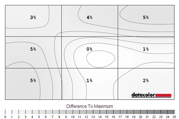
Luminance uniformity map
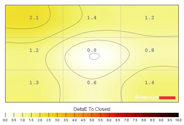
Colour temperature uniformity map
Contrast in games and movies
Lagom contrast tests
Colour reproduction
Colour gamut

Colour gamut 'Test Settings'
Colour gamut 'Custom Color'
Colour in games and movies
Viewing angles

The following video shows the Lagom text test, a mixed desktop background and dark desktop background from various viewing angles. Note that the image maintains its contrast and colour characteristics quite well even from moderate angles. Also note the ‘IPS glow’ that appears to bloom out from steeper viewing angles, for the final section of the video.
Interlace pattern artifacts
Responsiveness
Input lag
Perceived blur (pursuit photography)

Responsiveness in games and movies
HDR (High Dynamic Range)


The 2560 x 1440 (WQHD) experience on a 25” screen


Interpolation and upscaling

Conclusion
![]()
The bottom line; a well-rounded monitor with strong performance in a number of key areas, but HDR isn’t one of them.
Positives Negatives Excellent ‘out of the box’ setup and good sRGB coverage – vivid, accurate and consistent shade representation
Fair extension beyond sRGB (outside of the ‘Standard’ preset) but still no support for extended colour spaces such as Adobe RGB – certainly raises some eyebrows for an ‘HDR capable’ screen
A decent contrast performance; static contrast was in-line with expectation and the ‘IPS glow’ a little lower than you’d generally expect from an IPS-type panel of this size ‘IPS glow’ still present, eating away at some peripheral detail. Slightly stronger static contrast performance has also been observed on some IPS-type panels we’ve tested Good pixel responsiveness on the whole, for a convincing 60Hz performance without obvious overshoot or additional trailing. Low input lag
The 60Hz refresh rate may put some users off – there were also some minor weaknesses here and there in terms of pixel responsiveness
The resolution and screen size provided good ‘real-estate’ and a pleasing pixel density. Good ergonomics, an agreeable design and nice slim bezels on all sides
Price at time of review a bit on the high side, especially considering how lacklustre the HDR performance turned out to be
![]()

