Author: Adam Simmons
Last updated: October 18th 2025
Table of Contents
Introduction
A higher resolution has always been a desirable trait for a monitor, increasing the clarity and ‘real estate’ available to the user compared to similarly sized monitors with a lower resolution. The current buzzword for high resolution displays is something that many marketers refer to as 4K, but also more correctly referred to as ‘UHD’ (Ultra High Definition). This resolution offers 3840 horizontal pixels and 2160 vertical pixels – the vertical component is close to 4000, which is where ‘4K’ comes from. This 3840 x 2160 remains in the popular 16:9 aspect ratio which many consumers are now intimately familiar with. To put things in context, this resolution provides 4 times as many pixels as ‘Full HD’ (1920 x 1080 or 1080p) offers and 2.25 times as many as ‘QHD’ (2560 x 1440 or 1440p).
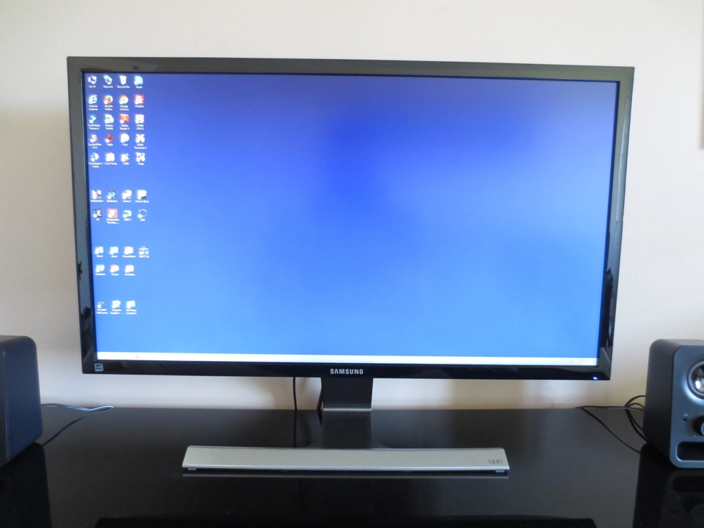
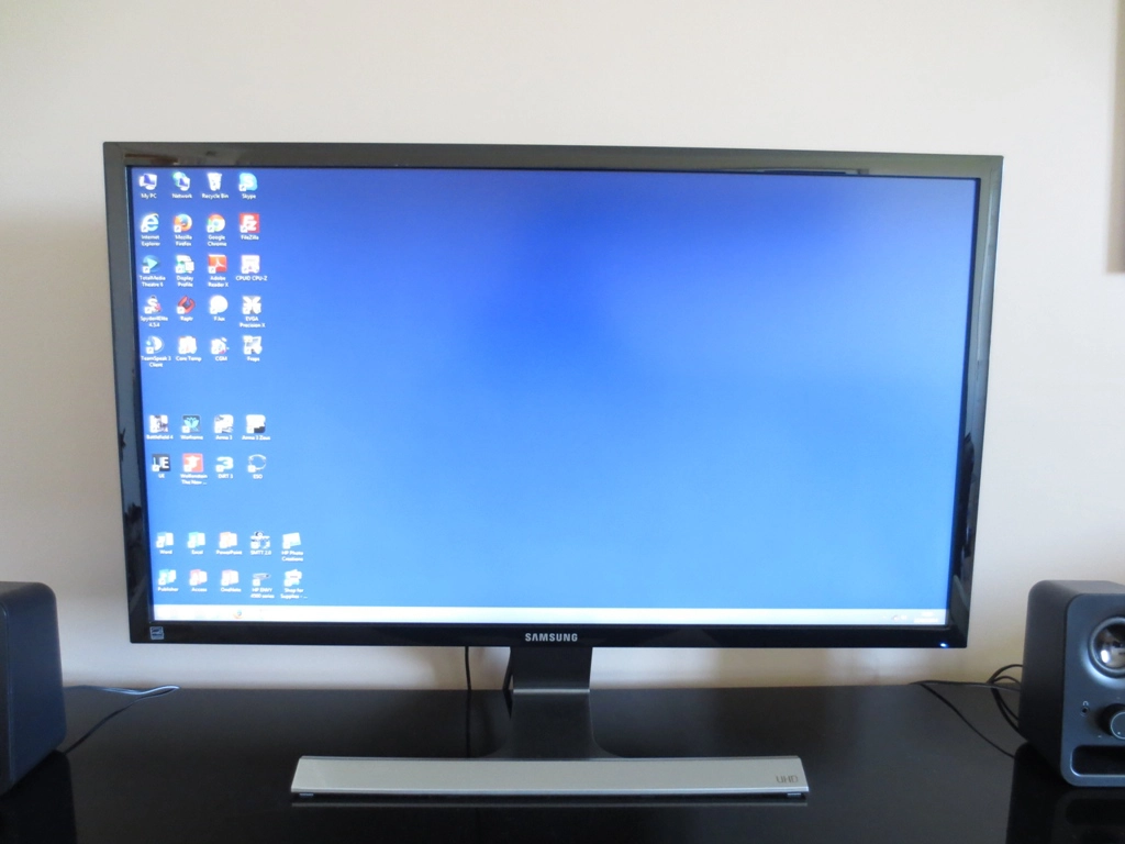
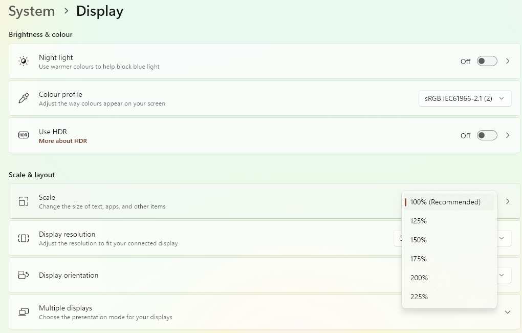
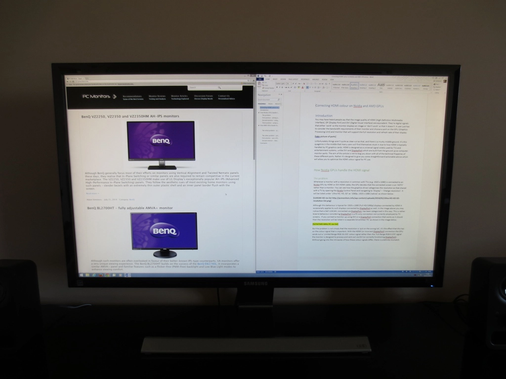
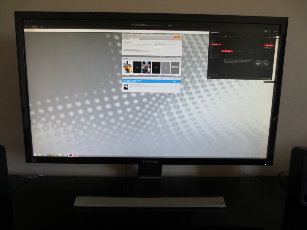
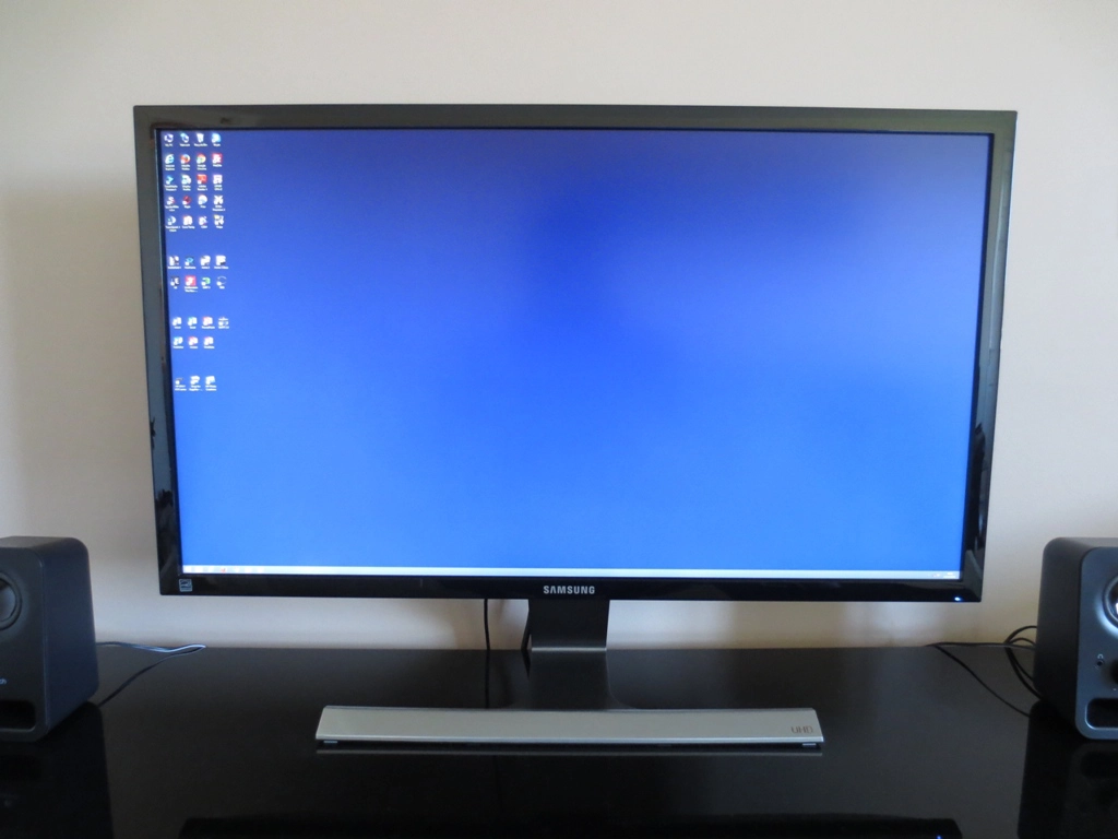
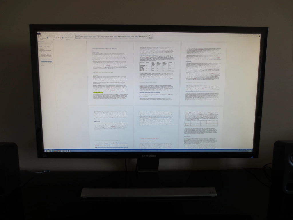
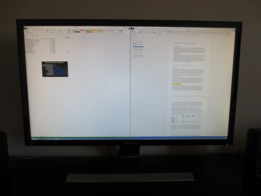
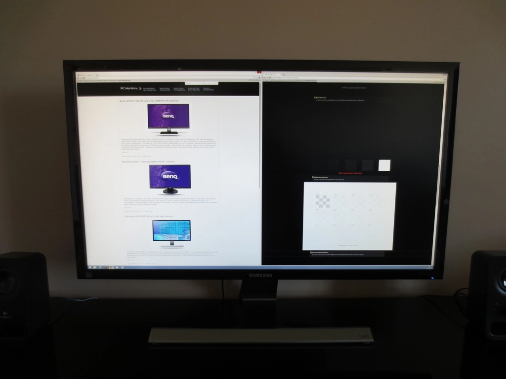
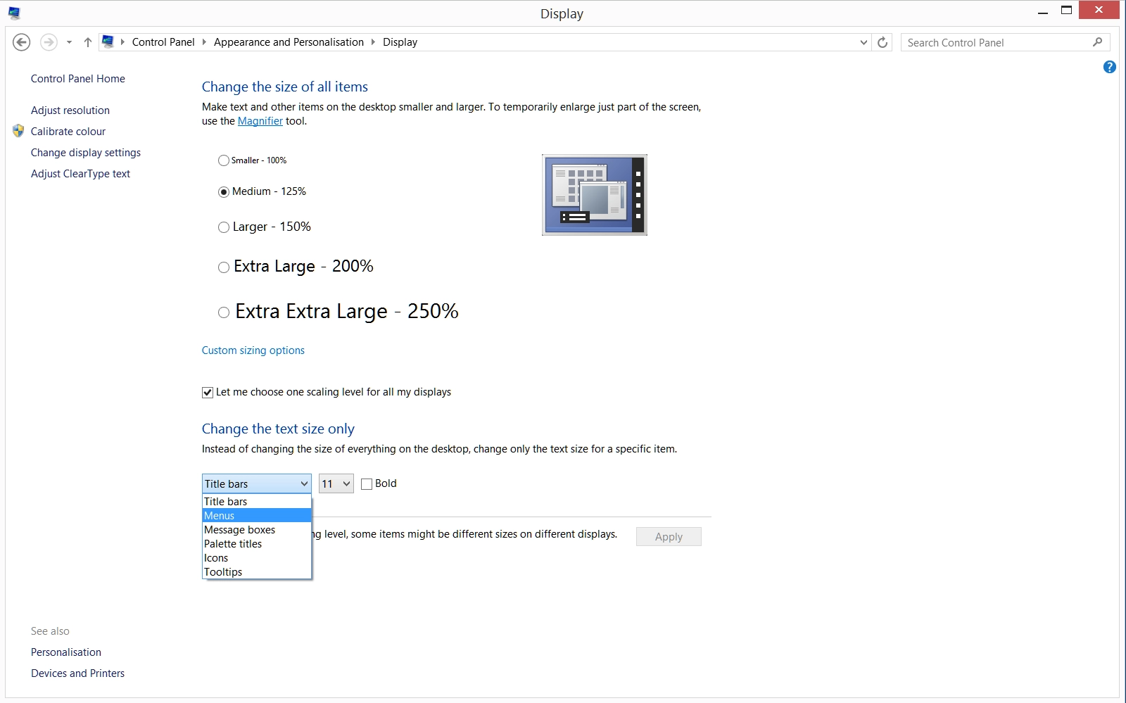
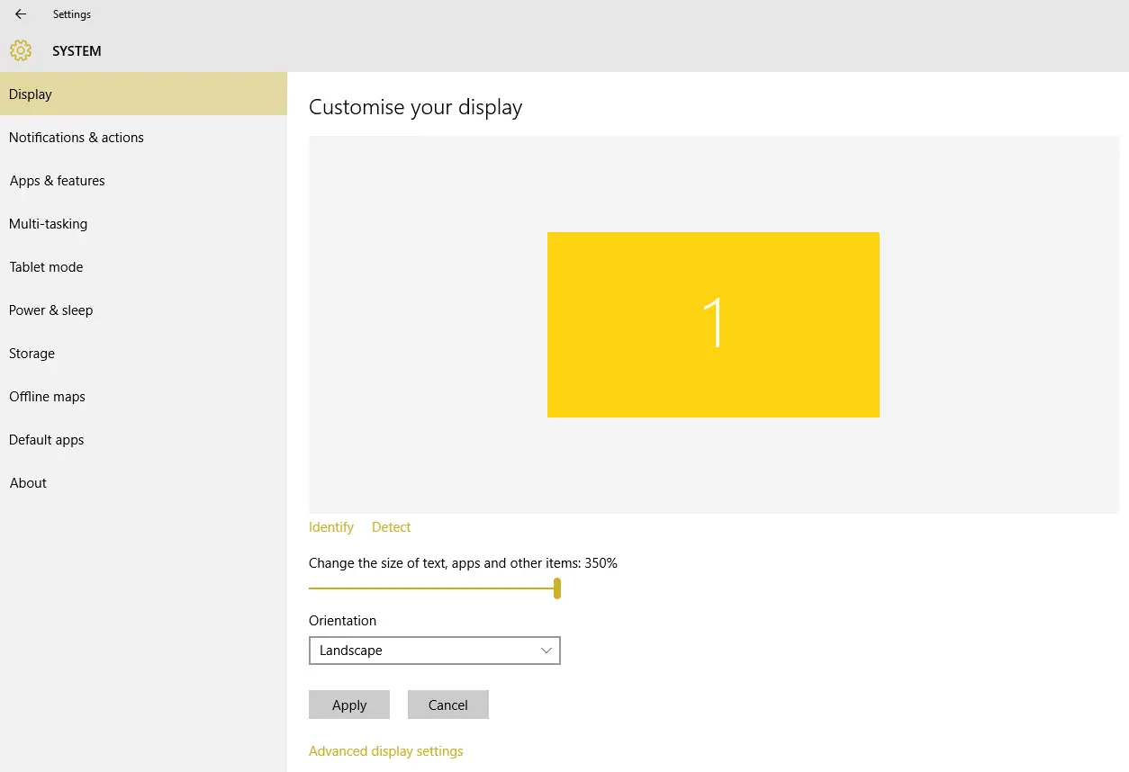
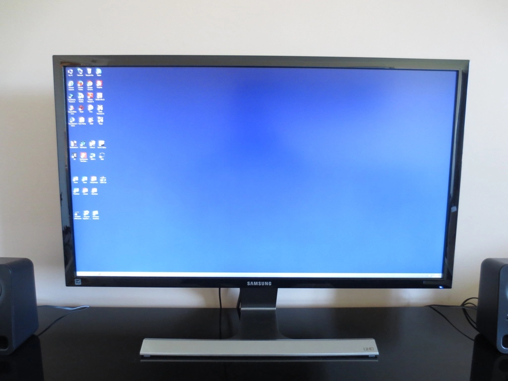
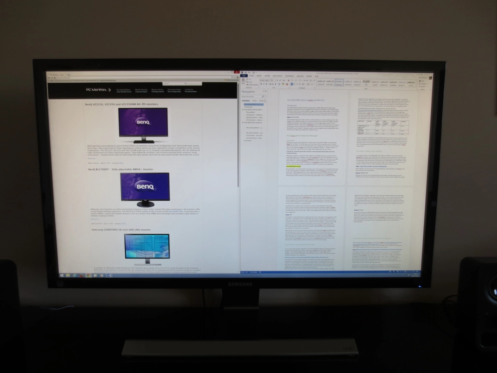
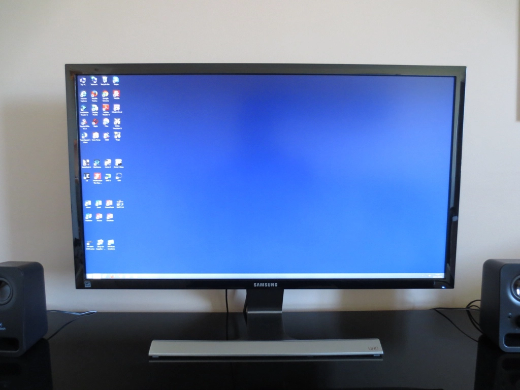
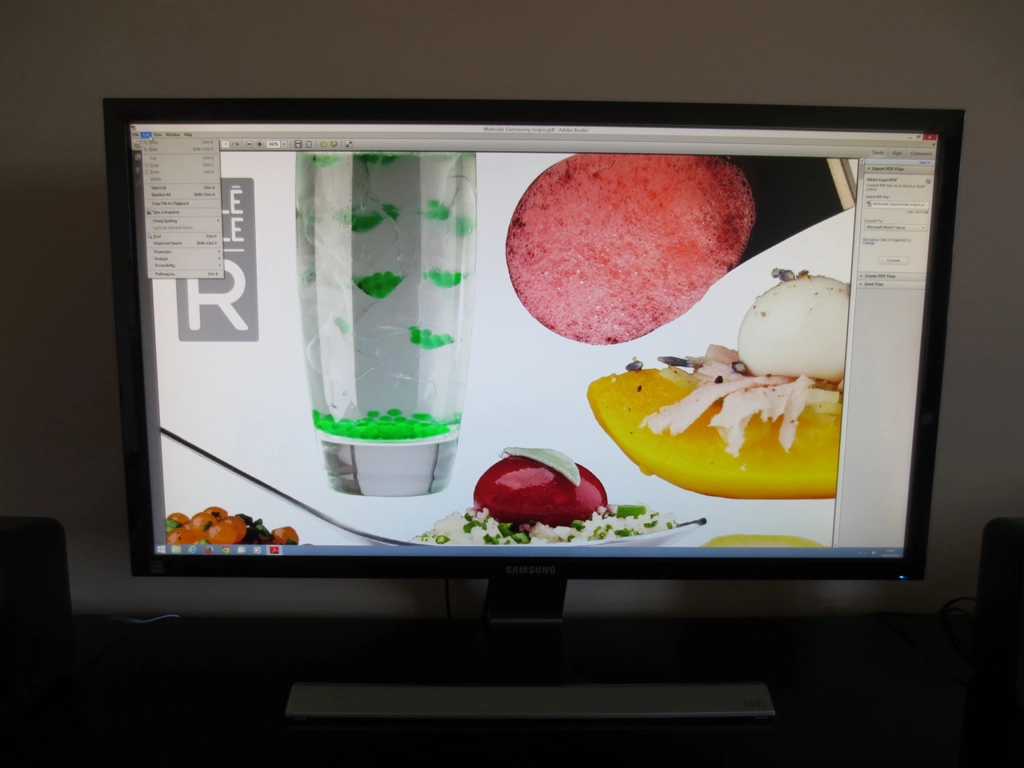
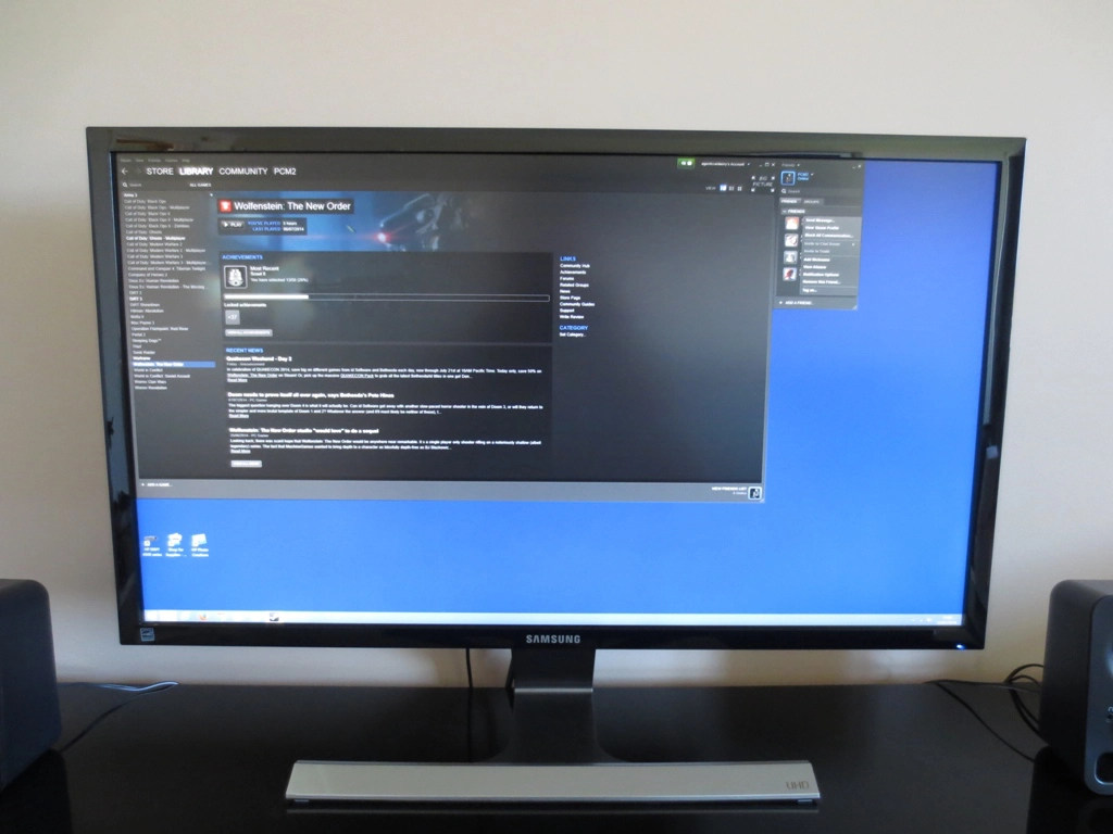
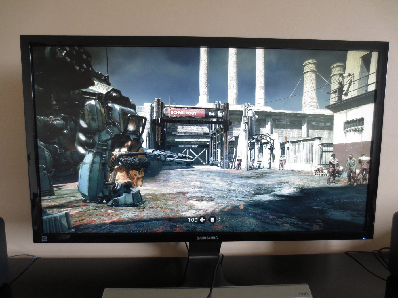
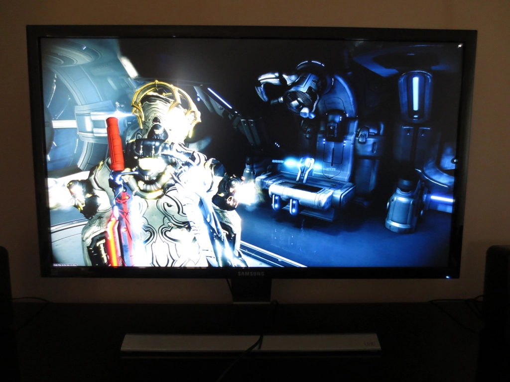
As you can imagine, such a large number of pixels can provide an impressive pixel density. When first published, this article focused on our experiences of the UHD resolution on a 28” monitor, the Samsung U28D590D. Some more recent thoughts have been added, again focusing on how things look on a model of this sort of size. It’s important to remember that UHD monitors come in various sizes, typically between 24” and 43” and different screen sizes will offer a different experience. It alters the pixel density. 27-28″ is something of a middle ground, the most ubiquitous size for monitors of this resolution. For reference, the pixel density of a 28” UHD screen is 157.35 Pixels Per Inch (PPI). This compares to 108.79 PPI for a 27” 2560 x 1440 model and 81.59 PPI for a 27” 1920 x 1080 monitor. The first thing you notice when you fire the monitor up and get onto Windows is how tiny icons on the desktop are. It isn’t just desktop icons that are minuscule, it’s everything else as well – text, buttons in programs, title bars, the taskbar, clock and various other elements. The following photos give an impression of the relative size of the desktop icons and taskbar when running the U28D590D at its native UHD resolution, the QHD resolution and the Full HD resolution. With everything looking so small and sharp, you have a lot of ‘real estate’ at your disposal. If you consider a program such as Microsoft Word, for example, the default behaviour is for the screen to display the best part of 6 pages from your document on the screen at the same time. But the text doesn’t look obscure and blurred – it is entirely crisp and, eyesight permitting, perfectly readable. Of course such potential is perhaps wasted on a single application – after all, how much of that individual document do you really need to see at the same time? You can instead opt to have two different programs running side by side, for example a Microsoft Excel Spreadsheet and Microsoft Word document. As you can see in the example below, you still get a massive amount of useful workspace for each application. You can see many cells on your spreadsheet whilst viewing the best part of two pages on the Office document, without things losing any sharpness. Such multi-tasking potential can also come in useful for simultaneously viewing multiple websites, if you’re that way inclined. When viewing a single website on the monitor there will generally be a great deal of wasted ‘white space’ horizontally. But on this monitor you can view two websites at the same time with a significant amount of crisp and clear content displayed on the screen at the same time. Coming back to our earlier point about how tiny and potentially difficult to read things are, it’s a good idea to check out the scaling capabilities of your operating system to improve the practicality of working with such a high resolution display. We used Windows 8.1 for our original testing, which has a number of useful integrated scaling features. These can be accessed in ‘Control Panel – Appearance and Personalisation – Display’. Alternatively you can right click on the desktop, select ‘Screen resolution’ and then click ‘Make text or other items larger or smaller’. The basic options include the ability to scale everything to 125% of the original size (‘Medium’), 150% (‘Larger’), 200% (‘Extra Large’) or 250% (‘Extra Extra Large’). This will scale text and UI elements and also change the default zoom level for applications such as web browsers that have such a control. The zoom control can be altered as required for such applications. Also note that scaling will not affect full screen videos. You can also specifically alter the size of different elements, such as icons, title bars and menus etc. Windows 10 handles scaling in a similar way, but you have more flexibility with the scaling values on the slider. You can select ‘100%’, ‘125%’, ‘150%’, ‘175%’, ‘200%’, ‘225%’, ‘250%’, ‘300%’ or ‘350%’. For newer versions of Windows 10 and Windows 11, the maximum value listed by default is ‘225%’, but you can enter a custom value if you prefer. These scaling options, shown below, are found under ‘Settings – System – Display’. They can be quickly accessed by right clicking on the desktop and selecting ‘Display settings’. The first image shows an earlier build of Windows 10 and the second image shows Windows 11 – if you press ‘>’ to the right of the scaling values you can enter a custom scaling value. Again, this scaling only affects UI elements, text and default zoom levels in applications – it will not adversely affect the clarity and resolution of full screen videos or images. Individual preferences are important, but the three people who cast eyes on this 28” UHD monitor during the initial review found the ‘125%’ scaling option optimal for the balance of viewing comfort and good ‘on screen real-estate’ with high resolution crispness. Though having now had years of experience with models of a similar pixel density, I’ve personally become accustomed to using no scaling (100%). With scaling in use many elements scaled very cleanly, increasing in size but remaining sharp and pleasing on the eye. Microsoft’s own desktop icons and some other icons (for games and other utilities) remained sharp and undistorted, for example. The same was true for other desktop elements such as title bars, text, buttons in most applications (including all of Windows own desktop navigation bits and pieces) and the taskbar. Some desktop icons, such as the Spyder4Elite colorimeter software and F.lux looked a little stretched but not to an extreme degree. Navigational elements on Internet Explorer, Firefox and Chrome also scaled quite nicely. In numerical terms, 125% scaling represents such elements at a size that they’d appear on a theoretical 35” UHD screen, with a pixel density of 125.88 PPI. If you recall that is still a greater pixel density than a 27” 2560 x 1440 model would provide (108.79 PPI) so you still have plenty of ‘real-estate’ at your disposal. Even when scaling text in this way, the physical pixel density of the display (157.24 PPI) is still an important factor in terms of the clarity and apparent ‘crispness’ of text, at least if it scales properly. Even programs specifically mentioned a little later on that didn’t scale ‘cleanly’ looked decent at 125% scaling, however. The image below shows the relative size of the desktop icons and taskbar on the monitor where 125% scaling is employed. They look smaller than when the monitor is running at 2560 x 1440 (and certainly sharper) and as the PPI would suggest, smaller than on a native 27” QHD display. Irrespective of this scaling setting, you benefit from the full native performance of the display when viewing text that scales ‘cleanly’, admiring images or playing games. Most applications also have a ‘zoom’ level which you can alter quite considerably. Zooming out slightly on Microsoft Word, for example, represents text in the same way as when the monitor displays it natively without any scaling, if you’ve got the OS set to 125% scaling. If you’ve used scaling in the first place, though, it’s highly likely that you’ll want to increase the text size slightly compared to this native state. Because this is something you can independently control, you’ll likely want to experiment with various settings on your own and perhaps use different zoom levels for different applications. That’s a freedom that you have regardless of how much if any OS scaling is used. The two image below show Google Chrome and Microsoft Word using a normal and high zoom level, respectively. This is just to give you an idea of how much real-estate you maintain when using this scaling option and won’t give you an indication of sharpness etc. (which is very good for both zoom levels used here). Some users may find the ‘150%’ setting preferable in terms of visibility on a 28” display. This presents items as the sort of size they’d appear on a 42” UHD screen, with a pixel density of 104.9 PPI. This drops it below the pixel density of a 27” QHD screen (108.79 PPI), but note again that the clarity of this (properly scaled) text is positively influenced by the actual pixel density of the display (157.24 PPI). Not everything scales ‘properly’, however. We found that scaling at this level made some elements look a bit wrong, such as some buttons on the taskbar and navigational elements of web browsers and many other applications. It also made many desktop icons and many buttons look stretched in a far noticeable way than the 125% scaling setting. The image below gives you a rough idea of the relative size of the desktop icons and taskbar using 150% scaling. Many of Adobe’s programs, including the popular Adobe Reader, did not scale very cleanly using this setting when we performed our original testing. It may not be clear from the image below, but the navigational elements were simply enlarged (stretched) and didn’t look particularly pleasing. As with the web browsers, though, you regain independent zoom control for the actual content. So you can scale that as you like whilst maintaining the sharpness benefits of the high resolution. With more recent versions of Adobe programs scaling is handled ‘cleanly’, with appropriate clarity maintained regardless of the setting applied in Windows. Another application which suffered similar aesthetically displeasing enlargement was Valve’s Steam, shown in the top image. EA’s Origin and AMD’s Raptr both declined to scale at all, meaning you were left with some pretty tiny elements. On Origin, for example the menu, friends list, game list and Store all looked lovely and crisp – but tiny. You can see how small all of these elements on Origin and Raptr look in the second image, contrasting with Steam shown above it. The good news is that, as with the Adobe Suite programs, Steam and Origin now scale appropriately. And Raptr no longer exists 🙁 . These sorts of programs are frequently updated, so it was only natural that as ‘4K’ screens have become more common they would have their scaling behaviour updated as well. Overall we were able to enjoy the desktop at the UHD resolution using Windows 8.1’s ‘125%’ scaling option. But not everything followed the same set of rules, and there is certainly a lot of room for improvement as far as non-Microsoft software goes. Fortunately the vast majority of applications have now (as of September 2018) been updated to handle scaling appropriately. If you do come across a stubborn older or seldom updated application that refuses to scale, you’re at least left with a zoom control for text that can be operated irrespective of the OS scaling level. Applications not ‘scaling cleanly’ can’t be overcome with a zoom control, of course. If you can get around the potential ‘inconveniences’ that may crop up here and there on the desktop, you’re in for some visual treats when gaming. Provided, that is, your system can cope with the immense demands put on it by those 8,294,400 pixels. If you recall that is 2.25 times as many pixels as QHD (1440p) and 4 times as many as Full HD (1080p), so it requires considerable graphical and computational horsepower. We played a number of game titles at this resolution on our humble Nvidia GTX 780. At time of testing this was one of the more powerful GPUs available, but one that still felt a bit lonely at this ‘4K’ resolution. Things have come a long way since then and we have more recently been able to enjoy high refresh rate ‘4K’ gaming on an ASUS PG27UQ with our much more powerful Nvidia GTX 1080 Ti. To help you visualise things we’ll start with our experiences on Battlefield 4 (BF4). The image below is just to help this visualisation process, it won’t give you any indication of what things actually looked like first hand on the monitor. The same applies to all images on this article – they’re just for setting the scene. There were many elements within BF4 multiplayer that had a definite ‘wow’ factor, with a level of crispness and sharpness that is just not possible on displays with a lower pixel density. The weapon, character model and many other textures looked stunningly crisp and detailed. The mottled imperfections of brickwork and crumbling road surfaces with detailed specular highlights were particularly intricately detailed. Metal walls and vehicle bodywork had a similar quality to it. There were some textures that looked impressive as long as you weren’t too close to them (the sort of distance that would cause blurring in real life anyway). Wooden panels, for example, were beautifully detailed and had a realistic look to them that simply isn’t captured at lower resolutions. Some textures, on the other hand, didn’t benefit at all from the high resolution and looked a bit out of place. Many areas of earthy or grassy ground and vegetation were generally the worst offenders. On more recent Battlefield titles, including Battlefield 1 (and BFV, based on the beta we’ve played) textures pretty much universally make good use of the ‘4K’ UHD resolution. Whilst some certainly make better use of the high pixel density than others, none looked out of place in the same way they did on Battlefield 4. Moving onto the single player gaming experience on Battlefield 4, we found the experience so engrossing and visually different to what we had seen before that we played through the entire campaign again. Those higher quality textures that really benefited from the ‘4K’ resolution were abundant and the plentiful particle and lighting effects on the title also had an extra layer of detail to them. Perhaps most impressive were the character models, the scarred and dimpled skin of some characters in particular. All of these visual niceties took their toll on performance on our system, even with the reduced settings mentioned above. Of course, as it was single player, we put up with this and simply admired the view. Some of the lower quality textures were there, for example some brickwork looked noticeably flat and unimpressive, but instances of this were few and far between. Another single player game we tried was Wolfenstein: The New Order (above). On the whole this was less impressive than Battlefield 4, visually, as lower quality textures were quite widespread. If you look at the image above you can see a giant robotic creature to the left, a central entrance labelled ‘Schwergut’ (‘heavy cargo’) and some prisoners up against some walls to the left. The robotic creature had fairly impressive textures, which at least from a distance greater than point blank looked far more detailed than when viewed at a lower pixel density. The clothes of the prisoners also looked decent, although didn’t really make full use of the UHD resolution. Many of the wall textures on the other hand appeared fairly low resolution, too smooth and lacking detail. The settings were put as high as possible, with MSAA disabled for the sake of our poor little GTX 780. This image also helps highlight a few areas of aliasing, which is why we’ve kept this one larger than most images on our website. You can see that the girder below the ‘Schwergut’ sign, for example, has a bit of a jagged appearance. Although not obvious in the picture, so do various other elements such as the fences and the wire coming from the megaphone. This appears to ‘crawl’ as you move your character. Again it is less widespread and less noticeable at this resolution, but as you can see even in this image it’s still there. More recent iterations of the Wolfenstein series, such as Wolfenstein II: The New Colossus made much better use of the ‘4K’ resolution, without any textures that really screamed ‘low resolution, please replace me’. Some textured appeared less detailed than others, particularly when viewed close up, but there were a sufficient number of very impressive textures to make the overall experience enjoyable on the monitor of this pixel density. One title that still shows this contrast between ‘good’ and ‘bad’ textures for this resolution is Elder Scrolls Online (ESO). This has some beautiful detail on certain objects in the world and on the characters of the game – clearly some ‘4K only’ stuff going on there. But there were many objects and patches of ground etc. with less impressive textures that really don’t really take advantage of the resolution. There was also a requirement to disable MSAA on our original test system, with the aforementioned caveats attached. On the GTX 1080 Ti we could happily apply MSAA as it did not prove to be too taxing on this GPU. Another game we tested was Warframe (below). High resolution textures with very nice lighting and very detailed particle effects were plentiful on Warframe. Many metals with specular highlights were particularly impressive, looking very detailed even if your character was close to them. The intricate detail and sharpness of the Warframes themselves was also impressive, something that was on a completely different level to what we’ve seen on even a 27” QHD monitor. There were some poorer textures, though, most noticeably on various boxes, barrels and areas of ground throughout the game world. This seemed more noticeable outside, although even offending textured looked much if your character was a little distance from them. Inside the flashy lighting and particle effects seemed to mask things more successfully. So overall we had an enjoyable time gaming on a 28” monitor at the UHD resolution. There were some textures that didn’t really benefit from such a pixel density, but other that really had the ‘wow’ factor. Newer titles make better and more widespread use of textures and special effects with this ‘wow factor’, fortunately. During out original testing we also had to make some sacrifices due to the demands of running the UHD resolution at reasonable frame rates. The need for MSAA was clearly reduced, something that was easy to disable on most titles with a significant performance gain after doing so. Having done that there were some instances of ‘jaggies’ but the overall smoothness of the game worlds was impressive and at times it was difficult to believe MSAA was actually disabled. We have found our more recent testing using a GTX 1080 Ti to be more enjoyable in terms of being able to increase the graphics settings (including anti-aliasing) and also simply playing newer game titles which generally make better use of the resolution. We’ve also very much enjoyed being able to experience the UHD resolution at significantly higher refresh rates and frame rates than 60Hz. Our observations below are mainly taken when the character is still and you can sit and admire the game, but when things are in motion this detail is all but lost on a 60Hz model. Ramping up the frame rate and refresh rate helps maintain some of this impressive detail during motion to a greater extent, as highlighted in a section of our ASUS PG27UQ video review below. As the previous sections have highlighted, there is still some untapped potential with the UHD resolution but this has been steadily improving as time has gone on. That is particularly true when it comes to movie content, which was very scarce indeed when we first published this article. This is due to the fact that it had yet to be widely adopted for either TVs or monitors. There is now an increasing amount of ‘4K’ content available on streaming services such as Netflix, Amazon Prime Video and on YouTube. There is still a lot of content restricted to lower resolutions, though, such as Full HD. This includes a fair amount of content from the aforementioned sources and standard Blu-rays, for people who still like physical media. With a 3840 x 2160 monitor, running the screen itself at 1920 x 1080 often leads to a sub-par experience and a clear loss of sharpness compared to a native 1920 x 1080 screen of similar size. This applies whether watching movie content, gaming or viewing content on the desktop. The interpolation (scaling) process used varies from monitor to monitor and some are better than others. In many cases it’s best to simply leave the monitor running at its native 3840 x 2160 resolution and view lower resolution content movie content using that native resolution. The monitor has no say in what happens in that case, it’s the software or GPU that handles the scaling. There is a bit of softening but nothing we consider extreme and nothing that most users would mind (many wouldn’t really notice). We generally find UHD movie content less impressive than suitably high resolution games with lots of eye-candy turned on. That’s because it’s often heavily compressed, which nullifies some of the potential detail advantage. Considering content on YouTube, for example, we found the overall impressiveness of this content varied somewhat depending on the camera used to shoot the video, the processing done etc. Some videos simply looked far softer than they should any looked very similar whether viewed on an actual UHD monitor or a Full HD one of similar size. One of the most impressive examples we saw was entitled ‘Awakening- New Zealand 4K/UHD’ which we will kindly embed below. This remains one of the better video showcases of the resolution, in our view, so we’ll embed it for you below. Make sure to watch the video full screen, preferably on a UHD monitor if you have one. Our earlier experiences with the ‘4K’ UHD resolution were something of a mixed bag, much like our experiences with any monitor we review. On the one hand, the massive amount of real-estate provided by the monitor was really nice – everything looked so crisp and small on the desktop and text remained crisp and well defined despite its small size. For the sake of practicality, though, it was necessary to apply some degree of scaling to make things… Well, a bit bigger! Regardless of the scaling setting used, many common applications such as Adobe Reader, Microsoft Word and web browsers have their own independent zoom control. This allows you to make the main content smaller so more fits on the screen, whilst the navigation remained readable. And even if you choose to scale text through the OS or via the zoom control, you still benefit from the strong clarity and sharpness potential offered by the high pixel density. We found the ‘Medium – 125%’ scaling option optimal for a 28” screen, but other users may have different preferences. In our earlier testing we found that some of Windows own desktop icons and navigational components started looking a bit out of place at higher scaling settings. And programs like Steam and Adobe Reader did not scale ‘cleanly’ at all, simply looking enlarged and quite ugly really at ‘Large – 150%’ or beyond. Then there were programs like Skype and EA Origin, which refused to scale at all. It didn’t matter what Windows scaling setting you used here, things remained sharp but tiny and fairly difficult to read at any setting. Fortunately scaling is now handled a lot better as developers have had to adapt to keep up with increased adoption of the ‘4K’ resolution. The main programs we listed as having issues with, originally, have now been updated to support scaling properly. Or in the case of Raptr, no longer exist at all. Things move on. Our gaming experience was also mixed, but we definitely enjoyed it – and this is something we have enjoyed to a greater degree with more recent testing. There were some things in games that really stood out in a brilliant way at the UHD resolution, for example certain textures that were just stunningly crisp and detailed even if you stood your character close to them. There were other elements that looked good from a certain distance, but became less appealing up close. And then there were other things that just didn’t take advantage of the resolution at all – certain flat looking textures for example. Different titles had a different weight of one type of element over the other and fortunately newer titles now make much better use of high resolution textures and effects. We also found the graphical horsepower required to deliver respectable frame rates at a resolution of 3840 x 2160 to be challenging in our initial testing, but with our more powerful GTX 1080 Ti found it much more manageable. For those who use lower-end GPUs or are struggling to get their titles to run as they want, we found disabling MSAA can give a nice performance boost. And, on the whole, didn’t provide the visual hit you might expect from doing so. Although we found the trade-off acceptable, some users may still find some instances of jagged edges distracting, in which case a higher level of AA would be ideal. And it’s certainly a nice thing to have enabled even at this resolution, if it’s at all practical. We can also completely understand people wanting to round off the experience with all the bells and whistles (a good amount of MSAA, ‘Ultra’ settings etc.) We also found the technology a bit ahead of its time when it came to movies, with our initial testing, as most content was available at a 1920 x 1080 resolution at most. It is much easier to find decent UHD content these days, even for free subscription-less consumption on YouTube. Even during our initial testing we found some very impressive ‘4K’ footage on YouTube. This was unlike anything we’ve ever seen on film. The UHD resolution and eventually higher resolutions will become increasingly popular, spreading not just in the monitor world but also TVs and mobile devices as well. Laptops with high DPI displays, for example. And of course as the hardware becomes increasingly ubiquitous, so will the content that can put it to good use. We’ve already seen significant developments in this area from when this article was first published but we expect further progress to be made. And it’s certainly interesting to reflect upon the progress that has been made. At the time this article was initially published, the 3840 x 2160 resolution was a very new thing, particularly for monitors. We got a lot of enjoyment from gaming at this resolution, watching a slim selection of ‘2160p’ content and enjoying the real-estate on the desktop. But for each of those tasks it was clear that there was a lot of room for the technology to grow. A lot of untapped potential. Significantly more powerful GPU options are available to tackle the resolution and higher resolution UHD options are available (at a price). Games make much greater use of high pixel densities with high-resolution textures and impressive particle effects, with far fewer ‘out of place’ eyesores. There’s a greater variety of streamed ‘4K’ content and support for scaling in both Windows and the programs you run on the OSD is now much improved. Things have come a long way and they’ll only continue get better from here. As an Amazon Associate I earn from qualifying purchases made using the below link. Where possible, you’ll be redirected to your nearest store. Further information on supporting our work.
As an Amazon Associate I earn from qualifying purchases made using the below link. Where possible, you’ll be redirected to your nearest store. Further information on supporting our work.

The desktop experience
The gaming experience
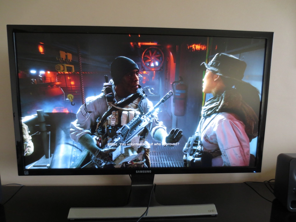
It’s important for users with only moderately powerful or weaker gaming systems to note that the need for MSAA is drastically reduced at the UHD resolution. The pixels are so tiny that the steps of the ‘jaggies’ are very small and generally much less distracting than at lower resolutions. It varies somewhat between different game titles, especially with different filters applies, but on Battlefield 4 we didn’t really find any of these ‘jaggies’ particularly distracting. On some objects, for example those with long straight edges (fences for example) the aliasing was a bit more visible but not to the extent that it would be whilst running without AA at 2560 x 1440 and certainly not at 1920 x 1080 on a screen of roughly this size. The overall smoothness and sharpness of objects, including edges, was excellent though. As you peered into the distance on the game and could make out some really minor object detail it was actually quite surprising that MSAA wasn’t being used.
The movie experience
Perhaps we’re just biased because our main reviewer has some Kiwi heritage and we think that it is a beautiful country, but this video quite clearly benefited from the high resolution in our eyes. When the camera panned slowly and the focus was right, the detail on rocks and vegetation was truly remarkable and unlike anything we’ve seen on a video of any sort before. What was even more telling was that such details just weren’t apparent when viewing the same video on a 27” Full HD monitor when running the video itself in ‘2160p’ or any other YouTube resolution. Again, these differences weren’t as pronounced as the differences in detail we observed for some game content. But we still appreciated them.
Conclusion
Further reading
We’ve reviewed a number of other ‘4K’ models as well. You can see these in the review list, which you can sort by resolution.


