Author: Adam Simmons
Date published: May 10th 2018
Table of Contents
Introduction
BenQ’s EW series and other similar VA (Vertical Alignment) models have found favour with users for a variety of reasons. The price, strong contrast performance, decent all-round image performance and viewing comfort amongst them. The BenQ EW277HDR leverages such a panel and combines it with some interesting features, including HDR (High Dynamic Range) support and a more generous colour gamut than previously seen from the company’s EW series models. We subject this monitor to our usual run of tests to see how it performs in several key areas.
Specifications
This monitor features a 60Hz 27” AMVA (Advanced Multi-Domain Vertical Alignment) panel from AU Optronics. Note that the company has now dropped the ‘+’ suffix from ‘AMVA’, but this is just a marketing change that in no way reflects any drop in actual specification or image performance. The monitor supports true 8-bit colour (no dithering) and a 1920 x 1080 resolution @ 60Hz. A 4ms grey to grey response time is specified, but as usual pay little attention to this. Some key ‘talking points’ of the specification have been highlighted in blue below, for your reading convenience.
Features and aesthetics
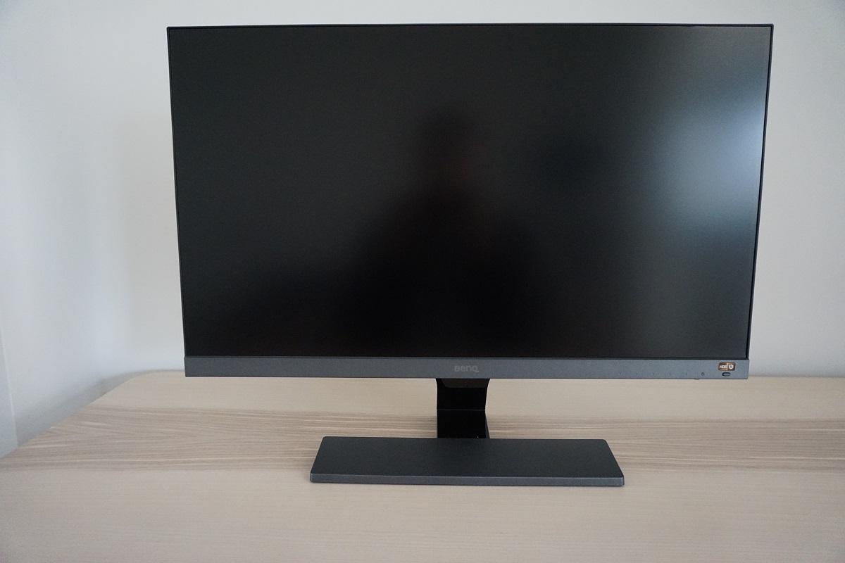
The monitor offers slim bezels with the now common dual-stage bezel design. This comprises a very thin hard black plastic outer component as well as a slender panel border that surrounds the image area. Including both components, the bezel thickness is ~8.5mm (0.33 inches) at the top and sides. The bottom bezel is significantly thicker, with a medium grey matte plastic finish – ~24mm (0.94 inches) or ~33mm (1.30 inches) if you include the central sensor unit. That’s the small boxy area centrally which hangs down a bit further; this houses the light sensor used for the ‘B.I.+’ feature that we look at deeper into the review. The stand neck is glossy black plastic, whilst the front rectangular area of the base is brushed matte plastic. Of a slightly darker grey shade than the bottom bezel. The screen surface is very light matte anti-glare, as explored later.
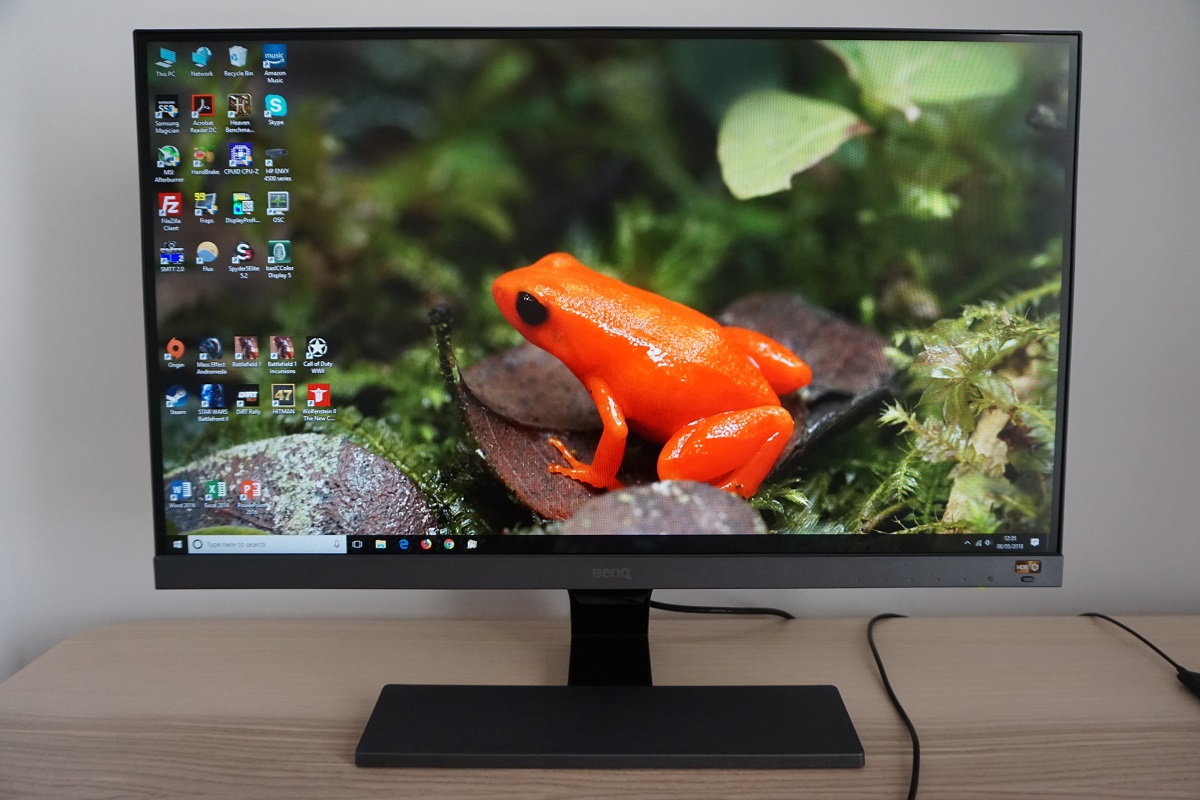
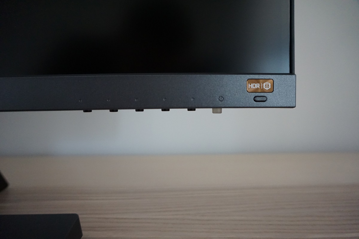
The OSD (On Screen Display) is controlled by pressable buttons on the underside of the bottom bezel, towards the right. There is also an ‘HDR/B.I.+’ (High Dynamic Range / Brightness Intelligence Plus) button which allows you to activate or deactivate both technologies independently. This is a forward-facing button with a rather shiny copper-coloured label above it. Shiny with a sort of vinyl-texture to it rather than eye-catchingly blinding. So it’s less ‘blingy’ in practice than it may look in some images, not enough to be annoying or distracting in our opinion but enough to let you know it’s there. The video below gives a run-through of the OSD menu system.
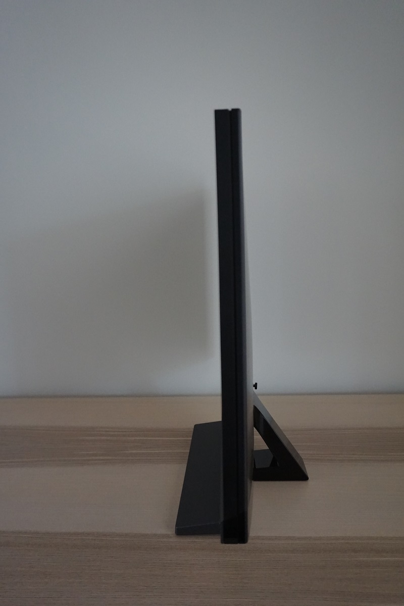
From the side the monitor is quite slim, ~21mm (0.83 inches) at thinnest point but lumping out just a little more centrally and towards the stand attachment point lower down. The included stand offers tilt (5° forwards, 20° backwards) as the only ergonomic flexibility and as covered shortly there is no provision for VESA holes. The bottom of the monitor (including the sensor unit) clears the desk by ~89mm (3.50 inches) with the top ~464mm (18.27 inches) above the desk surface.
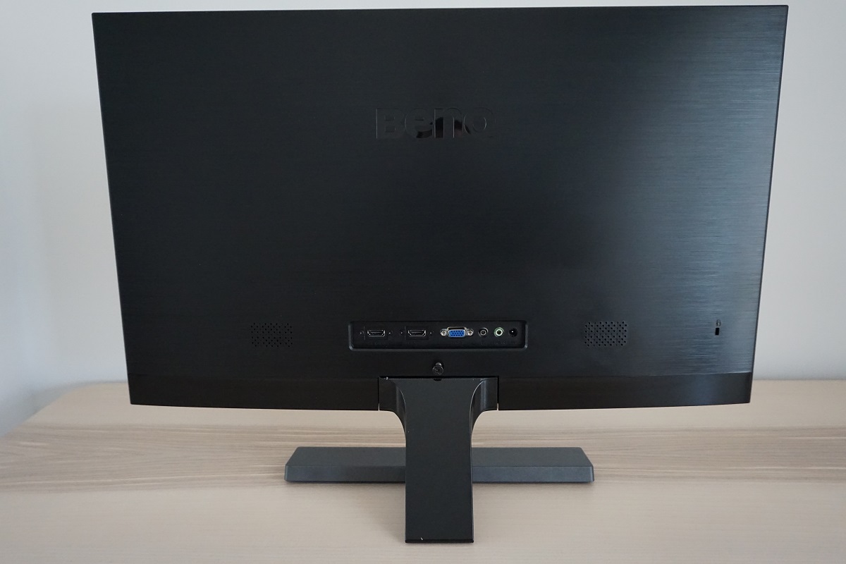
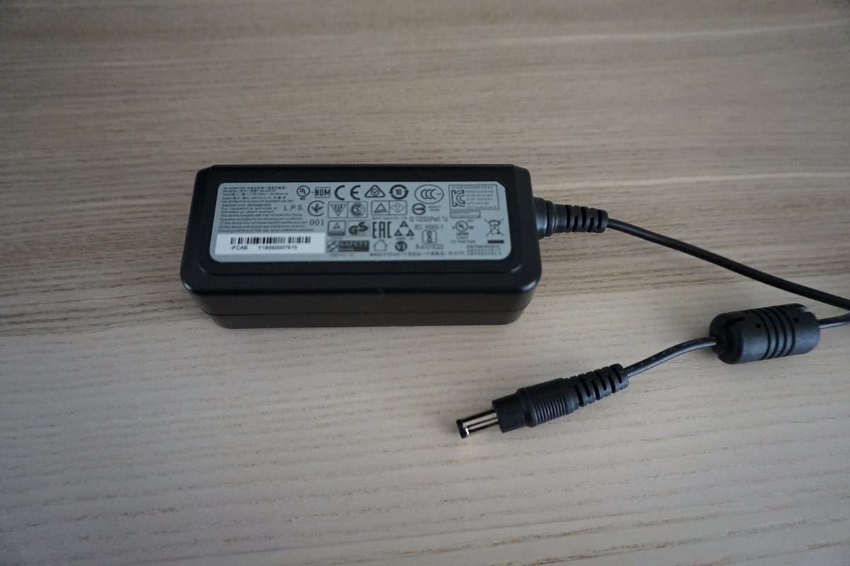
The rear of the monitor has a brushed matte black plastic for the most part, with a smoother textured matte black plastic used at the bottom and for the stand neck. There are no VESA holes, which will annoy users who prefer greater ergonomic flexibility than the included stand provides or want to use an alternative mounting solution for other reasons. The absence of VESA holes is common on the BenQ EW series. The ports face are located near the bottom central region, backwards and include; 2 HDMI 2.0 ports, VGA, 3.5mm headphone jack, 3.5mm audio input and a DC power input (external power brick). HDR is supported via HDMI 2.0 on both compatible PC GPUs and games consoles. The port area is flanked by 2 speakers and a K-Slot. The speakers are pretty basic low-powered affairs, with reasonable but not extreme volume and mediocre sound quality. A distinct lack of bass and shrill trebles – okay for basic tasks, but nothing audiophiles will admire. A power cable and adaptor plus HDMI cable is included as standard. A 3.5mm audio cable may also be included in some regions or by some retailers.
Calibration
Subpixel layout and screen surface
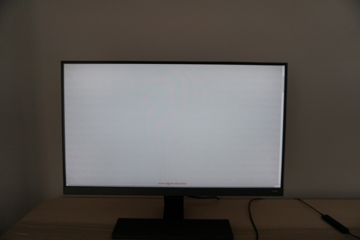
The image below is a macro photograph taken on Notepad with ClearType disabled. The letters ‘PCM’ are typed out to help highlight any potential text rendering issues related to unusual subpixel structure, whilst the white space more clearly shows the actual subpixel layout alongside a rough indication of screen surface. The monitor employs a very light matte anti-glare screen surface, which some users may refer to as ‘semi-glossy’. This provides quite effective glare handling, although less so than stronger matte screen surfaces. It preserves vibrancy and clarity a lot better than ‘stronger’ matte screen surfaces, however. The image appears free from obvious graininess, even when viewing very light shades such as white.
![]()
As shown in the image above, the monitor uses the standard RGB (Red, Green and Blue) stripe subpixel layout. This is the default expected by modern operating systems such as Microsoft Windows and Apple MacOS. You needn’t worry about text fringing from non-standard subpixel layouts as a Mac user and don’t need to run ClearType as a Windows user – although you may wish to adjust this according to preferences. The subpixel layout and arrangement is quite normal and we had no subpixel-related concerns related to sharpness or text clarity on this model.
Testing the presets
The BenQ EW277HDR offers a range of ‘Picture Mode’ presets; ‘Standard’, ‘HDR’, ‘Low Blue Light’, ‘Game’, ‘Photo’, ‘sRGB’, ‘Rec. 709’, ‘Eco’, ‘M-book’ and ‘User’. There are various other settings that can be manually adjusted, depending on the preset selected. These include ‘Gamma’ and ‘Color Temperature’. Some presets, such as ‘Low Blue Light’ and ‘User’ have their own additional associated options (different sub-presets or manual colour channel adjustment). The table below shows our general observations alongside key readings (gamma and white point) taken using a Datacolor Spyder5ELITE colorimeter, with the monitor running various settings. The monitor was left in its ‘Plug and Play’ state without additional drivers or ICC profiles specifically loaded and was left to run for over 2 hours prior to readings being taken. It was connected to an Nvidia GTX 1070 using the included HDMI cable, on a system running Windows 10. Unless otherwise stated, assume default settings were used. Although everything was configured correctly for us by default, in the graphics driver, also make sure that the colour signal is set correctly as covered in this article. When viewing the figures in this table, note that for most PC users ‘6500K’ for white point and ‘2.2’ for gamma are good targets to aim for.
| Monitor Settings | Gamma (central average) | White point (kelvins) | Notes |
| Rec. 709 | 2.1 | 6847K | Dim by default and slightly cool-looking. Relatively low saturation compared to factory defaults, due to restrictions to colour gamut. This is an emulation mode which uses the sRGB colour space. |
| sRGB | 2.1 | 6992K | As above but significantly brighter by default and slightly cooler in tone. |
| HDR (Emulated) | 2.4 | 7117K | Bright with a cool tone and many shades misrepresented. Looks quite ‘off’ overall and confers no advantage over other presets. Note that these observations apply to the ‘HDR Emulation’ mode with SDR content viewed, not HDR content (explored separately later on). |
| Standard (Factory Defaults) | 2.1 | 7079K | Bright and vivid with a cool tone, but respectable depth and variety. As typical for a VA panel, perceived gamma changes depending on which part of the screen you’re looking at. Some saturation is lost lower down the screen and towards the flanks, but the overall look is vibrant. |
| Gamma = 0 | 2.2 | 7125K | As above but a slight increase in shade depth due to marginally higher average gamma. |
| Gamma = 1 | 1.7 | 7114K | As factory defaults with much lower average gamma. Things lack depth and largely look undersaturated and ‘washed out’. |
| Gamma = 2 | 1.9 | 7096K | As above with slight increase in depth, but still a clear lack of depth and saturation. |
| Gamma = 4 | 2.3 | 7128K | Quite similar to ‘Gamma = 0’, but average gamma marginally higher giving a little more shade depth and saturation. |
| Gamma = 5 | 2.5 | 7085K | As above but gamma increased further, giving extra depth and saturation. The image looks very striking and vivid, but too deep in places with clear oversaturation of some shades. |
| Low Blue Light = Multimedia | 2.1 | 6646K | A weak Low Blue Light (LBL) setting. The colour temperature is lowered (warmer look) compared to factory defaults and is closer to the 6500K target. It should not really be considered a true LBL setting as it’s quite ineffective in that sense. |
| Low Blue Light = Web Surfing | 2.1 | 5987K | As above but a more significant blue light reduction and warmer appearance. |
| Low Blue Light = Office | 2.1 | 5556K | Another nudge down in colour temperature and drop in blue light output. A fairly effective LBL setting. |
| Low Blue Light = Reading | 2.1 | 5109K | The strongest LBL setting, with the colour temperature now a touch above 5000K. Blue light output is reduced significantly, especially when combined with a low brightness. This is a good setting for relaxing evening viewing (blue light is ‘energising’ and disruptive to sleep). Or indeed other times when the user wishes to minimise blue light output from the monitor. |
| User (Color Temperature = User Define) | 2.1 | 6493K | All colour channels are in their neutral position. The colour temperature is close to the 6500K target, but there is also a bit of a green push which isn’t ideal. The image appears bright and varied, quite similar to the factory defaults aside from appearing slightly warmer with the aforementioned green push. The colour channels are unlocked with this setting and it’s easy to counteract the green push. |
| Test Settings (see below) | 2.2 | 6498K | The image is nicely balanced with gamma and white point satisfying our targets. The image is vivid and varied, even with the weaker saturation in places and perceived gamma shifts considered. |
Out of the box the monitor was bright with a vivid and somewhat cool-toned look. Gamma tracking strayed just slightly off-target, but was easy to correct or adjust according to preferences using the included ‘Gamma’ settings in the OSD. The gamma curve for our ‘Test Settings’ is shown below, with good tracking of the desirable ‘2.2’ curve. This represents the central gamma as recorded by our Spyder5ELITE, it’s not representative of actual perceived gamma which as typical for a VA panel varies according to viewing angle and which section of the screen you’re viewing. This is explored elsewhere in the review. As usual for a modern BenQ monitor, a range of easily accessible Low Blue Light (LBL) settings are included, assigned to a hot key button (first OSD key). The strongest of these in particular was very effective at cutting down on blue light emission for the monitor and creating a good environment for relaxing evening viewing. This is something we took advantage of for our own viewing comfort but not for specific testing of the monitor. Our ‘Test Settings’ used the flexible ‘User’ mode and involved some slight changes to colour channel, gamma mode and more significant changes to brightness. Any settings not mentioned below, including contrast, were left at default. We have also included the AMA (Advanced Motion Acceleration) pixel overdrive setting used in the review just for reference. Brightness= 42 (according to preferences and lighting) Gamma= 0 Color Temperature= User Define R= 99 G= 98 B= 100 AMA= High We used a BasICColor SQUID3 (X-Rite i1Display Pro) to measure the luminance of black and white using various settings. From these values, static contrast ratios were calculated. This data is presented in the table below. Blue highlights indicate the results with HDR active and under our ‘Test Settings’. Black highlights indicate the highest white luminance, lowest black luminance and highest contrast ratio recorded. Assume that any settings not mentioned here were left at default, with the exceptions already noted in the calibration section.

Gamma 'Test Settings'
Test Settings
Picture Mode= User
Contrast and brightness
Contrast ratios
Monitor Profile White luminance (cd/m²) Black luminance (cd/m²) Contrast ratio (x:1) 100% brightness (Factory default) 321 0.11 2918 80% brightness 268 0.09 2978 60% brightness 213 0.07 3043 40% brightness 158 0.05 3160 20% brightness 100 0.03 3333 0% brightness 42 <0.02 >2100 Rec. 709 84 0.03 2800 sRGB 318 0.11 2891 HDR (Emulated) 319 0.11 2900 HDR (HDR content)* 418 0.10 4180 Gamma = 0 319 0.11 2900 Gamma = 1 321 0.11 2918 Gamma = 2 322 0.11 2927 Gamma = 4 321 0.11 2918 Gamma = 5 320 0.11 2909 Low Blue Light = Multimedia 212 0.09 2356 Low Blue Light = Web Surfing 183 0.08 2288 Low Blue Light = Office 157 0.07 2243 Low Blue Light = Reading 135 0.06 2250 User (Color Temperature = User Define) 353 0.11 3209 Test Settings 173 0.05 3460
*HDR measurements were made using this YouTube HDR brightness test video, running full screen at ‘1080p HDR’ on Google Chrome. The maximum reading from the smallest patch size (measurement area) that covered the entire sensor area was used for the white luminance measurement, which was ‘4% of all pixels’ in this case. The black luminance was taken at the same point of the video with the colorimeter offset to the side of the white test patch, equidistant between the test patch and edge of the monitor bezel.
With only brightness adjusted, the contrast ratio averaged 3086:1. This is much as we were hoping for given the panel used and in-line with specification. The peak contrast ratio was recorded using our ‘Test Settings’; 3460:1, which is strong. The contrast remained fairly similar to the factory defaults under the emulation settings (‘sRGB’ and ‘Rec. 709’), at 2800:1 – 2891:1. Contrast dropped somewhat with any of the Low Blue Light (LBL) settings active, as low as 2250:1 with the strongest (‘Reading’) setting employed. The maximum luminance recorded under normal SDR (Standard Dynamic Range) operation was 353 cd/m², with a minimum white luminance of 42 cd/m². This gives a luminance adjustment range of 311 cd/m² under SDR.
The monitor has a ‘Dynamic Contrast’ setting that can be activated in the ‘Game’ and ‘Photo’ presets, provided ‘B.I.+’ is disabled. This can be set between ‘1’ and ‘5’, with higher numbers increasing the speed of response to changes in scene brightness. With this setting enabled, the backlight brightness is allowed to dynamically adjust in response to changes in light and dark on the screen. As usual, the backlight is adjusted as a single Backlight Unit (BLU). Even with mixed content displayed we found the screen uncomfortably bright and didn’t find the setting really added anything positive to the experience. We prefer manual control of brightness.
With the monitor and PC running in an HDR environment, a luminance of 418 cd/m² was recorded. This is higher than the 353 cd/m² maximum recorded with HDR disabled. The black point as measured using the above-mentioned methodology remained similar to under SDR (0.10 cd/m²) despite this increase in maximum luminance. This gave a slightly enhanced contrast ratio of 4180:1 and suggests that the monitor may have some sort of limited local dimming control for the backlight under HDR. We were unable to ascertain how many dimming zones are used, but the relatively high black point and indeed price of the monitor strongly suggest only a few (maybe just a couple) would be used. We explore what HDR brings to the experience deeper into the review.
B.I.+ (Brightness Intelligence Plus)
B.I.+ (Brightness Intelligence Plus) can be thought of as a Dynamic Contrast setting on steroids. As with the regular Dynamic Contrast setting, it changes the backlight brightness and other elements of the image based on the content being displayed. The backlight is controlled as a single unit, just like with regular Dynamic Contrast. What impacts the changes made to the image more significantly, though, is the ambient lighting in the room. It uses a light sensor (contained in a small unit that hangs down below the BenQ logo on the bottom bezel) to measure ambient room lighting and makes continuous adjustments to the backlight brightness, colour temperature and other aspects of the image based on that. You can active B.I. in various presets, with the preset selected acting as a base to which changes are made. If you have the monitor in a ‘Low Blue Light’ setting, for example, the colour temperature will bias towards a warmer colour temperature than with other presets. As shown in the OSD video, you can also adjust the sensor sensitivity between ‘0’ and ‘100’ in increments of 10. This is designed to give you a small amount of flexibility if you find it is too reactive to relatively slight changes in ambient brightness.
We have already shared detailed observations on this feature in our review of another BenQ monitor that features it. Our findings on this model were very similar, so we aren’t going to be repeating them here. In a nutshell; we didn’t much like the feature. Everybody has different sensitivity to brightness and having the monitor decide what it sets this at, with no flexibility whatsoever, is a flawed approach. We found the constant adjustments to backlight brightness as the ambient lighting changed to be somewhat annoying, but moreover not in fitting with our personal preferences. The same can be said for colour temperature – it simply didn’t fit what we’d choose based on that particular time of day or the room lighting. The adjustments simply weren’t appropriate in most cases. It is a feature that seems to do too much all at once, and with its lack of flexibility is simply impractical in most cases.
PWM (Pulse Width Modulation)
The BenQ EW277HDR does not use PWM (Pulse Width Modulation) to regulate backlight brightness at any level. DC (Direct Current) is used to regulate backlight brightness, so the monitor is considered ‘flicker-free’. This will come as welcome news to users who are sensitive to flickering or other side-effects of PWM usage.
Luminance uniformity
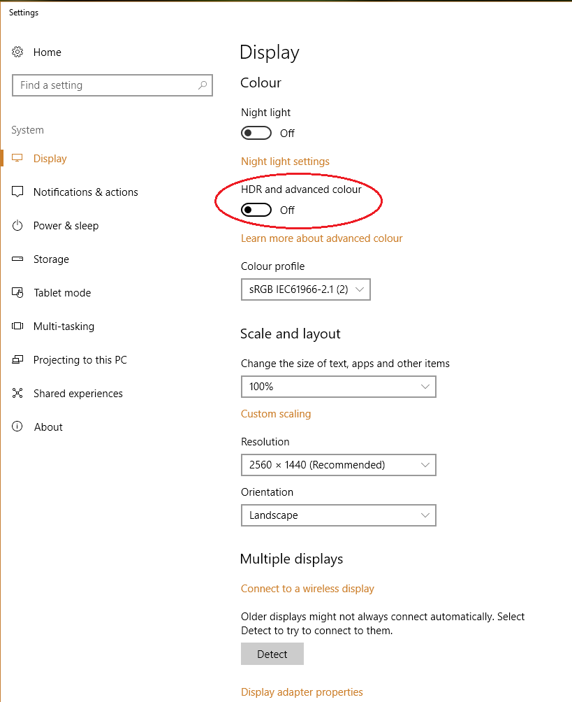
We observed a black background in a dark room and observed no obvious backlight bleed and only very minor clouding. It should be noted that individual units may vary in this regard, but as the best light blockers VA panels do tend to be relatively strong in this area. The image below was taken from a couple of metres back to eliminate so-called ‘VA glow’. This is a silverish-purple glow that appears from a normal viewing position towards the bottom of the monitor, particularly near the corners. It blooms out more noticeably ‘off-angle’ as demonstrated in the viewing angles video later on. As we explore, it is very constrained on this model – nowhere near as obtrusive as ‘IPS glow’ and less obtrusive than ‘VA glow’ on some models as well. The luminance uniformity of the screen was good overall. The brightest point recorded was ‘quadrant 5’ in the centre of the screen (160.4 cd/m²). The greatest deviation from this occurred at ‘quadrant 9’ towards the bottom right (141.1 cd/m², which is 12% dimmer). 11% deviation was recorded at ‘quadrant 6’ (right of centre) and ‘quadrant 7’ (bottom left). Elsewhere deviation from the brightest point was 4 – 9%, which is pleasing. Note that individual units vary when it comes to uniformity and there can be further deviation beyond the points measured. The contour map below gives a graphical representation of the deviations. Darker greys represent lower luminance and therefore greater deviation from the central point than lighter greys. The colour temperature deviations for the same 9 quadrants were also analysed using the colorimeter. Deviations here are assigned DeltaE values, with higher values representing greater deviation from the D65 (6500K) daylight white point target than lower values. The contour map below shows these deviations, with stronger shades indicating greater deviation from the 6500K target. A DeltaE of >3 here is considered significant deviation that many users would readily notice by eye. The results here were good, with no significant deviations recorded. As with other aspects of uniformity, it’s important to remember that there can be deviation beyond the points measured here and that individual units vary. An additional point to note is that VA panels such as this have perceived shifts in gamma that aren’t accounted for in these readings. These shifts can change the perception of colour temperature (and to a lesser extent brightness) depending on which section of the screen you’re looking at. On Battlefield 1 (BF1) the monitor provided excellent contrast. Dark areas were displayed in a deep and atmospheric way, whilst intermingling bright elements stood out very nicely. These lighter shades appeared smooth, with the very light matte anti-glare screen surface helping to avoid a grainy appearance. Being a VA panel, there was a degree of ‘black crush’ whereby very dark shades appeared even darker than intended from a normal viewing position. This caused them to blend into a sort of black mass rather than being, so some subtle details weren’t as distinct as they could be. This is observable in the centre of the screen when you’re sitting directly in front of it – viewing these shades from an angle or where they’re near the edge of the screen revealed the subtle details. This ‘black crush’ was fairly minor for a VA model, however. A bit more pronounced than we’ve seen on curved Samsung SVA panels (C27F591FD for example) but less of a feature than on other VA models (such as the AOC Q3279VWF). There was also a very small amount of ‘VA glow’, with the very bottom edge and corners of the screen appearing a little lighter than the rest. This was as subtle as we’ve seen on any VA model, though, and less of a ‘feature’ than with the aforementioned curved 27” Samsung panels. Dirt Rally provided a similar experience, with the monitor able to provide a rich and atmospheric look to the very dark night scenes in this game. In such scenes bright elements such as car headlights penetrated the darkness very nicely and appeared smooth thanks to the screen surface. Subtle details such as car tire tread patterns and the leaf structures of vegetation in the dark distance were masked slightly by ‘black crush’. But they were still visible to a degree, and this didn’t detract from the overall atmosphere in such scenes with pleasing depth to dark shades. We also observed the Blu-ray of Star Wars: The Force Awakens. This title has a lot of high-contrast scenes where bright elements such as explosions and light sabers intertwine with the deep dark depths of space. Or at the very least, a dimly lit room. The monitor provided a pleasing cinematic look to such scenes, with a strong atmosphere and shade depth maintained throughout the screen. The bright elements stood out nicely with a pleasing ‘pop’ and without any obvious graininess from the screen surface. The Lagom tests for contrast allow specific weaknesses in contrast performance to be identified. The following observations were made. The EW277HDR’s colour gamut (red triangle) was compared to the sRGB reference colour space (green triangle), as shown below. The image below shows the colour gamut using our ‘Test Settings’, which uses the ‘User’ preset and the full native gamut of the monitor. Here you can see comprehensive sRGB colour space coverage (100%) with a fair bit of extension beyond this. This is particularly noticeable in the green region, although things don’t extend to the extremes of the Adobe RGB colour space there. Although our colorimeter’s software doesn’t allow direct comparison, the native gamut of the monitor as shown here is quite close to the DCI-P3 colour space (93% DCI-P3 is specified by BenQ). This gives the monitor the potential of outputting all shades within the sRGB colour space, with a good dose of extra vibrancy. It also means the monitor can represent colours for HDR content (targeting DCI-P3 in the near term) in a largely appropriate way. On Battlefield 1 (BF1) the monitor provided a vibrant and varied palette of colours. The colour gamut of the monitor offers ‘generous’ extension beyond sRGB. That gives oversaturation of content such as this that was designed with sRGB in mind. Unlike digital saturation enhancement (Nvidia Digital Vibrance etc.), shade variety is maintained as shades aren’t simply pulled towards the edge of the colour gamut (without the gamut itself being expanded). When looking at vibrant elements on this title such as fires, for example, some yellow shades became deep enough to verge on orange and some oranges tended towards red. But a distinct range of vivid shades was maintained. The environments also showcased some very lush greens and earth browns, alongside more muted pastel shades. The pastel shades didn’t look as dusty or subdued as they should and some of the brown shades appeared with an overly rich red hue. Nonetheless, these shades were still much less saturated than the shades intended to be rich and deep shades– so they remained distinct. Most users will likely enjoy this vibrant and varied look. There was a degree of saturation lost towards the edges and bottom of the screen, due to perceived gamma changes associated with the VA panel. These shifts were relatively minor for the panel type, though, and from our preferred viewing distance (~70cm) the image maintained a look that was far from washed out even in the less saturated areas of the screen. This experience was reflected on Dirt Rally, where the car paint jobs and advertising around the track benefited from a healthy dose of vibrancy. There were some particularly eye-catching bright reds and oranges, deep blues and ‘neon’ greens and yellows. The racing environments appeared quite natural, despite some clear oversaturation. Because the green region of the colour gamut isn’t as extreme as a traditional wide gamut model (Adobe RGB colour space, for example), the environments don’t have the kind of cartoonish and garish oversaturated look that makes them look entirely fake. Such extra depth and richness, alongside some more muted shades. The colour gamut was not extreme enough to give spectators in the crowd a sun-burnt look or make earthy browns look like they belonged on Mars, either. Even if there was a little bit of a push towards red. Some saturation was again lost for some shades near the edges and bottom of the screen, but this was as subtle a shift as we’ve seen for a VA panel. And these shades remained vibrant even in those regions of the screen. Finally, we made some observations using the Blu-ray of Futurama: Into the Wild Green Yonder. This is one of our favourite titles to assess colour reproduction on a monitor as it’s particularly unforgiving. Large areas of solid shade feature, which makes any weaknesses in colour consistency very obvious. In this respect the monitor did well. You didn’t get IPS-type levels of colour consistency, as there were some areas of the screen (bottom and sides in particular) where saturation was reduced. But this was less pronounced than on many VA models we’ve used and a far cry from TN models where you’d get an obvious gradient of saturation from top to bottom. A good variety of distinct shades were presented, with some very eye-catching deep and neon shades. Some of the pastel shades again looked more deep and saturated than intended, but remained fainter and less saturated than the deep and neon shades. So a vivid but varied look was provided. Lagom’s tests for viewing angle tests were used to further explore colour consistency and viewing angle performance. The following observations were made from a normal viewing position, eyes around 70cm from the screen. On some monitors faint interlace patterns can be seen during certain transitions, particularly noticeable where light shades (muzzle flashes, explosions etc.) briefly pop up on the screen. These are sometimes referred to as ‘inversions artifacts’. Alternatively, static interlace patterns can be seen with some shades appearing as faint horizontal bands of a slightly lighter and slightly darker version of the intended shade. We did not observe any such patterns, either dynamic or static, on this model. A utility called SMTT 2.0 was used alongside a sensitive camera to compare the latency of the EW277HDR with various monitors of known input lag. We took over 30 repeat readings to maximise accuracy. Using this method, we measured 4.15ms (~1/4 of a frame at 60Hz) of input lag. This reading was similar at 75Hz. This value is influenced both by the element of input lag that you see (pixel responsiveness) and that which you feel (signal delay). It indicates a very low signal delay that even sensitive users shouldn’t find problematic. Using the HDR emulation mode (with SMTT 2.0, which is SDR content), we measured a marginally higher value of 6.78ms. Note that we have no way to accurately measure input lag of the monitor running with HDR content. In our responsiveness article we explore the factors which influence monitor responsiveness. One of the key concepts explored is ‘perceived blur’, caused predominantly by eye movement as motion is followed on a screen. Pixel responsiveness also contributes to this. We also explore a technique called ‘pursuit photography’, which uses a moving rather than stationary camera to capture motion in a way that reflects both eye (camera) movement and pixel responsiveness. This is a 60Hz monitor and 75Hz is not a listed refresh rate. Like many Full HD monitors of this sort, however, it can be ‘overclocked’ to run at 75Hz without issue. Refer to the proceeding section for information about that. The images below are pursuit photographs taken using the UFO Motion Test for ghosting, with the test running at the default speed of 960 pixels per second and the monitor set to 60Hz. This is a good practical speed for such photography, highlighting the key elements of perceived blur nicely. The UFO moves across the screen from left to right at a frame rate matching the refresh rate of the display. All background shade levels (dark, medium and light) were used and all three ‘AMA’ (‘Advanced Motion Acceleration’) settings on the monitor were tested. The final image shows a 60Hz reference monitor (Dell S2417DG) which offers rapid pixel responses without resorting to overly aggressive pixel overdrive. This gives a good idea of what to expect in this test where pixel responsiveness isn’t really a limiting factor. We used a Custom Resolution in Nvidia Control Panel (all timings etc. left at automatic) to set the monitor to 75Hz. This was supported with no image quality degradation or other issues, so we consider this a ‘comfortable’ overclock. There was were a few Hz of headroom above that as well, but much higher provided obvious softening to the image so we wouldn’t advise trying to set the monitor much above this. When it comes to overclocking, mileage may vary and there are no guarantees. Also note that HDR will not work with the monitor set to a refresh rate higher than 60Hz. The video below shows you how to create a custom resolution for the monitor with a higher refresh rate than the default of 60Hz. On Battlefield 1 (BF1), running the monitor at 75Hz provided some advantages over 60Hz, where the frame rate kept up. The most noticeable aspect was an increase in ‘connected feel’ as you interact with the game, particularly using the mouse where precision and fluid feeling is improved. There was also a slight decrease in perceived blur overall, with many pixel transitions occurring fast enough to make good use of the refresh rate. There was a little bit of overshoot where some lighter shades were involved in the transitions, giving a ‘snail slime’ trail in places that appeared semi-transparent and lighter than either the background or object colour. But we did not find this eye-catching. As with all VA models, though, there were also some weaknesses in pixel responsiveness. As highlighted with ‘Test UFO’ earlier, these were most prominent where dark shades were involved in the transition. This ‘smeary trailing’ was not as widespread or as obvious as we’ve seen on some models – there wasn’t an obvious smoke-like quality to the trailing – but they were weaknesses nonetheless. Many VA models suffer from what we call ‘break-up’ trailing. This is whereby some dark shades appear with a trailing that contains a noticeable hue of some of the shades that they contain. On this game, for example, there are some very dark brown woody tones that appear almost black when they’re static (they’re very dark), but the trailing appears with a dark red hue. This was nowhere near as extreme or as eye-catching as what some VA models would produce. The section of our video review below explores some of the weaknesses in pixel responsiveness on this model. It also points out that they exist regardless of refresh rate. We also tested our Blu-ray film titles. These run at ~24fps and therefore don’t require such snappy pixel responses as higher frame rate content, such as the games we tested above. Note that higher frame rate movie content (e.g. 60fps) exposes similar weaknesses to our game testing. There were no distinct weaknesses when viewing this ~24fps film content, with the frame rate itself being the main barrier to its fluidity. There was a very small degree of ‘break-up’ trailing we noticed where some slight red hues could be observed around rich brown objects, but this was slight and not something we found bothersome. When it comes to displays, HDR (High Dynamic Range) describes the ability to distinctly display very deep dark shades and very bright light shades simultaneously. It is also necessary for a display to be able to display a large variety of shades in between, from weakly saturated to very heavily saturated shades. To achieve this, it would be attractive for a monitor to have hundreds if not more dimming zones on the backlight – something referred to as FALD (Full Array Local Dimming). In an ideal world it would be able to control the brightness of each pixel individually (OLED technology, for example). This capability would allow the monitor to correctly display intricate mixtures of bright and dark content. Some sections of the screen could display dark content with suitably low brightness luminance, whilst other sections of the screen display brighter shades with brilliant luminance. When it comes to colour reproduction on an HDR monitor, the ultimate goal is coverage of a huge colour gamut; Rec. 2020. A more achievable near-term aim is for a monitor to offer 90%+ DCI-P3 (a Digital Cinema Initiatives standard colour space). Finally, it is required that the display offers (at least) 10-bits per channel for colour processing, giving it the precision required to appropriately map shades for HDR content. For most games and other full screen applications that support HDR, the BenQ EW277HDR will automatically switch into its HDR mode when the appropriate setting is selected in the game/application itself. If an application is running in HDR mode then you can’t manually disable HDR on the monitor, even using the shiny copper-coloured button. This will just control ‘B.I.+’ in an HDR environment and can also control the HDR emulation mode in an SDR environment. As usual for a monitor, it is specifically the ‘HDR10’ pipeline that is supported. With the Windows 10 ‘Creator’s update’, Microsoft added a feature called ‘HDR and advanced colour’. Some game titles will only run in HDR once this setting is activated in Windows. And if you wish to view HDR movies in a compatible web browser, for example, you would need to activate this setting as well. It will make the desktop itself look flooded and washed out so should only really be activated when it’s specifically needed. You can find this setting in ‘Display settings’ (right click on the desktop) as shown in the image below. We’ve used a range of monitors which tout various degrees of HDR capability and some are clearly better than others. A lot depends on whether the monitor has the hardware inside it to tick those ‘HDR checkboxes’ that were covered at the start of this section. The EW277HDR offers something that is better than a pure HDR emulation mode, but which fall short of a true HDR experience in some key areas. Starting off with the colour gamut, this comes close to DCI-P3 as we’ve already explored. As this is the near-term standard for HDR, it’s the gamut that most HDR content creators have in mind when they’re creating their content. Although we’re focusing on PC games for this section, our observations here are indicative of what you can expect when watching HDR movies and also when playing games on HDR capable games consoles. HDR implementations vary from title to title and some are better than others. We tested a range of titles using HDR on this monitor, including Hitman and Battlefield 1. We’ve used both of these titles extensively in our testing of other HDR monitors, so we know that they can put HDR screens to good use and highlight distinct strengths and weaknesses in HDR performance. Because the colour gamut the developers have in mind for HDR content is DCI-P3 rather than sRGB, you’ll notice that some shades appear less saturated with HDR enabled. That’s because shades are mapped more accurately to the gamut rather than stretched further out than intended – in other words, the screen can make better use of its fairly generous colour gamut. Some earthy browns have less of a red hue and some of the lush greens look less vivid but more natural. The strong variety of shades is maintained, and where appropriate the developer is free to inject a good dose of vibrancy. Shades appear here and there which are clearly beyond the boundaries of sRGB and closer to the periphery of the DCI-P3 gamut. Licks of vibrant orange and red in roaring fires and colourful purple and yellow flowers are examples of this. The image below shows the colour gamut of the monitor (red triangle) compared to the sRGB colour space (green triangle). Just as a reminder of the over-extension beyond sRGB that’s offered by this model, natively. Another important area of HDR is contrast. Your ideal HDR display will be able to simultaneously display very brilliant bright shades and very deep dark shades, with strong distinctions in between. This requires per-pixel illumination, ideally, or failing that a good number of dimming zones for the backlight. This model offers more of a simple backlight solution, which is typical of relatively inexpensive HDR-capable displays such as this. As noted in the contrast section the monitor doesn’t have a large number of dimming zones, it’s limited to just a few. The maximum luminance is enhanced (we recorded 418 cd/m² with HDR vs. 321 cd/m² without) whilst black depth stays the same. Given that a VA panel is used, the black depth is decent enough to avoid making the image look flooded. But under HDR, where there are bright shades displayed, we found the overall scene looked noticeably bright. Not just the light shades, but all of the dark shades as well. This is an obvious limitation that there is no way around, if you don’t have a good number of dimming zones (or per-pixel illumination) to play with. Dark shades did not appear as rich and deep as they should. Even where very dark content dominated, the black depth never seemed to fall much below what it would do under SDR with a moderately high brightness setting used. The bright shades weren’t as bright and brilliant as we’ve seen on some HDR displays, either, but we don’t feel they were exactly lacking in this area. Had the overall contrast been stronger (i.e. the dark shades deeper) they probably would have stood out better. On the plus side, the changes in backlight brightness were relatively subtle – so this didn’t feel like a jarring dynamic contrast mode, thankfully. Some users might find this increased brightness gives the sort of experience they’re after, especially if they haven’t seen HDR on more capable displays. But for us, we’d actually prefer if the monitor simply offered an ‘HDR gamut mapping’ option that could make better use of the DCI-P3 colour gamut. But which just left the backlight alone with manual adjustment, like under SDR. It’s also important to note that the panel used on this monitor is a true 8-bit panel and does not support higher bit depths, using dithering or otherwise. When the monitor runs in HDR, a 12-bit colour signal is used by the GPU as this (10-bit+ per channel) is a requirement for HDR content. This is then mapped (compressed) to an 8-bit output stream on the monitor itself. This didn’t make as much of a difference as you might expect given the numbers, but that’s because the other capabilities of the monitor don’t really warrant a higher native bit depth. It might have helped with more accurate mapping of the colour gamut, although the overall saturation levels are really what most users will notice in that respect. Where that could be most noticeable would be for closely matching dark shades or very bright shades, where subtle differences could potentially be enhanced by a higher bit depth and any gradients between tones smoother out. For this to really be useful, though, the extremes of contrast would have to be greater. A VA panel with a fairly normal black point and reasonably high but not extreme maximum luminance doesn’t really warrant that sort of precision. Overall, then, the HDR capabilities of the monitor are quite limited. It’s really putting the colour gamut to good use and a slightly higher maximum luminance that define the experience. Finally, note that the monitor will not run above 60Hz under HDR. The video below summarises some of the key points raised in this written review and shows the monitor in action. The video review is designed to complement the written piece and is not nearly as comprehensive. HDR (High Dynamic Range) has become a popular buzzword amongst manufacturers and is something that many consumers look for in a monitor. Unfortunately, as with many buzz words, it has become overused and has largely lost its meaning. There is a huge spectrum of performance when it comes to HDR, with some implementations being rather good and others being anything but. The BenQ EW277HDR even has ‘HDR’ in its name and whilst it didn’t have the worst HDR implementation we’ve seen, it missed out ticks in a lot of boxes as well. The setting did allow the monitor to reach a higher peak luminance without affecting the black point. Although the whole point in HDR would be to achieve a very deep black point for some sections of the image whilst outputting extreme luminance in others. In this case the peak luminance wasn’t exactly extreme, either, but it was still what we would describe as bright. Many users who aren’t used to better HDR implementations and who like some extra brightness may find this one to be an enjoyable addition. The other headline feature, ‘Brightness Intelligence Plus’, has a shiny copper-coloured quick-access button shared between HDR and itself. But as with HDR, we find the feature fell flat in practice and was something we preferred to leave disabled. But none of this should take away from the monitor’s core performance, which is really what’s important here. And given the fairly keen pricing, any headline features are only ever going to be the cherries on the cake. Not even the icing. After a few adjustments, the monitor provided a vibrant and well-balanced image. BenQ and panel manufacture AU Optronics have carried over their ‘very light matte’ anti-glare screen surface, which keeps the image pleasingly smooth and helps vibrancy potential as well. The colour gamut of this model was significantly increased compared to its predecessors. It was not able to cover Adobe RGB, nor was it aiming for that. Instead, it offered good DCI-P3 coverage. This gave a vivid and saturated (but still largely believable) look to the image which we feel many users will appreciate. It was also an appropriate gamut to target for HDR, with content developers creating their HDR content with DCI-P3 in mind as their near-term target. As is usual for a VA panel, there was some loss of saturation towards the flanks and bottom of the screen. But there was as little of this as we’ve observed on a VA panel of anything approaching this sort of size. The image therefore had good vibrancy throughout. The contrast performance was also pleasing. This is something you’d hope for from a VA panel, but even then there is a bit of wiggle room and things can go a bit wrong. Static contrast actually slightly exceeded the specified 3000:1, even following the adjustments made to our ‘Test Settings’. The contrast was slightly increased for HDR content, to just above 4000:1 – but this difference is not dramatic enough to bring about a true HDR experience. The contrast experience was rounded off by the aforementioned screen surface, which kept things free from any real graininess. But also by the notable lack of obtrusive ‘glow’ – many VA models of this sort of size, particularly but not exclusively where the screen is curved, tend to have more noticeable VA glow than observed here. Responsiveness was also largely pleasing, with low input lag and most pixel transitions being fast enough for an optimal performance at 60Hz. And also a bit beyond; we were able to overclock the monitor to 75Hz on our system, giving a bit of an edge in terms of felt responsiveness and perceived blur. As is usual for VA panels, there were some distinct weaknesses in terms of pixel responsiveness that contributed to perceived blur. Some extra trailing where darker shades were involved in the transitions. This was not extreme and, overall, we felt performance in this area was improved compared to previous Full HD VA models we’ve used. The exception being the Samsung C27F591FD, which this model came pretty close to really and that sets something of a benchmark for ~60Hz Full HD VA panels. There was no distracting overshoot to speak of either, with the monitor faring better than the Samsung model in that respect. The monitor may not whet the appetite of those looking for a solid HDR experience, even if it does offer a degree of support for HDR content. It may not please those who were hoping the ‘Brightness Intelligence Plus’ (B.I.+) feature would actually be intelligent, or indeed useful at all. It may also annoy some with its lack of flexibility, something that is expected from the ‘EW series predecessors to this model. You’ve got a tilt-only stand and no VESA holes to be found. And the pixel density and resolution is far from stellar. But it’s easy to criticise rather than focus on the strengths, which on this model we feel overshadow its weaknesses quite considerably. Especially when price is factored in. If you’re after a monitor for all-round use with a bit of gaming mixed in and you like strong contrast with vibrant-looking colours, you could do a lot worse than the BenQ EW277HDR.
The Spyder5ELITE colorimeter was used to analyse the uniformity of lighter colours, represented by 9 equidistant white quadrants running from the top left to bottom right of the screen. The table below shows the luminance recorded at each quadrant and the deviation between a given quadrant and the brightest quadrant.

Luminance uniformity table

Luminance uniformity map

Colour temperature uniformity map
Contrast in games and movies
Lagom contrast tests
Colour reproduction
Colour gamut

Colour gamut 'Test Settings'
The images below show the colour gamut of the monitor compared to the sRGB reference space using its ‘sRGB’ and ‘Rec. 709’ presets, respectively. These are emulation modes which purposefully restrict the colour gamut, giving a much less saturated appearance to the image. They cover 95% (sRGB) and 96% (Rec. 709) of the sRGB space according to our measurements. We don’t strongly recommend VA models for colour-critical work due to the gamma and colour inconsistencies explored elsewhere in the review. But if you do wish to use it for such purposes then using its native gamut and a colorimeter would probably be the way to go (for full sRGB coverage).

Colour gamut 'sRGB'

Colour gamut 'Rec. 709'
Colour in games and movies
Viewing angles
The following video shows the Lagom text test, a mixed desktop background and dark desktop background from various viewing angles. You can see some shifts in contrast and colour from steeper viewing angles, but vertically in particular this is nowhere near as pronounced as on a TN panel. And there is no colour inversion either. The final section of the video highlights some ‘VA glow’, but this is much more constrained than we’ve seen on some VA models.
Interlace pattern artifacts
Responsiveness
Input lag
Perceived blur (pursuit photography)
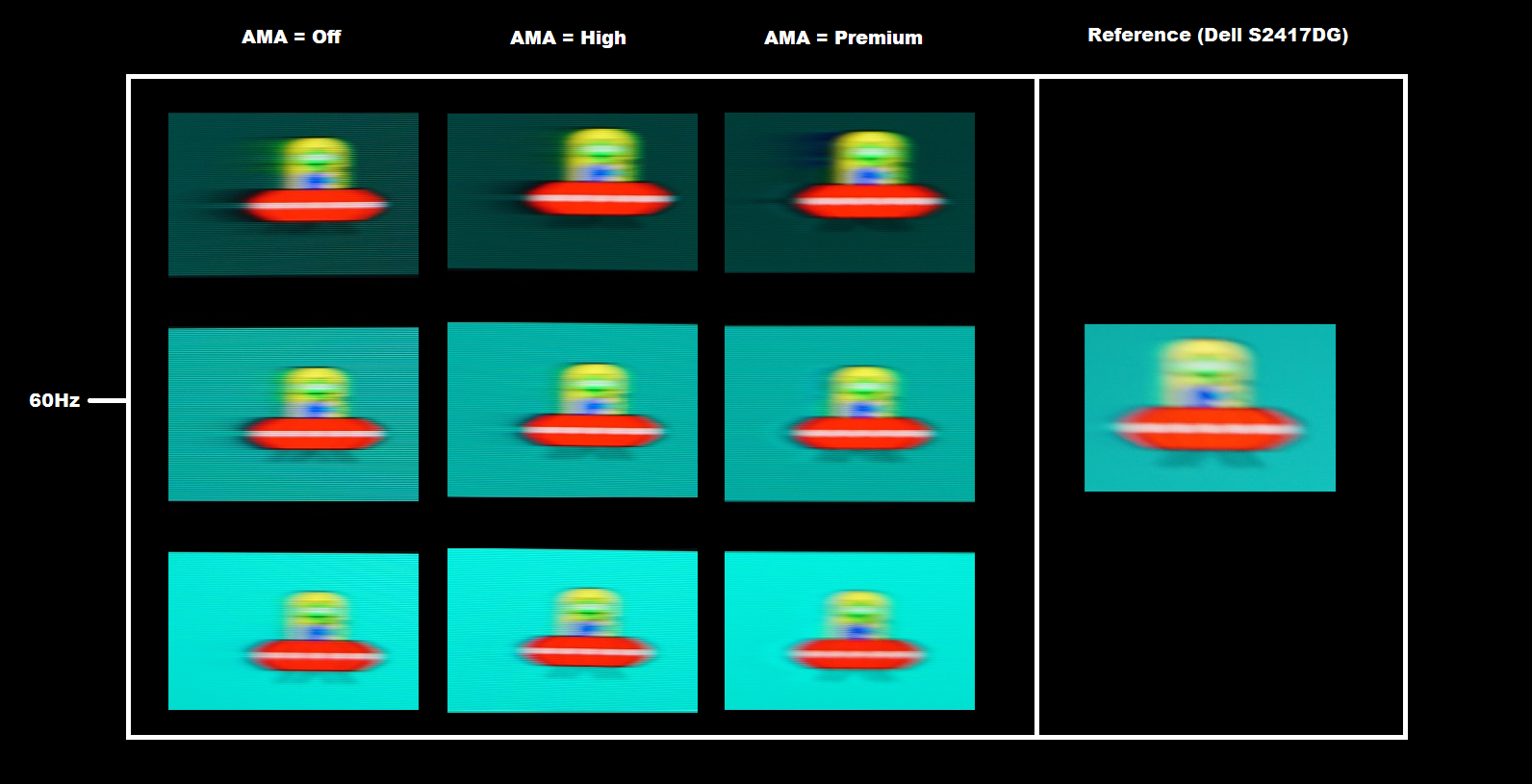
In all cases the UFO appears soft and unfocused, reflecting a moderate degree of perceived blur due to eye movement and linked to the 60Hz refresh rate of the display. There are also varying degrees of trailing behind the object, due to weaknesses in pixel responsiveness. With ‘AMA’ set to ‘Off’, this trailing is quite bold and for the dark background in particular rather extensive. The light background fares much better. With ‘AMA’ set to ‘High’, the trailing is slightly reduced for the dark background and to some extent the medium background. It is again lightest for the light background, although there now appears to be a ‘glow’ behind the UFO. This is overshoot (inverse ghosting) due to aggressive pixel overdrive being used to speed up the transitions. Setting ‘AMA’ to ‘Premium’ provides much stronger and more obvious overshoot, affecting all transitions with a very eye-catching inky trail for the dark background in particular. The image below shows the same test performed at 75Hz.
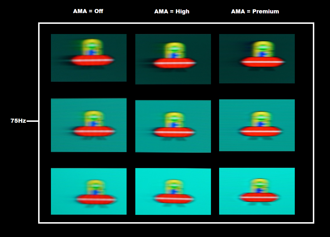
The UFO still appears soft and unfocused, although is now marginally narrower (this is clearest if you focus on the cockpit area). There is therefore still a moderate degree of perceived blur due to eye movement, with a slight reduction compared to 60Hz. There is again varying degrees of trailing behind the object, due to weaknesses in pixel responsiveness. The pattern of either trailing or overshoot is similar to at 60Hz, although the trailing is slightly more pronounced in places. That is because the refresh rate and frame rate has increased (by 15Hz and 15fps) and perceived blur due to eye movement has decreased slightly (the object appears narrower). The pixel responses aren’t keeping up, which as why there is trailing, and weaknesses are exposed a bit more clearly. Whether at 60Hz or 75Hz, we consider the default ‘High’ setting for ‘AMA’ to be optimal.
Running a custom resolution (overclocking)
In our experience we consider this sort of increase in refresh rate to be a ‘mild’ overclock that is completely within manufacturer tolerances. There is minimal risk involved and in all likelihood the monitor will last for its useful life in much the same way as if it was run at 60Hz. The general advice we give at this stage as to be aware that overclocking is something which you do at your own risk. We accept no liability should anything happen to the monitor which may or may not be due to running it at an increased refresh rate.
Responsiveness in games and movies
Overall, we’d say that the monitor is significantly more responsive than the likes of the AOC Q3279VWF. The pixel responsiveness is also a bit more tightly-tuned (generally faster) than previous Full HD VA models we’ve tested from BenQ, such as the EW2750ZL). It’s a bit closer to the Samsung C27F591FD, which we feel really sets the benchmark for Full HD VA pixel responsiveness. We made similar observations on Dirt Rally. The 75Hz refresh rate improved ‘connected feel’ and lowered perceived blur overall, with many pixel transitions occurring fast enough to take advantage of this. There were some weaknesses, including a small amount of overshoot in places which gave a little bit of bright trailing in places where some lighter transitions were involved. Seeing trees moving against a bright sky, for example, sometimes gave a bit of overshoot – but nothing too bright or eye-catching. There were some distinct weaknesses where darker transitions were involved, for example dark and shaded areas of forest or more commonly when driving at night. There was a bit of a ‘smeary’ trailing in places, for example where dark shadowy trees were cast against a somewhat brighter night sky. This wasn’t as extensive or obvious as some VA models provide and any ‘break-up’ trailing was pretty tame without obvious flashes of colour.
HDR (High Dynamic Range)
Colour gamut 'Test Settings'
Video review
Conclusion
The bottom line; looking past the headline features and the shiny copper-coloured button that allows quick access to them, this monitor provides strong all-round performance with pleasing contrast and vibrant but not gaudy colour output.
![]()
Positives Negatives Vibrant, varied and well-balanced colour reproduction following a little tweaking, with a generous colour gamut extending well beyond sRGB and coming quite close to DCI-P3. Good colour consistency for the panel type, even if weaker than IPS-type panels
Colour gamut doesn’t quite fully cover DCI-P3, which is the near-term ideal for HDR – and there is no 10-bit+ support from the panel either, which is part of a true HDR experience Excellent static contrast even following adjustments plus very little ‘glow’ of any description. A very light matte anti-glare screen surface is employed, giving a pleasingly smooth look to the image Although HDR gives a minor enhancement to contrast and fair enhancement to brightness, the image lacks the depth and black point or the absolute brilliant brightness of a true HDR experience Low input lag and well-tuned pixel responsiveness delivers a decent 60Hz performance – plus we were able to overclock to 75Hz
There are some distinct weaknesses in pixel responsiveness, although nothing extreme for the panel type. Some users would prefer a higher refresh rate and no variable refresh rate technology is supported Good flexibility in the OSD, including useful and easily accessible Low Blue Light (LBL) settings Very limited ergonomic flexibility and no provision for VESA mounting, whilst the B.I.+ feature seems to be a waste of a perfectly decent light sensor
![]()

