Author: Adam Simmons
Last updated: June 13th 2026
Table of Contents
Introduction
When it comes to text and edge clarity, having a high pixel density is greatly beneficial. But some models have clarity issues which you wouldn’t expect for a given pixel density. Some VA LCDs, for example, have each subpixel divided into two sections and show partial illumination of those sections when displaying text. Giving some text a softer (blurrier) than intended or ‘squashed up’ look, or potentially an unusually fine look depending on the sharpening algorithm. A minority of LCD panels used in monitors use a BGR rather than RGB subpixel layout, with associated fringing issues that partly relate to a lack of software optimization and support for the layout. This is particularly problematic in multi-monitor setups where models with BGR and RGB layouts are mixed. Most LCDs use a regular RGB stripe subpixel layout without any partial subpixel illumination. They have fully illuminated red, green then blue subpixels in an even fashion side by side, as illustrated below. They’re therefore free from ‘unexpected’ text rendering and fine edge clarity issues. When it comes to OLED technology, though, there are two dominant panel technologies (QD-OLED and WOLED) in the consumer segment which both have their own unique subpixel layout and come with their own associated issues.
![]()
QD-OLED fringing
Samsung Display QD-OLED technology combines a blue OLED light source for each individual pixel with layered red and green Quantum Dots. Rather than the red, green and blue subpixels being arranged in an RGB stripe layout, they’re typically arranged in a ‘triad’ design shown below, with the green subpixel located above the red and blue subpixel. The monitor used as an example in this section of the article is the Dell Alienware AW3423DW with a 34.18” 3440 x 1440 screen, yielding a pixel density of 109.11 PPI (Pixels Per Inch). The same subpixel structure is used for all current ~34″ QD-OLED models as they’re based on the same so-called ‘gen 1’ panel.
The ‘gen 2’ panel, first seen on the ~49″ Samsung Odyssey OLED G9 (G95SC), features a similar layout and pixel density to the 34″ models but with more of a square (or rectangular) appearance to the subpixels. This squarer appearance with less vertical elongation reduces but does not eliminate the fringing. It can still be observed for the scenarios presented in this article but in a slightly more subdued fashion. We explore the layout change and its impact in our video review of the ASUS ROG Swift OLED PG49WCD, which uses a 49″ ‘gen 2’ panel. The ~27″ QHD QD-OLED panels, such as those used in the likes of the Samsung Odyssey G60SD, share this improved subpixel structure. The high DPI ‘gen 3’ panel used in the ~32″ ‘4K’ models further improves things, by combining this improved layout with a much tighter pixel density. As noted in our video review of one such model, the Dell Alienware AW3225QF, the fringing is now exceptionally thin and hard to spot – so for the vast majority will be a complete non-issue. It’s even less of a potential issue with the ‘gen 4’ panel (explored in our review of the MSI MPG 272URX) with its even tighter pixel density 26.5″ ‘4K’ UHD display. The image below shows the ‘gen 1’, ‘gen 2’ and high DPI ‘gen 3’ layouts. The difference in the fringing is very difficult to capture on camera and quite misleading, so we won’t be including any comparison photos of the fringing.
![]()
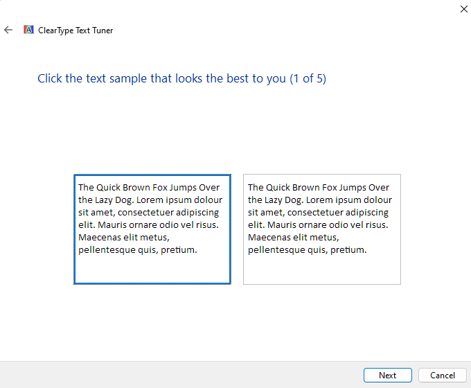
When observing text or fine edges with a contrasting background, you can see a fine colourful fringe at all sides. In practice this fringe is very slender and some people will find it very easy to ignore and not bothersome or necessarily even noticeable from a normal viewing distance, though there are some situations where it can be more noticeable than others. It’s not an easy form of fringing to accurately capture in photographs as they greatly exaggerate the fringing by making it look beautifully colourful and super-obvious. Even if we sat unusually close to the screen and started ‘pixel peeping’, we felt any photos we took tended to exaggerate the issue. But it’s still useful to have some photographic references of the issue to aid our explanations. The image below shows the letters ‘PCM’ typed out in size 11 (top) and 72 (bottom) as black text on a white background with ClearType optimisation performed. ClearType provides a more evenly spaced and more evenly bolded look to text, with a degree of freedom to customise the appearance – but disabling it will not eliminate the fringing shown here. Some may find the fringing slightly more or less noticeable depending on what is selected in ClearType – the first sample should be selected in test 1 of 5 as this provides RGB optimization, with the remaining samples set according to taste. Smaller text could also make the issues more noticeable in some cases as the text itself is closer to the width of the fringe. But as you’ll see below and with various examples shared later on, the issue persists even for larger text or contrasting straight edges.
Caution: the images in this section showing fringing issues also greatly exaggerate them and are not representative of what you will see by eye when using the monitor normally. Please read the accompanying text, which provides appropriate context.

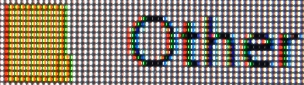
With the example above, you can see colourful fringing at the border between the white and black. Given the colourful nature, it could be described by the photography term ‘chromatic aberration’. It tends to appear either magenta, purple or burgundy on upper surfaces of letters and green at the bottom. Some other shades such as orange and yellow can also be seen. However; we can’t stress enough that you simply don’t see it like this to the eye. The fringe is exceptionally slender, a pixel wide, and appears far more blended and less saturated than this. We spend a lot of time observing text when using monitors and for black text on a white background or indeed relatively dark text on a relatively light background we didn’t readily notice this issue. It also occurs when observing text or other straight edges where the text (or object) is significantly brighter than the background. The image below shows the ‘Table of Contents’ found in our reviews, which includes white text against a black background. This is then surrounded by the white of the page.

This image again exaggerates the issue as the fringes appear more blended, less saturated and exceptionally slender in practice. But we did generally find the fringing a bit more noticeable for examples like this than when observing black text against a white background. If you observe the same ‘Table of Contents’ (or indeed normal text) closely enough on an LCD monitor of similar pixel density, you may notice some fringing as well. Because of the extreme contrast and very generous gamut of the QD-OLED models – plus the unusual subpixels – it does stand out a bit more in this case. We would again stress that it isn’t something that most will find bothersome, but it’s one of those things some are more sensitive to than others and it’s important to acknowledge the issue.
We also noticed it when observing a dark taskbar against a much lighter background, such as the white or light grey of a document on Microsoft Word. We observed a magenta fringe between the dark taskbar and light elements of the page. We’ll include an image of this just for reference, but remember the fringe is extremely slim and appears much more blended and less saturated to the eye. If you observe this fringe in person you might describe it as purple or perhaps burgundy rather than magenta, but it’s quite open to interpretation and difficult to say with certainty given how thin the fringe is. It’s also worth remembering that it isn’t just confined to the desktop where this fringing occurs, but with video and game content being as dynamic as it is we really didn’t find it at all bothersome or generally noticeable there.

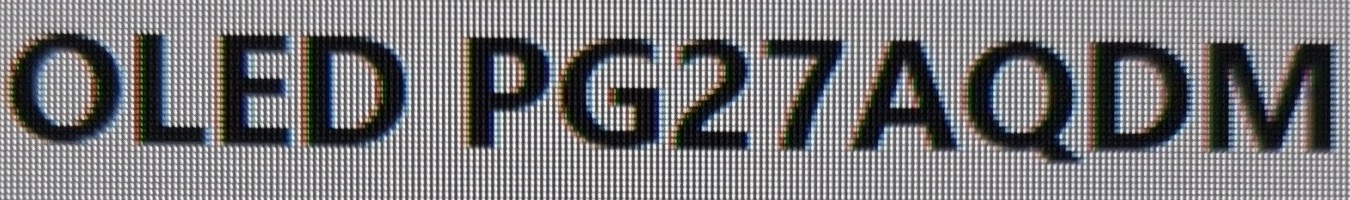
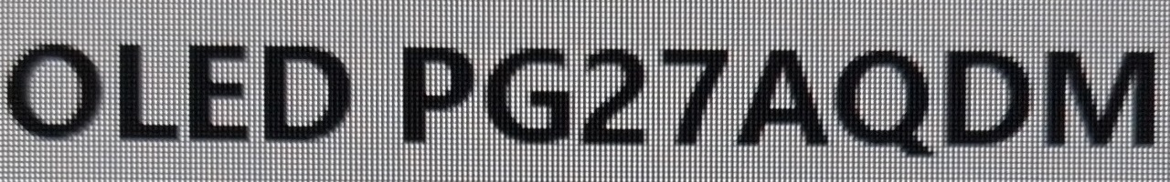
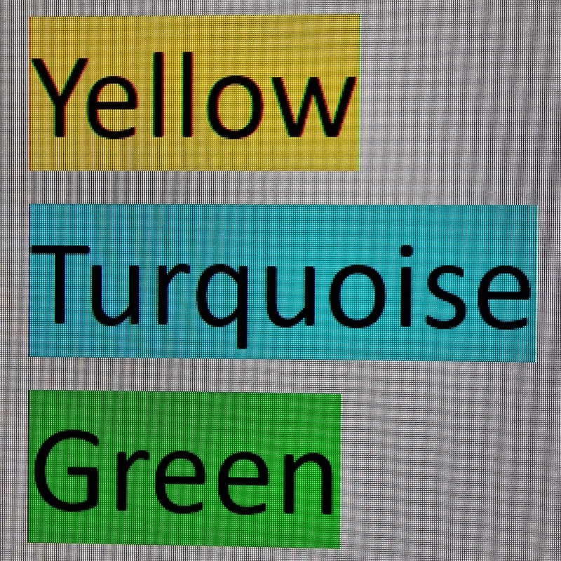
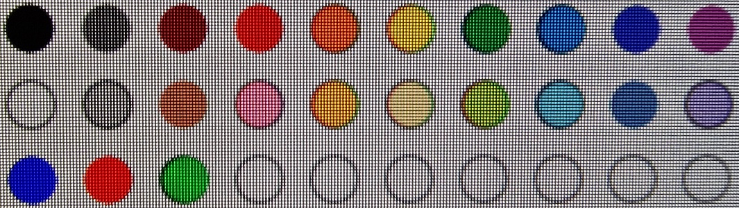
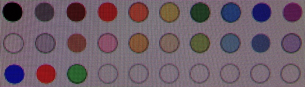
As an Amazon Associate I earn from qualifying purchases made using the below link. Where possible, you’ll be redirected to your nearest store. Further information on supporting our work. LG Display WOLED technology uses a white OLED light source and typically includes 4 distinct subpixels. Three of these filter the light into red, green and blue whilst the forth is an unfiltered white subpixel. This is used to provide the brightness of the monitor and is particularly dominant for high brightness situations, such as when displaying bright HDR content. The first image below shows a macro of the subpixels, but the arrangement is not distinct. The second image shows a vertical stripe with single pixel ‘dots’ of red, white, blue and green to better show the ordering of the subpixels (RWBG). The monitor used as an example in this section of the article is the ASUS PG27AQDM with 26.5” 2560 x 1440 screen, yielding a pixel density of 110.84 PPI. Many WOLED models share this specific RWBG subpixel layout, but some newer generation WOLED models have switched to a RGWB layout which significantly reduces (though does not entirely eliminate) some of the fringing issues covered in this section. We explore this in a section of our ASUS ROG Swift OLED PG32UCDP review, which is a 31.5″ ‘4K’ UHD model using this layout. Following ClearType optimisation, there’s fairly distinct fringing around a lot of text – like a shadowy displacement of the main text. For smaller text it tends to look over-sharpened, as if the sharpness of the monitor is set too high – but adjusting the sharpness control of the monitor, if that’s an option, won’t correct this. For larger text it’s even more noticeable as that has larger straight edges, with the fringe appearing as a shadow to the left of the text. If you disable ClearType then these text rendering issues don’t occur, but text generally has an unusually slender look with inconsistent bolding or spacing of some letters. We’re used to seeing the more consistent and generally ‘cleaner’ appearance with ClearType optimisation enabled and that has been the default state in Windows for many years. The fringing is brighter but less saturated than what we observed on the QD-OLED ultrawide panel and we found it more eye-catching, though that’s subjective. The images below show some text from the website (larger and smaller text) with ClearType enabled and disabled, respectively. This helps highlight the fringing present with the setting on but not off – it’s highly magnified compared to what you’d see to the eye, but as noted we found this quite obvious to the eye as well. Some applications, such as Adobe Reader used to view PDFs, use their own subpixel rendering system optimised for RGB. So disabling ClearType doesn’t affect them and fringing can be observed regardless. Coloured text or objects against very light backgrounds can have particularly noticeable fringing which isn’t influenced by ClearType. Highlighting text in yellow or yellow objects are the worst offenders, but other shades such as orange and chartreuse can also be problematic. Here, there is a defined red edge to the left and bright green to cyan edge to the right. Pure greens and some turquoise shades are interesting as they appear to have a similar bright fringe to the right, but to the left they have a dark (rather than clearly red) fringe. The image below shows a range of highlight colours surrounding black text, making this fringing particularly clear. The black text with yellow background also highlights some colourful fringing, though this is exaggerated in the image and not as noticeable by eye as the fringing described earlier against the light background. You can also see this slight colourful fringing when looking at yellow emoji against dark background (e.g. Twitter ‘Lights out’ mode). The images below show this fringing with a folder icon and shows some text beside it, with the first image showing ClearType on and the second ClearType off. Note the representation and fringing around the text changes, but the folder fringing remains the same. To help highlight differences between how the fringing manifests on WOLED and QD-OLED, we’ve included some images showing the colour swatches of Microsoft paint on both a WOLED screen (top) and QD-OLED screen (bottom). You would observe similar behaviour if you were to draw shapes of the same colour or simply observe objects of the same colour at their edge. For the WOLED screen you can see that some colours show a clear fringing to the left and right, as described earlier with the highlights. Most noticeable for yellow-biased shades but with a dark fringe to the left for some other shades. With the QD-OLED you can see a colourful fringe right around some of the swatches, most noticeably for the black – this is similar to the ‘table of contents’ example given earlier in the article. As noted earlier, this colourful fringing on the QD-OLED is greatly exaggerated in images like this. Really, which fringing is ‘worse’ is situational and quite subjective. Overall, though, we found some of the fringing more noticeable on the WOLED screen than on the QD-OLED. For occasional productivity use or browsing the internet you may not find the fringing problematic (again, subjective). But for significant productivity-focused usage including design work, drawing, image editing, working with coloured text or anything with colourful UI elements against lighter backgrounds you’re likely to observe strong fringing on the WOLED that could be rather bothersome. And you may notice colourful fringing on the QD-OLED that you’d find bothersome. As with the QD-OLED, there’s a possibility you could notice some fringing in games and movie content with very specific shade combinations if you looked out for it when there was little going on. Certain text, HUD elements and icons could show it. But the main content tends to be far more varied and dynamic, and when observing that we didn’t notice fringing on a broad range of game and video content. Some users report a degree of improvement using a utility called MacType (designed for Windows use, despite the name), which provides more flexibility and tune-tuning for the subpixel optimisations than ClearType. This doesn’t eliminate all fringing issues, but it may improve the rendering of text and make fringing less noticeable in places. This would be particularly applicable to WOLED technology where a lot of the text fringing is strongly linked to ClearType optimisations, but text rendering could be subjectively improved on either technology. If Microsoft included appropriate optimisations for the QD-OLED and WOLED subpixel structures described above, then it could yield further improvement for both technologies. But some of the fringing issues highlighted in this article would still remain, as they aren’t related to subpixel rendering optimisations and don’t just apply to text. Improving pixel density also makes the fringing less noticeable, as demonstrated with the high DPI ‘gen 3’ and ‘gen 4’ QD-OLED panels that are ~32” and ~27″, respectively, with a ‘4K’ UHD resolution. LG Display have introduced a 27″ ‘4K’ UHD WOLED panel (first seen on the ASUS ROG Swift PG27UCWM) which uses an RGB stripe design without an unfiltered white subpixels. Contrary to popular belief, the unfiltered white subpixel isn’t what defines a panel as WOLED but rather the use of a white OLED light source which can be passed through coloured filters. Samsung Display has introduced what they call a ‘V-Stripe’ (vertical stripe) layout on their 360Hz ultrawide QD-OLED panels, where the green subpixel is no longer displaced above the red and blue. Although the subpixel components aren’t all the same size, the side by side vertical arrangement of subpixels is similar to a traditional LCD and it results in the fringing issues described above being essentially eliminated. The image below compares the original QD-OLED layout on the Dell Alienware AW3423DW (‘AW34’) and the improved vertical stripe layout on the MSI MPG 341CQR QD-OLED X36 (‘X36’). The new layout doesn’t eliminate fringing, but it does greatly minimise it. More specifically, it gets rid of fringing above and below each subpixel so that you don’t get unwanted distinct colourful elements above and below contrasting elements such as text or other contrasting edges. The image below shows a dark taskbar against a white background on the ‘AW34’, where a distinct magenta fringe is observed at the boundary. And the same dark taskbar against white background on the ‘X36’, where the fringe is absent. When considering fringing to the sides of contrasting elements, this is still observed in places. A good example of this would be the bezels of the monitor, or more specifically the edge of the ‘active area’ or panel border with white or another light shade displaying in that region. Because the bezels are always there and it’s common to see ‘white space’ in this region when you’re on the desktop, it’s a place where fringing like this is relatively easy to notice. You can see a red to magenta fringe near the left bezel and cyan fringe near the right bezel. Remember that the fringe itself is under 1 pixel wide so it’s far from super obvious from a normal viewing position – note the exaggerated size of pixels in the image due to the proximity of the camera to the screen during capture. We didn’t find this fringe to be eye-catching when using the monitor normally, even with white or other light shades displayed at the edges of the screen. Though we found it quite easy to spot when specifically focusing on that region of the screen. Similar fringing can be observed to the sides of contrasting elements elsewhere on the screen, such as for the website ‘table of contents’ example used earlier in the article. It wasn’t possible to capture this in a way that provided a fair and accurate comparison with earlier QD-OLEDs, so no images will be included for this. With the lack of any fringing above and below objects and the fringing at the sides not being too obtrusive in our view, it is a significant improvement compared to earlier QD-OLED models sharing this pixel density. The effect of this is that where there are smaller contrasting edges or rounded objects, which are commonly observed in a lot of content, the fringing is much less apparent with much lower potential to be noticed at all. The image below shows the colour swatches from Microsoft Paint that were used as an example earlier, comparing the ‘AW34’ to the ‘X36’. Note the rainbow fringing around the black swatch is almost completely absent on the ‘X36’ – and the slight fringing on other shades (such as blue and dark grey) has been eliminated. This was true by eye and not just due to differences in how the camera captured the respective images. As noted earlier in the article, it’s extremely difficult and ultimately misleading to try to highlight the effect of pixel density on this fringing. The camera never fails to exaggerate the fringing significantly and makes such comparisons meaningless. But we’ll share some subjective impressions comparing what is observed on the ‘X36’ with two higher pixel density QD-OLEDs. Using the Dell Alienware AW3225QF (‘AW32’, which has a significantly higher pixel density ~140 PPI vs. ~110 PPI for the ‘X36’) side by side, we’d give an edge to the ‘X36’ in terms of the fringing being less noticeable. Unless specifically staring at the side bezels of the screen or very specific contrasting elements with long vertical straight edges. This is naturally very subjective and will depend on the content on screen. But we generally found the eyes drawn to the slight fringing on the ‘AW32’ more often than the slight fringing on the ‘X36’. The ASUS XG27UCDMG ‘XG27’ offers an even tighter pixel density (~166 PPI), and we found this improved things further compared to the ‘AW32’. We’d struggle to pick a clear ‘fringing winner’ from these two as again the ‘X36’ did have some fringing at the sides in certain cases that was ‘thicker’ than apparent fringing in similar places on the ‘XG27’. If looking very closely there were also some instances of minor fringing on the ‘XG27’ which was absent on the ‘X36’ (again above and below objects). This didn’t catch the eye during normal use anyway as the fringe was extremely small. So really, we found both models excellent in terms of unobtrusive fringing levels and certainly feel the new layout introduced on the 5th Gen ultrawides is a big step up from earlier generations sharing its pixel density. The real icing on the cake would be having this improved subpixel design brought to the higher pixel density QD-OLED panels. As an Amazon Associate I earn from qualifying purchases made using the below link. Where possible, you’ll be redirected to your nearest store. Further information on supporting our work.

WOLED fringing
![]()
![]()
WOLED subpixels individually lit
Which fringing is worse?
What will improve the situation?
Improved QD-OLED and WOLED layouts
![]()


