Author: Adam Simmons
Date published: August 16th 2018
Table of Contents
Introduction
The ‘4K’ UHD resolution on 27” screens brings significant real-estate and clarity benefits. The edge in detail is very attractive to gamers, but having to be restricted to a maximum refresh rate of 60Hz is less enticing. The ASUS PG27UQ is one of a new breed of monitors which pushes the refresh rate boundaries higher, supporting up to 144Hz at its native UHD resolution. It couples it with G-SYNC HDR to make the almost inevitable dips in frame rate more palatable and offers support for HDR with an advanced backlighting solution. We take a look at these features and of course the core performance of the monitor in our usual series of tests.
Specifications
This monitor uses an AHVA (IPS-type) panel, with a resolution of 3840 x 2160 (‘4K’ UHD) and support for a refresh rate of up to 144Hz. 10-bit colour is supported via 8-bit + FRC dithering, whilst a Quantum Dot backlight solution is employed. Namely a Nanosys QDEF (Quantum Dot Enhancement Film) solution. A 4ms grey to grey response time is specified, which as usual should be treated with an open mind. Some key ‘talking points’ of the specification have been highlighted in blue below, for your reading convenience.
From the front the monitor has distinctive ROG (Republic of Gamers) styling elements. The bezels are quite slim, with a single hard matte black plastic component covering the panel border almost entirely. The bottom bezel uses a combination of plain matte black plastic and black plastic with a brushed texture. The bezels are ~18mm (0.71 inches) thick at the sides, ~20mm (0.79 inches) at the top and ~23mm (0.91 inches) at the bottom. On the right bezel, near the bottom, there are OSD (On Screen Display) button markers. The buttons themselves are found at the rear of the screen, as explored shortly. The stand has an interesting shape, with powder-coated metal feet in a medium grey ‘Armor Titanium’ colour. There is a semi-matte plastic ‘Plasma Copper’ (orange-coloured) gill-like structure contained centrally. There is also a down-firing ‘Light Signature’ projector that projects a red ROG logo (or design of your choice) onto your desk, as explored alongside other lighting features shortly. This can be disabled if preferred. The screen itself is of course dominant from the front, with a light matte anti-glare surface used. The OSD (On Screen Display) is controlled by a combination of pressable buttons and a joystick at the rear of the monitor, running vertically down the right side (as viewed from the front). The video below runs through the functionality of the menu system, including the various ambient lighting systems of the monitor. From the side the monitor has reasonable central bulk – with the advanced backlighting system used, it was never going for the super-sleek look. At thinnest point it is ~24mm (0.94 inches), lumping out more noticeably centrally towards the stand attachment point. The robust nature of the stand is evident from this angle, too, as is its ‘Armor Titanium’ colouration. The included stand offers good ergonomic freedom; tilt (-5° to 20°), height (120mm or 4.72 inches), swivel (35° left, 35° right) and pivot (90° clockwise and anti-clockwise rotation into portrait). At lowest screen height the bottom of the screen clears the desk by ~67mm (2.64 inches) with the top of the screen ~445mm (17.52 inches) above the desk. The total depth of the monitor including screen and stand is ~280mm (11.02 inches), with the screen slightly further forwards than the stand feet. DisplayPort 1.4 must be used on a compatible Nvidia GPU to harness the full capabilities of the monitor, including 3840 x 2160 @ 144Hz and G-SYNC. You should also ensure you have the latest GPU firmware for DP and update if necessary, using this Nvidia tool. HDMI 2.0 supports 3840 x 2160 @ 60Hz and like DP 1.4 offers HDR support – this will come as welcome news to HDR games console owners who rely on HDMI 2.0 for their experience. The power adaptor and cable, an HDMI cable, DP cable and USB 3.0 cable are included as standard. Note that the included stand can be removed to make way for an alternative 100 x 100mm VESA solution. If you do this, you will of course loose access to the ‘Light Signature’ and ‘Light Signal’ features integrated into the stand. More importantly, be aware that the monitor has two internal fans as an active cooling solution and the included stand includes ventilation holes covered by a light mesh material. There are also ventilation slats surrounding the stand attachment point. Be mindful of ventilation if using alternative mounting and be careful not to completely block or significantly restrict airflow in this region. All of the clever internals such as complex backlight solution and hardworking G-SYNC board need this to function correctly. We didn’t find these fans obtrusive and it didn’t really stand out against our general system noise even when the system was ‘idle’ (on the desktop). With the graphics card fan spooled up under load, such as playing a game, we didn’t even notice the monitor fans above this noise. Those with silent systems or who like everything to be as quiet as possible may find the thought of fans in the monitor annoying, but most users should find the fans fine and soon forget they’re even there. The image below is a macro photograph taken on Notepad with ClearType disabled. The letters ‘PCM’ are typed out to help highlight any potential text rendering issues related to unusual subpixel structure, whilst the white space more clearly shows the actual subpixel layout alongside a rough indication of screen surface. A light matte anti-glare screen surface is used here, which provides good glare-handling characteristics. It offers a reasonably smooth surface texture and reasonably low haze value, imparting less obvious graininess and preserving clarity and vibrancy better than stronger matte screen surfaces. There is a bit of graininess when observing lighter shades, but we’d describe this as a light ‘misty’ graininess rather than a heavy or ‘smeary’ graininess. There is a very good article exploring reduced chroma and its effects on RTINGS.com. The take-home from that article, which is strongly reinforced by our own testing, is that games and movie content is designed to look good using a reduced chroma (4:2:2) signal. There may be some rare exceptions where there is particularly thin text that may appear fringed under 4:2:2, but we didn’t come across any of this in our testing. We would therefore recommend that users don’t hesitate to use 144Hz on this monitor for gaming purposes, but stick to 120Hz maximum on the desktop where the effects of reduced chroma is quite noticeable. We used a BasICColor SQUID 3 (X-Rite i1Display Pro) to measure white and black luminance levels, from which static contrast ratios could be calculated. The table below shows this data with a range of settings used, including those covered in the calibration section and a few extras. Assume any setting not mentioned was left at default, except for the changes already mentioned in the calibration section. Black highlights indicate the highest white luminance, lowest black luminance and maximum contrast ratio recorded. Blue highlights show the results with HDR active and also under our ‘Test Settings’. When viewing the figures in this table, note that for most PC users ‘6500K’ for white point and ‘2.2’ for gamma are good targets to aim for.
As an Amazon Associate I earn from qualifying purchases made using the below link. Where possible, you’ll be redirected to your nearest store. Further information on supporting our work.

Features and aesthetics


The rear of the monitor continues with ‘ROG’ styling elements, including a design that’s split diagonally down the middle. The left side features regular matte black plastic, whilst the right side uses a dark grey matte plastic with imprinted design. The top of the stand neck features a ROG emblem that is illuminated alongside the down-firing motif with the ‘LIGHT IN MOTION’ control of the OSD. There is also a ‘ROG Light Signal’ projector, which projects a red ROG logo onto the wall behind the monitor. There is a scroll wheel accompanying this which controls how high up the wall and how large the logo will appear – this depends on the distance to the wall. There’s also a ROG motif towards the upper right which can be illuminated in various ways and set to various colours in the OSD (‘Aura RGB’). Alternatively, you can use software (‘Aura Sync’) to control this lighting and also the lighting of other compatible peripherals. One or both of these features can be disabled if preferred – we explore them in the OSD video above. The bottom of the stand neck features a cable-tidy. Towards the bottom right there is a Kensington lock slot and towards the bottom left are the OSD controls. The ports are down-firing, neatly concealed beneath a removable plastic cover, with a small opening at the bottom to pass cables through. They include; DC power input (external power brick), HDMI 2.0b, 2 USB 3.0 ports (plus upstream) and DP 1.4.


Calibration
Subpixel layout and screen surface
![]()
As shown above, the monitor uses the standard RGB (Red, Green and Blue) stripe subpixel layout. This is the default expected by modern operating systems such as Microsoft Windows and Apple MacOS. You needn’t worry about text fringing from non-standard subpixel layouts as a Mac user and don’t need to run ClearType as a Windows user – although you may wish to adjust this according to preferences. We did not identify any issues related to text rendering on this model and indeed text clarity is an obvious strength of this screen given the pixel density and good subpixel structure. If running the monitor at 3840 x 2160 @ 144Hz, note that a compressed colour signal is used called “YCbCr422” (4:2:2) rather than “Full Range RGB” (4:4:4). The purpose of this is to save bandwidth, without such compression the monitor would be unable to run at 3840 x 2160 @ 144Hz. This signal type uses what is known as chroma subsampling (4:2:2), giving a rainbow-like fringe to some text. Slender text on plain coloured backgrounds tends to show this most clearly. You can see this fringing clearly in the ‘Display’ – ‘Change resolution’ section of Nvidia Control Panel, for example. Notice the cyan fringe around the ‘Customise…’ button and the fringe around various text elements. Compare the top image (120Hz, Full Range RGB / 4:4:4 Full Chroma) with the bottom image (144Hz, YCbCr422 4:2:2 Reduced Chroma).


Testing the presets
Preset Mode Gamma (central average) White point (kelvins) Notes Racing Mode (Factory Deaults) @ 120Hz 2.2 6782K The image appears bright with a slightly cool tint. It is not overly vivid, although shades within the sRGB space are reproduced accurately and there is good variety and consistency. This is an ‘sRGB emulation’ mode which restricts colour gamut of the monitor significantly, so it closely follows sRGB without clear over-extension. Racing Mode (Factory Deaults) @ 144Hz 2.2 6788K Appears very similar to 120Hz, except for the issues highlighted previously regarding the use of chroma subsampling. Display SDR Input = Wide Gamut 2.2 6797K As factory defaults in terms of colour balance, strong consistency and gamma handling. But the full native gamut is used, giving the image a significantly more vibrant and saturated look. The saturation levels are far beyond what you’d see from a digital saturation is increased (e.g. using Nvidia Digital Vibrance Control). An excellent variety of shades is also represented as there is no compression within the gamut. Gamma = 1.8 1.8 6791K As factory defaults but gamma significantly lower. The image appears quite washed-out. Gamma = 2.0 2.0 6795K As above but slightly more depth (still looks faded in places). Gamma = 2.4 2.4 6802K As per factory defaults with extra depth and a deeper look. Gamma = 2.6 2.6 6810K As above but extra depth. Combine this with the ‘Wide Gamut’ setting and things appear particularly striking in terms of depth and saturation. Blue Light Filter = Level 1 2.2 5850K A mild LBL (Low Blue Light) setting, reducing the strength of the blue colour channel and blue light output from the monitor a fair bit compared to factory default. The image has a slightly warm and green tint to it, which your eyes largely compensate for given a bit of time. Blue Light Filter = Level 2 2.2 5746K As above but image appears slightly warmer with increased green tint. Blue Light Filter = Level 3 2.2 5654K As above but warmer still and a slightly increased green tint. Blue Light Filter = Level 4 2.2 4668K This mode is an effective LBL setting. Blue light output is significantly reduced, with brightness being locked at a fairly low value which also aids this effect. The image looks noticeably warm and green, which becomes slightly less apparent after your eyes adjust but certainly still throws off the balance. Color Temp. = Warm 2.2 5686K An alternative LBL setting, which gives a moderate LBL effect (fairly similar to ‘Blue Light Filter = Level 3’) without a green push. Test Settings (as below) 2.2 6497K The image appears very vibrant, with strong saturation and excellent shade variety. The white point is better balanced to bring things in-line with our 6500K target, whilst gamma tracking remains strong and brightness more comfortable.
The monitor comes factory calibrated with a report showing its adherence to various parameters, calibrated for high levels of accuracy within the sRGB colour space. This calibration report is specific to each unit. Ours report was unfortunately crumpled up by a previous tester, engineer or ASUS monitor boxing and unboxing slave when we received it, so it didn’t scan very cleanly. As noted, results may vary under different test procedures, equipment and patterns. As with any monitor, changes occur over time and for the highest level of accuracy you should calibrate and re-calibrate on your system using your own colorimeter or similar device.

When testing the monitor in the way described early in this section, we found it delivered consistent gamma performance which matched the setting selected in the OSD. The graph below shows gamma tracking as measured on our unit under our ‘Test Settings’, with close adherence to the desirable ‘2.2’ curve as you can see. The gamma tracking was very similar using the factory defaults and was not significantly altered when using 144Hz complete with obligatory compressed colour signal (reduced chroma). The monitor has a range of Low Blue Light (LBL) settings. The main settings are called ‘Blue Light Filter’ and can be set to 4 levels of increasing effect. The first 3 levels only really provided a relatively minor decrease to blue light output, an effect enhanced by reducing brightness further than the defaults set here. ‘Level 4’ provided highly effective blue light reduction and coupled it with a fairly low but locked brightness level. These settings also imparted a green tint, becoming stronger as the setting was increased. There was an alternative LBL setting in the form of ‘Warm’, which provided a reduction to the blue channel but also green channel – avoiding a noticeable green tint. This setting was not as effective as the ‘Level 4’ setting for ‘Blue Light Filter’, however. You can create your own LBL setting by manually adjusting colour channels, but this is obvious far less convenient. Your eyes do adjust to the warmer, greener look eventually although there are still some obvious underlying imbalances in the image. The best use of these settings is in the hours leading up towards bed, where you should cut blue light exposure as much as possible to aid a restful night’s sleep. We used the ’Level 4’ setting for our own viewing comfort later on in the evening, but not for general testing of the monitor. Our ‘Test Settings’ involved a significant decrease to brightness and some colour channel changes. We also changed the ‘Display SDR Input’ setting to ‘Wide Gamut’. In our view, most users would prefer how things look with this setting vs. the default sRGB emulation mode. People these days are used to seeing screens (on smartphones and TVs or monitors) with potentially significant extension beyond sRGB. The sRGB setting, although good for colour accuracy, gives a noticeably subdued and in some ways lifeless look to the image which users will generally be less tolerant of than the highly saturated alternative. As explored later and to an extent in the calibration table, the image retains strong shade variety and is not skewed in the traditional wide gamut sense (Adobe RGB) either. Be aware that individual units and preferences vary, so these settings are only to be considered a guide which will not be optimal in all cases. We have included the ‘OD’ (Overdrive) and ‘GameVisual’ settings used, just for reference. We also turned ‘ECO Mode’ to ‘Off’ just in case it interfered with any of our testing, although it didn’t seem to have a noticeable impact on the image at all. We also had the ‘Variable Backlight’ set to ‘OFF’ for consistency, except for testing specifically related to this feature. Any setting not mentioned, including ‘Contrast’, ‘Gamma’ and ‘DP SDR YCbCr sRGB Gamma’ was left at default. Aside from the HDR section, all of our testing was performed with applications and the monitor running in their normal SDR (Standard Dynamic Range) state. Over Clocking= On Brightness= 25 (according to preferences and lighting) Color Temp.= User Mode R Gain= 100 G Gain= 97 B Gain= 92 OD= Normal Variable Backlight= OFF (unless otherwise stated) ECO Mode= OFF Display SDR Input= Wide Gamut Refresh rate (Windows setting)= 120Hz (desktop) / 144Hz (gaming) With HDR (High Dynamic Range) active, many of the monitor settings are greyed out or changed. By default there is actually a “Warning Message” (can be disabled in the ‘System Setup’ section of the OSD) that reminds you that changing colour settings etc. can mess things up in HDR. Indeed, HDR is designed to work best with the default colour settings. Don’t be afraid of making slight changes, for example keeping your SDR colour channel changes in place, but don’t expect things to look right with more extreme adjustments. You can apply one of the Low Blue Light (LBL) settings on top, for example, which will significantly impact the image but at least allow you to use HDR without disrupting your sleep so much. Well, unless you’re playing something too exciting. As explored later on, setting the refresh rate to 144Hz had no noticeable negative impact on the image compared to setting it to 98Hz or lower even though the colour signal is different. But it did have a performance impact, so we left it at 120Hz. We kept everything at default under HDR in the OSD except for changing the ‘Reference White (nits)’ setting to ‘40’, we’ve included a few minor changes or repeated some of the default settings below just for reference. This setting essentially biases things towards the brighter or dimmer end. If you set this too high, you crush brighter shades together. Set this too low and you crush darker shades together and everything just looks dull. The default setting of ‘80’ was too high as when applications called for lower brightness levels (such as 400 cd/m²) they were boosted too high. This caused some loss of definition at the upper end, unless you carefully fine-tuned the in game HDR brightness settings to compensate. For HDMI this setting also worked well at ‘40’, at least on our Nvidia GPU (AMD GPUs and games consoles may differ). This option may be greyed out on newer revisions of the PG27UQ. Note that individual units may vary and ‘40’ can’t be considered optimal for ‘Reference White (nits)’ in all cases. This is just a suggestion. You should always run through the in-game ‘HDR brightness’ or similar calibration procedure to help fine-tune things – you may want to tweak the ‘Reference White (nits)’ slider after doing so, especially if you find the game options too limited in their adjustment range and you can’t get the squares to blend together. You can also eyeball this YouTube HDR brightness test to help fine-tune the ‘Reference White (nits)’ setting on your unit. If the monitor seems to pump out its maximum luminance for the first or second block for each block size (target luminance of 100 cd/m and 400 cd/m²) then you should lower the ‘Reference White (nits)’ setting so they are distinctly dimmer than later blocks. Reference White (nits)= 40 OD= Normal Variable Backlight= Fast ECO Mode= OFF Refresh rate (Windows setting)= 120Hz We used a BasICColor SQUID 3 (X-Rite i1Display Pro) to measure white and black luminance levels, from which static contrast ratios could be calculated. The table below shows this data with a range of settings used, including those covered in the calibration section and a few extras. Assume any setting not mentioned was left at default, except for the changes already mentioned in the calibration section. Black highlights indicate the highest white luminance, lowest black luminance and maximum contrast ratio recorded. Blue highlights show the results with HDR active and also under our ‘Test Settings’.

Gamma 'Test Settings'
Test Settings (SDR)
GameVisual= Racing Mode
Test Settings (HDR)
Over Clocking= On
Contrast and brightness
Contrast ratios
Monitor Settings White luminance (cd/m²) Black luminance (cd/m²) Contrast ratio (x:1) 100% brightness 583 0.57 1023 80% brightness 495 0.49 1010 60% brightness (Factory Defaults) 381 0.37 1030 40% brightness 266 0.26 1023 20% brightness 143 0.14 1021 0% brightness 27 <0.03 >900 HDR* 1285 0.03 42,833 Variable Backlight = On (70mm² white patch, black background) 357 0.03 11,900 Variable Backlight = On (70mm² black patch, white background) 350 0.37 946 Variable Backlight = On (140mm² white patch, black background) 347 0.04 8675 Variable Backlight = On (140mm² black patch, white background) 348 0.15 2320 Variable Backlight = On (210mm² white patch, black background) 349 0.04 8725 Variable Backlight = On (210mm² black patch, white background) 338 0.08 4225 Variable Backlight = On (280mm² white patch, black background) 349 0.07 4986 Variable Backlight = On (280mm² black patch, white background) 338 0.05 6760 Refresh rate = 144Hz 381 0.37 1030 Display SDR Input = Wide Gamut 382 0.37 1032 Gamma = 1.8 381 0.38 1003 Gamma = 2.0 380 0.37 1027 Gamma = 2.4 381 0.37 1030 Gamma = 2.6 381 0.38 1003 Blue Light Filter = Level 1 363 0.38 955 Blue Light Filter = Level 2 363 0.38 955 Blue Light Filter = Level 3 363 0.37 981 Blue Light Filter = Level 4 133 0.14 950 Color Temp. = Warm 360 0.38 947 Test Settings 171 0.18 950
*HDR measurements were made using this YouTube HDR brightness test video, running full screen at ‘2160p 4K HDR’ on Google Chrome. The maximum reading from the smallest patch size (measurement area) that comfortably covered the entire sensor area and colorimeter housing was used for the white luminance measurement, which was ‘4% of all pixels’ in this case. The black luminance was taken at the same point of the video with the colorimeter offset to the side of the white test patch, equidistant between the test patch and inner edge of the monitor bezel.
The average contrast ratio with only brightness adjusted was 1021:1, which is as we’d expect from the panel used. Following the changes made to our ‘Test Settings’, contrast dropped slightly to a still respectable 950:1. The monitor maintained a contrast of at least 947:1 with any of the Low Blue Light (LBL) settings active, even the strongest ‘Blue Light Filter = Level 4’ setting. The highest white luminance recorded without HDR active was 583 cd/m², which is very bright, whilst the lowest white luminance recorded was a rather dim 27 cd/m². This gave an impressive luminance adjustment range of 556 cd/m². With HDR active we recorded an exceptionally bright white luminance of 1285 cd/m² with a rather low 0.03 cd/m² black point. This yielded a contrast ratio of 42,833:1. It’s best not to get too bogged down with the exact figure and how it compares to other monitors in HDR or any specified values. It clearly shows that the setting works and it works well – although in the real world performance is about a lot more than just pure white and some distance from that pure black. The same applies for the ‘Variable Backlight feature’ explored in the following paragraph. We will therefore be conducting further ‘real-world’ testing of both features using in-game environments where intricate mixtures of shade depth are found.
We also tested the monitor using its ‘Variable Backlight’ feature, under SDR. This controls the backlight not just as a single unit, but as 384 separate dimming zones with luminance independently controlled for each. We tested 4 different patch (square measurement zone) sizes with the colorimeter and this setting enabled, using the default brightness for the monitor (‘60’); 70mm², 140mm², 210mm² and 280mm². Note that 70mm² is the smallest patch size possible whilst fully covering the colorimeter sensor area and housing. Black and white patches were tested, with a background of the opposite shade. The readings for black point and white point were taken simultaneously, one from the patch itself and the other from the background. The reading for the background was taken with the colorimeter offset to the side of the test patch, equidistant between the test patch and inner edge of the monitor bezel. Except for the smallest black patch with white background, whereby black point was raised due to the fact the vast majority of the image was pure white, the variable backlight feature yielded a solid improvement in contrast ratio. The peak value recorded was 11,900:1 for the smallest white patch against a black background. The dimming zones covering the white square could happily pump out high luminance. Meanwhile, the dimming zones taking care of the surrounding sea of black could dim significantly, especially those far enough away from the white square (such as the measurement point).
PWM (Pulse Width Modulation)
The PG27UQ does not use PWM (Pulse Width Modulation) to regulate backlight brightness at any level and instead uses DC (Direct Current). The backlight is therefore considered ‘flicker-free’, which will come as welcome news to those worried about side-effects from PWM usage.
Luminance uniformity
Observing a black screen in a dark room under our ‘Test Settings’ revealed a little backlight bleed. This is shown in the image below, taken in a dark room using camera settings that are representative of what the eyes see when observing the screen. The image was also taken a sufficient distance back to eliminate any ‘AHVA glow’. This is a purple or golden-green glow (depending on viewing angle) that is visible most noticeably towards the bottom corners of the screen from a normal viewing position. It is somewhat reduced compared to what you’d expect to see on an IPS-model of this size, however. As usual the glow ‘blooms out’ as viewing angle is sharpened. Note that individual units vary when it comes to backlight bleed and clouding. Also note that the ‘Variable Backlight’ feature was disabled, as per our ‘Test Settings’, when this photograph was taken. With this setting enabled, all zones of the backlight pretty much shut off completely and it looks quite like the monitor is off when viewing an all-black screen. Not really very interesting to show in a photo nor very useful to represent how things will look ‘in the real world’ – unless you like to stare at black screen fills. Nonetheless, having the setting enabled does reduce the brightness for dimming zones covering dark content, reducing how noticeable any backlight bleed, clouding or ‘AHVA glow’ would be. The luminance uniformity was very good. The maximum luminance was recorded at ‘quadrant 7’ towards the bottom left of the screen (158.8 cd/m²). The greatest deviation from this occurred at ‘quadrant 2’ above the central region of the screen (146.0 cd/m², which is 8% dimmer). The average deviation between each quadrant and the brightest recorded point was 4.63%, which is pleasing. Note that individual units vary when it comes to uniformity and you can expect further deviation beyond the points measured. For example at the extreme edges, right next to the panel border, the monitor had a very thin strip that was brighter and cooler-looking than the rest of the screen. It was beyond the measurement area of the colorimeter in this test – it didn’t draw in the eye but it is worth noting. The contour map below gives a graphical representation of these deviations, with darker greys representing lower luminance (greater deviation from brightest point) than lighter greys. The percentage deviation between each quadrant and the brightest point recorded is also given. Deviations in colour temperature (white point) were also assessed, using the same 9 quadrants. Deviations here are assigned DeltaE values, with higher values representing greater deviation from the D65 (6500K) daylight white point target than lower values. The contour map below shows this, with stronger shades indicating greater deviation from the 6500K target. A DeltaE of >3 here is considered significant deviation that most users could notice quite readily by eye. The results here were mostly good. There was significant deviation towards the bottom of the monitor, with a maximum of DeltaE 4.6. This is not extreme deviation but we could see that lighter shades such as white looked somewhat warmer in this region. As with other aspects of uniformity, individual units vary – you can expect further deviation beyond the measured points. Note that the observations below were made using our ‘Test Settings’ with ‘Variable Backlight’ off. This feature is analysed separately in a later section of the review. On Battlefield 1 (BF1) the contrast performance was quite good overall. When observing lighter shades, such as white, you could see a slight graininess from the screen surface. A misty graininess rather than a heavy or ‘smeary’ grain. These brighter elements stood out quite well against darker surroundings, whilst darker elements maintained good visibility levels throughout most of the screen. There was a degree of ‘AHVA glow’ which ate away at some of the detail for dark shades, particularly near the bottom corners of the screen as viewed from a normal viewing position. This was not as strong or as widespread as you’d typically see from an IPS-type panel of this size, however. Our observations were similar on Dirt Rally. Bright elements such as the sun in the sky or car lights at night had a light misty graininess to them, rather than appearing completely smooth or with a very obvious ‘smeary’ graininess. This title also features relatively dark night scenes, especially if you drive carelessly enough to knock out your car’s headlights. These scenes did not look particularly deep or atmospheric, although detail levels were largely appropriate. Save for some loss of detail in regions affected by ‘AHVA glow’, even if that was reduced somewhat compared to most models of this size and panel type. Toggling the ‘Variable Backlight’ feature on significantly improved the atmosphere in these dark scenes and reduced the ‘AHVA glow’ further – we explore this shortly. Finally, we made some contrast assessments using the Blu-ray of Star Wars: The Force Awakens. This film features a great number of scenes that call for a strong contrast performance. Flames and explosions ripping through dark corridors, epic lightsabre battles with deep spacey backdrops and suchlike are commonplace here. The monitor provided a reasonable contrast experience, better than some IPS-type models but short of what you’d see on a decent VA model. If you are happy to watch your films or similar content in a well-lit room then you’re probably going to find it quite decent in terms of contrast. The contrast performance is greatly enhanced when you enable the ‘Variable Backlight’ feature – not to tease, yet again. The Lagom tests for contrast allow specific weaknesses in contrast performance to be identified. The following observations were made with eyes around 70cm from the screen. The ASUS PG27UQ’s colour gamut (red triangle) was compared to the sRGB (green triangle) and Adobe RGB (purple triangle) reference spaces, as shown below. This was using our ‘Test Settings’ which uses the full native gamut of the monitor (‘Display SDR Input = Wide Gamut’). You can see that the colour gamut is very wide in this representation, covering 100% of sRGB and 100% of Adobe RGB. There’s also significant extension beyond both in the red to blue regions and significant extension beyond sRGB in the green region of this diagram. Note that sRGB and Adobe RGB overlap in the red and blue corners of this representation. Also note that the Spyder5 tends to slightly under-report the blue region for gamuts this wide. ASUS actually targets the DCI-P3 colour gamut as the near-term HDR target with this model and specifies 97% DCI-P3 coverage. Unfortunately, our colorimeter software does not feature the DCI-P3 gamut for comparison. But the monitor appears to cover at least what’s promised and offers some generous extension beyond that in the green region. The monitor provided an unmistakably vibrant but varied look to Battlefield 1 (BF1). As explored earlier, there are two settings for colour gamut on the monitor and one of these is an sRGB emulation mode. We felt the ‘sRGB’ setting sapped the image of too much depth and things looked quite lacklustre overall. The ‘Wide Gamut’ setting as tested here provided strong saturation, clearly stronger than intended for many shades. An intermediate option might have been nice but given the two choices we feel most users will prefer the ‘Wide Gamut’ option, especially given how restrictive the alternative is. Unlike models with a traditional wide colour gamut (Adobe RGB), the gamut is quite evenly broadened out rather than heavily skewed only in some regions of the gamut. And unlike using a digital saturation enhancement (Nvidia Digital Vibrance etc.) shades are not simply pulled closer to the edge of the gamut without the gamut itself expanding, which would crush shade variety and make things look garish. The environments appeared lush and colourful, with an excellent richness to some of the deeper greens in particular. Colours which were supposed to be more muted (dusty greens and browns, Khaki shades) appeared muted in comparison, although again more saturated than intended. Some of the desert environments have a rich red hue to the sand which is intended to be more subtle than how it’s displayed here. It is brought out in a rather strong way, although it isn’t so extreme that it looks more like a Martian landscape than something you might find on earth. Vibrant elements such as red poppies in fields and rich mixtures or oranges, yellows and reds for fire and explosions stood out with excellent vibrant ‘pop’, too. Dirt Rally provided a similar experience, with strong variety and saturation. The car liveries showcased an eclectic mix of neon shades such as pinks, purples and yellows with some impressively deep blues and reds. The extra saturation meant that some yellow shades appeared with a stronger than intended orange hue, some oranges appeared slightly red and some reds were almost eye-poppingly brilliant. But the variety was maintained, things weren’t crushed together or skewed in a cartoonish way. The racing environments maintained a vibrant but fairly natural look, looking largely in-place and in some respects closer to their real-world counterparts than the limited sRGB gamut could provide. There were some excellent lush forest greens and a palette of more muted shades that gave a lively but not garish aesthetic. There was again a push of red hues that made some earthy or rich browns appear less neutral than intended, but this wasn’t too extreme. We also tested the Blu-ray of Futurama: Into the Wild Green Yonder. This is a particularly useful test for colour consistency as it features large blocks of individual shade. This is where TN and to a lesser but still apparent degree VA panels struggle, as the shades have a very different saturation and overall appearance comparing the central region of the screen to peripheral regions. The IPS-type panel used here fared very well in this respect, with the shade remaining similar whether displayed centrally or peripherally. This film showcased an excellent variety of eye-catching neon shades, such as pinks, greens and purples. There were some excellent deep shades as well. Pastel shades appeared somewhat less pastel than intended but were still a lot more muted than the aforementioned deep and neon shades. So everything remained relative and strong variety was maintained. The strong colour consistency also aided the display of an excellent range of skin tones and other subtle shade variations that are not maintained by other panel types. This gave good identity and individuality to the shades or characters associated with them. Lagom’s tests for viewing angle help explore the idea of colour consistency and viewing angle performance. The following observations were made from a normal viewing position, eyes around 70cm from the screen. On some monitors, particularly but not exclusively those with high refresh rates, interlace patterns can be seen during certain transitions. We refer to these as ‘interlace pattern artifacts’ but some users refer to them as ‘inversion artifacts’ and others as ‘scan lines’. They may appear as an interference pattern or mesh or interlaced lines which break up a given shade into a darker and lighter version of what is intended. They often catch the eye due to their dynamic nature, on models where they manifest themselves in this way. Alternatively, static interlace patterns may be seen with some shades appearing as faint horizontal bands of a slightly lighter and slightly darker version of the intended shade. We did not observe any such patterns, either dynamic or static, on this model. A small utility called SMTT 2.0 was used alongside a sensitive camera to analyse the latency of the PG27UQ, with over 30 repeat readings taken to maximise accuracy. Using this method, we calculated 7.87ms (a little over 1 frame at 144Hz) of input lag. This was reduced slightly to 6.95ms at 120Hz, according to our measurements. The use of chroma subsampling at 144Hz seems to impart a slight latency penalty, but nothing major. We did not find a measurable difference in latency with the ‘Variable Backlight’ feature enabled (‘Fast’ setting) vs. disabled. Note that we do not have the means to accurately measure input lag in an HDR environment or with G-SYNC active in a variable refresh rate and frame rate environment. Note that the input lag measured here is influenced by the element you ‘see’ (pixel responsiveness) and the element you ‘feel’ (signal delay). It indicates a fairly low signal delay, which most users should find fine. Some sensitive users may consider this a bit too high, but given the overall capabilities and market positioning of this screen (immersive gaming vs. competitive gaming) we feel it does pretty well in this regard anyway. In our responsiveness article, we explore the key concepts related to monitor responsiveness. One of the most important concepts explored here is ‘perceived blur’, contributed to in part by the pixel responsiveness of the monitor but generally in larger part by eye movement as you track motion on the screen. We discuss a photography method called ‘pursuit photography’, which uses a moving rather than static camera to capture snapshots of motion on a monitor in a way that reflects both elements of perceived blur. This compares with static photography or video methods which only reflect pixel responsiveness. The images below are pursuit photographs taken using the UFO Motion Test for ghosting, with the test running at 960 pixels per second. This is a good practical speed for capturing such photographs and highlights both elements of perceived blur nicely. The UFOs move across the screen from left to right at a frame rate matching the refresh rate of the display. All background shade levels (dark, medium and light) were used with the monitor set to all its ‘OD’ (Overdrive) settings; ‘OFF’, ‘Normal’ and ‘Extreme’. The monitor was tested at various refresh rates; 60Hz (directly below), 98Hz, 120Hz and 144Hz. Where possible, a reference image is included for comparison. This is a Dell S2417DG, a fast high refresh rate TN model which gives you an idea of how things look where pixel responsiveness isn’t really a limiting factor. On Battlefield 1 (BF1) the monitor put its 144Hz refresh rate to excellent use, where the frame rate kept up. With the monitor giving the user up to 2.4 times the visual feedback every second as a 60Hz monitor, there was an excellent ‘connected feel’ to the experience. You felt very in-tune with the game world, with a certain precision and fluidity that’s simply lacking with lower refresh rate models. This high refresh rate and frame rate combination also greatly reduced perceived blur by reducing eye movement, as explored earlier. This meant that the game environment and objects or enemies within it remained more sharply focused. This is useful from a competitive standpoint, but also to help better maintain the beautiful crisp visuals delivered by the high resolution and pixel density. There were no stand-out weaknesses in pixel responsiveness. There was a slight hint of overshoot (inverse ghosting) here and there, but nothing particularly eye-catching or bothersome. There were some faint halo trails which were lighter than either the background or object colour when moving against buildings in the fog, for example (medium and light shades). For some high contrast transitions there was a small hint of very light and short-lived powdery trailing. This was caused by a slim range of pixel transitions being just slightly slower than optimal. This was very subtle, not at all eye-catching and unlikely to bother even sensitive users. It only had a very minor impact on overall perceived blur and most users would struggle to see any weakness even compared to a fast and well-tuned TN model of this refresh rate. The high pixel density also helped contain this trailing so it was shorter and sharper with less overall impact on perceived blur than it otherwise might be. This strong 144Hz performance was reflected on Dirt Rally. The superior ‘connected feel’ when driving the vehicle is something that racing fans could certainly appreciate, less so rookies like ourselves. But it was still nice to have. The significant reduction in perceived blur compared to lower refresh rates (and indeed frame rates) was also beneficial, making the experience somewhat less dizzying and allowing you to better admire the beautiful UHD scenery (or the course, if you’re paying attention) more easily. There were no bothersome weaknesses, again just minor things such as a little overshoot here and there which most users wouldn’t really pick up on. We also observed our Blu-ray test titles. Fluidity here is limited by the ~24fps at which they run, although the monitor didn’t present any noticeable weaknesses on top of this. With the frame rate set to 120Hz (or 144Hz – although you’re less likely to want to do this on the desktop due to the reduced chroma text issues) the juddering was also decreased compared to a 60Hz monitor. This is due to the frame rate of the content dividing nicely into the refresh rate of the display. You can set the refresh rate to 24Hz or 30Hz if preferred, too. The monitor also delivered a competent performance for higher frame rate movie content, for example 60fps YouTube videos. As an Amazon Associate I earn from qualifying purchases made using the below link. Where possible, you’ll be redirected to your nearest store. Further information on supporting our work. Nvidia G-SYNC is a variable refresh rate technology that can be activated when a compatible Nvidia GPU is connected to a compatible monitor (such as the ASUS PG27UQ). Our article on the technology explores the principles behind the technology and its benefits, so we won’t be repeating too much of that. Essentially the technology allows the monitor to dynamically adjust its refresh rate to match, where possible, the frame rate outputted by the GPU. When the two are in sync it gets rid of the tearing (VSync off) and stuttering (VSync on) that occurs when the two are unsynchronised. An additional benefit for those who hate tearing and usually like to use VSync is a reduction in latency compared to ‘VSync on’ in the variable frame rate environment. As noted in the responsiveness section, though, we don’t have a way to accurately measure this. This monitor supports G-SYNC via DP 1.4 (DisplayPort), once connected to a compatible Nvidia GPU such as the GTX 1070 on our test system. Once connected up, G-SYNC should be automatically configured and ready to use. There’s usually even a little notification icon in the system tray telling you that a G-SYNC compatible display is detected. To check everything is configured correctly, open Nvidia Control Panel and navigate to ‘Display – Set Up G-SYNC’. Ensure that the checkbox for ‘Enable G-SYNC’ is checked, then select your preferred operating mode. As the image below shows, this technology works in both ‘Full Screen’ and ‘Window’ modes, provided the correct option is selected for this. If the G-SYNC options seem to be missing from Nvidia Control Panel, this may be remedied by reconnecting the GPU or possibly connecting the monitor to a different DP output if there’s one available. If the options are still missing, reinstalling the GPU driver or updating this is recommended. Next you should navigate to ‘Manage 3D settings’. Here there are a few settings of interest, the first of which is ‘Monitor Technology’. This should be set to ‘G-SYNC’ as shown below. Assuming this is all set up correctly, you should also see ‘G-SYNC Mode’ towards the top of the main OSD menu and the power light should glow red rather than white. The second setting of interest is VSync, which can be set to one of the following; ‘On’, ‘Use the 3D application setting’, ‘Off’ or ‘Fast’ (GPU dependent). The ASUS supports a variable refresh rate range of 30 – 144Hz, with the maximum value (ceiling) corresponding to the refresh rate you’ve selected for the monitor in Windows. That means that if the game is running between 30fps and 144fps, the monitor will adjust its refresh rate to match. When the frame rate rises above 144fps, the monitor will stay at 144Hz and the GPU will respect your VSync setting in the graphics driver. If you select ‘On’, VSync activates if the frame rate exceeds the static refresh rate that you’ve selected (e.g. 144Hz / 144fps) and the usual VSync latency penalty applies. If you select ‘Off’ then the frame rate is free to rise in an unrestricted way, but the monitor will only go as high as 144Hz – tearing and juddering will ensue if the frame rate rises above this. The ‘Use the 3D application setting’ largely works as you’d expect, but the general recommendation is to set VSync in the graphics driver if you wish to use it as in-game implementations can interfere with the smooth operation of G-SYNC. Some users prefer to leave VSync enabled but use a frame rate limiter set several frames below the maximum supported (e.g. 140fps) instead, avoiding any VSync latency penalty at frame rates near the ceiling of operation or tearing from frame rates rising above the refresh rate. The ‘Fast’ option is available on some newer GPUs, such as the GTX 1070 used in our test system. This enables a technology called ‘Fast Sync’, which only applies above the refresh rate and frame rate ceiling (>144Hz / 144fps). Below this G-SYNC operates as normal, whereas above this a special version of VSync called ‘Fast Sync’ is activated. This is a GPU rather than monitor feature so isn’t something we will explain in detail, but it is designed to reduce tearing at frame rates well above the refresh rate of the monitor. If you’re interested in this technology, which may be the case if you play older or less graphically demanding games at very high frame rates, you should watch this section of a video by Tom Petersen. If the frame rate drops below the lowest refresh rate supported by the monitor (i.e. the G-SYNC floor of 30Hz / 30fps) then the monitor sets its refresh rate to a multiple of the frame rate. This occurs regardless of VSync setting. If for example the game ran at 20fps, the monitor would set itself to 40Hz. This keeps stuttering and tearing from the usual frame and refresh rate mismatches at bay. As we explore shortly, though, low frame rates are low frame rates regardless of the technology. So whilst it is always beneficial to have stuttering and tearing removed, it’s also beneficial to have an elevated frame rate where possible. It’s also worth remembering that G-SYNC can’t eliminate stuttering caused by other issues on the system or game environment such as insufficient RAM or network latency. As usual we tested a broad range of game titles using G-SYNC on this monitor, but we found the experience very consistent on all of them. We will therefore simply be focusing on Battlefield 1 (BF1) for the purposes of this section. Even with settings set rather conservatively, our GTX 1080 Ti rarely maintained a solid 144fps on this title. There were frequent dips below this, sometimes a bit above 100fps and sometimes a bit below. Without G-SYNC enabled this resulted in obvious (to us) tearing and an accompanying juddering effect if VSync was off or stuttering if VSync was on. The flow of the content was much improved with G-SYNC enabled, with these annoying interruptions cast aside. We still noticed a decrease in ‘connected feel’ and an increase in perceived blur as the frame rate dipped, because the frame rate itself is still important regardless of any variable refresh rate technology. This became more pronounced if the eye candy was turned up, which is of course very tempting when you’ve got such a nice pixel density to play with. Setting the game to ‘Ultra’, for example, yielded frequent dips far below 100fps and closer to or sometimes below 60fps. The ‘connected feel’ took a real hit here and perceived blur was significantly increased. Two things which really make you appreciate what 144fps and 144Hz can bring to the table. However; the lack of tearing and stuttering was also very pleasant. These factors can be particularly easy to notice at reduced frame rates. Further increasing the graphics settings, for example increasing the resolution scale to drive the rendering resolution even higher than 3840 x 2160, yielded further drops in frame rate. If it dipped below 30fps and the monitor was therefore at its 30Hz floor of operation for G-SYNC, the refresh rate stuck to a multiple of the frame rate to keep tearing and stuttering in check. This worked well and the transition from normal G-SYNC operation to this felt very seamless to us. The horrendous level of perceived blur and awful ‘connected feel’ at such low frame rates is another matter, however. Another aspect to note is that Nvidia employs what they call ‘variable overdrive’, which means that the pixel overdrive is carefully tuned to a broad range of refresh rates. It loosens off as refresh rate decreases, as high levels of acceleration become undesirable as such snappy pixel transitions are no longer required and you can easily introduce obnoxious overshoot instead. The overshoot was well-contained even at these low frame rates and refresh rates and this is an area where FreeSync models typically struggle. Their pixel overdrive tends to be tuned to the static maximum refresh rate (144Hz) and more often than not overshoot becomes increasingly obvious as refresh rate decreases. So, we very much enjoyed using G-SYNC on this monitor and found it beneficial, although we also liked to keep a good balance between image quality and frame rate to get the most out of the monitor. Note that individual sensitivity to tearing, stuttering and indeed tolerance to low frame rate varies between individuals. HDR (High Dynamic Range) on a monitor requires the simultaneous display of very deep dark shades and very bright light shades. Furthermore, it is necessary for the monitor to be able to display a large gamut of colours with good precision, from weakly saturated pastel shades to strongly saturated shades as well as those in between. The ideal HDR monitor would have very precise control over its illumination, ideally per-pixel (OLED and suchlike). This would allow very intricate mixtures of bright and dark to be displayed with exceptional contrast. Failing that, an FALD (Full Array Local Dimming) backlight is desirable whereby the backlight is split into several hundred or more dimming zones. This doesn’t give you the same control and precision as per-pixel illumination (which is essentially millions of dimming zones) but a large number of dimming zones can still deliver a strong HDR contrast experience. For colour reproduction, it is desirable for a monitor to offer a gamut of >90% DCI-P3 (a Digital Cinema Initiatives standard colour space). This is the near-term target, with the ultimate goal of complete coverage of an even wider colour gamut; Rec. 2020. Finally, it is desirable for the display to offer (at least) 10-bits per channel for colour output, giving it exceptional precision when displaying shades for HDR content. For most games and other full screen applications supporting HDR, the ASUS PG27UQ will automatically switch into its HDR mode when the appropriate setting is selected in the game or application. It is specifically HDR10 that is supported on this model and indeed all current HDR-capable monitors. As of the Windows 10 ‘Creator’s update’, HDR support was integrated into the OS with a feature initially called ‘HDR and advanced colour’. This is now referred to as ‘HDR and WCG’ (meaning Wide Colour Gamut). A minority of game titles that support HDR will only run in HDR if this setting is active in Windows and if you wish to view HDR movies on a compatible web browser, for example, you’ll need to activate this setting as well. If you’re not actively viewing HDR content on the desktop then having this enabled can make things appear flooded and washed out, so it’s only supposed to be activated when it’s specifically needed. The setting can be found in ‘Display settings’ (right click the desktop) as shown below. The ASUS PG27UQ is the first PC gaming monitor to receive VESA DisplayHDR 1000 certification and is also Ultra HD Premium certified. The first monitor to be certified in this way was the Philips 436M6VBPAB, although that’s not specifically a PC gaming monitor. A particularly important aspect of the VESA DisplayHDR 1000 certification is that the monitor can simultaneously display very deep dark shades and very bright light shades, which necessitates an effective local dimming solution. The ASUS features a 384-dimming zone FALD solution, which as we’ve demonstrated in our contrast testing earlier can deliver exceptionally strong contrast. The backlight zones are arranged as a 24 x 16 (horizontal x vertical) grid. A similar solution was found on the ASUS PA32UC, although this was less tightly tuned for gaming and the dimming zones were larger due to the extra 5” of diagonal screen space on that model. The FALD solution can be enabled for SDR (Standard Dynamic Range) content by activating the ‘Variable Backlight’ feature in the ‘Image’ section of the OSD. It can be enabled at one of 3 different responsiveness settings; ‘Fast’, ‘Medium’ and ‘Gradual’. By default it is enabled using the ‘Fast’ setting – we found this worked nicely and noticed no drawbacks compared to ‘Medium’ or ‘Gradual’ so we’d recommend sticking with it. The graphic below demonstrates this sort of FALD backlight arrangement, although this model uses far more dimming zones that are smaller and more tightly packed together than in the graphic. It’s just included here for illustrative purposes. Bright elements surrounded by darkness (in particular white surrounded by black) had a ‘halo’ of sorts around it. This was because the dimming zones with mixed content (including the bright shade) were set brighter than the dimming zones containing only the darkness and therefore there was a difference in black depth and deep shades. If near the edge of the screen they also invited a bit ‘AHVA glow’. We found this ‘halo’ effect to be reasonably subtle overall, even in a dimly lit room, in as much as it didn’t really slap us in the face. The ‘halo’ effect was somewhat less pronounced than we observed on the ASUS PA32UC. The other advantage with this model is that the dimming zones reacted significantly more rapidly to extreme luminance changes. The PA32UC was certainly not as slow as some earlier models with FALD in that respect, but if you moved a white object against a black background you could see a sort of fading trail behind it that lasted around a second. With the ’Variable Backlight’ set to ‘Fast’ on this model, the transition was as good as instantaneous. And even the slowest ‘Gradual’ setting seemed significantly faster than on the PA32UC. The section of the video review below shows this ‘Variable Backlight’ feature in action, on the desktop first off and then using in-game examples. Staring at largely static content on the desktop is one thing, where these issues could be observed and could potentially bother some users. In more dynamic scenarios, such as gaming or watching movies, these issues were not really noticeable. In fact, we found the distinct contrast advantages of using the ‘Variable Backlight’ feature really shone through. You rarely get large areas of solid black filling the screen and therefore don’t tend to get dimming zones set to super-low luminance levels. So you don’t get that deep and inky look, particularly if observing the screen in a fairly dim room. And you can observe ‘halos’ around brighter objects as per viewing on the desktop. But you greatly benefit from significantly lower black depth than without the feature active and a better overall atmosphere for dark shades as a result. Where these predominantly dark areas cover areas of the screen near the edge or bottom you also get a reduction in ‘AHVA glow’ as a result. This model already has a relatively low level of ‘AHVA glow’, but with this feature enabled it is reduced further. These dark areas essentially look more like they would if you had the monitor brightness set to a very low level, but instead of brighter elements also looking dim they have plenty of brightness. Especially larger areas of bright shades like fire, explosions and the moon in the sky. Such elements contrasted very nicely with their darker surroundings. These distinctions between ‘bright’ and ‘dark’ became rather extreme with HDR enabled. We observed a range of HDR titles and found that BF1 and Hitman both provided a suitable testing ground for HDR. The implementation of HDR does vary from title to title and some titles make better use of it than others – these titles both put it to good use and we’ve tested various HDR displays using said titles so know what to expect. Our experiences here echo what you would see on other game titles that put HDR to good use on both PC and console, as well as HDR movies. Under HDR, the maximum luminance for the backlight zones was now increased to ~1285 cd/m², according to our earlier measurements. On BF1 we found bright elements such as the moon in the sky, burning fires and muzzle flashes stood out in a truly bright and brilliant way that is unlike anything you’d see from this or any other model we’ve tested under SDR. And indeed, most so-called HDR monitors you’ll come across at the moment. We did not find this painfully bright unless the room was very dim and we were staring at a static area of supreme brightness for prolonged periods, but individual sensitivity varies. And we would certainly recommend suitable lighting when using this monitor in HDR, you’ll still see these bright and brilliant flashes and appreciate the contrast with a bit of ambient light in the room. Large areas of darkness surrounding these bright elements appeared quite deep, too, providing excellent contrast between dark and dingy areas of the image and stunning bright elements. The image below is a scene from BF1 that we’ll use to pick out some specific examples. The image is just used to set the scene and in no way represents what the monitor looked like in person. Here you could see two brilliant light sources, a lantern with a bright warm glow and a moon with a white glow. These bodies appeared extremely bright, so bright that the camera simply captured them as giant balls of light. In reality you can see excellent detail levels on both objects, such as craters on the moon and various components within the lantern, including the flame itself. The dark mass of building materials to the left of the image appeared rather deep, giving a nice atmospheric look to the scene and providing a stark contrast with the bright elements. The detail in the dark areas was also excellent, because as with the bright objects the enhanced precision under HDR is coordinated with the luminance control of the relevant dimming zones. Under SDR these elements just appear either ‘flooded’ or lacking in detail in comparison, even with the ‘Variable Backlight’ solution active (although that does improve things vs. having it disabled). You can also see from the image that there’s quite an intricate mixture of light and dark. Ideally the dark elements (shadow detail, including cracks in the wood, lines in the brickwork etc.) would be deeper than they were. But this would require a greater number of dimming zones, or a panel with superior native contrast. Remember that the dimming zones are having to deal with intricate mixtures of bright and dark content rather than just big masses of very bright or very dark shades. You can also see a ‘halo’ around brighter shades immediately surrounded by darker shades as the dimming zones are brighter than those surrounding this, which are significantly dimmer. Around the compass and the HUD elements to the bottom right, for example. The brightening of the dimming zones here invited some ‘AHVA glow’, too, white added to the ‘halo’ effect in these regions a bit (especially if you view the screen from a sharper angle). The moths flying around the light against a darker background also had slight halos to them. We didn’t find any of these halos extreme or particularly bothersome even in a dimly lit room, although we did of course notice them and are able to describe them to you for that reason (duh). We also found the FALD solution very responsive as we moved around, so these halos did not leave odd trails that ate away into other sections of the screen. This is in stark contrast to our experience on the ASUS PA32UC. It would be prudent to compare to a monitor which we felt gave a very convincing performance without such an advanced FALD solution. These intricate mixtures of bright and dark were handled better by the Philips 436M6VBPAB, even though it had a mere 32 dimming zones and is a significantly larger screen. That’s because of the significantly higher native contrast, which keeps black depth relatively strong even as the backlight zones brighten up a fair degree. There’s less of sharp distinction between the ‘bright’ and ‘dark’ elements where they intertwine. We also noted, though, that the Philips was next to useless in its VESA DisplayHDR 1000 operating mode. The extreme luminance called for pumped out by relatively large dimming zones simply flooded the image, creating an ugly mess of brightness where it wasn’t wanted. The PG27UQ on the other hand is able to deliver bright shades with a superior eye-catching brilliance. This was noticeable on BF1, but also on Hitman – with camera flashes lighting up the surrounding darkness being a particularly noteworthy example. The section of the video review below showcases some of the content discussed and indeed about to be discussed in relation to HDR on the monitor. It shows some specific examples on both BF1 and Hitman and will allow you to take a welcome break from this barrage of text. It also talks about the benefits that HDR brings to the table in daylight scenes rather than just considering the extreme contrast examples mentioned above and runs through the other side of HDR; colour reproduction. Something which we will be moving onto immediately after the video. The other important aspect of the HDR experience is colour. The near-term target for HDR is a good degree of DCI-P3 coverage, with the most stringent current certification from VESA (DisplayHDR 1000) calling for at least 90% coverage of this Digital Cinema Initiatives colour space. As a reminder, the ASUS has a specified 97% DCI-P3 coverage and clearly offers a bit of extension beyond even this in the green region of the gamut. This is shown in the gamut diagram below. With this colour space at their disposal, game developers can provide a much broader palette of shades which can be accurately displayed by monitors like the PG27UQ. This cuts down on oversaturated elements that you’d see when sRGB content (SDR) is ‘stretched out’ onto the wide gamut of the monitor. On BF1 the developers are able to bring about the gritty aesthetic that they desire. Earthy browns are a more neutral colour with less of a red hue and you’ll notice some khaki greens of vegetation appearing suitably dusty and muted. At the other end of the gamut, you’ll notice some brilliantly vibrant and fiery yellows, reds and oranges for embers and flames. Some really lush and deep forest greens and some deep military paint colours. For other game titles, developers might decide to use this gamut to display an excellent array of special effects (various shades of ‘magic’ colour, for example) or enhance the natural variety of different skin tones for different characters. It’s a lot less restrictive than the sRGB reference space that they’ve been shackled to for so long. We’ve taken a fairly detailed look at the ‘4K’ UHD resolution on a ~27” screen in our dedicated article on the topic. More specifically it was a 28” screen tested in the article, but the inch really makes a negligible difference to the experience. We feel it is unnecessary to repeat too much of what we’ve already written here, so we’d recommend giving that article a read so that you understand the benefits and potential drawbacks of this resolution on a screen of this size. One issue to consider is that the pixel density of 163.18 PPI (Pixels Per Inch) is rather high and as such text and other items in programs and on the desktop will, without scaling, look very small. Some users will find this fine, depending on their viewing distance, eyesight and personal preferences. Others will need to use some degree of scaling, which not all programs support properly (if at all), or at least use application-specific zoom to enlarge text. Even with the potential issues raised in the article, we find ‘125%’ scaling works nicely. You still retain significant real-estate benefit from the resolution whilst (properly scaled) text appears crisp and readable. The images below give you an idea of the sort of real-estate and multi-tasking potential that the screen delivers with this ‘125%’ scaling level. Refer to the article for comparisons with this and various other scaling levels (including no scaling). The 3840 x 2160 (‘4K’ UHD) resolution is a demanding resolution for graphically intensive applications and indeed not all devices (some games consoles or Blu-ray players, for example) will support it. For that reason, you may wish or need to run the monitor at a lower resolution, such as 1920 x 1080 (‘1080p’ Full HD). As is usual for G-SYNC monitors, the monitor does not provide scaling capabilities via DP. It does offer scaling support via HDMI, however, for example ‘1080p’ at ‘50Hz’, ‘59Hz’ and ‘60Hz’. If you wish to use the monitor’s interpolation process you need to make sure that the GPU doesn’t take over scaling duties. For AMD GPU users this is automatically handled by the monitor when gaming, by default. Nvidia users should open the Nvidia Control Panel and navigate to ‘Display – Adjust desktop size and position’. They should ensure that ‘No Scaling’ is selected and ‘Perform scaling on:’ is set to ‘Display’ as shown below. Once you’re running at a non-native resolution via HDMI, you can adjust scaling behaviour using ‘Aspect Control’ in the ‘Image’ section of the OSD. There are three settings; ‘1:1’, ‘Aspect’ and ‘Full’. The 1:1 mode is a pixel mapping feature which will present the source resolution using only the number of pixels required by that resolution, filling in remaining pixels as blank space. For 1920 x 1080, for example, you’d get an undistorted Full HD image filling a ~20” diagonal space in the centre of the screen with a large black border around it. The ‘Aspect’ setting uses interpolation to map the source resolution to the screen but will maintain the aspect ratio of the resolution (so will display black bars at the side, for example). The default ‘Full’ setting uses an interpolation process to map the source resolution onto all pixels of the monitor, regardless of aspect ratio. The interpolation process is effective for the Full HD resolution, although things aren’t simply mapped in a 1:4 manner with no distortion or artifacts. That’s a common misconception people have about UHD monitors when running the Full HD resolution – the monitor uses the same interpolation process regardless of resolution. There is a small amount of softening and some over-sharpening in places (over-sharpened look to some edges, for example, and a bit of fringing in places). The resolution doesn’t look a million miles away from a native 27” Full HD display, especially if you sit some distance back from the screen as you might do when gaming on a console. The 2560 x 1440 (WQHD) resolution was also displayed with minor softening. The over-sharpening artifacts were not really noticeable at this resolution. As far as interpolation processes go this did a pretty decent job at this resolution, although it didn’t share the same clarity as a native 2560 x 1440 (WQHD) display. As usual, If you’re running the monitor at 3840 x 2160 and viewing 1920 x 1080 content (for example a video over the internet or a Blu-ray, using movie software) then it is the GPU and software that handles the upscaling. That’s got nothing to do with the monitor itself – there is a very small amount of softening to the image compared to viewing such content on a native Full HD monitor, but it’s slight and shouldn’t bother most users. The video below summarises some of the key points raised in this written review and shows the monitor in action. The video review is designed to complement the written piece and is not nearly as comprehensive. The ASUS PG27UQ is quite the showcase of monitor technology, being amongst the first to combine the ‘4K’ UHD resolution with a 144Hz refresh rate. Whilst it’s true that it only achieves this using chroma subsampling, we only found this to be problematic for text clarity on the desktop. When gaming this was very much a non-issue – outside of the frame rate drop associated with this extra processing under HDR. 120Hz is still a nice bump from 60Hz for the desktop and for HDR gaming, let’s be honest. The 3840 x 2160 ‘4K’ UHD resolution also has its fair share of critics on a 27” screen. Some users proclaim it “pointless” to have such a resolution on a 27” screen. In reality the resolution is still very enjoyable to use on a 27” screen, bringing with it excellent real-estate (even with scaling accounted for) and an excellent level of clarity for suitably high-resolution content such as graphically-rich games. Whilst it might have been nice and indeed optimal to have a slightly larger screen, it is truly disingenuous to claim the resolution is “pointless” on a 27” screen. The monitor provided a good contrast performance in SDR (Standard Dynamic Range) overall, with things largely in-line with our expectations for the panel. Not too off 1000:1 for static contrast. There was a bit of ‘AHVA glow’ (‘IPS glow’) but this was somewhat subdued compared to what you’d ordinarily see on an IPS-type screen of this size. The light matte anti-glare screen surface kept the image free from obvious ‘smeary’ graininess and helped the vibrancy potential. But there was still a light misty graininess and we would’ve welcomes a smoother (and even ‘lighter’) screen surface. The monitor also featured a very effective FALD (Full Array Local Dimming) solution that helped significant enhance contrast performance, with 384 independently controlled dimming zones. The ‘Variable Backlight’ feature allowed some areas of the image to remain very dim and others very bright. Because the dimming zones are only small rather than minuscule (they’re much larger than a pixel or even a fair-sized cluster of pixels), it can’t properly account for intricate mixtures of light and dark. And we noticed some ‘dragging down’ of the luminance for some mixed images on the desktop and a bit of a ‘halo’ effect in places. But we can’t deny how welcome the feature was to use when gaming or watching movies, with the significant enhancement to contrast being appreciated and the slight flaws being far more difficult to notice. Following minimal tweaking the monitor provided vibrant and varied colour output, with the strong consistency you’d hope for from an IPS-type panel. Under SDR it has two gamut settings. Using the full native gamut, which approximates DCI-P3, things were very ‘punchy’ with strong saturation. They avoided looking ‘cartoonish’ or garish as would be the case with digital saturation enhancement or a skewed gamut such as Adobe RGB and instead retained good balance and variety. The alternative sRGB emulation mode did its job very well, although most users would find it far too restrictive and ‘washed out’ in appearance. We would’ve liked to have seen a setting between these two but feel the full native gamut is the more pleasant of the two options (colour critical work within the sRGB colour space aside). Under HDR (High Dynamic Range), though, things can be accurately mapped to the ~DCI-P3 colour gamut – the near-term target for HDR. Things appeared with excellent variety and appropriate saturation. Under HDR, the monitor’s FALD solution was also put to full effect. The contrast produced by the monitor was exceptional, combining excellent deep dark shades and truly brilliant bright shades. The intricate mixtures weren’t handled perfectly due to the panel type and size of the dimming zones, though, and there was some ‘haloing’. This is whereby some dark shades were noticeably brightened due to the dimming zone also containing lighter content. The FALD solution was extremely responsive to luminance changes, though, more so than on the ASUS PA32UC with a less well-tuned iteration of the technology. The monitor didn’t disappoint when it came to responsiveness, either. Input lag was low (although not ‘very low’) and the monitor put its 144Hz refresh rate to excellent use. There were only very minor weaknesses that most users would struggle to see even if they were carefully pointed out. The kind that certainly don’t detract from the experience – and that is one of excellent 144Hz fluidity. G-SYNC also worked very well, doing its thing to remove tearing and stuttering from frame rate and refresh rate mismatches. So the monitor clearly put in a very pleasing all-round performance and was an absolute joy to use and especially game on with our GTX 1080 Ti based system. So what’s not to like? Although we found the build quality and aesthetics of the monitor decent enough, we would’ve liked to see greater use of metals to help give the product a premium feel. More like what ASUS achieved with the PA32UC. Some more useful ambient lighting features (cool though we found the ‘ROG Signature’ light projector) and a more elegant or high-tech cooling solution might have sweetened the deal as well. But the real elephant in the room here is the price of the monitor. Coming in at around $2000 (£2000) if not a bit more at time of writing, it’s one expensive bit of kit. More expensive than many whole PC systems, in fact. Far be it from us to tell people to spend their money, if you’re comfortable with the price it’s an excellent monitor. But the price at time of review is enough to stop us outright recommending the monitor despite its compelling overall performance.

We also used the Spyder5ELITE colorimeter to assess the uniformity of lighter colours, represented by 9 equidistant white quadrants running from the top left to bottom right of the screen. The table below shows the luminance recorded at each quadrant and the deviation between a given quadrant and the brightest quadrant.

Luminance uniformity table 'Test Settings'

Luminance uniformity map 'Test Settings'

Colour temperature uniformity map 'Test Settings'
Contrast in games and movies
Lagom contrast tests
Colour reproduction
Colour gamut

Colour gamut 'Test Settings'
The monitor also offers an sRGB emulation mode (‘Display SDR Input = Wide Gamut’). This cuts down the colour gamut significantly so that it closely matches the sRGB reference space, providing significantly improved colour accuracy when working with sRGB content. You can see in the diagram below that the emulation setting is very effective at cutting down the colour gamut but manages to do so without under-coverage (100% sRGB) or significant over-coverage. As explored earlier it also does this without loss of contrast – so an excellent sRGB setting all things considered. This will be appreciated in terms of colour accuracy, but we feel most users would find this too restrictive for general use of the monitor and will prefer the more vivid look of the ‘Wide Gamut’ mode. It’s nice that users have the option to use either and they both work well for their intended purpose. Although an intermediate setting between the two extremes might also have been nice. For users with their own calibration hardware and who have a colour-managed workflow, sticking to the native gamut will allow the monitor to be profiled for the sRGB, Adobe RGB or DCI-P3 colour space as appropriate.

Colour gamut 'sRGB'
Colour in games and movies
Viewing angles

The following video shows the Lagom text test, a mixed desktop background and dark desktop background from various viewing angles. For the mixed image you can see that the image is maintained well in terms of colour and contrast until the steepest angles are reached. The dark desktop background is shown twice, with the ‘Variable Backlight’ feature active for the second run. This feature is explored later, but the purpose of this demonstration is to help highlight the ‘halo effect’ associated with some dimming zones being very bright whilst surrounding zones are very dark. You can see this more clearly off-angle, with some ‘AHVA glow’ creeping in as well. You can also see in regions of the screen that are just dark, ‘AHVA glow’ is reduced compared to the initial showing of the black background with the feature disabled.
Interlace pattern artifacts
Responsiveness
Input lag
Perceived blur (pursuit photography)

At 60Hz (above), the object itself appears fairly broad and blurry, lacking distinct detail. This indicates a moderate level of perceived blur attributed to eye (camera) movement. With the ‘OD’ set to ‘OFF’ you can see a fair degree of trailing behind the object, caused by slower the optimal pixel responses. This is not significant for the light background (bottom image) but is a factor for the medium background (middle) and quite noticeable for the dark background (top). Using the ‘Normal’ setting significantly cuts down this trailing, leaving just a hint of ‘powdery’ trailing for the dark and medium backgrounds. The ‘Extreme’ setting slightly reduces this further, without introducing any obvious overshoot (inverse ghosting). The ‘Extreme’ setting appears optimal at 60Hz and might be worth using if you’re stuck there perhaps because you’re using the monitor with a games console. The ‘Normal’ setting is also very good, though, and comes close to the reference image. The image below shows how things look ramped up to 98Hz.

The UFO now appears somewhat narrower and slightly more sharply focussed, indicating a significant decrease in perceived blur attributable to eye movement. There are various degrees of trailing behind this due to non-optimal pixel transitions. With ‘OD = OFF’ there is a moderate amount of trailing behind the object. The ‘OD = Normal’ setting gives an excellent reduction such that no conventional trailing is visible. There is a small amount of overshoot, which you can see as a slight shadowy trail behind the UFO cockpit area or a slight halo (bright trail) behind the body. In practice this trailing is very short and blends in readily with the background, so you get a comfortable decrease in perceived blur compared to ‘OFF’ without any obvious negative implications. Using ‘OD = Extreme’ significantly increases the overshoot, which is now visible as obvious bright and colourful trails behind the object. Without question, ‘Normal’ is optimal at this refresh rate. Below you can see what happens when refresh rate is increased to 120Hz.

The UFO now appears narrower once again and more sharply focussed, indicating a reduction in perceived blur due to eye movement. The trailing behind this, be it conventional (‘OFF’) or overshoot (‘Normal’ or ‘Extreme’) is broadly similar to at 98Hz. The ‘Normal’ setting is again optimal due to having the lowest level of perceived blur without obvious negative consequences. In reality we’d say the overshoot is even less noticeable than in the images, due to how short and well-blended the trailing appears. Below you can see what happens at the maximum refresh rate of the monitor – 144Hz.

The UFO becomes slightly narrower and details a bit sharper, indicating a further reduction in perceived blur due to eye movement. Trailing characteristics are again similar and it’s clear the ‘Normal’ is not only the best mode to use but also very well optimised. This is very much reflected in our subjective testing that follows. It is clear that ASUS (and, importantly, Nvidia) have tuned the pixel overdrive very well on this monitor. The ‘Normal’ setting is good to use over a broad range of refresh rates, which you’ll be subjected to as frame rate fluctuates if you have G-SYNC active.
Responsiveness in games and movies
G-SYNC – the technology and activating it
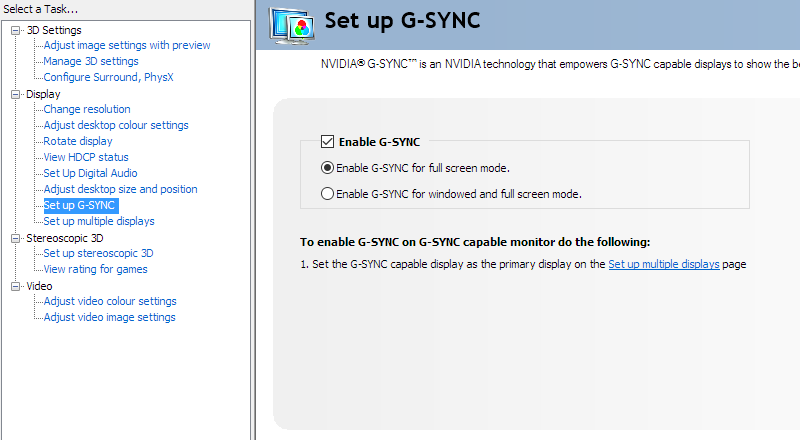
Enable G-SYNC
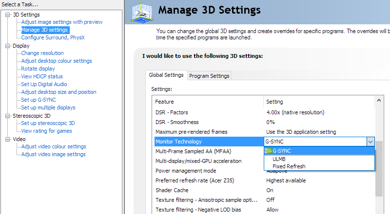
Set Monitor Technology to G-SYNC
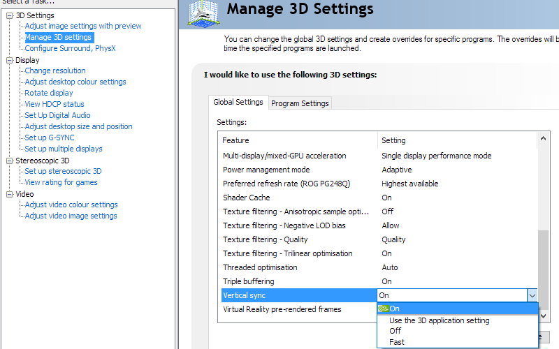
Set VSync according to preferences
G-SYNC – the experience
HDR (High Dynamic Range) and ‘Variable Backlight’


As you’ll note from our ‘Test Settings’, we left this option disabled for most of our testing. That’s because it’s good to get an idea of the contrast performance of the monitor when it operates as a normal monitor, with the whole backlight regulated as one unit. It allows more accurate ‘apples to apples’ comparisons to be drawn with other models. Some users might not find the feature ideal in a desktop environment, either, so it isn’t going to be an option every user will just want to set and forget. Fairly large areas of individual shade were handled with appropriate brightness and there was clearly an overall contrast advantage with the setting enabled. For more intricate mixtures of shade, though, there is a mixture of light and dark content covering a given dimming zone and it must essentially compromise for the overall makeup of the image in that region. Sometimes the brighter content, which may include text or lighter image content, was dragged down so it became a bit dimmer than we’d like due to the dimming zone also containing a good amount of dark content. For lighter text against a darker background, this could potentially affect readability. This wasn’t extreme and many users would likely find it acceptable, however. It occurred even with brightness raised to ‘100’ in the OSD, which brought in another issue of some lighter content being too bright for our tastes (uncomfortably for general desktop usage).

Colour gamut 'Test Settings'
Another aspect of the HDR10 pipeline is 10-bit colour reproduction. As we’ve noted earlier in the review, the monitor can use this when set as high as 98Hz, alongside a Full Range RGB signal, without any specific additional signal compression. At 120Hz a Full Range RGB signal can be used, but it’s limited to 8-bits per subpixel on the monitor. And at 144Hz a 10-bit signal is employed but it is used with a Limited Range YCbCr (4:2:2 reduced chroma) signal. This has obvious implications for slender text as seen on the desktop, but games are designed to look just fine with this signal. We were very surprised to see, though, that there were no noticeable differences in image quality when comparing the monitor running HDR at 98Hz, 120Hz or 144Hz (or indeed 60Hz). Even with the 120Hz 8-bit signal and focusing very carefully on fine gradients such as smoke, fog, areas of sky etc. we simply couldn’t see any difference. You have to remember that lots of ‘magic’ (highly technical term) happens both monitor and GPU side to make HDR work. Compression, decompression, conversions and suchlike. Even if the monitor isn’t using its complete 10-bit Full Range RGB signal, the GPU seems rather good at filling in the gaps. Add that to the fact developers want to make HDR content which looks good with a limited chroma signal, as that’s what many HDR-capable screens (i.e. TVs) will use anyway. Having said that, we did opt to stick to 120Hz and would recommend users do the same unless their GPU is pumping out frame rates comfortably exceeding that. 98Hz, if you’re more comfortable with that, is also a valid option if your frame rate stays in the double digits anyway. There was a slight performance drop of a few FPS when running things at 98Hz or 120Hz in HDR vs. SDR. But when you add in the chrome subsampling on top of the HDR processing done at 144Hz under HDR, the performance drop was more significant – we’d estimate ~10% if not higher in some cases.
The ‘4K’ UHD experience

The high pixel density delivers excellent detail and clarity to high resolution images, movies and games as well. When gaming, particularly on titles that use high resolution textures and special effects, there is a certain crispness and detail that is far beyond what models with significantly lower pixel density deliver. Staring at characters in the distance, for example, they often stand out against the environment in a fairly distinct way. Even when compared to a 27” 2560 x 1440 (WQHD) display this difference is pronounced, as explored in our previously linked article on the topic. There is also a reduced need for anti-aliasing and a certain clarity and definition to objects and edges that can be enjoyed even on older or less graphically refined titles. Although a bit of anti-aliasing and high-resolution textures certainly sweeten things up. The images below are just there to fire up your imagination and show the monitor in action, they in no way reflect what it looks like first-hand.


Interpolation and upscaling

Video review
Timestamps:
Features & Aesthetics
Contrast
Colour reproduction
HDR (High Dynamic Range)
Responsiveness
Conclusion
The bottom line; an outstanding all-round performer in both SDR and HDR – but it comes at a hefty price.
Positives Negatives Unmistakably vibrant and varied colour output, strong colour consistency and an excellent sRGB emulation mode
The two gamut settings are polar opposites, some sort of middle ground might have been nice Good static contrast with reduced ‘AHVA glow’, a very welcome ‘Variable Backlight’ feature and a very dynamic and engaging VESA DisplayHDR 1000 experience. The light matte anti-glare screen surface aided clarity and kept obvious graininess at bay A greater number of dimming zones (ideally per-pixel or close to) or VA panel type would help the monitor control intricate mixtures of light and dark better, including a lack of ‘halo’ effect for intricate mixtures of light and dark. A smoother and lighter matte screen surface would also have been welcome A fluid and responsive monitor at up to 144Hz with low input lag and very well-tuned pixel responsiveness. G-SYNC worked nicely across a broad range of refresh rates
Some users would prefer even lower input lag, 144Hz requires chroma subsampling which has an obvious effect on text clarity for desktop usage and affects HDR frame rate An excellent pixel density, delivering a very good amount of desktop real-estate and excellent clarity and detail to suitably high-resolution content A hefty price tag, material choices that don’t quite match that and some cooling fans which could annoy some users
As an Amazon Associate I earn from qualifying purchases made using the below link. Where possible, you’ll be redirected to your nearest store. Further information on supporting our work.
