Author: Adam Simmons
Date published: May 22nd 2018
Table of Contents
Introduction
For an immersive ‘4K’ UHD experience and comfortable reading without scaling, there’s a lot to be said for ‘the big screen’ experience offered by 40 – 43” screens. We’ve reviewed a number of 40 – 43” Philips models, each with fairly distinct features and equally pronounced strengths and weaknesses. The Philips 436M6VBPAB of the brand’s Momentum (M-Line) range offers this big-screen experience. It couples this is numerous attractive features for both PC and console gamers, including support extended colour spaces and a comprehensive level of HDR support. AMD FreeSync also features for use on compatible AMD GPUs and games consoles that support the variable refresh rate technology. It all looks very nice on paper, but that’s only ever part of the story. We put this monitor through its paces to see whether its real-world performance lives up to the hype.
Specifications
This monitor uses a 60Hz MVA (Multi-Domain Vertical Alignment) panel, with a resolution of 3840 x 2160 (‘4K’ UHD). 10-bit colour is supported via 8-bit + 2 bit FRC dithering (1.07 billion colours) and a Quantum Dot backlight is employed. A 4ms grey to grey response time is specified, which should as usual be paid little attention to. Some of the key ‘talking points’ of the specification have been highlighted in blue below, for your reading convenience.
62.69W typical
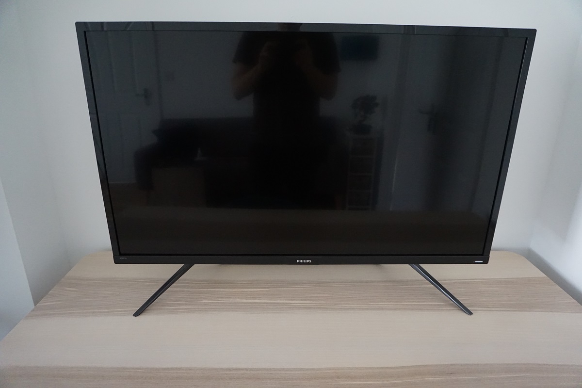
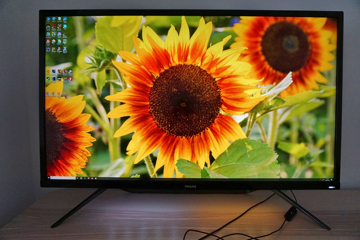
From the front the monitor looks distinctly TV-like rather than like a conventional monitor. This is standard for screens of this size and is something shared with previous 40 – 43” Philips models we’ve tested. The stand is metal, with a bar towards the rear and two additional feet facing diagonally forward, for additional stability. The bezels are glossy black plastic with a thickness of ~17mm (0.67 inches) at the sides, ~19mm (0.75 inches) at the top and ~24mm (0.94 inches) at the bottom. The bezel covers pretty much all of the panel border (i.e. this is a ‘single stage’ design), but there will be little slivers of panel border visible. The massive screen is really going to be the main focal point. A glossy screen surface is employed with very mild anti-glare treatment (2% haze), as explored later. The image below is a macro photograph taken on Notepad with ClearType disabled. The letters ‘PCM’ are typed out to help highlight any potential text rendering issues related to unusual subpixel structure, whilst the white space more clearly shows the actual subpixel layout alongside a rough indication of screen surface. A glossy screen surface is employed with an extremely mild (2% haze) anti-glare treatment. This cuts down on reflection somewhat compared to an untreated glossy surface, with reflections on the screen surface being of a softer and darker nature than they otherwise would be (refer to the image earlier in the review). It also prevents the loss of clarity and vibrancy that the use of a higher haze value (‘significantly more matte’) screen surface would provide. You need to be careful with your room lighting to minimise unwanted reflections, but with this appropriately controlled the rather direct emission of light and the perceived clarity and vibrancy benefits associated with that can be enjoyed. There is a very mild misty graininess due to the anti-glare treatment, but nothing obtrusive. Ambient light striking the screen surface gives the image a sort of ‘wet look’ with the image appearing very close to the outer layers of the screen surface. This essentially gives a slight red (to the left) and blue (to the right) fringe, which is present on text as well as symbols such as this. In practice the subpixels of this monitor are very small and the fringe in this example is only one subpixel thick – so it isn’t something everyone will notice and is quite subtle really. If text or the background is not a combination of pure black and white, the fringe can be multiple subpixels thick and involve various shades. You can see this in the example below, which is the ‘Monitor Reviews’ text from the header of our website. The Philips 436M6VBPAB includes various ‘SmartImageGame’ presets; ‘FPS’, ‘Racing’, ‘RTS’, ‘Gamer 1’, ‘Gamer 2’, ‘LowBlue Mode’, ‘Smart Uniformity’ and ‘Off’. As usual, we don’t really find most presets add anything positive to the experience. We will therefore be focusing on only some of these, but also a range of other settings that can be customised in the OSD. The table below includes general observations alongside key readings (white point and gamma) taken using a Datacolor Spyder5ELITE colorimeter. The monitor was left in its ‘Plug and Play’ state without additional drivers or ICC profiles specifically loaded, connected to a Windows 10 PC with an Nvidia GTX 1070. Additional testing (FreeSync) was performed using a Club3D Radeon R9 290 royalAce FreeSync-compatible GPU. The screen was left running for over 2 hours before readings were taken or observations made. Unless stated otherwise, assume default settings were used, including for ‘Contrast’. We made similar observations using our AMD GPU and also using HDMI 2.0 on our Nvidia GPU. When connecting our Nvidia GPU via HDMI, though, we had to correct the colour signal as the system defaulted to using a ‘Limited Range’ RGB signal. Furthermore, the HDR pipeline was restricted to 8-bits and the whole technology just didn’t seem to work as well via HDMI on our Nvidia GPU. Whether this is a bandwidth or other technological limitation, we’re not sure. Either way, our advice to Nvidia GPU users would simply be to use DP where possible to avoid having to play around with different driver settings and to ensure full HDR capability. When viewing the figures in this table, note that for most PC users ‘6500K’ for white point and ‘2.2’ for gamma are good targets to aim for. Out of the box the 436M6VBPAB produced a bright image that appeared vibrant in some ways, but lacking depth overall. This was easily correctable by adjusting the ‘Gamma’ setting – the factory defaults provided an average of ‘2.0’ despite the mode being called ‘2.2’. Unless the gamma is tightly calibrated, which it clearly isn’t in this case, it would be better to give these modes arbitrary numbers instead of misleading values. The ‘out of the box’ white point was more pleasing, as was the overall colour balance (including the green channel). Following a little tweaking, including using the ‘2.4’ gamma setting, gamma also matched our targets more closely as shown below. The monitor also included a range of Low Blue Light (LBL) settings. There were 4 different ‘Low Blue Mode’ settings of varying effectiveness and an alternative ‘Color Temperature = 5000K’ setting. Especially when combined with reduced brightness, setting ‘Low Blue Mode’ to ‘4’ was the most effective. Although the ‘5000K’ setting was a decent alternative as well. We made use of ‘Low Blue Mode = 4’ for our own viewing comfort in the evenings, but not when we were actively testing anything on the monitor. It is important to reduce blue light exposure in the hours leading up to sleep, as it affects sleep hormones and keeps your body alert when it should be winding down. We mention this because we care about your well-being and it’s nice that Philips includes some easily accessible and effective LBL settings on this model. Note that the sharpness may increase from the default of ‘50’ to ‘70’ using some of these settings – so return this to ‘50’ if you prefer a more neutral sharpness. Our ‘Test Settings’ involved a significant reduction in brightness and switching the ‘Gamma’ setting to ‘2.4’. There was no need to manually adjust colour channels on our unit. Anything not mentioned here was left at default in the OSD, including ‘Contrast’. We’ve also included the ‘SmartResponse’ setting used, just for reference, even though this was left at default. Note that these settings only apply to SDR testing, which is the bulk of our review. HDR has separate settings associated with it – we explore HDR separately in the designated section. Brightness= 16 (according to preferences and lighting) Gamma= 2.4 SmartResponse= Off We used a BasICColor SQUID 3 (X-Rite i1Display Pro) to measure white and black luminance levels, from which static contrast ratios could be calculated. The table below shows this data with a range of settings used, including those covered in the calibration section and a few extras. Assume any setting not mentioned was left at default, except for the changes already mentioned in the calibration section. Black highlights indicate the highest white luminance, lowest black luminance and maximum contrast ratio recorded. Blue highlights show the results with HDR active and also under our ‘Test Settings’. The average contrast ratio with only brightness adjusted was 4243:1, which is strong. This provided quite an inky look to text and deep shades, with perceived contrast further enhanced by the glossy screen surface. With the colour channels all at their neutral position of ‘100’, using ‘Color Temperature = User Define’, we recorded a peak static contrast of 4900:1. Under our ‘Test Settings’ contrast remained strong at 4150:1. Interestingly, the ‘Low Blue Mode’ settings provided contrast that slightly exceeded the factory default levels and came quite close to the peak recorded (generally around 4600 – 4800:1). The highest white luminance recorded with the monitor displaying SDR content was an impressively bright 784 cd/m², whilst the minimum was a fairly (but not very) dim 93 cd/m². This gave a luminance adjustment range of 691 cd/m², which is exceptional – although some sensitive users might like to have a lower luminance than 93 cd/m² without having to sacrifice contrast. The monitor also has a ‘SmartContrast’ Dynamic Contrast setting, which allows the backlight brightness to adjust (as a single unit) according to the levels of light and dark on the screen. Even when predominantly dark content was displayed, the brightness was obnoxiously high – we never find Dynamic Contrast settings particularly attractive, but this one certainly isn’t. Things get more interesting when the monitor is running in HDR. The backlight of the monitor is split into 32 independently controllable dimming zones when HDR content is being displayed. There are three different modes for HDR on this monitor; ‘Normal’, ‘VESA HDR 1000’ and ‘UHDA’. The second and third mode gave a fair boost in contrast, to 7507:1 and 7100:1, respectively. This was primarily due to the brightness being boosted to an impressive 1126 cd/m² (‘VESA HDR 1000’) or 1065 cd/m² (‘UHDA’). The black point was less impressive at 0.15 cd/m² – that’s similar to when the monitor runs at >80% brightness under SDR. The white square is so bright that it creates a significant halo of brightness around it, flooding some of the surrounding darkness. Even though the black point reading was taken around 18 – 19cm (7 – 8 inches) from the closest edge of the white square, the glow from the white square penetrated through in that region. Although not documented in the table, a similar thing happened with the smallest test patch size (‘1% of all pixels’). The ‘Normal’ HDR setting was more impressive in many respects. The brightness was more constrained but still very bright at 533 cd/m². This created a much more limited halo effect which didn’t affect the black point reading anywhere near as much, something that was also clear to the eye. We measured a much more pleasing black point of 0.03 cd/m² (similar to the monitor running SDR at ~10% brightness), yielding an impressive contrast ratio of 17767:1. The 436M6VBPAB does not use PWM (Pulse Width Modulation) to regulate backlight brightness at any level and instead uses DC (Direct Current). However; low amplitude and high frequency oscillation is present at a frequency of >1kHz. This was detectable using an oscilloscope. Unlike PWM, this does not involve the backlight switching ‘on’ and ‘off’ or exhibiting significant brightness changes. Rather, it means there are slight fluctuations in brightness, at a recordable frequency, rather than there being a constant and smooth oscilloscope trace. Due to the high frequency and low amplitude of these oscillations, it’s unlikely to be bothersome to most users even if they find traditional PWM bothersome. The monitor is therefore considered ‘flicker-free’, which will come as welcome news to those sensitive to flickering or worried about side-effects from PWM usage. Whilst observing a black screen in a dark room, using our ‘Test Settings’, we observed no obvious backlight bleed, with just a little clouding towards the bottom of the screen. Note that individual units vary when it comes to such things, but VA models such as this are the best light blockers and tend to be relatively strong in this area. The below image was taken from a few metres back to eliminate so-called ‘VA glow’. This is a silverish-purple glow that appears towards the edges of the screen and in particular the bottom corners, from a normal viewing position. It blooms out more noticeable ‘off-angle’ as demonstrated in the viewing angles video later on. As explored, it’s not a major issue on this model and is less obtrusive than on some VA models we’ve used. Under our ‘Test Settings’, the luminance uniformity was moderate to poor overall. The brightest point recorded was ‘quadrant 8’ below the centre of the screen (178.7 cd/m²). The maximum deviation occurred at ‘quadrant 2’, towards the top right (134.0 cd/m², which is 25% dimmer). The average uniformity deviation between each quadrant and the brightest point was 15.5%. Using the ‘SmartUniformity’ made very little difference to the overall uniformity. The brightest point recorded was again ‘quadrant 8’ below the centre of the screen (684.1 cd/m²). The maximum deviation from this again occurred at ‘quadrant 2’ (508.9 cd/m², which is 26% dimmer). The average uniformity deviation between the quadrants was actually slightly increased, at 16.38%. Note that uniformity varies between individual units and you can also expect variation beyond the points measured. Also note that we tested the ‘SmartUniformity’ mode with all other settings as per our ‘Test Settings’ and this did not yield any significant improvements or worsen anything. The contour maps below show these deviations graphically, with darker greys representing lower luminance and hence greater deviation from the brightest recorded point than lighter greys. Percentage deviations between each quadrant and the brightest point are also given. The top map shows results under our ‘Test Settings’ whilst the bottom shows results with ‘SmartUniformity’ enabled. The Spyder5ELITE was also used to analyse variation in the colour temperature (white point) for the same 9 quadrants. The deviation between each quadrant and the 6500K (D65) daylight white point target was analysed and a DeltaE value assigned. A DeltaE >3 represents significant deviation that most users would readily notice by eye. The top map shows the results using our ‘Test Settings’ and the bottom map with ‘SmartUniformity’ enabled. Using our ‘Test Settings’ the colour temperature uniformity was mostly good. There was borderline significant deviation (DeltaE 3.0) at the top central region and significant deviation towards the bottom right (DeltaE 3.3). But no extreme values by any means. With ‘SmartUniformity’ enabled, the colour temperature uniformity actually worsened. The deviation in the top central region increased to DeltaE 4.7 and towards the bottom right to DeltaE 5.2. Significant deviation was also recorded just above that (DeltaE 3.7). Again, remember that individual units vary when it comes to uniformity and the deviation beyond measured points can be expected. Also note that there are some perceived deviations in both brightness and colour temperature that are typical on VA panels and aren’t accounted for in these readings. Hopefully some units come with a better calibrated (and actually useful) ‘SmartUniformity’ setting as well. On Battlefield 1 (BF1) the contrast performance was excellent, with strong distinction between light and dark shades. The strong static contrast gave dark shades quite a deep and inky look, with perceived contrast further enhanced the glossy screen surface, in a lit room. Lighter shades such as flashes of yellow and orange from gunfire contrasted very nicely with the darker surroundings and had quite a smooth appearance free from obvious graininess. There was a very light dusting of ‘grain’ from the very mild anti-glare surface, but we found this completely unobtrusive and not noticeable for the most part. There was no troublesome ‘glow’ to speak of, just a touch of ‘VA glow’ that gave a little lightening of dark shades towards the corners and side edges of the screen. This was more constrained than we’ve seen on some much smaller VA models and was not noticeable at all in most lighting. There was a fair degree of ‘black crush’, which masked some detail in darker areas. This is related to the perceived gamma of VA models when observing dark shades. If you’re sitting down in front of the screen and observing content in the vast central area, you’ll notice many dark shades appear even darker than they should such that they readily blend into a dark mass. Observe the same shades near the edges of the screen or from an obscure angle and they will appear much lighter, revealing much more detail (some of which is not intended to be seen so clearly, but some of which is). We didn’t feel this was severe enough to either upset the atmosphere in dark scenes or give a significant competitive disadvantage (i.e. making enemies far too difficult to spot in dark areas). And if you do like to play competitively, you might consider using a lower ‘Gamma’ setting on the monitor to reveal extra detail in dark areas. Dirt Rally also gave an excellent contrast experience overall, with the night maps appearing impressively deep and ‘night-like’. Vegetation leaf structures, cracks in rocks and other such detailing was well-defined whilst bright elements stood out nicely in a crisp and ‘clean’ way. There was a little VA glow, but nothing bothersome, and a fair degree of black crush. This masked some more subtle detail in dark areas, such as car tread patterns and creases on car interior leather. These details were not as distinct as they should be, unless you viewed ‘off-angle’ or they were observed when close to the edge of the screen. The overall atmosphere was very good on this title. This was reflected in the Blu-ray of Star Wars: The Force Awakens. The depth to dark shades and excellent ‘pop’ of bright shades gave this film exactly the sort of cinematic look it craved. Light sabers lighting up deep and dark rooms, for example. Or unfortunate blasts of brilliant fire ripping said rooms apart. The Lagom tests for contrast allow specific weaknesses in contrast performance to be identified. The following observations were made. The Philips 436M6VBPAB’s colour gamut (red triangle) was compared with the sRGB (green triangle) and Adobe RGB (purple triangle) reference spaces, as shown below. This was under our ‘Test Settings’ and demonstrates the full native gamut of the monitor. You can see that the colour gamut is wide and extends far beyond sRGB, as provided by the Quantum Dot backlight solution used here. It also offers comfortable extension beyond Adobe RGB in some regions – note that Adobe RGB and sRGB overlap in the red and blue corners of this representation. There is a fair bit of under-coverage of Adobe RGB in the green and blue regions of the diagram (93% Adobe RGB). The target gamut for this model is actually DCI-P3, with Philips specifying 97.6% DCI-P3 coverage. This isn’t shown for comparison in the diagram (the colorimeter software doesn’t support this comparison) but this certainly looks close to DCI-P3 from what we can see. Note that the Spyder5 tends to under-report slightly in the blue corner of this diagram as well, for gamuts this wide. This is useful for HDR content (explored shortly) and allows the monitor to output all shades within sRGB with extra vibrancy and saturation. On Battlefield 1 (BF1) the monitor provided a lively but not gaudy palette of shades. There were flashes of excellent vibrancy, such as licks of deep yellow and orange flames and some impressively lush-looking greens. The glossy screen surface and generous colour gamut really helped give the image an impressive ‘pop’, with a ‘painted on’ (wet and close to the surface) look in most ambient lighting. The generous colour gamut did provide an excess of saturation in places. Skin tones appeared with too much of a red hue, as did golden-brown dessert sands in the desert. Some green vegetation appeared more deep and luscious than it should. But there was not a gaudy or ‘cartoonish’ look as models with an Adobe RGB gamut display, which is skewed to the extreme in the green region, much less so elsewhere on the gamut diagram. Nor did it simply look garish with crushed shade variety, as occurs if you simply digitally enhance saturation (Nvidia Digital Vibrance or another saturation slider). Rather than shades being squashed up near the edge of the gamut, the gamut itself is vast and shades are well spaced out within it. Although saturation is stronger than it should be in places, an appropriate variety of shades is maintained – so shades that should be more muted are more muted, in comparison to the more saturated shades. Dirt Rally provided a similar experience. There was plenty of vibrant ‘pop’, with car liveries showcasing an eye-caching array of colours with the sort of ‘painted on’ look they crave. They are, after all, painted onto the cars. There were some superb electric pinks, bright oranges and brilliant deep blues to name but a few shades. The racing environments looked vivid but still believable, as although more saturated overall than intended, balance and variety was maintained. There were some exceptionally lush forest greens mixed in with some more muted shades. Earthy browns tended towards red in places, but thankfully fell short of looking like a Martian landscape. There was a real richness to the environments that simply isn’t captured on models with ~sRGB colour gamuts, as there are just too many shades in nature that are beyond the boundaries of sRGB. In an ideal world everything would be mapped more accurately to the large gamut (as it is under HDR, which we explore shortly). But we feel many users would enjoy the presentation of shades on the Philips. On both BF1 and Dirt Rally (as with any other content being displayed), the VA characteristics were also apparent. There was a moderate amount of saturation lost towards the edges and bottom of the screen due to perceived gamma changes. Even in regions where saturation was lower, though, the image did not appear washed out and there was plenty of depth. To give an example, some of the richer red-tinted earth lost a bit of its red tint but still appeared a rich brown – probably closer to the intended shade, if anything. We also tested the Blu-ray of Futurama: Into the Wild Green Yonder. This is a particularly good and unforgiving test when it comes to colour consistency, as there are large patches of individual shade visible. This did indeed highlight that sort of saturation losses towards the side edges and bottom of the screen that we’d observed elsewhere in our testing. Dr Zoidberg, the red lobster-like creature, appeared a rather striking red centrally and a somewhat more muted shade further out. Even this more muted shade was fairly vibrant, though, and he was clearly identifiable as the infamous Dr Zoidberg regardless of his on-screen position. These shifts in saturation meant that subtle variations of shade, such as character skin tones, were lost to a degree. There was ‘shade overlap’ where shades lost their identity. But we feel this is of minor important on this title compared to the excellent representation of the deeper and neon shades. These were truly attention-grabbing, especially as bright neon colours (such as green and purple) were often found against a very dark background. And the strong contrast performance came into play as well as the generous colour gamut and glossy screen surface. Pastel shades did appear far more muted than these sorts of shades, too, even if they didn’t appear quite as muted as they should. Lagom’s tests for viewing angle tests help explore the idea of colour consistency and viewing angle performance. The following observations were made from a normal viewing position, eyes 70 – 80cm from the screen. On some monitors faint interlace patterns can be seen during certain transitions, particularly noticeable where light shades (muzzle flashes, explosions etc.) briefly pop up on the screen. These are sometimes referred to as ‘inversions artifacts’. Alternatively, static interlace patterns can be seen with some shades appearing as faint horizontal bands of a slightly lighter and slightly darker version of the intended shade. We did not observe any such patterns, either dynamic or static, on this model. Be aware of the separate issues raised earlier in relation to subpixel illumination, however. A small utility called SMTT 2.0 was used alongside a sensitive camera to analyse the latency of the 436M6VBPAB, with over 30 repeat readings taken to help maximise accuracy. Using this method, we calculated 6.09ms (a bit over 1/3rd of a frame at 60Hz) of input lag. This was the case on both our Nvidia and AMD GPU, via DP. Note that the ‘Low Input Lag’ setting is greyed out when DisplayPort is used to connect up the monitor, but we briefly tested via HDMI with this set to ‘On’ and input lag was similar to what we recorded above using DP. We didn’t observe any degradation in image quality or other issues with ‘Low Input Lag’ enabled vs. disabled. Note that we have no way to accurately measure input lag in the variable refresh rate and frame range environment under which FreeSync would be active. It isn’t possible for us to accurately measure the input lag in an HDR environment, either, but the HDR setting selected in the OSD didn’t seem to affect things under SDR usage. Note that the input lag measured here is influenced by both the element you ‘see’ (pixel responsiveness) and the element you ‘feel’ (signal delay). It indicates quite a low signal delay, which shouldn’t bother most users even if they’re sensitive to input lag. In our article on responsiveness, we explore the key concepts related to monitor responsiveness. Chief amongst these is ‘perceived blur’, contributed to by the pixel responsiveness of the monitor but (generally more significantly) eye movement as you track motion on the screen. We discuss a photography method called ‘pursuit photography’, which uses a moving rather than static camera to capture snapshots of motion on a monitor in a way that reflects both of these key elements of perceived blur. The images below are pursuit photographs taken using the UFO Motion Test for ghosting, with the test running at 960 pixels per second. This is a good practical speed for capturing such photographs, highlighting the elements of perceived blur nicely. The UFOs move across the screen from left to right at a frame rate matching the refresh rate of the display. All background shade levels (dark, medium and light) were used with the monitor set to all its ‘SmartResponse’ pixel overdrive settings; ‘Off’, ‘Fast’, ‘Faster’ and ‘Fastest’. The final column includes some reference shots taken on two monitors, using the optimal pixel response time setting and 60Hz on each. There is a Dell S2417DG (medium cyan background), which uses a fast TN panel with very snappy pixel responses and shows how things look where pixel responsiveness isn’t really a limiting factor. And then there is a Samsung C34F791 (dark cyan background), which is one of the faster VA models out there for 60Hz and is a good benchmark to compare with. Note that we will not be including a section on overclocking, as the monitor skipped frames when set much above 60Hz at its native resolution or indeed lower resolutions such as Full HD. On Battlefield 1 (BF1) there was a moderate degree of blur, caused predominantly by eye movement and linked to the 60Hz refresh rate. As with any VA model, there were some weaknesses in pixel responsiveness. Most of the pixel transitions were performed fast enough for optimal performance at 60Hz or introduced some light ‘powdery’ trailing on top. Nothing eye-catching and by far the more minor constituent of the perceived blur being observed. VA panels always struggle, to varying degrees, with pixel transitions involving dark shades. Such transitions are prevalent at night but also for dark/shaded areas during the daytime on this title. Usually there will be a pronounced ‘smeary’ trailing or what we dub ‘break-up’ trailing. The ‘smeary’ trailing is a more extended version of the trailing you’d usually see, running far back behind the object and sometimes appearing like a fine powder or in the worse cases like smoke. ‘Break-up’ trailing is where some shades contained within the very dark areas (like purples and reddish-browns) that aren’t readily visible when the scene is static leach out as if you’re wetting fountain pen ink on a page. This can be quite colourful and eye-catching and is generally ‘smeary’ in its appearance. As with our ‘Test UFO’ testing earlier, it was clear that this model employs very effective pixel overdrive and seems rather unlike your usual VA panel. We did not observe any obvious ‘smeary’ trailing nor any obvious ‘break-up’ trailing, even during transitions we know usually highlight such weaknesses. In their place during these transitions, however, there was a degree of overshoot. Not an extreme amount, by any means, but some – as the monitor was having to use strong levels of acceleration to speed up those natively sluggish transitions. Sometimes you could see a slight purple or green ‘glow’, a bit like ‘break-up’ trailing but more compact and somewhat brighter. There was also some bright ‘halo’ trailing in places. We did not find this overshoot to be extreme or particularly eye-catching and feel that users would generally find it more tolerable than the ‘smeary’ trailing that might replace it. Individual sensitivity to this varies. The overall level of perceived blur was kept at levels which were largely in line with the best 60Hz performers, so users who usually feel motion sickness from VA models may be fine with this one. The section of the video review below highlights these weaknesses. Our observations on Dirt Rally were similar. The monitor was again rather unlike your typical VA model, performing its pixel transitions quite rapidly. There was a bit of trailing in places that slightly increased perceived blur, but nothing extreme. Where dark shades were involved, and your typical VA model would typically provide more obvious and sometimes colourful ‘smeary’ trailing, this model instead gave some overshoot. When driving at night, for example, you could see a slight glowing fringe around dark hilltops as you moved past them, with night sky in the background. We didn’t find this particularly eye-catching when we were just concentrating on playing the game and found it less obtrusive than the usual ‘break-up’ trailing you’d typically see in such scenarios. Note that individual sensitivity to this sort of thing varies. Whilst not perfect in its pixel response performance, we’d say that most users would find this to be a very capable 60Hz monitor for gaming on both the PC and console. Without the sort of stand-out weaknesses you’d expect from a VA model. To round off, we also tested our Blu-ray test titles. We did not observe any clear weaknesses here attributable to pixel responsiveness on the monitor. These titles run at around 24fps, which greatly limits their fluidity and the pixel responsiveness requirements for optimal performance. Note that higher frame rate movie content (e.g. 60fps) exposes similar weaknesses to our game testing. Again, nothing that really stood out in an obvious and obtrusive way in our opinion. AMD FreeSync is a variable refresh rate technology, an AMD-specific alternative to Nvidia G-SYNC. The monitor dynamically adjusts its refresh rate so that it matches the frame rate being outputted by the GPU, where possible. Both our responsiveness article and the G-SYNC article linked to explore the importance of these two elements being synchronised. At a basic level, a mismatch between the frame rate and refresh rate can cause stuttering (VSync on) or tearing and juddering (VSync off). FreeSync also boasts reduced latency compared to running with VSync enabled, in the variable frame rate environment in which it operates. FreeSync requires a compatible AMD GPU such as the Club3D Radeon R9 290 royalAce used in our test system. There is a list of GPUs which support the technology here, with the expectation that future AMD GPUs will support the feature too. The monitor itself must support ‘VESA Adaptive-Sync’ for at least one of its display connectors, as this is the protocol that FreeSync uses. The 436M6VBPAB supports FreeSync via DP 1.4 and HDMI 2.0 on compatible GPUs and systems. If fully installed, AMD drivers feature Radeon Settings, which makes activation of the technology very simple and something that usually occurs automatically. To make sure the GPU driver is setup correctly to use FreeSync, open ‘AMD Radeon Settings’ and click on ‘Display’. You should then ensure that the first slider, ‘AMD FreeSync’, is set to ‘On’. If you hover over this, it will also report the variable refresh rate display supported by the display. Note that the image below is for a different monitor and is just used as an example here. VSync is configured in the ‘Gaming’ section of ‘Radeon Settings’, where it is referred to as ‘Wait for Vertical Refresh’. You can either configure this globally under ‘Global Settings’ or for each game individually. The default is ‘Off, unless application specifies’ which means that VSync will only be active if you enable it within the game itself, if there is such an option. Such an option does usually exist – it may be called ‘sync every frame’ or something along those lines rather than simply ‘VSync’. Most users will probably wish to enable VSync when using FreeSync to ensure that they don’t get any tearing. You’d therefore select either the third or fourth option in the list, shown in the image below. The fourth and final option, ‘Enhanced Sync’, is a relatively new addition to the driver. This is an alternative to VSync which allows the frame rate to rise above the refresh rate (no VSync latency penalty) whilst potentially keeping the experience free from tearing or juddering. This requires that the frame rate comfortably exceeds the refresh rate, not just peaks slightly above it. We won’t be going into this in detail as it’s a GPU feature than a monitor feature. We tested a range of games on this monitor with FreeSync active and found the experience much the same on all of these, as you might expect. We’ll therefore be focusing simply on one title; Battlefield 1 (BF1). Even with graphics settings set quite low, it was common to observe some dips in frame rate below 60fps on this title using our Radeon R9 290. With FreeSync disabled, even with the frame rate falling just slightly so it remains in the high 50fps region, we noticed jarring stuttering (VSync on) or tearing and juddering (VSync off). Individual sensitivity to such things varies, but we find these sorts of things very obvious at these sorts of frame rate. With FreeSync enabled, things flowed much better and these slight dips were pretty much unnoticeable. As the frame rate dropped a bit more, closer to 50fps, we noticed extra perceived blur and a worse ‘connected feel’ compared to 60fps. This wasn’t a massive difference, though, and we still found FreeSync greatly beneficial in such scenarios. With the FreeSync range being so limited, there wasn’t really scope much beyond that. Especially if we increased the detail settings a little, we’d commonly see dips below the 48fps (48Hz) floor of operation for FreeSync on this monitor. And things would return to their usual stuttery or tearing self. It would certainly have been nice to have seen a more generous FreeSync range on this monitor, although the technology still wouldn’t be able to account for lower frame rates being lower frame rates. And the significant drop off in ‘connected feel’ and increased perceived blur associated with the drop. With the restrictive FreeSync window and inevitability of drops below that came with any real increase in detail settings, we were generally happier gaming at this resolution on our more powerful Nvidia GPU. And just adjusting the graphics settings so that 60fps was more or less constant. Again, individual sensitivity to tearing, stuttering and decreased frame rate varies. It’s also worth saying that a broader FreeSync window and LFC being supported can be nice for movie content as well. For example, 30fps or even 24fps content can run at the correct frame rate or a multiple of it if a FreeSync monitor supports LFC. This reduces juddering, which some users appreciate, even if the fluidity remains limited by the low frame rate. On a monitor, HDR (High Dynamic Range) requires the simultaneous display of very deep dark shades and very bright light shades. It is also necessary for a display to be able to display a large variety of shades in between, from weakly saturated to very heavily saturated shades. Ideally, the monitor would be able to control the illumination of each pixel individually OLED technology, for example). This would allow the most intricate mixtures of bright and dark to be displayed with exceptional contrast. Failing that, the use of many dimming zones (ideally hundreds, if not more) on the backlight is desirable – something referred to as FALD (Full Array Local Dimming). This does not allow the same precision and intricate contrast presentation as per-pixel illumination, but gives greater control over illumination than where fewer or zero dimming zones are used. For colour reproduction, it is desirable for a monitor to offer a gamut of >90% DCI-P3 (a Digital Cinema Initiatives standard colour space). This is the near-term target, with the ultimate goal of complete coverage of an even wider colour gamut; Rec. 2020. Finally, it is desirable if the display offers (at least) 10-bits per channel for colour processing, giving the precision required to appropriately map shades for HDR content. For most games and other full screen applications that support HDR, the Philips 436M6VBPAB will automatically switch into its HDR mode when the appropriate setting is selected in the game or application itself. Provided that you have one of the ‘HDR’ modes selected in the ‘Picture’ section of the OSD; ‘Normal’, ‘VESA HDR 1000’ or ‘UHDA’. As usual for a monitor, it is specifically the ‘HDR10’ pipeline that is supported. With the Windows 10 ‘Creator’s update’, Microsoft added a feature called ‘HDR and advanced colour’. This is referred to as ‘HDR and WCG’ (meaning Wide Colour Gamut) in some versions of Windows 10. There are some game titles will only run in HDR once this setting is activated in Windows. And if you wish to view HDR movies in a compatible web browser, for example, you would need to activate this setting as well. It will make the desktop itself look flooded and washed out so should only really be activated when it’s specifically needed. You can find this setting in ‘Display settings’ (right click on the desktop) as shown in the image below. We’ve used a fairly broad range of monitors touting varying degrees of HDR capability – and some have clearly been better than others. On paper some ticks many boxes, some tick relatively few boxes and some barely support it at all. And use HDR as a mere marketing buzzword. We’ve also used a range of titles to test these monitors and some HDR implementations vary from title to title, with some being better than others. We tested a range of HDR titles on this monitor, but as usual found that Battlefield 1 (BF1) and Hitman offer a good HDR experience that really puts the onus on the monitor itself to perform well. They’re also titles we’ve used on many monitors in both HDR and SDR, giving us a good point of reference. We will therefore be focusing on these two PC titles for our observations in this section. You can also expect a similar experience when watching HDR movie content via DP – indeed we checked out some HDR movies and this was the case. As mentioned earlier, we used an Nvidia GTX 1070 for this section connected via DP. HDR on this monitor is not tied to any particular GPU vendor, the only requirement is that the GPU supports HDR. However; HDR did not look as it should via HDMI on this monitor when we tested on our Nvidia GPU. Things appeared completely flooded and washed out, with poor contrast and gamma issues. We’ve received confirmation from users of HDR-capable games consoles (refer to this post, for example) that things look equally poor for HDR content via HDMI on those systems. However; feedback from more recent units seems to suggest that HDR works properly via HDMI on both PCs and consoles, so the issue may have been addressed by Philips. The Philips ticks a lot of boxes for HDR and is the first monitor to receive VESA DisplayHDR 1000 certification. It is also UHDA (Ultra High Definition Alliance) certified – which covers two of the HDR modes that the monitor has in its OSD. One aspect that’s important for a compelling HDR performance is colour gamut, which as we’ve mentioned previously should be at least 90% DCI-P3 in the near term. The Philips has an impressive specified DCI-P3 coverage of 97.6% which comfortably exceeds the 90% desired minimum. As per our measurements earlier on in the review we can confirm that this sort of colour gamut is readily achieved by the monitor. Because game developers currently have DCI-P3 in mind when creating HDR content rather than sRGB, you’ll notice some shades appearing somewhat less saturated under HDR than SDR. That is fully intended and is because the shades are being mapped more accurately to the wider colour gamut rather than simply being stretched far beyond their intended sRGB coordinates. In Hitman, for example, we found some of the (slightly too) vibrant greens were muted just a bit. But still lush and lifelike in their appearance. Skin tones also appeared more neutral, with the red hue toned down a bit. On BF1 we noticed a toning down of various green and brown tones as well – things looked more natural but still appropriately vivid. There were some bursts of impressive vibrancy in both titles, too, for example the reds, yellows and oranges of flames and fireworks lighting up the night sky. This was the case regardless of the HDR mode selected in the OSD. It is up to the game developers how vibrant they want shades to appear, and with the DCI-P3 gamut they have a larger gamut to play around with than for their constrained sRGB SDR content. The gamut of the monitor under our ‘Test Settings’ is shown below (red triangle). The sRGB colour space is shown as a green triangle and Adobe RGB colour space as a purple triangle – unfortunately our software doesn’t map the DCI-P3 gamut for comparison. But it would be close to the monitor’s gamut in this representation. Another important area of HDR is contrast. The ideal HDR display can simultaneously display very brilliant bright shades and very deep dark shades, with strong distinctions in between. This requires per-pixel illumination, ideally, or failing that a good number of dimming zones for the backlight. This monitor has its backlight split into 32 independently controllable dimming zones. You can see the advantage of this vs. having the backlight dim as one by referring to the contrast section. In our contrast testing, the monitor was able to have the backlight zones covering the central region very bright for the central square. Whilst having the remaining zones much dimmer, for the black background. This significantly enhanced the contrast. If you look carefully at our test methodology, the values we recorded and the VESA DisplayHDR 1000 criteria, you’ll note that the monitor should provide 0.05 cd/m² for the black point in the corner of the screen whilst it is outputting its maximum luminance (of at least 1000 cd/m²) centrally. We used a more stringent measurement from the area to the right of the bright central patch. Because the central luminance was so extreme, this area was affected by a ‘halo’ of light that brought up the black level to 0.15 cd/m² where we measured. 3 times as high as the 0.05 cd/m² corner measurement demanded. We measured 0.03 cd/m² in the same spot if the ‘Normal’ HDR setting was used instead, which limits the brightness of the bright central test patch to (a still very bright) 521 cd/m². Measuring in this way is a bit more representative of what you can expect in the ‘real world’, we feel. Although it is still just a measurement of ‘white’ and then some distance away ‘black’, so it clearly doesn’t tell the whole story. And indeed, this was reflected and some gaps filled with our gaming experiences. On both BF1 and Hitman (and various undocumented additional testing), if the monitor was set to either ‘VESA HDR 1000’ or ‘UHDA’ the monitor provided exceptional luminance for bright shades. Observing bright muzzle flashes, sparks, flames, fireworks and the moon in the sky provided a brilliance that simply isn’t provided under SDR. We found this marginally uncomfortable in a dark room, although not worryingly so – and just fine in a properly lit environment. The darker shades surrounding these elements didn’t really have the depth we’d like. They didn’t look completely flooded, which is down in large part to the strong native contrast performance of the VA panel. But the black point was clearly raised beyond what is ideal, so there was a distinct lack of depth. We found setting the HDR setting to ‘Normal’ was preferable. This maintained a pleasing depth to dark areas and still had brilliant bursts of brightness – in other words, delivering the sort of experience you should expect from HDR. Although the bright shades had obvious brilliance, they did not cause obtrusive ‘halos’ that leached out far across the screen and affected black depth in areas of the image covered by (potentially distant) neighbouring dimming zones. The lack of pronounced ‘halo effect’ in general was rather impressive in this more constrained HDR setting, and better in many respects than the 384 dimming zone IPS implementations we’ve used. With their inferior light blocking capabilities, even with many more dimming zones, IPS-type models struggle to convincingly mix together very bright and dark shades (see ASUS PA32UC HDR section). With the Philips, there’s less of a disconnect between ‘bright’ and ‘dark’ elements, with mixed but predominantly dark content having good depth and structural detail even if it is quite close to significantly brighter shades. The higher native contrast, superior light blocking capabilities and excellent strong black depth really come into their own, even though a mere 32 dimming zones were used rather than 384. Furthermore, there is no danger of ‘IPS glow’ creeping in if bright and dark shades intertwine near the periphery of the screen. So; the mixture of ‘light’ and ‘dark’ was impressive overall – especially if your character was standing in a dimly lit environment looking out at a bright light source. For example, standing in an unlit building at night peering at a bright candle on a table outside. But it is also important to consider shades between those extremes and more intricate mixtures of light and dark shades. The image above is an example of a scene that highlights the advantages of HDR on the monitor nicely, beyond just extreme light and dark. The image is only used as an illustration and in no way shows how things looked when viewing the content first-hand on the monitor – that is, after all, clearly impossible. The backlight control helped make the moon appear very impressive and eye-catching – and the same for the glint from the moon on the weapon. This had a life-like quality to it that really did add to the immersion in this scene. The dark shadowy rocks appeared relatively deep. But the precision under HDR allowed some much clearer distinctions to be visible. The moon was not just a single bright object (as it appears in the image) but had a structure to it with many different white, off-white and bluish grey shades. Likewise, the rocks did not just appear ‘dark and shadowy’ with very limited detail as they do under SDR. They had more distinctive structures. Again, the backlight control at appropriate levels is important to bring these details out without things looking ‘flat’. But the monitor is also able to map things with excellent precision under HDR, as HDR10 makes appropriate use of its 10-bits per subpixel capability. We also found medium shades were represented better than we’ve seen on some HDR models, as daytime maps appeared nice and bright in an appropriate way. Rather than appearing either flooded/washed out or overly dim. It’s fair to say that the HDR experience was the most impressive we’ve come across on a monitor, at least using the ‘Normal’ HDR setting. It would have been nice if the dark areas could have been maintained in a deep and atmospheric way using the ‘VESA HDR 1000’ and ‘UHDA’ modes (which, by the way, appeared largely similar in how they represented things). That would’ve added extra contrast and extra ‘wow’ to the bright elements – although we still felt they stood out nicely in the more constrained setting. It would also have been nice to have many more dimming zones, or ideally per-pixel illumination. This would allow more intricate mixtures of bright and dark shade to be displayed in a more appropriate and lifelike way. Coming back to the image above, for example, there are some very dark shades on the gun and some shadowy rocky areas that could’ve done with extra depth. That would really have made the bright elements stand out with great ‘pop’ and add definition and structure to these elements. It could help add even more intensity to the already good ‘dark atmosphere’ for dark scenes, especially for viewers who like to experience HDR in a dark room. But as a reviewer, it would be surprising if we came across a “perfect HDR” solution this early on in the timeline of HDR displays. And perhaps a bit boring – we need something to look forward to! We’ve explored the 3840 x 2160 ‘4K’ UHD resolution on screens of various sizes, including ~27” screens in our dedicated article on the topic. We find this distinct ‘UHD look’ to the image, in terms of detail and clarity, is largely preserved on ~32” UHD screens with a pixel density of ~139.87 PPI (Pixels Per Inch). With its 42.51” UHD screen, the 436M6VBPAB has a pixel density of 103.64 PPI. This is significantly lower, but still decent – not far off the pixel density of a 27” 2560 x 1440 (WQHD) screen. So whilst it doesn’t give the same clarity and detail as significantly smaller UHD screens, the detail level provided is still good. Especially when the glossy screen is taken into account. You also have the pixel-rich 3840 x 2160 at your disposal, giving you a great deal of desktop real-estate to work with. Because the pixel density isn’t extreme, either, many users will find content very comfortable to read without using any scaling or application-specific zoom. The photos below give an idea of the work space provided on this screen. They show a desktop, some multi-tasking (web browser and word processor) and an Excel spreadsheet, respectively. The 3840 x 2160 (‘4K’ UHD) resolution is graphically demanding, requiring a great deal of GPU power to run properly. Some systems, including many games consoles or Blu-ray player, will not support output at a resolution this high anyway. It may therefore be tempting or indeed necessary to run the monitor at a lower resolution, such as 1920 x 1080 (‘1080p’ or Full HD). The monitor has some scaling settings in the ‘SmartSize’ menu of its OSD which is available when the monitor is connected via HDMI. These are explored in the OSD video earlier in the review. There is a 1:1 pixel mapping feature included there, which will use only the pixels called for by the source resolution, with the remaining pixels forming a black border around the image. The default setting, regardless of connection, is for the monitor to use an interpolation process to map the source resolution to use all 3840 x 2160 of its pixels. Unless the GPU takes over the scaling duties, that is. For AMD GPU users the monitor will handle the scaling by default, when gaming at non-native resolutions. Nvidia users should open the Nvidia Control Panel and navigate to ‘Display – Adjust desktop size and position’. They should ensure that ‘No Scaling’ is selected and ‘Perform scaling on:’ is set to ‘Display’ as shown below. The monitor’s interpolation process is very effective and is able to output 1920 x 1080 (Full HD) with minimal softening compared to running the resolution natively on a monitor of similar size. 2560 x 1440 (WQHD) is more difficult to assess as you don’t get ~43” screens of this resolution, but from our assessment it appeared to handle this resolution well. There was some extra clarity and detail compared to Full HD and no obvious softening of over-sharpening. This proved a useful stopgap between Full HD and UHD, with clarity and detail levels as well as GPU horsepower requirements some way between the two. Also note that users have access to the ‘Sharpness’ slider in the OSD and can fine-tune according to preferences if they prefer a softer or over-sharpened look instead. As usual, If you’re running the monitor at 3840 x 2160 and viewing lower resolution content (for example a video over the internet or a Blu-ray, using movie software), then it is the GPU and software that handles the upscaling. That’s got nothing to do with the monitor itself – there is a little bit of softening to the image compared to viewing such content on a native monitor of that resolution, but it’s not extreme and shouldn’t bother most users. The video below summarises some of the key points raised in this written review and shows the monitor in action. The video review is designed to complement the written piece and is not nearly as comprehensive. We’ve used a considerable number of monitors with the ‘4K’ UHD resolution, with a good variety of screen sizes. With a screen just shy of 43”, the Philips 436M6VBPAB is at the upper end of what we’ve tested. Whilst the pixel density isn’t as tight as smaller UHD models and you don’t get quite the same clarity and detail, it’s still decent. And coupled with the considerable desktop real-estate and huge physical screen size, it gives exactly the sort of practical and immersive experience some users are after. This certainly isn’t a monitor you’ll want to sit too close to. Not only because it would be ergonomically unsound, but because we identified some ‘interesting’ subpixel illumination issues. These issues affected the crispness of text and ‘solidness’ of various shades, by causing a slight fringe and woven appearance. From what many would consider a sensible viewing distance for a screen of this size (80cm), we found these issues far less obvious and much beyond that everything just blended together nicely so the issues were not visible at all. It’s also fair to say, as we spent more time with the monitor and stopped focusing on this issue, it stopped jumping out at us even when we were sitting closer to the screen. Another intricacy of this screen is its glossy screen surface. That demands more careful control of room lighting to avoid unwanted reflections. That isn’t to say you need to sit in a dark room – that’s unpleasant to many non-cave-dwelling specimens – but you need to make sure the room’s not too bright and where possible that lights aren’t striking the screen area directly. Once you’ve got the screen seated in an appropriately lit room and you’re sitting a decent distance from it, there’s plenty to enjoy. The glossy screen surface brings a crispness, clarity and ‘wet look’ to the image that really makes it ‘pop’. This is especially true when combined with its strong contrast; we measured values exceeding the already pleasing 4000:1 specified for this model. The monitor didn’t have any particular issues with ‘VA glow’ (and, obviously, no ‘IPS glow’) and overall gave a very convincing contrast performance with quite inky-looking dark shades. There was a moderate degree of ‘black crush’, related to the gamma behaviour of the VA panel and perceived gamma changes related to viewing position. Bright shades stood out very nicely against darker backgrounds, with the screen surface keeping such elements crisp and clear. There was a very mild graininess from the slight anti-glare surface applied to cut down on reflections slightly, but to most eyes this will be unobtrusive if even noticeable at all. The monitor also outputted a pleasing palette of punchy colours. The colour gamut was very generous, coming close to DCI-P3 and lifting the vibrancy and saturation of standard ‘sRGB’ content in a way many users will appreciate. Without crushing shades or introducing a gaudy or ‘cartoonish’ look. There were some inconsistencies in colour, with some saturation losses towards the bottom and side edges of the screen. These always appear to some degree on VA panels, especially ones as large as this. The monitor also put in a very competent HDR performance, which accentuated its strengths in contrast and helped games and other HDR content make better use of its colour gamut. Being capable of outputting (over) 1000 cd/m² looks very impressive on paper, as does being the first monitor on the market with VESA DisplayHDR 1000 certification. In practice, the extreme brightness was noticeable. But even with a 32-dimming zone backlight solution, there was an undesirable leaching out of light into areas of the image that should be kept much darker than they were. Fortunately, there was a more moderate HDR setting that gave less extreme but still very impressive luminance output of around half that. Plenty to make bright elements stand out with eye-catching brilliance, whilst at the same time keeping the depth and atmosphere required in dark areas. The upshot of this; easily the most impressive HDR performance we’ve come across yet on a monitor. Even more impressive than the ASUS PA32UC and its 384-dimming zone solution. Which, don’t get us wrong, was impressive in some respects. It’s just that VA panels are much better at blocking light and can deal with mixed very bright and very dim content better. The holy grail for HDR, of course, would be per-pixel illumination – but we’re not there yet. After our experiences with the BDM4037UW, we had a bit of a nervous sweat when it came to testing the responsiveness of this monitor. Fortunately, our fears melted away when we saw this thing in motion (so to speak). The obvious smeary trails and extreme break-up trailing was a distant memory. There were some weaknesses in pixel responsiveness, but they gave no more than a slight powdery trail in places. This thing was distinctly ‘un VA-like’ in many respects. There was evidence of strong and highly effective pixel overdrive being employed as there was some overshoot, even with ‘SmartResponse’ (inappropriate naming) set to ‘Off’. But we didn’t find this particularly strong or eye-catching and believe most users will find this entirely tolerable. And preferable to the usual smeary trailing that most VA models present. The monitor also provided little input lag, with quite a low signal delay that even sensitive users should find just fine. It’s still limited to 60Hz, which doesn’t give the same fluidity as higher refresh rate and frame rate combinations, however. The monitor also supported AMD FreeSync and that worked as we expected to combat tearing and stuttering. But with a 48 – 60Hz range, it’s very limited and more of a token bonus feature than anything. So there’s a lot to like about this 43” Momentum model, especially with the fairly keen price that Philips are targeting it at. The vibrant colour output and strong contrast under both SDR and HDR (via DP) will be very appealing to some. As will the relatively good pixel responsiveness for the panel type. The subpixel-related issues certainly aren’t ideal, but this can be overcome by a suitable (and not necessarily extreme) viewing distance. And given the marketing of this product as a console gaming monitor, viewing from some distance seemed to fit. Following publication of the review, we received confirmation that the monitor does not behave properly under HDR on games consoles, confirming observations we made on the PC via HDMI as well. However; feedback from more recent 436M6VBPABs seems to suggest that HDR works properly via HDMI on both PCs and consoles, so the issue may have now been addressed by Philips.
As an Amazon Associate I earn from qualifying purchases made using the below link. Where possible, you’ll be redirected to your nearest store. Further information on supporting our work.

Features and aesthetics
Towards the right side, facing forwards, there is a rounded rectangular power LED. This glows white when the monitor is on and blinks if it enters a low power state (e.g. signal to the PC is lost). The OSD (On Screen Display) is controlled primarily by an infrared remote control, much like a TV. There is also a joystick located at the rear, at the far right of the monitor as viewed from the front. This is a bit of a stretch and we feel most users would prefer to use the remote, but it’s nice to have as a backup. The video below shows this remote and gives a run-through of the OSD itself. The monitor also has Ambiglow ambient lighting, with 10 LEDs projecting downwards onto the desk. This is explored in the video as well.
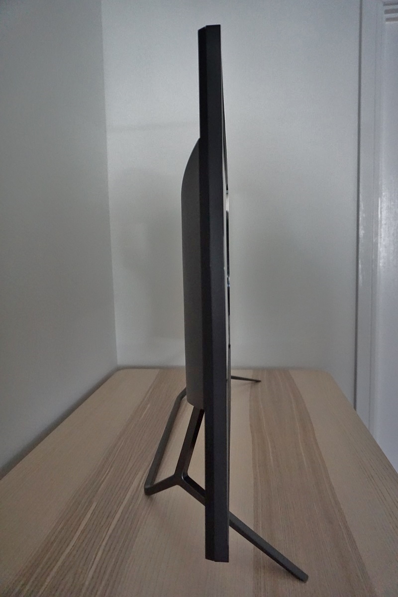
From the side the monitor is slim overall, ~25mm (0.98 inches) at thinnest point with more of a central bulk. The included TV-style stand offers tilt (-5° to 10°) as the only ergonomic flexibility. The bottom of the screen clears the desk by ~89mm (3.50 inches), with the top of the screen ~666mm (26.22 inches) above the desk surface. The total depth of the monitor including stand is ~265mm (10.43 inches), with the screen itself ~180mm (7.09 inches) forwards. As shown shortly, the monitor has VESA holes if you find the included stand too inflexible or would like the screen closer to the wall.
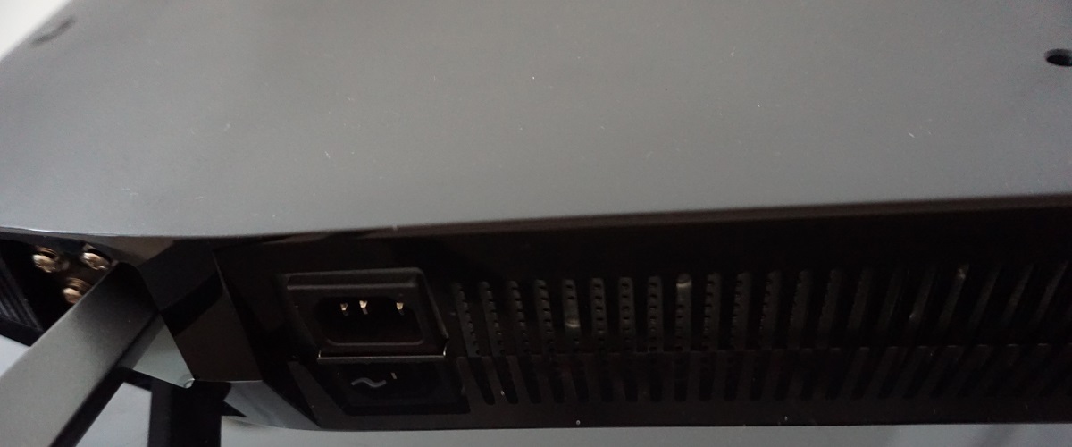
The rear of the monitor has a central area of matte plastic with glossy black plastic above and below that. Towards the bottom right there’s a K-Slot, whilst the OSD control joystick is found at the far left central region. The centre of the screen houses 200 x 200mm VESA holes for alternative mounting (the included stand can be detached, it doesn’t just float there). The ports face downwards and include; AC power input (internal power converter), HDMI 2.0, DP 1.4, mDP 1.4, USB Type-C (data + DP video signal), 2 USB 3.0 ports (with fast charging), 3.5mm audio input and 3.5mm headphone jack. There are also 2 x 7W up-firing DTS speakers integrated into the monitor, which provide quite a decent audio experience. The sound output has plenty of volume (and good adjustability of the volume), a reasonable amount of bass and fairly crisp trebles. The sound is ‘cleaner’ than most integrated speakers provide. They won’t win over audiophiles and don’t produce the punchiest or richest sound you’ll hear, but they should be adequate for many users to use instead of standalone speakers.
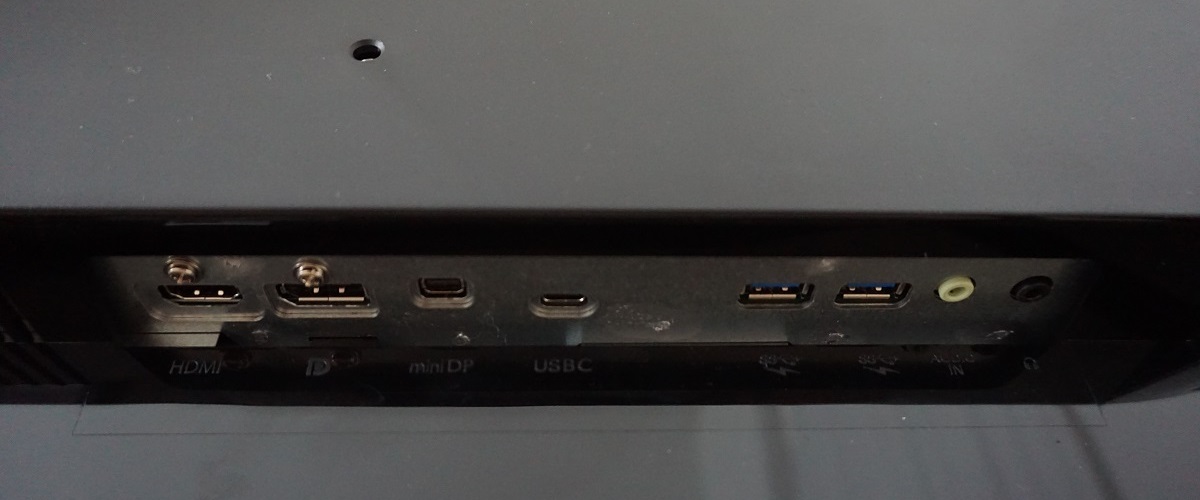
Adaptive-Sync (and hence AMD FreeSync) is supported for compatible GPUs and systems via DP 1.4 (includes USB-C DP operating mode) and HDMI 2.0 on this monitor. This means compatible games consoles such as the Xbox One X can make use of the technology as well as PC users. HDR is supported via all display connections, on compatible GPUs and systems. A USB-A to USB-C cable, USB-C cable, DP cable and power cable is included in the box.
Calibration
Subpixel layout and screen surface
![]()
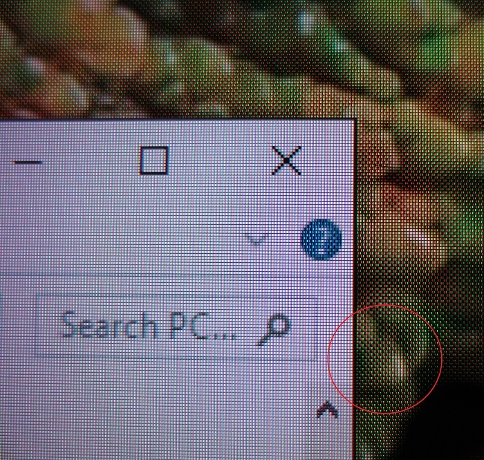
As shown above, the monitor uses a BGR (Blue, Green and Red) stripe subpixel layout. This is usual for 40”+ monitors it seems, but much less common overall than the standard RGB (Red, Green and Blue) layout expected by modern operating systems. Microsoft Windows users should run through the ClearType wizard to help reduce text fringing issues, whilst unfortunately Apple MacOS users are unable to compensate for this and have no similar utility available to them in the OS. Depending on viewing distance and individual sensitivity, this may not be a ‘deal breaker’. Whilst ClearType can help reduce text fringing, it doesn’t eliminate it on this monitor. The illumination behaviour of the subpixels is rather interesting, introducing some issues that can be noticed if you sit reasonably close to the screen but become less noticeable or invisible as viewing distance is increased. The image below shows a macro of an ‘X’ (close window) symbol. The subpixels directly bordering the ‘unlit’ (black) subpixels appear more saturated than the others.

Cross showing subpixels
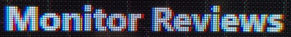
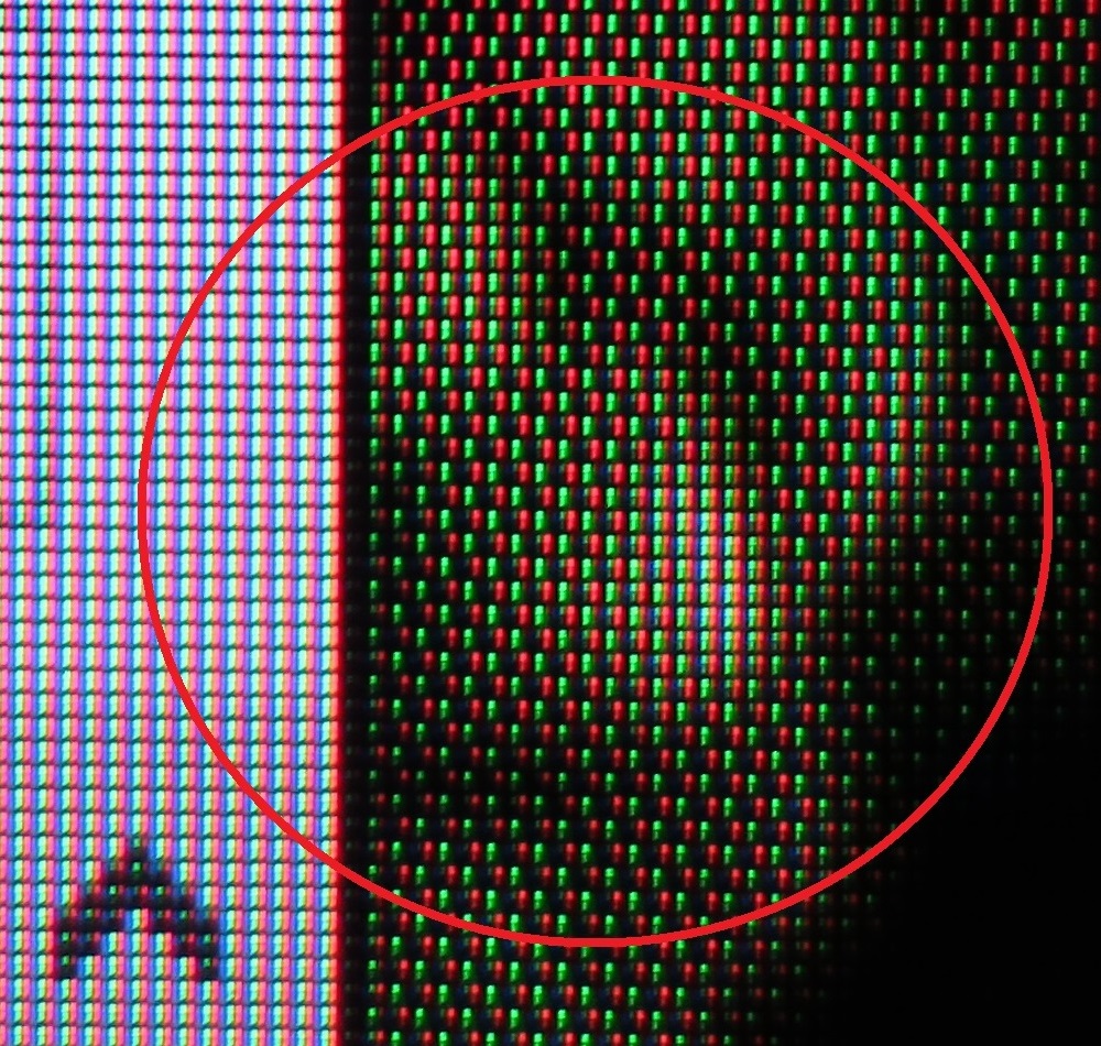
Another issue that is important to highlight is the rather peculiar subpixel illumination arrangement when the monitor is displaying certain shades. The subpixels are split into two sections each, a top and a bottom segment. These two segments aren’t always anywhere close to the same luminance. Similarly, the monitor will often illuminate only alternate subpixels. This is essentially a form of static dithering. It gives many shades a dithered magazine print appearance, with a checkerboard pattern rather than a solid shade visible. It’s not uncommon for large VA panels, especially those intended to be viewed from a distance (TVs and this sort of monitor), to have this sort of illumination pattern. You can see this in the images below. The first second image shows a zoomed in crop of the first image, focusing on a section that shows this variable subpixel illumination. For reference, it’s the chameleon wallpaper that we use in some of our review photography and videos.
As with the text fringing, it becomes less obvious as viewing distance increases. Philips did market this as a ‘console gaming monitor’ and it’s clearly a large screen, so naturally it isn’t designed to be viewed too close. Individual sensitivity and eyesight varies so there are no hard and fast rules about how far away you’d have to sit for the effect to disappear. It also depends on the brightness you’re using and your ambient brightness (we found the effect most obvious at very low brightness levels, generally). We typically sat anywhere between about 60 – 80cm from the screen, depending on how relaxed our posture was. In an ideal world we’d say that the mid to upper end of that is really the minimum distance you should consider for a screen of this size. The issue was far more obvious to us at ~60cm compared to ~80cm, although we found as we used the monitor more and more, the effect become far less noticeable to us. We would be happy with a slightly greater viewing distance, where things blend together and the effect becomes invisible. But the included stand didn’t allow us to place the screen close enough to the wall for that to be practical. If we had to live with the monitor and use it daily rather than just review it, that’s where those 200 x 200mm VESA holes might come in handy. Or perhaps a deeper desk (say 90cm+).
Testing the presets
Monitor Settings Gamma (central average) White point (kelvins) Notes Gamma = 1.8 1.6 6585K Very bright with some eye-catchingly vivid shades, thanks to the generous colour gamut and glossy screen surface. But a significant lack of depth overall, due to low overall gamma. Gamma = 2.0 1.8 6585K As above but with a slight bit of extra depth, still significant weakness in that respect. Gamma = 2.2 (Factory Default) 2.0 6593K As above, with a touch of extra depth but still in need of a bit more. As typical for a VA panel, perceived gamma also changes depending on which part of the screen you’re looking at. A fair degree of saturation is lost lower down the screen and towards the flanks. And towards the extreme side and bottom edge things appear somewhat dimmer. These saturation changes and the dimming is more pronounced the closer you sit to the screen (our observations are generally from ~80cm). Gamma = 2.4 2.2 6585K More depth with gamma now averaging the ‘2.2’ target centrally. The image appears vibrant with some eye-catching shades. Good balance to image with pleasing ‘out of the box’ white point and good balance to the green channel as well. Gamma = 2.6 2.3 6587K As above with a touch more depth. Low Blue Mode = 1 1.8 6330K A weak Low Blue Light (LBL) setting, making the image appear somewhat warmer and decreasing blue light output. Low Blue Mode = 2 1.9 6103K As above, slightly warmer and a greater reduction in blue light output. Low Blue Mode = 3 1.8 6101K As above but dimmer by default (brightness can be manually adjusted in all ‘Low Blue Mode’ settings). Low Blue Mode = 4 1.8 5737K The strongest LBL setting on the monitor. Although the colour temperature isn’t as low as you sometimes see with LBL settings (including the ‘5000K’ setting explored below), the blue channel is significantly weakened and blue light output greatly diminished. The red channel is also weakened somewhat, hence the colour temperature not being as low as you might expect. This is suitable for relaxing evening viewing, particularly with reduced brightness. Color Temperature = 5000K 1.9 5237K An alternative LBL setting. The red colour channel is strong with the blue channel weakened significantly. Almost paradoxically, ‘Low Blue Mode = 4’ is a bit more effective at cutting blue light (and weakening the blue channel) even though ‘Color Temperature = 5000K’ appears warmer to the eye. Color = sRGB 1.8 6707K This is an sRGB emulation mode. The colour gamut is restricted massively, as explored later. Things look bleached and severely lacking in depth and saturation. The combination of greatly restricted colour gamut and locked and low average gamma does not give a pleasing image. Color = User Define 1.8 7304K As factory defaults but poorer balance to image, with a very high colour temperature and an obvious cool look to the image. The point in this setting, though, is to allow users to manually adjust the colour channels if required. SmartImage = SmartUniformity 1.9 6607K This setting appears largely similar to the factory defaults, but is significantly brighter by default. It is designed to even out luminance across the screen, as a digital Uniformity Compensation (UC) mode. Test Settings (see below) 2.2 6546K Brightness is reduced to more comfortable levels and the optimal gamma setting is used for our unit. Image is vibrant and varied.

Gamma 'Test Settings'
Test Settings
SmartImageGame = Off
Contrast and brightness
Contrast ratios
Monitor Settings White luminance (cd/m²) Black luminance (cd/m²) Contrast ratio (x:1) 100% brightness 690 0.17 4059 80% brightness 574 0.14 4100 60% brightness (Factory Defaults) 454 0.11 4127 40% brightness 336 0.08 4200 20% brightness 216 0.05 4320 0% brightness 93 0.02 4650 HDR 'Normal'* 533 0.03 17767 HDR 'VESA HDR 1000'* 1126 0.15 7507 HDR 'UHDA'* 1065 0.15 7100 Gamma = 1.8 454 0.11 4127 Gamma = 2.0 454 0.11 4127 Gamma = 2.4 454 0.11 4127 Gamma = 2.6 454 0.11 4127 Low Blue Mode = 1 734 0.16 4588 Low Blue Mode = 2 763 0.16 4769 Low Blue Mode = 3 574 0.12 4783 Low Blue Mode = 4 569 0.12 4742 Color Temperature = 5000K 404 0.11 3673 Color = sRGB 460 0.11 4182 Color = User Define 521 0.11 4736 Color = User Define (100% brightness) 784 0.16 4900 SmartImageGame = SmartUniformity 683 0.16 4266 Test Settings 166 0.04 4150
*HDR measurements were made using this YouTube HDR brightness test video, running full screen at ‘2160p 4K HDR’ on Google Chrome. The maximum reading from the smallest patch size (measurement area) that comfortably covered the entire sensor area and colorimeter housing was used for the white luminance measurement, which was ‘4% of all pixels’ in this case. The black luminance was taken at the same point of the video with the colorimeter offset to the side of the white test patch, equidistant between the test patch and edge of the monitor bezel.
PWM (Pulse Width Modulation)
Luminance uniformity
The Spyder5ELITE was used to assess the uniformity of lighter colours, represented by 9 equidistant white quadrants. The luminance of each quadrant was measured and compared to the brightest measured quadrant. The tables below show these values as well as the percentage deviation between each quadrant and the brightest point measured. The top table shows the results under our ‘Test Settings’, whereas the bottom table shows the results with ‘SmartImageGame’ set to ‘SmartUniformity’. This is the factory-calibrated Uniformity Compensation (UC) mode mentioned previously.

Luminance uniformity table 'Test Settings'

Luminance uniformity table 'SmartUniformity'

Luminance uniformity map 'Test Settings'

Luminance uniformity map 'SmartUniformity'

Colour temperature uniformity map 'Test Settings'

Colour temperature uniformity map 'SmartUniformity'
Contrast in games and movies
Lagom contrast tests
Colour reproduction
Colour gamut

Colour gamut 'Test Settings'
The monitor also offers an sRGB emulation setting, specifically by setting ‘Color’ to ‘sRGB’ in the OSD. There is considerable under-coverage of the sRGB colour space, though, as shown in the diagram below. 84% sRGB coverage was measured, so for users who need to do work within the sRGB colour space or prefer that representation of colours we’d not recommend using this mode. Instead, it would be best to use the full native gamut as a base for calibration using a colorimeter or similar device.

Colour gamut 'sRGB'
Colour in games and movies
Viewing angles
The following video shows the Lagom text test, a mixed desktop background and dark desktop background from various viewing angles. For the mixed image you can see some shifts in colour and contrast, more pronounced at steeper angles. There is no ‘colour inversion’ as you’d observe on a TN model vertically and the shifts are not as extreme. The final third of the video shows a dark desktop background and highlights ‘VA glow’ which blooms out from more extreme angles. This is quite constrained overall and is only really noticeable on the video where the viewing angles are quite steep. This reflects our earlier observations from a normal viewing position, where ‘VA glow’ wasn’t an issue worth worrying about on this model.
Interlace pattern artifacts
Responsiveness
Input lag
Perceived blur (pursuit photography)
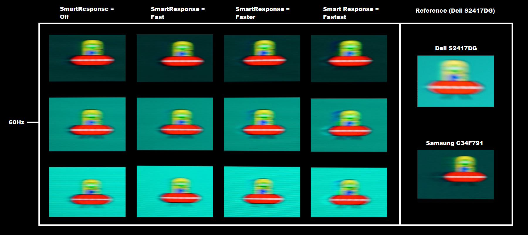
In all cases, the object itself appears broad and blurry without sharp details. This is the same for even the Dell S2417DG (fast reference) and reflects a moderate amount of perceived blur attributable to eye movement. You can also see varying degrees of trailing behind the object, which are weaknesses related to pixel responsiveness. With ‘SmartResponse = Off’, there is a fairly bold but very short trail behind the object. Interestingly, the trail is only marginally longer for the dark background (top) compared to the others. The trail is significantly shorter than for the C34F791 reference, at least for the dark background depicted here, and in practice this means overall perceived blur is lower. Increasing the ‘SmartResponse’ setting introduces ever-increasing levels of overshoot to the image. Even with ‘Fast’ there are some bright trails that weren’t visible before, and some conventional trailing also remains. The overshoot becomes significantly stronger using ‘Faster’ and stronger again using ‘Fastest’. We were very happy with the monitor’s performance in this test using the default setting of ‘Off’ – which very clearly still uses effective pixel overdrive. This is easily the best performance we’ve seen from a VA panel here, particularly for the dark background. We found ‘Off’ to be optimal in broader testing, too, as even the ‘Fast’ setting introduced some obvious overshoot that either wasn’t there or wasn’t as obvious using ‘Off’.
Responsiveness in games and movies
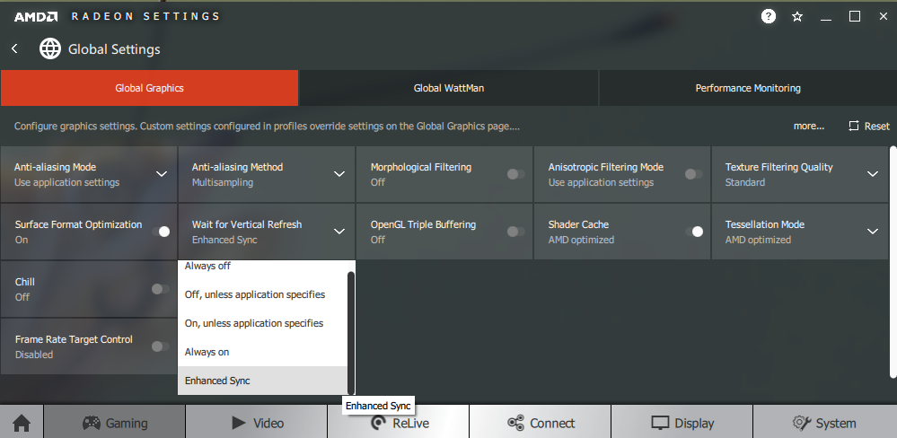
FreeSync – the technology and activating it

The Philips supports a variable refresh rate range of 48 – 60Hz. That means that if the game is running between 48fps and 60fps, the monitor will adjust its refresh rate to match. When the frame rate rises above 60fps, the monitor will stay at 60Hz and the GPU will respect your selection of ‘VSync on’ or ‘VSync off’ in the graphics driver. With ‘VSync on’ the frame rate will not be allowed to rise above 60fps, at which point VSync activates and imposes the usual associated latency penalty. With ‘VSync off’ the frame rate is free to climb as high as the GPU will output (potentially >60fps). LFC (Low Frame Rate Compensation) is not supported by this monitor, as that requires the upper limit (ceiling) to be at least 2x the lower limit (floor) of FreeSync operation. FreeSync is therefore deactivated if the frame rate falls below 48fps, with the monitor then respecting your choice of VSync and presenting you with either stuttering (VSync on) or juddering and tearing (VSync off).
Note that if you enter the OSD and navigate to ‘System’ – ‘Information’, the refresh rate will update in near enough real-time to reflect changes in the frame rate if FreeSync is active and things are within the FreeSync window of operation. Also note that FreeSync only removes stuttering or juddering related to mismatches between frame rate and refresh rate. It can’t compensate for other interruptions to smooth game play, for example network latency or insufficient system memory.
FreeSync – the experience
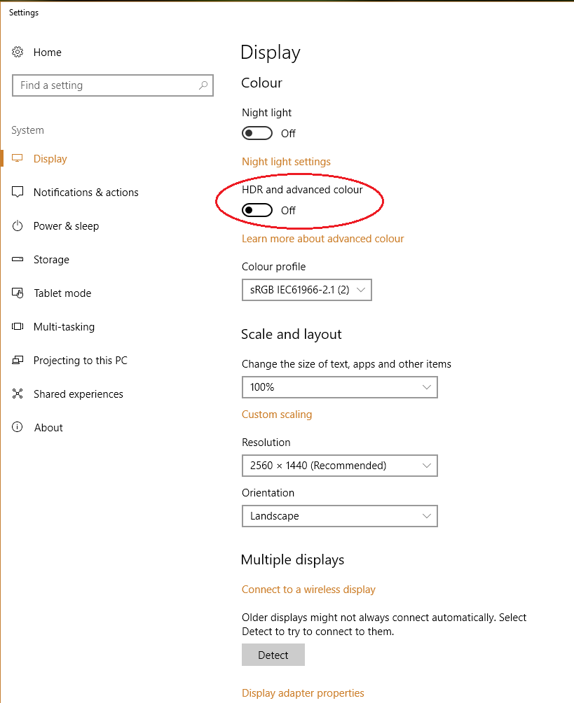
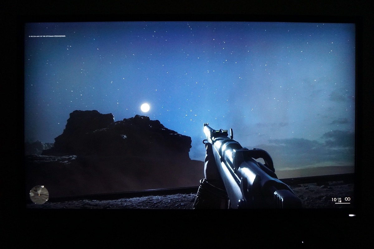
HDR (High Dynamic Range)
Colour gamut 'Test Settings'
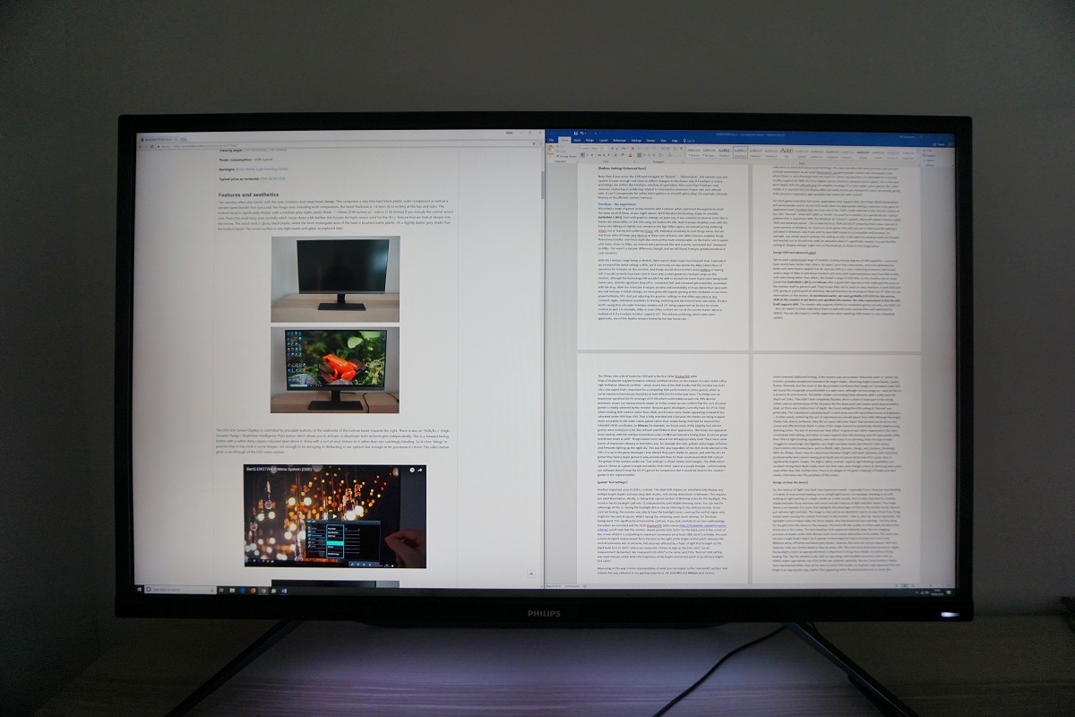
The ~43″ ‘4K’ UHD experience
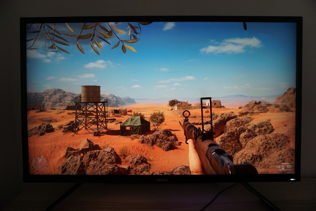
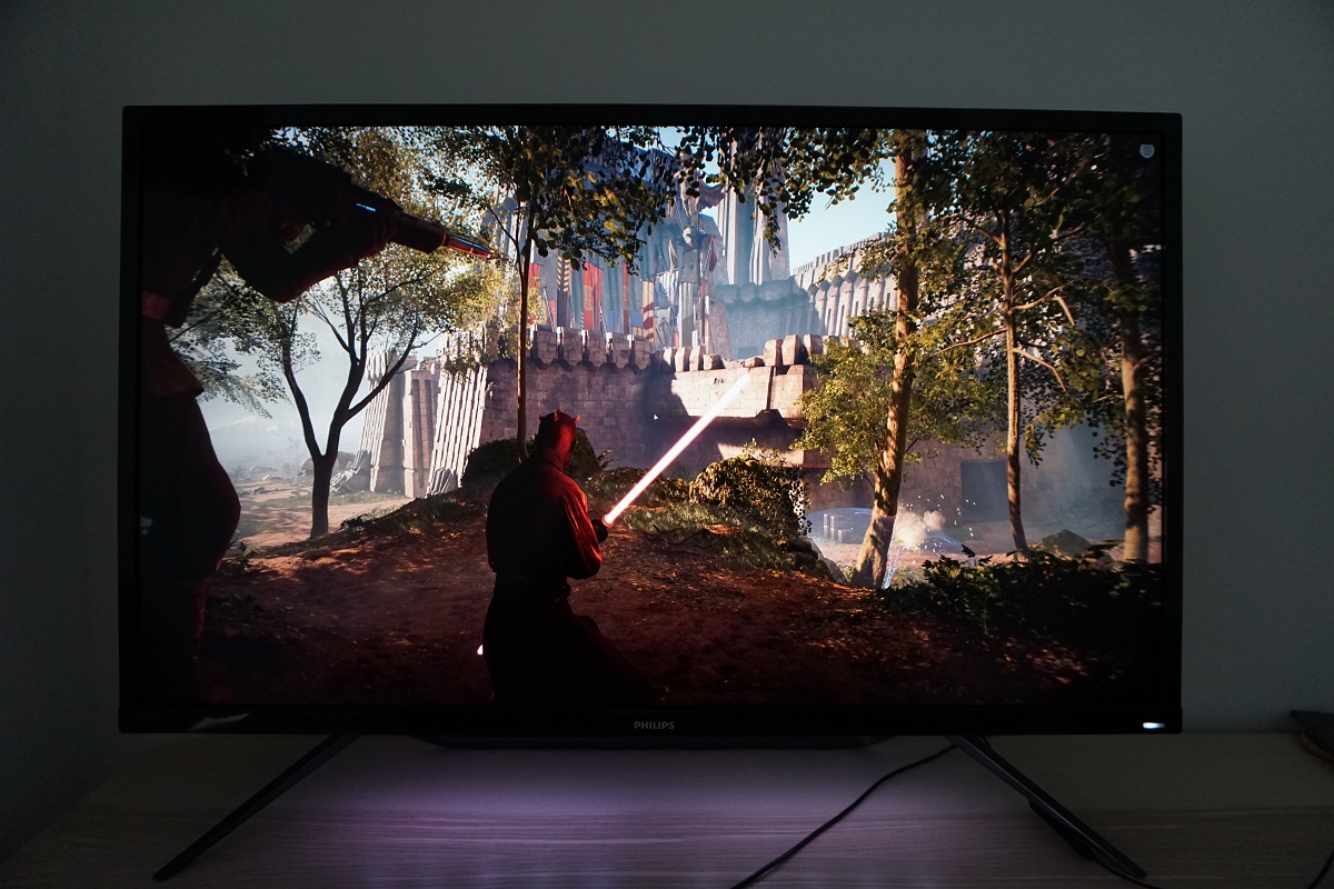
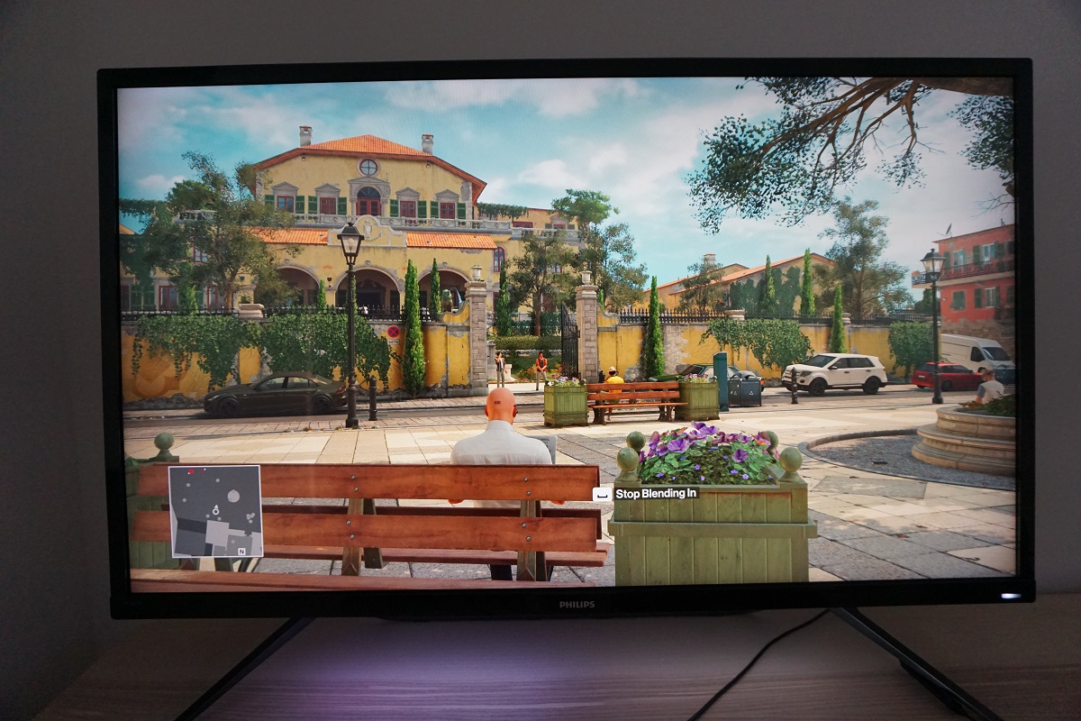
As noted earlier, the pixel density is just shy of a 27” WQHD (2560 x 1440) model. And therefore the level of detail when gaming or viewing images is very similar. Having the image spread out over such a vast area certainly changes the experience, however. We initially found the size of the screen quite overwhelming, even coming from a 27” 16:9 screen beforehand – so not exactly tiny. We soon adapted to the larger screen, though, and found it perfectly fine to use on a range of tasks. On the desktop, watching movies and playing games. Even from a viewing distance of 80cm, which is a bit further than we’d generally sit from smaller monitors, it engaged the peripheral vision very well. This provided an excellent level of immersion, drawing us into the gaming world. It also made it easier to admire some of the decent texture detail that was brought about by the pixel density. Again, this was not at the level of smaller UHD screens – but was still good. The images below show a variety of games being played on the monitor; Battlefield 1, Battlefront II and Hitman. They in no way represent what the monitor looks like when viewing it first-hand and are simply there to fire up your imagination.
Interpolation and upscaling

Video review
Timestamps:
Features & Aesthetics
Contrast
Colour reproduction
HDR (High Dynamic Range)
Responsiveness
Conclusion
The bottom line; a feature-packed monitor with strong contrast, vibrant colour output and convincing PC HDR – just make sure you’ve got a big enough desk.
Positives Negatives Vibrant and varied colour output with excellent DCI-P3 coverage plus excellent ‘pop’ from the glossy screen surface
Some VA-related colour inconsistencies (weaker saturation peripherally), a poor sRGB emulation setting and no Adobe RGB support. ‘Gamma’ modes inappropriately labelled in OSD Excellent static contrast exceeding the specifications, a convincing HDR performance (using the right setting) and strong clarity from the screen surface Per-pixel illumination (OLED etc.) or greater number of dimming zones (with the VA panel) would improve HDR. Poor HDMI HDR performance on our unit and glossy screen demands more careful control of lighting Surprisingly good pixel responsiveness given the panel type and low input lag. FreeSync worked effectively to combat tearing and stuttering
FreeSync range is limited, there’s some overshoot and the 60Hz refresh rate won’t appeal to everyone Excellent desktop real-estate and a comfortable pixel density from the ~43” UHD screen and strong interpolation performance Limited ergonomic flexibility from included stand. Subpixel illumination issues necessitate careful consideration of viewing distance
As an Amazon Associate I earn from qualifying purchases made using the below link. Where possible, you’ll be redirected to your nearest store. Further information on supporting our work.
