Author: Adam Simmons
Date published: April 18th 2021
Table of Contents
Introduction
IPS-type panels have significantly improved over the years when it comes to pixel responsiveness. To put this to good use, there has also been a trend towards higher refresh rates. The Gigabyte AORUS FI27Q-X makes use of a 240Hz IPS-type panel, combining it with the signature styling of the series and a 2560 x 1440 (WQHD or 1440p) resolution. This resolution has become very widely adopted on screens of this size for both gaming and productivity. Whilst this model is marketed more towards gamers, as a “Tactical Gaming Monitor” no less, it certainly has broader appeal. The pixel density is high enough to deliver good clarity and a useful desktop work-space, without being as demanding as graphically taxing as higher resolutions. We take a look at this model and put it through its paces in our usual suite of tests.
Specifications
The monitor adopts a 27” IPS (In-Plane Switching) type panel from Sharp. 10-bit colour (8-bit + FRC dithering) is supported, alongside a 240Hz refresh rate and a 2560 x 1440 (WQHD) resolution. A 1ms grey to response time is specified, or 0.3ms MPRT (Moving Picture Response Time) using the included strobe backlight setting. As we always say, though, you shouldn’t pay much attention to specified response times like this. Some of the key ‘talking points’ for this monitor have been highlighted in blue below, for your reading convenience.
*The monitor supports HBR3 (High Bit Rate 3) via DisplayPort 1.4, allowing it to use its full feature set at up to 200Hz. Including 10-bit 1440p, under SDR or HDR. It’s limited to 8-bit 1440p @240Hz, with GPU dithering used for HDR as explored later. HDMI 2.0 supports 10-bit 1440p @60Hz and 10-bit 1080p @120Hz and @60Hz. The bit-depths listed here are using a Full Range RGB signal. Via HDMI, 12-bit is listed for some resolutions and refresh rates. This includes a dithering stage added by the monitor’s scaler to facilitate work with 12-bit content.

As an Amazon Associate I earn from qualifying purchases made using the below link. Where possible, you’ll be redirected to your nearest store. Further information on supporting our work.
|

Features and aesthetics
The monitor adopts an angular ‘gamery’ style – a sharp-lined or aggressive look, if you like. The stand base has a ‘penguin-foot’ design and is black with a powder-coated metal finish for a weighty and premium feel. The bottom bezel is matte dark grey plastic, with a central mesh-pattern grey plastic area with shiny yet well-blended AORUS logo in the middle. The bottom bezel is fairly thick, at ~24mm (0.94 inches) plus just a silver of visible panel border. The top and side bezels on the other hand adopt a slim dual-stage design, including a slender panel border that’s flush with the rest of the screen plus a slim hard plastic outer component. Including both elements the bezels are ~8mm (0.31 inches). The main feature at the front is the screen itself, which adopts a light to very light matte anti-glare finish.


The OSD (On Screen Display) is controlled by a joystick which hangs down beneath the central logo. A small power LED is also found here, facing forwards, which glows white when the monitor is switched on and amber when it enters a low power state. There’s an option in the OSD to disable the LED when the monitor is switched on, if you prefer. The video below runs through the menu system and the ‘OSD Sidekick’ software that can be used to control it.
The monitor is fairly slender at thinnest point, ~18mm (0.71 inches), lumping out centrally towards the stand attachment point. The stand offers full ergonomic flexibility; tilt (5° forwards, 21° backwards), swivel (20° left, 20° right), height adjustment (130mm or 5.12 inches) and pivot (90° clockwise rotation into portrait). The adjustments were relatively smooth on our unit, whilst the screen was held tightly once adjusted – adding to the overall solid feel of the monitor. At lowest height the bottom of the screen sits ~690mm (2.72 inches) above the desk, with the top of the screen ~439mm (17.28 inches) above the desk. With the screen at lowest height, the carrying handle pokes ~45mm (1.77 inches) above the top of the screen. The total depth of the monitor plus stand is ~237mm (9.33 inches), with the screen a few cm back from the front edge of the stand. So a reasonably deep design that brings the screen fairly far forward from the wall. But not to the extent of some gaming monitors.


The rear of the monitor is largely dark grey to black matte plastic. Some glossy black elements are included which house RGB LEDs. An AORUS Falcon logo in the centre of the stand neck, some elements at the side of the stand neck and ‘wings’ at the rear of the screen running up towards the top left and top right. This lighting feature can be controlled through the OSD or using RGB Fusion 2.0 software, as shown in the OSD video earlier. These lights can only be viewed from behind and aren’t bright enough to create a field of light that’s clearly visible from the front. The stand attaches centrally using a quick-release mechanism, detachable by pinching inwards two ‘buttons’ either side of the attachment point. This reveals 100 x 100mm VESA holes for alternative mounting. The ports face downwards and include; AC power input (internal power converter), 3.5mm headphone jack, 3.5mm microphone jack, 2 HDMI 2.0 ports, DP 1.4 (HBR3) and 2 USB 3.0 ports (plus upstream). A K-Slot is located to the right of the power input.


2560 x 1440 @240Hz plus HDR and Adaptive-Sync can be leveraged via DP 1.4, including AMD FreeSync and Nvidia’s ‘G-SYNC Compatible Mode’. With HBR3 allowing 10-bit to be used simultaneously at up to 200Hz. HDMI 2.0 is limited to 144Hz regardless of bit depth and supports AMD FreeSync but not Nvidia’s ‘G-SYNC Compatible Mode’. Standard accessories include; a power cable, HDMI cable, DP cable and USB cable. The first and second images below show the refresh rates supported by the monitor when running at the 1920 x 1080 (Full HD or 1080p) resolution via DP. The first list is the same via HDMI, whereas for the second list 144Hz is the only refresh rate listed – that’s the maximum supported via HDMI. A ‘4k x 2k, 3840 x 2160’ downsampling mode is also included when using HDMI, at 60Hz and 59Hz. Potentially useful for games consoles that don’t support a 2560 x 1440 signal but would accept a 3840 x 2160 signal. The final image shows the refresh rates supported at the native 2560 x 1440 (WQHD or 1440p) resolution via DP, with HDMI limited to a maximum of 144Hz.


If you’re intending to use the monitor with the PS5 or Xbox Series X/S, be aware that a small settings tweak may be required to ensure 120Hz is selectable. Details can be found in this article.
Calibration
Subpixel layout and screen surface
The image below is a macro photographs taken on Notepad with ClearType disabled. The letters ‘PCM’ are typed out to help highlight any potential text rendering issues related to unusual subpixel structure, whilst the white space more clearly shows the actual subpixel layout alongside a rough indication of screen surface. This model uses a light to very light matte anti-glare screen surface with quite a smooth surface texture. This offers reasonable glare handling and provides fairly direct light emission for a matte surface. This prevents any real layering in front of the image, whilst better maintaining clarity and vibrancy potential compared to stronger matte surfaces. Meanwhile, the relatively smooth surface texture gives a smooth look to lighter content without clear graininess. A very fine ‘misty’ graininess was observed, but this is rather subtle and not something most users would notice or be bothered by.
![]()
As shown above, the monitor uses a BGR (Blue, Green and Red) stripe subpixel layout. This is a noteworthy change from the more usual RGB (Red, Green and Blue). Apple’s MacOS no longer uses subpixel rendering and therefore doesn’t optimise text for one particular subpixel layout to the detriment of another. Microsoft Windows uses a system called ClearType that’s optimised for RGB layouts by default. Most users prefer the look of text with ClearType enabled, it’s what we’ve become used to seeing in most cases and without it things can appear aliased, ‘pixelated’ and simply lacking a clear and crisp appearance. To configure ClearType correctly for a BGR display such as this, open the ‘ClearType Text Tuner’ that’s included with modern versions of the Windows OS. Simply type ClearType into the task bar on Windows 10 to locate this tool.
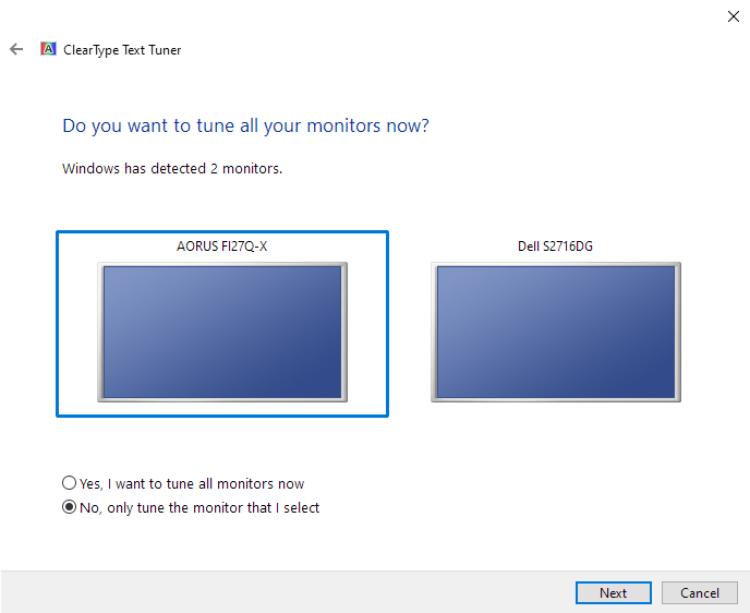
If you have multiple displays connected you can just fine-tune the AORUS as shown below. Unfortunately the main optimisation you’re interested in (for BGR or RGB) is largely determined by what is selected in ClearType for the primary display. Only applications built using WPF can have ‘per display’ optimisations and most will just pay attention to what is selected in ClearType for the primary display. This limits the appeal of multi-display setups in Windows with mixed RGB and BGR layouts.
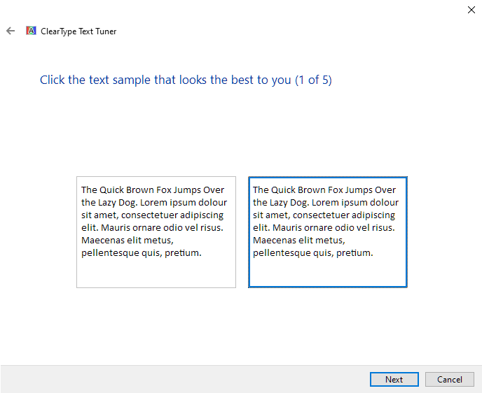
For the first set of text samples, ensure you select the 2nd option as shown in the image below. This second text sample should look clearer (bolder) than the first when viewed in person on this monitor. The remaining samples help fine-tune according to your own preferences.
After doing this you should notice that most text in the desktop environment appears correct, with appropriate clarity and without clear fringing. We’ll provide some examples of fringing shortly and explain it in more detail, but it’s essentially a cyan or magenta outline to some elements. With ClearType enabled and correctly optimised some slight fringing issues remained in places, but the relatively tight pixel density meant the fringing was very fine and not as eye-catching as it could’ve been. Google Chrome’s address bar and menu system, for example, didn’t look quite as clear as it should due to a small amount of fringing. The text remained readable and many people would say it looks quite normal, but to us it just looked slightly ‘off’ to our trained eyes. You’d spend most of your time on Chrome or other web browsers reading the content itself – and fortunately the vast majority of text on the webpages themselves looked as it should. Most users will want to use ClearType (appropriately optimised) as without it text tends to look quite a bit rougher in appearance – you can disable this on your own system if you’re using it and see for yourself.
Adobe Reader uses its own subpixel rendering system optimised for RGB, completely ignoring any ClearType optimisations. The first image below shows text from a PDF with magenta fringing to the left and cyan to the right. The fringing is greatly exaggerated in the image, in practice it’s very thin – see pixels in image for scale, which in reality are tiny. The second image below was taken with the display running ‘Landscape (flipped)’ so that an RGB subpixel layout is used. ClearType was appropriately optimised for RGB in this orientation – which the subpixel layout becomes after flipping the image like that. This is achieved in Windows 10 by going to ‘Display settings’ – ‘Display orientation’ and setting this to ‘Landscape (flipped)’. The graphics driver may have similar options.


Note that none of the fringing issues described here were alleviated by adjusting ‘Sharpness’ in the OSD. If you wanted to use the monitor in ‘Landscape (flipped)’ you’d have to physically rotate the screen 180°. The ports would be at the top so you’d have to make sure cables are long enough and not too tight, putting undue pressure on the ports. The thick bottom bezel would be at the top with an inverted ‘Gigabyte’ logo and the OSD would be upside down (OSD Sidekick use advised). There’s also a latency penalty associated with this setting, whilst Adaptive-Sync can’t be used at the same time. As we explore below there are some mild fringing issues that would remain even after doing this.
Looking past the subpixel arrangement itself (RGB vs. BGR), we observed some mild fringing on the monitor for other reasons. Dark content neighbouring brighter content, where distinct vertical lines were present, could highlight this. Flipping the screen simply reversed the side that the cyan and magenta fringing appeared. Monitors with regular RGB subpixels show this as well if you look closely, but it was more pronounced on this model than it would usually be. This could be partly due to the wider colour gamut or perhaps something else related to the subpixels. We found this fringing clearest for white objects with straight vertical edges set against darker backgrounds. The search bar on the head of our website being a good example of this, but even then we didn’t find this particularly eye-catching and most users wouldn’t notice it either. We also observed mild fringing for other solid shades with straight vertical edges against lighter backgrounds. Straight teal edges against white, for example, exhibited a very thin brown-gold fringe at the left and light blue fringe to the right. This can be seen in the example below, but note again that things are enlarged and therefore exaggerated here, the fringing was actually extremely slender in practice as it is only ever at most a few pixels thick.

Mild fringing could be observed here and there for similar reasons in games and movies, but it really didn’t jump out at us. Or even bother us when we were specifically looking for it, for that matter. We certainly don’t feel the BGR subpixel layout, specifically, had a significant impact there. Remember that games and video content are not optimised for any particular subpixel layout and BGR is not uncommon on TVs. In short; the fringing issues on this model are on the minor side and are not something most users will take issue with or even notice in the first place. They aren’t all that widespread nor are they extreme. Compared to some of the subpixel-related issues we’ve come across we really feel these issues are minor. Text and fine edge clarity issues related to split subpixel arrangements on some VA models (example) or fringing due to chroma subsampling usage (example) are far more significant. Such issues are of course subjective, like everything when it comes to monitors really. So some will still be bothered by the fringing issues highlighted here. We’d again stress that most users won’t find them bothersome or noticeable and shouldn’t be deterred by what will likely end up a non-issue for them.
Testing the presets
The FI27Q-X features a range of ‘Picture Mode’ presets; ‘Standard’, ‘FPS’, ‘RTS/RPG’, ‘Movie’, ‘Reader’, ‘sRGB’, ‘Custom 1’, ‘Custom 2’ and ‘Custom 3’. As usual, these presets alter various settings in the OSD that you could manually adjust instead. The ‘sRGB’ setting greys out most settings, whereas the remaining presets allow everything to be adjusted, whilst any adjustments made are memorised for that preset. A notable exception is that any changes to colour channels made with ‘Color Temperature’ set to ‘User Define’ are applied universally. The numbered ‘Custom’ modes are identical to ‘Standard’ by default and allow an additional 3 separate sets of settings to be used. We briefly explored these presets and related functionality in the OSD video earlier. The following table shows gamma and white point readings taken using a Datacolor SpyderX Elite colorimeter as well as general observations.
Our test system uses Windows 10 with an Nvidia RTX 3090, connected using the supplied DP cable. We performed additional testing using HDMI and using an AMD Radeon RX 580, but observations on this table were not significantly affected by this. Gamma was marginally higher and white point marginally lower on our AMD GPU, making the image a touch deeper for some mid-tones and very slightly warmer in appearance. The difference was not substantial. The monitor was left to run for over 2 hours before readings were taken and observations made, without any additional monitor drivers or ICC profiles specifically loaded. Aside from our ‘Test Settings’, where various adjustments were made, assume factory defaults were used. The refresh rate was set to 240Hz in Windows, although this didn’t significantly affect the values or observations in this table. When viewing the figures in this table, note that for most PC users ‘6500K’ for white point and ‘2.2’ for gamma are good targets to aim for. Individual targets depend on individual uses, tastes and the lighting environment, however.
Our firmware version was the latest available revision at time of review (‘F03 beta’). Firmware can be updated using the OSD Sidekick utility available on Gigabyte’s website. This is a simple process that the software guides you through – it requires that the USB upstream cable is connected to the monitor.
| Monitor Settings | Gamma (central average) | White point (kelvins) | Notes |
| Standard, Gamma 3 (Factory Defaults) | 2.2 | 6668K | Vibrant and varied with strong saturation. Tight ‘2.2’ gamma tracking and good colour channel channel balance. |
| Gamma OFF | 2.2 | 6702K | As above but gamma tracks the ‘2.2’ curve in a slightly looser fashion despite averaging 2.2. Gamma slightly reduced for darker shades, lifting darker shades up a bit. And raised slightly for some-mid tones, adding a little extra depth. The deviations aren’t huge, however. |
| Gamma 1 | 1.8 | 6732K | Significantly reduced gamma saps a lot of depth from the image, making it appear quite washed out in places. |
| Gamma 2 | 2.0 | 6699K | As above, gamma raised slightly but still too low. |
| Gamma 4 | 2.4 | 6644K | Gamma raised above factory defaults, making darker shades appear too blended (detail lost) but giving a cinematic look. |
| Gamma 5 | 2.6 | 6613K | As above with a further bump in gamma. A very deep and cinematic look to things, poor distinctions for darker shades. |
| Low Blue Light = 10 | 2.2 | 5358K | A moderately effective Low Blue Light (LBL) setting. The blue colour channel is weakened quite a bit, producing a warmer image and reducing blue light output. The green channel remains fairly strong, imparting a yellowish green tint. Your eyes adjust to some extent over time. |
| Color Temperature = Warm | 2.2 | 5297K | An alternative LBL setting. Quite similar effectiveness to the above without the green tint. The blue channel is reduced a little less but still significantly compared to factory defaults. Green channel is weakened a bit compared to ‘LBL 10’. |
| LBL 6 + Colour Temp. Warm | 2.2 | 4786K | Combining a moderate LBL setting (6) with ‘Warm’ provided a significant blue light reduction, a more effective LBL setting than ‘LBL 10’ or ‘Warm’ in isolation. The balance is good as well, with a warm look but only mild green tint. A higher LBL level combined with ‘Warm’ gave a stronger green tint on our unit, so we stuck with ‘6’ which was still very effective. |
| Color Temperature = User Define | 2.2 | 7060K | As factory defaults with a cool and slightly green tint introduced. |
| Picture Mode = sRGB | 2.2 | 6871K | An sRGB emulation setting, clamping the gamut close to sRGB. This eliminates the oversaturation of standard sRGB content but now causes noticeable undersaturation and a somewhat ‘foggy’ appearance in places. The default brightness is reduced but can be adjusted. Cool tint vs. our target 6500K. Gamma averages ‘2.2’ but tracks below for dark-mid tones and a bit above for very light shades. Gamma and colour channels inaccessible. |
| Test Settings (see below) | 2.2 | 6498K | A vibrant look with strong variety and good balance. |
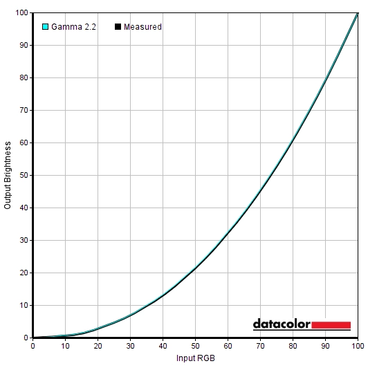
Straight from the box the monitor provided a well-balanced image in terms of gamma and colour channel balance. With strong vibrancy owing to the generous gamut. Gamma tracked the ‘2.2’ curve tightly, deviation from our preferred 6500K white point target was low and the green channel was also well balanced on our unit. The image below shows the gamma tracking under our ‘Test Settings’, very close to the factory default performance in this respect.
Gamma 'Test Settings'
Given the intended uses for the monitor, inter-unit variation and reasonable performance following OSD tweaking alone we will not be using any ICC profiles in this review or including any measurements or graphs using them. We wouldn’t recommend using them unless created for your specific unit using your own calibration device. But we appreciate some users still like to use profiles and some aspects such as gamut mapping for colour-aware applications can be useful. You can download our ICC profile for this model, which was created using our ‘Test Settings’ as a base. You can also download our sRGB profile which was created using and designed for the ‘sRGB’ setting (sRGB emulation mode). This tightened up tracking of the ‘2.2’ gamma curve on our unit and enriched the image – but be aware of inter-unit variation. And note again that these ICC profiles are not used in the review.
The monitor offers a few Low Blue Light (LBL) settings which can be easily activated or deactivated due to the flexible and easily accessed presets of the monitor. ‘Low Blue Light’ is the main setting and that can be adjusted between ‘0’ (off) and ‘10’ (strongest effect). This setting created a warmer look to the image and significantly reduced blue light output, whilst maintaining a relatively strong green channel. This meant that a bit of a yellowish green tint was imparted – your eyes can adjust to this to some extent and it wasn’t as strong as on some models. There was an additional LBL setting, achieved by changing ‘Color Temperature’ to ‘Warm’. This was about as effective as a high ‘Low Blue Light’ setting but didn’t impart the green tint. We didn’t find either setting in isolation quite as effective as we’d like at cutting out blue light output – although they still were still decent in that respect. So we used a combination of the two, the – ‘LBL 6’ combined with ‘Warm’. We used this highly effective combination for our own viewing comfort in the evenings, although not for any specific testing beyond that involving the setting itself. It’s particularly important to reduce blue light exposure in the hours leading up to sleep as blue light is stimulating to the body. It disrupts sleep hormones and increases your alertness state which is counter-productive when you want to relax prior to sleeping.
Test Settings
For our ‘Test Settings’ we switched to one of the ‘Custom’ presets and made some adjustments to brightness, colour channels and the ‘Gamma’ setting. ‘Custom 2’ and ‘Custom 3’ are set up the same way as this by default, so could be used as a base instead if preferred. ‘Standard’ offers a similar setup except ‘Gamma’ is set to ‘Gamma 3’ by default (which we ended up using) and Sharpness is set to ‘6’ (we slightly preferred ‘5’ and felt it was more neutral). Note that individual units and preferences vary, so these settings are simply a suggestion and won’t be optimal for all users or units. We’ve also included the refresh rate used in Windows and our preferred ‘Overdrive’ setting used for most of the review, just for reference. These settings only apply to SDR, HDR has separate settings associated with it (is far more restrictive) and is explored in the relevant section of the review.
Picture Mode= Custom 1
Brightness= 28 (according to preferences and lighting)
Gamma= Gamma 3
Color Temperature= User Define
R= 100
G= 96
B= 95
Overdrive= Balance
AMD FreeSync Premium= On
Refresh rate (Windows setting)= 240Hz
Contrast and brightness
Contrast ratios
An X-Rite i1Display Pro was used to measure the luminance of white and black using various setting on the monitor, including those found in the calibration section. From these values, static contrast ratios were calculated. The table below shows these results, with blue highlights indicating the results with HDR active and under our ‘Test Settings’. Black highlights indicate the highest white luminance, lowest black luminance and highest contrast ratio recorded (Aim Stabilizer deactivated). Assume any setting not mentioned was left at default, with the exceptions already noted here or in the calibration section.
| Monitor Settings | White luminance (cd/m²) | Black luminance (cd/m²) | Contrast ratio (x:1) |
| 100% brightness | 435 | 0.48 | 906 |
| 80% brightness | 364 | 0.40 | 910 |
| 60% brightness (Factory Defaults) | 289 | 0.32 | 903 |
| 40% brightness | 212 | 0.23 | 922 |
| 20% brightness | 129 | 0.14 | 921 |
| 0% brightness | 42 | <0.05 | >840 |
| HDR* | 466 | 0.49 | 951 |
| Gamma OFF | 295 | 0.32 | 922 |
| Gamma 1 | 294 | 0.32 | 919 |
| Gamma 2 | 292 | 0.32 | 913 |
| Gamma 4 | 289 | 0.32 | 903 |
| Gamma 5 | 287 | 0.32 | 897 |
| Low Blue Light = 10 | 284 | 0.32 | 888 |
| Color Temperature = Warm | 268 | 0.32 | 838 |
| LBL 6 + Color Temp. Warm | 265 | 0.32 | 828 |
| Color Temperature = User Define | 309 | 0.32 | 966 |
| Color Temperature = User Define (100% brightness) | 464 | 0.48 | 967 |
| Picture Mode = sRGB | 142 | 0.16 | 888 |
| Aim Stabilizer @120Hz | 186 | 0.20 | 930 |
| Aim Stabilizer @240Hz | 183 | 0.20 | 915 |
| Test Settings | 163 | 0.18 | 906 |
*HDR measurements were made using this YouTube HDR brightness test video, running full screen at ‘1440p HDR’ on Google Chrome. The maximum reading from the smallest patch size (measurement area) that comfortably covered the entire sensor area and colorimeter housing was used for the white luminance measurement, which was ‘4% of all pixels’ in this case. The black luminance was taken at the same point of the video with the colorimeter offset to the side of the white test patch, equidistant between the test patch and edge of the monitor bezel.
The average static contrast with only brightness adjusted was 913:1, lower than some IPS-type panels but slightly higher than others. The maximum contrast recorded, ‘User Define’ with all colour channels in their neutral position, was 967:1. A touch lower than the specified 1000:1 but only just. Under our ‘Test Settings’ we recorded 906:1, which is reasonable. Lower contrast ratios were recorded using the LBL settings, particularly the ‘Warm’ setting which makes significant colour channel adjustments and also using the sRGB setting. The monitor doesn’t offer local dimming and therefore offers no contrast advantage under HDR. The peak luminance under HDR (466 cd/m²) was not particularly high by HDR standards and similar to the maximum recorded under SDR (464 cd/m²). But sufficient for the VESA DisplayHDR 400 standard. The minimum white luminance recorded on the table was 42 cd/m², giving a luminance adjustment range under SDR of 422 cd/m² with a reasonably low minimum and quite bright maximum.
The monitor has a ‘Dynamic Contrast’ setting which can be set between 0 (off) and ‘5’, which allows the backlight to dim according to the overall bright vs. dark levels on the screen. A higher number appears to increase low-end gamma and therefore makes darker shades deeper than intended. Even set to ‘1’ the gamma is rather high for the dark shades, crushing detail. Adjusting the gamma setting in the OSD doesn’t alleviate this. You can adjust the brightness which will limit how bright the setting will go, whilst the screen will dim (where possible) if predominantly dark content is displayed. This is a nice flexibility to have it makes the setting potentially quite gentle in its adjustments which some users will get on with better. We still prefer manual adjustment of brightness, though, and didn’t appreciate the gamma adjustments made here.
PWM (Pulse Width Modulation)
The FI27Q-X does not use PWM (Pulse Width Modulation) to regulate backlight brightness at any level. Instead, DC (Direct Current) is used to moderate brightness. The backlight is therefore considered ‘flicker-free’, which will come as welcome news to those sensitive to flickering or worried about side-effects from PWM usage. The exception to this is with ‘Aim Stabilizer’ active, a strobe backlight setting which causes the backlight to flicker at a frequency matching the refresh rate of the display.
Luminance uniformity
Whilst observing a black background in a dark room, using our ‘Test Settings’, we noticed slight backlight bleed and a little clouding. It’s important to note that individual units vary when it comes to all aspects of uniformity, including backlight bleed and clouding. The following image was taken a few metres back to eliminate ‘IPS glow’. This tends to appear as a warm and slightly pink or reddish orange glow on this model that appears towards the edges. Particularly near the bottom corners of the screen from a normal viewing position. ‘IPS glow’ blooms out more strongly from sharper angles, as demonstrated in the viewing angles video later on.

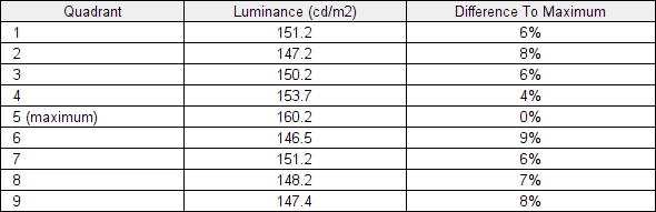
The SpyderX Elite was used to assess the uniformity of lighter shades, represented by 9 equally spaced white quadrants running from the top left to bottom right of the screen. The table below shows the luminance recorded at each quadrant as well as the percentage deviation between each quadrant and the brightest recorded point.
Luminance uniformity table
The luminance uniformity was pleasing. The maximum luminance was recorded at ‘quadrant 5’ in the centre of the screen (160.2 cd/m²). The greatest deviation from this occurred at ‘quadrant 6’ to the right of centre (146.5 cd/m², which is 9% dimmer). The average deviation between each quadrant and the brightest recorded point was 6.75%, which is respectable. Remember that individual units vary when it comes to uniformity and you can expect further deviation beyond the points measured. The contour map below shows these deviations graphically, with darker greys representing lower luminance (greater deviation from brightest point) than lighter greys. The percentage deviation between each quadrant and the brightest point recorded is also given.
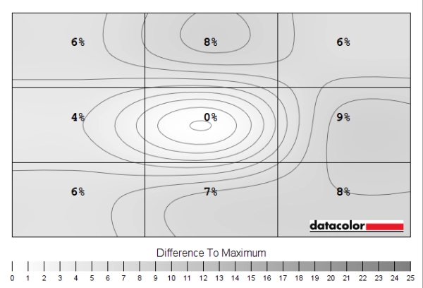
Luminance uniformity map
The SpyderX Elite was also used to analyse variation in the colour temperature (white point) for the same 9 quadrants. The deviation between each quadrant and the quadrant closest to the 6500K (D65) daylight white point target was analysed and a DeltaE value assigned. Darker shades are also used on this map to represent greater deviation from 6500K. A DeltaE >3 represents significant deviation that may be readily noticed by eye.
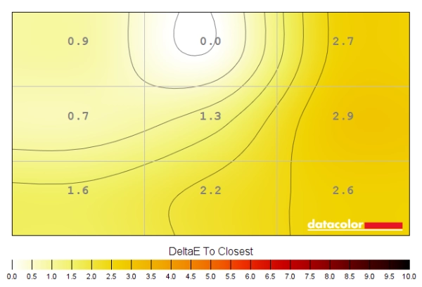
Colour temperature uniformity map
Results here were quite good, without significant deviation recorded. The point recorded as closest to 6500K was above the central region. A maximum deviation from this was DeltaE 2.9, recorded to the right of centre. The right side of the screen in general showed greater deviation from 6500K, although was still considered non-significant in this test. Remember again that individual units vary when it comes to uniformity and that you can expect deviation beyond the measured points.
Contrast in games and movies
The monitor provided a decent contrast experience on Battlefield V. At 906:1 under our ‘Test Settings’, the static contrast was not all that impressive for the panel type but not the lowest we’ve seen either. It’s quite a way off a decent VA model in that respect and isn’t sufficient to provide a deep, inky and atmospheric look to dark shades or dim areas of the game. This is especially true if you view the monitor in a dim to moderately dim room. There’s also ‘IPS glow’ which eats away at detail and atmosphere, most notably towards the bottom corners of the screen from a normal viewing position. The ‘IPS glow’ on this model is subdued somewhat compared to what we’d usually see. The glow tends to have a mild reddish orange or slightly pink tint to it and is certainly still there, but it didn’t encroach as far into the centre of the screen as we’ve often seen and isn’t quite as bright. This was preferable to having a somewhat higher static contrast but stronger ‘IPS glow’, in our view. It would be brought out more strongly if you’re sitting closer to the monitor, using a higher brightness setting or your unit has worse dark uniformity issues such clouding and backlight bleed. In a fairly well-lit room it was not all that eye-catching, although the relatively limited static contrast still limited the perceived depth of darker shades here. We found the screen surface agreeable in terms of the lack of layering in front of the image (its ‘light to very light’ quality). And the lack of obvious graininess from the relatively smooth finish, with just a fine mist instead that most won’t notice.
We made similar observations on Shadow of the Tomb Raider. This title is full or dark areas and certainly looks its best on a model with strong contrast performance. That wasn’t what was offered here, although the somewhat subdued ‘IPS glow’ did lift it a bit above some of its fellow IPS compatriots, even those with higher static contrast. We again found the weaknesses less apparent with brighter room lighting. On both titles we found the strong gamma consistency pleasing, without the dark detail gradient you see from top to bottom on TN models. Or the central black crush followed by some extra detail peripherally on VA models. We also observed Star Wars: The Rise of Skywalker, which is full of scenes demanding a strong contrast performance. The monitor didn’t give this a cinematic look, although the more subdued ‘IPS glow’ still helped. This film has black bars at the top and bottom (letterboxing) due to its aspect ratio and these certainly didn’t appear as deep as the black panel border. But weren’t as heavily lit up by ‘IPS glow’ as usual, either. Most content on platforms such as Netflix is native 16:9 content so wouldn’t show these bars.
Lagom contrast tests
The Lagom tests for contrast allow specific weaknesses in contrast performance to be identified. The following observations were made in a dark room.
- The contrast gradients were displayed appropriately with distinct brightness steps in all cases.
- Performance on the black level test was strong. The first few blocks blended readily into the background readily, which is expected for a monitor tracking the ‘2.2’ gamma curve closely for very dark shades. There was no obvious dithering.
- Performance on the white saturation test was very good. All patterns were distinct against the background. The final pattern was faintly visible, slightly fainter than it could be but not masked by obvious graininess or layering from the screen surface.
- The greyscale gradient appeared smooth without obvious banding or clear dithering.
Colour reproduction
Colour gamut
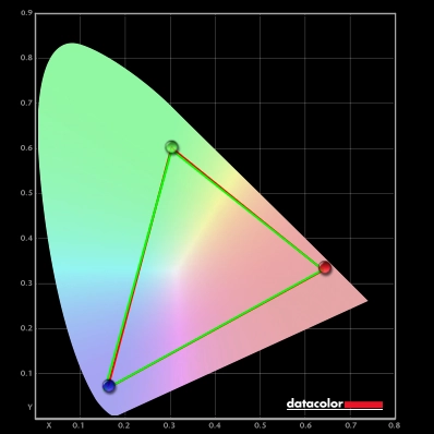
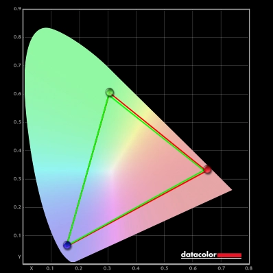
The Gigabyte AORUS FI27Q-X’s colour gamut (red triangle) was compared with the sRGB (green triangle) and DCI-P3 (blue triangle) reference colour spaces using our ‘Test Settings’, as shown in the first image below. It was also compared to Adobe RGB (purple triangle) in the second image. The gamut fully covers sRGB with a fair bit of extension beyond. This is particularly significant in the green region of the gamut but also for some areas of blue and red – more for reddish orange shades than pure reds. We measured 94% DCI-P3 coverage, close to the 93% specified. These coverage figures undersell the gamut, really, as there’s some extension beyond DCI-P3 in places as well. Particularly in that green region. The monitor provided 99% Adobe RGB coverage, just shy of the 100% specified. A very small amount of under-coverage and just a touch of extension beyond. This is a colour gamut biased towards the green to cyan region of the gamut but similar to sRGB in the red and blue corners of this gamut representation. This generous gamut provides a vivid look to sRGB content outside a colour-managed environment, with quite a hit of extra vibrancy and saturation.
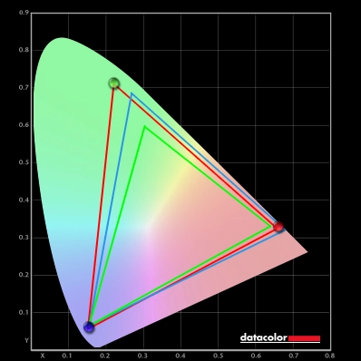
Colour gamut 'Test Settings'
Colour gamut 'Test Settings' vs. Adobe RGB
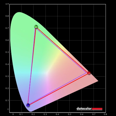
The monitor also offers an sRGB emulation setting, the ‘sRGB’ preset in the ‘Picture’ section of the OSD. This cuts down on the gamut very effectively without any real extension beyond sRGB and just a sliver of under-coverage – 99% sRGB coverage. Unlike such settings on some models, brightness is adjustable whilst ‘Overdrive’ can also be changed. As usual you can’t adjust gamma or colour channels, however. To maximise colour accuracy within the sRGB colour space, for colour-managed workflows, full calibration and profiling with a colorimeter or similar device is recommended. Using the full native gamut with full access to monitor controls, including colour channels. The excellent Adobe RGB coverage makes the monitor very capable for working within that colour space as well. You may try the ICC profile featured in the calibration section which includes gamut mapping for colour-aware applications, but best results are always obtained by calibrating your own unit with your own hardware.
Colour gamut 'sRGB'
Instead of using this ‘sRGB’ setting and putting up with the associated restrictions, AMD users can activate a flexible sRGB emulation setting via the graphics driver. This is done by opening ‘AMD Radeon Software’, clicking ‘Settings’ (cog icon towards top right) and clicking on ‘Display’. You should then ensure that the ‘Custom Color’ slider to the right is set to ‘Enabled’ and ‘Color Temperature Control’ set to ‘Disabled’. It may appear to be set this way by default, but the native rather than restricted gamut is likely in play. If that’s the case, simply switch the ‘Color Temperature Control’ slider to ‘Enabled’ then back to ‘Disabled’ to leverage the sRGB emulation behaviour. This setting is shown in the image below.

The gamut below shows results using our ‘Test Settings’ with this driver tweak applied. The colour gamut now offers 100% sRGB coverage, with just a sliver of extension beyond in some regions. The sRGB gamut is now covered very closely. This is a useful setting if you’re an AMD user and wish to gain good tracking of the sRGB gamut without profiling, including in applications that aren’t colour-managed. And you don’t wish to put up with restrictions associated with the monitor’s sRGB emulation setting. Remember not to use this tweak under HDR, though, or the image will appear significantly oversaturated.
Colour gamut AMD 'CTC disabled' setting
Colour in games and movies
The monitor gave Battlefield V a vibrant but varied appearance, with very strong saturation of some shades. Most content, including this game running in SDR, is designed with the sRGB colour space in mind. Where the monitor’s colour gamut extends beyond this, saturation is boosted which provides extra vibrancy. This look is different to a digital saturation boost, such as increasing ‘Color Vibrance’ in the OSD or increasing saturation via the graphics driver. That simply pulls shades closer to the edge of the gamut but does not expand the gamut itself, crushing things together and reducing variety. The saturation boost provided by the gamut maintains good spacing between shades so the variety remains. The very generous extension for green shades gave a very eye-catching look to vegetation, although some yellowish greens had their yellow brought out too strongly. And what should be lush and deep greens appeared more saturated than intended and somewhat neon. The gamut also extends beyond sRGB in the red region, but more towards orange than pure red. This gave fires a definite warming intensity and vividness, without some of the deep oranges verging too much on red as models with more pure red extension might show. The extension in the gamut here gave rich reddish brown earth and some woody tones a bit of an orangey-brown look. Affecting neutrality but falling short of the strong red push some wide gamut models would give. Some skin tones were affected in a similar way, looking overly tanned or pinkish as a result but not having the slightly sunburnt look that some models might provide.
Shadow of the Tomb Raider provided a similar experience. Some shades again stood out very strongly – orange fruit and berries in the environment, for example, had a real ‘orange pop’ to them. And fires were unmistakably vibrant and eye-catching. Some of the lush forest greens verged too much on the saturated neon side rather than looking as deep and lush as they should and some yellowish greens had yellow hues brought out too strongly. But the monitor still showcased a strong variety of green shades. Some of Lara Croft’s deep blue dresses and pink and purple flowers in the environment also had quite a punchy look. As did some patches of sky blue, which looked quite overdone and less muted than intended. Because of the excellent consistency, the strong vibrancy is maintained throughout the screen without the saturation losses in some regions that would be observed on VA and moreover TN models. This was observed on both titles and indeed more broadly. The strong vibrancy is something some users will really like, others not so much. This can be curtailed using the sRGB emulation setting described earlier, but you also need to put up with the restrictions imposed there including locked colour channels and things generally going too far the other way (undersaturated). You can at least adjust brightness here, which isn’t always possible with such settings.
We also observed various episodes of the animated TV series Futurama. This is an unforgiving test for colour consistency, with large areas of individual shade highlighting weaknesses there very readily. The monitor performed well in that respect, free from the clear saturation shifts you’d observe on VA or TN models. And stronger in that respect that respect than some IPS models, for that matter. The different shade classes were displayed in a distinct way – for example, pastel shades appeared more muted than shades that are intended to be deeper or more eye-catching. There was again clear extra saturation from the colour gamut, so pastel shades weren’t as muted as intended. But in comparison, some shades that are supposed to be vibrant such as bright oranges, neon pinks and greens stood out with exceptional ‘pop’. The strong colour consistency also allowed the monitor to display an excellent array of subtly different shades, including the skin tones of some characters – nuances lost on models with weaker colour consistency. Speaking of which, the red lobster-like creature Dr Zoidberg had a somewhat neon orangey-red appearance to his exoskeleton rather than the pale red intended. So whilst the representation of shades was certainly more saturated than intended here, with a particular bias for orange and green components, the strong variety was still maintained.
Shade representation using SpyderCHECKR 24
The image below shows a printed reference sheet of 24 ‘sRGB’ shades, included as part of the Datacolor SpyderCHECKR 24 package. The screen is displaying reference photographs of this printed sheet, in both the same order as printed (right side) and reverse order (left side). The camera is mounted slightly above centre so that the image is representative of what the eye sees from an ergonomically correct viewing position. This, coupled with the inclusion of a flipped version of the shade sheet, allows both accuracy and colour consistency to be visually assessed. Bracketed numbers in our analysis refer to shades on the printed sheet or right side of the screen if they’re ordered consecutively from top left to bottom right.
Note that there is always some disparity between how emissive objects (monitor) and non-emissive objects (printed sheet) appear. The representation of shades in this image depends on the camera and your own screen, it’s not designed to show exactly how the shades appear in person. It still helps demonstrate some of the relative differences between the original intended sRGB shade and what the monitor outputs, however. Full profiling and appropriate colour management on the application would provide a tighter match, our intention here is to show what can be expected in a non colour-managed environment.

The monitor represents shades in a vibrant way with clear extra saturation. On the red-biased side, medium orange (3) and tango pink (11) appear highly saturated and a touch neon. Candy apple red (14) appears quite neon rather than the intended deeper red shade, whilst light chocolate brown (24) is more of an orangey-brown hue. Peach pink (20) also appears mor reddish and less neutral in appearance than it should. This is all due primarily to the extension in the red region of the gamut with a particular bias in the orange-red region. The very generous extension beyond sRGB in the green region, meanwhile, gives dark lime green (18) and yellow green (19) a rather eye-catching look – again a bit neon. Some shades are quite well-represented with less oversaturation, such as; aquamarine (4), lilac and grape purple (15). The consistency of the screen is strong without the sort of clear saturation shifts you’d observe on a VA or TN model depending on the on-screen shade position. The slight differences when comparing a given shade are down more to slight uniformity issues on our unit than viewing angle related weaknesses. The image below shows how things appear using the sRGB emulation mode (‘sRGB’ in the ‘Picture’ section of the OSD).

Saturation is now massively reduced, with many shades now appearing undersaturated rather than oversaturated. To give just a few examples; aquamarine (4) appears more aqua, medium orange (3) appears too pale. And gamboge (23) has lost its intended rich saffron hue and appears too yellow. Candy apple red (14) appears deeper and much less neon, whilst peach pink (20) and light chocolate brown (24) appear more neutral. Dark lime green (18) and yellow green (19) are less neon as well and more appropriately displayed. Some of these differences are clearer when observing the screen in person due to the previously mentioned limitations. The representation of certain shades is particularly pleasing now, such as lilac (8), avocado (12) and grey blue (16). As usual, we’d recommend profiling the monitor with your own colorimeter or alternative calibrator using the native gamut if you require the highest level of colour accuracy.
Viewing angles
Lagom’s viewing angle tests help explore the idea of colour consistency and viewing angle performance. The following observations were made from a normal viewing position, eyes ~70cm from the screen.
- The purple block appeared pinkish purple throughout the screen. Very slightly pinker towards the extreme edges. The pink hue didn’t shift or intensity along with head movement as would be observed on a VA or TN model.
- The red block appeared a rich and vibrant red throughout the screen. Free from the saturation shifts between towards a more faded red or pink as you can see on VA or TN models.
- The green block appeared a saturated green chartreuse throughout. Without shifts between a purer green and more yellow-green as you might observe on other LCD panel types.
- The blue block appeared royal blue throughout.
- The Lagom text appeared blended grey throughout, with a subtle dark red striping towards the bottom and subtle blended green striping further up. There were no clear flashes of saturated red, green or orange. This indicates low viewing angle dependency to the gamma curve of the monitor, as typical for an IPS-type panel. The photo below gives a rough indication of how this test appeared.

The video below shows the Lagom text test, a mixed desktop background, game scene and dark desktop background from a variety of viewing angles. The medium-light grey background of the Lagom text shows a slightly more pronounced shift in colour temperature than you’d see on some IPS-type panels, becoming noticeably warmer as viewing angle increases. You can see some shifts in contrast and colour for the mixed desktop background and game scene, with a ‘hazing’ or perceived contrast loss at moderate to steep angles. The overall shifts in colour are less extreme than on some IPS models and lower than you’d see on TN or VA models. The dark desktop background highlights ‘IPS glow’, which creates an obvious ‘bloom’ as viewing angles become steeper. This appears with a slightly pink or reddish orange hue from most angles. Quite colourful in its appearance but not quite as intense with its blooming from narrower angles compared to most IPS models.
Interlace pattern artifacts
On some monitors, particularly but not exclusively those with high refresh rates, interlace patterns can be seen during certain transitions. We refer to these as ‘interlace pattern artifacts’ but some users refer to them as ‘inversion artifacts’ and others as ‘scan lines’. They may appear as an interference pattern, mesh or interlaced lines which break up a given shade into a darker and lighter version of what is intended. They often catch the eye due to their dynamic nature, on models where they manifest themselves in this way. Alternatively, static interlace patterns may be seen with some shades appearing as faint horizontal or vertical bands of a slightly lighter and slightly darker version of the intended shade.
We did not observe any static interlace patterns on this model. We observed some dynamic ‘interlace pattern artifacts’, fine interlaced vertical lines during movement or when scanning our eyes across the screen in a certain way. Mainly observed for brighter shades. They were quite easy to notice at low refresh rates, double digits and particularly closing in to ~60Hz. Here, they tended to catch the eye even when simply viewing static content and moving your eyes a little. They were relatively faint at higher refresh rates – by 100Hz or so most users would find them difficult to spot as they’re well-blended. Much above that they become too faint to be noticed by most users. They’re certainly not something everyone will notice or find bothersome from a normal viewing distance (60cm+), particularly at higher refresh rates. These are very tricky to accurately capture on camera, especially as moiré tends to dominate. But the image below demonstrates the static interlace patterns (vertical stripes). This was captured at 60Hz on The Outer Worlds.

Responsiveness
Input lag
A small utility called SMTT 2.0 was used alongside a sensitive camera to analyse the latency of the FI27Q-X, with over 30 repeat readings taken to help maximise accuracy. Using this method, we calculated 2.46ms (under 2/3rd of a frame at 240Hz) of input lag. We measured a marginally higher but still very respectable input lag of 3.35ms at 60Hz. The input lag measured here is influenced by both the element you ‘see’ (pixel responsiveness) and the main element you ‘feel’ (signal delay). It indicates a very low signal delay which even sensitive users shouldn’t find bothersome. Note that we don’t have the means to accurately measure input lag with Adaptive-Sync active in a variable refresh rate environment or with HDR active in an HDR environment.
Perceived blur (pursuit photography)
Our article on the topic explores various concepts related to monitor responsiveness, including perceived blur. This is contributed to by both the pixel responses of the monitor and the movement of your eyes as you observe motion on the screen. This second factor is dominant on modern monitors, but both factors are important. A photography technique known as ‘pursuit photography’ is also explored. Using a moving rather than stationary camera to capture motion on a monitor in a way that reflects both key elements of perceived blur.
The images below are pursuit photographs taken using the UFO Motion Test for ghosting, with the UFO moving across the screen from left to right at a frame rate matching the refresh rate of the display. The test is set to run at its default speed of 960 pixels per second, which is a good practical speed for such photographs highlights weaknesses well. The monitor was tested at 60Hz (directly below), 144Hz, 200Hz and 240Hz using all ‘Overdrive’ pixel response time settings; ‘Picture Quality’, ‘Balance’ and ‘Speed’. Intermediate refresh rates such as 120Hz and 165Hz were not included but were observed and performed some way between the tested refresh rates as you might expect. All rows of the UFO Motion Test were used, highlighting a range of pixel transitions between various shades. The final columns show some reference screens for comparison, using what we deem to be their optimal pixel response time settings. The first reference screen is the Dell Alienware AW2521HF using a fast AUO AHVA (IPS-type) panel and the second is the Acer XN253Q X using a very responsive TN panel.

At 60Hz, shown above, the UFO appears relatively broad without clear internal detailing. This reflects a significant degree of perceived blur due to eye movement and is tied to the 60Hz refresh rate. Varying levels of trailing can be seen behind the UFO due to weaknesses in pixel responsiveness. The ‘Picture Quality’ setting shows just a small whiff of ‘powdery’ trailing in places, behind the UFO for the dark background (top row) and medium background (middle row). The light background (bottom row) has an apparent ‘glow’ in the image around the UFO cockpit, but this wasn’t observed by eye. There was a little bit of overshoot (inverse ghosting) but nothing as distinct as the image might suggest. The ‘Balance’ setting gets rid of the already faint ‘powdery’ trailing and replaces it with moderate amounts of overshoot. With some bright and colourful elements visible – some ‘halo’ trailing that stands out due to being brighter than the object or background. The ‘Speed’ setting intensifies this overshoot, with it taking on a rather bright and colourful appearance, particularly for the dark and medium backgrounds. We consider the ‘Picture Quality’ setting optimal here, largely similar to the reference screens and quite well-tuned for 60Hz really. The pursuit photographs below show how things looked with refresh rate increased significantly to 144Hz.

At 144Hz, shown above, the UFO now appears significantly narrower with internal detailing more clearly visible. This indicates a significant reduction in perceived blur due to eye movement. There are again varying degrees of trailing behind the UFOs. The pixel response requirements for optimal performance are significantly increased now, with the ‘powdery’ trailing more visible with the ‘Picture Quality’ setting. The ‘Balance’ setting reduces this rather effectively, without introducing the sort of overshoot visible at 60Hz. There is still a bit of overshoot, particularly for the light background and behind the UFO legs for the dark background. Overall results are quite similar to the AW2521HF and not too far from the XN253Q X for the transitions shown. The Acer performs particularly well and ‘cleanly’ for the dark background, but shows a bit of ‘powdery’ trailing of its own behind the UFO cockpit with the medium background. We consider the ‘Balance’ setting optimal for the AORUS, although the ‘Picture Quality’ setting could be preferred by those sensitive to overshoot. The pursuit photographs below show how things looked with refresh rate bumped up to 200Hz.

At 200Hz, shown above, the UFOs appear somewhat narrower and a bit more sharply focused. This indicates a further decrease in perceived blur due to eye movement. The pixel response requirements are further increased. The overall trailing characteristics are quite similar to at 144Hz, with the ‘powdery’ trailing extending a little further back and being a bit bolder in places, especially with the ‘Picture Quality’ setting. The ‘Balance’ setting is good at minimising this without introducing obvious overshoot. The ‘Speed’ setting essentially removes any ‘powdery’ trailing for the transitions shown but introduces moderate overshoot. It’s less obvious than at lower refresh rates but some users would find it quite eye-catching still. We consider ‘Balance’ optimal here. The pursuit photographs below show things with a further increase in refresh rate, to 240Hz.

At 240Hz, shown above, the UFO appears narrower again with clearer internal detailing. The segmentation is clearer to the eye than it appears in the image, with bolder black lines – the brightness and saturation affected how the camera captured this. The pixel response requirements for optimal performance are further increased here, so the slight weaknesses such as ‘powdery’ trailing become more apparent. This is again decreased going from ‘Picture Quality’ to ‘Balance’. Performance with the ‘Balance’ setting is largely similar to the AW2521HF for the transitions shown. Slightly slower for some transitions (dark background), a touch faster elsewhere (medium background). Importantly, the AW2521HF is running with its ‘Extreme’ overdrive setting here and that requires Adaptive-Sync is enabled. And that the frame rate (and hence refresh rate) remains very high to avoid obvious overshoot. The AORUS with its ‘Balance’ setting is much more forgiving, offering similar pixel response tuning with Adaptive-Sync disabled or enabled. And providing more reasonable overshoot levels during refresh rate dips.
The ‘Speed’ setting still shows some overshoot, particularly for the dark background where a reasonably bright ‘halo’ trail is visible behind the UFO. But this is less noticeable than the overshoot using this setting at lower refresh rates. The XN253Q X again shows a rather clean performance in comparison, especially for the dark background. We consider ‘Balance’ optimal and nicely balanced in terms of rapid pixel responses without obvious overshoot. But if you can tolerate a bit of overshoot for some transitions, the ‘Speed’ setting may be of interest.
As well as increasing refresh rate to minimise perceived blur due to eye movement, an alternative way to minimise this can be found in the form of the Aim Stabilizer strobe backlight setting. With this enabled, the backlight pulses at a frequency matching the refresh rate of the display – either 120Hz, 144Hz, 165Hz, 200Hz or 240Hz. Sensitivity to this flickering varies and some may find it bothersome whilst others will notice accelerated eye fatigue when using the setting, even if the flickering isn’t actively bothersome to them. The pursuit photographs below were taken with the monitor set to 120Hz using Aim Stabilizer. The ‘Overdrive’ settings are greyed out with this active and set to a high level, whilst the brightness control is also inaccessible and HDR can’t be used. A few reference screens are also shown for comparison using their respective strobe backlight settings at 120Hz. The AOC C24G1 using MBR (Motion Blur Reduction) and set to what we consider its optimal setting for that. And the Dell S2417DG using ULMB (‘Ultra Low Motion Blur’).

With Aim Stabilizer active at 120Hz, above, the UFO appears narrowly focused with more distinct segmentation and internal detailing. This reflects a solid decrease in perceived blur due to eye movement. There are various ‘visual distractions’ to be aware of as you can no doubt see in the image. First and foremost, there’s a huge amount of overshoot behind the UFOs. Very bright and colourful. This is split into multiple distinct fragments due to the strobe nature of the background. There’s also a repetition of the object in front of the object, particularly for the dark background. The all-encompassing term ‘strobe crosstalk’ is used to describe this sort of repetition of the object. The KSF phosphors used for the backlight also introduce a colourful (magenta to red) fringe to the crosstalk in this example, due to their relatively slow decay rate. The reference shots are free from such clear strobe crosstalk, strong overshoot or colourful fringes. The image set below shows results with a bump up in refresh rate to 240Hz, Aim Stabilizer again active. Note we didn’t include results for intermediate refresh rates here as they didn’t show any novel behaviour. They just appeared some way between what is shown at 120Hz and 240Hz.

With Aim Stabilizer active at 240Hz, above, the UFO shows very distinct internal detailing. Segments and notches on the UFO body are clearly visible and the object appears very much like its original static source image. The fragments of overshoot and strobe crosstalk in front are much narrower due to the increased strobe frequency. The overshoot is just a touch weaker, but still very strong and eye-catching. Note that not all areas of the screen refresh simultaneously. So the strobe crosstalk, which can be seen most clearly here slightly in front of the UFO cockpit with the dark background, appears differently depending on how far up or down the screen the movement is observed. The images below show pursuit photographs running from the top to bottom regions of the screen, with the screen set to 240Hz and Aim Stabilizer active. Strobe crosstalk variation at different points was also observed at lower refresh rate and it was broadly similar, so we didn’t feel it was worthwhile documenting these observations.

Further up the screen the screen strobe crosstalk appears in front of the object. This becomes fainter and eventually disappears a bit further down. For the central regions it isn’t visible, at least for the transitions being performed here. That’s where your attention mainly focuses when immersed into a competitive FPS title where this sort of setting might be of particular interest. Lower down the screen the strobe crosstalk is displaced so it’s behind the UFO. It’s difficult to see in the image, but the UFO actually appears doubled up lower down the screen. The clear overshoot is present throughout the screen regardless of this strobe crosstalk behaviour – we explore this, other visual distractions and our overall feelings using this setting in our subjective testing a little later on.
Responsiveness in games and movies
On Battlefield V, with the frame rate keeping pace with refresh rate, the monitor put in a solid 240Hz performance overall. The monitor is outputting up to 4 times as much visual information every second compared to 60Hz. This improves the ‘connected feel’, which describes the precision and fluidity you feel when interacting with the game environment. This is also aided by the very low signal delay of the screen. This high refresh rate at suitably high frame rates significantly reduces perceived blur due to eye movement. This was demonstrated earlier using the UFO Motion Test for ghosting. Compared to 144Hz (at 144fps), the bump up isn’t as dramatic as when coming going from 60Hz to 144Hz. But the improvement in ‘connected feel’ and reduction in perceived blur due to eye movement was still something we noticed. And some users will readily appreciate this.
It’s also important to consider pixel responsiveness. And in that respect the monitor put in a pretty pleasing performance, with only minor weaknesses for some transitions. Most transitions were performed fast enough for a convincing 240Hz performance. The weaknesses manifested as faint ‘powdery’ trailing which stuck very close to the object and was significantly fainter than the object itself. As such the impact on perceived blur from these minor weaknesses was not too pronounced. This was most readily observed for very dark or very bright shades against a contrasting background, but even then it was quite restrained. And there was really nothing in the way of overshoot to complain about – slight traces in places but nothing that caught the eye. The ‘Speed’ setting cuts down on much of this ‘powdery’ trailing, although does not entirely eliminate it. And it introduces some overshoot in places. There are some good examples of this in the section of the video review highlighted below. As noted there it isn’t all that widespread or too strong at high refresh rates such as 240Hz so it may be the preferred setting for competitive play. But some will be perfectly satisfied with the less aggressive ‘Balance’ setting, even if gaming competitively.
Shadow of the Tomb Raider told a similar story. And that is one of a pretty solid high frame rate 240Hz performance, with only minor weaknesses. The competitive edge the high frame rate and refresh rate combination brings to this title is really of limited consequence. As a single player action-adventure game. Nonetheless, the fluidity was there to appreciate with a nice reduction in perceived blur due to eye movement, compared to lower frame rates or refresh rates. And an excellent ‘connected feel’ to go with it. There were no major pixel response time weaknesses, again some ‘powdery’ trailing which was most pronounced but still on the minor side for very bright or dark shades with a contrasting background. Quite common on this title, in fact. There was nothing significant in the way of overshoot to complain about, with very good pixel overdrive tuning in that respect.
We also observed a range of video content, including ~24-30fps movie content on platforms including Netflix. And 60fps YouTube videos. The monitor performed very well in both cases, without clear weaknesses from pixel responses or noticeable overshoot. The much lower frame rate certainly doesn’t let a monitor like this stretch its legs and the pixel response requirements for optimal performance are greatly reduced compared to the much higher frame rates observed during gameplay. The even division of 24fps, 30fps and indeed 60fps into 240Hz might also be appreciated by some for its even division, reducing juddering. But the low frame rates themselves still impart some juddering, especially during rapid pans of the camera – not a fault of the monitor.
As an Amazon Associate I earn from qualifying purchases made using the below link. Where possible, you’ll be redirected to your nearest store. Further information on supporting our work.
|
Aim Stabilizer
We’ve already introduced the Aim Stabilizer feature, its principles of operation and how it performs using specific tests. When using Aim Stabilizer or any strobe backlight feature, it’s vital that your frame rate matches the refresh rate of the display exactly. Otherwise you’re left with very clear stuttering or juddering. This is because there’s very little perceived blur due to eye movement to mask it. As is often the case with strobe backlight technologies, you can’t use Adaptive-Sync at the same time. HDR can’t be activated, either. We demonstrated earlier using UFO Motion Test for ghosting that activating this feature significantly reduces perceived blur due to eye movement. We used the feature on a range of game titles but will simply focus on Battlefield V running at a constant 240fps @240Hz with the feature active. The overriding observations were similar when using this model at lower refresh rates, although overshoot and flickering was intensified at reduced refresh rates. The setting certainly achieved its main aim of significantly reducing perceived blur due to eye movement. And the clarity of objects during motion was clearer as a result. During even the most rapid movement, including turning in a vehicle or rapidly turning your character, the game environment maintained sharp detail. This makes tracking and engaging enemies potentially a bit easier and can provide a competitive edge.
This was far from the cleanest strobe backlight experience, though. There was strong, colourful and inky-looking overshoot across a broad range of transitions. This occurred throughout the screen. There were secondary distractions to consider such as strobe crosstalk at some sections of the screen, but as demonstrated earlier the centre of the screen did not really suffer from this. Only higher up and lower down – and it’s the central band where you mainly focus during competitive play. For very bright shades we did actually observe strong crosstalk centrally as well and this showed some magenta to red fringing due to the KSF phosphors of the backlight. We also observed some colourful flashes, including cyan and magenta, when observing slender bright objects in particular. This is quite common on wide gamut models but quite noticeable in this case – although reduced at 240Hz compared to significantly lower refresh rates. The ‘dynamic interlace pattern artifacts’ we covered earlier become more noticeable with the feature active, too. Given these visual distractions, the locked brightness and inability to use Adaptive-Sync we see this as a setting with quite limited appeal really. Even many competitive gamers will find the regular operation of the monitor at 240Hz and suitably high refresh rates very good in terms of low perceived blur. And with far fewer visual distractions.
VRR (Variable Refresh Rate) technology
FreeSync – the technology and activating it
AMD FreeSync is a variable refresh rate technology, an AMD-specific alternative to Nvidia G-SYNC. Where possible, the monitor dynamically adjusts its refresh rate so that it matches the frame rate being outputted by the GPU. Both our responsiveness article and the G-SYNC article linked to explore the importance of these two elements being synchronised. At a basic level, a mismatch between the frame rate and refresh rate can cause stuttering (VSync on) or tearing and juddering (VSync off). FreeSync also boasts reduced latency compared to running with VSync enabled, in the variable frame rate environment in which it operates.
FreeSync requires a compatible AMD GPU such as the Radeon RX 580 used in our test system. The monitor must support ‘VESA Adaptive-Sync’ for at least one of its display connectors, as this is the protocol that FreeSync uses. The Gigabyte FI27Q-X supports FreeSync Premium via DP 1.4 and HDMI 2.0 on compatible GPUs and systems. Note that HDR can be activated (at the same time as FreeSync) as well. You need to make sure ‘AMD FreeSync Premium’ is set to ‘ON’ in the ‘Gaming’ section of the OSD. On the GPU driver side recent AMD drivers make activation of the technology very simple. You should ensure the GPU driver is setup correctly to use FreeSync, so open ‘AMD Radeon Software’, click ‘Settings’ (cog icon towards top right) and click on ‘Display’. You should then ensure that the first slider is set to ‘Enabled’ as shown below. The top image shows the monitor connected by DP and the bottom image by HDMI. The setting is referred to as ‘AMD FreeSync Premium’ in both cases, although the exact wording may depend on the driver version you’re using.


The AORUS supports a variable refresh rate range of 48 – 240Hz (144Hz max via HDMI). That means that if the game is running between 48fps and 240fps, the monitor will adjust its refresh rate to match. When the frame rate rises above 240fps, the monitor will stay at 240Hz and the GPU will respect your selection of ‘VSync on’ or ‘VSync off’ in the graphics driver. With ‘VSync on’ the frame rate will not be allowed to rise above 240fps, at which point VSync activates and imposes the usual associated latency penalty. With ‘VSync off’ the frame rate is free to climb as high as the GPU will output (potentially >240fps). AMD LFC (Low Framerate Compensation) is also supported by this model, which means that the refresh rate will stick to multiples of the frame rate where it falls below the 48Hz (48fps) floor of operation for FreeSync. If a game ran at 35fps, for example, the refresh rate would be 70Hz to help keep tearing and stuttering at bay. LFC sometimes seemed to activate at slightly higher refresh rates, closer to 52Hz (52fps) or so, but this makes little difference in practice. This feature is used regardless of VSync setting, so it’s only above the ceiling of operation where the VSync setting makes a difference.
To configure VSync, open ‘AMD Radeon Software’. Click ‘Settings’ (cog icon towards top right) and click ‘Graphics’. The setting is listed as ‘Wait for Vertical Refresh’. This configures it globally, but if you wish to configure it for individual games click ‘Game Graphics’ towards the top right. The default is ‘Off, unless application specifies’ which means that VSync will only be active if you enable it within the game itself, if there is such an option. Such an option does usually exist – it may be called ‘sync every frame’ or something along those lines rather than simply ‘VSync’. Most users will probably wish to enable VSync when using FreeSync to ensure that they don’t get any tearing. You’d therefore select either the third or fourth option in the list, shown in the image below. Above this dropdown list there’s a toggle for ‘Radeon Enhanced Sync’. This is an alternative to VSync which allows the frame rate to rise above the refresh rate (no VSync latency penalty) whilst potentially keeping the experience free from tearing or juddering. This requires that the frame rate comfortably exceeds the refresh rate, not just peaks slightly above it. We won’t be going into this in detail as it’s a GPU feature rather than a monitor feature.

Some users prefer to leave VSync enabled but use a frame rate limiter set a few frames below the maximum supported (e.g. 237fps) instead, avoiding any VSync latency penalty at frame rates near the ceiling of operation or tearing from frame rates rising above the refresh rate. If you go to ‘Game Assist’ and activate the ‘Refresh Rate’ feature, the monitor will display the refresh rate. This will coincide with the frame rate of the content if the monitor is within the main VRR window. The counter reacts very rapidly to changes in frame rate so it can be tricky to read the exact value. Finally, it’s worth noting that FreeSync only removes stuttering or juddering related to mismatches between frame rate and refresh rate. It can’t compensate for other interruptions to smooth game play, for example network latency or insufficient system memory. Some game engines will also show stuttering (or ‘hitching’) for various other reasons which won’t be eliminated by the technology.
FreeSync – the experience
As usual we used this monitor with a range of game titles using AMD FreeSync and found the experience similar in all cases. Any issues affecting one title but not another suggests a game or GPU driver issues rather than a monitor issue. We’ll therefore simply focus on Battlefield V for this section. The game offers excellent flexibility with its graphics settings, allowing a broad range of refresh rates to be tested. That said, the Radeon RX 580 used in our test system is far from a powerhouse and running a solid 240fps at the WQHD resolution is out of the question on this title. There were plenty of dips below this, but the technology worked well to ensure there wasn’t tearing or stuttering from frame and refresh rate mismatches. You’d usually see stuttering (VSync enabled) or tearing (VSync disabled) in such scenarios due to mismatches, without a VRR technology in use. Sensitivity to tearing and stuttering varies, but if you’re sensitive to such things it’s very nice having a VRR technology like FreeSync doing its thing.
The reduction in frame rate still negatively impacts ‘connected feel’ and increases perceived blur. Another consequence in reduced refresh rates is an increase in overshoot. The monitor doesn’t offer variable overdrive, so the pixel overdrive algorithm isn’t retuned as refresh rate changes. Into the double digits and especially by around 80Hz there was some fairly noticeable overshoot in places. Halo trailing that’s brighter than the object or background colour and sometimes includes some colourful (including blue to cyan) elements. This wasn’t all that widespread or as obnoxious as we sometimes see, so depending on tolerance the ‘Balance’ setting which we like to use for higher refresh rates could still make sense. Otherwise, the ‘Picture Quality’ setting might be of interest. It still provides a decent performance for these sorts of refresh rates where the pixel response requirements are reduced. And does so without any overshoot to speak of.
When frame rate dipped below the 48fps (48Hz) floor of operation, LFC (Low Framerate Compensation) kicked in. This kept tearing and stuttering at bay by ensuring the refresh rate of the monitor stuck to a multiple of the frame rate. There was a bit of stuttering when LFC activated or deactivated, which is something we always observe with this technology. But if you’re only occasionally passing the boundary, it isn’t something to worry about. It could be annoying if you’re frequently passing the boundary, though.
Nvidia Adaptive-Sync (‘G-SYNC Compatible’)
As noted earlier, AMD FreeSync makes use of Adaptive-Sync technology on a compatible monitor. As of driver version 417.71, users with Nvidia GPUs (GTX 10 series and newer) and Windows 10 can also make use of this Variable Refresh Rate (VRR) technology. When a monitor is used in this way, it is something which Nvidia refers to as ‘G-SYNC Compatible’. The Gigabyte AORUS is amongst models which are specifically validated as G-SYNC compatible, which means it has been tested by Nvidia and passes specific quality checks. With the FI27Q-X, you need to connect the monitor up via DisplayPort and enable ‘AMD FreeSync Premium’ in the ‘Gaming’ section of the OSD. This enables Adaptive-Sync on the monitor and will unlock the appropriate settings in Nvidia Control Panel. When you open up Nvidia Control Panel, you should then see ‘Set up G-SYNC’ listed in the ‘Display’ section. Ensure the ‘Enable G-SYNC, G-SYNC Compatible’ checkbox and ‘Enable settings for the selected display model’ is checked as shown below and press ‘OK’. If you’ve enabled ‘G-SYNC Compatible’ and it was previously disabled, the monitor should re-establish its connection with the system and the technology should now be active.
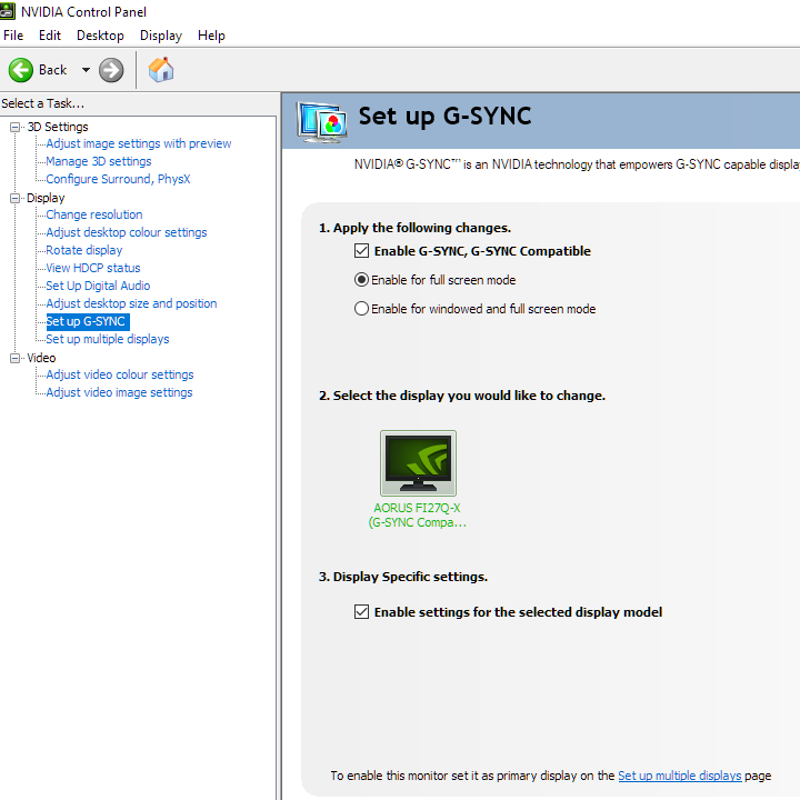
As noted previously and as highlighted in Nvidia Control Panel, this model has been specifically tested and validated as ‘G-SYNC Compatible’ by Nvidia. The experience using ‘G-Sync Compatible Mode’ on our RTX 3090 was very similar to the experience using AMD FreeSync on this model. A slight difference was the floor of operation, which was 60Hz if the monitor was set to 240Hz. 50Hz if it was set to 120Hz and between those values with intermediate refresh rates selected. An LFC-like frame to refresh multiplication technology was employed below that to keep tearing and stuttering from frame and refresh rate mismatches at bay. There was again a momentary stuttering as the boundary was crossed, as we observed with our AMD GPU as well.
Our suggestions regarding use of VSync also apply, but you’re using Nvidia Control Panel rather than AMD Radeon Software to control this. The setting is found in ‘Manage 3D settings’ under ‘Vertical sync’, where the final option (‘Fast’) is equivalent to AMD’s ‘Enhanced Sync’ setting. You’ll also notice ‘G-SYNC Compatible’ listed under ‘Monitor Technology’ in this section, as shown below. Make sure this is selected (it should be if you’ve set everything up correctly in ‘Set up G-SYNC’).

Finally, remember that you can use the ‘Refresh Rate’ feature in the ‘Game Assist’ section of the OSD to display the current refresh rate of the monitor. This will reflect the frame rate if it’s within the main variable refresh rate window. And as with AMD FreeSync, HDR can be used at the same time as ‘G-SYNC Compatible Mode’.
HDR (High Dynamic Range)
On an ideal monitor, HDR (High Dynamic Range) involves the display of very bright light shades and very deep dark shades simultaneously. The monitor should also be able to display an excellent range of shades between these, including highly saturated and much more muted ones. The monitor would ideally support per-pixel illumination (e.g. backlightless technology such as OLED) or failing that offer a very large number of dimming zones with precise control. A solution such as FALD (Full Array Local Dimming) with a good number of dimming zones, for example. This would allow some areas of the screen to pump out very high brightness whilst others remain very dim. Colour reproduction is an important part of HDR, too. The ultimate goal here is support for a huge colour gamut, Rec. 2020. A more achievable near-term goal is support for at least 90% DCI-P3 (Digital Cinema Initiatives standard colour space) coverage. Finally, HDR makes use of at least 10-bit precision per colour channel, so its desirable that the monitor supports at least 10-bits per subpixel.
The HDR10 pipeline is the most widely supported HDR standard used in HDR games and movies and that’s what’s supported here. For most games and other full screen applications that support HDR, the Gigabyte automatically switches into its HDR operating mode when an HDR signal is detected. As of the latest Windows 10 update, relevant HDR settings in Windows are found in ‘Windows HD Color settings’ which can be accessed via ‘Display settings’ (right click the desktop). Most game titles will activate HDR correctly when the appropriate in-game setting is selected. A minority of game titles that support HDR will only run in HDR if the setting is active in Windows as well. Specifically, the toggle which says ‘Play HDR games and apps’. If you want to view HDR movies on a compatible web browser, for example, you’d also need to activate the ‘Stream HDR Video’ setting. These settings are shown below. Also note that there’s a slider that allows you to adjust the overall balance of SDR content if HDR is active in Windows. This is really just a digital brightness slider, so you lose contrast by adjusting it. When viewing SDR content with HDR active in Windows things appeared better-balanced than we’ve seen on some models, but as explored shortly you lose access to many adjustments in the OSD, including brightness and colour channel settings. We’d recommend only activating HDR in Windows if you’re about to specifically use an HDR application that requires it, and have it deactivated when viewing normal SDR content on the monitor.
For simplicity we’ll just focus on a few titles in this section; Battlefield V and Shadow of the Tomb Raider. We’ve tested both titles on a broad range of monitors under HDR and we know they’re a good test for monitor HDR capability. The experience described here is largely down to the screen itself, with strengths and limitations made clear. Although our testing here is focused on HDR PC gaming using DisplayPort, we made similar observations when viewing HDR video content on the Netflix app. There are some additional points to bear in mind if you wish to view such content. We made similar observations using HDMI, which would be used when viewing HDR content on an HDR compatible games console for example. Testing on both our Nvidia and AMD GPUs showed that the HDR implementation was similar in both cases, although on our AMD GPU the monitor had a moderately strong yellowish green tint under HDR. Like some sort of chartreuse filter was applied, which your eyes adjust to a bit over time but don’t completely compensate for. As usual under HDR, many settings are inaccessible – including the entirety of the ‘Picture’ menu. You can’t change presets or adjust things like brightness, colour channels, sharpness or gamma. You can access ‘Super Resolution’ in the ‘Gaming’s section of the OSD if you want to add a sharpness filter.
The Gigabyte AORUS FI27Q-X is VESA DisplayHDR 400 certified. This is the lowest level of HDR certification provided by VESA, so only a basic HDR experience is provided. The colour gamut requirements are quite loose here, although we recorded 94% DCI-P3 on this model which is sufficient even for higher HDR tiers than this. This is shown in the graphic below, taken from earlier in the review. The red triangle shows the monitor’s colour gamut, the blue triangle DCI-P3 and green triangle sRGB. With the gamut providing a decent match for the near-term target developers have in mind under HDR (DCI-P3), the colour reproduction under HDR was quite respectable. Because wider gamuts like this are targeted rather than sRGB, which is the target under SDR, you don’t get that oversaturated look to some elements. The extra red and orange hues injected into shades such as certain woody tones, patches of earth and some skin tones is not present and such shades appear more neutral and appropriate. Likewise, the significant extension beyond sRGB in the green region of the gamut is put to good use now instead of causing some shades to appear somewhat neon where it isn’t intended.
Vegetation now appears lush and varied without inappropriately strong yellow hues or green shades which look brighter, more neon and simply less natural than intended. The colour gamut actually extends beyond DCI-P3 and encroaches more on the longer-term Rec. 2020 standard for some green shades which helps give strong but appropriate depth and saturation here under HDR. Certain other shades such as rich reds, deep purple flowers and some brightly painted objects weren’t as vivid as they could be. Greater encroachment of the Rec. 2020 gamut or even more complete DCI-P3 coverage in such regions of the gamut would help there. More precise luminance control (e.g. local dimming) would also help inject superior depth to some shades.
Colour gamut 'Test Settings'
The HDR10 pipeline makes use of 10-bits per colour channel, with the monitor supporting this (8-bit + FRC) at up to 200Hz via DP 1.4 and at up to 60Hz via HDMI 2.0 at the native resolution. At 240Hz via DP and 144Hz using HDMI, the 2-bit dithering stage is offloaded to the GPU. This actually works very well and provides a similar result, so don’t expect dramatic differences here. But subtle differences may be noticed during careful side by side comparison of very specific content and we can appreciate some people will like to know the monitor is handling the 10-bit signal itself without GPU dithering being used. However it’s achieved, the 10-bit colour processing provides a natural uplift to darker areas. There’s a greater nuanced variety of closely matching shades, achieving this look which simply isn’t replicated under SDR even with gamma enhancement. Such ‘enhancements’ would instead provide a flooded and less natural appearance to things. 10-bit colour is helpful for shade variety elsewhere, too. For very bright shades, for example particle effects such as smoke and fog and lighting effects, there were much smoother gradients. More natural-looking progressions which made certain elements appear more realistic. The image below shows one of our favourite scenes under Shadow of the Tomb Raider for highlighting a strong HDR performance. Note that the photo is purely for illustrative purposes and in no way represents how the monitor appeared running HDR in person.

This scene highlighted the positive impacts of the 10-bit colour reproduction nicely. The bright natural light streaming in from above with the misty spray from the waterfall both showed very natural and gentle gradients. The definition was improved for darker shaded areas by the enhanced nuanced shade variety, too. The maximum luminance is quite limited by HDR standards and there’s no local dimming on the backlight, though. Bright elements such as the sun or its glint off the water and waxy leaf surfaces didn’t really have the ‘pop’ it should have. Whilst shaded areas should appear dimmer than they should with suitable dimming of the backlight that respects the broad range of desired shade brightness levels. Darker areas didn’t have the atmospheric look they could have, with elevated luminance levels and ‘IPS glow’ brought out a fair bit. The monitor makes use of reactive Dynamic Contrast under HDR, though, which can respond to HDR metadata for enhanced precision. This is no substitute for local dimming, but it does add extra depth to predominantly dark scene and is something we much prefer to having the backlight just pumping out full luminance here unnecessarily. The video section below gives a run-through of the overall HDR capability of the display using Shadow of the Tomb Raider as an example.
Interpolation and upscaling
You might want to or be required to run the monitor below its native 2560 x 1440 (WQHD or 1440p). This could be for GPU performance reasons, or because you’re using a system such as a games console that doesn’t support the WQHD resolution. The monitor provides scaling functionality via both DP and HDMI. It can be run at resolutions such as 1920 x 1080 (Full HD or 1080p) and can use an interpolation (scaling) process to map the image onto all pixels of the screen. This is supported for refresh rates shown earlier in the first Full HD list (‘Ultra HD, HD, SD’) at the end of the ‘Features and aesthetics’ section – up to a maximum of 120Hz. It is also supported at 165Hz via DP, but oddly not 144Hz or at higher refresh rates from the ‘PC’ resolution list. As noted in that section a ‘4K’ UHD downsampling mode is also offered when using HDMI, at up to 60Hz. To ensure the monitor rather than GPU is handling the scaling process, as a PC user, you need to ensure the GPU driver is correctly configured so that the GPU doesn’t take over the scaling process. For AMD GPU users, the driver is set up correctly by default to allow the monitor to interpolate where possible. Nvidia users should open Nvidia Control Panel and navigate to ‘Display – Adjust desktop size and position’. Ensure that ‘No Scaling’ is selected and ‘Perform scaling on:’ is set to ‘Display’ as shown in the following image.

The monitor offers various ‘Display Mode’ settings in the ‘Gaming’ section of the OSD, as explored in the OSD video. These are only accessible if ‘AMD FreeSync Premium’ is disabled in the OSD. There’s a ‘1:1’ pixel mapping feature, where the monitor will only use the pixels called for in the source resolution to display the image. With a black border around the image using the remaining pixels. The default ‘Full’ setting instead uses interpolation to map the source resolution onto the 2560 x 1440 pixels of the display – this setting is used if Adaptive-Sync is active. The ‘Aspect’ setting does the same but will respect the aspect ratio of the source resolution so that it doesn’t stretch things. This will require a black border in some cases. When running at 1920 x 1080 (Full HD), the monitor presented the image that was moderately soft compared to viewing a native Full HD screen of the size. This could be counteracted by either increasing ‘Super Resolution’ or ‘Sharpness’ in the OSD. We found setting ‘Super Resolution’ to ‘1’ offset the softening quite effectively, although gave a slightly over-sharpened look. Increasing ‘Sharpness’ from ‘5’ to ‘10’ instead offset the sharpness quite nicely without the oversharpening. A touch softer in comparison, in other words. You’d have to adjust according to preferences, but we much preferred either setting set like this compared to both set to their neutral positions. Whilst it didn’t look quite the same as a native Full HD screen would, it provided a decent compromise. Whilst the flexibility provided by these two independent sharpness controls is welcome. In summary; a relatively strong and flexible interpolation performance is offered by the monitor.
As usual, if you’re running the monitor at 2560 x 1440 and viewing 1920 x 1080 content (for example a video over the internet or a Blu-ray, using movie software) then it is the GPU and software that handles the upscaling. That’s got nothing to do with the monitor itself – there is a little bit of softening to the image compared to viewing such content on a native Full HD monitor, but it’s not extreme and shouldn’t bother most users.
Video review
The video below shows the monitor in action. The camera, processing done and your own screen all affect the output – so it doesn’t accurately represent what you’d see when viewing the monitor in person. It still provides useful visual demonstrations and explanations which help reinforce some of the key points raised in the written piece.
Timestamps:
Features & Aesthetics
Contrast
Colour reproduction
HDR (High Dynamic Range)
Responsiveness (General)
Responsiveness (Adaptive-Sync)
Conclusion
New generation IPS-type panels offer a highly responsive experience. The Gigabyte FI27Q-X homes in on this, driving the refresh rate up to 240Hz and combining it with a 2560 x 1440 (WQHD or 1440p) resolution. A combination which lets more powerful systems stretch their legs. The monitor uses an IPS-type panel from Sharp, which uses an unconventional (BGR) subpixel layout. This provided mild fringing issues which, especially once ClearType is corrected if required, most users shouldn’t find problematic. The resolution was coupled with a light to very light matte screen surface, offering good clarity and vibrancy potential to suitably high resolution content. As an AORUS model this was complimented by solid build quality and a full ergonomic flexibility. We always like a bit of powder-coated metal for our stands. And although sharp-lined and aggressive-looking ‘gamery’ designs aren’t to everyone’s taste, this one kept things quite simple and well-blended. The only dashes of colour, aside from those displayed by the screen itself, came from the RGB LED lighting feature at the rear. Something which couldn’t be appreciated from the front even if you wanted to.
The static contrast was close to the specified 1000:1, dropping a bit below and closer to 900:1 following the adjustments made to our ‘Test Settings’. It redeemed itself a bit by offering a lower level of ‘IPS glow’ than we’d typically observe. This was still a feature, especially in dimmer lighting conditions. But it was more subdued than usual and didn’t spread as far into the centre of the screen. We still wouldn’t say contrast was the main strength of the monitor, but we were still pleased to see this. The screen surface, as well as being light to very light, had a fairly smooth finish which kept the image free from obvious graininess. When it came to colour reproduction, the monitor certainly delivered a vibrant image with some particularly punchy green and orange-red shades. The gamut coincided closely with Adobe RGB, greatly extending beyond sRGB in the green region in particular. Whilst the IPS-type panel maintained excellent consistency. This works nicely if you like your shades vibrant and punchy or wish to work within the Adobe RGB colour space. Many users will enjoy the ‘pop’ offered here. The monitor also offered an sRGB emulation setting for those preferring more subdued and potentially accurate output within the colour space. Brightness was adjustable, which was good to see. But things appeared on the undersaturated side, even with the confines of the sRGB colour space in mind. Gamma tracking was off with this mode, whereas gamma tracked the ‘2.2’ curve very closely using the native gamut and factory defaults on our unit.
The VESA DisplayHDR 400 support offered is only a basic level, without local dimming or a particularly spectacular peak brightness. Nonetheless, monitors vary a lot in their HDR implementations even at this level. And this was one of the better VESA DisplayHDR 400 implementations we’ve come across. The fairly generous colour gamut does not fully cover DCI-P3 (near term target) and certainly not Rec.2020 (long term target) for HDR, but it offers decent DCI-P3 coverage with some extension beyond in the green region. This gamut was put to good use under HDR, allowing more natural and subdued shades where they were wanted. Alongside some rather eye-catching and lush-looking shades elsewhere – with some greens and oranges particularly lively but only where they should be. The monitor also used effective Dynamic Contrast under HDR, which can be enhanced by HDR metadata to make its adjustments more appropriate to the content being displayed. This was no substitute for local dimming, but at least meant the backlight wasn’t flooding predominantly dark scenes in the way some models do under HDR. Where the backlight would just stick to its maximum brightness level, inappropriately. 10-bit processing also did its thing to enhance the nuanced shade variety.
The monitor is clearly built for speed and when it came to responsiveness the monitor didn’t disappoint. It offered very low input lag and put in a solid 240Hz performance, with rapid overall pixel responses that made good use of such high refresh rates. There were some minor weaknesses – ‘powdery’ trailing in places which added a touch of perceived blur. The ‘Speed’ setting may be preferred by some as it pushes things further with a bit of overshoot in places instead. Overshoot levels were nice and low using our preferred ‘Balance’ setting, although did increase somewhat at lower refresh rates. This occurs during frame rate dips with Adaptive-Sync active. Something the monitor made good use of by supporting both AMD FreeSync Premium and Nvidia’s ‘G-SYNC Compatible Mode’. It would’ve been preferable to have variable overdrive, as used to good effect for models with a G-SYNC module. And a G-SYNC module would also remove the slight stuttering when the LFC boundary is crossed (as there wouldn’t be one). But we’ve certainly seen far more obnoxious overshoot than this at reduced refresh rates and the Adaptive-Sync implementation in general was about as good as we’ve seen.
The Dell Alienware AW2721D is an alternative to this model which does offer this full fat ‘G-SYNC experience’ as well as a higher HDR level (VESA DisplayHDR 600). But it also has some drawbacks such as supporting a 10-bit signal at a lower refresh rate, worse Adobe RGB coverage and higher ‘IPS glow’. We’ve drawn up a comparison between the AW2721D and FI27Q-X on our forum, with further reading including some positive user feedback also linked to there. Overall, we feel the AORUS is a very well-rounded product that’s very capable for both work and play. Particularly attractive to those seeking vibrant colour output or wishing to make use of the colour reproduction capability for creative purposes. And looking for strong responsiveness at the same time. Some nice additions like reduced ‘IPS glow’ and an agreeable screen surface thrown might help sweeten the deal, too.
![]()
| Positives | Negatives |
| Vibrant colour output with excellent Adobe RGB coverage, good DCI-P3 coverage and strong consistency from the IPS-type panel. Colour output under HDR quite respectable | Potential ‘fringing’ issues related to subpixels, sRGB emulation mode causes some undersaturation |
| ‘IPS glow’ subdued a bit, light to very light screen surface with relatively smooth finish aided vibrancy and clarity | ‘IPS glow’ still a feature, affecting atmosphere particularly in dimmer lighting. No local dimming or a particularly high peak brightness for HDR |
| A strong 240Hz performance with well-tuned pixel responses, very low input lag and a good Adaptive-Sync performance on both the AMD and Nvidia side | Optimal response time setting varies depending on refresh rate. Unappealing strobe backlight implementation with very strong overshoot and other visual disturbances |
| A good resolution and comfortable pixel density for both work and play, solidly built with good ergonomics and a very feature-rich OSD | RGB LED lighting feature only visible from back, OSD Sidekick has a few bugs and typos – hopefully addressed in future updates |
As an Amazon Associate I earn from qualifying purchases made using the below link. Where possible, you’ll be redirected to your nearest store. Further information on supporting our work.
|
