Author: Adam Simmons
Date published: July 17th 2019
Table of Contents
Introduction
For competitive gamers after a competitive edge for high frame rate play, 240Hz monitors can be an attractive proposition. Some gamers enjoy high frame rates where possible, but will play more graphically demanding titles or come across areas of gameplay where dips in frame rate are encountered. The Acer XN253Q X appeals to both groups, offering a 240Hz refresh rate alongside support for Nvidia G-SYNC. Accompanying Nvidia-specific technologies including ULMB and 3D Vision (1 & 2) are also supported – although we won’t be specifically exploring the 3D Vision capabilities of the monitor in this review. This screen is certainly a speed demon on paper – we put it to the test in practice, using our usual suite of tests.
Specifications
The monitor uses a 24.5” 240Hz Full HD TN panel from AUO. 8-bit colour is supported via the usual 6-bit + FRC dithering. Acer specifies a 1ms grey to grey response time, although the product packaging also mentions “Up to 0.4ms Response Time”. You shouldn’t put too much weight on either figure, however. We’ve highlighted some of the key ‘talking points’ of this model in blue below, for your reading convenience.
Features and aesthetics
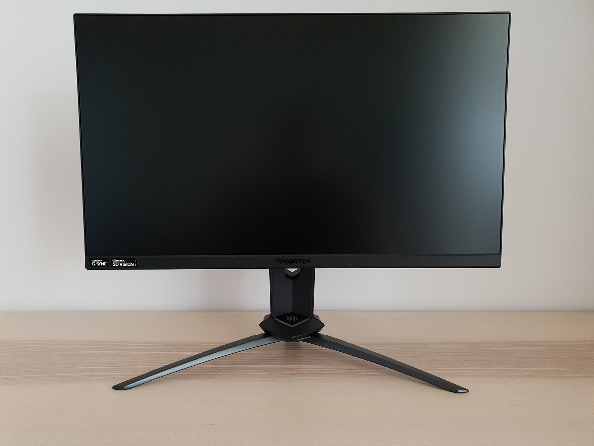
The monitor has the signature angular appearance of other recent Predator models. It has a tripod-style base with dark grey powder-coated metal feet. This gives good weight and a high-quality feel to the stand in general. The bottom bezel is matte dark grey plastic with a central shiny silver Predator logo – we say shiny, although we only really noticed it when looking for it. The logo is fairly well blended in really and includes a black backing plate for a little extra contrast. A ‘Zero Frame’ design is used at the top and sides, with a very slender panel border around the image that’s flush with the rest of the screen. Plus a thin hard black plastic outer component. Including both components the bezels are very slender at the top and sides – ~6mm (0.24 inches). The bottom bezel is ~20mm (0.79 inches), including just a sliver of visible panel border. Most of the frontal area is covered by the 24.5” screen, though, which features a ‘regular’ (medium) matte anti-glare finish as explored shortly.

The OSD (On Screen Display) is controlled by pressable buttons and a joystick running down the right side of the monitor (as viewed from the front), at the rear. The joystick is located at the bottom and is quite neatly positioned, allowing intuitive control of the OSD system without too much of a stretch. Unless your desk is particularly deep and you’ve got the monitor quite far away from you, of course. There’s a small rectangular power LED towards the bottom right as well, which glows blue when the monitor is on and amber when it’s in a low power state (signal to the system is lost). The video below runs through the OSD.
From the side the monitor’s sturdily built stand is visible. The screen is fairly slim at thinnest point at ~15mm (0.59 inches), lumping out centrally towards the stand attachment point. At the left side there are 2 USB 3.0 ports, with the top one supporting fast-charging for connected devices. The stand offers full ergonomic flexibility; tilt (5° forwards, 25° backwards), swivel (20° left, 20° right), height adjustment (4.53” or 11.51cm) and pivot (90° clockwise or anti-clockwise rotation into portrait). At lowest stand height, the screen clears the desk by ~73mm (2.87 inches) with the top of the screen ~403mm (15.87 inches) above the desk. Or 410mm (16.14 inches) above the desk if you include the top of the stand neck, which pokes up above the rest of the screen. The total depth of the monitor including stand is ~250mm (9.84 inches) with the screen a few cm back from the front edge of the stand base. So it’s not as much of a desk depth hog as some models, nor the most compact design on the market.


The rear of the screen combines matte black plastic with brushed-effect plastic. There’s also a satin (semi-matte) bluish-grey ring towards the top of the stand base and a shiny silver-coloured Predator logo at the top. A headphone hook (above) is also found near the top of the stand, at the rear, which is extended by pressing in at the bottom. The included stand attaches using a quick-release mechanism, easily removed by pushing up a switch located beneath the stand attachment point. This reveals 100 x 100mm VESA holes for alternative mounting. The remaining ports of the monitor, in addition to the 2 USB ports at the side, are down-firing and include; AC power input with ‘zero watt’ power switch (internal power converter), DP 1.2, HDMI 1.4, a 3.5mm headphone jack and 2 further USB 3.0 ports (plus upstream). There are also 2 x 2W down-firing speakers included, which provide basic sound output. The output isn’t particularly high quality, although isn’t the worst quality we’ve heard from integrated speakers either. Alright for sound accompanying videos, listening to the radio and podcasts but nothing that audiophiles or fans of directional or immersive audio for gaming will love.


The full capabilities of the monitor including Nvidia G-SYNC and 240Hz capability can be harnessed using DP 1.2 on compatible GPUs. The HDMI port is just there for connection to devices such as games console, with the HDMI 1.4 port on this monitor supporting a maximum of 1920 x 1080 @ 60Hz. When connected to our Nvidia GPU via HDMI, the monitor actually worked best with a ‘Limited Range RGB’ signal (refer to this article). ‘Full’ gave obvious oversaturation and bleaching, whereas the image was displayed correctly with ‘Limited’ selected. Standard accessories include a power cable, DP cable and USB 3.0 cable – although this may vary by retailer and region.
Calibration
Subpixel layout and screen surface
The image below is a macro photograph taken on Notepad with ClearType disabled. The letters ‘PCM’ are typed out to help highlight any potential text rendering issues related to unusual subpixel structure, whilst the white space more clearly shows the actual subpixel layout alongside a rough indication of screen surface. This model uses a ‘regular’ (medium) matte anti-glare surface. This provides significant diffusion of ambient light and therefore offers strong glare-handling characteristics. If affects light emitted from the monitor in the same way, affecting the clarity and vibrancy potential of the screen. There is a moderate but not extreme graininess to the screen surface when observing lighter content, similar to most high refresh rate TN models. There is not a heavy or ‘smeary’ graininess that some matte screen surfaces have nor an overly ‘sandy’ appearance, thankfully.
![]()
As shown in the image above, the monitor uses the usual RGB (Red, Green and Blue) stripe subpixel layout. This is the default expected by modern operating systems such as Microsoft Windows and Apple’s MacOS. As a Windows user you don’t need to run through the ClearType wizard, although you may still wish to adjust this according to your preferences. As a Mac user there’s no need to worry about text fringing from non-standard subpixel layouts. The subpixel layout and arrangement is normal and we had no subpixel-related concerns related to sharpness or text clarity on this model.
Testing the presets
This monitor includes a range of presets which are referred to as ‘Modes’; ‘Action (G1)’, ‘Racing (G2), ‘Sports (G3), ‘User’, ‘Standard’, ‘ECO’, ‘Graphics’ and ‘Movie’. These presets simply change various settings in the OSD. If you make manual adjustments to most settings (including but not limited to brightness, contrast or the colour channels) the monitor automatically switches to the fully customisable ‘User’ setting. The first 3 presets in the list (G1, G2 and G3 for short) are also fully customisable, allowing you to easily save and recall 3 sets of preferred settings. You can’t save individual colour channel adjustments. But you can certainly save and recall different brightness levels, contrast levels and ‘Low Blue Light’ levels. Instead of focusing on these presets, we’ll look at manual adjustment of a range of settings in the OSD in the table below. This table provides gamma readings taken using a DataColor Spyder5ELITE and white point measurements taken using an X-Rite i1Display Pro, alongside general observations.
Our test system runs Windows 10 with an Nvidia GTX 1080 Ti connected using the DisplayPort cable supplied with the monitor. No additional monitor drivers or ICC profiles were specifically loaded (unless stated otherwise) and the monitor was left to run for over 2 hours before readings were taken or observations made. Aside from our ‘Optimal OSD Settings’ and ‘Test Settings’ where various adjustments are made, assume factory defaults are used. Exceptions include that the monitor was set to 240Hz in Windows (did not affect observations in this table), except for where ULMB was active using a range of refresh rates. When viewing the figures in this table, note that for most PC users ‘6500K’ for white point and ‘2.2’ for gamma are good targets to aim for. Individual targets depend on individual uses, tastes and the lighting environment, however.
| Preset Mode | Gamma (central average) | White point (kelvins) | Notes |
| Standard Mode (Factory Defaults) | 2.3 | 6615K | Fairly well-balanced overall, especially compared to models with low central gamma. The image appears slightly too deep and somewhat dull looking in places, but richer than most high refresh rate TN models ‘out of the box’. As usual for the technology, perceived gamma is higher further up the screen (things appear deeper) and lower further down the screen (things appear less saturated). |
| Gamma = 1.9 | 2.1 | 6623K | As above with lower gamma, giving the image appear more muted overall. |
| Gamma = 2.5 | 2.6 | 6600K | As factory defaults but gamma is now significantly higher. Things appear deep and quite cinematic. A look some might quite like, but particularly further up the screen darker content appears blended together far too well. |
| Gamma = Gaming | 3.0 | 6598K | As above but gamma much higher again. A striking look but not very practical. |
| Blue Light = 80% | 2.4 | 5749K | A mild Low Blue Light (LBL) setting, slightly reducing blue light output compared to the factory defaults and imparting a slight green tint. This is because the green channel remains strong, retaining good contrast at the expense of colour balance. |
| Blue Light = 70% | 2.4 | 5488K | As above but marginally more effective for reducing blue light output. The default brightness is also slightly reduced. |
| Blue Light = 60% | 2.4 | 5099K | As above. More effective again, plus slightly lowered default brightness. |
| Blue Light = 50% | 2.4 | 4808K | As above with a further reduction in blue light output and lower default brightness. This is a highly effective LBL setting, significantly reducing blue light output from the monitor. The brightness can be lowered further, making it even more effective. The green channel is relatively strong, giving a green tint (particularly further up the monitor). |
| Optimal OSD Settings (see below) | 2.3 | 6534K | The brightness is much more comfortable and slight adjustments are made to colour channels. The image is quite well balanced overall, although some shades are slightly darker and duller looking than intended due primarily to gamma tracking. Overall things still have a decent and quite rich look, much more so than models with significantly lower central gamma. |
| Test Settings (ICC profile applied, see below) | 2.2 | 6504K | The calibrated ICC profile lifts some shades up a bit, providing a bit of extra vividness in places. Things appear quite rich and well-balanced overall, although the usual TN caveats still apply. |
Out of the box the monitor produced an image that was quite well-balanced overall and richer than many high refresh rate TN models produce (often even after tweaking in the OSD). The gamma tracked at ‘2.3’ on average as shown below. This avoided the ‘washed out’ look imparted by central gamma being far too low, which is a common issue on high refresh rate TN models in particular. The curve bows considerably centrally and the gamma is actually a bit lower than intended at the extreme ends. This is shown in the first gamma graph below, with the monitor set up as per our ‘Optimal OSD Settings’. It shows the bowing nicely although isn’t really high enough resolution to show the lower gamma at the extremes. The second graph shows the results with our ICC profile applied (per our ‘Test Settings’), with tracking much closer to the ‘2.2’ curve. The monitor also includes a ‘Blue Light’ Low Blue Light (LBL) setting. This can be set between ‘50%’ (maximum effect) and ‘80%’ (minimum effect) in increments of 10%. This setting was effective, particularly at the greater effect levels, significantly reducing blue light output from the monitor. Minimising exposure to stimulating blue light in the hours leading towards bed is particularly important to aid a restful night’s sleep. As common for LBL settings, the green channel is left alone so that it remains relatively strong. This minimises the impact on static contrast from applying the setting, but it also imparts a green tint that’s strongest near the top of the screen (due to viewing angle behaviour). The eyes adjust to this to an extent, so it becomes a bit less noticeable in time. We used the strongest LBL setting with further reduction in brightness for our own viewing comfort in the evening. But the LBL settings weren’t applied during testing – beyond that focusing on the LBL settings themselves. We assigned this to the ‘G2 – Racing’ preset and used ‘G1 – Action’ for our ‘Test Settings’, making it easy to activate and deactivate the setting. We lowered brightness and made slight tweaks to the colour channels to improve the overall balance of the image. Gamma remained at ‘2.3’ and it wasn’t possible to correct this appropriately to ‘2.2’ in the OSD. The image remained quite rich, although it was lifted up just a bit following the full calibration (with ICC profile) that accompanies our ‘Test Settings’. Assume any setting not mentioned, including contrast, was left at default. We’ve also included the refresh rate set in Windows, just for reference, although this didn’t significantly impact static image quality. Remember that individual units and preferences vary, so these are to be considered a suggestion and won’t be optimal for all users or units. Color Temp.= User Red Color= 50 Green Color= 48 Blue Color= 50 Over Drive= Normal Refresh rate (Windows setting)= 240Hz We created an ICC profile using our Spyder5ELITE colorimeter to improve gamma tracking and make further refinements to the image beyond what could be done with OSD tweaking alone. The ‘Optimal OSD settings’ above were used as a base, over which our ICC profile was applied. Note that the ICC profile is specific to our unit and, along with the OSD settings, it may not be optimal for all units. You can use the profile in combination with whatever brightness or colour channel adjustments you require. To make use of our profile do the following:
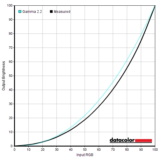
Gamma 'Optimal OSD Settings'
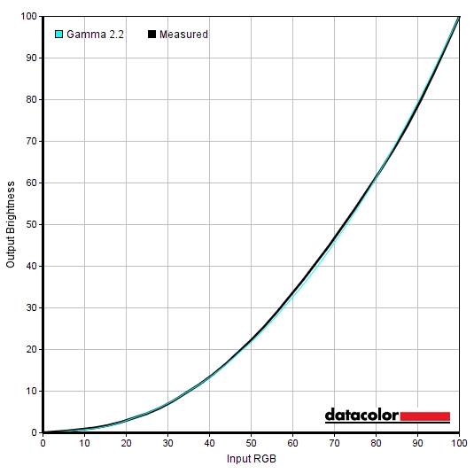
Gamma 'Test Settings'
Optimal OSD Settings
Brightness= 35 (according to preferences and lighting)
Test Settings (ICC profile)
2) Set the monitor up according to the ‘Optimal ‘OSD settings’, although further adjustments can be made if desired. Using a brightness of ‘35’ provided ~175 cd/m² on our unit with the ICC profile applied.
3) This article provides instructions on activating the profile as well as some limitations to be aware of when gaming in particular. Games do generally respond to the profile or at least apply the gamma correction. And even without the profile, the image appears quite rich, so consider the ICC profile a bonus rather than essential.
4) Some web browsers have colour management issues when ICC profiles like this are used. We observed messed up gamma, with gamma being far too low leading to detail that should be blended and masked instead appearing too distinct. This gave an obvious blocky appearance to dark scenes on Netflix content, for example. This is easy to correct on Google Chrome. You simply type the following into the address bar: chrome://flags/#force-color-profile and change from ‘Default’ to ‘sRGB’ then restart your browser. You only have to do this once (set and forget), although what the setting is called may differ depending on the version of Chrome you’re using.
Contrast and brightness
Contrast ratios
An X-Rite i1Display Pro was used to measure the luminance of black and white using a range of settings. From these values, static contrast ratios were calculated. The following table shows this data, with blue highlights indicating the results under our ‘Optimal OSD Settings’ and ‘Test Settings’ (ICC profile applied). Black highlights indicate the highest white luminance, lowest black luminance and highest contrast ratio recorded (ULMB disabled). Assume that any setting not mentioned was left at default, with the exceptions already noted in the calibration section. Note that changing refresh rate did not impact contrast (where ULMB was disabled).
| Monitor Settings | White luminance (cd/m²) | Black luminance (cd/m²) | Contrast ratio (x:1) |
| 100% brightness | 393 | 0.47 | 836 |
| 80% brightness | 330 | 0.39 | 846 |
| 60% brightness | 270 | 0.32 | 844 |
| 40% brightness | 205 | 0.24 | 854 |
| 20% brightness | 138 | 0.16 | 863 |
| 0% brightness | 68 | 0.08 | 850 |
| Factory defaults (65% brightness) | 285 | 0.34 | 838 |
| Gamma = 1.9 | 284 | 0.34 | 835 |
| Gamma = 2.5 | 284 | 0.34 | 835 |
| Gamma = Gaming | 284 | 0.34 | 835 |
| Blue Light = 80% | 322 | 0.4 | 805 |
| Blue Light = 70% | 306 | 0.38 | 805 |
| Blue Light = 60% | 273 | 0.34 | 803 |
| Blue Light = 50% | 256 | 0.33 | 776 |
| ULMB @ 144Hz (PW = 100) | 270 | 0.35 | 771 |
| ULMB @ 144Hz (PW = 0) | 28 | 0.04 | 700 |
| ULMB @ 120Hz (PW = 100) | 297 | 0.39 | 762 |
| ULMB @ 120Hz (PW = 0) | 31 | 0.04 | 775 |
| Optimal OSD Settings | 176 | 0.23 | 765 |
| Test Settings | 176 | 0.23 | 765 |
The average contrast ratio with only brightness adjusted was 849:1, a bit shy of the specified 1000:1 but still decent for the panel type. The contrast dropped a bit under our ‘Test Settings’ to a still reasonable 765:1 and to 700:1 – 776:1 with ULMB active. Note that the default contrast is dropped to ‘45’ under ULMB as this improves shade distinctions for closely matching bright shades with this mode active. Contrast of ~800:1 was maintained with even the strongest ‘Blue Light’ LBL setting active. The highest luminance recorded on this table was 393 cd/m², whilst the lowest white luminance recorded (ULMB disabled) was 68 cd/m². That minimum is a bit higher than some sensitive users might like but will be dimmer than most users would use in general. This gave a luminance adjustment range of 325 cd/m².
The monitor includes a Dynamic Contrast setting called ‘Adaptive Contrast’. This allows the backlight brightness to adjust according to the level of ‘light’ or ‘dark’ on the screen. As usual, the backlight is controlled as a single unit (i.e. there is no local dimming support) so it just works on averages across the entire screen. The gamma is also modified with this setting active, increasing somewhat for darker content to try to increase the ‘cinematic look’. You can set the brightness manually and this is used as a base around which the backlight brightness will adjust. This setting didn’t really seem very dynamic and was rather gentle in its adjustments, good in some ways but not really doing anything dramatic to change the experience. At any rate, we prefer manual control of the backlight brightness over Dynamic Contrast settings like this.
PWM (Pulse Width Modulation)
The XN253QX does not use PWM (Pulse Width Modulation) to regulate backlight brightness at any level. Instead, it employs DC (Direct Current) regulation of the backlight. The backlight is therefore considered ‘flicker-free’, which will come as welcome news to those sensitive to flickering or worried about side-effects from PWM usage. The exception to the flicker-free status is where ULMB is active; this by its very nature flickers at a frequency matching the refresh rate selected.
Luminance uniformity
Whilst observing a black screen in a dark room, using our ‘Test Settings’, we noticed a little backlight bleed and clouding towards the bottom of the screen. This is shown in the image below, but be aware that individual units vary when it comes to uniformity issues such as this. A slight silver or golden sheen (depending on angle) was visible from sharper viewing angles. This so-called ‘TN glow’ is highlighted in a viewing angles video later on. It’s very different to ‘IPS glow’ as it isn’t as strong nor is it readily observed from a normal viewing position.

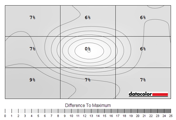
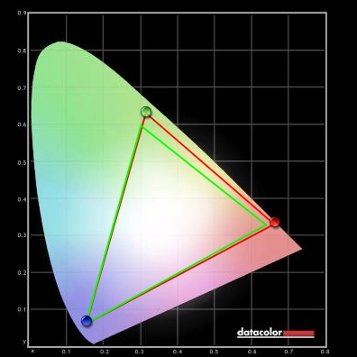
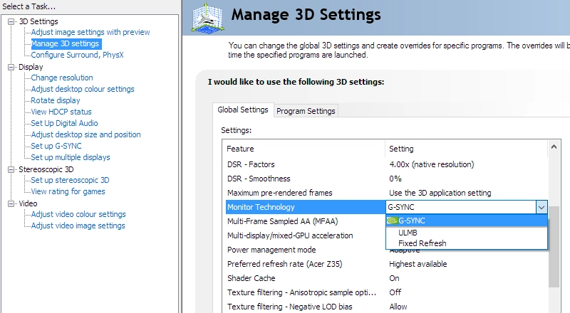
The Spyder5ELITE colorimeter was used to assess the uniformity of lighter shades, represented by 9 equidistant white quadrants running from the top left to bottom right of the screen. The table below shows the luminance recorded at each quadrant and the deviation between a given quadrant and the brightest quadrant. The luminance uniformity was very good. The maximum luminance was recorded at ‘quadrant 5’ in the centre screen (173.8 cd/m²). The greatest deviation from this occurred at ‘quadrant 7’ towards the bottom left (158.6 cd/m², which is 9% dimmer). The average deviation between each quadrant and the brightest recorded point was 6.88% which is pleasing. Note that individual units vary when it comes to uniformity and you can expect further deviation beyond the points measured. Also note that the viewing angle limitations of the TN panel introduce differences in perceived luminance that aren’t accounted for in these measurements. Perceived brightness changes depending on which part of the screen you’re looking at. The contour map below shows these deviations graphically. In this graphic, darker greys represent lower luminance and hence greater deviation from the brightest point than lighter greys. The percentage deviation between each quadrant and the brightest point is also given. Due to the aforementioned viewing angle limitations, we will not be providing colorimeter-based analysis of the colour temperature uniformity on this monitor. Perceived differences in colour temperature due to viewing angle can be quite pronounced, even from a normal viewing position. Any readings provided here would therefore have the potential to be highly misleading. On Battlefield V the monitor provided decent contrast output overall. The level of detail in dark scenes was much as it should be for the central mass of the screen. There were perceived gamma shifts related to the TN technology, though. Perceived gamma was higher further up the screen, which masked some detail in dark areas. Whilst lower perceived gamma further down the screen lifted out some ‘unintended detail’, giving some shades a less blended appearance than intended and a somewhat ‘blocky’ appearance. These perceived gamma shifts were not as pronounced as on some TN models (e.g. 24” 144Hz Full HD TN models), although were certainly still a feature. There was no ‘IPS glow’ or anything of that nature to worry about. Brighter shades stood out quite well against darker surroundings, with the screen surface provided a light but not extreme (heavy or smeary) mask of graininess. Shadow of the Tomb Raider is a title that looks its best on a monitor with strong contrast performance. There are plenty of dimly lit caves, tombs and passageways lit up by a few point sources of light such as flames and torches. As a TN model, the depth to the dark shades wasn’t on par with models with much stronger static contrast (some VA models, for example). But the lack of ‘IPS glow’ which eats away at detail peripherally will please some. The perceived gamma shifts observed on Battlefield V were also observed quite readily on this title. Porous rock textures on this game indicate if a surface is climbable using a climbing axe, for example. This texture was too faint higher up the screen and overly visible lower down the screen – but this difference from top to bottom of the screen was reduced somewhat compared to some TN models. Particularly those with larger screens, but also some 24” models. There was again a bit of graininess from the screen surface when observing lighter shades, but nothing extreme. We also observed the contrast performance using the film Star Wars: The Last Jedi. With epic light saber and space battles, this film has various scenes in it which demand a strong contrast performance to look appropriately cinematic and atmospheric. This isn’t really something TN models like this deliver, although the lack of ‘IPS glow’ was nice and the overall atmosphere for such scenes was decent. The perceived gamma shifts explored in our game titles did apply, although the black bars at the top and bottom of the screen (16:9 letterbox format) helped reduce the extremes. The Lagom tests for contrast allow specific weaknesses in contrast performance to be identified. The following observations were made. The colour gamut of the XN253QX (red triangle) was compared with the sRGB reference colour space (green triangle), as shown in the image below. The monitor offers fairly comprehensive sRGB coverage (99%), with just a very small amount of under-coverage in the green to blue region of the diagram. There is also some overextension in the green to red region. This gives the monitor the potential to output most shades within the sRGB colour space, with just a touch of extra vibrancy. On Battlefield V colours were represented in quite a rich and natural way overall. Appropriate central gamma handling helped lift this model above the sort of ‘washed out’ appearance that models with low central gamma provide. Natural environments showed some reasonably lush-looking deep greens and fairly neutral-looking earthy browns. Vibrant elements such as roaring orange flames also appeared fairly lively. There were some losses in saturation further down the screen in particular (lower perceived gamma), making shades appear more muted. And a deeper look overall further up the screen (higher perceived gamma). These shifts were noticeable to us, but they were less pronounced than on many Full HD TN models – including the plethora of 24” 144Hz Full HD TN models available. The newer 24.5” panels as used here certainly offer some improvement in that respect. A similar picture was painted on Shadow of the Tomb Raider. Again, the look was quite rich and natural overall. A more generous colour gamut, lighter screen surface and greater colour consistency would certainly have lifted things up in terms of vibrancy. But things were much improved over models with clear central gamma issues. There were shifts in saturation vertically, which were certainly something we and many users would readily observe. These shifts were sufficient to make some greens of vegetation appear more muted and more of a pastel variant of the intended green shade. And earthy browns tended to look quite clay-like lower down the screen and a deeper and often somewhat reddish brown further up. The shifts were less pronounced than on some TN models of this sort of size, however. Finally, we used the film Futurama: Into the Wild Green Yonder to assess colour reproduction. This film has large areas of individual shade and is therefore a particularly unforgiving test for colour consistency. Indeed, some of the TN-related weaknesses were made particularly apparent here. Shades such as the red of Dr Zoidberg appeared too deep higher up the screen, too muted lower down the screen but fairly accurate centrally. These shifts also meant that closely matching shades, particularly subtly different pastel shades, lost their individuality and unique identity. Still, most users would find the overall look preferable to the washed-out appearance that low central gamma would provide. And indeed the shifts in saturation vertically were not as pronounced as on some TN models. There were some nice vibrant neon shades such as pinks, greens and purples that stood out quite nicely as well. Not as well as on models with a more generous colour gamut or lighter screen surface, but still appearing quite vivid overall. We used Lagom’s tests for viewing angle to more closely analyse colour consistency and viewing angle performance. The following observations were made from a normal viewing position, eyes around 70cm from the screen. A sensitive camera and a utility called SMTT 2.0 was used to analyse the latency of the Acer XN253Q X. Over 30 repeat readings were taken to help maximise accuracy. Using this method, we calculated 3.26ms (under 1 frame at 240Hz) of input lag. This figure is influenced both by the element of input lag you ‘see’ (pixel responsiveness) and the element you ‘feel’ (signal delay). It indicates a low signal delay which even sensitive users shouldn’t find bothersome. Note that we have no way to accurately measure input lag with G-SYNC active in a variable refresh rate and frame rate environment. Our article on responsiveness analyses the key factors affecting monitor responsiveness. Chief amongst these is the concept of ‘perceived blur’, contributed to by both pixel responses and the movement of your eyes as you track motion on the screen. This second factor is usually the most important on modern monitors, although both elements play a role. A photography technique called ‘pursuit photography’ is also explored, which uses a moving rather than static camera. This allows motion on a monitor to be captured in a way that accurately reflects both of these elements of perceived blur rather than simply reflecting the pixel response element. The images below are pursuit photographs taken using the UFO Motion Test for ghosting, with the test running at its default speed of 960 pixels per second. This is a good practical speed to take such photographs at, highlighting both elements of perceived blur nicely. The UFOs move across the screen from left to right at a frame rate matching the refresh rate of the display. All three rows of the test are analysed (dark, medium and light background) to show a range of pixel transitions. The monitor was tested at 60Hz (directly below), 144Hz and 240Hz using all available ‘Over Drive’ settings. Note that the monitor can also be set to 100Hz, 120Hz and 200Hz. Although not documented in this testing, performance there was as you’d expect and some way between the lower and higher values shown here. Additional testing was performed with ULMB active. Where possible, reference shots are shown which include results from an earlier generation of 240Hz monitor (AOC AG251FG) and a very fast 144Hz TN reference (ViewSonic XG240R) with very well-implemented pixel overdrive. At 60Hz, above, you can see that the UFO appears soft and blurry, without distinct internal details. This reflects a moderate amount of perceived blur due to eye movement, something also reflected by the reference displays. There are also varying degrees of trailing behind the object due to weaknesses in pixel responsiveness. With ‘Over Drive’ set to ‘Off’ there is a moderate amount of ‘powdery’ trailing behind the object, particularly for the middle row (medium cyan background). The ‘Normal’ setting cuts back on this considerably and looks fairly similar to the reference shots, perhaps a bit better overall if focusing on the middle row. The ‘Extreme’ setting ramps up the pixel overdrive levels considerably, producing obvious overshoot (inverse ghosting) in the form of colourful bright ‘halo’ trails. From this analysis it’s clear that ‘Normal’ is the optimal setting at 60Hz. The image below shows how things look with refresh rate bumped up to 144Hz. At 144Hz, above, the UFO appears narrower with some sharper internal detailing. This reflects a significant reduction in perceived blur due to eye movement. There are again varying levels of trailing behind the UFOs due to weaknesses in pixel responsiveness. The ‘Off’ setting gives some bold ‘powdery’ trailing, particularly for the medium background. The ‘Normal’ setting cuts down on this very effectively. There is just a trace remaining and a small amount of overshoot for the middle row, so things aren’t quite as clean as the rather impeccable XG240R. But not too far off really. The ‘Extreme’ setting provides extreme levels of overshoot, with obvious colourful overshoot. The ‘Normal’ setting is again optimal here. Below you can see how things appear with refresh rate ramped up to 240Hz. At 240Hz, above, the UFOs again appear more narrowly focused with more distinct internal detailing. This reflects another significant reduction in perceived blur due to eye movement. There is again varying degrees of trailing behind the UFOs due to weaknesses in (or over-accelerated) pixel responses. The ‘Off’ setting shows a short but bold trailing for the dark and medium background. The ‘Normal’ setting eliminates this, replacing it with just a touch of overshoot (slight ‘shadowy’ trailing and some very slight ‘halo’ trailing) behind the UFO. This is most noticeable but still faint and largely un-distracting in practice for the medium background. The reference shows somewhat stronger overshoot, but nothing extreme. The ‘Extreme’ setting does show extreme overshoot, though, with very bold and inky-looking trailing that’s extremely distracting. The ‘Normal’ setting is, again, the optimal setting. Note that there are many transitions that aren’t analysed in this test, which is what our subjective testing will look at shortly. The monitor has another trick available in the form of ULMB (Ultra Low Motion Blur), to massively reduce perceived blur due to eye movement. This is an Nvidia-specific strobe backlight feature that can be employed instead of G-SYNC on compatible GPUs. ULMB causes the backlight to flicker at a frequency matching the refresh rate of the display, with 120Hz and 144Hz selectable for ULMB and working as intended. 100Hz is selectable but the strobe frequency fluctuates between 90.88Hz and 90.94Hz rather than matching 100Hz solidly. This gave obvious stuttering to interactions with the content (including solid 100fps content), making it very uncomfortable to use. For this reason we discounted the setting from further analysis. With the backlight flickering at 120Hz or 144Hz, for the modes that work correctly, some users will find this more fatiguing than the normal operation of the monitor. Individual tolerance to flickering varies and it’s sometimes a trade-off competitive gamers will be willing to make. The images below show the monitor at 120Hz and 144Hz with ULMB active, including the AOC AG251FG as a reference for comparison (set to PW = 100). Note that ‘PW’ refers to ‘Pulse Width’, which can be adjusted in single unit increments between ‘10’ (minimum) and ‘100’ (maximum). A higher setting increases the length of time for the ‘on’ phase of the strobe, resulting in a higher maximum brightness at the expense of motion clarity potential. The ‘Over Drive’ setting can’t be adjusted with ULMB active. With ULMB active you can see that the object is significantly narrower and more sharply focused, even if you compare 120Hz ULMB to 240Hz with the technology disabled. At 144Hz in particular, you can see excellent well-defined internal detailing on the UFO itself. Including distinct notches on the body and 3 distinct eyes on the alien. The distinctions are somewhat higher with ‘PW = 10’ than ‘PW = 100’ at a given refresh rate, but strong in both cases (particularly at 144Hz). This indicates a significant decrease in perceived blur compared to the technology being deactivated, even when comparing to normal 240Hz operation. You can also see moderate overshoot behind the UFOs, with very high levels of pixel overdrive used to ensure conventional trailing is kept out of the equation. Trailing behind or potentially in front of the object under strobe backlight operation is broadly termed ‘Strobe Crosstalk’. Whilst the overshoot observed here (a form of strobe crosstalk) is something that can be noticed in practice, it is not as noticeable or detrimental to overall perceived blur levels as some forms of strobe crosstalk. Trailing that’s so bold it appears as repetitions of the object either behind or in front, for example. Because not all parts of the screen refresh simultaneously, strobe crosstalk can manifest differently at different parts of the screen. That was not an issue here as strobe crosstalk behaviour (moderate overshoot in this case) appeared similar throughout the screen. On Battlefield V the monitor provided an exceptionally fluid experience, where the frame rate kept up with the 240Hz refresh rate. Compared to a 60Hz monitor (or indeed this monitor running at 60Hz), the monitor is outputting 4 times as much visual information every second. And twice as much visual information as a 120Hz monitor or ~1.67 times as much as a 144Hz monitor. This gave an exceptional ‘connected feel’ when interacting with the game world. A certain precision and fluidity that’s not there at significantly lower refresh rates (or frame rates), regardless of input lag. Although low input lag, as in this case, is certainly an important ingredient for strong ‘connected feel’. The perceived blur is also greatly reduced, much as demonstrated earlier with Test UFO. This made it easier to track enemies during engagements, including when turning in a vehicle or staffing or turning the character rapidly. Compared 144Hz, the step up in terms of ‘connected feel’ and lower perceived blur is nowhere near as pronounced at the step up from 60Hz to 144Hz. It’s certainly there and competitive gamers who can maintain this sort of frame rate might appreciate the edge it gives. But for most users ~144Hz would provide something of a ‘sweet spot’ – and in terms of frame rate on most titles, it’s certainly more achievable with some of the eye candy turned on. The monitor provided very snappy pixel responses, too, putting the 240Hz refresh rate to very good use. When we tested 240Hz models in the past using earlier versions of this panel, including the ViewSonic XG530 and AOC AG251FG (plus various other models we’ve used but didn’t fully review), there were some notable weaknesses in pixel transitions. Nothing extreme, but some ‘powdery’ trailing where brighter shades moved against significantly darker backgrounds. On this model we did not observe any distinct weaknesses of that sort. There was a bit of overshoot in places, including some ‘shadowy’ trailing (somewhat darker than object or background colour) and a little ‘halo’ trailing (brighter than object or background colour). This was short and snappy overshoot and it was not extreme and colourful, so wasn’t something we found distracting or generally eye-catching. It didn’t really detract from the experience, in other words. But sensitivity to overshoot does vary. Given the extensive analysis above, we don’t really have much to add from Shadow of the Tomb Raider. The 240Hz refresh rate at suitably high frame rates again provided exceptional fluidity and a very low level of perceived blur. There were no distinct weaknesses in pixel responsiveness, just a touch of overshoot in places but nothing too eye-catching in our view. This title hardly calls for such a ‘competitive advantage’ from this sort of extreme refresh rate and frame rate. It was nice to have, but given the visual sacrifices we felt this title was more enjoyable with the eye candy turned up and the frame rate perhaps 80fps or more lower than this. With G-SYNC enabled, of course, as we explore shortly. We also made some observations using movie content of various frame rates, including Netflix and YouTube content. This was mainly 24 – 30fps, but some of it was 60fps content. There were no weaknesses of note from the monitor itself, with the frame rate limiting fluidity. There was perhaps a small amount of overshoot in places, but this was very faint and short-lived and not particularly noticeable really. 240Hz is also quite neat in that 24fps, 30fps and 60fps all divides evenly into it. This reduces juddering when watching such content, so it can be nice if you’re sensitive to that sort of thing. The low frame rate of such content certainly doesn’t let the monitor stretch its legs in the same way as higher frame rate content, but it’s still nice not to observe any real weakness from the monitor itself. On some monitors, particularly but not exclusively those with high refresh rates, interlace patterns can be seen during certain transitions. We refer to these as ‘interlace pattern artifacts’ but some users refer to them as ‘inversion artifacts’ and others as ‘scan lines’. They may appear as an interference pattern, mesh or interlaced lines which break up a given shade into a darker and lighter version of what is intended. They often catch the eye due to their dynamic nature, on models where they manifest themselves in this way. Alternatively, static interlace patterns may be seen with some shades appearing as faint horizontal or vertical bands of a slightly lighter and slightly darker version of the intended shade. Whilst we didn’t observe static interlace patterns on this model, we did observe dynamic interlace pattern artifacts. When movement was observed on the screen, the image sometimes appeared to break up into an interference pattern composed of vertical pinstripes. We found it quite noticeable, although it didn’t really distract us when gaming. Sensitivity to this sort of thing varies, it also depends on eyesight and viewing distance – not everyone will notice them and not everyone who does will find them distracting. They manifested in a similar way regardless of refresh rate or whether G-SYNC was active. They were particularly easy to notice with ULMB active, as we explore shortly. Nvidia G-SYNC is a variable refresh rate technology that can be activated when a compatible Nvidia GPU is connected to a compatible monitor (such as the Acer XN253Q X). Our article on the technology explores the principles behind the technology and its benefits, so we won’t be repeating too much of that. Essentially the technology allows the monitor to dynamically adjust its refresh rate to match, where possible, the frame rate outputted by the GPU. When the two are in sync it gets rid of the tearing (VSync off) and stuttering (VSync on) that occurs when the two are unsynchronised. An additional benefit for those who hate tearing and usually like to use VSync is a reduction in latency compared to ‘VSync on’ in the variable frame rate environment. As noted in the responsiveness section, though, we don’t have a way to accurately measure this. This monitor supports G-SYNC via DP 1.2 (DisplayPort), once connected to a compatible Nvidia GPU such as the GTX 1080 Ti used by our test system. Once connected up, G-SYNC should be automatically configured and ready to use. There’s usually even a little notification icon in the system tray telling you that a G-SYNC compatible display is detected. To check everything is configured correctly, open Nvidia Control Panel and navigate to ‘Display – Set Up G-SYNC’. Ensure that the checkbox for ‘Enable G-SYNC’ is checked, then select your preferred operating mode. As the image below shows, this technology works in both ‘Full Screen’ and ‘Window’ modes, provided the correct option is selected for this. If the G-SYNC options seem to be missing from Nvidia Control Panel, this may be remedied by reconnecting the GPU or possibly connecting the monitor to a different DP output if there’s one available. If the options are still missing, reinstalling the GPU driver or updating this is recommended. Next you should navigate to ‘Manage 3D settings’. Here there are a few settings of interest, the first of which is ‘Monitor Technology’. This should be set to ‘G-SYNC’ as shown below. Assuming this is all set up correctly, you should see ‘NVIDIA G-SYNC’ listed as ‘Mode’ in the ‘Information’ section of the OSD menu (press top menu button when in main menu). The refresh rate listed there just corresponds to the static refresh rate you’ve selected in Windows or your game (‘Max Refresh Rate’ as stated). The second setting of interest is VSync, which can be set to one of the following; ‘On’, ‘Use the 3D application setting’, ‘Off’ or ‘Fast’ (GPU dependent). The Acer supports a variable refresh rate range of 30 – 240Hz, with the maximum value (ceiling) corresponding to the refresh rate you’ve selected for the monitor in Windows. That means that if the game is running between 30fps and 240fps, the monitor will adjust its refresh rate to match. When the frame rate rises above 240fps, the monitor will stay at 240Hz and the GPU will respect your VSync setting in the graphics driver. If you select ‘On’, VSync activates if the frame rate exceeds the static refresh rate that you’ve selected (e.g. 240Hz / 240fps) and the usual VSync latency penalty applies. If you select ‘Off’ then the frame rate is free to rise in an unrestricted way, but the monitor will only go as high as 240Hz – tearing and juddering will ensue if the frame rate rises above this. The ‘Use the 3D application setting’ largely works as you’d expect, but the general recommendation is to set VSync in the graphics driver if you wish to use it as in-game implementations can interfere with the smooth operation of G-SYNC. Some users prefer to leave VSync disabled and use a frame rate limiter set several frames below the maximum supported (e.g. 236fps) instead, avoiding any VSync latency penalty at frame rates near the ceiling of operation or tearing from frame rates rising above the refresh rate. The ‘Fast’ option is available on some newer GPUs, such as the GTX 1080 Ti used in our test system. This enables a technology called ‘Fast Sync’, which only applies above the refresh rate and frame rate ceiling (>240Hz / 240fps). Below this G-SYNC operates as normal, whereas above this a special version of VSync called ‘Fast Sync’ is activated. This is a GPU rather than monitor feature so isn’t something we will explain in detail, but it is designed to reduce tearing at frame rates well above the refresh rate of the monitor. If you’re interested in this technology, which may be the case if you play older or less graphically demanding games at very high frame rates, you should watch this section of a video by Tom Petersen. If the frame rate drops below the lowest refresh rate supported by the monitor (i.e. the G-SYNC floor of 30Hz / 30fps) then the monitor sets its refresh rate to a multiple of the frame rate. This occurs regardless of VSync setting. If for example the game ran at 20fps, the monitor would set itself to 40Hz. This keeps stuttering and tearing from the usual frame and refresh rate mismatches at bay. As we explore shortly, though, low frame rates are low frame rates regardless of the technology. So whilst it is always beneficial to have stuttering and tearing removed, it’s also beneficial to have an elevated frame rate where possible. It’s also worth remembering that G-SYNC can’t eliminate stuttering caused by other issues on the system or game environment such as insufficient RAM or network latency. Some game engines will also show stuttering (or ‘hitching’) for various other reasons which won’t be eliminated by the technology. We used various game titles to test G-SYNC on the monitor, with the technology working consistently well on all of these. Because of this, we’ll simply focus on a single title rather than repeating observations over a spread of titles. Battlefield V offers a good level of flexibility in its graphics options and shows a range of scenes which stress the PC to various degrees, allowing the full range of refresh rates to be explored. Getting close to 240fps for much of the time required considerable visual sacrifices, and even then there were inevitable dips below that. Without G-SYNC active, these dips would lead to a frame rate and refresh rate mismatch that would cause obvious tearing and juddering (VSync off) or stuttering (VSync on). Even with the slightest drop down from 240fps, these imperfections in motion performance and the loss of ‘flow’ that it gave were obvious to us – although individual sensitivity to tearing and stuttering varies. As frame rate dropped further, perhaps aided by more generous graphics settings, the level of perceived blur increased, and ‘connected feel’ dropped off. As frame rates in the 200s became a distant memory and things dropped firmly into the 100s, this was certainly noticeable. Although the overall perceived blur levels and ‘connected feel’ were quite good – certainly compared to much lower frame rates. The lack of tearing and stuttering from frame rate and refresh rate mismatches was something we very much appreciated. Further drops in frame rate yielded further loss of ‘connected feel’ and an increase in perceived blur. Regardless of how low the frame rate dipped, though, the lack of tearing and stuttering was a nice thing – even if significantly higher frame rates were preferable for other reasons. Below 30fps the technology worked as intended as well, keeping tearing and stuttering at bay by sticking to a multiple of the frame rate with the monitor’s refresh rate. To us, though, the ‘connected feel’ was horrendous and level of perceived blur massively increased compared to significantly higher frame rates – making such low frame rates a very uncomfortable place to be, even without additional tearing or stuttering. The use of ‘Variable Overdrive’ ensured that the pixel overdrive was not simply tuned to the highest refresh rate (240Hz) but was re-tuned to fit a broad range of refresh rates below this. By lowering the voltage surges and hence acceleration levels suitably for lower refresh rates, the experience was free from increasingly strong overshoot as frame rate (and hence refresh rate) dipped with G-SYNC active. This is in stark contrast to typical Adaptive-Sync (FreeSync) models where the pixel overdrive is tuned for the peak refresh rate. And using the optimal pixel response time setting for this peak refresh rate will nearly always lead to increasingly noticeable and potentially very eye-catching overshoot as frame rate dips and refresh rate does alongside it. We introduced ULMB earlier, including its principles of operation and its effect on perceived blur using the UFO Motion Test for ghosting. In this section we’ll explore how to activate the technology and also provide some subjective analysis of the experience when gaming. ULMB can be enabled by first setting the monitor to a supported refresh rate (120Hz or 144Hz – 100Hz also supported but note earlier issues with strobe frequency). The next step is to navigate to ‘Manage 3D settings’ in the Nvidia Control Panel and select ‘ULMB’ for ‘Monitor Technology’ as shown in the image below. There is also a ‘ULMB’ setting in the ‘Gsync Setting’ section of the OSD for the monitor, which should be enabled – this generally happens automatically if the monitor is set to an appropriate refresh rate and driver option anyway. An additional setting called ‘ULMB Pulse width’ can be configured in the OSD, which adjusts the length of the ‘on phase’. A lower setting reduces the length of the ‘on phase’, resulting in a dimmer image but potentially offering further improvement in motion clarity. Most users will find that a high ‘Pulse Width’ setting delivers a nice low level of perceived blur and won’t find the slight benefits of lowering this much noticeable. Although many will also find a setting of ‘100’ too bright (with default monitor brightness) so might prefer lowering this a bit according to preferences, perhaps to around ’60 or ‘70’. When ULMB is enabled, you should notice a change in image brightness and you may notice some flickering, especially when you first activate it. You can also confirm that it is activated by navigating to the ‘Information’ section of the OSD and seeing whether ‘Mode’ is listed as ‘ULMB’. It’s very important to understand that, as typical for a strobe backlight feature, ULMB will only work properly if your frame rate is able to consistently match the refresh rate of the display. Without this, you’ve got very little perceived blur (due to eye movement) to mask stuttering or juddering. This is very obvious indeed and it just doesn’t look pleasant at all. With Battlefield V running at a solid 144fps (monitor set to 144Hz with ULMB), we noticed a significant decrease in overall perceived blur. Certainly when comparing to 144Hz @ 144fps with ULMB disabled, but also comparing to 240Hz @ 240fps. Indeed the technology lived up to its name, delivering exceptionally (ultra) low levels of (motion) blur. Regardless of how rapidly you were moving in the game, be it on foot or in an agile vehicle, it was very easy to track and engage enemies. Whilst the environment remained relatively sharply focused as well. The ‘connected feel’ was naturally not quite as good as at 240Hz and 240fps, but was very similar to 144Hz and 144fps with ULMB deactivated. So very good, really. There was a moderate amount of overshoot, though, as demonstrated with ‘Test UFO’ earlier. Most notably some quite bright ‘halo’ trailing in places as well as some dirty-looking ‘shadowy’ trailing. This wasn’t detrimental to overall perceived blur levels as it was significantly fainter than and altogether distinct from the main objects that were moving. But if you’re sensitive to this sort of thing you could find it unsightly or potentially a bit distracting. We also found the ‘interlace pattern artifacts’ noted earlier a lot easier to notice with ULMB active, with what we’d describe as ‘dancing lines’ greeting you as you moved your eyes. This, again, wouldn’t distract everyone and doesn’t necessarily detract from the potential competitive advantage from using ULMB. It’s also worth noting that we observed video content with ULMB active and also noticed a reduction in perceived blur (due to reduced eye movement). This was naturally more noticeable for 60fps content than 24 – 30fps content, with rapid pans showing the clearest edge (pun intended). For 60fps content we’d recommend setting the monitor to 120Hz if you wish to use ULMB due to the even division of frame rate into that and reduced juddering. Having said that, we feel most users would find the benefits of ULMB for this sort of content outweighed by the more comfortable and more visually stable flicker-free operation of the monitor without ULMB. The video below summarises some of the key points raised in this written review and shows the monitor in action. The video review is designed to complement the written piece and is not nearly as comprehensive. High refresh rate monitors are favoured by gamers looking for a responsive experience at high frame rates, particularly fast TN models like the Acer XN253Q X. The Full HD resolution on this 24.5” model doesn’t deliver a particularly impressive pixel density or as much desktop real-estate as higher resolutions, but it’s certainly relatively easy to drive at decent frame rates. And being a 240Hz monitor, that’s really where this model truly shines. By coupling this high refresh rate with very well-tuned and rapid pixel responses and support for Nvidia G-SYNC, the monitor performed very nicely across a broad range of frame rates and refresh rates. There was a little overshoot in places, but nothing extreme and overly eye-catching – whilst this model was free from some of the weaknesses (‘powdery’ trailing) we observed in places on earlier generation 240Hz models. Input lag was also low, whilst ULMB worked as intended to give users exceptionally low levels of motion blur at a solid 120fps (at 120Hz) or 144fps (at 144Hz) if they favour strobe backlight operation over G-SYNC. There were some strobe frequency mismatch issues that made ULMB ineffective at 100Hz, but this is a minor point really. In terms of contrast the monitor was much in-line with our expectations for the panel type. Reasonable static contrast and no ‘IPS glow’ to contend with provided a decent but not particularly noteworthy experience for darker content. As typical for a TN panel, there were also perceived gamma shifts when comparing the top and bottom of the screen. These were less pronounced than on some TN models, but were still a feature. Detail in darker scenes was more heavily masked than ideal higher up the screen and more distinct than it should be lower down. The screen surface was also far from the smoothest and lightest we’ve seen, imparting a bit of a grainy look to the image. But this was not a course, ‘smeary’ or ‘sandy’ graininess, thankfully. The perceived gamma shifts also affected colour saturation levels – things appeared deeper further up the screen and more muted lower down. Overall the image appeared rich, especially following appropriate tweaking (and ideally following full calibration and profiling). Certainly better than models with much lower than intended central gamma. The monitor was also well-built overall, with a decent premium feel. The powder-coated metal elements and otherwise quite robust (and fully adjustable) stand certainly helped give this impression. The design was very familiar amongst modern models in the Acer Predator series, with sharp lines but a fairly muted appearance overall. No bright or gimmicky aesthetic features, which could be particularly divisive. This monitor certainly won’t be cheap for a Full HD model and it won’t wow most users with its image quality. But it’s certainly passable in that respect. And when it comes to responsiveness, it’s truly a beastly monitor. For competitive gaming at high frame rates or simply for users who prioritise responsiveness above all else, this model should certainly warrant careful consideration. The bottom line; a solidly built monitor that comes at quite a premium for a Full HD model. But it offers reasonable contrast, decent colour reproduction and exceptional responsiveness.
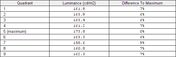
Luminance uniformity table
Luminance uniformity map
Contrast in games and movies
Lagom contrast tests
Colour reproduction
Colour gamut
Colour gamut 'Test Settings'
Colour in games and movies
Viewing angles

The video below shows the results of the Lagom text test, a mixed desktop background and dark desktop background from a variety of viewing angles. You can see obvious shifts in the Lagom text striping as viewing angle is changed. You can see pronounced brightness and contrast shifts and even some colour inversion vertically for the mixed background. The dark background has a silver or golden sheen which blooms out from sharper viewing angles. This is something we’ll refer to as ‘TN glow’. It isn’t visible from a normal viewing position and isn’t anyway near as intense as ‘IPS glow’ from a given viewing position. These characteristics are typical for TN panel technology.
Responsiveness
Input lag
Perceived blur (pursuit photography)


Responsiveness in games and movies
Interlace pattern artifacts
G-SYNC – the technology and activating it
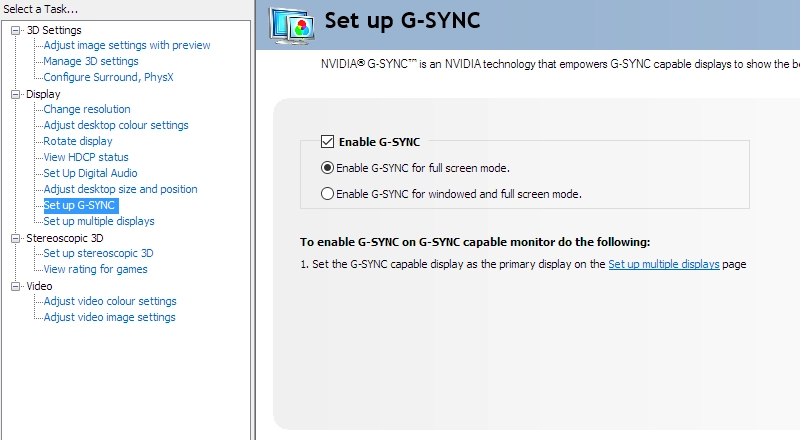
Enable G-SYNC
Set Monitor Technology to G-SYNC
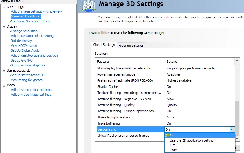
Set VSync according to preferences
G-SYNC – the experience
ULMB (Ultra Low Motion Blur)
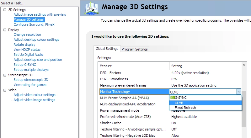
Set Monitor Technology to ULMB
Video review
Timestamps:
Features & Aesthetics
Contrast
Colour reproduction
Responsiveness
Conclusion
Positives Negatives Decent ‘out of the box’ performance, allowing a fairly rich and natural image to be obtained with OSD tweaking alone
Full profiling (with ICC profile) required to get ideal image balance with ‘2.2’ gamma. The usual TN viewing angle limitations apply, including perceived gamma and saturation changes up and down the screen
Reasonable contrast performance, in line with our expectations for the panel type. No ‘IPS glow’ to contend with Perceived gamma changes affect representation of dark scenes and a slightly grainy appearance to lighter shades from the screen surface Very solid responsiveness with low input lag and a high refresh rate put to excellent use from rapid and well-tuned pixel responses. G-SYNC and ULMB worked as intended to complement the experience
Some overshoot in places and improper support for 100Hz ULMB due to strobe frequency mismatches Good ergonomic flexibility and a solid build, without any overly flowery ‘gamer’ elements
A premium price tag for a Full HD model, with the resolution being quite limiting in some respects
![]()

