Author: Adam Simmons
Last updated: January 2nd 2025
Table of Contents
Introduction
Monitors are used for a diverse range of tasks, for both business and pleasure. Personal preferences and budget will may restrict your choice when it comes to factors such as screen size and resolution as well as potentially desirable characteristics such as HDR and refresh rate. Regardless of budget and preferences, it’s important that the monitor you choose is suited to its intended tasks. This guide covers the key areas to focus on when selecting a screen for colour critical work such as photo and video editing.
Resolution and clarity
The 1920 x 1080 (Full HD or 1080p) resolution has been something of a standard for monitors for quite some time – and a lot of video content is still based around this. With system power and capability improving, a range of 3840 x 2160 (‘4K’ UHD) models are also available. With modern compression techniques and improvements to internet connectivity, this is becoming increasingly popular for streamed media in addition to physical media such as Blu-rays. A particularly popular monitor resolution lies between these two, 2560 x 1440 (WQHD or 1440p). Whilst some content on platforms such as YouTube support this, it’s not widely supported outside of that for video content. 16:9 is the main modern standard for media creation and consumption, but some prefer to view in or create in other aspect ratios. 21:9 UltraWide resolutions such as 3440 x 1440 (UWQHD) can be quite compelling to some.
Whilst you’ll generally have a specific resolution in mind for video editing, photo editing is more flexible. Modern cameras, including those on smartphones, are capable of capturing at exceptionally high resolutions. Editing on a high resolution monitor can certainly make sense, with improved detail and clarity from an increased pixel density. For a screen of a given size, the step up from Full HD to WQHD is significant and so is that next step up to ‘4K’ UHD. Higher resolutions with the 16:9 aspect ratio such as 5120 x 2880 (‘5K’) and 7680 x 4320 (‘8K’ UHD) are also available, but they’re a lot more niche than the alternatives covered earlier. When considering any increase in pixel density, how much you’ll actual get out of that depends on the sort of editing you do. Plus other factors such as your viewing distance and eyes.
Other factors can impact clarity, including obscure subpixel arrangements. The worst offenders in this respect are certain VA models using partial subpixel illumination, impacting fine edge clarity to a potentially severe degree. Although we wouldn’t include models like that in this section for the colour-related reasons explored shortly. Screen surface also impacts clarity, with glossy surfaces impeding the image the least and ‘stronger’ matte anti-glare surfaces the most. Glossy models are very rare indeed in the monitor market now, but there are quite a few ‘light’ to ‘very light’ matte anti-glare surfaces in use on various models we recommend. These diffuse light from the monitor less than ‘stronger’ matte screen surfaces and give less of a layered appearance in front of the image. The clarity they provide is therefore superior, particularly if the screen surface also has a relatively smooth finish. This prevents an obvious grainy appearance to lighter content. The colour gamut dictates the range of colours that a monitor can display and defines its limits of saturation. It is often quoted against specific reference colour spaces, which we’ll cover shortly. The native gamut of a display is determined by the backlight or light source – including the diodes, phosphors or other materials used. That includes any materials used for the ‘LEDs’ in self-emissive displays such as OLED. Some models include ‘emulation’ modes which clamp the gamut to specific colour spaces that fit within the gamut. The most common being an sRGB emulation mode used to restrict a wide gamut to the sRGB colour space. Such settings aren’t always perfect, as covered in the article, with common restrictions to colour channel adjustment, gamma settings and even brightness. As noted in the article there are GPU-level alternatives for AMD and Nvidia GPUs which provide sRGB emulation without such restrictions. Profiling the monitor with your own colorimeter or similar device using its full native gamut and all monitor OSD (On Screen Display) controls unlocked is preferable. This is the case regardless of the colour space you wish to work in. Or even if you simply wish to use whatever gamut your monitor supports, which may sit between specific colour spaces. Having a tight factory calibration is certainly a good start – and many monitors recommended here offer that. But things can shift over time and the corrections made with your own colorimeter, spectrophotometer or similar device are more precise. The image below shows some commonly used colour gamuts for photography and video editing, giving you an idea of how they compare to one another. The red triangle is the monitor being measured, green triangle is sRGB, purple triangle is Adobe RGB and blue triangle is DCI-P3. sRGB is the standard colour space used for digitally consumed media, including images and SDR (Standard Dynamic Range) video content viewed on the internet. As well as games played under SDR. Whilst displays with a wider gamut than this are becoming increasingly prevalent, sRGB remains the lowest common denominator and the colour space most displays will be able to fully or mostly cover. As such, some will prefer to work within this colour space whether editing photos and videos or developing games. Particularly if the content is to be consumed by a wide audience, digitally. Adobe RGB is a wider colour space, designed to encompass more of the saturated shades that most photo printers can print. There is significant extension beyond sRGB in the green region of the gamut and green to blue edge, whereas the pure red and blue regions coincide with sRGB. There’s therefore some extension beyond sRGB for intermediate shade areas such as cyan, yellows and oranges. This is a popular choice for those who end up printing photos or where their creations end up on other physical media. Because this gamut can capture more of the saturated shades you might be exposed to in the real world, some prefer to use this colour space even if they don’t end up printing their work. This might be particularly relevant for content creation focused on ‘nature scenes’ with elements such as lush foliage, skies or tropical oceans. As long as the display being used to view the content has a sufficiently wide gamut, those extra colours can be enjoyed. DCI-P3 is an alternative colour space defined by the Digital Cinema Initiatives (DCI) organization. This is the near-term target which developers of HDR (High Dynamic Range) content have in mind. It’s really an intermediate step towards a much wider gamut, Rec. 2020, which most displays offer limited coverage of. The colour space isn’t as generous as Adobe RGB for some green to blue shades but provides more extension in the green to red and blue to red region. Including for pure reds, oranges and purples. It encompasses a broad range of more saturated shades from the real world that are missing from sRGB. It’s also more widely supported than Adobe RGB, partly because it’s easier to achieve with less ‘exotic’ backlighting solutions or light sources. But also given the popularity of HDR and hardware capability pushing in that direction. For these reasons, DCI-P3 is preferred by some working with SDR video and image content and not just HDR content. Whilst having an appropriate colour gamut for your work is important, it’s also important that a given shade is displayed in much the same way regardless of its position on the screen. All of the LCD models recommended in this section use IPS-type panels, which as explored in the linked article provide far superior colour consistency to other LCD panel types. VA and moreover TN panels have perceived gamma shifts associated with them, so a given shade can appear very differently depending on where on the screen it’s displayed. This affects the apparent brightness and saturation of a shade. With TN models perceived gamma is relatively high further up the screen, providing a deeper than intended look with a masking of dark detail. And relatively low further down the screen, revealing unintended detail for darker shades and reducing saturation to many shades so they appear ‘washed out’. This is illustrated in the image below. VA models show weakening saturation and varying degrees of extra dark detail peripherally and excessive detail masking centrally (‘black crush’). IPS models are far more consistent when it comes to gamma and saturation levels throughout the screen. Non-LCD technologies such as OLED is also very impressive in this respect. The most meaningful measure of contrast is ‘static contrast’, defining the relative brightness of pure white to pure black. This is an area where VA models are relatively strong, typically around 3 times as high as other LCD panel types. Backlightless technology such as OLED is exceptionally strong, with virtually infinite static contrast. Other aspects to consider affecting perceived contrast include ‘IPS glow’, a haze or bloom that’s typically strongest towards the corners of the screen – particularly bottom corners from a normal seated viewing position. Making things appear brighter and eating away at dark detail. And ‘VA glow’ which is a generally weaker version of this. As a key part of what ultimately defines contrast, peak luminance (brightness) is also important to consider. Most users will target 100 – 200 cd/m² and almost all monitors will achieve that. But lighting conditions or simply sensitivities and preferences can certainly require values either side of that. Some LCD models employ local dimming, allowing more precise luminance control at different points of the screen. Improving contrast and potentially reducing the intensity of ‘IPS glow’ and suchlike. Local dimming is something we explore a bit more with respect to HDR shortly, but similar features can often be enabled under SDR for the sorts of screen considered here. The importance of contrast really depends on the sort of content you edit. For some, it’s very important that subtle details in dark areas of the video or image are well-defined. But for many, this is really just something that needs to be ‘good enough’ and is far less important than accurate colour output. There are always compromises which have to be made and this is usually one of those areas when it comes to colour critical usage. The bit depth or colour depth is a measure of how precisely shades can be displayed. For monitors, it refers to the bits per subpixel or bits per channel – the number of variations or red, green and blue that can be outputted. This can be achieved in various ways. The most common bit-depths supported are 8-bit (16.7 million colours) and 10-bit (1.07 billion colours). These may seem like vastly different figures – indeed they are. But the effect this has on the image and how essential it is that you demand 10-bit colour is more nuanced than you might think. Less extreme than ridiculously exaggerated manufacturer marketing images might lead you to believe. Most content we consume under SDR – in image, video and game format – is limited to 8-bit. But that doesn’t necessarily mean a higher bit-depth isn’t useful for content creators. And whilst many will get by with 8-bit for photo and video editing, if you have the correct hardware and software workflow you can certainly make use of 10-bit colour for your creations. The enhanced precision can be particularly useful when manipulating fine gradients or simply working with extremely subtle variations of a shade. This can be particularly important if you’re working within an extended colour space. Where you’ve got a lot more ground to cover compared to the much more ‘compressed’ sRGB colour space. How this bit depth is achieved varies and may involve the use of FRC (Frame Rate Control) or temporal dithering. When a monitor employs dithering of this type, it rapidly alternates between a slightly lighter and darker version of a shade, allowing a perceived intermediate shade that it can’t physically display. This is particularly common for achieving 10-bit colour, but the dithering is extremely finely handled there and involves tiny variations in shade brightness. Nonetheless, some users prefer knowing that the monitor has a ‘true’ colour depth without dithering. It’s also a potential viewing comfort concern for some users, although we’d put this very low down on our list of things to worry about in that respect. Especially when considering 8-bit + 2-bit FRC to achieve 10-bit output from the monitor. Some monitors also offer an enhanced level of processing, regardless of the bit depth they can ultimately output. Monitors have a LUT (Look Up Table) which is used to convert data from the GPU into visual data on the screen. Whilst this will often match the bit depth of the display, the precision is sometimes enhanced at the LUT level. A 10-bit display with 12-bit, 14-bit or higher LUT or a ‘3D LUT’ which further enhances precision is not unheard of for monitors in this segment. To massively oversimplify things, you can think of this like an extra layer of checking which occurs before the image is displayed. This can improve the effectiveness of calibrations made to the monitor, too, and in particular reduce the likelihood of issues such as banding or grey neutrality issues occurring if significant changes are made. Some models also offer hardware-addressable LUTs, otherwise known as hardware calibration. This allows a colorimeter, spectrophotometer or alternative calibration device to be used to profile the monitor directly. As opposed to creating an ICC profile, which makes corrections at the GPU and software level. Many monitors with a focus on colour critical work such as photo editing will include some degree of factory calibration. But things shift over time and tighter corrections or indeed different calibration targets may be preferred. With hardware calibration, you’re essentially creating a preset on the monitor with direct adjustment of areas such as the colour gamut. And additional corrections made in a similar way to some you can often make yourself through the OSD. Changes made through hardware calibration in this way are therefore universal. Another useful hardware-addressable functionality is Uniformity Compensation (UC) adjustment. HDR (High Dynamic Range) on an ideal monitor describes the ability to simultaneously display very bright light shades and very deep dark shades on the screen. It also involves the appropriate use of a wide colour gamut, with Rec. 2020 being the long-term target and DCI-P3 as a more achievable immediate goal. And at least 10-bit colour processing, allowing the gamut to be applied with appropriate precision whilst improving the ‘nuanced shade variety’ for very dark and very bright content. The most common format is HDR10, which is further refined by VESA DisplayHDR certification levels. These all focus on 10-bit output and include DisplayHDR 400, which requires at least 400 cd/m² peak luminance output. It also requires (as of the stricter ‘CTS 1.2’ criteria) a 1300:1+ static contrast ratio and 90%+ DCI-P3 coverage. It doesn’t require local dimming is used to enhance contrast, however. DisplayHDR 600 necessitates local dimming for LCDs and bumps the minimum peak luminance requirement to 600 cd/m² whilst also requiring 95%+ DCI-P3 coverage. A similar (but rarely used in actual products) tier with slightly lower 500 cd/m² requirement is also available, DisplayHDR 500. DisplayHDR 1000 further boosts the peak luminance requirement to at least 1000 cd/m² and requires more complex local dimming, with FALD (Full Array Local Dimming) popular here. The DisplayHDR 1400 level requires a peak luminance of at least 1400 cd/m² and further tightens the contrast requirements; more intricate FALD solutions such as Mini LED with typically 512+ dimming zones are favoured here. Both DisplayHDR 1000 and DisplayHDR 1400 retain the 95%+ DCI-P3 coverage requirement. For OLED screens the peak luminance is much more limited but the focus is more on exceptional contrast, alongside an appropriately used wide gamut. Separate DisplayHDR ‘True Black’ tiers are included for such displays, the highest of which is VESA DisplayHDR True Black 1000. This tier demands a 1000 cd/m²+ peak luminance capability as well as a sustained minimum (even with full screen white) of 500 cd/m²+. For manipulating static images, the responsiveness of the monitor is of limited importance. You’re still moving the mouse around the screen or dragging around various ‘tools’ and other elements. So a high refresh rate and strong pixel responsiveness can be attractive for this reason. But it certainly shouldn’t be put high up your list of priorities for such uses. For video editing the requirements in this respect aren’t all that clear-cut and it really depends on the content you work with. A lot of video content remains low frame rate, ~24 – 30fps. The pixel response requirements for optimal performance here are relatively low and you could use a relatively ‘slow’ monitor with little to no impact on your work. 60fps is typically the upper limit for video content and therefore going beyond 60Hz is not necessary. There may be a niche requirement for a higher refresh, such as 120Hz to match 120fps content. But for the most part the advantage in increased refresh rate will be much as they are with photo editing. Making your editing experience more ‘fluid’ without directly affecting the content itself. All of the models listed in this section will deal with 60fps content competently, with only minor if any detectable weaknesses. Nothing that should really impede your work when the monitor is set to its appropriate pixel overdrive setting. Everybody’s workflow is different, whilst budget and personal preferences will make certain models more suitable than others. This guide has hopefully armed you with the knowledge needed to make an informed decision when purchasing your monitor for colour critical purposes. But to help you along the way, we’ve also got a dedicated photo and video editing recommendations section focusing on some of the best models for such purposes. We frequently seek feedback on such models and reassess the models we consider worthy of the most careful consideration. As an Amazon Associate I earn from qualifying purchases made using the below link. Where possible, you’ll be redirected to your nearest store. Further information on supporting our work.
As an Amazon Associate and Newegg Affiliate I earn from qualifying purchases made using the below link. Where possible, you’ll be redirected to your nearest store. Further information on supporting our work.

Colour gamut
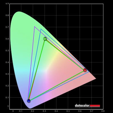
Colour gamut comparison
Colour consistency

It’s worth noting that uniformity can also affect how shades are represented at different points of the screen. There are no guarantees in this respect, even with relatively expensive IPS models. Some models offer a digital Uniformity Compensation (UC) setting which is designed to even out luminance and colour temperature at different points of the screen. Adjustments are usually made relative to the brightest point of the screen. Because some regions of the screen are digitally dimmed and other adjustments are required, you can expect a loss of contrast when using such settings. But the benefits of an effective UC setting could outweigh this for some users. It’s also worth noting that things shift over time, so the most effective UC settings can be re-calibrated by the user rather than just set at the factory. This concept of hardware calibration is explored shortly.
Contrast
Bit depth
Hardware Calibration and LUTs
HDR capability
Mastering video content in HDR can certainly be attractive as a content creator, particularly if the monitor has a high level of HDR capability. Just as consumers of the content seek to be able to enjoy such content under HDR, in a way that can make it appear more engrossing and lifelike. As most models under HDR are focused on the HDR10 pipeline, creators will often choose to stick to this. Some monitors offer support for alternative HDR formats such as Dolby Vision which includes dynamic metadata, changing scene by scene rather than being set for the entire video. And includes support for 12-bit colour. And specialized formats such as HLG (Hybrid Log Gamma) or HLG10 co-created by the BBC and NHK broadcasting corporations. Wikipedia has a useful entry covering HDR formats in more detail. Photo editing isn’t carried out under HDR in this way. But having a screen with the hardware capabilities to provide a compelling HDR experience can certainly help provide excellent SDR output as well.
Responsiveness
Conclusion and recommendations

