Author: Adam Simmons
Date published: August 9th 2015
Table of Contents
Introduction
For some users, one of the most important aspects of image performance is contrast. And when it comes to strong contrast, VA (Vertical Alignment) panels lead the way by some margin. Along with Samsung, BenQ are a manufacturer that uses such technology fairly broadly. The EW2750ZL is the company’s latest 27” Full HD model to feature a VA panel. This model can be thought of as a follow-up to the EW2740L with some new features added and reworked aesthetics. At time of writing BenQ does not propose to replace the EW2740L with the new model but rather have it complementing the older member of the ‘EW’ series.
Specifications
The panel used is a 60Hz 27” AMVA+ (Advanced Multi-Domain Vertical Alignment +) panel, employing true 8-bit colour without dithering. A strong 3000:1 static contrast is specified alongside the usual optimistic 4ms grey to grey response time. Key ‘talking points’ of the specification have been highlighted in blue below.
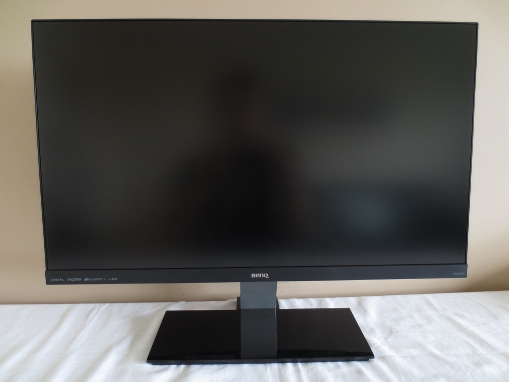
Features and aesthetics
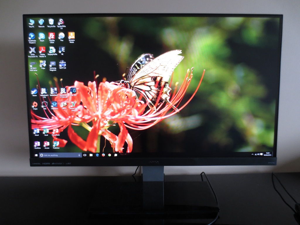
The front of the monitor is dominated by the screen, with a very thin matte plastic bezel at the top and sides and a thicker bottom bezel. As you can see most clearly when the monitor is switched on, there is also a very slender dark grey panel border at the top and sides. This panel border is also there when the screen is off, but it blends into the rest of the screen quite readily. The total bezel width at the top or each, with both aforementioned components included, is a mere 8mm (0.31 inches). The panel border is one of the thinnest we’ve seen on a monitor with this ‘dual bezel’ design, which is nice to see. The bottom bezel is matte black plastic with a shiny silver-coloured BenQ logo in the middle. The stand neck is matte silver plastic, whilst the base is glossy black plastic. The screen surface is very light mate anti-glare, which some users may refer to as ‘semi-glossy’. This is explored in more detail a little later in the review.
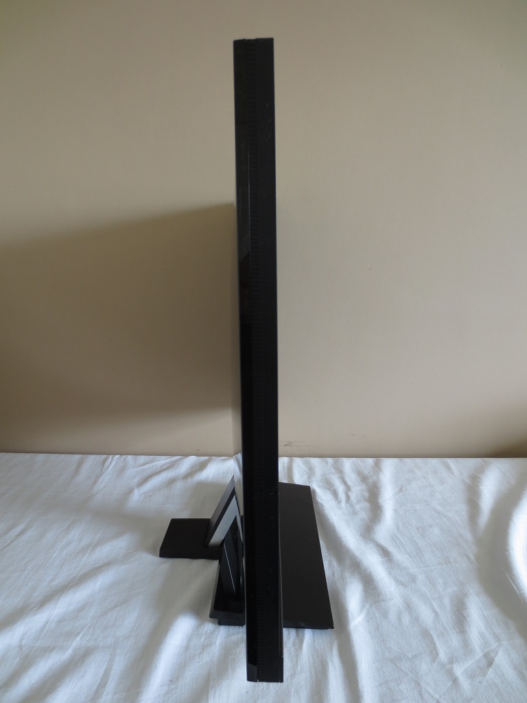
From the side the monitor has a slender and minimalistic appearance. It’s 20mm (0.79 inches) at thinnest point and a bit thicker towards the middle. The total depth including stand (from front to rear edge) is ~199mm (0.79 inches) at thinnest point and a bit thicker towards the middle. The total depth including stand (from front to rear edge) is ~199mm (7.83 inches). The bottom of the screen sits ~96mm (3.78 inches) off the desk surface with the top of the screen ~462mm (18.19 inches) above the desk. The only ergonomic adjustment afforded by the stand is screen tilt (5° forwards, 20° backwards).
The rear of the monitor is covered in generous lashings of glossy black plastic. In the middle there are vertically arranged ports, which from top to bottom are; VGA, HDMI 1.4, HDMI 1.4 (with MHL), 3.5mm line-in, 3.5mm headphone jack and DC power input (external power brick). An HDMI and MHL cable is included as standard accessories. Additional cables may be provided by some retailers.
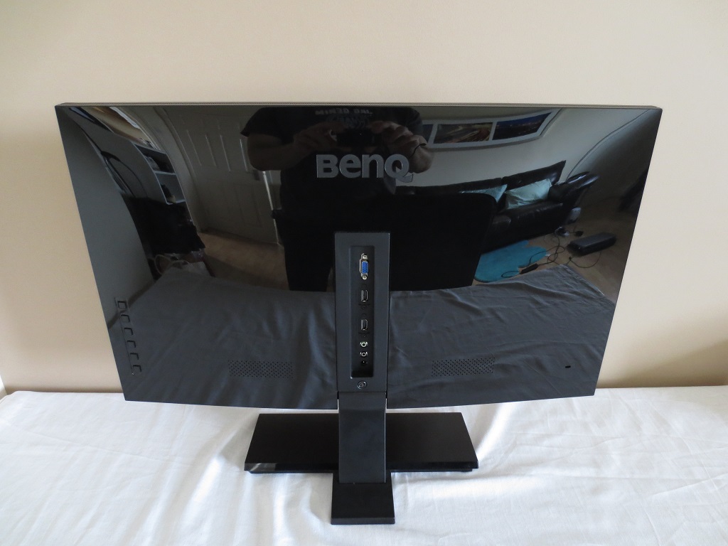
At either side of the port area there is a 2W speaker. These speakers provide basic sound output – a bit hollow with little dynamic range, but still functional. To the far left (right if viewing the screen from the front) there are 6 pressable buttons that control the OSD (On Screen Display) and power state of the screen. The functionality of the OSD is looked at in the following video.
Calibration
Correcting the colour signal
An Nvidia GeForce GTX 970 was used on our test system, connected to the monitor via HDMI. As per usual for a Full HD display connected in this way, the GPU treats the monitor as an HDTV by default and sends out an inappropriate ‘Limited Range RGB 16-235’ signal. This produced a mixture of some slightly washed out and overly deep shades, with an obvious loss of ‘dynamic range’ – some obvious oversaturation and some shades that simply couldn’t be displayed. The monitor can at least handle this signal type without making things look completely flooded and without the black point or static contrast suffering, but things look much better when the ‘Full Range RGB 0-255’ signal is used. To make the most of the monitor and ensure that this optimal 0-255 signal is used, do the following:
1) Open Nvidia control panel and navigate to ‘Display – Change resolution’. As of driver version 347.09, there is a drop-down option for ‘Output dynamic range’ which is set to ‘Limited’ by default. Simply set this to ‘Full’ and press ‘Apply’. Further information on this can be found here. That article also issues guidance on corrections which AMD users can make in their Catalyst Control Centre.
2) Enter the OSD of the monitor (main menu) and navigate to ‘Picture Advanced – HDMI RGB PC Range’. Select the top option, which is ‘RGB(0 ~255)’.
Subpixel layout and screen surface
As noted earlier, a very light matte (some people may call it ‘semi-glossy’) screen surface is used on the monitor. This provides good glare handling characteristics without introducing the graininess associated with stronger matte screen surfaces. The surface texture provides an exceptionally smooth appearance to the image which is as light as we’ve seen from a monitor that isn’t glossy or very close to glossy. There is no obvious graininess and the image does not appear ‘under’ a layer of haze as it might on most matte screen surfaces. Such a light and smooth screen surface also aids the apparent vibrancy of the image as explored in this article.
![]()
The subpixel layout of the monitor is the RGB (Red, Green and Blue) stripe, shown above. This is the typical layout expected by operating systems such as Microsoft Windows and Apple MacOS. You therefore don’t need to worry about running Windows ClearType or anything of that nature, unless you’ve already tweaked this for a different monitor. You may like to play around with ClearType just to suit your preferences, however.
Testing the presets
There are a number of ‘Picture Mode’ presets available on the monitor; ‘Standard’, ‘Low Blue Light’, ‘Cinema’, ‘Game’, ‘Photo’, ‘sRGB’, ‘Eco’, ‘M-book’ and ‘User’. Rather than going through each of these presets individually, we shall take a look at a selection of those alongside some other settings that can be modified in the OSD such as ‘Gamma’. The table below includes our observations using various setting combinations as well as readings of white point and gamma taken using a Datacolor Spyder5ELITE colorimeter. The monitor was kept in its ‘plug and play’ state without any additional ICC profiles or drivers specifically loaded, on a system running Windows 10. Unless stated otherwise assume defaults were used, with the exception being changes to the colour signal and related settings as detailed above.
| Preset Mode | Gamma (central average) | White point (kelvins) | Extra OSD features | Notes |
| sRGB | 2.5 | 6639K | Very bright with impressive ‘pop’ to the image. This is caused largely by the gamma being very high, so many shades appear deeper than they should with lighter shades contrasting particularly strongly. ‘Black crush’, explored later, emphasised by this. Overall colour channel balance is good, however. | |
| Standard (Factory Defaults) | 2.5 | 6640K | Gamma, Color Temperature (Normal, Bluish, Reddish, User Define), Saturation, DynamicContrast | As above, but more flexibility in the OSD options. |
| Gamma = 0 | 2.0 | 6717K | Gamma, Color Temperature (Normal, Bluish, Reddish, User Define), Saturation, DynamicContrast | A mysterious new gamma setting. For those who prefer their image to look faded (washed out) with low gamma. |
| Gamma = 1 | 2.1 | 6619K | Gamma, Color Temperature (Normal, Bluish, Reddish, User Define), Saturation, DynamicContrast | Slightly washed out but good balance otherwise. |
| Gamma = 2 | 2.3 | 6528K | Gamma, Color Temperature (Normal, Bluish, Reddish, User Define), Saturation, DynamicContrast | A good balance to the image aside from the brightness being too high. |
| Gamma = 4 | 2.7 | 6615K | Gamma, Color Temperature (Normal, Bluish, Reddish, User Define), Saturation, DynamicContrast | The image is far too deep, but looks quite spectacular in places because of the gamma and contrast. |
| Gamma = 5 | 2.9 | 6588K | Gamma, Color Temperature (Normal, Bluish, Reddish, User Define), Saturation, DynamicContrast | For those that like everything to look ludicrously deep and dark – gamma too high for any use that comes to mind. |
| Low Blue Light = Multimedia -30% | 2.5 | 6038K | Saturation, DynamicContrast | The image is dimmed significantly (default brightness is also 70 now, not 100). The image has a bit of a warm look to it due to weakening of the blue colour channel. |
| Low Blue Light = Web Surfing -50% | 2.5 | 5549K | Saturation, DynamicContrast | As above but a slightly dimmer with a warmer appearance to the image (default brightness 64). |
| Low Blue Light = Office -60% | 2.5 | 5144K | Saturation, DynamicContrast | As above but an extra step up in ‘warmth’ and dimmer again (default brightness 56). |
| Low Blue Light = Reading -70% | 2.5 | 4784K | Saturation, DynamicContrast | The most effective ‘Low Blue Light’ setting, much dimmer and warmer than the other ‘Picture Mode’ options and the desired effect – significant blue light reduction and more relaxing viewing suitable for the evening in particular. |
| User (Colour Temperature = User Define) | 2.5 | 7090K | Gamma, Color Temperature (Normal, Bluish, Reddish, User Define), Saturation, DynamicContrast | As ‘Standard’ but slightly brighter with a cool tint. |
| Test Settings (as below) | 2.3 | 6485K | Gamma, Color Temperature (Normal, Bluish, Reddish, User Define), Saturation, DynamicContrast | As ‘Standard’ with better D65 colour temperature conformity and much more comfortable brightness. The image looks rich and inviting with pleasing shade variation and consistency. As is usual for this panel type the saturation weakens a bit towards the side and bottom edges for some shades. |
Straight from the box the monitor produced a very bright and eye-catching image. The high gamma complimented the contrast to provide dazzling distinction between ‘dark’ and ‘light’, but also prevented the monitor from representing most shades accurately. Fortunately BenQ provide a good range of gamma adjustment options (including a curious new ‘0’ setting) in the OSD, allowing this to be rectified quite readily. In terms of balance to the colour channels the monitor was almost spot on really and there was little need to make changes here. Being thorough as we are, though, we decided to make a few minor changes to offset the very slight blue bias on our unit. Interestingly the ‘Standard’ mode gives exactly the same flexibility as ‘User’ mode, including full control over colour channels. The image when using the same settings in either mode is identical. Following the adjustments made to our test settings, covered in the proceeding section, the gamma curve looked like this: ‘2.2’ purists may not appreciate the slight deviation here, but we feel it doesn’t really matter on this particular model. With this panel type there is deviation in gamma if you compare the central point of the screen to the side or bottom edge, by eye, which the colorimeter doesn’t account for. Or indeed if you move your head even slightly. Granted this shift is relatively low on this particular model compared to most other VA models, but it’s still there. The overall representation is good and on this monitor the slight bump in the gamma curve compared to ‘2.2’ helps aid shade depth in peripheral sections. It is certainly preferable to using the lower gamma settings such as ‘1’, which gives a ‘2.1’ central average at most. In short; there’s no need to worry about this slight deviation shown in the curve nor any good reason to try to stringently stick to ‘2.2’ in the centre of this monitor. It’s also worth mentioning the ‘Low Blue Light’ settings of this monitor, which are implemented in a way on BenQ monitors such as this that really sets the standard. You get good flexibility with the adjustment options here, the modes are easy to activate (and deactivate, depending on the image mode you usually use) and they do what they say on the tin. The strongest setting, ‘Reading’, provides a huge reduction in blue light output from the monitor. This can help reduce eye fatigue in sensitive users, but is also an important consideration if using the monitor before bed. Blue light is an important ‘alertness’ signal for the body and it affects our hormone production in such a way as to keep us relatively alert and awake. This is not at all what you want before bed, so it’s good to be able to cut it out effectively. As noted above the colour balance was really very strong out of the box, but we decided to make some minor tweaks here anyway. Be aware that individual units can be expected to vary when it comes to certain image characteristics, including colour channel balance and going by other VA models gamma behaviour, so the below should only be used for reference. Given this inter-unit variation, what we’ve already said about gamma tracking on the monitor and some of the points explored here we will not be providing any ICC profiles for this monitor. Please also remember that the ‘User’ mode can be used to apply these settings rather than ‘Standard’ and the results will be identical. Anything not mentioned here was left at default, with the exception of the colour signal being corrected in the Nvidia drivers as mentioned earlier. We’ve included the ‘AMA’ setting here just for reference as well. Brightness= 50 (according to preferences and lighting) Gamma= 2 Color Temperature= User Define R= 100 G= 100 B= 95 AMA= High HDMI RGB PC Range= RGB(0 ~255). Refer to ‘Correcting the colour signal’ above We used a KM CS-200 light meter to measure the white and black luminance levels of the monitor. From these values, static contrast ratios were calculated. This data is shown in the table below. Be aware that the measurement instrument is only accurate to one decimal place. Given the very low black luminance levels of the panel type this rounding can significantly affect the contrast reported at the end. Unless stated otherwise assume that any setting not mentioned was left at default, except for the corrected HDMI colour signal mentioned earlier. Black highlights in this table indicate the highest white luminance, lowest black luminance and highest static contrast ratio recorded. Blue highlights indicate the recordings for our ‘Test Settings’.

Gamma test settings
Test Settings
Picture Mode= Standard (or User)
Contrast and brightness
Contrast ratios
Monitor Profile White luminance (cd/m²) Black luminance (cd/m²) Contrast ratio (x:1) 100% brightness (Factory Defaults) 289 0.08 3613 80% brightness 241 0.06 4017 60% brightness 191 0.05 3820 40% brightness 137 0.04 3425 20% brightness 80 0.02 4000 0% brightness 19 <0.01 – Gamma = 0 289 0.08 3613 Gamma = 1 287 0.08 3588 Gamma = 2 287 0.08 3588 Gamma = 4 287 0.08 3588 Gamma = 5 286 0.08 3575 Low Blue Light = Multimedia -30% 211 0.06 3517 Low Blue Light = Web Surfing -50% 186 0.05 3720 Low Blue Light = Office -60% 160 0.04 4000 Low Blue Light = Reading -70% 137 0.04 3425 User (Color Temperature= User Define) 296 0.07 4229 sRGB 289 0.08 3613 Test Settings 167 0.04 4175
The average static contrast with only brightness adjusted was 3775:1, which is exceptional. The adjustments made to our ‘Test Settings’ were really rather minor and the static contrast there was recorded a very impressive 4175:1. This may of course be due in large part to ‘lucky rounding’ with the black point there. Static contrast peaked at 4229:1, recorded under ‘User (Color Temperature = User Define)’. Under this setting the peak white luminance was recorded, a fairly bright 296 cd/m². The minimum white luminance recorded in this table was a very dim 19 cd/m², giving the monitor a very respectable luminance adjustment range of 277 cd/m². Contrast also remained strong when using the ‘Low Blue Light’ settings, dropping to a still excellent 3425:1 using the strongest setting.
There is a ‘Dynamic Contrast’ setting, found in the ‘Picture Advanced’ section of the menu. This can be activated in the following picture modes; ‘Standard’, ‘Low Blue Light’, ‘Game’, ‘Photo’ and ‘User’. You can set the between a value of ‘1’ and ‘5’, which seems to primarily affect how quickly the backlight responds to changes in scene brightness. The idea of a dynamic contrast setting is that the backlight brightness (‘brightness’ on a monitor) adjusts automatically according to the level of ‘light’ or ‘dark’ on the screen. On this model the ‘contrast’ setting is also altered automatically. We found the backlight tended to be too bright and contrast too high in mixed images with plenty of bright content. This gave a flooded look which really ‘killed’ image quality, for lack of a better phrase. Really we don’t see the attraction of using this sort of mode on any monitor, especially one where the static contrast performance is so strong.
PWM (Pulse Width Modulation)
The EW2750ZL does not use PWM (Pulse Width Modulation) to regulate backlight brightness at any brightness level. Instead, DC (Direct Current) is used. The backlight is therefore considered ‘flicker-free’, as promised, which will come as welcome news to those who are either sensitive to flickering, find PWM-modulated backlights fatiguing or dislike PWM artifacts.
Luminance uniformity
Whilst observing a black screen in a dark room there was no observable backlight bleed. The screen appeared very uniform, as you can see in the image below (individual units may vary). The image was taken from a few metres back to eliminate something we dub ‘VA glow’. This appears from non-central viewing angles as a mild silverish purple glow, as shown in the ‘viewing angles’ video later on in the review. On a screen of this size it can also be seen to some extent from a normal viewing angle, towards the bottom two corners of the screen. It is nowhere near as noticeable, distracting or intense as ‘IPS glow’ or anything of that nature – it is subtle.
The Spyder5ELITE was used to analyse the uniformity of lighter colours. 9 equidistant white quadrants were analysed with the colorimeter, running from the top left to bottom right of the screen. The following table shows the luminance values recorded at each quadrant as well as the percentage deviation between each quadrant and the brightest recorded point. The luminance uniformity of the screen was very good overall. The brightest point was ‘quadrant 5’ in the centre of the screen (165 cd/m²). The maximum deviation occurred at ‘quadrant 9’ (144 cd/m², which is 13% dimmer than centre). Elsewhere brightness was between 2-7% of the central value which is excellent. The graphic below shows these deviations as a contour map, with darker greys representing lower luminance and hence greater deviation from the brightest point than lighter greys. We also assessed the consistency of colour temperature using the same 9 quadrants. Deviations here are represented as DeltaE values, showing how far each quadrant deviates from the 6500K (D65) daylight white point target. Lower DeltaE values represent less deviation from this target, with a value < DeltaE 3 generally considered deviation that most users wouldn’t readily notice by eye. There was some significant deviation towards the bottom of the monitor (up to a DeltaE of 3.5 in the bottom left corner, ‘quadrant 7’). This was not severe or a cause for alarm. Elsewhere deviation was pleasingly low, with DeltaE values of 0.3 – 1.3. It’s worth remembering that individual units can vary when it comes to all aspects of uniformity and that there can be deviation beyond the measured points. It’s also worth bearing in mind that there can be some slight shifts in colour temperature on a panel of this type based on viewing angle. Even all of this considered, though, the white luminance uniformity of the unit we tested was pleasing overall. On Battlefield 4 (BF4) the contrast performance was excellent. Dark shades had excellent depth to them, whilst bright shades stood out in a brilliant way against them. Dark areas of the map, such as underground caves, tunnels and building interiors on night had an appropriate atmosphere as a result of this. Shadow detail was also well-defined from strong and quite inky-looking blacks, giving vegetation, rocks and suchlike a good ‘3D’ structure. There was a degree of ‘black crush’, which is observed to some extent on all VA panels of this size. This is where very dark shades appear darker than they should and therefore blend into black from a normal viewing position but generally lighten up to reveal extra detail if you move your head to a non-central position. This effect was quite minor on this model, affecting some minor dark details but not really detracting from the overall atmosphere. The sheer brilliance of gunfire, fire and explosions ripping through these dark areas more than made up for that. Such bright shades also looked very ‘pure’ without distracting graininess from the screen surface. On Dirt 3 the strong contrast performance of the monitor also shone through. ‘Black crush’ again ate away at a little detail here and there, for example the leather steering wheel texture when driving at night didn’t have quite as much definition as it should. The overall level of detail in such dark areas was good, though, and throughout the screen there was excellent depth to blacks and other dark shades without atmosphere-destroying glow or anything of that nature. There was just a little bit of the aforementioned ‘VA glow’ visible towards the bottom corners, but this was really very subtle. The deep blacks also helped give rocks and vegetation a pleasing structure as you whizzed past (a very important thing, of course). Bright elements contrasted brilliantly with their dark surroundings and weren’t impeded by noticeable graininess from the screen surface. On The Elder Scrolls Online (ESO) the excellent deep, dark shadows and shaded areas helped give objects a nice distinct and well-defined 3D structure. Bright elements such as fire and spell effects stood out brilliantly against darker backgrounds and had a good ‘clean’ (non-grainy) look to them. This gave the game a superb atmosphere at night in particular. There was a slight degree of ‘black crush’ in places. This only really affected subtle details involving the darkest (near-black) shades and didn’t detract from the game atmosphere as ‘IPS glow’ and suchlike might. Contrast performance was also excellent on the Blu-ray of Skyfall. Dark shades had excellent depth, creating an appropriate atmosphere in dark scenes. The level of detail here was also very pleasing, with only some very minor detail lost due to ‘black crush’ but impressive detail levels overall. Light shades punched through brilliantly well, for example the neon lights in the Shanghai night scenes where the strong contrast of the monitor came into its own. These light elements didn’t have unnecessary graininess to them either, aiding the vibrant look. We also used Lagom’s tests for contrast to help identify specific weaknesses in the contrast performance that other testing may not highlight. The following observations were made. The BenQ EW2750ZL’s colour gamut (red triangle) was compared to the sRGB reference colour space (green triangle). The monitor offered complete (100%) sRGB coverage with a little bit extra for good measure. This slight over-coverage helped give some shades a hint of extra vibrancy, but wasn’t significant enough to give things a garish or unrealistic look. This is a standard rather than wide gamut monitor with a generous but not excessive colour gamut. Colour reproduction was excellent overall on BF4. The environments looked natural and as they should, with rich and well-represented colours on the whole. There was a pleasing palette of rich greens and earthy browns, with just a bit of weakening saturation towards the very side edges and bottom edge of the screen. Richness was maintained for a given shade much better than you’d typically see on a VA panel of this size, aiding the apparent variety of unique shades. There were some very impressive vibrant dashes of colour here and there too, most noticeable where bright shades are set against a darker background. Rich orange flames and sparks in dark areas were particularly spectacular, as were the neon green and red painted ‘ghost sights’ of certain weapons. Colours were equally pleasing on Dirt 3. There were lashings of vibrant colours for the car liveries and advertising around the track, which is exactly the aesthetic that such elements crave. Some of the liveries showed off some impressively deep reds and blues as well as some neon shades with excellent ‘pop’ – especially where black was mixed into the palette for contrast. The environments looked appropriately rich and natural, with a very nice variety of plant-like greens and neutral browns. There were some impressively lush greens in the mix, with just a bit of saturation loss peripherally as noted earlier. The colour reproduction was also strong on ESO. There were some strong and vibrant blue, purple and red spell effects – popping with real brilliance in dark surroundings in particular. The neon yellowish-green glow of ‘torchbugs’ and cyan and purple flames throughout the game were really eye-catching. The environments showcased a good range of earthy browns and green tones, giving a pleasing and varied look. There was some saturation lost as as observed in other titles, towards the edges and bottom of the screen. This was really as subtle as we’ve seen on a 27” VA panel, however. On the Skyfall Blu-ray colours were represented in an appropriate way. Skin tones appeared appropriately saturated, as did natural environments. The weakening saturation towards the sides of the screen was too subtle to detract from the rich look overall. There were also some impressive moments of vibrancy as well, for example the bright cyan and blue neon lights in the Shanghai night scenes. There was also a rather striking red dress worn by Miss Moneypenny which stood out very well without looking overblown or incorrect. We also assessed colour reproduction using the Blu-ray of Futurama: Into the Wild Green Yonder. Right from the start of the film it was clear that the monitor provided just the aesthetic that this title craves. The opening scenes show various ‘neon’ shades such as brightly coloured glowing violet planets and green cosmic energy. These elements stood out with brilliant vibrancy against the deep, dark space surrounding them. Throughout the film there were plenty of other elements like this, alongside other deep shades and bright neon shades that were represented with pleasing pizazz. The movie also calls for varied production of closely matching pastel shades, with many objects and skin tones showing only very slight variation with their neighbours. In this respect the monitor did quite well, particularly for a non IPS-type panel. The weakening saturation peripherally and viewing angle-related shifts in gamma meant that shades didn’t maintain the same consistency and individuality as on IPS-type panels. But variation here was not extreme, certainly much less extensive than TN panels of this size and what you’d typically see on a VA panel. Compared to earlier AMVA+ panels, such as the ones used on the EW2740L, it’s quite possible the shifts in colour are even less extensive. But without the aid of a side-by-side comparison and owing to the fact we tested the former model a long time ago it would be difficult to say for sure. We used Lagom’s tests for viewing angle to aid our exploration of colour consistency and viewing angle performance. The following observations were made from a normal viewing position around 70cm from the screen. The video below shows this text test, a mixed desktop background and dark desktop background from a range of viewing angles. Note the aforementioned ‘VA glow’ in the final third of the video. A small tool called SMTT 2.0 was used alongside a sensitive camera to compare the latency of the EW2750ZL with a range of monitors of known input lag. By taking over 30 repeat readings using this method we were able to get a representative value of input lag, measuring 5.63ms (around 1/3 of a frame) of input lag. This value not only reflects the signal delay (what you ‘feel’) but also an element of pixel responsiveness (what you see). This indicates that the monitor has a very low signal delay, one which shouldn’t in itself inhibit the gaming experience. When considering the visual responsiveness of a monitor, it’s important to look at how the pixels behave during transitions between different shades. It is also important to consider how we perceive motion on the monitor. In this article we explore the concept of perceived blur and how the movement of our eyes as we track motion on the screen creates blur. This exists regardless of what the monitors pixels are doing. That article also introduces the concept of ‘pursuit photography’, whereby a moving camera is used to capture moving images on a monitor. This not only captures what the pixels of the monitor are doing but also reflects how our eye movement (or movement of the camera in this case) induces additional blur. The images below are pursuit photographs taken using the UFO Motion Test for ghosting. The test runs at 960 pixels per second, which is a good speed for taking the photographs and for highlighting the pixel response behaviour and other blur contributors. Images are included for both the top row of the test (dark cyan background, left column of the image) and the middle row (medium cyan background, right column of the image). All of the AMA (Advanced Motion Acceleration) pixel overdrive settings on the monitor were tested; ‘Off’, ‘High’ and premium. We have also included shots taken with the monitor running at 75Hz (we will come onto this later) using the ‘High’ AMA setting. Finally we have included an image from a Samsung S27A750D set to full brightness (eliminates PWM) and 60Hz, using its ‘Faster’ response time setting. This is used as a reference to show how a 60Hz LCD should look when the pixel responses are pretty much optimal for the refresh rate. With ‘AMA = Off’ you can see a moderate degree of trailing in addition to the blur you’d perceive with ‘perfect’ pixel responsiveness (i.e. the reference screen). This is particularly prevalent on the dark cyan background, which is something you’ll commonly observe on a VA panel due to such transitions tending to be slower. With ‘AMA = High’ performance on the dark background remained similar, with some relatively sluggish pixel transitions still occurring. The trailing was significant reduced on the medium cyan background, however. With ‘AMA = Premium’ there was actually a surprising reduction in trailing for the dark background. Unfortunately there was fairly noticeable overshoot (inverse ghosting) introduced with the transitions against the medium cyan background. In practice there was significant overshoot using this setting over a broad range of transitions, with obvious bright halo trails and things just looking overly sharp and frankly wrong during motion. Needless to say that we preferred to stick with ‘AMA = High’. With this in mind as the optimal setting, we also tested the monitor at 75Hz. This reduced perceived blur, which you can see as the object (UFO) is slightly less elongated than any of the 60Hz examples (including the reference). This is best illustrated on the alien and his cockpit area. However; increasing refresh rate does not speed up pixel transitions. There is still considerable trailing due to slower than optimal pixel responses with the dark cyan background and a touch with the medium cyan background. We would really have liked it if BenQ could have provided a bit more acceleration for the dark background type transitions as they managed to do with the ‘Premium’ setting without noticeable negative consequences. But without accelerating other transitions such that obvious overshoot was induced. The monitor will comfortably run at up to 75Hz at 1920 x 1080. By ‘comfortably’ we mean that default timings could be used. Furthermore there were no recordable or observable changes to image quality (gamma, colour temperature or contrast) and no frame skipping – so it is ‘true 75Hz’. The monitor could be pushed as high as 77Hz with default timings, but any higher and an ‘out of range’ error was displayed along with a blank screen. In order to run the monitor at 1920 x 1080 @ 75Hz you must create a ‘custom resolution’. There is no need to adjust timings, so it’s a fairly straightforward process. The video below runs through how this can be done using the Nvidia Control Panel, or for AMD users, using a tool called CRU (Custom Resolution Utility). BF4 helped to reinforce the observations made during the pursuit photography testing. Where lighter or medium shades were involved in the transition (the majority of transitions on this title), things were largely in-line with the fastest 60Hz LCDs when it came to perceived blur. There was a little bit of extra trailing in places during some transitions, but it was really eye movement that was the predominant source of blur here. Where darker shades were added to the mix, though, some more sluggish pixel transitions came into play. Generally this would create a sort of mask of additional blur rather than creating the sort of painfully obvious smeary ‘smoke-like’ trails associated with some slower VA panels. When moving through shaded forest areas with patches of dark and lighter vegetation and ground, for example, things just didn’t quite look as sharp as they could on a 60Hz LCD. This is something that some users wouldn’t notice, whereas it may contribute to a bit of motion sickness in others (for example if zipping around in a vehicle where this ‘blur mask’ can become a bit more pronounced). Where the very darkest shades were involved there were some slightly more extended trails similar to those captured in the pursuit photographs. If you observed dark vehicle wheels against a lighter background, for example, the dark wheel texture appeared to sort of bleed into the background a bit. You could see hints of other colours such as dark red and blue, which is typical of a VA panel. On this model it wasn’t all that extensive really and it was more that the dark texture became fuzzy with a short additional trail during faster movement. The good news is that there was very little in the way of overshoot, with just the slightest hints where some medium and light shades moved against one another. In this respect there was a vast reduction compared to the EW2740L, with as good as no overshoot this time around. Dirt 3 told a similar story. Your average race track on this game calls for a large spread of different pixel transitions to be performed. There are plenty of light, medium and dark shades inter-twined. There are always a lot of deep shadows and areas of darker vegetation on this game with lighter shades surrounding them. Again, most of the motion blur was caused by eye movement but there was some additional blur on top of this in places. Racing at night introduced a lot of very dark shades set alongside a range of slightly lighter to much lighter shades. This introduced the slowest pixel transitions that the monitor performs. With that there was noticeable additional trailing (general additional blur) on top of what you’d expect to see from an ideal 60Hz sample and hold display. Things stopped short of those ‘smoke-like’ smeary trails that some VA models display, though, and there was no noticeable overshoot across any transition range on this title. We also observed the Blu-ray movie test titles. The pixel responses were fast enough to handle this pace of action without introducing any issues (overshoot or response-related trailing). The fluidity of action here is limited by the frame rate at which the films run, around 24fps, and as such the demands from the monitor are lower from a pixel response perspective. Having used a number of monitors with AMVA+ panels, we knew roughly what to expect from the BenQ EW2750ZL. This model is something of a refresh of the highly capable EW2740L, with slimmer bezels and some additional features in the OSD. Upon closer inspection (i.e. testing) it also became apparent that a brand new panel is used, which always piques the interest of monitor reviewers and enthusiasts alike. This delivered a similar contrast performance to its predecessor, with the specified 3000:1 seeming a little pessimistic if anything. Blacks and dark shades were impressively deep, whilst bright shades were bright and brilliant – standing out very nicely indeed against darker surroundings. The same very light matte screen surface was used, giving an impressively smooth appearance to the image and maintaining strong vibrancy. The out of the box colour setup was also pleasing, with just a few little tweaks made to improve things further. Colour reproduction was amongst the best we’ve seen from any VA panel with full sRGB colour gamut coverage and a rich and varied look to the image. As usual for a VA panel there was a degree of viewing angle dependency to the gamma curve of the monitor and there was some loss of saturation towards the far edges and bottom of the screen. This was impressively muted for a panel of this type and size, though, and seemed slightly improved even from earlier AMVA+ panels such as that used in the EW2740L. Another area much improved from older VA panels and even some modern VA panels from other manufacturers was responsiveness. We’ve been a bit spoilt recently by testing models like the Samsung S34E790C which seemed to outperform its IPS counterpart when it came to responsiveness, but had a few more realistic benchmarks in mind for this monitor. The ‘original’ AMVA+ model from BenQ was the GW2760HS, which offered low levels of grey to grey acceleration to maintain an overshoot (inverse ghosting) free image at the expense of frequent and rather obvious trailing. Then came the EW2740L with greater levels of acceleration, cutting down on much of the trailing but bringing with it a fair degree of overshoot. The EW2750ZL sat some way between these really, offering greater acceleration than the GW2760HS without the overshoot issues of the EW2740L. Interestingly it seemed some of the more sluggish transitions (involving dark shades) were accelerated nicely by the ‘Premium’ AMA setting, but unfortunately the remaining transitions were completely overdone and burdened by excessive overshoot. The ‘High’ setting was therefore optimal, although we can’t help feeling that a little bit more fine-tuning could have been done by BenQ to improve the speed of some of the slowest transitions. Overall this monitor delivered a very well-rounded performance. It’s a monitor that is well suited to tasks such as movie watching, general desktop work and a bit of gaming on either a PC or a console. We also feel it is suitable for a bit of hobbyist photo editing, although those serious about colour accuracy should really turn to IPS-type panels for the highest levels of consistency and lowest levels of viewing angle dependency. Some users may not be enamoured with the lack of ports, the ergonomically inflexible stand or lack of VESA holes. But we found the overall styling and minimalistic nature of the monitor quite appealing and feel its current asking price is fair.

Luminance uniformity table

Luminance uniformity map

Colour temperature uniformity map
Contrast in games and movies
Lagom contrast tests
Colour reproduction
Colour gamut

Colour gamut test settings
Colour in games and movies
Viewing angles
Responsiveness
Input lag
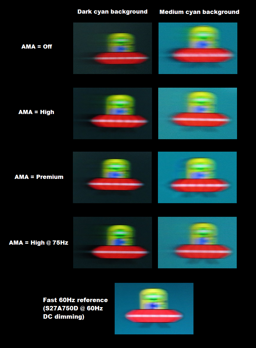
Perceived blur (pursuit photography)
Running a custom resolution (overclocking)
We consider this to be a ‘mild’ overclock, handled comfortably by the monitor with minimal risk involved. It is likely that the monitor will last its useful lifetime at 75Hz much as it would at 60Hz. Regardless of this, as with any form of overclocking you’re doing this at your own risk. The risk may well be very low, but we accept no liability should anything happen to the monitor which may or may not be due to running it at an increased refresh rate. Please note as well that newer revisions of the monitor than the one we tested may not overclock as well (or may even overclock slightly better). This was the case with earlier models such as the GW2760HS where several revisions involving different panels were deployed over its lifetime, with differing overclockability. For the sake of this review, including the section that follows, the monitor was run at its native 60Hz refresh rate.
Responsiveness in games and movies
Conclusion
Positives Negatives Only minor OSD adjustments were required to bring out the best from this monitor. Colours were rich and varied with surprising consistency for a VA panel
Colour consistency not quite up to IPS levels and no gamma mode that would give ‘2.2’ centrally (although as noted in the review, that isn’t really a big issue on such a monitor)
Excellent static contrast performance coupled with one of the lightest (least grainy) matte screen surfaces you’ll find provided good ‘pop’ to the image and strong atmosphere in dark scenes There was some ‘black crush’ as usual for a VA panel, but nothing major. Static contrast could be higher still, although it’s about as high as we’ve seen from an AMVA+ panel specifically Responsiveness was better than many VA panels with an overdrive implementation that is better balanced than that of either of this model’s predecessors. Very low input lag and the ability to run at ~75Hz with ease will also appeal to some users
Some transitions were slower than optimal for a 60Hz monitor and we feel that a little more acceleration could have been used in places (i.e. where dark shades were involved) with little ill effect
A simple but at the same time quite appealing design we feel – and some useful additions such as ‘Low Blue Light’ modes
None of the new OSD features were particularly useful in our eyes (the ‘Low Blue Light’ settings were, but they’re not new) and the lack of ergonomic adjustability or VESA holes may irk some users
![]()

