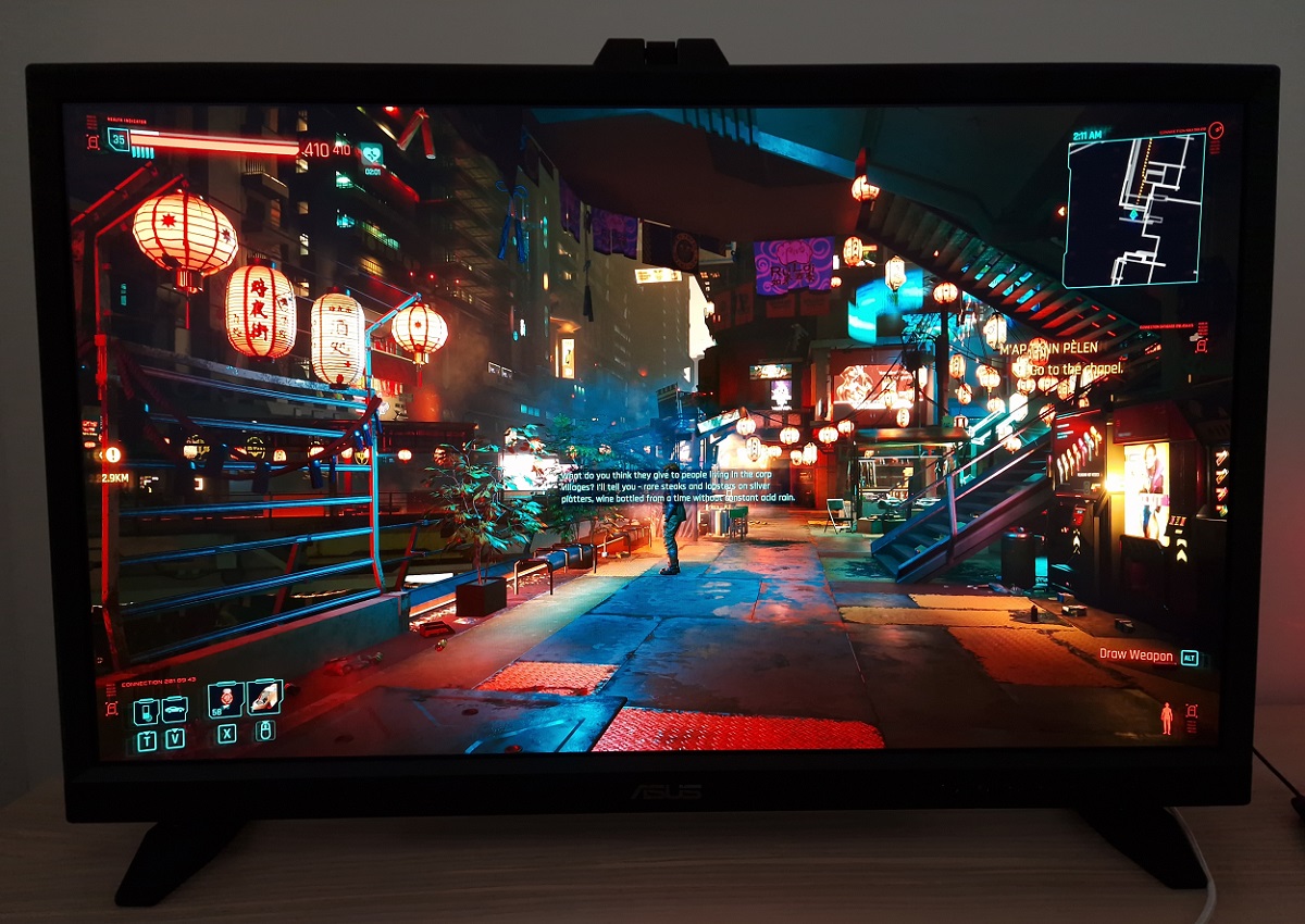
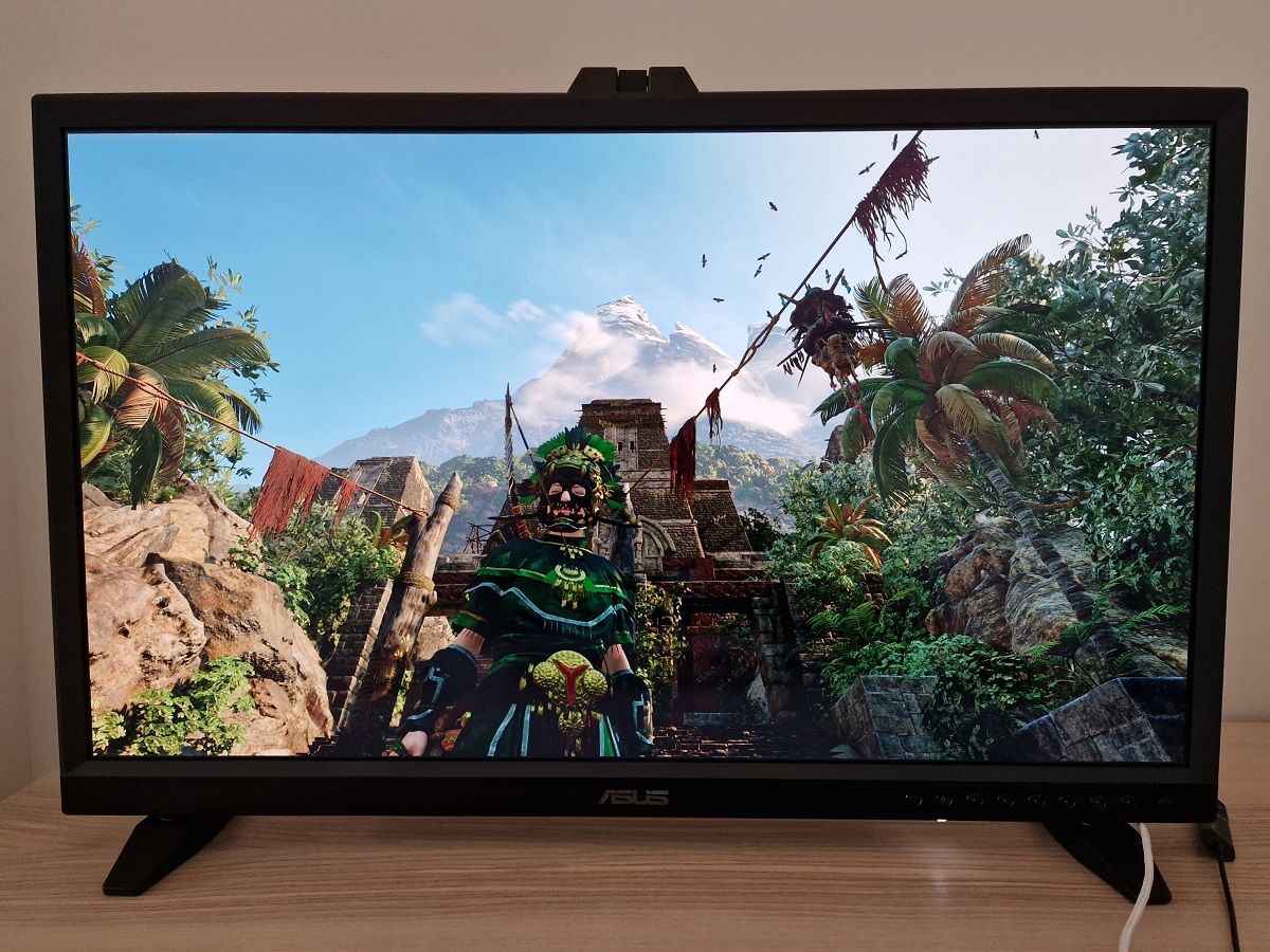
Author: Adam Simmons
Date published: July 21st 2022
Table of Contents
Introduction
OLED technology has been on many people’s radar for quite a while now and is just now slowly infiltrating the mainstream monitor market. Whilst sitting at the higher end of ‘mainstream’ in terms of pricing, the ASUS PA32DC is one such offering – adopting a true RGB OLED design without a backlight or colour filters. This model is designed to be a colour-accurate reference monitor with SDR and HDR content creation and consumption in mind. This is combined with the usual OLED benefits of exceptional contrast and pixel responsiveness, delivered by a ~32” ‘4K’ UHD panel which provides a strong pixel density and plenty of ‘desktop real-estate’. We put this monitor through its paces in our usual suite of tests, including ‘real-world’ usage on the desktop, viewing video content and gaming.
Specifications
The monitor uses a 31.5” RGB OLED panel from specialist Japanese manufacturer JOLED, with 3840 x 2160 resolution. This is complemented by a 60Hz refresh rate and true 10-bit colour support. A 0.1ms grey to grey response time is specified – and though we often say to pay little attention to such figures, OLED technology is known for very strong pixel responsiveness. Some of the key ‘talking points’ for this monitor have been highlighted in blue below, for your reading convenience.
Users in the UK and EMEA can register for a warranty extension, bringing the warranty up from the usual 3 years to 5 years.
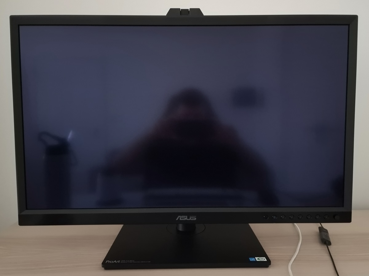
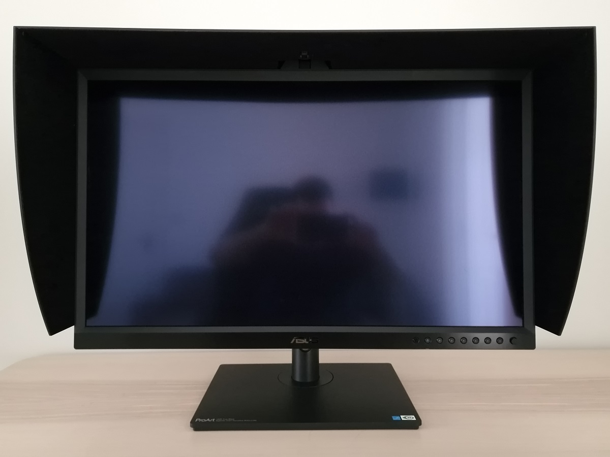
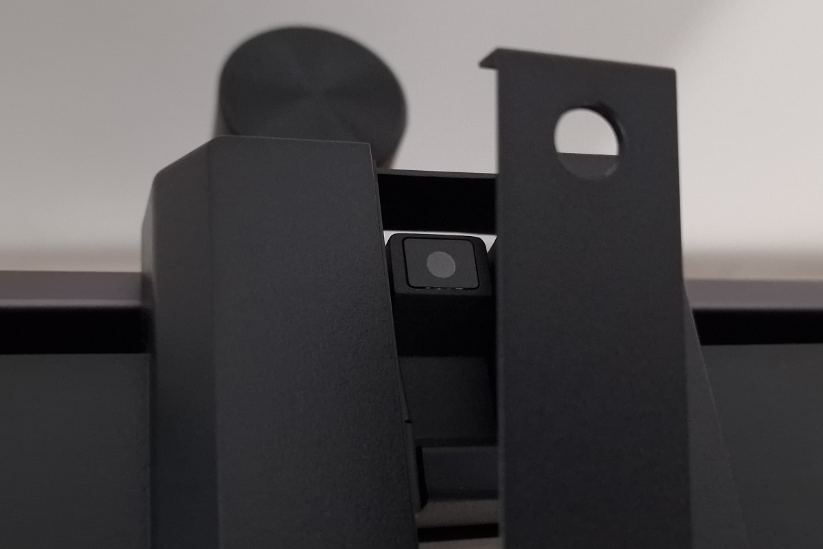
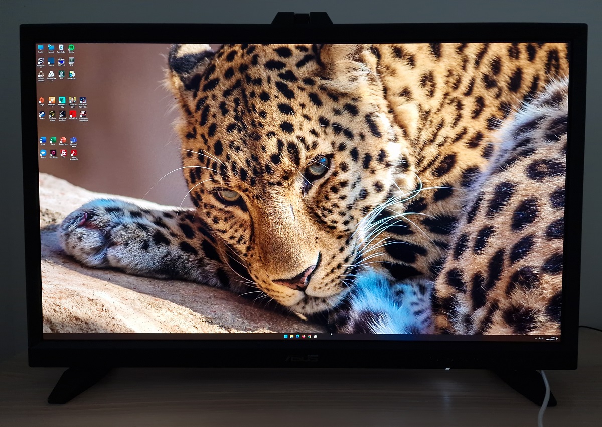
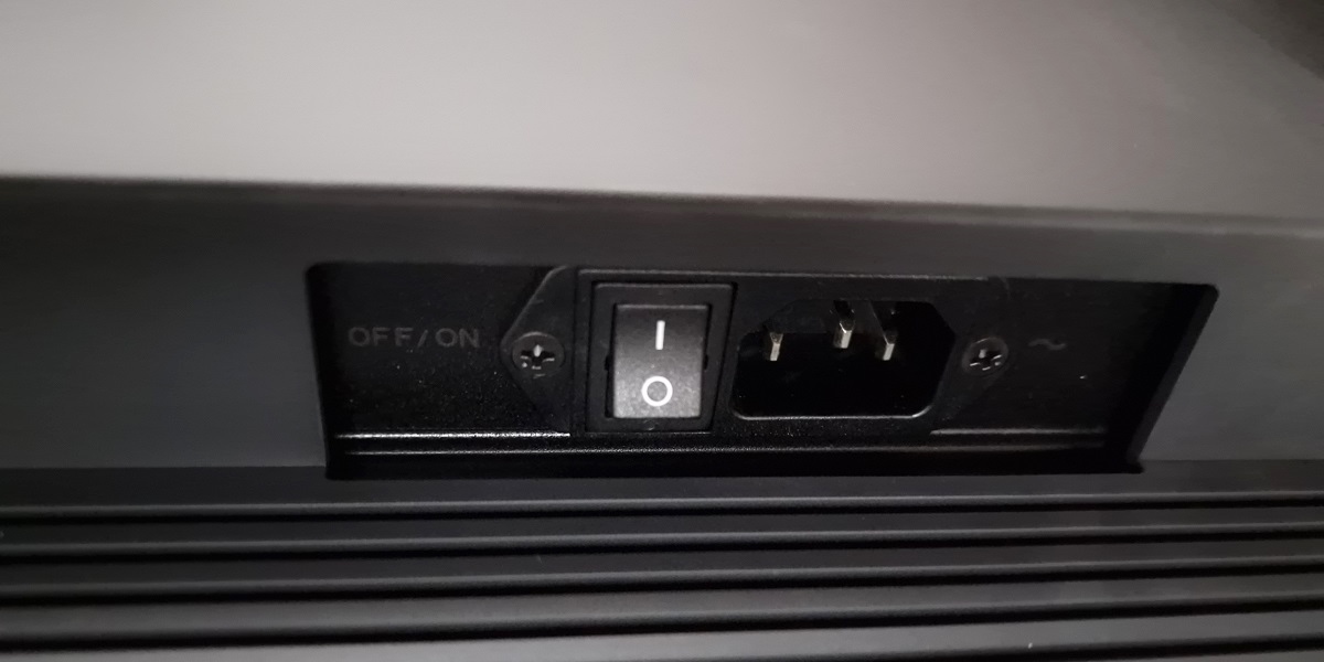
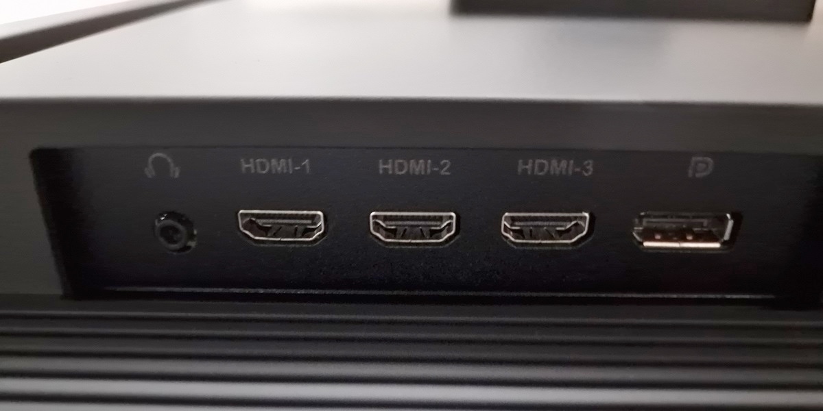
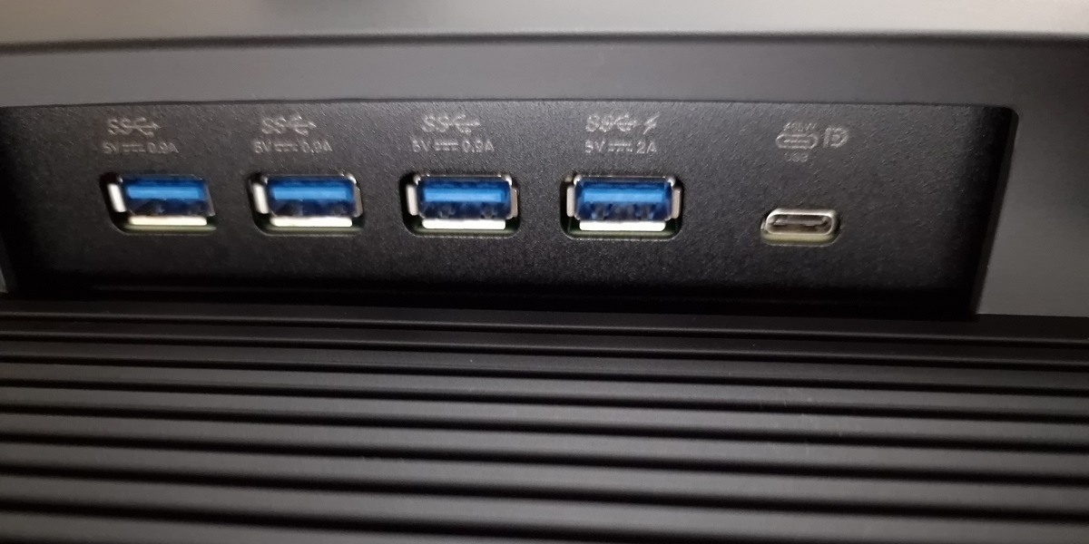
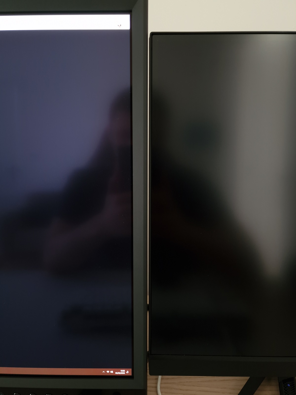
*10-bit can be selected in the graphics driver when using a DP signal at any refresh rate, up to the native resolution. 10-bit and 12-bit can be selected when using HDMI at up to 30Hz for the native resolution. 12-bit includes an additional 2-bit dithering stage added by the monitor’s scaler to facilitate work with higher bit depth content. The screen has a professional design, with dark matte plastics the material of choice for the screen itself. The bottom bezel is moderately thick (35mm or 1.38 inches) with a brushed metal texture, which is also used for the base of the stand. The stand has a matte (or brushed-look) plastic finish but is internally weighted with metal for a very solid and weighty feel. For those who wish to have a lower-profile look, have to squeeze the monitor into a smaller space or improve portability an alternative ‘mini stand’ configuration can be used. The ‘standard stand’ is detached and a small foot screwed into the bottom of the screen, one at each side. The top of the screen features an integrated motorised colorimeter, explored shortly in the calibration section. When you first turn the monitor on it makes a fairly loud motorised noise for a few seconds, although the colorimeter remains in position until called upon by the calibration software to perform calibration. This occurs whenever you turn the monitor on, but not if it ‘wakes up’ from a low power state. At rest this colorimeter acts as a light sensor which can be used to allow the monitor to adjust brightness and colour temperature according to ambient lighting. The top and side bezels are moderately thick, though slimmer than the bottom bezel – ~15mm (0.59 inches) at the sides and ~18mm (0.71 inches) at the top – or ~32mm (1.26 inches) including the integrated colorimeter. A sliver of black panel border is also visible at all sides. A detachable shading hood is included to reduce glare from light striking the screen from sharp angles at the sides or above. This is attached by screwing two side pieces and a top piece into small screw holes (screws included) after removing small rubber plugs with a paperclip, metal hair pin or similar. A lightweight flap is included at the top of the hood which can be pushed up by the included colorimeter, so it doesn’t impede its operation. The screen has a very light matte anti-glare or ‘semi-glossy’ finish, explored later. For the images below showing the front of the screen, the room is moderately bright with light streaming in from an anti-glare blind to the left and an open door to the right – though little to no light is striking the screen directly. The 2nd image shows a slightly dimmer (but not dim) environment with light streaming in from the AG blind to the left but no additional light entering the room. The OSD (On Screen Display) is controlled by pressable buttons which face forwards on the bottom bezel, towards the right side. There are 6 function keys – they aren’t illuminated, but they have silver-coloured blobs on them to make them a little more distinct in most lighting. The first 2 of these are customisable ‘Shortcut’ keys, which allow quick access to a variety of functions. A directional button (‘joystick’) is included for intuitive navigation, at the far right. The leftmost button is a dedicated power button, with accompanying status LED beneath it. This glows white when the monitor is on and amber when it enters a low power state (signal to the system is lost), but can be disabled in the OSD if preferred. Our main gripes with the OSD are that only 2 of the 6 function keys are customisable, which seems unnecessarily limited. And that when you cycle through presets in the menu system, they’re activated, which takes a few seconds, making it more cumbersome and time consuming that it should be to switch between them. The OSD is otherwise intuitive to navigate and has a great deal of functionality and image options available. The following video runs through the menu system including PiP and PbP functionality, ambient light sensor, the motorised colorimeter and accompanying ASUS ProArt Calibration software. The ports are located at the sides of the monitor, in the boxy central region – so they can be accessed easily with either stand configuration. At the right side as viewed from the front; a 3.5mm headphone jack, 3 HDMI 2.0 ports, DP 1.4 and an AC power input (internal converter) with ‘zero watt’ switch. At the left side as viewed from the front; USB-C (65W PD, DP Alt Mode, upstream data) and 4 USB 3.2 Gen 2 ports. Because there’s no additional USB upstream port, KVM functionality is not offered. The monitor includes 2 x 3W down-firing speakers. These produce quite a hollow sound with rather limited volume and little bass, clarity or range. They’re there if you need to use them but won’t replace even a reasonable set of standalone speakers or headphones. The best sound you’ll hear from this monitor actually comes from the motorised colorimeter! OLED technology is often associated with a potential image retention or ‘burn-in’ risk. This can include temporary afterimages which are shown on the screen, or in more severe cases it can include permanent damage. The monitor includes a few features designed to help protect from image retention or burn-in: 1) A proximity sensor, located to the right of the power button, allows the screen to automatically dim if nobody is detected using it. The setting is located under ‘Proximity Sensor’ in the ‘System Setup’ section of the OSD. It does this in stages, dimming slightly after ~1 minute if nobody is detected then dimming further at various points beyond that. When the user returns, it quickly returns to full brightness and normal operation. 2) Alternatively, a ‘Screen Protection’ feature can be enabled in the ‘System Setup’ section of the OSD. This will dim the screen if the signal doesn’t change at all (or very little) for 5 minutes and will dim further at various points beyond that. It will ignore slight changes such as the system clock changing or a small blinking cursor on the screen (i.e. that won’t prevent the feature kicking in) and is designed to dim the screen when nobody is using the monitor. 3) A ‘pixel shift’ feature is included which occasionally nudges the entire image over very slightly. When the image is shifted it only lasts a split second and it only seemed to happen very occasionally. To accommodate this, there’s a small ‘active area’ between the image and bezel, as shown in the image below. This was taken with high exposure plus light striking the screen, so the area could be seen against the bezel and sliver of panel border, but it isn’t something you’d generally find bothersome when using the monitor normally. Also be aware the blue fringe at the right edge of the image was not observed by eye. If you set the monitor to a low brightness the automatic dimming features described above will have little to no effect as the screen is already at a suitably dim level. Under our ‘Test Settings’ (~160 cd/m²) the effect was noticeable. We used the ‘Screen Protection’ feature and set Windows to ‘Turn off display’ after 20 minutes of inactivity in the power options. The ‘Proximity Sensor’ should work well most of the time as an alternative, but it depends on your desk configuration. The sensor seemed to be too low down to detect somebody using it with the monitor in its mini stand configuration or with the monitor set to a low height with its normal stand. We didn’t take any additional precautions when using the monitor, such as auto-hiding the taskbar or turning the monitor off as soon as we left the room. You may wish to set the taskbar to auto-hide as an additional precaution, as this is content which will remain largely static when on the desktop. We didn’t experience any ‘burn-in’ or even mild image retention when using the monitor over the review period. Though this was limited to ~3 weeks, so this doesn’t represent long-term use of the monitor. This model uses a very light matte anti-glare screen surface, which some would classify as ‘semi-glossy’. The screen surface texture isn’t as smooth as some matte screen surfaces, with a fine and slightly sandy texture when observing brighter content. This screen surface provides fairly weak glare handling, whilst allowing relatively direct emission of light from the screen. It better preserves vibrancy and clarity than most matte screen surface, whilst minimising layering in front of the image. Under most conditions you will avoid the sort of distinctly detailed and sharp reflections you’d see on a glossy surface or the diffused glare across the screen that stronger matte surfaces can provide. But with a bit of light in the room it tends to have quite a ‘glassy’ appearance. Under moderately bright to bright ambient lighting, we noticed some sharp glare from light or brighter objects behind us with a blue cast to it. This can be observed when viewing darker shades (black or close to black) on the screen in a similar way to when the screen is switched off. You can see this in the image below, with the PA32DC switched on and displaying black for most of the screen (pixels unilluminated) in a moderately bright room but without light striking the screen surface directly. To the right of this is an LCD switched off (pixels unilluminated) with light to very light matte anti-glare screen surface. Both models are affected by glare to an extent with some of the glare appearing quite sharp, particularly for light sources or in the case of the ASUS also for light reflecting from brightly coloured objects. The ASUS shows stronger and sharper glare here and has a general blue tint – which contrasts not just with the other screen but also the sliver of black panel border. This could be due to the OLED screen not having an outer polarising layer, something we observed on the Dell Alienware AW3423DW and its QD-OLED panel where it took on a red to purple hue in brighter light. The image below is a macro photograph taken on Notepad with ClearType disabled. The letters ‘PCM’ are typed out to help highlight any potential text rendering issues related to unusual subpixel structure, whilst the white space more clearly shows the actual subpixel layout alongside a rough indication of screen surface. You can see that the standard RGB (Red, Green and Blue) stripe subpixel layout is used. The blue subpixel is roughly as wide as the green and red subpixels combined, but this does not impact text or fine edge clarity of have any other negative consequences that we could see. This contrasts with both WOLED (or WRGB OLED) and QD-OLED panels which both have their own ‘unique’ subpixel structures that does have an impact. This regular RGB layout is the default expected by modern operating systems such as Microsoft Windows. Apple’s MacOS no longer uses subpixel rendering and therefore doesn’t optimise text for one particular subpixel layout to the detriment of another. You needn’t worry about text fringing from non-standard subpixel layouts and won’t need to change the defaults in the ‘ClearType Text Tuner’ as a Windows user. You may still wish to run through the ClearType wizard and adjust according to preferences, however. We therefore had no subpixel-related concerns related to sharpness or text clarity on this model. The PA32DC features various ‘ProArt Preset’ modes; ‘Standard’, ‘sRGB’, ‘Adobe RGB’, ‘DCI-P3’, ‘Rec. 2020’, ‘DICOM’, ‘Rec. 709’, ‘User Mode 1’ and ‘User Mode 2’. Some of these settings are emulation modes which clamp the gamut to the appropriate colour space. The ‘User Mode 1’ and ‘User Mode 2’ settings do not include ‘Gamma’ or ‘Color Temp.’ settings, though RGB channels are accessible. They were set up in a similar way by default to ‘Standard’, but with a marginally lower white point (~6450K) on our unit. There are also 4 dedicated HDR presets; ‘HDR_PQ DCI’, ‘HDR_PQ Rec2020’, ‘HDR_HLG BT2100’, ‘HDR_HLG DCI’ and ‘Dolby Vision’ which allow the monitor to respond to various HDR standards, as explored later. You can activate them under SDR as well if you have ‘HDR Preview’ enabled in the ‘System Setup section of the OSD – but you will be presented with a hugely inaccurate, messy, oversaturated and crushed together image. The ‘ProArt Presets’ can be re-calibrated using the hardware calibration functionality of the monitor, explored later – with the ‘User mode’ settings allowing various targets for white point, gamma and colour space to be defined. For the purposes of this table we’ll be focusing on a selection of these presets as well as manual adjustments elsewhere in the OSD. The table below shows gamma and white point readings taken using a Datacolor SpyderX Elite colorimeter, alongside general observations by eye. Our test system uses Windows 11 with an Nvidia RTX 3090 connected using the supplied DisplayPort cable. Additional testing was performed via HDMI and also using an AMD Radeon RX 580, though observations on this table didn’t differ significantly between inputs or GPUs. The monitor was left to run for over 2 hours before readings were taken and observations made, without any additional monitor drivers or ICC profiles specifically loaded. We had also used the monitor for several days prior to taking these readings as OLED monitors can have a settling period and our unit was very new at time of review. Aside from our ‘Test Settings’, where various adjustments were made, assume factory defaults were used. When viewing the figures in this table, note that for most PC users ‘6500K’ for white point and ‘2.2’ for gamma are good targets to aim for. Individual targets depend on individual uses, tastes and the lighting environment, however. Straight from the box the monitor is set to its ‘Standard Mode’ preset, which uses the generous full native gamut. The image was highly vibrant and white point was very close to the 6500K target. There was a bit of a green push on our unit, recorded by the colorimeter but also noticeable by eye. This was not a major push and our eyes readily adjusted to it, but it was also easy to correct in the OSD or with calibration (including hardware calibration). Gamma tracked the ‘2.2’ curve very closely, with the graph below taken under our ‘Test Settings’ – very similar in this respect to the monitor’s out of the box state. Excellent gamma tracking was maintained throughout the various preset modes, with the gamma options in the OSD matching the values stated in the OSD. Unlike on the AW3423DW, the gamma did not vary with brightness. The monitor is factory calibrated within the sRGB, DCI-P3 and Adobe RGB colour spaces. A unique 2-page ‘Calman Verified’ factory calibration report is included with each unit. We prefer to analyse things in a more visual and qualitative way, but using the ‘sRGB Mode’ we can confirm an average DeltaE of 0.65 within the sRGB colour space recorded with our SpyderX Elite, using the same 24 test patches analysed visually deeper into the review (SpyderCHECKR 24). Using an extended test with 48 patches we recorded an average DeltaE of 0.60. Note that shade 1F (cerulean) is usually always reported with a relatively high DeltaE by the Spyder device and software and based on a visual assessment, as performed shortly using SpyderCHECKR 24, this should be discounted. Similar measurements and observations were made with respect to colour accuracy using either the ‘sRGB Mode’ or ‘Rec. 709 Mode’ presets with the same gamma setting of ‘2.2’. To maintain the highest levels of colour accuracy over time, as aspects such as colour temperature and overall channel balance can shift, it’s best to periodically recalibrate using your own colorimeter or alternative calibration device. The integrated motorised colorimeter can be used with ASUS ProArt Calibration software and even set up to automatically calibrate the monitor at set schedules, for example once a week or once a month at a time you wouldn’t usually need to be using it. Alternative colorimeters from Datacolor, Klein Instruments and X-Rite (Calibrite) can be used. The colorimeter is used to hardware calibrate the monitor (addressable 3D LUT), with data saved to any of the ‘ProArt Preset’ modes – ‘User Mode 1’ and ‘User Mode 2’ are the most configurable. The entire calibration process should take under 10 minutes. The included motorised colorimeter can also be used with Calman and Light Illusion ColourSpace CMS, if you prefer. The video below runs through the ProArt software and its capabilities and shows the motorised colorimeter in action. For our ‘Test Settings’ we stuck to the factory default ‘Standard Mode’ preset, as we like to discuss the capabilities primarily using the full native gamut whilst exploring performance with various colour space emulation settings separately. ‘User Mode 1’ and ‘User Mode 2’ also use the full native gamut by default. We made adjustments to brightness and slightly reduced the green colour channel to remove a mild green tint on our unit. Note that individual units and preferences vary, so these settings are simply a suggestion and won’t be optimal for all users or units. These settings only apply to SDR, HDR has separate settings associated with it and is explored in the relevant section of the review. ProArt Preset = Standard Brightness = 43 (according to preferences and lighting) Color Temp.= User Define Color – R Gain = 50 Color – G Gain = 44 Color – B Gain = 50 Uniform Brightness = On An X-Rite i1Display Pro Plus (Calibrite ColorChecker Display Plus) was used to measure the luminance of white using various settings, including those found in the calibration section. Because of the self-emissive nature of this display, black depth is ‘0’ and contrast ratio essentially infinite as measured with the colorimeter regardless of settings used. Blue highlights indicate the results under our ‘Test Settings’ and with HDR active. For the HDR readings here we used the ‘HDR_PQ Rec2020’ setting as the HDR test we use is HDR10 content (matching settings with ‘PQ’ in them on the monitor) – ‘HDR_PQ DCI’ provided similar results here. Black highlights indicate the highest white luminance recorded under SDR. Assume any setting not mentioned was left at default, with the exceptions noted here or in the calibration section. Note that this monitor features an ABL (Automatic Brightness Limiter) which means the entire screen will dim if a relatively large amount of bright content is displayed. This is a rather aggressive ABL which we found very noticeable on the desktop in particular, but also when gaming and watching video content in some cases. Fortunately, this can be disabled by setting ‘Uniform Brightness’ to ‘ON’ in the ‘System Setup’ section of the OSD. With this enabled, the maximum luminance of the monitor is limited as shown in the table. With this setting disabled the maximum luminance increases, but even if you set the brightness to a low level it still kicks in noticeably. Unless stated otherwise, the ‘Uniform Brightness’ function was in use for the purposes of this table under SDR as this is a setting most will want to enable. A few readings are also given at various OSD brightness setting with the function disabled. A brightness range is given with the setting disabled as various desktop backgrounds (including pure black and pure white) are used around the measurement patch. The white luminance measured was dependant on the background with ‘Uniform Brightness’ disabled, as that filled up most of the screen and caused the ABL to kick in heavily in some cases.
As an Amazon Associate I earn from qualifying purchases made using the below link. Where possible, you’ll be redirected to your nearest store. Further information on supporting our work.

Features and aesthetics
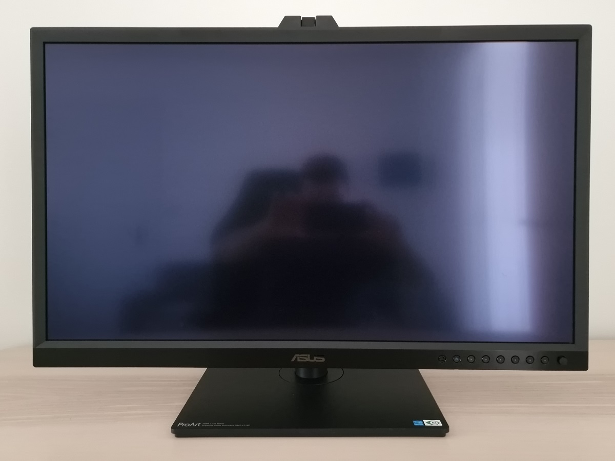
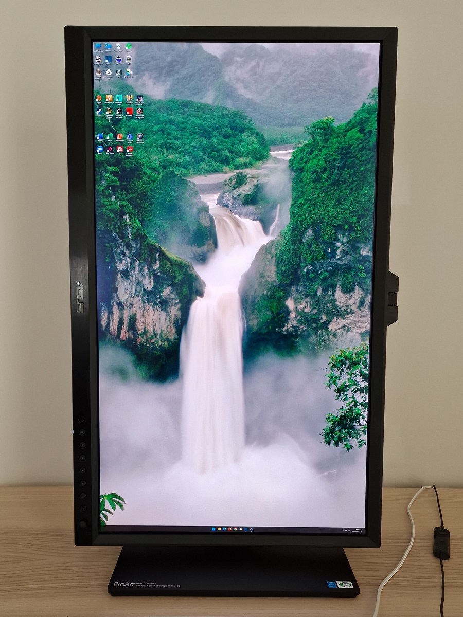
The screen is reasonably slim at thinnest point (~20mm or 0.79 inches), with more central bulk. The ‘regular stand’ is fully adjustable; tilt (23° backwards, 5° forwards), swivel (30° left, 30° right), height adjustment (130mm or 5.12 inches) and pivot 90° either direction into portrait. The mini stand configuration uses fixed feet without any adjustability. At lowest stand height the bottom of the screen sits ~29mm or 1.14 inches (~22mm or ~0.87 inches for mini stand) above the desk with the top of the integrated colorimeter ~498mm or ~19.61 inches (~491mm or ~19.33 inches for mini stand) above the desk. The total depth of the monitor plus stand is ~245mm or ~9.65 inches (~163mm or 6.42 inches for mini stand). The screen sits ~75mm or ~2.95 inches (~58mm or 2.28 inches for mini stand) back from the front most edge of the stand base or feet. So it’s a reasonably compact stand given the overall size of the screen that allows you to have the screen relatively close to the wall even if your desk isn’t particularly deep. And the mini stand offers an alternative if space is at a particular premium.
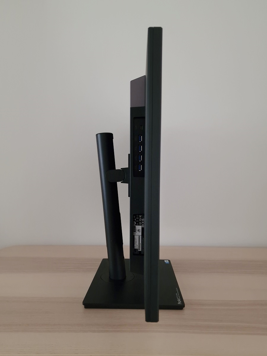
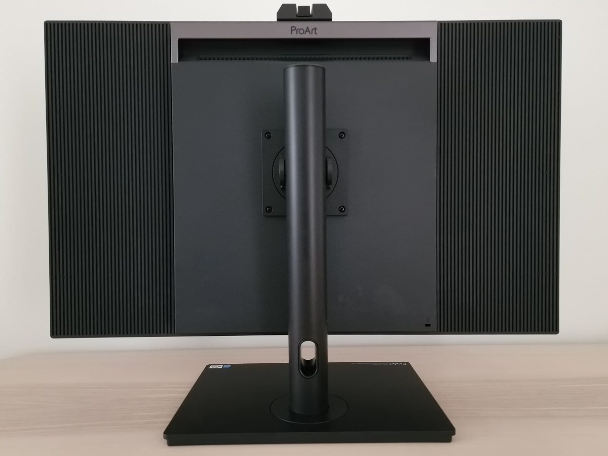
The rear of the monitor is largely matte black plastic, with a plain texture for the central bulk and a corrugated (vertical striped) texture surrounding that. A dark silver coated metal carrying handle is included at the top, improving portability and complementing the mini stand configuration of the screen. The regular stand attaches via 100 x 100mm VESA and can be removed and replaced with an alternative VESA 100 compatible solution, if preferred. A K-slot is located towards the bottom right, whilst near the bottom of the stand neck you’ll find a cable-tidy loop. A DP cable, HDMI cable, USB-C cable, USB-C to A cable and power cable is included as standard, though this can vary regionally. It’s also worth noting that this monitor doesn’t require an active cooling solution (fan) or aggressive passive cooling solution such as a special heatsink. It doesn’t generate as much heat or consume as much energy as competing LCD designs with FALD (Full Array Local Dimming) or Mini LED backlights.
3840 x 2160 @60Hz can be leveraged using suitable versions of DP and HDMI, with HDR also supported. The first image below shows some of the refresh rates supported for the native 3840 x 2160 (‘4K’ UHD) via DP and the second via HDMI. The same refresh rates are listed for 1920 x 1080 (Full HD or 1080p), except 30Hz and 60Hz is added – as well as 59Hz which isn’t listed at the native resolution using DP. These are all categorised in the EDID of the monitor as ‘TV’ resolutions and listed in Nvidia Control panel under ‘Ultra HD, HD, SD’; they can also be accessed by other devices such as the PS5 and Xbox Series X/S.

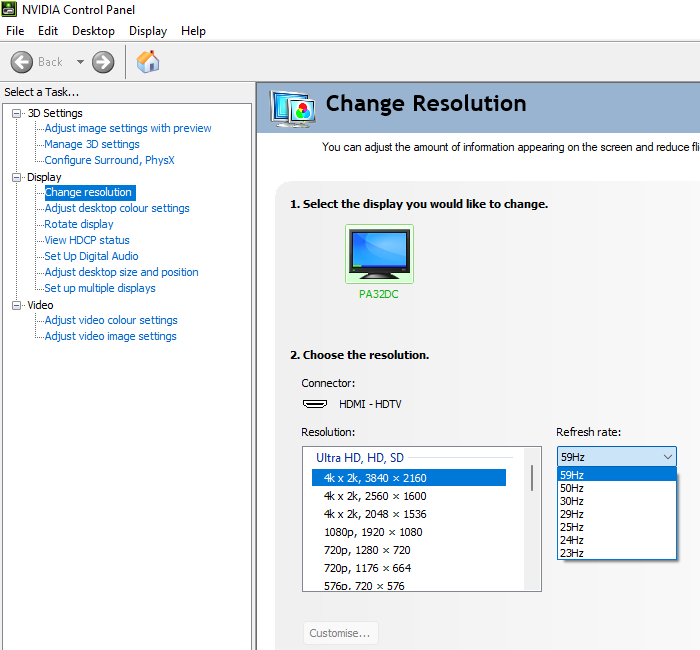
The image below shows the refresh rates listed in a 2nd list for the native resolution, categorised in the EDID of the monitor and listed in Nvidia Control Panel as a ‘PC’ resolution. The same refresh rates are listed here via HDMI. Despite the name, compatible games consoles such as the PS5 and Xbox Series X/S can also access them – hence can run at 3840 x 2160 @60Hz. For 2560 x 1440 (WQHD or 1440p), only 60Hz is listed here via both DP and HDMI which the Xbox Series X/S can also use.
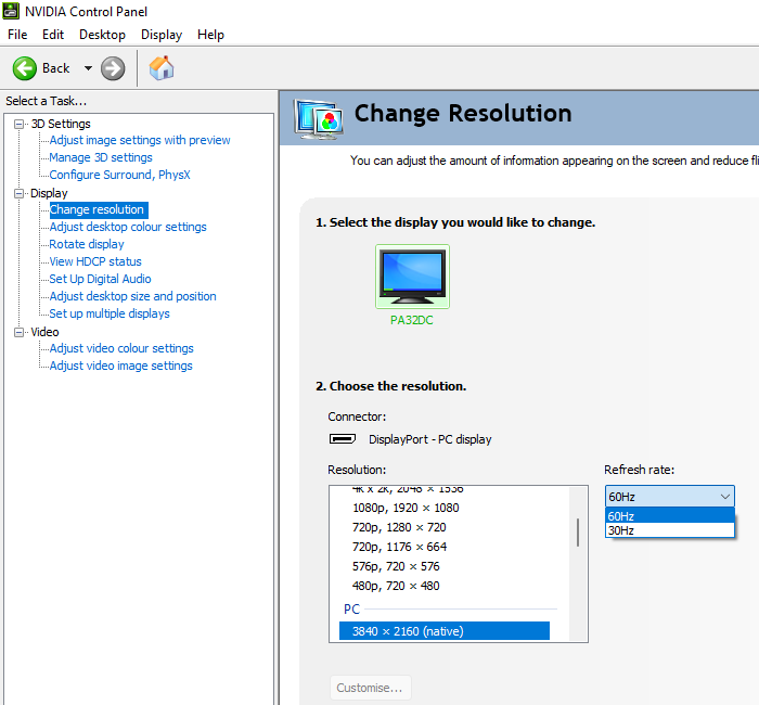
Image retention and burn-in

Calibration
Subpixel layout and screen surface
![]()
Testing the presets
Monitor Settings Gamma (central average) White point (kelvins) Notes Standard Mode, Gamma = 2.2 (Factory Defaults) 2.2 6529K Highly vibrant look, excellent gamma tracking and good white point balance. Green channel is a touch high (persists for other settings tested here, outside of '5000K') but a mild tint that was easily corrected. Gamma = 1.8 1.8 6533K As defaults but significantly lower gamma, providing a ‘flooded’ look with clear lack of depth in places and raised dark detail. Gamma = 2.0 2.0 6532K As above, slight gamma and depth increase. Gamma = 2.4 2.4 6528K Factory defaults with higher gamma, providing extra depth and masking dark shades more readily. Gamma = 2.6 2.6 6529K As above, further increase in gamma and depth. A rather contrasty and ‘punchy’ look with dark detail heavily masked and blended. sRGB Mode 2.2 6545K A well-balanced sRGB emulation setting with locked and quite low brightness (plus mild and easily corrected green tint). Gamut is clamped, limiting saturation and enhancing sRGB accuracy. Gamma tracks ‘2.2’ curve rather than sRGB curve (sRGB curve can be targeted via hardware calibration if preferred). Adobe RGB Mode 2.2 6552K An Adobe RGB emulation, clamping the gamut to avoid extension beyond Adobe RGB. Again well-balanced gamma and white point (aside from slight and correctable green push). Rec. 2020 Mode 2.4 6557K Uses full native gamut, gamma set to ‘2.4’ by default (can be adjusted). Native gamut falls some way short of Rec. 2020 – this mode has notable oversaturation and crushes together heavily saturated shades with clear compression or bunching near outer edge of gamut. DCI-P3 Mode (P3-Theater) 2.6 6356K A DCI-P3 emulation mode, clamping gamut close to DCI-P3. Gamma averages ‘2.6’ and there’s a strong green tint. Both can be easily corrected in OSD. DCI-P3 Mode (6500K) 2.6 6562K As above but 6500K white point targeted, with reduced green tint. Rec. 709 Mode 2.4 6549K Similar to ‘sRGB Mode’ but more flexible, including brightness adjustment. Gamma averages ‘2.4’ by default, but can be adjusted. Overall, a well-balanced and flexible sRGB emulation setting. Blue Light Filter = Level 1 2.2 6224K A mild Low Blue Light (LBL) setting with blue channel reduced somewhat to reduce blue light output. The green channel is not reduced and is therefore relatively strong, imparting a bit of a green tint. Blue Light Filter = Level 2 2.2 6041K As above, stronger LBL effect plus slightly more noticeable green tint. Blue Light Filter = Level 3 2.2 5867K A fairly effective LBL setting with a warm and green-tinted look. Low Blue Light = Level 4 2.2 4712K Very effective LBL setting with strong green tint, brightness locked to low level. This is adjustable with the other LBL settings. Color Temp. = 5000K 2.2 5175K An effective LBL setting. Slightly above the stated ‘5000K’ according to our measurements. Image appears warmer without the green tint. Test Settings 2.2 6534K A highly vibrant look with strong depth and saturation but otherwise well-balanced.
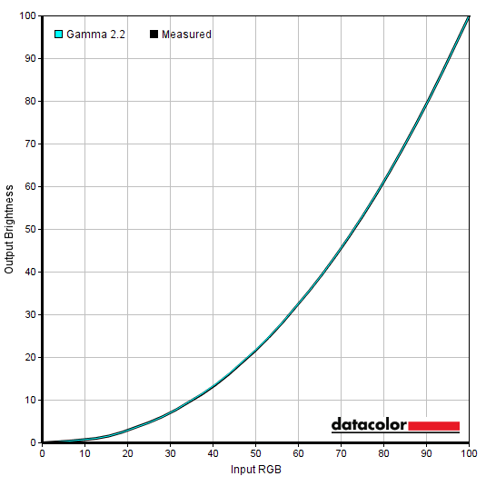
Gamma 'Test Settings'
Given inter-unit variation and pleasing performance on our unit with OSD tweaking alone we won’t be using any ICC profiles in this review or including any measurements or graphs using them. We wouldn’t recommend using them unless created for your specific unit using your own calibration device. As this monitor includes an integrated colorimeter, you can perform a calibration on your own unit which will yield better results than using a third-party ICC profile. We therefore won’t be providing any downloadable ICC profiles for this model. The monitor also offers a range of Low Blue Light (LBL) settings, with the main one called ‘Blue Light Filter’. A warm look to the image is considered more relaxing by some and can be particularly important in the hours leading up to sleep. The ‘Blue Light Filter’ includes 4 levels; ‘Level 1’, ‘Level 2’, ‘Level 3’ and ‘Level 4’ – with a higher level giving a stronger effect. Whilst we found ‘Level 4’ particularly effective, it also locked off the brightness control. Reducing brightness on a monitor will minimise blue light output and this can be done manually with the other LBL settings. These settings also impart a green tint to the image as a relatively strong green channel is maintained. This can be counteracted by reducing the green channel gain in the OSD, but that adjustment will also apply for the preset when the LBL setting is disabled. We preferred simply using the alternative setting of setting ‘Color Temp.’ to ‘5000K’, which was an effective LBL setting without green tint and with brightness adjustment allowed. We used this in conjunction with our ‘Test Settings’ for our own viewing comfort in the evenings, but not for specific testing except where the setting is explicitly mentioned. As explored in the OSD video, ‘Blue Light Filter’ or ‘Color Temp.’ can be assigned to ‘Shortcut Key 1’ or ‘Shortcut Key 2’ for easy access.
Test Settings
Contrast and brightness
Contrast ratios
Monitor Settings White luminance (cd/m²) Black luminance (cd/m²) Contrast ratio (x:1) 100% brightness 264 0.00 ∞:1 80% brightness 234 0.00 ∞:1 60% brightness 203 0.00 ∞:1 40% brightness 152 0.00 ∞:1 20% brightness 79 0.00 ∞:1 0% brightness 6 0.00 ∞:1 50% brightness (Factory Defaults) 188 0.00 ∞:1 100% brightness (‘Uniform Brightness’ disabled) 276 - 541 0.00 ∞:1 50% brightness (‘Uniform Brightness’ disabled) 198 - 385 0.00 ∞:1 0% brightness (‘Uniform Brightness’ disabled) 6.2 - 12.5 0.00 ∞:1 HDR Max. Nits / 250 Nits (1% white, peak)* 545 / 252 ∞:1 N/A HDR Max. Nits / 250 Nits (4% white, peak)* 542 / 251 ∞:1 N/A HDR Max. Nits / 250 Nits (9% white, peak)* 541 /251 ∞:1 N/A HDR Max. Nits / 250 Nits (25% white, peak)* 536 /248 ∞:1 N/A HDR Max. Nits / 250 Nits (49% white, peak)* 532 / 246 ∞:1 N/A HDR Max. Nits / 250 Nits (100% white, sustained)** 269 /127 N/A N/A HDR (Uniform Brightness = On)** 256 N/A N/A Gamma = 1.8 188 0.00 ∞:1 Gamma = 2.0 188 0.00 ∞:1 Gamma = 2.4 188 0.00 ∞:1 Gamma = 2.6 188 0.00 ∞:1 sRGB Mode 188 0.00 ∞:1 Adobe RGB Mode 189 0.00 ∞:1 Rec. 2020 Mode 188 0.00 ∞:1 DCI-P3 Mode 181 0.00 ∞:1 DCI-P3 Mode (6500K) 188 0.00 ∞:1 Rec. 709 Mode 188 0.00 ∞:1 Blue Light Filter = Level 1 187 0.00 ∞:1 Blue Light Filter = Level 2 187 0.00 ∞:1 Blue Light Filter = Level 3 186 0.00 ∞:1 Blue Light Filter = Level 4 76 0.00 ∞:1 Color Temp. = 5000K 174 0.00 ∞:1 Test Settings 156 0.00 ∞:1
*HDR measurements were made using this YouTube HDR brightness test video, running full screen at ‘2160p 4K HDR’ on Google Chrome. The maximum reading using the patch size (measurement area) specified in the table was used. The black luminance was taken at the same point of the video with the colorimeter offset to the side of the white test patch, equidistant between the test patch and edge of the monitor bezel.
**These readings were taken using the above test. A reading was taken using a white screen fill (‘all pixels’), 30 seconds after it was displayed. This is used to represent the sustained luminance level the monitor can provide under HDR, rather than the peak luminance achieved for smaller sections of the screen. Because the entire screen is white for this test, black luminance levels can’t be read and an HDR contrast reading can’t be ascertained.
The monitor provided a peak luminance of 264 cd/m² under SDR with ‘Uniform Brightness’ disabled and 276 – 541 cd/m² with it enabled. It stuck mainly to the upper end of this or dropped just a bit, unless bright shades dominated where it dropped to the lower end. Whilst this isn’t as high as some LCDs can provide for bright-dominant content, it’s high enough in most cases with people generally setting a monitor to between 100 cd/m² and 200 cd/m². The strong overall uniformity and contrast can also make the screen appear somewhat brighter than with an equivalent setting on an LCD. 264 cd/m² is also a decent peak brightness level for an OLED screen to be able to sustain under SDR regardless of content displayed. The minimum luminance recorded was 6 cd/m², which is exceptionally dim and will be appreciated by particularly light-sensitive users.
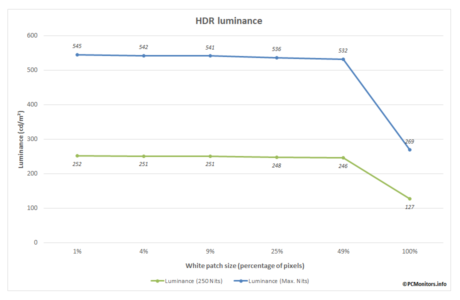
Under HDR the peak luminance recorded was 545 cd/m², with only a minor drop off as the white patch size increased. The exception was the sustained 100% white reading, where the monitor dropped to 269 cd/m². When viewing or indeed creating most HDR content, the monitor will rarely drop the brightness in this way as even a fairly small area of darker content will prevent such a significant drop. We explore this subjectively a little later on. If setting brightness to ‘250 Nits’ the monitor achieved around that for most patch sizes, but dropped to 127 cd/m² for the 100% white sustained measurement. The HDR luminance data for the two brightness settings is shown in the graph below, for those preferring a graphical representation. Around 250 nits could be sustained at all patch sizes, if you want that level of consistency, by enabling ‘Uniform Brightness’ – the brightness being set to ‘Max’ or ‘250 Nits’ doesn’t matter in that case.
PWM (Pulse Width Modulation)
The PA32DC does not use PWM (Pulse Width Modulation) to regulate the brightness of its pixels at any level. Instead, DC (Direct Current) is used to moderate brightness. As is common for OLED screens, the screen uses low amplitude oscillation – so there’s a slight cyclical dip in brightness. This can be seen by camera with certain settings and was recordable via oscilloscope where you can see an alternation between a small dip and a larger dip at a frequency of 60Hz (i.e. one dip every 16.67ms). Even the larger dip does not involve the complete ‘on-off’ cycling associated with traditional PWM, though the monitor dips to ~66% of its original brightness momentarily. This behaviour shouldn’t be bothersome to most users – as a result, the monitor is advertised as ‘flicker-free’ by the manufacturer and in accordance with its TÜV certification. Sensitive users could potentially still find the 60Hz cyclical dips bothersome, however.
Luminance uniformity
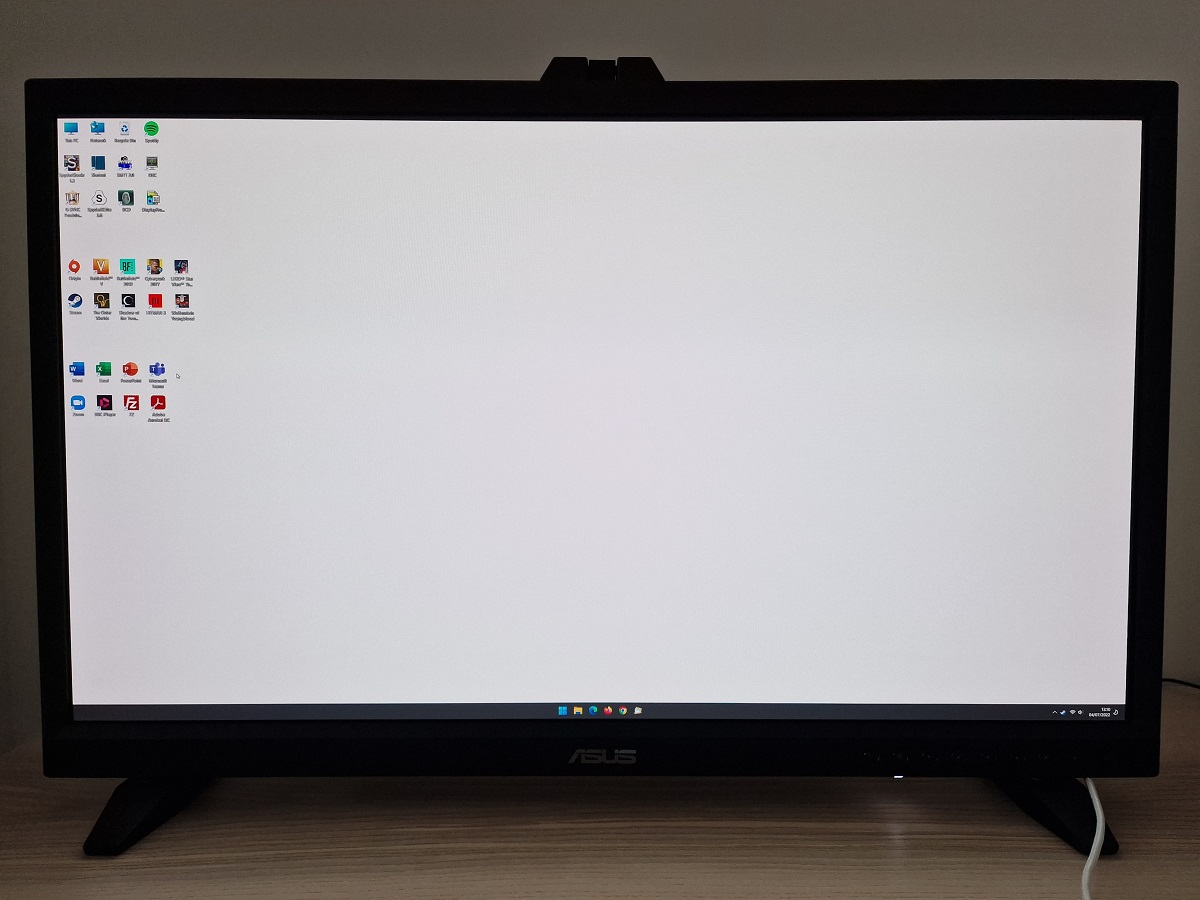
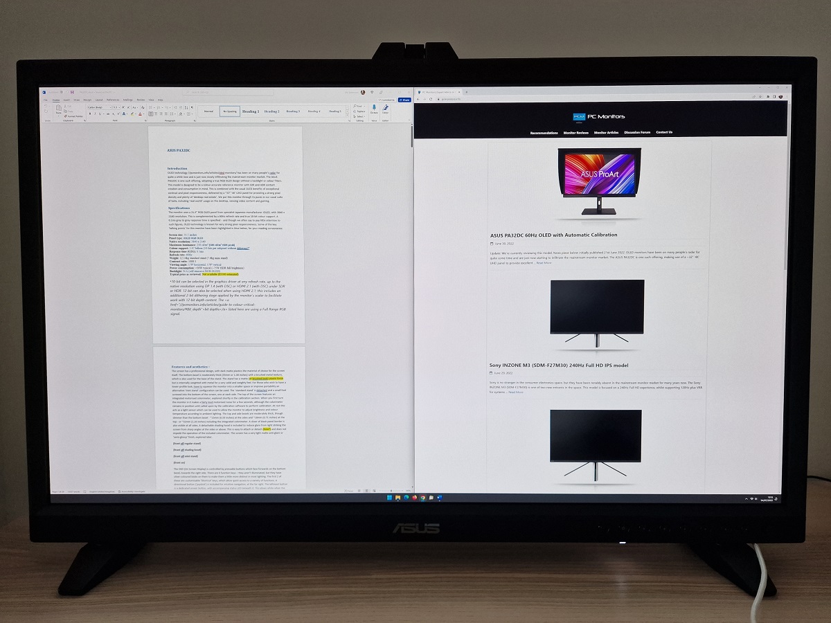
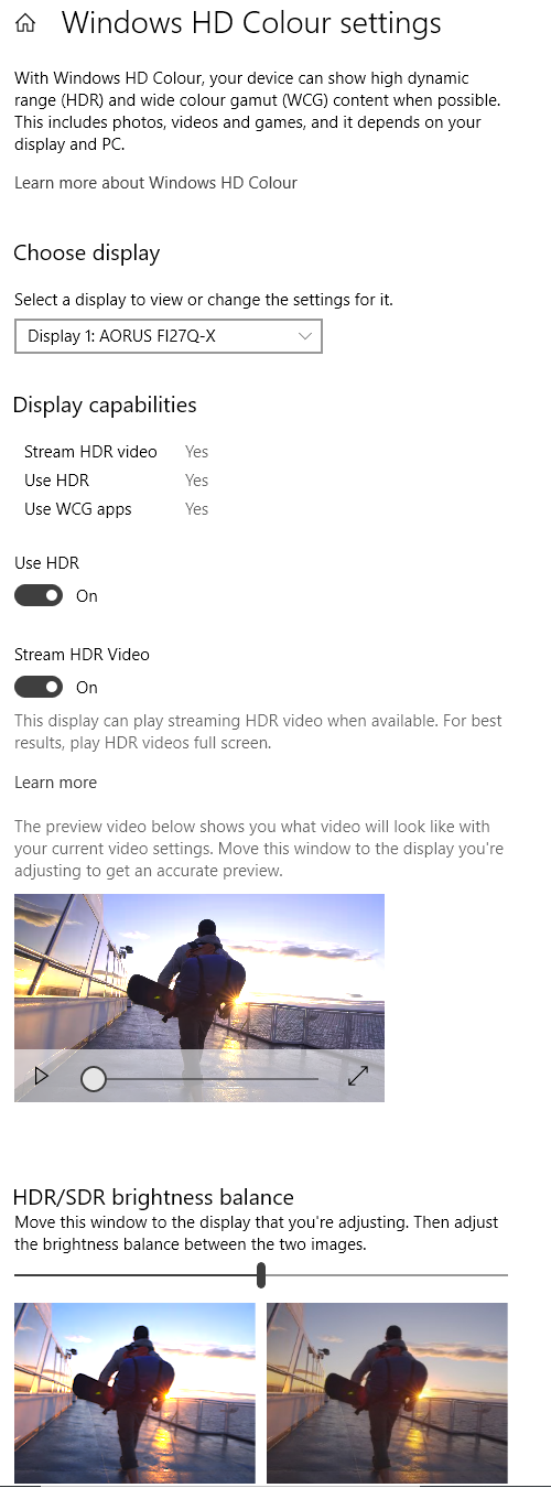
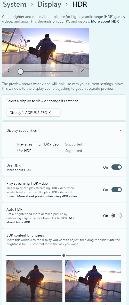
This monitor uses OLED technology with self-emissive pixels rather than relying on a backlight. As such, there is no backlight bleed or associated clouding. Whilst observing a black background in a dark room, using our ‘Test Settings’, we saw a pure blackness – as if the screen was switched off. This is shown in the image below, which is simply for reference and included as we usually do so at this point in the review. Any patchiness in the image is due to the camera or image processing, not the monitor. The luminance uniformity was excellent. The maximum luminance was recorded at ‘quadrant 8’ beneath centre (154.8 cd/m²). The greatest deviation from this occurred at ‘quadrant 4’ to the left of centre (152.3 cd/m², which is 2% dimmer). The average deviation between each quadrant and the brightest recorded point was 0.75%, which is exceptional. Remember that individual units vary when it comes to uniformity and you can expect further deviation beyond the points measured. But with its lack of backlight and direct emission from the pixels, relatively strong uniformity can certainly be expected in this case. The contour map below shows these deviations graphically, with darker greys representing lower luminance (greater deviation from brightest point) than lighter greys. The percentage deviation between each quadrant and the brightest point recorded is also given. The SpyderX Elite was also used to analyse variation in the colour temperature (white point) for the same 9 quadrants. The deviation between each quadrant and the quadrant closest to the 6500K (D65) daylight white point target was analysed and a DeltaE value assigned. Darker shades are also used on this map to represent greater deviation from 6500K. A DeltaE >3 represents significant deviation that may be readily noticed by eye. Results here were excellent, with no significant deviations recorded – the bottom left was recorded as closest to 6500K, with a maximum DeltaE of 1.7 recorded above centre. Note again that individual units vary when it comes to uniformity and that you can expect deviation beyond the measured points. Also note that this colour temperature measurement doesn’t account for the green channel strength, which can also vary at different points of the screen. This wasn’t a significant issue on our unit, with only minor variation observed. In addition to the quantitative testing above, we performed a subjective assessment of the uniformity of a variety of dark and medium shades, including 5% grey and 50% grey. Some OLED screens are susceptible to uniformity issues such as splotches or obvious striations when viewing large areas of flat shades such as this, giving an inconsistent appearance that some users refer to as ‘DSE’ (‘Dirty Screen Effect’). We observed no issues of that nature in this case. We observed that white and other very light shades took on a pink hue towards the side edges of the screen, from a normal viewing position. This shifted between a pink and blue cast depending on viewing angle, particularly with horizontal viewing angle shifts. If you’re not working with or spending a lot of time viewing very bright shades this shouldn’t be an issue, but we did notice it readily on the desktop for example when viewing white and light grey. We also noticed this for some purple shades, such as the purple block of Lagom, which appeared pinker towards the side edges. Such shades shift between pink (or a more reddish purple) and a bluish purple alongside head movement. This is all related to viewing angle rather than uniformity so can’t be corrected by any form of calibration. Such weaknesses stood out to us as most shades were represented in a very uniform way by the monitor. As we explored earlier with respect to screen surface, the contrast is most impressive in a dimly lit room. Our observations below mainly relate to how things appear in dimmer lighting conditions. As the room becomes brighter, you’ll observe glare or some reflections on the screen which affect the representation of dark shades. We also noted that there’s a blue tint to this glare, so pure black does not appear as such under those conditions. The contrast is still impressive under duller daylight conditions or dimmed evening lighting with minimal light striking the screen surface, but beyond that the gap between this and LCDs closes off. And in bright ambient lighting there’s really not much of a difference between the dark shade representation on this screen and an IPS model with ~1000:1 contrast. You’ll be observing glare and light interacting with the screen surface in both cases. The monitor provided an exceptional contrast performance on Battlefield 2042. The self-emitting nature of the pixels provided excellent depth and atmosphere to dark scenes. An absolute lack of ‘glow’ of any sort to worry about peripherally combined with very strong gamma consistency meant that dark detail levels were evenly maintained across the screen. The exceptional depth of dark shades also provided a deep and ‘inky’ look to such elements, with shadow details and other fine dark details looking more defined as a result. The exceptional contrast helped provide a definite solidity to medium shades as well. LCDs (particularly with TN and IPS panels) have a slightly translucent quality to these medium shades in comparison, improved to an extent with FALD and a large number of dimming zones. The very light matte screen surface aided fairly direct light emission from the screen as well, without any real layering to speak of in front of the image. Though it did impart some graininess to brighter content. Shadow of the Tomb Raider told a similar story. This title has plenty of darker shades such as caves and other interior locations with just a few light sources partially illuminating the scene. The monitor provided good depth to the darker shades which helped add definition and structure. As well as aiding the atmosphere for darker scenes. Brighter shades stood out very nicely against darker surroundings, with the screen surface again providing a bit of graininess but allowing quite direct light emission for a matte surface. We also observed the film Star Wars: The Rise of Skywalker. There are plenty of high-contrast scenes here as well with bright light sources such as light sabers and bursts of light illuminating much darker surroundings. The atmosphere and depth to dark shades was again exceptional here. The film is presented with black bars at the top and bottom (letterboxed), but the depth of these bars was impressive in dim lighting so that they were easy to ignore. Most content you consume on streaming media platforms including Disney+, Netflix, Amazon Prime Video and certainly YouTube is 16:9 so it appears without any black bars. The Lagom tests for contrast allow specific weaknesses in contrast performance to be identified. The following observations were made in a dark room. As an RGB OLED monitor, the ASUS provides strong and distinct peaks of blue, green and red energy. This enhances the colour gamut whilst also creating a more balanced and less blue-biased spectral profile, potentially aiding viewing comfort. The ASUS PA32DC’s colour gamut (red triangle) was compared with the sRGB (green triangle) and DCI-P3 (blue triangle) reference colour spaces using our ‘Test Settings’, as shown in the first image below. The gamut fully covers sRGB with significant extension beyond. We measured 97% DCI-P3 coverage* using the SpyderX Elite, just a touch below the 99% specified by the manufacturer. There’s a fair bit of extension beyond DCI-P3 for the green to blue edge of the gamut. The second image shows the monitor’s colour gamut (red triangle) compared to Adobe RGB (purple triangle). We recorded 97% Adobe RGB coverage* using the SpyderX Elite, just a touch below the 99% specified by the manufacturer. There’s also some extension beyond Adobe RGB, particularly towards the red corner and for the green to red edge of this representation. This is a generous gamut, so standard sRGB content outside of a colour-managed environment is presented in a highly vibrant and saturated way. The SpyderX Elite plus Datacolor software used to measure these gamuts is not as well-tuned to spectral output of this particular monitor as it could be, leading to under-reporting of the gamut. Using the integrated colorimeter or an X-Rite i1Display Pro Plus (Calibrite ColorChecker Display Plus) and the ProArt Calibration software yielded superior coverage readings which aligned more closely with the specifications. You can see the coverage levels and other data with this combination shortly. The monitor includes emulation modes for sRGB, DCI-P3 and Adobe RGB – accessible by using the appropriately named presets of the monitor. The ‘Rec. 709 Mode’ preset also provides emulation of the sRGB colour gamut. ‘sRGB Mode’ is brightness locked at a moderate level. With the ‘DCI-P3 Mode’ and ‘Rec. 709 Mode’ presets you retain full control of brightness, gamma, colour channels and various other settings. The ‘Adobe RGB Mode’ allows adjustment of these settings, aside from gamma. All of these presets clamp the colour gamut close to that relevant for the colour space. With our SpyderX Elite and the included software we recorded; 96% sRGB, 95% DCI-P3 and 92% Adobe RGB coverage for the respective settings with very little extension beyond. ‘Rec. 709 Mode’ provided the same coverage as ‘sRGB Mode’. As noted above and as we’ll explore shortly, the gamut is being under-reported in these representations. The monitor’s integrated colorimeter (or an alternative) plus ProArt Calibration software can be used to hardware calibrate the monitor, as explored earlier. Similar gamut readings were yielded to the above following full calibration using the SpyderX Elite and ProArt Calibration software, with gamut read using the Datacolor software. Slightly higher coverage was read by the ProArt Calibration software, whilst even higher coverage was read using either the integrated colorimeter or an X-Rite i1Display Pro (Calibrite ColorChecker Display Plus) with the ProArt Calibration software. This suggests the included colour space emulation modes are well-tuned in terms of their gamut clamping behaviour. The following reports show custom calibrations performed for sRGB, DCI-P3 and Adobe RGB using the X-Rite i1Display Pro as well as the integrated colorimeter. The gamut is clamped appropriately to each of the target colour spaces with minimal undercoverage and next to no extension beyond, which is combined with accurate gamma and white point calibration (alongside other corrections) to achieve excellent accuracy. SDR and HDR calibration reports using the Rec. 2020 colour space target are also shown for completeness, where the monitor’s gamut coverage is far less complete but again very close to specified. X-Rite i1Display Pro (Calibrite ColorChecker Display Plus): The monitor provided a high level of vibrancy in Battlefield 2042. Like most content consumed under SDR, the game is developed with sRGB in mind as the target colour space. Viewing on a monitor with wider gamut than sRGB introduces extra saturation and a more vibrant look than intended by the creators. With the native gamut extending significantly beyond sRGB, there was plenty of extra ‘pop’ to various shades. Yellowish greens were brought out strongly and many greens in general looked less muted than intended – some vegetation looked a touch neon as a result. There were some good eye-catching deep and bright forest greens in the mix as well. Sky blues also exhibited extra pop and looked rather vivid, whilst reddish tones for some earthy browns, tree trunks and wooden objects were brought out too strongly. This red push was not as strong as on some models which extend further beyond DCI-P3 in the red region. Similar observations were made on Shadow of the Tomb Raider. There were some very vivid-looking purple and blue flowers, bright blue and green artifacts and dresses whilst fires and lava appeared with some very lively deep oranges and reds. Lara’s skin and some other skin tones in the game appeared a bit too sunkissed or generally too rich and saturated, but not to an extreme degree. Some vegetation again verged onto the neon side. Some people will like this highly vibrant and saturated look, whilst others will prefer things to look more muted and as the developers intend. Or perhaps some way between. The monitor gives you suitable flexibility for any of these preferred looks to be achieved. sRGB emulation (with ‘Rec. 709 Mode’ being the most flexible) will give the more toned down ‘as the developers intend’ look. The ‘DCI-P3 Mode’ will clamp the gamut a bit in some regions, particularly the green and cyan region, to tone things down a bit there with good overall vibrancy. Whilst the ‘Adobe RGB Mode’ will skew things more towards that green to cyan region whilst cutting back mainly on the reds. You still retain control of colour channels and various other image controls (including brightness) for these particular modes. On both titles and regardless of the preset used, colour consistency was excellent and saturation levels were maintained very well throughout the screen. Aside from the isolated issues explored elsewhere for very bright shades and certain others such as some purple shades, with that variable pink tint towards the side edges. We used the TV series Futurama to make further observations on colour reproduction. As with many animated titles, it features large blocks of individual shade and is therefore a particularly challenging test for colour consistency. The monitor again performed impressively well here overall, with a very even display of shades such as the red of Dr Zoidberg throughout the screen. Many IPS models will show at least slight dulling or depth change for this shade towards the extreme side edges, whilst VA and TN models show quite pronounced saturation shifts at various points of the screen. With the full native gamut things again looked lively, with some impressively eye-catching neon greens, bright yellows and cyans for example. And a less muted look than intended to pastel shades, but with excellent variety maintained with even subtly different shades appearing unique – something the strong consistency helps with. Again, different presets of the monitor will give a different look based on the various gamuts used. The image below shows a printed reference sheet of 24 ‘sRGB’ shades, included as part of the Datacolor SpyderCHECKR 24 package. The screen is displaying reference photographs of this printed sheet, in both the same order as printed (right side) and reverse order (left side). The camera is mounted slightly above centre so that the image is representative of what the eye sees from an ergonomically correct viewing position. This, coupled with the inclusion of a flipped version of the shade sheet, allows both accuracy and colour consistency to be visually assessed. Bracketed numbers in our analysis refer to shades on the printed sheet or right side of the screen if they’re ordered consecutively from top left to bottom right. Note that there is always some disparity between how emissive objects (monitor) and non-emissive objects (printed sheet) appear. The monitor is set to a very low brightness to help minimise this disparity. The representation of shades in this image depends on the camera and your own screen, it’s not designed to show exactly how the shades appear in person. It still helps demonstrate some of the relative differences between the original intended sRGB shade and what the monitor outputs, however. Full profiling and appropriate colour management on the application (or hardware calibration of the monitor) would provide a tighter match, our intention here is to show what can be expected in a non colour-managed environment. Lagom’s viewing angle tests help explore the idea of colour consistency and viewing angle performance. The following observations were made from a normal viewing position, eyes ~70cm from the screen. On some monitors, particularly but not exclusively those with high refresh rates, interlace patterns can be seen during certain transitions. We refer to these as ‘interlace pattern artifacts’ but some users refer to them as ‘inversion artifacts’ and others as ‘scan lines’. They may appear as an interference pattern, mesh or interlaced lines which break up a given shade into a darker and lighter version of what is intended. They often catch the eye due to their dynamic nature, on models where they manifest themselves in this way. Alternatively, static interlace patterns may be seen with some shades appearing as faint horizontal or vertical bands of a slightly lighter and slightly darker version of the intended shade. We did not observe either artifact type on this monitor. A sensitive camera and a utility called SMTT 2.0 was used to analyse the latency of the PA32DC. Over 30 repeat readings were taken to help maximise accuracy. Using this method, we calculated 28.90ms (~1.75 frames at 60Hz) of input lag – we tested this across multiple presets including ‘Rec. 709 Mode’ and the ‘User’ presets and results were similar. This figure is influenced by both the element of input lag you ‘see’ (pixel responsiveness) and the main element you ‘feel’ (signal delay). Due to the extremely rapid pixel responses, the element of input lag you ‘see’ (pixel responsiveness) only contributes in a very minor way to this figure. It indicates a significant signal delay, which may be higher than some would like for gaming but should be fine otherwise. Note that we don’t have the means to accurately measure input lag with HDR active in an HDR environment. Our article on responsiveness explores the key factors related to the responsiveness of monitors. An important concept covered is ‘perceived blur’, which is contributed to by both the pixel responses of the monitor and the movement of your eyes as you track motion on the screen. This second factor usually dominates on modern monitors, though both factors play an important role. A photography technique called ‘pursuit photography’ is also explored, which uses a moving rather than stationary camera to capture motion in a way that reflects both elements of perceived blur, rather than just the pixel response element. The images below are pursuit photographs taken using the UFO Motion Test for ghosting, with the test running at its default speed of 960 pixels per second. This is a good practical speed to take such photographs at and highlights both elements of perceived blur well. The UFOs move across the screen from left to right at a frame rate matching the refresh rate of the display. The two final columns show reference screens, set to what we consider their optimal response time setting for the 60Hz refresh rate shown. The Acer XV282K KV, an IPS LCD which uses quite aggressive pixel overdrive to speed up its pixel transitions. And the Gigabyte M32U, which is quite a capable IPS LCD performer in terms of pixel responsiveness. The UFO appears quite soft and relatively unfocused compared to what you’d observe at significantly higher refresh rates. This reflects a moderate amount of perceived blur due to eye movement. Although things appear more blended in the photo than by eye, the black lines which define the segments of the UFO are more distinct and the segments are countable. They aren’t highly distinct by any means, but they’re a bit sharper than they’d typically be on LCDs at this refresh rate without a strobe backlight setting active. These internal details are mainly dictated by perceived blur due to eye movement. But pixel responses also play their role here, particularly if they’re very strong as they are in this case which can give a bit of an edge in definition. In the image there appears to be what a small amount of overshoot (inverse ghosting) including some ‘halo trailing’ behind the UFO for the medium background in particular. This wasn’t readily observed by eye, not just for transitions shown here but more broadly as well. This contrasts with the XV282K KV reference which shows moderately strong overshoot and the M32U which shows a bit of ‘powdery’ trailing from slower than optimal pixel transitions. The static 60Hz refresh rate without VRR (Variable Refresh Rate) support will limit its appeal to gamers in particular. Although that isn’t a key intention of this model and is a limitation of the panel used, OLED technology is certainly well suited to high refresh rates and that can improve fluidity even on the desktop. As this test and broader observations demonstrate, the monitor has extremely rapid pixel responses without conventional trailing or overshoot to worry about. So within the confines of the 60Hz refresh rate, the monitor is visually very impressive. Note that we will not be including a section on overclocking, as the monitor skipped frames when set much above 60Hz. On various Battlefield titles, Shadow of the Tomb Raider and other game titles we tested a moderate degree of perceived blur was observed, with the game running at a consistent 60fps to get the most from the screen in this respect. This was entirely linked to eye movement and the 60Hz refresh rate of the display. Pixel responsiveness was exceptional, delivering rapid pixel responses that provided an optimal 60Hz sample and hold experience without any additional trailing or overshoot visible. Much as explored using Test UFO earlier. We also observed video content at a range of refresh rates, including ~24 – 30fps content on platforms such as Netflix and 60fps content on YouTube. Because of the exceptionally rapid pixel responses, you don’t get even the most minor mask of additional perceived blur from pixel responses for any of this content. This means you can become particularly aware of the limited frame rate, observing ‘low framerate judder’ in a particularly clear way for example. Some may want to set the refresh rate to match or stick to a multiple of the content (e.g. 24Hz for 24fps, 50Hz for 50fps, 60Hz for 30fps and 60fps etc.) to try to reduce judder, but the low frame rate itself is not changed and a key barrier to fluidity. As an Amazon Associate I earn from qualifying purchases made using the below link. Where possible, you’ll be redirected to your nearest store. Further information on supporting our work. HDR (High Dynamic Range) on an ideal monitor involves the simultaneous display of very deep dark shades and brilliantly bright light shades. As well as a broad spectrum of shades between these extremes, including muted pastel shades alongside very vibrant saturated shades. Ideally, per-pixel illumination would be provided (e.g. self-emissive displays such as this), or for LCDs a very large number of precisely controlled dimming zones used. A solution such as FALD (Full Array Local Dimming) with a generous number of dimming zones, for example. Such a solution would allow some areas of the screen to remain very dim whilst others show brilliantly high brightness. Colour reproduction is also an important part of HDR, with the ultimate goal being support for a huge colour gamut, Rec. 2020. A more achievable near-term goal is support for at least 90% DCI-P3 (Digital Cinema Initiatives standard colour space) coverage. Finally, HDR makes use of at least 10-bit precision per colour channel, so its desirable that the monitor supports at least 10-bits per subpixel. HDR10 is the most widely supported standard used in HDR games and movies and what is one of the formats supported here. For games and other full screen applications that support HDR, the ASUS PA32DC automatically switches to its HDR operating mode if an HDR signal is provided. Some game titles will activate HDR correctly when the appropriate in-game setting is selected. Others that support HDR will only run in HDR if ‘Use HDR’ is turned on in Windows, too. Related Windows HDR settings are found in the ‘Windows HD Color settings’ (Windows 10) or ‘HDR’ (Windows 11) section of ‘Display settings’ (right click the desktop). If you want to view HDR movie content, ensure ‘Stream HDR Video’ (Windows 10) or ‘Play streaming HDR video’ (Windows 11) is active. Also note that there’s an ‘HDR/SDR brightness balance’ (Windows 10) or ‘SDR content brightness’ (Windows 11) slider that allows you to adjust the overall balance of SDR content if HDR is active in Windows. This is really just a digital brightness slider that only makes changes for SDR content. Regardless of how you set this up, the gamma behaviour and colour output for SDR content isn’t right and things aren’t represented as they should be. You’re also restricted with the adjustments you can make in the OSD, so we’d only recommend activating HDR in Windows if you’re about to use an HDR application that specifically requires it. This model supports multiple HDR formats; HLG (Hybrid Log Gamma), Dolby Vision (not available at time of review or for early samples, will be available as firmware update shortly after release) and HDR10. We will be focusing on HDR10 as this is the most widely supported for game and movie content on the PC and is what we have experience with on other models. We’ll use Shadow of the Tomb Raider as an example here, which we’ve tested on a broad range of models and we know offers a good HDR implementation which is limited by the screen itself. It’s certainly good at highlighting both the strengths and weaknesses for monitor HDR performance which would apply to other HDR content as well. Although our testing here focuses on HDR PC gaming using an RTX 3090, we made similar observations when viewing HDR video content on the Netflix app. As with games, some video content naturally made better use of HDR than other video content. There are some additional points to bear in mind if you wish to view such content. We also made similar observations using HDMI, which would be used when viewing HDR content on an HDR compatible games console for example. Testing on both our Nvidia and AMD GPUs showed that the HDR implementation was similar in both cases, too. Under HDR your main presets available depend on the HDR format of the content you’re viewing; ‘HDR_PQ DCI’ and ‘HDR_PQ Rec2020’ (both options available for all HDR10 content), ‘HDR_HLG’, ‘HDR_HLG DCI’ and ‘Dolby Vision’. ‘User Mode 1’ and ‘User Mode 2’ are also available, but they seem to give a weird hybrid HDR-SDR experience where things don’t look as they should regardless of adjustments you make. As covered earlier, though, you can hardware calibrate these and indeed the other HDR presets using the ProArt Calibration software so they provide the intended HDR output with the same adjustments the preset provides by default. With the main HDR presets adjustments are severely limited, as usual under HDR. Gamma, contrast and saturation can’t be adjusted whilst brightness adjustment is very limited. Colour channels are available for you to tweak and you can allow the monitor to run up to its maximum brightness level (545 cd/m² recorded) or cap this as explored earlier in the ‘Contrast and brightness’ section. Because we’re focusing on HDR10 content here, the settings of interest are ‘HDR_PQ DCI’ and ‘HDR_PQ Rec2020’. The former will clamp the gamut to DCI-P3, whilst the latter will allow the monitor to use its full native gamut – which technically falls some way short of Rec. 2020. Remember that only strongly saturated shades are affected by this and wider gamuts are targeted under HDR than SDR. So if you select ‘Rec2020’ even though the content targets DCI-P3 it won’t create the same oversaturation of more muted shades that is observed under SDR using the native gamut. There are also three different HDR settings available for each HDR preset; ‘PQ Optimized’, ‘PQ Basic’ and ‘PQ Clip’. The ASUS PA32DC is VESA DisplayHDR True Black 400 certified; not to be confused with the level without ‘True Black’ included. This focuses more on a pure contrast experience than high brightness by HDR standards, with a wide gamut as appropriate for HDR content. The gamut requirement isn’t all that strict for this standard, as it seeks 90% DCI-P3. This model comfortably exceeds that, as we measured up to ~99% DCI-P3 coverage. It also provides some extension beyond DCI-P3 with its full native gamut, with ~80% Rec. 2020 recorded and included on spec sheets supplied by the manufacturer. This gamut is shown in the representation below, with the red triangle showing the monitor, blue triangle DCI-P3 and green triangle sRGB. The HDR10 pipeline uses 10-bits per colour channel, which this monitor outputs natively without dithering. This enhanced precision aids the nuanced shade variety for darker and brighter shades, whilst allowing the monitor to use its generous colour gamut with appropriate precision. This provides a natural uplift to detail for darker shades, very different to the artificial uplift a gamma enhancement under SDR could provide where shade variety isn’t enhanced but rather shades are simply displaced. For brighter shades this enhanced precision can help smooth out gradients and provide more natural shade progressions for elements such as weather effects, smoke and various particle effects. The per-pixel illumination helped accentuate this and allowed intricate mixtures of good deep dark shades and much brighter bright shades to be displayed on the screen at the same time. There was also an immediate and precise transition between the two, without any ‘haloing’ or ‘blooming’ as you’d observe on LCD alternatives with FALD backlights. This monitor effectively has over 8 million dimming zones, which far surpasses what such alternatives provide. The scene below is one we particularly like from Shadow of the Tomb Raider under HDR. Remember that the photo is purely for illustrative purposes and in no way represents how the monitor appeared running HDR in person. This scene highlighted the aforementioned advantages nicely, with an excellent variety of shades displayed and a good mixture of shade depths. The monitor was able to display intricate dark detail for shaded areas such as the rocks and their crevices and the vegetation structures very well. Even the medium shades displayed here and in other scenes are often shown in a somewhat ‘flooded’ way on an LCD under HDR. This isn’t such an issue for capable FALD backlights, but with the OLED screen there was an unmistakable solidity and depth that applied evenly throughout the screen. Brighter elements such as the glint on the water surface, waxy leaf surface and sunlight streaming in from above were displayed in a fairly eye-catching way. Even though these were smaller bright areas, which allows the monitor to reach towards its peak luminance, that luminance is still quite limited by HDR standards. For most content the luminance would remain close to the peak capability of the monitor or drop just a bit, still staying ~400 cd/m² but often above. Remember that the absolute worst case recorded in the table (269 cd/m²) was for a pure white screen, but with even a bit of darker content introduced things won’t dip that low. If you repositioned Lara so the light streaming in from above covered most of the screen, for example, the overall brightness levels maintained were quite similar to if she was positioned as shown in the photo. So overall the HDR was very enjoyable and praiseworthy in terms of its pure contrast and colour performance. More limited in terms of brightness, but without the aggressive ABL that some OLED models use. It really depends on what you want from the experience and whether such limitations would be acceptable for HDR content you might be creating yourself with the monitor. The section of video review below explores the HDR performance of the monitor using various scenes from Shadow of the Tomb Raider and Cyberpunk 2077. We’ve got an article exploring the 3840 x 2160 ‘4K’ UHD experience on a 28” screen with pixel density of 157.35 PPI (Pixels Per Inch). The 31.5” screen of the ASUS provides a slightly lower but still high pixel density of 139.87 PPI. This still provides a distinctly ‘UHD’ look to content of suitable resolution, similar to the look we describe in the article. This is a look that models with a significantly lower pixel density, including 27” 2560 x 1440 (WQHD or 1440p) models just don’t provide. The generous screen size will also be considered more practical by some as it lends itself well to viewing without scaling or with lower levels than would be used for smaller screens sharing the resolution. We found the screen very comfortable to use on the desktop without scaling, from our preferred viewing distance of ~70 – 80cm – but individual preferences will vary. An excellent amount of ‘desktop real-estate’ was provided here, with exceptional multi-tasking potential and pleasing text clarity. As our experience article points out, the strong text clarity and crispness related to the high pixel density remains even if scaling is used. Provided it scales ‘cleanly’, which in most cases it does. The images below show the screen in action on the desktop and performing some multi-tasking natively (100%, no scaling) and with a small amount of scaling applied (125%). Note that these images are just for illustrative purposes and don’t accurately reflect how the monitor appears in person. Any banding and patchiness on solid backgrounds are artifacts in the image, not observed in person. The 3840 x 2160 (‘4K’ UHD) resolution is graphically demanding, so it may be desirable to run certain games or applications at a lower resolution for performance reasons. Or this may be necessary because you’re using a system such as games console that doesn’t support a ‘4K’ UHD signal. The monitor is able to use interpolation (scaling) to display lower resolutions such as 1920 x 1080 (‘1080p’ or Full HD) onto all 3840 x 2160 pixels of the display. To ensure the monitor rather than GPU is handling the scaling process, as a PC user, you need to ensure the GPU driver is correctly configured so that the GPU doesn’t take over the scaling process. For AMD GPU users the monitor will handle the scaling by default, when gaming at non-native resolutions. Nvidia users should open the Nvidia Control Panel and navigate to ‘Display – Adjust desktop size and position’. They should ensure that ‘No Scaling’ is selected and ‘Perform scaling on:’ is set to ‘Display’ as shown below. As usual, if you’re running the monitor at 3840 x 2160 and viewing 1920 x 1080 content (for example a video over the internet or a Blu-ray, using movie software) then it is the GPU and software that handles the upscaling. That’s got nothing to do with the monitor itself – there is a very small amount of softening to the image compared to viewing such content on a native Full HD monitor, but it’s slight and shouldn’t bother most users. The video below shows the monitor in action. The camera, processing done and your own screen all affect the output – so it doesn’t accurately represent what you’d see when viewing the monitor in person. It still provides useful visual demonstrations and explanations which help reinforce some of the key points raised in the written piece. The combination of 3840 x 2160 (‘4K’ UHD) resolution and 32” screen size provides a strong pixel density and creates a useful amount of ‘desktop real estate’. The detail and clarity provided to suitably resolution image content is also noteworthy. The ASUS PA32DC delivers this, with a true RGB OLED panel that’s put to good use. Excellent OSD functionality was provided, with a large range of image adjustments and a wide variety of well-calibrated presets. Including colour space emulation for sRGB, Adobe RGB and DCI-P3 with the monitor providing excellent close coverage of these colour spaces. Unlike such settings on most monitors, you’re free to adjust aspects such as not just brightness but various image controls including colour channels. Hardware calibration was also provided and very well-implemented, with a motorised colorimeter for added convenience. This device performed its functions well with the included ASUS ProArt Calibration software and was a very welcome addition in our view. The OLED panel also delivered excellent colour consistency and viewing angle performance overall, save for some issues with a pink hue towards the side edges for very bright shades and some purple shades. The monitor delivered exceptional contrast, a definite strength – particularly in dimmer conditions. It wasn’t hampered by an aggressive ABL that couldn’t be disabled, either – delivering up to ~250 nits regardless of the content displayed under SDR. The glare handling was not particularly strong and very dark shades on the screen took on a blue appearance in moderately bright or bright conditions. The monitor also delivered an excellent HDR performance in terms of both contrast and colour reproduction, with support for a range of HDR formats and pleasing HDR10 (VESA DisplayHDR True Black 400) output. The brightness was limited compared to some LCD alternatives, but was still decent and also relatively consistent with the drop off limited to situations where bright shades heavily dominate. The adjustability under HDR was also good – and appropriate – allowing some tweaks to be made to colour channels to offset slight imbalances. Maximum luminance could also be limited, with hardware calibration allowing great flexibility in that respect. In terms of pixel responsiveness, the monitor was exceptional – as expected for an OLED model. Input lag was high, though, and the static 60Hz refresh rate without VRR support will limit the appeal for some. Gamers in particular, though even for general productivity it can be nice but by no means essential to have a higher refresh rate for improved ‘connected feel’ and visual fluidity. Something that the exceptional OLED pixel responses would complement very well. Overall, this monitor provided a strong performance in many areas, with a particular nod towards strong contrast and colour accuracy. Models like the ASUS PA32UCG offer superior HDR brightness capability and a higher refresh rate, but can’t match the exceptional luminance precision offered by the PA32DC and its effective >8 million dimming zones. The monitor doesn’t come cheap, though – we’d estimate the price to be $4000+ based on models using the same JOLED panel (e.g. LG 32EP950 and 32BP95E). For some this would be an acceptable price to pay given the performance and features on offer – some reference monitors, including Sony Trimaster OLED models, cost significantly more without the extra cost being easy to justify. As an Amazon Associate I earn from qualifying purchases made using the below link. Where possible, you’ll be redirected to your nearest store. Further information on supporting our work.

The SpyderX Elite was used to assess the uniformity of lighter shades, represented by 9 equally spaced white quadrants running from the top left to bottom right of the screen. The table below shows the luminance recorded at each quadrant as well as the percentage deviation between each quadrant and the brightest recorded point.

Luminance uniformity table
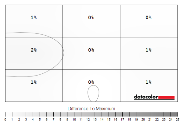
Luminance uniformity map
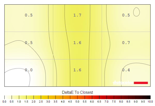
Colour temperature uniformity map
Contrast in games and movies
Lagom contrast tests
Colour reproduction
Colour gamut
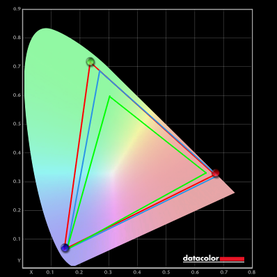
Colour gamut 'Test Settings'
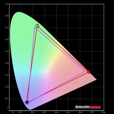
Colour gamut 'Test Settings' vs. Adobe RGB

Colour gamut 'sRGB Mode'

Colour gamut 'DCI-P3 Mode'
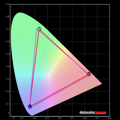
Colour gamut 'Adobe RGB'
99.99% sRGB coverage – Page 1 / Page 2
99.22% DCI-P3 coverage – Page 1 / Page 2
97.92% Adobe RGB coverage – Page 1 / Page 2
79.61% Rec. 2020 coverage – Page 1 / Page 2
79.59% Rec. 2020 coverage (HDR)- Page 1 / Page 2
Integrated Colorimeter:
100.33% sRGB coverage – Page 1 / Page 2
98.84% DCI-P3 coverage – Page 1 / Page 2
99.10% Adobe RGB coverage – Page 1 / Page 2
80.13% Rec. 2020 coverage – Page 1 / Page 2
80.29% Rec. 2020 coverage (HDR)- Page 1 / Page 2
Colour in games and movies
Shade representation using SpyderCHECKR 24
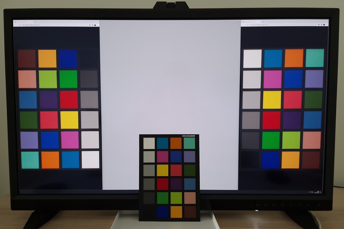
The monitor outputs shades with strong vibrancy and extra saturation when using its generous native colour gamut. There is extra ‘pop’ and a somewhat neon appearance to dark lime green (18) as a result of the extension in the green region. The extra extension for the green to blue edge adds a bit of extra depth and saturation to aquamarine (4) and grey blue (16), whilst royal blue (22) also appears a slightly brighter than intended shade. The fairly generous extension in the red region invites extra vibrancy to shades such as tango pink (11) and candy apple red (14), whilst peach pink (20), light chocolate brown (24) and to a lesser extent medium orange (3) have a bit of a red push. Not as extreme as on models with an even wider gamut in the red region, but still noticeable. Colour consistency is very strong, without the clear shifts observed on VA or TN LCDs. This was aided by the strong viewing angle performance and also pleasing overall uniformity of our sample. The image below shows how things appeared using ‘Rec. 709 Mode’ and ‘2.2’ gamma, with the monitor set to a similar (very low) brightness to the settings used for the first image.
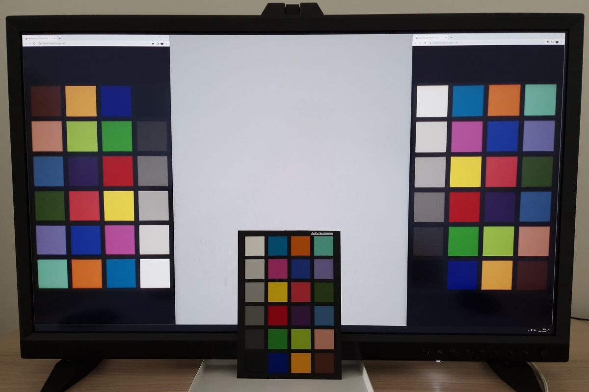
The saturation is significantly reduced now due to the gamut being clamped close to sRGB. There is a touch of undersaturation for some shades, most notably gamboge (23) which appears too yellow without the richer orange component it should have. There is also a touch of undersaturation to medium orange (3) and aquamarine (4), though the match appeared slightly closer by eye than in the image. Overall saturation levels are more appropriate and a closer match to the printed sheet, however. For the tightest match calibrating (and re-calibrating) the monitor over time in your preferred colour space is advised, with the monitor facilitating this via its hardware calibration capability.
Viewing angles
The video below shows the Lagom text test, a mixed desktop background, game scene and dark desktop background from various viewing angles. As explored earlier, very bright shades and some purple shades show some variable tinting between blue and pink, depending on angle. You can see this quite clearly for the background of the Lagom text test and to some extent for the very light brown wood in the background for the mixed desktop. Aside from this the shifts in the image including contrast, colour and the representation of black are very minor. Performance here is much stronger than on any LCD we’ve observed. And in some respects it’s almost like you’re viewing a picture rather than a screen at sharper angles. The camera introduces slight shifts in places which weren’t observed by eye, particularly at sharp angles. Partly as it struggles to focus on the entire screen.
Interlace pattern artifacts
Responsiveness
Input lag
Perceived blur (pursuit photography)
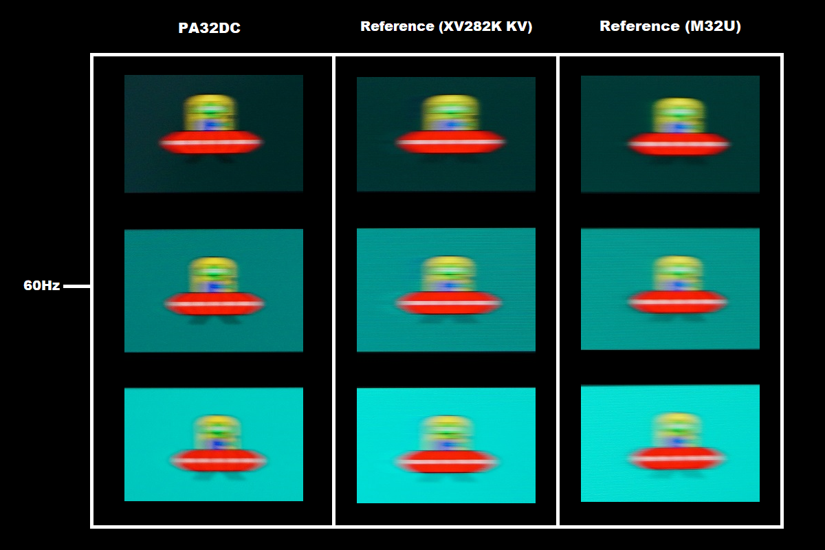
Responsiveness in games and movies

HDR (High Dynamic Range)
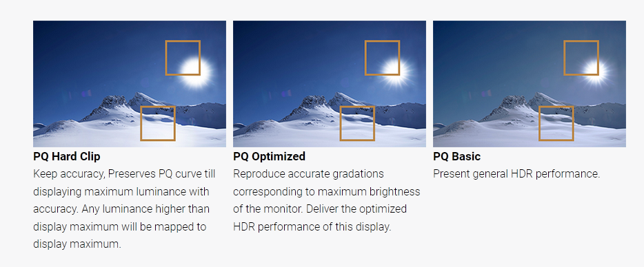
As summarised in the image above, the ‘PQ Clip’ setting will display HDR content accurately up to the maximum luminance of the display. Any shades that are brighter than this will appear as if they’re at this same maximum level. In practice this gives a blended appearance and crushing together of brighter content under HDR, unless the content is carefully calibrated to match the capability of the display. This setting is useful for editing, less useful for general consumption of HDR content. The differences between the two remaining settings are more nuanced really, with the ‘PQ Basic’ setting sticking the most faithfully to the HDR metadata and the ‘PQ Optimized’ setting making some adjustments based on the known hardware capabilities of the display. We were happy to use ‘HDR_PQ Rec2020’ with the default ‘PQ Optimized’ setting, alongside maximum brightness for our testing here. This generally mimics the behaviour of most monitors we’ve tested under HDR and allows appropriate subjective assessment of their HDR performance to be made.

Colour gamut 'Test Settings'
This generous gamut plus exceptional colour consistency from the OLED screen help provide a suitable look to HDR content in the colour department. Including a good dose of vibrancy where the developers intend it – deep orange and red lava, brightly painted artifacts, shiny gold objects and blue and purple flowers all looked nice and vivid and as they’re intended to look. Lush forest vegetation also had a good deep and lush look to it. Some greens and light blue to cyan shades were perhaps a touch less saturated than we’ve seen on models like the ASUS PG32UQX, with their Quantum Dot LED backlights providing an even more generous gamut in that region – but there was still a good level of vibrancy here. Because the monitor is RGB OLED rather than WOLED (or WRGB OLED), a white subpixel isn’t used to promote higher brightness levels so you don’t get dilution to saturation levels at higher brightness. In other words, the monitor also has a strong colour volume. And because the developers target wider colour spaces than sRGB under HDR, the oversaturation observed under SDR wasn’t present. Earth brown shades and skin tones appeared appropriately saturated rather than oversaturated with a red push, whilst vegetation appeared appropriately lush but varied where intended. Without the overdone yellowish greens or slightly neon appearance observed using the native gamut under SDR.
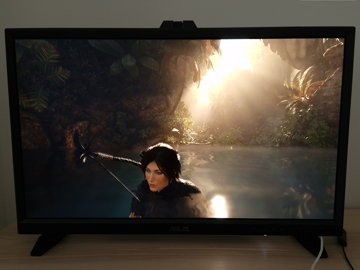
The ‘4K’ UHD experience
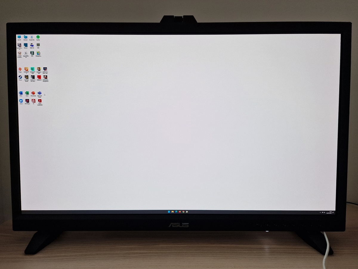
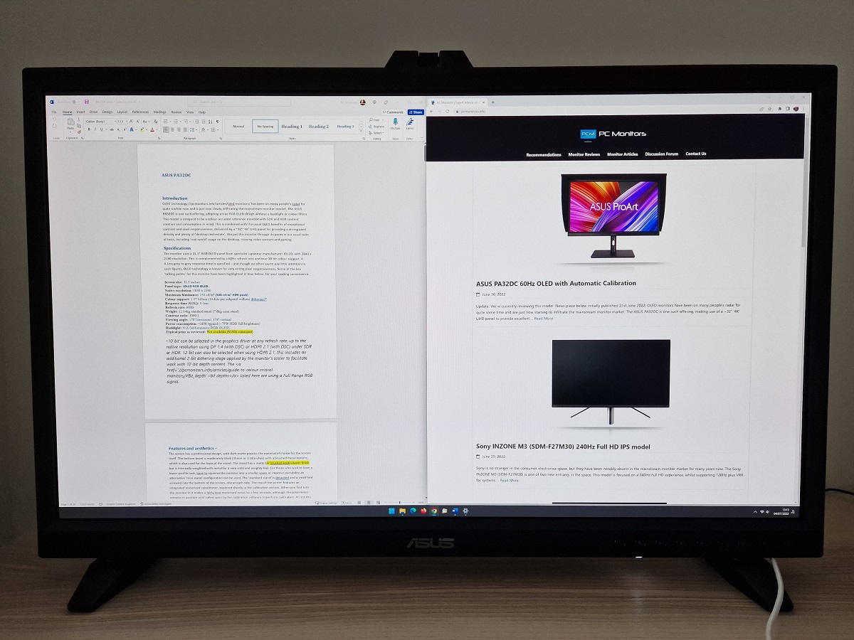
We also appreciated the ‘4K’ UHD experience on the 31.5” screen when gaming. Immersion was enhanced from our normal viewing position due to the size of the screen, but we didn’t find it overbearing. The size would also lend itself well to viewing a bit further back if required. The strong pixel density gave content clear definition and a detailed look that is again similar to that described in the article. Edge-definition was strong even as you look into the distance on a game title and this is something that can be appreciated even on graphically simpler titles. Things were particularly impressive on graphically complex titles with lots of eye candy, high resolution textures and suchlike. The exceptional contrast of the screen accentuated these clarity benefits, too. And in some respects the strong pixel responsiveness also helped when observing content in motion, but the limited refresh rate still added a fair dose of perceived blur due to eye movement as we explored earlier. The images below show the monitor running various game titles at the native resolution. These are purely for illustrative purposes and in no way indicate how the monitor appears in person.
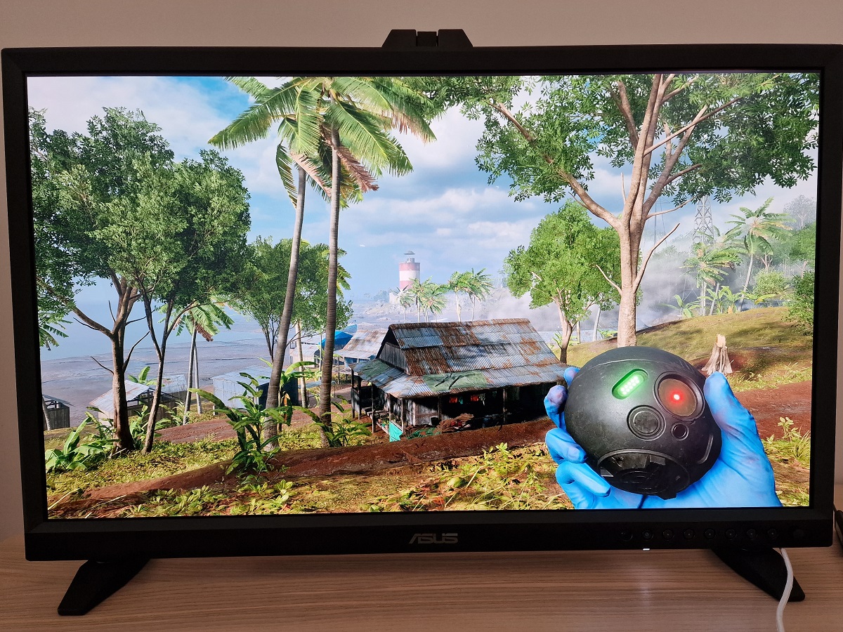
Interpolation and upscaling
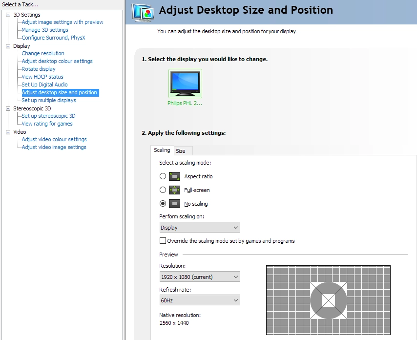
The monitor includes an ‘Aspect Control’ setting in the ‘Image’ section of the OSD, which is unlocked when running the monitor in a non-native resolution. The setting is shown briefly in this section of the OSD video. The main settings of note are ‘Full’ which will use an interpolation process which uses all pixels of the screen and ‘1:1’, a pixel mapping mode which only uses the pixels called for by the source resolution. When running the monitor at either 1920 x 1080 (Full HD or 1080p) or 2560 x 1440 (WQHD or 1440p), things were presented in a softer way than they would on a screen of this size running the resolution natively. Increasing the ‘Sharpness’ control to ‘10’ or ‘20’ offset this quite nicely for the WQHD resolution, without a clearly over-sharpened look. Quite impressive, actually. For the Full HD resolution some elements appeared too soft and others over sharpened with a setting of ‘20’. Finer control or an alternative sharpness control may have been useful in that respect, though the Full HD resolution is never going to look amazing on a screen of this size.
Video review
Timestamps:
Image Retention
Features & Aesthetics
Contrast
Colour reproduction
HDR (High Dynamic Range)
Responsiveness
Conclusion
Positives Negatives Strong vibrancy, exceptional overall colour consistency and viewing angle performance plus excellent calibration and gamut support for sRGB, DCI-P3 and Adobe RGB
Rec. 2020 support limited to ~80%, consistency issues (variable pink tint) for particularly bright shades and some purple shades Exceptional static contrast performance, very light matte screen surface for relatively direct light emission and a strong HDR performance in terms of contrast and colour output Fairly weak glare handling and a blue tint introduced to very dark shades in moderately bright or brighter conditions, brightness much more limited than LCD counterparts with FALD solutions Exceptional pixel responsiveness allows the monitor to deliver a visually faultless 60Hz sample and hold image in that respect High input lag, no VRR support and 60Hz refresh rate will limit the appeal for some – no pixel strobe option to reduce perceived blur, either Solidly built with excellent ergonomics, great screen size and resolution combination for detail and ‘desktop real estate’, very feature-rich OSD and welcome additions such as integrated colorimeter and USB-C High price, not the sleekest design (though not bad for a ‘reference monitor’) and image retention a potential issue as with other OLED models


