Author: Adam Simmons
Date published: June 12th 2021
Table of Contents
Introduction
With the increased graphical capability of both PC and games consoles, the combination of 3840 x 2160 (‘4K’ UHD) resolution and high refresh rate can be a tantalising combination. This is something the Acer XV282K KV (XV282K KVbmiipruzx) of the Nitro XV2 Series offers, in addition to attractive features such as Adaptive-Sync, including AMD FreeSync Premium. And HDMI 2.1 with VRR (Variable Refresh Rate) support. This allows the high refresh rate and resolution combination plus VRR to be delivered not just to PC users, but also to other systems such as the Xbox Series X and PlayStation 5. This monitor also has a viewing comfort focus, including ‘Eyesafe’ certification and Acer’s ‘VisionCare 3.0’ sensor suite. A light sensor provides automatic brightness and colour temperature adjustment, whilst a proximity sensor allows the screen to dim or turn off if nobody is using it. We put this intriguing model through our usual suite of tests.
Specifications
The monitor uses a 28” IPS (In-Plane Switching) type panel from Innolux. Or AAS (Azimuthal Anchoring Switch) as Innolux refers to it. A 144Hz refresh rate is supported alongside 10-bit colour (8-bit + FRC dithering). A 1ms grey to grey response time is specified, sometimes marketed as ‘0.5ms min’. But as usual don’t put too much weight on such figures. Some of the key ‘talking points’ for this monitor have been highlighted in blue below, for your reading convenience.
The monitor has a homely design, with rounded stand base and cylindrical base. The stand base is matte black plastic, with a weighted metal central plate which gives a good solid heft to it. The stand neck is topped with powder-coated metal, giving it more of a premium look and feel than matte plastics. A metallic-looking light red ring surrounds the neck to base join, with a small cable-tidy hook at the rear. An ‘Xbox edition’ is also available which is identical aside from this ring and cable-tidy being green rather than red. The bottom bezel is matte black plastic and juts out in quite a prominent way – a bit like a large and elongated space bar has been stuck onto the bottom of the screen. It sits ~8mm (0.31 inches) forwards from the rest of the screen. The bottom bezel has a matte silver Acer logo towards the left side and includes a central sensor suite for Acer’s VisionCare 3.0 feature set – glossy in appearance and ~76.2mm (3.00 inches) long at the bottom edge. This includes ‘LightSense’ which adjusts according to brightness according to ambient lighting and ‘ColorSense’ which does the same with colour temperature. There’s also a ‘ProxiSense’ proximity sensor which dims the screen significantly if nobody is detected in front of it for 1 minute. And if nobody is detected for a further 2 minutes, it sends the screen into a low power state to conserve energy. When the user returns, it quickly switches back on, set to normal brightness. These features are explored in the OSD (On Screen Display) video shortly. The bottom bezel is ~21mm (0.83 inches) thick with a sliver of visible panel border. The top and side bezels are dual-stage, encompassing a panel border that’s flush with the rest of the screen and a slim hard plastic outer part. Including both elements, the top bezel is ~7mm thick (0.28 inches) and the side bezels ~6.5mm thick (0.26 inches). The screen has a light to very light matte anti-glare finished, as explored shortly. The OSD is controlled by a joystick and accompanying buttons at the rear of the monitor, towards the right side as viewed from the front. A small rectangular power LED is located towards the bottom right of the bottom bezel. It underhangs in such a way that it isn’t always visible from in front of the screen. It glows blue when the monitor is switched on amber when it enters a low power state. The video below runs through the menu system and OSD controls. The images below show the refresh rates supported for the native 3840 x 2160 (‘4K’ UHD) resolution and indeed 2560 x 1440 (WQHD or 1440p). The first image shows the resolutions categorised in the EDID of the monitor as ‘TV’ resolutions and listed here under ‘Ultra HD, HD, SD’, with the monitor connected via HDMI 2.1 in this case. If connecting via DP this first list only includes 59Hz and 60Hz. The second image shows resolutions categorised in the EDID and listed here as ‘PC’ resolutions. This includes 3840 x 2160 @120Hz, which can be used by the Xbox Series X via HDMI 2.1. The PS5 should also be able to leverage this combination, but it isn’t listed as officially supported by Acer at time of writing. A possible workaround posted there is to enable HDCP 1.4 whilst in safe mode on the PS5. Another user shared a workaround on YouTube which simply involves power cycling the PS5. So leaving it hooked up to the monitor and monitor powered on. Then disconnecting the PS5’s power cable, leaving it for 30 seconds or so and plugging it back in. They were able to get a 120Hz ‘4K’ UHD signal with HDCP 2.3 enabled by doing this. If you’re still having issues we’d recommend trying a good quality braided Ultra High Speed HDMI cable rather than the one bundled with the monitor or system. The image below is a macro photograph taken on Notepad with ClearType disabled. The letters ‘PCM’ are typed out to help highlight any potential text rendering issues related to unusual subpixel structure, whilst the white space more clearly shows the actual subpixel layout alongside a rough indication of screen surface. This model uses a light to very light matte anti-glare screen surface. This offers reasonable glare handling and also provides fairly direct emission of light from the screen. This means there isn’t a clear layered appearance in front of the image, with better preservation of clarity and vibrancy compared to stronger matte surfaces. The screen can sometimes have a ‘glassy’ appearance in brighter conditions, with light striking the screen surface directly. But the glare handling is superior to even lighter matte screen surfaces and certainly compared to glossy surfaces. The screen surface texture gives a bit of a grainy look to lighter shades, but this isn’t a heavily ‘sandy’ look or a clear layering of graininess. Most users should be just fine with this level of graininess simply not notice it at all. The XV282K KV includes a range of presets which Acer simply refers to as ‘Modes’ in the OSD; ‘Action (G1)’, ‘Racing (G2), ‘Sports (G3), ‘User’, ‘Standard’, ‘ECO’, ‘Graphics’ and ‘HDR’. With the exception of ‘HDR’ (High Dynamic Range), these presets simply change a range of settings in the OSD and don’t achieve anything you couldn’t achieve with manual adjustment. With an SDR (Standard Dynamic Range) signal detected, the ‘HDR’ mode is similar to ‘Standard’ with many settings locked off. And applies a high default brightness level plus the ‘Super Sharpness’ filter by default. If you make manual adjustments to most settings in the other modes (including but not limited to brightness, contrast or the colour channels) the monitor automatically switches to the fully customisable ‘User’ setting. Like the ‘User’ setting, the first 3 presets in the list (G1, G2 and G3 for short) are fully customisable. These numbered presets allow you to easily save and recall 3 sets of preferred settings. A notable exception is that colour channel changes (‘Color Temp.’ set to ‘User’) are applied universally, so you can’t have different custom colour channel adjustments and easily recall them. The ‘Max Brightness’ setting is also applied universally. We run through this preset system in the OSD video, but for the purposes of this table we’ll simply focus on a range of manual adjustments instead. The table provides gamma and white point readings taken using a Datacolor SpyderX Elite colorimeter, alongside general observations. Our test system runs Windows 10 with an Nvidia RTX 3090 connected via DisplayPort. We performed additional testing using HDMI, but observations on this table were not significantly affected by this. We also tested using an AMD Radeon RX 580 and found gamma to be marginally higher, such that the default setting of ‘2.2’ averaged ‘2.2’ and would be the most appropriate setting to use on our unit. No additional monitor drivers or ICC profiles were specifically loaded and the monitor was left to run for over 2 hours before readings were taken or observations made. The monitor was set to 144Hz in Windows, although that didn’t significantly affect the values or observations in this table. When viewing the figures in this table, note that for most PC users ‘6500K’ for white point and ‘2.2’ for gamma are good targets to aim for. Individual targets depend on individual uses, tastes and the lighting environment, however. Aside from our ‘Test Settings’ where various adjustments are made, assume factory defaults are used. There were a couple of exceptions:
*10-bit can be selected in the graphics driver at any refresh rate, up to the native resolution using DP 1.4 (with DSC) or HDMI 2.1 under SDR or HDR. 12-bit can also be selected when using HDMI 2.1; this includes an additional 2-bit dithering stage applied by the monitor’s scaler to facilitate work with 12-bit content. The bit depths listed here are using a Full Range RGB signal.
As an Amazon Associate I earn from qualifying purchases made using the below link. Where possible, you’ll be redirected to your nearest store. Further information on supporting our work.

Features and aesthetics


At the side, the monitor is quite slender at thinnest point – ~16mm (0.63 inches). It has more bulk centrally, where the stand attaches. The included stand offers full ergonomic flexibility; tilt (5° forwards, 35° backwards), swivel (~360° using turntable mechanism), height adjustment (130mm or 5.12 inches) and pivot (90° clockwise or anticlockwise rotation into portrait). The height adjustment mechanism has a smooth gliding feel to it with less catching than quite a few height adjustment mechanisms we’ve used. The left side includes 2 USB 3.0 ports. At lowest stand height the top of the screen sits ~454mm (17.87 inches) above the desk. The total depth of the monitor including stand is ~269mm (~10.59 inches) with the screen sitting ~95mm (3.74 inches) back from the frontmost point of the stand base. So you can place the screen reasonably close to the wall if you wish, certainly a more compact design than some gaming monitors.


The rear of the monitor is dominated by black matte plastic. With a brushed texture towards the top and plain texture elsewhere. The Acer logo towards the top left is glossy black plastic. The stand attaches using a quick-release mechanism, with the screen easily detached by pushing up a latch beneath the attachment point. This reveals 100 x 100mm VESA holes for alternative mounting. A K-Slot is found towards the bottom left, to the right of the OSD joystick. The ports are located centrally, facing downwards and include; DC power input (external ‘power brick’), 2 HDMI 2.1 ports, DP 1.4 (with DSC), USB-C (65W PD, DP Alt Mode, upstream data), 2 USB 3.0 ports (plus upstream) and a 3.5mm audio output. KVM functionality is included, allowing connected USB peripherals to be shared between multiple systems. 2 x 2W down-firing speakers are included which provide basic sound output. Not particularly rich or high quality, although not the worst we’ve heard. Still useful to have if you need them but no substitute for a reasonable pair of headphones or external speakers.


3840 x 2160 @144Hz plus HDR and Adaptive-Sync can be leveraged via DP 1.4 (with DSC) and HDMI 2.1. AMD FreeSync Premium and Nvidia’s ‘G-SYNC Compatible Mode’ is supported on compatible GPUs and systems via suitable versions of DP and HDMI. HDMI 2.1 includes integrated VRR (Variable Refresh Rate) capability which does not rely on Adaptive-Sync and can be used via ‘G-SYNC Compatible Mode’. HDMI 2.1 VRR is particularly useful for the Sony PS5 which does not support Adaptive-Sync. This HDMI revision also allows the Xbox Series X and possibly PS5 to run 3840 x 2160 @120Hz. Standard accessories include; a power cable, DP cable, Ultra High Speed HDMI cable and USB-C cable but may vary between region and retailer.


The images below show the refresh rates supported for 1920 x 1080 (Full HD or 1080p). The first image shows the ‘TV’ resolution list and the second the ‘PC’ list. Both lists are identical via DP and HDMI. Note that 120Hz appears in the ‘TV’ list, which can be accessed by other devices such as the PS5 and Xbox Series X.


If you’re intending to use the monitor with the PS5 or Xbox Series X/S, be aware that a small settings tweak may be required to ensure 120Hz is selectable. Details can be found in this article.
Calibration
Subpixel layout and screen surface
![]()
As shown above the standard RGB (Red, Green and Blue) stripe subpixel layout is used. This is the default expected by modern operating systems such as Microsoft Windows. Apple’s MacOS no longer uses subpixel rendering and therefore doesn’t optimise text for one particular subpixel layout to the detriment of another. You needn’t worry about text fringing from non-standard subpixel layouts and won’t need to change the defaults in the ‘ClearType Text Tuner’ as a Windows user. You may still wish to run through the ClearType wizard and adjust according to preferences, however. The subpixels are quite ‘squat’ with relatively large gaps above and below. On some models this contributes to ‘static interlace pattern artifacts’ and can affect text and fine-edge clarity. On this model we observed no such issues, likely as the pixel density is so high that the gaps above and below the subpixels are still tiny. We therefore had no subpixel-related concerns related to sharpness or text clarity on this model.
Testing the presets

Preset Mode Gamma (central average) White point (kelvins) Notes Gamma = 1.8 1.7 6360K A flooded appearance with clear lack of depth due to gamma, slight green channel weakness and a touch warmer than target but decent balance otherwise. Gamma = 2.0 1.9 6337K As above with a touch of extra depth. Gamma = 2.2 (Factory Defaults) 2.1 6423K Quite a vibrant look with good variety. Lack of depth to some shades due to gamma handling. Gamma = 2.4 2.3 6390K As above with a bit more depth. Just a touch too much for some shades, but a well-balanced and fairly vibrant and suitably varied look overall. Gamma = 2.6 2.5 6385K As above but more depth – quite a cinematic look with clear loss of detail for dark shades. Color Temp. = User 2.1 6501K Similar to factory defaults but the slight green weakness has turned into a moderate green push. Color Space = sRGB 2.2 6421K A well-tuned sRGB emulation setting, restricting the colour gamut so it follows sRGB much more closely. Gamma tracks the ‘sRGB’ curve (rather than ‘2.2’), lifting up detail in dark areas. Saturation levels are curtailed and sRGB content is displayed more faithfully. Many settings locked off including colour channels and gamma, but brightness is adjustable. ‘Super Sharpness’ enabled by default, easy to disable. Blue Light = Level 1 2.1 5877K A moderately effective Low Blue Light (LBL) setting. Marginally warmer appearance to image compared to default with a noticeable green cast - the green channel remains relatively strong. Blue Light = Level 2 2.1 5608K As above but further reduction to green channel (stronger effect) and lower brightness. Blue Light = Level 3 2.1 5242K An effective LBL setting, with the image now appearing warm with a noticeable green tint due to strong green channel. Red channel is slightly weakened, so colour temperature is a bit higher than you might expect for such effective LBL. Your eyes adjust to the green tint to some extent, but not fully. Brightness is slightly reduced. Blue Light = Level 4 2.1 5009K A highly effective LBL setting. As above but slightly dimmer by default with even stronger green tint. Test Settings (see below) 2.3 6523K Quite vibrant and well balanced with good variety.
The monitor provided a fairly vibrant image straight from the box, with good variety and strong consistency. Some shades lacked a bit of depth due to the gamma handling, but this could be adjusted in the OSD. For our ‘Test Settings’ we adopted the ‘2.4’ gamma setting, which provided the closest tracking of the ‘2.2’ curve. Gamma was a touch higher than this for some mid to darker shades, averaging ‘2.3’ – but nothing dramatic. The gamma tracking under our ‘Test Settings’ is shown in the graph below. The monitor includes a factory-calibrated sRGB setting (sRGB emulation mode), accessible by setting ‘Color Space’ to ‘sRGB’ in the ‘Color’ section of the OSD. Each unit is provided an individual calibration report to show adherence to various targets and DeltaE values for colour accuracy. This is shown for our unit in the first image below. The monitor has a claimed DeltaE <1 and this was reported for our unit. We prefer to analyse things in a more visual and qualitative way, but can confirm an average DeltaE of 0.79 recorded with our SpyderX Elite, using the same 24 test patches analysed visually deeper into the review (SpyderCHECKR 24). This qualitative analysis confirmed that this was a well-calibrated sRGB emulation mode on our unit. The gamma curve using this setting is shown in the second image below. Although not clear given the resolution of the curve, the gamma is lowered somewhat for the darkest shades. The monitor tracks the ‘sRGB’ curve rather than the ‘2.2’ curve, specifically. Which lightens these very dark shades up, enhancing visibility and distinction there. Given inter-unit variation and decent adherence to our preferred targets using OSD adjustments, we will not be using any ICC profiles in this review or including measurements or graphs using them. We wouldn’t recommend using them unless created for your specific unit using your own calibration device. But we appreciate some users still like to use profiles and some aspects such as gamut mapping for colour-aware applications can be useful. You can download our ICC profile for this model, which was created using our ‘Test Settings’ as a base. You can also download our sRGB profile which was created using and designed for the ‘Color Space = sRGB’ setting (sRGB emulation mode). Amongst other things, this shifts gamma so it adheres to our usual target of the ‘2.2’ curve. Be aware of inter-unit variation and note again that these ICC profiles are not used in the review. This monitor is certified as ‘Eyesafe’ by TÜV Rheinland, which means it incorporates patented ‘always on’ Low Blue Light (LBL) technology developed by US-based company Eyesafe. Specialised filtering materials are used to shift the blue light peak to less energetic wavelengths – from the more common ~450nm to ~460nm whilst also reducing the amplitude of the peak. There’s also a subsequent reduction in even more energetic wavelengths such as 435 – 440nm. Combined with software-level adjustment (colour channel pre-correction), this ‘always on’ feature integrated into the Acer is designed to greatly reduce energetic blue light output without imparting the sort of tint associated with traditional LBL implementations. This can be beneficial from a viewing comfort perspective. But there are many facets to viewing comfort, so this doesn’t guarantee a comfortable viewing experience in isolation. Reducing exposure to stimulating blue light of all wavelengths in the hours leading towards bed is particularly important to aid a restful night’s sleep. Cutting out the most energetic wavelengths alone is helpful, but even the less energetic wavelengths of blue light affect sleep hormones. Most importantly by suppressing melatonin. To help with this, the monitor includes additional ‘Low Blue Light’ (LBL) functionality in the ‘Picture’ section of the OSD. This is set to ‘Standard’ by default, which includes those always-on corrections mentioned above. Additional filtering is applied by setting this between ‘Level 1’ (minimum effect) and ‘Level 4’ (maximum effect). This setting was effective, particularly at higher levels (‘Level 3’ and ‘Level 4’). Significantly reducing blue light output from the monitor. Lowering brightness further reduces blue light output. An annoying inflexibility with these settings is that they lock off brightness – if you attempt to change it ‘Blue Light’ returns to ‘Standard’. The only control you have over this is whether ‘Max Brightness’ is enabled or not. And as noted earlier, this setting applies universally. The luminance change is dramatic. As common for LBL settings, the green channel also remains relatively strong. This minimises the contrast hit from activating the setting, but it also imparts a noticeable green tint. Your eyes adjust to an extent over time, but never fully compensate. We didn’t find the image balance or lack of brightness adjustment with these settings suitable. We instead found activating ‘ColorSense’ in the ‘Color’ section of the OSD useful. During the daytime we tended to find this a touch warmer than we’d like (~6000K) and we found the sometimes-sudden fluctuations with natural daylight changes a bit annoying. We liked using this setting in the evening, though, in a more stable lighting environment under dim conditions or with warm-coloured room lighting. There, it acted as a moderately effective LBL setting without greatly upset image balance. It provided a colour temperature of <5000K with decent reduction in the blue channel and slight green channel reduction. If you change brightness after activating the setting it will deactivate it without reporting that in the OSD - you’ll need to disable then re-enable it or turn the monitor off then on again for appropriate adjustments to be made. We used this for our own viewing comfort in the evenings, but didn’t have the setting active for normal testing. For our ‘Test Settings’ we reduced brightness, reduced the green colour channel and made a few further tweaks as noted below. We’ve included our preferred ‘Over Drive’ setting, just for reference, although this was the default setting and is greyed out when using Adaptive-Sync. The setting controlling Adaptive-Sync on the monitor is referred to as ‘AMD FreeSync Premium’ if using DP and ‘AdaptiveSync’ if using HDMI, regardless of GPU vendor. Note that individual units and preferences vary, so these settings are simply a suggestion and won’t be optimal for all users or units. These settings only apply to SDR, HDR has separate settings associated with it (is far more restrictive) and is explored in the relevant section of the review. Mode= Standard Brightness= 52 (according to preferences and lighting) Gamma= 2.4 Color Temp.= User R Gain= 50 G Gain= 43 B Gain= 50 Over Drive= Normal AMD FreeSync Premium= On (will grey out ‘Over Drive’) HDMI 2.1= On (for full HDMI functionality, no effect when using DP) Refresh rate (Windows setting)= 144Hz
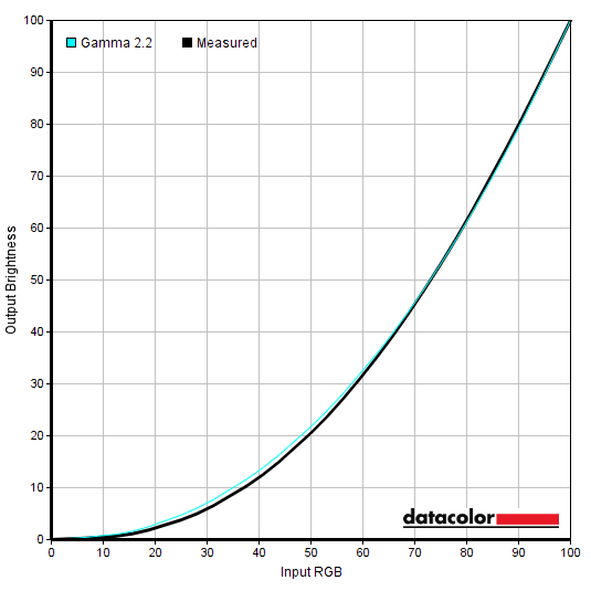
Gamma 'Test Settings'

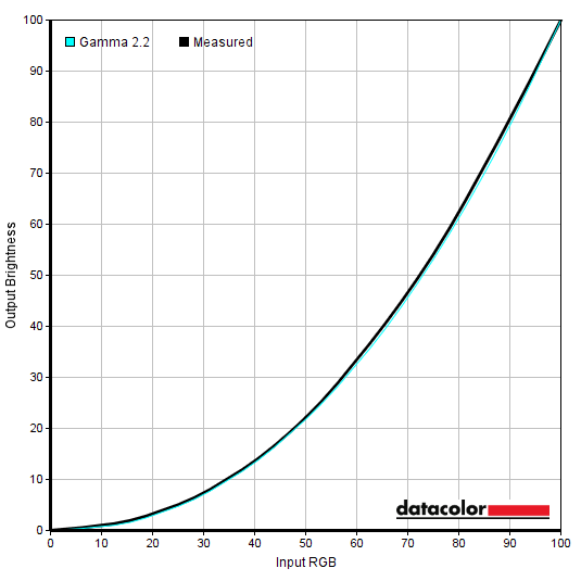
Gamma 'sRGB'
Test Settings
Contrast and brightness
Contrast ratios
An X-Rite i1Display Pro Plus was used to measure the luminance of white and black using various settings, including those found in the calibration section. From these values, static contrast ratios were calculated. The table below shows these results. Blue highlights indicate the results under our ‘Test Settings’ and with HDR active. Black highlights indicate the highest white luminance, lowest black luminance and highest contrast ratio recorded under SDR. Assume any setting not mentioned was left at default, with the exceptions already noted here or in the calibration section – including ‘Max Brightness’ being enabled.
Note that measurements using VRB were taken at 144Hz – brightness levels were the same at 120Hz so these were not included in the table. Whilst the brightness slider is unlocked when using VRB, adjusting this deactivates the setting.
| Monitor Settings | White luminance (cd/m²) | Black luminance (cd/m²) | Contrast ratio (x:1) |
| 100% brightness | 280 | 0.27 | 1037 |
| 80% brightness | 241 | 0.23 | 1048 |
| 60% brightness | 192 | 0.18 | 1067 |
| 40% brightness | 140 | 0.13 | 1077 |
| 20% brightness | 87 | 0.08 | 1088 |
| 0% brightness | 31 | 0.03 | 1033 |
| 70% brightness (Factory Defaults) | 219 | 0.21 | 1043 |
| 100% brightness (Max Brightness = Off) | 139 | 0.13 | 1069 |
| 0% brightness (Max Brightness = Off) | 31 | 0.03 | 1033 |
| HDR = Auto* | 344 | 0.38 | 905 |
| HDR = HDR-400* | 419 | 0.28 | 1496 |
| Gamma = 1.8 | 217 | 0.21 | 1033 |
| Gamma = 2.0 | 217 | 0.21 | 1033 |
| Gamma = 2.4 | 217 | 0.21 | 1033 |
| Gamma = 2.6 | 218 | 0.21 | 1038 |
| Color Temp. = User | 234 | 0.21 | 1114 |
| Color Temp. = User (100% brightness) | 313 | 0.28 | 1118 |
| Color Space = sRGB | 109 | 0.11 | 991 |
| Blue Light = Level 1 | 257 | 0.23 | 1117 |
| Blue Light = Level 2 | 242 | 0.22 | 1100 |
| Blue Light = Level 3 | 215 | 0.20 | 1075 |
| Blue Light = Level 4 | 200 | 0.18 | 1111 |
| Blue Light = Level 4 (Max Brightness = Off) | 96 | 0.09 | 1067 |
| VRB Normal | 187 | 0.21 | 890 |
| VRB Normal (Max Brightness = Off) | 94 | 0.10 | 940 |
| VRB Extreme | 154 | 0.15 | 1027 |
| VRB Extreme (Max Brightness = Off) | 77 | 0.08 | 963 |
| Test Settings | 170 | 0.16 | 1063 |
*HDR measurements were made using this YouTube HDR brightness test video, running full screen at ‘2160p 4K HDR’ on Google Chrome. The maximum reading from the smallest patch size (measurement area) that comfortably covered the entire sensor area and colorimeter housing was used for the white luminance measurement, which was ‘4% of all pixels’ in this case. The black luminance was taken at the same point of the video with the colorimeter offset to the side of the white test patch, equidistant between the test patch and edge of the monitor bezel.
The average static contrast with only brightness adjusted was 1058:1, just creeping past the specified 1000:1. The maximum contrast recorded was 1118:1 with colour channels in their neutral position, with 1063:1 recorded under our ‘Test Settings’. This is respectable, especially given the green channel adjustments we made. The ‘sRGB’ setting resulted in just a slight drop in contrast to 991:1, with some drops recorded below that using VRB. The brightness jumped about a bit in this mode which can throw off measurement accuracy, however. The maximum luminance recorded under SDR was 313 cd/m², whilst the minimum white luminance recorded was 31 cd/m². This provides a 282 cd/m² luminance adjustment range with quite a low minimum and sufficient brightness for most users. Using VRB we recorded a maximum luminance of 187 cd/m² and minimum white luminance of 77 cd/m². This depended on whether VRB was set to ‘Normal’ or ‘Extreme’ and whether ‘Max Brightness’ was enabled – you only have 4 brightness options with a fairly limited range, in other words. The brightness is at least within what most users would consider a normal range, preferable to things being locked to very high or low brightness. Note that perceived brightness using strobe backlight settings like this can be somewhat lower than you might expect from the measured values.
Under HDR with the ‘HDR = Auto’ setting, we recorded a luminance of 344 cd/m² which is slightly but not substantially above our SDR readings. Contrast was recorded as 905:1, with this reduction being due to the higher black point at the offset measurement point used here compared to the centre of the screen. The ‘HDR = HDR-400’ setting increased the recorded luminance to 419 cd/m² whilst also boosting contrast to 1496:1. We tested various patch sizes not documented here but didn’t record significantly higher luminance with any of these. This setting enables local dimming on the backlight, with an 8-zone edge-lit arrangement used. The zones are arranged as vertical bands running across the screen from left to right. This luminance level is hardly spectacular for HDR and this is only a very limited number of dimming zones, but it still provides a situational boost to contrast as demonstrated here. A Dynamic Contrast setting called ‘ACM’ (Adaptive Contrast Management) can be enabled under SDR, allowing the backlight to adjust as a single unit (no local dimming) to changes in scene brightness. The brightness slider remains unlocked but changing this disables ACM. This setting makes changes at a fairly moderate pace, but we found it was quite biased towards high brightness for mixed content with plenty of dark elements. As usual it’s a compromise and we prefer manual brightness control for SDR.
PWM (Pulse Width Modulation)
The XV282K KV does not use PWM (Pulse Width Modulation) to regulate backlight brightness at any level. Instead, DC (Direct Current) is used to moderate brightness. Under HDR with local dimming active (‘HDR-400’) we observed high frequency low amplitude oscillation of the backlight. This is different to typical PWM behaviour as it involves only very slight but still cyclical brightness changes. The backlight is therefore considered ‘flicker-free’, which will come as welcome news to those sensitive to flickering or worried about side-effects from PWM usage. The exception to this is with VRB active, a strobe backlight setting which causes the backlight to flicker at a frequency matching the refresh rate of the display.
Luminance uniformity
Whilst observing a black background in a dark room, using our ‘Test Settings’, we noticed moderate backlight bleed and clouding, particularly towards the top corners of the screen. It’s important to note that individual units vary when it comes to all aspects of uniformity, including backlight bleed and clouding. The following image was taken a few metres back to eliminate ‘IPS glow’. This is a brownish-grey haze emanating from the edges of the screen, particularly the bottom corners from a normal viewing position. It can appear warm from some angles. This ‘IPS glow’ blooms out more strongly from steeper angles, as demonstrated in the viewing angles video later. The luminance uniformity was variable. The maximum luminance was recorded at ‘quadrant 5’ in the centre of the screen (165.7 cd/m²). The greatest deviation from this occurred at ‘quadrant 2’ above centre (139.2 cd/m², which is 16% dimmer). The average deviation between each quadrant and the brightest recorded point was 10.25%, which is moderate. Remember that individual units vary when it comes to uniformity and you can expect further deviation beyond the points measured. The contour map below shows these deviations graphically, with darker greys representing lower luminance (greater deviation from brightest point) than lighter greys. The percentage deviation between each quadrant and the brightest point recorded is also given. The SpyderX Elite was also used to analyse variation in the colour temperature (white point) for the same 9 quadrants. The deviation between each quadrant and the quadrant closest to the 6500K (D65) daylight white point target was analysed and a DeltaE value assigned. Darker shades are also used on this map to represent greater deviation from 6500K. A DeltaE >3 represents significant deviation that may be readily noticed by eye. Results here were strong, with no significant deviations recorded. The central point was recorded as being closest to 6500K, whilst the highest deviation recorded above this (DeltaE 1.8). Note again that individual units vary when it comes to uniformity and that you can expect deviation beyond the measured points. The monitor provided a reasonable contrast performance on Battlefield V. With contrast sitting at 1063:1 under our ‘Test Settings’, the monitor doesn’t provide a deep and atmospheric look to darker scenes – particularly in dimmer lighting conditions. Some IPS-type models are a bit above this, some a bit below with this sitting comfortably in the middle and just above what is specified. ‘IPS glow’ has to be considered, too – a bloom most noticeable towards the bottom corners, from a normal viewing position. On this model there was a moderate and quite usual amount of this. It was observed as a cool green or warmer brownish-grey haze, depending on angle, which eats away at atmosphere and lightens up darker shades. This ‘IPS glow’ becomes more intense if you’re sitting closer to the screen and is brought out most strongly when using a higher brightness setting. It can also be clearer on units with higher levels of backlight bleed or clouding. On the plus side, the monitor offers excellent gamma consistency. Meaning detail in dark areas is better maintained at different points of the screen. ‘IPS glow’ naturally eats away at some of this, but on VA panels you have a central area that’s too blended (‘black crush’) and can have extra unintended detail revealed peripherally. And on TN models you essentially have a detail gradient with extra detail lower down the screen and masking of detail further up. Lighter shades had a slightly grainy appearance from the screen surface, but without an obvious layered appearance due to the screen surface being light to very light matte. Similar observations were made on Shadow of the Tomb Raider. With plenty of dimly lit areas such as caves and passageways, this title craves a strong contrast performance. That’s not really something delivered by this model, particularly in a dimly lit room. Although some IPS models are weaker in this respect as well. ‘IPS glow’ was a dominant factor, eating away at the atmosphere in affected regions of the screen. The strong gamma consistency was certainly a plus, though. On models where perceived gamma can be much lower than intended at some regions, particularly TN but also some VA models, there can be a banded or ‘blocky’ appearance due to unintended detail being revealed. The screen surface imparted a slightly grainy look to lighter content, but not in a ‘smeary’ way. The emission of light was more direct than many matte surfaces, helping avoid that sort of thing. We also viewed the film Star Wars: The Rise of Skywalker. There’s an abundance of high contrast scenes here, with explosions and energy pulses lighting up very dark surroundings. The monitor didn’t deliver a cinematic look or impressive and deep atmosphere here, especially in dim room lighting. Edging out some IPS models but not quite as strong as others – although we’d argue they’re never going to be wonderful in such conditions. ‘IPS glow’ was again a feature, most noticeably towards the bottom corners of the screen. This film had black bars at the top and bottom due to its ‘letterboxed’ format which highlighted these weaknesses quite readily. Most content on platforms such as Netflix and YouTube is delivered in the 16:9 aspect ratio without these bars, however. The screen surface imparted a bit of graininess observable on lighter content, but didn’t give the sort of layered appearance stronger matte screen surfaces would give. The Lagom tests for contrast allow specific weaknesses in contrast performance to be identified. The following observations were made in a dark room. The colour gamut of the XV282K KV is shown as a red triangle below. It was compared with the sRGB (green triangle) and DCI-P3 (blue triangle) reference colour spaces using our ‘Test Settings’. The gamut fully covers sRGB with some extension beyond – we recorded 89% DCI-P3 coverage. The red corner creeps towards DCI-P3, whilst the gamut more closely tracks sRGB for the red to green edge. There is some extension beyond sRGB for other green and green to blue shades. Although not shown in the graphic, we recorded 84% Adobe RGB coverage. This DCI-P3 and Adobe RGB coverage isn’t high enough for accurate reproduction within those colour spaces. For standard sRGB content outside a colour-managed environment, the moderate but not extreme extension beyond sRGB imparts some extra vibrancy and saturation without the strongly oversaturated appearance of some wide gamut models. The monitor also offers an sRGB emulation setting – ‘Color Space = sRGB’ in the ‘Color’ section of the OSD. This cuts down on the gamut very effectively so there’s just a sliver of extension beyond and also just a sliver of under-coverage – 98% sRGB recorded. You can adjust brightness in this setting, although settings such as gamma and colour channels are locked off. As covered earlier our unit was well-calibrated in this mode, but mileage may vary and things can change slightly over time. To maximise colour accuracy within the sRGB colour space, for colour-managed workflows, full calibration and profiling with a colorimeter or similar device using the full native gamut is recommended. You may try the ICC profile featured in the calibration section which includes gamut mapping for colour-aware applications, but best results are always obtained by calibrating your own unit with your own hardware. Instead of using this ‘sRGB’ setting and putting up with the associated restrictions, AMD users can activate a flexible sRGB emulation setting via the graphics driver. This is done by opening ‘AMD Radeon Software’, clicking ‘Settings’ (cog icon towards top right) and clicking on ‘Display’. You should then ensure that the ‘Custom Color’ slider to the right is set to ‘Enabled’ and ‘Color Temperature Control’ set to ‘Disabled’. It may appear to be set this way by default, but the native rather than restricted gamut is likely in play. If that’s the case, simply switch the ‘Color Temperature Control’ slider to ‘Enabled’ then back to ‘Disabled’ to leverage the sRGB emulation behaviour. This setting is shown in the image below. The gamut below shows results using our ‘Test Settings’ with this driver tweak applied. The colour gamut now covers 99% sRGB. There’s some extension beyond this towards the red corner – significantly less than with the native gamut but more than the sRGB emulation setting of the monitor. This setting offers reasonable tracking of sRGB and helps to cut down on the colour gamut without profiling, including in applications that aren’t colour managed. And you don’t have to put up with restrictions associated with the monitor’s sRGB emulation setting. Remember not to use this tweak under HDR, though, or the image will appear significantly oversaturated. On Battlefield V the monitor presented colours in a fairly vibrant way. As with most other content you consume on the monitor under SDR, the sRGB colour space is what developers have in mind. Viewing such content on a model with wider gamut provides a boost to vibrancy and saturation. This is not the same as a digital saturation enhancement, such as increasing ‘6-axis Saturate’ in the OSD or increasing saturation in the graphics drivers. These digital saturation adjustments pull shades closer to the edge of the gamut without expanding the gamut itself, crushing things together without increasing saturation of shades on the edge of the gamut. The 89% DCI-P3 coverage of the monitor gives a boost to some shades, particularly in the green and red region. But the extension for greens in particular isn’t extreme, nor is it extreme for intermediate shades such as oranges and yellows. As such you don’t get the strongly oversaturated appearance associated with viewing content like this on some wide gamut models. There are some good lush-looking greens in the environment, some deep greens and some more muted dusty shades. Yellowish greens don’t have their yellow component brought as in the overly strong way observed on some models and there are fewer cases of ‘neon-looking’ green vegetation which can look out of place. Earthy browns and skin tones didn’t have the same overdone red look that some wide gamut models provide, either, although there was still a bit of a red push. This also gave fires in the game vivid but still quite balanced and varied look, with impressive deep oranges and yellows without things verging too much onto red. Shadow of the Tomb Raider showcased similar colour output. The fairly generous colour gamut injected some extra vibrancy and gave a more saturated look, but in a more tame way than sometimes observed. Sky blues appeared a bit more saturated than intended without appearing otherworldly, whilst there was again a nice array of green shades. Without the same neon look or overdone yellow push sometimes provided by wide gamut models. On the red side there was certainly a push towards stronger red hues for reddish browns, but this wasn’t extreme. The skin tones of characters such as the great Lara Croft appeared a bit richer than intended. A bit too tanned you might say, but not completely overdone. On both titles the strong colour consistency of the monitor ensured shades maintained their vividness throughout the screen. As explored earlier an sRGB emulation setting is included for those who wish to tone things down and keep them looking more as the developers intend. We feel most will enjoy the extra but not extreme vibrancy of the native gamut, but it’s good to have an sRGB emulation setting that includes brightness adjustability – and on our unit it was particularly well-calibrated, too. Further observations were made on the animated TV series Futurama. This title includes large patches of single shade and as such is a brutal test for colour consistency. The monitor provides a strong performance here, free from the sort of saturation shifts observed on TN or VA models. Any shifts observed were on the minor side, attributable mainly to slight uniformity issues rather than viewing angle related. Some IPS-type panels show darkening or fading of certain shades peripherally, such as the pale red of Dr Zoidberg. We didn’t observe that here. An excellent range of closely matching pastel shades was observed – subtle distinctions often lost with other panel types due to perceived saturation shifts. Alongside a strong variety of more eye-catching deep and neon shades. The generous gamut again gave these quite a vivid look, but not in the strongly saturated way of some models. There were some impressively deep-looking reds and greens and eye-catching neon cyans, for example. The image below shows a printed reference sheet of 24 ‘sRGB’ shades, included as part of the Datacolor SpyderCHECKR 24 package. The screen is displaying reference photographs of this printed sheet, in both the same order as printed (right side) and reverse order (left side). The camera is mounted slightly above centre so that the image is representative of what the eye sees from an ergonomically correct viewing position. This, coupled with the inclusion of a flipped version of the shade sheet, allows both accuracy and colour consistency to be visually assessed. Bracketed numbers in our analysis refer to shades on the printed sheet or right side of the screen if they’re ordered consecutively from top left to bottom right. Note that there is always some disparity between how emissive objects (monitor) and non-emissive objects (printed sheet) appear. The representation of shades in this image depends on the camera and your own screen, it’s not designed to show exactly how the shades appear in person. It still helps demonstrate some of the relative differences between the original intended sRGB shade and what the monitor outputs, however. Full profiling and appropriate colour management on the application would provide a tighter match, our intention here is to show what can be expected in a non colour-managed environment. Lagom’s viewing angle tests help explore the idea of colour consistency and viewing angle performance. The following observations were made from a normal viewing position, eyes ~70cm from the screen. On some monitors, particularly but not exclusively those with high refresh rates, interlace patterns can be seen during certain transitions. We refer to these as ‘interlace pattern artifacts’ but some users refer to them as ‘inversion artifacts’ and others as ‘scan lines’. They may appear as an interference pattern, mesh or interlaced lines which break up a given shade into a darker and lighter version of what is intended. They often catch the eye due to their dynamic nature, on models where they manifest themselves in this way. Alternatively, static interlace patterns may be seen with some shades appearing as faint horizontal or vertical bands of a slightly lighter and slightly darker version of the intended shade. We did not observe either artifact type on this monitor. A sensitive camera and a utility called SMTT 2.0 was used to analyse the latency of the Acer XV282K KV. Over 30 repeat readings were taken to help maximise accuracy. Using this method, we calculated 3.02ms (under ½ a frame at 144Hz) of input lag and recorded similar values at 120Hz. At 60Hz we measured a higher but still reasonable 6.96ms. These figures are influenced by both the element of input lag you ‘see’ (pixel responsiveness) and the main element you ‘feel’ (signal delay). They indicate a low signal delay at high refresh rates, which even sensitive users shouldn’t find bothersome. Note that we don’t have the means to accurately measure input lag with VRR technology active in a VRR environment or HDR active in an HDR environment. Our article explores the key factors affecting monitor responsiveness. An important concept is explored here called ‘perceived blur’, which is contributed to not just by the pixel responses of the monitor, but also the movement of your eyes as you track motion on the screen. This second factor is predominant on most modern monitors, but both factors play a role. A photography technique called ‘pursuit photography’ is also explored in the article, which uses a moving rather than stationary camera. This allows motion to be captured on a monitor in a way that reflects both aspects of perceived blur rather than just reflecting the pixel response element. The images below are pursuit photographs taken using the UFO Motion Test for ghosting, with the test running at its default speed of 960 pixels per second. This is a good practical speed to take such photographs at and highlights both elements of perceived blur well. The UFOs move across the screen from left to right at a frame rate matching the refresh rate of the display. All three rows of the test are analysed to show a range of pixel transitions. The monitor was tested at 60Hz (directly below), 120Hz and 144Hz using all available ‘Over Drive’ settings; ‘Off’, ‘Normal’ and ‘Extreme’. The final column includes a reference screen, the Acer XB273K P, set to what we consider the optimal setting for a given refresh rate. This is another 144Hz ‘4K’ UHD model with IPS-type panel, a tightly-tuned model with G-SYNC module but using an older AUO AHVA panel. If ‘Adaptive-Sync’ or ‘FreeSync Premium’ is set to ‘On’ in the OSD, it greys out the ‘Over Drive’ setting. It doesn’t matter what this is set to before activating Adaptive-Sync, the monitor will lock it off with similar behaviour to ‘Normal’. You can change the ‘Over Drive’ setting when using HDMI 2.1 VRR, but as we explore here we see no real reason you’d want to do so. At 60Hz, above, the UFO appears soft and unfocused without clear internal detailing. This reflects a moderate amount of perceived blur due to eye movement. Whilst no conventional trailing is visible with this model in these pursuit photographs, which would be due to slower than optimal pixel responses. There are varying degrees of overshoot (inverse ghosting). The ‘Off’ and ‘Normal’ settings appear very similar, with moderately strong overshoot with some colourful bright cyan elements and an inky appearance in places. It’s clear that calling the lowest setting ‘Off’ is rather misleading given the clear use of (fairly aggressive) pixel overdrive. This becomes much stronger with the ‘Extreme’ setting. The Reference screen offers more appropriate pixel response tuning, with much lower overshoot and just a small trace of faint ‘powdery’ trailing due to some very slightly slower than optimal pixel responses. We consider the ‘Off’ or ‘Normal’ setting optimal here. It’s possible the ‘Off’ setting could be re-tuned in later revisions of this model but that’s not something we’d count on. Below you can see how things appear with refresh rate doubled to 120Hz. At 120Hz, above, the UFO appears significantly narrower with clearer internal detailing. This reflects a significant decrease in perceived blur due to eye movement. There’s again no real conventional trailing to speak of, just a very small whiff of faint ‘powdery’ trailing for the dark background (top row) behind the yellow UFO cockpit. The ‘Off’ and ‘Normal’ settings are essentially indistinguishable from one another. The overshoot is significantly reduced compared to 60Hz and things are actually quite well-tuned here. Pixel responses are rapid enough to provide a very solid 120Hz performance for the transitions shown, with just a bit of overshoot which mainly appears as ‘halo’ trailing that’s brighter than the background shade. This overshoot is clearest but not extreme for the light background (bottom row), a bit more subdued for the medium background (middle row) and very faint for the dark background. The reference screen set top its optimal setting doesn’t perform quite as well as it shows some conventional trailing behind the red UFO body, particularly for the dark and medium backgrounds. And shows some ‘inky’ overshoot behind the yellow UFO cockpit. The ‘Extreme’ setting ramps up the overshoot so it appears bright, colourful and behind the UFO cockpit rather inky. It’s clear from this and broader analysis that the ‘Off’ or ‘Normal’ setting is optimal. The images below show things bumped up slightly to 144Hz. At 144Hz, above, the UFO appears very slightly narrower with slightly better definition. This reflects a slight reduction in perceived blur to eye movement – with only an extra 24Hz, this difference is not dramatic. The ‘Off’ and ‘Normal’ settings are again very similar to one another. The overshoot is further reduced compared to 120Hz, whilst there’s no real conventional trailing observed. Overall the monitor provides a rather clean performance here and handles the demands of the 144Hz refresh rate very well for the transitions shown. The overshoot is clearest behind the red UFO body with the light background, as a ‘halo’ trail – but even then it’s not extreme. The reference screen shows some slight ‘powdery’ trailing in places and morte noticeable overshoot, with an ‘inky’ appearance behind the UFO body. Switching over to the ‘Extreme’ setting on the XV282K KV provides very strong overshoot with no practical benefit. Although the segmentation may appear clearer, to the eye this difference is not observed. This is simply due to how the camera captures things, compensating differently when faced with a large amount of colourful overshoot in the image. The ‘Off’ or ‘Normal’ setting is again optimal here. The monitor also includes a setting called VRB (Visual Response Boost) that can be activated instead of using a VRR technology if you wish. This is a strobe backlight setting which forces the backlight to flicker at a frequency matching the refresh rate of the display, with 120Hz and 144Hz selectable. Sensitivity to this flickering of the backlight varies and some will find it bothersome whilst others may notice accelerated eye fatigue, even if the flickering isn’t actively bothersome to them. The pursuit photographs below were taken with the monitor set to 120Hz using VRB set to both the ‘Normal’ and ‘Extreme’ setting. The ‘Extreme’ setting uses a marginally shorter pulse width than ‘Normal’, meaning the backlight spends a relatively long period in its ‘off’ phase. This offers a potential motion clarity improvement at the expense of brightness. The reference screens used for comparison are the AOC C24G1 using its ‘MBR’ setting and the Dell S2417DG using its ‘ULMB’ settings. These are both quite useable strobe backlight settings and make appropriate references. Note that the ‘Over Drive’ setting is adjustable with VRB active, but the ‘Off’ and ‘Normal’ are very similar and ‘Extreme’ (not to be confused with VRB setting of the same name) shows obnoxious levels of colourful overshoot. We’ll therefore only focus on the ‘Normal’ setting here. With VRB active at 120Hz, above, the main object is significantly narrower with clearer internal detailing than compared to the setting deactivated. Whilst the ‘Extreme’ setting gives a slightly sharper look to the segmentation and in particular the white notches compared to ‘Normal’, the difference isn’t as exaggerated as it appears in these photos. The relatively high brightness pulses using the ‘Normal’ setting caused a bit of bleaching of the white notches in particular. There’s just a touch of overshoot, but less than in the reference shots. The clearest trailing is actually visible in front of the object, particularly for the dark background. This trailing appears as a distinct repetition of the object and is broadly termed ‘strobe crosstalk’ – it can appear in front as it mainly does here or behind the object. The KSF phosphors of the backlight introduce a colourful (magenta to red) fringes to the crosstalk here, due to their relatively slow decay rate. Whilst the reference shots show stronger overshoot, there is no strobe crosstalk with colourful fringing. The images below show the monitor running with VRB set to 144Hz. With VRB active at 144Hz, above, the main object again shows excellent clarity. With the notches now extremely sharp and distinct with the ‘Extreme’ setting in particular. The trailing behaviour is largely similar to 120Hz, although some of the overshoot has been replaced by faint conventional trailing – particularly behind the UFO for the dark and medium background using the ‘Extreme’ setting., The trailing or strobe crosstalk fragments are slightly narrower due to the increased refresh rate. In practice the colourful fringes from the KSF phosphors are the main visual distinction here. The overall levels of strobe crosstalk or overshoot is not too extreme, with the C24G1 reference showing more strobe crosstalk and the AG2521FG more overshoot. Not all areas of the screen refresh simultaneously. So the strobe crosstalk can be stronger or weaker depending on how far up or down the screen the motion is observed. The images below show pursuit photographs running from the top to bottom of the screen, with the screen set to 144Hz and VRB set to ‘Normal’. Broadly similar observations were made at 120Hz and using the ‘Extreme’ setting, so we won’t be providing separate analysis of those. Further up the screen the strobe crosstalk appears in front of the object, crossing over so it’s behind the object towards the centre of the screen. Centrally and just below centre the strobe crosstalk is quite strong, eventually becoming as bold as the object itself further down the screen. So the UFO essentially appears as a double object. When gaming normally it’s the central band of the screen you’ll mainly focus on, so the reasonable level of strobe crosstalk here is a plus. It could be lower, but we’ve certainly seen worse examples. We explore the VRB experience subjectively using in game examples shortly. The monitor provided a very fluid experience on Battlefield V, where the frame rate kept pace with the 144Hz refresh rate. Compared to a 60Hz monitor or indeed this monitor running at 60Hz, over twice as much visual information is presented every second. This provides an excellent ‘connected feel’, particularly when combined with the low input lag recorded for this model. The ‘connected feel’ describes the precision and fluidity felt when interacting with the game world. Another key benefit to the high frame and refresh rate combination is a significant decrease in perceived blur, as demonstrated using Test UFO earlier. This provides a competitive edge on titles such as this, making it easier to track and engage enemies. It also complements the high resolution and pixel nicely, preserving some of that detail better during motion. The monitor provided impressively rapid pixel responses, too, which helped cement this strong 144Hz performance. We had no real complaints in terms of conventional trailing. Some very faint whiffs of ‘powdery’ trailing in places, such as very light shades (white text or icons, for example) against somewhat darker backgrounds. But this was slight and far from widespread, with most transitions performed optimally or very close to optimally. There was a touch of overshoot in places, with some ‘halo’ trailing that was somewhat brighter than the background colour and stood out a bit for that reason. Sensitivity to overshoot varies, but in our view this was far from extreme overshoot at 144Hz – as demonstrated earlier using Test UFO. It was mainly observed where medium to dark shades moved against brighter backgrounds – such as a tree trunk with a bright sky behind it. We made similar observations on Shadow of the Tomb Raider. An impressively strong 144Hz performance, with some overshoot in places (nothing extreme) and nothing to really complain about in the way of conventional trailing. The competitive edge this all gives is less relevant on this title, but we still found the fluidity to be a nice bonus. Sensitivity to refresh rate and response performance varies so not everyone would notice this difference so readily, but for us it certainly enhanced the experience. We also observed video content at a range of frame rates, including ~24 – 30fps content on platforms such as Netflix and 60fps YouTube content. There were no real weaknesses on the monitor side in terms of pixel responsiveness. Some traces of overshoot in places, but nothing that really caught the eye. The main barrier to fluidity in both cases was really the frame rate of the content itself rather than any weakness from the monitor. As an Amazon Associate I earn from qualifying purchases made using the below link. Where possible, you’ll be redirected to your nearest store. Further information on supporting our work. We explored the VRB (Visual Response Boost) feature earlier in the review and have covered its principles of operation and how it performs using specific tests. When using VRB or a similar strobe backlight feature, your frame rate must match the refresh rate precisely. Otherwise you’re left with extremely obvious stuttering or juddering. Standing out in such a clear way due to there being very little perceived blur due to eye movement to mask it. You can’t use Adaptive-Sync or HDMI 2.1 VRR at the same time as VRB and you’re limited to certain brightness levels as covered earlier. ‘ProxiSense’, ‘LightSense’ and HDR must also be disabled. We tested VRB using various game titles, but to keep things simple we’ll just use Battlefield V running at a solid 144fps and monitor set to 144Hz for this section. Changing the refresh rate or changing VRB from ‘Normal’ to ‘Extreme’ did not significantly affect the observations made here. The most obvious change with the different VRB levels was simply to brightness. We consider any increase in clarity marginal going from ‘Normal’ to ‘Extreme’, so we’d really just advise selecting the setting based on brightness preferences. This setting did what it set out to do, significantly reducing perceived blur due to eye movement. The main object clarity and subtle texture details were certainly clearer during motion with this setting activated and the competitive edge that gives will be appreciated by some. We observed moderate strobe crosstalk in places, including the central band of the screen where your eyes mainly fixate during competitive gaming on titles like this. This strobe crosstalk was not too bad for the most part and we’ve certainly seen ‘messier’ strobe backlight settings in that respect. It was quite strong for some transitions, particularly where very bright shades were involved. It was also accompanied by a magenta to red fringe due to the backlight phosphors, clearest for brighter objects. We could see colourful flashes which we perceived as green to cyan or magenta whilst moving our eyes as well, particularly where slender light-coloured objects were displayed. Coupled with the flickering of the screen and the restrictions mentioned earlier, we don’t really see this setting as having broad appeal on this model, but some will certainly appreciate its utility. And although not perfect in its implementation, we’ve certainly seen worse strobe backlight efforts. AMD FreeSync is a variable refresh rate technology, an AMD-specific alternative to Nvidia G-SYNC. Where possible, the monitor dynamically adjusts its refresh rate so that it matches the frame rate being outputted by the GPU. Both our responsiveness article and the G-SYNC article linked to explore the importance of these two elements being synchronised. At a basic level, a mismatch between the frame rate and refresh rate can cause stuttering (VSync on) or tearing and juddering (VSync off). FreeSync also boasts reduced latency compared to running with VSync enabled, in the variable frame rate environment in which it operates. FreeSync requires a compatible AMD GPU such as the Radeon RX 580 used in our test system. The monitor must support ‘VESA Adaptive-Sync’ for at least one of its display connectors, as this is the protocol that FreeSync uses. The XV282K KV supports FreeSync via DP and HDMI on compatible GPUs and systems. Note that HDR can be activated at the same time as FreeSync. You need to make sure ‘AMD FreeSync Premium’ (DP) or ‘AdaptiveSync’ (HDMI) is set to ‘On’ in the ‘Gaming’ section of the OSD. The naming difference is a bit confusing as it’s AMD FreeSync Premium that’s supported in both cases. On the GPU driver side recent AMD drivers make activation of the technology very simple. You should ensure the GPU driver is setup correctly to use FreeSync, so open ‘AMD Radeon Software’, click ‘Settings’ (cog icon towards top right) and click on ‘Display’. You should then ensure that the first slider is set to ‘Enabled’ as shown below. The top image shows the monitor connected by DP and the bottom image by HDMI. The setting is referred to as ‘AMD FreeSync Premium’ in both cases, although the exact wording may depend on the driver version you’re using. To configure VSync, open ‘AMD Radeon Software’. Click ‘Settings’ (cog icon towards top right) and click ‘Graphics’. The setting is listed as ‘Wait for Vertical Refresh’. This configures it globally, but if you wish to configure it for individual games click ‘Game Graphics’ towards the top right. The default is ‘Off, unless application specifies’ which means that VSync will only be active if you enable it within the game itself, if there is such an option. Such an option does usually exist – it may be called ‘sync every frame’ or something along those lines rather than simply ‘VSync’. Most users will probably wish to enable VSync when using FreeSync to ensure that they don’t get any tearing. You’d therefore select either the third or fourth option in the list, shown in the image below. Above this dropdown list there’s a toggle for ‘Radeon Enhanced Sync’. This is an alternative to VSync which allows the frame rate to rise above the refresh rate (no VSync latency penalty) whilst potentially keeping the experience free from tearing or juddering. This requires that the frame rate comfortably exceeds the refresh rate, not just peaks slightly above it. We won’t be going into this in detail as it’s a GPU feature rather than a monitor feature. As usual we tested various games using AMD FreeSync and found the experience similar in all cases. Any issues affecting one title but not another suggests a game or GPU driver issue rather than a monitor issue. For simplicity we’ll just use Battlefield V as our example in this section. The game has sufficient flexibility with its graphics options to test the entire VRR range with our RX 580. Although without extreme adjustments there, it was common to see significant dips in frame rate below 144fps. Or indeed 120fps, which matches the maximum 120Hz supported by our RX 580 via DP 1.4. DSC is required to push this up to 144Hz, which isn’t supported by our AMD GPU but is for newer generation products. These dips were free from the tearing (VSync off) or stuttering (VSync on) you’d get without the technology active. The refresh rate of the screen was dynamically adjusting to match that frame rate. The drops in frame rate still had an adverse effect on the ‘connected feel’ and level of perceived blur, which isn’t something VRR technology can counteract. But for users sensitive to tearing and stuttering the technology is very welcome. As frame rate dipped we observed increasing levels of overshoot, including some fairly bright ‘halo’ trailing’. Although it’s not a hard cut-off point, we found this quite noticeable with frame rates in the double-digits. As things dipped below 80fps and closed in on 60fps or even lower, the overshoot became quite difficult to ignore. It didn’t have the sort of colourful bursts we sometimes see, but it was significantly brighter than the object or background shade and stood out for that reason. Sensitivity to this varies, but unfortunately the monitor doesn’t give you any means to get rid of this overshoot at low refresh rates. Some users might find the tearing or stuttering of having VRR disabled and the monitor set to a static high refresh rate more tolerable. The technology worked down to the floor of operation of 48Hz (48fps), below which LFC (Low Framerate Compensation) came into play. Keeping the refresh rate at a multiple of the frame rate to keep tearing and stuttering at bay. There was a brief stuttering when passing this boundary in either direction, potentially annoying if you’re frequently doing so but not something you’d generally find bothersome otherwise. As noted earlier, AMD FreeSync makes use of Adaptive-Sync technology on a compatible monitor. As of driver version 417.71, users with Nvidia GPUs (GTX 10 series and newer) and Windows 10 can also make use of this Variable Refresh Rate (VRR) technology. When a monitor is used in this way, it is something which Nvidia refers to as ‘G-SYNC Compatible’. Some models are validated as G-SYNC compatible, which means they have been specifically tested by Nvidia and pass certain quality checks. With the XV282K KV you can connect the monitor up via either DisplayPort 1.4 or HDMI 2.1 to use ‘G-SYNC Compatible Mode’, with the latter technically making use of HDMI 2.1’s integrated VRR functionality rather than Adaptive-Sync. If using DP you need to make sure ‘AMD FreeSync Premium’ is set to ‘On’ in the ‘Gaming’ section of the OSD. If using HDMI, you just need to ensure ‘HDMI 2.1’ is set to ‘On’ in the ‘System’ section of the OSD. When you open up Nvidia Control Panel, you should then see ‘Set up G-SYNC’ listed in the ‘Display’ section. Ensure the ‘Enable G-SYNC, G-SYNC Compatible’ checkbox and ‘Enable settings for the selected display model’ is checked as shown below and press ‘OK’. If you’ve enabled ‘G-SYNC Compatible’ and it was previously disabled, the monitor should re-establish its connection with the system and the technology should now be active. HDMI 2.1 includes Variable Refresh Rate (VRR) support as part of the specification. This is an integrated technology, which unlike FreeSync does not rely on VESA Adaptive-Sync to function. As such it can potentially be used by devices such as the PS5 that don’t support Adaptive-Sync. It can also be leveraged via ‘G-SYNC Compatible Mode’ on compatible Nvidia GPUs. Based on our testing of ‘G-SYNC Compatible Mode’ using HDMI 2.1 VRR, the experience was very similar to the Adaptive-Sync experience under SDR and HDR. Unlike when using Adaptive-Sync, the ‘Over Drive’ setting was not greyed out. But because the ‘Off’ and ‘Normal’ settings were so similar and ‘Extreme’ shows very strong overshoot there’s little benefit to doing this. The ideal HDR (High Dynamic Range) experience on a monitor involves the simultaneous display of very bright light shades and very deep dark shades. An excellent range of shades between these extremes should also be shown, from muted pastel shades to eye-catching vibrant shades with plenty of ‘pop’. Ideally, per-pixel illumination would be used (backlightless technology such as OLED). Failing that, a backlight solution such as FALD (Full Array Local Dimming) with a great number of dimming zones is desirable. This allows some areas of the screen to display very deep dark shades whilst other areas display brilliant bright shades. Colour reproduction is also an important part of HDR. The long-term goal is support for a huge colour gamut, Rec. 2020. A more achievable near-term goal is support for at least 90% DCI-P3 (Digital Cinema Initiatives standard colour space) coverage. Finally, HDR makes use of at least 10-bit precision per colour channel, so its desirable that the monitor supports at least 10-bits per subpixel. The most widely supported HDR standard for games and movies is HDR10, and that’s what’s supported here. As we’ve seen on other HDR-capable models from Acer, the XV282K KV doesn’t automatically switch into its HDR operating mode when an HDR signal is detected. Instead you need to do this manually – there are various ways to do this. You can set ‘HDR’ to ‘Auto’ or ‘HDR-400’ in the ‘Picture’ section of the OSD. As explored in the ‘Contrast and brightness’ section earlier, these settings involve very different dimming behaviours for the backlight. Or you can select ‘HDR’ as the ‘Mode’ or ‘Color Space’ in the ‘Color’ section of the OSD. As of the latest Windows 10 update, relevant HDR settings in Windows are found in ‘Windows HD Color settings’ which can be accessed via ‘Display settings’ (right click the desktop). Most game titles will activate HDR correctly when the appropriate in-game setting and monitor setting is selected. A minority of game titles that support HDR will only run in HDR if the setting is active in Windows as well. Specifically, the toggle which says ‘Play HDR games and apps’. If you want to view HDR movies on a compatible web browser, for example, you’d also need to activate the ‘Stream HDR Video’ setting. These settings are shown below. Also note that there’s a slider that allows you to adjust the overall balance of SDR content if HDR is active in Windows. This is really just a digital brightness slider, so you lose contrast by adjusting it. The balance of the image was decent when displaying SDR content with HDR enabled – but you lose adjustment or brightness, colour channels gamma and various other settings in the OSD. We’d recommend only activating HDR in Windows if you’re about to specifically use an HDR application that requires it, and have it deactivated when viewing normal SDR content on the monitor. To keep things simple we’ll just focus on our two main game test titles for this section; Battlefield V and Shadow of the Tomb Raider. We’ve used a broad range of HDR models using these titles and know they’re good at highlighting the strengths and weaknesses in HDR performance. The experience described here is really limited by the screen itself and its HDR implementation. Our testing here is focused on HDR PC gaming using DisplayPort, but we made similar observations when viewing HDR video content on the Netflix app. There are some additional points to bear in mind if you wish to view such content. We made similar observations using HDMI, which would be used when viewing HDR content on an HDR compatible games console for example. Testing on both our Nvidia and AMD GPUs showed that the HDR implementation was similar in both cases, too. Under HDR it’s common for monitors to include a sharpness filter to help accentuate some of its enhancements. In this case it can be manually enabled via ‘Super Sharpness’ in the ‘Picture’ section of the OSD. Or disabled, which is our preference. As usual under HDR, many settings are inaccessible – including the entirety of the ‘Picture’ menu. You can’t change presets or adjust things like brightness, colour channels or gamma. The Acer XV282K KV is VESA DisplayHDR 400 certified. This is the lowest level of VESA DisplayHDR certification, so only a basic HDR experience is offered. One area that the VESA DisplayHDR 400 requirement isn’t very strict about is colour gamut, compared to higher tiers which require at least 90% DCI-P3 coverage. In this case we measured 89% DCI-P3, shown in the representation below. The red triangle shows the monitor’s colour gamut, the blue triangle DCI-P3 and green triangle sRGB. This reasonable DCI-P3 coverage coupled with the strong colour consistency of the panel helped keep a good amount of vibrancy in place where developers intend it. Roaring orange flames, lush deep greens and bright blue flowers being some examples of elements that stood out well. With shades some way beyond the sRGB colour space. Further extension in the gamut towards DCI-P3 and even beyond that towards the longer term Rec. 2020 target would’ve helped inject even more vibrancy to such shades. Superior local dimming precision would also help provide extra depth to some shades. Elements that should appear more muted such as dusty greens, earthy browns and sky blues looked appropriate – without the extra saturation observed under SDR. Lara’s skin tone on Shadow of the Tomb Raider showcased the more muted shades appropriate to her complexion under HDR. Compared to the slightly too tanned appearance under SDR – similar observations were made to various characters on Battlefield V, with the skin tones appearing somewhat richer and more saturated than intended. Although not to the extent observed on models with an even more generous gamut, as noted earlier. The enhanced nuanced shade variety was showcased nicely here, with some fine gradients for the mist and spray around the waterfall. And for the light streaming in from above. VESA DisplayHDR 400 doesn’t require local dimming and is far more restrictive than higher tiers when it comes to luminance levels. In terms of luminance control things were extremely limited using the ‘Auto’ HDR setting – even Dynamic Contrast was lacking, with the backlight sticking to a moderate luminance (344 cd/m²) regardless of content displayed. The ‘HDR-400’ setting provided a somewhat higher luminance, but it was still rather limited by HDR standards (419 cd/m²). It also provided 8-zone local dimming as covered earlier, an edge-lit arrangement with light guides creating 8 dimming zones running across the screen. This is a small number of dimming zones and the local dimming algorithm is less aggressive than some. Zones covering entirely dark content dimmed somewhat but never reached particularly low levels. And relatively small bright areas such as a torch or candle might not trigger a pulse to higher brightness for that zone. This means the setting isn’t as ‘dynamic’ as it could’ve been. But on the plus side it made the frequent luminance adjustments of the zones less jarring than if more extreme brightness adjustments were made. The overall result of this was a situational edge in perceived contrast, allowing areas composed of largely dim content to look somewhat dimmer and more atmospheric than they otherwise would. And for brighter areas elsewhere to pulse a bit brighter at the same time. Certainly nothing earth-shattering and not comparable to the experience of a much greater number of dimming zones with stronger peak luminance and dimming potential. To give some examples from the above scene, the light streaming in and glints of this light on the water and waxy leaf surfaces didn’t appear as brilliant as it should. And didn’t stand out as well as it could against the darker shades surrounding it. The depth of these medium to dark shades simply weren’t as strong as it should be, but were still improved a bit by the local dimming. The HDR experience using Shadow of the Tomb Raider as an example is explored in the section of video review below. Our article on the ‘4K’ UHD experience explores what the resolution brings to the table when gaming, watching movies and on the desktop. The XV282K KV uses a 28” panel, the same size as the model used in the article – with a pixel density of 157.35 PPI (Pixels Per Inch). This is a high pixel density and as such many users will want to use a degree of scaling. We enjoyed using the monitor without scaling and found it very useable in that way from our usual viewing distance of ~70cm. But text and other elements were very small and it took some getting used to. We found 125% scaling to offer a good balance as well, giving an excellent amount of ‘desktop real estate’. And still advantageous in that respect compared to a 2560 x 1440 (WQHD) model. But it’s worth remembering that elements that scale cleanly – and that’s most content now – appeared with a definite clarity and crispness that’s simply lacking from models with lower pixel density. This is retained even if you use scaling or application-specific zoom and is tied to the high pixel density itself. The following images show the screen on the desktop natively (100%, no scaling) and a small amount of scaling applied (125%). The article linked to earlier includes further analysis over a broader range of scaling settings, but the level of scaling preferred will be a very individual thing and something you’d need to explore in person when using the monitor. Note that these images are just for illustrative purposes and don’t accurately reflect how the monitor appears in person. Banding and patchiness on solid backgrounds are artifacts in the image, not observed in person. The 3840 x 2160 (‘4K’ UHD) resolution is graphically taxing, so it may be desirable to reduce the resolution for graphically intensive tasks, such as running some games. Or this may be necessary due to the system you’re using, such as a games console that may not run at the ‘4K’ UHD resolution. The monitor can use an interpolation (scaling) process to map lower resolutions such as 1920 x 1080 (‘1080p’ Full HD) onto all 3840 x 2160 pixels. To ensure the monitor rather than GPU is handling the scaling process, as a PC user, you need to ensure the GPU driver is correctly configured so that the GPU doesn’t take over the scaling process. For AMD GPU users the monitor will handle the scaling by default, when gaming at non-native resolutions. Nvidia users should open the Nvidia Control Panel and navigate to ‘Display – Adjust desktop size and position’. They should ensure that ‘No Scaling’ is selected and ‘Perform scaling on:’ is set to ‘Display’ as shown below. When running the monitor at either 1920 x 1080 (Full HD or 1080p) or 2560 x 1440 (WQHD or 1440p), the interpolation process provided a moderate amount of softening. Not as much as we’ve seen on some models, but certainly without the sort of sharpness you’d observe natively on a screen of this sort of size. This could be offset effectively by activating ‘Super Sharpness’ in the ‘Picture’ section of the OSD. With this the image appeared somewhat over-sharpened, particularly at the Full HD resolution. Everybody will have their own preference for sharpness levels and some might prefer the softer look with ‘Super Sharpness’ disabled, whilst others will prefer the over-sharpened alternative. We felt WQHD was quite well-balanced with ‘Super Sharpness’ enabled – we haven’t really seen a substantially better interpolation performance than this. We would’ve liked to have seen better flexibility to help people fine-tune the sharpness to their own preferences, though, particularly for the Full HD resolution where the two sharpness options were dramatically different. As usual, if you’re running the monitor at 3840 x 2160 and viewing 1920 x 1080 content (for example a video over the internet or a Blu-ray, using movie software) then it is the GPU and software that handles the upscaling. That’s got nothing to do with the monitor itself – there is a very small amount of softening to the image compared to viewing such content on a native Full HD monitor, but it’s slight and shouldn’t bother most users. The video below shows the monitor in action. The camera, processing done and your own screen all affect the output – so it doesn’t accurately represent what you’d see when viewing the monitor in person. It still provides useful visual demonstrations and explanations which help reinforce some of the key points raised in the written piece. The 28” screen and 3840 x 2160 (‘4K’ UHD) resolution of the Acer XV282K KV delivers an excellent pixel density. Providing strong clarity and a crisp look to text and excellent detail to suitably high content such as images, games and UHD videos. Impressive ‘desktop real estate’ potential is also afforded by this resolution. We enjoyed using the screen from our normal viewing position without scaling, although most will want to use a degree of scaling. Even with this, the text clarity benefits and other positive attributes of the resolution can be enjoyed all the same. The monitor’s homely design is quite unfussy overall, without the overtly ‘gamery’ aesthetic of some gaming monitors. The powder-coated metal stand neck was probably our favourite feature here. Not just because we like a bit of metal, but because it included a satisfyingly smooth height-adjustment mechanism. The bottom bezel jutting out was perhaps the most aesthetically displeasing aspect from the front, but we paid little attention to this when using the monitor normally. It also facilitated the ‘Vision Care 3.0’ sensor suite. We found the ‘LightSense’ feature to be more of a hindrance than anything, making adjustments to brightness which seemed unsuitable at times. We certainly got some use out of the ‘ColorSense’ feature in the evening and found the ‘ProxiSense’ feature useful as well. The ‘always on’ reduction in energetic blue light output (Eyesafe) was also a reassuring touch, which will also aid viewing comfort for some users. The contrast lined up with our expectations for the panel, with a static contrast of a bit beyond 1000:1 with our ‘Test Settings’ and a touch higher with all colour channels in their neutral position. Coupled with ‘IPS glow’, which was at the usual level for an IPS-type panel, the screen certainly didn’t provide a deep and atmospheric look to things. Particularly darker content when observed in a dimly lit room. On the plus side, the excellent gamma consistency helped keep detail levels appropriate throughout the screen without the TN or VA shifts. The light to very light matte screen surface aided vibrancy and clarity potential, too – although the surface texture imparted a bit of a grainy look to lighter content. The monitor also received a contrast boost under HDR, something not required under its VESA DisplayHDR 400 level. 8-zone local dimming was employed, without a particularly aggressive dimming algorithm. So this was certainly limited in its effect on contrast, but still gave a situational edge. The peak luminance was not overly impressive by HDR standards, although still provided a boost compared to the maximum SDR brightness on this model. On the colour side the IPS-type panel delivered strong colour consistency, matched with 89% DCI-P3 colour space coverage. This provided quite a vibrant look, with good richness maintained through the screen. But without the sort of strong oversaturation of sRGB content shown by models with a more generous gamut. It fell some way short of the desired DCI-P3 and certainly Rec. 2020 desirable for HDR10 content, but still delivered a definite boost there compared to models tracking sRGB more closely. Overall, shades that should be vibrant looked quite vibrant and those that should look more muted did so under HDR. Back to SDR, for accurate output within the sRGB colour space the monitor provided an sRGB emulation mode. This was not fully flexible as colour channels and gamma couldn’t be adjusted. But the setting was impressively calibrated on our unit, with the promised DeltaE <1 achieved there as per the promised factory calibration. And a good match to sRGB for the gamut. Brightness could also be adjusted, which is more than can be said for some models. When it came to responsiveness, the Acer provided an impressively fluid high refresh rate experience. The pixel response tuning we felt was quite aggressive but not overdone for high refresh rates. There was very little to complain about there in terms of ‘conventional’ trailing and there was some but not a lot of overshoot – it’s at a level where most people wouldn’t really notice it. Unfortunately, the tuning was less impressive for lower refresh rates due to increasingly strong overshoot. Which could accompany a drop in frame rate if using VRR on the monitor. Under Adaptive-Sync the ‘Overdrive’ control is locked at the ‘Normal’ setting – but being able to shift this to ‘Off’ (the lowest setting) for lower refresh rates wouldn’t help anyway. The ‘Off’ setting was essentially indistinguishable from ‘Normal’ on our unit. This could perhaps be re-tuned in the future, but we can only comment on what we had in front of us for testing. Input lag was also very low and with HDMI 2.1 the monitor provided options for a high refresh rate ‘4K’ UHD experience for not just PC users but also new games consoles. The VRR technology either via HDMI 2.1 or using Adaptive-Sync via DP worked in much the same way on our Nvidia GPU (‘G-SYNC Compatible Mode’) as Adaptive-Sync on our AMD GPU (FreeSync Premium). This got rid of tearing and stuttering from frame rate and refresh rate mismatches within the advertised range. And without any unexpected upsets. Input lag on this model was also low, whilst a reasonable (but certainly not perfect) strobe backlight setting was included for those wishing to use it. Overall, we very much enjoyed the experience offered by this model. The combination of high refresh rate and high resolution was very attractive, especially when coupled with a pleasing overall colour performance. And impressively strong responsiveness for high refresh rates. This was certainly the case with our RTX 3090 at least – it’s alright for some. And this is likely true for other users able to maintain good triple digit framerates, ideally close to 144fps. But ever-increasing overshoot as refresh rate dipped, particularly into the double digits, could be bothersome. Something which would coincide with frame rate dips if VRR was active. The fact there was no escaping this due to the lowest overdrive setting actually being rather aggressive was an unfortunate inflexibility. Perhaps some would even prefer disabling VRR for that reason. Indeed, some are more sensitive to overshoot than tearing and stuttering from frame and refresh rate mismatches. We’d also liked to have seen the retail price a bit lower than the ~$900 USD it hovered around at time of review. Although we understand the current market situation is not favourable – this is one of the earlier HDMI 2.1 capable 144Hz ‘4K’ UHD models available and there are global supply issues to contend with. As an Amazon Associate I earn from qualifying purchases made using the below link. Where possible, you’ll be redirected to your nearest store. Further information on supporting our work.

The SpyderX Elite was used to assess the uniformity of lighter shades, represented by 9 equally spaced white quadrants running from the top left to bottom right of the screen. The table below shows the luminance recorded at each quadrant as well as the percentage deviation between each quadrant and the brightest recorded point.
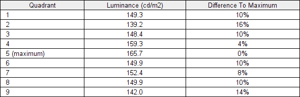
Luminance uniformity table
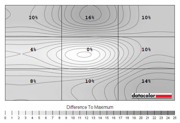
Luminance uniformity map
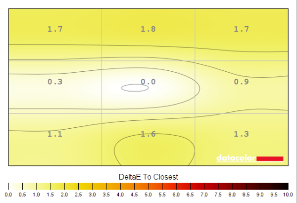
Colour temperature uniformity map
Contrast in games and movies
Lagom contrast tests
Colour reproduction
Colour gamut
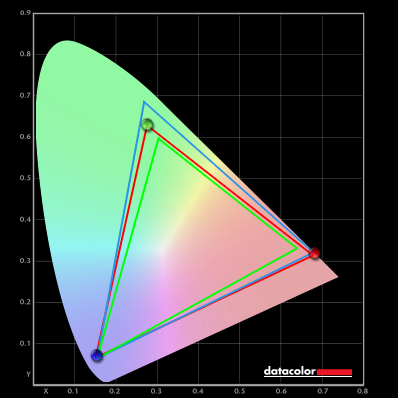
Colour gamut 'Test Settings'
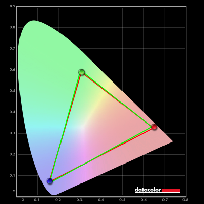
Colour gamut 'sRGB'

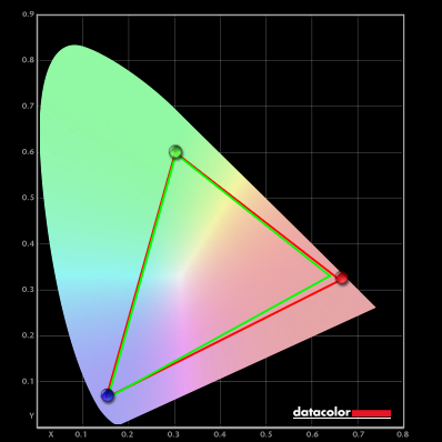
Colour gamut AMD 'CTC disabled' setting
Colour in games and movies
Shade representation using SpyderCHECKR 24

The monitor presents shades in a fairly vibrant way, with a touch of extra saturation due primarily to the colour gamut. The extension in some red regions of the gamut is evident for shades such as medium orange (3) and candy apple red (14), which have a touch of extra ‘pop’ and in the case of candy apple red verges a bit on a more neon shade than intended. There’s also a bit of a warm cast to peach pink (20) and a red push for light chocolate brown (24). These shifts towards a more saturated or reddish shade than intended are less extreme than observed on models with an even more generous gamut. The extension in the green region is also evident, particularly for dark lime green (18) which has some extra depth and vibrancy to it. Quite a few of the remaining shades are fairly well-represented. Including neighbouring yellow green (19), lilac (8) and Persian pink (6). The monitor showed strong consistency, too. Free from the sort of clear saturation shifts observed on VA or TN models depending on the on-screen position of the shade. The image below shows how things appear using the sRGB emulation mode (setting ‘Color Space’ to ‘sRGB’ in the ‘Color’ section of the OSD).

The saturation levels are significantly reduced now, due primarily to colour gamut restriction. Most shades are represented faithfully now, matching even more closely than it appears in the photo. This is due to the natural discrepancy between how the printed sheet vs. monitor is captured as covered earlier. Aquamarine (4) appears more of an aqua shade and Persian pink (6) just a touch undersaturated. Dark lime green (18) has a touch of oversaturation, but to the eye matches the printed sheet more closely – and has certainly lost the more neon appearance it had using the native gamut. The red casts and overly deep appearance to the red-biased shades is reduced. Overall, the shade representation using this setting shows pleasing accuracy. As usual, though, we’d recommend profiling the monitor with your own calibration device using the native gamut if you require the strongest level of colour accuracy.
Viewing angles

The video below shows the Lagom text test, a mixed desktop background, game scene and dark desktop background from various viewing angles. You can see relatively minor colour shifts for the mixed desktop background and game scene, with much stronger performance in that respect than VA or TN models. You can observe ‘hazing’ (contrast loss) from sharper angles, but this is at a fairly typical level for an IPS-type model. Some IPS-type panels are slightly stronger in this respect but others slightly weaker. The dark desktop background highlights ‘IPS glow’, which blooms out as viewing angle increases. This appears as a slightly greenish-grey shade or slightly warmer brown shade depending on angle.
Interlace pattern artifacts
Responsiveness
Input lag
Perceived blur (pursuit photography)


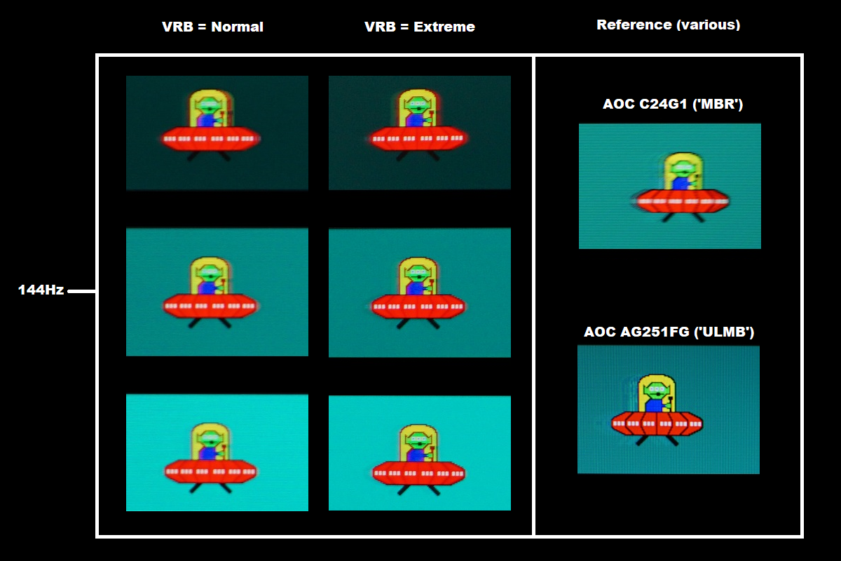

Responsiveness in games and movies
VRB (Visual Response Boost)
VRR (Variable Refresh Rate) technology
FreeSync – the technology and activating it


The Acer supports a variable refresh rate range of 48 – 144Hz. That means that if the game is running between 48fps and 144fps, the monitor will adjust its refresh rate to match. When the frame rate rises above 144fps, the monitor will stay at 144Hz and the GPU will respect your selection of ‘VSync on’ or ‘VSync off’ in the graphics driver. With ‘VSync on’ the frame rate will not be allowed to rise above 144fps, at which point VSync activates and imposes the usual associated latency penalty. With ‘VSync off’ the frame rate is free to climb as high as the GPU will output (potentially >144fps). AMD LFC (Low Framerate Compensation) is also supported by this model, which means that the refresh rate will stick to multiples of the frame rate where it falls below the 48Hz (48fps) floor of operation for FreeSync. If a game ran at 35fps, for example, the refresh rate would be 70Hz to help keep tearing and stuttering at bay. This feature is used regardless of VSync setting, so it’s only above the ceiling of operation where the VSync setting makes a difference.

Some users prefer to leave VSync enabled but use a frame rate limiter set a few frames below the maximum supported (e.g. 141fps) instead, avoiding any VSync latency penalty at frame rates near the ceiling of operation or tearing from frame rates rising above the refresh rate. If you activate the ‘Refresh Rate Num’ setting in the ‘Gaming’ section of the OSD, this will display the refresh rate of the display and therefore indicate the frame rate if FreeSync is active and the frame rate is within the variable refresh rate range of the display. The final point to note is that FreeSync only removes stuttering or juddering related to mismatches between frame rate and refresh rate. It can’t compensate for other interruptions to smooth game play, for example network latency or insufficient system memory. Some game engines will also show stuttering (or ‘hitching’) for various other reasons which won’t be eliminated by the technology.
FreeSync – the experience
Nvidia Adaptive-Sync (‘G-SYNC Compatible’)

You will also see in the image above that it states: “Selected Display is not validated as G-SYNC Compatible.” This means Nvidia hasn’t specifically tested and validated the display, not that it won’t work. On our RTX 3090 the experience was very similar to what we described with FreeSync. With the technology getting rid of tearing and stuttering from what would otherwise be frame and refresh rate mismatches, within the VRR range of 48 – 144Hz (48 – 144Hz fps). An LFC-like frame to refresh multiplication technology was employed below that to keep tearing and stuttering from frame and refresh rate mismatches at bay. There was again a momentary stuttering as the boundary was crossed, as we observed with our AMD GPU as well. Our suggestions regarding use of VSync also apply, but you’re using Nvidia Control Panel rather than AMD Radeon Software to control this. The setting is found in ‘Manage 3D settings’ under ‘Vertical sync’, where the final option (‘Fast’) is equivalent to AMD’s ‘Enhanced Sync’ setting. You’ll also notice ‘G-SYNC Compatible’ listed under ‘Monitor Technology’ in this section, as shown below. Make sure this is selected (it should be if you’ve set everything up correctly in ‘Set up G-SYNC’).

Note again that you can activate the ‘Refresh Rate Num’ setting in the ‘Gaming’ section of the OSD. This displays the refresh rate of the display and therefore indicates the frame rate if that is within the VRR window (48 – 144Hz). This is a useful indication that the technology is active. And as with AMD FreeSync Premium, HDR can be used at the same time as ‘G-SYNC Compatible Mode’.
HDMI 2.1 VRR
HDR (High Dynamic Range)
Colour gamut 'Test Settings'
The HDR10 pipeline makes use of 10-bits per colour channel, which this monitor supports via 8-bit + FRC. This enhanced precision not only helps the monitor put its generous gamut to appropriate use, it also aids the nuanced shade variety at the low and high end. At the low end (dark shades) there’s a natural uplift of detail, with a superior variety of closely matching shades. Very different to the ‘flooded’ look you’d get if you were to lift out such detail without this increase in shade variety – such as a low-end gamma enhancement under SDR. At the high end (bright shades) there were smoother progressions of shades, with finer gradients used for smoke and weather effects for example. The image below is taken from one of our favourite scenes to test HDR on Shadow of the Tomb Raider. Remember that the photo is purely for illustrative purposes and in no way represents how the monitor appeared running HDR in person.

The ‘4K’ UHD experience


The tight pixel density is also beneficial to the detail and clarity it gives suitably high resolution image content, ‘4K’ UHD movie content and game content. Some games naturally make better use of the resolution as they include high resolution textures, detailed lighting and particle effects which are best accompanied by a high pixel density. But even for older or less graphically impressive titles, the strong pixel density gives a definite clarity and definition to objects and the game environments – especially as you view distance objects. This isn’t something that models with significantly lower pixel densities such as 27″ WQHD can replicate. It’s also easier to appreciate this level of detail in motion with the high refresh rate (at suitably high frame rates). A combination we very much enjoy and found to be a competitive advantage, with enemies appearing more distinct from the background and easier to spot in the distance. The images below show the monitor in action on various game titles. Again, the images are just for illustrative purposes and don’t accurately reflect how the monitor appears in person.


Interpolation and upscaling

The monitor includes a range of scaling settings found under ‘Wide Mode’ in the ‘System’ section of the OSD; ‘Full’, ‘Aspect’, ‘1:1’ and ’21:9’. These are accessible at up to 144Hz (WQHD) or 120Hz (Full HD), even if Adaptive-Sync is active. We tested a range of resolutions of different aspect ratios and found the default ‘Full’ setting and ‘Aspect’ worked in the same way. Using interpolation and filling up as many pixels of the screen as possible to display the image, whilst maintaining an appropriate aspect ratio. So the image wasn’t stretched and distorted and black borders were present for unused pixels. The ‘1:1’ setting is a pixel mapping feature, only using the pixels called for in the source resolution, presenting an undistorted and unscaled image in the centre of the screen with a black border for unused pixels. The ’21:9’ setting simulates an UltraWide aspect ratio, compressing things downwards with a black border at the top and bottom. We demonstrate these settings in this section of the OSD video.
Video review
Timestamps:
Features & Aesthetics
Contrast
Colour reproduction
HDR (High Dynamic Range)
Responsiveness (General)
Responsiveness (VRR)
Conclusion
Positives Negatives Strong colour consistency and a fairly generous colour gamut delivered quite a vibrant but not heavily oversaturated image throughout the screen
DCI-P3 and Adobe RGB coverage insufficient for work within those colour spaces, gamma didn’t quite sit at ‘2.2’ on our unit even with reasonable OSD adjustment Reasonable contrast performance and a light to very light screen surface providing quite direct emission of light without an obvious layered appearance. 8-zone local dimming lifted HDR above some VESA DisplayHDR 400 level displays Moderate ‘IPS glow’ ate away at detail and atmosphere, especially in dimmer conditions and a slightly grainy look to the screen surface. HDR limited by luminance, basic local dimming capability and gamut Impressively strong pixel responsiveness for 144Hz, low input lag and VRR working as promised via HDMI 2.1 or Adaptive-Sync (FreeSync Premium and ‘G-Sync Compatible’) Some overshoot, particularly at reduced refresh rates even using the lowest ‘Over Drive’ setting available. Strobe backlight experience marred by visual disturbances (mainly related to KSF phosphors) Excellent ergonomics and a weighty feel to the stand. A tight pixel density, providing strong detail and clarity alongside excellent on-screen ‘real estate’ potential Prominent bottom bezel, plastic rather than metal used for stand base outer surface. Price a bit on the high side at time of review
