Author: Adam Simmons
Date published: May 20th 2022
Table of Contents
Introduction
OLED technology has been on the horizon for quite some time. Whilst such screens have been used in various large TVs and smaller portable devices, the monitor segment has long been dominated by LCD panels. The Dell Alienware AW3423DW shakes things up by offering a high refresh rate 34” ultrawide screen with OLED technology. More specifically QD-OLED, which combines a blue OLED light source for each individual pixel with layered red and green Quantum Dots. This provides the usual benefits you’d associate with OLED, with the QD component promising an expanded colour gamut compared to WRGB OLED alongside enhanced brightness and a potentially reduced chance of ‘burn-in’. A G-SYNC module is also included, providing variable refresh rate (VRR) capabilities. We put this very interesting model through its paces in our usual suite of tests. Focusing on desktop usage, gaming and movie content.
Specifications
The monitor uses a ~34” Samsung Display QD-OLED (Quantum Dot – Organic Light Emitting Diode) or ‘QD display’ panel with 3440 x 1440 resolution, 21:9 aspect ratio and 1800R (moderate) curve. This is accompanied by 10-bit colour support and a 175Hz refresh rate. A 0.1ms grey to grey response time is specified – and though we often say to pay little attention to such figures, OLED technology is known for very strong pixel responsiveness. Some of the key ‘talking points’ for this monitor have been highlighted in blue below, for your reading convenience.
The screen has quite a striking ‘sci-fi film prop’ design. This includes matte silverish white (or very light grey) plastic at the top of the ‘penguin-foot’ stand and more extensively at the rear. And dark matte back plastic used extensively elsewhere. The manufacturer refers to this as their ‘Lunar Light’ colour scheme. Although plastics are the materials of choice here, the screen has a decidedly solid feel to it. The bottom bezel is ~16mm (0.63 inches) thick for the front surface, sloping diagonally backwards and downwards for an additional few mm. The front surface is dark grey metal with a blended grey brand logo in the middle. The top and side bezels are dual-stage, with a slender panel border flush with the rest of the screen plus a slim hard plastic outer part. The bezels are ~9.5mm (0.37 inches) thick at sides and ~6mm (0.24 inches) thick at the top, including both components. There’s also a slim ‘active area’ between the panel border and the image which the entire image periodically moves around in – a few mm thick or so. This only occurs occasionally, is very brief when it happens and is one of the integrated measures the monitor includes to reduce the chance of image retention. The main element from the front is of course the screen itself, with moderate curve and glossy anti-reflective finish. Both elements are explored deeper into the review. As noted earlier, the monitor includes a generous array of ventilation slats. It also includes an active cooling solution in the form of two small fans. At least one fan is a usual addition for ‘G-SYNC Ultimate’ models. We could only hear the fans above our system when the system was idle if we tuned our ears into them. We didn’t find them particularly loud or bothersome. One of them seemed to stay on constantly when the monitor was in use, whilst the other occasionally spooled up to provide enhanced cooling, particularly if the monitor was running under HDR and displaying a lot of brighter content. Our system would be under load at this point, though, and we found the GPU fan drowned it out sufficiently. The fans have a spool-down time and will aid cooling of the monitor for several minutes or so after switching the monitor off. You could bypass this by unplugging the power cable or switching the screen off at the wall if you really needed to, but we’d recommend just letting it aid the natural cooldown of the screen after switching it off. For reference, our system sits under the desk and is air-cooled. Ideally these fans wouldn’t be required and we can appreciate some users dislike them being there. It could be bothersome if you’re particularly sensitive to fan noise or if you have a silent or very quiet system and favour a very quiet environment. But for most people we don’t feel this should be a significant concern. OLED technology is often associated with a potential image retention or ‘burn-in’ risk. This can include temporary afterimages which are shown on the screen (image retention), or in more severe cases and over a longer period it can include permanent damage (‘burn-in’). In addition to manufacturer-imposed limits to luminance, which reduce the risk, the monitor includes 3 main mitigation measures. The first and most regular is a pixel shift algorithm which nudges the entire image over very slightly several times per hour. There’s a small ‘active area’ between the image and the panel border which facilitates this, as shown in the image below. This is a close-up photograph with direct light striking the screen to help highlight the border, but it’s very slender in practice and shouldn’t be something you generally notice or find bothersome when using the monitor normally. Also note the ‘white dot’ on the panel border, which appears tiny and less bright in reality, is a calibration mark used in production of the panel and is often found on LCDs as well. When the image is shifted it only lasts a split second – we did notice it doing this, particularly on the desktop, but didn’t find it bothersome. After every 4 hours of cumulative use, the monitor will want to run its ‘OLED Pixel Refresh’ cycle, which is the 2nd mitigation measure. The message below is displayed when it first wants to run this. If you select ‘Proceed’ (or more likely ‘Proceed and do not show this message again.’) it will run the cycle immediately. It will do this again when you next turn the monitor off or it’s allowed to go into standby, if it has been used for another cumulative 4 hours or more. But it shouldn’t display the message again if you selected the correct option. The screen remains off during the process and the power LED flashes green, with the cycle usually taking around 7 minutes to complete. After that the monitor will remain off. The process is seamless and non-disruptive as it occurs when you’re not using the monitor, except for the first time it runs where it will do so immediately. If the monitor has been used for 20 hours straight without going into standby or being turned off, it will also display the message and at this point we’d strongly encourage running the cycle. You can also run it manually by selecting it in the OSD under ‘Others’ – ‘OLED Panel Maintenance’. Perhaps worth doing if you notice slight image retention. After each cumulative 1500 hours of use the monitor will want to run a more thorough maintenance cycle called ‘OLED Panel Refresh’. This takes approximately an hour to complete and is something we’d advise running through when prompted or shortly afterwards if you can. The power LED will flash red during this time and you may see a coloured line moving around the screen. You can also manually run this cycle by selecting it in the OSD under ‘Others’ – ‘OLED Panel Maintenance’. But this is quite an intensive maintenance cycle which could be detrimental to the lifespan of the product if run too frequently. Generally, you should just do it when prompted by the monitor. If for some reason the monitor’s integrated cycles don’t seem to be running as you’d expect, or perhaps it keeps prompting you to perform a ‘Pixel Refresh’ even though you’ve told it not to display that message again, we’d recommend performing a ‘Factory Reset’ in the ‘Others’ section of the OSD. You’ll also lose any changes you made in the OSD by doing this, but it’s important that the monitor performs these cycles to keep things in good working order. During our review period we spent around a month using the monitor pretty solidly, including with a good chunk of time spent on the desktop. We didn’t take any specific measures beyond what we’d take with LCD monitors we test. We set Windows to ‘Turn off display’ after 20 minutes of inactivity in the power options, but that was it. No auto-hiding taskbar or turning the monitor off as soon as we leave the room. We didn’t experience even the mildest image retention or any ‘burn-in’ issues. QD-OLED is a very new technology at time of review and it will be interesting to see how it fares during longer term use, but we’re confident that the mitigation measures included here will serve their intended purpose. In addition to this, Dell includes ‘burn in cover’ as part of the included 3 year warranty for additional peace of mind. We will be keeping hold of this monitor for longer term testing and will update this section if we come across any issues with burn-in. Update: June 4th 2023 We’ve been using this monitor quite extensively now as our main monitor for a mixture of entertainment (gaming and video watching) plus a good amount of productivity. It has been used since the review in this fashion for over a year, when not reviewing other screens and at times alongside them. We haven’t experienced any burn-in issues of note and any mild image retention we experience from time to time clears up after the usual scheduled ‘Pixel Refresh’ cycle is run. We continue to monitor this. Update: March 11th 2024 We’ve continued to use the monitor as described above, for just shy of 2 years. We did not observe any burn-in during this period, but will not continue to monitor this as we no longer have the monitor to monitor! 😉 It has been sold and replaced by the AW3225QF, which we will continue to use in a similar fashion for however long we end up keeping it. If we observe issues with burn-in we’ll provide an update on our website or social channels. Because there’s quite a lot to cover here, we’ll first focus on the subpixel layout. The image below is a macro photograph taken on Notepad with ClearType disabled. The letters ‘PCM’ are typed out to help highlight any potential text rendering issues related to unusual subpixel structure, whilst the white space more clearly shows the actual subpixel layout alongside a rough indication of screen surface. The monitor has an RGB (Red, Green and Blue) subpixel layout, but the green subpixel is displaced above the red and blue subpixel. Most Windows users will be used to the representation of text using ClearType. For the first set of samples on the ‘ClearType Text Tuner’ (1 of 5) you should select the first option which will optimise for RGB rather than BGR. Aside from that, it’s really down to your own preferences. Regardless of how you set things up here or even if you’re not using ClearType, there are some slight drawbacks to this subpixel arrangement in the way of fringing. We say slight because this fringing isn’t something most people are likely to readily notice or find bothersome if they do from their normal viewing distance. Some will, however. Frustratingly, as a reviewer, it’s extremely difficult if not impossible to accurately represent how you’d perceive this fringing by eye in photos or videos. Even if we sat unusually close to the screen and started ‘pixel peeping’, we felt any photos we took tended to exaggerate the issue. But it’s still useful to have some photographic references of the issue to aid our explanations. The image below shows the letters ‘PCM’ typed out in size 11 (top) and 72 (bottom) as black text on a white background with ClearType optimisation performed. ClearType produces a bolder look to text, more so depending on how you set it up. Some may feel this helps mask the issue to an extent. For some it can be more noticeable for smaller text as the text itself is closer to the width of the fringe. But as you’ll see below and with various examples shared later on, the issue persists even for larger text or contrasting straight edges. Caution: the images in this section showing fringing issues also greatly exaggerate them and are not representative of what you will see by eye when using the monitor normally. Please read the accompanying text, which provides appropriate context. With the example above, you can see colourful fringing at the border between the white and black. It tends to appear either magenta, purple or burgundy on upper surfaces of letters and green at the bottom. Some other shades such as orange and yellow can also be seen. However; we can’t stress enough that you simply don’t see it like this to the eye. The fringe is exceptionally slender, a pixel wide, and appears far more blended and less saturated than this. We spend a lot of time observing text when using monitors and for black text on a white background or indeed relatively dark text on a relatively light background we didn’t readily notice this issue. It also occurs when observing text or other straight edges where the text (or object) is significantly brighter than the background. The image below shows the ‘Table of Contents’ found in our reviews, which includes white text against a black background. This is then surrounded by the white of the page. This image again exaggerates the issue as the fringes appear more blended, less saturated and exceptionally slender in practice. But we did generally find the fringing a bit more noticeable for examples like this than when observing black text against a white background. If you observe the same ‘Table of Contents’ (or indeed normal text) closely enough on an LCD monitor of similar pixel density, you may notice some fringing as well. Because of the extreme contrast and very generous gamut of the Alienware – plus the unusual subpixels – it does stand out a bit more in this case. We would again stress it isn’t something that most will find bothersome, but it’s one of those things some are more sensitive to than others and it’s important to acknowledge the issue. We also noticed it when observing a dark grey taskbar against the white or light grey of a document on Microsoft Word, with a magenta fringe. We’ll include an image of this just for reference, but remember the fringe is extremely slim and appears much more blended and less saturated to the eye. To the eye it could be described as purple or perhaps burgundy rather than magenta, but it’s quite open to interpretation and difficult to say with certainty given how thin the fringe is. We were quite reluctant to include this one but since we did still notice the issue by eye here, even if it was much less obvious than in the image, we will include it. It’s also worth remembering that it isn’t just confined to the desktop where this fringing occurs, but with video and game content being as dynamic as it is we really didn’t find it at all bothersome or generally noticeable there. Moving on now to the screen surface, which is glossy on this model with a highly effective anti-reflective coating applied. The benefits of a glossy screen surface compared to matte anti-glare screen surfaces are covered in our article on the topic. Essentially they allow more direct emission of light from the monitor, providing extra ‘pop’ and a smoother look to the image without graininess or layering in front of it. Some people find slight reflections on the surface provides a ‘wet look’ to the screen which they find attractive, too. Unlike many glossy screen surfaces we’ve come across, reflections are subdued significantly on this model and generally aren’t noticeable enough to be distracting even in a moderately bright room. In brighter conditions you can see some reflections when observing darker shades, particularly reflections of brighter objects. But these aren’t the same sharp mirror-like reflections that some glossy screen surfaces produce. Similar lighting conditions will also cause issues with glare on matte anti-glare screen surfaces which can ‘flood’ the image somewhat. Due to the curve of the screen, reflections stretch across the screen a bit. The curve also means the screen picks up more pronounced reflections which stretch across the screen in a very exaggerated way when viewed from the side rather than from a normal viewing position. This is demonstrated in the video review. The photographs below show the monitor with a pure black desktop background in a range of lighting conditions. From top to bottom they show; a dark room, dim natural lighting, moderate natural lighting, bright uncontrolled natural lighting (some light hitting screen directly, not an extreme amount), moderately bright artificial lighting in the evening and dimmed artificial lighting in the evening. You can see an increase in reflections as the room becomes brighter, but the anti-reflective screen surface works very well to combat these overall. If you compare the depth of the ‘black’ being displayed by the screen to the black panel border, you can also see it lightens up in a brighter room. We add some further thoughts on this with respect to contrast a bit deeper into the review, but we believe it’s contributed to in part by the lack of outer polarising layer on the monitor. A similar observation can be made for non-LCD technologies like CRTs and plasmas where the screen appears as a dark grey, sometimes with a slight tint, rather than black when exposed to enough light. In brighter conditions with some light striking the screen surface directly, the Alienware’s screen even takes on a bit of a red to purple hue. Brighter lighting conditions also cause glare or give a generally hazy look to anti-glare finishes, even without strong direct light striking the screen surface. And for glossy screen surfaces, brighter conditions can introduce reflections which are typically sharper and more widespread than observed here. The AW3423DW features various ‘Preset Modes’; ‘Standard’, ‘Creator’, ‘FPS’,’ MOBA/RTS’, ‘RPG’, ‘SPORTS’, ‘Game 1’, ‘Game 2’, ‘Game 3’, ‘Warm’, ‘Cool’ and ‘Custom Color’. The presets with named game genres upset the image in various ways that can’t be counteracted in the OSD. We explore these briefly in the OSD video. ‘Standard’, ‘Custom Color’ and numbered ‘Game’ presets are set up in the same way by default, with ‘Custom Color’ allowing RGB colour channel adjustment and the numbered ‘Game’ presets unlocking RGBCMY colour channel adjustment. The numbered ‘Game’ presets are useful as they allow you to have 3 separate profiles with different brightness and colour channel settings. Note that the ‘Contrast/Brightness’ settings and any changes made there are shared between the ‘Standard’, ‘Warm’, ‘Cool’ and ‘Custom Color’ presets. The table below shows gamma and white point readings taken using a Datacolor SpyderX Elite colorimeter, alongside general observations by eye. Our test system uses Windows 11 with an Nvidia RTX 3090 connected using the supplied DisplayPort cable. Additional testing was performed via HDMI and also using an AMD Radeon RX 580, though observations on this table didn’t differ significantly between inputs or GPUs. The monitor was left to run for over 2 hours before readings were taken and observations made, without any additional monitor drivers or ICC profiles specifically loaded. We also used the monitor for a week prior to readings being taken with the monitor running through several ‘OLED Pixel Refresh’ cycles. We’ve been informed OLED technology may have a settling period and as our unit was brand new at time of review we felt it was worth doing this. Aside from our ‘Test Settings’, where various adjustments were made, assume factory defaults were used. We also bumped brightness up to ‘75%’ for ‘Creator’ mode so it was more in-line with the other settings tested – the default brightness of ‘15%’ was too low for appropriate comparisons to be made and gamma behaviour was also particularly quirky there (we explore this in more detail shortly). The refresh rate was set to 175Hz in Windows, although this didn’t significantly affect the values or observations in this table. When viewing the figures in this table, note that for most PC users ‘6500K’ for white point and ‘2.2’ for gamma are good targets to aim for. Because of the very strong peak of red and green energy you may find the monitor ‘spectrally unbalanced’ when viewing it beside a monitor with significantly narrower colour gamut, even if both are calibrated to ‘6500K’ and with neutral green channels. Feel free to target a higher white point or make appropriate colour channel adjustments to compensate. Note that this issue isn’t unique to QD-OLED technology – it’s always difficult to closely match monitors with very different spectral profiles. This isn’t an issue when viewing the monitor in isolation, your eyes should compensate appropriately. Straight from the box the monitor produced a highly vibrant image with decent colour channel balance. Gamma didn’t tightly track the ‘2.2’ curve at all points, instead it weaved around it with a notable uplift of detail for darker shades due to the gamma being reduced significantly there. This was a more extensive dip than you’d see for the ‘sRGB’ gamma curve, which tracks ‘2.2’ except for very dark shades. As we explore shortly, there are also changes to gamma tracking depending on the brightness level set in the OSD. The graph below shows the gamma tracking with the monitor in its ‘out the box’ state – the ‘Standard’ preset set to ‘75%’ brightness. The monitor includes a factory calibration report, with the full calibration applying to the ‘Creator’ presets. The monitor has a claimed average DeltaE 2000 ≤2 within the sRGB colour space (‘sRGB’ gamut selected) and DCI-P3 colour space (‘DCI-P3’ gamut selected). We prefer to analyse things in a more visual and qualitative way, but can confirm an average DeltaE of 1.32 within the sRGB colour space and the monitor set to a brightness of ‘60’ (120 cd/m² on our unit). For reference, with brightness set to the preset default of ‘15’ (~40 cd/m² on our unit), we recorded an average DeltaE of 2.92. Colour accuracy suffers there primarily due to the associated gamma changes we explore shortly. This was recorded using our SpyderX Elite and the same 24 test patches analysed visually deeper into the review (SpyderCHECKR 24), with a gamma of ‘2.2’ selected in the OSD. Because of the exceptional contrast of the screen coupled with reduced gamma for dark shades, you may find some very dark shades are less masked than you might be used to seeing on an LCD calibrated to ‘2.2’. Some may prefer setting the screen to a higher gamma, perhaps ‘2.4’, for a bit more of a blended look which will better mask ‘compression artifacts’, noise and unintended dark detail in videos and images. Something we found a bit awkward with this in mind is that the ‘Gamma’ control is locked to the ‘Creator’ preset. If you want to access the colour channels, which would make sense for content creation for example, you’d have to be running in ‘Custom Color’ or one of the numbered ‘Game’ presets which doesn’t include the gamma option. The graph below shows the gamma tracking under our ‘Test Settings’, where we opted for ‘2.4’ gamma for the more appropriately blended look. For particularly dark and particularly bright shades the curve actually tracked closer to ‘2.2’, whilst gamma was raised for medium shades. This gave some extra depth with appropriate dark detail and highlight distinctions, which we felt worked complemented the capabilities of this model well for general purpose and entertainment usage. The gamma tracking on this model is also quite quirky as it changes alongside brightness. This isn’t something we’d usually observe to a significant degree when testing LCD monitors and we’re not sure if it’s specific to the panel technology or this particular model. With an LCD, changing brightness alters backlight brightness and this affects all shades in a relatively even fashion. In this case there isn’t a backlight, so keeping the relative brightness of shades (i.e. gamma) consistent may require additional processing which this monitor doesn’t perform. Whilst this may not be a major issue for general usage and some hobbyist image editing and suchlike, for colour-critical usage we would recommend full profiling of the monitor using your own calibration device to ensure tight gamma tracking at your preferred brightness setting. Because of the significant gamma corrections this will make, it may induce slight banding issues in places – which could be problematic if you manipulate fine gradients, for example. The table below provides average gamma readings for a range of brightness settings using the SpyderX Elite. Graphs are included if you click on a given gamma value. The monitor is set to ‘Standard’, but similar observations were made with other presets, including ‘Creator’ (regardless of configuration), as well as at other refresh rates. G-SYNC being active didn’t influence these readings, either. We confirmed this using alternative software and an X-Rite i1Display Pro (Calibrite ColorChecker Display Plus) as well. Given the intended uses for the monitor, inter-unit variation and performance with OSD tweaking alone we won’t be using any ICC profiles in this review or including any measurements or graphs using them. We wouldn’t recommend using them unless created for your specific unit using your own calibration device. But we appreciate some users still like to use profiles and some aspects such as gamut mapping for colour-aware applications can be useful. You can download our ICC profile for this model, which was created using our ‘Test Settings’ as a base. You can also download our sRGB profile which was created using and designed for ‘Creator’ mode with ‘Colour Space = sRGB’ and ‘Gamma = 2.2’. Amongst other things, this tightened up tracking of the ‘2.2’ curve on our unit – but be aware of inter-unit variation. Brightness was set to ’75%’ when the profiles were created. And note again that these ICC profiles are not used in the review. This monitor is certified by TÜV Rheinland with the status of ‘Low Blue Light (Hardware Solution)’, which makes it suitable for Dell’s ‘ComfortView Plus’ designation. This refers to a relative reduction in high energy blue light due to the large and relatively broad peaks of green and red energy also produced. Something we refer to as ‘balanced spectral output’. This can be beneficial for viewing comfort, though as the article explores viewing comfort is a broad concept with many factors to consider. An even more pronounced reduction in stimulating blue light and a warmer look to the image can help create a more relaxing viewing experience. Something that could be particularly useful in the hours leading up to sleep. You could achieve this by making manual adjustments to colour channels, but the monitor also includes an easily accessible Low Blue Light (LBL) setting – the ‘Warm’ preset mode. This provides a warmer look to the image with blue channel weakened quite a bit compared to default and a slightly reduced green channel. The look is quite well-balanced for an LBL setting, but it achieves the primary goal of further reducing blue light output. Reducing brightness also reduces blue light emission from the monitor. With this in mind, we used this setting at reduced brightness for our own viewing comfort in the evenings. But not for any specific testing beyond that involving the setting itself. For our ‘Test Settings’ we switched over to the ‘Creator’ preset with the ‘DCI-P3’ gamut, as we like to discuss the capabilities primarily using the full native gamut. Brightness was set to a similar level we usually aim for in our reviews, for consistency. Due to the excellent contrast and overall ‘punch’ provided by the screen, though, you may feel comfortable using a relatively low brightness setting. We also switched ‘Gamma’ over to ‘2.4’ for reasons explored earlier, which required the ‘Creator’ preset to be used. The white point and overall colour channel balance was good enough on our unit, thankfully, as you’d need to switch over to a different preset to adjust those such as ‘Custom Color’. You can also adjust the colour channels with ‘Game 1’, ‘Game 2’ and ‘Game 3’ – but note ‘50%’ rather than ‘100%’ is the neutral point for each channel there. Be aware that individual units and preferences vary. We’ve also included the refresh rate used in Windows for most of the review, just for reference. These settings only apply to SDR, HDR has separate settings associated with it (is more restrictive) and is explored in the relevant section of the review. Preset Mode = Creator Color Space = DCI-P3 Gamma = 2.4 Brightness = 75 (according to preferences and lighting) Refresh rate (Windows setting) = 175Hz An X-Rite i1Display Pro Plus (Calibrite ColorChecker Display Plus) was used to measure the luminance of white using various settings, including those found in the calibration section. Because of the self-emissive nature of this display, black depth is ‘0’ and contrast ratio essentially infinite as measured with the colorimeter regardless of settings used. Blue highlights indicate the results under our ‘Test Settings’ and with HDR active. Black highlights indicate the highest white luminance recorded under SDR. Assume any setting not mentioned was left at default, with the exceptions noted here or in the calibration section. This includes brightness being set to ‘75%’ for ‘Creator’ to match factory defaults. Note: The test patch used under SDR is a fairly large white box (60mm x 60mm) in the centre of the screen, surrounded by a bit of light grey with black text for the UI elements of the program. The desktop background is shown surrounding that complete with desktop icons to the left and the taskbar at the bottom (example). Unlike some OLED screens, this monitor doesn’t include an aggressive ABL (Automatic Brightness Limiter) under SDR. However; a mild ABL is used under SDR. We recorded fluctuating brightness levels depending on the desktop background displayed – a range of wallpapers were observed, as were solid shades including black and white. The brightness range recorded for each setting is provided. If the white patch was made smaller it had little effect for a given wallpaper. And if the white patch was expanded to fill up nearly the entire screen, the luminance sat near the middle of the range. The recorded fluctuations are quite small even at higher brightness levels. We didn’t find the fluctuating brightness obvious by eye – unlike the much more aggressive ABL feature some OLED screens use which can be annoying for desktop usage. **This reading was taken using the above test. A reading was taken using a white screen fill (‘all pixels’), 30 seconds after it was displayed. This is used to represent the sustained luminance level the monitor can provide under HDR, rather than the peak luminance achieved for smaller sections of the screen. Because the entire screen is white for this test, black luminance levels can’t be read and an HDR contrast reading can’t be ascertained. The monitor provided a peak luminance of 232 – 265 cd/m² under SDR, with a range provided because it depends on the content displayed. The specified 250 cd/m² slots neatly towards the middle of these two figures. Whilst this may be too limited for some users, most people tend to settle for a brightness somewhere between 100 cd/m² and 200 cd/m² which this monitor can provide without issue. The minimum luminance recorded was 22 – 26 cd/m², which is very low. This should come as welcome news to particularly light-sensitive users. Under HDR the peak luminance recorded was 1059 cd/m² (‘HDR Peak 1000’) or 458 cd/m² (‘HDR 400 True Black’). The luminance dropped for larger white patch sizes – at the recorded 25% or larger recorded patch sizes both HDR settings were brought roughly in-line with one another. A sustained luminance of 257 cd/m² (‘HDR Peak 1000’) or 264 cd/m² (‘HDR 400 True Black’) was recorded. The drop-off in white luminance recorded under HDR using the ‘HDR Peak 1000’ setting was therefore more substantial than with the ‘HDR 400 True Black’ setting. With a range of 802 cd/m² for the former and 194 cd/m² for the latter. One setting is therefore more consistent, whilst the other can provide much more ‘pop’ to smaller bright areas. We explore this subjectively in the HDR section. The HDR luminance data for the two settings is shown in the graph below, for those preferring a graphical representation. The AW3423DW does not use PWM (Pulse Width Modulation) to regulate the brightness of its pixels at any level. Instead, DC (Direct Current) is used to moderate brightness. As is common for OLED screens, the screen uses low amplitude oscillation – so there’s a slight cyclical dip in brightness. This occurs at a frequency matching the refresh rate of the display. This was recordable via oscilloscope (trace at 175Hz) and can be observed by a camera with certain settings, but is very different to the more pronounced brightness changes accompanying PWM. As such, it shouldn’t be bothersome to most users and the monitor can be considered ‘flicker-free’ as advertised in the product manual. Sensitive users could potentially find this bothersome, particularly at lower refresh rates. We’ve communicated with some individuals who are particularly sensitive to PWM flickering but find OLED screens with similar brightness regulation comfortable to view, so sensitivity to PWM doesn’t necessarily mean this will be problematic. This monitor uses QD-OLED technology with self-emissive pixels rather than relying on a backlight. As such, there is no backlight bleed or associated clouding. Whilst observed a black background in a dark room, using our ‘Test Settings’, we observed a pure blackness – as if the screen was switched off. This is shown in the image below, which is simply for reference and included as we usually do so at this point in the review. Any patchiness in the image is due to the camera or image processing, not the monitor. The luminance uniformity was excellent. The maximum luminance was recorded at ‘quadrant 6’ to the right of centre (148.7 cd/m²). The greatest deviation from this occurred at ‘quadrant 7’ towards the bottom left (144.9 cd/m², which is 3% dimmer). The average deviation between each quadrant and the brightest recorded point was 1.50%, which is exceptional. Remember that individual units vary when it comes to uniformity and you can expect further deviation beyond the points measured. But with its lack of backlight and direct emission from the pixels, relatively strong uniformity can certainly be expected in this case. The contour map below shows these deviations graphically, with darker greys representing lower luminance (greater deviation from brightest point) than lighter greys. The percentage deviation between each quadrant and the brightest point recorded is also given. The SpyderX Elite was also used to analyse variation in the colour temperature (white point) for the same 9 quadrants. The deviation between each quadrant and the quadrant closest to the 6500K (D65) daylight white point target was analysed and a DeltaE value assigned. Darker shades are also used on this map to represent greater deviation from 6500K. A DeltaE >3 represents significant deviation that may be readily noticed by eye. Results here were excellent, with no significant deviations recorded – the top right was recorded as closest to 6500K, with a maximum DeltaE of 1.3 recorded centrally. Note again that individual units vary when it comes to uniformity and that you can expect deviation beyond the measured points. Though the lack of backlight again goes in this model’s favour. Also note that this colour temperature measurement doesn’t account for the green channel strength, which can also vary at different points of the screen. This wasn’t a significant issue on our unit, with minor variation observed. In addition to the quantitative testing above, we performed a subjective assessment of the uniformity of a variety of dark and medium shades, including 5% grey and 50% grey. Some OLED screens are susceptible to uniformity issues such as splotches or obvious striations when viewing large areas of flat shades such as this, giving an inconsistent appearance that some users refer to as ‘DSE’ (‘Dirty Screen Effect’). We observed nothing beyond faint vertical striations when closely observing the screen in this case, isolated to some very dark grey shades. We didn’t observe clear blotchiness or obvious striations and most shades were displayed with strong uniformity. As explored earlier with respect to screen surface, the contrast is most impressive in dimmer lighting conditions. Our observations below with respect to very dark shades mainly relate to how things appear in dimmer lighting conditions. This doesn’t just mean a completely dark room, it would include viewing in duller daylight conditions or dimmed evening lighting. As the room becomes brighter, the gap between the contrast experience offered here and by your typical LCD in similar lighting conditions narrows. Under moderate natural lighting (not overly bright but not dim either) we’d say it was still quite strong though not clearly superior to what a good VA LCD with ~3500:1+ static contrast might offer in terms of depth. In bright ambient lighting (e.g. a fairly bright day, plenty of natural light in the room) the screen lightens up significantly when observing darker content, even without strong light striking it directly. Bright coloured walls or other brightly coloured objects behind you can also affect the representation in brighter conditions, reflecting on the screen surface. The contrast advantage and in particular depth of dark shades vanishes at this point, even compared to an IPS LCD with sub-1000:1 static contrast. Bright ambient lighting can be problematic for any LCD we’ve tested as well, imparting clear glare which floods the image with a hazy look (anti-glare) or causing reflections (glossy) that are usually more distinct than those observed here. On Battlefield 2042 the monitor provided an exceptional contrast performance. With its self-emitting pixels (and gamma set up appropriately for the low-end), dark scenes were shown with excellent depth and atmosphere. No ‘glow’ to worry about peripherally, with excellent gamma consistency ensuring dark detail levels were evenly maintained throughout the screen. Dark shades also had a deep and ‘inky’ quality to them, which helped provide structural definition to various objects and enhanced the contrast between shadow details and brighter shades surrounding them. The self-illuminated nature of the display and exceptional contrast that provides also gave a definite solidity to medium shades. LCDs (particularly non-VA) have a slightly translucent quality there in comparison. You can observe improvement to LCDs in that area if they have an FALD (Full Array Local Dimming) solution active as well. But this screen provides a very pure and inky look to these medium shades and naturally to darker shades as well. The screen surface also helps in this respect, allowing rather direct light emission rather than diffusing it like a matte anti-glare surface. There is no layering in front of the image nor any graininess when observing even the lightest content. Shadow of the Tomb Raider provided a similar experience. This title is dominated by dark passageways, caves and tombs illuminated by point sources of light. The monitor gave such scenes on this title the look they crave, with a very deep and atmospheric look to the darker shades and excellent ‘pop’ for brighter shades. Standing out very nicely against darker surroundings. Darker elements within scenes such as shadow detailing also benefited from the strong shade depth, with medium shades again having a definite solidity to them. The screen surface provided a smooth (non-grainy) look to lighter shades and didn’t impede them with any additional layering in front. We also viewed the film Star Wars: The Rise of Skywalker. As with Tomb Raider, this film craves a strong contrast performance with plenty of pulses of light (fires, light sabers, bright projectiles etc.) cast against much darker surroundings. And that’s exactly what was provided here, with excellent depth and atmosphere. The film is presented without black bars in an ultrawide aspect ratio. A lot of content you’ll consume on streaming media platforms including Netflix, Amazon Prime Video and certainly YouTube is 16:9 so there will be large black bars at the sides. In dimmer lighting these bars appear deep black and are quite easy to ignore in our view – though they’ll lighten up along with the room as explored earlier. The glossy screen surface ensured no additional graininess or layering was imparted and light emission from the monitor was rather direct. The Lagom tests for contrast allow specific weaknesses in contrast performance to be identified. The following observations were made in a dark room. As a QD-OLED monitor, layers of Quantum Dots (QDs) are included which provide strong peaks of green and red energy when excited by the blue OLED light source. This enhances the colour gamut whilst also creating a more balanced and less blue-biased spectral profile, potentially aiding viewing comfort. This balanced spectrum is the reason Dell markets this as a ‘ComfortView Plus’ option, with TÜV Rheinland certifying it as a Low Blue Light ‘hardware solution’. The Dell Alienware AW3423DW’s colour gamut (red triangle) was compared with the sRGB (green triangle) and DCI-P3 (blue triangle) reference colour spaces using our ‘Test Settings’, as shown in the first image below. The gamut fully covers sRGB with significant extension beyond. We measured 99% DCI-P3 coverage, very close to the 99.7% specified by the manufacturer. There’s some extension beyond this for the red to blue and green to blue edges of the gamut. The second image shows the monitor’s colour gamut (red triangle) compared to Adobe RGB (purple triangle). We recorded 94% Adobe RGB coverage with some extension beyond, particularly towards the red corner of this representation. This is a generous gamut, so standard sRGB content outside of a colour-managed environment is presented in a highly vibrant and saturated way. If you use the ‘Creator’ preset mode and select ‘Color Space = DCI-P3’, this doesn’t clamp the gamut to DCI-P3 and instead uses the native gamut shown above. You will therefore still get some oversaturation within the DCI-P3 colour space. Selecting ‘Color Space = sRGB’ does clamp the gamut to sRGB though, as an sRGB emulation setting. The gamut is cut down very effectively without over-extension and just a bit of under-coverage (98% sRGB). Brightness can be adjusted with this setting active and you have access to the gamma control, but as covered earlier you can’t adjust colour channels with the ‘Creator’ preset. To maximise colour accuracy within the sRGB colour space, for colour-managed workflows, full calibration and profiling with a colorimeter or similar device using the full native gamut is recommended. This will give complete sRGB coverage, allow control of colour channels and make further corrections (including to gamma). The generous DCI-P3 coverage also gives the monitor good potential for work within the DCI-P3 colour space. The fairly generous Adobe RGB coverage gives decent potential for work within that colour space, though higher coverage would be ideal. You may try the ICC profile featured in the calibration section which includes gamut mapping for colour-aware applications, but best results are always obtained by calibrating your own unit with your own hardware. The gamut below shows results using our ‘Test Settings’ with this driver tweak applied. The colour gamut now fully covers sRGB (100%), with just a little over-extension towards the green corner and red to blue edge. This setting provides good sRGB tracking and helps to cut down on the colour gamut without profiling, including in applications that aren’t colour managed. And you don’t have to lock yourself in ‘Creator’ mode which locks off colour channel access – though you could use this setting in conjunction with ‘Creator’ set to ‘DCI-P3’ if you wish to make gamma adjustments instead of colour channel adjustments. Whilst Nvidia doesn’t have a similar option in their graphics driver, a third party tool called ‘novideo_srgb’ can be used. This provides a similarly effective GPU-side gamut clamp to the AMD driver option. The resulting gamut was very similar to that shown above with the AMD tweak – this is expected given it uses the same data from the EDID of the monitor. The tool and its usage is covered in our sRGB emulation article. As covered in the article, the tool can also provide DCI-P3 and Adobe RGB emulation. It can remove over-extension in the gamut but can’t add additional coverage, so you’ll be just a touch below full DCI-P3 coverage and will have a fair chunk of Adobe RGB missing on this model. The monitor gave Battlefield 2042 a highly vibrant look overall. As with most content consumed under SDR, the game is developed with the sRGB colour space in mind. When viewed on a model with a wider gamut, extra saturation and vibrancy is introduced beyond what the developers intend. With its considerable extension beyond sRGB, the monitor boosted red tones such that earthy browns and some skin tones appeared less neutral than intended. Richer, with an extra red hue. Roaring fires also showed yellows which verged on orange and oranges which verged on red – an eye-catching and vivid look, but not as intended. The greens of vegetation also showed strong vibrancy, with yellowish greens brought out too strongly and green-biased shades generally appearing rather lively. This wasn’t as extreme as on models with superior Adobe RGB coverage, however. Sky blues were also given some extra ‘pop’ and saturation, again somewhat less than on some wide gamut models but still noticeable. The gamma setup under our ‘Test Settings’ injected some extra depth as well, which accentuated some of this extra saturation in places. Similar observations were made on Shadow of the Tomb Raider. There were plenty of eye-catching vibrant shades, such as orange berries, purple flowers, some of Lara Croft’s brightly coloured dresses and gold artifacts to give just a few examples. Vegetation showcased some very lush-looking shades as well as some highly vivid brighter green shades. Again, livelier than intended. Lara’s skin appeared a bit more sun-kissed than intended and earthy browns often took on a stronger than intended orange or red push. On both titles colour consistency was excellent, so saturation levels were maintained throughout the screen. The screen surface and strong contrast performance also aided the ‘pop’ on both titles, much as explored in the contrast section earlier. The vibrant look with strong saturation is one some will really like and find very appealing, but others will prefer the more toned down and ‘as the developers intend’ look of sRGB emulation, such as setting the ‘Creator’ preset to ‘Color Space = sRGB’. We used the TV series Futurama to make further observations on colour reproduction. Like many animated titles, Futurama includes large areas of single shade – making it a particularly unforgiving test of colour consistency. In this respect there was really nothing to complain about, with a given shade displayed very evenly throughout the screen. A pleasing variety of shades was presented including some muted pastel shades and eye-catching neon shades. The pastel shades were less muted than they should be, though still muted relative to deep or neon shades. Whilst said neon shades such as neon green and bright purple appeared with excellent ‘pop’. The colour gamut, screen surface and strong contrast (especially when a given shade was surrounded by darker content) aided this. Again, sRGB emulation is an option for those preferring the more muted representation which the content creators have in mind during production of their content. The image below shows a printed reference sheet of 24 ‘sRGB’ shades, included as part of the Datacolor SpyderCHECKR 24 package. The screen is displaying reference photographs of this printed sheet, in both the same order as printed (right side) and reverse order (left side). The camera is mounted slightly above centre so that the image is representative of what the eye sees from an ergonomically correct viewing position. This, coupled with the inclusion of a flipped version of the shade sheet, allows both accuracy and colour consistency to be visually assessed. Bracketed numbers in our analysis refer to shades on the printed sheet or right side of the screen if they’re ordered consecutively from top left to bottom right. Note that there is always some disparity between how emissive objects (monitor) and non-emissive objects (printed sheet) appear. The monitor is set to a very low brightness to help minimise this disparity. The representation of shades in this image depends on the camera and your own screen, it’s not designed to show exactly how the shades appear in person. It still helps demonstrate some of the relative differences between the original intended sRGB shade and what the monitor outputs, however. Full profiling and appropriate colour management on the application would provide a tighter match, our intention here is to show what can be expected in a non colour-managed environment. Lagom’s viewing angle tests help explore the idea of colour consistency and viewing angle performance. The following observations were made from a normal viewing position, eyes ~70cm from the screen. On some monitors, particularly but not exclusively those with high refresh rates, interlace patterns can be seen during certain transitions. We refer to these as ‘interlace pattern artifacts’ but some users refer to them as ‘inversion artifacts’ and others as ‘scan lines’. They may appear as an interference pattern, mesh or interlaced lines which break up a given shade into a darker and lighter version of what is intended. They often catch the eye due to their dynamic nature, on models where they manifest themselves in this way. Alternatively, static interlace patterns may be seen with some shades appearing as faint horizontal or vertical bands of a slightly lighter and slightly darker version of the intended shade. We did not observe either artifact type on this monitor. A sensitive camera and a utility called SMTT 2.0 was used to analyse the latency of the AW3423DW. Over 30 repeat readings were taken to help maximise accuracy. Using this method, we calculated 5.17ms (under 1 frame at 175Hz) of input lag* and recorded similar values at lower refresh rates, including 60Hz and 120Hz. This figure is influenced primarily by the main element of input lag you ‘feel’ (signal delay). Due to the extremely rapid pixel responses, the element of input lag you ‘see’ (pixel responsiveness) only contributes in a very minor way to this figure. It indicates a fairly low signal delay, though a bit higher than you’d typically see on models with G-SYNC modules. Most users should be fine with this and the monitor will feel highly responsive, though some sensitive users may prefer an even lower signal delay. Note that we don’t have the means to accurately measure input lag with G-SYNC active in a VRR environment or HDR active in an HDR environment. Update: December 5th 2023 Dell has released new firmware for the AW3423DW, which is supposed to decrease input lag. Apparently there are 2 ‘hardware versions’ of the AW3423DW and older models (like the one reviewed here) include ‘MOB1x’ from the factory and can be upgraded to ‘MOB106’. Newer models include ‘MOB2x’ from the factory and can be upgraded to ‘MOB205’. You need a PC with Nvidia GPU to update the firmware. *Using the updated ‘MOB106’ firmware we recorded 2.18ms (under 1/2 a frame at 175Hz) of input lag. Our article on responsiveness explores the key factors related to the responsiveness of monitors. An important concept detailed in the article is ‘perceived blur’, which is contributed to by the pixel responses of the monitor and the movement of your eyes as you track motion on the screen. This second factor dominates on modern monitors, though both factors play an important role. A photography technique called ‘pursuit photography’ is also explored, which uses a moving rather than stationary camera to capture motion in a way that reflects both elements of perceived blur, not just the pixel response element. The images below are pursuit photographs taken using the UFO Motion Test for ghosting, with the test running at its default speed of 960 pixels per second. This is a good practical speed to take such photographs at and highlights both elements of perceived blur well. The UFOs move across the screen from left to right at a frame rate matching the refresh rate of the display. All three rows of the test are analysed to highlight a range of pixel transitions. The monitor was tested at 60Hz (directly below), 120Hz, 144Hz and 175Hz. The final two columns show reference screens, set to what we consider their optimal response time setting for a given refresh rate. The first reference is the Acer XB323U GP, a fast IPS model with relatively good pixel response tuning. And the Gigabyte M27Q, a decent but not outstanding performer which most users are perfectly happy with in terms of pixel responsiveness. At 60Hz, above, the UFO appears soft and unfocused without clear internal detailing. This reflects a moderate amount of perceived blur due to eye movement. Unlike with the reference screens, there are no visible weaknesses from slower than optimal pixel responses. This manifests on the reference screens mainly as ‘powdery’ trailing behind the UFOs, but there’s not even a trace of that on the QD-OLED model. The images below show things with a doubling of the refresh rate to 120Hz. At 120Hz, above, the UFO appears significantly narrower with clearer internal detail. This reflects a significant decrease in perceived blur due to eye movement. The pixel response requirements are significantly increased there and the reference LCD screens show some weaknesses. The XB323U GP is using strong pixel overdrive here, providing overshoot (inverse ghosting) behind the UFOs with a bit of an inky look in places or bright ‘halo’ trailing elsewhere. There’s also a touch of ‘powdery’ trailing for the dark background (top row) behind the yellow UFO cockpit. The M27Q shows distinct ‘powdery’ trailing due to moderate weaknesses in pixel response times at this refresh rate. The AW3423DW instead delivers a visually perfect pixel response experience. Note that UFO segmentation is fairly distinct to the eye, with 6 ‘countable’ sections separated by black lines. Rather than just a blended red body as it appears in the photo. Below you can see things bumped up slightly, to 144Hz. At 144Hz, above, the UFO appears slightly narrower with slightly improved definition. This reflects a slight reduction in perceived blur due to eye movement, but as this is only an extra 24Hz it’s not as significant a step up compared to going from 60Hz to 120Hz. The pixel response requirements for a strong performance are increased, so the ‘powdery trailing’ for the reference screens is increased. This model again shows no such weakness. The UFO segmentation is again more distinct than it appears in the photo and also slightly more distinct than at 120Hz. Below you can see how things appear with another step up in refresh rate, to 175Hz. The reference screens run at 170Hz rather than 175Hz, but this 5Hz difference is negligible. At 175Hz, above, the UFO appears a bit narrower again with clearer internal detailing due to a further decrease in perceived blur due to eye movement. The weaknesses for the reference LCDs are more pronounced now due to the increased response time requirements. The M27Q struggles here, but even the XB323U GP shows some ‘powdery trailing’ for the dark background in particular that’s entirely absent on the Alienware. In addition, we observed excellent internal detail levels on the Alienware at 175Hz – the segments are certainly very distinct at this point with reasonably sharp lines separating them, but also the three white blobs on each segment are countable when tracking the UFOs by eye. These details appear more blended in the photo than they do in person. Whilst it’s primarily eye movement that dictates how these internal details appear and the distinctions become clearer with increased refresh rate, pixel responses also play a role. On LCDs without a strobe backlight setting active the white blobs can’t usually be counted due to weaknesses in pixel responsiveness. These pixel response weaknesses are slight on some LCDs (like the XB323U GP), but they can still create a mask of perceived blur that blends fine elements like that together. This is something we’ve observed even on models with a significantly higher refresh rate, including 360Hz, so it’s nice to see such an impressively clear 175Hz performance here. On various Battlefield titles, at a frame rate keeping pace with the 175Hz refresh rate, the monitor provided an exceptionally fluid experience. Compared to a 60Hz monitor or indeed this monitor running at 60Hz (or 60fps), nearly 3 times the visual information is outputted every second. This significantly improves the ‘connected feel’, which describes the precision and fluidity felt when interacting with the game environment. The fairly low input lag also helped in this respect. The high frame and high refresh rate combination also decreases perceived blur due to eye movement, much as we demonstrated earlier using Test UFO. This provides a nice competitive edge and can improve viewing comfort for some, particularly when observing fast paced game content. To help maximise this benefit, it’s important that pixel responses are also performed well. Even relatively fast LCDs like the XB323U GP referenced with the pursuit photos earlier have slight weaknesses. For some transitions pixel transitions are slightly slower than optimal, adding a bit of ‘powdery’ trailing. This may be faint and as a result isn’t usually distracting like more distinct weaknesses, but it’s still there and adds a bit of perceived blur. There’s also overshoot which can stand out due to being a bit brighter or darker than the background. The Alienware with its QD-OLED panel had no perceivable weaknesses whatsoever from its pixel responses, which aided its visual fluidity. Not even the faintest whiff of powdery trailing for ‘high contrast’ transitions which will usually highlight varying degrees of weakness for LCDs. Nor any observable overshoot. So when it came to pixel responsiveness, it squeezed every last drop out of its 175Hz sample and hold refresh rate. This provided excellent overall clarity during motion, with even minor texture details remaining relatively sharp due to perfectly optimal pixel responses being performed. The monitor doesn’t include a strobe backlight (or in this case pixel strobing or ‘Black Frame Insertion’ – BFI) setting such as ULMB, which would work on the other element of perceived blur (eye movement) and is something we’re sure some would’ve liked to have seen included as an option. We also observed video content at a range of refresh rates, including ~24 – 30fps content on platforms such as Netflix and 60fps content on YouTube. Because of the essentially instantaneous pixel responses, there is not even the most minor mask of additional perceived blur for any of this movie content. As such you become quite aware of the limited frame rate, observing ‘low framerate judder’ in quite a clear fashion for example. Some may want to set the refresh rate to a multiple of the refresh rate (e.g. 120Hz which suits 24fps, 30fps and 60fps content) to try to reduce judder, but the low frame rate itself is not changed and a key barrier to fluidity. If G-SYNC (or VRR) is used, it will automatically adjust the refresh rate to match the frame rate of some full screen video content. As an Amazon Associate I earn from qualifying purchases made using the below link. Where possible, you’ll be redirected to your nearest store. Further information on supporting our work. Nvidia G-SYNC is a variable refresh rate technology that can be activated when a compatible Nvidia GPU is connected to a compatible monitor (such as the Dell Alienware AW3423DW). Our article on the technology explores the principles behind the technology and its benefits, so we won’t be repeating too much of that. Essentially the technology allows the monitor to dynamically adjust its refresh rate to match, where possible, the frame rate outputted by the GPU. When the two are in sync it gets rid of the tearing (VSync off) and stuttering (VSync on) that occurs when the two are desynchronised. An additional benefit for those who hate tearing and usually like to use VSync is a reduction in latency compared to ‘VSync on’ in the variable frame rate environment. This monitor is a ‘G-SYNC Ultimate’ model, with a focus on strong HDR performance as well as the VRR aspects. This monitor supports G-SYNC via DP and HDMI, when connected to a compatible Nvidia GPU such as the RTX 3090 used in our test system. Note that HDR can be activated at the same time as G-SYNC. Once connected up, G-SYNC should be automatically configured and ready to use. There’s usually even a little notification icon in the system tray telling you that a G-SYNC capable display is detected. To check everything is configured correctly, open Nvidia Control Panel and navigate to ‘Display – Set Up G-SYNC’. Ensure that the checkbox for ‘Enable G-SYNC’ is checked, then select your preferred operating mode. As the image below shows, this technology works in both ‘Full Screen’ and ‘Window’ modes, provided the correct option is selected for this. If the G-SYNC options seem to be missing from Nvidia Control Panel, this may be remedied by reconnecting the GPU or possibly connecting the monitor to a different DP output if there’s one available. If the options are still missing, reinstalling the GPU driver or updating this is recommended. The Alienware supports a variable refresh rate range of 1 – 175Hz (1-100Hz via HDMI). That means that if the game is running up to 175fps, the monitor will adjust its refresh rate to match. When the frame rate rises above 175fps, the monitor will stay at 175Hz and the GPU will respect your VSync in the graphics driver. With ‘VSync on’ the frame rate will not be allowed to rise above 175fps, at which point VSync activates and imposes the usual associated latency penalty. With ‘VSync off’ the frame rate is free to climb as high as the GPU will output (potentially >175fps). Technically it appeared that the monitor stuck to a multiple of the frame rate with its refresh rate if frame rate dipped below 15fps. But this did the trick to remove tearing and stuttering and was essentially seamlessly integrated – we wouldn’t have known it was doing this if not indicated by the ‘Frame Rate’ feature of the display. VSync behaviour is configured in the ‘Manage 3D settings’ section of Nvidia Control Panel. It’s labelled ‘Vertical sync’ and can be set to one of the following; ‘On’, ‘Use the 3D application setting’, ‘Off’ or ‘Fast’ (GPU dependent). The ‘Use the 3D application setting’ largely works as you’d expect, but the general recommendation is to set VSync in the graphics driver if you wish to use it as in-game implementations can interfere with the smooth operation of G-SYNC. The ‘Fast’ option enables a technology called ‘Fast Sync’, which only applies above the refresh rate and frame rate ceiling (>175Hz / 175fps). Below this G-SYNC operates as normal, whereas above this a special version of VSync called ‘Fast Sync’ is activated. This is a GPU rather than monitor feature so isn’t something we will explain in detail, but it is designed to reduce tearing at frame rates well above the refresh rate of the monitor. If you’re interested in this technology, which may be the case if you play older or less graphically demanding games at very high frame rates, you should watch this section of a video by Tom Petersen. Some users prefer to leave VSync enabled but use a frame rate limiter set a few frames below the maximum supported (e.g. 172fps) instead, avoiding any VSync latency penalty at frame rates near the ceiling of operation or tearing from frame rates rising above the refresh rate. If you activate the ‘Frame Rate’ feature in the ‘Game’ – ‘Game Enhance Mode’ section of the OSD, this will indicate the frame rate of your content if G-SYNC is active. If G-SYNC isn’t active it will simply show the static refresh rate the monitor is running at. The final point to note is that G-SYNC only removes stuttering or juddering related to mismatches between frame rate and refresh rate. It can’t compensate for other interruptions to smooth game play, for example network latency or insufficient system memory. Some game engines will also show stuttering (or ‘hitching’) for various other reasons which won’t be eliminated by the technology. As usual, we tested G-SYNC using various game titles and found the experience very similar an all of them. Issues affecting one title but not another would also suggest a game or GPU driver issue rather than a monitor issue. We’ll therefore focus on various Battlefield titles in this section, to keep things simple. These titles offer sufficient flexibility to allow assessment across a very broad range of refresh rates on our RTX 3090. With frame rate dipping at all below 175ps, you can observe tearing (VSync off) or stuttering (VSync on) without a VRR technology such as G-SYNC active. The technology removed mismatches from frame and refresh rate which caused such issues – which is very nice if you’re sensitive to tearing and stuttering. Not everyone is as sensitive to such issues as others, however. Because of the exceptional pixel responsiveness of the monitor, stuttering tends to present itself in a particularly obvious way so it can certainly be nice having that removed. It’s worth remembering, as we noted earlier, that not all forms of stuttering are removed – just that related to frame and refresh rate mismatches. The technology worked seamlessly regardless of how low the frame rate (and therefore refresh rate of the display) dipped. At this point we’d usually point out the advantages of the G-SYNC module in terms of supporting variable overdrive, re-tuning the acceleration across the refresh rate range to prevent strong overshoot at lower refresh rates. For OLED models aggressive pixel overdrive is not required and overshoot isn’t an issue either way. Other advantages of the G-SYNC module include the fact there isn’t a defined LFC boundary as you get with Adaptive-Sync models (usually 48Hz), with slight momentary stuttering when it’s crossed. Low frame rates certainly affect the ‘connected feel’ and significantly increase perceived blur, though, and that’s not something any VRR technology can help with regardless of how tightly tuned it is. We’ve also experienced a reduction in issues such as micro stuttering where a module is used vs. Adaptive-Sync (including ‘G-SYNC Compatible’). Monitors with particularly strong contrast are prone to flickering for some shades during heavy frame rate fluctuations. These are due to slight gamma changes at the lower end of the curve as refresh rate changes in a VRR environment and are not visible on models with relatively weak contrast. We had hoped the G-SYNC module might’ve allowed re-tuning of gamma to account for this, but whether for a technical reason or otherwise that wasn’t the case here. We observed some flickering under VRR for dark and medium-dark shades during heavy frame rate fluctuation. Some refer to this as “near-black flickering”, but we consider that misleading as it implies it only affects very dark shades. It can be observed for medium-dark shades which aren’t particularly “near-black” as well. With our RTX 3090 this was not commonly observed during gameplay, simply as the frame rate was generally relatively high and fairly stable. But it did crop up from time to time in darker scenes and could be observed quite readily during certain loading screens or some in-game menus where frame rate fluctuated heavily. It was not as obtrusive as the more intense and widespread flickering common to VA models, which are not only related to gamma changes but also high voltage sensitivity in a VRR environment. If you do find it bothersome it might be worthwhile limiting frame rate or setting the monitor to a lower refresh rate to limit fluctuations. In addition to supporting G-SYNC on compatible Nvidia GPUs, AMD FreeSync can be used. The monitor includes Adaptive-Sync support via DP, which allows compatible GPUs and systems to use FreeSync. To enable FreeSync as a PC user open ‘AMD Software’. Then click ‘Settings’ (cog icon towards top right) and click on ‘Display’. You should then ensure that the first slider is set to ‘Enabled’. The setting is referred to as ‘Adaptive Sync Compatible’ here, although the exact wording may depend on the driver version you’re using. With our Radeon RX 580, we were able to activate the technology via DP (first image) but not HDMI (second image). Whilst AMD GPUs seem to require that a monitor is specifically FreeSync-certified to use the technology via HDMI, not all devices are as fussy. The Xbox Series S/X can use make use of Adaptive-Sync VRR via HDMI on this model. HDR (High Dynamic Range) on an ideal monitor involves the simultaneous display of very deep dark shades and brilliantly bright light shades. As well as a broad spectrum of shades between these extremes, including muted pastel shades alongside very vibrant saturated shades. Ideally, per-pixel illumination would be provided (e.g. self-emissive displays such as this), or for LCDs a very large number of precisely controlled dimming zones used. A solution such as FALD (Full Array Local Dimming) with a generous number of dimming zones, for example. Such a solution would allow some areas of the screen to remain very dim whilst others show brilliantly high brightness. Colour reproduction is also an important part of HDR, with the ultimate goal being support for a huge colour gamut, Rec. 2020. A more achievable near-term goal is support for at least 90% DCI-P3 (Digital Cinema Initiatives standard colour space) coverage. Finally, HDR makes use of at least 10-bit precision per colour channel, so its desirable that the monitor supports at least 10-bits per subpixel. HDR10 is the most widely supported standard used in HDR games and movies and what is supported here. For games and other full screen applications that support HDR, the Dell Alienware AW3423DW automatically switches to its HDR operating mode if an HDR signal is provided. Some game titles will activate HDR correctly when the appropriate in-game setting is selected. Others that support HDR will only run in HDR if ‘Use HDR’ is turned on in Windows, too. Related Windows HDR settings are found in the ‘Windows HD Color settings’ (Windows 10) or ‘HDR’ (Windows 11) section of ‘Display settings’ (right click the desktop). If you want to view HDR movie content, ensure ‘Stream HDR Video’ (Windows 10) or ‘Play streaming HDR video’ (Windows 11) is active. Also note that there’s an ‘HDR/SDR brightness balance’ (Windows 10) or ‘SDR content brightness’ (Windows 11) slider that allows you to adjust the overall balance of SDR content if HDR is active in Windows. This is really just a digital brightness slider that only makes changes for SDR content. Regardless of how you set this up, the gamma behaviour and colour output for SDR content under HDR is ‘odd’ and things certainly aren’t presented as they should be. You also have some restrictions to what you can change in the OSD, so we’d only recommend activating HDR in Windows if you’re about to use an HDR application that specifically requires it. We’ll just focus on Shadow of the Tomb Raider for this section, to keep things simple. This is a title we’ve assessed using a broad range of monitors under HDR and we know it has a good HDR implementation. It’s therefore a good title to highlight the strengths and weaknesses in the HDR performance of a monitor. Although our testing focuses on HDR PC gaming using DisplayPort on an RTX 3090, similar observations were made when viewing HDR video content on the Netflix app. As with games, some video content naturally made better use of HDR than other video content. There are some additional points to bear in mind if you wish to view such content. We also made similar observations using HDMI, which would be used when viewing HDR content on an HDR compatible games console for example. As noted earlier, the Xbox Series X/S can’t run under HDR with this model as they only support this in conjunction with a ‘4K’ UHD signal. Testing on both our Nvidia and AMD GPUs showed that the HDR implementation was similar in both cases, too. Under HDR there are two distinct modes, ‘HDR 400 True Black’ and ‘HDR Peak 1000’. We explored these numerically in the contrast and brightness section. But here we’ll summarise what they do for you in ‘real world’ scenarios. The former conforms to the VESA DisplayHDR True Black 400 level (not to be confused with the non- ‘True Black’ level) and provides a more consistent brightness experience. ‘HDR Peak 1000’ (not to be confused with DisplayHDR 1000) allows for some pulses of brightness that are beyond what the ‘HDR 400 True Black’ level provides. Because this is an OLED monitor with per-pixel illumination, the black depth and dim look to dark shades is not compromised by this. Whilst isolated or relatively small areas of brightness can be given good ‘pop’ with elevated brightness, where brighter shades dominate the ABL (Automatic Brightness Limiter) comes into play rather aggressively. For example, you might be observing a particularly bright glint on a shiny object or small patch of sky, then see those bright elements become less bright and brilliant because you’ve moved your character and introduced a lot of other bright shades into the scene. You can also observe a dimming of medium or medium-bright shades under these conditions. This can be particularly noticeable for static shades of a fixed brightness, such as HUD elements in games. It’s personal preference as to which experience is considered ‘best’ and both have their merits. We generally preferred the extra ‘pop’ provided by the ‘HDR Peak 1000’ setting and didn’t find the fluctuating brightness levels bothersome. Some will prefer the more consistent and predictable experience of ‘HDR 400 True Black’ – and it can be more comfortable to use for longer periods of time. The ‘HDR Peak 1000’ setting was used for our observations related to brightness output a bit later on. Note: We found the monitor sometimes reported the HDR setting as ‘HDR 400 True Black’ even though it was running ‘HDR Peak 1000’, as that’s what we set it to. It behaved exactly as you’d expect from ‘HDR Peak 1000’, so this was just a visual bug in the OSD with how the setting was reported and didn’t affect its performance. If we then selected ‘HDR Peak 1000’ in the OSD the screen didn’t blank out as it normally would when the setting is switched over – as the monitor was already running that anyway. When running the monitor in HDR, brightness can’t be adjusted and you can’t select the ‘Creator’ preset mode to change gamma or colour space. Whilst the ‘Creator’ mode is greyed out, this will be selected if that’s what you were using under SDR before activating HDR. If you were using another ‘Preset Mode’ instead under SDR, this will be selected under HDR. ‘Standard’, ‘Creator’ (even greyed out and regardless of the gamma or colour space you were using under SDR), ‘Custom Color’, ‘Game 1’, ‘Game 2’ and ‘Game 3’ all provide the same experience. Unless you change the colour channels so they deviate from the default values of ’50 %’ (‘Gamer 1’, ‘Gamer 2’, ‘Gamer 3’) or ‘100 %’ (‘Custom Color’). We were happy with things left at their default state under HDR and whilst people should feel free to make slight tweaks if they prefer how things look, we recommend you don’t go crazy and make huge adjustments or use the ‘FPS’, ‘MOBA/RTS’, ‘RPG’ or ‘SPORTS’ presets. These deviate far too far from the intended look and what the metadata is telling the screen to do under HDR. As a reminder, the colour gamut of the monitor is shown in the representation below, where the red triangle shows the monitor’s colour gamut, the blue triangle DCI-P3 and green triangle sRGB. The HDR10 pipeline uses 10-bits per colour channel, which this monitor also supports. Whilst this is handled on the monitor at 144Hz and below, for bandwidth reasons the monitor sticks to 8-bit and the GPU adds a dithering stage at 175Hz (100Hz via HDMI) at the native resolution. We’ve carefully observed a range of content, including fine gradients, on a broad range of monitors where 10-bit is supported monitor side (usually 8-bit + FRC) and where the GPU handles the dithering under HDR. Including comparisons with a given model where the monitor handles the dithering at some refresh rates and the GPU handles it at others. Regardless of how ’10-bit’ is achieved, the resulting image is essentially identical. This enhanced precision helps the monitor put its generous gamut to good use and improves the nuanced shade variety for both brighter and darker shades. This gives a natural uplift in detail for dark shades, which complements the exceptional contrast of the screen very nicely. This is very different to what could be achieved with a gamma uplift for dark shades under SDR, which gives an artificial and in places ‘blocky’ or banded look. For brighter shades it provides smoother gradients, more natural shade progressions which help the representation of particle effects such as smoke, weather effects and other fine gradations. The high peak brightness of the monitor helps accentuate this in places, too, bringing out very bright shades nicely without giving a ‘blown out’ look. The image below shows one of our favourite scenes from Shadow of the Tomb Raider for HDR. Remember that the photo is purely for illustrative purposes and in no way represents how the monitor appeared running HDR in person. Bright elements such as the glint on the water surface, waxy leaf surface and patch of light streaming in from above stood out in a rather eye-catching way. With a peak luminance of 1059 cd/m², the monitor was capable of giving a very lively look to smaller bright areas. If the character was repositioned so the light streaming in from above dominated, the ABL kicked in and dimmed things quite a bit. Observing scenes where bright shades dominated, such as where large areas of daylight sky is visible, we certainly didn’t notice the same eye-catching highlights or bright and natural daylight look we’ve observed on some strong LCD performers under HDR. In scenes where smaller bright elements such as flames, torchlight and explosions or glints of light were surrounded by darker to medium shades the bright elements had excellent ‘pop’. Standing out very nicely, even in a moderately bright room. The depth to the dark and medium shades was also suitably low, with per-pixel illumination helping even intricate details appear very defined. Even if very bright shades were right next to them. There was no ‘haloing’ to worry about at the boundary between the very bright and much darker shades as exhibited by current Mini LED backlights. In the scene above, dark shadow detail helped add definition to vegetation and rock structures for example and helped the brighter elements contrast with them strongly. The section of video review below explores the HDR performance of the monitor using various scenes from Shadow of the Tomb Raider, Cyberpunk 2077 and Battlefield V. As explored in our article on the topic, the 3440 x 1440 resolution and 21:9 (ultrawide) aspect ratio confers various benefits for both work and play. This monitor has a similar screen size and resolution to that used in the article – technically 34.18” in this case, though some of that appears to include the ‘active area’ used for the pixel shift feature of the screen. The pixel density and height is similar to a 27” 2560 x 1440 (WQHD or 1440p) screen, whilst you get extra horizontal screen size and pixels in this case. This provides a boost to horizontal ‘desktop real estate’, which can be useful for multi-tasking or applications which provide a lot of horizontal data. Unlike the screen used in the article, the Dell Alienware includes a curve – a moderate curve at 1800R. This just slightly enhances the feeling of depth when using the screen and potentially improves viewing comfort by bringing the edges of the screen slightly closer to your eyes. We found the curve very natural and soon got so used to it we weren’t really aware of it. This is exaggerated in images and videos showing the monitor, which makes it look like there’s a defined ‘pinching’ centrally. Some users, such as graphic designers, may prefer the geometric predictability of a flat screen. But for most people the curve should feel a natural addition which is easy to adapt to. The images below show the desktop and some multi-tasking on the screen. Again, note they exaggerate the curve and non-uniform or tinted patches were not observed by eye. The article also explores some compatibility concerns. Most titles natively support the 3440 x 1440 resolution and 21:9 aspect ratio, whilst a minority may have minor issues such as HUD placement being odd or may not support the resolution at all. For those that don’t support the aspect ratio, running at a 16:9 resolution such as 1920 x 1080 (or preferably 2560 x 1440) with black bars at the sides is the most compelling option. We explore this in the subsequent section of the review. One game title we tested, The Outer Worlds, didn’t support 21:9 at all. The other titles we tested worked correctly, including; Battlefield 2042 (and other BF titles), Shadow of the Tomb Raider, Call of Duty: Vanguard and Cyberpunk 2077. Cut scenes and in some cases menus before entering the main game were presented with black borders, but the game itself worked correctly in 21:9. The photos below are again just for illustrative purposes, exaggerate the curve and in no way indicate how the monitor would look in person. They show various titles running the native 3440 x 1440 resolution (21:9) and the same scenes shown with 2560 x 1440 (16:9) to give you an idea of the extra horizontal FOV offered. Note that Cyberpunk 2077 enforced full screen (stretch to fit) GPU scaling, distorting the image as shown when running at a resolution that has a non-native aspect ratio such as 16:9. Due to graphical demands or incompatibility with a certain system (e.g. games console) or game, it might be necessary to run the monitor at a lower resolution than 3440 x 1440. The monitor supports an interpolation (scaling) process to display resolutions such as 1920 x 1080 (Full HD or 1080p) and 2560 x 1440 (WQHD or 1440p) via HDMI. A range of refresh rates are supported, including 60Hz and 120Hz for these key resolutions. For PC users, GPU scaling can be used via DP but the monitor will not provide its own scaling capability and will run its native 3440 x 1440 resolution instead. To ensure the monitor rather than GPU is handling the scaling process, via HDMI where it’s supported, you need to make sure the GPU driver is set up correctly. For AMD GPU users the monitor will handle the scaling by default, when gaming at non-native resolutions. Nvidia users should open the Nvidia Control Panel and navigate to ‘Display – Adjust desktop size and position’. They should ensure that ‘No Scaling’ is selected and ‘Perform scaling on:’ is set to ‘Display’ as shown below. For the 1920 x 1080 (Full HD) resolution, the same image size and black bars are observed as for WQHD, but interpolation is used to map things to the 2560 x 1440 pixels of the display. The image is displayed in a somewhat softer way than on a native 27” Full HD screen. In our opinion things appear only marginally sharper than with GPU scaling employed here – and there’s no flexibility to adjust sharpness in the OSD. Again, a common limitation with models that have a G-SYNC module. With GPU scaling you could avoid this softening if you select ‘No scaling’ (which uses 1:1 pixel mapping), but the image area is then significantly smaller. Note that you may need to check the ‘Override the scaling mode set by games and programs’ checkbox in Nvidia Control Panel. As usual, if you’re running the monitor at 3440 x 1440 and viewing lower resolution content (such as a 1920 x 1080 Full HD video) then it is the GPU and software that handles the upscaling. That’s got nothing to do with the monitor itself – there is a little bit of softening to the image compared to viewing such content on a native Full HD monitor, but it’s not extreme and shouldn’t bother most users. The video below shows the monitor in action. The camera, processing done and your own screen all affect the output – so it doesn’t accurately represent what you’d see when viewing the monitor in person. It still provides useful visual demonstrations and explanations which help reinforce some of the key points raised in the written piece. There are many ~34” 3440 x 1440 Ultrawide models on the market. With the exception of the Dell Alienware AW3423DW, they’re all based on either VA or IPS LCD panels. The monitor delivered the usual 21:9 experience for movies and games with a decent amount of (horizontally biased) ‘desktop real estate’ for productivity purposes. The unusual subpixel arrangement caused some fringing issues, particularly for bright text or edges against a darker background. Though these are too minor for most to find bothersome or really notice at all, it will be problematic for some. We could say the same about the integrated cooling solution, with 2 fans – one constantly on and another spooling up from time to time. ‘Only’ bothersome to a minority, but a potential issue nonetheless. Though plastics were used in favour of metals for the construction of the monitor, it certainly felt solid if rather chunky in its design. Good ergonomic flexibility was also offered, though as usual for a curved screen pivot was not an option here. The QD-OLED panel performed exceptionally well in terms of colour consistency and viewing angles, which was combined with a generous gamut for vibrant colour output. Our unit also showed strong uniformity for brighter, medium and darker shades. The gamma handling was quirky, changing with brightness and never hitting the ‘2.2’ curve at all points regardless of OSD adjustment. Our preference was the ‘2.4’ setting simply as the ‘2.2’ setting provided gamma that was far too low for dark shades, inviting unintended detail and making dark content appear far less blended than it should. The monitor performed exceptionally well in terms of contrast, though the edge compared to LCD technology ebbed away as the room became brighter. The anti-reflective screen surface was highly effective at combating reflections whilst minimally diffusing light from the screen, but the lack of outer polariser meant dark shades were noticeably brightened up in brighter conditions. Still, that didn’t mean we had to sit in a pitch-black room to enjoy the strong contrast performance – and brighter environments can cause issues with glare and reflections on various LCD models we’ve tested. The HDR performance was very pleasing overall, with the monitor able to deliver excellent ‘pop’ to intertwined bright elements whilst simultaneously providing exceptional depth to darker shades. It also delivered suitably varied colour output with some good vibrant elements but naturally muted pastel shades, due to its generous DCI-P3 coverage. Where brighter shades dominated, the monitor’s ABL (Automatic Brightness Limiter) kicked in quite aggressively using the ‘HDR Peak 1000’ setting. And regardless of the HDR setting used, brightness was rather limited in such situations compared to where plenty of medium and darker shades were also presented. This didn’t generally detract from how enjoyable the screen was to use under HDR and its clear strengths in both colour and contrast. But it’s important to point out that in some situations and for certain scenes LCD models with powerful Mini LED backlight solutions still have some advantages. Pixel responsiveness was exceptionally strong, as expected for OLED-based technology. The monitor was able to deliver a visually ‘perfect’ 175Hz output in that respect, completely removing any perceived blur associated with even the most minor pixel response time weaknesses. And without visible overshoot artifacts, either. The input lag was fairly low and won’t be an issue for most people, but not quite as low as we typically see on models with G-SYNC modules. The module provided an excellent VRR experience, via both ‘G-SYNC’ and Adaptive-Sync – even though the advantages of variable overdrive which are often touted are pretty meaningless in this case. Overall, this monitor provided a truly unique experience which in many respects was very enjoyable. At time of review it’s not an easy model to get hold of, with demand greatly outstripping supply. But even if you’re not interested in or able to get hold of this specific model, it certainly offers a nice glimpse into what can be expected from future models adopting similar technologies in a range of screen sizes and resolutions. Alternative QD-OLED models are available without the G-SYNC module including the AW3423DWF, Odyssey OLED G8 and MEG 342C QD-OLED. Some points of comparison can be found in this thread. Whilst the G-SYNC module of the ‘DW’ Alienware model imposes some restrictions (OSD features, lack of ‘4K’ downsampling and HDMI 2.1) it also offers a slightly smoother VRR experience. In addition to the advantages noted with respect to the module in this review, the models without G-SYNC module seem to suffer from more pronounced VRR flickering and don’t have the same tight HDR tuning. In many respects these will provide a similar core experience to what is reviewed here, though, and that’s a potentially very enjoyable one. As an Amazon Associate I earn from qualifying purchases made using the below link. Where possible, you’ll be redirected to your nearest store. Further information on supporting our work.
*10-bit can be selected in the graphics driver at up to 144Hz when using DP and running at the native resolution, with 12-bit also available at 120Hz and below. 10-bit and 12-bit can be selected at up to 60Hz when using HDMI. The panel itself is 10-bit, so selecting 12-bit involves an additional 2-bit dithering stage applied by the monitor’s scaler (G-SYNC module) to facilitate work with higher bit depth content. The bit depths listed here are using a Full Range RGB signal.
As an Amazon Associate I earn from qualifying purchases made using the below link. Where possible, you’ll be redirected to your nearest store. Further information on supporting our work.

Features and aesthetics


The OSD (On Screen Display) is controlled by a joystick beneath the brand logo on the bottom bezel. Customisable ‘AlienFX’ RGB lighting is also included with 4 distinct zones. There’s a ‘downlight’ bar just in front of the joystick, which includes touch activation and deactivation by touching the area just in front of it. This could theoretically be used to read something beneath the monitor, though the brightness is rather limited so it may be more suitable for a little ambience beneath the monitor. Though even that role is questionable unless the monitor is adjusted low on the stand. There’s also a dedicated power button towards the right, facing downwards, with a customisable LED ring surrounding it. And there are 2 zones at the rear, which we show shortly. The video below explores the OSD and demonstrates the ‘AlienFX’ lighting features.
The screen is slim at thinnest point (~7mm or 0.28 inches), with the panel located quite far forwards and a generous complement of ventilation slats behind it to aid cooling. Behind these matte black plastic elements the screen has further bulk, covered with matte silverish white plastic that continues for the rather robust stand neck. The stand offers tilt (5° forwards, 21° backwards), swivel (20° left, 20° right) and height adjustment (110mm or 4.33 inches). It also offers slant adjust (5° clockwise or anticlockwise rotation), so if your screen doesn’t appear level you can rotate it slightly – but can’t fully pivot into portrait. At lowest stand height the bottom of the screen sits ~56mm (2.20 inches) above the desk with the top of the screen ~418mm (16.46 inches) above the desk. The total depth of the monitor including stand is ~306mm (12.05 inches), with the centre of the screen sitting ~50mm (1.97 inches) back from the frontmost point of the stand. So a rather chunky design which eats up a lot of depth on the desk.

The rear of the monitor is largely matte silverish white plastic centrally with matte black plastic elements at the sides and towards the top. The final 2 ‘AlienFX’ RGB lighting elements are visible from the rear, with a ring of RGB LEDs beneath ventilation slats surrounding the stand attachment point and an ‘alien head’ logo to the left. The stand attaches centrally via a quick-release mechanism, released by pressing a button beneath the attachment point. This reveals provision for 100 x 100mm VESA mounting if you wish to use an alternative stand or mount. The ports face downwards with most beneath a removable plastic port cover and include; AC power (internal power converter), 2 USB 3.2 Gen 1 ports (plus upstream), 2 HDMI 2.0 ports, DP 1.4 and a 3.5mm audio output. 2 further USB 3.2 Gen 1 ports and a 3.5mm headphone jack are located at the bottom of the screen, just to the left of centre as viewed from the front, for easy access. A K-Slot is located to the right of the power input. Our port cover didn’t appear to fit flush and was always slightly raised at either end, but we didn’t spend a lot of time trying to fit and re-fit it and this could be user error or correctable with some gentle bending of the cover. Also be aware that there isn’t a lot of space between the ports and the bottom lip of the port area, so it can be a bit fiddly trying to fit less flexible (thicker) cables.


3440 x 1440 @175Hz plus HDR and G-SYNC (or FreeSync via Adaptive-Sync) can be leveraged via DP 1.4. HDR and G-SYNC can also be leveraged via HDMI 2.0, with VRR support via Adaptive-Sync also offered for the Xbox Series S/X via HDMI. Compatible Intel graphics hardware should also be able to use VRR (i.e. access the G-SYNC module) via DP Adaptive-Sync. A DP cable, Mini DP – DP cable and USB 3.2 cable is included as standard, whilst an HDMI 2.0 cable may be included in some regions. The first image below shows the refresh rates supported for the native 3440 x 1440 (UWQHD) resolution via suitable versions of DP and the second via suitable versions of HDMI. Note that a ‘4K’ UHD downsampling mode is not included, so the monitor will not accept a ‘4K’ signal and consequently won’t support HDR on the Xbox Series X/S either.
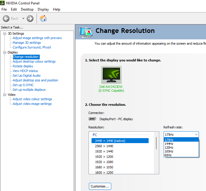

Via DP the monitor doesn’t provide any scaling capability for lower resolutions, so it stays at its native 3440 x 1440 with the same refresh rates as above listed whilst the GPU or system handles any scaling. Via HDMI the monitor provides scaling capability for resolutions including 2560 x 1440 (WQHD or 1440p) and 1920 x 1080 (Full HD or 1080p). The image below shows the refresh rates listed for the WQHD resolution via HDMI, categorised in the EDID and listed here as ‘PC’ resolutions. This includes 2560 x 1440 @120Hz which can be accessed by the Xbox Series X/S.

The image below shows the refresh rates supported for the Full HD resolution, combinations listed in the EDID of the monitor as ‘TV’ resolutions and listed here under ‘Ultra HD, HD, SD’. This includes 1920 x 1080 @120Hz which can be accessed by compatible games consoles such as the Xbox Series X/S. 100Hz is listed separately in the ‘PC’ resolutions list, though the monitor doesn’t provide any scaling there and the monitor stays at its native 3440 x 1440 resolution.

If you’re intending to use the monitor with the PS5 or Xbox Series X/S, be aware that a small settings tweak may be required to ensure 120Hz is selectable for supported resolutions. Details can be found in this article.
Image retention and burn-in

![]()

Calibration
Subpixel layout and screen surface
![]()


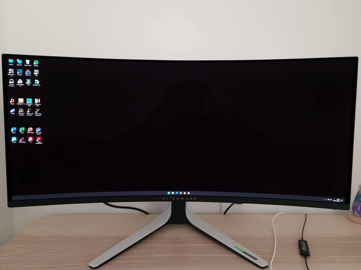


Testing the presets
Monitor Settings Gamma (central average) White point (kelvins) Notes Standard (Factory Defaults) 2.3 6778K A highly vibrant look to things with strong saturation. Gamma averages ‘2.3’ but swings significantly lower for dark shades, elevating detail levels there. Creator = sRGB (Gamma 1.8) 1.9 6812K An sRGB emulation setting which clamps the gamut close to sRGB, reducing oversaturation and vibrancy. Gamma is also very low due to ‘1.8’ setting being used, giving a clearly ‘flooded’ look overall. Creator = sRGB (Gamma 2.0) 2.0 6807K As above, a bit of extra depth. Creator = sRGB (Gamma 2.2, default) 2.3 6802K Similar gamma handling to factory defaults, sRGB clamp applied to limit saturation. Creator = sRGB (Gamma 2.4) 2.4 6820K Gamma raised to average ‘2.4’ (at brightness tested). Extra depth to medium shades, but for dark shades tracking is raised and more appropriate than with the ‘2.2’ setting. This gives a more blended appearance with appropriate masking of dark detail, without crushing shades together. Creator = sRGB (Gamma 2.6) 2.7 6814K As above, extra depth which gives quite a ‘punchy’ and cinematic look. Dark detail slightly crushed, but gamma there is just a bit higher than ‘2.2’ and nowhere near the ‘2.7’ average. Creator = DCI-P3 (Gamma 2.6, default) 2.7 6818K Very similar appearance to factory defaults, with gamma set to ‘2.6’ and brightness marginally lower at given setting. A highly vibrant look with strong (excessive in places) depth. This mode still uses the native gamut of the display, which extends a bit beyond DCI-P3. Creator = DCI-P3 (Gamma 2.2) 2.3 6817K As above with reduced gamma. Same points apply with gamma tracking, with significant dip at low end which raises dark detail excessively. Warm 2.3 5792K White point reduced significantly. Gamma somewhat raised at low end compared to defaults, keeping dark detail more blended. This is a fairly effective LBL (Low Blue Light) setting, particularly when coupled with reduced brightness. Test Settings (see below) 2.4 6812K A highly vibrant look with strong depth and saturation overall, with a suitably blended appearance to dark detail.
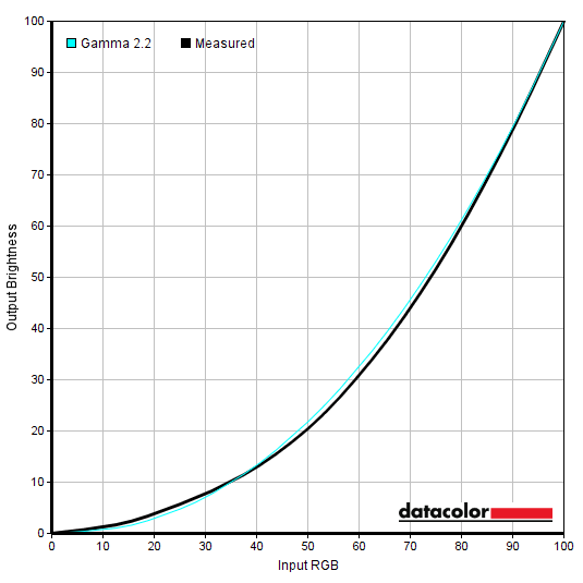
Gamma (factory defaults)

Gamma 'Test Settings'
Test Settings
Contrast and brightness
Contrast ratios
Monitor Settings White luminance (cd/m²) Black luminance (cd/m²) Contrast ratio (x:1) 100% brightness 232 - 265 0.00 ∞:1 80% brightness 182 - 208 0.00 ∞:1 60% brightness 140 - 158 0.00 ∞:1 40% brightness 101 - 115 0.00 ∞:1 20% brightness 61 - 72 0.00 ∞:1 0% brightness 22 - 26 0.00 ∞:1 75% brightness (Factory Defaults) 172 - 193 0.00 ∞:1 HDR 400 True Black / HDR Peak 1000 (1% white, peak)* 458 / 1059 0.00 ∞:1 HDR 400 True Black / HDR Peak 1000 (4% white, peak)* 455 / 940 0.00 ∞:1 HDR 400 True Black / HDR Peak 1000 (9% white, peak)* 455 / 586 0.00 ∞:1 HDR 400 True Black / HDR Peak 1000 (25% white, peak)* 390 / 391 0.00 ∞:1 HDR 400 True Black / HDR Peak 1000 (49% white, peak)* 332 / 331 0.00 ∞:1 HDR 400 True Black / HDR Peak 1000 (100% white, sustained)** 264 / 257 N/A N/A Creator = sRGB (Gamma 1.8) 151 – 166 0.00 ∞:1 Creator = sRGB (Gamma 2.0) 151 – 166 0.00 ∞:1 Creator = sRGB (Gamma 2.2, default) 150 - 165 0.00 ∞:1 Creator = sRGB (Gamma 2.4) 150 - 165 0.00 ∞:1 Creator = sRGB (Gamma 2.6) 150 - 165 0.00 ∞:1 Creator = DCI-P3 (Gamma 2.6, default) 150 - 165 0.00 ∞:1 Creator = DCI-P3 (Gamma 2.2) 150 - 165 0.00 ∞:1 Warm 158 - 174 0.00 ∞:1 Test Settings 148 - 166 0.00 ∞:1
*These HDR measurements were made using this YouTube HDR brightness test video, running full screen at ‘1440p HDR’ on Google Chrome. A browser extension discussed in our 3440 x 1440 article was used to scale the patches to the 21:9 aspect ratio. Though results without the extension active were quite similar overall. The maximum reading using the patch size (measurement area) specified in the table was used. The black luminance was taken at the same point of the video with the colorimeter offset to the side of the white test patch, equidistant between the test patch and edge of the monitor bezel.

PWM (Pulse Width Modulation)
Luminance uniformity

The SpyderX Elite was used to assess the uniformity of lighter shades, represented by 9 equally spaced white quadrants running from the top left to bottom right of the screen. The table below shows the luminance recorded at each quadrant as well as the percentage deviation between each quadrant and the brightest recorded point.
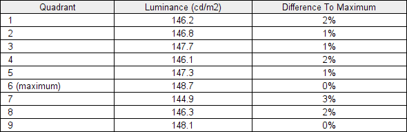
Luminance uniformity table
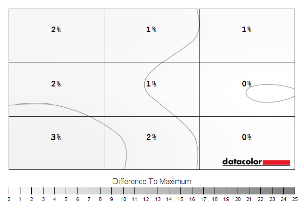
Luminance uniformity map
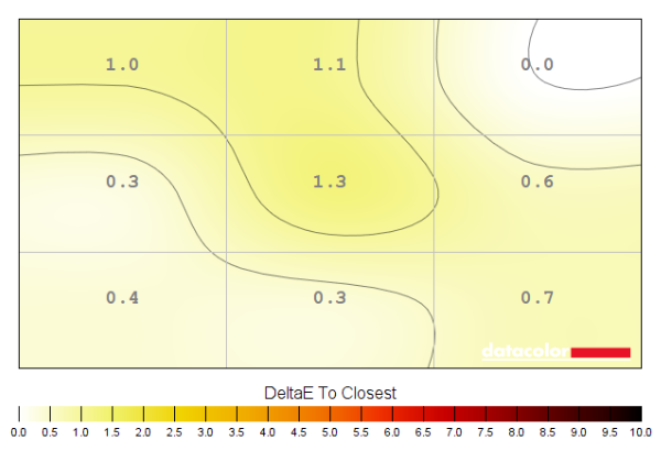
Colour temperature uniformity map
Contrast in games and movies
Lagom contrast tests
Colour reproduction
Colour gamut

Colour gamut 'Test Settings'
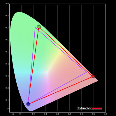
Colour gamut 'Test Settings' vs. Adobe RGB
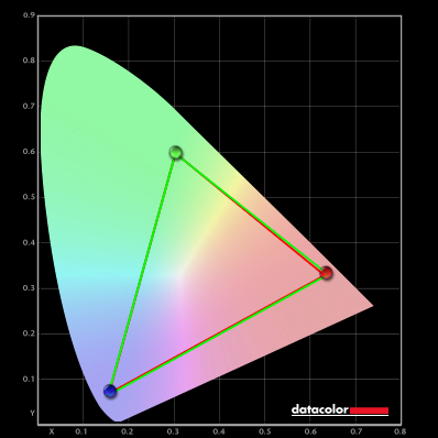
Colour gamut 'sRGB'
If you wish to make colour channel adjustments on the monitor and don’t mind using the default gamma setting, you can use GPU-level sRGB emulation in conjunction with ‘Custom Color’ or a numbered ‘Game’ preset instead. AMD users can activate a flexible sRGB emulation setting via the graphics driver. This is done by opening ‘AMD Software’, clicking ‘Settings’ (cog icon towards top right) and clicking on ‘Display’. You should then ensure that the ‘Custom Color’ slider to the right is set to ‘Enabled’ and ‘Color Temperature Control’ set to ‘Disabled’. It may appear to be set this way by default, but the native rather than restricted gamut is likely in play. If that’s the case, simply switch the ‘Color Temperature Control’ slider to ‘Enabled’ then back to ‘Disabled’ to leverage the sRGB emulation behaviour. This setting is shown in the image below.

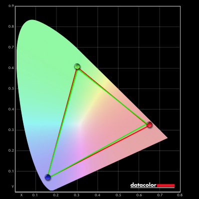
Colour gamut AMD 'CTC disabled' setting
Colour in games and movies
Shade representation using SpyderCHECKR 24

The monitor outputs shades in a vibrant way, with quite a bit of extra saturation due primarily to the colour gamut. You can see a particularly ‘punchy’ and oversaturated look to some of the shades containing red – such as medium orange (3), Persian pink (6), tango pink (11) and candy apple red (14). Peach pink (20) and light chocolate brown (24) show extra richness with a red push as well, whilst gamboge (23) appears with too much of a saffron tint. The fairly generous extension beyond sRGB in the green region invites some extra saturation elsewhere as well, with dark lime green (18) and yellow green (19) appearing a bit livelier than intended. Though not as ‘neon’ as on models with even more generous coverage in that region of the gamut. Colour consistency is very strong, without the clear shifts observed on VA or TN LCDs. The strong viewing angle performance and pleasing uniformity of our sample aided this. We often experience slight glare patches due to the low brightness of the screen combined with the lighting required to illuminate the printed sheet sufficiently, but that wasn’t an issue with this glossy screen and its effective anti-reflective coating. The images below shows how things appeared with using the ‘Creator’ preset set to ‘sRGB’, with the top image showing the ‘2.2’ and the bottom image the ‘2.4’ gamma setting.


The saturation is curtailed significantly now due to clamping of the gamut close to sRGB. Using the ‘2.2’ gamma setting provides a somewhat undersaturated appearance in places, with shades such as medium orange (3), aquamarine (4) and gamboge (23) looking quite a bit less rich than intended. As we explored earlier, gamma changes with brightness on this model – and gamma is actually far too low overall using the ‘2.2’ setting at the low brightness levels required for this assessment. The ‘2.4’ setting adds some extra depth, richness and saturation and provides a rather faithful representation of these shades overall. A touch of extra richness in places, such as for peach pink (20) and light chocolate brown (24), but a much closer match than using the native gamut. And no real undersaturation of note, just a touch for a few shades such as aquamarine (4) which verges slightly too much on aqua and gamboge (23) which verges a bit too much towards a yellower than intended version of the shade. As usual, we’d recommend profiling the monitor with your own calibration device using the native gamut if you require the highest level of colour accuracy. In this case the lack of ability to control the colour channels through the OSD with the ‘Creator’ setting and quirky gamma behaviour which also changes with brightness would certainly make this beneficial. You’d also gain full sRGB coverage if calibrating with the native gamut vs. a little under-coverage using the ‘sRGB’ setting.
Viewing angles

The video below shows the Lagom text test, a mixed desktop background, game scene and dark desktop background from various viewing angles. The shifts in the image including contrast, colour and the representation of black are extremely minor. Performance here is much stronger than on any LCD we’ve observed. The camera introduces slight shifts in places which weren’t observed by eye, from particularly sharp angles. Partly as it struggles to focus on the entire screen. By eye it appeared extremely consistent even from sharp angles, almost like you’re viewing a picture rather than a screen in that respect.
Interlace pattern artifacts
Responsiveness
Input lag
Perceived blur (pursuit photography)


Responsiveness in games and movies
VRR (Variable Refresh Rate) technology
G-SYNC – the technology and activating it
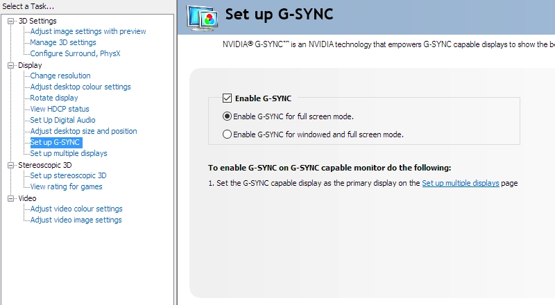
Enable G-SYNC
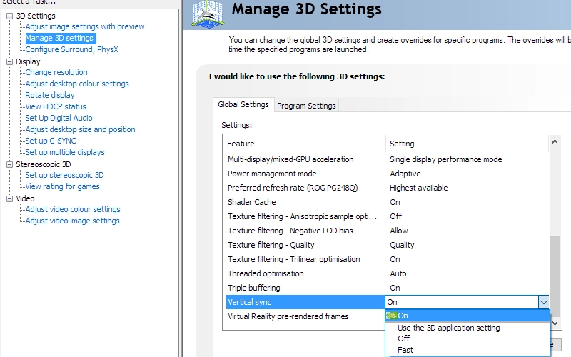
Set VSync according to preferences
G-SYNC – the experience
FreeSync


The experience was very much the same as it was with G-SYNC. The key features of the G-SYNC module are accessible, with Adaptive-Sync simply being an alternative way to access the module for compatible AMD hardware. This included seamless operation throughout the very generous VRR range. Our suggestions regarding use of VSync also apply, but you’re using AMD Software rather than Nvidia Control Panel to control this. Open up AMD Software and click ‘Settings’ (cog icon towards top right), then ‘Graphics’. The setting is listed as ‘Wait for Vertical Refresh’. This configures it globally, but if you wish to configure it for individual games click ‘Game Graphics’ towards the top right. Above this dropdown list there’s a toggle for ‘Radeon Enhanced Sync’ which is AMD’s version of Nvidia’s ‘Fast Sync’.

The ‘Frame Rate’ feature found under ‘Game’ – ‘Game Enhance Mode’ in the OSD will again reflect the frame rate of the content within the VRR window, with Adaptive-Sync active. HDR can be used at the same time as Adaptive-Sync, too.
HDR (High Dynamic Range)
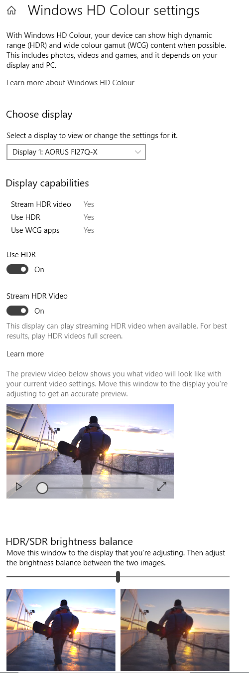
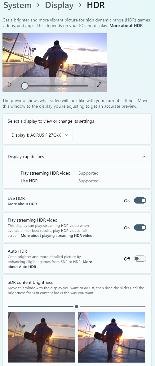
Colour gamut 'Test Settings'
The 99% DCI-P3 coverage recorded (with some extension beyond) plus the very strong colour consistency and contrast performance of the panel helped provide a good deal of vibrancy where developers wanted it. There was a beautiful and ‘pure’ look to golds, some really solid and eye-catching red flowers and painted pottery and striking blues as well. Bright golden highlights were particularly impressive for an OLED screen as they require strong colour volume to be delivered – or an appropriate level of both saturation and brightness. Screens based on LG Display’s WRGB OLED rely on a white subpixel to deliver strong luminance, diluting saturation in a way that doesn’t occur on QD-OLED or LCD technology. Because the developers target wider colour spaces than sRGB, the oversaturation observed under SDR wasn’t present. Skin tones and earthy browns were appropriately muted (or rich, where appropriate) and vegetation appeared lush and varied without overdone yellowish greens or a somewhat neon appearance. There was certainly plenty of vibrancy as well as exceptional variety here. We feel some of the LCD models we’ve tested under HDR with QD LED backlights (e.g. XB323U GP and PG32UQX) provided even stronger saturation to some shades, such as some very deeply saturated greens and bright blues and cyans. This could well be because their gamuts are even more generous for the green to blue edge, with excellent encroachment on Rec. 2020 there. For reference, this model provides ~80% Rec. 2020 coverage so certainly doesn’t fully cover that very wide colour space. But very few do – and we still felt the overall saturation levels and general representation of shades were pleasing in terms of vibrancy.

The 34” 3440 x 1440 curved ultrawide experience

We also found the screen created a little extra immersion when gaming, nicely complementing the significant width of the screen. Even for games where our eyes scanned from centre to edge, we didn’t find the curve particularly noticeable as we might with a steeper curve. The 21:9 aspect ratio also provided a significant Field of View (FOV) advantage for most game titles and allowed an entirely undistorted screen-filling experience for appropriate video content. Our article on the resolution explores this experience for both games and movies in more detail. As covered, most games use ‘HOR+’ scaling – so you gain horizontal FOV (can see more of the game at once) compared to a 16:9 model whilst the vertical FOV remains the same. We felt this added to immersion and in some cases could be considered a competitive advantage.


Interpolation and upscaling

As usual for a model with G-SYNC module, the monitor doesn’t give you any say in how the scaling is handled. It will automatically use ‘aspect’ scaling, which will use as many pixels of the screen as possible without distorting the image geometrically. 2560 x 1440 (WQHD) is displayed perfectly whether the monitor or GPU is handling the scaling. With this ‘aspect’ scaling (or anything aside from ‘Full-screen’ selected in the GPU driver for GPU scaling), it simply appears with black bars at the sides to ‘cover up’ the remaining pixels. With the image appearing as it would on a 27” WQHD (16:9) model.
Video review
Timestamps:
Features & Aesthetics
Image Retention
Contrast
Colour reproduction
HDR (High Dynamic Range)
Responsiveness (General)
Responsiveness (VRR)
Conclusion
![]()
Positives Negatives Strong vibrancy, exceptional colour consistency and viewing angle performance from the QD-OLED panel with generous DCI-P3 coverage and a bit of extension beyond
Unusual gamma handling, lack of colour channel adjustment in the ‘Creator’ preset and incomplete Adobe RGB coverage will limit its appeal for some creative workflows Exceptional static contrast and glossy screen surface with strong anti-reflective properties, compelling and highly dynamic HDR experience with good ‘pop’ and vibrancy Clear edge in contrast compared to LCDs eaten away in brighter lighting, limited maximum brightness under SDR plus ABL limits ‘pop’ to large areas of bright shades under HDR Exceptional pixel responsiveness provides a very strong 175Hz performance, fairly low input lag and strong VRR performance across the range Input lag a touch higher than some models, no ULMB or similar setting and some flickering under VRR for dark to medium-dark shades during heavy frame rate fluctuation Solidly built, good horizontal ‘desktop real-estate’ and 21:9 FOV for certain video content and games, good ergonomics Limited availability, active cooling and fringing will be issues for some users, image retention a potential issue with integrated measures to combat it ‘part of the experience’

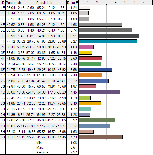
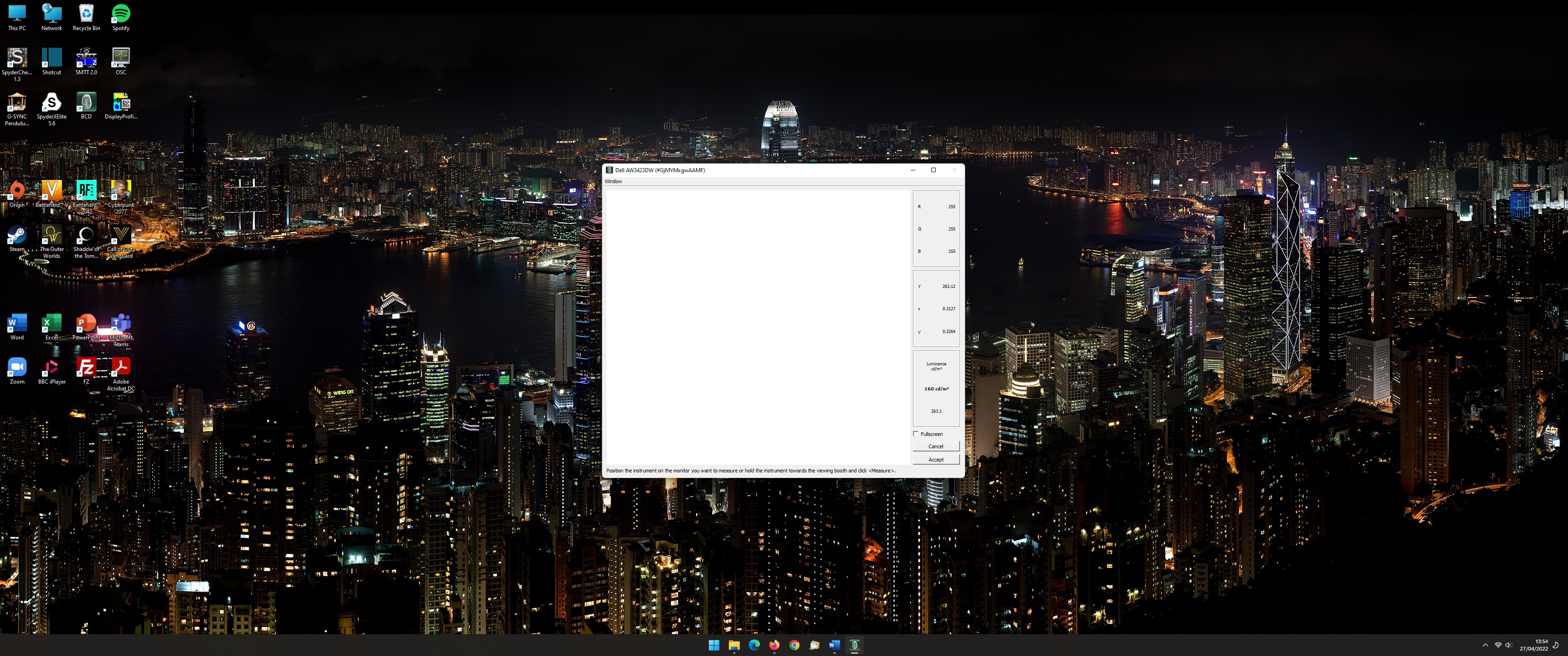
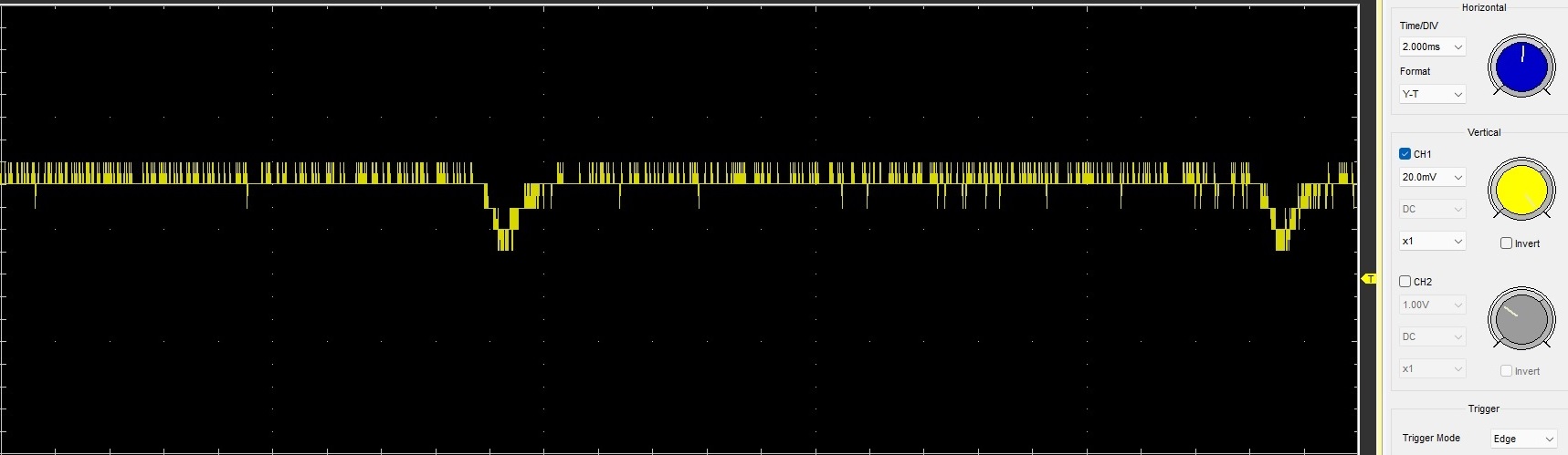