Author: Adam Simmons
Date published: November 10th 2018
Table of Contents
Introduction
HDR (High Dynamic Range) is something heavily marketed in TVs and monitors today. In many cases it is a buzzword thrown around loosely for monitors, even if it is only very loosely supported. To try to add a bit of clarity, VESA created a certification process to broadly classifies screens based on their capabilities. The Philips 328P6VUBREB features a large VA screen with a ‘4K’ UHD resolution and support for VESA DisplayHDR 600. This is the ‘medium’ level of HDR that VESA certifies for, which at least on papers means a monitor has the capability to deliver a convincing HDR experience. We put this monitor through its paces in our usual suite of tests, focusing on its general performance and HDR capabilities in detail.
Specifications
This monitor uses a 60Hz VA (Vertical Alignment) panel, or more specifically a TPV CELL (panel without backlight) based on an Innolux AAS (Azimuthal Anchoring Switch) panel – essentially a variant of VA. This has a resolution of 3840 x 2160 (‘4K’ UHD). 10-bit colour is supported, with 12-bit internal processing supported for extra mapping precision. A 4ms grey to grey response time is specified, which as usual must be taken with a good pinch of salt. Some of the key ‘talking points’ of the specification have been highlighted in blue below, for your reading convenience.
41W typical
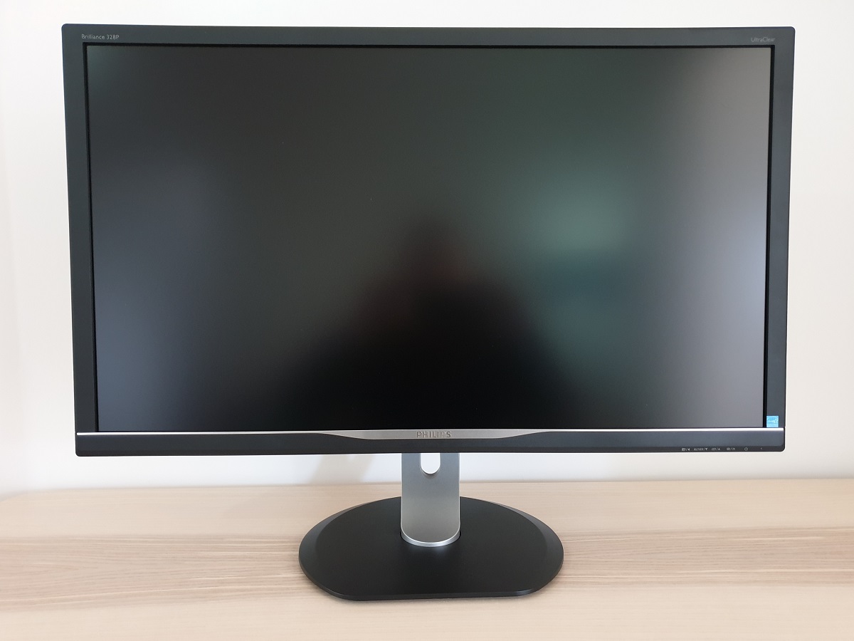
The monitor shares a home-office look that has been used on some Philips models for a while now. It’s a fairly low-key look and wouldn’t generally be referred to as sleek, stylish or head-turningly beautiful. Function over form, you might say. Textured matte black plastics and silver matte plastic are used in combination for a bit of visual interest. The bezels are matte black plastic and moderately thick by modern standards – ~20mm (0.79 inches) at the top and sides and ~26mm (1.02 inches) at the bottom. Most noticeable from the front when actually using the monitor, though, is the large medium (‘relatively light’) matte anti-glare screen. And indeed, the size of this is something that the images in this review don’t really convey. We explore this and the screen surface in more detail later. The image below is a macro photograph taken on Notepad with ClearType disabled. The letters ‘PCM’ are typed out to help highlight any potential text rendering issues related to unusual subpixel structure, whilst the white space more clearly shows the actual subpixel layout alongside a rough indication of screen surface. A medium (or ‘relatively light’, depending on how you choose to classify it) screen surface is used. The screen surface offers more direct emission of light than ‘stronger’ matte screen surfaces, but less so than lighter matte or glossy screen surfaces. It also diffuses light emitted from the monitor by a fair degree, whilst the surface texture itself isn’t particularly smooth. The image therefore has a bit of a grainy look to it. A fine but to us noticeable graininess rather than a smeary or heavy graininess – not everyone would be bothered by this, but it is something we noticed pretty much immediately after first turning the monitor on. The Philips 328P6VUBREB includes various ‘SmartImage’ presets; ‘EasyRead’, ‘Office’, ‘Photo’, ‘Movie’, ‘Game’, ‘Economy’, ‘LowBlueMode’, ‘SmartUniformity’ and ‘Off’. Most of these offer very little practical purpose and simply upset image balance, in some cases lock off settings and in others simply set them inappropriately. We’ll be quite selective in which of these we choose to look at more closely, although they are all demonstrated at least briefly in the OSD video featured earlier. The table below provides key readings (gamma and white point) taken using a Datacolor Spyder5ELITE colorimeter, alongside general observations. The monitor was left in its ‘Plug and Play’ state without additional drivers or ICC profiles specifically loaded. It was connected to a Windows 10 PC with an Nvidia GTX 1080 Ti, via DisplayPort. The screen was left running for over 2 hours before readings were taken or observations made. Unless stated otherwise, assume default settings were used, including for ‘Contrast’. When viewing the figures in this table, note that for most PC users ‘6500K’ for white point and ‘2.2’ for gamma are good targets to aim for.
As an Amazon Associate I earn from qualifying purchases made using the below link. Where possible, you’ll be redirected to your nearest store. Further information on supporting our work.

Features and aesthetics
The OSD (On Screen Display) is controlled by touch-sensitive areas on the bottom bezel, towards the right. We found this control system a bit fiddly and difficult to make fine adjustments with, although the sensitivity of the touch-sensitive areas was good and you could activate them either from the front or bottom. The system seemed to have a mind of its own sometimes, we certainly prefer physical buttons or a joystick to this system. There is also a small circular white power LED that faces forwards towards the right side. This glows white when the monitor is on and flashes white when it enters a low power state (signal to the system is lost). The video below runs through the OSD menu system.
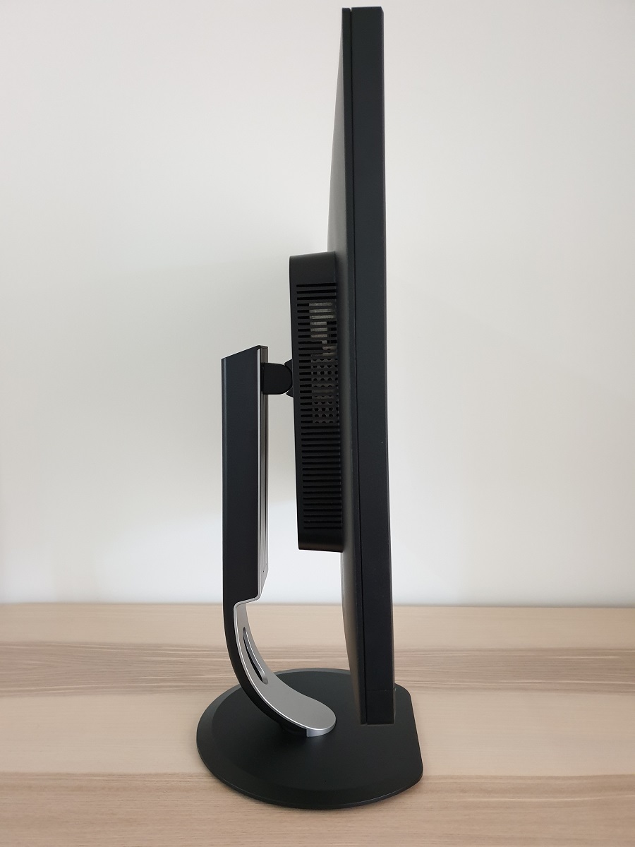
From the side the monitor is fairly slender, ~22mm (0.87 inches) at thinnest point but thicker towards the stand attachment point. The included stand offers good ergonomic flexibility; tilt (5° forwards, 20° backwards), height adjustment (180mm or ~7 inches), swivel (170° left, 170° right) and pivot (90° clockwise rotation into portrait). At lowest height the bottom of the screen clears the desk by ~45mm (1.77 inches) with the top of the screen ~483mm (19.02 inches) above the desk surface. The total depth of the monitor including stand is ~270mm (10.63 inches), so not the sleekest of stand designs thanks to the fairly deep base.
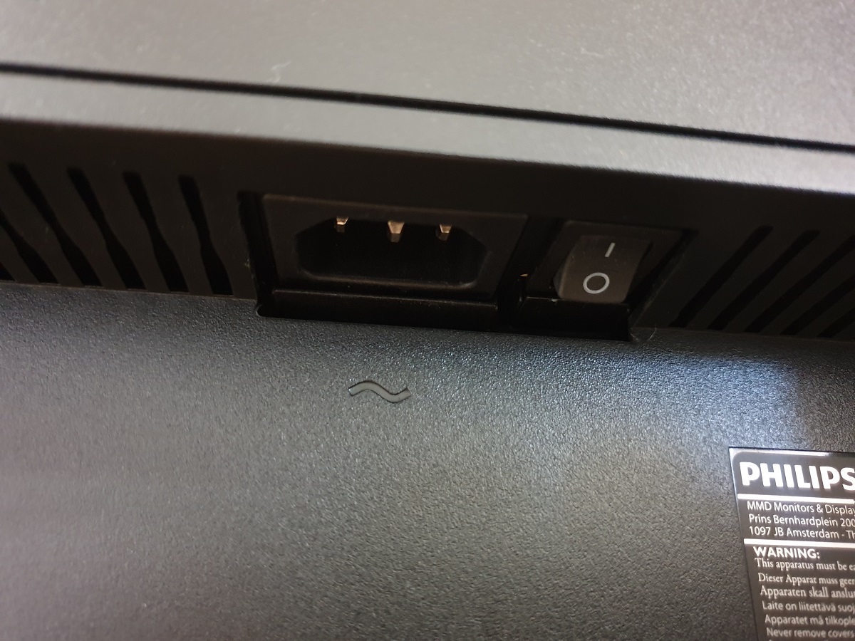
The rear of the monitor is dominated by matte black plastic. The stand attaches using a 100 x 100mm VESA mounting mechanism and can be replaced by an alternative if desired. There is a K-slot towards the bottom right. The ports are down-firing and include; AC power input with zero-watt power switch (internal power converter), 2 HDMI 2.0 ports, DP 1.4, USB-C 3.1 (with DP alt mode and PD 2.0), RJ-45 ethernet power, 4 USB 3.0 ports (2 ports to the right with fast-charging) and a 3.5mm headphone jack. 2 x 3W speakers are also included. These offer reasonable sound output, with decent volume and clarity. Not the clearest sound output we’ve heard from integrated speakers nor the most bass-rich, but not unbearably tinny or hollow-sounding either.
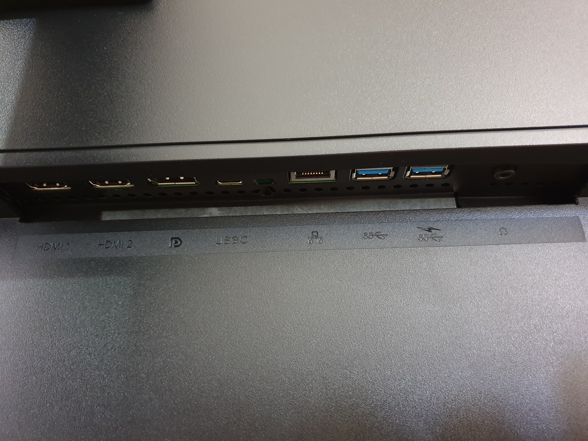
The full resolution and HDR capability is supported via both DP 1.4 and HDMI 2.0 on compatible systems. A DP cable, HDMI cable, USB-C cable, USB-C to USB-A cable and power cable is included as standard.
Calibration
Subpixel layout and screen surface
![]()
As shown above, the monitor uses the standard RGB (Red, Green and Blue) stripe subpixel layout. This is the default expected by modern operating systems such as Microsoft Windows and Apple’s MacOS. Mac users needn’t worry about text fringing from less usual subpixel layouts, whilst Windows users don’t necessarily need to run through the ClearType wizard. They may still wish to adjust this according to preferences, however. The subpixel layout and arrangement is quite normal and we had no subpixel-related concerns related to sharpness or text clarity on this model.
Testing the presets
Monitor Settings Gamma (central average) White point (kelvins) Notes Gamma = 1.8 1.4 7082K Very bright with an obvious flooded look overall. A clear lack of depth and a cool tint to the image when compared to the 6500K reference white point. Gamma = 2.0 1.6 7079K As above but marginally more depth. Gamma = 2.2 (Factory Default) 1.8 7079K As above, more depth and saturation. Some vibrant-looking shades but still an overall lack of depth. Although not specific to these settings and more a general observation, saturation was stronger in the central region and weakened significantly towards the peripheral regions of the screen. This is typical perceived gamma and saturation change related to viewing angle weaknesses on VA panels, but the shifts here are quite noticeable compared to some VA models we’ve tested recently. Gamma = 2.4 1.9 7078K As above, more depth and saturation. Gamma = 2.6 2.0 7081K As above with a touch more depth. Some quite vibrant elements coming through, although still some depth and saturation lacking in places. Low Blue Mode = 1 2.3 5983K A weak Low Blue Light (LBL) setting, making the image appear somewhat warmer and decreasing blue light output. The green channel is quite strong, giving a somewhat yellow tint to the image. Low Blue Mode = 2 2.3 5223K As above, a further decrease in blue light output and a warmer appearance to the image. Low Blue Mode = 3 2.3 5147K As above with increased sharpness by default. This can be manually adjusted and then the setting preference is remembered for next time. Low Blue Mode = 4 2.3 4941K The strongest LBL setting on the monitor. Default sharpness again increased. This is an effective LBL setting, significantly reducing blue light output from the screen. Color Temperature = 5000K 2.0 5237K An alternative LBL setting. Although not quite as warm as the 2 strongest ‘Low Blue Mode’ settings, it’s still very effective and has a more balanced look to the image as the green channel is weakened appropriately. Your eyes adjust to the warmer temperature fairly readily and the image appears quite neutral after a while. Color = sRGB 2.2 7073K An sRGB emulation setting. Colour gamut restricted, reducing saturation significantly. The image is too cool for our preferences and lighting, but this setting could be considered for use as a base for calibration using a colorimeter. Color = User Define 2.3 7039K The gamma is boosted significantly compared to the factory defaults and the green channel is a bit stronger, but otherwise things are quite similar. The image appears very bright and quite vibrant overall. SmartImage = SmartUniformity 1.7 7009K Significantly dimmer than factory defaults. A UC (Uniformity Compensation) setting designed to even out luminance across the screen, as we explore later. Test Settings (see below) 2.1 6546K Brightness is reduced to more comfortable levels. The gamma is quite close to the desired ‘2.2’ curve (it is rounded down to ‘2.1’ but doesn’t deviate too much overall). The image appears quite vibrant and saturated, with weaker depth and saturation peripherally.
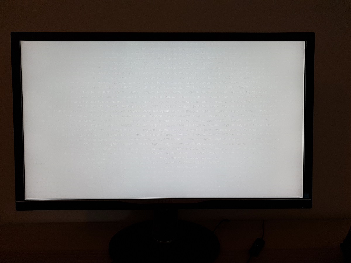
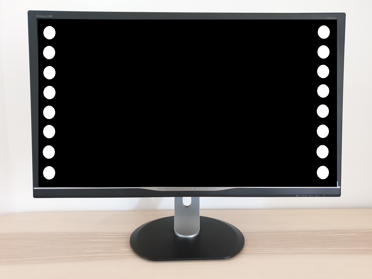
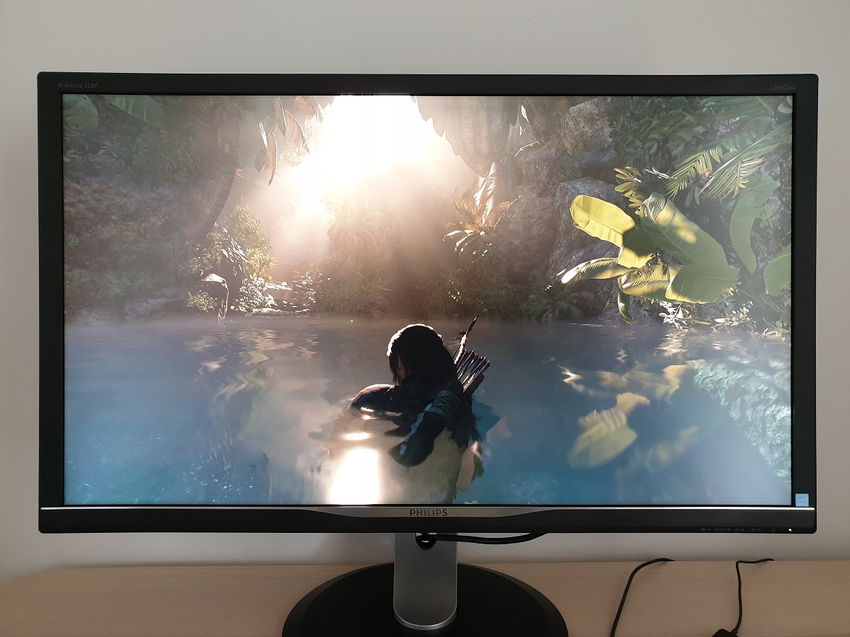
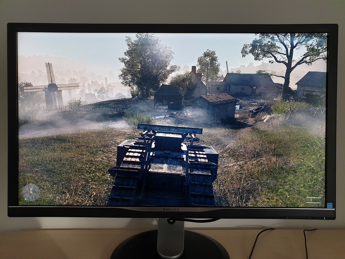
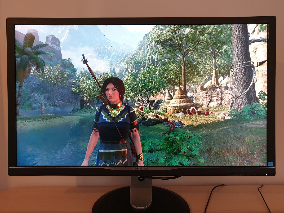
The monitor provided a very bright image out of the box, with some vibrant elements but a lack of depth overall. The monitor provided good flexibility to adjust gamma (various ‘Gamma’ settings), although the gamma curve was rather sensitive to adjustments to colour channels. Perceived gamma shifts were also significant, more so than some VA models we’ve tested recently. With this all said, for our ‘Test Settings’ we were able to achieve decent central gamma tracking that was quite close to the desired ‘2.2’ curve. There was a little drop off in places and the colorimeter rounded the final reading down to ‘2.1’, although all things considered this made little difference in practice. The generous colour gamut and perceived shifts mentioned above more than counteracted these slight deviations. The gamma curve under our ‘Test Settings’ is shown below. The monitor also included a range of Low Blue Light (LBL) settings. Cutting out stimulating blue light is important in the hours leading up to bed as it affects sleep hormones and keeps the body ‘alert’ even if it should be winding down. The main settings are referred to as ‘Low Blue Mode’ settings, with 4 levels of ever-increasing strength and effectiveness. These certainly worked as intended, although as is quite common they leave the green channel somewhat too strong. This is good for helping preserve static contrast, but you end up with a green or yellow cast to the image which it’s difficult for your eyes to fully adjust to. An alternative and still highly effective LBL setting is available in the form of ‘Color Temperature = 5000K’ setting. We preferred the more neutral look to this, with appropriate green channel reduction as well as significant blue channel reduction. We used this for our own viewing comfort in the evening but not for any specific testing beyond that involving this particular setting. Our ‘Test Settings’ involved a significant reduction in brightness and some changes to colour channels. If using HDMI as an Nvidia user, you’ll also need to correct the colour signal from the default ‘Limited Range’ to ‘Full Range’ RGB as explored in this article. Assume that any setting not mentioned here was left at default in the OSD, including ‘Contrast’. We’ve also included the ‘SmartResponse’ setting used, for reference. Note that these settings only apply to SDR testing, which is the bulk of our review. HDR has separate settings associated with it – we explore HDR separately in the designated section. The ‘HDR’ setting in the ‘Picture’ settings of the OSD had no effect on SDR content so we simply left this at the default value (‘VESA HDR 600’). Note that these settings only apply to SDR testing, which is the bulk of our review. HDR has separate settings associated with it – we explore HDR separately in the designated section. The ‘HDR’ setting in the ‘Picture’ settings of the OSD had no effect on SDR content so we simply left this at the default value (‘VESA HDR 600’). Brightness= 25 (according to preferences and lighting) SmartResponse= Fast Color Temp. = User Define Red= 100 Green= 99 Blue= 98 We used a BasICColor SQUID 3 (X-Rite i1Display Pro) to measure white and black luminance levels, from which static contrast ratios could be calculated. The table below shows this data with a range of settings used, including those covered in the calibration section and a few extras. Assume any setting not mentioned was left at default, except for the changes already mentioned in the calibration section. Black highlights indicate the highest white luminance, lowest black luminance and maximum contrast ratio recorded. Blue highlights show the results with HDR active and also under our ‘Test Settings’. The average contrast ratio with only brightness adjusted was 3246:1, which is good. This provided superior depth to dark text and deep shades to that provided by non-VA LCDs (and some weaker VA LCDs). The maximum contrast ratio recorded under SDR (Standard Dynamic Range) was 3464:1, with all colour channels in their neutral position (‘Color = User Define’). Contrast was almost as strong under our ‘Test Settings’, with the adjustments made having minimal impact in that respect, at 3460:1. Strong contrast was maintained with ‘Low Blue Mode’ settings employed, dropping slightly to a still relatively strong 2960:1 using the ‘5000K’ alternative. The ‘sRGB’ emulation mode also yielded relatively strong contrast, with the biggest drop being observed using the ‘SmartUniformity’ setting – to 2200:1. Unfortunately brightness is very high using this setting and can’t be adjusted. The highest white luminance recorded under SDR was 485 cd/m², whilst the minimum was 67 cd/m². This gave a pleasing luminance uniformity range of 418 cd/m² with a moderately dim minimum and bright maximum. The monitor also has a ‘SmartContrast’ Dynamic Contrast setting, which allows the backlight brightness to adjust (as a single unit) according to the levels of light and dark on the screen. The monitor remained (often uncomfortably) bright even with a lot of dark content displayed. We don’t ever find Dynamic Contrast settings attractive and this one certainly didn’t sway our opinion. The monitor’s backlight is split into dimming zones, although the exact number isn’t something Philips specifies publicly. Our testing revealed that 16 dimming zones are used in an edge-light array, with 8 at each side of the screen. These dimming zones are activated for HDR content, whereas for SDR content the backlight always dims as one unit. In other words, no SDR local dimming support is offered. The monitor has 2 HDR settings; ‘Normal’ and ‘VESA HDR 600’. The former is less bright and offers superior black depth, whereas the latter has a higher peak luminance and higher black depth. Both HDR settings yielded an improvement in contrast ratio, although at roughly 4000:1 for both settings this was hardly an astronomical change. Because the native contrast of the panel is good, the black depth was never atrocious even for the brighter ‘VESA HDR 600’ setting. So that compares favourably to non-VA models with less capable HDR settings (no local dimming support). But the black point certainly could have been better – it was similar to having the monitor running under SDR at full brightness. We suspect this is due to a relatively limited number of dimming zones used by the backlight. If you look at the official VESA DisplayHDR 600 criteria you might expect a black point of 0.10 cd/m² or under using the ‘VESA HDR 600’, significantly lower than the 0.16 cd/m² we measured. The measurement patch size and position we used is different, so this can contribute to the difference. Although we did try various different patch sizes and black measurement sites and could not get the black point as low as 0.10. The 328P6VUBREB does not use PWM (Pulse Width Modulation) to regulate backlight brightness at any level and instead uses DC (Direct Current). The monitor is therefore considered ‘flicker-free’, which will come as welcome news to those sensitive to flickering or worried about side-effects from PWM usage. Whilst observing a black screen in a dark room, using our ‘Test Settings’, we observed some backlight bleed and clouding towards the corners of the screen. Note that individual units vary when it comes to all aspects of uniformity, including when observing dark content like this. The below image was taken a few metres back to eliminate so-called ‘VA glow’. This is a silverish-purple glow that appears towards the edges of the screen and in particular the bottom corners, from a normal viewing position. It blooms out more noticeable ‘off-angle’ as demonstrated in the viewing angles video later on. As explored, it’s not a major issue on this model and is less obtrusive than on some VA models we’ve used. Under our ‘Test Settings’, the luminance uniformity was quite poor overall. The brightest point recorded was ‘quadrant 5’ in the centre of the screen (159.2 cd/m²). The maximum deviation from this occurred at ‘quadrant 7’, towards the bottom left (117.8.0 cd/m², which is 26% dimmer). The average uniformity deviation between each quadrant and the brightest point was 18.25%. Using the ‘SmartUniformity’ significantly improved luminance uniformity, at significant contrast expense as explored earlier. The brightest point recorded was ‘quadrant 8’ below the centre of the screen (283.8.1 cd/m²). The maximum deviation from this occurred at ‘quadrant 4’ to the left of centre (274.9 cd/m², which is 3% dimmer). The average uniformity deviation between the quadrants was an exceptional 1.5%. Note that uniformity varies between individual units and you can also expect variation beyond the points measured. Note that, although not documented here, we also tested the SU setting at reduced brightness and found the setting effective. The contour maps below show these deviations graphically, with darker greys representing lower luminance and hence greater deviation from the brightest recorded point than lighter greys. Percentage deviations between each quadrant and the brightest point are also given. The top map shows results under our ‘Test Settings’ whilst the bottom shows results with ‘SmartUniformity’ enabled. The Spyder5ELITE was also used to analyse variation in the colour temperature (white point) for the same 9 quadrants. The deviation between each quadrant and the 6500K (D65) daylight white point target was analysed and a DeltaE value assigned. A DeltaE >3 represents significant deviation that most users would readily notice by eye. The top map shows the results using our ‘Test Settings’ and the bottom map with ‘SmartUniformity’ enabled. Using our ‘Test Settings’ the colour temperature uniformity was good, with no significant deviation recorded. With ‘SmartUniformity’ enabled, the colour temperature uniformity was somewhat worse. The top three quadrants went from having the highest but still non-significant deviations to having significant deviations. The values here aren’t extreme but still cross the DeltaE significant boundary at DeltaE 3.4-3.8. It’s worth again bearing in mind that individual units vary when it comes to uniformity and that deviation beyond measured points can be expected. Also note that there are some perceived deviations in both brightness and colour temperature that are typical on VA panels and aren’t accounted for in these readings. In addition to the quantitative testing above, we performed a subjective assessment of the uniformity of a variety of ‘medium’ shades, including 50% grey. Some monitors exhibit uniformity issues such as splotches or striations when viewing screen fills of such shades, giving an inconsistent appearance that some users refer to as ‘DSE’ (‘Dirty Screen Effect’). VA models are particularly prone to this and we did observe this to a degree on our 328P6VUBREB sample. There wasn’t the extreme variation, strong striations or blotchy appearance observed on some of the worst offenders. But there was some patchiness and minor striations for some shades. The photo below gives an example of this, although it is very difficult to accurately represent what the eye sees in a photo. The level of ‘DSE’ observed here should not be enough to bother most users, but some users are bothered by this sort of thing. On Battlefield 1 (BF1) the monitor put in a strong contrast performance overall. In dimly lit environments such as dark building interiors, the strong static contrast provided a good depth and atmosphere. Not the sort of inky depth that would give a lovely atmospheric look in a dark room (this is not an OLED screen), but certainly a more atmospheric look and superior depth to your typical non-VA LCD in most lighting conditions. The level of detail for these darker shades was eaten away somewhat by a moderate amount of ‘black crush’. This is a viewing angle related phenomenon whereby perceived gamma varies depending on which section of the screen you’re viewing (and indeed in relation to your viewing position relative to the screen). From a normal viewing position the perceived gamma is significantly increased for content in the centre of the screen, so dark shades essentially blend into one another too readily and a fair amount of detail is lost. The level of ‘black crush’ is somewhat higher than on some VA models of this sort of size we’ve reviewed recently, such as the LG 32GK850G and ASUS XG32VQ. There was no obvious ‘VA glow’ to speak of, though, so this decent atmospheric look to dark areas was maintained quite well throughout the screen without significant lightening peripherally. Just a touch towards the bottom corners of the screen in particular, but nothing too bothersome. Brighter shades contrasted well with their darker surroundings and stood out with reasonable ‘pop’. The screen surface imparted a bit of a grainy look to such elements, however. Shadow of the Tomb Raider provided a similar contrast experience. This is a title which demands a good contrast performance, with many dark caves, tombs and passageways that demand a deep and atmospheric look. The monitor delivered that to a good degree, under most lighting conditions (again – even VA models like this aren’t going to give you an awesome dark room experience). There was again moderate detail loss due to ‘black crush’, with details such as rock cracks and stonework appearing less distinct than it should. Brighter elements stood out well in dark surroundings, which worked nicely on this title where there are often isolated light sources such as flames and torches illuminating dark spaces. These lighter elements looked somewhat grainy due to the screen surface, although not in a heavily ‘smeared’ fashion as some stronger matte screen surfaces display. We also observed the film Star Wars: The Last Jedi. The strengths in static contrast (and fairly low levels of ‘VA glow’) again came through here, giving the title a good cinematic look. There are plenty of scenes where this strong contrast is advantageous, for example light saber battles and burning buildings at night where the dark shades had quite good depth and the bright shades stood out well. The weaknesses in terms of ‘black crush’ and somewhat grainy screen surface were also apparent; these issues aren’t magically solved by watching a movie rather than playing a game. Regardless of this, we found the monitor gave this title the sort of look it craved overall. The Lagom tests for contrast allow specific weaknesses in contrast performance to be identified. The following observations were made. The Philips 328P6VUBREB’s colour gamut (red triangle) was compared with the sRGB (green triangle) and Adobe RGB (purple triangle) reference spaces, as shown below. Our ‘Test Settings’ were used here, which make use of the full native gamut of the monitor. You can see that the colour gamut reaches far beyond the confines of the sRGB colour space (100% sRGB). It also extends far beyond Adobe RGB in some regions – note that sRGB and Adobe RGB overlap at the red and blue corners of this diagram. There is some under-coverage of Adobe RGB in the blue but moreover green region of the diagram as well (88% Adobe RGB). This model targets good DCI-P3 coverage instead, with Philips specifying 98% DCI-P3 coverage. The colorimeter software doesn’t offer a comparison with DCI-P3 so this isn’t included in the diagram, but their specified value looks roughly correct. Also note that the Spyder5 tends to under-report slightly in the blue corner of this diagram as well, for gamuts this wide. This generous DCI-P3 coverage is useful for HDR content (explored later) and allows the monitor to output all shades within the sRGB space with extra vibrancy and saturation. On Battlefield 1 (BF1) the monitor outputted colours in a vibrant way overall. Because this was due to the colour gamut being generous ‘at all corners’, this vibrancy was delivered in a more balanced way than on traditional wide gamut models (~Adobe RGB coverage). And unlike with digital saturation enhancement, which simply pushes shades closer to the edge of the gamut (without expanding the gamut itself), strong shade variety was maintained. The natural environments showcased a good range of vivid-looking deep greens, more muted shades and a good array of earthy browns. The reddish-brown hues showed quite a strong red push, with some areas of desert sand and certain tree trunks appearing less neutral (and redder) than they should. This was not extreme and is common on models with extended gamuts when viewing content like this developed with the sRGB colour space in mind. There was a moderate degree of saturation lost towards the edges of the screen, more so than we’ve seen on other VA models of this sort of size we’ve looked at recently. This made some shades look less lively and more faded towards the side edges and bottom of the screen, offsetting some of the extra saturation from the gamut. But because of the strong base of saturation these shades didn’t exactly appear ‘washed out’ even on regions of the screen where saturation was weakened. Shadow of the Tomb Raider highlighted similar colour performance characteristics. Things looked vibrant overall, with strong but not extreme or garish saturation. This gave the environments a rich look, with lots of deep and luscious greens as well as some more muted shades. Earthy browns also looked rich, if at times too red as observed on BF1. Lara’s skin appeared a bit more tanned than intended, but the monitor avoided giving her a sunburnt or lobster-like look (some traditional wide gamut displays might do this). There were some good vibrant blues, reds and purples displayed for elements such as fruit and flowers as well. There was moderate loss of saturation towards the edge of the screen and some of these shades become noticeable more muted at the extreme side edges in particular. This was relative to their saturated central appearance, they didn’t look ‘washed out’ in our view. We also tested the Blu-ray of Futurama: Into the Wild Green Yonder. With large areas of individual shade, this film is a good test for colour reduction and in particular colour consistency. The film was shown in quite a vibrant way overall, with some good deep shades and impressive neon shades. These stood out particularly nicely where they were set against a darker background (cosmic purple and green energy in space, that sort of thing). The contrast and generous colour gamut combined to give these elements a nice ‘pop’. The monitor also provided a good palette of more muted shades, sometimes appearing somewhat more saturation than intended but still looking pastel and relatively muted compared to the shades intended to be highly saturated. The viewing angle related weaknesses in colour consistency were such that large areas of individual shade did show moderate saturation changes across the screen. The red of Dr Zoidberg, for example, looked quite vibrant (somewhat too saturated) centrally, transitioning to more of a burnt red further out and quite a faded-looking pinkish red at the extreme edges. These saturation changes also reduced the apparent shade variety, with closely matching pastel shades in particular (character skin tones, for example) losing their unique identity in some cases. These colour shifts were more pronounced than on other VA models we’ve seen recently but not as pronounced as the vertical saturation shifts you’d see on TN models. Lagom’s tests for viewing angle tests help explore the idea of colour consistency and viewing angle performance. The following observations were made from a normal viewing position, eyes 70 – 80cm from the screen. Note that the shifts explored are more pronounced the closer to the screen you’re sitting. On some monitors, particularly but not exclusively those with high refresh rates, interlace patterns can be seen during certain transitions. We refer to these as ‘interlace pattern artifacts’ but some users refer to them as ‘inversion artifacts’ and others as ‘scan lines’. They may appear as an interference pattern or mesh or interlaced lines which break up a given shade into a darker and lighter version of what is intended. They often catch the eye due to their dynamic nature, on models where they manifest themselves in this way. Alternatively, static interlace patterns may be seen with some shades appearing as faint horizontal bands of a slightly lighter and slightly darker version of the intended shade. We did not observe either artifact type on this monitor. A small utility called SMTT 2.0 was used alongside a sensitive camera to analyse the latency of the 328P6VUBREB, with over 30 repeat readings taken to help maximise accuracy. Using this method, we calculated 28.85ms (a little under 1.75 frames at 60Hz) of input lag. This was no different in the ‘Game’ preset, which as usual applies different image settings rather than making any changes to signal processing. Note that we don’t have the means to accurately measure the input lag in an HDR environment, but the HDR setting selected in the OSD didn’t seem to affect things under SDR usage. Note that the input lag measured here is influenced by both the element you ‘see’ (pixel responsiveness) and the element you ‘feel’ (signal delay). It indicates quite a high signal delay for a monitor, which some users will find bothersome. In our article on responsiveness, we explore key concepts surrounding monitor responsiveness. An important concept explored in the article is ‘perceived blur’, which is contributed to by both the pixel responsiveness of the monitor but also eye movement as you track motion on the screen. This second factor usually dominates on modern monitors, although both are important. We also introduce a photography method called ‘pursuit photography’, which uses a moving rather than static camera to capture snapshots of motion on a monitor in a way that reflects both of these key elements of perceived blur rather than only reflecting pixel responses. The images below are pursuit photographs taken using the UFO Motion Test for ghosting, with the test running at 960 pixels per second. This is a good practical speed for capturing such photographs and highlights both elements of perceived blur nicely. The UFOs move across the screen from left to right at a frame rate matching the refresh rate of the display. All background shade levels (dark, medium and light) were used with the monitor set to all its ‘SmartResponse’ pixel overdrive settings; ‘Off’, ‘Fast’, ‘Faster’ and ‘Fastest’. The final column includes a reference shot, a Dell S2417DG set to its optimal pixel overdrive setting for 60Hz. This model uses a fast TN panel without significant pixel response time limitations and shows how things look where pixel responsiveness isn’t really a limiting factor. Note that we will not be including a section on overclocking, as the monitor skipped frames when set much above 60Hz at its native resolution or indeed lower resolutions such as Full HD. On Battlefield 1 (BF1) there was a fair amount of perceived blur, caused mainly by eye movement and linked to the 60Hz refresh rate. There were also some weaknesses linked to the pixel response behaviour, which all VA models have to some degree. Most pixel transitions were performed fast enough to either give an optimal performance for the 60Hz refresh rate, with some slight weaknesses being quite widespread where medium-dark shades were presented. There was a slight ‘mask’ of additional blur due to ‘powdery trailing’ in places, which is faint and short-lived enough that it didn’t prove too eye-catching or distracting. It just slightly increased perceived blur, but the refresh rate (and frame rate) and perceived blur due to eye movement were far more significant contributors. There were some more pronounced weaknesses involving dark shades – so-called ‘high-contrast transitions’. Here the trailing took on a somewhat ‘smeary’ appearance, sometimes just like a ‘heavier’ (bolder) version of the ‘powdery trailing’ observed elsewhere. But most noticeable with examples of what we call ‘break-up trailing’. This is whereby some shades contained within the dark areas (like purples, browns and reds) that aren’t readily visible when the scene is static leach out as if you’re wetting water-soluble ink on a page. This ‘smeary’ trailing was not particularly bad for the panel type, however. It was certainly there, but not as bold or extensive as on some models we’ve tested – including the Philips BDM4037UW. There was also a small amount of overshoot in places, with some semi-transparent trailing that was sometimes slightly lighter or darker than the object or background colour. But nothing that really caught the eye. The section of the video review below illustrates some of these trailing examples and discusses the responsiveness of the monitor more broadly. These observations were echoed on Shadow of the Tomb Raider. For the most part there were no real stand-out weaknesses. Perceived blur was largely as you’d expect from a 60Hz LCD with decent pixel overdrive, with a slight extra mask from the light ‘powdery trailing’ in places. Darker shades are common on this title, however. So the examples of ‘smeary trailing’ observed on BF1 were present here and generally more widespread. There was nothing extreme, though, and we weren’t distracted from actually playing the game due to the weaknesses in pixel responsiveness. Sensitivity to such things varies, however. We didn’t observe any eye-catching overshoot, either, only some isolated examples where we were specifically looking out for it. We also observed the responsiveness using a range of movie titles and other video content. This was mainly lower frame rate content (24 – 30fps), for example on Netflix. The overall visual fluidity and indeed the demands on pixel response speed are limited by the relatively low frame rate, so there weren’t really any obvious weaknesses from the monitor’s pixel responses. For higher frame rate content (e.g. 60fps) the weaknesses observed when gaming applied. But, again, we didn’t find them extreme for a VA panel at all. The pixel overdrive was quite well-balanced overall and we’d rate this as one of the more capable VA models in terms of pixel responsiveness. As an Amazon Associate I earn from qualifying purchases made using the below link. Where possible, you’ll be redirected to your nearest store. Further information on supporting our work. HDR (High Dynamic Range) on a monitor requires the simultaneous display of very deep dark shades and very bright light shades. Furthermore, it is necessary for the monitor to be able to display a large gamut of colours with good precision, from weakly saturated pastel shades to strongly saturated shades as well as those in between. The ideal HDR monitor would have very precise control over its illumination, ideally per-pixel (OLED and suchlike). This would allow very intricate mixtures of bright and dark to be displayed with exceptional contrast. Failing that, an FALD (Full Array Local Dimming) backlight is desirable whereby the backlight is split into several hundred or more dimming zones. This doesn’t give you the same control and precision as per-pixel illumination (which is essentially millions of dimming zones) but a large number of dimming zones can still deliver a strong HDR contrast experience. For colour reproduction, it is desirable for a monitor to offer a gamut of >90% DCI-P3 (a Digital Cinema Initiatives standard colour space). This is the near-term target, with the ultimate goal of complete coverage of an even wider colour gamut; Rec. 2020. Finally, it is desirable for the display to offer (at least) 10-bits per channel for colour output, giving it exceptional precision when mapping shades for HDR content. For most games and other full screen applications supporting HDR, the Philips 328P6VUBREB will automatically switch into its HDR mode when the appropriate setting is selected in the game or application. Provided, that is, that you have selected either ‘Normal’ of ‘VESA HDR 600’ for ‘HDR’ in the ‘Picture’ section of the OSD. It is specifically HDR10 that is supported on this model and indeed all current HDR-capable monitors. As of the Windows 10 ‘Creator’s update’, HDR support was integrated into the OS with a feature initially called ‘HDR and advanced colour’. This is now referred to as ‘HDR and WCG’ (meaning Wide Colour Gamut). A minority of game titles that support HDR will only run in HDR if this setting is active in Windows and if you wish to view HDR movies on a compatible web browser, for example, you’ll need to activate this setting as well. If you’re not actively viewing HDR content on the desktop then having this enabled can make things appear flooded and washed out, so it’s only supposed to be activated when it’s specifically needed. The setting can be found in ‘Display settings’ (right click the desktop) as shown below. The Philips 328P6VUBREB is VESA DisplayHDR 600 certified. This level of certification, broadly speaking, means that a monitor offers a ‘mid-range’ HDR solution – enough to make a significant difference to the visual experience, hopefully in a positive way. A particularly important aspect of the VESA DisplayHDR 600 certification is that it necessitates local dimming on the backlight. The monitor is able to dim some sections of the screen whilst brightening others, improving contrast ratio. Although Philips don’t officially specify the exact backlight arrangement used, our testing confirms that an edge-lit arrangement is used with 8 LED clusters running down both side edges of the screen. Combined with light guides, this essentially splits the screen into 16 zones with a degree of independent luminance control for each. The monitor doesn’t offer any local dimming support under SDR, only under HDR. You can see from the figures earlier on in the review (in the contrast section) that the local dimming capability did work, to a degree, to somewhat enhance the contrast of the screen. It also allowed it to reach a higher peak luminance under the full ‘VESA HDR 600’ OSD setting, a rather bright 670 cd/m². The diagram below gives a rough indication of the dimming zone locations on the screen. It is by no means designed to be completely accurate, it’s simply to help illustrate the solution described above. We observed various game titles (and a range of movie content) using HDR on the monitor. We found that some implementations were certainly better than others, but the monitor itself largely dictated HDR performance on a broader level. We will therefore be focusing on a few titles which put HDR to good use; Battlefield 1 (BF1) and Shadow of the Tomb Raider on our PC test system. Our observations here are similar to what you’d observe on game console titles which support HDR as well as whilst watching HDR movie content. Just as in the title we test, such content is written with the HDR10 pipeline in mind. The testing performed here focuses on and is limited by the capabilities of the monitor itself rather than the system. Firstly, we’d like to give the ‘Normal’ setting a brief mention. Brief because we found it delivered an experience that was simply not ‘dynamic’ enough to encompass a true HDR experience. The maximum luminance was simply too limited for bright elements to have the sort of eye-catching look you’d expect from HDR. The ‘VESA HDR 600’ setting, on the other hand, gave bright elements in the game a really eye-catching ‘pop’ that goes far beyond what you observe with HDR disabled. On Shadow of the Tomb Raider, for example, glints of light reflecting off water and shiny objects stood out very nicely. The raised peak luminance coupled with local dimming support also gave daylight areas a brighter and more natural look. Because local dimming was employed this isn’t the same as simply applying a universally high luminance, which floods the image. There were some very impressive elements where brighter and darker shades intertwined, for example light streaming in through an opening in the forest canopy. The image below illustrates the elements we’ve just discussed, but in no way reflects what they look like first hand on the monitor. It’s just to set the scene. When it came to scenes involving predominantly darker content, there were some good and not so good elements to highlight. Firstly the good. The HDR10 pipeline calls for 10-bit colour reproduction and more careful and precise tone mapping, which on monitors like this are coordinated with localised luminance changes from the local dimming solution. This means that more subtle details for both dark and light elements are far more distinct than under SDR. They aren’t brought out in a way that is akin to simply raising gamma (and flooding the image, bringing about extra detail whilst killing depth and atmosphere) but in a far more pleasing and natural way. The enhanced processing of HDR also forms much smoother gradients, which is noticeable in both darker and lighter areas. The distinct rays of light and misty appearance to the opening in the forest canopy (not captured at all in the image) had a very natural appearance, with smooth, gradual and precise shade changes. Now for the not so good. The dark areas weren’t as deep and atmospheric as we’d like to see. This was most noticeable where there was a single or limited number of light sources illuminating an otherwise very dark area. On Tomb Raider this was common in caves, tombs and dark passageways. On BF1 an example would be a lantern or small patches of moonlight illuminating dark building interiors. Because the native contrast of the screen was decent, these areas didn’t look completely flooded and still had reasonable depth. But they certainly didn’t have an inkiness to them – that is reflected by the black point readings in the contrast section. We also observed a sort of spotlighting effect, because at least some of the LED clusters were having to lighten quite a lot to make sure the bright elements of the scene were nice and bright. At the expense of the darker mass surrounding it. Towards the corners of the screen you could essentially see backlight bleed, with the LED clusters themselves partially visible – you can see a similar effect under SDR if you raise the luminance up far beyond the levels used in our ‘Test Settings’. A more effective local dimming solution, with a greater number of dimming zones, would be required to alleviate these issues. The section of the video review below runs through these strengths and weaknesses with HDR on the monitor. Another important aspect of the HDR experience is colour reproduction. The near-term target for HDR is strong DCI-P3 coverage. The VESA DisplayHDR 600 standard requires a minimum of 90% DCI-P3 – the Philips has a specified 98% DCI-P3 coverage, so a big tick there. With content creators targeting the DCI-P3 gamut, it means monitors which cover this well can output an excellent array of shades with appropriate saturation. This contrasts with simply displaying content designed with sRGB in mind (a game under SDR, for example) on a colour gamut this wide as it curtails the oversaturation. Skin tones are more appropriately muted (no more overly tanned Lara Croft), earthy browns appear rich but not due to an excessive red hue and green vegetation appears lush, deep and appropriately varied with lots of more muted shades. Rather than overly bright in places and somewhat less natural than intended. But stronger saturation can be injected where it is warranted, including some of those lush forest greens but also beautiful orange and yellow glowing fires, brightly painted houses and little environmental elements. On Tomb Raider, for example, there were some flowers and fruit which had more of a vibrant ‘pop’ to them using HDR than under SDR. The colour gamut of the monitor is shown below, as compared to sRGB and Adobe RGB earlier in the review. You can see the extra coverage beyond sRGB and can imagine the effect that has on the images when game developers can accurately map such a broad range of shades. Our article on the 3840 x 2160 ‘4K’ UHD resolution explores the experience on a ~28” screen, with further reading on screens of various other sizes. With a pixel density of ~139.87 PPI (Pixels Per Inch), 31.5” screens such as the Philips make very good use of the resolution. The benefits in terms of clarity and detail is very much there, with suitably high-resolution content appearing crisp and distinctly ‘UHD-like’ in its appearance. The larger screen size also means that users can get away with lower levels of scaling, or perhaps don’t need to rely on scaling at all. We found the screen very usable without scaling or application-specific zoom from our preferred viewing distance of 70 – 80cm. Individual preferences vary, however. You have an excellent amount of useful on-screen ‘real-estate’ at your disposal, which is great for multi-tasking potential. The photos below give an indication of the amount of workspace at your disposal on the monitor, showing a desktop background as well as some of the multi-tasking potential of the screen. The 3840 x 2160 (‘4K’ UHD) resolution is graphically demanding, requiring significant GPU horsepower to run smoothly. Some users may therefore consider using a lower resolution for some games and applications. And some systems, including older games consoles and Blu-ray players, may not support the native ‘4K’ UHD resolution anyway. It may therefore be necessary to run at a lower resolution, such as 1920 x 1080 (‘1080p’ or Full HD). The monitor can then use an interpolation (scaling) process to fit the image to its 3840 x 2160 pixels. You need to ensure, as a PC user, that the GPU is not trying to take over scaling duties. For AMD GPU users the monitor will handle the scaling by default, when gaming at non-native resolutions. Nvidia users should open the Nvidia Control Panel and navigate to ‘Display – Adjust desktop size and position’. They should ensure that ‘No Scaling’ is selected and ‘Perform scaling on:’ is set to ‘Display’ as shown below. The monitor provides moderate but not extreme softening to the image using its interpolation process, based on observations of the 1920 x 1080 (Full HD) resolution. Things don’t look as crisp or defined as a native Full HD screen of this size, with edges and texture details softer than they should be. Things don’t look as bad as on some monitors, though, and we’d say the interpolation process is effective enough if you’re sitting some distance from the monitor (well beyond arms length), which might make sense for console gaming and suchlike. This softening is also evident at 2560 x 1440 (WQHD), comparing to a native screen of the size. There was definitely an advantage in sharpness and clarity coming up from Full HD to WQHD, but not the native clarity you’d see on a screen of that size and resolution. Note that upping ‘Sharpness’ in the OSD didn’t really improve things, it just made things look artificially over-sharpened in places whilst still lacking definition. The monitor also offers a 1:1 pixel mapping feature (‘Picture’ – ‘Picture Format’ – ‘1:1’ in the OSD). Whereas the default setting of ‘Wide Screen’ will use all pixels of the monitor for the image, using interpolation, the 1:1 mode only uses pixels for the image called for by the source resolution. The image is therefore displayed in an undistorted and unsoftened way whilst the remaining pixels are unilluminated, as a large black border. There is also a 4:3 mode designed for viewing in that aspect ratio, specifically. Finally, note that if you’re running the monitor at 3840 x 2160 and viewing lower resolution content (for example a video over the internet or a Blu-ray, using movie software) then it is the GPU and software that handles the upscaling. That’s got nothing to do with the monitor itself – there is a very small amount of softening to the image compared to viewing such content on a native Full HD monitor, but it’s slight and shouldn’t bother most users. The video below summarises some of the key points raised in this written review and shows the monitor in action. The video review is designed to complement the written piece and is not nearly as comprehensive. Having used a large number of ‘4K’ UHD models of various sizes, we consider the 31.5” screen of the Philips 328P6VUBREB to be somewhat optimal. Delivering a nice pixel density and a clear ‘UHD’ experience, whilst keeping text and UI elements large enough for many users to use without or with only a low level of scaling. The screen size itself is also one we enjoyed using on the desk, providing an immersive but not overwhelming experience. Speaking of the screen on our desk, it certainly wasn’t the most stylish centrepiece of the room it was in. Looking decided boring and office-like, not in keeping with the modern styling of other aspects of the room. Or indeed many modern monitors. Nonetheless, it was a functional design with good ergonomic flexibility and quite a solid build. The OSD controls were technically part of this ‘functional design’ and arguably the most modern-feeling aspect of the monitor – but they were also more frustrating to use than normal pressable buttons or a joystick. The VA panel type is known for strong contrast, and that was one of the highlights of this model. Static contrast was strong (although not exceptional for the panel type), delivering a contrast experience beyond what you’d see from your typical non-VA LCD. There was a moderate amount of ‘black crush’ and a small amount of ‘VA glow’, but overall atmosphere for dark scenes was relatively good. The screen surface could certainly have been lighter and less grainy and although not the worst we’ve seen in this respect, it was enough to mar our overall enjoyment of the screen. It’s something not everyone is as sensitive to or doesn’t generally care so much about, but for those that do this could be bothersome. Colour reproduction was quite vibrant and varied overall. There were some shifts in saturation and gamma that were more pronounced than on some modern VA models we’ve used. But nothing we consider extreme, especially compared to the vertical inconsistencies of TN panels. The colour gamut extended very generously beyond sRGB, helping inject strong saturation to the image. It was also a big box ticked for the HDR support of the monitor, essential for its VESA DisplayHDR 600 certification in fact. The HDR performance of the monitor was good for the most part, with plenty of localised brightness giving a nice natural look to daylight in HDR games and movies. It also helped brighter elements stand out with a certain brilliance that’s simply lacking under SDR. The local dimming helped in this respect, avoiding everything simply looking flooded. Performance for dark scenes under HDR was less impressive, however. With only 16 dimming zones for what is a relatively large screen, the fine level of control required to properly display mixtures of dark and light content under HDR was simply not there. This is easier to ignore in a well-lit room, although how bothersome a user finds it is quite individual really. Even with this, we found the monitor enjoyable to use under HDR and favoured this over SDR during normal daytime use of the monitor. The experience was certainly enriched to a greater degree than the plethora of monitors supporting VESA DisplayHDR or similar – entirely superficial HDR support, in other words. When it came to responsiveness the experience was quite mixed, as is often the case. Pixel responsiveness was quite decent for the panel type. There were certainly some weaknesses from slower than optimal pixel transitions, but these weren’t as pronounced as on some VA models. Overall it delivered a decent 60Hz performance in that respect. The input lag was quite high, though, which will be a deal-breaker for some users. Others won’t find this bothersome, it’s something individuals will have to assess based on their own experiences and expectations. Overall this monitor will deliver the sort of experience that some users are after. It certainly delivers an HDR experience that’s more compelling than the majority of so-called HDR models on the market. But if you’re after a lovely atmospheric deep look under HDR or are sensitive to input lag or grainy screen surfaces, this model may be less enjoyable to use.
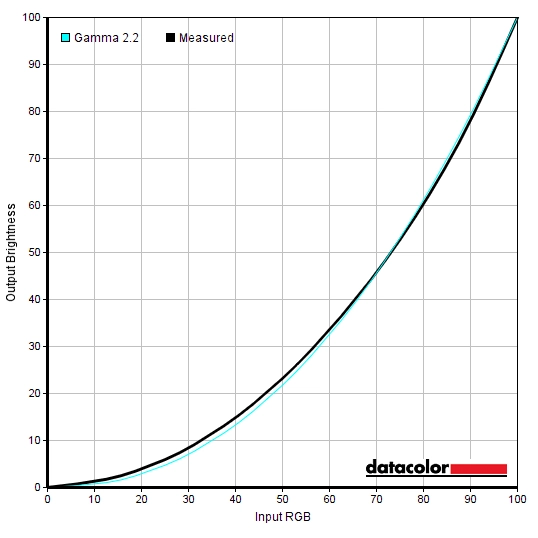
Gamma 'Test Settings'
Test Settings
SmartImageGame = Off
Contrast and brightness
Contrast ratios
Monitor Settings White luminance (cd/m²) Black luminance (cd/m²) Contrast ratio (x:1) 100% brightness (Factory Defaults) 474 0.15 3160 80% brightness 397 0.12 3308 60% brightness 319 0.1 3190 40% brightness 237 0.07 3386 20% brightness 154 0.05 3080 0% brightness 67 0.02 3350 HDR 'Normal'* 398 0.1 3980 HDR 'VESA HDR 600'* 670 0.16 4188 Gamma = 1.8 478 0.15 3187 Gamma = 2.0 476 0.15 3173 Gamma = 2.4 475 0.15 3167 Gamma = 2.6 476 0.14 3400 Low Blue Mode = 1 445 0.14 3179 Low Blue Mode = 2 464 0.14 3314 Low Blue Mode = 3 352 0.11 3200 Low Blue Mode = 4 351 0.11 3191 Color Temperature = 5000K 444 0.15 2960 Color = sRGB 477 0.15 3180 Color = User Define 485 0.14 3464 SmartImage = SmartUniformity 308 0.14 2200 Test Settings 173 0.05 3460
*HDR measurements were made using this YouTube HDR brightness test video, running full screen at ‘2160p 4K HDR’ on Google Chrome. The maximum reading from the smallest patch size (measurement area) that comfortably covered the entire sensor area and colorimeter housing was used for the white luminance measurement, which was ‘4% of all pixels’ in this case. The black luminance was taken at the same point of the video with the colorimeter offset to the side of the white test patch, equidistant between the test patch and edge of the monitor bezel.
PWM (Pulse Width Modulation)
Luminance uniformity

The Spyder5ELITE was used to assess the uniformity of lighter colours, represented by 9 equidistant white quadrants. The luminance of each quadrant was measured and compared to the brightest measured quadrant. The tables below show these values as well as the percentage deviation between each quadrant and the brightest point measured. The top table shows the results under our ‘Test Settings’, whereas the bottom table shows the results with ‘SmartImage’ set to ‘SmartUniformity’. This is the factory-calibrated Uniformity Compensation (UC) mode mentioned previously.
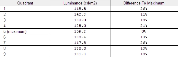
Luminance uniformity table 'Test Settings'
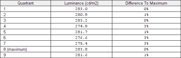
Luminance uniformity table 'SmartUniformity'
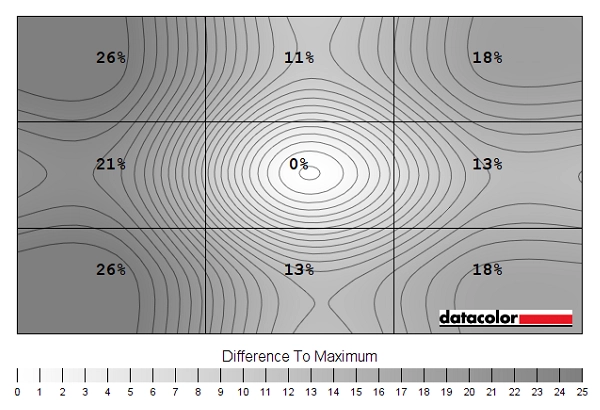
Luminance uniformity map 'Test Settings'
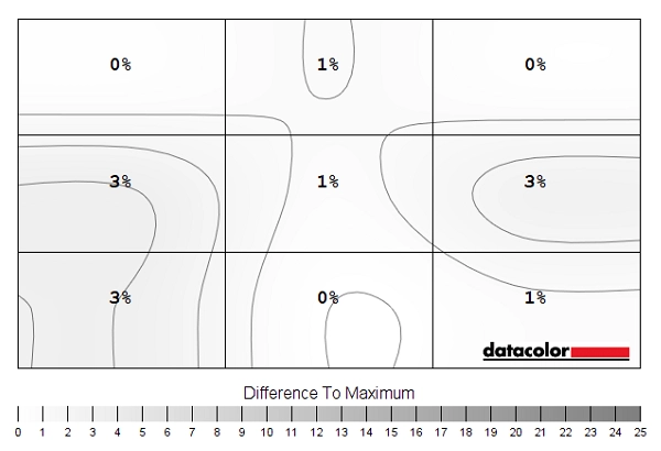
Luminance uniformity map 'SmartUniformity'
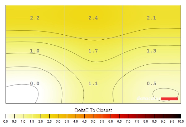
Colour temperature uniformity map 'Test Settings'
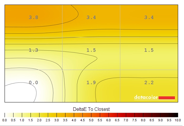
Colour temperature uniformity map 'SmartUniformity'
Contrast in games and movies
Lagom contrast tests
Colour reproduction
Colour gamut
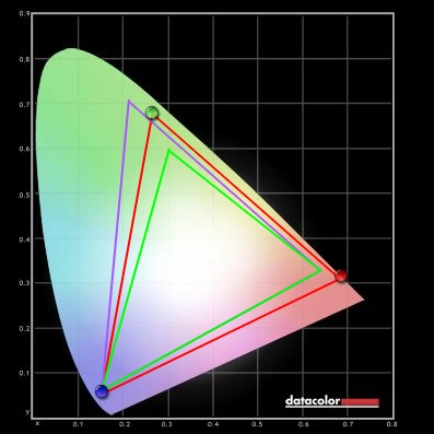
Colour gamut 'Test Settings'
For accurate colour representation within the sRGB space it is detrimental to have such a wide colour gamut. The monitor also offers an sRGB emulation setting, activated by setting ‘Color’ to ‘sRGB’ in the OSD. This cuts down the colour gamut significantly so that it approximates sRGB fairly closely. There is a little under-coverage in some regions and a little over-coverage in others but nothing extreme (97% sRGB). Unlike some sRGB emulation settings, this did not result in a recordable drop in contrast. Although it does lock off manual colour channel adjustments – and more importantly brightness – in the OSD, which requires ‘Color’ is set to ‘Custom Color’ instead.

Colour gamut 'sRGB'
Colour in games and movies
Viewing angles
The following video shows the Lagom text test, a mixed desktop background and dark desktop background from various viewing angles. For the mixed image you can see some shifts in colour and contrast, more pronounced at steeper angles. There is no ‘colour inversion’ as you’d observe on a TN model vertically and the shifts are not as extreme. The final third of the video shows a dark desktop background and highlights ‘VA glow’ which blooms out from more extreme angles. This is quite constrained overall and is only really noticeable on the video where the viewing angles are quite steep. This reflects our earlier observations from a normal viewing position, where ‘VA glow’ wasn’t an issue worth worrying about on this model.
Interlace pattern artifacts
Responsiveness
Input lag
Perceived blur (pursuit photography)
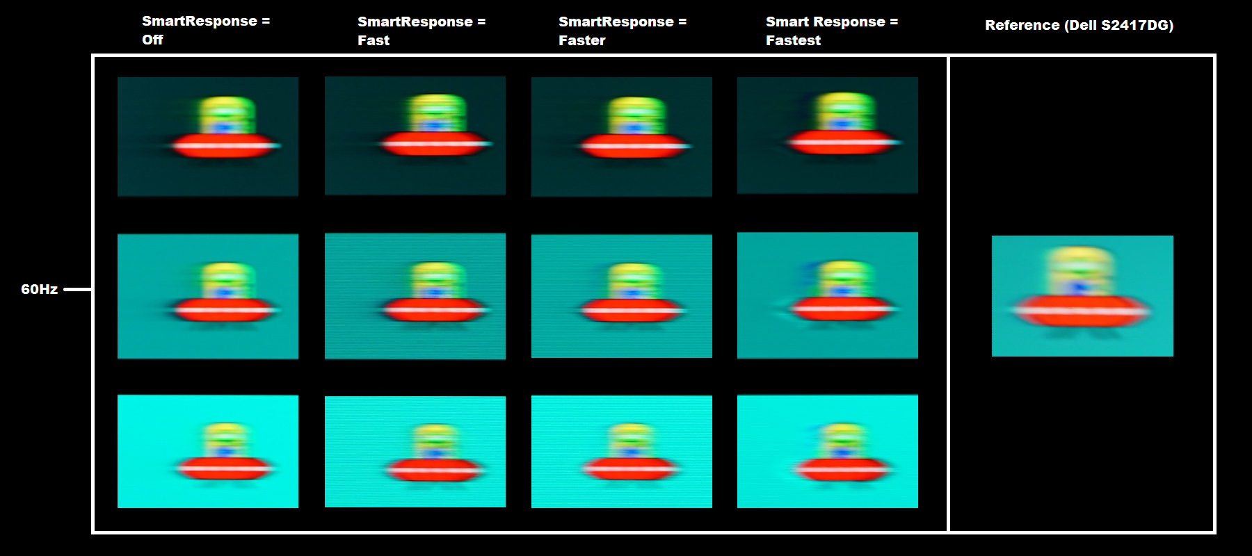
The UFO appears blurred and unfocused, without distinctive detailing. This reflects a moderate amount of perceived blur due to eye (camera) movement. In addition to this, there are varying amounts of trailing behind the UFO. This trailing is caused by weaknesses in pixel responsiveness. With ‘SmartResponse = Off’, there is quite a bold and extended trailing for the back background (top row). It’s also quite prominent for the medium background (middle row) and fainter for the light background (bottom row). There is a small amount of overshoot (inverse ghosting) visible for the light background, a slight bright ‘halo trail’. With ‘SmartResponse = Fast’ the trailing is cut down a bit overall. For the dark background the trailing is shorter. It’s less extensive in all cases, but certainly still there for the dark background in particular. There is also slightly stronger (but still mild) overshoot for the light background and a bit introduced for the medium background. The trailing behind the UFO cockpit there has a slightly dirty appearance due to this, but nothing that stands out in an obvious way during normal observation. The ‘Faster’ setting cuts down on the conventional trailing further, introducing more noticeable overshoot. The ‘Fastest setting’ strengthens the overshoot further and gives obvious bright trailing. In practice we found the ‘Fast’ setting gave the best balance between pixel responsive times and overshoot. The ‘Faster’ setting introduced some very obvious overshoot for some transitions not explored above, we found this too noticeable in practice.
Responsiveness in games and movies
HDR (High Dynamic Range)

Colour gamut 'Test Settings'
Although it doesn’t really fit in directly with enhancing the contrast or colour performance of the monitor, it is common for HDR implementations to include an additional sharpness filter. This can help emphasise the effects of increased contrast. On this model the level of sharpness is increased somewhat when running in HDR and this can’t be adjusted by the user. Given the tight pixel density we found this quite natural rather than giving an artificial or obviously over-sharpened look to the image. User sensitivity to this sort of thing and individual preferences vary, so it would’ve been nice for the user to have some control over this element. HDR also tightly controls the colour balance, gamma, brightness and various other aspects of the image. So as pointed out in the HDR section of our video review, manual adjustments are greatly reduced when running the monitor under HDR.
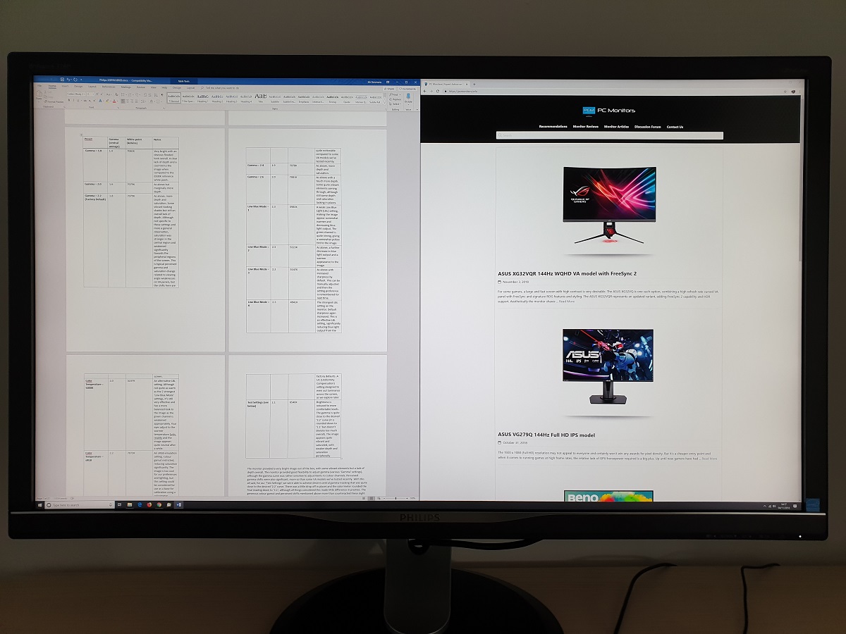
The ‘4K’ UHD experience
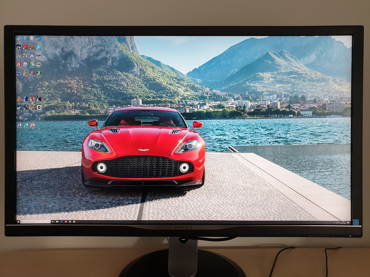
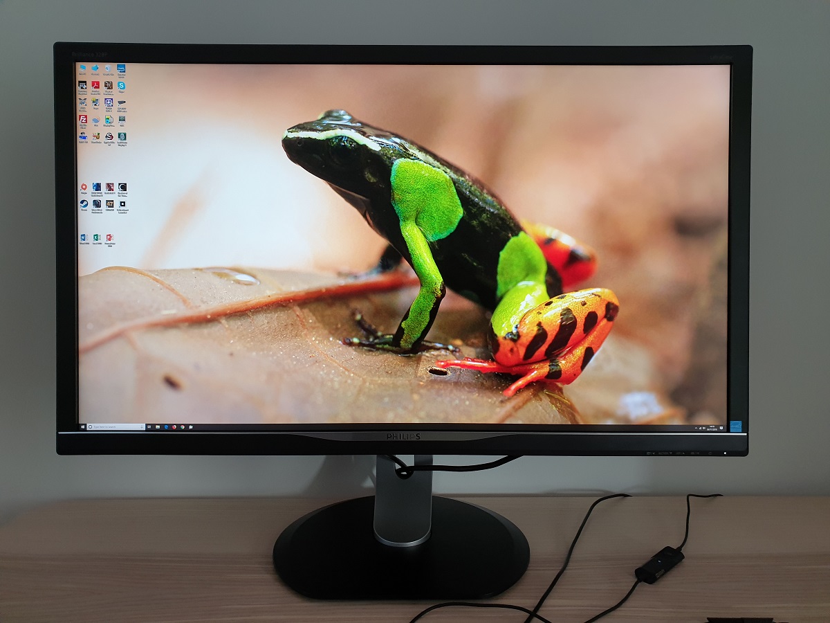
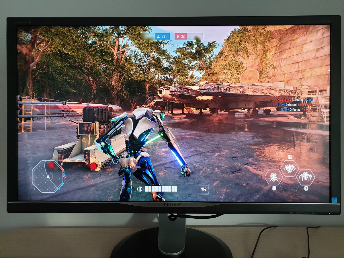
The large screen provides a good immersive experience as well, without feeling overwhelming on the desk (individual sensitivity to this will vary and it depends what you’re used to, however). The excellent pixel density also provides a pleasing detail and clarity to high resolution content such as games. As covered in our article on the resolution, one of the clearest benefits (pun intended) is the distinction of objects and edges and you stare into the distance on the game. This definition is something that applies even on games without particularly fancy graphics. Having suitably high-resolution textures and effects helps, though. Shadow of the Tomb Raider, for example, makes excellent use of the resolution for many of its textures. The creases, crinkles and dimples on skin and rough material textures have a certain lifelike quality that’s lacking on screens with significantly lower pixel density. Many of the objects and artifacts in the game also take good advantage of the high resolution, appearing beautifully crisp and detailed. Various effects in the game such as smoke and fog also appear with finer particle detail, which adds somewhat to the immersion. The images below show the monitor running various game titles, including this one. They are purely for illustrative purposes and in no way indicate how the monitor appears in person.
Interpolation and upscaling

Video review
Timestamps:
Features & Aesthetics
Contrast
Colour reproduction
HDR (High Dynamic Range)
Responsiveness
Conclusion
The bottom line; a sturdily built monitor with a decent HDR performance for brighter scenes. Less so for darker scenes – plus some potential deal-breakers such as fairly high input lag thrown into the mix.
Positives Negatives Quite vibrant and varied colour output overall, with excellent DCI-P3 coverage (ticking an important box for HDR)
VA-related gamma and saturation shifts, which were more pronounced than on some ~32” VA screens, and gamma slightly off the ‘2.2’ target using basic OSD adjustment alone Very good static contrast, a fairly low level of ‘VA glow’ and a good amount of HDR brightness with effective local dimming for mixed scenes with plenty of bright content A somewhat grainy look to lighter elements from the screen surface and a less than impressive HDR performance for dark scenes, especially when viewed in dimmer lighting Decent pixel responsiveness for the panel type overall, delivering a reasonably good 60Hz performance in that respect
Quite high input lag, some pixel responsiveness weaknesses and lack of variable refresh rate support won’t appeal to everyone A nice screen size and pixel density, putting the 3840 x 2160 resolution to good use. Good ergonomic flexibility An uninspiring design and frustrating OSD controls, no local dimming for SDR
As an Amazon Associate I earn from qualifying purchases made using the below link. Where possible, you’ll be redirected to your nearest store. Further information on supporting our work.
