Author: Adam Simmons
Date published: March 26th 2021
Table of Contents
Introduction
~27” screens with a ‘4K’ UHD resolution cram in a lot of pixels, providing excellent desktop real-estate potential and strong clarity to text and suitably high-resolution image content. The Philips 279P1 of the Brilliance ‘P Line’ series is built around this. With a productivity focus, it includes a good range of inputs – including USB-C and USB 3.2 ports. It also includes a ‘PowerSensor’ function that dims the screen significantly and ultimately sends it into standby if you’re not using it, saving power. The screen quickly springs back to normal brightness when a user returns. We take a look at the monitor in our usual broad range of tests.
Specifications
The monitor is based on a 27” IPS (In-Plane Switching) type panel from Panda. This supports a 60Hz refresh rate and 10-bit colour (8-bit + FRC dithering). A 4ms grey to grey response time is specified, but as usual you shouldn’t pay much attention to such figures. Some of the key ‘talking points’ for this monitor have been highlighted in blue below, for your reading convenience.
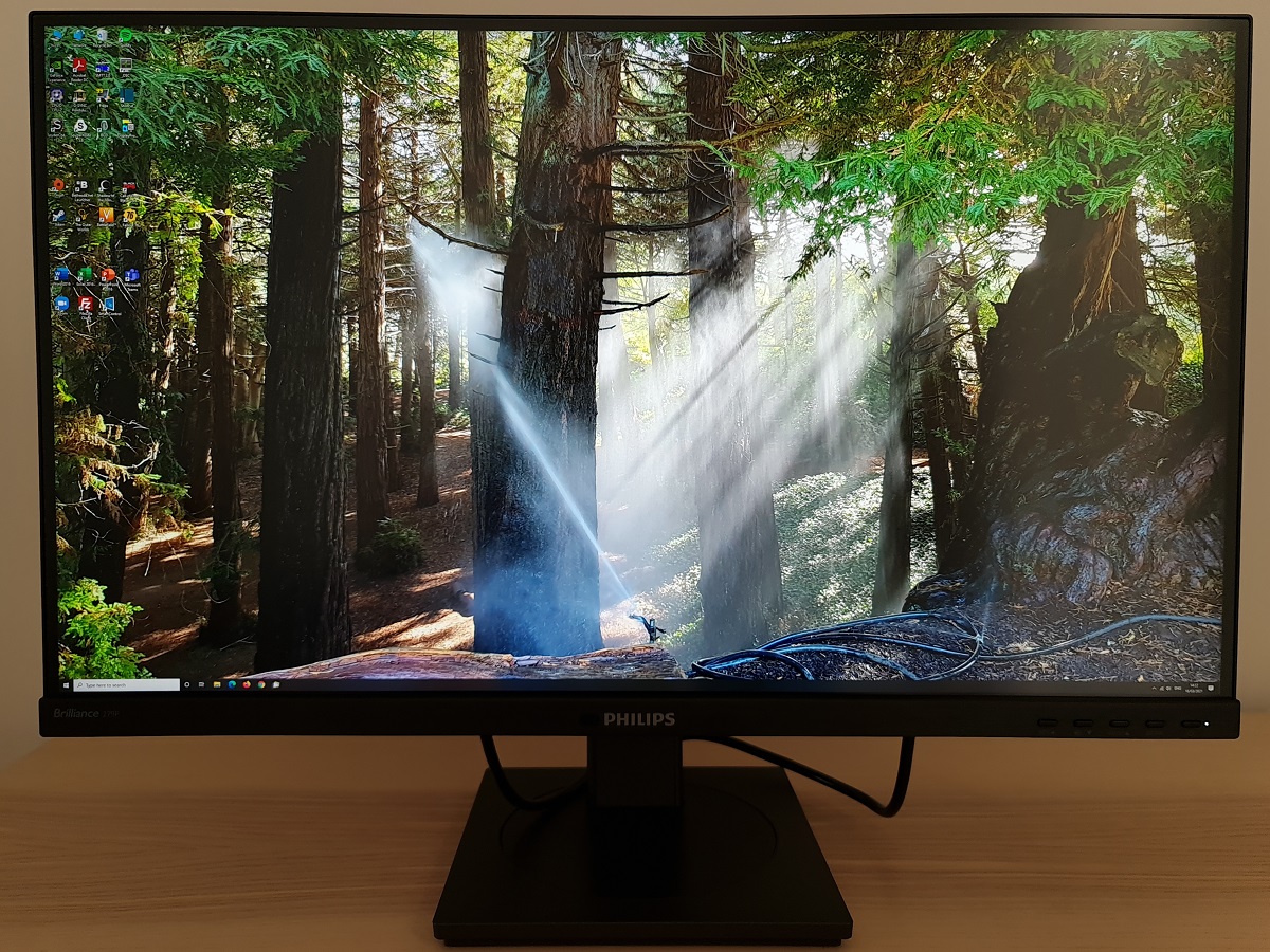
The monitor has a smart home-office appearance from the front. The stand base is rectangular dark grey matte plastic, with a central turntable swivel mechanism. This central turntable has a brushed texture, similar to the bottom bezel of the monitor. The bottom bezel includes a shiny silver-coloured Philips logo centrally with a small suite of sensors to the left of it. This includes the ‘PowerSensor’ which dims the screen significantly if nobody is detected in front of it for 1 minute. And if nobody is detected for a further 2 minutes, it sends the screen into a low power state to conserve energy. When the user returns, it quickly switches back on, set to normal brightness. And the ‘LightSensor’ which allows the monitor to adjust its brightness based on ambient lighting. These features are explored in the OSD (On Screen Display) video shortly. This bottom bezel juts out around 5mm (0.20 inches) from the rest of the screen and is moderately thick, ~20mm (0.79 inches) including a sliver of visible panel border. The top and side bezels are dual-stage, with a panel border that’s flush with the rest of the screen plus a slender hard plastic outer component. Including both elements, the bezels at the top and sides are ~7mm (0.28 inches). The screen has a light matte anti-glare finish, as explored shortly. The OSD is controlled by pressable buttons that face forwards at the right side of the bottom bezel. A small pinprick-style power LED is located to the right of these buttons, glowing white when the monitor is switched on and flashing white when it enters a low power state. The video below runs though the menu system and OSD controls, including the sensor suite described earlier. The image below is a macro photograph taken on Notepad with ClearType disabled. The letters ‘PCM’ are typed out to help highlight any potential text rendering issues related to unusual subpixel structure, whilst the white space more clearly shows the actual subpixel layout alongside a rough indication of screen surface. This model uses a light matte anti-glare screen surface, offering relatively good glare handling and avoiding sharper reflections as you’d see on a glossy or lighter matte screen surface. Meanwhile, clarity and vibrancy is better preserved compared to ‘stronger’ matte surfaces – without the same layered appearance in front of the image. There was a misty graininess when observing lighter content or a slightly ‘sandy’ appearance you might say. This was less obtrusive than the stronger graininess we’ve observed on some ‘4K’ models of this size and shouldn’t bother most users. The 279P1 features a range of ‘SmartImage’ presets; ‘EasyRead’, ‘Office’, ‘Photo’, ‘Movie’, ‘Game’, ‘Economy’, ‘LowBlue Mode’ and ‘SmartUniformity’. Many of these presets simply adjust various settings in the OSD and don’t achieve anything you couldn’t achieve yourself with manual adjustment. We briefly explore these presets in the OSD video. A notable exception is ‘SmartUniformity’, explored here alongside a few other manual adjustments. The table below includes gamma and white point readings taken using a Datacolor SpyderX Elite colorimeter. General observations on the image are also provided. Our test system uses Windows 10 and an Nvidia RTX 3090 connected using the supplied DP cable. Additional testing was performed with an AMD Radeon RX 580. No additional monitor drivers or ICC profiles were specifically loaded. The monitor was left to run for over 2 hours before readings were taken or observations made. Aside from our ‘Test Settings’ where various adjustments are made, assume factory defaults are used. An important step also had to be performed in the graphics driver if connected to an Nvidia GPU via HDMI. The colour signal had to be corrected to a ‘Full Range RGB’ signal as detailed in this article. When viewing the figures in this table, note that for most PC users ‘6500K’ for white point and ‘2.2’ for gamma are good targets to aim for. Individual targets depend on individual uses, tastes and the lighting environment, however.
*10-bit can be selected in the graphics driver when using DP at any refresh rate, up to the native resolution. 10-bit and 12-bit can be selected when using HDMI at up to 30Hz for the native resolution. Or at up to 60Hz for lower resolutions such as WQHD and Full HD. 12-bit includes an additional 2-bit dithering stage added by the monitor’s scaler.
As an Amazon Associate I earn from qualifying purchases made using the below link. Where possible, you’ll be redirected to your nearest store. Further information on supporting our work.

Features and aesthetics
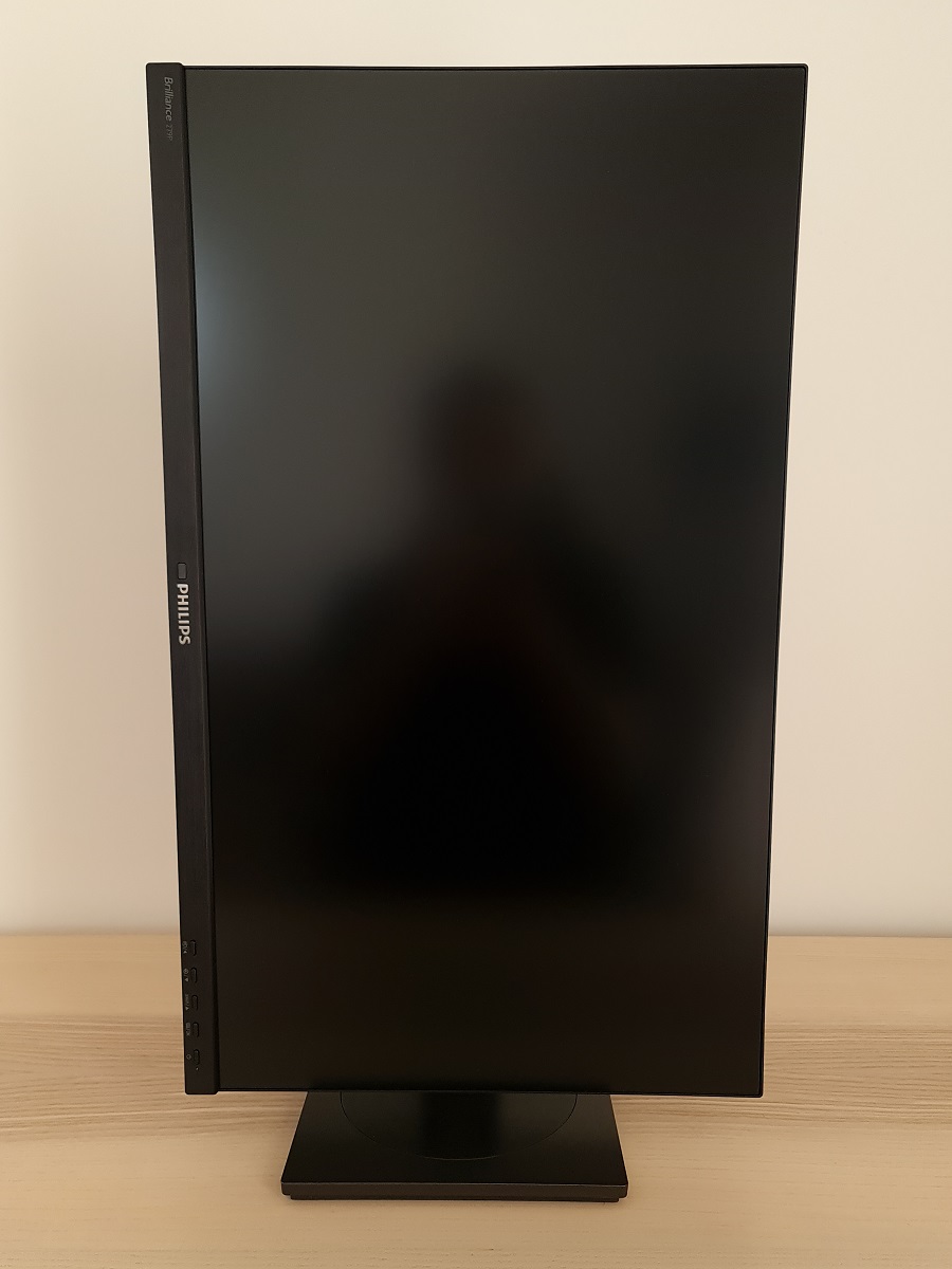
From the side the monitor is fairly slim at thinnest point, ~19mm (0.75 inches), with more central bulk. The included stand offers full ergonomic flexibility; tilt (5° forwards, 35° backwards), height adjustment (150mm or 5.91 inches), swivel (180° left, 180° right) and pivot (90° rotation clockwise or anti-clockwise into portrait). The left side of the screen includes 2 USB 3.2 ports, with the rearmost (yellow coloured) port offering BC 1.2 fast-charging. At lowest stand height, the monitor sits ~25mm (0.98 inches) above the desk surface, with the top of the screen ~393mm (15.47 inches) clear of the desk. The total depth of the monitor including stand is ~204mm (8.03 inches), with the screen sitting ~35mm (1.38 inches) back from the front edge of the stand. So this is quite a compact design that allows you to have the screen reasonably close to the wall if you wish.
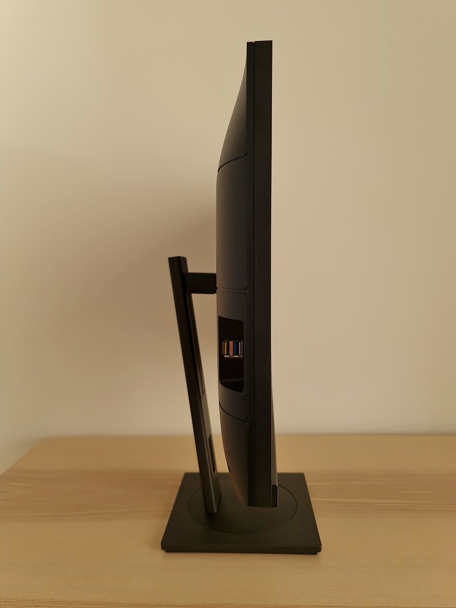
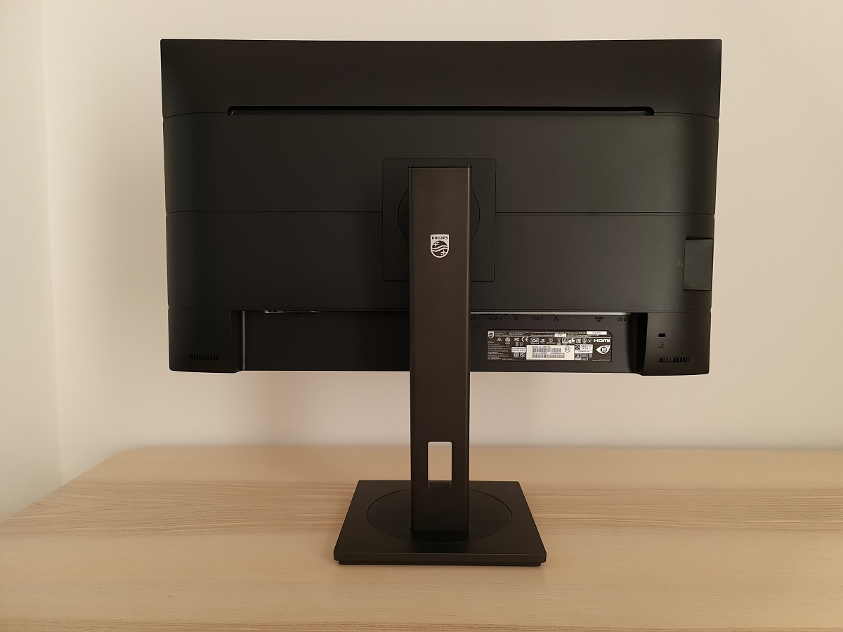
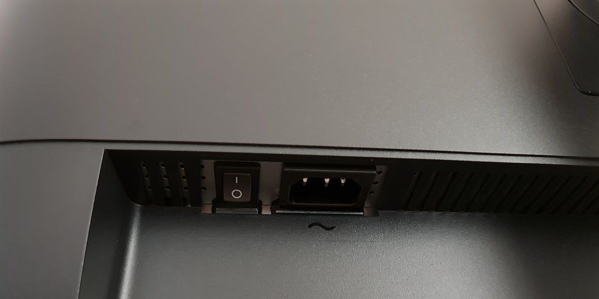
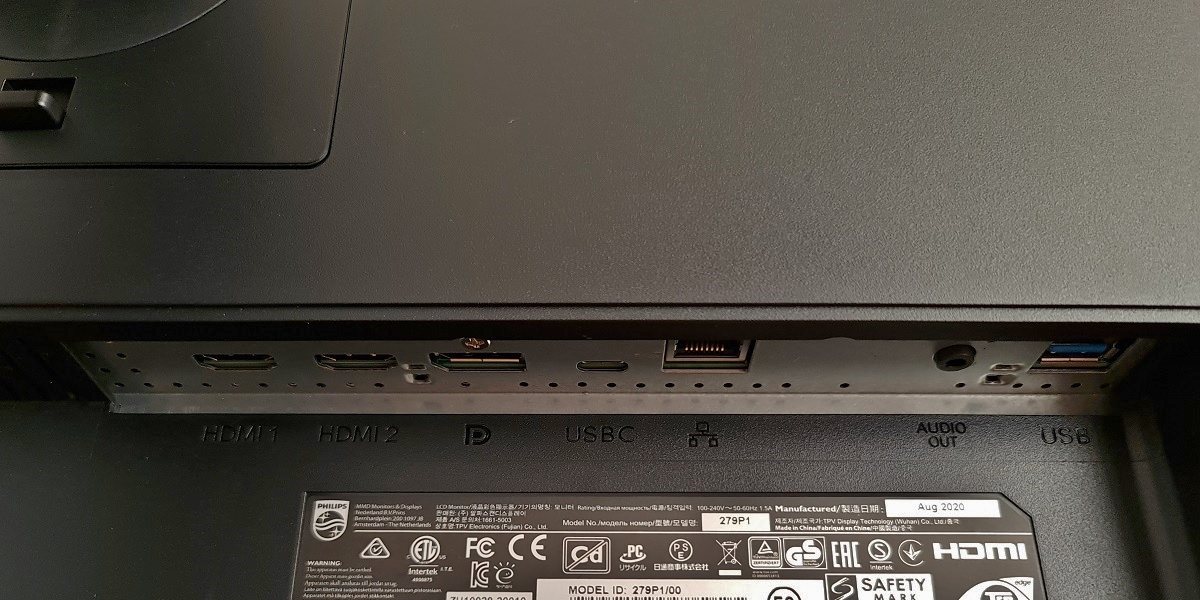
The rear of the monitor is black (or dark grey) matte plastic. The stand attaches centrally using a quick-release mechanism and can be detached by pressing the switch beneath the attachment point upwards. This reveals 100 x 100mm VESA holes for alternative mounting. A K-Slot is located towards the bottom right. The stand neck has a powder-coated metal finish at the sides and rear for a nice solid and premium feel to it. The ports face downwards and include; AC power input (internal power converter) with ‘zero watt’ switch, 2 HDMI 2.0 ports, DP 1.4, USB-C 3.2 Gen2 (65W PD and DP Alt Mode), RJ45 LAN, 3.5mm audio output and 2 additional USB 3.2 ports (added to 2 at side). The USB-C port includes upstream data transfer, so it acts as the single dedicated upstream port on the monitor (USB-C to USB-A cable included). Or can be used in this capacity alongside PD and DP Alt Mode as a convenient single-cable USB-C solution. 2 x 3W speakers are included, facing backwards with one either side of the main port area. These offer basic sound output with reasonable volume. The sound produced isn’t particularly bassy, crisp or high quality. Although still produce a sound that’s slightly fuller and less ‘tinny’ than some integrated speakers.
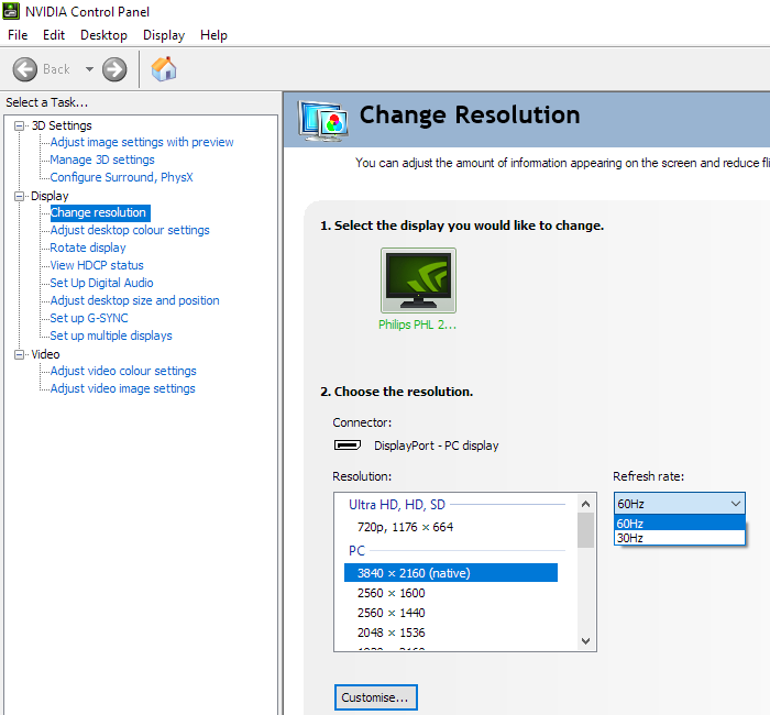
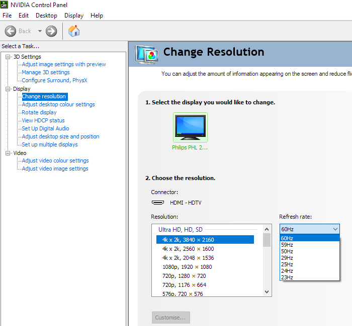
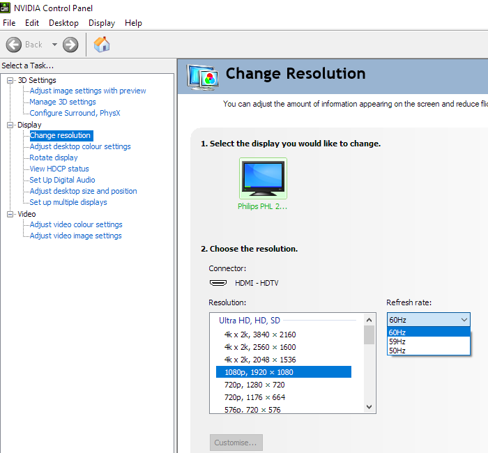
3840 x 2160 @60Hz can be leveraged via suitable versions of HDMI and DP (including USB-C with DP Alt Mode). A power cable is included as standard alongside a DP cable, HDMI cable and USB-C to C/A Y-shaped cable. This may vary depending on region. The first image below shows the refresh rates supported for the native 3840 x 2160 (‘4K’ UHD) and indeed lower resolutions including 2560 x 1440 (WQHD) and 1920 x 1080 (Full HD) when using DisplayPort. These refresh rates are also supported for the ‘4K’ UHD resolution via HDMI – they’re categorised in the EDID of the monitor as ‘PC’ resolutions. Curiously 60Hz but not 30Hz is listed for WQHD via HDMI. Additional refresh rates are supported via HDMI and categorised in the EDID as ‘TV’ resolutions. Nvidia Control Panel lists these as ‘Ultra HD, HD, SD’ and they can be accessed by other devices such as the PS5 and Xbox Series X. The second image shows these for the ‘4K’ UHD resolution and the third image for the Full HD resolution.
Calibration
Subpixel layout and screen surface
![]()
As illustrated above the standard RGB (Red, Green and Blue) stripe subpixel layout is used. This is the default expected by modern operating systems such as Microsoft Windows. Apple’s MacOS no longer uses subpixel rendering and therefore doesn’t optimise text for one particular subpixel layout to the detriment of another. You needn’t worry about text fringing from non-standard subpixel layouts and won’t need to change the defaults in the ‘ClearType Text Tuner’ as a Windows user. You may still wish to run through the ClearType wizard and adjust according to preferences, however. The subpixel layout and arrangement is normal and we had no subpixel-related concerns related to sharpness or text clarity on this model.
Testing the presets
Monitor Settings Gamma (central average) White point (kelvins) Notes Gamma = 1.8 1.8 6674K An overly bright look with too little depth to many shades. Gamma = 2.0 2.0 6670K As above but a bit of extra depth. Gamma = 2.2 (Factory Default) 2.2 6657K A vibrant and varied look with good adherence to the ‘2.2’ gamma curve and well-balanced in terms of colour channels. Gamma = 2.4 2.4 6669K As above but a bit of extra depth due to raised gamma. Gamma = 2.6 2.6 6675K As above with a further increase in gamma. A deeper, more saturated and quite cinematic look. Low Blue Mode = 1 2.2 6133K A mild Low Blue Light (LBL) setting, giving a somewhat warmer appearance to the image and slightly reducing blue light output compared to factory defaults. Low Blue Mode = 2 2.2 5298K A very effective LBL setting. The image appears warm with a clear yellowish green tint. Your eyes adjust to some extent over time, but not entirely. The blue colour channel is massively weakened, significantly reducing blue light output from the monitor. The green channel remains strong. Low Blue Mode = 3 2.2 5294K As above but dimmer by default and overly sharp due to default sharpness setting of ‘70’ rather than ‘50’ (easily corrected). Low Blue Mode = 4 2.2 5187K As above with slightly stronger blue light reduction. Color Temperature = 5000K 2.2 5222K An alternative LBL setting. Effective in reducing blue light output, especially when combined with a reduced brightness. Doesn’t impart the yellowish green tint as the green channel is reduced as well. Color = sRGB 2.2 6871K An sRGB emulation setting. Includes the full factory calibration of the display. Very bright and notably less saturated than factory defaults due to gamut restriction, brightness locked to ‘100%’ and no control over colour channels. sRGB gamma curve followed, lightening up some darker shades. Color = User Define 2.2 7249K Similar to factory defaults but a cool tint introduced. SmartImage= SmartUniformity 2.0 6865K A Uniformity Compensation (UC) setting designed to even brightness out across the screen (we explore this later). Contrast takes a hit and the gamma curve bows significantly in the centre, meaning some mid-tones are quite a bit lighter than they should be. SmartImage= SmartUniformity (Gamma = 2.4) 2.1 6865K As above but bowing of gamma curve reduced somewhat. Some mid-tones remain too bright, better than before with many shades having more appropriate depth now. Test Settings (see below) 2.2 6510K Vibrant with good variety and overall balance.
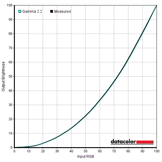
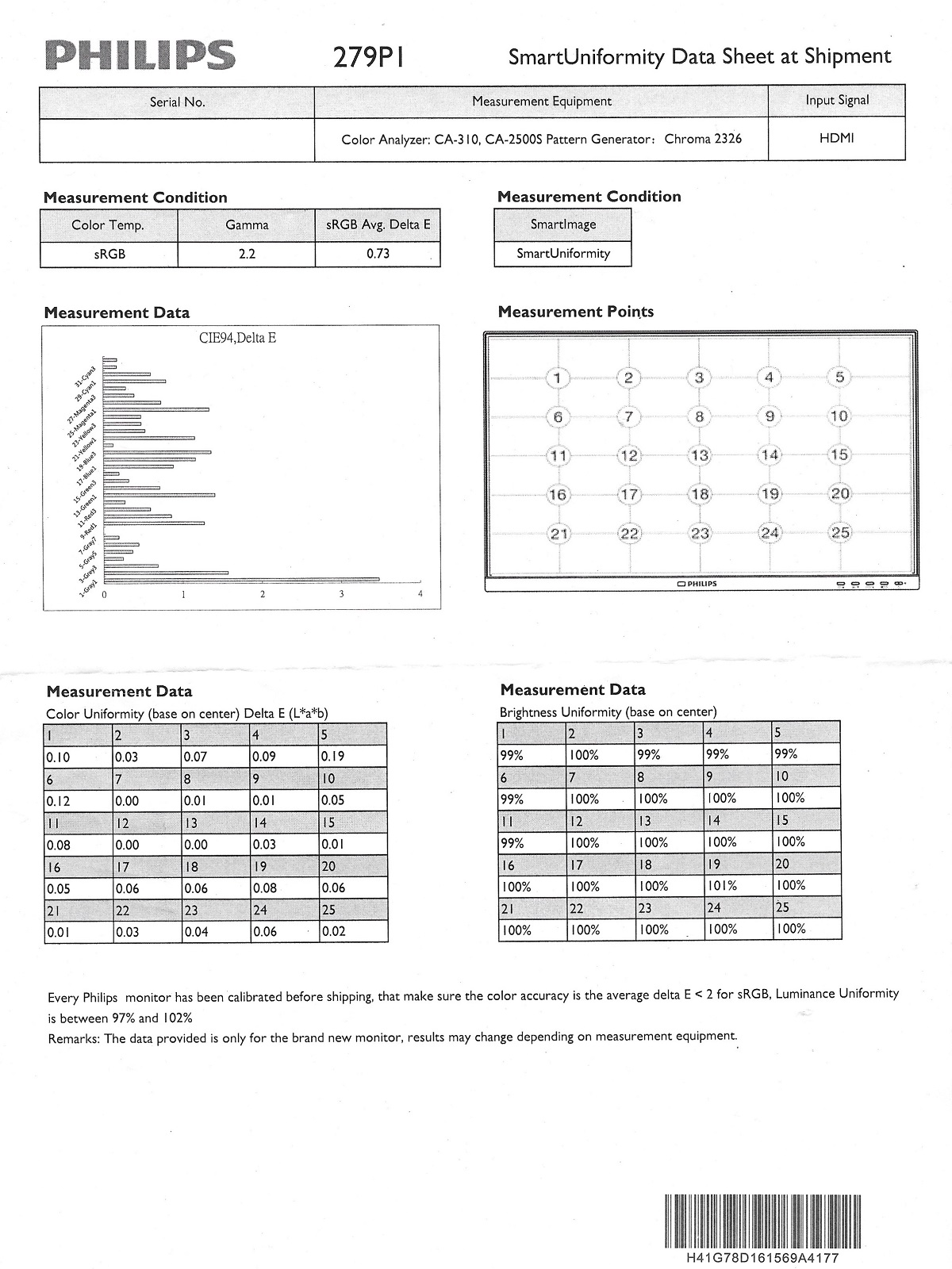
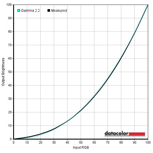
Straight from the box, the monitor provided an image that was vibrant and varied. The generous gamut invited extra saturation and vibrancy, whilst gamma tracking and overall colour channel balance was strong. The graph below shows the gamma tracking under our ‘Test Settings’, with strong adherence to the ‘2.2’ curve. The tracking was similar using the factory defaults. The monitor includes a factory-calibrated ‘sRGB’ setting as well as a ‘SmartUniformity’ Uniformity Compensation (UC) setting, as described in the table. A calibration report is included which is unique to each unit, showing its compliance in terms of gamma and colour accuracy (DeltaE deviation) for specific shades with the ‘sRGB’ setting. Plus colour and brightness uniformity using the ‘SmartUniformity’ setting. As noted in the table the ‘sRGB’ setting is locked at maximum brightness, which as we explore shortly is rather bright – this limits its practicality and appeal to most users. The monitor includes a range of Low Blue Light (LBL) settings. The main settings are referred to as ‘LowBlue Mode’ settings, with 4 levels of effectiveness. The weakest setting (‘1’) was very mild, whilst the remaining settings were effective in reducing the blue colour channel and minimising blue light output from the monitor. The green channel remained strong, which helps maintain strong contrast – but imparted a yellowish green tint that our eyes only partially adjusted to over time. We preferred the alternative LBL setting, ‘Color Temperature = 5000K’, which was only slightly less effective than the stronger ‘LowBlue Mode’ settings. This is better balanced visually as the green channel is reduced, avoiding an unwanted green tint. We used this setting with reduced brightness (’52’, as with our ‘Test Settings’) for our own viewing comfort in the evenings, but not for specific testing aside from that involving the setting itself. Cutting out stimulating blue light is important in the hours leading up to bed as it affects sleep hormones and keeps the body ‘alert’ even if it should be winding down. We would’ve liked to have seen a shortcut key or similar to activate or deactivate this setting, although switching to the main ‘Low Blue Mode’ setting can be done without entering the main menu. For our ‘Test Settings’ we reduced brightness and made some colour channel adjustments. Note that individual units and preferences vary, so these settings are simply a suggestion and won’t be optimal for all users or units. We’ve also included our preferred ‘SmartResponse’ setting, for reference. SmartImageGame = Off Brightness= 52 (according to preferences and lighting) SmartResponse= Fast Color Temperature= User Define R= 100 G= 100 B= 93
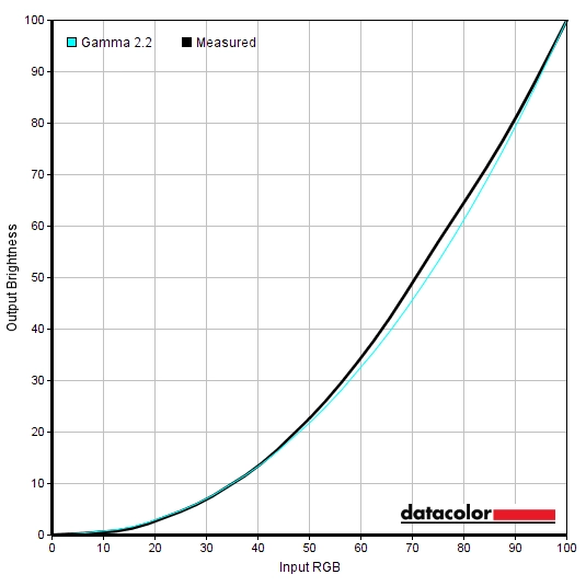
Gamma 'Test Settings'
The first image below shows the gamma curve using the ‘sRGB’ setting – note the deviation for darker shades. Whilst gamma averages 2.2, the ‘sRGB’ curve is followed rather than ‘2.2’ gamma curve. This lifts up some darker shades somewhat and coupled with the high locked brightness of this setting and restricted gamut makes some areas of the image appear a bit ‘flooded’ really. The second image below shows gamma tracking with the ‘SmartUniformity’ setting. The gamma is set to ‘2.4’ which gave the best adherence to the desired ‘2.2’ curve on our unit without completely overshooting at the top and bottom end. Note the deviation for mid-bright shades in particular, though. With gamma reduced there, meaning quite a few shades appear somewhat brighter than they should be.
Gamma 'sRGB'
Gamma 'SmartUniformity' (Gamma 2.4)
Given inter-unit variation and good performance following OSD tweaking alone, we will not be using any ICC profiles in this review or including any measurements or graphs using them. We wouldn’t recommend using them unless created for your specific unit using your own calibration device. But we appreciate some users still like to use profiles and some aspects such as gamut mapping for colour-aware applications can be useful. You can download our ICC profile for this model, which was created using our ‘Test Settings’ as a base. You can also download our sRGB profile which was created using and designed for the ‘sRGB’ setting (sRGB emulation mode). Amongst other things, this shifts gamma so it adheres to our usual target of the ‘2.2’ curve. Be aware of inter-unit variation and note again that these ICC profiles are not used in the review.
Test Settings
Contrast and brightness
Contrast ratios
We used an X-Rite i1Display Pro to measure white and black luminance levels, from which static contrast ratios could be calculated. The table below shows this data, with various settings used. Assume any setting not mentioned was left at default, except for the changes already noted in the calibration section. Black highlights indicate the highest white luminance, lowest black luminance and maximum contrast ratio recorded. Blue highlights indicate the results under our ‘Test Settings’.
| Monitor Settings | White luminance (cd/m²) | Black luminance (cd/m²) | Contrast ratio (x:1) |
| 100% brightness | 274 | 0.24 | 1142 |
| 80% brightness | 234 | 0.21 | 1114 |
| 60% brightness | 190 | 0.17 | 1118 |
| 40% brightness | 139 | 0.12 | 1158 |
| 20% brightness | 87 | 0.08 | 1088 |
| 0% brightness | 33 | 0.03 | 1100 |
| 70% brightness (Factory Defaults) | 216 | 0.19 | 1137 |
| Gamma = 1.8 | 215 | 0.19 | 1132 |
| Gamma = 2.0 | 215 | 0.19 | 1132 |
| Gamma = 2.4 | 215 | 0.19 | 1132 |
| Gamma = 2.6 | 215 | 0.19 | 1132 |
| Low Blue Mode = 1 | 261 | 0.24 | 1088 |
| Low Blue Mode = 2 | 267 | 0.24 | 1113 |
| Low Blue Mode = 3 | 209 | 0.19 | 1100 |
| Low Blue Mode = 4 | 209 | 0.19 | 1100 |
| Color Temperature = 5000K | 189 | 0.19 | 995 |
| Color = sRGB | 274 | 0.24 | 1142 |
| Color = User Define | 215 | 0.19 | 1132 |
| Color = User Define (100% brightness) | 276 | 0.24 | 1150 |
| SmartImage= SmartUniformity | 186 | 0.24 | 775 |
| SmartImage= SmartUniformity (Gamma = 2.4) | 186 | 0.24 | 775 |
| Test Settings | 169 | 0.15 | 1127 |
The average contrast ratio with only brightness adjusted was 1120:1, a touch higher than specified and quite reasonable for the panel type used. The maximum contrast recorded was 1150:1 using ‘Color = User Define’ at full brightness. We recorded 1127:1 following the adjustments made to our ‘Test Settings’, which is respectable. A slightly reduced contrast was recorded using ‘Color Temperature = 5000K’ (995:1) due to the significant adjustments to colour channels made there, including a significantly reduced green channel. The ‘SmartUniformity’ setting reduced contrast to 775:1. A reduction in contrast is usual for such a setting as it’s a Uniformity Compensation (UC) setting that reduces digital brightness for some points of the screen, whilst making other adjustments to even things out overall. The ‘sRGB’ setting is locked to a brightness of 274 cd/m², which is quite high considering most users will set their monitor to 100 – 200 cd/m². The highest white luminance recorded on this table was 276 cd/m², whilst the minimum white luminance recorded was 33 cd/m². This gives a brightness adjustment range of 243 cd/m², with a maximum that falls some way short of the specified 350 cd/m² but is still bright enough for most users. And quite a dim minimum.
The monitor has a Dynamic Contrast setting called ‘SmartContrast’, which allows the backlight brightness to adjust (as a single unit) according to the levels of light and dark being displayed on the screen. The luminance adjusted at a moderate pace to changes in scene brightness and dimmed effectively if mostly dark content was displayed. For most content, including mixed with plenty of dark components, the luminance levels were too high for our taste with this setting active. The brightness setting isn’t locked off when using this setting, but is swiftly ignored when the setting is active. As usual this Dynamic Contrast mode is a compromise which can’t properly compensate for intricate mixtures of light or dark on the screen. The adjustments it makes we often consider far from optimal and the continuous adjusting of the backlight at moderate pace can be quite annoying – we therefore prefer manual brightness control.
PWM (Pulse Width Modulation)
The 279P1 does not use PWM (Pulse Width Modulation) to regulate backlight brightness at any level. Instead, DC (Direct Current) is used to moderate brightness. The backlight is therefore considered ‘flicker-free’, which will come as welcome news to those sensitive to flickering or worried about side-effects from PWM usage.
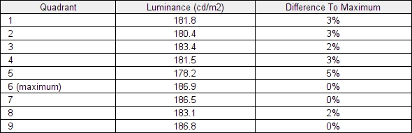
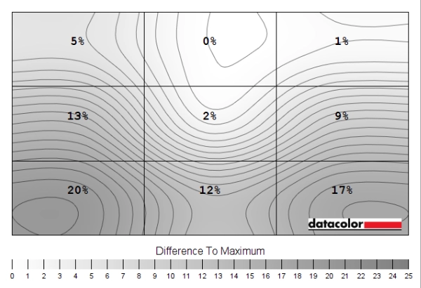
Luminance uniformity
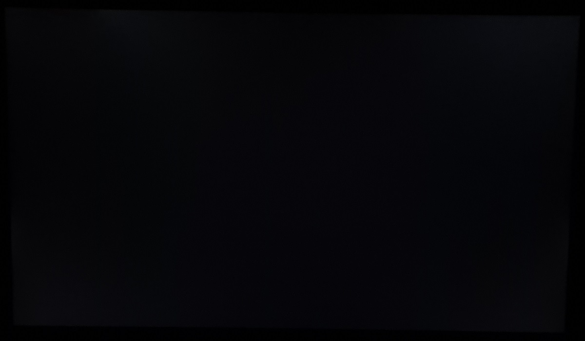
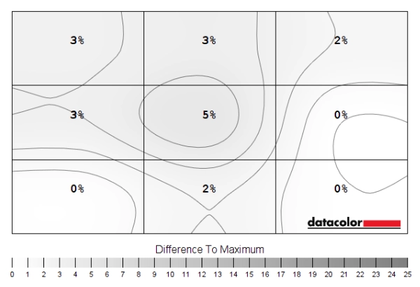
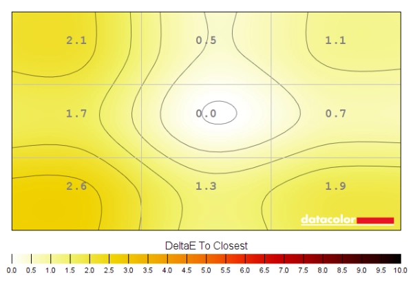
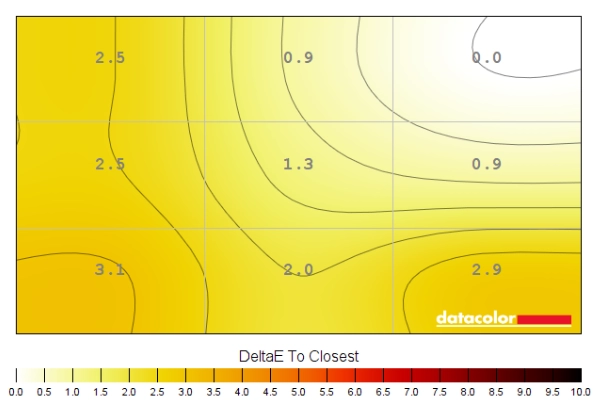
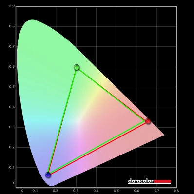
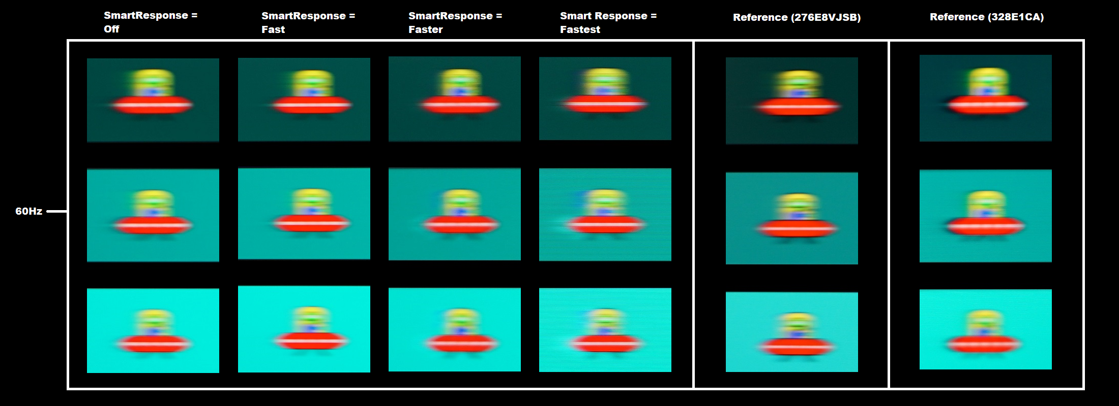
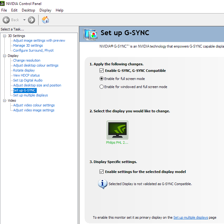
Whilst observing a black background in a dark room, using our ‘Test Settings’, we noticed moderate backlight bleed and some clouding. It’s important to note that individual units vary when it comes to all aspects of uniformity, including backlight bleed and clouding. The following image was taken a few metres back to eliminate ‘IPS glow’. This is bluish silver glow that creates a haze that emanates from the edges of the screen, particularly near the bottom corners from a normal viewing position. This ‘IPS glow’ blooms out more strongly from steeper angles, as demonstrated in the viewing angles video later. The luminance uniformity using our ‘Test Settings’ was variable. The maximum luminance was recorded at ‘quadrant 2’ (166.6 cd/m²). The greatest deviation from this occurred at ‘quadrant 7’ towards the bottom left of the screen (133 cd/m², which is 20% dimmer). The average deviation between each quadrant and the brightest recorded point was 9.88%, which is reasonable. Using ‘SmartUniformity’ offered an improvement. The maximum luminance was recorded at ‘quadrant 6’ to the right of centre (186.9 cd/m²). The greatest deviation from this occurred at quadrant 5 (178.2 cd/m², which is 5% dimmer). The average deviation between each quadrant and the brightest recorded point was now a mere 2.25%, which is very impressive. Remember that individual units vary when it comes to uniformity and you can expect further deviation beyond the points measured. The contour map below shows these deviations graphically, with darker greys representing lower luminance (greater deviation from brightest point) than lighter greys. The percentage deviation between each quadrant and the brightest point recorded is also given. The top table shows the results under our ‘Test Settings’, the bottom using ‘SmartUniformity’ with default settings. The SpyderX Elite was also used to analyse variation in the colour temperature (white point) for the same 9 quadrants. The deviation between each quadrant and the quadrant closest to the 6500K (D65) daylight white point target was analysed and a DeltaE value assigned. Darker shades are also used on this map to represent greater deviation from 6500K. A DeltaE >3 represents significant deviation that may be readily noticed by eye. Results here were very good using our ‘Test Settings’, with no significant deviation recorded and the central point recorded as closest to 6500K. Results were slightly worse in this test using ‘SmartUniformity’, with significant but by no means huge deviation recorded towards the bottom left (DeltaE 3.1). If comparing every quadrant to the centre rather than the point recorded as closest to 6500K (top right), though, there would be no significant deviation recorded. And the ‘SmartUniformity’ mode is calibrated by Philips in the factory with reference to the central point of the screen. Remember again that individual units vary when it comes to uniformity and that you can expect deviation beyond the measured points. On Battlefield V the monitor put in a reasonable contrast performance. At 1127:1 under our ‘Test Settings’, the static contrast was certainly not sufficient to provide impressive depth and atmosphere to darker scenes. Particularly in dimmer lighting conditions. The contrast slightly edged out some IPS models, although ‘IPS glow’ was certainly a feature and at quite typical levels for a 27” IPS-type panel. This hazing was most notable towards the bottom corners of the screen from a normal viewing position but will depend on where you’re sitting. It appeared as a bluish silver sheen, eating away at detail for darker shades and detracting from that atmospheric look. This ‘IPS glow’ is more intense if you sit closer to the screen or use a higher brightness and can be brought out more strongly on units that suffer higher levels of backlight bleed or clouding. A real strength of IPS-type models like this is gamma consistency. So whilst ‘IPS glow’ eats away at some of the detail in affected areas of the screen, you don’t see the sort of obvious vertical shifts in detail level (due to perceived gamma changes) that occur on TN models. And you don’t have a central area that’s too blended ‘black crush’ and excessive detail revealed peripherally as you’d see on VA models. This can give a banded or blocky appearance in places, so it’s good to avoid such inconsistencies. When viewing brighter content, the screen surface imparted slight graininess – with a misty or lightly sandy quality to it rather than a ‘smeary’ or layered look. Shadow of the Tomb Raider told a similar story. This title craves a strong contrast performance as dimly lit passageways, tombs and caverns with just a few point sources of light illuminating them are common. The contrast performance of the monitor was certainly too limited to give the sort of strong atmosphere to dark scenes demanded by this title, especially if sitting in a dim or moderately dim room. A touch stronger than some IPS models, but again ‘IPS glow’ is quite a dominant feature that detracts from that atmospheric look. The strong gamma consistency was again observed, with subtle textures on rocks and suchlike maintaining decent visibility throughout the screen. Again reduced by ‘IPS glow’, but without the significant gamma and hence detail shifts observed on VA and TN panels. The screen surface again kept lighter content free from strong graininess, giving just a misty or lightly sandy appearance instead of anything stronger. We made additional observations on the film Star Wars: The Rise of Skywalker. This is another title that craves a strong contrast performance, with plenty of deep and dark backdrops lit up by pulses of light. The monitor didn’t deliver a compelling atmosphere or strongly cinematic look here, but that isn’t something we’d expect from any IPS-type panel. ‘IPS glow’ was again there to eat away at detail, whilst the static contrast wasn’t sufficient to deliver inky depth in dimmer room lighting conditions. The film also has black bars at the top and bottom (letterboxing) which highlight these weaknesses. Most content on Netflix, YouTube and other streaming media platforms is designed for the 16:9 aspect ratio and won’t show these bars. But some content, especially Hollywood film titles, will do so. The light screen surface with reasonably smooth finish again prevented things appearing smeary or heavily grainy on this title, even when observing very bright shades. Still a misty look rather than appearing very smooth, but this shouldn’t bother most people or even be something they’d necessarily notice. The Lagom tests for contrast allow specific weaknesses in contrast performance to be identified. The following observations were made in a dark room. The colour gamut of the 279P1 (red triangle) was compared with the sRGB (green triangle) and DCI-P3 (blue triangle) reference colour spaces using our ‘Test Settings’, as shown below. The gamut fully covers sRGB with a fair bit of extension beyond, particularly in the green and red region. We measured 93% DCI-P3 coverage and although not shown in the graphic, 85% Adobe RGB coverage. This DCI-P3 and Adobe RGB coverage isn’t really high enough for accurate reproduction within those colour spaces. For standard sRGB content outside a colour-managed environment, there’s a fair dose of extra vibrancy and saturation due to the gamut. The monitor offers an sRGB emulation setting, accessed by changing ‘Color’ to ‘sRGB’ in the OSD. This cuts down on the gamut very effectively so it does not extend beyond sRGB, with a touch of under-coverage – 97% sRGB recorded. This setting locks off various settings in the OSD including gamma settings, colour channel adjustments and most importantly brightness. As demonstrated earlier brightness is locked to a high level, making this setting impractical for many users even if they’d ideally like to use such a setting. To maximise colour accuracy within the sRGB colour space, for colour-managed workflows, full calibration and profiling with a colorimeter or similar device using the full native gamut is recommended. You may try the ICC profile featured in the calibration section which includes gamut mapping for colour-aware applications, but best results are always obtained by calibrating your own unit with your own hardware. Instead of using this ‘sRGB’ setting and putting up with the associated restrictions, AMD users can activate a flexible sRGB emulation setting via the graphics driver. This is done by opening ‘AMD Radeon Software’, clicking ‘Settings’ (cog icon towards top right) and clicking on ‘Display’. You should then ensure that the ‘Custom Color’ slider to the right is set to ‘Enabled’ and ‘Color Temperature Control’ set to ‘Disabled’. It may appear to be set this way by default, but the native rather than restricted gamut is likely in play. If that’s the case, simply switch the ‘Color Temperature Control’ slider to ‘Enabled’ then back to ‘Disabled’ to leverage the sRGB emulation behaviour. This setting is shown in the image below. The gamut below shows results using our ‘Test Settings’ with this driver tweak applied. The colour gamut now covers 99% sRGB with just a sliver of extension beyond in some regions. This offers even closer tracking of sRGB than the emulation mode and is a reliable way to cut down on the colour gamut without profiling, including in applications that aren’t colour managed. And you don’t have to put up with restrictions associated with the monitor’s sRGB emulation setting. On Battlefield V the monitor provided a vibrant look to things with good variety. This game and indeed most content you consume is designed around the sRGB colour space. With this monitor providing extension beyond that, you get an injection extra vibrancy and saturation. This is different to a digital saturation boost, such as increasing saturation in the graphics driver, which simply pulls shades closer to the edge of the gamut without expanding the gamut itself. Therefore crushing things together and negatively affecting shade variety. With a generous gamut you maintain good spacing between shades and strong variety – but things do look more saturated than intended by the developer. Some yellowish green shades, found on some vegetation for example, appeared with too much of a yellow push and appeared a bit unnatural because of this. Reddish browns of certain woody tones and patches of earth were brought out a bit too strongly and some character skin tones appeared a bit too tanned. The extension beyond sRGB isn’t as extreme as on some models and hence this extra saturation wasn’t as intense – but it was certainly still there. There were some impressive deep oranges and reds which gave a vivid look to fires and explosions on the game, whilst brightly painted objects stood out nicely. Shadow of the Tomb Raider provided a similar colour experience. The fairly generous gamut again provided a vibrant but varied look to things. Lara Croft’s skin appeared a touch too tanned and some vegetation again had a bit of a bright yellowish quality in places. But there were some nice rich earthy (and sometimes slightly too reddish) browns and lush-looking deeper green shades in the mix as well. Brightly painted artifacts, purple flowers and bright orange berries were amongst some shades that certainly had strong vibrant ‘pop’ to them – well beyond what you’d see within the confines of the sRGB colour space. Some users will like this look and it’s one we’ve become accustomed to with more generous gamuts found on TVs, smartphones and suchlike. But it isn’t for everyone. As covered earlier, there’s an sRGB emulation option to clamp the gamut closer to sRGB. But the monitor’s own setting for this is annoyingly inflexible and won’t be a practical alternative for many due to being locked at a high brightness level. Whether using the native gamut or otherwise, the monitor provided strong colour consistency. With shades maintaining their saturation levels throughout the screen much better than VA or TN alternatives would. We also observed the animated TV series Futurama. This is an unforgiving test for colour consistency as there are large areas of single shade being displayed and any variation across the screen becomes very clear. The monitor performed well in that respect. The monitor gave an eye-catching look to neon shade, which are intended to ‘pop’ – bright pinks and yellows, amongst others. This vivid look was maintained well throughout the screen. Some deep blues, reds and purples also particularly strong depth to them. An excellent array of pastel shades was displayed, which includes many of the ‘background’ shades used in the environment and the skin tones of most characters. There were subtle distinctions that would be lost on models with weaker colour consistency. Some shades, particularly red-biased shades, appeared just a touch dimmer at the very edges of the screen. But this was subtle compared to the shifts observed on TN or VA panels. These pastel shades didn’t look as muted as they should overall, but still appeared muted relative to those deeper and neon shades. The image below shows a printed reference sheet of 24 ‘sRGB’ shades, included as part of the Datacolor SpyderCHECKR 24 package. The screen is displaying reference photographs of this printed sheet, in both the same order as printed (right side) and reverse order (left side). The camera is mounted slightly above centre so that the image is representative of what the eye sees from an ergonomically correct viewing position. This, coupled with the inclusion of a flipped version of the shade sheet, allows both accuracy and colour consistency to be visually assessed. Bracketed numbers in our analysis refer to shades on the printed sheet or right side of the screen if they’re ordered consecutively from top left to bottom right. Note that there is always some disparity between how emissive objects (monitor) and non-emissive objects (printed sheet) appear. The representation of shades in this image depends on the camera and your own screen, it’s not designed to show exactly how the shades appear in person. It still helps demonstrate some of the relative differences between the original intended sRGB shade and what the monitor outputs, however. Full profiling and appropriate colour management on the application would provide a tighter match, our intention here is to show what can be expected in a non colour-managed environment. Lagom’s viewing angle tests help explore the idea of colour consistency and viewing angle performance. The following observations were made from a normal viewing position, eyes ~70cm from the screen. On some monitors, particularly but not exclusively those with high refresh rates, interlace patterns can be seen during certain transitions. We refer to these as ‘interlace pattern artifacts’ but some users refer to them as ‘inversion artifacts’ and others as ‘scan lines’. They may appear as an interference pattern, mesh or interlaced lines which break up a given shade into a darker and lighter version of what is intended. They often catch the eye due to their dynamic nature, on models where they manifest themselves in this way. Alternatively, static interlace patterns may be seen with some shades appearing as faint horizontal or vertical bands of a slightly lighter and slightly darker version of the intended shade. We did not observe either artifact type on this monitor. A small utility called SMTT 2.0 was used alongside a sensitive camera to analyse the latency of the 279P1, with over 30 repeat readings taken to help maximise accuracy. Using this method, we calculated 7.12ms (under 1/2 a frame at 60Hz) of input lag. The input lag measured here is influenced by both the element you ‘see’ (pixel responsiveness) and the main element you ‘feel’ (signal delay). It indicates a reasonably low signal delay which shouldn’t bother most users. Note that we don’t have the means to accurately measure input lag with Adaptive-Sync active in a variable refresh rate environment. Our article on responsiveness explores the key factors affecting monitor responsiveness. Chief amongst these is ‘perceived blur’, contributed to by both the pixel responses of the monitor and the movement of your eyes as you track motion of the screen. This second factor generally dominates on modern monitors, although both factors play a role. We also explore a photography technique called ‘pursuit photography’, using a moving rather than stationary camera to capture motion on a monitor in a way that reflects both elements of perceived blur. The images below are pursuit photographs taken using the UFO Motion Test for ghosting, with the test running at its default speed of 960 pixels per second. This is a good practical speed to take such photographs at, highlighting both elements of perceived blur well. The UFOs move across the screen from left to right at a frame rate matching the refresh rate of the display, 60fps and 60Hz in this case. All three rows of the test are analysed to show a range of pixel transitions and all ‘SmartResponse’ pixel overdrive settings were tested. Reference shots are included in the final columns for comparison, set to their optimal pixel overdrive setting. The first reference is the Philips 276E8VJSB, based on the same panel but with a different backlight and feature set. The second reference is the Philips 328E1CA, a larger ‘4K’ VA option. The UFO appears soft and unfocused without clear internal detail. This reflects a moderate amount of perceived blur due to eye movement. This is also reflected by the reference shots. There is also varying degrees of trailing behind the UFOs caused by weaknesses in pixel response times. The ‘Off’ setting shows some ‘powdery trailing’ that’s boldest for the dark background (top row) but still pronounced for the medium background (middle row). Performance for the light background (bottom row) is fine even with this setting. Turning things up to ‘Fast’ cuts down on the trailing quite effectively, although a fair bit remains for the dark background in particular. This is quite a bit bolder than the IPS reference screen (276E8VJSB), particularly behind the yellow UFO cockpit with the dark background. There isn’t the very bold trail immediately behind the UFO as observed on the VA reference (328E1CA), caused by some significantly slower pixel responses. This is reflected by our broader subjective testing which considers a broader spread of transitions, including much darker and brighter shades than shown here. The ‘Faster’ setting introduces strong overshoot in places, particularly with the medium background where a bright and colourful blue and cyan ‘halo’ trail is visible. This is very eye-catching in practice. The 276E8VJSB we use as a reference was actually set to this same ‘Faster’ setting. But it was clearly better tuned in that case, without this obvious overshoot. The ‘Fastest’ setting ramps things up further, with the overshoot now becoming very strong, colourful and eye-catching. With this and according to broader testing we consider the ‘Fast’ setting optimal for the 279P1, although we would’ve preferred something between the ‘Fast’ and ‘Faster’ setting in terms of tuning here. Note that we will not be including a section on overclocking, as the monitor skipped frames or displayed clear visual artifacts when set much above 60Hz. There was a moderate degree of perceived blur on Battlefield V, running at a solid 60fps to make the most out of the monitor. This was mainly related to eye movement and linked to the 60Hz refresh rate, but there were certainly some weaknesses on top of that due to slower than optimal pixel responsiveness. Quite a few transitions were performed somewhat slower than optimal, leading to what we like to call ‘powdery’ trailing and similar to what was shown with the UFO Motion Test for ghosting earlier. Where very dark or much brighter shades were involved the weaknesses were more pronounced. We observed bolder and denser trailing behaviour that we’d describe as ‘heavy powdery’ trailing, extending further back from the object during motion. This could actually be described as slightly ‘smeary’ in places. This added a mask of perceived blur in many places where darker shades were mixed in with brighter shades, leading to a loss of definition for elements such as bricks with darker join lines and some foliage. Whilst there’s always going to be a moderate amount of perceived blur due to eye movement at 60Hz, we did find performance here noticeably weaker than on the Philips 276E8VJSB using its optimal ‘SmartResponse’ setting of ‘Faster’. Which unfortunately caused too much overshoot on the 279P1. But still better than what you’d typically observe on a VA alternative, even a fairly well-tuned one like the 328E1CA. We made similar observations on Shadow of the Tomb Raider. This title has plenty of contrasting scenes in it which mix together very dark and very bright shades. There were again instances of ‘heavy powdery’ trailing with a somewhat ‘smeary’ appearance in places. Not to the extent you’d typically see on a VA model, but a bit beyond faster IPS-type performers at 60Hz. These weaknesses won’t bother everyone, especially for casual gaming or outside of gaming – and this is indeed a productivity focused monitor. But we still feel the ‘SmartResponse’ pixel overdrive could’ve been better tuned so that the ‘Faster’ setting provided a bit of a boost with less extensive overshoot. Going back to our preferred ‘Fast’ setting, which we were using for our testing here, there were only slight traces of overshoot on either title. Nothing that really stood out or caught the eye. We also made observations using video content at a range of frame rates, including ~24 – 30fps content on platforms such as Netflix and 60fps YouTube content. We didn’t observe any significant weaknesses caused by slow pixel responses for the lower frame rate content – the pixel response requirements for optimal performance are much lower here. The low frame rate of the content itself is really the main barrier to fluidity. For the higher frame rate content, we observed the same weaknesses as we did in game at the same 60fps. As an Amazon Associate I earn from qualifying purchases made using the below link. Where possible, you’ll be redirected to your nearest store. Further information on supporting our work. Adaptive-Sync is a Variable Refresh Rate (VRR) technology that can be leveraged on a compatible monitor on compatible AMD GPUs and systems via FreeSync. As of driver version 417.71, users with Nvidia GPUs (GTX 10 series and newer) and Windows 10 can also make use of this VRR technology. Adaptive-Sync isn’t an officially listed or advertised feature, so no guarantees are made by Philips as to how well this will be supported on various GPUs or if it will be supported at all. Our AMD Radeon RX 580 did not allow FreeSync to be used with the monitor via either DP or HDMI. Curiously, though, our Nvidia RTX 3090 did offer some degree of Adaptive-Sync support. It allowed activation of ‘G-SYNC Compatible Mode’. Some models are specifically validated as G-SYNC compatible, which means they have been specifically tested by Nvidia and pass specific quality checks. With the 279P1, you need to connect the monitor up via DisplayPort. There’s no OSD setting for Adaptive-Sync on the monitor, that’s handled automatically. When you open up Nvidia Control Panel, you should then see ‘Set up G-SYNC’ listed in the ‘Display’ section. Ensure the ‘Enable G-SYNC, G-SYNC Compatible’ checkbox and ‘Enable settings for the selected display model’ is checked as shown below. Press OK, then turn the monitor off then on again so that it re-establishes connection – the technology should now be active. The real kicker here was that there was no floor of operation. So rather than the technology deactivating at 38Hz, it kept on going. With the monitor attempting to run at refresh rates that it doesn’t actually support. We were greeted with flickering, partial screen blanks or other artifacts on the screen. If you’re always going to be running >38fps this isn’t a problem, but if you dip below this even momentarily this could prove distracting. This can unfortunately happen during some cut-scenes in games and could potentially occur in other applications when running full screen. We didn’t have any issues viewing video content through a browser or using the Netflix App, thankfully. Again, as Adaptive-Sync isn’t considered an officially supported feature on this model any usage you can get out of the technology is a bonus. If you enable VSync the refresh rate will not rise above the maximum supported by the monitor (ceiling) of 60Hz, with Adaptive-Sync employed below that. If VSync is disabled the frame rate will run as high as it can, potentially >60fps, at which point the monitor will stay at 60Hz. The VSync setting is found in ‘Manage 3D settings’ under ‘Vertical sync’, where the final option (‘Fast’) is equivalent to AMD’s ‘Enhanced Sync’ setting. You’ll also notice ‘G-SYNC Compatible’ listed under ‘Monitor Technology’ in this section, as shown below. Make sure this is selected (it should be if you’ve set everything up correctly in ‘Set up G-SYNC’). Our ‘4K’ UHD experience article looks at the advantages and disadvantages of the resolution for a range of different tasks. This article uses a 28” ‘4K’ panel as an example, which provides a very similar experience to the 27” panel used on the 279P1. The pixel density of this screen is 163.18 PPI (Pixels Per Inch), which is a high pixel density that will necessitate the use of scaling for many users. We found the monitor useable and text readable without scaling from our preferred viewing distance (~70cm). Although we got used to how things looked unscaled and quite enjoyed it, we’d agree that text and UI elements appeared very small indeed. This might look a bit weird and unnatural or simply difficult for some to work with or adjust to. We found using a relatively low level of scaling (125%) was nicely balanced as an alternative. With this, an excellent amount of ‘desktop real estate’ was still maintained. Furthermore, text and others elements which scale ‘cleanly’ (that’s most content now, thankfully) still benefited from the excellent pixel density. This remains the case even if a higher level of scaling or application-specific zoom is used, with a crispness that you simply don’t get from significantly lower pixel density displays. The images below show the screen in action on the desktop without scaling (100%) and using 125% scaling. Further analysis using different scaling settings on a screen of this sort of size is provided in the article linked to previously. Note that these images are just for illustrative purposes and don’t accurately reflect how the monitor appears in person. The 3840 x 2160 (‘4K’ UHD) resolution is quite graphically taxing and requires a fairly powerful GPU to run smoothly, especially when gaming or carrying out other graphically intensive tasks. It may be desirable to drop the resolution to compensate, whilst some systems (including older games consoles) don’t necessarily support ‘4K’ output anyway. The monitor can use an interpolation (scaling) process to map lower resolutions such as 1920 x 1080 (‘1080p’ Full HD) onto all 3840 x 2160 pixels. To ensure the monitor rather than GPU is handling the scaling process, as a PC user, you need to ensure the GPU driver is correctly configured so that the GPU doesn’t take over the scaling process. For AMD GPU users the monitor will handle the scaling by default, when gaming at non-native resolutions. Nvidia users should open the Nvidia Control Panel and navigate to ‘Display – Adjust desktop size and position’. They should ensure that ‘No Scaling’ is selected and ‘Perform scaling on:’ is set to ‘Display’ as shown below. When running the monitor at either 1920 x 1080 (Full HD) or 2560 x 1440 (WQHD), the image was presented in a somewhat softer way than on a 27” screen and that as their native resolution. The softening wasn’t as extreme as we’ve seen in some cases and was somewhat less noticeable for WQHD vs. Full HD. You can also adjust ‘Sharpness’ in the ‘Picture’ section of the OSD according to taste. When gaming at either the Full HD or WQHD resolution on the monitor, we preferred setting ‘Sharpness’ to ‘60’. It didn’t completely offset the softening or make things look like that resolution would natively, but it did improve things. Whilst providing a bit of oversharpening, which we found more noticeable in Full HD. Overall we found the interpolation performance of the monitor quite decent and it made non-native resolutions quite useable if you need to rely on them from time to time. Even finer control of sharpness would’ve been nice to have, though, as the difference between ‘50’ and ‘60’ and then a further step up to ‘70’ was quite dramatic. As usual, if you’re running the monitor at 3840 x 2160 and viewing 1920 x 1080 content (for example a video over the internet or a Blu-ray, using movie software) then it is the GPU and software that handles the upscaling. That’s got nothing to do with the monitor itself – there is a very small amount of softening to the image compared to viewing such content on a native Full HD monitor, but it’s slight and shouldn’t bother most users. The video below shows the monitor in action. The camera, processing done and your own screen all affect the output – so it doesn’t accurately represent what you’d see when viewing the monitor in person. It still provides useful visual demonstrations and explanations which help reinforce some of the key points raised in the written piece. The 3840 x 2160 (‘4K’ UHD) resolution has a lot to offer for both work and play. This model is productivity-focused, making use of a 27” screen of the resolution. We often say we consider ~32” screens to be something of a sweet spot for this resolution, allowing you to use lower levels of scaling (if any) compared to a 27” screen. Although it’s not something we’d expect most people to get on with, we did manage to use this screen throughout the review without using any scaling. But we also felt 125% scaling offered a nice compromise between readability and ‘real-estate’. Even if scaling is used, most elements scale ‘cleanly’ and you benefit from the excellent pixel density. Text has a definite crispness and definition that’s simply lacking with significantly lower pixel densities. Suitably high resolution image content, games and movies can also make very good use of this. We found the addition of the PowerSensor particularly useful and felt the monitor was well-built with good ergonomic flexibility. Some users such as those with Mac systems or compatible laptops might appreciate the USB-C support, too. Which included a decent amount of Power Delivery (PD) and data transfer capability. Alongside DP Alt Mode. The contrast was very much in-line with our expectations from the panel type. We measured static contrast as a touch above the specified 1000:1 (1127:1 under our ‘Test Settings’). Some are a bit stronger in that respect and some a bit weaker. But the overarching experience was very familiar, with moderate ‘IPS glow’ that ate away at depth and atmosphere for darker content. Particularly when viewed in dimmer lighting conditions. But excellent gamma consistency, maintaining detail levels in more of an even and appropriate way for such content compared to a VA or TN model. The screen surface imparted just a light ‘misty’ graininess rather than anything heavier and was more agreeable to us than some screens of this sort of size and resolution. The monitor provided vibrant colour output with good variety and a pleasing ‘out of the box’ performance in terms of gamma and colour channel balance. Covering 93% DCI-P3, it injected extra vividness for standard sRGB content which some users will enjoy. It didn’t cover enough of the DCI-P3 and moreover Adobe RGB colour spaces to be well-suited for colour-critical work within those spaces. But it offered comprehensive sRGB coverage, which was combined with strong colour consistency. The monitor includes an sRGB emulation setting which the factory calibration is based around. Unfortunately, this was locked at the monitor’s maximum brightness and we recorded 274 cd/m² using this setting. That’s much brighter than most users will want to use and even brighter than the factory default brightness (‘70’, which yields 216 cd/m²). Perhaps a slight saving grace was that our unit failed to reach the specified 350 cd/m² even at maximum brightness and colour channels set natively – so the sRGB setting could be even brighter on some units. Responsiveness was reasonable, within the confines of its 60Hz refresh rate. Input lag was reasonable, whilst pixel responsiveness were quite acceptable when looked at though a productivity-focused lens. With some video content and a bit of casual gaming on the side. But we’ve seen better from a model based around the same panel (or CELL – with different backlight solution) – the Philips 276E8VJSB. So we know the panel can be better utilised in this respect and can’t help feeling a bit disappointed as a result. The monitor at least provided a low-overshoot experience using our preferred ‘SmartResponse’ setting. And worked with Adaptive-Sync – at least on our Nvidia GPU. If you ignore the fact there was no floor of operation, which is the likely reason our AMD GPU refused to use FreeSync. This isn’t an officially advertised feature and really any use you get out of that technology should be considered a bonus. All things considered, this model is quite a well thought out productivity-oriented screen. And in some regions more than others – the US being a good example – the price is highly competitive given the performance and feature-set. For those who don’t mind the stripped down feature-set, including lack of ergonomic flexibility, fewer ports and narrower colour gamut the Philips 276E8VJSB remains an attractive alternative. Especially if the tighter pixel response tuning and significantly lower price is of interest. As an Amazon Associate I earn from qualifying purchases made using the below link. Where possible, you’ll be redirected to your nearest store. Further information on supporting our work.
The SpyderX Elite was used to assess the uniformity of lighter shades, represented by 9 equally spaced white quadrants running from the top left to bottom right of the screen. The tables below shows the luminance recorded at each quadrant as well as the percentage deviation between each quadrant and the brightest recorded point. The first table shows the results under our ‘Test Settings’, whilst the second table shows results using ‘SmartUniformity’ with default settings.
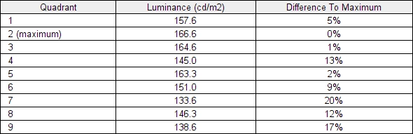
Luminance uniformity table 'Test Settings'
Luminance uniformity table 'SmartUniformity'
Luminance uniformity map 'Test Settings'
Luminance uniformity map 'SmartUniformity'
Colour temperature uniformity map 'Test Settings'
Colour temperature uniformity map 'SmartUniformity'
Contrast in games and movies
Lagom contrast tests
Colour reproduction
Colour gamut
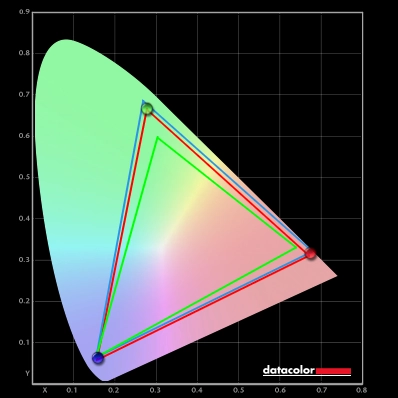
Colour gamut 'Test Settings'

Colour gamut 'sRGB'

Colour gamut AMD 'CTC disabled' setting
Colour in games and movies
Shade representation using SpyderCHECKR 24
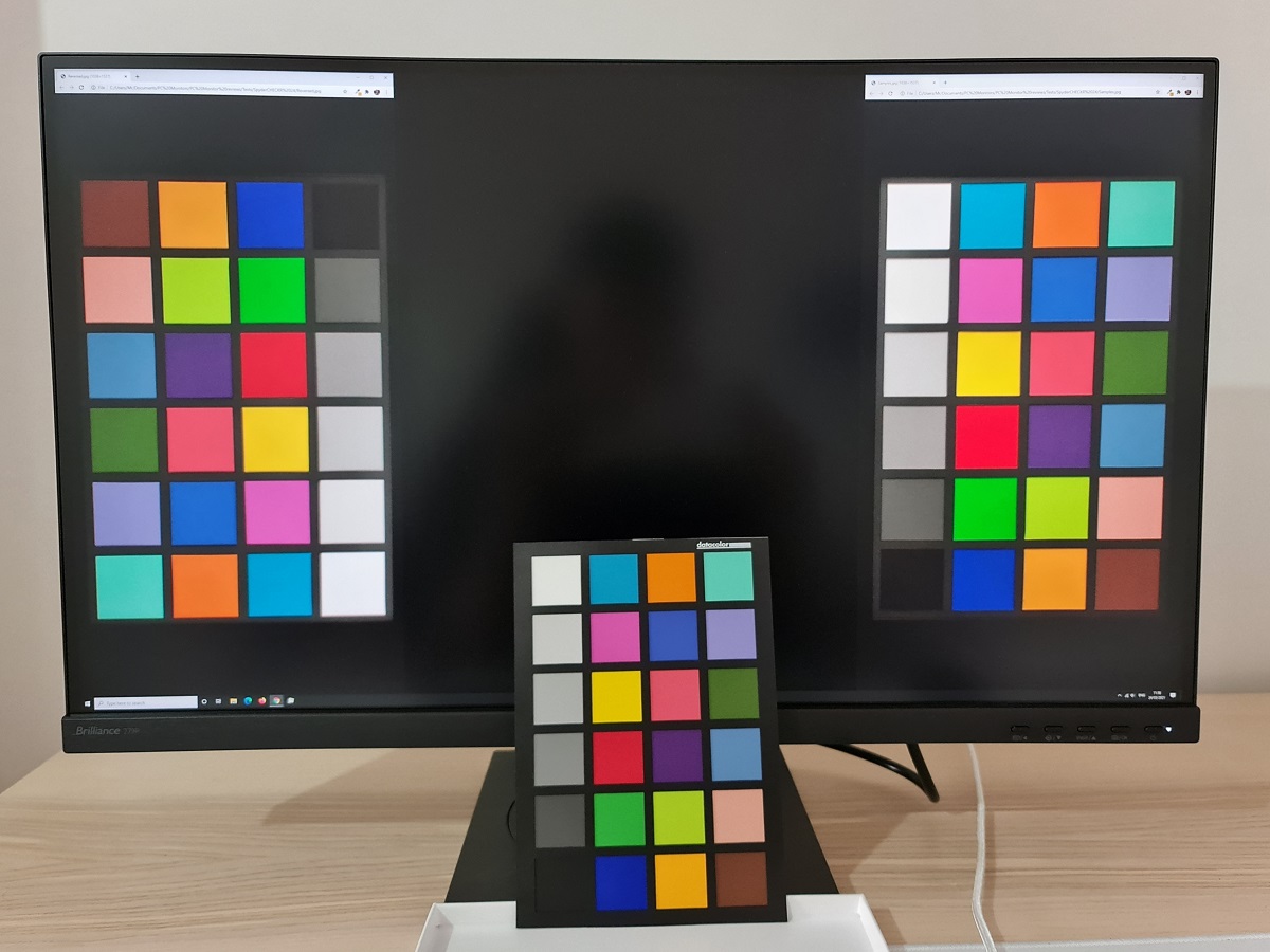
The monitor outputs shades in a vibrant way with extra saturation. Medium orange (3) appears a deeper shade than intended, more of a reddish orange. Whilst tango pink (11) and dark lime green (18) also appear with extra depth and saturation. Candy apple red (14) appears a touch neon and light chocolate brown (24) has a bit of a red cast to it – but not as strong as we’ve seen on some models, with even more generous gamuts. Most others shades were represented fairly faithfully, with aquamarine (4), Persian pink (6) and lilac (8) and grape purple (15) being amongst shades which showed relatively little deviation. The consistency of the screen was strong without the sort of clear saturation shifts you’d observe on a VA or TN model depending on the position of the shade on the screen. As explored earlier, the monitor includes an sRGB emulation mode. But it’s very limited in its practicality due to the brightness being locked at a high level. The comparison between printed sheet and the screen is massively skewed and captured poorly if a high monitor brightness is used, so we won’t be including any photos using this setting and the SpyderCHECKR 24 test. As usual, we’d recommend profiling the monitor with your own colorimeter or spectrophotometer using the native gamut if you require the strongest level of colour accuracy.
Viewing angles
The video below shows the Lagom text test, a mixed desktop background, game scene and dark desktop background from a variety of viewing angles. You can see fairly minor colour shifts for the mixed desktop background and game scene. Certainly less pronounced than you’d see on TN or VA models. There’s a horizontal ‘hazing’ (contrast loss) at moderate to sharper viewing angles horizontally which is more pronounced than on some IPS-type models. The dark desktop background highlights ‘IPS glow’, which creates an obvious ‘bloom’ as viewing angles sharpen. Depending on angle, the glow may take on a warmer appearance with some hints of green-grey or a slightly warmer appearance with subtle reddish purple hints.
Interlace pattern artifacts
Responsiveness
Input lag
Perceived blur (pursuit photography)
Responsiveness in games and movies
VRR (Variable Refresh Rate) technology
Adaptive-Sync
You will also see in the image above that it states: “Selected Display in not validated as G-SYNC Compatible.” This means Nvidia hasn’t specifically tested and validated the display. The technology worked, with caveats. At higher frame rates it worked as it should – anything higher than 38Hz (38fps) in fact. We diidn’t observe the tearing that we’d usually see (VSync off) or stuttering (VSync on) from the frame and refresh rate mismatches that occur without a VRR technology like this active. Even at 38Hz there wasn’t an obnoxious level of overshoot using our preferred ‘SmartResponse = Fast’ setting, either. Which can sometimes sour the experience at reduced refresh rates.

Note that the refresh rate displayed in ‘Setup’ – ‘Information’ in the OSD reflects in real time the frame rate of the content (up to 60Hz = 60fps). Finally, it’s worth noting that Adaptive-Sync only removes stuttering or juddering related to mismatches between frame rate and refresh rate. It can’t compensate for other interruptions to smooth game play, for example network latency or insufficient system memory. Some game engines will also show stuttering (or ‘hitching’) for various other reasons which won’t be eliminated by the technology.
The ‘4K’ UHD experience
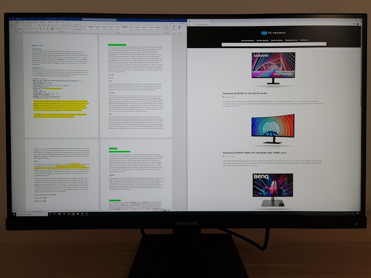
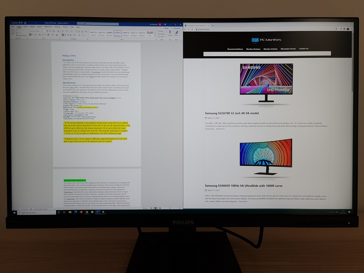
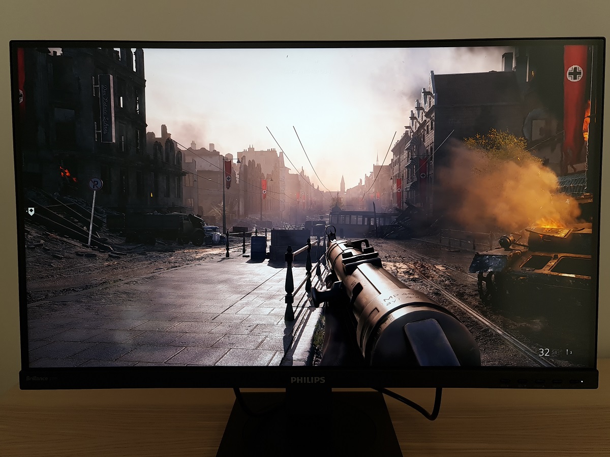
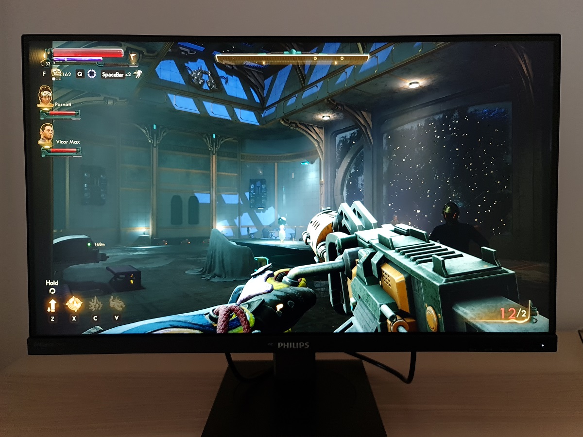
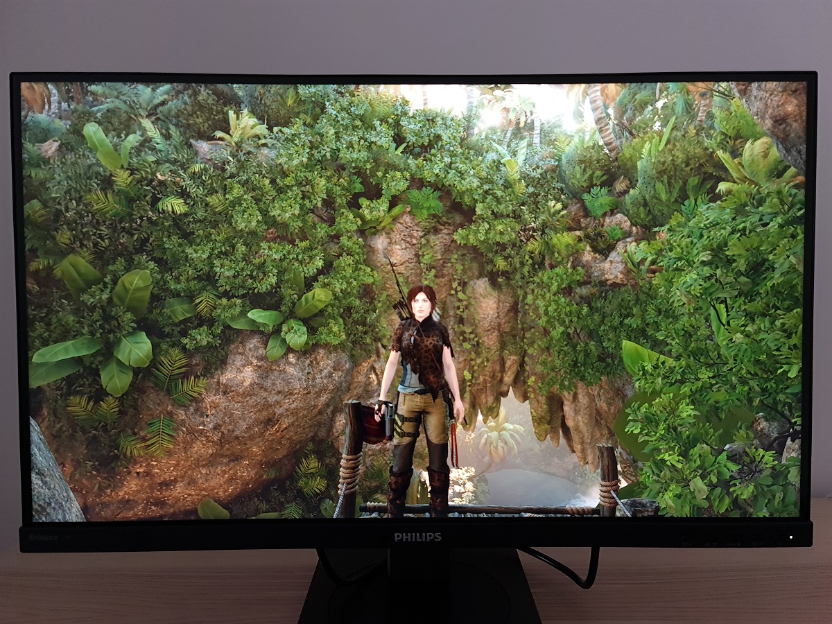
The excellent pixel density also brings benefits to suitably high resolution image content, ‘4K’ movies and games. Some games naturally make better use of the resolution than others, with high-resolution textures and particle effects used very generously. But the strong pixel density provides benefits even if you’re running older titles or using low graphics settings. Various elements appear sharper with superior definition. Objects and people in the game appear more distinct from one another and their surroundings because of this, with a distant clarity you simply don’t get with a significantly lower pixel density. The images are again for illustrative purposes, using a range of game titles. They don’t accurately reflect how the monitor appears in person.
Interpolation and upscaling

‘Picture Format’ in the ‘Picture’ section of the OSD has various settings that control the monitor’s scaling behaviour. ‘Wide Screen’ uses an interpolation process with all pixels of the monitor used to display the image, so the full screen space is used. If you’re using Adaptive-Sync (‘G-SYNC Compatible Mode’ active in the driver) the monitor will be locked into this setting. ‘4:3’ enforces that aspect ratio regardless of resolution used, whilst ‘1:1’ is a pixel mapping feature that only uses pixels called for by the source resolution to display an image. With a black border filling out the remaining pixels. These settings are shown in this section of the OSD video.
Video review
Timestamps:
Features & Aesthetics
Contrast
Colour reproduction
Responsiveness (General)
Responsiveness (Adaptive-Sync)
Conclusion
Positives Negatives A generous colour gamut and strong consistency delivers a vibrant and varied image – gamma and colour channels well-tuned on our unit as well
DCI-P3 and Adobe RGB coverage insufficient for work within those colour spaces, sRGB emulation mode locked at high brightness and no HDR support Decent static contrast for an IPS-type panel, whilst the light and reasonably smooth screen surface provided only a ‘misty’ graininess without an obvious layered appearance Moderate ‘IPS glow’ ate away at detail and atmosphere, especially in dimmer conditions Low overshoot using optimal ‘SmartResponse’ setting and reasonably low input lag Pixel overdrive could be better-tuned, some moderate pixel response time weaknesses and no official Adaptive-Sync support Excellent ergonomics and a strong pixel density offering, offering pleasing detail and on-screen ‘real-estate’ potential. A good port selection plus some useful additions like the PowerSensor Pricing much more competitive in some regions (such as US) than others at time of writing
