Author: Adam Simmons
Date published: May 5th 2015
Table of Contents
Introduction
There are many different paths that users can take when it comes to buying a monitor, and indeed no single product is perfect. For many users, though, a screen that delivers a crisp and vibrant image is highly desirable. The ViewSonic VP2780-4K is one of a growing number of screens to combine a ‘4K’ UHD (3840 x 2160) resolution with an IPS-type panel. It all looks good on paper, but we give this 27” pixel pusher a good testing with a range of games, movies and other applications to see how it performs out there in the real world.
Specifications
The monitor uses a 27” ‘4K’ UHD panel, which makes use of an LG AH-IPS (Advanced High–Performance In-Plane Switching) matrix. The colour processing is 8-bit + FRC dithering, bringing it up to 10-bit. In addition to this a 14-bit LUT is used alongside a 3D LUT to further enhance colour precision and provide smooth gradation performance. A rather precise-sounding grey to grey response time of 5ms is specified, although in reality you can expect this to change depending on the shades involved in the transition. Some of the key ‘talking points’ of the monitor have been highlighted in blue below.
The key ‘talking points’ of the specification have been highlighted in blue below.
Features and aesthetics
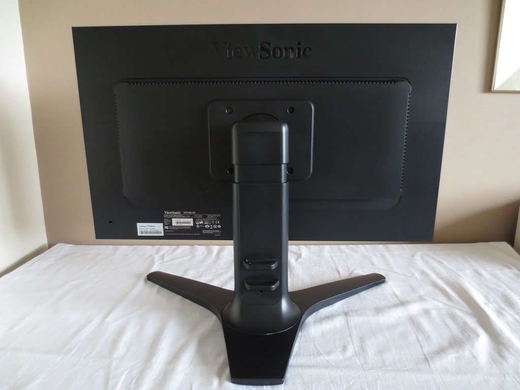
From the front, the monitor has a fairly sensible no-frills office-like appearance. The stand base is a large forked foot, made from matte black plastics. It is also quite deep and on our desk it brought the screen closer to our eyes than we would have liked, with the screen sitting >10 inches from the rear of the stand. The same matte black plastic is used on the fairly chunky bezels, which measure ~21.5mm (0.85 inches) at all edges. A very light matte anti-glare screen surface is used, as explored later.
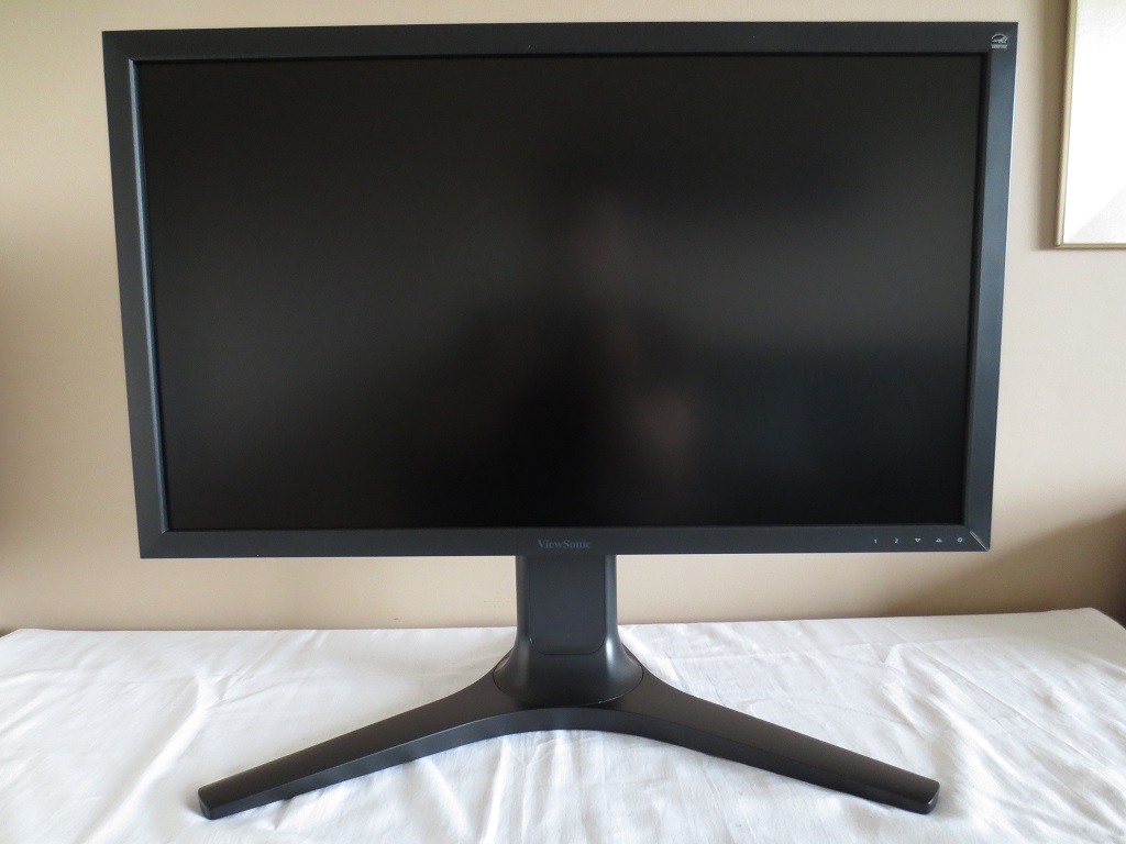
The OSD (On Screen Display) is controlled by touch-sensitive buttons at the right side of the bottom bezels. There is a fairly funky power LED, which is a strip running diagonally from inside lower right bezel to the outside lower right bezel. The LED itself only illuminates the half of this strip closest to the bottom corner rather than lighting the whole thing up. It glows dark blue when the monitor is on and amber when in standby. The following video shows the menu system of the monitor, the buttons used to control it and the power LED.
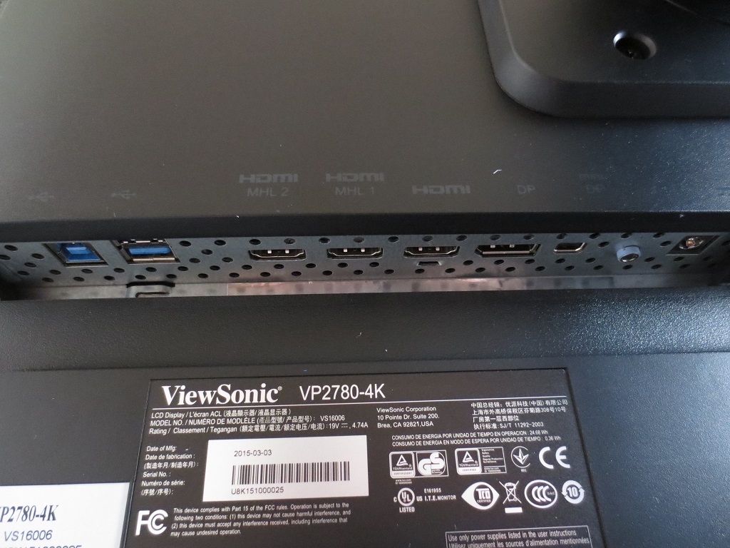
From the side the monitor is reasonably svelte; 26mm (1.02 inches) at thinnest point, protruding out to around 56mm (2.20 inches) centrally. The stand protrudes back from that further. There are also 2 USB 3.0 ports at the right side, as shown below.
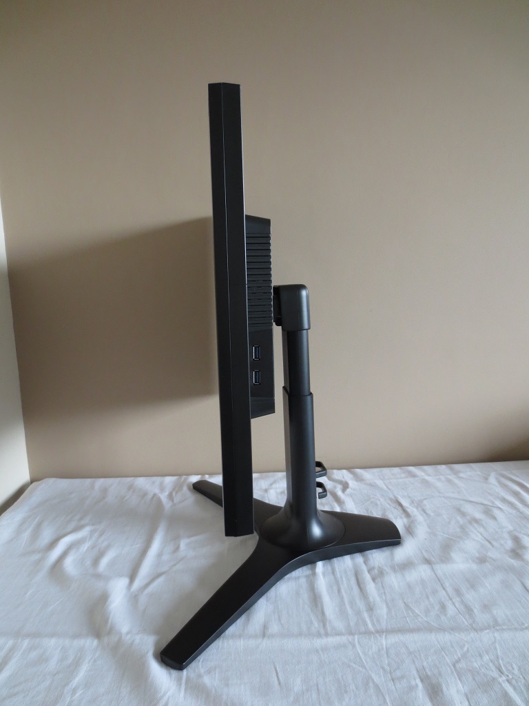
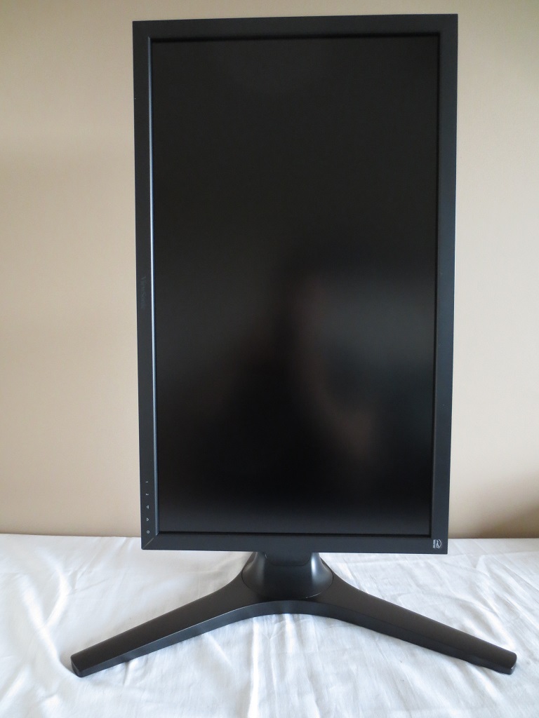
The stand is fully adjustable, offering; tilt (5° forwards, 23° backwards), swivel (60° left and 60° right, height adjustment (150mm or 5.9 inches) and pivot (90° clockwise rotation into portrait, shown below).
The rear continues with the matte black plastic. The stand attaches centrally by 100 x 100mm VESA and can be removed to make way for an alternative VESA 100 stand or mount. There is a Kensington lock socket at the bottom left and some cable tidy clips just above the centre of the stand base.
The ports are down-firing and are, from left to right; USB 3.0 upstream plus 2 USB 3.0 downstream ports (4 downstream ports in total), 2 HDMI 1.4 ports (with MHL 2.0), HDMI 2.0, DP 1.2a, MiniDP 1.2a, 3.5mm headphone jack and DC power input (external power brick). HDMI 2.0 and DP 1.2a supports 60Hz at 3840 x 2160, whereas HDMI 1.4 or earlier and DP 1.1 is limited to 30Hz at 3840 x 2160. Please note that DP 1.2a does not mean that the monitor is Adaptive-Sync compatible, as that is an optional and not compulsory extension of DP 1.2a that is not used here. The necessary power cables, a DisplayPort cable, HDMI cable, MHL cable and USB 3.0 upstream cable is generously included in the box.
Calibration
Subpixel layout and screen surface
A very light matte screen surface is used on this monitor, which some users may refer to as ‘semi-glossy’. This provides strong glare-handling characteristics in moderate lighting conditions without affecting the vibrancy or clarity as much as stronger matte screen surfaces. There is only a slight graininess to the screen surface, which does not give the image a ‘smeary’ or overly granular appearance.
![]()
The subpixel layout for the panel is RGB (Red, Green and Blue) stripe. This is the most common layout and is the default expected by common Operating Systems including Microsoft Windows and Apple’s Mac OS. Apple users can expect strong text clarity without the ‘fringing’ issues caused by other subpixel layouts. Windows users should expect the same, but are also able to run ‘ClearType’ to optimise the text-viewing experience according to preferences. There should be no particular issues unless you have previously run ‘ClearType’ on a monitor with a different sub-pixel layout, in which case you should run it again with different selections.
Testing the presets
The VP2780-4K features a range of settings that can be adjusted through the OSD. There are what you may consider traditional presets on the monitor, referred to as ‘Viewmode’ settings; ‘Standard’, ‘Game’, ‘Movie’, ‘Web’, ‘Text’ and ‘Mono’. Somewhat confusingly, there are some other presets available in the ‘Color Adjust’ menu; ‘sRGB’, ‘EBU’, ‘Bluish’, ‘Cool’, ‘Native’, ‘Warm’ and ‘User Color’. If you wish to use any of these ‘Color Adjust’ settings, then the ‘Viewmode’ is automatically set to ‘Standard’ – in other words, these sets of presets override one another.
Rather than testing all of these presets, which would be tedious to say the least, we have selected a few to concentrate on in the table below. In addition we will focus on some other options available in the OSD such as the ‘Blue Light Filter’ and ‘Gamma’ settings. Our test system used an Nvidia GeForce GTX 970 connected using a MiniDP to DP cable. The monitor was left in its ‘plug and play’ state on Windows 8.1, without any additional drivers or ICC profiles specifically loaded. Aside from our ‘Test Settings’, assume any setting not mentioned here was left at default.
| Preset Mode | Gamma (central average) | White point (kelvins) | Extra OSD features | Notes |
| Color Adjust = sRGB | 2.3 | 6049K | Brightness | Fairly dim but otherwise nicely balanced. An excellent variety of shades with good depth and richness overall. |
| Color Adjust = Native (Factory Defaults) | 2.3 | 6104K | Brightness, Contrast, Dynamic Contrast, Gamma, Blue Light Filter | Extremely bright with a good vivid look and pleasing depth and variety amongst many shades. Brightness alone causes some oversaturation in places. It looks quite like ‘sRGB’ really, but brighter by default. |
| Color Adjust = Warm | 2.1 | 4867K | Brightness, Contrast, Dynamic Contrast, Gamma, Blue Light Filter | As the name suggests, an obvious warm tint to this mode. This is essentially a ‘Low Blue Light’ setting, suitable for relaxing evening viewing. |
| Color Adjust = User Color | 2.0 | 6178K | Brightness, Contrast, Dynamic Contrast, Blue Light Filter | Very bright with poorer balance than some of the other presets. Some shades appear more muted than they should whilst others appear oversaturated. |
| Gamma = 2.0 | 1.9 | 6109K | Brightness, Contrast, Dynamic Contrast, Gamma, Blue Light Filter | As ‘Native’, but an obvious lack of depth to some shades giving a slightly washed out look. |
| Gamma = 2.4 | 2.3 | 6118K | Brightness, Contrast, Dynamic Contrast, Gamma, Blue Light Filter | This changes the gamma curve compared to the native ‘2.2’ setting, despite the average remaining at 2.3 in reality. The low end of the gamma curve is ‘upset’ so that some of the darkest shades blend together too readily – giving a loss of detail. |
| Blue Light Filter = 0 | 2.3 | 4323K | Brightness, Contrast, Dynamic Contrast, Gamma, Blue Light Filter | This gives a ‘maximum’ blue light reduction, giving an even warmer look to the image than the ‘Warm’ setting. You can set this filter between 0-100 in single unit increments according to preferences. |
| Viewmode = Game | 2.1 | 6131K | One of the better balanced game modes we’ve seen on a monitor, although that’s not saying much. Brightness is fixed and will be brighter than some users will like and the balance is quite similar to ‘User Color’ (a bit off compared to some of the other presets). | |
| Viewmode = Mono | 2.7 | 6901K | This is an interesting and quite unusual mode which does what you would expect – makes everything black and white or greyscale. The distinction between greys is far worse than on any other mode, however. | |
| Test Settings (as below) | 2.3 | 6135K | Brightness, Contrast, Dynamic Contrast, Gamma, Blue Light Filter | As ‘Standard’ with better daylight colour balance and lower brightness. Good vibrant and varied look to the image. |
| Low Blue Light = Reading -70% | 2.2 | 4896K | As above, but another reduction in blue light output. The blue colour channel has been weakened massively – this is an effective mode for users with sensitive eyes or anybody wishing to minimise blue light exposure before bed. | |
| User | 2.2 | 6728K | Gamma, Hue, Saturation, Color Temperature (Normal, Bluish, Reddish, User Define) | Similar to factory defaults, but brighter and ‘cooler’ in tint – plus RGB channels now unlocked. |
| Test Settings (as below) | 2.2 | 6493K | Brightness, Contrast | Simply sRGB with reduced brightness, as we found this preset to be very pleasing. |
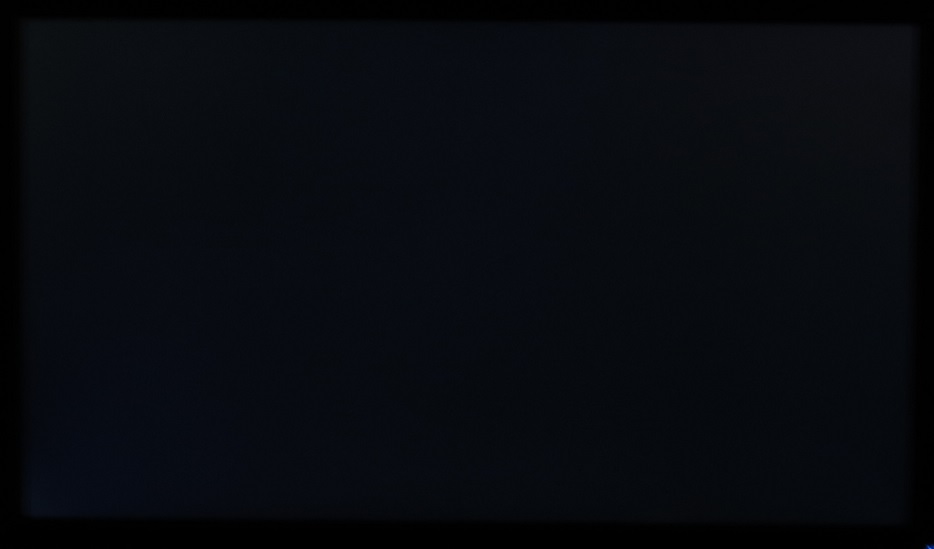
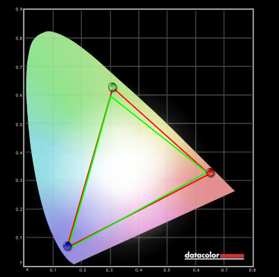
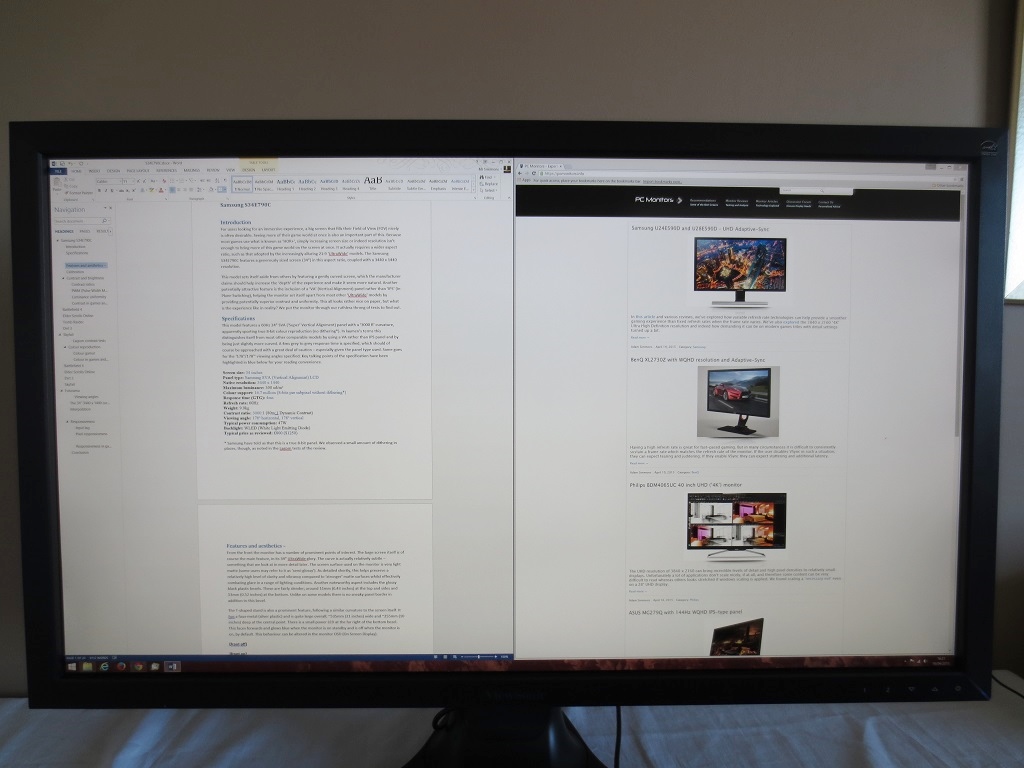
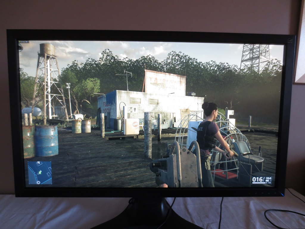
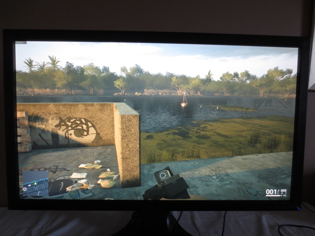
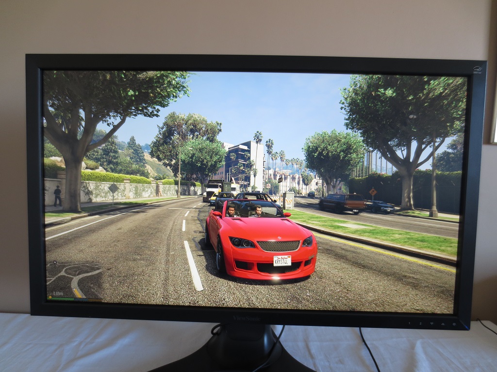
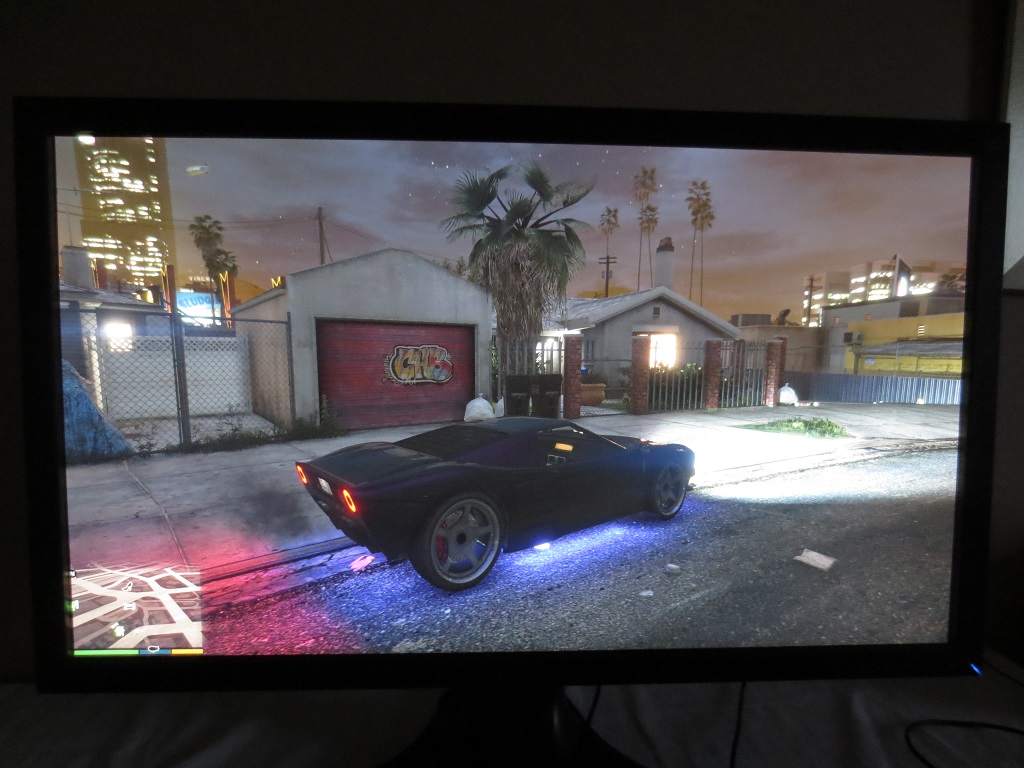
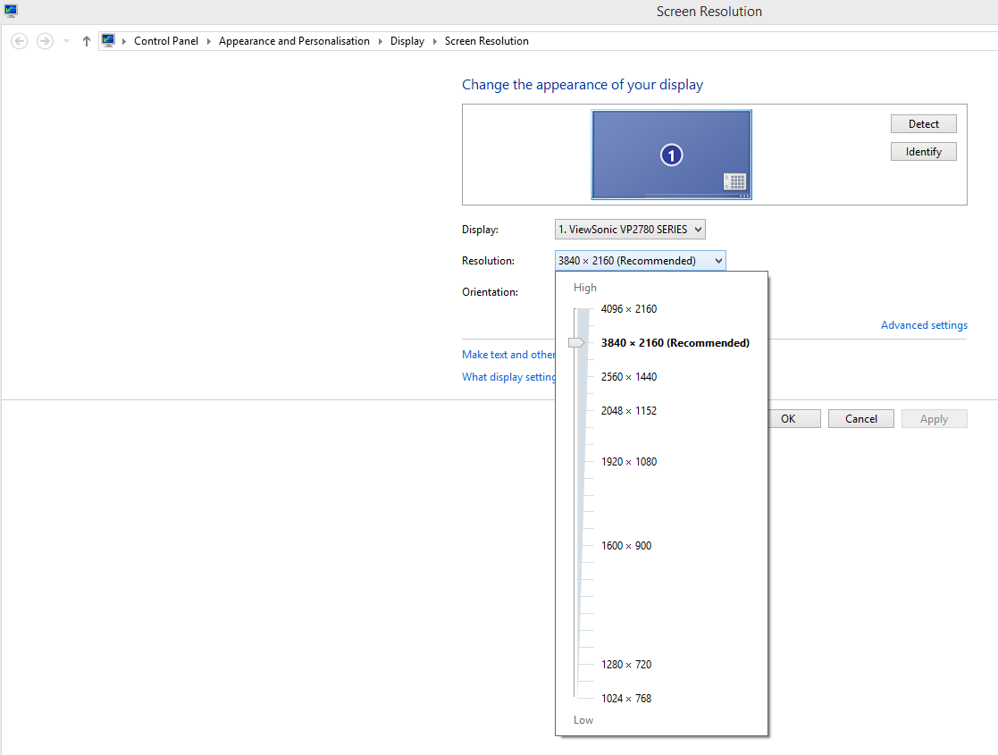
The monitor comes factory calibrated in its ‘Native’, ‘sRGB’ and ‘EBU’ presets as shown by a 2-page factory calibration reports that is included with each unit. Unfortunately our test sample did not include this. The overall balance of the image was pleasing, despite none of the ‘presets’ actually meeting the ‘6500K’ or ‘2.2 gamma’ targets. Being overly rigid with these targets is not necessary for most users as the ideal targets actually vary depending on ambient lighting – which is rarely strictly controlled. For users where absolute adherence to certain standards are vital, a calibration and indeed a number of re-calibrations over time using your own equipment are essential. The gamma curve using our ‘Test Settings’ is shown below. It tracks at 2.3 on average due to some ‘sagging’ centrally, but shows good curve conformity at the upper and lower end on this representation. Importantly, it gave a pleasing end-result – a rich and varied image with good shade depth overall. The colour balance was also good, as although the white point sat below 6500K (which is perfectly valid depending on lighting conditions) there was no green tint or relatively green channel weakness. The same can’t be said if you use the ‘User Color’ preset, which is required to manually adjust the colour temperature. The colour channel can of course be corrected to whichever value you want, but the gamma can’t be adjusted at all in the OSD. You’re left with a gamma curve that looks quite bizarre as shown below. We also tested a number of other settings, including a few different ‘Gamma’ settings. These certainly changed the gamma, although it never quite seemed to adhere to the specified target values. The ‘Blue Light Filter’ setting proved useful and did exactly what it set out to do, as a customisable ‘Low Blue Light’ mode. Given the poor gamma handling in the ‘User Color’ mode, this was also preferable to simply lowering the blue colour channel yourself. We also found that the ‘Warm’ setting provided a good setting of this type as well, so overall certainly a monitor that can provide relaxing evening viewing. For our ‘Test Settings’ we simply used the factory defaults (Color Adjust = Native) with lowered brightness. This provided what we feel was a rich and nicely balanced image, taking advantage of the screen’s factory calibration. Given our uses and that the ideal targets really depend on room lighting, which in our case is a bit variable, a little deviation from the usual ‘6500K’ and ‘2.2 gamma’ is perfectly acceptable. If you wish your monitor to adhere more strictly to these targets or other specific targets then calibration and indeed re-calibration over time with your own colorimeter is recommended. For other users we feel the factory setup is very pleasing, aside from the retina-scorching brightness. Any settings not mentioned here were left at default. We have included other alterations we made in the OSD including the ‘Response Time’ setting here just for reference. Response Time= Advanced A Konica Minolta CS-200 luminance meter was used to measure the luminance of white and black using a range of settings. From this, contrast ratios could be calculated. The table below shows these values and ratios, where black highlights indicate the results of our test settings and blue highlights indicate the ‘best’ values recorded (highest white luminance, lowest black luminance and highest contrast ratio). Aside from for our test settings, assume any setting not mentioned in the table was left at default. The average static contrast on the VP2780-4K with only brightness adjusted was recorded as 1203:1, which is pleasing. Because our test settings simply involved a change in brightness, contrast remained similar at 1164:1. The peak contrast ratio recorded was 1313:1, in the ‘User Color’ setting which lacks the fairly rigorous calibration of some of the other settings. Static contrast remained above 1000:1 even with the maximum ‘Blue Light Filter’ applied (a setting of ‘0’). It only dipped below this in the rather unusual ‘Mono’ setting. The maximum luminance recorded was a very bright 407 cd/m², whilst the minimum white luminance was a not terribly low 92 cd/m². This provides a good luminance adjustment range of 315 cd/m², although some users would prefer a lower minimum without a loss of contrast. A ‘Dynamic Contrast’ setting features as well, which can be activated in certain presets as explored in the calibration section. This allows the backlight intensity to adjust dynamically according to the levels of light and dark on the screen. The backlight responded extremely rapidly to changes in the makeup of a scene, which meant it was very ‘dynamic’ and effective at doing what it is supposed to. These rapid brightness fluctuations are also fairly annoying and there is no way to limit the brightness at the upper end – giving an uncomfortable brightness if fairly light content is being displayed. As with all settings of this type on modern LCD monitors, the backlight is always controlled as one unit and therefore can’t provide anything more than a compromise where mixed content is displayed. And in real use, mixed content is almost always displayed. Needless to say we aren’t fans of such settings, but it is there if you wish to use it. The monitor does not use PWM (Pulse Width Modulation) to regulate backlight brightness and instead uses DC (Direct Current) modulation. The monitor is therefore considered to be ‘flicker-free’, as advertised, which will come as welcome news to those who are sensitive to flickering or other aspects of PWM usage. Whilst observing a black screen in a dark room, using our test settings, no significant backlight bleed or clouding was observed. You can see in the image below that there are only some very small patches here and there, for example in the bottom left corner. This was not an issue at all in practice and was completely drowned out by something we will come onto shortly called ‘IPS glow’. The image below was taken from a few metres back with the camera as central as possible to eliminate this ‘IPS glow’. Many people reading this will probably be familiar with ‘IPS glow’, but for those who aren’t it’s a typical phenomenon associated with panels of this type. If you observe dark content in a moderately bright to dim room you can see that the bottom corners in particular (from a normal viewing position) have a silvery blue or slightly golden sheen to them. This sheen ‘blooms out’ if you move your head and becomes very noticeable off-angle. Some of the implications of this from a normal viewing position are explored later on in the review – and there is also a video showing how it manifests itself ‘off-angle’. We used the Spyder4Elite to assess the uniformity of white on the screen, measuring the brightness of 9 equidistant white quadrants running from top left to bottom right of the screen. The following table shows the luminance recorded at each quadrant alongside the brightness deviation between a given quadrant and the brightest point recorded. The luminance uniformity was strong overall. The maximum luminance was recorded at ‘quadrant 2’ at the top central region of the screen (165.8 cd/m²). The greatest deviation from this was recorded at ‘quadrant 9’ at the bottom left (146.3 cd/m²), which is 12% dimmer than the brightest point. Elsewhere deviation from the brightest point was just 1-8%, which is excellent. It is worth remembering that individual units can vary when it comes to uniformity and indeed there may be further deviation beyond the 9 quadrants measured here. For those who prefer a visual representation of these results, the contour map below shows the deviations graphically. Here darker greys represent lower luminance than lighter greys and hence greater deviation from the brightest point. Percentage deviation between each quadrant and the brightest point are also shown. The Spyder4Elite was also used to analyse variation in the colour temperature (white point) of the same 9 quadrants. The graphic below represents deviation between each quadrant and the 6500K (D65) daylight white point target. Deviations here are given as DeltaE values, where a DeltaE >3 represents deviation that could readily be noticed by most users by eye. On this map darker colours represent higher deviations from 6500K than lighter colours. The results here are reasonable. The point closest to 6500K is ‘quadrant 2’, the top central region. There is significant deviation in colour temperature shown when comparing the bottom region of the screen to this top central region. The values shown here are ‘only just’ significant, however. If you compare any quadrant other than ‘quadrant 2’ to any of the other quadrants then the deviation is not considered significant. As above, you can expect some variation beyond the points analysed and also between individual VP2780-4Ks. On Battlefield 4 the contrast performance was good overall. There was a fair degree of detail lost towards the bottom two corners of the screen and some slight detail lost at the flanks due to IPS glow. Elsewhere there was a pleasing level of detail in dark areas. Bright elements contrasted well and therefore stood out nicely. Light shades such as white appeared slightly grainy due to the screen surface, but this wasn’t excessive and didn’t have a smeary quality as you see with some stronger matte surfaces. On Dirt 3 the contrast performance was also good overall. There was some loss of detail in areas of the screen affected by IPS glow, meaning the car interiors, car tread patterns and the like lacked proper distinctness. Elsewhere on the screen such details were visible quite distinctly. Bright elements stood out well and indeed the variety of very light shades was rather impressive. Slightly different hues for car headlights and other artificial lights added a nice variety to night scenes, again with a slight but not excessive graininess from the screen surface. We also assessed the contrast performance using the Blu-ray of Skyfall. Because this movie is presented in a 2.40:1 (16:9 letterbox) format, there are black bars at the top and bottom which ‘absorb’ much of the IPS glow. The level of subtle detail was very good in this film, with wrinkles on clothes and hair strands in dark areas showing quite decent distinction. Brighter elements contrasted well, perhaps best showcased on the night scene in Macau where candles, lanterns and fireworks light up the night sky. There wasn’t the same ‘pop’ that you’d get on a VA panel with very strong static contrast or indeed a glossy monitor, but things still stood out nicely. We used Lagom’s tests for contrast to help analyse specific weaknesses in contrast performance which may not be obvious during other testing. We observed the following. The colour gamut of the VP2780-4K (red triangle) has been compared with the sRGB space (green triangle) in the following image. The first image shows the colour gamut in the ‘User Color’ mode, which is one of the presets that uses the full colour gamut of the monitor. You can see that there is very slight under-coverage in some regions and a little bit of over coverage in the green and orange region of this diagram. The second image shows the colour gamut under our ‘Test Settings’. You can see that the calibration of the monitor cuts back on the over-extension and provides a bit of extra under-extension. The gamut follows sRGB closely here, which is good from the perspective of colour accuracy but can cut back on vibrancy a little. On Battlefield 4 colours were pleasing in both their depth and variety. The environments looked natural, complemented by an excellent variety of earthy browns and a strong palette of mixed greens. Some of the deeper greens weren’t quite as lush as we’ve seen on some monitors (due largely to colour gamut) but were still rich with respectable depth. There were good strong red, yellows and oranges seen in the fires and explosions that feature prominently on this game. Again some of the deepest shades were not quite as saturated as on models with a slightly more generous colour gamut (not necessarily wide gamut) but were displayed in a rich and accurate way. Colours were also represented in a pleasing way on Dirt 3. Environments looked very much as they should, with a rich palette of karkhi colours and deeper shades creating a believable aesthetic. Each shade was maintained with excellent consistency throughout the screen, providing a rich look throughout. Some of the strongly saturated greens were a touch lighter than they could be, but that were displayed accurately – so that’s not really a complaint. The car liveries also benefited from this excellent variety and richness, looking pleasingly vivid overall. There were some particularly eye-catching neon greens, light blues and deep purples there. The strong colour reproduction characteristics were also evident on the Blu-ray of Skyfall. Natural environments were appropriately saturated, as were character skin tones. There were some good strong deep purples and neon cyans evident, for example in the Shanghai night scene where neon lights are abundant. Some of the deep blues and reds weren’t as strong as we’ve seen, but were still vivid. We also tested the Blu-ray of Futurama: Into the Wild Green Yonder, which is an excellent test for the colour reproduction capabilities of a monitor. In particular it demonstrates weaknesses in consistency, with large areas of a single shade covering much of the screen. The colour consistency of the VP2780-4K was excellent here, as you would hope. This allowed a great variety of subtly different shades to coexist and remain looking correct regardless of on-screen position. There were also some excellent deep and neon shades, such as dark purples, bright cyans and highlighter greens to name but a few. Lagom’s tests for viewing angle were used to more closely assess colour consistency and how viewing angle affects the image. The following observations were made from a normal viewing position, around 70cm from the screen. A sensitive camera utility called SMTT 2.0 was used to assess the ViewSonic VP2780-4K’s latency. This monitor was photographically compared with a range of other monitors where the latency values are known whilst running this test on the same system. Using this method we calculated 10.5ms (over ½ a frame) of input lag. This value is influenced both by the raw signal delay (the element you ‘feel’) and pixel responsiveness (the element you ‘see’) and indicates that the monitor has quite a low signal delay that shouldn’t prove problematic to most users. The overall ‘feel’ of the monitor was influenced primarily by its 60Hz refresh rate. In this article we explore the limitations of the traditional static photography methods used to capture the motion performance of a monitor. We introduce the concept of ‘pursuit photography’, which uses a moving camera to capture movement on a screen in a way that accurately reflects what the eye actually sees. This is something that static photography and videos simply don’t represent correctly. The images below are pursuit shows captured with the UFO Motion Test for ghosting running at 960 pixels per second. This is a good practical speed for such photography and allows accurate analysis of both blur from eye movement and pixel response behaviour. The monitor was set to its three different ‘Response Time’ settings; ‘Standard’, ‘Advanced’ and ‘Ultra Fast’, respectively. The bottom photograph shows a fast 60Hz reference – a Samsung S27A750D set to full brightness (to eliminate PWM) and 60Hz, using the ‘Faster’ response time setting. The pixel responses on this model are fast enough so that the transitions here are masked entirely by perceived blur – and there is no observable overshoot (inverse ghosting) either. With the ‘Standard’ setting you can see a fair bit of ‘blur’ behind the UFO (remember that it travels from left to right) on top of what is observed due to eye movement. The bottom image, the fast 60Hz reference, shows what you would observe due to eye movement alone. This ‘blur’ is therefore trailing, which is visible here due to sluggish pixel response times for the transitions being shown. With the ‘Advanced’ setting this trailing is cut down significantly, although there is still a little bit remaining as you can see by comparing to the reference. The ‘Ultra Fast’ setting produces what looks like a shadow behind the UFO – that is overshoot (inverse ghosting) due to overly aggressive pixel overdrive. From this analysis it is clear that the ‘Advanced’ setting is optimal for this monitor. For these transitions things actually come quite close to the 60Hz reference, with the pixel responses only playing a minor role in the overall perceived blur. It is important to remember that different transitions (i.e. movement involving different shades) can occur at different speeds. In the analysis that follows we take a subjective look at the gaming experience, considering perceived blur over a very broad range of different pixel transitions and in various different scenarios. On Battlefield 4 the motion blur was largely as you’d see on even the fastest 60Hz LCDs. There was some slight trailing on top of this, but as demonstrated in the previous section this was quite minor. It was most noticeable when moving rapidly and a vehicle with a mixture of light and darker shades, for example earth and vegetation with some lightly painted buildings in the scene. Even then the perceived blur was largely down to eye movement with only a weak influence of pixel responsiveness. We did observe some light traces of overshoot (inverse ghosting) between some medium shades. For example if you moved past silver metal pylons with blue sky in the background, it produced a slight trail that was a little darker than the sky (and of course the pylon). If you moved past a dark object (such as a rotor blade or darkly painted vehicle) with the same blue sky in the background it produced a lighter trail than either of these shades, an almost transparent-looking trail. In both cases this was rather faint and not something some users would notice even if they were specifically looking out for it. We don’t feel it’s the sort of overshoot that would prove distracting if playing the game normally, even to sensitive users. It didn’t occur at all for the majority of transitions, either, only in specific scenarios such as those described. There was a moderate degree of blur on Dirt 3, intensifying during sharp cornering and other rapid manoeuvres. This was again largely as you would see on the fastest 60Hz LCDs, with pixel responsiveness only playing a minor role. Even on the Gymkhana mode we don’t feel this slight whiff of extra trailing here and there would actually impede anybody’s playability of the game. If a user is sensitive enough to find this problematic, then they aren’t likely going to be satisfied with any 60Hz LCD. As on Battlefield 4 there was no obvious overshoot, just slight traces here and there which were not distracting. We also tested the Blu-ray movie titles mentioned earlier. These titles run at a framerate of around 24fps, which is really the limiting factor when it came to fluidity. Here the pixel responsiveness did not impede the experience at all, nor was there any observable overshoot. In this article we explore the experience of using the ‘4K’ UHD resolution of 3840 x 2160 on a 28” screen. Because this is a 27” screen with the same resolution, the pixel density and hence overall experience is extremely similar. We are therefore not going to repeat too much of what was said on that article but rather supplement it with some additional testing. Although we did find the monitor ‘useable’ on the desktop with no scaling applied, the text and other elements in programs such as buttons are really rather tiny. Depending on eyesight and preferences various degrees of scaling would be used instead, with ‘Medium – 125%’ being quite agreeable with ourselves on Windows 8.1. To give a vague idea of the sort of increase this makes to the relative size of things please observe the images below. The top one shows the desktop with no scaling (‘Small – 100%’) whilst the second image shows ‘Medium – 125%’. We won’t repeat what we’ve already said about how hit and miss scaling can be depending on the programs used, but the more general programs we used (web browsers, the latest Microsoft Office suite etc.) worked nicely. They have an independent zoom control allowing text size to be altered according to preferences independently of the scaling set in Windows. The image below shows how nice this monitor can be for multitasking, with a Microsoft Word document on the left side of the screen and Google Chrome open on the right side. Text was small but crisp and perfectly readable for us – so plenty of content could be displayed at any one time, which is good for productivity. To supplement our article we would like to look at what the ‘4K’ UHD resolution brought to the table on a couple of other game titles. First up we played through some of the Battlefield Hardline campaign. The screenshots in this section will not give you a good idea of what the game actually looks like first-hand on the monitor, as that is not possible, but are simply there to help set the scene. Some textures showed excellent levels of detail and a look that only a pixel density this high could give. The dimpled orange plastic of tactical equipment boxes, realistic-looking pond weed in the Everglades (an important visual feature, of course), rusty old barrels and graffiti on weathered walls all took advantage of the resolution. As observed in our experience article, the need for Multi Sample Anti-Aliasing (MSAA) or similar is also greatly reduced. It certainly isn’t the case that aliasing magically disappears completely without AA enabled – thin straight edges in particular still have some little jaggies on them. But the prevalence of these jaggies is hugely reduced such that most of the game environment looks ‘jaggie-free’ even without the use of MSAA. The clarity of the game world as you stare into the distance was also excellent. We also had a play on Grand Theft Auto 5 (GTA V). There were again some textures that don’t really take advantage of the high pixel density of the ViewSonic. The character’s clothes, for example, have quite flat and undetailed-looking textures. On this title, though, there were an abundance of textures that really did take advantage of the high pixel density, at least if your character’s face wasn’t right up against the texture. Road textures were particularly impressive, as was a lot of the vegetation in the game which generally had an excellent crisp and detailed look. Painted breeze block walls and some signs on those walls had a very realistic quality to them, is did reflections on shiny floor surfaces or wet roads. Skin textures (wrinkles, dimples, stubble, pores and all) also had a good believable quality to them. Reflections on cars and shiny floor surfaces also looked uniquely appealing. And last but certainly not least, the vehicles themselves looked appealing at this resolution. Carbon fibre and leather elements, alloy wheels, tires and whatnot all looked pretty impressive – as did the paintwork in general, especially once it developed imperfections. The native resolution of the monitor is 3840 x 2160, also referred to as UHD (Ultra High Definition) ‘4K’. This is an awful lot of pixels for your computer to work with, putting particular strain on the GPU when gaming. You may also connect some devices, such as games consoles, which simply won’t run at that resolution and instead might be limited to 1920 x 1080 at most. The following section of the OSD video, shown previously, looks specifically at the scaling options available on the monitor. These are found in ‘Manual Image Adjust – Aspect Ratio’ within the OSD. The two key options here are ‘1:1’ and ‘Full Screen’. 1:1 is a pixel mapping setting which specifies that only the pixels used in the selected (or source) resolution are actually used, with a black border being used for the remaining pixels. The second option ensures that all of the 3840 x 2160 pixels of the monitor are used regardless of the resolution selected, with the monitor using an interpolation process to ‘fill out’ the image in this way. When the monitor uses its interpolation process, its handling of non-native resolutions is actually quite reasonable. You do lose a bit of sharpness compared to running a given resolution natively on a screen of similar size and screen surface, but the softening is not as severe as we’ve seen on some models (including UHD ones). We specifically tested 1920 x 1080 and 2560 x 1440 and found that both were handled similarly in terms of interpolation – just because 1920 x 1080 divides into 3840 x 2160 nice and evenly does not mean that ‘perfect scaling’ is used. Exactly the same interpolation process that is used to display 2560 x 1440 on this monitor is employed. You could definitely see that text or textures and edges in games lacked the sharpness of a 27” monitor running that resolution natively, but it didn’t look like you were looking at everything through a soft-focus lens. As the video shows, you can also run the monitor at 4096 x 2160, which is the DCI (Digital Cinema Initiatives) 4K standard or as some people might refer to it ‘true 4K’. This is primarily for compatibility purposes or content creation in this resolution. The monitor can’t magically generate extra pixels or change its aspect ratio to suit, so things look a bit squashed horizontally as an interpolation process is used. The overall clarity is still quite good though, so this is certainly useable if you need it. The screenshot below shows how this resolution is presented in the resolution list on Windows. The range of ‘4K’ UHD models available on the market is increasing at quite a pace, with several ‘affordable’ options available with various panel types and sizes. The ViewSonic VP2780-4K is designed to offer strong colour performance at a competitive price. Its IPS panel was put to good use with a strong factory calibration. The factory calibration didn’t quite hit the ‘6500K white point’ and ‘2.2 gamma’ targets, but it came close enough for any differences to be counteracted by lighting conditions anyway. Of course, if particular targets are imperative for your workflow, then you should be performing your own calibration appropriate to your own system, unit and lighting conditions at any moment in time. For general use (including gaming, web browsing and watching movies) the exceptional variety and richness of colours was very pleasing, with excellent consistent representation of shades within the sRGB colour space. The 3840 x 2160 resolution was also appealing in both the real-estate that it provided on the desktop and the level of detail it brought to games. There is certainly room for improvement as far as its handling on some applications goes, but that is not a fault of this monitor specifically. We were also pleased with the handling of non-native resolutions such as 1920 x 1080 (Full HD) and 2560 x 1440 (WQHD) on the monitor, with quite a good interpolation algorithm being used. There was also the rather nifty inclusion of the 4096 x 2160 (‘True 4K’ or DCI 4K) resolution. This was handled of course using interpolation rather than the monitor suddenly gaining extra pixels, but is a compatibility feature some content creators would admire. Elsewhere performance was pleasing on the whole. Static contrast was about as strong as you can expect from a panel of this type, although the usual loss of detail in some sections of the screen due to ‘IPS glow’ persisted. Responsiveness was also quite strong overall, within the constraints of the 60Hz refresh rate. Input lag was much lower than we’ve seen on some UHD models (and even most WQHD models for that matter) whilst the pixel responses only played quite a minor role in perceived blur on the screen. The pixel overdrive solution was well balanced using the ‘Advanced’ setting, without obvious overshoot or bothersome trailing. The VP2780’s styling didn’t exactly get the heart racing, as this was certainly designed to be a sensible-looking monitor that is functional rather than flashy. Ergonomic flexibility was strong with full adjustability, although we were not fans of the excessively deep stand as it brought the screen closer to the eyes than we would have liked. Fortunately VESA mounting to a stand or mount of your choice is an option if that does happen to bug you. The range of ports was good – this included HDMI 2.0, DP 1.2a, HDMI 1.4 with MHL 2.0 support and USB 3.0. Overall this monitor provided a strong all-round performance. It is not perfect, like every model out there, but it should make your shortlist if you’re interested in a UHD model of this size.

Gamma test settings

Gamma 'User Color'
Test Settings
Brightness= 22 (according to preferences and lighting)
Contrast and brightness
Contrast ratios
Monitor Profile White luminance (cd/m²) Black luminance (cd/m²) Contrast ratio (x:1) 100% brightness (Factory Defaults) 402 0.33 1218 80% brightness 340 0.28 1214 60% brightness 280 0.23 1217 40% brightness 219 0.18 1217 20% brightness 156 0.13 1200 0% brightness 92 0.08 1150 Color Adjust = sRGB 96 0.08 1200 Color Adjust = Warm 358 0.31 1155 Color Adjust = User Color 407 0.31 1313 Gamma = 2.0 406 0.32 1269 Gamma = 2.4 406 0.33 1230 Blue Light Filter = 0 309 0.30 1030 Viewmode = Game 406 0.33 1230 Viewmode = Mono 294 0.33 892 Test Settings 163 0.14 1164 Low Blue Light = Reading -70% 121 0.19 637 User 296 0.31 955 Test Settings 163 0.17 959
PWM (Pulse Width Modulation)
Luminance uniformity

Luminance uniformity table

Luminance uniformity map

Colour temperature uniformity map
Contrast in games and movies
Lagom contrast tests
Colour reproduction
Colour gamut
Colour gamut 'User Color'

Colour gamut test settings
Colour in games and movies
Viewing angles
Responsiveness
Input lag
Perceived blur (pursuit photography)

Perceived blur with various settings
Responsiveness in games and movies
The ‘4K’ UHD experience
Interpolation and upscaling
Conclusion
Positives Negatives Strong colour performance with the factory-calibrated IPS panel delivering an excellent range and variety of rich-looking shades with good balance
A bit of deviation from the common ‘6500K’ and ‘2.2 gamma’ goals, with users also unable to manually fine-tune the colour balance without switching to a preset with poor gamma handling
Static contrast about as good as we’ve seen from an IPS panel and a very light matte screen surface helping to preserve the clarity and vibrancy of the image The usual ‘IPS glow’ was observed and the screen surface could have been even lighter/less grainy whilst retaining its fairly effective matte anti-glare properties Relatively low input lag and well-balanced pixel responsiveness delivered quite strong 60Hz responsiveness
Limited to 60Hz maximum at the native resolution (like all current UHD options) and no support for extended colour spaces – a huge way off Rec. 2020, as are all current models
The 3840 x 2160 ‘4K’ UHD resolution provided a great deal of useful screen real-estate and delivered clear image quality advantages to games and supported movies – interpolation was also handled quite well for displaying non-native resolutions
The resolution is graphically taxing and brings with it some scaling issues, out of place textures in games and lack of broad support for movie content– although these are not faults of the monitor itself
![]()

