Author: Adam Simmons
Date published: January 31st 2023
Table of Contents
Introduction
A strong HDR experience and 34” 3440 x 1440 format can provide a good level of immersion and a generally very enjoyable gaming experience. The ViewSonic XG341C-2K of the ELITE series delivers this, with its ultrawide Mini LED VA panel and VESA DisplayHDR 1400 certification. This is combined with a refresh rate of up to 200Hz – as well as HDMI 2.1 support to improve handling for new generation games consoles such as the PS5 and Xbox Series X. We put this model through its paces with our usual testing, including gaming usage, general desktop usage and movie viewing.
Specifications
The monitor uses a 34” VA (Vertical Alignment) panel with 1500R (moderately steep) curve. A 165Hz native refresh rate is supported (200Hz via factory overclock) plus 3440 x 1440 resolution, with true 8-bit colour support. A 1ms MPRT response time is specified using the strobe backlight setting, without a specified grey to grey response time indicated. You shouldn’t put much weight on such specified response times, anyway. Some of the key ‘talking points’ for this monitor have been highlighted in blue below, for your reading convenience.
*10-bit can be selected in the graphics driver at 165Hz or below, up to the native resolution using DP 1.4 (with DSC) under SDR or HDR. 10-bit can be selected at 144Hz and below (with 12-bit available at 60Hz and below) using HDMI 2.1. Or at higher refresh rates for HDMI 2.1 if the ‘OverClock’ feature is enabled – whether ‘FreeSync Premium Pro’ is active in the OSD can also affect the bit-depths selectable. These bit depths beyond 8-bit include an additional dithering stage applied by the monitor’s scaler to facilitate viewing 10-bit or 12-bit depth content. The bit depths listed here are using a Full Range RGB signal.
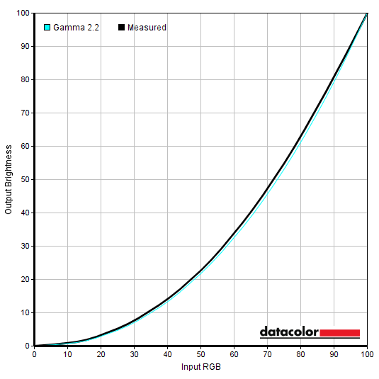
**200Hz is not guaranteed on this model and is facilitated using a so-called ‘OverClock’ feature. It didn’t work on our unit or system, using an RTX 3090 via either DP 1.4 or HDMI 2.1, as it it caused severe frame skipping. This was clear when moving the mouse across the screen, casually observing the monitor and with specific tests (Test UFO). If you activate the ‘OverClock’ feature you lose access to key features such as ‘Local Dimming’, proper HDR support, ‘FreeSync Premium Pro’ (and any VRR support) plus ‘PureXP’ regardless of the refresh rate you select. Matte black materials dominate at the front of the screen, with blended grey used for any branding, including an ‘ELITE’ logo in the centre of the bottom bezel and ‘ViewSonic’ logo at the front-central section of the stand base. The stand base is coated metal with a wide-legged tripod design, which alongside the weighty coated metal neck gives a definite solid and premium feel to things. The screen itself is also held in place nice and firmly, aiding the premium feel. The bottom bezel is made from matte black plastic and ~19mm (0.75 inches) thick. The top and side bezels are sleeker, with a dual-stage design including a slender panel border flush with the rest of the screen and slim hard plastic outer part. Including both elements, the bezels are ~8.5mm (0.33 inches) at the top and sides. The main feature of note from the front is the screen itself, which includes a light matte anti-glare finish and moderately steep (1500R) curve. Both of which are explored a little later on. The OSD (On Screen Display) is controlled by a joystick at the rear of the screen, towards the right side as viewed from the front. There’s a small pinprick-style LED power indicator towards the right side of the bottom bezel that glows blue when the monitor is on and amber when it enters a low power state (signal to the system is lost). It can be disabled in the OSD under ‘Setup Menu’ – ‘Power Indicator’. The video below runs through the menu system including PiP/PbP and associated KVM functionality (sort of) as well as the ‘ELITE RGB’ LED lighting. As noted there we found the menu system a bit less intuitive than some joystick-controlled systems as pressing the joystick in when the monitor is on but you’re not in the main menu turns the monitor off. On most systems from other manufacturers that would bring up a radial quick menu or enter the main menu. If you’re deep into the menu you need to press ‘left’ multiple times to go ‘back’ and eventually press ‘up’ to exit the menu – on most systems the same key can be pressed multiple times or held to quickly exit the menu. When putting our ears to the top of the monitor we could hear a quiet and consistent low-pitch noise which could perhaps be described as a ‘whirring’, but this was not something we noticed when using the monitor normally. We couldn’t say for certain that this is a low-speed fan in operation or if this was some form of electrical noise. If it was a fan there wasn’t an obvious strong outflow of air or ramping up of the fan even when the monitor reached high brightness levels. At the rear of the monitor there aren’t any clear inlets which you’d expect from a more aggressive active cooling solution, either – though there are some vents at the bottom. The noise disappeared when the monitor was switched off and when switching it on there was what sounded like a very brief period of low-speed fan operation before it very quickly reached full speed. This isn’t something we’d worry about and if this is a fan it was nowhere near as obvious as it is on some models, but it’s still important to note it’s possible a simple low-powered active cooling solution is used here. Standard accessories include; a power cable, DP cable, Ultra High Speed HDMI cable, USB upstream cable and USB-C cable but may vary regionally. 120Hz is not listed for 3440 x 1440 or 2560 x 1440 using DP unless ‘FreeSync Premium Pro’ is active in the OSD. It is always listed via HDMI and worked correctly for 2560 x 1440, but selecting it (regardless of ‘FreeSync Premium Pro’ status) for 3440 x 1440 compressed the image via HDMI with the screen behaving as if it’s 16:9 with a simulated ultrawide aspect ratio. The monitor reported running at ‘2160p120’. The image below is a macro photograph taken on Notepad with ClearType disabled. The letters ‘PCM’ are typed out to help highlight any potential text rendering issues related to unusual subpixel structure, whilst the white space more clearly shows the actual subpixel layout alongside a rough indication of screen surface. This model uses a light matte anti-glare screen surface with reasonably smooth surface texture. This provides decent glare handling without as much layering in front of the image as some matte surfaces, alongside better maintenance of clarity or vibrancy potential. There is a ‘misty’ graininess to lighter content rather than strong graininess. Light tends to be moderately diffused across the screen, with only particularly bright direct lighting causing sharper glare patches and slight reflection. Lighter matte surfaces than this will tend to produce more of these sharper glare patches with less diffusion and lower potential hazing of the image as a result. Glossy surfaces take this to the extreme with sharp reflections and no noticeable diffusion or hazing. Because of the curve to the screen, the glare is stretched out horizontally and when you view the screen from a decentralised angle the image can be flooded by glare in brighter conditions. The XG341C-2K features a range of ‘Gaming Modes’, which are the main presets of the monitor; ‘Standard’, ‘Custom 1’, ‘Custom 2’, ‘FPS’, ‘MOBA’, ‘Battle Royale’, ‘Realistic’, ‘Vibrant’, ‘Console Speed’ and ‘Console Color’. The first 3 modes offer full flexibility (nearly full for ‘Standard’) in the OSD, but some settings including individual colour channel adjustments made using ‘Full Color Control’ are shared between them (set universally). The remaining presets set things to various values but also block off various key controls including ‘Gamma’, ‘Color Temperature’, and ‘Sharpness’. We ran through these briefly in the OSD video, but for this section will be mainly focusing on other settings and manual adjustments that can be made. The table below shows gamma and white point readings taken using a Datacolor SpyderX Elite colorimeter, alongside general observations by eye. Our test system uses Windows 11 with an Nvidia RTX 3090 connected using an Ultra High Speed HDMI cable. Additional testing was performed via DP and also using an AMD Radeon RX 580, though observations on this table didn’t differ significantly between inputs or GPUs. The monitor was left to run for over 2 hours before readings were taken and observations made, without any additional monitor drivers or ICC profiles specifically loaded. Aside from our ‘Test Settings’, where various adjustments were made, assume factory defaults were used with the monitor set to ‘Custom 1’. The only adjustment made was that ‘Color Saturation’ was set to the correct neutral point of ‘50’ rather than ‘55’. The monitor was set to 165Hz in Windows, although this didn’t significantly affect the values or observations in this table. When viewing the figures in this table, note that for most PC users ‘6500K’ for white point and ‘2.2’ for gamma are good targets to aim for. Individual targets depend on individual uses, tastes and the lighting environment, however. Straight from the box the monitor provided an image that had good vibrancy in places, but was lacking in depth elsewhere due to lower than intended gamma. Default brightness was high and the image was slightly cool-tinted with slightly weak green channel as well. This was all correctable in the OSD – there are a range of ‘Gamma’ settings but they didn’t correspond to the intended values on our unit. The ‘2.0’ setting tracked closest to the ‘2.2’ curve, as shown below, so we settled on this for our ‘Test Settings’. Gamma is slightly higher than the ‘2.2’ curve (raised gamma) for dark shades and slightly lower (reduced gamma) for some medium shades. The deviations were minor overall and tracking of the ‘2.2’ curve was significantly improved compared to the ‘out of the box’ setup. Given the intended uses for the monitor, inter-unit variation and performance on our unit with OSD tweaking alone we won’t be using any ICC profiles in this review or including any measurements or graphs using them. We wouldn’t recommend using them unless created for your specific unit using your own calibration device. But we appreciate some users still like to use profiles and some aspects such as gamut mapping for colour-aware applications can be useful. You can download our ICC profile for this model, which was created using our ‘Test Settings’ as a base. Note again that this ICC profile was not used in the review. The monitor includes a ‘Blue Light Filter’ setting in ‘Display’ which can be set between ‘0’ (disabled) and ‘100’ (strongest effect). At higher values this is a very effective LBL setting. It’s also well-balanced visually, providing a warmer image but without an unwanted green or yellow tint. Setting ‘Color Temperature’ to ‘Warm’ is similar to setting the filter to a moderately high level. Reducing brightness further reduces blue light output (and indeed all light output) from the screen. The warmer look to the image that this LBL filter gives is considered more relaxing by some and can be particularly important in the hours leading up to sleep. We used ‘Blue Light Filter’ at ‘100’ on top of our ‘Test Settings’ for our own viewing comfort in the evenings, but not for any specific testing beyond that involving the setting itself. As demonstrated in the OSD video you can assign this setting to a ‘Quick Access’ slot in the OSD so it’s easy to activate – and if you have another preset listed in ‘Quick Access’ you can quickly deactivate the setting as well. For our ‘Test Settings’ we set ‘Game Mode’ to ‘Custom 1’ and made various adjustments including to brightness, colour channels, gamma, sharpness and ‘Color Saturation’. ‘Local Dimming’ was disabled in the OSD, except where required for specific testing. Note that individual units and preferences vary, so these settings are simply a suggestion and won’t be optimal for all users or units. We’ve also included the refresh rate used in Windows and our preferred ‘Response Time OD’ setting used for most of the review, just for reference. These settings only apply to SDR, HDR has separate settings associated with it and is explored in the relevant section of the review. We left everything at default under HDR for most of our testing, with ‘HDR = DisplayHDR’ and ‘Local Dimming = Level 3’ our preference there. Game Mode = Custom 1 FreeSync Premium Pro = Off (enabled for Adaptive-Sync testing) Response Time OD = Faster (Fast for HDR) Color Temperature = Full Color Control R = 97 G = 100 B = 95 Gamma = 2.0 Color Saturation = 50 Brightness = 12 (according to preferences and lighting) Sharpness = 25 (according to preferences) Refresh rate (Windows setting) = 165Hz An X-Rite i1Display Pro Plus (Calibrite ColorChecker Display Plus) was used to measure the luminance of white and black using various settings, including those found in the calibration section. From these values, static contrast ratios were calculated. The table below shows these results. Blue highlights indicate the results under our ‘Test Settings’ and with HDR active (factory defaults). Black highlights indicate the highest white luminance, lowest black luminance and highest contrast ratio recorded under SDR, with ‘Local Dimming’ disabled. Assume any setting not mentioned was left at default, with the exceptions already noted here or in the calibration section. ‘ECO Mode’ was set to ‘Standard’ – setting this to ‘Optimize’ and moreover ‘Conserve’ will limit brightness. These limiters don’t affect the minimum white luminance but will limit brightness with any setting in the OSD above ‘0’. Some values in the table are approximate, designated with relevant symbols. This is due to a lack of precision from the measurement instrument for black luminance readings, which significantly affects the measured contrast if the black point is low. Measurements using ‘PureXP’ were taken at 165Hz – brightness levels were similar at lower refresh rates, so we didn’t feel it was worthwhile documenting these observations in the table.
As an Amazon Associate I earn from qualifying purchases made using the below link. Where possible, you’ll be redirected to your nearest store. Further information on supporting our work.

Features and aesthetics


The monitor has reasonable bulk from the side, accentuated due to the curve. At thinnest point it’s ~20mm (0.79 inches) but bulks out towards the centre. The included stand provides; tilt (5° forwards, 23° backwards), swivel (25° left, 25° right) and height adjustment (120mm or 4.72 inches). These adjustments felt fairly smooth rather than ‘grabby’. At lowest stand height the bottom of the screen clears the desk by ~120mm (4.72 inches) with the top of the stand ~481mm (18.44 inches) above the desk. The total depth of the monitor including stand is ~384mm (15.12 inches) with the centre of the screen sitting ~75mm (2.95 inches) back from the frontmost point of the stand. So this is an unmistakably and in our view annoyingly deep stand design. It won’t give great viewing distance flexibility on desks which don’t have a decent depth to them.

The rear of the monitor is largely matte black plastic, with a bit of colour added by the ‘ELITE RGB’ LED lighting strips which were demonstrated in the OSD video. These aren’t sufficiently bright to be considered a bias light that could enhance perceived contrast, but it still creates a glow on the wall behind the monitor that’s visible from the front in a dim room. The included stand can be removed by pressing up a quick-release latch beneath the attachment point, revealing 100 x 100mm VESA holes for alternative mounting. A flip-down headphone hook is included at the right side (left side if viewed from the front) with flip-down mouse anchors at the bottom at either end of the recessed area containing the ports. The stand neck is mainly separated into two segments, allowing you to use the central gaps as a cable tidy, with a small bridge integrated into the stand neck beneath the ports to assist with routing. The ports face downwards and include; AC power input (internal power converter), 2 HDMI 2.1 ports, DP 1.4, USB-C (90W PD, DP Alt Mode, upstream data), 3 USB 3.2 Gen 1 ports (plus Type-B upstream) and a 3.5mm headphone jack. The monitor also includes 2 x 5W up-firing speakers, which provide sound with a good low minimum setting and fairly loud maximum. The sound quality isn’t particularly high and there is a certain lack of bass and clarity compared to better integrated monitors speakers, though these aren’t the worst we’ve heard either. They’re quite usable if you need them, but they certainly won’t keep audiophiles happy.


3440 x 1440 @165Hz plus HDR and Adaptive-Sync can be leveraged via DP 1.4 (with DSC) and HDMI 2.1. AMD FreeSync Premium Pro and Nvidia’s ‘G-SYNC Compatible’ is supported on compatible GPUs and systems via suitable versions of DP and HDMI. Compatible Intel graphics hardware can also leverage Adaptive-Sync. HDMI 2.1 includes integrated VRR (Variable Refresh Rate) capability which doesn’t rely on Adaptive-Sync and can be used via ‘G-SYNC Compatible’ and the PS5 which doesn’t support Adaptive-Sync. The images below show the refresh rates supported for the native 3440 x 1440 resolution. The first image below shows the refresh rates supported for the native 3440 x 1440 (UWQHD) resolution via suitable versions of DP and the second via suitable versions of HDMI.


The images below show the refresh rates supported for 1920 x 1080 (Full HD or 1080p). The first and second images show the resolutions categorised in the EDID of the monitor as ‘TV’ resolutions and listed here under ‘Ultra HD, HD, SD’ (DP and HDMI, respectively). The third and fourth images show resolutions categorised in the EDID and listed here as ‘PC’ resolutions (DP and HDMI, respectively).


The images below show the refresh rates supported for 1920 x 1080 (Full HD or 1080p). The first and second images show the resolutions categorised in the EDID of the monitor as ‘TV’ resolutions and listed here under ‘Ultra HD, HD, SD’ (DP and HDMI, respectively). The third and fourth images show resolutions categorised in the EDID and listed here as ‘PC’ resolutions (DP and HDMI, respectively).


A ‘4k x 2k, 3840 x 2160’ downsampling mode is included via HDMI at up to 120Hz, with the first image showing the ‘TV’ resolution list and the second image the ‘PC’ resolution list. With HDMI 2.1, games consoles like the Xbox Series X and PS5 are able to run up to 3840 x 2160 @120Hz using this ‘4K’ downsampling mode. In the case of the Xbox Series X this also allows HDR to be used as that console doesn’t support HDR at lower resolutions. The HDMI 2.1 ports of this model offer a bandwidth of 24Gbps, meaning they’re limited to a ‘4:2:0’ (limited range, reduced chroma) signal for 3840 x 2160 @120Hz. This provides minimal visible difference when gaming or watching video content compared to a Full Range signal, but it can have a minor impact on colour quality and introduce ‘fringing’ in some instances.


If you’re intending to use the monitor with the PS5 or Xbox Series X/S, be aware that a small settings tweak may be required to ensure 120Hz is selectable for supported resolutions. Details can be found in this article.
Calibration
Subpixel layout and screen surface
![]()
As shown above the standard RGB (Red, Green and Blue) stripe subpixel layout is used. This is the default expected by modern operating systems such as Microsoft Windows. Apple’s MacOS no longer uses subpixel rendering and therefore doesn’t optimise text for one particular subpixel layout to the detriment of another. You needn’t worry about text fringing from non-standard subpixel layouts and won’t need to change the defaults in the ‘ClearType Text Tuner’ as a Windows user. You may still wish to run through the ClearType wizard and adjust according to preferences, however. The subpixels are slightly ‘squat’ with slightly larger gaps above and below than some models will show. In some cases this contributes to ‘static interlace pattern artifacts’ and can affect text and fine-edge clarity. In this case we observed no issues of concern here. Unlike some VA models, this model avoids the use of partial subpixel illumination (split subpixels), which negatively affects text and fine edge clarity on models which use it. We therefore had no subpixel-related concerns related to sharpness or text clarity on this model.
Testing the presets
Preset Mode Gamma (central average) White point (kelvins) Notes Gamma = 1.8 2.0 6723K Low gamma makes things appear brighter, with a ‘flooded’ look in places and some unintended dark detail revealed. As usual for VA technology there are some perceived gamma shifts, reducing perceived gamma and saturation towards the edges of the screen. Otherwise a vibrant look overall, slight cool tint and slightly weak green channel. Gamma = 2.0 2.2 6728K As above, good depth with better ‘2.2’ gamma tracking. Gamma = 2.2 (Factory Defaults) 2.4 6726K As above, extra depth due to raised gamma. Gamma = 2.4 2.6 6722K As above, even more depth. Quite a bold and ‘contrasty’ look with poor dark detail distinction. Gamma = 2.6 2.8 6723K As above, gamma raised further with a very deep look and significant dark shade crushing. Gamma = 2.8 3.1 6730K As above with even higher gamma, further depth and crushing. Color Temperature = Full Color Control 2.4 6678K As factory defaults, slightly brighter and a touch warmer with slightly weaker green channel. Blue Light Filter = 100 2.4 4615K A very effective Low Blue Light (LBL) setting. The image appears warm but doesn’t have an unwanted green or yellow tint. With this setting the screen has a strong red channel, reduced green channel and heavily reduced blue channel which greatly reduces blue light output. Reducing brightness enhances this effect. Test Settings 2.2 6507K Vibrant overall, particularly punchy for red-biased shades. Superior gamma and white point balance compared to factory defaults.
Gamma 'Test Settings'
Test Settings
Contrast and brightness
Contrast ratios
Monitor Settings White luminance (cd/m²) Black luminance (cd/m²) Contrast ratio (x:1) 100% brightness 707 0.17 4159 80% brightness 601 0.15 4007 60% brightness 496 0.12 4133 40% brightness 369 0.09 4100 20% brightness 218 0.05 4360 0% brightness 71 <0.02 >3550 50% brightness (Factory Defaults) 440 0.11 4000 FreeSync Premium Pro = On 472 0.12 3933 DisplayHDR, Local Dimming = Level 1 / Level 2 / Level 3 / Level 4 (1% white, peak)* 759 / 792 / 809 / 842 <0.01 >75,900 / >79,200 / >80,900 / >84,200 DisplayHDR, Local Dimming = Level 1 / Level 2 / Level 3 / Level 4 (4% white, peak)* 1221 / 1225 / 1235 / 1244 <0.01 >122,100 / >122,500 / >123,500 / >124,400 DisplayHDR, Local Dimming = Level 1 / Level 2 / Level 3 / Level 4 (9% white, peak)* 1411 / 1413 / 1418 / 1422 <0.01 >141,100 / >141,300 / >141,800 / >142,200 DisplayHDR, Local Dimming = Level 1 / Level 2 / Level 3 / Level 4 (25% white, peak)* 1137 / 1139 / 1141 /1142 <0.01 >113,700 / >113,900 / >114,100 / >114,200 DisplayHDR, Local Dimming = Level 1 / Level 2 / Level 3 / Level 4 (49% white, peak)* 1090 / 1092 / 1095 / 1096 <0.01 >109,000 / >109,200 / >109,500 />109,600 DisplayHDR, Local Dimming = Level 1 / Level 2 / Level 3 / Level 4 (100% white, sustained)** 1025 / 1025 / 1025 / 1025 N/A N/A DisplayHDR, Local Dimming = Off (1% white, peak)* 517 0.13 3977 DisplayHDR, Local Dimming = Off (100% white, sustained)** 518 N/A N/A CinematicHDR, Local Dimming = Level 4 (1% white, peak)* 843 <0.01 84,300 CinematicHDR, Local Dimming = Level 4 (100% white, sustained)** 1023 N/A N/A GameplayHDR, Local Dimming = Level 4 (1% white, peak)* 844 <0.01 84,400 GameplayHDR, Local Dimming = Level 4 (100% white, sustained)** 1023 N/A N/A Local Dimming = Level 1 / Level 2/ Level 3 / Level 4 (4% white, peak)*** 496 / 498 / 501 / 505 <0.01 >49,600 / >49,800 / >50,100 / >50,500 DisplayHDR (SDR signal), Local Dimming = Level 1 / Level 2/ Level 3 / Level 4 (4% white, peak)*** 1228 / 1233 / 1239 / 1254 <0.01 >122,800 / >123,300 / >123,900 / >125,400 Gamma = 1.8 447 0.11 4064 Gamma = 2.0 443 0.11 4027 Gamma = 2.4 434 0.11 3945 Gamma = 2.6 428 0.11 3891 Gamma = 2.8 424 0.11 3855 Color Temperature = Full Color Control 482 0.11 4382 Color Temperature = Full Color Control (100% brightness) 765 0.17 4500 Blue Light Filter = 100 295 0.11 2682 PureXP = Light 481 0.13 3700 PureXP = Normal 414 0.11 3764 PureXP = Extreme 345 0.09 3833 PureXP = Ultra 208 <0.06 >3467 Test Settings 168 0.04 4200
*HDR measurements were made using this YouTube HDR brightness test video, running full screen at ‘1440p HDR’ on Google Chrome. A browser extension discussed in our 3440 x 1440 article was used to scale the patches to the 21:9 aspect ratio. The maximum reading using the patch size (measurement area) specified in the table was used. The black luminance was taken at the same point of the video with the colorimeter offset to the side of the white test patch, equidistant between the test patch and edge of the monitor bezel.
**These readings were taken using the above test. A reading was taken using a white screen fill (‘all pixels’), 30 seconds after it was displayed. This is used to represent the sustained luminance level the monitor can provide under HDR, rather than the peak luminance achieved for smaller sections of the screen. Because the entire screen is white for this test, black luminance levels can’t be read and an HDR contrast reading can’t be ascertained.
***These readings were taken in the same way as the HDR reading, except the monitor is running in SDR. Although not documented in the table, somewhat larger white areas increase the measured luminance. Where the ‘DisplayHDR’ setting is not used runs closer to the maximum measured under SDR (>700 cd/m²) and where the setting is used runs closer to the maximum measured under HDR (>1400 cd/m²).
The average static contrast with only brightness adjusted was 4152:1 (excluding values affected too heavily by rounding precision), comfortably exceeding the specified 3000:1 and a good value for a modern VA monitor. The maximum contrast recorded under SDR (‘Local Dimming’ disabled) was 4500:1 and under our ‘Test Settings’ was 4200:1, which is strong. The ‘Blue Light Filter’ being enabled fully makes very large changes to colour channels and incurs a significant contrast penalty – dropping to 2682:1, which is still beyond what non-VA LCDs provide natively. The ‘PureXP’ strobe backlight setting, explored in more detail later, dropped the contrast somewhat below 4000:1 and allowed limited brightness adjustment. The 208 cd/m² minimum using that setting is fairly bright, although perceived brightness is somewhat lower due to the strobe nature of the backlight – the 481 cd/m² maximum brightness using that setting is strong. The maximum white luminance recorded under SDR (‘Local Dimming’ disabled) was 765 cd/m², whilst the minimum was 71 cd/m² – giving an impressive luminance adjustment range of 694 cd/m². This is a very bright maximum value for SDR, but a moderate minimum luminance which some sensitive users may find too bright.
On our unit activating ‘FreeSync Premium Pro’ in the OSD (which is the Adaptive-Sync control on this monitor) locked the brightness setting under SDR to 472 cd/m², which is even higher than the already bright factory defaults and certainly brighter than we like for regular usage. HDMI 2.1 VRR can be used without ‘FreeSync Premium Pro’ being active, without brightness being locked. No other setting was active which should have caused this brightness lock – we hope this is not intentional behaviour and have reported it as a possible firmware bug to ViewSonic, but at least one other reviewer (TotallydubbedHD on YouTube) has noted the same behaviour on another unit. With ‘Local Dimming’ active (under SDR or HDR) brightness behaviour was the same whether ‘FreeSync Premium Pro’ was active in the OSD or not.
The monitor includes a 1152-zone Mini LED backlight solution, which is activated with the ‘Local Dimming’ setting – brightness control is locked with this setting. Under SDR this boosted contrast as high as >50,500:1 with a maximum luminance of 505 cd/m² recorded in the table – but as noted under the table brightness can exceed this depending on the content. Having ‘DisplayHDR’ active under SDR with ‘Local Dimming’ increases brightness even for smaller white patches (>125,400:1 contrast with up to 1254 cd/m² brightness recorded). If you enjoy such high brightness, the representation under HDR is far superior. With an HDR signal a contrast as high as >142,200:1 was recorded, alongside a 1422 cd/m² brightness – impressively bright and a value which makes sense given the VESA DisplayHDR 1400 certification. The luminance level and contrast depends on the content being displayed and on the ‘Local Dimming’ level used. A range of readings were taken under HDR to reflect this, with further subjective reinforcement with more complex ‘real world’ examples later. The HDR data for the 4 ‘Local Dimming’ settings is shown below, for those preferring a graphical representation. The ‘DisplayHDR’ setting is used, but the ‘CinematicHDR’ and ‘GameplayHDR’ settings yielded similar results.

Data labels for the ViewSonic are only shown in the graph with ‘Local Dimming’ set to ‘Level 1’ and ‘Level 4’, just to keep things neat. Most of the values are close together, as you can see from the data in the table or by observing the lines of the graph – it’s the more complex shade mixtures in ‘real world’ testing that separates these settings more clearly. The Dell Alienware AW3423DW QD-OLED is also included for reference, using its ‘HDR Peak 1000’ setting. This highlights the superior brightness capability of the ViewSonic and much improved ability to sustain this even for larger patch sizes. It also highlights the improved brightness precision of the Alienware, which allows it to display small bright highlights at full brightness.
The monitor includes a Dynamic Contrast setting called ‘Advanced DCR’ (Advanced Dynamic Contrast Ratio), found in the ‘Display’ – ‘Image Adjust’ section of the OSD. This can be set between ‘1’ and ‘20’ (or ‘0’ for disabled), with an increasing number simply increasing the sharpness filter strength applied. Even set to ‘1’ we found it overly sharp. ‘Advanced DCR’ allows the backlight to adjust as a single unit according to overall brightness levels on the screen. This locks off your usual brightness control. It’s a compromised solution, as usual for such a setting, and it also tends towards high brightness even for mixed content with plenty of darkness mixed in. Only dimming effectively where dark shades really dominate. As usual we prefer manual control over brightness for SDR – and the ‘Local Dimming’ setting with its zonal control is much better for those seeking a dynamic experience.
PWM (Pulse Width Modulation)
The XG341C-2K does not use PWM (Pulse Width Modulation) to regulate backlight brightness at any brightness level, with DC (Direct Current) used to moderate brightness instead. PWM was avoided regardless of ‘Local Dimming’ being active under SDR or HDR and the monitor didn’t exhibit the low amplitude oscillation we sometimes observe with local dimming solutions. The backlight is therefore considered ‘flicker-free’, which will come as welcome news to those sensitive to flickering or worried about side-effects from PWM usage. The exception to this was with ‘PureXP’ active, a strobe backlight setting which causes the backlight to flicker in sync with the refresh rate of the display.
Luminance uniformity
Whilst observing a black background in a dark room, using our ‘Test Settings’, we noticed some backlight bleed and moderate clouding, mainly near the bottom of the screen but a bit elsewhere as well. It’s important to remember that individual units vary when it comes to all aspects of uniformity, including backlight bleed and clouding. The following image was taken a few metres back to eliminate ‘VA glow’. This is a mixture of a silver and reddish glow that appears towards the edges, particularly near the bottom of the screen from a normal viewing position. This ‘VA glow’ blooms out more noticeably from sharper angles, as demonstrated in the viewing angles video later on.
As with most of our testing, we had the ‘Local Dimming’ setting disabled here. With the setting active, the dimming zones of the backlight essentially shut off so it looked like the monitor was switched off. The luminance uniformity was very strong. The maximum luminance was recorded at ‘quadrant 4’ to the left of centre (164.9 cd/m²). At 163.6 cd/m², the central point was 1% dimmer than this. The greatest deviation from the brightest point occurred at ‘quadrant 8’ below centre (159.9 cd/m², which is 3% dimmer). The average deviation between each quadrant and the brightest point was 1.63%, which is exceptional. Note that individual units vary when it comes to uniformity and you can expect further deviation beyond the points measured. The contour map below shows these deviations graphically, with darker greys representing lower luminance (greater deviation from brightest point) than lighter greys. The percentage deviation between each quadrant and the brightest point recorded is also given. The SpyderX Elite was also used to analyse variation in the colour temperature (white point) for the same 9 quadrants. The deviation between each quadrant and the quadrant closest to the 6500K (D65) daylight white point target was analysed and a DeltaE value assigned. Darker shades are also used on this map to represent greater deviation from 6500K. A DeltaE >3 represents significant deviation that may be readily noticed by eye. The colour temperature deviation was more variable and less impressive than brightness uniformity, with significant deviation recorded towards the bottom corners of the screen, up to DeltaE 4.7 at the left and DeltaE 4.6 at the right. Note again that individual units vary when it comes to uniformity and that you can expect deviation beyond the measured points. Also be aware that there are some perceived deviations in both brightness and colour temperature that are typical on VA panels and aren’t reflected by these readings. In addition to the quantitative testing above, we performed a subjective assessment of the uniformity of a variety of ‘medium’ shades, including 50% grey. Some monitors exhibit uniformity issues such as splotches or striations when viewing screen fills of such shades, giving an inconsistent appearance that some users refer to as ‘DSE’ (‘Dirty Screen Effect’). VA models are particularly prone to this. In this case we only observed some slight patchiness and minor striations in places, no obvious issues such as heavy patchiness or clear striations. Note: These observations are with ‘Local Dimming’ disabled. Observations with this setting enabled are explored separately. The monitor put in a strong contrast performance on Battlefield 2042, overall. Under our ‘Test Settings’ we recorded a static contrast of 4200:1. This is sufficient to give a good atmosphere to darker scenes and good depth to darker shades, which adds structural definition and a bit more of a ‘3D’ appearance to various elements of the game world. Some medium shades appeared a bit inkier and more ‘solid’ as a result of this relatively strong contrast, when compared to models with significantly weaker contrast. If you observe in a dimly lit room you don’t get the same sort of depth and atmosphere you’d see on an OLED model, for example, as there isn’t the same absolute depth and inky look to things. But the monitor still outperformed many other LCDs in that respect, particularly those without VA panels and some with VA panels. There was a moderate amount of ‘VA glow’ which brightened up darker shades peripherally, most noticeably towards the bottom of the screen from a normal viewing position. But potentially observed towards the top of the screen as well, depending on viewing position. It isn’t as intense or widespread as ‘IPS glow’, but as with ‘IPS glow’ it can be brought out more strongly if you use a higher brightness setting, sit closer to the screen or your unit has significant backlight bleed or clouding. We also observed ‘black crush’, whereby dark shades (other than black) appear deeper than intended and blend into a dark mass. Perceived gamma for these shades is higher than intended, in other words. This occurs towards the centre of the screen or the area directly in line with your eyes. Perceived gamma is reduced somewhat towards the extreme edges of the screen, revealing a bit of ‘excess’ dark detail. This ‘black crush’ and the gamma shifts described were less pronounced than we’ve seen on some VA models from our preferred viewing distance of ~70cm or a touch further back. Bright shades stood out well against darker surrounding shades, whilst the screen surface provided just a bit of ‘misty’ graininess without a sandy appearance and with less clear layering in front of the image than stronger matte surfaces. Similar contrast observations were made on Shadow of the Tomb Raider. This title includes plenty of predominantly dark scenes such as caves and passageways with a few dispersed light sources mixing in some brightness as well. The relatively strong contrast delivered a good atmosphere here, whilst aiding structural definition to rock cracks, vegetation and suchlike. Some medium shades were given a bit of extra depth as well, making them appear a bit more solid. We observed a moderate amount of ‘VA glow’ and slight some (not extreme) ‘black crush’. The contrast performance here was certainly not comparable to an OLED, particularly if observed in dimmer lighting, but was superior to many non-VA LCDs and some VA LCDs. The relatively strong contrast performance was also evident on the movie Star Wars: The Rise of Skywalker. There are plenty of high-contrast scenes here, with bright elements (light sabers, flames, energy pulses etc.) set against much darker surroundings. Whilst the experience was again not OLED-like, it was relatively strong for an LCD. The gamma shifts and ‘black crush’ were again observed, which brought out a touch of extra detail towards the edges of the screen and masked some dark detail centrally. This extra detail was most noticeable towards the side edges and lower down from a normal viewing position but was not extreme from our preferred viewing position in this case. For highly compressed streamed content this sort of thing can bring out ‘compression artifacts’ which can give a bit of a ‘blocky’ or banded appearance or it can simply make some elements appear less deep than they should. ‘VA glow’ was also noticed in dimmer lighting – this title is presented with black bars at the top and bottom which make this more noticeable. Much of the streamed content you’ll watch on platforms like Netflix, Disney Plus, Amazon Prime Video and certainly YouTube will be presented in 16:9 without these bars at the top and bottom but instead at the sides. The Lagom tests for contrast allow specific weaknesses in contrast performance to be identified. The following observations were made in a dark room. As noted earlier, the monitor includes a Mini LED backlight (FALD – Full Array Local Dimming) solution with 1152 independently addressable zones. This is a key part of the HDR experience of the monitor, but can also be used under SDR to enhance the contrast experience. The setting is referred to as ‘Local Dimming’ and found in the ‘Display’ section of the OSD. Brightness can’t be adjusted when using this setting and as covered earlier things can certainly get rather bright for an SDR experience. The monitor includes 4 separate local dimming ‘levels’, with lower settings more heavily dark biasing and higher levels pushing more towards high brightness even for smaller bright areas (i.e. bright biasing). Because the monitor has far more pixels (~5 million) than it does dimming zones, its dimming algorithm will have to compromise one way or the other where there are intricate shade mixtures being displayed. Dark biasing (lower local dimming ‘levels’) reduces ‘halos’ or ‘blooming’, terms which can be used interchangeably in this context. This is when a zone brightens up a lot even though it’s partly occupied by darker shade, brightening that darker area up a lot more than adjacent dimming zones only displaying darker content. Bright biasing increases these ‘halos’ and makes them more widespread; more generally, it can negatively impact shade depth for medium to dark shades if brighter shades are mixed in. On the plus side, bright-biasing can improve the ‘pop’ and wow factor even for smaller bright areas and prevent medium to bright shades being dragged down and ‘muddied’ when surrounded by darker shades. This dragging down of medium-dark shades so they blend into dark shades more readily can look unappealing in places and is also undesirable for competitive play. All these local dimming levels reacted rapidly to changes in the image, with zones brightening and dimming at a good pace. They’re still not technically as fast as the pixel responses of the monitor, so they can impact perceived visual responsiveness (particularly for significant brightness changes). Though the pixel responses of this model for such ‘high contrast’ transitions aren’t particularly rapid anyway, so we didn’t find this to have a significant visual impact. We found ‘Level 4’ brightened too much for small bright areas, making ‘halos’ more obvious and widespread whilst also sapping some depth away from dark and medium shades (where brighter shades intermingled). ‘Level 3’ struck a bit of a better balance in this respect. ‘Level 2’ tended to dim some reasonably small bright areas such as torches and street lamps a bit too much and gave even smaller bright areas a rather muddy look. But this dark biasing also reduced the formation of ‘halos’. ‘Level 1’ dark biased to a more extreme degree even with somewhat larger bright areas such as the moon in the night sky. We settled for ‘Level 3’, though just to be awkward we might’ve gone for a ‘Level 2.5’ if such a setting existed. Ultimately there’s always a compromise one way or the other with local dimming solutions and people will have their own preferences – it’s good the ViewSonic gives users some control over how aggressive the dimming vs. brightening is. With 1152 dimming zones, you simply don’t have the same precision as you’d have with an OLED model – something like the Dell Alienware AW3423DW with per-pixel illumination providing ~5 million dimming zones. So you have to deal with the compromises described above, with intricate shade mixtures simply not handled with the same precision. However, this is still a decent number of zones which provides an unmistakable positive impact on the overall contrast experience. Where large areas of darker shade were present, the ability of relevant dimming zones to tone down brightness gave far superior depth and atmosphere. Whilst brighter elements of the scene could be brightened up considerably. For movie content with black bars at the top and bottom, these appeared very deep and inky with this setting active – aside from at the boundary if bright content is displayed there, where a bit of the ‘blooming’ can occur. Lower zone-count FALD solutions suffer more from this. And the natively strong contrast of the VA panel helped prevent this ‘blooming’ becoming as strong as it could be for a given brightness level, particularly for the central mass of the screen. The VA viewing angle limitations meant these ‘halos’ could be easier to spot peripherally and the locked high brightness brought them out more as well. As we noted earlier, they’re less likely to form when you use a reduced ‘level’ of local dimming but can still occur – being able to set the screen to a lower brightness would also subdue them, but that isn’t possible here. For those who prefer a ‘contrast-first’ experience without the high brightness being part of the experience, it would’ve been much better to have been able to lower the brightness as well. This locked brightness control also meant that whilst this can make the local dimming setting good for a very dynamic SDR viewing experience, it’s less useful for viewing comfort and longer periods of use. You don’t get the precise tone mapping that accompanies HDR, so you tend to find large areas of medium or bright shade being displayed at high brightness. Under HDR such scenes would include isolated bright shades, including well-defined highlights, and superior depth to many of the medium shades. This occurs regardless of the ‘level’ of local dimming used and can quickly become uncomfortable or overwhelming, depending on brightness sensitivity and room lighting. With this locked brightness in mind, we didn’t find any utility to this setting on the desktop – browsing the internet, productivity tasks and suchlike. The brightness was simply excessive and quickly became uncomfortable with large white areas or other bright shades dominating a lot of the time. In this desktop environment, things are far less dynamic than for games and videos. You get large patches of static shade beside each other – various contrasting objects with well-defined lines and boundaries. Such conditions highlight the significant discrepancy between the number of dimming zones and the number of pixels on the monitor. Large bright elements are shown with quite some brilliance, with smaller bright elements sharing in this if you’ve got the ‘Local Dimming’ set high enough (certainly ‘4’ and to an extent ‘3’). We find these bright elements brighter than we’d like for normal desktop use and brightness can’t be adjusted. For the lower ‘Local Dimming’ settings, particularly ‘1’, small bright elements surrounded by darker shades are muddied and dragged down. This happens to some extent with higher settings as well, but what is more apparent there are ‘halos’. If you have bright text or your mouse cursor against a medium or dark shade, you can see the relatively dark shade directly surrounding the bright elements is brightened up a lot more than the areas of that shade further from the bright content. The gamma of the monitor also changes situationally when using ‘Local Dimming’ and certain interactions of shade can cause some changes to colour representation. Because of the locked brightness and these inconsistencies on the desktop, we prefer keeping the setting disabled there. The section of the video review below shows this local dimming solution in action on the desktop and in-game. The monitor uses a Quantum Dot (QD) backlight solution to enhance the gamut, employing blue LEDs layered with red and green Quantum Dots. This creates larger peaks of green and red light than you’d see on your typical standard gamut monitor. These relatively strong green and red peaks enhance the colour gamut whilst also creating a more balanced and less blue-biased spectral profile, potentially aiding viewing comfort. The colour gamut of the XG341C-2K is shown as a red triangle below. It was compared with the sRGB (green triangle) and DCI-P3 (blue triangle) reference colour spaces using our ‘Test Settings’. The gamut fully covers sRGB (100%) with some extension beyond – we recorded 95% DCI-P3 coverage which falls just below the specified 97% DCI-P3. The exact measured gamut can vary depending on measurement instrument and software, with slight inter-unit variation also possible. There’s significant extension beyond DCI-P3 for the red to blue edge of the gamut, covering certain red shades, pinks, purples and blues. Although not shown in the graphic, we recorded 90% Adobe RGB coverage. This Adobe RGB coverage isn’t high enough for accurate reproduction within that colour space, but the DCI-P3 coverage provides decent potential with the DCI-P3 colour space in mind. For standard sRGB content outside a colour-managed environment, the significant extension beyond sRGB provides a large dose of extra saturation and vibrancy, particularly for red-biased shades. The monitor doesn’t include an sRGB emulation setting to clamp the gamut closer to sRGB. A flexible and well-tuned sRGB emulation setting on the monitor itself is always best, but there are GPU-level alternatives that can be used. AMD users can activate a flexible sRGB emulation setting via the graphics driver. This is done by opening ‘AMD Software’, clicking ‘Settings’ (cog icon towards top right) and clicking on ‘Display’. You should then ensure that the ‘Custom Color’ slider to the right is set to ‘Enabled’ and ‘Color Temperature Control’ set to ‘Disabled’. It may appear to be set this way by default, but the native rather than restricted gamut is likely in play. If that’s the case, simply switch the ‘Color Temperature Control’ slider to ‘Enabled’ then back to ‘Disabled’ to leverage the sRGB emulation behaviour. This setting is shown in the image below. The gamuts below shows results using our ‘Test Settings’ with this driver tweak applied. The first image shows ‘HDR’ set to ‘Off’ in the OSD where we recorded 96% sRGB coverage, with a bit of undercoverage in the green and blue region and slight overextension mainly in the red region. The second image shows ‘HDR’ set to ‘DisplayHDR’ in the OSD. All other settings are the same and the monitor is running with an SDR signal in both cases. Despite this having no effect on the image or measured gamut natively (‘Color Temperature Control’ not disabled), it seems to feed the GPU different EDID data in the ‘Color Temperature Control’ disabled state. We now recorded 99% sRGB coverage with extra extension for the red to blue edge. Either way, you get tighter tracking of sRGB than you do by using the full native gamut of the monitor without profiling, including in applications that aren’t colour managed. Whilst Nvidia doesn’t have a similar option in their graphics driver, a third party tool called ‘novideo_srgb’ can be used. This provides a similarly effective GPU-side gamut clamp to the AMD driver option. The resulting gamut is usually very similar if not identical to what we’d see with the AMD tweak – this is expected given it should be using the same data from the EDID of the monitor. In this case it seems to draw from different EDID data as we recorded 100% sRGB coverage with more noticeable overextension compared to using the AMD tweak, as shown below. This was significant in the red region, but the gamut was still cut down significantly compared to with the full native gamut. This full native gamut was identical with both our Nvidia and AMD GPUs. The tool and its usage is covered in our sRGB emulation article. On Battlefield 2042 the monitor presented things in a rather vibrant way. As is the case with most content consumed under SDR, be it on the desktop or playing a game, it’s designed with the sRGB colour space in mind. If viewing this content on a monitor using its full native gamut that extends beyond this, it imparts extra saturation and provides a more vibrant look to things. That’s the case here, with a native gamut we measured at 95% DCI-P3 with significant extension beyond for the red to blue edge. There was quite a bit of ‘pop’ to reds and red-biased shades, making some skin tones appear rather rich and in some cases quite sun-kissed. It also brought out the reddish tones of some browns rather strongly, making woody shades and some earthy browns appear particularly rich with a red push. Vegetation showcased a good range of greens, with some overly eye-catching yellowish and bright greens and pastel shades generally appearing less muted than they should. This was less extreme than on some models with even more generous coverage in the green region of the gamut, though, and didn’t really give what we’d describe as an unintended ‘neon’ look to natural greens. The skies in the game appeared a bit livelier than intended as well, but not to an extreme degree. Similar observations were made on Shadow of the Tomb Raider. The red push was again evident for certain earthy and woody tones, as well as some skin tones – Lara Croft, for example, appeared to have a richer and more tanned appearance than intended. This was less apparent towards the edges of the screen due to slight saturation losses, as explored very shortly. Vegetation looked lush overall with a bit of a push towards a brighter and more vivid than intended appearance for some greens – again falling short of looking inappropriately ‘neon’ in our view. On both of these titles the strongest saturation and highest vibrancy was observed towards the central region of the screen, with some saturation loss peripherally. Mainly towards the flanks of the screen and lower down, from a normal viewing position. This was due to perceived gamma shifts and lower perceived gamma peripherally vs. centrally – this is always observed to a degree on VA models. In this case the shifts were not extreme from our preferred viewing distance of ~70cm or a bit further back and quite typical amongst ~34” VA ultrawides. We also observed various episodes of the animated TV series Futurama. We like to include this as a particularly harsh test for colour consistency. The large areas of individual shade make any shifts in saturation very apparent. In this case there was certainly a bit of that going on, but not an extreme amount by any means. If you observe the skin tones of many characters, they’ll appear somewhat oversaturated centrally and will appear more appropriate or in some cases slightly undersaturated or duller peripherally. Particularly near the side edges of the screen or lower down, where the most saturation is lost. There were some good eye-catching shades such as neon greens, bright yellows and very lively pinks and purples – particularly if they’re observed against darker surroundings. With both the contrast and generous colour gamut giving them quite a bit of ‘pop’. Whether you’re watching video content, simply on the desktop or watching video content, some people will enjoy the sort of extra vibrancy and saturation given by the wide gamut. But if you want to tone things down and go for a look closer to the intentions of the creators of the content, using sRGB emulation may be preferred. Because there’s no gamut clamp on the monitor itself, this would have to be done at the GPU level and won’t necessarily provide super-tight sRGB coverage as we explored earlier. The image below shows a printed reference sheet of 24 ‘sRGB’ shades, included as part of the Datacolor SpyderCHECKR 24 package. The screen is displaying reference photographs of this printed sheet, in both the same order as printed (right side) and reverse order (left side). The camera is mounted slightly above centre so that the image is representative of what the eye sees from an ergonomically correct viewing position. This, coupled with the inclusion of a flipped version of the shade sheet, allows both accuracy and colour consistency to be visually assessed. Bracketed numbers in our analysis refer to shades on the printed sheet or right side of the screen if they’re ordered consecutively from top left to bottom right. Note that there is always some disparity between how emissive objects (monitor) and non-emissive objects (printed sheet) appear. The monitor is set to a very low brightness to help minimise this disparity. The representation of shades in this image depends on the camera and your own screen, it’s not designed to show exactly how the shades appear in person. It still helps demonstrate some of the relative differences between the original intended sRGB shade and what the monitor outputs, however. Full profiling and appropriate colour management on the application would provide a tighter match, our intention here is to show what can be expected in a non colour-managed environment. Lagom’s viewing angle tests help explore the idea of colour consistency and viewing angle performance. The following observations were made from a normal viewing position, eyes ~70cm from the screen. The shifts observed are more readily apparent if sitting closer and less apparent if sitting further away. On some monitors, particularly but not exclusively those with high refresh rates, interlace patterns can be seen during certain transitions. We refer to these as ‘interlace pattern artifacts’ but some users refer to them as ‘inversion artifacts’ and others as ‘scan lines’. They may appear as an interference pattern, mesh or interlaced lines which break up a given shade into a darker and lighter version of what is intended. They often catch the eye due to their dynamic nature, on models where they manifest themselves in this way. Alternatively, static interlace patterns may be seen with some shades appearing as faint horizontal or vertical bands of a slightly lighter and slightly darker version of the intended shade. In this case we observed some extremely faint static interlace patterns at ~144Hz and above, with some shades (mainly blue-biased) appearing with very fine lines of a very slightly darker and lighter variant of the intended shade. As faint as we’ve seen them whilst still being able to observe them. We also observed slight dynamic interlace patterns. More specifically, a fine polygonal mesh could be observed during movement at lower refresh rates. These were difficult to spot rather than obvious, even at relatively low refresh rates such as 60Hz and not observed above ~120Hz. They occurred regardless of VRR status and ‘Local Dimming’ etc. Neither artifact type was obvious on this monitor and aren’t something most will notice or find eye catching from a normal viewing distance at any refresh rate – but we like to note their existence for completeness. A sensitive camera and a utility called SMTT 2.0 was used to analyse the latency of the XG341C-2K. Over 30 repeat readings were taken to help maximise accuracy. Using this method, we calculated 3.63ms (slightly above ½ a frame at 165Hz) of input lag. Similar input lag was recorded using ‘Local Dimming’. This figure is influenced by both the element of input lag you ‘see’ (pixel responsiveness) and the main element you ‘feel’ (signal delay). It indicates a low signal delay which most users should find acceptable. Note that we don’t have the means to accurately measure input lag with VRR technology active in a VRR environment or HDR active in an HDR environment. In our responsiveness article, we explore the key concepts surrounding monitor responsiveness. One of these is the concept of ‘perceived blur’, contributed to by both the movement of your eyes as you track motion on the screen and the pixel responses of the screen. This first factor is dominant on modern monitors, but both elements play an important role. A photography technique called ‘pursuit photography’ is also explored, which uses a moving rather than stationary camera to capture motion performance in a way that reflects both aspects of perceived blur. The images below are pursuit photographs taken using the UFO Motion Test for ghosting, with the test running at its default speed of 960 pixels per second. This is a good practical speed to take such photographs at and highlights both elements of perceived blur well. The UFOs move across the screen from left to right at a frame rate matching the refresh rate of the display. All three rows of the test are analysed to highlight a range of pixel transitions. The monitor was tested at 60Hz (directly below), 120Hz and 165Hz. All 5 ‘Response Time OD’ settings were tested. The two final columns show reference screens, set to what we consider their optimal response time setting for a given refresh rate. The AOC CQ32G3SU, which is a 165Hz VA model providing a fairly average (or slightly above average) pixel response performance for the panel type. Or the CU34G2X for results at 144Hz as this offers similar responsiveness to the CQ32G3SU but like the ViewSonic was tested at 144Hz. The other reference screen is the Gigabyte M27Q, which is an IPS model offering a decent but not outstanding pixel response experience – one which most are perfectly happy with. At 60Hz, above, the UFO appears soft and unfocused without clear internal detailing. This reflects a moderate amount of perceived blur due to eye movement. Significant weaknesses are exhibited, including distinct ‘smeary’ trailing for the dark background (top row) in particular and less extensive but still ‘smeary’ trailing for the medium background (middle row). Performance for the light background (bottom row) is better. There is a slight reduction in this trailing going up from ‘Standard’ to ‘Fast’ and a slight further reduction in places going up to ‘Faster’. These differences aren’t particularly clear for the transitions shown here – they are somewhat clearer for some other transitions not shown, but even with the ‘Faster’ setting some distinct weaknesses remain. The ‘Ultra Fast’ and ‘Fastest’ settings appear to be ordered incorrectly in the OSD and named incorrectly as the ‘Fastest’ setting is actually slower than ‘Ultra Fast’. This was the case on our unit, at least – it may vary between units and firmware revisions. ‘Ultra Fast’ shows more distinct overshoot (inverse ghosting) in this test, with bright and colourful ‘halo’ trailing. In practice even the slightly slower ‘Fastest’ setting shows extreme overshoot for some transitions and we see little practical use for it. We therefore consider the ‘Faster’ setting optimal for 60Hz – both reference screens offer superior performance, however. Below you can see what things look like with refresh rate increased significantly to 144Hz. We’d usually include results at 120Hz, but as covered near the end of the ‘Features and aesthetics’ section this isn’t supported correctly at the native resolution. Unless using DP with ‘FreeSync Premium Pro’ active – and that locks the brightness at unacceptably high levels for this testing. Based on visual assessment, though, performance at 120Hz was quite similar to what is shown below at 144Hz with only a marginal reduction in trailing length. At 144Hz, above, the UFO appears significantly narrower with clearer internal detail. This reflects a significant decrease in perceived blur due to eye movement. To the eye the black lines which separate the segments of the UFO are less blended than they appear in the photos, so segmentation is more distinct – but the white notches still blend together. There’s a significant increase in the pixel response requirements for good performance here. The ‘smeary’ trailing is now bolder, particularly for the medium background where there is now a very bold and more extended look to the trailing. The relative impact of each of the ‘Response Time OD’ settings is similar to at 60Hz. Whilst ‘Fastest’ may appear optimal from these photos, in practice there is some very obvious overshoot using this setting for quite a broad range of transitions not shown here. Including ‘halo’ trailing that’s significantly brighter than the background and stands out in a clear way. We again consider the ‘Faster’ setting optimal, for 144Hz. The reference screens both outperform the ViewSonic – the IPS reference in particular, though the VA reference still shows less extended and bold trailing for the dark and medium backgrounds. Below you can see things with a slight boost in refresh rate up to 165Hz. The M27Q IPS reference runs at 170Hz, but this makes a negligible difference compared to 165Hz. As noted earlier, using the ‘OverClocking’ feature allowed the ViewSonic to run at 200Hz but in our case also caused significant frame skipping so was excluded from our analysis. Based on casual observation it was clear the pixel responses were not providing an optimal 200Hz experience, anyway. Pixel response tuning was similar to at 165Hz and weaknesses were more apparent due to the increased pixel response requirements. At 165Hz, above, the UFO appears slightly narrower with somewhat improved definition. To the eye the segmentation is quite distinct now, though the white notches still appear blended together as they appear in the photos. This reflects a further reduction in perceived blur to eye movement – a much less significant one than the initial more than doubling from 60Hz to 144Hz as it’s only an additional 21Hz in this case. The pixel response requirements for a good performance are slightly bumped up here, but the overall performance was quite similar to at 144Hz. The overshoot appears clearer for the ‘Fastest’ and moreover ‘Ultra Fast’ settings. In practice we found it problematic regardless of refresh rate, particularly for transitions not even assessed here. There were also overdrive artifacts observed, including over-sharpening during movement and interlaced patterns observed within the overshoot. For some transitions not shown with Test UFO, there are some clearer differences between ‘Fast’ and ‘Faster’ which become more noticeable under HDR. We’d consider ‘Fast’ or ‘Faster’ optimal depending on whether you want to sway things more towards reduced overshoot (especially under HDR) with ‘Fast’ or slightly improved pixel responses with ‘Faster’. These differences were also apparent at lower refresh rates so this is a more general observation than a 165Hz-specific one. Both reference screens again offered superior performance here for all backgrounds, but particularly the medium and dark backgrounds. Remember that these references are far from the fastest examples for their respective panel types, too. The monitor includes a strobe backlight setting called ‘PureXP’ (“Pure Experience”), which we covered earlier with respect to brightness. This allows the backlight to flicker at a frequency matching the refresh rate of the display – with 100Hz (DP only), 144Hz and 165Hz selectable. Sensitivity to this flickering varies and some may find it bothersome whilst others will notice accelerated eye fatigue when using the setting, even if the flickering isn’t actively bothersome to them. There are various levels of ‘PureXP’, with all levels explored here; ‘Light’, ‘Normal’, ‘Extreme’ and ‘Ultra’. We feel this and the ‘Response Time OD’ settings should just include numbered values instead of ambiguous and in some places misplaced wording. The higher the ‘PureXP’ level, the shorter the pulse width – meaning the ‘on’ phase of the strobe is shorter. This decreases brightness but can improve motion clarity. The pursuit photographs below were taken with the monitor set to 100Hz, 120Hz and 144Hz using ‘PureXP’. A few reference screens are also shown for comparison, where possible, using their respective strobe backlight settings. The AOC C24G1 using MBR (Motion Blur Reduction) and set to what we consider its optimal setting for that. And the Dell S2417DG or AOC AG254FG using ULMB (‘Ultra Low Motion Blur’). Note that the ‘Response Time OD’ setting is unavailable when using ‘PureXP’. ‘FreeSync Premium Pro’ is not available, either, so Adaptive-Sync can’t be used at the same time. If you attempt to use HDMI 2.1 VRR at the same time (doesn’t require ‘FreeSync Premium Pro’ to be active in the OSD), fluctuations in frame rate provide extreme flickering and additional visual glitches – so VRR is not supposed to be used at the same time as ‘PureXP’. Regardless of refresh rate, the setting was hampered by significant issues which prevented it from providing the sort of motion clarity improvement you’d hope for. If you just focus on the main object, it’s narrower with some more distinct detail and segmentation. To the eye segmentation is quite distinct, particularly at 144Hz and above. The white notches are more distinct and vaguely countable, but overlap in a messy way due to strong strobe crosstalk. This is a duplication of the main object which can appear either in front or behind of the main object – in this case it’s mainly in front and melds into the main object, greatly affecting motion clarity. The strobe crosstalk varies in position and intensity depending on how high up or down the screen you’re observing, but in this case it’s even strong centrally where your eyes mainly focus during the competitive play this sort of setting is designed for. There are also distinct repetitions behind the UFOs due to significant pixel response time weaknesses. For transitions not shown here, significant and widespread overshoot was also observed as bright and eye-catching fragments of ‘halo’ trailing. The reference screens perform significantly better here and actually offer potentially useful strobe backlight settings. In this case the ‘PureXP’ setting failed to achieve its main goal of improving motion clarity, even with the ‘Ultra’ level and where your frame rate matches the refresh rate perfectly – we found it visually distracting and uncomfortable to use for this reason. If the frame rate departs at all from the refresh rate, you’re met with significant and obvious stuttering which is normal for such a setting. Because of this poor performance and restrictions we’ve mentioned elsewhere in the review, we won’t be performing further assessment of this setting. On various Battlefield titles, at a frame rate keeping up with the 165Hz refresh rate, the monitor provided a fluid feel to things. Compared to a 60Hz monitor or this monitor running at 60Hz (or 60fps), up to 2.75 times as much visual information is presented every second. This significantly enhances the ‘connected feel’, describing the precision and fluidity felt when interacting with the game world. The low input lag also aided this feeling. The combination of high refresh rate and frame rate also decreases perceived blur due to eye movement, demonstrated earlier with pursuit photographs. These photographs also demonstrated some significant weaknesses in pixel responsiveness, which significantly increased perceived blur. For transitions mainly involving light or medium and light shades, there was a bit of ‘powdery’ trailing which added something of a mask of perceived blur – nothing extreme. Where darker shades were involved, though, there were clear weaknesses. For very bright or highly saturated shades against medium backgrounds, such as when moving beside concrete or metal with brightly coloured paint on it, there were also significant weaknesses including ‘smeary’ trailing’. Similar to and in some cases more extensive than the sort of trailing demonstrated for the dark row of Test UFO earlier. Depending on the hue of the dark shades, various colours could leach out such as purple, blue and magenta as if wetting a page with water soluble ink on it. Where dark and somewhat lighter shades combined, such as a bush with dark shadow detail alternating with the leaves or branches, a ‘flickering’ effect could also be observed. The lighter shades blended into the darker shades during movement and brightened up again when the movement ceased. For some isolated transitions (including with certain mixtures of medium and dark shades) we observed a bit of ‘halo’ trailing that’s slightly brighter than the background and ‘dirty’ trailing that’s darker than the background. This overshoot was sometimes slightly colourful in appearance, but we didn’t find it overly eye-catching or bothersome under SDR using our preferred ‘Faster’ setting. It was toned down using the ‘Fast’ setting – but this came at the expense of somewhat increased and more widespread ‘smeary’ trailing. And most of the colourful trailing observed under SDR was actually associated with significantly slower than optimal pixel responses. Under HDR there were some very clear and colourful flashes of overshoot using the ‘Faster’ setting which we found distracting. This was toned down or for some transitions eliminated using ‘Fast’, so we preferred ‘Faster’ for SDR and ‘Fast’ for HDR viewing. The likelihood of seeing very dark and brighter shades which are associated with the clearest weaknesses on this model are also increased under HDR, whilst the high brightness can make weaknesses more apparent. The section of the video review below highlights some of these weaknesses. As an Amazon Associate I earn from qualifying purchases made using the below link. Where possible, you’ll be redirected to your nearest store. Further information on supporting our work. AMD FreeSync is a variable refresh rate technology, an AMD-specific alternative to Nvidia G-SYNC. Where possible, the monitor dynamically adjusts its refresh rate so that it matches the frame rate being outputted by the GPU. Both our responsiveness article and the G-SYNC article linked to explore the importance of these two elements being synchronised. At a basic level, a mismatch between the frame rate and refresh rate can cause stuttering (VSync on) or tearing and juddering (VSync off). FreeSync also boasts reduced latency compared to running with VSync enabled, in the variable frame rate environment in which it operates. FreeSync requires a compatible AMD GPU such as the Radeon RX 580 used in our test system. The monitor itself must support ‘VESA Adaptive-Sync’ for at least one of its display connectors, as this is the protocol that FreeSync uses. The XG341C-2K supports FreeSync Premium Pro via DP and HDMI on compatible GPUs and systems. Note that HDR can be activated at the same time as FreeSync and ‘Local Dimming’ (SDR or HDR) can be used. You need to make sure ‘FreeSync Premium Pro’ is enabled in the ‘Display’ section of the OSD. On the GPU driver side recent AMD drivers make activation of the technology very simple. You should ensure the GPU driver is setup correctly to use FreeSync, so open ‘AMD Software’, click ‘Settings’ (cog icon towards top right) and click on ‘Display’. You should then ensure that the first slider is set to ‘Enabled’ as shown below. The top image shows the monitor connected by DP and the bottom image by HDMI. The setting is referred to as ‘Adaptive Sync Compatible’ via DP and ‘VRR’ via HDMI, although the exact wording may depend on the driver version and GPU you’re using. To configure VSync, open ‘AMD Software’. Click ‘Settings’ (cog icon towards top right) and click ‘Graphics’. The setting is listed as ‘Wait for Vertical Refresh’. This configures it globally, but if you wish to configure it for individual games click ‘Game Graphics’ towards the top right. The default is ‘Off, unless application specifies’ which means that VSync will only be active if you enable it within the game itself, if there is such an option. Such an option does usually exist – it may be called ‘sync every frame’ or something along those lines rather than simply ‘VSync’. Most users will probably wish to enable VSync when using FreeSync to ensure that they don’t get any tearing. You’d therefore select either the third or fourth option in the list, shown in the image below. Above this dropdown list there’s a toggle for ‘Radeon Enhanced Sync’. This is an alternative to VSync which allows the frame rate to rise above the refresh rate (no VSync latency penalty) whilst potentially keeping the experience free from tearing or juddering. This requires that the frame rate comfortably exceeds the refresh rate, not just peaks slightly above it. We won’t be going into this in detail as it’s a GPU feature rather than a monitor feature. As usual we tested a range of game titles using AMD FreeSync and found the experience similar in all titles. Any issues which affect one title but not others would suggest a GPU driver issue or game issue rather than a monitor issue. To keep things simple we’ll just focus on Battlefield titles for this section. With these titles there is sufficient flexibility to allow the full VRR range of the monitor to be tested with our Radeon RX 580. Because this isn’t a particularly powerful GPU, it was very common to see dips below 165fps. Without a VRR technology like FreeSync, these dips cause frame and refresh rate mismatches which result in tearing (VSync off) or stuttering (VSync on). By keeping the frame and refresh rate synchronised, these issues are removed – which is very welcome if you’re sensitive to tearing or stuttering. The reduced frame rate still impacts the ‘connected feel’ and increases perceived blur, however. LFC worked as described earlier to keep tearing and stuttering at bay below ~55Hz. There was a momentary stuttering when it activated or deactivated, though this is something we always observe and not specific to this model. It was much less noticeable than traditional stuttering from frame and refresh rate mismatches and given the issues we explore later in this section, the least of your worries when using VRR on this model. The monitor doesn’t suffer from extreme overshoot (for SDR, using our preferred ‘Faster’ setting) as refresh rate dips. It appears to use some degree of variable overdrive, or perhaps the acceleration wasn’t aggressive enough anyway to cause significant overshoot issues regardless. There was an increase in overshoot as refresh rate decreased, particularly into the double digits and below ~80fps – including some slightly bright ‘halo’ trailing, some ‘dirty’ trailing and some overshoot artifacts with an interlaced pattern to overshoot in places. We didn’t find this to be eye-catching and extreme overshoot. Even at these reduced refresh rates (frame rates), though, the more noticeable weaknesses stemmed from pixel response time weaknesses. They were somewhat less distinct given the decrease in pixel response requirements, but there was still definite ‘smeary’ trailing where darker shades were involved. An issue which requires some discussion with VRR active on this model is ‘VRR flickering’. Monitors with particularly strong contrast (such as this one) are prone to flickering for some shades during heavy frame rate fluctuations. These are due to slight gamma changes at the lower end of the curve for certain refresh rate changes in a VRR environment and are not visible on models with relatively weak contrast. VA models like this are also particularly sensitive to the voltage changes that occur under VRR and particularly during heavy refresh rate fluctuation, which can cause flickering not just for darker shades but elsewhere as well. We observed significant and frequent flickering issues under VRR, even where the frame rate was stable and high. It was most intense when the frame rates and hence refresh rates were in the double digits, particularly below ~80fps (80Hz) and this was really rather distracting. The flickering was there even with mild to no real fluctuation in frame rate, including in the triple digits and near the maximum of the monitor. It was observable at any brightness level but became even more intense and distracting at high brightness, including with ‘Local Dimming’ active under SDR and HDR. Whilst we dislike tearing and stuttering, we found this flickering overbearing and preferred keeping VRR disabled for this reason. As noted earlier, AMD FreeSync makes use of Adaptive-Sync technology on a compatible monitor. As of driver version 417.71, users with Nvidia GPUs (GTX 10 series and newer) and Windows 10 or later can also make use of this Variable Refresh Rate (VRR) technology. When a monitor is used in this way, it is something which Nvidia refers to as ‘G-SYNC Compatible’. Some models are validated as G-SYNC compatible, which means they have been specifically tested by Nvidia and pass certain quality checks. With the XG341C-2K you can connect it up using either DisplayPort 1.4 or HDMI 2.1 to use ‘G-SYNC Compatible Mode’, with the latter technically making use of HDMI 2.1’s integrated VRR functionality rather than Adaptive-Sync. You need to make sure ‘FreeSync Premium Pro’ is switched on in the ‘Display’ section of the OSD to use the technology via DP as this acts as an Adaptive-Sync toggle on this monitor. When you open up Nvidia Control Panel, you should then see ‘Set up G-SYNC’ listed in the ‘Display’ section. Ensure the ‘Enable G-SYNC, G-SYNC Compatible’ checkbox and ‘Enable settings for the selected display model’ is checked as shown below and press ‘OK’. If you’ve enabled ‘G-SYNC Compatible’ and it was previously disabled, the monitor should re-establish its connection with the system and the technology should now be active. HDMI 2.1 includes Variable Refresh Rate (VRR) support as part of the specification. This is an integrated technology, which unlike FreeSync does not rely on VESA Adaptive-Sync to function. As such it be used by devices such as the PS5 that don’t support Adaptive-Sync. It can also be leveraged via ‘G-SYNC Compatible Mode’ on compatible Nvidia GPUs. You don’t need to have ‘FreeSync Premium Pro’ active in the OSD of the monitor to use this technology. That meant normal brightness adjustment was available with HDMI 2.1 VRR, whereas the setting was locked when using Adaptive-Sync (including ‘G-SYNC Compatible’ via DP). This aside and based on our testing of ‘G-SYNC Compatible Mode’ using HDMI 2.1 VRR, the experience was very similar to the Adaptive-Sync experience under SDR and HDR. On an ideal monitor, HDR (High Dynamic Range) involves the simultaneous display of very deep dark shades and brilliant bright shades, with an excellent range of shades between these extremes. Including highly saturated shades with strong vibrancy and appropriately muted pastel shades. Ideally the monitor would offer per-pixel illumination (e.g. self-emissive displays such as OLED), or for LCDs a very large number of precisely controlled dimming zones would be used. An FALD (Full Array Local Dimming) solution such as Mini LED with a generous zone count, for example. This sort of solution would allow some regions of the screen to remain nice and deep for inky-looking dark shades, whilst at the same time others are very bright for brilliant light shades. Colour reproduction is also a key part of the HDR experience, with the ultimate goal being support for a huge colour gamut, Rec. 2020. A more achievable near-term goal is support for at least 90% DCI-P3 (Digital Cinema Initiatives standard colour space) coverage. Finally, HDR makes use of at least 10-bit precision per colour channel, so its desirable that the monitor supports at least 10-bits per subpixel. HDR10 is the most widely supported standard used in HDR games and movies and what is supported here. For games and other full screen applications that support HDR, the XG341C-2K automatically switches to its HDR operating mode if an HDR signal is provided, as long as you have selected your preferred ‘HDR’ mode in the OSD. When we selected an ‘HDR’ mode in the OSD with an SDR signal and used our Nvidia GPU connected via DP, the image was completely messed up with intense oversaturation, shade crushing and clear inaccuracy. It also restricted the OSD options in the same way as HDR, explored shortly. When using HDMI 2.1 or with an AMD GPUs it provided the same experience as with ‘HDR’ set to ‘Off’ in the OSD and didn’t lock off any of the settings – so it could simply be left enabled. If you want to use ‘Local Dimming’ you must also remember to enable that. Then when switching back to SDR viewing may need to switch ‘HDR’ to ‘Off’ (as an Nvidia DP user) and disable ‘Local Dimming’ if you don’t wish to use it. Switching the ‘HDR’ setting in the OSD also seemed to reset our gamma to ‘2.2’ rather than the ‘2.0’ we selected. We found it far more convenient to avoid using Nvidia DP for this reason, but also feel ‘Local Dimming’ should be set separately for SDR and HDR. Also note that the ‘HDR’ and ‘Local Dimming’ settings are universal and can’t be tied to specific presets and therefore quickly changed just by changing preset. They can’t be assigned to the ‘Quick Access’ shortcut keys, either. Some game titles will activate HDR correctly when the appropriate in-game setting is selected and the setting is enabled on the monitor. Others that support HDR will only run in HDR if ‘Use HDR’ is turned on in Windows, too. Related Windows HDR settings are found in the ‘Windows HD Color settings’ (Windows 10) or ‘HDR’ (Windows 11) section of ‘Display settings’ (right click the desktop). If you want to view HDR movie content, ensure ‘Stream HDR Video’ (Windows 10) or ‘Play streaming HDR video’ (Windows 11) is active. Also note that there’s an ‘HDR/SDR brightness balance’ (Windows 10) or ‘SDR content brightness’ (Windows 11) slider that allows you to adjust the overall balance of SDR content if HDR is active in Windows. This is really just a digital brightness slider that only makes changes for SDR content, and you lose contrast by adjusting it. Image balance is upset when viewing SDR content under HDR, as if gamma too high overall which makes some shades overly deep (or the opposite in the case of DP, with a generally foggy look) – colour accuracy also suffers. As usual, we’d recommend only activating HDR in Windows if you’re about to use an HDR application that specifically requires it. For simplicity we’ll primarily focus on Shadow of the Tomb Raider in this section, though other games were tested and observed. This is a game we’ve tested extensively on a broad range of monitors under HDR know to have a good HDR implementation which is limited by the screen itself. It highlights strengths and weaknesses in a screen’s HDR capability appropriately. Although our testing focuses on HDR PC gaming using HDMI on an RTX 3090, similar observations were made when viewing HDR video content on the Netflix app. As with games, some HDR video content makes better use of HDR than others. There are some additional points to bear in mind if you wish to view such content. We also made observations using DP and with an AMD GPU as well. Using DP caused a strange ‘foggy’ appearance to many medium shades, independent of refresh rate, with a lack of depth to many scenes and elements within scenes. The sort of look you might expect under SDR if your gamma is set below ‘2.0’. This was a bit more pronounced on our Nvidia GPU compared to our AMD GPU, but noticed on both. Using HDMI on both GPUs (this would be used when viewing HDR content on an HDR compatible games console as well) yielded better results, with more appropriate depth. With ‘AMD FreeSync Premium Pro’ active in the OSD on our AMD GPU (either input), the representation was a bit different again, with more of a ‘contrasty’ look. There was an excessively deep look to some shades, whilst some medium-bright shades were over-brightened somewhat giving some blending together of highlight detail. Preferences for these various different ‘looks’ to HDR will vary, but we preferred the more natural-looking, accurate and ‘as expected’ HDR output delivered using HDMI (and without ‘AMD FreeSync Premium Pro’ active on the AMD side). The screen includes three main HDR settings which were introduced earlier with respect to contrast and brightness; ‘DisplayHDR’, ‘CinematicHDR’ and ‘GameplayHDR’. If you’ve got ‘FreeSync Premium Pro’ active in the OSD then only ‘DisplayHDR’ can be selected. When we tested with our Nvidia GPU, the image did not change regardless of the mode selected. There may be some changes depending on your system or GPU – we only tested the ‘DisplayHDR’ setting with our AMD GPU. The only other difference was that, if ‘Local Dimming’ is disabled (removes any contrast advantage to HDR and we strongly advise against this), ‘brightness’ was adjustable using the ‘CinematicHDR’ and ‘GameplayHDR’ settings. Aside from that many settings are locked off under HDR including brightness, gamma, sharpness and colour channels. The monitor doesn’t apply clearly excessive sharpness under HDR like some models, however. The ‘Local Dimming’ settings (‘levels’) work in a similar way under HDR to what we described under SDR and shift things more towards dark biasing (‘Level 1’ in particular) or bright biasing (‘Level 4’ in particular). All settings are reactive and respond without obvious visual delay to changes in the image. Our preference under HDR is the same as it is under SDR here, so we set ‘Local Dimming’ to ‘Level 3’ and used the ‘DisplayHDR’ setting for the subjective assessment below. Again, personal preferences will vary and you should feel free to experiment with these settings and work out which you prefer. The ViewSonic XG341C-2K is VESA DisplayHDR 1400 certified. This is the highest level of HDR certification provided by VESA for LCD models. Focusing first on the colour gamut, this certification level requires a minimum 95% DCI-P3 coverage. In this case the QD LEDs of the backlight provided 95% DCI-P3 with a fair bit of extension beyond DCI-P3 in the red to blue region – so a bit more encroachment onto Rec. 2020 than pure DCI-P3 would provide, but by no means full or near full Rec. 2020 coverage. This is a somewhat more generous gamut than we typically see on VA models, though falling short of some of the OLED models and also some Mini LED IPS models such as the ASUS PG32UQX, The gamut is shown in the representation below, where the red triangle shows the monitor’s colour gamut, the blue triangle DCI-P3 and green triangle sRGB. The monitor also supports 10-bit colour, which can be used efficiently for HDR10 content like this to facilitate the enhanced luminance and shade mapping precision expected under HDR. This is provided as a dithering stage applied by the scaler of the monitor at 165Hz and below and via the GPU at 200Hz. Regardless of the technique used, the end result was extremely similar even if observing fine gradients or other areas where you may expect differences to show up. With 200Hz you lose any ‘Local Dimming’ so it’s of very little use for HDR purposes, however. This 10-bit processing enhances the nuanced shade variety, allowing the monitor to put its gamut to good use. It also provides an excellent range of closely matching dark shades, providing a natural uplift in detail that’s very different to the sort of unnatural-looking uplift a gamma enhancement under SDR might provide. This helped offset a bit of the ‘black crush’ we explored earlier, to some extent at least. As covered we didn’t feel this was extreme even under SDR, but it’s still a factor. The enhanced precision of the 10-bit processing also provided a smoother look to gradients and allowed for more natural-looking and gentle shade progressions. Positively affecting some weather and particle effects, for example – it’s still up to the developer to decide the potential detail level for such effects so some titles and some scenarios show this benefit more clearly than others. The image below shows one of our favourite scenes from Shadow of the Tomb Raider for HDR. Remember that the photo is purely for illustrative purposes and in no way represents how the monitor appeared running HDR in person. This scene highlights the 10-bit precision well, with a good mixture of shade depths and some very closely matching shades. The local dimming solution did its thing to ensure good depth was maintained for darker shades, such as shaded areas of vegetation and shadowy rocks. At the same time, brighter shades such as the glint of light on the water surface were displayed with good ‘pop’ – with a peak luminance of >1400 cd/m², as recorded earlier, the monitor was certainly able to provide some good pulses of brightness under HDR. Even in a moderately bright room bright elements like the glint of light on the water stood out nicely. The compromises described under SDR still exist when you’re dealing with 1152 dimming zones vs. ~5 million pixels and because peak luminance is increased, they can be more apparent in places as well. You don’t get the sort of precision you’d see with an OLED where shadow details would be even deeper and darker and any shade right next to that could be brilliantly bright or anywhere in between. But the overall representation was still good. The local dimming solution provided some nice extra depth to various medium shades as well – not to the extent of OLED technology, again, but a significant improvement compared to with local dimming disabled or indeed models with more limited local dimming. Although not applicable to this scene, observing bright objects such as flames and embers or bright in-game HUD elements against darker surroundings creates a ‘halo’ or ‘blooming’. This can occur for brighter shades against medium shades as well and is similar to what we’ve described under SDR. With a decent number of dimming zones and the strong native contrast of the VA panel, this was not an extreme amount of ‘haloing’ or ‘blooming’. In most scenes they simply weren’t an issue, it’s really very situational. Using our preferred ‘level’ of local dimming (‘Level 3’) they weren’t too widespread and didn’t occur in a particularly strong way for the smallest bright elements – you have the flexibility to opt for a lower level if you prefer to diminish these ‘halos’ further, too. The monitor handled bright daylight scenes and other scenes where bright shades dominated very well. Unlike competing OLED models (like the AW3423DW), there was not a noticeable dimming for such scenes and changes to the brightness as you moved around so the balance of dark vs. light shade changed. This gave bright daylight scenes a nice natural look, with excellent brightness for the sun itself, rays of light and silver linings of clouds for example. And a nice luminous (but not flooded or overdone) look to bright blue skies. Even when observing in a well-lit room, this strong brightness was apparent and bright highlights still managed to stand out. Whilst the monitor wasn’t quite as impressive as the PG32UQX in this respect, it came much closer to that sort of experience than current OLED models do. So overall, we felt the monitor offered a strong HDR performance amongst LCDs. Yes, there were still ‘halos’ in places and there simply wasn’t the same look to some elements that per-pixel illumination provides. But the monitor still put in a pleasing HDR contrast performance with the ability to give both an atmospheric look to dark scenes and an impressively natural look to brighter scenes – whilst also handling mixtures of the two well. The colour vibrancy was also strong overall, with some inaccurate shade representation and oversaturation that was at least toned down compared to SDR. The inconsistencies between DP and HDMI plus some additional inconsistencies between GPU vendor made for some ‘interesting’ observations and also meant this was one of the few monitors where we decided to perform most of our testing over HDMI rather than DisplayPort. There are then those issues related to pixel response time weaknesses and VRR flickering explored earlier, which could sour the experience for some. The section of video review below runs through the HDR experience using various scenes in Shadow of the Tomb Raider plus a bit of Battlefield V for additional variety. Our article on the 3440 x 1440 resolution and 21:9 (ultrawide) aspect ratio explores the experience when gaming, watching video content and gaming. The ViewSonic, like the screen used in the article, has a 34” diagonal size and 3440 x 1440 resolution – providing a similar pixel density and vertical size to a 27” 2560 x 1440 (QHD or 1440p) monitor. The extra width and extra horizontal pixels of the ultrawide enhances the horizontal ‘desktop real estate’, which can be useful for multi-tasking and for applications which present a lot of data (or potentially require a lot of scrolling) horizontally. Unlike the screen used in the article, the ViewSonic employs a 1500R (moderately steep) curve, which draws you in a bit and enhances the feeling of depth. Additionally, the edges of the screen are brought slightly closer to the eyes compared to a flat screen positioned identically, potentially improving viewing comfort. The curve to the screen was something we found very natural and easy to adapt to, largely forgetting it was even there after a few days of use. We find similar curvature on a 16:9 screen of up to 32” more noticeable – the curve is also something we find hugely exaggerated in images and videos which show the monitor. There appears to be a ‘pinching’ or pincushion effect that you don’t observe in person. Being mindful of this when viewing the images below, they show the desktop and a bit of multi-tasking on the screen. Any banding and patchiness on solid backgrounds are artifacts in the image, not observed in person. Some compatibility concerns may arise, but as covered in the article most titles natively support the 3440 x 1440 resolution and 21:9 aspect ratio. A minority of titles may have minor issues such as odd HUD placement, whilst some may not support the resolution at all. For titles which don’t support the resolution a good fallback is to run them at a 16:9 resolution such as 1920 x 1080 (or preferably 2560 x 1440) with black bars at the sides. We explore this in the subsequent section of the review. We tested various game titles including; various Battlefield titles (including BF 2042), Shadow of the Tomb Raider, Call of Duty: Modern Warfare II, Cyberpunk 2077 and The Outer Worlds. Cut scenes and in some cases menus before entering the main game were presented with black borders, but most of these game titles worked correctly in 21:9 whilst in-game. The exception was The Outer Worlds, which didn’t support 21:9 at all. The photos below are again just for illustrative purposes, exaggerate the curve and are not indicative of how the monitor would look in person. They show various titles running the native 3440 x 1440 resolution (21:9) and the same scenes shown with 2560 x 1440 (16:9) to give you an idea of the extra horizontal FOV offered. It may be desirable or indeed necessary to run the monitor at a resolution other than its native 3440 x 1440. This could be for performance reasons or alternatively because you’re using a system (such as games console) that doesn’t support it. The monitor supports scaling functionality when using any of its display inputs at up to 120Hz (and only at 120Hz for the QHD resolution). As explored earlier it also includes a 3840 x 2160 (‘4K’ UHD) downsampling mode via HDMI 2.1, allowing it to output a ‘4K’ UHD signal at up to 120Hz. To ensure the monitor rather than GPU is handling the scaling process, you need to make sure the GPU driver is set up correctly. For AMD GPU users the monitor will handle the scaling by default, when gaming at non-native resolutions. Nvidia users should open the Nvidia Control Panel and navigate to ‘Display – Adjust desktop size and position’. They should ensure that ‘No Scaling’ is selected and ‘Perform scaling on:’ is set to ‘Display’ as shown below. The interpolation process used by the monitor, for example to display 1920 x 1080 using the ‘Aspect’ setting, works quite well. There is moderate softening of the image, particularly if you lower the ‘Sharpness’ (‘Image Adjust’ section of OSD) from the default ‘75’ as we did for our ‘Test Settings’. But setting it to ‘100’ reduced this. The image didn’t appear as it would natively, but the softening was far from extreme and the image appeared just slightly oversharpened in places if anything. It’s certainly usable if you’re restricted to the Full HD resolution for whatever reason, but if you’re running at 2560 x 1440 and use the ‘Aspect’ or ‘1:1’ setting you’ll get an entirely undistorted non-interpolated QHD image. As if you’re viewing on a 27” QHD display, but with black bars at the sides. With the monitor set to 3840 x 2160 (‘4K’ UHD), the downsampling mode worked much as we’ve seen on other models with the feature. It doesn’t appear like a native 27” UHD model (using the ‘Aspect’ setting to match that size) as this monitor doesn’t benefit from the same tight pixel density. But it does look quite crisp, as if very strong anti-aliasing and a bump up in texture resolution has been applied to the game. It also added a significant amount of felt latency, even at 120Hz – we didn’t measure this but could feel it readily when gaming. As usual, if you’re running the monitor at 3440 x 1440 and viewing lower resolution content (such as a 1920 x 1080 Full HD video) then it is the GPU and software that handles the upscaling. That’s got nothing to do with the monitor itself – there is a little bit of softening to the image compared to viewing such content on a native Full HD monitor, but it’s not extreme and shouldn’t bother most users. The video below shows the monitor in action. The camera, processing done and your own screen all affect the output – so it doesn’t accurately represent what you’d see when viewing the monitor in person. It still provides useful visual demonstrations and explanations which help reinforce some of the key points raised in the written piece. The ViewSonic XG341C-2K provides the usual 3440 x 1440 and 21:9 benefits, with a moderate curve added to the mix to draw you in a bit. This was something we found natural and easy to adapt to – easy to even forget it’s there, in fact, after using the monitor for a few days. HDMI 2.1 is included with 4K @120Hz support (via downsampling) to appease console gamers – at least as a secondary use, as ultrawides like this are primarily designed for PC usage. The screen offered good ergonomics with a premium feel – though a large part of that comes from the hulking coated metal stand base. This takes up a very large amount of desk space and depth in particular, much more than it needs to. VESA mounting is facilitated as an alternative, but it would’ve been nice to have a more ‘desk efficient’ stand included in the first place. The OSD was very feature-rich, though certain quirks such as the use of a single joystick press power off for the monitor, combination of directional presses to exit the menu from deep within it and very limited shortcut key (‘Quick Access’) flexibility made it less intuitive than it could be. Contrast was a key strength, with strong static contrast and further enhancement offered by a 1152-zone local dimming solution. This was very dynamic under SDR, though locked at a high brightness level which really limited its practicality. Even without ‘Local Dimming’ active, the monitor provided impressive SDR brightness. A range of settings were included which pushed more towards dark biasing (minimising some instances of ‘blooming’) or bright biasing (maximising the brightness for smaller bright areas surrounded by darker shades). Under HDR the local dimming solution was put to excellent use, with tight control. The monitor was able to sustain impressive brightness levels even where bright shades dominated, surpassing competing OLED models in that respect. The monitor provided a generous gamut, particularly in the red region, which gave a good level of vibrancy overall. For SDR there was no sRGB emulation mode to tone things down by clamping the gamut, whilst for HDR the monitor mapped things in a way that also gave a bit of oversaturation – to a less extreme degree than under SDR. The monitor provided low input lag and VRR ‘worked’ in much the same way with both our Nvidia and AMD GPUs. That’s about where our praise ends when it comes to responsiveness, however. The advertised 200Hz refresh rate was not possible to achieve on our unit without frame skipping – though given there were distinct pixel response weaknesses even for much lower refresh rates, this isn’t a huge loss. ‘Smeary trailing’ where dark shades were involved was more significant in this case than significantly cheaper VA ultrawides such as the AOC CU34G2X – and hampered our enjoyment of the monitor under both SDR and HDR. VRR flickering was obtrusive and widespread enough in this case that we simply preferred to disable the technology. We couldn’t help but compare this experience to that offered by the Dell Alienware AW3423DW with its 34” QD-OLED panel. The ViewSonic offers superior brightness for SDR and HDR (including where bright shades dominate), has normal RGB subpixels without any fringing issues, doesn’t include OLED ‘burn-in’ or image retention concerns and offers a matte screen surface which some will prefer. Others will prefer the glossy screen surface of the Alienware – or its vastly superior pixel responsiveness, far better dimming precision, superior contrast for dimmer lighting and greater colour consistency and viewing angle performance. It has higher vibrancy potential and also includes a dedicated G-SYNC module, with significantly less ‘VRR flickering’ and various other benefits whilst retailing for ~$300 less. Although very specific use cases could be made for the ViewSonic and it depends exactly what you want from the experience, it’s not an easy one to outright recommend. As an Amazon Associate I earn from qualifying purchases made using the below link. Where possible, you’ll be redirected to your nearest store. Further information on supporting our work.

The SpyderX Elite was used to assess the uniformity of lighter shades, represented by 9 equally spaced white quadrants running from the top left to bottom right of the screen. The table below shows the luminance recorded at each quadrant as well as the percentage deviation between each quadrant and the brightest recorded point.
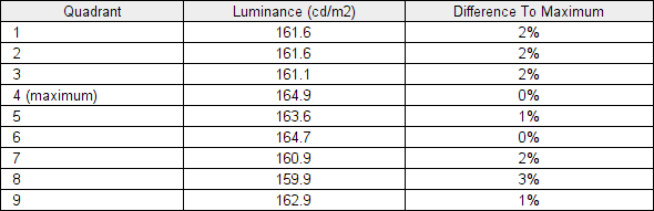
Luminance uniformity table
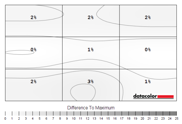
Luminance uniformity map
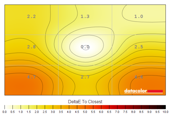
Colour temperature uniformity map
Contrast in games and movies
Lagom contrast tests
Local Dimming (SDR)
Colour reproduction
Colour gamut
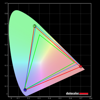
Colour gamut 'Test Settings'

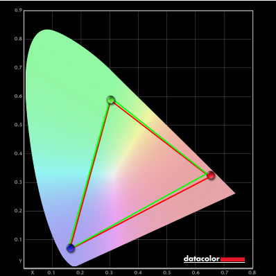
Colour gamut AMD 'CTC disabled'
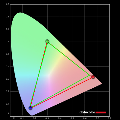
Colour gamut AMD 'CTC disabled' ('DisplayHDR')
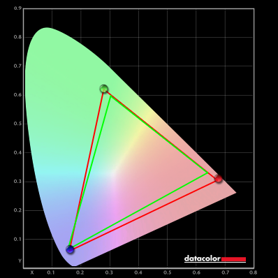
Colour gamut Nvidia 'novideo_srgb'
Colour in games and movies
Shade representation using SpyderCHECKR 24

The monitor displays most shades with a fair dose of extra vibrancy, largely due to the generous colour gamut which extends significantly beyond sRGB. The extension is most pronounced for the red to blue edge of the gamut, encompassing red-biased shades plus some pinks and purples. Medium orange (3), Persian pink (6), tango pink (11) and candy apple red (14) are good examples of shades which show significant oversaturation. Light chocolate brown (24) shows a significant red push and there’s a slight reddish push to peach pink (20) as well. Some other shades such as dark lime green (18) are shown in an overly vibrant fashion due to gamut extension in the green region, too. Though to a less extreme degree and with less of a ‘neon’ appearance than on models with an even wider gamut in that region. There are also saturation losses lower down the screen – these are far from extreme from a VA panel but can be seen with shades such as medium orange (3) which actually appears more appropriate lower down and aquamarine (4) which appears too icy lower down. Although the relative change in position is less extreme, Persian pink (6) also has extra saturation and ‘pop’ when displayed further up (more central relative to camera and expected eye position). The saturation losses towards the edges of the screen can’t be assessed with this shade arrangement – and could potentially appear towards the top of the screen depending on viewing position, too. Overall the performance here is superior to TN models, vertically, but not up to IPS levels. As noted earlier the monitor lacks an sRGB emulation setting to clamp the gamut closer to sRGB, including outside of colour-managed applications.
Viewing angles

The following video shows the Lagom text test, a mixed desktop background, a game scene and dark desktop background from various viewing angles. For the mixed image and game scene you can see noteworthy shifts in contrast and colour – quite a ‘washed out’ look as angles become relatively steep. Or overly deep and crushed together if viewed from below. These shifts are not as extreme vertically as you’d observe on a TN model (there’s no ‘colour inversion’, for example) and somewhat weaker than on certain VA models – but more pronounced than on IPS and certainly OLED alternatives. The final section of the video shows a dark desktop background and highlights the ‘VA glow’ mentioned earlier. This blooms out more noticeably from sharper viewing angles but is not as strong from centralised viewing angles. The dark background is also shown with ‘Local Dimming’ set to ‘Level 3’, showing a ‘blooming’ surrounding brighter shades which flares out when viewed from an angle – the black of the background is significantly deeper in comparison as the dimming zones essentially shut off there.
Interlace pattern artifacts
Responsiveness
Input lag
Perceived blur (pursuit photography)


Responsiveness in games and movies
Similar observations were made on Shadow of the Tomb Raider. Plenty of these problematic ‘high contrast transitions’ are found on this title, so the weaknesses including ‘smeary’ trailing were rather widespread. Whilst these won’t be bothersome to everyone, they’re certainly quite noticeable with a somewhat weaker than average performance even for a VA model. We also observed video content at a range of refresh rates, including ~24 – 30fps content on platforms such as Netflix and 60fps YouTube content. For the 60fps content some fairly distinct weaknesses remained where darker shades were involved – less extensive ‘smeary’ trailing than observed at significantly higher frame rates, but ‘smeary’ in appearance nonetheless where various dark shades were involved. Nothing of particular note in the way of overshoot, however. Some weaknesses were apparent even for the ~24 – 30fps content where some dark shades were present. The trailing here was not ‘smeary’ in appearance as it stuck close to the object, but there was still a bit of a mask of additional perceived blur that ideally wouldn’t be there.
VRR (Variable Refresh Rate) technology
FreeSync – the technology and activating it


The ViewSonic supports a variable refresh rate range of 48 – 165Hz. That means that if the game is running between 48fps and 165fps, the monitor will adjust its refresh rate to match. When the frame rate rises above 165fps, the monitor will stay at 165Hz and the GPU will respect your selection of ‘VSync on’ or ‘VSync off’ in the graphics driver. With ‘VSync on’ the frame rate will not be allowed to rise above 165fps, at which point VSync activates and imposes the usual associated latency penalty. With ‘VSync off’ the frame rate is free to climb as high as the GPU will output (potentially >165fps). AMD LFC (Low Framerate Compensation) is also supported by this model, which means that the refresh rate will stick to multiples of the frame rate where it falls below the 48Hz (48fps) floor of operation for FreeSync. If a game ran at 31fps, for example, the refresh rate would be 62Hz to help keep tearing and stuttering at bay. LFC often seemed to activate at slightly higher refresh rates, usually 55Hz (55fps) – this slightly different floor of operation makes little difference in practice. This feature is used regardless of VSync setting, so it’s only above the ceiling of operation where the VSync setting makes a difference.

Some users prefer to leave VSync enabled but use a frame rate limiter set a few frames below the maximum supported (e.g. 162fps) instead, avoiding any VSync latency penalty at frame rates near the ceiling of operation or tearing from frame rates rising above the refresh rate. If you go to ‘Setup Menu’ – ‘Information’ in the OSD, the current refresh rate of the monitor is listed. This updates in real time and will reflect the frame rate of the content, if the monitor is within the main VRR window. Finally, it’s worth noting that FreeSync only removes stuttering or juddering related to mismatches between frame rate and refresh rate. It can’t compensate for other interruptions to smooth game play, for example network latency or insufficient system memory. Some game engines will also show stuttering (or ‘hitching’) for various other reasons which won’t be eliminated by the technology.
FreeSync – the experience
Nvidia Adaptive-Sync (‘G-SYNC Compatible’)

You will also see in the image above that it states: “Selected Display is not validated as G-SYNC Compatible.” This means Nvidia hasn’t specifically tested and validated the display, not that it won’t work. On our RTX 3090 the experience was very similar to what we described with FreeSync. With the technology getting rid of tearing and stuttering from what would otherwise be frame and refresh rate mismatches, within the VRR range. Similar VRR flickering behaviour was observed, with some clear issues there even with frame rates quite stable and particularly obnoxious for double-digit frame rates. The floor of operation again appeared to be 55Hz (55fps) most of the time, so 55 – 165Hz. Though an LFC-like frame to refresh multiplication technology was employed below that to keep tearing and stuttering from frame and refresh rate mismatches at bay. There was again a subtle momentary stuttering as the boundary was crossed, as we observed with our AMD GPU as well. Though accompanying flickering is going to be more noticeable than this. Our suggestions regarding use of VSync also apply, but you’re using Nvidia Control Panel rather than AMD Software to control this. The setting is found in ‘Manage 3D settings’ under ‘Vertical sync’, where the final option (‘Fast’) is equivalent to AMD’s ‘Enhanced Sync’ setting. You’ll also notice ‘G-SYNC Compatible’ listed under ‘Monitor Technology’ in this section, as shown below. Make sure this is selected (it should be if you’ve set everything up correctly in ‘Set up G-SYNC’).

If you go to ‘Support’ – ‘Information’ in the OSD, the current refresh rate of the monitor is listed. This updates in real time and will reflect the frame rate of the content, if the monitor is within the main VRR window. And as with AMD FreeSync, HDR can be used at the same time as ‘G-SYNC Compatible’ and ‘Local Dimming’ (SDR or HDR) can be used.
HDMI 2.1 VRR
HDR (High Dynamic Range)
Colour gamut 'Test Settings'
With this gamut, the monitor was able to provide a good level of vibrancy where the developers intended it to be. With content creators having wide gamuts such as DCI-P3 and Rec. 2020 in mind under HDR, rather than the more restrictive sRGB colour space that’s the common SDR target, the oversaturated elements observed when using the native gamut under SDR wasn’t as much of an issue. As explored earlier some saturation losses occurred lower down the screen and towards the sides from a normal viewing position, but the overall look was still vivid. ViewSonic has mapped things in a way that gives some oversaturation, though it’s less extreme than the oversaturation you get when viewing standard SDR content with the untamed native gamut. Skin tones, woody tones and earthy browns appeared appropriately rich and neutral, without the same clear red push observed under SDR. There was a slight red push to some browns and to a lesser degree some pink shades covering certain skin tones, but it was relatively tame. Flames and lava appeared vivid and lively but not as overdone as under SDR – with a good variety of yellows, deep oranges and rich reds. Green shades, including some vegetation, appeared with a somewhat overdone yellow component and some shades appeared as a brighter than intended green due to how things were mapped, but to a less extreme degree than under SDR. They appeared more natural than under SDR, in other words. Some of these saturated greens weren’t as strongly saturated and luscious as we’ve seen on some wide gamut models, but still looked far from ‘washed out’. The Mini LED backlight’s enhanced dimming precision also helped provide extra depth to many shades, spanning both dark and medium shades.

The curve and resolution

A good level of immersion was provided when gaming and we felt the significant width of the screen plus its curve aided this. Even when playing titles which require a lot of horizontal scanning of the eyes between the sides and centre of the screen, the curve didn’t really become bothersome. The 21:9 aspect ratio provided a significant Field of View (FOV) advantage for most game titles and allowed an undistorted full screen experience for appropriate video content. We explore these advantages in our experience article. As noted there, most games use ‘HOR+’ scaling – so you gain horizontal FOV (can see more of the game at once) compared to a 16:9 model whilst the vertical FOV remains the same. This increases the engagement of peripheral vision and in some cases could be considered a competitive advantage, though for competitive play some will prefer a smaller and more focused 16:9 experience.


Interpolation and upscaling

Various scaling options can be found under ‘Display’ – ‘Image Adjust’ – ‘ViewScale’ in the OSD. There are three main settings – ‘Full’, ‘Aspect’ and ‘1:1’ – as well as various settings simulating different screen sizes and aspect ratios. We explore this in this section of the OSD video. The ‘Full’ setting uses all pixels of the screen regardless of the source aspect ratio, distorting and stretching it across the screen if necessary. The ‘Aspect’ setting uses as much of the screen space as possible without distortion (16:9 resolutions including FHD will fill up the space vertically but not horizontally) and ‘1:1’ is a pixel mapping feature which should only use the pixels demanded by the source resolution without any distortion or interpolation. This worked correctly in our testing for FHD but not the QHD resolution – though for the QHD resolution the ‘Aspect’ ratio achieves 1:1 anyway. With any unused pixels remaining as a black border around the image. These ‘ViewScale’ options are greyed out if ‘FreeSync Premium Pro’ is enabled in the OSD, meaning the setting can’t be changed with Adaptive-Sync active – the default ‘Full’ setting is always used. You can access the ‘ViewScale’ options when using HDMI 2.1 VRR, however.
Video review
Timestamps:
The Curve and Resolution
Features & Aesthetics
Contrast
Local Dimming (SDR)
Colour reproduction
HDR (High Dynamic Range)
Responsiveness (General)
Responsiveness (VRR)
Conclusion
Positives Negatives Vibrant colour output with a generous gamut for some red-biased shades in particular
Adobe RGB coverage insufficient for work within that colour space, no sRGB emulation and some colour consistency weaknesses related to the VA technology Pleasing static contrast and a highly dynamic HDR experience with good atmospheric dark shades and excellent sustained brightness even where bright shades dominate Moderate ‘VA glow’, a little ‘black crush’ and locked high brightness for SDR local dimming. Plus a much smaller dimming zone count than pixel count – giving some ‘blooming’ and dragging down of bright shades in places Low input lag, VRR available via HDMI 2.1 and via Adaptive-Sync for both ‘AMD FreeSync Premium Pro’ and ‘Nvidia G-SYNC Compatible’ Locked brightness with Adaptive-Sync (adjustable with HDMI 2.1 VRR), significant pixel response time weaknesses, obvious and widespread VRR flickering A solid and premium feel with good ergonomics, good horizontal ‘desktop real-estate’ and 21:9 FOV for supported video and game content plus HDMI 2.1 and USB-C support Premium pricing, unnecessarily large stand footprint and really shouldn’t be marketed as a 200Hz gaming monitor “for hyper-responsive visuals”
