Author: Adam Simmons
Date published: October 7th 2022
Table of Contents
Introduction
Some seek an immersive gaming experience under both SDR (Standard Dynamic Range) and HDR (High Dynamic Range). With its curved ~32” ‘4K’ UHD screen, 165Hz refresh rate and Mini LED backlight solution that’s exactly what the Samsung Odyssey Neo G7 (S32BG75 of the G75B series) aims to deliver. To broaden the appeal to console gamers, HDMI 2.1 is also included for ‘4K’ UHD @120Hz and VRR support for compatible consoles such as the PS5 and Xbox Series X. We put this very interesting model through its paces in our usual suite of ‘real world’ tests, spanning usage on the desktop, movie watching and of course gaming.
Specifications
The monitor is based on a 31.5” CSOT VA (Vertical Alignment) panel with 1000R (relatively steep) curve. A 165Hz refresh rate and 3840 x 2160 resolution is supported, alongside 10-bit colour. A 1ms grey to grey response time is specified, but as usual you shouldn’t pay too much attention to specified response times. Some of the key ‘talking points’ for this monitor have been highlighted in blue below, for your reading convenience.
The monitor offers some of the distinctive styling elements the company’s Odyssey offerings are known for. From the front, dark matte plastic is used extensively for the neck, stand base and bottom bezel. There are two ‘cheeks’, one at each side of the bottom bezel, with a darker matte plastic section. And RGB LED lighting elements at the bottom, which form part of the ‘Infinity Core Lighting’ feature which can be customised or disabled in the OSD (On Screen Display). They’re inset in such a way that they’re either not visible or only partially visible from a normal viewing position in front of the monitor, but more visible from beneath or when viewing the screen further back. They aren’t angled appropriately or bright enough to create a pool of light on the desk. The total thickness of the bottom bezel is ~36mm (1.42 inches), including the ‘cheeks’. The top and side bezels use a slimmer dual-stage design, with thin panel border flush with the rest of the screen plus slim hard plastic outer part. Including both components, the bezels are~9mm (0.35 inches). The ‘penguin foot’ stand base is metal-weighted with a matte plastic coating, providing decent weightiness to things but without the same ‘premium feel’ as a coated metal stand. The stand neck is a reasonably solid-feeling plastic – we tend to prefer the look and feel of coated metal for such stand elements. The monitor and stand when considered separately still have a fairly robust feel, but the screen isn’t held in place on the stand very firmly. There is quite a bit of wobble to the screen when repositioning it or using the OSD controls at the bottom, for example. The key feature at the front is the screen itself, which has a light to very light matte anti-glare finish and relatively steep (1000R) curve – both explored deeper into the review. The OSD (On Screen Display) is controlled by directional buttons beneath the central region of the bottom bezel. We found these quite intuitive, though quite firm and not the easiest to press – our preference goes to a more traditional joystick design for OSD control. There’s a reasonably dim power LED which faces downwards to the right of the controls. This glows quite a dim red when the monitor is switched on (‘Power LED ON’ set to ‘Working’ in OSD). If using the ‘Stand-by’ setting instead, it glows a dim red when it enters a deep standby state – which occurs if no signal is received for a while (‘Eco Timer’ enabled) or it it’s switched off using the power button. Regardless of setting used, it blinks dark red when the monitor initially enters a low power state (signal to the system is lost). The LED isn’t bright and isn’t visible unless you have the monitor mounted rather high up or are viewing from below or some distance back. The video below runs through the menu system including ‘Eco Sensor Mode’ and ‘Adaptive Picture’ which adjusts screen according to ambient lighting, PiP (Picture in Picture) and the ‘Infinity Core Lighting’ RGB LED lighting feature. The images below show the refresh rates supported for the native 3840 x 2160 (‘4K’ UHD) resolution. The first image shows the resolutions categorised in the EDID of the monitor as ‘TV’ resolutions and listed here under ‘Ultra HD, HD, SD’. The second image shows resolutions categorised in the EDID and listed here as ‘PC’ resolutions. This includes 3840 x 2160 @120Hz, which can be used by the Xbox Series X and PS5 via HDMI 2.1. Note that both lists are largely the same via suitable revisions of DP and HDMI, except that for HDMI 50Hz is also included on the first list. The image below is a macro photograph taken on Notepad with ClearType disabled. The letters ‘PCM’ are typed out to help highlight any potential text rendering issues related to unusual subpixel structure, whilst the white space more clearly shows the actual subpixel layout alongside a rough indication of screen surface. This model uses a light to very light matte anti-glare screen surface, which provides decent glare handling without as much layering in front of the image as some matte screen surfaces, alongside better maintenance of clarity and vibrancy potential. There’s a touch more layering than we’ve observed on IPS models with light to very light matte anti-glare screen surfaces, perhaps contributed to by the curved nature of the screen. In brighter conditions when light strikes the screen directly, you can sometimes observe slightly sharper glare patches which can give a bit of a ‘glassy’ look to the screen. Due to the curve of the screen this tended to be a bit softer and more diffused than on flat screens with a similar screen surface, with glare stretched out horizontally. These stretched out glare patches can cause significant flooding of the image in a bright room when the screen is viewed slightly from one side. From a normal centralised viewing position, these brighter conditions cause a more heavily diffused haze for stronger matte surfaces, which is more likely to flood the image, whilst glossy screens can have more distinct and sharper reflections. The screen surface has a somewhat grainy finish, something that could be described as a slightly sandy appearance but without the course or ‘smeary’ graininess that some matte surfaces provide. The Odyssey Neo G7 features a range of ‘Picture Mode’ presets; ‘Custom’, ‘FPS’, ‘RTS’, ‘RPG’, ‘Sports’, ‘sRGB’, ‘Cinema’ and ‘Dynamic Contrast’. If the monitor is in ‘AV’ rather than ‘PC’ mode (this is selected manually – ‘PC’ is the default and preferred setting even for modern games consoles) you can select ‘Dynamic’, ‘Standard’ or ‘Movie’. These settings make a range of adjustments in the OSD and many of these changes run contrary to accurate image output with respect to areas such as colour temperature, gamma and overall image balance. Most of the settings don’t lock off options in the OSD, though, so you can use them as a base and make your own adjustments from there if you wish. We touch upon these in the OSD video, but for this section will instead focus on a few of these presets and various manual adjustments to other settings in the OSD. The table below shows gamma and white point readings taken using a Datacolor SpyderX Elite colorimeter, alongside general observations by eye. Our test system uses Windows 11 with an Nvidia RTX 3090 connected using the supplied DisplayPort cable. Additional testing was performed via HDMI and also using an AMD Radeon RX 580, though observations on this table didn’t differ significantly between inputs or GPUs. The monitor was left to run for over 2 hours before readings were taken and observations made, without any additional monitor drivers or ICC profiles specifically loaded. Aside from our ‘Test Settings’, where various adjustments were made, assume factory defaults were used. The refresh rate was set to 165Hz in Windows, although this didn’t significantly affect the values or observations in this table. When viewing the figures in this table, note that for most PC users ‘6500K’ for white point and ‘2.2’ for gamma are good targets to aim for. Individual targets depend on individual uses, tastes and the lighting environment, however. Out of the box the monitor provided quite a vibrant image, but with curiously low default brightness. Perhaps done for energy efficiency reasons in case people just leave it ‘as is’. White point was too high, giving a cool tint to the image. Gamma tracked a bit beyond the desired ‘2.2’ curve, particularly for medium and medium-dark shades. But there wasn’t extreme deviation or ‘bowing’ in the curve. This can be seen in the graph below for our ‘Test Settings’, but gamma tracking was very similar straight from the box. The ‘Calibration Report’ found in the ‘Picture’ section of the OSD noted an average gamma of 2.27 which is close to our measurement. Given the intended uses for the monitor, inter-unit variation and pleasing performance on our unit with OSD tweaking alone we won’t be using any ICC profiles in this review or including any measurements or graphs using them. We wouldn’t recommend using them unless created for your specific unit using your own calibration device. But we appreciate some users still like to use profiles and some aspects such as gamut mapping for colour-aware applications can be useful. You can download our ICC profile for this model, which was created using our ‘Test Settings’ as a base. You can also download our sRGB profile which was created using and designed for the ‘sRGB’ preset (sRGB emulation mode). Amongst other things, this adjusted gamma to track the ‘2.2’ curve on our unit – but be aware of inter-unit variation. And note again that these ICC profiles are not used in the review. The monitor includes a range of Low Blue Light (LBL) settings, the most heavily marketed being ‘Eye Saver Mode’. This can be set to ‘Low’ which is locked to a moderate brightness and gives a moderately strong blue light reduction or ‘High’ which provides stronger blue light reduction and is locked to a lower brightness. These settings also purposefully reduce contrast (more so the ‘High’ setting), which is intentional as it can reduce the amount of time your eye spends adjusting to changing light levels from the monitor. An alternative and our preferred LBL setting is to set ‘Color Tone’ to ‘Warm 2’. This gives a strong reduction in the blue colour channel and slight reduction to green channel. It therefore provides a warmer look to the image but avoids the unwanted yellow or green tint that some LBL solutions impart. It doesn’t decrease contrast to the same degree as ‘Eye Saver Mode’, nor is brightness locked to a preset value. Reducing brightness will reduce blue light output (and, naturally, all light output) from the screen. We used this ‘Warm 2’ setting with reduced brightness for our own viewing comfort in the evenings, although not for any specific testing beyond that involving the setting itself. This warm look to the image is considered more relaxing by some and can be particularly important in the hours leading up to sleep. You have to go fairly deep into the menu to activate or deactivate this setting, though you could dedicate one of the presets to be based around this setting and cycle through your presets with the ‘Custom Key’ feature of the OSD. This ‘Custom Key’ can alternatively be set to cycle the ‘Eye Saver Mode’ settings, if you prefer using them. For our ‘Test Settings’ we lowered brightness and made some colour channel adjustments using the default ‘Custom’ setting. The colour channels were quite sensitive to adjustment, so we’d recommend going easy on them. Our unit’s green channel was just slightly higher than ideal set to ‘50’, for example, but lowering to ‘49’ made it a fair bit lower than ideal. Note that individual units and preferences vary, so these settings are simply a suggestion and won’t be optimal for all users or units. We’ve also included the refresh rate used in Windows and our preferred ‘Response Time’ setting used for most of the review, just for reference. These settings only apply to SDR, HDR has separate settings associated with it and is explored in the relevant section of the review. We left everything at default under HDR for most of our testing, with ‘Local Dimming = High’ our preference for that setting. Picture Mode = Custom Brightness = 45 (according to preferences and lighting) Color Tone = Custom R = 50 G = 50 B = 45 Response Time = Standard (greyed out for VRR) Adaptive-Sync (FreeSync Premium Pro for AMD) = On Local Dimming = Off* Dynamic Brightness = Off Refresh rate (Windows setting) = 165Hz *Setting ‘Local Dimming’ to ‘Auto’ is supposed to disable it for SDR but enable it for HDR. It didn’t behave that way in practice in our testing. Local dimming was also used for SDR with the ‘Auto’ setting for certain shade combinations on the screen including on the desktop, so we set this to ‘Off’ – we test the monitor with the setting enabled separately. With this set to ‘Off’ another menu option is available and enabled by default called ‘Dynamic Brightness’ – this is a Dynamic Contrast setting (explored later) which we disabled. An X-Rite i1Display Pro Plus (Calibrite ColorChecker Display Plus) was used to measure the luminance of white and black using various settings, including those found in the calibration section. From these values, static contrast ratios were calculated. The table below shows these results. Blue highlights indicate the results under our ‘Test Settings’ and with HDR active (factory defaults). Black highlights indicate the highest white luminance, lowest black luminance and highest contrast ratio recorded under SDR, with ‘Local Dimming’ disabled. Assume any setting not mentioned was left at default, with the exceptions already noted here or in the calibration section. Some values in the table are approximate, designated with relevant symbols. This is due to a lack of precision from the measurement instrument for black luminance readings, which significantly affects the measured contrast if the black point is low. Measurements using ‘Extreme (MBR)’ were taken at 165Hz – brightness levels were similar at lower refresh rates, so we didn’t feel it was worthwhile documenting these observations on the table.
*10-bit can be selected in the graphics driver at any refresh rate, up to the native resolution using DP 1.4 (with DSC) or HDMI 2.1 under SDR or HDR. 12-bit can also be selected when using HDMI 2.1; this includes an additional 2-bit dithering stage applied by the monitor’s scaler to facilitate work with 12-bit depth content. The bit depths listed here are using a Full Range RGB signal.
As an Amazon Associate I earn from qualifying purchases made using the below link. Where possible, you’ll be redirected to your nearest store. Further information on supporting our work.

Features and aesthetics


The screen is reasonably slim at thinnest point (~70mm or 2.76 inches) but has significantly more central bulk, which is accentuated by the curve of the screen. The stand provides full ergonomic flexibility; tilt (9° forwards, 13° backwards), swivel (15° left, 15° right), height adjustment (120mm or 4.72 inches) and pivot (90° clockwise rotation into portrait). These adjustments felt relatively smooth rather than ‘grabby’ as they can be on some screens, though the height and swivel adjustments were quite firm on our unit. The monitor was brand new and this may loosen off over time, however. At lowest stand height the bottom of the screen sits ~50mm (1.97 inches) above the desk with the top of the screen ~485mm (19.09 inches) above the desk. The total depth of the monitor including stand is ~311mm (12.24 inches) with the centre of the screen ~7.5mm (3.00 inches) back from the frontmost point of the stand. So this is quite a deep stand design which is a bit of a desk depth hog – not ideal if you don’t have a particularly deep desk and don’t wish for the screen to be rather close to your face.

The rear of the monitor is mainly dark matte plastic with engraved radial patterns. The central region is glossy translucent plastic with the radial design continuing – this also houses a ‘Core Lighting’ feature which was explored in the OSD video earlier. It’s not bright enough to be considered a contrast-enhancing bias light, but still creates a slight glow on the wall and desk behind the screen that is visible from the front in a dim room. The stand screws into the centre of the screen, with provision for 100 x 100mm VESA mounting facilitated via an included bracket. A detachable rubber cable-tidy clip is included towards the base of the stand neck, with a K-slot located to the far right. The ports face downwards and include; 2 HDMI 2.1 ports, DP 1.4 (with DSC), 2 USB 3.0 ports (plus Type-B upstream), a 3.5mm headphone jack and DC power input (external ‘power brick’). Standard accessories include; a power cable and adaptor, DP cable and USB cable but may vary regionally.


3840 x 2160 @165Hz plus HDR and Adaptive-Sync can be leveraged via DP 1.4 (with DSC) and HDMI 2.1. AMD FreeSync Premium Pro and Nvidia’s ‘G-SYNC Compatible’ is supported on compatible GPUs and systems via suitable versions of DP and HDMI. Compatible Intel graphics hardware can also leverage Adaptive-Sync. HDMI 2.1 includes integrated VRR (Variable Refresh Rate) capability which doesn’t rely on Adaptive-Sync and can be used via ‘G-SYNC Compatible’ and the PS5 which doesn’t support Adaptive-Sync. With HDMI 2.1, games consoles like the Xbox Series X and PS5 are able to run 3840 x 2160 @120Hz. The HDMI 2.1 ports of this model offer a bandwidth of 40Gbps which means the PS5 can use its maximum supported ‘4:2:2’ signal for ‘4K’ UHD @120Hz, with PCs and the Xbox Series X using their fully supported Full Range or ‘4:4:4’ signal.


The image below shows the refresh rates listed for the 2560 x 1440 (WQHD or 1440p) resolution, with the same options available via DP and HDMI.

The images below show the refresh rates supported for 1920 x 1080 (Full HD or 1080p), with the same options available via DP and HDMI. The first image shows the ‘TV’ resolution list and the second image the ‘PC’ resolution list.


If you’re intending to use the monitor with the PS5 or Xbox Series X/S, be aware that a small settings tweak may be required to ensure 120Hz is selectable for supported resolutions. Details can be found in this article.
Calibration
Subpixel layout and screen surface
![]()
As shown above the standard RGB (Red, Green and Blue) stripe subpixel layout is used. This is the default expected by modern operating systems such as Microsoft Windows. Apple’s MacOS no longer uses subpixel rendering and therefore doesn’t optimise text for one particular subpixel layout to the detriment of another. You needn’t worry about text fringing from non-standard subpixel layouts and won’t need to change the defaults in the ‘ClearType Text Tuner’ as a Windows user. You may still wish to run through the ClearType wizard and adjust according to preferences, however. The subpixels are noticeably ‘squat’ with relatively large gaps above and below. On some models this can affect text and fine-edge clarity, but that wasn’t an issue in this case. Aided by the pixel density being so high that the gaps above and below the subpixels are still tiny. Unlike some VA models, this model avoids the use of partial subpixel illumination (split subpixels), which negatively affects text and fine edge clarity on models which use it. We therefore had no subpixel-related concerns related to sharpness or text clarity on this model.
Testing the presets
Preset Mode Gamma (central average) White point (kelvins) Notes Gamma = Mode1 (Factory Defaults) 2.3 7174K Quite a vibrant look (though dim with default brightness), a bit cool-looking due to white point and slight extra depth in places due to gamma tracking. As usual for VA technology there are some perceived gamma shifts, reducing perceived gamma and saturation towards the edges of the screen. Gamma = Mode2 2.1 7158K As above but gamma reduced, making some shades appear brighter and revealing some unintended dark detail. Gamma = Mode3 2.6 7204K As defaults with much higher gamma, giving quite a deep and ‘contrasty’ look overall, crushing together dark detail significantly. Eye Saver Mode = Low 2.1 5612K An effective Low Blue Light (LBL) setting with warm colour temperature and contrast purposefully minimised. Green channel reduced to avoid obvious green or yellow tint. The image appears warm and 'flooded’ as a result of these changes. Brightness is locked at a moderate level. Eye Saver Mode = High 1.9 4947K As above, stronger effect with warmer appearance and brightness locked at lower level. Gamma is also reduced and contrast is hugely decreased. Color Tone = Warm 2 2.3 4550K A highly effective Low Blue Light (LBL) setting. As above, blue channel is significantly reduced and green channel is slightly reduced. Red channel remains relatively strong, giving a warm but otherwise well-balanced look without unwanted green or yellow tint. Your eyes adjust to the warm look to some extent. Doesn’t have the locked brightness or heavily reduced contrast of ‘Eye Saver Mode’. Picture Mode = sRGB 2.3 7309K An sRGB emulation setting which clamps the gamut closer to sRGB, significantly reducing saturation. The image has a fairly strong cool tint and looks undersaturated in places. Brightness can be adjusted and gamma mode changed, but some other settings including colour channels are locked. Test Settings 2.3 6494K Quite vibrant with good overall balance - superior white point balance to defaults.
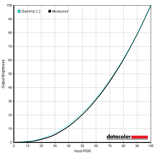
Gamma 'Test Settings'
Test Settings
Contrast and brightness
Contrast ratios
White luminance (cd/m²) Black luminance (cd/m²) Contrast ratio (x:1) 100% brightness 381 0.11 3464 80% brightness 308 0.09 3422 60% brightness 239 0.07 3414 40% brightness 166 0.05 3320 20% brightness 93 <0.03 >3100 0% brightness 16 <0.01 >1644 15% brightness (Factory Defaults) 74 >0.02 <3700 HDR Auto / HDR High / HDR Low (1% white, peak)* 825 / 914 / 664 <0.01 / <0.01 / <0.02 >82,500 / >91,400 / >33,200 HDR Auto / HDR High / HDR Low (4% white, peak)* 1355 / 1356 / 852 <0.01 / <0.01 / <0.02 >135,500 / >135,600 / >42,600 HDR Auto / HDR High / HDR Low (9% white, peak)* 1328 / 1328 / 863 <0.01 / <0.01 / <0.02 >132,800 / >132,800 / >43,150 HDR Auto / HDR High / HDR Low (25% white, peak)* 1073 / 1067 / 764 <0.01 / <0.01 / <0.02 >107,300 / >106,700 / >38,200 HDR Auto / HDR High / HDR Low (49% white, peak)* 654 / 637 / 593 <0.01 / <0.01 / <0.02 >65,400 / >63,700 / >29,650 HDR Auto / HDR High / HDR Low (100% white, sustained)** 353 / 353 / 353 <0.01 / <0.01 / <0.02 >35,300 / >35,300 / >35,300 HDR Local Dimming = Off (1% white, peak)* 354 0.11 3218 HDR Local Dimming = Off (100% white, sustained)** 354 N/A N/A Local Dimming = High / Low, 0% brightness (4% white, peak)*** 13.8 / 13.6 <0.01 / <0.01 >1380 / >1360 Local Dimming = High / Low, 50% brightness (4% white, peak)*** 580 / 372 <0.01 / <0.02 >58,000 / >18,600 Local Dimming = High / Low, 100% brightness (4% white, peak)*** 1332 / 381 <0.01 / <0.02 >133,200, >19,050 Gamma = Mode2 74 >0.02 <3700 Gamma = Mode3 74 >0.02 <3700 Eye Saver Mode = Low 171 0.26 658 Eye Saver Mode = High 99 1.45 68 Color Tone= Warm 2 57 >0.02 <2850 Color Tone= Warm 2 (Brightness = 100) 289 0.11 2627 Picture Mode = sRGB 72 >0.02 <3600 Picture Mode = sRGB (Brightness = 100) 368 0.11 3345 Extreme (MBR) 55 ~0.02 ~2750 Test Settings 173 0.05 3460
*HDR measurements were made using this YouTube HDR brightness test video, running full screen at ‘2160p 4K HDR’ on Google Chrome. The maximum reading using the patch size (measurement area) specified in the table was used. The black luminance was taken at the same point of the video with the colorimeter offset to the side of the white test patch, equidistant between the test patch and edge of the monitor bezel.
**These readings were taken using the above test. A reading was taken using a white screen fill (‘all pixels’), 30 seconds after it was displayed. This is used to represent the sustained luminance level the monitor can provide under HDR, rather than the peak luminance achieved for smaller sections of the screen. Because the entire screen is white for this test, black luminance levels can’t be read and an HDR contrast reading can’t be ascertained.
***This reading was taken in the same way as the HDR reading, except the monitor is running in SDR.
The average static contrast with only brightness adjusted was 3405:1 (excluding values affected too heavily by rounding precision), exceeding the specified 3000:1 and a decent value for a modern VA monitor. The maximum contrast recorded under SDR (‘Local Dimming’ disabled) was 3464:1 and under our ‘Test Settings’ was 3460:1, which is very respectable despite slightly favourable rounding helping in this case. The Low Blue Light (LBL) settings reduce the contrast, particularly ‘Eye Saver’ where it is intentionally reduced to 658:1 (High) or 68:1 (Low). The ‘MBR’ strobe backlight locked brightness to a rather low 55 cd/m². The maximum white luminance recorded under SDR (‘Local Dimming’ disabled) was 381 cd/m², whilst the minimum was 16 cd/m². This gives a brightness adjustment range of 365 cd/m² with a range that most users will be very comfortable with. With a fairly bright maximum and good low minimum.
The monitor includes a 1196-zone Mini LED backlight Samsung refers to as a ‘Quantum Matrix’ solution. This can be activated using the ‘Local Dimming’ setting. Under SDR this boosted contrast to as high as >133,200:1 with a maximum luminance of >1332 cd/m² recorded – this is a very impressive boost. Under HDR a contrast as high as >135,600:1 and peak luminance of 1356 cd/m² was recorded. The luminance level and contrast is highly dependent on the ‘Local Dimming’ level used and also the content being displayed. A range of readings were taken under HDR which demonstrates this well, whilst it’s explored subjectively later on. The HDR luminance data for the 3 ‘Local Dimming’ settings is shown in a graph below, for those preferring a graphical representation.

The monitor includes two Dynamic Contrast settings which allow the backlight to adjust as a single unit according to the overall levels of bright or dark on the screen. One is a dedicated preset aptly named ‘Dynamic Contrast’, whilst the other is a setting found in the ‘System’ section of the OSD called ‘Dynamic Brightness’. The dedicated preset reacts very rapidly and is more dynamic, making more significant adjustments and dimming more effectively. The ‘Dynamic Brightness’ setting takes a gentler approach. With both settings you can adjust ‘Brightness’ to limit how bright the setting will go. As usual we prefer manual control over brightness for SDR compared to Dynamic Contrast – and if you want a more dynamic experience, the ‘Local Dimming’ setting would be a better option.
PWM (Pulse Width Modulation)
The Odyssey Neo G7 does not use PWM (Pulse Width Modulation) to regulate backlight brightness at any brightness level, with DC (Direct Current) used to moderate brightness instead. Across the brightness range but mainly below a brightness level of ‘40’, we noticed some low amplitude high frequency oscillation of the backlight. The exact frequency depended on brightness and was difficult to pinpoint, but was always very high (multiple kHz). This does not include the distinct and extreme brightness cycling of PWM, with the brightness changes far more subtle. Most users should find this behaviour entirely unbothersome and should consider the backlight ‘flicker-free’ as advertised.
With ‘Local Dimming’ enabled, we observed some similar examples of low amplitude high frequency oscillation. But also observed PWM with a cycling frequency of ~1kHz at a brightness of ’19’ or below (oscilloscope trace showing 947Hz PWM at ‘0’ brightness). We weren’t able to record any lower frequency PWM as some reviewers have mentioned, possibly due to some revisions Samsung has made to the product or its backlight behaviour. Whilst this won’t be bothersome to everyone, if you’re sensitive to flickering it’s best to avoid using the ‘Local Dimming’ setting at these relatively low brightness settings.
Luminance uniformity
Whilst observing a black background in a dark room, using our ‘Test Settings’, we noticed slight backlight bleed and clouding, mainly near the top and bottom edge. It’s important to remember that individual units vary when it comes to all aspects of uniformity, including backlight bleed and clouding. The following image was taken a few metres back to eliminate ‘VA glow’. This is a mild bluish silver to purple glow that appears towards the edges, particularly near the bottom of the screen from a normal viewing position. This ‘VA glow’ blooms out more noticeably from sharper angles, as demonstrated in the viewing angles video later on.
As with most of our testing, we had the ‘Local Dimming’ setting disabled here. With the setting active, the dimming zones of the backlight essentially shut off so it looked like the monitor was switched off. The luminance uniformity was variable. The maximum luminance was recorded at ‘quadrant 4’ to the left of centre (186.0 cd/m²). At 164.3 cd/m², the central point was 12% dimmer than this. The greatest deviation from the brightest point occurred at ‘quadrant 8’ below centre (159.2 cd/m², which is 14% dimmer). The average deviation between each quadrant and the brightest point was 9.25%, which is reasonable. Note that individual units vary when it comes to uniformity and you can expect further deviation beyond the points measured. The contour map below shows these deviations graphically, with darker greys representing lower luminance (greater deviation from brightest point) than lighter greys. The percentage deviation between each quadrant and the brightest point recorded is also given. The SpyderX Elite was also used to analyse variation in the colour temperature (white point) for the same 9 quadrants. The deviation between each quadrant and the quadrant closest to the 6500K (D65) daylight white point target was analysed and a DeltaE value assigned. Darker shades are also used on this map to represent greater deviation from 6500K. A DeltaE >3 represents significant deviation that may be readily noticed by eye. The colour temperature deviation was moderate, with significant deviation recorded towards the left of the screen (up to DeltaE 3.5, to the left of centre) and bottom right (DeltaE 3.3). Note again that individual units vary when it comes to uniformity and that you can expect deviation beyond the measured points. For example, there was a noticeable cool tint on our unit towards the extreme side edges which aren’t accounted for by these measurements. Also be aware that there are some perceived deviations in both brightness and colour temperature that are typical on VA panels and aren’t reflected by these readings. In addition to the quantitative testing above, we performed a subjective assessment of the uniformity of a variety of ‘medium’ shades, including 50% grey. Some monitors exhibit uniformity issues such as splotches or striations when viewing screen fills of such shades, giving an inconsistent appearance that some users refer to as ‘DSE’ (‘Dirty Screen Effect’). VA models are particularly prone to this. We observed minor striations and very slight patchiness in places, but there were no obvious issues such as clear striations or heavy patchiness. Note: These observations are with ‘Local Dimming’ disabled. Observations with this setting enabled are explored separately. On Battlefield 2042 the monitor put in strong contrast performance overall. With a static contrast of 3460:1 recorded under our ‘Test Settings’, the monitor was able to give darker scenes good atmosphere and provide good depth to darker shades within scenes, adding to structural definition. The contrast also provided a bit more of a ‘solid’ and inky appearance to some medium shades compared to models with significantly weaker contrast (mainly non-VA LCDs). Observing in dimmer lighting didn’t provide the same experience as an OLED model – the absolute depth and inkiness that they provide was not observed here – but the monitor performed better than most LCDs in this regard. Dark shades were brightened up somewhat by ‘VA glow’, most noticeable from a normal viewing position towards the bottom of the screen but observable further up depending on viewing position. This was not an extreme amount of ‘VA glow’, it was only observed in dimmer lighting and wasn’t as intense as ‘IPS glow’. The glow is brought out more if you use a higher brightness setting, sit closer to the screen or have a unit with significant backlight bleed or clouding. We also observed ‘black crush’, which is where dark shades (other than black) appear even deeper than intended and blend into a dark mass. So perceived gamma is higher than intended for these dark shades. This occurs in the centre of the screen or wherever your eyes are directly in line with. For the very far edges of the screen perceived gamma was somewhat lower than it should be, revealing some excess detail. The ‘black crush’ and perceived gamma shifts described here were not as significant as we’ve observed on some VA models, from our preferred viewing distance of ~70cm or a bit further back. But it was still something we noticed and more significant than we observed on the AOC CQ32G3SU, which uses an AUO VA panel with 1000R curve. Bright content stood out well against darker surroundings, with the screen surface imparting a bit of graininess but without obvious layering in front of the image. These observations were echoed on Shadow of the Tomb Raider. There are many high-contrast scenes on this title with small areas of bright shade such as flames and small patches of daylight surrounded by much darker shades. The relatively strong contrast provided by the monitor gave such scenes the sort of look they demand. The depth of dark shaded aided the definition of shadows and fine structural details on vegetation and suchlike, whilst the extra depth to medium shades again helped give them a bit more of a solid and ‘inky’ look. ‘Black crush’ and ‘VA glow’ were both observed, though not to an extreme degree. So the monitor didn’t provide an OLED-like look when observed in a dimmer room, but certainly offered improvements compared to your typical IPS and even some VA LCDs. The screen surface again provided relatively direct light emission for a matte screen surface, without strong layering and with a somewhat grainy but not ‘smeary’ appearance to the finish. We also appreciated the relatively strong contrast performance on the film Star Wars: The Rise of Skywalker. This title has many scenes which demand strong contrast, with light sabers, explosions and other energy pulses set against much darker surroundings. Things were again not ‘OLED-like’ in terms of depth and atmosphere, but this was up there with some of the better VA models we’ve observed in this respect. ‘Black crush’ was again observed, alongside a bit of excess dark detail near the far edges of the screen. This can bring out ‘compression artifacts’ on heavily compressed streamed content more readily and give a slightly ‘blocky’ or banded appearance, but in this case it wasn’t too extreme from our preferred viewing position. ‘VA glow’ was also noticed in dimmer lighting – this title is presented with black bars at the top and bottom which make this more noticeable. Much of the streamed content you’ll watch on platforms like Netflix, Disney Plus, Amazon Prime Video and certainly YouTube will be presented in 16:9 without these bars. The Lagom tests for contrast allow specific weaknesses in contrast performance to be identified. The following observations were made in a dark room. As noted earlier, the monitor includes a Mini LED backlight (FALD – Full Array Local Dimming) solution with 1196 independently addressable zones. This is a key part of the HDR experience of the monitor, but can also be used under SDR to enhance the contrast experience. The setting is referred to as ‘Local Dimming’ and found in the ‘System’ section of the OSD. Brightness can be adjusted when using this setting. We’d start by using a similar brightness to what you set the monitor to without using the setting and see how you find it, but you may wish to adjust this depending on how dynamic you want things to be. As we explore with HDR, the dimming algorithm tends to dark-bias on this monitor which favours contrast (and deeper dark shades) over absolute brightness where mixtures of dark and bright cover a given zone. As we explore in the proceeding paragraphs, this reduces ‘haloing’ or ‘blooming’ – but it also drags down the brightness of brighter shades. Some people may find these inconsistencies a bit weird in general or at least take some getting used to. It also tends to drag down the brightness of medium-dark shades so they blend into darker shades more readily, which could make this setting undesirable for competitive play. There are 3 ‘Local Dimming’ settings; ‘Auto’, ‘Low’ and ‘High’. As noted earlier, ‘Auto’ is supposed to disable the setting for SDR content and enable it for HDR but didn’t work that way on our unit. The setting seemed to have a mind of its own and sometimes switched on for SDR content, depending on the shade mixtures displayed and usually where dark shades dominated. This could be triggered for various websites (Twitter ‘Lights Out’ mode for example), some desktop backgrounds and certain applications or scenes in games and videos. When triggered it behaved quite similarly to ‘High’. It was very unpredictable and clearly wasn’t looking at whether the signal was HDR or SDR. The ‘Low’ setting dims quite well for large masses of very dark shade and brightens up for larger areas of brighter content, but is relatively constrained and undynamic for most mixed content. It also has a heavy dark-bias, dragging down the brightness of many medium to bright shades significantly. The ‘High’ setting is very dynamic and can really hammer home the advantages of the local dimming solution – this is our preferred choice. Although the setting was very reactive to changes in the image, the zones did brighten and dim rapidly and kept up with this pace of change well. Though they aren’t as fast as the pixel responses of the monitor, so they can impact perceived visual responsiveness (particularly for significant brightness changes). 1196 dimming zones doesn’t give you the same precision as you’d have with an OLED solution – which, on a screen of this resolution, would give you ~8.3 million dimming zones. But it’s still a decent number of zones and significantly enhances the contrast compared to having the setting disabled. Whilst intricate mixtures of light and dark shades can’t be accounted for in the same way as with per-pixel illumination (OLED etc.), it can certainly add significant extra depth to plenty of the darker shades on the screen whilst simultaneously brightening up lighter elements. The natively strong contrast performance of the VA panel combined with the dark-biased dimming algorithm also minimises ‘haloing’ or ‘blooming’ around dark objects. Whilst this is certainly visible in a dimly lit room, for certain scenarios where very bright and very dark shades intertwine, ‘blooming’ is about as subtle as we’ve seen on a Mini LED solution under our ‘Test Settings’ (includes brightness at ‘44’). Due to weaknesses in viewing angle, it’s easier to spot towards the edges of the screen and extremely obvious when viewing the screen off-angle. It also becomes somewhat stronger (but not extreme) with brightness turned up significantly – as we measured earlier, the screen can reach up to 1332 nits under SDR which is impressively bright. Where bright shades dominate the brightness is reduced somewhat – refer to our HDR measurements where the backlight behaves in a similar fashion. We also noticed greater depth and solidity to medium shades with local dimming active, with the dimming zones able to tone them down a bit. For movie content with black bars at the top and bottom, these appeared very deep and inky with this setting active – aside from at the boundary if bright content is displayed there, where a bit of the ‘blooming’ can occur. So an undeniable contrast advantage with this setting active, providing a very dynamic experience. These were our thoughts on ‘Local Dimming’ when gaming on the monitor or watching video content, at least. When you’re on the desktop things are far less dynamic and you often see large patches of static shade beside each other; various contrasting elements separated by straight edges and suchlike. Such conditions highlight the large discrepancy between the number of dimming zones and the pixel count of the monitor. Some brighter shades were dragged down and some darker shades brightened up a bit, which can be quite noticeable at the well-defined boundaries between these shades. Or where small bright objects such as the mouse cursor move against darker backgrounds – which is common on the desktop, of course. Sometimes the mouse cursor remained bright against medium backgrounds, with a noticeable ‘halo’ around the cursor where the medium background became brighter. Not the sort of thing that’s generally noticeable in a game or movie, but certainly noticeable on the desktop with these large static shade blocks. The ‘Low’ setting didn’t suffer in the same way, but for a lot of mixed content the benefits to the setting were limited. And you certainly got obvious dark-biasing which dragged brighter shades down – if you raise the brightness to counteract this, you might find larger areas of bright shade uncomfortably bright. We therefore preferred the predictability of disabling the setting entirely on the desktop. The section of the video review below shows this local dimming solution in action. The monitor uses a Quantum Dot (QD) backlight solution to enhance the gamut, employing blue LEDs layered with red and green Quantum Dots. This creates larger peaks of green and red light than you’d see on your typical standard gamut monitor. These relatively strong green and red peaks enhance the colour gamut whilst also creating a more balanced and less blue-biased spectral profile, potentially aiding viewing comfort. There is significantly less green energy and red energy compared to some QD solutions, such as that used on the PG32UQX or XB323U GP, so the relative reduction in blue energy and ‘balancing’ of the spectral profile isn’t as significant in this case. The colour gamut of the Odyssey Neo G7 is shown as a red triangle below. It was compared with the sRGB (green triangle) and DCI-P3 (blue triangle) reference colour spaces using our ‘Test Settings’. The gamut fully covers sRGB (100%) with some extension beyond – we recorded 91% DCI-P3 coverage which falls a bit short of the specified 95% DCI-P3. The exact measured gamut can vary depending on measurement instrument and software, with slight inter-unit variation also possible. There is some extension beyond DCI-P3 for the red to blue edge, but undercoverage elsewhere. Although not shown in the graphic, we recorded 84% Adobe RGB coverage. This DCI-P3 and Adobe RGB coverage isn’t high enough for accurate reproduction within those colour spaces. For standard sRGB content outside a colour-managed environment, the extension beyond sRGB provides a good hit of extra saturation and vibrancy. This isn’t as extreme as on some models with an even more generous gamut (or indeed stronger colour consistency) but is certainly noticeable. The monitor offers an sRGB emulation setting, the ‘sRGB’ preset in the ‘Picture’ section of the OSD. This cuts down on the gamut effectively overall, though there’s a bit of remaining extension beyond sRGB for the red to blue edge. There is only a small amount of undercoverage, mainly in the blue region, with 98% sRGB coverage recorded. Brightness, the gamma mode and response time setting (VRR disabled) can be adjusted with this setting active, but various other settings are locked off including colour channels. To maximise colour accuracy within the sRGB colour space, for colour-managed workflows, full calibration and profiling with a colorimeter or similar device using the full native gamut is recommended. You may try the ICC profile featured in the calibration section which includes gamut mapping for colour-aware applications, but best results are always obtained by calibrating your own unit with your own hardware. Instead of using this ‘sRGB’ setting and putting up with the associated restrictions, AMD users can activate a flexible sRGB emulation setting via the graphics driver. This is done by opening ‘AMD Software’, clicking ‘Settings’ (cog icon towards top right) and clicking on ‘Display’. You should then ensure that the ‘Custom Color’ slider to the right is set to ‘Enabled’ and ‘Color Temperature Control’ set to ‘Disabled’. It may appear to be set this way by default, but the native rather than restricted gamut is likely in play. If that’s the case, simply switch the ‘Color Temperature Control’ slider to ‘Enabled’ then back to ‘Disabled’ to leverage the sRGB emulation behaviour. This setting is shown in the image below. The gamut below shows results using our ‘Test Settings’ with this driver tweak applied. The colour gamut now covers 99% sRGB with very little extension beyond. This setting offers good sRGB tracking and helps to cut down on the colour gamut without profiling, including in applications that aren’t colour managed. And you don’t have to put up with restrictions associated with the monitor’s sRGB emulation setting such as locked colour channels. Whilst Nvidia doesn’t have a similar option in their graphics driver, a third party tool called ‘novideo_srgb’ can be used. This provides a similarly effective GPU-side gamut clamp to the AMD driver option. The resulting gamut was very similar to that shown above with the AMD tweak – this is expected given it uses the same data from the EDID of the monitor. The tool and its usage is covered in our sRGB emulation article. The monitor provided quite a vibrant look to Battlefield 2042. As with most content consumed under SDR (either on the desktop or whilst gaming), this is designed with the sRGB colour space in mind. Viewing the content on a model with a gamut extending beyond sRGB, as in this case with 91% DCI-P3 coverage using the native gamut, invites extra vibrancy and saturation. The gamma setup of our unit also added just a touch of extra depth in places. There was a rather punchy look to red-biased shades, which gave a rich look to earthy and woody brown and reddish brown shades, with a red push. There were some rather lush greens as well which gave vegetation quite good ‘pop’, though some green shades were overly bright and less muted than intended. The oversaturation was less extreme than some models with more generous coverage for the green region of the gamut, however. Brightly painted objects and roaring flames showcased some good vibrant-looking shades as well – not as strong as on some models with an even more generous gamut, but still vivid. We made similar observations on Shadow of the Tomb Raider. The environments in the game showcased the red push to brown shades and extra ‘pop’ to various green shades quite readily. Yellowish greens were brought out quite strongly, for example, but vegetation didn’t verge on ‘neon’ in the way it can on particularly wide gamut models. The generous coverage in the red region of the gamut added some extra richness to skin tones as well. On both game titles the strongest saturation was observed centrally, with some dulling and saturation loss for some shades towards the peripheral regions of the screen. Particularly the extreme side edges and lower down from a ‘normal’ viewing position with eyes slightly above centre. This is due to reduced perceived gamma peripherally, which is typical for VA models and inescapable for a monitor of this size. From our preferred viewing distance (~70cm or a bit further back) this was not an extreme gamma shift or saturation change for such a large VA model. Though consistency wasn’t the best we’ve seen for a VA panel of this size, either – the CQ32G3SU with its AUO VA panel performed significantly better in this respect. Neither model is up to the standards of competing IPS models when it comes to colour consistency, however. Lara Croft’s skin tone, for example, appeared slightly more sun kissed than it should centrally but if anything appeared more appropriate or slightly undersaturated when viewed near the bottom or side edges of the screen. We also observed various episodes of the animated TV series Futurama. This is a particularly unforgiving test for colour consistency as it features large areas of individual shade. The shifts in saturation observed when gaming were certainly apparent here, though by no means extreme for a VA model of this size. The red of Dr Zoidberg, for example, was particularly punchy centrally but a bit duller peripherally. Some skin tones also lost a fair bit of saturation peripherally, appearing quite a bit duller than intended. There was a good array of vibrant-looking neon shades such as bright pinks, oranges and greens. Pastel shades appeared more saturated than intended, particularly centrally, but were more muted compared to the vibrant neon shades and also showcased good variety. Whether gaming, watching video content or on the desktop some will enjoy the extra vibrancy of the native gamut. But for those seeking a more muted and toned-down appearance, more ‘as the creators intend’, the sRGB emulation setting (‘Picture Mode’ – ‘sRGB’) may be preferred. The image below shows a printed reference sheet of 24 ‘sRGB’ shades, included as part of the Datacolor SpyderCHECKR 24 package. The screen is displaying reference photographs of this printed sheet, in both the same order as printed (right side) and reverse order (left side). The camera is mounted slightly above centre so that the image is representative of what the eye sees from an ergonomically correct viewing position. This, coupled with the inclusion of a flipped version of the shade sheet, allows both accuracy and colour consistency to be visually assessed. Bracketed numbers in our analysis refer to shades on the printed sheet or right side of the screen if they’re ordered consecutively from top left to bottom right. Note that there is always some disparity between how emissive objects (monitor) and non-emissive objects (printed sheet) appear. The monitor is set to a very low brightness to help minimise this disparity. The representation of shades in this image depends on the camera and your own screen, it’s not designed to show exactly how the shades appear in person. It still helps demonstrate some of the relative differences between the original intended sRGB shade and what the monitor outputs, however. Full profiling and appropriate colour management on the application would provide a tighter match, our intention here is to show what can be expected in a non colour-managed environment. The colour gamut also gives a red push to browns and in particular reddish browns, at least when displayed for the central bulk of this screen. This affects light chocolate brown (24), for example, but because the shade is displayed towards the top and bottom corners of the screen the perceived gamma shifts and accompanying saturation losses counteract this. Black (21) is interesting to observe as it highlights some of the perceived gamma shifts. The photograph shown on the screen is of the actual printed sheet, which has a slight material texture to it. This is well-blended and barely visible when viewed on most of the screen, but it’s more visible lower down the screen (or towards the sides) due to the aforementioned perceived gamma shifts. This is clearer by eye than in the photo. Overall the performance here is superior to TN models, vertically, but not up to IPS levels. It’s in-line with most other modern VA models we’ve tested in the last few years, though the AOC CQ32G3SU with new generation AUO VA panel provides superior performance here. The photograph below shows the monitor running its sRGB emulation mode (‘Picture Mode’ set to ‘sRGB’). Lagom’s viewing angle tests help explore the idea of colour consistency and viewing angle performance. The following observations were made from a normal viewing position, eyes ~70cm from the screen. The shifts observed are more readily apparent if sitting closer and less apparent if sitting further away. On some monitors, particularly but not exclusively those with high refresh rates, interlace patterns can be seen during certain transitions. We refer to these as ‘interlace pattern artifacts’ but some users refer to them as ‘inversion artifacts’ and others as ‘scan lines’. They may appear as an interference pattern, mesh or interlaced lines which break up a given shade into a darker and lighter version of what is intended. They often catch the eye due to their dynamic nature, on models where they manifest themselves in this way. Alternatively, static interlace patterns may be seen with some shades appearing as faint horizontal or vertical bands of a slightly lighter and slightly darker version of the intended shade. We observed some static interlace patterns on the Odyssey Neo G7, but they weren’t extreme by any means. Some shades appeared as alternating horizontal bands of a slightly lighter and darker version of the intended shade. This was observed for various shade including certain blue, green, cyan and paler orange or yellow shades. This didn’t affect the entire screen equally and tended to be more noticeable near the bottom and also side edges (more so the right side). There seemed to be some interaction with viewing angle as these could be masked or appear more prominent in certain sections of the screen as viewing angle was adjusted. They were clearest at 165Hz but still reasonably faint here and something most won’t notice. They were even fainter at 120Hz and not observable as horizontal lines at 60Hz. The Neo G8 by comparison shows much clearer static interlace patterns when running at 240Hz. The image below shows the medium blue shade which highlights selected resolutions in Nvidia Control Panel at 60Hz, 120Hz and 165Hz. The text is different at 60Hz compared to higher refresh rates because it’s pulled from a larger photo which has the resolution highlighted and the resolution is referenced differently by Nvidia. The target blue shade is identical in all cases. At 165Hz (bottom bar) you can see alternating horizontal stripes of lighter and darker shade, which are quite faint to the eye. At 60Hz (top bar) these stripes aren’t visible, but the shade shows a patchwork of static dithering where the screen alternates between a lighter and darker version of the intended shade within the same row of pixels. To the eye this was again faint but could be observed in place of the static interlace patterns that were seen at higher refresh rates. At 120Hz (middle bar) things appeared as a sort of blend of the two patterns and to the eye really just appeared as very faint horizontal lines. The text clarity may appear different at various refresh rates in these images, but this is not observed by eye and is just due to differences in camera focus or processing. Several shots were taken at each refresh rate and the characteristic patterns discussed here for the blue background were observed in the way shown and described at a given refresh rate. Dynamic ‘interlace pattern artifacts’ were also observed. To the eye it was as if the dithered pattern at 60Hz appeared to shift if you moved your eyes or observed moving content on the screen. It could be described as an interference pattern, grid or mesh. This could be observed on any section of the screen and also for shades which don’t clearly show static interlace patterns. It was also faintly visible at higher refresh rates, but much less readily observed. The patterns were observed with VRR enabled in much the same way, with their appearance depending on the refresh rate and whether that was closer to 60Hz (or below) or 165Hz for example. Although we like to mention these interlace pattern artifacts (both static and dynamic), that’s only for completeness and we’d stress that most people will not notice these. They aren’t particularly strong or obvious in this case, regardless of refresh rate. A sensitive camera and a utility called SMTT 2.0 was used to analyse the latency of the Odyssey Neo G7. Over 30 repeat readings were taken to help maximise accuracy. Using this method, we calculated 3.45ms (slightly above ½ a frame at 165Hz) of input lag. Similar values were recorded at 120Hz and 60Hz – and with ‘Local Dimming’ enabled. These figures were recorded using the ‘Low Input Lag’ setting in the ‘Game’ section of the OSD. If you use VRR, which requires ‘Adaptive-Sync’ or ‘AMD FreeSync Premium Pro’ to be enabled in the OSD, the setting is not available. Under VRR we recorded a higher but still reasonable value of 4.31ms with ‘VRR Control’ off and a significantly higher 9.87ms with ‘VRR Control’ on. These figures are influenced by both the element of input lag you ‘see’ (pixel responsiveness) and the main element you ‘feel’ (signal delay). They indicate a low signal delay with VRR off and reasonably low signal delay with VRR on (‘VRR Control’ off) which most users should find acceptable. Note that we don’t have the means to accurately measure input lag with VRR technology active in a VRR environment or HDR active in an HDR environment. Our article on responsiveness explores the key factors related to the responsiveness of monitors. An important concept detailed in the article is ‘perceived blur’, which is contributed to by both the pixel responses of the monitor and the movement of your eyes as you track motion on the screen. This second factor is predominant on modern monitors, though both factors play an important role. A photography technique called ‘pursuit photography’ is also explored, which uses a moving rather than stationary camera to capture motion in a way that reflects both elements of perceived blur. Rather than solely reflecting the pixel response component. The images below are pursuit photographs taken using the UFO Motion Test for ghosting, with the test running at its default speed of 960 pixels per second. This is a good practical speed to take such photographs at and highlights both elements of perceived blur well. The UFOs move across the screen from left to right at a frame rate matching the refresh rate of the display. All three rows of the test are analysed to highlight a range of pixel transitions. The monitor was tested at 60Hz (directly below), 120Hz and 165Hz. The three main ‘Response Time’ settings are tested as well as VRR active, which greys this out so it’s unselectable. The two final columns show reference screens, set to what we consider their optimal response time setting for a given refresh rate. The AOC CQ32G3SU, which is another 165Hz VA model that provides quite an average pixel response performance for the panel type. And the Gigabyte M27Q, which is an IPS model offering a decent but not outstanding pixel response experience – one which most are perfectly happy with. At 60Hz, above, the UFO appears soft and unfocused without clear internal detailing. This reflects a moderate amount of perceived blur due to eye movement. Some trailing is observed due to some weaknesses in pixel response times or overly aggressive tuning. ‘VRR’ enabled and the ‘Standard’ response time setting offer a similar performance and show less clear weaknesses (less obvious ‘powdery’ trailing) compared to the CQ32G3SU, particularly for the dark background (top row) and medium background (middle row). Performance for the light background (bottom row) is impressive and also better than the CQ32G3SU. There is a bolder initial trail than with the M27Q for the dark and a lesser extent medium background due to some relative pixel response time weaknesses for these particular transitions. The ‘Faster’ and moreover ‘Extreme’ settings introduce clear overshoot (inverse ghosting), including colourful and bright ‘halo trailing’ which is brighter than the background and stands out for that reason. And some inky or ‘dirty’ trailing that’s darker than the background, most noticeable for behind the yellow UFO cockpit area for the dark background. We consider ‘Standard’ (or VRR) optimal here. Below you can see what things look like with refresh rate doubled to 120Hz. At 120Hz, above, the UFO appears significantly narrower with clearer internal detail. This reflects a significant decrease in perceived blur due to eye movement. To the eye the black lines which separate the segments of the UFO are less blended than they appear in the photos, so segmentation is more distinct. The pixel response requirements for a good performance here are significantly increased. The monitor ramps up the aggressiveness of its pixel overdrive. You can see some overshoot even using the ‘Standard’ setting or VRR, mainly as slight ‘dirty’ trailing which gives a bit of a shadow behind the UFO cockpit for the dark and medium background. There is also some conventional trailing, with bold initial trail for the dark background in particular, behind the red UFO body. We might describe what is seen here for the dark background as ‘heavy powdery’ trailing. But it doesn’t have the smeary appearance of the trailing for the CQ32G3SU reference (which plagues most VA models) and is not as much of a significant or noticeable weakness in practice. The M27Q doesn’t have the same bold initial component to the trail or overshoot, but has ‘powdery’ trailing which extends further back – a fairly typical pixel response time weakness for IPS models. The ‘Faster’ and ‘Extreme’ settings both show more noticeable overshoot, with a bright and colourful appearance in places and a deeply inky look elsewhere. We again consider ‘Standard’ (or VRR) optimal here. Below you can see things bumped up a bit further, to 165Hz. At 165Hz, above, the UFO appears slightly narrower with somewhat improved definition. To the eye the segmentation is quite distinct now, though the white notches still appear somewhat blended as they appear in the photos. This reflects a further reduction in perceived blur to eye movement. The pixel response requirements for a good performance are further bumped up here. Things shift a bit more towards conventional trailing in place of overshoot compared to at 120Hz. The ‘Standard’ setting or VRR shows a fairly bold initial trail, extending just slightly for the dark background. And there’s a touch of overshoot in places. But the weaknesses are far less pronounced than with the CQ32G3SU – which is itself far from the worst ‘high refresh rate’ VA performer we’ve come across. The M27Q has more distinct ‘powdery’ trailing behind the UFO cockpit in particular, but has lower overshoot levels and has a less bold initial component to the trail behind the UFO body for the dark and medium backgrounds. The ‘Faster’ and ‘Extreme’ settings again show more noticeable overshoot and for some transitions not shown we found this very eye-catching. We again consider ‘Standard’ (or VRR) optimal here. Though not perfect, the Samsung performs impressively well for a VA panel here. The monitor includes a strobe backlight or ‘Motion Blur Reduction’ setting we introduced earlier with respect to brightness; ‘Extreme (MBR)’. This is listed as a ‘Response Time’ setting with VRR and ‘Local Dimming’ disabled. This setting forces the backlight to flicker in sync with the refresh rate of the display, with 60Hz, 120Hz or 165Hz selectable. 60Hz being selectable could be unintentional as the setting doesn’t work as it should – the monitor strobes at 120Hz and this gives very poor motion clarity with the monitor set to 60Hz. The flickering of this strobe backlight setting can accelerate eye fatigue even if the flickering isn’t actively noticed, but even with this in mind some users still like the competitive edge such a setting can bring in terms of minimising perceived blur. Unfortunately, there are significant strobe timing issues with this setting. The level of strobe crosstalk (duplication of the main object) is significant at 165Hz. It’s about as bold as the actual object, it overlaps it and makes it appear as if the object is duplicated. If you’re gaming, this would apply to various objects, textures or other asset in the game – they would appear to duplicate during movement due to the heavy strobe crosstalk. At 120Hz the strobe crosstalk constantly shifts between being behind and in front of the object, crossing over the main object as it does so – which is extremely weird and distracting. We consider this feature essentially unusable or at least very undesirable because of this and it fails to achieve its main objective – so we won’t be including our full assessment of the setting. Below you can see how things look using ‘Test UFO’ and this setting at 120Hz and 165Hz. The strobe crosstalk is shown as displaced in front and behind at 120Hz, as described previously. Remember that the UFOs move across the central bands of the screen during this test, where your eyes mainly focus during competitive gameplay and where you’d ideally see low strobe crosstalk. On various Battlefield titles, at a frame rate keeping up with the 165Hz refresh rate, the monitor delivered a fluid experience. Compared to a 60Hz monitor or this monitor running at 60Hz (or 60fps), the monitor provides 2.75 times as much visual information every second. This has two main effects. It greatly improves the ‘connected feel’, which describes the precision and fluidity felt when interacting with your character or the game environment. This is also aided by the low input lag of the screen. The high frame and refresh rate combination also decreases perceived blur due to eye movement, something we demonstrated earlier using Test UFO. These advantages can not only make the gaming experience more comfortable for some, it can also provide a competitive edge in games like Battlefield. Making it easier to track and engage enemies. It complements the high pixel density of the screen well, too, with better preservation of some of the detail during motion due to the increased frame and refresh rate. Pixel responsiveness is another key part of perceived blur and that is the traditional Achilles heel of VA technology. As demonstrated earlier using Test UFO, the monitor is not perfect in that respect but is also very impressive for the panel type. Most transitions are performed very quickly – those exclusively involving medium to brighter shades exceptionally so, without particular weaknesses of note due to slower than optimal pixel responses. Where darker shades are introduced, some more significant weaknesses are introduced – though these remain very much on the minor side for a VA model. There is ‘powdery’ trailing which we might describe as ‘heavy’ or ‘bold’ for the slowest transitions (certain dark shades against medium backgrounds). But this doesn’t take on the distinct ‘smeary’ appearance typical of VA models. Whilst some fast IPS models wouldn’t exhibit the same weaknesses for these transitions, others would – and some are actually worse in this respect. So really, this is a competent performance which is particularly impressive given the panel type used. It was also free the ‘flickering effect’ some VA models have with mixtures of lighter and darker shades where the brighter shade dims during movement and brightens when movement ceases. There was reasonably low overshoot overall – a bit of ‘dirty’ trailing and ‘halo’ trailing as we described with Test UFO but nothing that we found really jumped out in an eye-catching way for most transitions. There was some slightly eye-catching overshoot where some dark shades were involved, but this was still far from extreme. We made similar observations on Shadow of the Tomb Raider, so a fluid 165Hz experience overall. There are plenty of darker shades mixed in on this title, highlighting some of the weaker transitions performed. But again, the typical VA ‘smears’ were absent here and there wasn’t strong overshoot in its place, either. We also observed video content at a range of refresh rates, including ~24 – 30fps content on platforms such as Netflix and 60fps content on YouTube. There were no major weaknesses from the pixel responses of the monitor. There was just a touch of ‘powdery’ (nowhere close to ‘smeary’) trailing for some transitions involving certain dark shades for the 60fps content. And some traces of overshoot in places, but nothing that really stood out in a clear way. The main barrier to fluidity was the frame rate of the content itself rather than weaknesses related to the pixel responses of the monitor. As an Amazon Associate I earn from qualifying purchases made using the below link. Where possible, you’ll be redirected to your nearest store. Further information on supporting our work. AMD FreeSync is a variable refresh rate technology, an AMD-specific alternative to Nvidia G-SYNC. Where possible, the monitor dynamically adjusts its refresh rate so that it matches the frame rate being outputted by the GPU. Both our responsiveness article and the G-SYNC article linked to explore the importance of these two elements being synchronised. At a basic level, a mismatch between the frame rate and refresh rate can cause stuttering (VSync on) or tearing and juddering (VSync off). FreeSync also boasts reduced latency compared to running with VSync enabled, in the variable frame rate environment in which it operates. FreeSync requires a compatible AMD GPU such as the Radeon RX 580 used in our test system. The monitor itself must support ‘VESA Adaptive-Sync’ for at least one of its display connectors, as this is the protocol that FreeSync uses. The Odyssey Neo G7 supports FreeSync Premium Pro via DP and HDMI on compatible GPUs and systems. Note that HDR can be activated at the same time as FreeSync. You need to make sure ‘FreeSync Premium Pro’ is enabled in the ‘Game’ section of the OSD. On the GPU driver side recent AMD drivers make activation of the technology very simple. You should ensure the GPU driver is setup correctly to use FreeSync, so open ‘AMD Software’, click ‘Settings’ (cog icon towards top right) and click on ‘Display’. You should then ensure that the first slider is set to ‘Enabled’ as shown below. The top image shows the monitor connected by DP and the bottom image by HDMI. The setting is referred to as ‘AMD FreeSync Premium Pro’ in both cases, although the exact wording may depend on the driver version you’re using. To configure VSync, open ‘AMD Software’. Click ‘Settings’ (cog icon towards top right) and click ‘Graphics’. The setting is listed as ‘Wait for Vertical Refresh’. This configures it globally, but if you wish to configure it for individual games click ‘Game Graphics’ towards the top right. The default is ‘Off, unless application specifies’ which means that VSync will only be active if you enable it within the game itself, if there is such an option. Such an option does usually exist – it may be called ‘sync every frame’ or something along those lines rather than simply ‘VSync’. Most users will probably wish to enable VSync when using FreeSync to ensure that they don’t get any tearing. You’d therefore select either the third or fourth option in the list, shown in the image below. Above this dropdown list there’s a toggle for ‘Radeon Enhanced Sync’. This is an alternative to VSync which allows the frame rate to rise above the refresh rate (no VSync latency penalty) whilst potentially keeping the experience free from tearing or juddering. This requires that the frame rate comfortably exceeds the refresh rate, not just peaks slightly above it. We won’t be going into this in detail as it’s a GPU feature rather than a monitor feature. As always, various game titles were tested using AMD FreeSync and the experience was similar in all cases. Any issues which affect one title but not others would suggest a GPU driver issue or game issue rather than a monitor issue. To keep things simple, we’ll just focus on Battlefield titles for this section. The full VRR range of the monitor can be tested with these titles using our Radeon RX 580. This isn’t a very powerful GPU by modern standards, so it wasn’t unusual to see dips below 165fps. Without VRR technology in use, these dips would be accompanied by tearing (VSync off) or stuttering (VSync on) from frame and refresh rate mismatches. FreeSync removed these mismatches and if you’re sensitive to them, it’s certainly nice to have them removed. There are still downsides to reduced frame rate in the form of a worse ‘connected feel’ and increased perceived blur, however. The monitor doesn’t allow the ‘Response Time’ setting to be adjusted with VRR active. The monitor employs a degree of variable overdrive, though, which reduces the aggressiveness of the pixel overdrive as refresh rate decreases – something which coincides with frame rate decreases when VRR is active. This ensures you don’t get a significant increase in overshoot over a broad range of transitions, at reduced refresh rates. But we did notice some ‘halo’ trailing around some darker objects with certain medium-bright shades in the background, which became more noticeable at decreased refresh rates. With drops to ~120Hz this was quite noticeable and it became increasingly noticeable as things dipped further into the double digits. By ~60Hz it was rather eye-catching and difficult to ignore – potentially quite annoying where affected transitions are present, which isn’t uncommon in darker scenes or potentially for shadowy areas of brighter scenes. Although the pixel overdrive was slackened off somewhat as refresh rate decreased, it still remained strong enough to provide a respectable performance across the VRR range. FreeSync worked down to the floor of operation (~48Hz – 53Hz), below which LFC (Low Framerate Compensation) kicks in. This keeps the refresh rate at a multiple of the frame rate to keep tearing and stuttering at bay. There was a subtle momentary stuttering when LFC activated or deactivated, something we always observe and not specific to this model. It was much less noticeable than traditional stuttering from frame and refresh rate mismatches, but if you’re sensitive to it and frequently passing the boundary it could be annoying. An issue which requires some discussion with VRR active on this model is ‘VRR flickering’. Monitors with particularly strong contrast (such as this one) are prone to flickering for some shades during heavy frame rate fluctuations. These are due to slight gamma changes at the lower end of the curve for certain refresh rate changes in a VRR environment and are not visible on models with relatively weak contrast. VA models like this are also particularly sensitive to the voltage changes that occur during heavy refresh rate fluctuation, which can cause flickering not just for darker shades but elsewhere as well. We observed some flickering with VRR active, mainly during heavy fluctuations in refresh rate. If the frame rate stayed in the triple digits or dipped just below that, there wasn’t noticeable flickering (or if there was, it was on the mild side). It was a bit easier to notice but still not extreme in our view when the brightness was increased – including with ‘Local Dimming’ active under SDR or HDR. For significant fluctuations where double digit frame rates were involved, we noticed some flickering but it was usually fairly mild unless the fluctuation was rather extreme. It was particularly strong as the LFC boundary was crossed in either direction, as this involves a significant sudden increase or drop in refresh rate with double digit frame rates involved. Loading screens in some games and some in-game maps or menus could trigger moderate flickering. This monitor wasn’t the worst offender in terms of VRR flickering overall – some models show obvious flickering even when the refresh rate is relatively stable. But it’s certainly still something to consider if you’re sensitive to flickering and like to use VRR technologies like FreeSync. The ‘VRR Control’ setting found in the ‘System’ section of the OSD gets rid of this flickering, but as measured earlier significantly increases input lag. It also introduces stuttering. Whilst this isn’t as obvious as the stuttering you can get with VRR disabled (VSync on) and there isn’t any tearing, we still found this stuttering rather obnoxious. It occurred even if the frame rate was high and also when it was very stable. If you’re particularly sensitive to flickering but less so stuttering and don’t mind the increase in input lag then this setting may be of use. But for us it detracts from the purpose of VRR technology with the stuttering that occurs and we prefer to keep ‘VRR Control’ disabled. As noted earlier, AMD FreeSync makes use of Adaptive-Sync technology on a compatible monitor. As of driver version 417.71, users with Nvidia GPUs (GTX 10 series and newer) and Windows 10 or later can also make use of this Variable Refresh Rate (VRR) technology. When a monitor is used in this way, it is something which Nvidia refers to as ‘G-SYNC Compatible’. Some models are validated as G-SYNC compatible, which means they have been specifically tested by Nvidia and pass certain quality checks. With the Odyssey Neo G7 you can connect the monitor up via either DisplayPort 1.4 or HDMI 2.1 to use ‘G-SYNC Compatible Mode’, with the latter technically making use of HDMI 2.1’s integrated VRR functionality rather than Adaptive-Sync. You need to make sure ‘Adaptive-Sync’ is switched on in the ‘Game’ section of the OSD to use the technology via either DP or HDMI as this acts as a VRR toggle on this monitor. When you open up Nvidia Control Panel, you should then see ‘Set up G-SYNC’ listed in the ‘Display’ section. Ensure the ‘Enable G-SYNC, G-SYNC Compatible’ checkbox and ‘Enable settings for the selected display model’ is checked as shown below and press ‘OK’. If you’ve enabled ‘G-SYNC Compatible’ and it was previously disabled, the monitor should re-establish its connection with the system and the technology should now be active. The image below is taken from another monitor – although the model number differs, the rest of the information in the image is identical. HDMI 2.1 includes Variable Refresh Rate (VRR) support as part of the specification. This is an integrated technology, which unlike FreeSync does not rely on VESA Adaptive-Sync to function. As such it be used by devices such as the PS5 that don’t support Adaptive-Sync. It can also be leveraged via ‘G-SYNC Compatible Mode’ on compatible Nvidia GPUs. Although Adaptive-Sync isn’t used, you need to have ‘Adaptive-Sync’ active in the OSD of the monitor as this acts as a VRR toggle on this model. Based on our testing of ‘G-SYNC Compatible Mode’ using HDMI 2.1 VRR, the experience was very similar to the Adaptive-Sync experience under SDR and HDR. HDR (High Dynamic Range) on an ideal monitor involves very deep dark shades and brilliantly bright light shades being displayed simultaneously. Alongside a broad spectrum of shades between these extremes, including muted pastel shades and highly vibrant saturated shades. Ideally, per-pixel illumination would be offered (e.g. self-emissive displays such as OLED), or for LCDs a very large number of precisely controlled dimming zones used. A solution such as FALD (Full Array Local Dimming) with a generous number of dimming zones, for example. Such a solution would allow some areas of the screen to remain very dim whilst others show brilliantly high brightness. Colour reproduction is also an important part of HDR, with the ultimate goal being support for a huge colour gamut, Rec. 2020. A more achievable near-term goal is support for at least 90% DCI-P3 (Digital Cinema Initiatives standard colour space) coverage. Finally, HDR makes use of at least 10-bit precision per colour channel, so its desirable that the monitor supports at least 10-bits per subpixel. HDR10 is the most widely supported standard used in HDR games and movies and what is supported here. For games and other full screen applications that support HDR, the Odyssey Neo G7 automatically switches to its HDR operating mode if an HDR signal is provided. Some game titles will activate HDR correctly when the appropriate in-game setting is selected. Others that support HDR will only run in HDR if ‘Use HDR’ is turned on in Windows, too. Related Windows HDR settings are found in the ‘Windows HD Color settings’ (Windows 10) or ‘HDR’ (Windows 11) section of ‘Display settings’ (right click the desktop). If you want to view HDR movie content, ensure ‘Stream HDR Video’ (Windows 10) or ‘Play streaming HDR video’ (Windows 11) is active. Also note that there’s an ‘HDR/SDR brightness balance’ (Windows 10) or ‘SDR content brightness’ (Windows 11) slider that allows you to adjust the overall balance of SDR content if HDR is active in Windows. This is really just a digital brightness slider that only makes changes for SDR content, and you lose contrast by adjusting it. Image balance is upset when viewing SDR content under HDR, as if gamma is quite a bit too low overall which gives a rather foggy look and reveals a fair bit of unintended detail – colour accuracy also suffers. As usual. we’d recommend only activating HDR in Windows if you’re about to use an HDR application that specifically requires it. For simplicity we’ll just focus on Shadow of the Tomb Raider for this section. This is a title we’ve tested extensively, observed on a broad range of monitors under HDR. It has a good HDR implementation which is very much limited by the screen itself, highlighting strengths and weaknesses in HDR performance well. Although our testing focuses on HDR PC gaming using DisplayPort on an RTX 3090, similar observations were made when viewing HDR video content on the Netflix app. As with games, some HDR video content makes better use of HDR than others. There are some additional points to bear in mind if you wish to view such content. We also made similar observations using HDMI, which would be used when viewing HDR content on an HDR compatible games console for example. Testing on both our Nvidia and AMD GPUs showed that the HDR implementation was similar in both cases, too. Unusually for HDR, many of the settings remain available for you to change including brightness, gamma and colour channels. Any adjustments you make in the ‘Picture’ section of the OSD apply to HDR but won’t carry over if you switch to SDR. We wouldn’t recommend making significant adjustments here as it will go against the intended HDR output. It’s fine to make slight colour channel adjustments as you might under SDR to rebalance white point or get rid of an obvious tint. Reducing brightness a bit if you’re sensitive to it and prefer things to look dimmer is also ‘OK’, but significant adjustments there really make things look rather dull and faded. The monitor is really optimised and configured under HDR for high brightness levels. The main setting of interest under HDR is ‘Local Dimming’, found in the ‘Game’ Section of the OSD. As highlighted earlier with respect to brightness, there are three settings here; ‘Off’, ‘Auto’, ‘Low’ and ‘High’. ‘Auto’ and ‘High’ are quite similar to one another overall, or certainly were on our unit and in our testing. The ‘High’ setting seems to slightly brighten some small bright highlights, helping them pop out just a bit more in some instances. Overall, we didn’t find the difference between the two settings dramatic. The ‘Low’ setting limits brightness levels significantly and favours dimming over brightening zones where possible. It also doesn’t dim as aggressively for the darkest shades. We certainly felt the ‘Low’ setting limited the potential of the monitor too much under HDR, so we settled for ‘High’ for our testing here. Aside from that, we left things at default for our testing under HDR. The Samsung Odyssey Neo G7 doesn’t include any specific VESA DisplayHDR certification. Samsung went off-piste with their own unique ‘Quantum HDR 2000’ marketing. This relates to the use of a 1196-zone Quantum Dot Mini LED backlight solution which is supposed to achieve a peak luminance of 2000 cd/m². Whilst the peak luminance levels we recorded earlier were very respectable, they still fell well short of that figure. We took some in-game measurements in Shadow of the Tomb Raider and a few other titles and regardless of how HDR was calibrated in the game, we did not record anywhere near this brightness level and didn’t exceed the sort of figures provided earlier. It may be possible to achieve this under extremely specific test conditions, but we’re more interested in what the user will see when using the monitor than misleading marketing. The use of QD LEDs for the backlight is how the monitor achieved its wide gamut, with 91% DCI-P3 coverage recorded. This is shown in the representation below, where the red triangle shows the monitor’s colour gamut, the blue triangle DCI-P3 and green triangle sRGB. The monitor also supports 10-bit colour, which HDR10 content like this makes use of. This enhances the nuanced shade variety, helping the monitor put its gamut to good use but also bringing out some extra dark detail. We felt this helped overcome some of the (already reasonably mild, for a VA panel) ‘black crush’ noted earlier and gave a natural uplift of detail. Which is very different to what a gamma enhancement would achieve under SDR. It also provided more natural progressions for brighter shades – weather effects, smoke effects and certain particle effects benefited from this. With smoother gradients, which is more noticeable on some titles or even some scenes than others. The image below shows one of our favourite scenes from Shadow of the Tomb Raider for HDR. Remember that the photo is purely for illustrative purposes and in no way represents how the monitor appeared running HDR in person. This scene showcases the 10-bit precision advantages well, with a good intricate mixture of shade depths. The local dimming solution of the monitor performed well in this scene (and in general, for that matter) in terms of ensuring good depth was maintained for medium to dark content. The shaded areas of vegetation, for example, and the darker rocky areas were dimmed well. Even greater precision could’ve helped really accentuate the very dark shadow detail and helped with some of the subtle definition, but for an LCD performance in this respect was strong. Brighter content such as the glint on the water and the light streaming in from above appeared nice and bright with good eye-catching ‘pop’. Not as extreme as we’ve seen on some models, such as the ASUS PG32UQX, but definitely still bright. The respectable pulses of luminance (1355 cd/m² peak as recorded earlier) come into play for such elements. Although not applicable to this exact scene, if you observe bright objects such as flames, embers or sparks (or bright HUD elements in a game) against significantly darker surroundings you can see a ‘halo’ or ‘blooming’ around the brighter object. As the dimming zone containing a mixture of the bright and dark shade will brighten up and lift up the depth of the dark shades compared to much dimmer surrounding zones. The combination of the natively strong contrast of the VA panel plus the tendency of the dimming solution to dark-bias meant that any ‘haloing’ or ‘blooming’ was reasonably subtle in this case. Though the bright shades had their luminance dragged down, too – more so for the smallest bright elements. In comparison, the ASUS has an IPS-type panel and is also generally less shy about brightening up its zones – which adds extra ‘pop’ to some of the bright shades, but can also make halos more noticeable. The ASUS is far from the worst offender in that respect, as we note in the review, but the Odyssey Neo G7 is really a step above. Performing about as well as we’ve seen from an LCD with FALD backlight in terms of ‘blooming’ – so not distracting in our view for most content, but as always that’s subjective. Another comparison with the ASUS can be made in terms brightness where bright shades dominate in a scene. The PG32UQX is very impressive in this regard, able to pump out strong luminance even if bright shades dominate – bright daylight scenes with lots of daylight sky, for example. Even if you observe that monitor in a well-lit room, there’s always an eye-catching look to brighter content regardless of how much is visible on the screen at once. As we explored in the contrast and brightness section, the Odyssey Neo G7 can’t match that – though it still performs better than OLED models such as the AW3423DW and PG42UQ in that regard. It’s able to provide good brightness for mixed content with some good chunks of bright shade – a fair bit of bright daylight sky visible on the game, for example (similar to earlier 25% white reading of 1073 cd/m²) which can give clouds a nice glowing silver lining and the sun a good bright look. If bright shades dominate, so that bright sky fills up most of the screen (between 100% and 49% white readings, 353 cd/m² – 654 cd/m²), it takes a bit of an edge off the bright sky and highlights shown there, such as the silver lining of clouds and the sun itself. Not super dim and superior to what typical OLED models would show in similar scenarios, but a far cry from what models like the PG32UQX can achieve. Overall, it would be easy to pick out flaws in the HDR performance. Getting hung up over the completely unachievable ‘2000 nit’ peak brightness, bright-dominated scenes being less bright and brilliant than they could be, the fact 1196 dimming zones still limits precision compared to the ~8.3 million pixels of the display, the less than stellar Rec. 2020 gamut coverage and somewhat limited DCI-P3 coverage for example. However; the HDR experience here was ultimately a lot more compelling than what the vast majority of LCDs offer in terms of contrast. The atmospheric look to darker content was maintained well in a wide range of scenes, whilst there were some good eye-catching bursts of brightness at the same time. And these were sustained even with decent chunks of bright content on the screen. The section of video review below runs through the HDR experience using various scenes in Shadow of the Tomb Raider with some Battlefield V on the side for a bit of variety. We’ve tested a range of screens with various curvatures, screen sizes and aspect ratios. The 31.5” screen with 1000R curve on the Odyssey Neo G7 is certainly a defining feature of the product. Initially we found this curve very difficult to ignore regardless of what we were using the monitor for – it was something we were always consciously aware of. After an adjustment period, which took several days of using the monitor for us, it started to feel a bit more natural but was still something we were often consciously aware of. It was different in this sense to models with a shallower curve, where we almost forget we’re even using a curved screen after this adaptation period. The curve draws you into the experience and arguably makes the experience more immersive – some will enjoy the overall feeling or experience of using a steeply curved monitor like this, but for others it could be annoying. Particularly on the desktop, where the curvature tends to be easier to notice or where the geometric perfection of a flat screen might be preferred. The curvature is potentially beneficial in terms of viewing comfort, too. We found this monitor perfectly comfortable to use, but we’d say the same about many flat screens as well, even for relatively large screens like this. Our article on the 3840 x 2160 ‘4K’ UHD resolution looks at what the resolution brings to a ~28” screen on the desktop, when watching video content and playing games. The screen in the article has a pixel density of 157.35 PPI (Pixels Per Inch), somewhat higher than the 139.87 PPI of the Samsung. There’s still a distinct ‘4K’ appearance to suitably high resolution content, which is similar to what is described in the article. This is a look that simply isn’t provided by models with a significantly lower pixel density, such as 27” 2560 x 1440 (WQHD or 1440p) models. The larger screen size will also be considered more practical by some as it can allow viewing without as much scaling or application-specific zoom as for smaller screens sharing the resolution, such as the 28” screen used as an example in the article. We were comfortable using the screen without any scaling at all from our preferred viewing distance of ~70 – 80cm, but individual preferences will vary in that regard. This provided a very nice amount of ‘desktop real-estate’ with excellent multi-tasking potential as well as strong text clarity. As explored in the article, the high pixel density remains beneficial in terms of text clarity even if scaling or application-specific zoom is used. As long as it scales ‘cleanly’ (which it does in most cases on modern Windows versions), it appears larger but maintains its crisp and clear appearance. The images below show the screen in action on the desktop and performing some multi-tasking natively (100%, no scaling) and with a small amount of scaling applied (125%). Note that these images are just for illustrative purposes and don’t accurately reflect how the monitor appears in person. Pictures and videos of the monitor tend to exaggerate the curve – the ‘pincushion’ effect observed here is not something you notice when using the monitor). Any banding and patchiness on solid backgrounds are artifacts in the image, not observed in person. The 3840 x 2160 (‘4K’ UHD) resolution is graphically demanding, so it may be desirable to run certain games or applications at a lower resolution for performance reasons. Or this may be essential due to the use of a system such as games console that doesn’t support a ‘4K’ UHD signal. The monitor can use interpolation (scaling) to map lower resolutions such as 1920 x 1080 (‘1080p’ or Full HD) onto all 3840 x 2160 pixels of the display. To ensure the monitor rather than GPU is handling the scaling process, as a PC user, you need to ensure the GPU driver is correctly configured so that the GPU doesn’t take over the scaling process. For AMD GPU users the monitor will handle the scaling by default, when gaming at non-native resolutions. Nvidia users should open the Nvidia Control Panel and navigate to ‘Display – Adjust desktop size and position’. They should ensure that ‘No Scaling’ is selected and ‘Perform scaling on:’ is set to ‘Display’ as shown below. Note: Running the monitor at 2560 x 1440 seemed to disable VRR on our Nvidia GPU (but not AMD GPU), regardless of what was reported in the OSD. VRR worked as expected at 1920 x 1080. There’s also an ‘Ultrawide Game View’ setting in the ‘Game’ section of the OSD (VRR disabled only) which sets the resolution to 3840 x 1600 (used on 37.5” ’21:9’ ultrawides), with a 120Hz maximum refresh rate. This uses all 3840 rows of pixels horizontally but only 1600 of the 2160 pixels vertically. This means you get an undistorted and non-interpolated ultrawide image with the usual FOV advantages that brings in games, but without the actual physical dimensions of such a screen and with large black bars at the top and bottom. The various scaling settings are briefly explored in this section of the OSD video, with the image below showing the ‘Ultrawide Game View’ setting in action on Battlefield 2042. The second image shows the game running in the monitor’s native resolution with 16:9 aspect ratio, for comparison. As usual, if you’re running the monitor at 3840 x 2160 and viewing 1920 x 1080 content (for example a video over the internet or a Blu-ray, using movie software) then it is the GPU and software that handles the upscaling. That’s got nothing to do with the monitor itself – there is a very small amount of softening to the image compared to viewing such content on a native Full HD monitor, but it’s slight and shouldn’t bother most users. The video below shows the monitor in action. The camera, processing done and your own screen all affect the output – so it doesn’t accurately represent what you’d see when viewing the monitor in person. It still provides useful visual demonstrations and explanations which help reinforce some of the key points raised in the written piece. The Odyssey Neo G7 offers the attractive combination of ‘4K’ UHD resolution and ~32” screen size. The desktop-real estate, crispness and clarity offered by this is certainly something which can be appreciated for both work and play. The 1000R curve is a definite statement on a screen of this size and aspect ratio and it’s something which some will like, others will warm to and others will dislike. It draws you in and gives an extra feeling of depth which some will like, but it can also be quite noticeable and potentially annoying to some when it comes to general desktop usage or competitive gaming for example. The monitor offers good ergonomics and is complemented by HDMI 2.1, providing 4K @120Hz for the PS5 and Xbox Series X, alongside integrated VRR support. The overall construction of the monitor is not up there with some other premium offerings. The stand hogs quite a bit of desk depth and the screen exhibits significant wobble rather than having a reassuring firmness. The main strength of the monitor is contrast, with a strong performance ‘natively’ and significant enhancement with local dimming set to ‘High’ or ‘Auto’. With its 1196-zone local dimming, the monitor was able to dim darker content significantly whilst providing good pulses of brightness. Due to dark-biasing ‘blooming’ was minimised and good depth and atmosphere was often maintained, though brighter elements were sometimes dragged down. Under HDR similar observations were made on the contrast side. Whilst we could criticise Samsung for highly misleading marketing and draw comparisons with some Mini LED solutions that can deliver superior brightness levels for some very small bright elements or bright-dominant situations, the HDR contrast experience here was still one of the stronger ones we’ve come across overall. The monitor’s fairly generous gamut helped deliver a good dose of vibrancy, though some saturation was lost peripherally due to VA viewing angle and colour consistency characteristics. The gamut was also far less generous than some models we’ve used – so not as suitable for content creation within wide colour spaces, optimal HDR colour output or SDR output for those appreciating higher saturation levels. In terms of responsiveness the monitor was undeniably a strong performer for the panel type. There were some weaknesses in pixel responses as well as some overshoot, mainly where darker shades were involved. But these weaknesses were very minor compared to those associated with most VA models and even some IPS models. Low input lag was also offered, with VRR doing its thing to synchronise frame and refresh rate on both our AMD and Nvidia GPUs. Overshoot became more noticeable for some isolated transitions at lower refresh rates, but a degree of variable overdrive was used to prevent widespread and extreme overshoot. There were some issues with flickering under VRR, particularly during heavy frame rate fluctuations. This wasn’t extreme and we’ve certainly seen worse from other VA models, but it’s something that ideally wouldn’t be there. Overall, this monitor has its fair share of quirks and isn’t the strongest performer in all areas. But it also provided a unique experience, with a particular nod towards strong contrast and a rather dynamic experience under SDR and HDR. Without the traditional VA pixel response time weaknesses souring the experience. Most comparisons that could be drawn are rather ‘apples to oranges’, with the closest competitor really being the Samsung Odyssey Neo G8 (S32BG85). There are aesthetic differences, the Neo G8 has a stronger (less ‘light’) matte screen surface and offers a 240Hz refresh rate with different pixel response time tuning related to that. It’s also more expensive and suffers from particularly noticeable ‘interlace pattern artifacts’ at 240Hz – so we’d generally still side with the Neo G7. As an Amazon Associate I earn from qualifying purchases made using the below link. Where possible, you’ll be redirected to your nearest store. Further information on supporting our work.

The SpyderX Elite was used to assess the uniformity of lighter shades, represented by 9 equally spaced white quadrants running from the top left to bottom right of the screen. The table below shows the luminance recorded at each quadrant as well as the percentage deviation between each quadrant and the brightest recorded point.
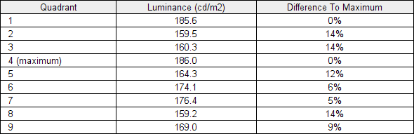
Luminance uniformity table
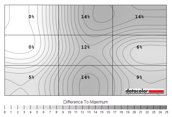
Luminance uniformity map
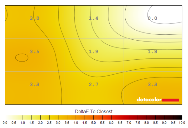
Colour temperature uniformity map
Contrast in games and movies
Lagom contrast tests
Local Dimming (SDR)
Colour reproduction
Colour gamut

Colour gamut 'Test Settings'
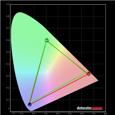
Colour gamut 'sRGB'


Colour gamut AMD 'CTC disabled' setting
Colour in games and movies
Shade representation using SpyderCHECKR 24

The monitor displays most shades with a hit of extra vibrancy and saturation, mainly due to the colour gamut extending comfortably beyond sRGB. The generous extension in the gamut in the red region, for example, gave shades such as medium orange (3), tango pink (11) and candy apple red (14) some extra punch. Extension in the green to blue region added extra saturation to shades such as aquamarine (4) and dark lime green (18). The extra saturation was more constrained than on models with an even wider gamut. There was also noteworthy weakening of saturation lower down the screen, due to perceived gamma shifts. This also occurs at the sides of the screen, but that can’t be assessed with this shade arrangement – and could appear further up the screen, depending on viewing position. The extra boost in saturation discussed for shades such as medium orange (3) and aquamarine (4) is significantly reduced lower down the screen and medium orange (3) actually appears less saturated than intended there.

The saturation levels are significantly reduced now. Rather than most shades appearing oversaturated, many appear undersaturated. The saturation losses towards the top and indeed sides of the screen come into play, sapping extra saturation in those regions. This makes shades such as medium orange (3) appear rather pale – especially when displayed lower down. And aquamarine (4) appears a faded and icy-looking pale blue. The cool colour temperature of our unit in its sRGB mode (channels locked) does not help, either. Gamboge (23) appears more yellow than it should and lacks the rich and slightly orange push it should have, especially lower down the screen. Shades such as candy apple red (14) and dark lime green (18) which were notably oversaturated before have been toned down. Shades such as lemon yellow (10), avocado (12) and – more so to the eye than in the photo – grape purple (15) are also displayed well. So that’s a win for most of the fruity shades! As usual, we’d recommend profiling the monitor with your own calibration device using the native gamut if you require the highest level of colour accuracy.
Viewing angles

The following video shows the Lagom text test, a mixed desktop background, a game scene and dark desktop background from various viewing angles. For the mixed image and game scene you can see significant shifts in contrast and colour – a clear ‘washed out’ look as angles become relatively steep. The shifts are not as extreme vertically as you’d observe on a TN model (there’s no ‘colour inversion’, for example) but are more pronounced than some VA models and IPS technology. The final section of the video shows a dark desktop background and highlights the ‘VA glow’ mentioned earlier. This blooms out more noticeably from sharper viewing angles but is not as strong from centralised viewing angles. The dark background is also shown with ‘Local Dimming’ set to ‘High’, showing a ‘blooming’ surrounding brighter shades which flares out when viewed from an angle – the black of the background is significantly deeper in comparison as the dimming zones essentially shut off there.
Interlace pattern artifacts
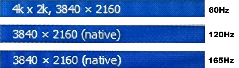
Static interlace patterns, various refresh rates
Responsiveness
Input lag
Perceived blur (pursuit photography)


Responsiveness in games and movies
VRR (Variable Refresh Rate) technology
FreeSync – the technology and activating it


The Samsung supports a variable refresh rate range of 48 – 165Hz. That means that if the game is running between 48fps and 165fps, the monitor will adjust its refresh rate to match. When the frame rate rises above 165fps, the monitor will stay at 165Hz and the GPU will respect your selection of ‘VSync on’ or ‘VSync off’ in the graphics driver. With ‘VSync on’ the frame rate will not be allowed to rise above 165fps, at which point VSync activates and imposes the usual associated latency penalty. With ‘VSync off’ the frame rate is free to climb as high as the GPU will output (potentially >165fps). AMD LFC (Low Framerate Compensation) is also supported by this model, which means that the refresh rate will stick to multiples of the frame rate where it falls below the 48Hz (48fps) floor of operation for FreeSync. If a game ran at 35fps, for example, the refresh rate would be 70Hz to help keep tearing and stuttering at bay. LFC sometimes seemed to activate at slightly higher refresh rates, sometimes as high as 53Hz (53fps) – this slightly different floor of operation makes little difference in practice. This feature is used regardless of VSync setting, so it’s only above the ceiling of operation where the VSync setting makes a difference.

Some users prefer to leave VSync enabled but use a frame rate limiter set a few frames below the maximum supported (e.g. 162fps) instead, avoiding any VSync latency penalty at frame rates near the ceiling of operation or tearing from frame rates rising above the refresh rate. If you go to ‘Support’ – ‘Information’ in the OSD, the current refresh rate of the monitor is listed. This updates in real time and will reflect the frame rate of the content, if the monitor is within the main VRR window. Finally, it’s worth noting that FreeSync only removes stuttering or juddering related to mismatches between frame rate and refresh rate. It can’t compensate for other interruptions to smooth game play, for example network latency or insufficient system memory. Some game engines will also show stuttering (or ‘hitching’) for various other reasons which won’t be eliminated by the technology.
FreeSync – the experience
Nvidia Adaptive-Sync (‘G-SYNC Compatible’)

You will also see in the image above that it states: “Selected Display is not validated as G-SYNC Compatible.” This means Nvidia hasn’t specifically tested and validated the display, not that it won’t work. On our RTX 3090 the experience was very similar to what we described with FreeSync. With the technology getting rid of tearing and stuttering from what would otherwise be frame and refresh rate mismatches, within the VRR range. Similar VRR flickering behaviour was observed, mainly during heavy fluctuations in frame rate and hence refresh rate. There appeared to be a slightly higher floor of operation of 55Hz, so 55 – 165Hz. Though an LFC-like frame to refresh multiplication technology was employed below that to keep tearing and stuttering from frame and refresh rate mismatches at bay. There was again a subtle momentary stuttering and quite noticeable flickering as the boundary was crossed, as we observed with our AMD GPU as well. Our suggestions regarding use of VSync also apply, but you’re using Nvidia Control Panel rather than AMD Software to control this. The setting is found in ‘Manage 3D settings’ under ‘Vertical sync’, where the final option (‘Fast’) is equivalent to AMD’s ‘Enhanced Sync’ setting. You’ll also notice ‘G-SYNC Compatible’ listed under ‘Monitor Technology’ in this section, as shown below. Make sure this is selected (it should be if you’ve set everything up correctly in ‘Set up G-SYNC’).

If you go to ‘Support’ – ‘Information’ in the OSD, the current refresh rate of the monitor is listed. This updates in real time and will reflect the frame rate of the content, if the monitor is within the main VRR window. And as with AMD FreeSync, HDR can be used at the same time as ‘G-SYNC Compatible’.
HDMI 2.1 VRR
HDR (High Dynamic Range)
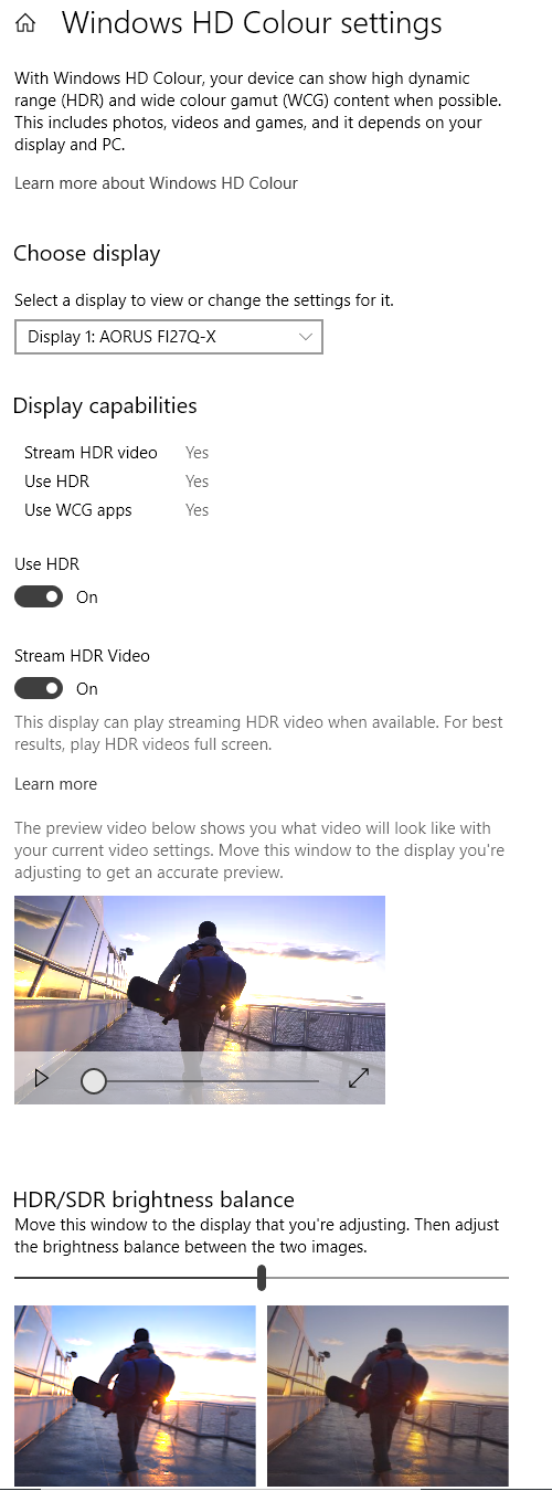
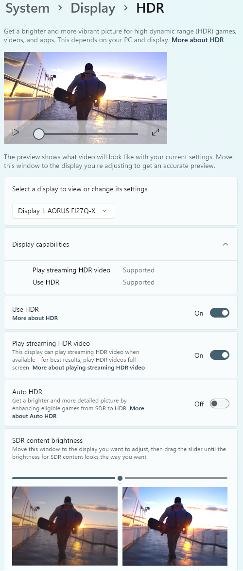
Colour gamut 'Test Settings'
This reasonable DCI-P3 coverage provided a fairly vibrant look overall, with reasonable vividness where the developers wanted it. Rich orange flames, brightly painted red and gold artifacts and some fairly lush-looking deep green vegetation for example. There certainly wasn’t as much ‘pop’ to these vibrant elements as we’ve seen on some models, particularly those with a more generous gamut covering more of the DCI-P3 colour space but also better covering Adobe RGB and therefore more of the Rec. 2020 colour space. This would help provide some more eye-catching greens and blues as well as intermediate shades such as cyans – forest greens, sky blues and some aquatic scenes on this game could look more vivid, for example. These shades looked far from washed out, though, and the precision of the backlight and natural light-blocking capability of the VA panel also helped give decent depth to many medium shades. It provided a certain ‘solidity’ which you don’t always get on LCDs. There were some saturation losses peripherally compared to more central regions of the screen, though such shifts were not extreme for a large VA model. Because the developers have wider gamuts than sRGB in mind for HDR, we didn’t observe the oversaturation we saw using the native gamut under SDR. Overly rich skin tones, some overdone or overly bright greens and that reddish push to brown shades for example were all tamed.

The curve and resolution


The ‘4K’ UHD gaming experience was also enjoyable on the 31.5” screen. It was certainly immersive but not overbearing, with the immersion arguably aided by the curve as that added a bit of a sense of depth to the experience. And the relatively large screen size can facilitate sitting a bit further back from the screen, if that’s your thing. The pixel density gave a clearly defined and detailed look to high resolution game content, similar to what is described in the article. The benefits are easier to appreciate in motion due to the high refresh rate (at suitably high frame rates), too. And again, this is a look not offered by models with a significantly lower (but still reasonable) pixel density such as 27” WQHD screens. The curvature of the screen felt quite natural to us when engrossed in single player games or watching movies, though mileage may vary in that respect. We found it particularly noticeable and perhaps a hindrance on some game titles where your eyes spend a lot of time scanning horizontally between the centre and edges of the screen. Competitive multiplayer FPS titles are a classic example of this. Also, whilst the curve is 1000R on average, it’s actually shallower centrally and particularly steep near the edges of the screen. We tend to prefer our 16:9 models to be flat, or for the curve to be shallower than this if a curve is present – we feel moderate to steeper curves are better placed on ultrawide screens. Really this is very subjective – some will find the curve a nice addition, some will put up with it and others will dislike it. The images below show the monitor running various game titles at the native resolution. These are purely for illustrative purposes and in no way indicate how the monitor appears in person. Again, be aware that the curve appears exaggerated in images like this compared to when you use the monitor in person.


Interpolation and upscaling

The monitor includes a range of ‘Screen Size’ options in the ‘Game’ section of the OSD, which control scaling behaviour. There are various settings which will simulate different screen sizes and aspect ratios, from 17” 4:3 to 27” 16:9 with various options between. There’s an ‘Auto’ setting which will use as many pixels on the screen as possible whilst respecting the aspect ratio of the source resolution. And ‘Wide’ which will fill up the entire screen space regardless of the source aspect ratio, potentially stretching and distorting the image. If the monitor is in ‘AV’ mode, which as covered earlier restricts OSD settings, the settings available are slightly different and include a ‘4:3’ option. This is a setting which will be manually selected – most users will want to stick to the ‘PC’ mode for the monitor (even if using a modern games console) as that will unlock a greater range of settings in the OSD. ‘Auto’ is the default setting used for ‘Screen Size’ and is always used if VRR is in use, as this greys out the ‘Screen Size’ menu.


When running the monitor at either 1920 x 1080 (Full HD or 1080p) or 2560 x 1440 (WQHD or 1440p), with ‘Screen Size’ set to ‘Auto’ (or VRR in use), the interpolation process of the monitor provided moderate softening. This was more pronounced and obvious at 1080p. This doesn’t look particularly sharp even natively on a screen of this size, but things still looked softer and less crisp than that. This couldn’t be offset effectively with the sharpness control of the monitor, as some elements became over-sharpened whilst others remained too soft. The monitor fared better at 1440p – we felt increasing the sharpness to ‘68’ provided quite a nice balance, but personal preferences would dictate the preferred setting to use. Even with this set to the neutral position, the interpolation process provided quite decent results here really.
Video review
Timestamps:
The Curve
The Resolution
Features & Aesthetics
Contrast
Local Dimming (SDR)
Colour reproduction
HDR (High Dynamic Range)
Responsiveness (General)
Responsiveness (VRR)
Conclusion
Positives Negatives Quite vibrant colour output with a reasonably generous gamut and an sRGB emulation setting with adjustable brightness
DCI-P3 and Adobe RGB coverage insufficient for work within those colour spaces, sRGB emulation mode quite inflexible and gamma tracking deviates somewhat from preferred ‘2.2’ curve Strong static contrast and a good ‘contrast first’ experience from local dimming solution, providing a dynamic SDR and HDR experience with about the least ‘blooming’ we’ve seen from a Mini LED solution Some ‘VA glow’ and ‘black crush’, a bit of graininess to the screen surface and still a much smaller dimming zone count than pixel count – giving some ‘blooming’ and dragging down of bright shades Low input lag and a much more convincing 165Hz experience than most VA models provide (without the traditional ‘smeary’ trailing), with VRR added for good measure Some weaknesses in pixel responsiveness and overshoot, mainly where dark shades are involved – plus some VRR flickering issues which may bother some people Strong pixel density provides excellent detail and clarity with pleasing ‘desktop real estate’. Good ergonomics and HDMI 2.1 support with feature-rich OSD Strong curve won’t be to everyone’s taste and a pricey monitor without the solid ‘feel’ and premium construction you might expect given its price tag
