Author: Adam Simmons
Date published: March 30th 2017
Table of Contents
Introduction
Back in March 2015 we published a review of the Samsung S34E790C, which was novel at the time for its use of a curved 34” VA (Vertical Alignment) UltraWide panel. As well as offering strong contrast and decent colour reproduction, responsiveness was quite decent as well. Although pixel responsiveness was quite decent for a VA panel, overall responsiveness was still limited by the 60Hz refresh rate. We’ve now seen from the likes of the ASUS MX34VQ and AOC AG352UCG that UltraWide VA panels can put in a competent performance at 100Hz as well. The Samsung C34F791 (also referred to as CF791 or C34F791W with various additional regional suffixes) offers a similar 100Hz VA panel to the ASUS MX34VQ and also couples this with support for AMD FreeSync, by way of Adaptive-Sync on the monitor. Some additions on this model include a steeper curve (1500R vs. 1800R), a ‘Quantum Dot’ backlight to further enrich the colour gamut and a height-adjustable stand. It all looks very nice on paper, but we see how things turn out in practice.
Specifications
This monitor features a 100Hz 34” Samsung SVA (‘Super’ Vertical Alignment) panel, with a resolution of 3440 x 1440 and curvature of 1500R. True 8-bit colour is supported, without dithering, and a 4ms grey to grey response time is specified (as usual, approach with caution). A Nanosys ‘Quantum Dot’ backlight solution is used. Some of the key ‘talking points’ of the specification have been highlighted in blue for your reading convenience below.
Features and aesthetics
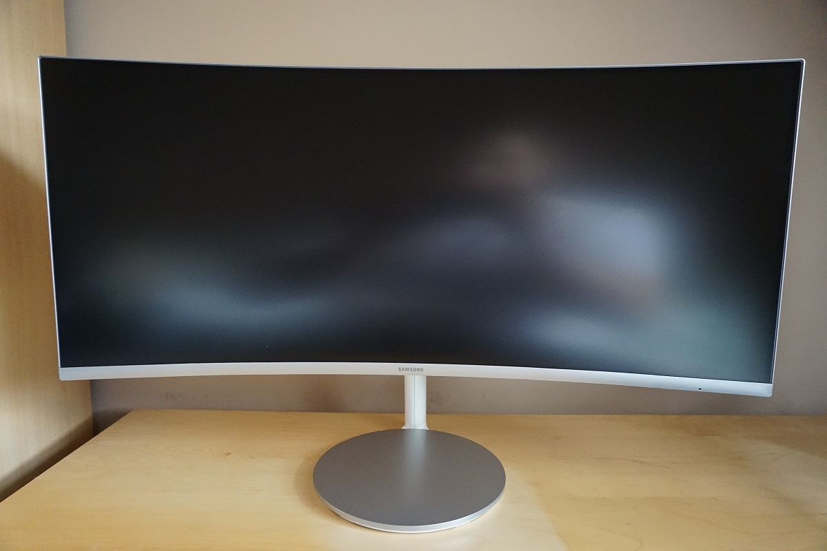
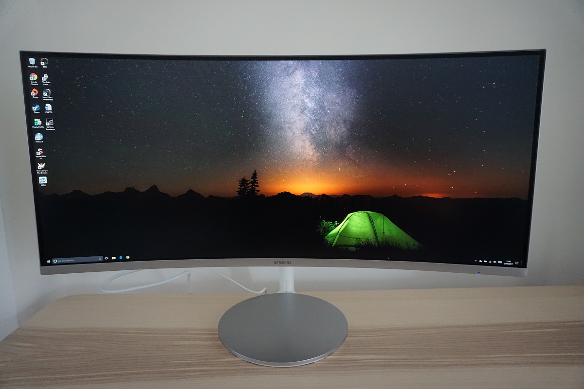
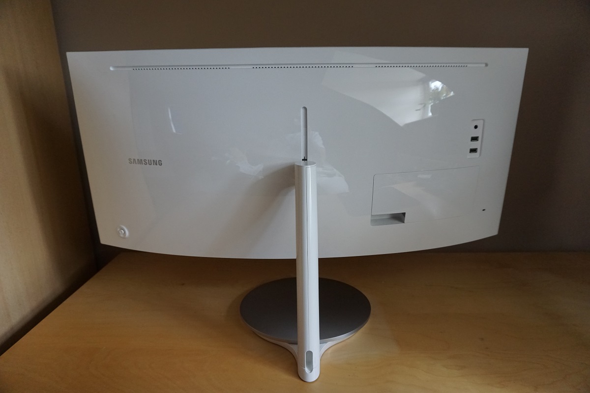
From the front the monitor is dominated by its large screen, which uses a very light matte anti-glare screen surface and employs a 1500R curve. We explore both features a little later. The bezels comprise a thin hard (silver plastic) outer bezel component and a thin panel border, which blends in seamlessly when the monitor is switched off. The total bezel width remains very slender; ~8.5mm (0.33 inches) at the top and sides and ~17.5mm (0.69 inches) at the bottom , including the sliver of panel border there. The stand base has the now familiar dish shape that we’ve seen on the likes of the C24FG70 and C27F591FD. We can’t help feeling better use could have been made of such a ‘dish’, like the Qi Wireless charger integrated in a similar place on the stand of the ASUS MX34VQ. You could still place your phone there if you wish, of course, but if you’re wanting to charge it using the monitor you’d have to use a good old USB cable instead.
The OSD (On Screen Display) is controlled by a ‘JOG button’ (joystick) at the rear of the monitor, near the bottom right as viewed from the front. There is also a small power LED towards the right of the bottom bezel, facing forwards. This glows blue when the monitor is on and flashes if it enters a low power state. If preferred it can be configured to stay off when the monitor is on. The functionality of the OSD is showcased in the video below.
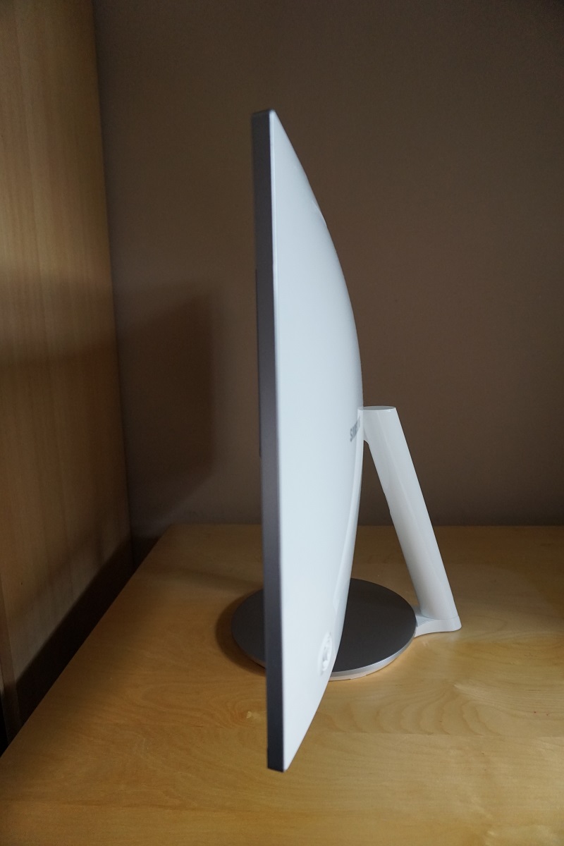
From the side the monitor shows off a lot of white plastic, aside from the matte silver elements around the edge of the screen and the top of the stand base. The monitor is ~10mm (0.39 inches) at thinnest point, lumping out centrally where the stand attaches. The total depth of monitor including stand is ~305mm (12.01 inches). The stand offers tilt adjustment (14°/2° forwards and 22°/34° backwards with the stand fully up or down, respectively) and limited height adjustment (100mm or 3.94 inches). At lowest stand height the bottom of the screen clears the desk surface by ~50.80mm (2.00 inches) with the top of the screen ~411mm (16.18 inches) above the desk.
The rear of the monitor continues with the glossy white theme, appearing rather minimalistic. The stand attaches centrally, but can be removed and replaced with a 100x100mm – 200x200mm VESA bracket included with the product. Instructions on how to do this are included on page 16 – 17 of the user manual. The monitor includes 2 x 7W up-firing speakers, which produce a reasonably bassy sound with plenty of volume. The overall quality and clarity was not up to par with the MX34VQ, but better than many integrated monitor speakers really. There is a 3.5mm headphone jack and 2 USB 3.0 ports atop a concealable port area. This port area has a removable plastic cover with a gap in one corner for easy access and to feed ports through. Removing this cover reveals the remaining ports; DC power input (external power brick), 2 HDMI 2.0 ports (supports Adaptive-Sync), DP 1.2a (Supports Adaptive-Sync), a USB 3.0 upstream port and a service port. There is also a Kensington lock socket to the left of this concealable port area.
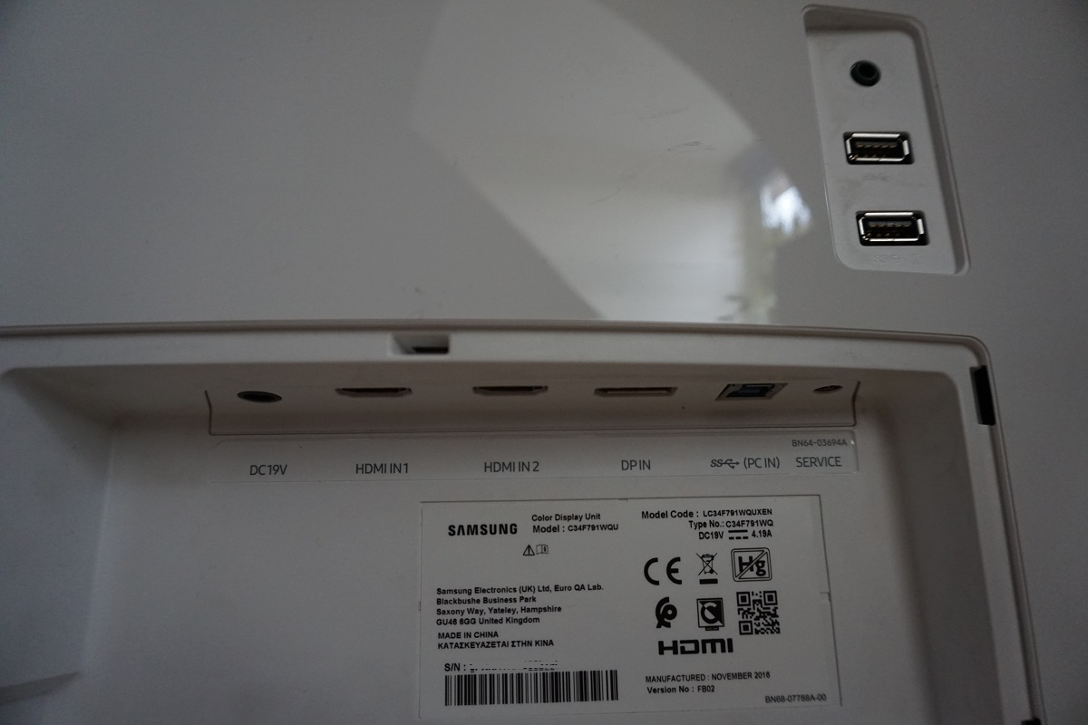
Both DP 1.2 and HDMI 2.0 support the full 3440 x 1440 @ 100Hz on this model. For complete AMD FreeSync functionality DP 1.2a or HDMI 2.0 must be used on a compatible GPU. A DP cable and HDMI cable is included in the box alongside the power adaptor.
Calibration
Subpixel layout and screen surface
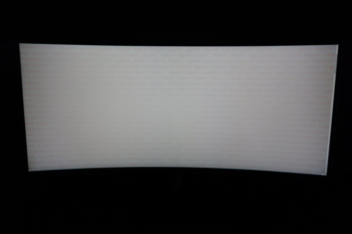
This monitor uses a light matte anti-glare screen surface, as mentioned previously. This has quite a smooth surface texture, providing white and other light shades with quite a smooth appearance that is free from obvious graininess of ‘smearing’. There is a bit of light misty graininess (the appearance is not as smooth as 34” IPS models) but this is not particularly obtrusive and it isn’t a massive difference really. This sort of screen surface also provides strong glare-handling, keeping reflections at bay. Regardless of the effectiveness in this respect, it’s important to consider your room lighting and avoid direct light striking the screen or overly bright ambient light where possible.
![]()
The standard RGB (Red, Green and Blue) stripe subpixel layout is used, which is the default expected by modern operating systems such as Microsoft Windows and Mac OS. Mac users don’t need to worry about text fringing that can occur due to non-standard subpixel layouts, whilst Windows users don’t necessarily need to use ClearType. You can see from the image above that the subpixels appear slightly squat, but unlike on the Samsung S34E790C this did not create a softer than optimal look to the image. In fact we found the image overly sharp by default. We ran through ClearType according to preferences but this had little impact on this – there was some very slight red fringing to text and it just appeared overly sharp to our eyes. After reducing sharpness from the default of ‘60’ to ‘44’ as covered in the ‘Test Settings’ later on we found the sharpness and text clarity to be on par with other models (including TN and IPS-type displays of similar pixel density).
Testing the presets
The C34F791 offers a range of ‘MagicBright’ presets; ‘Custom’, ‘Standard’, ‘Cinema’, ‘Dynamic Contrast’, ‘Basic Color’ and ‘High Bright’. In addition, there are various other settings to tweak including 3 ‘Gamma’ settings and a ‘Color Tone’ option. We test a range of settings, namely those we feel offer good utility or are otherwise interesting. We will not be spending (read: wasting) our time analysing the ‘Game Mode’ setting, as all this does is oversaturates, over-sharpens and generally upsets the image without offering any real benefits. The ‘Standard’ mode is identical to ‘Custom’ but with brightness set to ‘38’, which can of course be achieved in the ‘Custom’ mode as well. The table below includes key readings taken using a Datacolor Spyder5ELITE colorimeter alongside general observations.
The monitor was left to run for over 2 hours before these readings and observations were made, connected to a Windows 10 system. We installed the driver included on the disk that came with the monitor – this is also available to download from Samsung. As with all modern monitors, it is entirely ‘plug and play’ and doesn’t require a driver to perform its core functions or make positive changes to image quality. Nonetheless, some users have reported some improvement in FreeSync behaviour with the driver. We can’t see that we noticed the same, although we kept the driver installed rather than the basic ‘Plug and Play’ driver as it did no harm either. Our test system used a Club3D Radeon R290 royalAce FreeSync-compatible GPU connected via DisplayPort. We also tested with an Nvidia GTX 1070 and tested both GPUs via HDMI and made similar observations in terms of image quality. Unless stated otherwise and for our ‘Test Settings’, assume factory defaults were used with the monitor set to 100Hz. Note; the refresh rate did not influence the image quality for the purposes of this table anyway.
| Monitor Settings | Gamma (central average) | White point (kelvins) | Notes |
| Gamma = Mode1 (Factory Defaults) | 2.1 | 6339K | The image is bright and vibrant, with strong saturation. The saturation levels are nowhere near as intense as ‘wide gamut’ (~Adobe RGB+) models displaying, though, which is a good thing. There is some weakening of saturation towards the flanks and bottom edge of the screen, which is typical behaviour for a VA panel. Having said that, this model has about as little saturation fading as we’ve seen from a VA model of anywhere near this size. |
| Gamma = Mode2 | 2.3 | 6319K | As above, but a bit of extra depth to some shades. This isn’t particularly obvious in terms of vibrancy, but it does cause some very dark shades to blend in too readily and appear less distinct than they should (a greater degree of so-called ‘black crush’). |
| Gamma = Mode3 | 2.5 | 6340K | As above, but far too much depth with extreme levels of ‘black crush’ and poor shade distinction and accuracy overall. |
| Color Tone = Warm2 | 2.1 | 3984K | A highly effective ‘Low Blue Light’ setting, which creates a much warmer image with a significant reduction in the blue channel. This reduced blue light output is attractive for relaxing viewing, particularly in the evenings where stimulating blue light should be cut out as much as possible to aid a restful night’s sleep. |
| Eye Saver Mode | 1.7 | 5041K | This is an alternative ‘Low Blue Light’ setting. This greys out the brightness control and sets the screen to quite a dim level, it makes the image appear much warmer (significant reduction in blue channel) and also reduces contrast to a fraction of the normal levels. This is designed to create an image that is very restful, at the expense of accurate or rich shade representation. |
| MagicBright = Basic Color | 2.1 | 6602K | This is an sRGB emulation mode which significantly reduces the colour gamut so that it falls closer to the sRGB reference. Things appear clearly less saturated, although as we explore later there are some gaps even in sRGB coverage using this setting. |
| MagicBright = High Bright | 2.1 | 6687K | Similar to the factory defaults, but a slightly cooler look to the image and some minor changes to gamma and shade handling. These differences are quite subtle, but essentially means the monitor is using a slightly looser calibration to maximise contrast and hence achieve maximum brightness at any given ‘brightness’ level in the OSD. |
| Test Settings (modified as below) | 2.1 | 6454K | Similar to factory defaults with massively reduced brightness. This naturally improved the white point so that it lay close to the 6500K target on our unit, without imbalance in the green channel either. The image is less piercing due to the brightness being more comfortable, but it’s still very vivid with strong (but not excessive, in our view) saturation and nice balance and variety overall. |
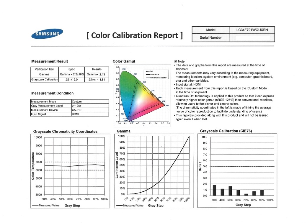
Out of the box the C34F791 provided a vibrant image with good balance overall. Gamma and white point were both within comfortable range of their targets of ‘2.2’ and ‘6500K’, respectively. The gamma tracked at ‘2.1’, essentially making some shades slightly lighter than they would be at a gamma of ‘2.2’. However; this did little to upset the strong vibrancy of the monitor and actually helped alleviate some of the ‘black crush’ associated with this panel type, slightly improving visibility in dark areas. This worked well for the intended uses of this monitor, we feel, and there are other ‘Gamma’ settings available if users wish to use them. The images below show the factory calibration report included with our unit and the gamma curve using our ‘Test Settings’, respectively.
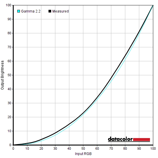
Gamma 'Test Settings'
There are also a few ‘Low Blue Light’ (LBL) settings included with the monitor. Our preferred option is simply setting ‘Color Tone’ to ‘Warm2’, as this was highly effective in reducing blue light output from the monitor without strongly impacting contrast. It also allows manual control of brightness. The mode that is specifically marketed, though, is ‘Eye Saver Mode’. This creates a much dimmer and warmer image, without manual control of brightness. It also purposefully restricts the static contrast of the monitor so that it is extremely weak, intended to reduce the range of light levels outputted by the monitor and hence reduce the amount of time spent by the eye compensating for such changes. We certainly found this mode comfortable, but we didn’t feel our eyes ‘needed saving’ from more conventional settings anyway. For users with particularly sensitive eyes this would certainly be worth experimenting with, at least for prolonged reading sessions or perhaps in the evening.
Test Settings
For our ‘Test Settings’ we simply lowered brightness. There was no need for manual colour channel adjustments on our unit, as the white point and overall balance was pleasing after reducing brightness. Note that individual units may vary, however. We also reduced the sharpness slightly to ‘44’ as we found things unnaturally sharp with a very slight red fringe to text using the default value of ‘60’. As with everything else, though, this is something that should be set according to personal preferences. We have also included the ‘Response Time’ setting, ‘FreeSync’ setting for the monitor and refresh rate used in Windows, just for reference. Any setting not mentioned here, including contrast, was left at default. Sharpness= 44 (according to preferences) Response Time= Standard FreeSync= Ultimate Engine Refresh rate= 100Hz
Brightness= 45 (according to preferences and lighting)
Contrast and brightness
Contrast ratios
We used a BasICColor SQUID 3 (X-Rite i1Display Pro) to measure the luminance of white and black using a range of settings. From these values, static contrast ratios were calculated. This data is presented in the following table, with black highlights indicating the highest white luminance, lowest black luminance and peak static contrast ratio recorded. Blue highlights in the table indicate the results under our ‘Test Settings’. Except for the changes already mentioned in the calibration section or this table, assume defaults were used.
| Monitor Settings | White luminance (cd/m²) | Black luminance (cd/m²) | Contrast ratio (x:1) |
| 100% brightness | 296 | 0.12 | 2467 |
| 80% brightness | 245 | 0.10 | 2450 |
| 60% brightness | 198 | 0.08 | 2475 |
| 40% brightness | 153 | 0.06 | 2550 |
| 20% brightness | 109 | 0.04 | 2725 |
| 0% brightness | 68 | <0.03 | >2267 |
| Gamma = Mode2 | 293 | 0.12 | 2442 |
| Gamma = Mode3 | 292 | 0.12 | 2433 |
| Color Tone = Warm2 | 234 | 0.12 | 1950 |
| Eye Saver Mode | 73 | 1.77 | 41 |
| MagicBright = Basic Color | 314 | 0.12 | 2617 |
| MagicBright = High Bright | 308 | 0.12 | 2567 |
| Test Settings | 166 | 0.07 | 2371 |
The average contrast ratio with only brightness adjusted was 2533:1, excluding readings at ‘0% brightness’ where the black point measurement lacked sufficient accuracy. The highest static contrast ratio recorded was 2725:1, which comes quite close to the specified 3000:1. Regardless of this, perceived contrast was strong and there was a distinct ‘VA look’ to things with quite good inky-looking deep shades. Under our ‘Test Settings’ a contrast of 2371:1 was recorded, which is in-line with the other readings really and only slightly lower due to rounding of the black point. The lowest static contrast was recorded using ‘Eye Saver Mode’ (41:1), but as mentioned earlier this is intentional. The ‘Basic Color’ sRGB emulation setting yielded the highest white luminance (314 cd/m²) and provided strong contrast – contrary to many sRGB emulation modes which adversely affect contrast. The minimum white luminance recorded on this table was 68 cd/m², which is not quite as dim as the competing models we’ve recently reviewed. This provided a luminance adjustment range of 246 cd/m².
There is a ‘DynamicContrast’ setting as a separate ‘MagicBright’ preset on this monitor. This completely locks off manual control of various settings, including ‘Brightness’, ‘Contrast’, Sharpness’ and ‘Color’. It allows the backlight to dim or brighten based on the overall level of light or dark being displayed on the screen. As usual, the backlight is controlled as a single unit and therefore there is no ability to compensate for intricate mixes of light and dark. The backlight reacted rapidly to changes in overall light or dark in a given scene, but we preferred manual control of the backlight and indeed other settings on the monitor.
PWM (Pulse Width Modulation)
This monitor does not use PWM (Pulse Width Modulation) to regulate backlight brightness at any level. DC (Direct Current) modulation is instead used, meaning that the backlight is considered flicker-free. This will be welcomed by those sensitive to flickering or other side-effects from PWM usage.
Luminance uniformity
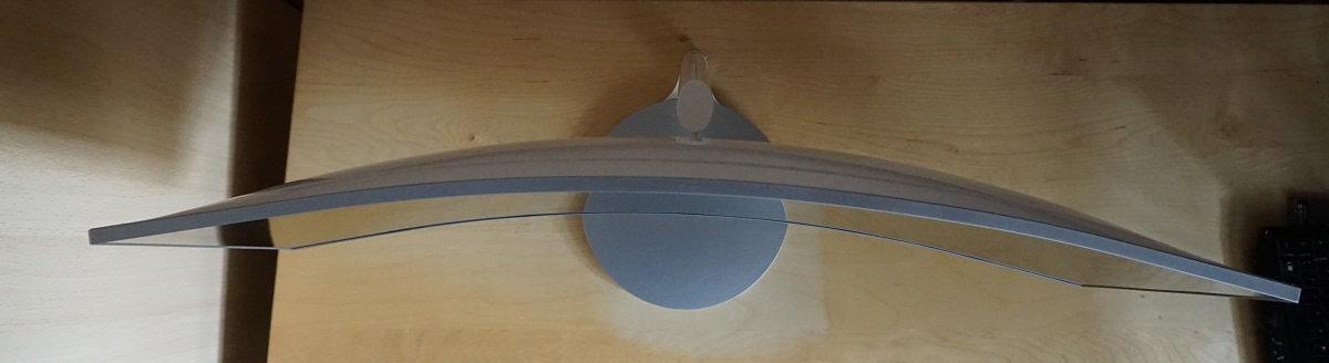
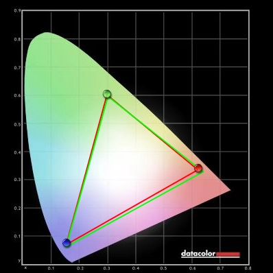
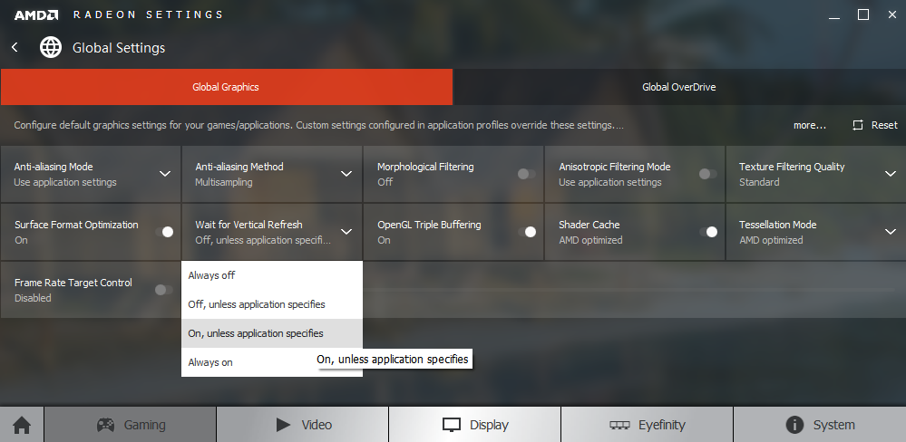
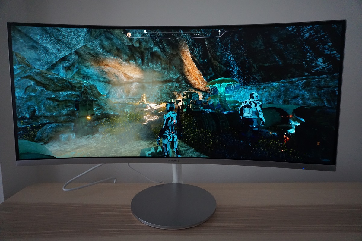
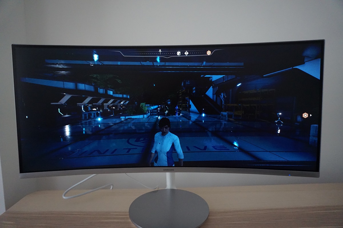
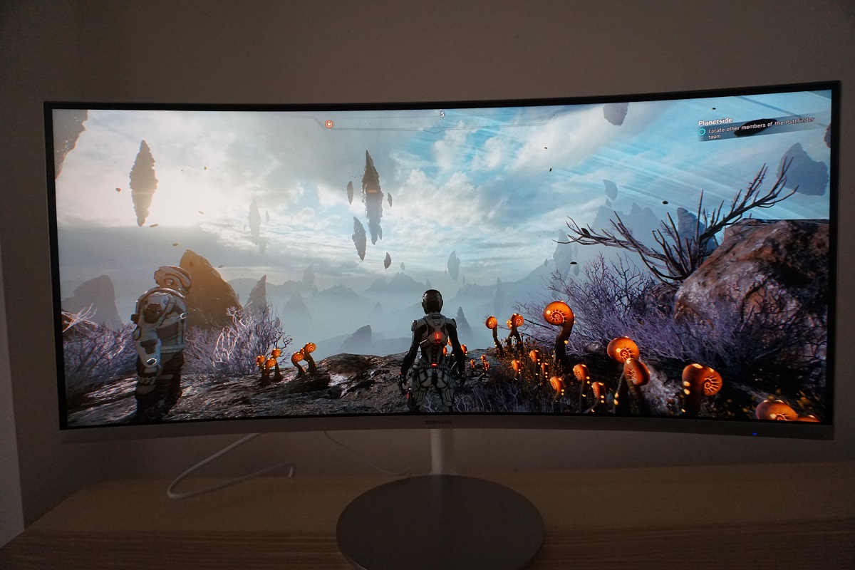
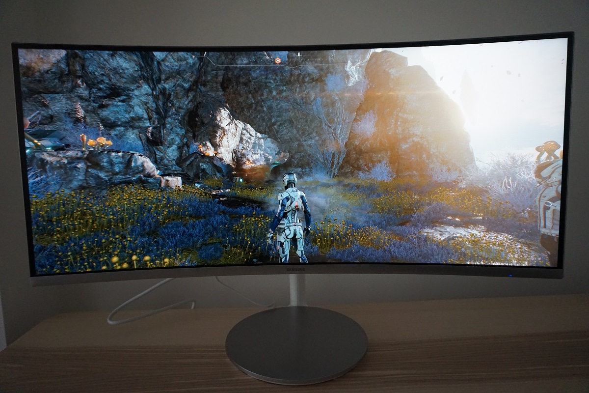
We observed a black background in a dark room and observed no obvious backlight bleed. There was slight clouding, for example near the bottom left of the screen, but nothing troublesome. This is shown in the image below, which was taken some distance back to eliminate so-called ‘VA glow’. This is a silverish or purple glow that’s visible towards the bottom of the screen in particular, from a normal viewing angle. It blooms out more noticeably from sharper viewing angles. This is nowhere near as obtrusive as ‘IPS glow’ nor does it have the same detrimental impact on fine detail or overall atmosphere in dark scenes. Note that individual units vary when it comes to backlight bleed, although being the best light-blockers, VA models such as this are generally relatively strong in this area. The luminance uniformity of the screen was excellent overall. The brightest point recorded was ‘quadrant 5’ in the centre of the screen (158.2 cd/m²). The greatest deviation from this occurred at ‘quadrant 8’ below the centre of the screen (137.9 cd/m², which is 13% dimmer than centre). Elsewhere recorded brightness was within 1 – 10% of the brightest point, which is strong. It’s important to note that individual units vary when it comes to uniformity and that further deviation can be expected beyond the measured points. The graphic below is a contour map showing these deviations graphically, with darker greys representing lower luminance and hence greater deviation from the brightest point than lighter greys. We also measured the colour temperature (white point) uniformity of the same 9 quadrants. Deviations here are assigned DeltaE values, with higher values representing greater deviation from the 6500K (D65) daylight white point target than lower values. A value below DeltaE 3 is considered deviation that most users wouldn’t readily notice by eye. The results here were good, with no significant deviations recorded. The point closest to 6500K was above centre, with a maximum deviation of this towards the bottom right of the screen (DeltaE 2.7). As with luminance uniformity, it’s important to note that individual units can vary when it comes to colour temperature uniformity. Note as well that VA models such as this have perceived shifts that aren’t accounted for by these readings, due to viewing angle weaknesses. Regardless of this, it is good to see such a strong performance for both measures of uniformity on the Samsung. The monitor provided a strong contrast performance on Battlefield 1 (BF1). Dark scenes appeared with excellent depth and a good level of detail. A little detail was lost due to ‘black crush’, whereby some shades in the central region of the screen appear darker than they should and blend into a sort of black or very dark shade. This is a typical VA characteristic, but there was about as little of this as we’ve seen on a VA model of anywhere near this size. There was also a small amount of ‘VA glow’ near the bottom of the screen which lightened some shades slightly. But this was much more subdued than ‘IPS glow’ or anything like that and the overall atmosphere (depth of shades) was pleasing. Brighter shades contrasted nicely in darker surroundings, with the screen surface ensuring such elements look relatively smooth rather than overly grainy. The contrast performance was also pleasing on Dirt Rally. There was again a little ‘VA glow’ near the bottom of the screen and some ‘black crush’ as on BF1, but the overall distinction of shades and atmosphere created in dark scenes was very good. The strong contrast performance also helped bring out well-defined details for vegetation leaf structures, cracks in rocks, building brickwork etc. Brighter elements such as car headlights in the night stood out very well indeed against darker surroundings and had only a slight graininess from the screen surface rather than anything obtrusive. We also tested the Blu-ray of Star Wars: The Force Awakens and found contrast equally appealing. This film features many shades that really benefit from strong contrast on a monitor, with light elements such as light sabers piercing the surrounding spacey darkness. The monitor did a very good job at creating the sort of atmosphere this film craved. We also tested the Blu-ray of Star Wars: The Force Awakens. The strong static contrast again aided the look of this film, with plenty of scenes showcasing this nicely. Flames, explosions, burning projectiles and glowing light sabers stood out very nicely in the darkness. The level of detail in the dark areas was good overall, with the minor ‘black crush’ doing little to detract from the overall cinematic look of the film. Lagom’s contrast tests were used to analyse specific weaknesses in contrast performance which may not have been identified during other testing. The following observations were made. The C34F791’s colour gamut (red triangle) was compared to the reference sRGB colour space (green triangle) as shown below. The monitor offers comprehensive (100%) sRGB coverage with some overextension particularly in the green and red regions of this diagram. This allows the monitor to reproduce all shades within the sRGB space with some extra saturation. The colour gamut is still considerably constrained compared to traditional wide gamuts like Adobe RGB, especially in the green region. Many users will find this vivid but not garishly oversaturated colour reproduction appealing for gaming and general-purpose use. The monitor also offers an sRGB emulation setting, namely a ‘MagicBright’ preset called ‘Basic Color’. This massively reduces the colour gamut, as shown below. As covered earlier on it does so without reducing contrast, but it does only provide ~94% sRGB coverage. Some users may find this a bit restrictive for work within the sRGB colour space, if colour accuracy is important to them. Then again, the inconsistencies related to VA panels (viewing angle weaknesses even from normal viewing positions) makes them less than ideal for such work anyway. The monitors displayed an impressive array of vivid shades on Battlefield 1 (BF1). There was clearly strong saturation, overall, but not the sort of eyesore gained when an untamed wide gamut (Adobe RGB or greater) monitor displays sRGB content such as this. The environments looked rich and natural, rather than artificial and alien. There were some impressively luscious forest greens alongside a nice range of more muted shades, helping give a lush look to vegetation. Earthy browns were also well-represented on the whole, with just a touch of extra red in places but not the sort of unnatural mars-like hue wide gamut models present here. There was a pleasing vibrancy to fires, explosions and various other bursts of colour (including some impressive red poppies on some map). We wouldn’t really say competing models like the ASUS MX34VQ suffered an obvious lack of vividness in scenes like this. Nonetheless, the ‘Quantum Dot’ backlight of the CF791 and slight stretching out of the colour gamut that results does provide another extra dose of vibrancy. There was some loss of saturation towards the flanks and bottom of the screen, attributable to viewing angle related gamma shifts that are typical on VA models. This loss of saturation was about as low as we’ve seen on a VA model – even including significantly smaller models – and even at these extremities the saturation levels remained pretty strong. These slight inconsistencies have little impact when gaming or just using the monitor generally, but should still be considered if colour accuracy is a prime consideration. Shades were also represented in a vibrant and varied way on Dirt Rally. The car paint jobs showcased some particularly impressive bright and neon shades, such as pink and orange, alongside some good deep shades. The most eye-catching of these were probably bright neon shades (such as pink) painted on a darker background. The combination of strong contrast and generous colour gamut created impressive vibrant ‘pop’. The racing environments looked vivid but natural, with a pleasing array of khaki shades displayed alongside some rich and full greens and browns. As we observed on Battlefield 1, some brown shades had slightly too much of a red hue, but this was not particularly bothersome and certainly not as obvious as on untamed wide gamut models displaying this content. The representation of greens, although quite saturated in places, provided a good deep and natural-looking effect rather than an out of place garish look, too. Again in contrast with untamed wide gamut displays. We also made some notes on the shade representation on Futurama: Into the Wild Green Yonder. With its large blocks of individual shade, this is a particularly good and unforgiving test for colour consistency. This highlighted the variations in saturation (i.e. weakening saturation towards the sides and bottom of screen) very well, but also hammered home the fact that the consistency was actually very impressive for such a large VA panel. These slight saturation variations also meant that subtly different shades (such as character skin tones) lost a bit of their individuality, but the monitor still provided a decent experience in that regard. The overall range of shades, the vibrancy of shades that demanded it (neon shades, deep shades etc.) and good pastel look to more muted shades was all very impressive. We used Lagom’s tests for viewing angle to analyse colour consistency and the influence of viewing angle in a more specific way. The following observations were made from a normal viewing position, around 70cm from the screen. Perceived changes in gamma and saturation can be more pronounced if you sit closer to the screen. The video below shows this text test, a mixed desktop background and dark desktop background from a variety of viewing angles. You can see a loss of perceived contrast and general lightening of the image from more extreme viewing angles, but vertically in particular performance is stronger than TN (Twisted Nematic) panels as there is no colour inversion or more extreme colour shifts. The final third of the video highlights the ‘VA glow’ mentioned previously, which blooms out from extreme viewing angles but is not never as obvious as ‘IPS glow’ regardless of viewing angle. Using a sensitive camera and small tool called SMTT 2.0, we compared the latency of the C34F791 to a range of monitors of known latency. Over 30 repeat readings were taken to help enhance accuracy. Using this method, we measured 16.86ms (over 1.5 frames @100Hz) of input lag. The ‘Game Mode’ and ‘Response Time’ setting did not have a significant impact on this value. Note that this value is influenced both by the element of input lag you see (pixel responsiveness) and the element you feel feel (signal delay). It indicates a moderate signal delay that sensitive users might notice, but most users should find fine. We don’t have the equipment to accurately measure input lag whilst FreeSync is active, unfortunately. In this article we explore the factors affecting monitor responsiveness. One of the key concepts explored here is ‘perceived blur’, influenced by both what the monitor is doing (i.e. pixel responsiveness) and by eye movement as you track motion on the screen. We also introduce a photography technique called ‘pursuit photography’ which captures motion on a monitor in a way that reflects not only what the screen is doing (pixel responsiveness) but also blur due to eye movement. And this second factor is often the most significant on modern monitors. The following images are pursuit photographs taken using the UFO Motion Test for ghosting, with the test running at its default speed of 960 pixels per second. This is a good practical speed for such photography and reflects both elements of perceived blur nicely. The monitor was tested at all ‘Response Time’ settings, at both 60Hz and 100Hz. Note that the UFO in this test moves across the screen from left to right at a frame rate matching the refresh rate of the screen. All three rows of the test are analysed (i.e. a dark, medium and light cyan background) so that a decent range of transitions between various shades are shown. We’ve also included a reference shot at both 60Hz and 100Hz, specifically the Dell S2417DG running the test with the medium cyan background. This shows how things should look where pixel response time isn’t really a limiting factor and only eye movement is really affecting perceived blur. Any interlacing patterns shown here are simply moiré from the camera rather than any artifacts being shown by the monitor itself. At 100Hz, the object appeared more sharply focussed and narrower, owing to a significant reduction in perceived blur from eye (camera) movement. Using the ‘Standard’ setting gave a fairly bold and deep trail behind the UFO where the dark background was used. This indicates slower than optimal pixel transitions – it may appear bolder than the trailing at 60Hz, but if you look carefully at the image you can see a fringe of this bold trailing near the rear of the object at 60Hz as well. The trail is simply more pronounced at 100Hz due to the natural increase in refresh rate and frame rate for the test. The trailing was fainter with the medium cyan background and fainter still for the light cyan background. For the light background there was also a bit of overshoot visible. The ‘Faster’ setting provided only subtle changes, with perhaps a very slight decrease in trailing for the medium background and a touch more overshoot for the light background. The ‘Fastest’ setting introduced some overshoot for the dark background, giving it a dirty appearance, and introduced a little for the medium background as well. The overshoot levels were further increased for the light background. From this analysis, it would be tempting to conclude that ‘Faster’ is the optimal setting. However; whilst observing a broader range of pixel transitions, we noticed that overshoot became quite a bit more widespread with this setting, particularly where lighter shades were involved in the transition. We found this slightly distracting at times and didn’t feel that the reduction in conventional trailing was at all noticeable. We therefore settled for the ‘Standard’ setting, giving the least amount of overshoot without any real drawbacks elsewhere. On some monitors artifacts can be observed when viewing content moving on the screen, particularly for high refresh rate screens. These artifacts can appear as a mesh or interlaced or woven lines of an alternating shade that is lighter or darker than intended; hence the name ‘interlace pattern artifacts’. Such artifacts were not present on this model during motion. There were very faint static interlacing patterns in places if you looked closely, with the horizontal bands alternating between a very slightly lighter and darker version of the intended shade. These aren’t worth worrying about in our view, though, as they were too faint to notice when gaming and aren’t something most users would notice during general use anyway. The monitor gave a competent 100Hz experience on Battlefield 1 (BF1), where the frame rate kept pace with the refresh rate. The increased refresh rate provided an improvement to the ‘connected feel’ and that feeling or precision and ‘snappiness’ when interacting with the character. This was something that no 60Hz monitor can capture, regardless of how low its input lag may be. This is due to the fact the monitor is outputting 1.67 times as much information every second. This increased refresh rate and frame rate also provided significant benefits in reducing perceived blur, with the game world appearing sharper and more detailed during movement compared to a 60Hz display. With both factors combined, the playability of this game and our ability to be competitive in multiplayer was greatly enhanced compared to gaming on a 60Hz model. Most of the pixel transitions were also sufficiently fast to provide a really decent 100Hz experience, too. This was a far cry from older VA models, even those with high refresh rates such as the Acer Z35. Rather than obvious widespread weaknesses in pixel responsiveness, giving a smeary and at times quite messy experience overall, most pixel transitions were performed at a good speed. There was some extra trailing in places for ‘common transitions’ between light and medium shades, but this was light and powdery in nature rather than heavy and smeary. It didn’t really catch our eye or affect the playability of the game. There was also a little bit of overshoot in places, particularly where the lightest shades were involved, but this was quite light and not obtrusive to our eyes. There were some weaknesses apparent where darker transitions were involved, however. This is something of an inevitability with VA panels, but the degree of weakness here does vary. For this model, things were actually rather good for a VA panel even where the weakest transitions were present. There were no obvious extended ‘smoke-like’ smeary trailing and no obvious look of wet ink being smeared across the screen. There was some ‘break-up’ trailing where dark shades with a slight hue (such as rich brown earth in the darkness or dark rocks with a slight blue-grey hue to them) appeared with a more colourful trail behind them than you might expect. There was also a touch of overshoot added to the mix for some of these transitions involving dark shades, although it was difficult to distinguish between this and ‘break-up’ trailing on this model. Rather than confuse you with further descriptions of these weaknesses, we’ll give you a video-based run-through instead. This video is actually for the ASUS MX34VQ, which is a touch more responsive than the Samsung using its optimal pixel overdrive setting. The weaknesses highlighted here as they would manifest in a video are generally quite similar, however. To finish off, we tested our Blu-ray test titles. There were no obvious weaknesses observed from issues with the monitor’s pixel responsiveness, such as trailing or overshoot. The 24 -30fps or so at which these titles run is really the main limiting factor in terms of their fluidity and the requirements in terms of pixel responsiveness is significantly lower than running higher frame rate content such as games. The 100Hz refresh rate didn’t provide any benefit given the low frame rate, either. AMD FreeSync is a variable refresh rate technology supported by certain AMD GPUs (including the GPUs listed here, as well as future models). As with Nvidia G-SYNC, an alternative variable refresh rate technology for Nvidia users, the technology is designed to allow the monitor to dynamically adjust its refresh rate to match the frame rate of the content. In doing so, there is an elimination of the stuttering (VSync on) or tearing and juddering (VSync off) that would generally occur if the refresh rate and frame rate was mismatched. In addition, there is reduced input lag compared to running with VSync enabled – although aren’t able to accurately measure this. Unlike Nvidia G-SYNC, which uses a proprietary ‘G-SYNC board’ integrated into the monitor, AMD FreeSync makes use of VESA Adaptive-Sync. This functionality is integrated into the DP 1.2a or HDMI 1.4a (and above) port controllers of some monitors, including the C34F791. Our test system uses a Club3D Radeon R9 290 royalAce FreeSync-compatible GPU. This GPU uses DP 1.2a, where FreeSync worked as expected, but lacks HDMI 2.0 so we were unable to properly test functionality via HDMI. FreeSync was automatically activated when we first hooked the display up to the GPU. That should generally be what happens, provided you also have ‘FreeSync’ enabled in the ‘System’ section of the monitor’s OSD. There are two options to select that will enable the technology here; ‘Standard Engine’ and ‘Ultimate Engine’ as we explore shortly. To make sure everything is also set up correctly in the graphics driver, open ‘AMD Radeon Settings’ and click ‘Display’. You should then ensure that the first slider, ‘AMD FreeSync’, is set to ‘On’. If you hover over this, it will also report the variable refresh rate display supported by the display. Note that the image below is for a different monitor and is just used here for reference. The variable refresh rate range supported by the monitor is 48 – 100Hz with ‘Ultimate Engine’ selected (80 – 100Hz with ‘Standard Engine’ selected). Above the refresh rate ceiling for FreeSync (100Hz, corresponding to 100fps in a game), the GPU respects your selection of ‘VSync on’ or ‘VSync off’ in the graphics driver. With ‘VSync on’ the frame rate will not rise beyond 100fps, at which point VSync activates, bringing with it the usual latency penalty when it does so. With ‘VSync off’ the frame rate is free to rise above 100fps, but the monitor will simply stay at 100Hz and therefore tearing and juddering will occur. VSync is configured in the ‘Gaming’ section of ‘Radeon Settings’, where it is referred to as ‘Wait for Vertical Refresh’. This can either be set globally under ‘Global Settings’, or independently for each game title. The default is ‘Off, unless application specifies’ which means that VSync will only activate if it is selected in the game itself (if there is such an option, which there usually is). The in-game option may be referred to as ‘sync every frame’ or something along those lines rather than ‘VSync’ or ‘Vertical Sync’. Most users will probably wish to enable VSync when using FreeSync to ensure that they don’t get any tearing. One of the final two options in the list, shown in the image below, would therefore be preferable. Below the floor of FreeSync operation (48Hz), the monitor employs AMD LFC (Low Frame Rate Compensation) when FreeSync is active, regardless of the VSync setting used. This is only the case when ‘Ultimate Engine’ is selected, as LFC requires the refresh rate ceiling to be at least 2x the refresh rate floor of operation (48 – 100Hz satisfies this). The documentation linked to is outdated in that it states the maximum must be at least 2.5x the minimum, which is no longer the case. With LFC, the refresh rate will try to stick to multiples of the frame rate when the frame rate dips below 48fps. So if for example the game was running at 35fps, the monitor would run at 70Hz. This is effective in combatting the tearing or stuttering that would occur if the monitor simply stayed at a static refresh rate matching its floor or ceiling (i.e. 48Hz or 100Hz). If ‘Standard Engine’ is used, the monitor respects your selection of VSync on or VSync off below the 80fps (80Hz) floor when using this option, so you get stuttering or tearing, respectively. The monitor will say ‘FreeSync’ at the bottom of the ‘Information’ section of the OSD if it’s connected up to a compatible GPU and the option is enabled in the OSD. There is no indication of the monitor that FreeSync is actually active and being used, only that it has been ‘enabled’. It should be obvious from the behaviour in a game when it is or isn’t being used, though, and provided everything is set up as above there shouldn’t be any issues. The final thing to bear in mind that FreeSync can only remove stuttering or juddering from frame and refresh rate mismatches, it can’t compensate for other interruptions to smooth gameplay such as network latency or insufficient system memory. We tested a range of game titles including; Battlefield 1 (BF1), Elder Scrolls Online (ESO), Star Wars Battlefront (SWBF), Hitman, Mass Effect Andromeda and various indie titles using FreeSync. For the most part the technology worked as we would expect on these titles, but we did observe some flickering at certain frame rates. On these titles the screen would flicker like crazy between 45 – 53fps in-game (45 – 53Hz), but was fine either above or below this level. Some titles may flicker at other frame rates with FreeSync active as well, and we are aware of users reporting this on some titles. We completely understand the frustration with this issue, but it isn’t restricted to the CF791 and is actually a broader issue. Similar observations have been made on the ASUS MX34VQ and for some titles various 16:9 FreeSync models as well. This is an issue that’s up to AMD to address with an improved driver really. For reference, we were using AMD Crimson ReLive Edition 17.2.1 and as mentioned earlier had the Samsung monitor driver installed on a system running Windows 10. For frame rates and refresh rates outside of the range affected by flickering, we found FreeSync did its thing and performed much as we would hope for given our past experiences with the technology. We will simply be focussing on BF1 for this analysis as the end result was the same on all of the titles we tested. Furthermore, this title has the flexibility with graphics settings to be run at a full range of different frame rates on our Radeon 290-based test system. With our usual settings employed the frame rate fluctuated quite readily between around 50 -100fps, although generally stayed around 70 – 80fps. With FreeSync disabled and the monitor running a static 100Hz, these fluctuations resulted in tearing and juddering (VSync off) or stuttering (VSync on). To us these imperfections were obvious, although sensitivity to such things does vary. With FreeSync enabled the game just ‘flowed’ better, not interrupted by such nuisances. As frame rate dropped away from 100fps the level of perceived blur increased and ‘connected feel’ worsened. This was the case even with FreeSync enabled; it can’t compensate for reduced frame rates and make them feel like higher frame rates. It can simply smooth out the experience by removing the tearing and stuttering that would otherwise occur. As frame rates approached the ‘flicker zone’ on BF1 and therefore dropped comfortably (or uncomfortably) below 60fps, it wasn’t really a nice place to be. Not just because of the looming threat that flickering might kick in, but also because of the massive drop in the ‘connected feel’ and considerable increase in perceived blur. We also observed a bit more overshoot as frame rate dropped, which is something we commonly observe on FreeSync models. This is an advantage of G-SYNC – the pixel overdrive is tuned for different refresh rates individually and ‘slackened off’ at lower refresh rates where such rapid pixel responses aren’t required and overshoot can become more of an eyesore. Having said that, although the overshoot was somewhat more noticeable at lower vs. higher refresh rates, it was not really particularly obtrusive or widespread really. This article takes a detailed look at the 3440 x 1440 resolution and the sort of experience it provides on the desktop, when playing games and when watching movies. We won’t be repeating too many of the fundamentals of this here and instead would urge you to read that article. One notable difference with the Samsung, though, is that it has a fairly steep curve to the screen at 1500R. This is twice as steep as this model’s predecessor, the S34E790C. It’s also slightly steeper than the curvature of models like the ASUS MX34VQ, and AOC AG352UCG. When we first started using the screen, we’d just come from a range of flat screens and certainly noticed the curve. The steepness of the curve was quite evident when looking at the taskbar on the desktop, for example. Even then, the experience did not feel unnatural and we didn’t feel things looked odd or out of place. Designers and other users who require geometrically correct shapes will of course have to be very cautious with this, but for general use it wasn’t an issue. We also found our eyes quickly adjusted to this and before long we felt right at home using the 1500R curved screen. We can’t exactly back up Samsung’s claims that the viewing experience is made more comfortable by this sort of curvature as it creates a more uniform viewing distance between the centre and edges of the screen. But that’s just because we don’t really find flat screens inherently uncomfortable. And we certainly didn’t find this one uncomfortable – and perhaps reading text at the edges of the screen was a bit easier. The images below are just for illustrative purposes and make the curve appear quite exaggerated and more noticeable than it is when you actually use the monitor. For gaming we found that the curve gave an extra feeling of depth and immersion, complementing the 21:9 aspect ratio nicely. The enhanced Field of View (FOV) afforded to most game titles (including BF1) was also appreciated, which is something covered by our 3440 x 1440 experience article. Compared to the marginally less steep curve of models like the ASUS MX34VQ (1800R), the 1500R curve made a subtle but noticeable difference in this respect. Just as we’ve found with increasing curvature from the original 3000R screens to around 2000R, the difference is quite subtle once you get used to it, but something we quite liked. We know users don’t always like change and some see the curve as a ‘gimmick’, but generally once those users see it for themselves and actually use the monitor for a bit they learn to rather like the curve. With that said, again note that the images below (of Mass Effect Andromeda) exaggerate the curve and in no way reflect how the monitor looks in person in terms of image quality either. They are just for illustrative purposes. This monitor has an integrated scaler and provides two options in the OSD (On Screen Display) which affect the handling of non-native resolutions; ‘Auto’ and ‘Wide’. The ‘Auto’ options maintains the aspect ratio of the resolution you have selected, so 2560 x 1440 (WQHD) is displayed with large black borders at the side. The image itself appears undistorted and is displayed with 1:1 pixel mapping, in this case just as a 27” 2560 x 1440 display. This is therefore a useful fall-back for titles that don’t support 21:9. For 1920 x 1080 (Full HD), the monitor again maintains the 16:9 aspect ratio and displays the image using interpolation, again using up 2560 x 1440 pixels on the screen. Due to the interpolation process, there is a degree of softening compared to viewing 1920 x 1080 natively on a 27” screen. It isn’t too severe really and certainly doesn’t give the image as much of a soft look as some screens do when using interpolation. Some users may also like to use ‘MagicUpscale’ to increase sharpness, although we found even the weaker of the two settings (‘Mode 2’) overly sharp and artificial-looking. The ‘Wide’ option ensures that all pixels on the screen are illuminated, ignoring the aspect ratio of the source resolution. The aforementioned 16:9 aspect ratio resolutions therefore appear stretched in an obvious way, because that is exactly what happens to the image. The monitor can also display 2560 x 1080 using interpolation, using the full screen space and keeping the 21:9 aspect ratio. It does this regardless of whether ‘Auto’ or ‘Wide’ is selected. This uses considerably less GPU horsepower than 3440 x 1440, so might be useful for some of the more demanding game titles. The interpolation process again gives a bit of softening compared to a 34” native 2560 x 1080 display, but it’s actually rather good overall. It’s certainly one of the better models we’ve seen for displaying 2560 x 1080 non-natively and we feel this could be a useful option for some users. The Samsung C34F791 builds on some of the strengths of the S34E790C, featuring a newer VA panel with similar strengths in contrast but various changes and improvements such as a steeper curve, more generous colour gamut and superior refresh rate. Out of the box the CF791 offered an impressive image setup, with a well-balanced white point and good gamma handling. Gamma did not track perfectly at the ‘2.2’ curve that is often desired, but it came close by tracking at ‘2.1’ on average. And with the generous colour gamut afforded by the Quantum Dot backlight, vibrancy was not in short supply. Colours were rich and lively with strong variety. Colour consistency was also pleasing given the panel type, perhaps enhanced slightly by the curvature, although a little saturation was still lost towards the edges and bottom of the screen. Overall, the image was a touch more vibrant than on other recent UltraWides we’ve tested, such as the ASUS MX34VQ and AOC AG352UCG. But this was not a massive difference really, just a slight edge in a department many users will likely admire. Fortunately it didn’t impart the unnatural look of an untamed wide gamut (Adobe RGB+) model displaying sRGB content. Things still looked natural overall rather than completely overblown. The contrast performance was strong, as you’d hope for given the panel type. Although we were unable to quite achieve contrast matching the specified 3000:1, we did get plenty of readings around 2500:1 and a bit above. And that gave a distinctly ‘VA’ look to the image with respectable depth and strong distinction between bright and dark shades. As is usual for a VA model there was a degree of ‘black crush’, although this was as low as we’ve seen on a model of this size. The overall atmosphere created in dark scenes when gaming or watching movies was very good, far superior to what any non-VA model could produce. The screen surface didn’t mar lighter shades with obtrusive graininess, either. There was just a touch of light graininess rather than an unsightly smear of heavy grain. In this respect the monitor was similar to the other VA UltraWides we’ve looked at recently and indeed quite similar to its predecessor. One area in particular where it is unreasonable to expect perfection from the VA panel type is responsiveness. Although perfection was not achieved, which should come as no shock, the monitor did provide a competent experience that made very good use of its maximum supported refresh rate of 100Hz. Overall, pixel responses were good enough to drive 100fps @ 100Hz comfortably, with most weaknesses resulting in a bit of extra ‘powdery’ trailing rather than the extensive smeary trailing that some VA models produce. The monitor was free from obtrusive overshoot, at least in the ‘Standard’ setting which we actually favour for this reason. FreeSync also worked to combat the tearing and stuttering associated with mismatches between frame rate and refresh rate. As we often observe with the technology, overshoot was a bit more noticeable as refresh rate decreased. But was never too much of an eyesore. The more obvious visual distractions came from some unmistakable flickering, which affected the lower end of the FreeSync range on the titles we tested (45 – 53Hz or 45 – 53fps in a game with FreeSync active). This aside, we always found the experience on this monitor most enjoyable at higher frame rates and feel FreeSync is a nice bonus rather than a defining feature of the monitor for us. Indeed, our greatest enjoyment during multiplayer gaming came from our more powerful Nvidia GPU. This could could deliver a solid 100fps without requiring any drastic image-quality destroying graphical tweaks on titles like Battlefield 1. It would also be improper not mentioning the curve of the monitor. This is the strongest curve we’ve experienced on any monitor, somewhat steeper than the 1800R – 2000R of competing UltraWides and significantly steeper than the 3000R curve of this model’s predecessor. We felt this provided a bit of extra depth to the experience, but was not actually as noticeable or distracting as you might think. Especially given how steep it looks in some images. Once you’re sitting in front of the monitor using it, it is something you soon adapt to and it becomes a nice part of the experience rather than this terrifying and odd feature. Overall we feel this is a well-refined monitor that builds on the strengths of its predecessor to deliver a convincing and immersive 100Hz gaming experience. The bottom line; a monitor that delivers a rich and engaging gaming experience, making surprisingly good use of its 100Hz refresh rate.
The Spyder5ELITE was used to analyse the uniformity of 9 equidistant white quadrants running from the top left to bottom right of the screen. The following table shows the luminance recorded at each quadrant alongside the percentage deviation between each quadrant and the brightest recorded point.
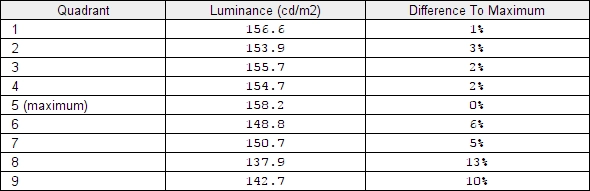
Luminance uniformity table
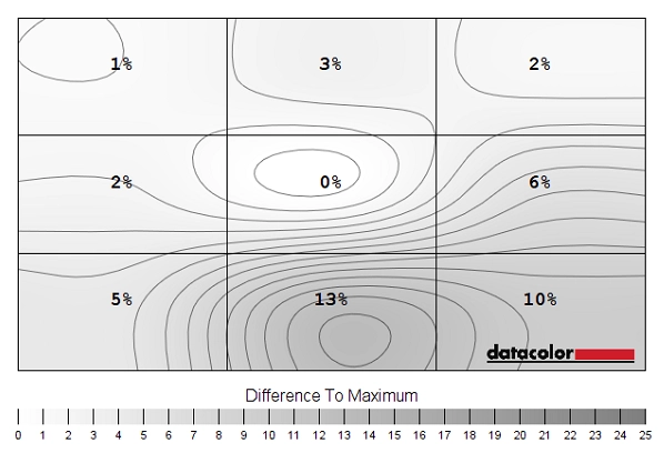
Luminance uniformity map
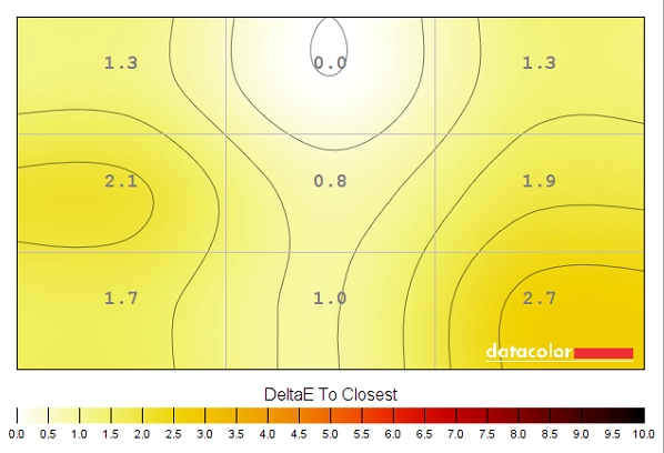
Colour temperature uniformity map
Contrast in games and movies
Lagom contrast tests
Colour reproduction
Colour gamut

Colour gamut 'Test Settings'
Colour gamut 'Basic Color'
Colour in games and movies
Viewing angles
Responsiveness
Input lag
Perceived blur (pursuit photography)
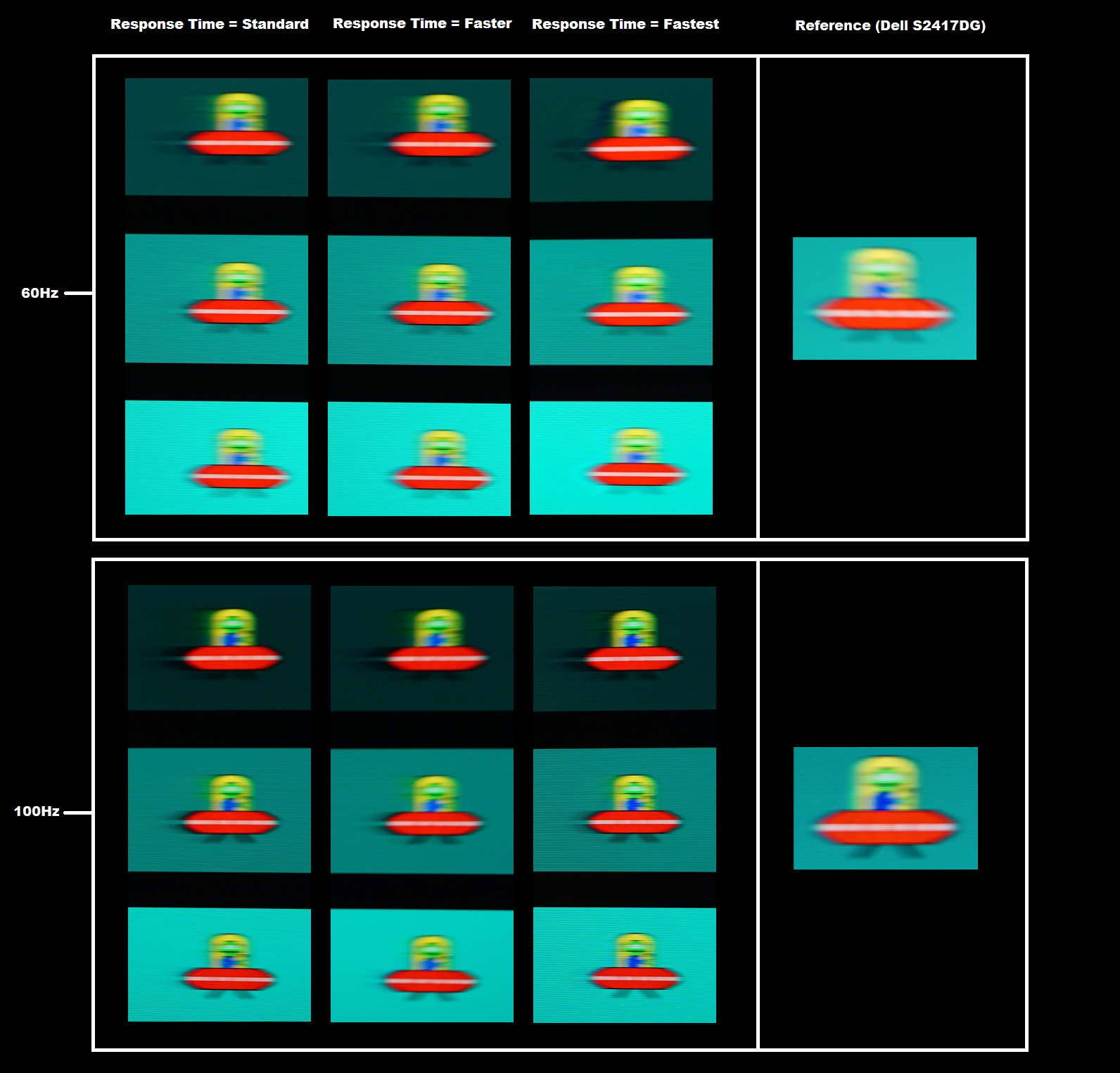
At 60Hz the object itself (UFO) appears soft and blurry, reflecting a high level of perceived blur due to eye (camera) movement. Using the ‘Standard’ setting for ‘Response Time’, there was a fair degree of trailing behind the object for the dark background (first image), which is trailing from slower than optimal pixel response times. The medium cyan background showed much fainter trailing, but also a little bit of overshoot (a light ‘halo’ trailing which is quite faint in this example). For the light background there was a further reduction in trailing, although the overshoot was a bit more pronounced now. Bumping up to ‘Faster’ had very little effect in this test. The ‘Faster’ setting gave strong overshoot for the dark background, as you can see an inky trail behind the UFO. The overshoot was also just slightly increased for the medium background and increased fairly significant for the light background, with an obvious halo.
Interlace pattern artifacts
Responsiveness in games and movies
On Dirt Rally the ‘connected feel’ was again excellent on this 100Hz display, where the frame rate kept up. Whilst we didn’t feel this was as beneficial to our gaming experience as on FPS titles like BF1, that is probably more down to our skill (or lack of) on this game. For more competitive racing fans, having a good ‘connected feel’ between the controller and the car in the game could certainly be of great benefit. The perceived blur was also greatly reduced compared to the more restricted frame rates offered by a 60Hz monitor, with the racing environment, tracks and competitors all appearing sharper and more ‘focussed’ whilst racing. The same weaknesses observed on BF1 were apparent here, although most transitions were again very snappy and provided a solid 100Hz experience. Some of the more obvious weaknesses became apparent when driving at night, as this introduced some of the slowest ‘high contrast’ transitions involving particularly dark shades. Even then, it was more of a case of ‘slightly extended trailing’ rather than the obvious smearing that many VA models suffer from. Even those with high refresh rates, such as the Acer Z35. There was particularly obvious smearing on the Acer for some of the pixel transitions between very dark greys and slightly lighter greys, such as mountains or trees silhouetting the slightly brighter night sky. On the Samsung things were far more constrained in such scenarios. And there was no obvious overshoot, either.
FreeSync – the technology and activating it

FreeSync – the experience
The 34” 3440 x 1440 curved ‘UltraWide’ experience
Interpolation and upscaling
Conclusion
![]()
Positives Negatives Pleasing factory calibration with slight brightness and sharpness adjustments in the OSD being all that was required on our unit (according to preferences). The image was vivid and varied with good colour consistency for such a wide VA model Some saturation was lost towards the bottom and flanks of the screen, but less than you might expect from a VA model of this size Good static contrast and a smooth and light matte screen surface that gave quite a clear look to light colours, free from obvious graininess Not quite as smooth as the screen surface used on 34” IPS-type panels. There was a little ‘black crush’, as you would expect from a VA model, but this was about as low as we’ve seen and was not a major issue in our view Strong 100Hz performance overall with quite well-balanced pixel responsiveness and a good performance in that respect given the panel type. AMD FreeSync is also supported on compatible GPUs Some weaknesses in pixel responses in places, particularly where the darkest shades are involved. Overshoot became somewhat more noticeable at lower refresh rates and some flickering with FreeSync was observed in some cases A good aspect ratio and resolution for game and movie titles that support it (most do), a good amount of space and pixel density for productivity. Plus a height-adjustable stand and a curve that is noticeable enough to give a bit of depth, but one that doesn’t deliver a strange viewing experience Relatively limited ergonomic flexibility, despite limited height and tilt adjustment. VESA mounting is supported with a supplied bracket, however
![]()

