Author: Adam Simmons
Date published: March 16th 2015
Table of Contents
Introduction
For users looking for an immersive experience, a big screen that fills their Field of View (FOV) nicely is often desirable. Seeing more of their game world at once is also an important part of this. Because most games use what is known as ‘Hor+’, simply increasing screen size or indeed resolution isn’t enough to bring more of this game world on the screen at once. It actually requires a wider aspect ratio, such as that adopted by the increasingly alluring 21:9 ‘UltraWide’ models. The Samsung S34E790C features a generously sized screen (34”) in this aspect ratio, coupled with a 3440 x 1440 resolution.
This model sets itself aside from others by featuring a gently curved screen, which the manufacturer claims should help increase the ‘depth’ of the experience and make it seem more natural. Another potentially attractive feature is the inclusion of a ‘VA’ (Vertical Alignment) panel rather than ‘IPS’ (In-Plane Switching), helping the monitor set itself apart from most other ‘UltraWide’ models by providing potentially superior contrast and uniformity. This all looks rather nice on paper, but what is the experience like in reality? We put the monitor through our ruthless throng of tests to find out.
Specifications
This model features a 60Hz 34” SVA (‘Super’ Vertical Alignment) panel with a ‘3000 R’ curvature, apparently sporting true 8-bit colour reproduction (no dithering*). In laymen’s terms this distinguishes itself from most other comparable models by using a VA rather than IPS panel and by being just slightly more curved. A 4ms grey to grey response time is specified, which should of course be approached with a great deal of caution – especially given the panel type used. Same goes for the ‘178°/178°’ viewing angles specified. Key talking points of the specification have been highlighted in blue below for your reading convenience.
*Samsung have told us that this is a true 8-bit panel and shades were mainly displayed in a way we’d expect from such a panel. We observed a small amount of dithering in places, though, as noted in the Lagom tests of the review.
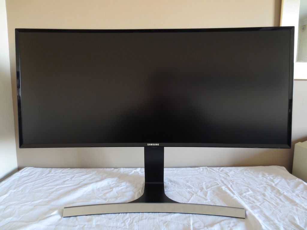
Features and aesthetics
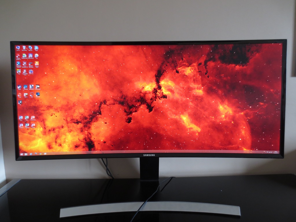
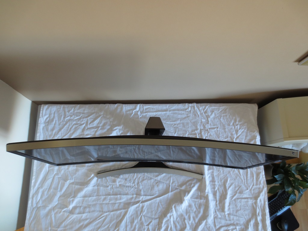
From the front the monitor has a number of prominent points of interest. The large screen itself is of course the main feature, in its 34” UltraWide glory. The curve is actually relatively subtle – something that we look at in more detail later. The screen surface used on the monitor is light matte anti-glare. As detailed shortly, this helps preserve a relatively high level of clarity and vibrancy compared to ‘stronger’ matte surfaces whilst effectively combating glare in a range of lighting conditions. Another noteworthy aspect includes the glossy black plastic bezels. These are fairly slender; around 11mm (0.43 inches) at the top and sides and 13mm (0.52 inches) at the bottom. Unlike on some models there is no sneaky panel border in addition to this bezel.
The T-shaped stand is also a prominent feature, following a similar curvature to the screen itself. It has a faux-metal (silver plastic) and is quite large overall; ~535mm (21 inches) wide and ~255mm (10 inches) deep at the central point. There is a small power LED at the far right of the bottom bezel. This faces forwards and glows blue when the monitor is on standby and is off when the monitor is on, by default. This behaviour can be altered in the monitor OSD (On Screen Display).
From the side the curvature of the monitor can be appreciated with the rear following the curve in a convex manner. The screen is ~23mm (0.91 inches) thick at thinnest point but protrudes back considerably further to ~60mm (2.36 inches). A matte black plastic with brushed metal texture is used at the rear. The side of the screen has a brushed metal surround, whereas the stand neck uses a matte silver plastic. The stand itself is fairly robust and gives the user a bit of ergonomic flexibility; tilt (2° forwards and 20° backwards) and 100mm (3.94 inches) of height adjustment. The bottom of the monitor sits ~96mm (3.78 inches) off the desk surface at lowest height with the top ~455mm (17.91 inches) above the desk surface. The top of the stand neck does not protrude above this. The screen itself is quite heavy and is brought forwards ~35mm (1.38 inches) from the stand neck by a reasonably small attachment joint. As a result it does wobble a bit if you knock the screen or desk, but not alarmingly so. We didn’t find it distracting us with any hypnotic gyrations whilst typing, for example.
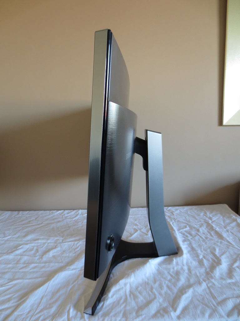
The rear of the monitor is dominated by matte black plastic with a brushed metal texture. There is a small amount of glossy black plastics used for the ventilation grills, which face upwards and downwards from the central bulk of the monitor. The rear-facing surfaces of the stand base (but not the long neck) also use glossy black plastics. The stand attaches by 100 x 100mm VESA, so alternative mounting can be used after liberating the screen from the supplied stand, if you wish. The ports are all located to the right of the stand neck, facing directly backwards but cutting in a bit further than the surrounding ‘central bulk’ of the screen. These are; DC power input (external power brick), 2 HDMI 1.4 ports, DP 1.2, USB 3.0 upstream and 3.5mm audio output. Running down the screen at the rear, towards the right, there are also 4 USB 3.0 ports. A USB 3.0 upstream and DP cable is included in the box.
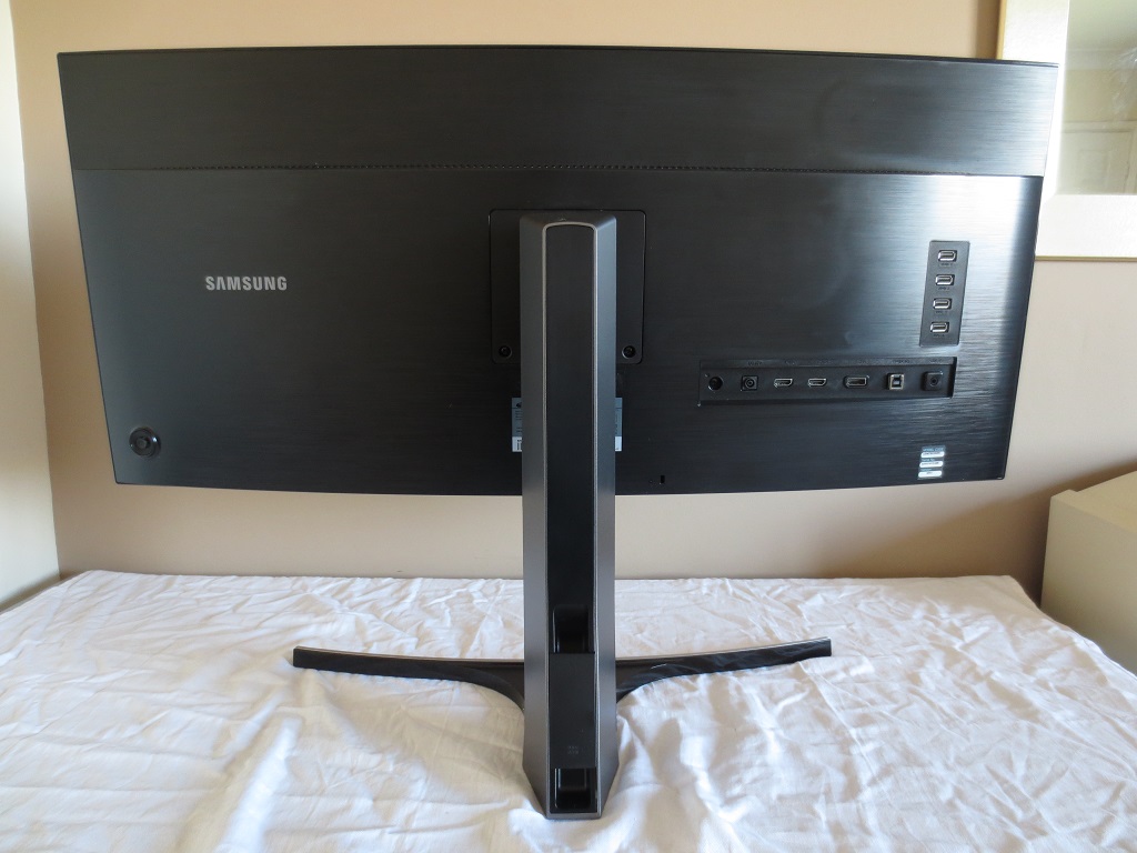
There are some more features to note at the rear. To the immediate right of the stand neck there is a K-Slot. At the base of the stand neck there is a simple cable routing system (cable tidy). There are also 7W down-firing stereo speakers hidden beneath the bottom vent grill (only visible if looking up from beneath the monitor). The speakers come with a range of ‘Sound Mode’ options, accessible in the aptly named ‘Sound’ section of the OSD; ‘Standard’, ‘Music’, ‘Movie’ and ‘Clear Voice’. The speakers provided a fairly dynamic sound with good volume and decent bass, particularly using the ‘Music’ setting. They certainly had decent power for integrated monitor speakers. They sounded a little distorted at times with a lack of distinction in some mid-tones, particularly at higher volumes. Whilst they may not replace a good set of standalone speakers they are certainly better than the majority of integrated speakers, at any rate. That can be a useful bonus on a monitor that takes up so much desk space.
Last but not least there is a JOG button (joystick) to allow you to quickly navigate through the OSD (On Screen Display) of the monitor. This control system is certainly intuitive, but due to the considerable width of the monitor can be a bit of a stretch to access at the rear of the screen, far to the right. The following video shows the menu system and the functionality within.
Calibration
Subpixel layout and screen surface
The screen surface of the monitor is light matte anti-glare. This offers effective glare handling in a range of lighting conditions without introducing the dirty or overly grainy appearance that some ‘stronger’ matte surfaces do. The screen surface used on LG’s current 34” curved AH-IPS panel is a touch lighter, imparting even less graininess. The screen surface used here is still pretty smooth and is one of the less grainy matte surfaces out there, however.
![]()
![]()
The monitor uses RGB (Red, Green and Blue) stripe subpixels as shown in the top image above. These are a little squatter than the subpixels used on LG’s AH-IPS panels, shown on the U3415W in the second picture. This may be a contributing factor to the slightly softer appearance of the image on the Samsung compared to the Dell. This is not correctable by adjusting sharpness on the monitor and does appear to be a pixel structure issue, which isn’t at all unique amongst VA panels. We found that ‘ClearType’ had to be adjusted on our Windows 8.1 setup in order to optimise the appearance of Windows-based text.
On Windows 8.1 and possibly other recent Windows versions you can navigate to ‘Control Panel’ – ‘Display’ – ‘Adjust ClearType text’ to access the appropriate settings. Alternatively you can simply type ‘ClearType’ into the charms search bar on the desktop or the control panel search. You are then guided step-by-step through a sort of calibration process, where you need to select which box looks best to you on each one of 5 sets of boxes. We selected the following boxes from each set, respectively:
Box 1 –> Box 2 –> Box 1 –> Box 2 –> Box 3
Not all versions of Windows have 5 sets of boxes (Windows 7 for example only has 4), but we advise you to spend some time playing around with ClearType settings to try to improve the text clarity. The sharpness on Windows-based text was improved for us following these adjustments, although it did still appear a little soft. This sharpness issue also applies more broadly and of course ClearType can’t correct images or program-specific image-based fonts. The clarity is still very good overall and the difference in sharpness compared to equivalent IPS models is not something some users will even notice.
Testing the presets
Samsung provides a fairly cut-down selection of ‘MagicBright’ presets as well as a dedicated ‘Game Mode’. There are also a number of ‘Color Tone’ settings (alongside manual adjustments) as well as 3 discrete ‘Gamma’ modes. Rather than going through each possible combination of settings, we will instead take a look at a selection of modes which we feel are most appealing or of particular interest to people.
The table below shows some key readings taken using a Spyder4Elite colorimeter. Some general observations are also provided. Any setting not specifically mentioned in the table was left at default, with the exception of our ‘Test Settings’ where various adjustments were made. Our system used an Nvidia GeForce GTX 970 connected via DP 1.2. We used the monitor in its ‘Plug and Play’ state with no additional drivers or ICC profiles loaded. We did test the supplied driver and ICC profile, but they did not change the image in any way. The monitor has everything it needs to function correctly built into its firmware – and the ICC profile is identical to the default Windows profile. It simply ensures that other profiles, such as those intended for other monitors, are deactivated.
Also note that the image is exactly the same if an HDMI cable is used, but the monitor is restricted to 50Hz by default. We were able to set it to 60Hz over HDMI using a custom resolution without any issues, however. DP 1.1 supports 60Hz on this monitor natively and gives the same image as DP 1.2. We also tested the monitor with a modern AMD GPU and found the image very similar, so the observations below are applicable to AMD GPUs as well.
| Monitor Settings | Gamma (central average) | White point (kelvins) | Notes |
| Gamma = Mode1 (Factory Defaults) | 1.9 | 6398K | Uncomfortably bright with a slight green bias. Some shades appear too heavily saturated and ‘in your face’ whilst others appear less deep than they should, somewhat faded if you will. |
| Gamma = Mode2 | 2.0 | 6439K | As above, but considerably more depth. Some shades appear exceptionally deep (and too heavily saturated in places). Certainly a vibrant look in general. |
| Gamma = Mode3 | 2.1 | 6443K | As above but even more depth. Some shades now appear far too deep. The darkest shades blend into pure black too readily – so-called ‘black crush’ in full swing. |
| Color Tone = Warm1 | 1.9 | 5270K | This mode dims the screen somewhat, but brightness is still a bit high by default (and fortunately adjustable). The image appears warm – this does what it says on the tin and is essentially a ‘Low Blue Light’ setting. |
| Color Tone = Warm2 | 1.9 | 4850K | As above, but an even greater blue light reduction. The image appears even warmer and slightly dimmer, with the user again able to dim the screen further. |
| Game Mode | 1.8 | 6360K | This mode is one of the more pointless additions to modern Samsung monitors, which alongside the ‘Cinema’ MagicBright mode upsets the image considerably. There is intense oversaturation, which completely annihilates subtle shade variety at the high end so that bright shades blend into a blinding mess. The image is also excessively sharp – and the user is only able to adjust ‘Brightness’ in this setting, not contrast or colour balance. |
| Test Settings (see below) | 2.1 | 6500K | The brightness is now much more comfortable and the image much better balanced. There is good depth and variety to shades, with a vibrant but accurately represented look on the whole. Some shades stand out beautifully well thanks to the high contrast and really look appealing to our eyes. |
Straight from the box the S34E790C was uncomfortably bright. The image was vibrant but not particularly well balanced. Although white point was fairly close to the 6500K daylight target, there was a bit of a green bias. More significant was the extra depth given to some shades, which ended up looking rather punchy but also a bit wrong. In other places, some shades appeared somewhat muted. There are two additional ‘Gamma’ settings which allow you to overcome those muted shades. Depending on the other settings you use and with ‘Mode3’ in particular those deeper shades can actually become a bit too dark and indistinct, however.
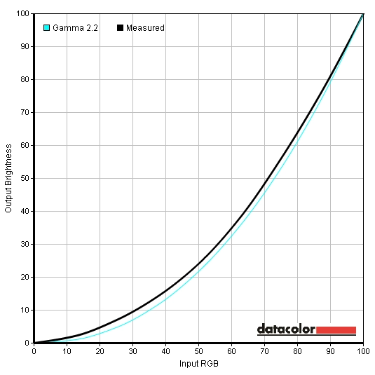
Once the brightness was reduced and some other slight tweaks were made, the image was rather rewarding. Balance was good with some vivid and eye-catching shades but a pleasing variety of shades which were faithfully represented on the whole. Because of how Vertical Alignment panels (even ‘good expensive ones’ like this) behave with relation to ‘gamma shifting’ and the like, it’s important not to put too much weight on exactly what your colorimeter or other measurement instrument is telling you. Use it as a guide, of course, but don’t disregard your own brain and eyes! As an example of this you can study the two gamma curves below. Both were recorded using our ‘Test Settings’, with the top curve using ‘Gamma2’ and the bottom curve using ‘Gamma3’. As you can see, ‘Gamma3’ tracks quite close to the 2.2 target curve for the most part, whereas ‘Gamma2’ sags a little bit in places. However; both of these modes produce an image with a level of depth vividness that you’d not typically see on a monitor when calibrating it to 2.2 gamma. The light screen surface, generous colour gamut and panel type all help bring out some really eye-catching shades. With a panel such as this it’s important not to blindly follow what a colorimeter is telling you, as this panel type is quite heavily influenced by viewing angle whereas that doesn’t influence the colorimeter readings at all. A key reason we opted for ‘Gamma2’ rather than ‘Gamma3’ for our test settings is that ‘Gamma3’ accentuates what is commonly referred to as ‘black crush’. Deep shades tend to blend into a sort of black sea using ‘Gamma3’ when viewing the monitor from a normal viewing position (directly in front of the screen). If you observe at a sharper angle, you see a lot of missing detail reveal itself. Using ‘Gamma2’ reduced this ‘black crush’ massively and allowed the monitor to combine a great atmospheric look with deep shades without losing subtle details and distinctions in the same way. For our test settings we made a number of adjustments to the monitor. Any OSD settings not mentioned here, such as contrast, were left as default. Please be aware that individual units will vary, so use these as a guide rather than taking them as gospel. Some users may also prefer ‘Gamma3’ for even more depth to certain colours, but be aware of our observations above regarding ‘black crush’. Due to inter-unit variation, the perils of ‘black crush’ and these limitations with respect to this monitors intended uses, we will not be providing any ICC profiles for users to download. Brightness= 38 (according to preferences and lighting) Gamma= Mode2 R= 50* G= 40 B= 50 Response Time= Normal We used a Konica Minolta CS-200 light meter to measure the luminance of black and white on the monitor and calculate static contrast ratios based on that. The following table shows this data, with the monitor set to a number of settings including those detailed in the ‘Calibration’ section. If a setting isn’t explicitly mentioned in the table, assume it was left at default. The exception to this is our ‘Test Settings’ where specific adjustments, detailed previously, were made. Blue highlights on the table indicate the results using these settings whereas black highlights indicate the peak white luminance, lowest black luminance and highest contrast ratio recorded.
Gamma test settings
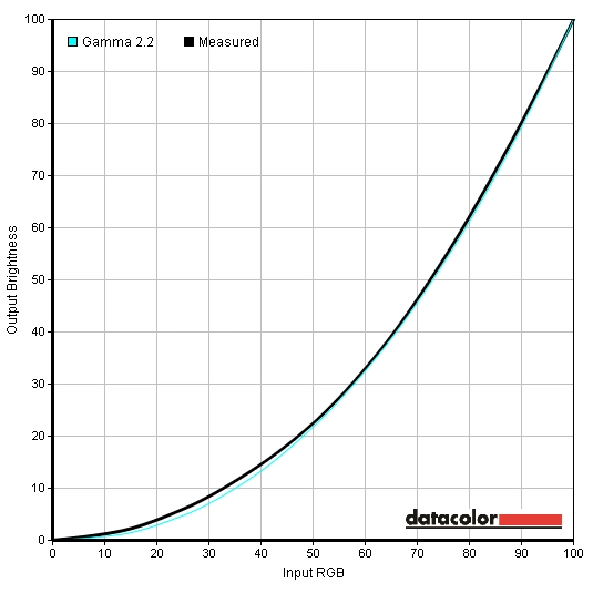
Gamma test settings (plus Gamma = Mode3)
Test Settings
MagicBright= Custom
*Note we applied these settings to another unit and found that the red channel required lowering (to around 42) to overcome a slight red bias on the second unit. Be aware of this inter-unit variation and indeed the possibility of variation with other colour channels as well.
Contrast and brightness
Contrast ratios
Monitor Settings White luminance (cd/m²) Black luminance (cd/m²) Contrast ratio (x:1) 100% brightness (Factory Default) 326 0.13 2508 80% brightness 314 0.13 2415 60% brightness 244 0.10 2440 40% brightness 298 0.12 2483 20% brightness 129 0.05 2580 0% brightness 58 0.02 2900 Gamma = Mode2 324 0.13 2492 Gamma = Mode3 322 0.13 2477 Color Tone = Warm1 283 0.13 2177 Color Tone = Warm2 267 0.13 2054 Game Mode 330 0.14 2357 Test Settings 179 0.08 2238
With only brightness adjusted, we recorded an average contrast ratio of 2571:1 on the S34E790C. This falls a bit below the specified 3000:1, but is still very good and firmly beyond what non-VA LCD panels could achieve. This sort of contrast ratio gives black text and deep shades a fairly ‘inky’ look and helps bright elements stand out very well as we explore later. Following the adjustments made to our ‘Test Settings’, contrast fell a little to a still respectable 2238:1. More significant changes were made to the colour channels for the ‘Warm1’ and ‘Warm2’ presets, knocking down the contrast further to 2177:1 and 2054:1, respectively. We recorded a good bright 330 cd/m² peak luminance, which is nice and bright. The minimum white luminance recorded in the table was 58 cd/m² which is fairly dim. This gave a 272 cd/m² luminance adjustment range which is good. It should be noted that users who are particularly sensitive to light may prefer the ‘Warm2’ preset. Although not noted in the table we recorded a white luminance of 47 cd/m² using ‘Warm2’ at 0 brightness, which is nice and dim really.
There is a ‘Dynamic Contrast’ MagicBright mode on the monitor which allows the backlight to adjust its intensity based on the overall balance of ‘light’ and ‘dark’ being displayed on the screen. This setting reacted rapidly to changes in brightness of content being displayed on the screen, but tended to provide uncomfortably high brightness during mixed images. It dimmed very effectively during predominantly dark content. Because the backlight is all controlled as an individual unit, this setting can’t keep some areas of the screen nice and bright whilst keeping others supremely dim. It is the same for all current LCD monitors and is one of the reasons we don’t feel this setting is of much benefit really. We would advise taking advantage of the strong static contrast performance of this monitor and using a brightness setting that you find comfortable instead.
PWM (Pulse Width Modulation)
The S34E790C does not use PWM (Pulse Width Modulation) at any brightness setting to moderate the backlight intensity. It uses DC (Direct Current) modulation instead, meaning that the backlight is ‘flicker-free’ as advertised by Samsung. This will be welcomed to those who suffer from visual fatigue or discomfort as a result of flickering or who are sensitive to PWM artifacts during motion.
Luminance uniformity
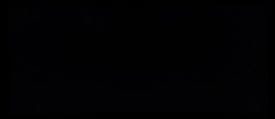
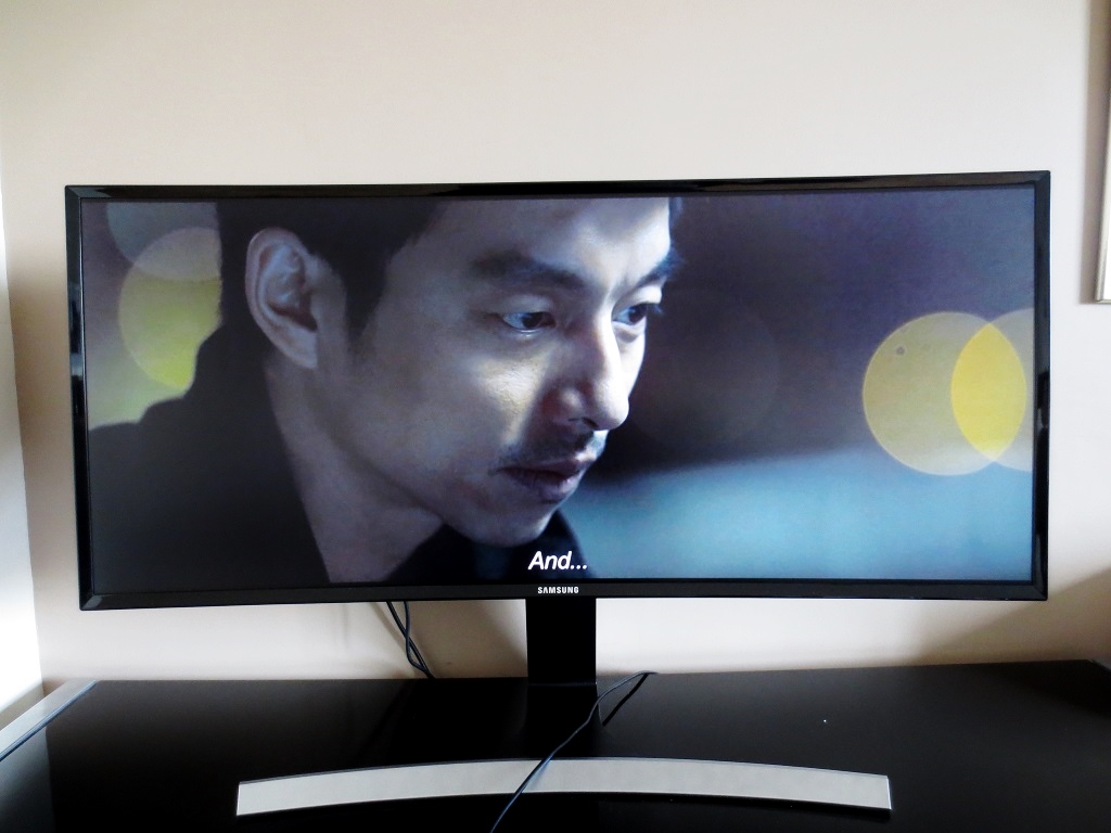
Observing a completely black screen in a dark room revealed just how good the black uniformity of the screen is, as there was no noticeable backlight bleeding or clouding. It’s worth noting that our test unit was a random retail unit rather than some specially selected ‘golden sample’. However; individual units can still vary in this regard. From a normal viewing position there was a mild warm (yellowish) glow which was most noticeable towards the bottom corners of the screen but also visible near the very edges. This was really quite subtle and is a characteristic of the panel type, which we will dub ‘VA glow’. It is nowhere near as obtrusive as ‘IPS glow’ and can only really be observed when viewing dark content in a dim room – not bothersome at all to us. If you move a little further back and remain central you will see this ‘glow’ disappear. If you view the screen from an angle the ‘VA glow’ becomes a bit more pronounced, as demonstrated in the viewing angles video further on in the review. The image below shows how the monitor looked from a few metres back (central viewing position) in a dark room, to demonstrate the strong black uniformity and eliminate the aforementioned ‘VA glow’.
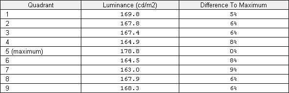
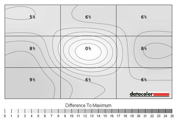
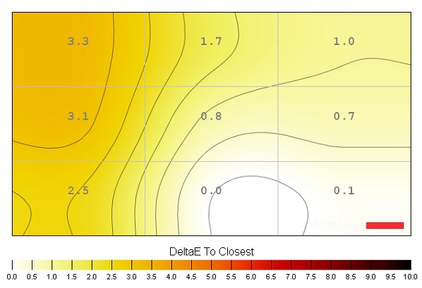
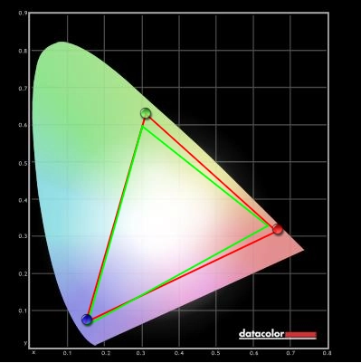
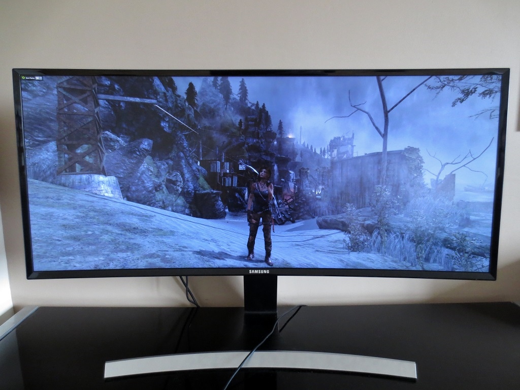
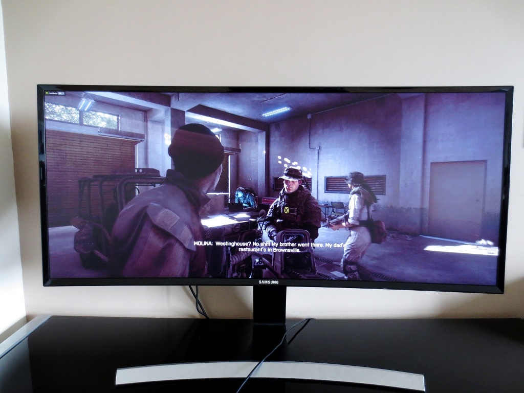
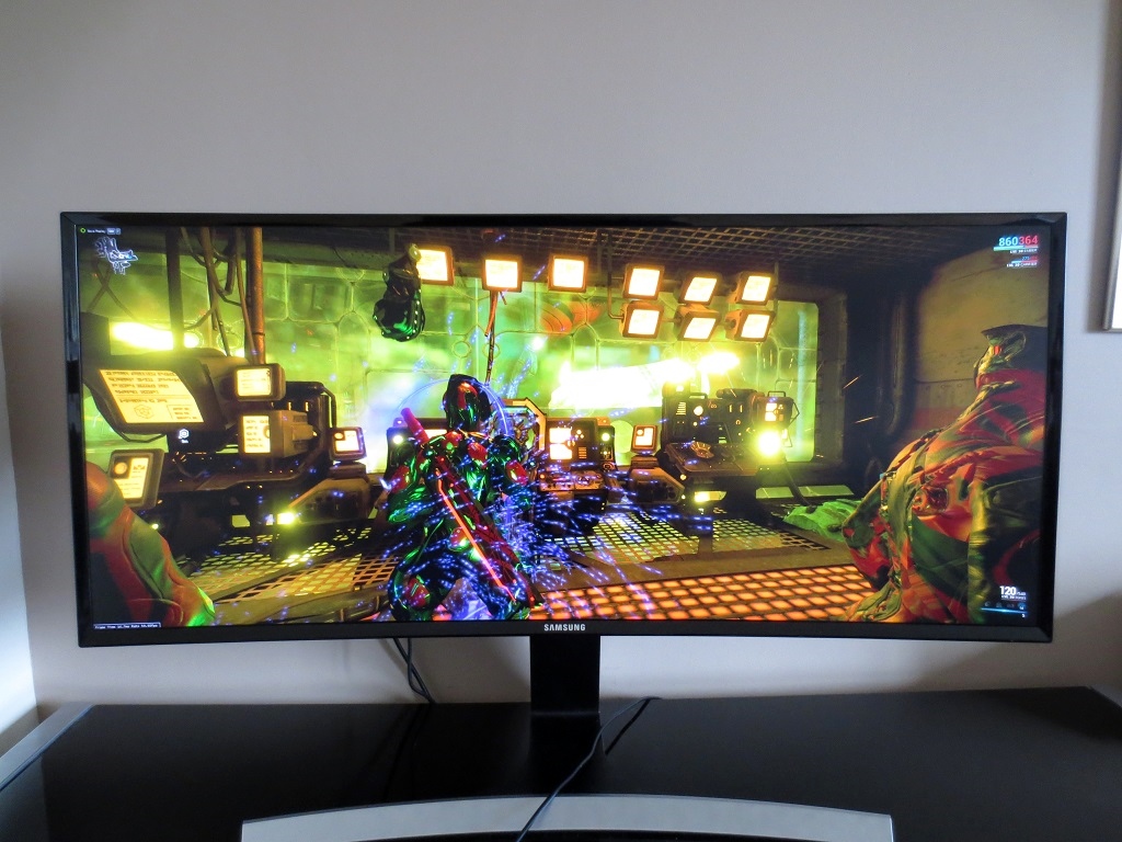
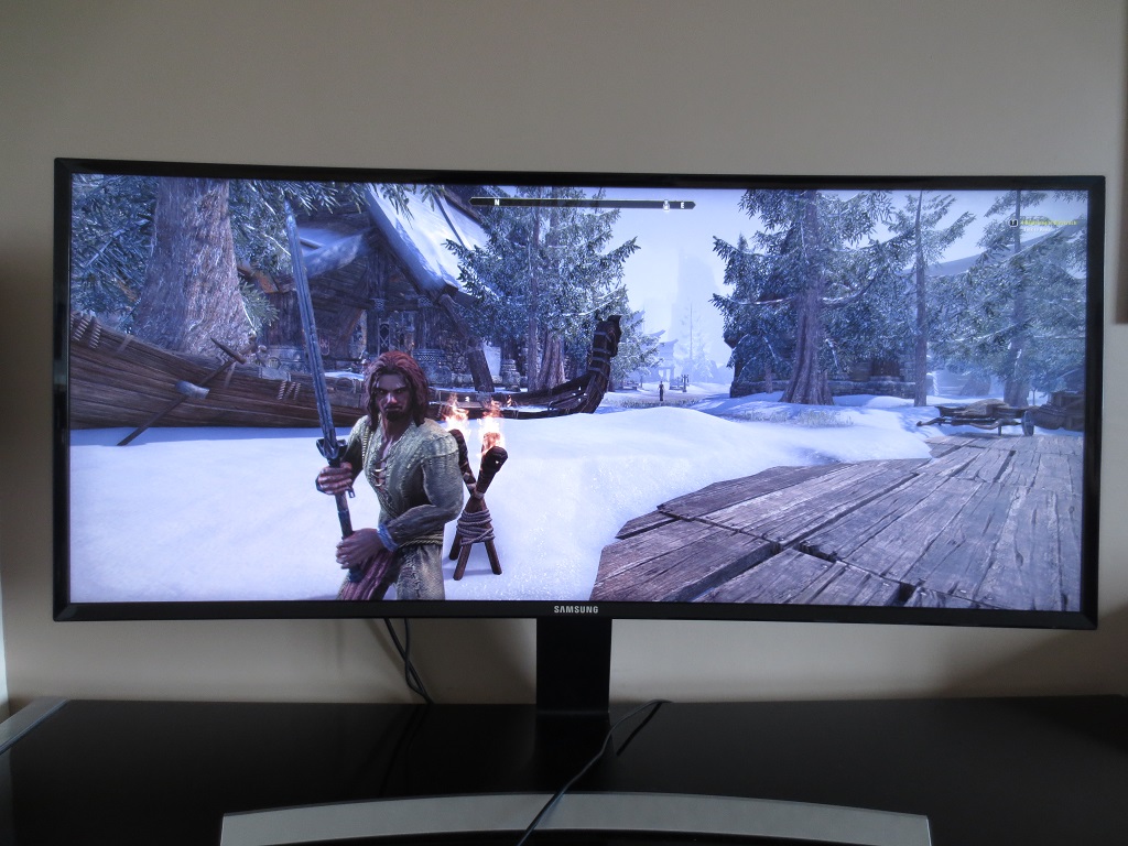
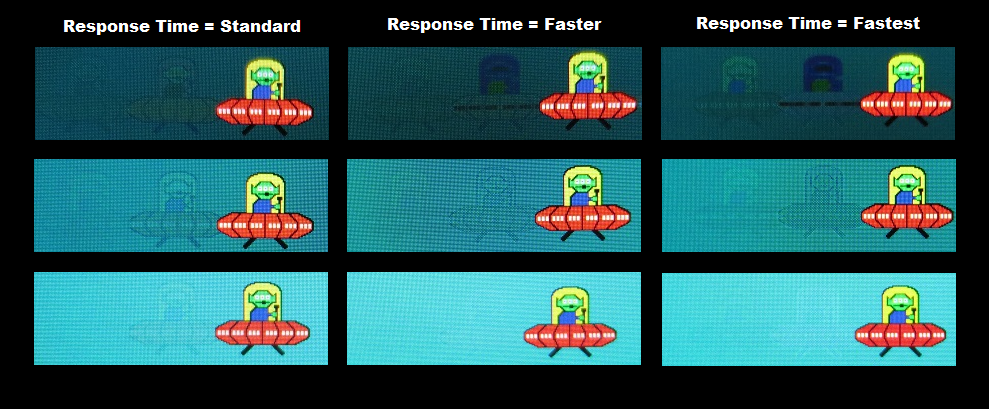
Our Spyder4Elite was used to analyse 9 equally spaced white quadrants, which run from the top left to bottom right analyse the uniformity of lighter colours. The brightness of 9 equidistant white quadrants was analysed, which run from the top left to bottom right of the screen. The following table shows the luminance measured at each quadrant alongside a percentage deviation each quadrant and the brightest measured point. The luminance uniformity of the screen was very good. The brightest point measured was ‘quadrant 5’ at the centre of the screen (178.8 cd/m²). The maximum deviation from this value was recorded at ‘quadrant 7’ at the bottom left (163.0 cd/m²), a 9% deviation. Elsewhere deviation from the brightest point was 5-8%, which is very pleasing. It is important to note that individual units will differ when it comes to uniformity and you can also expect deviation on a finer scale, between the 9 quadrants measured here. Still a good result, though. The contour map below represents the recorded deviations with darker greys representing greater deviation than lighter greys. Percentage deviations are also provided between a given quadrant and the relatively bright central region. The consistency of colour temperature (white point) was also analysed, as shown in the contour map below. Here deviations between each quadrant and the point on the screen closest to the 6500K (D65) daylight white point target are assigned DeltaE values. A DeltaE above 3 is considered deviation that can be noticed fairly readily by eye, particularly if observing white content. Darker shades on this contour map represent greater deviation from the 6500K target than lighter colours. The results here are mostly good, although some significant deviations were recorded at the left side of the screen (particularly the upper right, ‘quadrant 1’, with a DeltaE of 3.3). These values are not outrageously high by any stretch of the imagination, but they do still cross the ‘line of significance’ on this particular test. We did notice the screen appeared slightly warmer in this upper right region in particular, but didn’t find it distracting. It’s also important to note two things. Firstly; individual units can vary in this respect. Secondly; viewing angle of VA panels such as this affects perceived colour temperature in a way that colorimeters don’t record. In other words the flanks of the screen could appear just slightly warmer from a normal viewing position even if uniformity was recorded as being close to perfect. The contrast performance was very pleasing on Battlefield 4 (BF4). Dark areas were graced with good deep colours. Although these didn’t look quite as bold and ‘inky’ as we’ve seen on some VA panels (with significantly higher contrast ratios) they certainly helped create a pleasing atmosphere that helps draw you into the game. The level of subtle detail in such areas was also pleasing. Usually VA panels have quite a degree of ‘black crush’, which means that many dark shades blend into a pool of oily-looking blackness. Using our test settings there was only a minor amount of this going on. Bright elements penetrated this darkness very nicely. Muzzle flashes, tracers and explosions stood out very nicely and had excellent ‘pop’ to them. There were also good distinctive dark details (cracks and crevices in rocks, shaded details amongst foliage etc.) that only a VA panel can provide in LCD form, helping certain objects stand out a bit rather than appear flat like they might on monitors with weaker contrast. Bright elements also appeared relatively ‘clean’ thanks to the fact the screen surface was fairly smooth rather than being obtrusively grainy. The contrast performance impressed on Elder Scrolls Online (ESO), with the screen providing dark areas with a pleasing depth and atmosphere. There was a slight lightening due to the VA glow towards the bottom corners of the screen in particular from a normal viewing position, but this was quite restrained. Blacks and dark greys in the menu system, compass bar and status bars in the game (health, stamina and Magicka) appeared bold. In predominantly brighter areas of the game the shadow and highlight details were good, helping objects appear distinct. Darker interiors and exterior locations at night also had plenty of good deep-looking aspects. Some subtle detail were lost due to black crush, but this was not too pronounced. There were bright flashes of brilliance which lit up these dark surroundings well, for example spell effects and flames which were very eye-catching. With its dark caves and tombs and its abundance of shaded areas, Tomb Raider is a title that really benefits from a monitor with strong contrast performance. Whilst the darkest shades didn’t look quite as deep and inky as you’d see on some VA panels (with more than double the contrast ratio of the S34E790C) they were certainly nice and dark overall. This helped produce an appropriate atmosphere in dark areas such as caves, without disruptive levels of glow getting in the way peripherally. Bright elements such as flames and torches appeared very bright and ‘popped out’ of the darkness very agreeably. On Dirt 3 pleasing levels of detail were maintained throughout the screen. The material textures inside the cars, tire tread patterns and the underside of bridges were appropriately visible without troubling glow or excessive ‘black crush’. Bright elements such as car lights broke through the darkness in a pleasing and rather piercing way, whilst such light shades looked fairly clean rather than looking dirty or excessively grainy. This is related to the screen surface, which imparted only a mild graininess – things didn’t look as pure as they would on a glossy screen, but for a matte screen things looked quite smooth. The Skyfall Blu-ray was given the sort of contrast performance it craved, with good atmospheric dark scenes and piercing bright elements mixing together very nicely. The level of subtle detail in dark scenes was also pleasing, with details such as creases and material textures on some clothes visible. Some of the scenes which particularly stood out on this film included ones where Bond is driving at night past the bright lights of the city in Shanghai and where candles and fireworks light up the night in Macau. Such scenes really do make use of the strong contrast of VA panels rather nicely. We used the Lagom contrast tests to help reveal weaknesses in a monitors contrast performance which our other testing may not highlight so readily. The following observations were made. The Samsung S34E790C features an enhanced phosphor WLED backlight, which allows the monitor to offer strong sRGB coverage. You can see in the 2D representation of the gamut below that the monitor offers very little sRGB under-coverage and a bit of over-coverage. The red triangle shows the colour space of the monitor whilst the green triangle is the sRGB reference space. This over-coverage allows the monitor to produce a bit of extra saturation in places without things looking out of place. On Battlefield 4 colours were rich and rewarding. The game had an appropriate look, with good natural-looking environments. The variety of earthy browns and greens was good and helped aid this natural look. Some shades did lose a little saturation towards the bottom and edges of the screen. Some of the deeper earthy browns, for example, appeared a little more of a clay-like colour at the very edges of the screen for example. Lush green grass lost some of its vivacity further from the centre, too. This sort of subtle detail isn’t likely to be of pivotal importance to the gameplay experience and may well escape your notice, but we like to be complete in our assessment. There was a very pleasing variety of vibrant shades as well, some of which stood out beautifully well. There were some particularly deep autumnal reds on some vegetation, for example. Fires were a very deep and vivid orange with good licks of red and yellow mixed in, having particularly good ‘pop’ when burning away in dark areas. Elder Scrolls Online (ESO) was displayed with a pleasing array of dashing and more muted colours. Some colours really stood out, particularly red and purple spell effects cast in dark areas. They had impressive depth and intensity. There was also a pleasing intensity to some of the skies of the game – in an appropriate rather than overblown way. Some shades, such as lush green vegetation and the woods of ornate buildings, became a little less saturated towards the edges compared to the central regions of the screen. The game still managed to look rich overall and even at the extremities didn’t exactly look ‘washed out’. When it came to colours the Samsung provided a rich and engaging experience on Dirt 3. The variety of subtle shades (minty greens, deeper greens, earthy browns, kharki colours etc.) was pleasing and helped give natural environments a believable appearance. Some shades did lose a little bit of saturation towards the very bottom and edges of the screen, but this wasn’t as significant as the loss of saturation you’d see from a normal viewing position comparing the bottom to top of a TN panel monitor. For most shades it was really rather subtle and regardless of this tended to be in sections of the screen which engage peripheral vision anyway, so not something you’d necessarily notice at all on this sort of game. What would be noticed far more readily, though, are the vibrant colours employed on the car liveries. Some shocking pinks, dashing reds and bright neon-looking greens and yellows were particularly eye-catching. The liveries that combined dark shades with these brighter neon shades looked particularly appealing thanks to the relatively high contrast of the screen. The combination of natural-looking earthy browns and greens in the environment and some rather vivid bright colours made the Skyfall Blu-ray very engaging to watch. There were good lush-looking greens for some of the vegetation, which alongside some of the earthy browns lost just a bit of saturation towards the extremities of the monitor (bottom and sides). There were some excellent deep blues, electric cyans and bright reds shown throughout the film and exemplified in some of the Shanghai scenes where bright neon lines shone through the night. Futurama: Into the Wild Green Yonder, another Blu-ray, showcased a dazzling array of neon colours. These stood out particularly nicely on this film in the scenes set in the dark depths of space. Brilliant electric blues, deep reds, neon greens, vibrant oranges and shocking pinks to name but a few stand-out shades. With its large areas of solid colour, this film also proves its worth as a test for the colour consistency of a monitor and its ability to display closely matching shades distinctly. In this respect performance was quite good, with a nice variety of closely matching skin tones and other colours appearing quite distinct. Some shades did lose a bit of saturation further down the screen, but not to the extent you’d see on TN panels even close to this size vertically. This film was also displayed with large black borders at the sides due to it being 16:9 and us preferring that the screen respected the aspect ratio rather than stretching the film. As a result the horizontal colour shift was rather subtle on this film. The ‘gamma shift’ that we noted previously can also be observed whereby shades change somewhat if you move your head even slightly, but again this is subtle and didn’t impede our enjoyment of the film. Lagom’s viewing angle tests were used to further analyse the colour consistency and viewing angle performance of the monitor. The following observations were made from a normal viewing position (70-80cm from the monitor, sitting centrally). In this article we explore in quite some detail what the 3440 x 1440 resolution brings to the table on 34” UltraWide monitors. The amount of physical space and ‘pixel real-estate’ is pleasing for desktop work whilst the immersion it brings in movies and games is outstanding. This monitor has something extra to bring to the party – a subtle curve. And we stress, this really is quite a subtle curve. Many people have it in their minds that the curve of the screen will make everything look weird, distorted and just completely different to look at. But quite simply – it doesn’t. After using the monitor for a matter of hours we soon forgot the curve was even there. But the fact that you don’t really actively notice it is perhaps one of its strengths. The manufacturers suggest that the more uniform focal distance (edges being brought closer to your eyes) creates a more comfortable and more natural-looking experience and reduces eye movement. We can’t really back that up with any sound scientific testing, but we can say that the curve was something we found comfortable. It also seemed to add just a little bit of extra depth to the gaming and movie watching experience, helping draw you into this wonderfully wide screen just a little bit more. Whilst we don’t think it revolutionises the experience, it is a nice addition and not something to worry about. The curve could be considered an issue for certain productivity tasks. As we tested the monitor, we didn’t find things looked distorted or unusual, even where straight lines were involved (Excel spreadsheets and the like). But we can appreciate that some users see things a little differently and could find a flat screen better for their work (designers and suchlike). To round off this section we’ll leave you with a collection of images of the monitor in action. This is a very poor representation of what you’d actually see when using the monitor, but we know people like to fire up their imaginations with this sort of thing. This monitor operates at a native resolution of 3440 x 1440. The pixels are a set size – and whether active or not there are always 3440 of them horizontally and 1440 vertically. There are two different modes which you will find under ‘Screen – Image Size’ in the OSD. First up there is ‘Auto’, which maintains the aspect ratio of your chosen resolution. For aspect ratios which differ from the native 21:9 aspect ratio of the monitor (such as 16:9 and 16:10), you get thick black borders either side of the screen. An interpolation process is used to ‘stretch’ the image vertically so that it fills the entire height of the screen. This makes resolutions such as 1920 x 1080 and 1920 x 1200 look rather soft, but not geometrically distorted. The 2560 x 1440 resolution is essentially displayed 1:1 in this mode as the vertical component of the resolution (1440) matches that of the monitor so that no interpolation is required. The image basically appears as it would on a 27” 2560 x 1440 display, with large black borders for the unused horizontal screen space. The second option is ‘Wide’, which uses an interpolation process so that whatever resolution you select fills the screen. Regardless of which resolution you select, if it’s anything but the native resolution it looks softer than it should. Geometric distortion (a horizontally stretched look) also applies if it is not a 21:9 resolution. Both of these options as they apply to the 1920 x 1080 are demonstrated in the OSD video, with the relevant section shown below for your viewing convenience. We recorded input lag using SMTT 2.0, a small testing tool specifically designed for this purpose, and a sensitive camera. The S34E790C was compared to a number of monitors where the latency is known, with over 30 repeat readings taken. We measured 7.1ms (under half a frame) of input lag using this method. This value takes into account an element of pixel responsive (the element you see) and signal delay (the element you feel). Usually when gamers consider ‘input lag’ they’re really interested in the signal delay – and our testing suggests a pleasingly low signal delay on this monitor. Game mode had no effect on this value. We used the UFO Motion Test for ghosting alongside a highly sensitive camera to assess the pixel responsiveness of the screen. This test was set to run at ‘3840 Pixels Per Sec’, meaning that the UFO travelled rapidly across the screen (in a little under 1 second). Following image shows the snapshots taken by the camera using the three ‘Response Time’ settings; ‘Standard, ‘Faster’ and ‘Fastest’. There are three rows in the test, each with an increasingly light background colour. This ensures that different pixel transitions (between different grey levels) are assessed and has been included in the image below. As with input lag, ‘Game Mode’ had no recordable effect on the pixel response behaviour of the monitor. The results here are quite interesting, as they highlight just how important it is to consider different pixel transitions when considering the pixel response performance of a VA panel such as this. They also highlight some important differences between the three ‘Response Time’ settings. Using the ‘Standard’ setting, there is a reasonably faint primary trail and faint secondary trail where the dark cyan background is used. There isn’t the sort of very bold primary trail you’d traditionally see on a modern VA monitor here, but there are some slight overshoot (inverse ghosting) from fairly aggressive grey to grey acceleration. With the medium cyan background there is a faint but overshoot-free primary trail and a very faint secondary trail, again less bold than you’d usually see on a VA panel. On the light background, still using the same ‘Standard’ setting, there is only a very faint hint of a primary trail – significantly weaker than you’d usually see from this panel type. Bumping up to the ‘Faster’ setting, which is actually the factory default, the level of overshoot increases quite significantly on the dark cyan background. There is now an inky blue towards the top of the UFO, fairly heavy overshoot as an inverse of the yellow UFO cockpit. The secondary trail remains similar. For the medium cyan background the primary trail has a sort of traced appearance, again a sign of overshoot. The secondary trail remains fairly similar. With the light cyan background, though, there is no visible trailing at all. This transition is clearly being performed very quickly indeed by the monitor here – with no negative repercussions. The ‘Fastest’ setting increased the overshoot again, making the inky trail on the dark background even more distinct and shading in that trace-like primary trail on the medium cyan background. The ‘perfect’ transition for the light background now had a faint halo (a form of inverse ghosting) which is quite faint on the image but noticeable as a bright streak when observing the motion first-hand. It’s extremely important to note that our eyes do not perceive motion in the same way as a camera taking a static photograph. As noted in this article, the movement of our eyes as we track motion on the screen actually creates a significant amount of motion blur. This testing does show a few things fairly convincingly, however. Firstly, the ‘Standard’ provides the best balance between pixel transition speed and low levels of overshoot. If you observe a broader range of transitions, when playing games for example, this becomes even more apparent. Secondly, the pixel responsiveness is surprisingly good for a VA panel. So let’s see how this all plays out with some subjective assessment of the monitor’s motion performance in games and movies. On Battlefield 4 the vast majority of blur you see is due to the movement of your eyes. Unlike what you’d usually see on even the fastest VA panels, you don’t get that unnerving feeling that your gameplay is going to be suddenly ruined by unsightly trailing or smearing as the monitor is forced to do some transitions it’s not too hot on. In most circumstances, in fact, the experience was much as you’d see on the fastest (overshoot-free) 60Hz monitors. There were some exceptions – minor ones really, but still worth noting. Where there were very dark shades (black or near-black) and certain lighter shades moving against one another, there was a little bit of ‘edge bleed’ style trailing. This distinguishes itself from conventional trailing as it doesn’t appear as a subtle blend of the background and foreground shade, but rather a different shade entirely. If you strafed past dark, shadow-covered metals from vehicles with some light brown earth in the background, you might see a slight dark red fringe around the metal. This is not at all like the ‘smeary’ trailing you’d usually see on VA models in such circumstances as it is quite short and sharp and something that wouldn’t generally slap users in the face (relatively subtle for most). There were some examples of a bit of extra trailing in places, usually involving similar combinations of very dark and somewhat lighter shades. This was not extreme by any stretch of the imagination. In the way of overshoot there was only slight hints of it here and there, again something that would escape most users notice and that even those who know what they’re looking for (such as ourselves) could happily ignore. Overall it’s fair to say this was the best performance we’ve seen from a VA panel on this title. On Dirt 3 the experience was again rather impressive for a VA model. As on BF4, there were some instances where trailing was a little more pronounced than on some faster 60Hz models, but nothing worrisome. The overall pixel responsiveness was good enough to make you completely forget you’re using what is traditionally the slowest LCD panel type out there – because in this case, it clearly isn’t. Often on such monitors you’d find driving about at night particularly challenging due to the combination of light and dark shades intertwining, forcing the monitor to perform transitions which are usually massively slower than for transitions between similar shades. On the SE790 the slower transitions only really resulted in a whiff of extra trailing, not a smeary mess or obvious extended trails. There was again only mild overshoot here and there, nothing troubling. We also assessed the responsiveness in a range of other titles, including those mentioned before (such as ESO and Tomb Raider). As above really, there were no significant issues with responsiveness and everything seemed unusually smooth for a 60Hz Vertical Alignment screen. In fact the Dell U3415W we had alongside it for some of the time showed weaker responsiveness in general, which was initially quite surprising. We have to commend the performance of the monitor, in particular, on Warframe which features a brutal range of high-contrast transitions. This can become quite dizzying on some monitors, particularly of this type. We found this title eminently playable without the usual smeary nasties or even any particularly extended trails at all. The pixel responsiveness was also assessed in our Blu-ray test titles, where no issues cropped up. The low frame rate (~24fps) at which the films run limited to fluidity of the action, but the monitor’s pixel responsiveness didn’t inhibit the experience. When it comes to offering something unique in a display, Samsung often chooses to let their original and sometimes fairly outlandish styling differentiate their products. The S34E790C certainly offers some ‘Samsung flair’ in its styling, but also offers something a bit different in its viewing experience. We’ve already explored the merits of the 3440 x 1440 resolution on a 34” ‘UltraWide’ screen. With these assets, the monitor is able to provide a good amount of practical working space whilst offering an engrossing movie watching and gaming experience. This model also offers a curved screen. The curve is really rather subtle and didn’t exactly revolutionise the viewing experience, but by the same token it didn’t make it seem like a completely alien experience either. It helped to add a little more depth and ensured a comfortable viewing experience, but wasn’t something you even notice all that much after a while. There are other curved UltraWide models on the market, of course. The key differentiator here is that the SE790C is the only model currently on the market which also uses a VA (Vertical Alignment) panel. A key strength here is its contrast performance. In that respect the monitor put in the sort of experience only a panel of its type can in LCD form. Blacks and other dark shades had pleasing depth whilst lighter shades contrasted very nicely. The light matte screen surface also aided the appearance of those lighter shades, ensured they weren’t swallowed up into a grainy-looking hole. Strong contrast can of course help bring out subtle details, not just create a good atmosphere in dark scenes. In that respect the monitor was quite pleasing, as the so-called ‘black crush’ that can cause problems on some VA panels wasn’t a major issue here. Coupled with the strong uniformity we saw, this helped give dark scenes the look they crave. Although contrast wasn’t as strong as we’ve seen on some VA panels, around half as strong in fact, we felt it definitely helped distinguish this model from the competition. Due in part to some of the aforementioned strengths, the colour reproduction was also pleasing overall. Out of the box things looked rather lacklustre, but after a bit of tweaking really started to shine. There were plenty of eye-catching vivid colours and a good look to many more muted shades, too. Things certainly looked inviting whether gaming, watching movies or browsing the internet. As is usual for a panel of this type, though, there was a fair viewing angle dependency to the gamma curve. This meant that some shades appeared a little different (generally a bit more faded) towards the flanks and bottom of the screen. As we noted this was sometimes noticeable to our keen eyes when gaming or watching movies, but didn’t generally slap you in the face. It was actually a bit less pronounced that we’d expect from a screen of this size, perhaps aided a bit by the curve. It does mean that perceived colour accuracy suffers, which makes the monitor less suitable for colour-critical work such as photography and design. That is really an area where the AH-IPS models such as the Dell U3415W have an advantage. Last but certainly not least is the Achilles heel of your typical VA panel; responsiveness. This really surprised us on the S34E790C, in a good way. Whilst there were a few weaknesses in pixel responsiveness here and there, there was not the same level of trailing you’d usually see on a panel of this type. In fact many of the transitions were so fast as to be covered entirely by the blur from your eye movement, a major contributor to perceived motion blur. And this was just using the ‘Standard’ setting, which ironically is not the default and therefore not particularly standard. Ramping up the response time simply introduced a greater level of overshoot (inverse ghosting), which was not at all desirable. The input lag of the monitor was very pleasing, even using the ‘Standard’ setting – it shouldn’t be a hindrance to anybody’s gaming enjoyment. Overall the S34E790C provided a solid and enjoyable experience, particularly when gaming and watching films. It certainly wasn’t perfect, and no monitor is, but on balance it provided a strong performance even in areas where the panel type would traditionally be a big problem. The 60Hz refresh rate and lack of additional extras such as ‘Adaptive-Sync’ may limit the appeal of the monitor to some gamers, but its responsiveness is otherwise rather good. Coupled with the depth and atmosphere its image performance brings to games and the benefits of its resolution, aspect ratio and subtle curve it’s certainly a worthy choice.
Luminance uniformity table
Luminance uniformity map
Colour temperature uniformity map
Contrast in games and movies
Lagom contrast tests
Colour reproduction
Colour gamut
Colour gamut test settings
Colour in games and movies
Viewing angles
The 34″ 3440 x 1440 curved ‘UltraWide’ experience
Interpolation and upscaling
If you’re connected to a PC you can also use the scaling options available in the graphics driver, for example ‘1:1’ which will ensure only the pixels contained in your selected resolution will light up on the monitor. This may give not just vertical black bars either side of the image but also horizontal black bars at the top and bottom, but will ensure no geometric distortion. If you view content that is a lower resolution than 3440 x 1440 (Full HD Blu-rays and other movies, for example) on a PC and keep the monitor at its native resolution, then upscaling is handled automatically by the software and GPU. This does not give the same sort of softening as running the monitor in a non-native resolution and maintains the original look of the content much better.
Responsiveness
Input lag
Pixel responsiveness
Responsiveness in games and movies
Conclusion
Positives Negatives Following tweaking the monitor provides colours that are vibrant and accurately represented overall with some shades that really stand out in quite a stunning way
Lacklustre ‘out of the box’ image setup, colour accuracy suffers due to VA gamma shift and some minor sharpness issues compared to 34” IPS models
Very good contrast performance creating an atmosphere in dark game and movie scenes that other LCD panel types can’t match – and a screen surface that didn’t provide an overly grainy look to light shades Static contrast weaker than we’ve seen on some VA panels and the screen surface is just a touch less smooth than on competing 3440 x 1440 AH-IPS models (Surprisingly) good responsiveness for a VA panel and pleasingly low input lag, providing a well-rounded gaming experience
Some weaknesses in pixel responsiveness here and there and only support for up to 60Hz at the native resolution
The 3440 x 1440 resolution on the curved 34″ screen provided a very engaging experience that many other monitors simply can’t match
The curve has the potential to cause issues for some users into design/photography and suchlike. However; it is really very subtle as noted in the review and shouldn’t be at all bothersome to most users
![]()

