Author: Adam Simmons
Date published: September 2nd 2019
Table of Contents
Introduction
The combination of ~32” screen size and ‘4K’ UHD resolution is very attractive to some users. There are a wide range of models available that offer this, but some are very expensive options. There are a range of more affordable models with VA panels, but although the manufacturer and feature-set may differ many of them use the same panel. The flat VA panel, as we’ll refer to it, is offered by Innolux and is used in a diverse range of models including the feature-rich Philips 326M6VJRMB reviewed a little before this one. The Philips 328E1CA is more stripped-down in terms of its feature-set, but uses a curved VA panel instead and comes with a significantly lower price tag. We put this model through its paces to see how it performs in our usual gauntlet of tests.
Specifications
This monitor uses a TPV panel, based on a 60Hz Samsung SVA CELL (panel without backlight) with custom backlight solution added. This has a 3840 x 2160 (‘4K’ UHD) resolution, a 1500R curve and supports 10-bits per subpixel colour output (8-bits + FRC). A 4ms grey to grey response time is specified, which as usual should be approached with caution (especially given the panel type used). Some of the key ‘talking points’ of the specification have been highlighted in blue below.
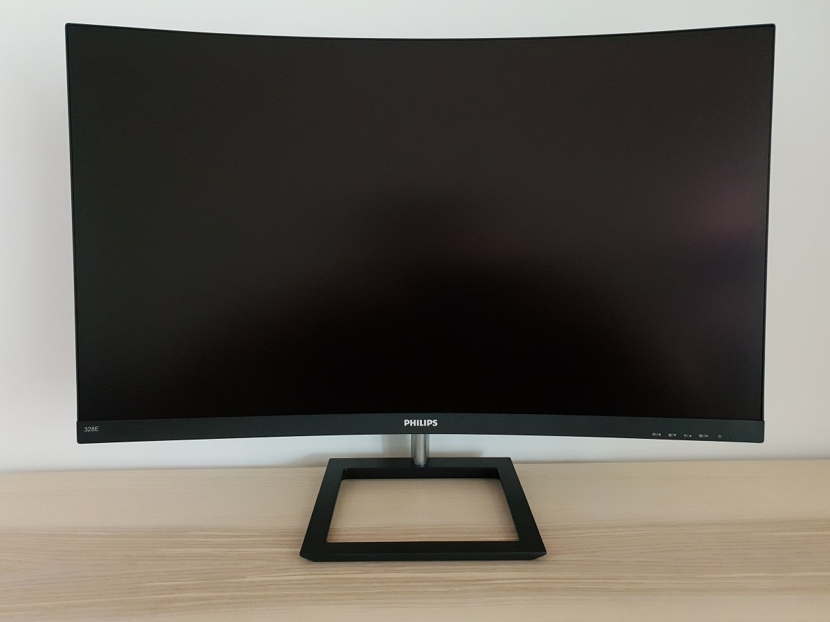
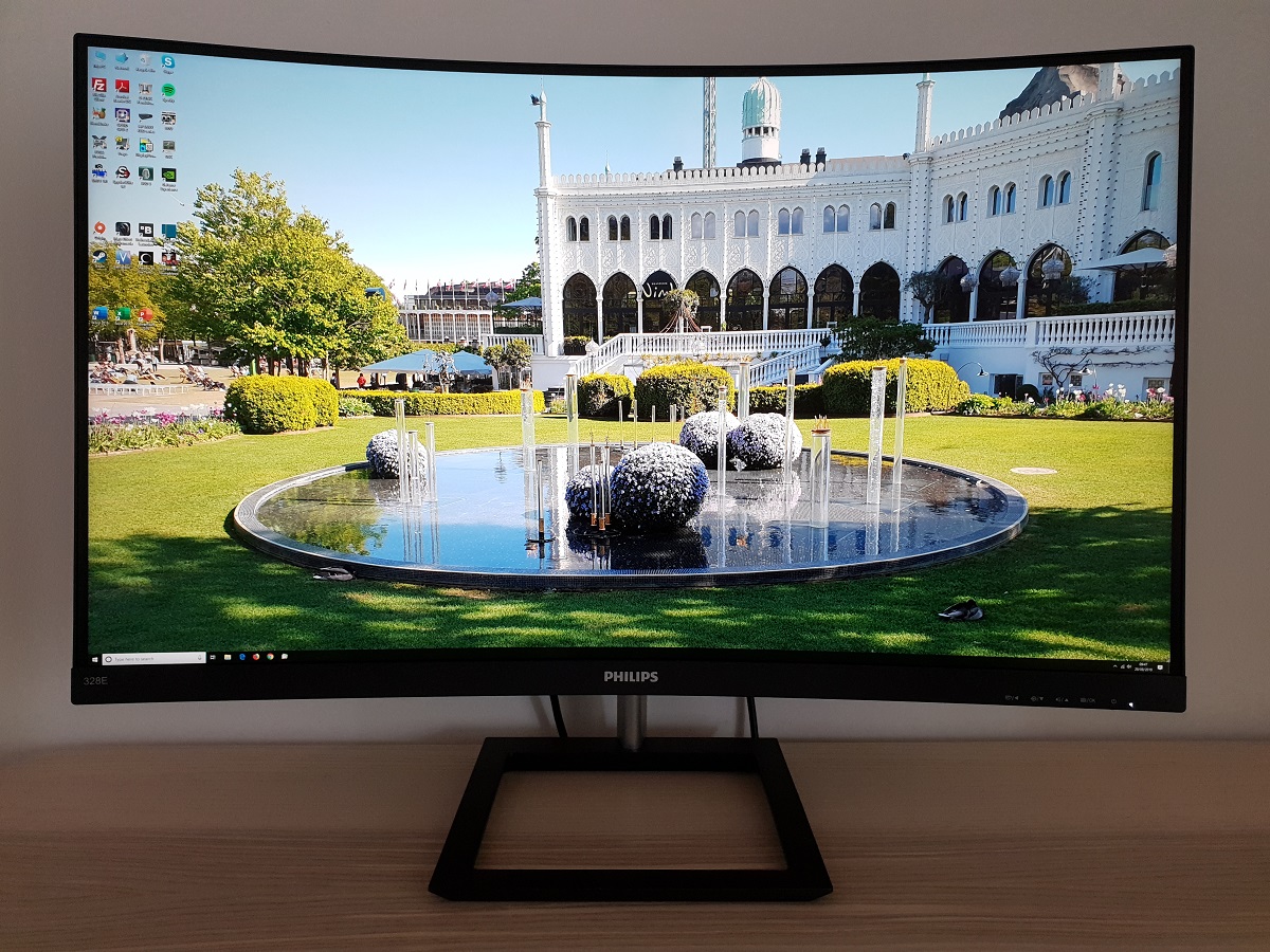
The monitor has a homely and minimalistic look from the front. The stand base has square ‘ring’ styling, whilst the neck of the stand is silver-coloured powder-coated metal. The monitor adopts a ‘dual-stage’ bezel design. This comprises a slim panel border around the image that’s flush with the rest of the screen, blending in seamlessly when the monitor is off. Plus a slender hard black plastic outer component. Including both the panel border and outer piece, the bezel area at the top and sides is ~8.5mm (0.33 inches). The bottom bezel is thicker with just a sliver of panel border, at ~24mm (0.94 inches). It’s finished in matte black plastic with a central silver-coloured painted Philips logo. Most noticeable from the front is the large curved screen, which uses a light matte anti-glare screen surface. Both the curve and screen surface are explored later. The image below is a macro photograph taken on Notepad with ClearType disabled. The letters ‘PCM’ are typed out to help highlight any potential text rendering issues related to unusual subpixel structure, whilst the white space more clearly shows the actual subpixel layout alongside a rough indication of screen surface. A light matte anti-glare screen surface is employed, which offers good glare handling whilst keeping the image reasonably free from strong graininess. It also aids vibrancy preservation to a greater degree than ‘stronger’ matte screen surfaces. There is a slight graininess to lighter content, not a ‘heavy’ or ‘smeary’ graininess. The Philips 328E1CA features various ‘SmartImage Game’ presets; ‘FPS’, ‘Racing’, ‘RTS’, ‘Gamer 1’, ‘Gamer 2’, ‘LowBlue Mode’ and ‘SmartUniformity’. Most of these presets (with the exception of ‘SmartUniformity’) simply adjust various settings in the main OSD and don’t achieve anything you couldn’t achieve yourself with manual adjustments. There’s also a ‘Bright Frame’ feature which highlights a specific area of the screen that’s only accessible in some presets. The ‘Gamer 1’ and ‘Gamer 2’ presets allow full flexibility and allow you to easily recall different sets of settings. We touch upon the presets briefly in the OSD video but won’t be revisiting them here. We’ll instead focus on various manual adjustments plus the unique ‘SmartUniformity’ setting. The table below gives gamma readings taken using a DataColor Spyder5ELITE and white point measurements taken using an X-Rite i1Display Pro, alongside general observations. Our test system uses Windows 10 and an Nvidia GTX 1080 Ti connected using the supplied DP cable. Additional testing was performed with an AMD Radeon RX 580. No additional monitor drivers or ICC profiles were specifically loaded. The monitor was left to run for over 2 hours before readings were taken or observations made. Aside from our ‘Test Settings’ where various adjustments are made, assume factory defaults are used. An important step also had to be performed in the graphics driver if connected to an Nvidia GPU via HDMI. The colour signal had to be corrected to a ‘Full Range RGB’ signal as detailed in this article. When viewing the figures in this table, note that for most PC users ‘6500K’ for white point and ‘2.2’ for gamma are good targets to aim for. Individual targets depend on individual uses, tastes and the lighting environment, however.
As an Amazon Associate and Newegg Affiliate I earn from qualifying purchases made using the below link. Where possible, you’ll be redirected to your nearest store. Further information on supporting our work.

Features and aesthetics
The OSD (On Screen Display) is controlled by pressable buttons on the underside of the bottom bezel, towards the right. There’s also a small forwards-facing power LED which glows white when the monitor is on and flashes when it enters a low power state (i.e. signal to the system is lost). The video below runs though the OSD controls and menu system.
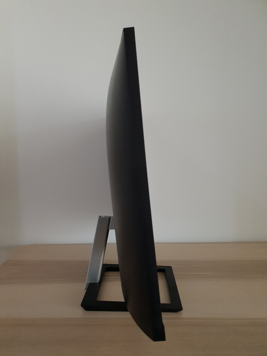
From the side the monitor is reasonably slender – ~12mm (0.47 inches) at thinnest point, with more central bulk. The included stand offers tilt (5° forwards, 20° backwards) as the only ergonomic flexibility. The bottom of the monitor sits ~100mm (3.94 inches) above the desk surface, with the top of the screen ~525mm (20.67 inches) above the desk. The total depth of the monitor including stand is ~250mm (9.84 inches), with the screen around 8-9cm back from the front edge of the stand. So it isn’t as much of a desk depth hog as some screens of this size, useful if you don’t have a particularly deep desk.
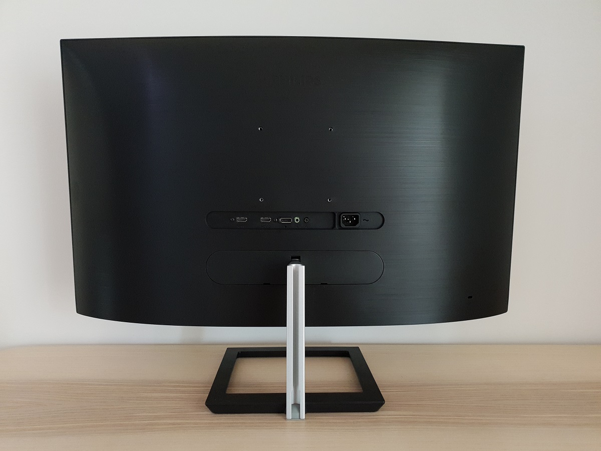
The rear of the monitor uses matte black plastic with a brushed texture. There are central 100 x 100mm VESA holes for alternative mounting, with the included stand mounted lower down (this is removable). There’s a K-Slot towards the bottom right. The ports face backwards in a recessed area above the mounting point for the included stand. The ports include; 2 HDMI 2.0 ports, DP 1.2a, a 3.5mm audio input, 3.5mm headphone jack and AC power input (internal power converter). The monitor also includes 2 x 3W down-firing stereo speakers. The sound produced by these speakers is above average far as integrated monitor speakers go, with a somewhat fuller and richer quality to the sound. But the bar is set rather low in that respect. These certainly don’t compare to even a half-decent set of standalone speakers or headphones, nor are they even close to the best speakers we’ve heard from a monitor. They provide decent volume, but given that they are down-firing and sit quite close to the desk surface you can easily lose clarity from the sound output at higher volumes. The desk surface can also affect acoustics with such a solution. In our case we found up to a volume of ‘50’ or so (which is still quite loud) provided reasonable enough clarity without strong distortion.
3840 x 2160 @60Hz plus Adaptive-Sync is supported via both DP 1.2a and HDMI 2.0. A DP cable, HDMI cable, audio cable and power cable are included as standard.
Calibration
Subpixel layout and screen surface
![]()
As shown above, the monitor uses the standard RGB (Red, Green and Blue) stripe subpixel layout, which is the default expected by modern operating systems such as Microsoft Windows and Apple’s MacOS. Windows users don’t need to run through the ClearType wizard, although may still with to do so and adjust according to preferences. Mac users needn’t worry about text fringing from less usual subpixel layouts. The subpixels are slightly squat as is fairly typical for Samsung SVA panels, with relatively thick vertical gaps between subpixels. This can lead to or exacerbate issues such as static ‘interlace pattern artifacts’, although this model didn’t have such issues as explored shortly. It can also make some text or fine edges appear just a touch softer, although we didn’t observe any issues with that here. Perhaps due to the high pixel density and appropriately-tuned sharpness algorithm. The subpixels do not show partial illumination as some VA models do, which would lead to more obvious text and fine-edge clarity issues. The subpixel layout and arrangement is therefore considered normal and we had no subpixel-related concerns with respect to sharpness or text clarity on this model.
Testing the presets
Monitor Settings Gamma (central average) White point (kelvins) Notes Gamma = 1.8 1.7 7327K A bright and flooded look overall, with a cool and slightly green tint. Gamma = 2.0 1.9 7300K As above but a touch of extra depth. Gamma = 2.2 (Factory Default) 2.1 7372K As above but a significantly richer look overall. Quite vibrant with quite strong saturation. Some saturation is lost and things appear a little duller towards the edges and bottom of the screen (a general observation, not specific to this setting). These are related to perceived gamma shifts due to viewing angle, which are relatively mild from a normal viewing position on this screen. Gamma = 2.4 2.3 7349K As above but extra depth and a touch more saturation. Gamma = 2.6 2.4 7399K As above with a further increase in depth and saturation. Some elements a fair bit deeper than they should be. Low Blue Mode = 1 2.0 4910K An effective Low Blue Light (LBL) setting. The image appears warmer with a green tint (green channel remains strong). The blue colour channel is massively weakened, significantly reducing blue light output from the monitor. Low Blue Mode = 2 2.1 4549K As above with a further weakening in the blue colour channel and reduction in blue light output. Low Blue Mode = 3 2.1 4530K As above but dimmer by default. Brightness manually adjustable for all LBL settings (it’s recommended to reduce this for maximum effect). Low Blue Mode = 4 2.1 4468K The strongest LBL setting on the monitor. A highly effective LBL setting, with a warm green tint. The blue colour channel is diminished significantly. Color Temperature = 5000K 2.0 5065K An alternative LBL setting. Fairly effective in reducing blue light output, although not to the extent of the main LBL settings. The green channel is also weakened, though, so image appears better balanced. Color = User Define 2.1 6597K Similar to factory defaults but less of a cool tint. There is a strong green tint, though. SmartImage = SmartUniformity 2.1 6817K A Uniformity Compensation (UC) setting designed to even brightness out across the screen (we explore this later). Quite a bit dimmer than factory defaults and slightly less cool-tinted. Noticeable drop in contrast, image appears less bold with deceased depth to dark shades. Also over-sharp due to default sharpness setting of ‘70’ rather than ‘50’ (easily corrected). Test Settings (see below) 2.1 6374K Brightness is comfortable and minor colour channel corrections to remove the cool tint. The image appears quite vibrant overall with good balance.
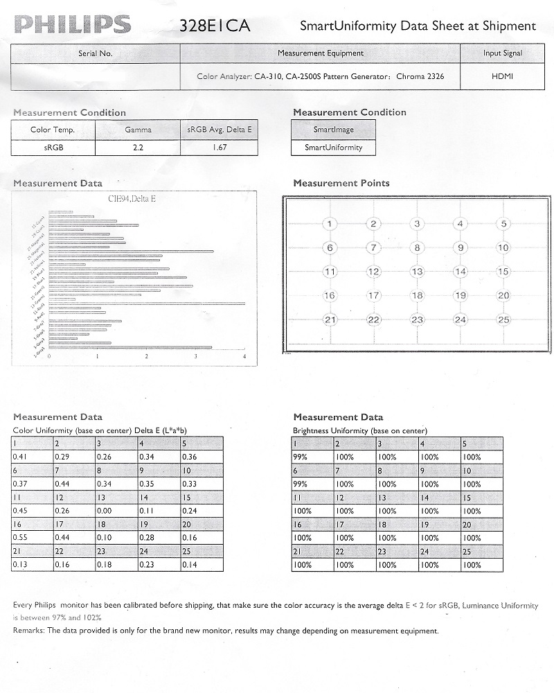
Out of the box the monitor was bright with a cool and somewhat green tint. A factory calibration report is included, unique to each unit. Our example is shown below. The factory calibration data shown in the report refers to the factory calibration of the monitor when it’s set to the ‘SmartUniformity’ setting. Note that the ‘Color’ section of the OSD can’t be adjusted with this setting active, although most other settings including ‘Brightness’ are still adjustable. The monitor also included various Low Blue Light (LBL) settings. The main settings are referred to as ‘Low Blue Mode’ settings, with 4 levels of effectiveness. Even the weakest setting (‘1’) worked very effectively, greatly reducing the blue colour channel and minimising blue light output from the monitor. The green channel remained strong, which is intentional and common for LBL settings to ensure there isn’t a significant reduction in contrast. This would occur following significant reductions to the green channel. Your eyes adjust to the green tint to an extent, although never fully. The alternative LBL setting, which is not quite as strong but is still effective, is the ‘Color Temperature = 5000K’ setting. This is better balanced in the sense that the green channel is reduced, avoiding an unwanted green cast. We used this setting (with brightness reduced to ‘38’) for our own viewing comfort in the evening. But not for any specific testing beyond that involving the setting itself. Cutting out stimulating blue light is important in the hours leading up to bed as it affects sleep hormones and keeps the body ‘alert’ even if it should be winding down. You can assign this setting along with other adjustments (to brightness etc.) to the fully customisable ‘Gamer 1’ or ‘Gamer 2’ presets, allowing it to be easily activated and deactivated. Our ‘Test Settings’ involved a significant reduction in brightness and some changes to colour channels. Note that individual preferences and units of the same model vary, so these settings aren’t going to be optimal in all cases and are just a suggestion. As an Nvidia user connected via HDMI, you’ll also need to correct the colour signal in the graphics driver from the default ‘Limited Range’ to ‘Full Range’ RGB as explored in this article. Assume that any setting not mentioned here was left at default in the OSD, including ‘Contrast’. We’ve also included our preferred ‘SmartResponse’ setting, just for reference. Note that the white point under our ‘Test Settings’ was slightly below the ‘6500K’ daylight target we aim for but close enough really. ‘6500K’ is only a very rough guide anyway and the appropriate white point target depends on preferences and lighting anyway. Reducing the blue channel from ‘100’ to ’99’ gave quite a jump down in colour temperature, finer control would’ve been preferred. Brightness= 38 (according to preferences and lighting) SmartResponse= Faster Color Temp. = User Define Red= 100 Green= 88 Blue= 99 We used an X-Rite i1Display Pro to measure white and black luminance levels, from which static contrast ratios could be calculated. The table below shows this data, with various settings used. Assume any setting not mentioned was left at default, except for the changes already noted in the calibration section. Black highlights indicate the highest white luminance, lowest black luminance and maximum contrast ratio recorded. Blue highlights indicate the results under our ‘Test Settings’.
Regardless of the ‘Gamma’ setting used or following other reasonable adjustments, the monitor didn’t quite average ‘2.2’ under any setting. The default mode averaged ‘2.1’ with only fairly minor deviation from the desired curve. More so at the low-end, which can slightly help alleviate ‘black crush’ as well. Given this and the inter-unit variation that exists, we don’t feel it is necessary or appropriate to provide an ICC profile for this model or indeed use one in the review. The gamma curve under our ‘Test Settings’ is shown below.
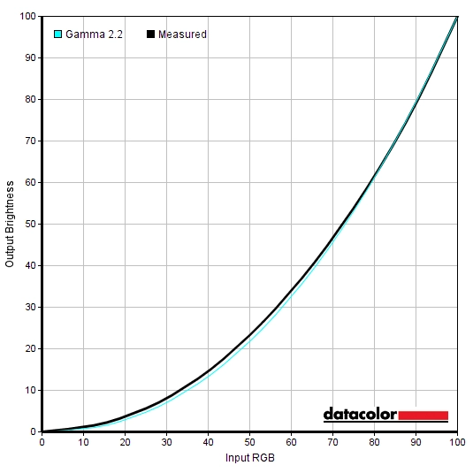
Gamma 'Test Settings'
Test Settings
SmartImageGame = Off
Contrast and brightness
Contrast ratios
Monitor Settings White luminance (cd/m²) Black luminance (cd/m²) Contrast ratio (x:1) 100% brightness (Factory Defaults) 318 0.13 2446 80% brightness 271 0.11 2464 60% brightness 226 0.09 2511 40% brightness 179 0.07 2557 20% brightness 132 0.06 2200 0% brightness 80 0.03 2667 90% brightness (Factory Defaults) 293 0.12 2442 Gamma = 1.8 297 0.12 2475 Gamma = 2.0 295 0.12 2458 Gamma = 2.4 295 0.12 2458 Gamma = 2.6 292 0.12 2433 Low Blue Mode = 1 315 0.12 2625 Low Blue Mode = 2 331 0.12 2758 Low Blue Mode = 3 281 0.1 2810 Low Blue Mode = 4 280 0.1 2800 Color Temperature = 5000K 269 0.12 2242 Color = User Define 356 0.12 2967 Color = User Define (100% brightness) 382 0.13 2938 SmartImage= SmartUniformity 189 0.12 1575 Test Settings 176 0.07 2514
The average contrast ratio with only brightness adjusted was 2469:1, which is right in line with the specifications. This sort of contrast gives a deeper appearance to darker shades and a somewhat inkier appearance to text compared to non-VA LCDs. The maximum contrast recorded was 2967:1, using ‘Color = User Define’ and all colour channels in their neutral position of ‘100’. A contrast ratio of 2514:1 was recorded following the adjustments made to our ‘Test Settings’, which is pleasing. The contrast recorded under the ‘Low Blue Mode’ settings was quite strong (up to 2810:1), somewhat weaker but still decent using the ‘5000K’ mode which also reduces the green colour channel (2242:1). The lowest contrast recorded was 1575:1, using the ‘SmartUniformity’ setting which evens out brightness at various points of the screen at the expense of contrast. The highest white luminance recorded was 382 cd/m², which is quite bright and hugely exceeds the very conservative 250 cd/m² specified. The minimum white luminance recorded in the table was 80 cd/m², which is a bit higher than highly light-sensitive users might like. This gives a luminance adjustment range of 302 cd/m², which is pleasing given the conservative luminance specifications.
The monitor has a Dynamic Contrast setting called ‘SmartContrast’, which allows the backlight brightness to adjust (as a single unit) according to the levels of light and dark being displayed on the screen. The luminance adjusted at a moderate pace to changes in scene brightness and dimmed effectively for predominantly dark content. Most of the time we found the luminance levels were too high with this setting active, even with mixed content containing plenty of dark elements. Although the brightness setting isn’t greyed out with this setting active, this only has an effect for a short time with the backlight then adjusting in exactly the same way regardless of this setting. As usual this Dynamic Contrast mode is a compromised solution which can’t adequately compensate for intricate mixtures of light or dark on the screen. There is no local dimming. We therefore prefer manual brightness control.
PWM (Pulse Width Modulation)
The 328E1CA does not use PWM (Pulse Width Modulation) to regulate backlight brightness at any level and instead uses DC (Direct Current). The monitor is therefore considered ‘flicker-free’, which will come as welcome news to those sensitive to flickering or worried about side-effects from PWM usage.
Luminance uniformity
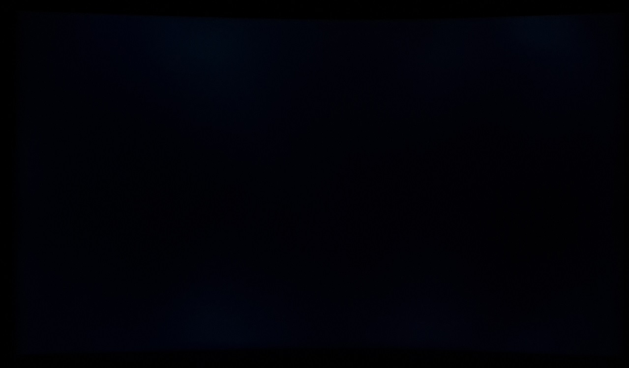
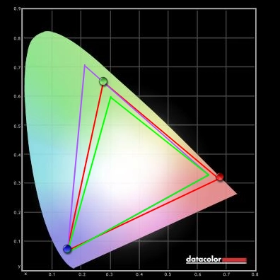
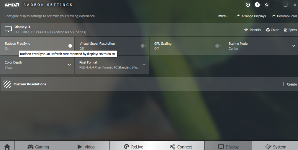
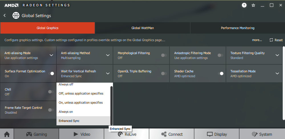
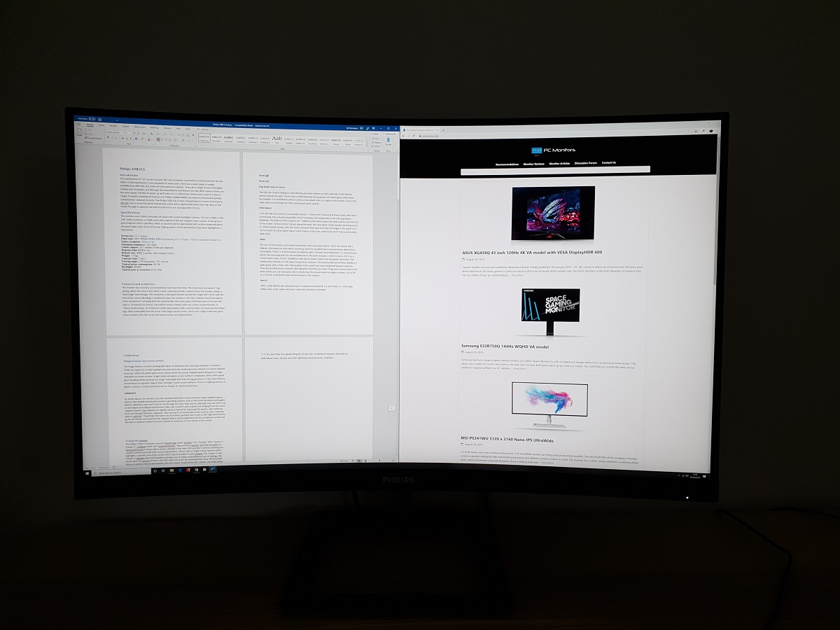
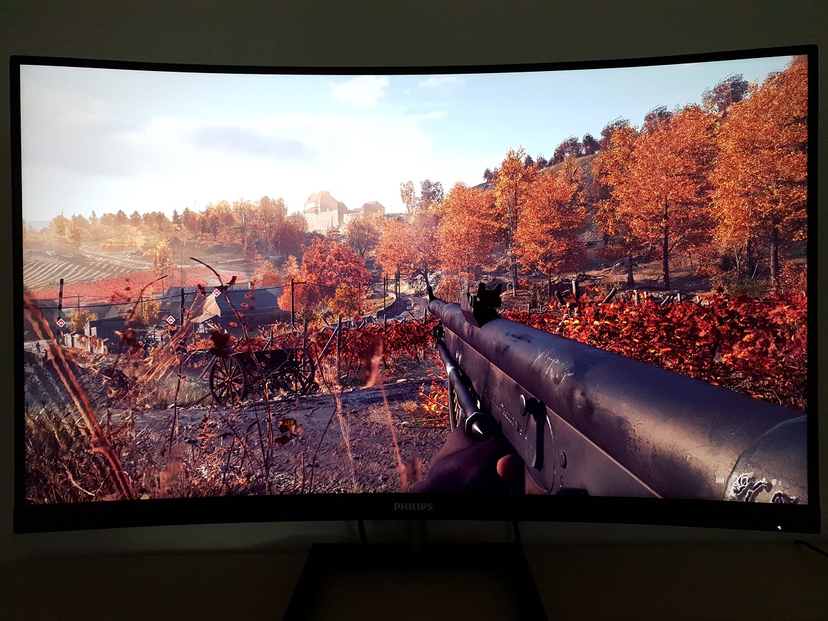
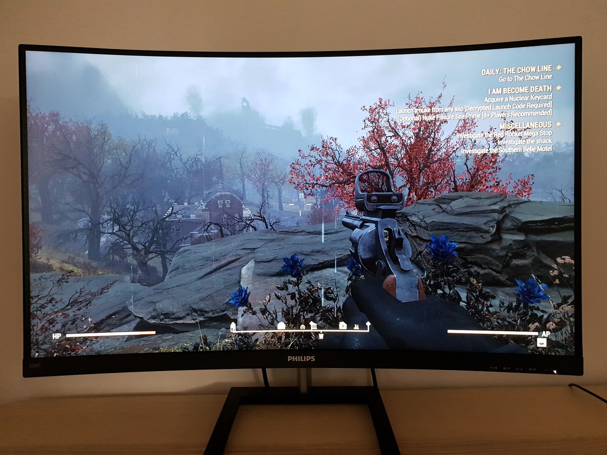
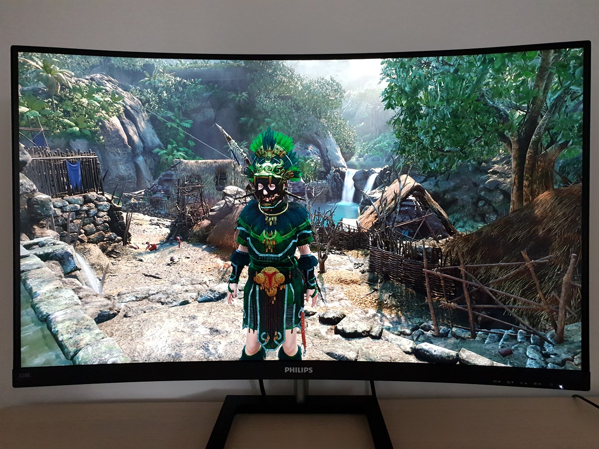
Whilst observing a black screen in a dark room, using our ‘Test Settings’, we observed some backlight bleed and moderate clouding at the top and bottom of the screen. It’s important to remember that individual units vary when it comes to all aspects of uniformity, including backlight bleed and clouding. The following image was taken a few metres back to eliminate so-called ‘VA glow’. This is a silverish-purple glow that appears towards the edges, particularly towards the bottom corners of the screen from a normal viewing position. The ‘VA glow’ blooms out in a more obvious way from sharper angles, as demonstrated in the viewing angles video a bit later. As explored the ‘VA glow’ on this model is relatively minor, from a normal viewing position, but is still a feature nonetheless. Under our ‘Test Settings’, the luminance uniformity was decent overall. The brightest point recorded was ‘quadrant 5’ in the centre of the screen (150.9 cd/m²). The maximum deviation from this occurred at ‘quadrant 9’, towards the bottom right (129.1 cd/m², which is 14% dimmer). The average deviation between each quadrant and the brightest point was 8.00%, which is reasonable. The ‘SmartUniformity’ offered some improvement in luminance uniformity, at the expense of contrast as explored earlier. The brightest point recorded was ‘quadrant 1’ towards the top left (174.9 cd/m²). The maximum deviation from this occurred at ‘quadrant 8’ (161.1 cd/m², which is 8% dimmer). The average deviation between each quadrant and the brightest point was 3.13%, which is impressive. It’s important to remember that uniformity varies between individual units and you can also expect variation beyond the points measured. The contour maps below show these deviations graphically, with darker greys representing lower luminance and hence greater deviation from the brightest recorded point than lighter greys. Percentage deviations between each quadrant and the brightest point are also given. The first graphic shows results under our ‘Test Settings’ whilst the bottom graphic shows results with ‘SmartUniformity’ enabled. The Spyder5ELITE was also used to analyse variation in the colour temperature (white point) for the same 9 quadrants. The deviation between each quadrant and the quadrant closest to the 6500K (D65) daylight white point target was analysed and a DeltaE value assigned. A DeltaE <3 represents deviation that most users wouldn’t readily notice by eye. The top graphic shows the results using our ‘Test Settings’ and the bottom graphic with ‘SmartUniformity’ enabled. Using our ‘Test Settings’ the colour temperature uniformity was very good overall, with no significant deviation recorded. The maximum deviation recorded was DeltaE 2.4 towards the bottom right (DeltaE <2 elsewhere). The ‘SmartUniformity’ slightly improved things further. The maximum deviation recorded was now DeltaE 1.6 towards the bottom corners. Again, remember that individual units vary when it comes to uniformity and that deviation beyond measured points can be expected. Also note that there are some perceived deviations in both brightness and colour temperature that are typical on VA panels and aren’t reflected by these readings. In addition to the quantitative testing above, we performed a subjective assessment of the uniformity of a variety of ‘medium’ shades, including 50% grey. Some monitors exhibit uniformity issues such as splotches or striations when viewing screen fills of such shades, giving an inconsistent appearance that some users refer to as ‘DSE’ (‘Dirty Screen Effect’). VA models are particularly prone to this, but we didn’t observe any issues of note on our 328E1CA sample. There was some very minor patchiness observed on some shades, but this was subtle and there were no distinct striations or strong patchiness. On Battlefield V the monitor provided a strong contrast performance overall. Bright elements stood out nicely against darker surroundings, whilst the darker surroundings showed good shade depth. Viewing in a dark room doesn’t give the sort of inky depth you might get on a screen with much stronger contrast (for example an OLED). But in any lighting conditions, the overall atmosphere for dark scenes was far superior to any non-VA LCD without effective local dimming technology. As a VA model there was a degree of ‘VA glow’ which was most noticeable towards the bottom of the screen from a normal viewing position. This was reasonably mild, lightening up dark shades in this region a bit. It’s more pronounced if you’re closer to the screen or are viewing the screen from a sharper decentralised angle, but didn’t really detract too much from the overall atmosphere from a normal viewing position. It was significantly milder than ‘IPS glow’, which eats away at peripheral detail far more, is stronger and affects a larger area of the screen. There was also some ‘black crush’. This is whereby some of the darkest shades (close to black) in the central region of the screen appear even darker than intended when viewed from a normal viewing position, so they blend into a black mass. This masks some detail, whereas observing these shades closer to the edges of the screen reveals a more appropriate level of detail. A touch of extra unintended detail towards the bottom corners, in fact. Viewing from a sharper viewing angle (‘off-angle’) reveals a high level of unintended detail. The level of ‘black crush’ was relatively minor – about as low as we’ve seen from a VA model. The screen surface imparted a little graininess to the image, but nothing heavy or smeary – with a slightly smoother appearance than the 31.5” flat ‘4K’ VA panels from Innolux that are commonly used. These experiences were echoed on Shadow of the Tomb Raider. The overall contrast performance was strong, with a good atmosphere for the dark scenes and dark areas of the image that are common on this title. Dark caverns, tombs and building interiors appeared with respectable depth to the dark shades. Light sources within them stood out nicely. With a slight graininess from the screen surface, but nothing too obnoxious. As with Battlefield V, there was a (reasonably mild) degree of ‘VA glow’ and some ‘black crush’ – about as little of that as we’ve seen on a VA model. The overall atmosphere and contrast performance was clearly superior to non-VA alternatives without fancy (and expensive) local dimming solutions for the backlight. We also observed the film Star Wars: The Last Jedi. The monitor gave this title a nice cinematic look, with the high contrast scenes looking quite appropriate. Good distinction between bright elements such as light sabers and explosions against dimly lit interiors and the depths of space. The ‘black crush’ and ‘VA glow’ didn’t really detract from this in our view. We didn’t observe obvious issues such as ‘banding’ or ‘blockiness’ from excessive detail levels (often from inappropriate gamma handling), which can also damage the atmosphere in dark scenes. There was a bit of extra unintended detail which reveals this sort of thing towards the bottom corners of the screen, but this was fairly minor. As with any LCD, we’d avoid watching in lighting conditions that are too dim if possible – don’t expect inky-looking dark shades if you do. The Philips 328E1CA’s colour gamut (red triangle) was compared with the sRGB (green triangle) and Adobe RGB (purple triangle) reference colour spaces using our ‘Test Settings’, as shown below. The gamut fully covers the sRGB colour space (100%) with a bit of extension beyond in several regions. The gamut covers 85% Adobe RGB – note that Adobe RGB coincides with sRGB in the red and blue corner of this gamut representation, so the monitor’s colour gamut extends further there. This gives the monitor the potential of outputting all shades within the sRGB colour space, with some extra saturation. The extension beyond sRGB is not as extreme as on some models but is enough to give a bit of an edge in vibrancy without heavy oversaturation. On Battlefield V the monitor outputted a varied and rather vivid palette of colours. The extra extension beyond sRGB invited some extra vibrancy, but unlike a digital saturation enhancement (e.g. Nvidia Digital Vibrance Control) maintains strong shade variety. With an expanded gamut and good spacing between shades, rather than simply pulling shades closer to the edge of the gamut without expanding the gamut itself. The environments showcased a good variety of earthy browns and a nice mixed palette of greens, including deeper lush-looking shades and more muted pastel shades. Some of the earthy browns and woody tones naturally had a slightly redder hue than intended due to the colour gamut, but still looked more or less as they should overall. There were perceived gamma shifts that could be observed from a normal viewing position, leading to a slight loss of saturation towards the edges and bottom of the screen. This is typical for a VA panel, but was quite subtle on this model from a normal viewing position. The image still appeared rich even at the very edges of the screen, even if some shades had the saturation turned down a bit compared to central regions. We also observed Shadow of the Tomb Raider, where the monitor presented an equally varied and quite vibrant-looking spectrum of shades. The game environments appeared natural with a bit of extra saturation but nothing extreme. Fires appeared intense and vibrant, with a nice range of rich orange and yellow shades. The game certainly didn’t look cartoonish or garishly oversaturated. Lara’s skin looked only slightly more tanned (or rosy) than it should due to some slightly richer red hues. The shifts in saturation were generally most noticeable on pastel shades such as Lara’s skin, as this appeared somewhat less saturated when displayed towards the edge of the screen than when displayed centrally. If anything it appeared more accurate towards the edges of the screen due to the slight oversaturation centrally, but the shifts weren’t dramatic. And indeed were far less pronounced than the vertical saturation shifts you’d see on a TN models. And also less pronounced than the saturation shifts you’d see on the flat 31.5” ‘4K’ VA models using Innolux panels. We also made some observations using the animated TV series Futurama. This is an excellent test for colour consistency due to large area of individual shade being displayed. There were some nice vibrant elements displayed in quite an eye-catching way– bright neon pinks and greens against dark deep space backgrounds stood out particularly nicely. There were some shifts in saturation, which is always expected to an extent with any non-IPS LCD. Medium and lighter (pastel) pink and some brown and orange shades seemed to show this most clearly. Various character skin tones, for example, lost some saturation towards the sides and bottom of the screen from a normal viewing position. These shifts were generally quite subtle, though, certainly compared to the vertical shifts of TN models or indeed most VA models of this sort of size. And the overall look of the animated series was largely as it should be, with some good distinctive vivid-looking shades and a nice range of more muted pastel shades. Lagom’s tests for viewing angle help explore the idea of colour consistency and viewing angle performance. The following observations were made from a normal viewing position, eyes ~70cm from the screen. Note that the shifts explored are more pronounced the closer to the screen you’re sitting. On some monitors, particularly but not exclusively those with high refresh rates, interlace patterns can be seen during certain transitions. We refer to these as ‘interlace pattern artifacts’ but some users refer to them as ‘inversion artifacts’ and others as ‘scan lines’. They may appear as an interference pattern, mesh or interlaced lines which break up a given shade into a darker and lighter version of what is intended. They often catch the eye due to their dynamic nature, on models where they manifest themselves in this way. Alternatively, static interlace patterns may be seen with some shades appearing as faint horizontal or vertical bands of a slightly lighter and slightly darker version of the intended shade. We did not observe either artifact type on this monitor. A small utility called SMTT 2.0 was used alongside a sensitive camera to analyse the latency of the 328E1CA, with over 30 repeat readings taken to help maximise accuracy. Using this method, we calculated 3.96ms (a bit under 1/4 of a frame at 60Hz) of input lag. Note that the input lag measured here is influenced by both the element you ‘see’ (pixel responsiveness) and the element you ‘feel’ (signal delay). It indicates a low signal delay which shouldn’t bother even sensitive users. Note that we don’t have the means to accurately measure input lag with Adaptive-Sync active in a variable refresh rate environment. Our article on responsiveness explores key concepts surrounding monitor responsiveness. Chief amongst these is the concept of ‘perceived blur’, which is contributed to by both the pixel responses of the monitor and the movement of your eyes as you track motion on the screen. This second factor is actually the dominant contributor to perceived blur on modern monitors, although weaknesses in pixel responsiveness are also important. A method of photography called ‘pursuit photography’ is also explored, which uses a moving rather than stationary camera to capture motion on a monitor in a way that reflects both key elements of perceived blur. This contrasts with static photography or videos, which only reflect pixel responsiveness. The images below are pursuit photographs taken using the UFO Motion Test for ghosting, with the test running at 960 pixels per second. This is a good practical speed for capturing such photographs and highlights both elements of perceived blur nicely. The UFOs move across the screen from left to right at a frame rate matching the refresh rate of the display. All background shade levels (dark, medium and light) were used with the monitor set to all its ‘SmartResponse’ pixel overdrive settings; ‘Off’, ‘Fast’, ‘Faster’ and ‘Fastest’. The two final columns show 2 reference displays, both set to what we consider their optimal pixel overdrive settings and running at 60Hz. The Philips 326M6VJRMB, which uses the commonly used flat alternative to this panel (Innolux VA-type). And the ViewSonic XG240R, a fast TN model which shows how things look where pixel responsiveness isn’t a significant limiting factor. This is particularly true for the top row, showing the dark background. Note that we will not be including a section on overclocking, as the monitor lost signal when set much above 60Hz at its native resolution or indeed lower resolutions such as Full HD. On Battlefield V there was a moderate amount of perceived blur, which was mainly caused by eye movement and linked to the 60Hz refresh rate. There were some weaknesses beyond this due to slower than optimal pixel responses, something which is common to varying degrees on VA models in particular. Most transitions (especially between lighter and medium shades) were performed fast enough for a solid 60Hz performance. There was a bit of ‘powdery’ trailing in places for some of these ‘good’ transitions, but this was faint and only a minor contributor to overall perceived blur. There were some more noticeable weaknesses where darker shades were involved in the transition, giving some ‘heavy powdery’ trailing which sometimes had a bit of a smeary nature to it. This sort of trailing was not as widespread or as ‘smeary’ in its appearance as on many VA models, however. There was also a degree of what we call ‘break-up’ trailing in places for some of the slowest transitions, whereby some of the constituent hues that make up the object or background appear to ‘leach out’. Slight reddish or purple tones for some very dark objects against medium-light backgrounds, for example. A bit like wetting a page with water soluble ink on it. This ‘break-up’ trailing was quite rare on this model, affecting a slim number of transitions, and it wasn’t extensive (the ‘break-up’ remained quite close to the object rather than appearing as an extended smear). There was a small amount of overshoot in places, a little bit of ‘halo’ trailing that was slightly brighter than the object or background shade. But not particularly bright and very well-blended overall – most users wouldn’t notice this as it isn’t strong or eye-catching. Overall, this was quite an impressive 60Hz VA performer on BFV (and similar titles). There were some weaknesses, but they were not as widespread or extensive as most VA models. The section of the video review below runs through some of the strengths and weaknesses in terms of the monitor’s pixel responsiveness and responsiveness more broadly. We made similar observations on Shadow of the Tomb Raider. For the most part the monitor made good use of its 60Hz refresh rate. There were some weaknesses, but these were not as common or eye-catching as they sometimes are for VA models on this title. There were plenty of high-contrast transitions which VA models struggle with on this title, particularly in dimly lit caves with some bright light sources creating strong contrast. ‘Powdery’ trailing was there and there was what some users may describe as ‘smeary’ trailing in places, too. It wasn’t really extensive or eye-catching enough to detract from general gameplay, in our view, but it still has the potential to bother some users. The overall pixel responsiveness on this title edged out the flat counterparts to this model (with the commonly used 31.5” Innolux AAS VA-type panels), which are themselves far from the worst VA performers. We also tested a range of movie content, with refresh rates including 24 – 30fps and 60fps. For the lower frame rate content there were no standout weaknesses really, it looked largely as it would on even the fastest 60Hz models. The 60fps content exhibited the same strengths and weaknesses as we observed when gaming (at similar frame rates). So a bit of ‘powdery’ trailing in places being the most common weakness, but nothing overly distracting in our view. As an Amazon Associate and Newegg Affiliate I earn from qualifying purchases made using the below link. Where possible, you’ll be redirected to your nearest store. Further information on supporting our work. AMD FreeSync is a variable refresh rate technology, an AMD-specific alternative to Nvidia G-SYNC. Where possible, the monitor dynamically adjusts its refresh rate so that it matches the frame rate being outputted by the GPU. Both our responsiveness article and the G-SYNC article linked to explore the importance of these two elements being synchronised. At a basic level, a mismatch between the frame rate and refresh rate can cause stuttering (VSync on) or tearing and juddering (VSync off). FreeSync also boasts reduced latency compared to running with VSync enabled, in the variable frame rate environment in which it operates. FreeSync requires a compatible AMD GPU such as the Radeon RX 580 used in our test system. There is a list of GPUs which support the technology here, with the expectation that future AMD GPUs will support the feature too. The monitor itself must support ‘VESA Adaptive-Sync’ for at least one of its display connectors, as this is the protocol that FreeSync uses. The 328E1CA supports FreeSync via DP and HDMI on compatible GPUs and systems. If fully installed, AMD drivers feature Radeon Settings, which makes activation of the technology very simple and something that usually occurs automatically. There is no monitor-side setting for Adaptive-Sync or FreeSync in the OSD, you just need to make sure the GPU driver is setup correctly to use FreeSync. So open ‘AMD Radeon Settings’ and click on ‘Display’. You should then ensure that the first slider, ‘AMD FreeSync’, is set to ‘On’. If you hover over this, it will also report the variable refresh rate display supported by the display. VSync is configured in the ‘Gaming’ section of ‘Radeon Settings’, where it is referred to as ‘Wait for Vertical Refresh’. You can either configure this globally under ‘Global Settings’ or for each game individually. The default is ‘Off, unless application specifies’ which means that VSync will only be active if you enable it within the game itself, if there is such an option. Such an option does usually exist – it may be called ‘sync every frame’ or something along those lines rather than simply ‘VSync’. Most users will probably wish to enable VSync when using FreeSync to ensure that they don’t get any tearing. You’d therefore select either the third or fourth option in the list, shown in the image below. The final option, ‘Enhanced Sync’, is a relatively new addition to the driver. This is an alternative to VSync which allows the frame rate to rise above the refresh rate (no VSync latency penalty) whilst potentially keeping the experience free from tearing or juddering. This requires that the frame rate comfortably exceeds the refresh rate, not just peaks slightly above it. We won’t be going into this in detail as it’s a GPU feature than a monitor feature. We ran a range of game titles on this monitor, with FreeSync enabled. As usual, the technology worked in much the same way across all of these titles. Any issues identified on one title but not another would suggest an issue with the game or GPU driver rather than the monitor, too. We’ll therefore simply focus on a single title for this section; Battlefield V. This title offers good flexibility with its graphics options, allowing the full variable refresh rate range of the monitor to be tested. The Radeon RX 580 used in our test system is hardly a powerhouse of a GPU, so maintaining a consistent 60fps was difficult, even with graphics settings significantly lowered. Dips below this were frequent. Most common were dips just a bit below this, but still above 50fps. In this range, FreeSync did its thing to get rid of the tearing (VSync off) or stuttering (VSync on) that would occur without the technology enabled. To users like ourselves who are sensitive to this, it was very nice indeed. And at these sorts of frame rates such issues are quite easy to notice really, so avoiding them is very welcome. There was a bit of a drop off in ‘connected feel’ and a slight increase in perceived blur due to the drop in frame rate, but FreeSync certainly made such drops a lot more palatable due to the aforementioned tearing and stuttering issues being removed. There were times when the frame rate dropped further, due to the action intensifying. Or if we wanted to increase the graphics settings a bit. Due to the rather restricted variable refresh rate range of this model, FreeSync deactivated below 48Hz (48fps). Tearing and stuttering due to mismatches in the frame rate (<48fps) and refresh rate (60Hz) resulted, which was certainly noticeable to us. With a more powerful GPU, more conservative settings or less graphically demanding titles it’s easier to stay above this range. But the 3840 x 2160 resolution is quite demanding and it can be tempting to ramp up some graphics settings to ‘make the most of it’ – so be aware of the restrictive range. We didn’t observe any particular issues with more noticeable overshoot as frame rate dropped towards the floor of operation, which is an issue that commonly affects FreeSync models. More so if the variable refresh rate range is broader, though. As noted earlier, AMD FreeSync makes use of Adaptive-Sync technology on a compatible monitor. As of driver version 417.71, users with Nvidia GPUs (GTX 10 series and newer) and Windows 10 can also make use of this Variable Refresh Rate (VRR) technology. When a monitor is used in this way, it is something which Nvidia refers to as ‘G-SYNC Compatible’. Some models are specifically validated as G-SYNC compatible, which means they have been specifically tested by Nvidia and pass specific quality checks. To make use of the technology, you need to connect the monitor up via DisplayPort. When you open up Nvidia Control Panel, you should then see ‘Set up G-SYNC’ listed in the ‘Display’ section. Ensure the ‘Enable G-SYNC, G-SYNC Compatible’ checkbox and ‘Enable settings for the selected display model’ is checked as shown below. Press OK, then turn the monitor off then on again so that it re-establishes connection – the technology should now be active. We’ve got an article exploring the 3840 x 2160 ‘4K’ UHD resolution, focusing on the experience on the desktop, playing games and watching suitably high resolution movie content. This article uses a ~28” screen as an example, with a further reading section with examples from screens of various sizes. With a 31.5” screen, the pixel density of the Philips remains high at ~139.87 PPI (Pixels Per Inch). This is sufficiently high to give a distinctly ‘4K UHD’ appearance to things, much as described in our article on a slightly smaller screen. The slightly slacker pixel density in comparison to 27-28” ‘4K’ UHD screens means that lower levels of scaling can be used without the same detrimental impact on readability. We found the screen very usable from our preferred viewing distance of ~70 – 80cm without any scaling or application-specific zoom used at all. Personal preferences vary, though, and some users may prefer to use a small amount of scaling. Undoubtedly a lower level than they’d need on a 27-28” model. The 3840 x 2160 resolution being used fully on the desktop provided an excellent amount of on-screen ‘real-estate’. This worked nicely for multi-tasking or simply focusing on a single document with a large amount of text and other data being displayed at once. Overall clarity of various elements, including text, was also strong. As covered in the ‘4K experience’ article, this is also the case if you use scaling. Provided the text scales ‘cleanly’, which it does in most cases. The images below give an indication of the level of workspace available. The first image shows the desktop, whilst the second image shows the multi-tasking potential. The images are just for illustrative purposes and in no way reflect the clarity of the screen as viewed in person. The 3840 x 2160 (‘4K’ UHD) resolution is relatively demanding, requiring a good amount of GPU power to run smoothly. Because of this, it may be desirable to use a lower resolution. And on some systems (some games consoles etc.) it would be necessary as they don’t support ‘4K’ output. The monitor is able to use an interpolation (scaling) process to map lower resolutions such as 1920 x 1080 (‘1080p’ or Full HD) onto all of its 3840 x 2160 pixels. You need to ensure, as a PC user, that the GPU is not trying to take over scaling duties. For AMD GPU users the monitor will handle the scaling by default, when gaming at non-native resolutions. Nvidia users should open the Nvidia Control Panel and navigate to ‘Display – Adjust desktop size and position’. They should ensure that ‘No Scaling’ is selected and ‘Perform scaling on:’ is set to ‘Display’ as shown below. The ‘SmartSize’ section of the OSD has various settings that control the monitor’s scaling behaviour. Note that this is greyed out if Adaptive-Sync is being used. It was also greyed out on our AMD GPU even if ‘FreeSync’ was disabled in the driver via either HDMI 2.0 or DP 1.2a. Setting ‘DisplayPort’ to ‘1.1’ in the ‘Setup’ menu of the OSD fixed this, but you’d need to remember to change it back to ‘1.2’ to use the full capabilities of the monitor. There’s ‘Panel Size – 31.5”W (16:9)’ which will ensure all pixels of the monitor are illuminated and the full screen space is used. There’s ‘1:1’, a pixel mapping feature that will display the source resolution without any distortion or ‘stretching’ and fill up the remaining pixels as a black border. And there’s ‘Aspect’, which will use interpolation vertically but not horizontally. It is intended to maintain the aspect ratio of the source resolution but fill up as much of the screen as possible with that in mind. But it seemed to horizontally compress things, even considering resolutions with a 16:9 aspect ratio. So they appeared squashed up and distorted – this is something we’ve noticed with other models using the ‘Aspect’ function of ‘SmartSize’ before. The section of the OSD video below shows this feature in action. When running the monitor at 1920 x 1080 (Full HD), there was a somewhat softer look to the image than viewing a screen of this sort of size with a native Full HD resolution. This softening was not as extreme as we’ve seen on some models, though. We didn’t find increasing the ‘Sharpness’ level to be helpful as textures and objects have a combination of apparent lack of detail with an over-sharpened and filtered look. We consider the interpolation process to be quite decent (but not amazing) on this model, certainly useable for the monitor as a secondary use. Especially if you’re able to sit a little bit back from the screen, which makes the softening less noticeable. When running at the 2560 x 1440 (WQHD) resolution, the softening was less noticeable really. Things were still somewhat softer than a native WQHD screen of the size, but the difference was not huge. So this seems to be a decent fallback resolution if the 3840 x 2160 is impractical for certain games or applications. However; we’d advise lowering other graphics settings first and consider reducing resolution to be a last resort. As usual, if you’re running the monitor at 3840 x 2160 and viewing 1920 x 1080 content (for example a video over the internet or a Blu-ray, using movie software) then it is the GPU and software that handles the upscaling. That’s got nothing to do with the monitor itself – there is a very small amount of softening to the image compared to viewing such content on a native Full HD monitor, but it’s slight and shouldn’t bother most users. The video below summarises some of the key points raised in this written review and shows the monitor in action. The video review is designed to complement the written piece and is not nearly as comprehensive. The 31.5” curved screen of the Philips provided an immersive viewing experience, with the curve sufficient to draw you into the viewing experience without feeling unnatural. The accompanying 3840 x 2160 ‘4K UHD’ resolution worked nicely in harmony with the fairly large screen, delivering a good ‘UHD look’ to the image and giving a nice amount of useful workspace without necessitating high levels of scaling (if any at all). The external design of the monitor may not excite or inspire, but it’s smart and sensible in our view. The lack of ergonomic flexibility (tilt-only stand) could bother some users, but fortunately VESA holes are provided for alternative mounting. As we’ve come to expect from modern Philips models, the OSD provided good flexibility, with various settings such as colour temperature and gamma presets that some manufacturers miss off. There was also a Uniformity Compensation mode that worked much as intended, evening out luminance variations at the expense of contrast. Whilst no setting was quite spot on the desired ‘2.2’ gamma curve, the default came close enough so that there was little perceptible difference. This certainly wasn’t a model we felt worthy of fully profiling with our colorimeter for general purpose use and gaming. The contrast performance, often a key strength of VA models, was indeed relatively strong. We got close to the specified 2500:1 static contrast ratio even following the adjustments made to our ‘Test Settings’. There was a bit of ‘VA glow’ and ‘black crush’, but overall these elements were about as minimal as we’ve seen from a VA model. The overall atmosphere created for dark scenes was good, with a depth to dark shades that non-VA LCDs (without complex local dimming) simply can’t replicate. There was a slight graininess from the screen surface, something we’re notoriously sensitive to, but not a ‘heavy’ or ‘smeary’ graininess. Colour reproduction was pleasing overall. The colour gamut extended comfortably beyond sRGB, without reaching any broader extremes such as DCI-P3 or Adobe RGB. This was enough to inject a bit of extra vibrancy, without strong oversaturation of the image. An ‘sRGB emulation’ mode was lacking, though, and there were some losses of saturation towards the bottom and sides of the screen. These saturation changes and the related shifts in gamma were about as low as we’ve seen on a VA model of the size, certainly lower than competing 31.5” models based on flat ‘4K’ Innolux panels. For general purpose usage including gaming and watching films we feel the colour reproduction and overall image quality will appeal, but for colour-critical work we’d advise caution. Something we’d say for any VA model, though, even one with an effective ‘sRGB emulation’ mode. The responsiveness of the monitor was also worthy of some praise, especially given the panel type used. There were some weaknesses for some transitions, but the weaknesses were less widespread and generally less noticeable than is typical on a VA model. Input lag was also low and Adaptive-Sync did its thing to get rid of tearing and stuttering (on both the AMD and Nvidia GPU we tested). Coupled with low input lag, it’s really the 60Hz refresh rate that’s the main limitation to the overall smoothness and fluidity of the experience. A broader VRR (Variable Refresh Rate) range wouldn’t have gone amiss, but the technology certainly worked as intended within the VRR range provided. All things considered, including the price, we feel this model brings a lot to the table. And for users who are considering a model of this sort of size and resolution for general purpose use, including gaming on a PC or modern games console, this model is a compelling choice. Donations are also greatly appreciated.
The Spyder5ELITE was used to assess the uniformity of lighter shades, represented by 9 equidistant white quadrants. The luminance of each quadrant was measured and compared to the brightest measured quadrant. The tables below show these values as well as the percentage deviation between each quadrant and the brightest point measured. The top table shows the results under our ‘Test Settings’, whereas the bottom table shows the results with ‘SmartImage Game’ set to ‘SmartUniformity’. This is the factory-calibrated Uniformity Compensation (UC) mode mentioned previously.
Luminance uniformity table 'Test Settings'
Luminance uniformity table 'SmartUniformity'
Luminance uniformity map 'Test Settings'
Luminance uniformity map 'SmartUniformity'
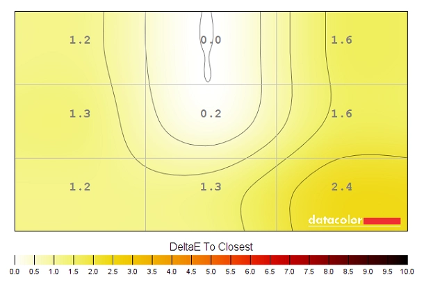
Colour temperature uniformity map 'Test Settings'
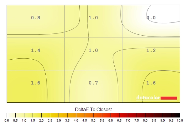
Colour temperature uniformity map 'SmartUniformity'
Contrast in games and movies
Lagom contrast tests
The Lagom tests for contrast allow specific weaknesses in contrast performance to be identified. The following observations were made.
Colour reproduction
Colour gamut
Colour gamut 'Test Settings'
There is no ‘sRGB emulation’ mode on this monitor to restrict the colour gamut. AMD users can activate an ‘sRGB emulation’ setting by opening ‘Radeon Settings’, navigating to ‘Display’ – ‘Color’ (little icon towards the top right) and press the ‘Color Temperature’ toggle so it reads ‘Automatic’ instead of ‘6500K’. The gamut below shows the colour gamut under our ‘Test Settings’ with this driver tweak applied. Note that the colour gamut is restricted, although there is some under-coverage now (94% sRGB). Given the under-coverage, users with access to their own calibration hardware should simply use the native gamut of the monitor as a base for calibration. But this setting can be useful for non colour-managed applications or where the user lacks an appropriate calibration device.

Colour gamut AMD 'Automatic' setting
Colour in games and movies
Viewing angles
The following video shows the Lagom text test, a mixed desktop background and dark desktop background from various viewing angles. For the mixed image you can see some shifts in colour and contrast, more pronounced at steeper angles. There is no ‘colour inversion’ as you’d observe on a TN model vertically and the shifts are not as extreme. The final third of the video shows a dark desktop background and highlights ‘VA glow’ mentioned earlier. This blooms out more noticeably from sharper viewing angles but is not as noticeable from more centralised viewing angles.
Interlace pattern artifacts
Responsiveness
Input lag
Perceived blur (pursuit photography)
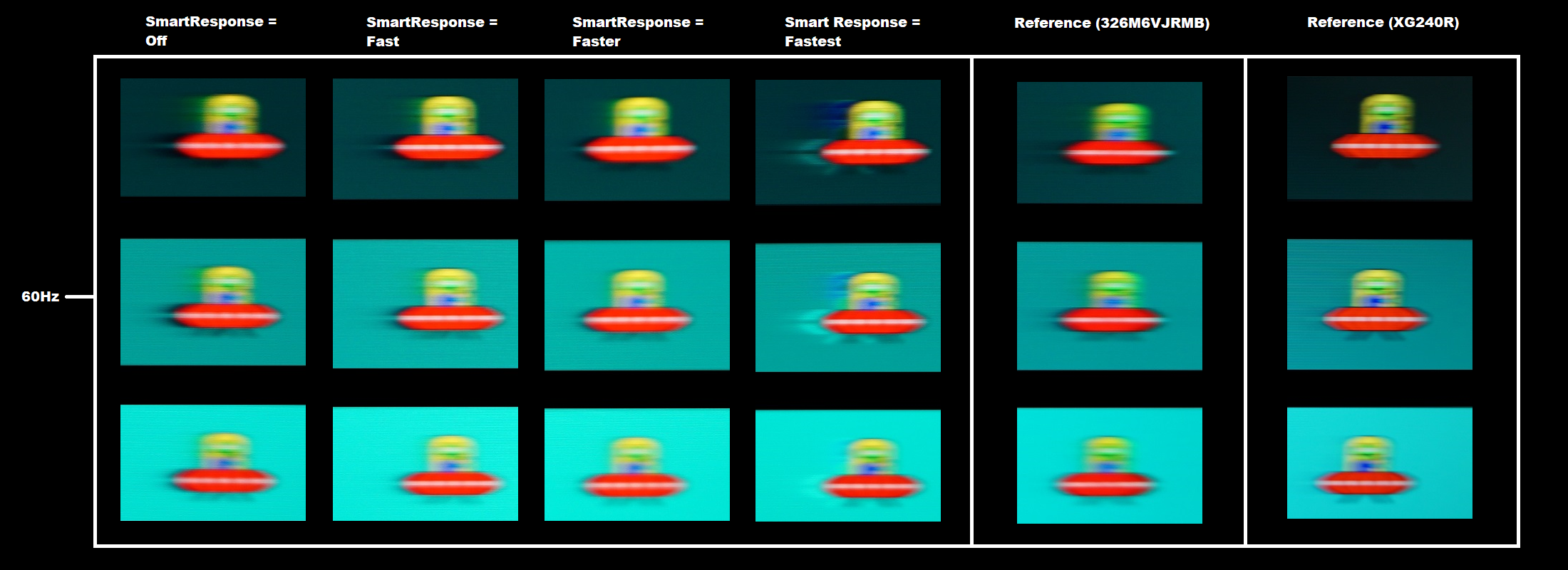
The UFOs appear unfocused, without sharp or clear detailing. This reflects a moderate amount of perceived blur due to eye movement – this relatively soft and broad appearance to the UFO is seen on the reference shots, due to the limitations of the 60Hz refresh rate. Varying amounts of trailing can also be seen behind the UFOs due to weaknesses in pixel responsiveness. With ‘Smart Response = Off’ these weaknesses are clearest. There’s a strong and bold trailing, extending particularly far back for the dark background (top row) but also extensive for the medium background (middle row). The light background (bottom row) exhibits faster pixel responses, with more minor trailing. The ‘Fast’ setting cuts down on the trailing for all of the respective rows, although there still remains a ‘smeary’ appearance to the trailing for the dark background and to a lesser extent the medium background. The ‘Faster’ setting offers further improvement, with the trailing now sticking closer to the object. It’s still quite bold for the dark background, appears as a slightly bold fringe for the medium background and as good as non-existent for the light background. This compares favourably to the 326M6VJRMB reference, which is actually far from the slowest VA model to compare with. The ‘Fastest’ setting introduces obvious overshoot (inverse ghosting), with bright and colourful trailing behind the UFOs. It’s clear from this analysis and indeed broader analysis that the ‘Faster’ setting is optimal on this model.
Responsiveness in games and movies
FreeSync – the technology and activating it
The Philips supports a variable refresh rate range of 48 – 60Hz. That means that if the game is running between 48fps and 60fps, the monitor will adjust its refresh rate to match. When the frame rate rises above 60fps, the monitor will stay at 60Hz and the GPU will respect your selection of ‘VSync on’ or ‘VSync off’ in the graphics driver. With ‘VSync on’ the frame rate will not be allowed to rise above 60fps, at which point VSync activates and imposes the usual associated latency penalty. With ‘VSync off’ the frame rate is free to climb as high as the GPU will output (potentially >60fps). LFC (Low Frame Rate Compensation) is not supported by this monitor, as that requires the upper limit (ceiling) to be at least 2x the lower limit (floor) of FreeSync operation. FreeSync is therefore deactivated if the frame rate falls below 48fps, with the monitor then respecting your choice of VSync and presenting you with either stuttering (VSync on) or juddering and tearing (VSync off).
Some users prefer to leave VSync enabled but use a frame rate limiter set a few frames below the maximum supported (e.g. 57fps) instead, avoiding any VSync latency penalty at frame rates near the ceiling of operation or tearing from frame rates rising above the refresh rate. If you go to ‘Setup’ – ‘Information’ in the OSD, you will see the refresh rate listed there change in real time alongside the frame rate of the content, if it’s within the variable refresh rate range of the display. Finally, it’s worth noting that FreeSync only removes stuttering or juddering related to mismatches between frame rate and refresh rate. It can’t compensate for other interruptions to smooth game play, for example network latency or insufficient system memory. Some game engines will also show stuttering (or ‘hitching’) for various other reasons which won’t be eliminated by the technology.
FreeSync – the experience
Nvidia Adaptive-Sync (‘G-SYNC Compatible’)
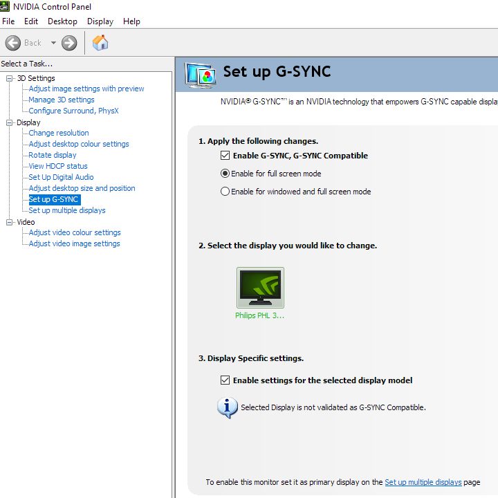
You will also see in the image above that it states: “Selected Display is not validated as G-SYNC Compatible.” This means Nvidia hasn’t specifically tested and validated the display, not that it doesn’t work. Indeed the technology did work. It delivered an experience that was very similar to FreeSync, getting rid of tearing and stuttering in much the same way as frame rate fluctuated between 40 and 60 fps. Note again that if you go to ‘Setup’ – ‘Information’ in the OSD, you will see the refresh rate listed there change in real time alongside the frame rate of the content, if it’s within the variable refresh rate range of the display. Our suggestions regarding use of VSync also apply, but obviously you’re using Nvidia Control Panel rather than Radeon Settings to control this. The setting is found in ‘Manage 3D settings’ under ‘Vertical sync’, where the final option (‘Fast’) is equivalent to AMD’s ‘Enhanced Sync’ setting. You’ll also notice ‘G-SYNC Compatible’ listed under ‘Monitor Technology’ in this section, as shown below. Make sure this is selected (it should be if you’ve set everything up correctly in ‘Set up G-SYNC’).

The 31.5″ curved ‘4K’ UHD experience
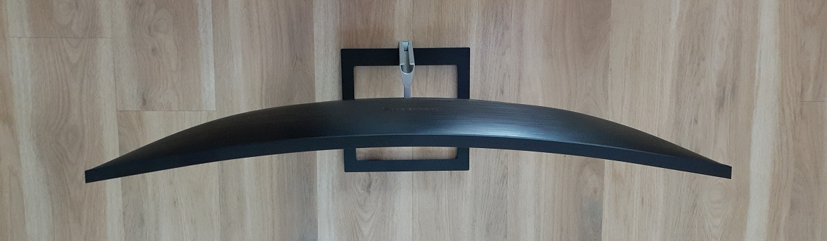
You’ll also notice the curvature of the screen in the images above. This is something that’s exaggerated in photos and videos, with a pincushion effect that isn’t apparent when sitting in front of the monitor and using it normally. The 1500R curve certainly has a noticeable effect on the 31.5” screen. It’s less subtle than the curve of some screens, although we found it quite natural to use and was something we readily adapted to. It draws you into the experience a bit, giving an extra level of immersion on top of that from the large screen. Designers or users after geometric perfection may prefer flat screens, but most other users should get on with the curve just fine. And users who will very much enjoy the addition of the curve. For gaming, the combination of large screen and curvature certainly draws you into the experience. We didn’t find the size overwhelming at all for desktop use from our preferred viewing position (or even sitting a bit closer, perhaps ~65cm). Although personal preferences vary, and there is an acclimatisation period if you’re coming from a significantly smaller screen. Meanwhile, the strong pixel density delivered a nice detailed look to the game world. This was especially where graphics settings were ramped up and high-resolution textures and particle effects could be enjoyed. But even at much lower graphics settings, the defined look it gave to object edges and the clarity and distinctiveness of things even in the distance on the game world was much more impressive than at significantly lower pixel densities. The images below show the monitor running a variety of game titles. As before, the images are purely for illustrative purposes and in no way indicate how the monitor appears in person.
Interpolation and upscaling

Video review
Timestamps:
Features & Aesthetics
Contrast
Colour reproduction
Responsiveness
Conclusion
The bottom line; an immersive and pixel-dense screen with pleasing contrast, fairly vibrant colour output and decent 60Hz responsiveness.
![]()
Positives Negatives Extension beyond sRGB and relatively good colour consistency for the panel type helps deliver fairly vibrant colour output overall
Gamma not quite as ‘2.2’ with optimal OSD settings, no support for extended gamuts Strong static contrast and a light matte screen surface free from strong graininess, delivering a nice experience for both lighter and darker content A bit of ‘VA glow’ and ‘black crush’, but about as little as we’ve seen given the panel type Good 60Hz responsiveness overall, with low input lag and most pixel responses performed well. Adaptive-Sync worked as intended to get rid of frame and refresh rate mismatches
Some weaknesses in pixel responsiveness for some ‘high contrast’ transitions, but a more respectable performance than most VA models The screen size and 3840 x 2160 resolution worked nicely to give strong detail and lots of useful workspace. The curve of the screen we see as a nice bonus that we found easy to adapt to, not something that felt unnatural Very limited ergonomic flexibility, although VESA holes are included
As an Amazon Associate and Newegg Affiliate I earn from qualifying purchases made using the below link. Where possible, you’ll be redirected to your nearest store. Further information on supporting our work.
