Author: Adam Simmons
Date published: April 19th 2019
Table of Contents
Introduction
For users looking for an affordable entry into the world of ‘4K’, 28” TN models like the BenQ EL2870U may seem appealing. When it comes to colour quality, though, these models leave a bit to be desired compared to more expensive models with IPS-type panels. Some surprising weaknesses in pixel responsiveness are also apparent with those models, really hammering home the fact that specified response times are often exceptionally misleading. The Philips 276E8VJSB offers a budget-friendly IPS-type alternative. We put this monitor through its paces in our usual series of tests to see whether it’s a worthy choice.
Specifications
This monitor uses a 60Hz IPS-type (In-Plane Switching or similar) panel from Chinese firm Panda Electronics. It has a resolution of 3840 x 2160 (‘4K’ UHD) and supports 10-bits per subpixel colour output via 8-bit + FRC dithering. A 5ms grey to grey response time is specified, which as usual you shouldn’t put too trust in. Some of the key ‘talking points’ of the specification have been highlighted in blue below.
The monitor has a minimalistic appearance from the front. The crescent-shaped stand base and slender cylindrical stand neck are finished with powder-coated metal, giving them a slightly weighty and premium feel. The bottom bezel is glossy black plastic, whilst what the manufacturer refers to as an ‘ultra-narrow border’ design is used for the top and side bezels. The bezels here comprise a slender panel border around the image, which blends in well when the monitor is switched off, alongside a slim hard plastic outer component. Including both components, the bezels are ~6.5mm (0.26 inches) at the top and sides. The bottom bezel is ~20mm (0.79 inches), including a silver of visible panel border. There is also a transparent tag-style Philips logo in the centre of the bottom bezel, hanging down ~10mm (0.39 inches) beneath the bottom bezel. The screen has a light matte anti-glare finish, as explored later. The image below is a macro photograph taken on Notepad with ClearType disabled. The letters ‘PCM’ are typed out to help highlight any potential text rendering issues related to unusual subpixel structure, whilst the white space more clearly shows the actual subpixel layout alongside a rough indication of screen surface. A light matte anti-glare screen surface is employed, with a reasonably smooth finish. This allows fairly direct emission of light, without the strength of diffusion seen on some matte screen surface. The reasonably smooth finish imparts a slight graininess when viewing brighter shades, less obtrusive than on some models of this sort of size and resolution. The Philips 276E8VJSB includes a range of ‘SmartImage Game’ presets; ‘FPS’, ‘Racing’, ‘RTS’, ‘Gamer 1’, ‘Gamer 2’ and ‘LowBlue Mode’. These presets simply adjust various settings in the main OSD and don’t achieve anything you couldn’t with manual adjustments. The exception to this is the ‘Bright Frame’ feature which highlights a specific area of the screen – this is only accessible in certain presets. We touch upon the presets briefly in the OSD video but won’t be revisiting them here. Instead, we’ll be taking a look at various other manual adjustments in the OSD. The table below gives gamma readings taken using a DataColor Spyder5ELITE and white point measurements taken using a BasICColor SQUID 3 (X-Rite i1Display Pro), alongside general observations. Our test system is Windows 10 based, using an Nvidia GTX 1080 Ti connected using the supplied HDMI cable. No additional monitor drivers or ICC profiles were specifically loaded. The monitor was left to run for over 2 hours before readings were taken or observations made. Aside from our ‘Test Settings’ where various adjustments are made, assume factory defaults are used. An important step also had to be performed in the graphics driver if connected to an Nvidia GPU via HDMI. The colour signal had to be corrected to a ‘Full Range RGB’ signal as detailed in this article. When viewing the figures in this table, note that for most PC users ‘6500K’ for white point and ‘2.2’ for gamma are good targets to aim for. Individual targets depend on individual uses, tastes and the lighting environment, however.
As an Amazon Associate I earn from qualifying purchases made using the below link. Where possible, you’ll be redirected to your nearest store. Further information on supporting our work.

Features and aesthetics

The OSD (On Screen Display) is controlled by a joystick located beneath the tag-style logo. We found the positioning of the joystick a little awkward and you had to be quite firm and definite with your movement to made sure it registered an input in the correct direction. But it still wasn’t the least intuitive nor most frustrating OSD experience we’ve had. The video below runs through the menu system. Note that there’s a fairly bright pinprick-style power LED facing forwards towards the right of the bottom bezel. This can’t be disabled in the OSD. We didn’t find it distracting, but for users who do they might need to get crafty with a little bit of black tape or something similar to cover it up.
From the side the monitor is slim – ~15mm (0.59 inches) at thinnest point. It extends back a bit further where the stand attaches. The included stand offers tilt (5° forwards, 20° backwards) as the only ergonomic flexibility. The bottom of the monitor sits ~94mm (3.70 inches) above the desk, or more specifically the bottom of the Philips logo ‘tag’ does. The top of the monitor sits ~469mm (18.46 inches) above the desk. The total depth of the monitor including stand is ~190mm (7.48 inches). So quite a compact design overall, at the expense of ergonomic freedom. You can at least place the screen quite close to the wall, which will be welcomed by users who have relatively shallow desks and like some extra freedom with their viewing distance.

The rear of the monitor is minimalistic, with glossy black plastic featuring heavily. The stand attaches towards the bottom and there are no VESA holes. The screen is too slender to allow them. There’s a Kensington lock slot towards the bottom left. The ports face backwards and include; 2 HDMI 2.0 ports, DP 1.2, a 3.5mm audio output and DC power input (external power brick).

3840 x 2160 @60Hz is supported via both DP 1.2 and HDMI 2.0. An HDMI cable plus the power cable and adaptor are included as standard.
Calibration
Subpixel layout and screen surface
![]()
As shown above, the monitor uses the standard RGB (Red, Green and Blue) stripe subpixel layout. This is the default expected by modern operating systems such as Microsoft Windows and Apple’s MacOS. Mac users needn’t worry about text fringing from less usual subpixel layouts, whilst Windows users don’t necessarily need to run through the ClearType wizard. They may still wish to run through this and make some changes according to their preferences, however. The subpixel layout and arrangement is normal and we had no subpixel-related concerns related to sharpness or text clarity on this model.
Testing the presets
Monitor Settings Gamma (central average) White point (kelvins) Notes Gamma = 1.8 1.8 7305K Bright, cool and somewhat green-tinted with a flooded look. An obvious lack of depth due to the low average gamma. Gamma = 2.0 2.0 7307K As above but a little extra depth. Gamma = 2.2 (Factory Default) 2.2 7214K As above but a much richer look overall with good depth and saturation. Good consistency of saturation levels across screen, as expected from an IPS-type panel. Gamma = 2.4 2.3 7311K As above but extra depth and saturation. Gamma = 2.6 2.5 7235K As above with even more depth and saturation. Some elements appear quite a bit deeper than they should. Gives quite a striking and cinematic look, but not a generally accurate one. Low Blue Mode = 1 2.2 6068K A weak Low Blue Light (LBL) setting. Gives the image a warm and somewhat green appearance. Your eyes adjust to this. The blue channel is weakened somewhat compared to factory defaults and blue light output is slightly reduced. Low Blue Mode = 2 2.2 5520K As above but a more significant decrease in blue light output. Quite an effective LBL setting, especially if the user lowers brightness. Low Blue Mode = 3 2.2 5515K As above but dimmer by default. Low Blue Mode = 4 2.2 5283K The strongest LBL setting on the monitor – highly effective. As above but a further weakening of the blue channel. Color Temperature = 5000K 2.2 5555K An alternative LBL setting. The image appears warmer than factory defaults, but it doesn’t have the green hue introduced with the ‘Low Blue Mode’ settings. The reduction in blue light output is not as significant as using the ‘Low Blue Mode’ at a higher level, but this remains quite an effective LBL setting. Color = sRGB 2.2 7263K An sRGB emulation setting. The saturation is toned down a bit due to restriction of the colour gamut so it runs closer to the sRGB reference space. The image appears somewhat cool and green and colour channels are locked so you can’t correct this in the OSD. Brightness is also locked at a high level. Color = User Define 2.2 7084K As factory defaults but green tint increased and image is slightly warmer (but still cool-looking overall). Test Settings (see below) 2.2 6477K A significant reduction in brightness and colour channel tweaks creates a fairly vivid, consistent and nicely balanced image.
Out of the box the monitor was bright with a cool and slightly green tint. Gamma tracking was good, though, and the image appeared consistently rich throughout the screen. An sRGB emulation mode is included which tones down saturation a little so it more closely corresponds to the sRGB space. Although the native gamut doesn’t really extend massively beyond this, so most users will likely want to make use of the native gamut instead. In doing so, they also have access to the colour channels and brightness which is blocked off using the ‘sRGB’ setting. Following corrections in the OSD, as per our ‘Test Settings’, a nicely balanced, fairly vivid and varied image resulted. The gamma tracking here is shown in the graph below, with good adherence to the desired ‘2.2’ curve. The monitor also included various Low Blue Light (LBL) settings. The main settings are referred to as ‘Low Blue Mode’ settings, with 4 levels of effectiveness. These worked as intended by significantly cutting out blue light output from the monitor. The resulting image was warmed and had a green tint. The eyes adjust to this to a degree, although the alternative ‘Color Temperature = 5000K’ setting may appeal to some due to the better overall balance. The image there appears warmer, but it doesn’t have the accompanying green tint. That’s because both the green and blue colour channels are significantly reduced. The red channel is also relatively high – so the dip in colour temperature isn’t purely down to the blue colour channel being weakened. The blue light reduction isn’t as significant, but it is still an effective LBL setting. We used this for our own viewing comfort in the evening, although not for any specific testing beyond that involving the setting itself. Cutting out stimulating blue light is important in the hours leading up to bed as it affects sleep hormones and keeps the body ‘alert’ even if it should be winding down. You can also assign this setting along with other adjustments (to brightness etc.) to the fully customisable ‘Gamer 1’ or ‘Gamer 2’ presets, allowing it to be easily activated and deactivated. Our ‘Test Settings’ involved a significant reduction in brightness and some changes to colour channels. As an Nvidia user connected via HDMI, you’ll also need to correct the colour signal in the graphics driver from the default ‘Limited Range’ to ‘Full Range’ RGB as explored in this article. Assume that any setting not mentioned here was left at default in the OSD, including ‘Contrast’. We’ve also included our preferred ‘SmartResponse’ setting, just for reference. Brightness= 32 (according to preferences and lighting) SmartResponse= Faster Color Temp. = User Define Red= 100 Green= 93 Blue= 94 We used a BasICColor SQUID 3 (X-Rite i1Display Pro) to measure white and black luminance levels, from which static contrast ratios could be calculated. The table below shows this data, with various settings used. Assume any setting not mentioned was left at default, except for the changes already noted in the calibration section. Black highlights indicate the highest white luminance, lowest black luminance and maximum contrast ratio recorded. Blue highlights indicate the results under our ‘Test Settings’.
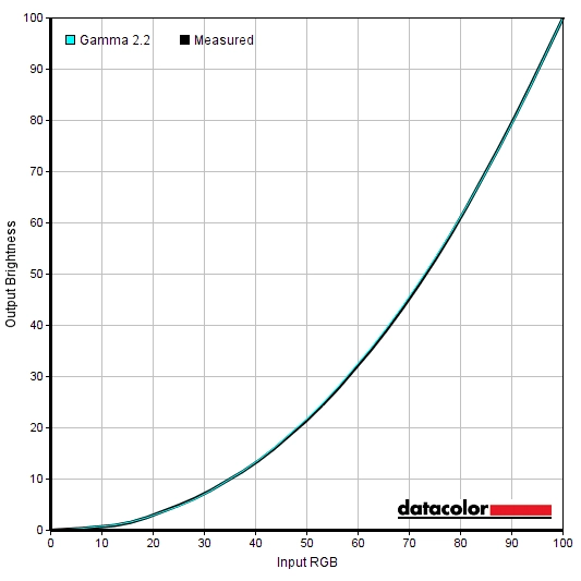
Gamma 'Test Settings'
Test Settings
SmartImageGame = Off
Contrast and brightness
Contrast ratios
Monitor Settings White luminance (cd/m²) Black luminance (cd/m²) Contrast ratio (x:1) 100% brightness (Factory Defaults) 413 0.44 939 80% brightness 341 0.36 947 60% brightness 263 0.27 974 40% brightness 195 0.2 975 20% brightness 143 0.15 953 0% brightness 89 0.09 989 Gamma = 1.8 413 0.43 960 Gamma = 2.0 412 0.43 958 Gamma = 2.4 412 0.43 958 Gamma = 2.6 412 0.43 958 Low Blue Mode = 1 421 0.43 979 Low Blue Mode = 2 436 0.43 1014 Low Blue Mode = 3 320 0.31 1032 Low Blue Mode = 4 318 0.31 1026 Color Temperature = 5000K 353 0.43 821 Color = sRGB 372 0.39 954 Color = User Define 447 0.43 1040 Test Settings 170 0.18 944
The average contrast ratio with only brightness adjusted was 963:1, which is reasonable. The maximum contrast recorded was 1040:1, in-line with the panel specifications and our expectations, using the ‘User Define’ setting with all colour channels in their neutral position (‘100’). We recorded a contrast ratio of 944:1 following adjustments made to our ‘Test Settings’, which is decent. Relatively strong contrast was maintained using the ‘Low Blue Mode’ settings (>1000:1). There was a slight drop in contrast to 821:1 using the alternative ‘Color Temperature = 5000K’ LBL mode – this modifies the green colour channel, which typically affects contrast in this way. The ‘sRGB’ emulation setting maintained decent contrast, at 954:1. The highest white luminance recorded was a rather bright 447 cd/m², with a minimum white luminance of 89 cd/m² recorded on the table. This gives a luminance adjustment range of 358 cd/m², which is good. Although the minimum is somewhat higher than highly light-sensitive users might like.
The monitor has a Dynamic Contrast setting called ‘SmartContrast’. This allows the backlight brightness to adjust (as a single unit) according to the overall levels of bright vs. dark being displayed on the screen. This adjusted at a moderate pace to changes in scene brightness and dimmed quite effectively for predominantly dark content. We found the backlight too bright using this setting, overall, regardless of what the ‘Brightness’ was set to. You can adjust the ‘Brightness’ with this setting active, but it only seems to affect it initially, the ‘SmartContrast’ setting soon takes the reins and sets the brightness as it wants. As usual this Dynamic Contrast mode is more of a distraction and can’t compensate properly for the intricate mixtures of dark and light on the screen. There is no local dimming, of course. We therefore prefer manual control of brightness.
PWM (Pulse Width Modulation)
The 276E8VJSB does not use PWM (Pulse Width Modulation) to regulate backlight brightness at any level and instead uses DC (Direct Current). The monitor is therefore considered ‘flicker-free’, which will come as welcome news to those sensitive to flickering or worried about side-effects from PWM usage.
Luminance uniformity
Whilst observing a black screen in a dark room using our ‘Test Settings’, we observed some backlight bleed and moderate clouding. This is shown in the image below, which was taken a sufficient distance back to eliminate any ‘IPS glow’. This is a silverish or golden glow (depending on viewing angle). It’s visible most clearly towards the bottom corners of the screen, from a normal viewing position. The glow also ‘blooms out’ at more extreme viewing angles, as shown in a video later on in the review. Note that individual units vary when it comes to all aspects of uniformity, including backlight bleed. The luminance uniformity was respectable overall. The brightest point recorded was ‘quadrant 5’ in the centre of the screen (157.7 cd/m²). The maximum deviation from this occurred jointly at ‘quadrant 2’ above centre and ‘quadrant 3’ to the left of that (140.8 cd/m², which is 11% dimmer). Percentage deviation elsewhere was in the single digits. The average deviation between each quadrant and the brightest point was 7.38%, which is quite impressive. It’s important to remember that uniformity varies between individual units and you can also expect variation beyond the points measured. The contour map below shows these deviations graphically, with darker greys representing lower luminance and hence greater deviation from the brightest recorded point than lighter greys. Percentage deviations between each quadrant and the brightest point are also given. The Spyder5ELITE was also used to analyse variation in the colour temperature (white point) for the same 9 quadrants. The deviation between each quadrant and the quadrant closest to the 6500K (D65) daylight white point target was analysed and a DeltaE value assigned. A DeltaE >3 represents significant deviation that most users would readily notice by eye. Results here were decent overall. Significant deviation was recorded towards the top left (DeltaE 3.9), without significant deviation recorded elsewhere. It’s worth noting again that individual units vary when it comes to uniformity and the deviation beyond measured points can be expected. On Battlefield V the monitor provided a decent experience in terms of contrast. The level of detail in dark areas was much as it should be for the central mass of the screen, aided by appropriate gamma handling. There was some loss of detail peripherally due to ‘IPS glow’, though, which provided a bloom that lightened dark shades. This was most noticeable towards the bottom corners of the screen, from a normal viewing position. The ‘IPS glow’ was at a moderate level, quite typical for the panel type. Brighter shades stood out quite nicely against darker surroundings, whilst the light matte screen surface kept them free from obvious ‘smeary’ graininess. Just a light ‘misty’ graininess in places, significantly less obtrusive than most 27” models of this resolution we’ve used in fact. We made similar observations on Shadow of the Tomb Raider. This title has plenty of dark caves and interiors, best viewed on a monitor with strong contrast performance. That’s not something that IPS models like this provide, however. The atmosphere to these dark scenes was lacking and certainly not helped by ‘IPS glow’ (or the only reasonable overall static contrast). But it was nice to have a good central level of detail for these dark scenes, whilst the strong gamma consistency avoided the issue you’d get on TN models of this size. And that is dark shades blending together extremely readily towards the top of the screen an excessive levels of detail being apparent lower down the screen. The light matte screen surface kept brighter elements such as the daylight sky and flames in dark passageways appearing reasonably smooth, without an obvious layered and grainy appearance. Finally, we made some observations on the film Star Wars: The Last Jedi. The contrast certainly wasn’t sufficient to give this an overly deep and cinematic look, especially when viewing in dimmer lighting environment. But in more sensible lighting and considering the panel type used, things were certainly decent enough. Bright elements such as light sabers and energy pulses lighting up deep dark space stood out quite nicely, whilst again the screen surface avoided giving them an overly grainy appearance. The Lagom tests for contrast allow specific weaknesses in contrast performance to be identified. The following observations were made. The Philips 276E8VJSB’s colour gamut (red triangle) was compared with the sRGB (green triangle) reference space using our ‘Test Settings’, as shown below. The gamut fully covers the sRGB colour space (100%) with some extension beyond this, particularly in the green region of this representation. That gives the monitor the potential to output all shades within the sRGB colour space, with an extra bit of saturation. This gives a bit more of a vivid look overall, but the extension beyond sRGB is far from extreme – so you don’t get more noticeable oversaturation and things appear quite natural and faithful to the original sRGB source overall. The monitor provided a rich, varied and natural palette of colours on Battlefield V. The environments appeared much as they should, with some good rich greens and pleasant autumnal brown and red shades. The slight extension beyond sRGB in the gamut provided a bit of extra vividness, but nothing extreme – saturation levels were only a bit higher than intended overall. Fires had a nice vibrant look to them without yellows verging on orange or oranges verging on red. And reddish brown earth appeared quite appropriate, rather than appearing with an overly strong red hue. We made similar observations on Shadow of the Tomb Raider. The game appeared vivid but natural, with an excellent variety of shades. Subtle variations of said shades (such as a variety of muted greens and browns) was displayed nicely thanks to the consistency of the IPS-type panel. Saturation was well-maintained throughout the screen, with only a bit of a boost from the colour gamut rather than anything extreme. Enough to keep things looking quite vivid, but not enough to give Lara too much of a suntan (or worse, sunburn!) Shadow of the Tomb Raider highlighted similar colour performance characteristics. Things looked vibrant overall, with strong but not extreme or garish saturation. This gave the environments a rich look, with lots of deep and luscious greens as well as some more muted shades. Earthy browns also looked rich, if at times too red as observed on BF1. Lara’s skin appeared a bit more tanned than intended, but the monitor avoided giving her a sunburnt or lobster-like look (some traditional wide gamut displays might do this). There were some good vibrant blues, reds and purples displayed for elements such as fruit and flowers as well. There was moderate loss of saturation towards the edge of the screen and some of these shades become noticeable more muted at the extreme side edges in particular. This was relative to their saturated central appearance, they didn’t look ‘washed out’ in our view. We also made some observations on the movie Futurama: Into the Wild Green Yonder. This is a particularly unforgiving test for colour consistency as there are large areas of individual shade. Any shifts in saturation or tone here are generally easy to spot. The monitor performed well here, allowing a good variety of subtly different shades to be displayed. Pastel shades appeared appropriately muted, with a nice variety of orange and pink hues which can often be lost. There were some decent deep shades such as purples and some nice neon green and pink shades. The vibrancy of these shades wasn’t as head-turning as on some models, with more generous colour gamuts. But it was definitely still there to a decent degree, giving this title the sort of look it craved overall. Lagom’s tests for viewing angle help explore the idea of colour consistency and viewing angle performance. The following observations were made from a normal viewing position, eyes around 70cm from the screen. On some monitors, particularly but not exclusively those with high refresh rates, interlace patterns can be seen during certain transitions. We refer to these as ‘interlace pattern artifacts’ but some users refer to them as ‘inversion artifacts’ and others as ‘scan lines’. They may appear as an interference pattern, mesh or interlaced lines which break up a given shade into a darker and lighter version of what is intended. They often catch the eye due to their dynamic nature, on models where they manifest themselves in this way. Alternatively, static interlace patterns may be seen with some shades appearing as faint horizontal or vertical bands of a slightly lighter and slightly darker version of the intended shade. We did not observe either artifact type on this monitor. A small utility called SMTT 2.0 was used alongside a sensitive camera to analyse the latency of the 276E8VJSB, with over 30 repeat readings taken to help maximise accuracy. Using this method, we calculated 2.79ms (~1/6th of a frame at 60Hz) of input lag. Note that the input lag measured here is influenced by both the element you ‘see’ (pixel responsiveness) and the element you ‘feel’ (signal delay). It indicates a very low signal delay which shouldn’t bother even sensitive users. Our article on responsiveness explores the key factors affecting monitor responsiveness. Chief amongst these is ‘perceived blur’, contributed to by both the pixel responsiveness of the monitor and eye movement as you track motion on the screen. This second factor is usually dominant on modern monitors, although both factors are important. We also introduce a photography method called ‘pursuit photography’, which uses a moving rather than static camera to capture snapshots of motion on a monitor in a way that reflects both these key elements of perceived blur rather than only reflecting pixel responses. The images below are pursuit photographs taken using the UFO Motion Test for ghosting, with the test running at 960 pixels per second. This is a good practical speed for capturing such photographs and highlights both elements of perceived blur nicely. The UFOs move across the screen from left to right at a frame rate matching the refresh rate of the display. All background shade levels (dark, medium and light) were used with the monitor set to all its ‘SmartResponse’ pixel overdrive settings; ‘Off’, ‘Fast’, ‘Faster’ and ‘Fastest’. The final column shows a reference, a fast TN model (ViewSonic XG240R) showing what things look like where pixel responsiveness isn’t generally a limiting factor. Note that we will not be including a section on overclocking, as the monitor skipped frames when set much above 60Hz at its native resolution or indeed lower resolutions such as Full HD. On Battlefield V there was a moderate degree of perceived blur, mainly caused by eye movement and linked to the 60Hz refresh rate. There were some slight weaknesses beyond that, although nothing that really stood out in a distracting way. Some of the pixel transitions involving brighter shades against a much darker background (and sometimes dark shades against a much brighter background) produced a ‘powdery’ trailing similar to that shown in the top row of the UFO Motion Test for ghosting earlier. This was most noticeable if you moved past white text prompts or interaction notifications against dark backgrounds. But even that was less noticeable than the sort of weaknesses (‘smeary’ trailing) you typically observe for similar transitions on VA models. There was also some overshoot in places. A dark tree trunk against a dusky sky, for example, produced a semi-transparent (‘snail slime’) trail behind the tree that was slightly brighter than the background. And observing very bright shades such as lamps against medium backgrounds sometimes revealed trailing that was slightly darker than the background (‘dirty trailing’). We didn’t find either type of overshoot particularly strong or obnoxious and as far as overshoot goes these examples were far less obtrusive or noticeable as they could be. We made similar observations on Shadow of the Tomb Raider. It was really the perceived blur due to eye movement that dominated, with secondary weaknesses such as a bit of ‘powdery’ trailing and some overshoot very much secondary. And not sufficient to really detract from the gameplay. We also made observations using movie content at a range of frame rates, including 24fps – 30fps and 60fps content. There were no significant weaknesses observed due to pixel response behaviour here. For the higher frame rate content exactly the same slight weaknesses were exposed as when gaming at 60fps. For the lower frame rate content these weaknesses were not really evident, aside from a small amount of overshoot (bright trailing) in places. This was mild and could be eliminated by reducing the ‘SmartResponse’ setting if desired. The fluidity of motion and pixel response requirements were significantly limited by the frame rate itself. The monitor therefore provided a good response performance for movie viewing without any stand-out weaknesses. As an Amazon Associate I earn from qualifying purchases made using the below link. Where possible, you’ll be redirected to your nearest store. Further information on supporting our work. Our article on the ‘4K’ UHD experience explores the pros and cons of the resolution on a variety of tasks. The article is focused on a 28” screen – the 27” screen of the 276E8VJSB offers a very similar experience. With a pixel density of 163.18 PPI (Pixels Per Inch), many users will want to use a degree of scaling. We were able to use the monitor without any scaling from our normal viewing distance (~70cm), but text and various other elements on the screen appeared very small indeed and we found this rather strange. We preferred using a reasonably low level of scaling (‘125%’) worked nicely, making things a bit larger and therefore less weird-looking whilst maintaining an excellent level of ‘desktop real estate’. Properly scaled elements (including text on most applications we used) appeared lovely and crisp as well, benefiting greatly from the high pixel density. The images below are there to give a rough idea of how things appear using our preferred ‘125%’ scaling setting on the desktop. The experience article linked to at the start of this paragraph draws further comparisons, with various different scaling levels applied. The 3840 x 2160 (‘4K’ UHD) resolution is relatively demanding, requiring a good amount of GPU power to run smoothly. Because of this, it may be desirable to use a lower resolution. And on some systems (some games consoles etc.) it would be necessary as they don’t support ‘4K’ output. The monitor is able to use an interpolation (scaling) process to map lower resolutions such as 1920 x 1080 (‘1080p’ or Full HD) onto all of its 3840 x 2160 pixels. You need to ensure, as a PC user, that the GPU is not trying to take over scaling duties. For AMD GPU users the monitor will handle the scaling by default, when gaming at non-native resolutions. Nvidia users should open the Nvidia Control Panel and navigate to ‘Display – Adjust desktop size and position’. They should ensure that ‘No Scaling’ is selected and ‘Perform scaling on:’ is set to ‘Display’ as shown below. The ‘SmartSize’ section of the OSD has various settings that control the monitor’s scaling behaviour. There’s ‘Panel Size – 27”W (16:9)’ which will ensure all pixels of the monitor are illuminated and the full screen space is used. There’s ‘1:1’, a pixel mapping feature that will display the source resolution without any distortion or ‘stretching’ and fill up the remaining pixels as a black border. And there’s ‘Aspect’, which will use interpolation vertically but not horizontally. It is intended to maintain the aspect ratio of the source resolution but fill up as much of the screen as possible with that in mind, although it seemed to horizontally compress resolutions with a 16:9 aspect ratio so that they appeared stretched and distorted. Considering the Full HD resolution, the monitor provided some softening to the image when using interpolation. It certainly didn’t have the same clarity and edge definition as a screen of this size running Full HD natively. But the softening was not extreme and was actually quite difficult to notice if you sit a bit further back from the monitor. This was also true for the 2560 x 1440 (WQHD) resolution, which actually looked about as good as we’ve seen it displayed on a 3840 x 2160 model. The softening that was observed was not improved by increasing ‘Sharpness’ in the OSD, that just gave an artificially over-sharpened and frankly ugly appearance to the image. As usual, if you’re running the monitor at 3840 x 2160 and viewing 1920 x 1080 content (for example a video over the internet or a Blu-ray, using movie software) then it is the GPU and software that handles the upscaling. That’s got nothing to do with the monitor itself – there is a very small amount of softening to the image compared to viewing such content on a native Full HD monitor, but it’s slight and shouldn’t bother most users. The video below summarises some of the key points raised in this written review and shows the monitor in action. The video review is designed to complement the written piece and is not nearly as comprehensive. With its 27” ‘4K’ UHD screen, the Philips 276E8VJSB provides an excellent pixel density and an excellent amount of desktop real-estate. Even if you end up using a bit of scaling or application-specific zoom, which most mere mortals will be doing. The monitor had a homely look with a nice solid looking and feeling powder-coated metal crescent-shaped stand. This afforded tilt as the only ergonomic freedom, though, and there was no provision for VESA mounting. The fairly bright white pinprick-style power LED could bother some users as well – it can’t be disabled in the OSD, so a less elegant solution such as a small bit of tape would be required. The OSD controls, although intuitive, were quite picky about how firmly and in what direction you pressed them. Not a major problem, of course, but potentially slightly annoying to some users. The monitor provided excellent gamma handling out of the box and offered provision to easily correct white point. Which wasn’t wildly off on our unit out of the box, but was certainly not quite where we wanted it. There were various gamma settings in the OSD, alongside an array of other settings including various Low Blue Light (LBL) modes. These worked effectively and were easy to activate or deactivate – including by assigning them to a custom preset. The gamma consistency throughout the screen was strong, as hoped for given the panel type. Static contrast was also in-line with our expectations for an IPS-type panel, with a moderate (but largely average) level of ‘IPS glow’ eating away at some detail and atmosphere for peripheral sections of the screen. We were quite pleased with the choice of screen surface, which was light matte anti-glare with a fairly smooth finish. There was slight graininess when observing lighter shades, easy to ignore for the most part and less obtrusive than on many competing models. The palette of colours provided by the screen was rich and varied. There was some extension beyond the sRGB gamut which lifted up the vibrancy of many shades without strong oversaturation. This allowed the monitor to output shades in a way that was quite faithful to the original source material whilst injecting a little extra vividness. The IPS-type panel’s gamma and shade consistency helped maintain this rich look throughout the screen. Far from being some sort of cheap imitation of IPS technology, we found this Panda Electronics IPS-type panel to perform every bit as well if not better in some areas compared to its LG IPS counterparts. An effective sRGB emulation mode was also included, effectively cutting back on the colour gamut without compromising on contrast. The colour channels were locked when using this setting and if you wish to make changes of that nature you’d need to use a colorimeter or make changes at the software level by other means, such as the graphics driver. The monitor provided decent 60Hz responsiveness, too. Input lag was nice and low and there were no major issues with pixel responsiveness. A bit of ‘powdery’ trailing in places and a bit of overshoot, but it was largely the 60Hz refresh rate that dictated the experience. Given the price of the monitor and its clearly superior colour performance (and in fact responsiveness) compared to the more common 28” TN alternatives in the price range, this is worth careful consideration. Paying a higher price could grant features like FreeSync support, very rudimentary HDR support and greater ergonomic flexibility or mounting options. Considering, for example, the LG 27UK650, 27UL650 and related models. But if such additions don’t interest you then there are far worse ways to spend your money than on the Philips 276E8VJSB.

The Spyder5ELITE was used to assess the uniformity of lighter colours, represented by 9 equidistant white quadrants. The luminance of each quadrant was measured and compared to the brightest measured quadrant. The table below shows these values as well as the percentage deviation between each quadrant and the brightest point measured.
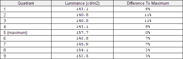
Luminance uniformity table
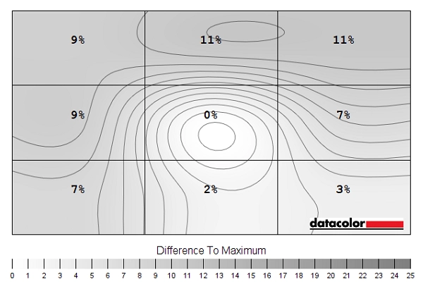
Luminance uniformity map
Colour temperature uniformity map
Contrast in games and movies
Lagom contrast tests
Colour reproduction
Colour gamut

Colour gamut 'Test Settings'
The monitor also provides an sRGB emulation setting (setting ‘Color’ to ‘sRGB’ in the OSD). This cuts down the colour gamut so that it tracks sRGB more closely, shown below with the same triangle colours used as before. There is a little under-extension below sRGB, but nothing severe (98%). The full native gamut of the monitor does not offer extreme extension and it’s often desirable to balance things as best you can on the monitor side rather than just going all-out on the software side (i.e. with an ICC profile). Given this, the full sRGB coverage with the native gamut and that the ‘sRGB’ setting locks off colour channels in the OSD it may make sense to simply use the full native gamut as a base of calibration. Profiling with a colorimeter or similar device will account for this slight extra saturation for colour-managed applications, too.
Colour gamut 'sRGB'
Colour in games and movies
Viewing angles

The following video shows the Lagom text test, a mixed desktop background and dark desktop background from various viewing angles. For the mixed image you can see slight shifts in colour and contrast, particularly at sharper viewing angles. The image retains its integrity better overall compared to non IPS panels, however. The dark desktop background highlights ‘IPS glow’, showing how it manifests itself off-angle and blooms out noticeably from sharper viewing angles.
Interlace pattern artifacts
Responsiveness
Input lag
Perceived blur (pursuit photography)

The UFO appears soft and unfocused without sharp details, reflecting a moderate amount of perceived blur due to eye (camera) movement. This aspect is also reflected in the reference shots. There are also various degrees of trailing behind the object, reflecting weaknesses due to suboptimal pixel responsiveness. With ‘SmartResponse = Off’ there is significant trailing behind the object for the dark (top row) and medium (middle row) backgrounds and just a bit for the light background (bottom row). The ‘Fast’ setting cuts down on this, so a little bit remains but significantly less. The light background shows a small amount of overshoot (inverse ghosting) as a slightly bright (‘halo’) trail behind the UFO. The ‘Faster’ setting further cuts down on the trailing. There’s now just a whiff of light ‘powdery’ trailing for the dark background. The medium and light backgrounds both show some overshoot (slightly bright trailing) but nothing extreme. The ‘Fastest’ setting introduces a small amount of overshoot for the dark background and significantly increases overshoot for the medium and light backgrounds. It’s very colourful and obvious. According to this analysis and indeed broader analysis in-game, we consider ‘Faster’ to be optimal. Users who prefer slightly lower overshoot at the expense of a bit more conventional trailing may want to try the ‘Fast’ setting instead.
Responsiveness in games and movies
The ‘4K’ UHD experience


The strong 163.18 PPI pixel density also brings excellent detail and clarity to suitably high resolution image content. Including high-resolution images, movies and games. Even if you set the game to fairly low detail levels, or you’re running an older title which is far from graphically complex, there is great benefit to be had from the pixel density. Various elements simply appear sharper and better defined – objects or people stand out better from one another and their environment, even quite far into the distance. Add in some fancy particle effects and high resolution textures and the benefits of this pixel density were very clear to us. The images below show various game titles in action on the monitor. They in no way reflect what the monitor look like in person, they’re simply there for a bit of visual stimulation.


Interpolation and upscaling

Video review
Timestamps:
Features & Aesthetics
Contrast
Colour reproduction
Responsiveness
Conclusion
The bottom line; strong all-round performance at an attractive price, with vivid and varied colour output and good 60Hz responsiveness.
![]()
Positives Negatives Rich and varied colour output, with some extension beyond sRGB plus an effective sRGB setting. Strong colour consistency from the panel
No support for extended gamuts Decent static contrast (in-line with expectation) and a light matte screen surface with smoother finish than some competing models, giving a relatively ‘clean’ appearance to the image ‘IPS glow’ ate away at peripheral detail in dark scenes – not a panel type that lends itself well to observing dark scenes in a dark room, anyway Good 60Hz responsiveness with low input lag and no major pixel response time issues
Some slightly slower than optimal pixel transitions, a bit of overshoot and no VRR (Variable Refresh Rate) support An excellent pixel density and lots of useful desktop workspace from the 3840 x 2160 resolution and 27” screen. And very attractive pricing Very limited ergonomic freedom and no VESA support
As an Amazon Associate I earn from qualifying purchases made using the below link. Where possible, you’ll be redirected to your nearest store. Further information on supporting our work.
