Author: Adam Simmons
Date published: May 8th 2020
Table of Contents
Introduction
The 3840 x 2160 (‘4K’ UHD) has a lot to offer. This is especially true when combined with a ~32” screen size, which we see as something of a sweet spot for the resolution. A combination that the EW3280U offers, whilst also employing an IPS-type panel with an emphasis on strong colour reproduction. This is coupled with VESA DisplayHDR 400 certification (basic HDR capability), support for Adaptive-Sync and some little touches that are unique to the manufacturer. Such as an IR remote control and integrated subwoofer. We put this model through its paces in our usual suite of tests.
Specifications
The monitor adopts a 32” AHVA (Advanced Hyper-Viewing Angle) panel from AUO, an IPS-type (In-Plane Switching type) technology. This is paired with a 60Hz refresh rate and support for 10-bit colour (8-bit + FRC dithering), whilst a WLED backlight with enhanced phopshors (KSF) is used to enhance colour gamut. A 5ms response time is specified, but as usual you shouldn’t put much weight on this figure. Some of the key ‘talking points’ for this monitor have been highlighted in blue below, for your reading convenience.
The monitor has a somewhat rustic aesthetic from the front, with the bottom bezel and stand base using a fairly unconventional colour choice. The stand base has a bronze-coloured finished, with powder-coated metal used for a premium look and feel. The bottom bezel is a reddish-brown matte plastic, with a honeycomb mesh texture. This is a speaker grille, housing some speakers from the ‘treVolo’ speaker system of the monitor. The bottom bezel is ~33mm (1.30 inches) thick, excluding a central box that hangs a further ~8mm (0.31 inches) below that. This houses the ‘B.I.+’ light sensor and IR sensor for the included remote control. Both features are explored a little later, in the OSD video. The monitor uses a dual-stage design at the top and sides, comprising a slender panel border that’s flush with the rest of the screen plus a slim hard plastic outer component. Including both components the bezels are quite slim; ~7.5mm (0.30 inches) at the sides and ~8.5mm (0.33 inches). The screen has a very light matte anti-glare finish, as explored shortly. It’s worth noting that the panel border edge is actually very slightly in front of the rest of the screen, where the image is displayed. A reflection of this panel border can be seen if you sit close enough to the screen or are viewing from a a sharp angle, which makes the inset appear much greater than it is. This reflection is clearest for brighter content and is common to see to some degree on models with this dual-stage design. We’re now very used to using such monitors, so don’t generally comment on this. The effect is pretty subtle and most will find it unobtrusive during normal use, but we’ve tried to capture it in the image below. We’ve described this in the past as a ‘shadowy border’, which seems quite an apt way to describe it if viewed from a sharper angle, but makes it sounds a bit worse than it really is. It can be seen from less extreme angles than shown in the photo, this was just to try to emphasise the effect as it’s tricky to capture with a photo. The monitor is mainly matte black plastic at the rear. The stand attaches towards the bottom and can be unscrewed and removed. There are 100 x 100mm VESA holes located beneath a clip-off plastic cover above the stand attachment point, for alternative mounting. The stand neck includes a cable-tidy system, with a cable entry point at the bottom and a cable channelling system that’s accessible by removing a plastic cover. Towards the left side the OSD controls are located and towards the right side there’s a K-Slot. The ports face downwards and include; a 3.5mm headphone jack, 2 HDMI 2.0 ports, DP 1.4, USB-C (60W PD, DP Alt Mode, upstream data) and an AC power input (internal power converter). Towards the top, in the central region, there’s a 5W subwoofer covered with a black plastic speaker grille. This accompanies the 2 x 2W speakers at the front of the monitor, beneath the grille-style bottom bezel. This 2.1 channel ‘treVolo’ speaker setup provides sound with plenty of volume and decent bassy fullness. Far more of this than typically found on integrated monitor speakers, with the subwoofer making its presence very clear. The trebles and mid-tones aren’t as varied or clear as some speakers and the bassiness can sometimes drown these out. For a better dynamic range of sound we’ve only really noticed significant improvement from much higher wattage systems than this. There are various ‘Audio Scenario’ settings, equalizer presets which make slight adjustments to the overall balance. We found the default ‘Live/POP’ to be the best balanced with some of the others sounding pretty hollow really and not putting the main draw of this system to good use; the subwoofer. Some of the less bass-rich presets can be useful when listening to certain audio, though. It gets rid of a certain ‘booming’ sensation and vibration that can occur when listening to some voice-heavy audio. The native 3840 x 2160 @60Hz plus HDR functionality is supported via DP 1.4 and HDMI 2.0. Adaptive-Sync is supported using both inputs, although HDMI 2.0 only supports AMD FreeSync specifically. A power cable and HDMI cable is included as standard, with additional accessories in some regions and from some retailers including; DP-MiniDP cable, USB-C cable and 3.5mm audio cable. The monitor supports a wide range of refresh rates when running at either ‘4k x 2k, 3840 x 2160’ (native ‘4K’ UHD) or ‘1080p, 1920 x 1080’ (Full HD), including 24Hz. The full list of refresh rates supported is shown in the image below, identical via suitable versions of DP and HDMI. PC-specific resolutions such as 2560 x 1440 only have 60Hz as a listed refresh rate. The image below is a macro photograph taken on Notepad with ClearType disabled. The letters ‘PCM’ are typed out to help highlight any potential text rendering issues related to unusual subpixel structure, whilst the white space more clearly shows the actual subpixel layout alongside a rough indication of screen surface. This model uses a very light matte anti-glare screen surface, which provides decent glare handling. It diffuses light significant less than ‘stronger’ matte screen surfaces. This means you can get some sharper glare from bright light directly striking the screen surface, rather than such light spreading out across the screen in a softer way. However; you avoid the sort of sharp and frequent reflections you’d see on a glossy or close to glossy screen. The reduced diffusion of light emitted from the monitor improves the clarity and vibrancy potential and avoids a ‘layered’ appearance in front of the image. We observed a fine misty graininess when viewing brighter shades, but most users should find this quite unobtrusive. It’s certainly preferable to some matte screen surfaces which give a more distinct ‘smeary’ appearance or heavier graininess. This includes many ‘4K’ UHD models – this is one of the smoother screen surfaces we’ve come across on a UHD model recently. As illustrated above the standard RGB (Red, Green and Blue) stripe subpixel layout is used. This is the default expected by modern operating systems such as Microsoft Windows and Apple MacOS. You needn’t worry about text fringing from non-standard subpixel layouts as a Mac user and don’t need to run ClearType as a Windows user. You may still wish to run through the ClearType wizard and adjust according to preferences, however. The subpixel layout and arrangement is normal and we had no subpixel-related concerns related to sharpness or text clarity on this model. The BenQ EW3280U features various ‘Color Mode’ presets; ‘Low Blue Light’, ‘Rec. 709’, ‘Color Weakness’, ‘M-book’, ‘Standard’, ‘Gamer1’, ‘Gamer2’, ‘Gamer3’ and ‘User’. Some additional ‘HDR’ mode presets are also available; ‘Game HDRi’, ‘Cinema HDRi’ and ‘Display HDR’. Under HDR these are the only selectable presets. They can also be selected under SDR where they act as so-called ‘HDR emulation’ settings. Which is a bit of a misnomer, really. In the OSD video we briefly explore these settings, but for the purposes of this section we’ll look at manual OSD adjustments and a select few ‘Color Mode’ presets. The table below includes gamma and white point readings taken using a Datacolor SpyderX Elite colorimeter and general observations made by eye. Our test system runs Windows 10, with an Nvidia GTX 1080 Ti connected using a DP cable. Additional testing was performed with an AMD Radeon RX 580 and also using HDMI, but this did not significantly alter observations in this table. No additional monitor drivers or ICC profiles were specifically loaded and the monitor was left to run for over 2 hours before readings were taken or observations made. Aside from our ‘Test Settings’ where various adjustments are made, assume default settings were used. When viewing the figures in this table, note that for most PC users ‘6500K’ for white point and ‘2.2’ for gamma are good targets to aim for. Individual targets depend on individual uses, tastes and the lighting environment, however.
As an Amazon Associate I earn from qualifying purchases made using the below link. Where possible, you’ll be redirected to your nearest store. Further information on supporting our work.

Features and aesthetics


The OSD can be controlled by pressable buttons and a joystick at the rear of the monitor, running vertically down the right side as viewed from in front. There’s also a dedicated volume control wheel on the underside of the bottom bezel, towards the left. The preferred method for most people to control the OSD will by with the TV-style IR remote control. This can be placed on a small grippy silicon tray that sits inside the stand base. This is shown below – note that the tray can be moved inside the stand base so it is located elsewhere, if preferred. The OSD menu system and both control methods are explored in the video below.


From the side the monitor is fairly slender – ~20mm (0.79 inches) at thinnest point, lumping out centrally. The included stand offers tilt (5° forwards, 15° backwards) as the only ergonomic flexibility. The bottom sits ~76mm (2.99 inches) clear of the desk surface, including the central sensor box underhang. The top of the screen sits ~525mm (20.66 inches) above the desk. The screen sits ~203mm (8.00 inches) back from the front edge of the stand.


Calibration
Subpixel layout and screen surface
![]()
Testing the presets
Preset Mode Gamma (central average) White point (kelvins) Notes Standard (Factory Defaults) 2.2 6579K A vibrant and varied look with appropriate gamma tracking and white point. Gamma = 1.8 1.8 6575K As above but a washed out in places and clear lack of depth due to significant gamma reduction. Gamma = 2.0 2.0 6633K As above with slight increase in depth and saturation. Gamma = 2.4 2.4 6579K As per factory defaults with some extra depth and saturation due to gamma increase. Some masking of darker shades. Gamma = 2.6 2.6 6554K As above with further increase in gamma. Things look very ‘cinematic’, deep and too-well blended at the low end. Rec. 709 2.4 6494K An effective sRGB emulation setting with very low default brightness (can be adjusted). The image appears less saturated overall, although some extra depth is apparent in places due to increased gamma. Low Blue Light = Multimedia 2.2 6134K A weak Low Blue Light (LBL) setting, offering a slight reduction in blue colour channel strength and hence slight reduction in blue light emitted. The image appears slightly warmer than factory defaults. Low Blue Light = Web Surfing 2.2 5516K A slightly stronger LBL setting. The image is now significantly warmer than factory defaults. The green channel is weakened somewhat and red channel strengthened to aid overall image balance compared to many LBL implementations. Low Blue Light = Office 2.2 5012K An effective LBL setting, slightly warmer in appearance. Low Blue Light = Reading 2.2 4687K A highly effective LBL setting with a significantly warmer look to the image and reduced default brightness (this can be manually adjusted with all LBL settings). Low Blue Light = ePaper 3.1 6470K Combines significant blue light reduction with a greyscale filter. The image appears as black, white or various warm-tinted grey tones. User (Color Temperature = User Define) 2.2 7161K As factory defaults but significantly brighter with a noticeable cool tint. Contrast is maximised as all colour channels are in their neutral position (‘100’). Test Settings 2.2 6505K Similar to factory defaults with a few minor tweaks, more comfortable brightness being the most noticeable change.
Out of the box the monitor was surprisingly well-calibrated with respect to gamma tracking and white point. The green channel was also well-balanced, with the resulting image appearing vibrant and varied. A range of gamma settings were provided, from ‘1.8’ to ‘2.6’ in increments of ‘0.2’, with measured values matching the stated values in the OSD. The graph below shows gamma tracking under our ‘Test Settings’, very closely following the desirable ‘2.2’ curve. Given the intended uses for monitor, inter-unit variation and pleasing performance following OSD tweaking alone we will not be using any ICC profiles for this review or including any measurements or graphs using them. We wouldn’t recommend using them unless created for your specific unit using your own calibration device. But we appreciate some users still like to use profiles and some aspects such as gamut mapping for colour-aware applications can be useful. You can download our ICC profile for this model, which was created using our ‘Test Settings’ as a base. You can also download our Rec.709 profile which was created using and designed for the ‘Rec.709’ sRGB emulation mode of the monitor and corrected gamma from ‘2.4’ to ‘2.2’ on our unit. Note again that these ICC profiles are not used in the review. The monitor also included a range of Low Blue Light (LBL) settings, which were easy to activate and deactivate. The ‘Reading’ setting was particularly effective in reducing blue light output from the monitor – the effectiveness of any of the settings can be enhanced by also lowering brightness. This is user-adjustable in all cases. As usual, BenQ doesn’t simply reduce the blue colour channel like some implementations would do for their LBL setting. The red channel is also raised and green channel reduced somewhat to help provide a better balance to the image. This comes at the expense of contrast, as explored shortly. Reducing blue light exposure is particularly important in the hours leading up to sleep as blue light is stimulating to the body and affects sleep hormones. It increases alertness and makes it more difficult to ‘shut off’. We used the ‘Reading’ setting for our own viewing comfort in the evenings, but didn’t use it for any specific testing beyond that involving this specific setting. The monitor provided a nice balance out of the box, with pleasing performance simply following a reduction in brightness. Despite this, we decided to make a few further tweaks using the ‘User’ colour setting. It’s important to remember that individual preferences vary and that different units of the same model will require different adjustments. These settings are simply a suggestion and won’t be optimal in all cases. Assume that any setting not mentioned here was left at default in the OSD, including ‘Contrast’ and ‘Gamma’. We’ve also included our preferred ‘AMA’ setting, just for reference. Note that these settings apply to SDR, which is used for the bulk of the review. HDR has separate settings associated with it and is explored in the relevant section of the review – our preference there was to set ‘HDR Mode’ to ‘Display HDR’. Brightness= 38 (according to preferences and lighting) Color Temperature = User Define R= 100 Green= 98 Blue= 95 AMA= High We used an X-Rite i1Display Pro to measure white and black luminance levels, from which static contrast ratios could be calculated. The table below shows this data, with various settings used. Assume any setting not mentioned was left at default, except for the changes already noted in the calibration section. Black highlights indicate the highest white luminance, lowest black luminance and maximum contrast ratio recorded under SDR. Blue highlights indicate the results with HDR active and under our ‘Test Settings’.

Gamma 'Test Settings'
Test Settings
Color Mode = User
Contrast and brightness
Contrast ratios
Monitor Settings White luminance (cd/m²) Black luminance (cd/m²) Contrast ratio (x:1) 100% brightness 351 0.36 975 80% brightness (Factory Defaults) 294 0.30 980 60% brightness 237 0.24 988 40% brightness 180 0.19 947 20% brightness 120 0.12 1000 0% brightness 60 0.06 1000 65% brightness (Factory Defaults) 251 0.26 965 HDR Mode = Game HDRi (very bright room)* 469 0.44 1066 HDR Mode = Game HDRi (moderately bright room)* 332 0.30 1107 HDR Mode = Game HDRi (dark room)* 125 0.12 1042 HDR Mode = Cinema HDRi (very bright room)* 469 0.44 1066 HDR Mode = Cinema HDRi (moderately bright room)* 331 0.30 1103 HDR Mode = Cinema HDRi (dark room)* 125 0.12 1042 HDR Mode = Display HDR* 413 0.38 1087 Gamma = 1.8 251 0.26 965 Gamma = 2.0 250 0.26 962 Gamma = 2.4 250 0.26 962 Gamma = 2.6 249 0.26 958 Rec.709 81 0.09 900 Low Blue Light = Multimedia 194 0.31 626 Low Blue Light = Web Surfing 170 0.28 607 Low Blue Light = Office 145 0.25 580 Low Blue Light = Reading 126 0.22 573 Low Blue Light = ePaper 116 0.28 414 User (Color Temperature = User Define) 370 0.36 1028 Test Settings 174 0.18 967
*HDR measurements were made using this YouTube HDR brightness test video, running full screen at ‘2160p 4K HDR’ on Google Chrome. The maximum reading from the smallest patch size (measurement area) that comfortably covered the entire sensor area and colorimeter housing was used for the white luminance measurement, which was ‘4% of all pixels’ in this case. The black luminance was taken at the same point of the video with the colorimeter offset to the side of the white test patch, equidistant between the test patch and edge of the monitor bezel.
The average contrast ratio with only brightness adjusted was 982:1, close to the specified 1000:1 and as expected for the panel type. The highest contrast ratio recorded under SDR was 1028:1. With ‘Color Temperature = User Define’, which sets all colour channels into their neutral position for optimal contrast. Under our ‘Test Settings’ we measured a fairly respectable 967:1. The lowest contrast ratios were recorded using the ‘Low Blue Light’ settings, ranging from 414:1 for the ‘ePaper’ setting to 626:1 for ‘Multimedia’. This reduction in contrast was explained earlier and is down to the way the colour channels are re-balanced for better visual balance (less of a strong ‘green tint’ etc.) vs. contrast preservation. The highest white luminance recorded under SDR was 370 cd/m², with a minimum recorded white luminance of 60 cd/m². This provides a luminance adjustment range of 310 cd/m², with fairly low but not exceptionally low minimum value.
The monitor offers no local dimming and therefore there was no significant contrast benefit under HDR. A slight edge was recorded under HDR due to the offset zone giving a slightly lower black luminance reading than the central zone would provide, for a given backlight brightness level. The peak luminance recorded was 469 cd/m², using the ‘Game HDRi’ and ‘Cinema HDRi’ modes in a very bright room. This room was lit by strong sunlight streaming in quite freely. These particular settings use the ‘B.I.+’ light sensor discussed shortly, so in this case the backlight brightness as raised as much as possible to try to out-compete the high ambient light levels. In a moderately bright room (fairly bright daylight conditions, without strong direct light hitting the screen) a dimmer peak luminance of 331-332 cd/m² was recorded. This is slightly below the maximum luminance recorded under SDR and a distinctly ‘non-HDR’ peak brightness level. In a dark room a much lower 125 cd/m² was recorded. Using the ‘DisplayHDR’ setting, which remains consistent regardless of room light levels, we recorded a fairly bright 413 cd/m². This was held back slightly due to the fact the test uses a white square surrounded by black rather than a white screen fill. This is more representative of actual viewing conditions, though, as you wouldn’t typically have the entire screen displaying white.
A ‘Dynamic Contrast’ setting is included, available in some presets under SDR if ‘B.I.+’ is disabled. You can set this between ‘1’ and ‘5’, where higher numbers increase the speed of response to changes in scene brightness. The backlight adjusts, as a single unit (global dimming), to changes in the levels of light and dark in the scene. Even for mixed content with plenty of dark elements we found things edges towards brighter levels than we’d like with this setting active. As we always say at this point, we prefer manual control of brightness over using this sort of setting under SDR. For HDR the monitor uses a Dynamic Contrast mode which can’t be disabled, although it’s more finely controlled due to being able to respond to HDR metadata. This is obviously still a compromise and no substitute for effective local dimming; we explore the impact of this and the ins and outs of the HDR experience later.
B.I. + (Brightness Intelligence Plus)
B.I.+ (Brightness Intelligence Plus) can be thought of as a souped-up Dynamic Contrast setting. As with Dynamic Contrast, adjustments are made to backlight brightness and some other elements of the image based on the content being displayed. Additional and potentially more significant adjustments are also made based on room lighting conditions, as measured by the light sensor integrated into the bottom bezel. Global rather than local dimming is used, as with the regular Dynamic Contrast setting. You can activate ‘B.I.+’ by using the dedicated key on the IR remote or by navigating to ‘Eye Care’ – ‘B.I.+ (Brightness Intelligence Plus)’ using the OSD. If you select ‘Game HDRi’ or ‘Cinema HDRi’ under ‘HDR Mode’ then this feature is forcibly enabled. Adjustments are made to both brightness levels and colour temperature. You can adjust the sensor sensitivity between ‘0’ and ‘100’ in increments of 10, as shown in the OSD video. This gives you a little bit of flexibility if you’re finding the sensor too sensitive or not sensitive enough to changing room lighting conditions. The ‘B.I.+’ setting is applied on top of presets and various other adjustments you might make in the OSD (under SDR). If for example you had a Low Blue Light (LBL) setting active, it would bias the colour temperature towards a warmer setting.
We’ve already explored this setting in our review the BenQ EW2770QZ which was the first BenQ model we used that used the technology. It worked in a very similar way on this model, so it remained a feature that we disliked and saw little practical utility in. Everybody has their own sensitivity to brightness, so the monitor adjusting this itself without any flexibility is a flawed approach. We found the colour temperature changes disagreeable as well, not in keeping with our own preferences based on room lighting or time of day. We found this a strange thing to bundle in with HDR with the ‘HDRi’ settings, too. The ‘HDR10’ pipeline is designed with very specific parameters in mind and should involve tight control between the content itself, GPU and monitor. It’s also designed to include some high brightness levels far beyond what you’d expect to see under SDR. Adding ‘B.I.+’ on top, which often restricted brightness (unless the room was particularly bright) and made various other changes, was quite unwieldy. Just as it did under SDR, the setting ended up skewing the image in ways we didn’t find agreeable. And in many cases, this went against the intended HDR output parameters.
PWM (Pulse Width Modulation)
The EW3280U does not use PWM (Pulse Width Modulation) to regulate backlight brightness at any level and instead uses DC (Direct Current). The monitor is therefore considered ‘flicker-free’, which will come as welcome news to those sensitive to flickering or worried about side-effects from PWM usage.
Luminance uniformity
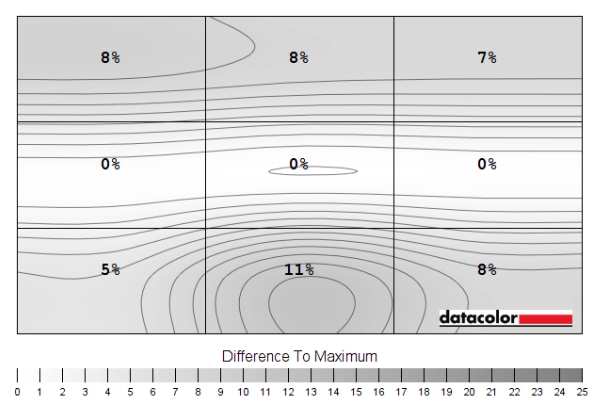
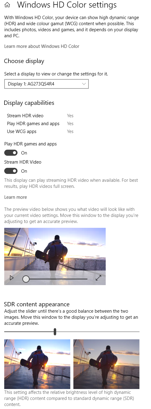
Whilst observing a black background in a dark room, using our ‘Test Settings’, we noticed some backlight bleed and slight clouding, particularly towards the bottom left of the screen. It’s important to remember that individual units vary when it comes to backlight bleed and clouding. The image below shows the results on our unit, taken a sufficient distance back to eliminate ‘IPS glow’. This is most noticeable towards the bottom corners of the screen, from a normal viewing position. It appears as a cool-tinted haze towards the bottom left and a cool-tinted greenish grey haze towards the bottom right. It ‘blooms out’ from sharper viewing angles and from some position takes on a slightly golden hue, as demonstrated in the viewing angles video later on. The luminance uniformity was moderate overall. The brightest point recorded was ‘quadrant 5’ in the centre of the screen (166.3 cd/m²). The greatest deviation from this occurred at ‘quadrant 1’, towards the top left (141.8 cd/m², which is 15% dimmer). The average deviation between each quadrant and the brightest point was 12.38%, which is fair. Each of the measured points outside of the central region had luminance levels within 6% of each other, it was really the central point that was the outlier here and somewhat brighter than the rest of the screen. Not sufficiently so to create a ‘spotlighting’ effect or anything of that nature, more of a gentle transition thankfully. It’s important to remember that uniformity varies between individual units and you can also expect variation beyond the points measured. The contour maps below show these deviations graphically, with darker greys representing lower luminance and hence greater deviation from the brightest recorded point than lighter greys. Percentage deviations between each quadrant and the brightest point are also given. The SpyderX Elite was also used to analyse variation in the colour temperature (white point) for the same 9 quadrants. The deviation between each quadrant and the quadrant closest to the 6500K (D65) daylight white point target was analysed and a DeltaE value assigned. A DeltaE >3 represents significant deviation that most users could readily notice by eye. The colour temperature uniformity was good. Significant deviation was recorded beneath the central point, although just beyond the significance boundary at a DeltaE 3.1. It’s again important to remember that individual unit vary when it comes to uniformity and that deviation beyond the measured points should be expected. On Battlefield V the monitor provided a reasonable contrast performance. Darker elements such as dimly lit interiors didn’t look overly deep and atmospheric. The static contrast wasn’t high enough to provide a ‘deep and inky’ appearance to darker shades, particularly if viewed in dimmer lighting conditions. But it was improved compared to weaker IPS-type panels in that respect, at least sitting quite close to 1000:1. There was a moderate amount of ‘IPS glow’ most noticeably towards the bottom corners of the screen from a normal viewing position. This ate away at dark detail and atmosphere, introducing a cool-tinted haze – a pretty typical level of this for the size of screen, though. The consistent gamma performance ensured detail levels were largely appropriate throughout the screen, with the experience free from the shifts in perceived gamma associated with VA and moreover TN panels. This avoided giving a ‘blocky’ or ‘banded’ appearance from excess detail, brought out on other panel types by perceived gamma being too low near the peripheral regions of the screen. Brighter content stood out well against darker surroundings and appeared fairly smooth without obtrusive graininess, only a light mist from the screen surface rather than anything more obtrusive. Shadow of the Tomb Raider provided a similar experience. With plenty of dark caves and other dimly lit locations, illuminated by just a few point sources of light, this title looks most inviting where contrast performance is strong. We certainly wouldn’t say the monitor provided a deep and atmospheric look to such scenes, but it wasn’t poor in that respect either. Moderate ‘IPS glow’ again came into play, as did reasonable but not particularly strong static contrast. Brighter elements stood out nicely, with the screen surface impeding this a lot less than some matte surfaces. The ‘very light’ nature of the screen surface made such elements appear quite ‘pure’ in a way that’s lost in many cases. Whilst the contrast may not be as strong as on competing VA models, the screen surface is somewhat lighter so the BenQ has an edge in that respect. The strong gamma consistency also came into play, preventing excessive detail peripherally or things appearing too blended centrally (‘black crush’, which VA models are known for). We made similar observations using the film Star Wars: The Last Jedi. As with Tomb Raider, this title has plenty of dark scenes that are lit up with a few sources of light. Lightsaber battles in dimly lit interiors, explosions in the deep depths of space and suchlike, which all look their most spectacular where contrast is strong. The monitor didn’t provide a particularly cinematic look to such scenes in terms of contrast, but it was quite reasonable. Especially if viewing in a relatively well-lit room rather than under dimmed lighting. The screen surface again kept obtrusive graininess or an obvious smeary appearance out of the equation, whilst the consistent gamma handling helped avoid excessive details. This consistent gamma handling is most welcome on heavily compressed streamed content, where so-called compression artifacts may be brought out in a particularly obvious way. This sort of ‘blocky’ or ‘banded’ appearance was avoided here as things appeared appropriately well-blended rather than excessively detailed. The Lagom tests for contrast allow specific weaknesses in contrast performance to be identified. The following observations were made. The BenQ EW3280’s colour gamut (red triangle) was compared with the sRGB (green triangle) and DCI-P3 (blue triangle) reference colour spaces using our ‘Test Settings’, as shown below. The gamut fully covers sRGB, with significant extension beyond. We measured 96% DCI-P3 coverage and although not shown on the graphic, 86% Adobe RGB coverage. This gamut is appropriate for HDR content, where DCI-P3 is the target colour space and therefore good coverage of it is desirable. It also gives the monitor the potential to output all shades within the sRGB colour space (for normal SDR content), with a good dose of extra saturation and vibrancy. The gamut below shows results using our ‘Test Settings’ with this driver tweak applied. The colour gamut now covers 99% sRGB with a very small amount of extension beyond. This is a useful setting if you’re an AMD user and wish to gain close tracking of the sRGB gamut without profiling, including in applications that aren’t colour-managed. Or simply wish to retain greater flexibility with the OSD settings, including colour channel and gamma adjustment. The monitor provided a vibrant and varied palette of colours on Battlefield V. As with most SDR content, this game is designed with the sRGB colour space in mind. When viewed on a monitor with a wider gamut, shades are represented in a more saturated way. The increased saturation was evident here, due to considerable extension in the gamut beyond sRGB. This boost in saturation was applied quite evenly, though, and provided a very different look to what a digital saturation boost would achieved. Such as increasing ‘Saturation’ in the OSD or using Nvidia’s ‘Digital Vibrance Control’ to increase saturation. Such methods push shades closer to the edge of the gamut but don’t expand the gamut itself, crushing things together. Contrasting with the varied look here, achieved by appropriate spacing being maintained between shades on the gamut. There were some quite eye-catching vibrant elements such as roaring fires, with very rich yellows and oranges. Some of the yellows verged on orange and oranges on red, but the variety was certainly there. Vegetation and earthy browns in the environment looked somewhat less pastel than they should in places for similar reasons, but there was again a nice variety of shades. Including some very rich reddish browns, lush and deep greens and a nice palette of shades that were far more muted in comparison. Shadow of the Tomb Raider provided a similar experience. There was a nice range of deep and lush greens, alongside a good palette of more muted shades. Saturation was again stronger than intended for many of these shades, but the variety remained and things didn’t look ‘cartoonish’ for this reason. Skin tones in this game and woody tones had some red hues which were brought out a bit too strongly by the colour gamut, but this was not extreme in our view. Lara Croft appeared to have something of a ‘healthy’ tan rather than appearing sunburnt of lobster-like. Speaking of lobsters, we also observed various episodes of the animated TV series Futurama. There are large blocks of individual colour on this title, highlighting weaknesses in colour consistency very readily. The monitor performed well in this respect. The red of Dr Zoidberg (a talking lobster-like creature) appeared rich and punchy regardless of where on the screen he appeared, for example. Contrasting with VA and moreover TN panels where the red would appear less saturated in some regions of the screen. There were some nice vibrant neon shades such as greens and oranges. Whilst muted pastel shades appear more saturated than they should, the variety was maintained and they still appeared much more muted than the more lively shades. Lagom’s viewing angle tests help explore the idea of colour consistency and viewing angle performance. The following observations were made from a normal viewing position, eyes ~70cm from the screen. On some monitors, particularly but not exclusively those with high refresh rates, interlace patterns can be seen during certain transitions. We refer to these as ‘interlace pattern artifacts’ but some users refer to them as ‘inversion artifacts’ and others as ‘scan lines’. They may appear as an interference pattern, mesh or interlaced lines which break up a given shade into a darker and lighter version of what is intended. They often catch the eye due to their dynamic nature, on models where they manifest themselves in this way. Alternatively, static interlace patterns may be seen with some shades appearing as faint horizontal or vertical bands of a slightly lighter and slightly darker version of the intended shade. We did not observe either artifact type on this monitor. A small utility called SMTT 2.0 was used alongside a sensitive camera to analyse the latency of the EW3280U, with over 30 repeat readings taken to help maximise accuracy. Using this method, we calculated 3.13ms (around 1/5th of a frame at 60Hz) of input lag. This value reflects both the element you ‘see’ (pixel responsiveness) and the element you ‘feel’ (signal delay). It indicates an impressively low signal delay which even sensitive users should find absolutely fine. Note that we don’t have the means to accurately measure input lag with Adaptive-Sync active in a variable refresh rate environment or with HDR active in an HDR environment. Our article on responsiveness explores the key concepts related to monitor responsiveness. This includes an important concept called ‘perceived blur’, which is contributed to by both the movement of your eyes as you track motion on the screen and the pixel responses of the monitor. The first factor is responsible for most of the perceived blur you observe on a modern monitor, but the second also plays an important role. The article also describes a photography technique called ‘pursuit photography’, which uses a moving rather than stationary camera to capture motion in a way that reflects both elements of perceived blur. In contrast, a stationary camera, whether taking a picture or video, will only reflect pixel responsiveness. The images below are pursuit photographs taken using the UFO Motion Test for ghosting, with the test running at 960 pixels per second. This is a good practical speed for capturing such photographs and highlights both elements of perceived blur nicely. The UFOs move across the screen from left to right at a frame rate matching the refresh rate of the display, which is 60Hz (60fps) in this case. All background shade levels (dark, medium and light) were used with the monitor set to various ‘AMA’ (Advanced Motion Acceleration) pixel overdrive settings; ‘OFF’, ‘High’ and ‘Premium’. The final two columns show reference displays, both set to what we consider their optimal pixel overdrive settings. The first reference display is the Philips 328E1CA, a competing VA model. The second reference display is the AOC AG273QCG, a fast and well-tuned TN model that shows how things look where pixel responses aren’t really a limiting factor. The UFOs appear broad and fairly softly focused, without clear internal detailing. This reflects a moderate level of perceived blur due to eye movement and is also seen on the reference displays. There are also varying degrees of trailing behind the UFOs, caused by weaknesses in pixel responsiveness. With the ‘OFF’ setting, the trailing is most pronounced – but even here, there’s less of a bold initial trail than on the VA reference screen. The ‘High’ setting cuts down on this trailing. There remains a bit of ‘powdery’ trailing which is most pronounced for the dark background (top row) and just a whiff of this for the medium background (middle row). The light background (bottom row) has no noticeable conventional trailing behind the object, although this a small trace of overshoot or inverse ghosting in the form of a ‘halo’ trailing that’s slightly brighter than the background. The ‘Premium’ setting ramps the pixel overdrive up considerably, removing any conventional trailing but replacing it with obvious and in places colourful overshoot. This is most noticeable and eye-catching for the medium background but quite obtrusive in practice for the light background as well. From this assessment we consider ‘High’ to be the optimal setting and it brings the monitor neatly between the two reference displays really. But closer to the fast TN reference really. You may also notice some patchiness to the background in places. This is temporary image retention that we only observed on the BenQ during this test or for a short while after it was run. It soon disappeared when using the monitor normally and is something we’ve observed on quite a few models when running this test. So it’s not something to worry about, but worth pointing out for those curious. There was a moderate degree of perceived blur on Battlefield V, mainly related to eye movement and linked to the 60Hz refresh rate. There were some minor weaknesses beyond that, caused by some slower than optimal pixel responses. Similar to what was shown earlier using the UFO Motion Test for ghosting, there was a bit of ‘powdery’ trailing in places. This was strongest where there was a fair contrast in shade level between the object and background – a dark tree trunk against a twilight sky, for example. Even then it was far removed from the sort of ‘smeary’ trailing typically observed on VA models for such transitions. The effect on perceived blur was therefore not as pronounced and these weaknesses were not as widespread, either. There was also a touch of overshoot for a select few transitions, usually manifesting as some ‘halo’ trailing that was slightly brighter than the object or background shade. Or slightly ‘dirty’ trailing that was a touch darker than either the object or background shade. This was light and well-blended overshoot, though, and didn’t affect many pixel transitions using our preferred ‘AMA = High’ setting. We made similar observations on Shadow of the Tomb Raider. There were plenty of ‘high contrast’ transitions here, with bright shades such as fire or small patches of sunlight surrounded by darkness. This brought out a bit of ‘powdery’ trailing as described earlier, at an untroublesome level which had minimal impact on overall perceived blur. Again, much less pronounced than the weaknesses on competing VA models. Most of the pixel transitions were performed optimally, without adding additional trailing. There was again a touch of overshoot in places, but this wasn’t something we found eye-catching nor was it widespread. We also observed video content at a range of frame rates. This included ~24 – 30fps content on platforms such as Netflix and 60fps YouTube content. The higher frame rate content showed the same minor weaknesses observed when gaming at 60fps. For the lower frame rate content, the frame rate itself is the main barrier to visual fluidity. The pixel response requirements are significantly lower and there were no standout weaknesses. There was just a touch of overshoot in places, but this was very faint and difficult to notice. As an Amazon Associate I earn from qualifying purchases made using the below link. Where possible, you’ll be redirected to your nearest store. Further information on supporting our work. AMD FreeSync is a variable refresh rate technology, an AMD-specific alternative to Nvidia G-SYNC. Where possible, the monitor dynamically adjusts its refresh rate so that it matches the frame rate being outputted by the GPU. Both our responsiveness article and the G-SYNC article linked to explore the importance of these two elements being synchronised. At a basic level, a mismatch between the frame rate and refresh rate can cause stuttering (VSync on) or tearing and juddering (VSync off). FreeSync also boasts reduced latency compared to running with VSync enabled, in the variable frame rate environment in which it operates. FreeSync requires a compatible AMD GPU such as the Radeon RX 580 used in our test system. There is a list of GPUs which support the technology here, with the expectation that future AMD GPUs will support the feature too. The monitor itself must support ‘VESA Adaptive-Sync’ for at least one of its display connectors, as this is the protocol that FreeSync uses. The EW3280U supports FreeSync via DP and HDMI on compatible GPUs and systems. Note that HDR can be activated (at the same time as FreeSync) via DP 1.4 or HDMI 2.0. Recent AMD drivers make activation of the technology very simple and something that usually occurs automatically. You should ensure the GPU driver is setup correctly to use FreeSync, so open ‘AMD Radeon Software’, click ‘Settings’ (cog icon towards top right) and click on ‘Display’. You should then ensure that the first slider, ‘Radeon FreeSync’ is set to ‘Enabled’ as shown below. To configure VSync, open ‘AMD Radeon Software’. Click ‘Settings’ (cog icon towards top right) and click ‘Graphics’. The setting is listed as ‘Wait for Vertical Refresh’. This configures it globally, but if you wish to configure it for individual games click ‘Game Graphics’ towards the top right. The default is ‘Off, unless application specifies’ which means that VSync will only be active if you enable it within the game itself, if there is such an option. Such an option does usually exist – it may be called ‘sync every frame’ or something along those lines rather than simply ‘VSync’. Most users will probably wish to enable VSync when using FreeSync to ensure that they don’t get any tearing. You’d therefore select either the third or fourth option in the list, shown in the image below. Above this dropdown list there’s a toggle for ‘Radeon Enhanced Sync’. This is an alternative to VSync which allows the frame rate to rise above the refresh rate (no VSync latency penalty) whilst potentially keeping the experience free from tearing or juddering. This requires that the frame rate comfortably exceeds the refresh rate, not just peaks slightly above it. We won’t be going into this in detail as it’s a GPU feature rather than a monitor feature. We played various games on the monitor with FreeSync enabled and as usual found the technology worked in much the same way on all of them. Any issues identified on a particular title would suggest a game or GPU driver issue rather than a monitor issue. We’ll therefore just focus on a single title for this section; Battlefield V. This title offers sufficient flexibility with its graphics options to test the full range 40 – 60Hz (40 – 60fps) variable refresh rate range of the monitor. The Radeon RX 580 used in our test system for this section is far from a powerhouse, so expecting a consistent 60fps at 3840 x 2160 is unrealistic in most scenarios. Without FreeSync enabled, even slight drops below this would cause obvious (to us) tearing with Vsync disabled or obvious (to us) stuttering with VSync enabled. Having such interruptions removed was certainly nice. But the dips in frame rate could still be seen and felt. As frame rate dipped closer to the 40fps floor of operation, we noticed a significant drop off in ‘connected feel’ and increase in perceived blur simply because the frame rate was significantly reduced. We also noticed an increase in overshoot, but this was far from extreme and isn’t a major issue on this model even near the floor of operation. This is due to Adaptive-Sync models like this lacking the variable overdrive technology that models with a G-SYNC module offer. This re-tunes the pixel overdrive as refresh rate drops. So things remain appropriately optimised, without excessive voltage surges that can cause strengthening overshoot as refresh rate dips. Dips below the 40fps (40Hz) floor were not unheard of, either, which causes the technology to deactivate so tearing and stuttering ensue. LFC (Low Frame Rate Compensation) is not used as that would require the ceiling of operation to be at least twice the floor of operation. That’s the usual state of things for 60Hz Adaptive-Sync models and actually some are even more restricted than this, with a 48 – 60Hz variable refresh rate range. As noted earlier, AMD FreeSync makes use of Adaptive-Sync technology on a compatible monitor. As of driver version 417.71, users with Nvidia GPUs (GTX 10 series and newer) and Windows 10 can also make use of this Variable Refresh Rate (VRR) technology. When a monitor is used in this way, it is something which Nvidia refers to as ‘G-SYNC Compatible’. Some models are specifically validated as G-SYNC compatible, which means they have been specifically tested by Nvidia and pass specific quality checks such as the inclusion of effective variable overdrive. The make use of the technology, you need to connect the monitor up via DisplayPort. When you open up Nvidia Control Panel, you should then see ‘Set up G-SYNC’ listed in the ‘Display’ section. Ensure the ‘Enable G-SYNC, G-SYNC Compatible’ checkbox as well as ‘Enable settings for the selected display model’ is enabled as shown below. Press OK – the monitor should briefly flick off then on again and the technology should be active. HDR (High Dynamic Range) on an ideal monitor involves the simultaneous display of very bright light shades and very deep dark shades. The monitor should also be able to display a strong variety of shades between these extremes, including highly saturated vivid shades alongside much more muted ones. The monitor would ideally support per-pixel illumination (backlightless technology such as OLED, for example) or at least offer a very large number of dimming zones controlled with strong precision. A solution such as FALD (Full Array Local Dimming) with a very high number of dimming zones, for example. This sort of solution allows some areas of the image to remain very dim whilst others show brilliant high luminance levels. Colour reproduction is also an important part of HDR, with the ultimate goal being support for a huge colour gamut, Rec. 2020. A more achievable near-term goal is support for at least 90% DCI-P3 (Digital Cinema Initiatives standard colour space) coverage. Finally, HDR makes use of at least 10-bit precision per colour channel, so its desirable that the monitor supports at least 10-bits per subpixel. The HDR10 pipeline is the most widely supported HDR standard used in HDR games and movies and the pipeline supported by this model. For most games and other full screen applications that support HDR, the BenQ EW3280U automatically switches into its HDR operating mode. As of the latest Windows 10 update, relevant HDR settings in Windows are found in ‘Windows HD Color settings’ which can be accessed via ‘Display settings’ (right click the desktop). Most game titles will activate HDR correctly when the appropriate in-game setting is selected. A minority of game titles that support HDR will only run in HDR if the setting is active in Windows as well. Specifically, the toggle which says ‘Play HDR games and apps’. If you want to view HDR movies on a compatible web browser, for example, you’d also need to activate the ‘Stream HDR Video’ setting. These settings are shown below. Also note that there’s a slider that allows you to adjust the overall balance of SDR content if HDR is active in Windows. This is really just a digital brightness slider, so you lose contrast by adjusting it. When viewing SDR content with HDR active in Windows things appear over-sharpened with upset image balance. The sharpness can be curtailed using the OSD, but things really don’t look like they should and you lose your regular OSD brightness control. We’d recommend only activating HDR in Windows if you’re about to specifically use an HDR application that requires it, and have it deactivated when viewing normal SDR content on the monitor. We’ll simply focus on two titles for this section; Battlefield V and Shadow of the Tomb Raider. These are titles we’ve tested on many HDR-capable monitors and we know offer a good experience on monitors with appropriate HDR capability. The experience we describe here is largely dictated and limited by the screen itself. Although our testing here is focused on HDR PC gaming using DisplayPort, we made similar observations using HDMI. The observations apply to other HDR content, such as movies, and also running HDR on compatible games consoles. The monitor includes three ‘HDR Mode’ settings; ‘Game HDRi’, ‘Cinema HDRi’ and ‘Display HDR’. The ‘HDRi’ settings both include ‘Brightness Intelligence +’, which as explored earlier isn’t a feature we’re keen on either under SDR or HDR. With these ‘HDRi’ settings the monitor appeared far too cool-tinted and not particularly ‘HDR’ in appearance in most lighting. The ‘Cinema HDRi’ setting, specifically, modified the gamma curve for a somewhat deeper and cinematic look. At the expense of crushing shades together, particularly for darker content. We preferred using the better balanced ‘Display HDR’ setting, which did not make adjustments using the light sensor. And will be focusing on that for the rest of this section. As usual for HDR implementations, a sharpening filter is applied with moderate strength by default. This is designed to slightly accentuate the enhanced bit depth and (doesn’t apply here) enhanced contrast under HDR. This model offers good flexibility with sharpness, with the ‘Sharpness’ control in the ‘Picture’ section of the OSD unlocked. We preferred setting this to a neutral value of ‘5’ and felt it was quite redundant given the high pixel density of this model, although the high pixel density made the filter effect appear less ‘ugly’ than on some models as well. Either way, being able to adjust this according to preferences is a nice flexibility to have and isn’t usually a flexibility offered by monitors under HDR. The BenQ EW3280U is VESA DisplayHDR 400 certified. This is the lowest level that VESA certifies for and therefore means that only a basic HDR experience is offered. One area of the VESA DisplayHDR 400 requirements are not just met but comfortably exceeded is colour gamut. We recorded a colour gamut of 96% DCI-P3 on the BenQ, as shown in the gamut representations below. These are taken from the colour reproduction section of the review. The red triangle shows the monitor’s colour gamut, the blue triangle DCI-P3 and the green triangle sRGB. Because DCI-P3 is the near-term standard game developers and HDR movie directors have in mind when creating HDR content, it makes sense to have good coverage of this colour space for HDR purposes. This good match between content and monitor capability allowed more accurate output. Some of the oversaturation we observed on both titles was curtailed. For example, some woody tones which had an overly aggressive red hue and some pastel greens appearing less muted than intended under SDR. There were plenty of more vibrant elements including eye-catching brightly painted objects, vivid red and purple flowers and some good deep and lush-looking green vegetation. So there were some shades displayed that were clearly beyond the boundaries of the sRGB colour space, displayed alongside appropriate natural-looking shades. Whilst this scene highlighted the nuanced shade variety very nicely, it also looked far less spectacular than it does on much more capable HDR performers. VESA DisplayHDR 400 does not mandate any local dimming and has a more restrictive brightness requirement than higher DisplayHDR levels. This scene is a daylight scene with plenty of bright to very bright content, but also some medium and dimmer content. With the moderately high peak brightness (by HDR standards), the bright elements appeared quite bright. But without the eye-catching ‘pop’ we’ve seen on some of the more capable HDR performers with exceptionally high peak luminance. Furthermore, the darker elements did not have the depth they ideally would have. Alas; this is a limitation of global dimming, with the backlight having to settle as a single unit to a level that ‘suits’ the overall scene. The backlight did globally dim and brighten based on overall scene brightness, essentially enhanced Dynamic Contrast behaviour that also responds to HDR metadata. The backlight brightness was elevated somewhat if there was a hint of anything much brighter than black on the screen, raising the black point and bringing in that moderate ‘IPS glow’. Although it did at least remain dimmer than if Dynamic Contrast wasn’t used and the monitor was just pumping out its maximum luminance. The overall appearance even for such dark-biased scenes was far from deep or atmospheric, even if viewed in a moderately bright room. The overall look was a bit less ‘flooded’ than we’ve seen on some models under similar circumstances, but effective local dimming and greater static contrast performance would certainly improve things here. The section of the video review below focuses on the HDR performance of the monitor and runs through various examples on both test titles. Our article on the 3840 x 2160 ‘4K’ UHD experience takes a look at what you can expect from the resolution in games, movies and on the desktop. The article explores the resolution from the perspective of a ~28” screen. The BenQ offers a larger 32” screen, providing a pixel density of 137.68 PPI (Pixels Per Inch). Whilst this isn’t as high as a 27-28” screen, it’s still on the high side and gives a distinct ‘4K’ appearance to content of suitable resolution. The larger screen size also lends itself well to viewing without scaling, or to lower levels of scaling or application-specific zoom than would be required on a smaller screen. From our preferred viewing distance of ~70cm, we found the screen perfectly useable without any scaling at all. Individual preferences will vary in this respect. With this, the monitor provided excellent ‘desktop real-estate’, which is to say there was a great deal of useful workspace on the desktop and excellent multi-tasking potential. Text clarity was also very strong. As covered in the ‘4K experience’ article, this is also the case if you use scaling. Provided the text scales ‘cleanly’, which it does in most cases. The following images give a rough idea of the sort of work space you can expect, but are purely for illustration and don’t reflect how the monitor would appear in person. It might be necessary or desirable to run the monitor at a lower resolution than 3840 x 2160, perhaps because you’re using a system such as an older games console that doesn’t support ‘4K’ UHD output or to reduce graphical demand. The monitor supports scaling functionality on all display inputs. A range of refresh rates are supported when running in 1920 x 1080 (‘1080p’ Full HD), up to a 60Hz maximum. This is covered in features and aesthetics section. The monitor also supports scaling at 2560 x 1440 (WQHD), but only 60Hz is selectable. To ensure the monitor rather than GPU is handling the scaling process, you need to make sure the GPU driver is set up correctly. For AMD GPU users the monitor will handle the scaling by default, when gaming at non-native resolutions. Nvidia users should open the Nvidia Control Panel and navigate to ‘Display – Adjust desktop size and position’. They should ensure that ‘No Scaling’ is selected and ‘Perform scaling on:’ is set to ‘Display’ as shown below. There are three scaling modes listed under ‘Picture’ – ‘Advanced’ – ‘Display Mode’ in the OSD; ‘Full’, ‘Aspect’ and ‘1:1’. The ‘Full’ setting uses an interpolation process to use all pixels on the screen to display the image. The ‘Aspect’ setting will do the same whilst respecting the aspect ratio of the source resolution (it’s greyed out if a 16:9 resolution is selected). The ‘1:1’ setting is a 1:1 pixel mapping mode which will only use the pixels called for in the source resolution when displaying an image. A black border is displayed for remaining pixels. Naturally, it’s greyed out and doesn’t apply when running the monitor at its native resolution. When running the monitor in the 1920 x 1080 (‘1080p’ Full HD) resolution with interpolation, there was moderate softening compared to running a display of this size at the resolution natively. This could be counteracted to an extent by increasing the ‘Sharpness’ setting in the OSD, which can be set between ‘1’ and ‘10’ in single unit increments. Or ‘Super Resolution’ which can be set between ‘0’ (off) and ‘3’ (strongest effect). We found setting ‘Sharpness’ and ‘9’ worked quite well, but everyone will have their own preferences. It didn’t have all of the natural quality or clarity of a native Full HD display, with some elements appear over-sharpened and others a bit soft and undetailed. But it was certainly one of the more reasonable interpolation processes we’ve seen on a UHD monitor and it’s good to have flexibility with multiple sharpness filter options. For the 2560 x 1440 (WQHD) resolution the interpolation performance was quite impressive. Things again didn’t appear as crisp and detailed as a native WQHD display of this size, but not bad by any means. We preferred how things looked following a slight bump up in ‘Sharpness’ to ‘7’, taking the edge off the softening whilst introducing a little over-sharpening in places. People will again have their own preferences for the balance here, but we certainly found the monitor quite useable in this resolution and the overall image representation and flexibility better than most we’ve come across. As usual, if you’re running the monitor at 3840 x 2160 and viewing 1920 x 1080 content (for example a video over the internet or a Blu-ray, using movie software) then it is the GPU and software that handles the upscaling. That’s got nothing to do with the monitor itself – there is a very small amount of softening to the image compared to viewing such content on a native Full HD monitor, but it’s slight and shouldn’t bother most users. The video below shows the monitor in action. The camera, processing done and your own screen all affect the output – so it doesn’t accurately represent what you’d see when viewing the monitor in person. It still provides useful visual demonstrations and explanations which help reinforce some of the key points raised in the written piece. We don’t try to hide the fact we like the combination of ~32” screen size and 3840 x 2160 (‘4K’ UHD) resolution. In our view, it’s something of a sweet spot in terms of physical size, on-screen real estate and pixel density. With this, the EW3280U is able to deliver a productive work area where relatively low levels of scaling (if any at all) is required, whilst delivering excellent clarity and detail for suitably high resolution content. Whilst the tilt-only stand won’t be to everyone’s taste, the screen size is pretty enveloping, and the mount position should work for many users. If not, 100 x 100mm VESA holes are included for greater flexibility. We found the rustic aesthetic quite endearing, something we weren’t too sure of before seeing a model with this sort of design in person. It was visually a bit more interesting than most monitors, without appearing tacky and blending into its ‘deskly’ surroundings quite nicely. The addition of the OSD remote and integrated subwoofer were appreciated too – sometimes it’s the little things that help. The monitor put in a contrast experience that was consistent with our expectations. With such a large IPS-type panel, ‘IPS glow’ was certainly a feature. And that ate away at detail and atmosphere for darker content, especially if viewed in fairly dim lighting. Gamma consistency was excellent, though, so there wasn’t extra detail revealed for darker content towards the edges – something some VA competitors are particularly prone to. The static contrast was very close to the specified 1000:1, so stronger than some IPS-type models and a bit weaker than others. We found the very light matte anti-glare screen surface more agreeable than on many ‘4K’ UHD models. There was a fine ‘misty’ graininess, but this is something most users will find unobtrusive and perhaps not even notice at all. The screen surface didn’t create an obvious window or layer over the image, either, so the vibrancy and clarity potentially was preserved very nicely. The main strength of the monitor comes from its colour reproduction prowess, with excellent consistency ensuring shades remain vibrant not just centrally but also towards the edges of the screens. Free from the sort of shifts in perceived saturation associated with other panel types of anywhere near this size. The generous colour gamut (96% DCI-P3 measured) injected a good amount of extra vibrancy and saturation to the typical content you consume, which is created with the narrower sRGB colour space in mind. Many will like this look, although it isn’t for everyone. The monitor provided a useable sRGB emulation setting, although gamma was locked at a setting that was somewhat too high and you don’t have the flexibility to adjust colour channels. The monitor also provides VESA DisplayHDR 400 capability. This allows the colour gamut to be put to appropriate use, alongside 10-bit colour reproduction. This brought out a greater nuanced shade variety and provided a more natural and appropriate look to various elements, with the strong saturation levels and vibrancy only where the developers intend it to be. The brightness under HDR was decent but not spectacular by HDR standards and no local dimming is supported. So it was far from the most engaging HDR experience and certainly far from ‘full fat’ in that respect. The monitor provided pretty solid 60Hz responsiveness as well. Low input lag was coupled with pixel responses that were, on the whole, sufficiently fast for a very good 60Hz experience. There were a few weaknesses here and there including a bit of ‘powdery’ trailing and a little overshoot, but nothing obnoxious or eye-catching in our view. And certainly nothing that compares to the sort of weaknesses observed on competing VA models. Adaptive-Sync did its thing, at least via AMD FreeSync on our AMD GPU, to get rid of tearing and stuttering from frame and refresh rate mismatches. The effective range of operation was at the typical higher end for a 60Hz Adaptive-Sync model (40 – 60Hz), so it doesn’t give as much flexibility as some might like. The technology didn’t work at all on our Nvidia GPU (‘G-SYNC Compatible Mode’) due to screen blanking issues, but BenQ never claimed that it would work. And we’ve received solid feedback that it works correctly with newer GPUs, including the RTX 20 series. The monitor provides a good and flexibility interpolation process to handle non-native resolutions, too. We found its handling of 2560 x 1440 particularly impressive, better than most ‘4K’ models we’ve come across in that respect, really. Overall, the monitor put in a good all-round performance. A stronger contrast performance would’ve rounded things off nicely, but this wasn’t something we expected for the panel. Competing VA models are perhaps the more tempting (and cheaper) option if strong contrast is a primary consideration. But you then sacrifice things like the excellent colour consistency, smoother and lighter screen surface and competent 60Hz responsiveness. Smaller niggles such as the limited stand adjustability and lack of useable variable refresh rate solution for Nvidia GPU users are also considerations. But shouldn’t be considered deal-breakers when considering what’s otherwise a very well-rounded product. The bottom line; a solid all-round performer with clear strengths in terms of colour reproduction and competent 60Hz responsiveness, but lovers of strong contrast or those with a lower budget should consider VA alternatives.

The SpyderX Elite was used to assess the uniformity of lighter shades, represented by 9 equidistant white quadrants. The luminance of each quadrant was measured and compared to the brightest measured quadrant. The table below shows these values as well as the percentage deviation between each quadrant and the brightest point measured.

Luminance uniformity table
Luminance uniformity map

Colour temperature uniformity map
Contrast in games and movies
Lagom contrast tests
Colour reproduction
Colour gamut

Colour gamut 'Test Settings'
The monitor also offers an sRGB emulation setting – accessible by setting the ‘Color Mode’ to ‘Rec.709’ in the ‘Color’ section of the OSD. As mentioned earlier you can adjust brightness when using this setting, but the colour channels are not accessible. The colour gamut using this setting is shown below, with things now tracking closer to the sRGB colour space. There’s slight undercoverage (98% sRGB) but essentially no extension beyond sRGB. If you have a colour-managed workflow you’d get the highest levels of accuracy by full calibration and profiling with a colorimeter or similar device using the full native gamut. But the ‘Rec.709’ offers reliable emulation of the sRGB colour space where this is not possible. Alternatively, you may wish to try the ICC profile featured in the calibration section which includes gamut mapping for colour-aware applications whilst the monitor uses its native colour gamut. Or the ICC profile created using the ‘Rec.709’ sRGB emulation setting, which corrected the gamma on our unit when using the setting from ‘2.4’ to ‘2.2’. Best results are always obtained by calibrating your own unit with your own hardware, however.

Colour gamut 'Rec.709'
Instead of setting ‘Color Mode’ to ‘Rec.709’ and putting up with the restrictions associated with that, AMD users can activate a more flexible sRGB emulation. This is done by opening ‘AMD Radeon Software’, clicking ‘Settings’ (cog icon towards top right) and clicking on ‘Display’. You should then ensure that the ‘Custom Color’ slider to the right is set to ‘Enabled’ and ‘Color Temperature Control’ set to ‘Disabled’. This is shown in the image below.


Colour gamut AMD 'CTC disabled' setting
Colour in games and movies
Viewing angles

The video below shows the Lagom text test, a mixed desktop background and dark desktop background from a variety of viewing angles. You can see relatively minor shifts in contrast and colour for the mixed desktop background, certainly less than you’d see on TN or VA models. The dark desktop background highlights ‘IPS glow’, which creates an obvious ‘bloom’ as viewing angles become steeper. Depending on angle, the glow may take on a subtle greenish-grey, cool-tinted silver or a reddish hue.
Interlace pattern artifacts
Responsiveness
Input lag
Perceived blur (pursuit photography)

Note that we will not be including a section on overclocking, as the monitor refused to display an image if set much above 60Hz at its native resolution or indeed lower resolutions such as Full HD.
Responsiveness in games and movies
FreeSync – the technology and activating it

The BenQ supports a variable refresh rate range of 40 – 60Hz. That means that if the game is running between 40fps and 60fps, the monitor will adjust its refresh rate to match. When the frame rate rises above 60fps, the monitor will stay at 60Hz and the GPU will respect your selection of ‘VSync on’ or ‘VSync off’ in the graphics driver. With ‘VSync on’ the frame rate will not be allowed to rise above 60fps, at which point VSync activates and imposes the usual associated latency penalty. With ‘VSync off’ the frame rate is free to climb as high as the GPU will output (potentially >60fps). AMD LFC (Low Frame Rate Compensation) is not supported by this monitor, as that requires the upper limit (ceiling) to be at least 2x the lower limit (floor) of FreeSync operation. FreeSync is therefore deactivated if the frame rate falls below 40fps, with the monitor then respecting your choice of VSync and presenting you with either stuttering (VSync on) or juddering and tearing (VSync off).

Some users prefer to leave VSync enabled but use a frame rate limiter set a few frames below the maximum supported (e.g. 57fps) instead, avoiding any VSync latency penalty at frame rates near the ceiling of operation or tearing from frame rates rising above the refresh rate. If you go to ‘System’ – ‘Information’ in the OSD, you will see the refresh rate listed there alongside resolution for ‘Current Resolution’. The displayed refresh rate changes if Adaptive-Sync is active and reflects the frame rate at the time of entering that section of the OSD. Provided it’s within variable refresh rate range – it is after all a refresh rate rather than frame rate being displayed. Finally, it’s worth noting that FreeSync only removes stuttering or juddering related to mismatches between frame rate and refresh rate. It can’t compensate for other interruptions to smooth game play, for example network latency or insufficient system memory. Some game engines will also show stuttering (or ‘hitching’) for various other reasons which won’t be eliminated by the technology.
FreeSync – the experience
Nvidia Adaptive-Sync (‘G-SYNC Compatible’)

You will also see in the image above that it states: “Selected Display is not validated as G-SYNC Compatible.” This means Nvidia hasn’t specifically tested and validated the display. Unfortunately the technology did not work correctly, giving frequent screen blanking. This means that the screen turned off briefly before displaying an image again and it’s something that occurred over a broad range of refresh rates. Because of this, the technology is essentially unusable. Obviously this is disappointing, although issues like this are always a possibility on models that aren’t certified by Nvidia as ‘G-SYNC Compatible’. It’s worth nothing as well that not everyone finds Adaptive-Sync to be a game-changing technology – it really depends on your own sensitivity to tearing and stuttering. We actually preferred using our GTX 1080 Ti even without this technology compared to our less powerful AMD GPU, simply as it was easier to maintain high frame rates. As explored earlier, low frame rates are still low frame rates regardless of Adaptive-Sync being active or not. According to our research some users don’t have this issue and it seems to come down to the GPU they’re using. It affects GTX 10 series cards such as the GTX 1080 Ti used in our test system, but doesn’t seem to affect the RTX 20 series and shouldn’t apply to future GPUs either.
HDR (High Dynamic Range)
Colour gamut 'Test Settings'
The monitor supports 10-bits per channel colour output, as required for HDR10 content. This is achieved with a dithering stage on the monitor (8-bit + FRC) via either DisplayPort or HDMI. The enhanced precision of the 10-bit signal provides a better nuanced shade variety. Closely matching dark shades are displayed in a way that gives dark and shaded areas a more detailed look. Lifting out detail in a natural and varied way, rather than using some sort of gamma enhancement under SDR which simply gives an unnatural or ‘flooded’ look. This greater nuanced shade variety works nicely for brighter shades as well, allowing for more natural-looking gradients. Various special effects, smoke, sun rays piercing through the clouds etc. all show smoother transitions and better subtle shade variety. The image below is from Shadow of the Tomb Raider. On one of our favourite scenes for showcasing HDR capability. Remember that the photo is purely for illustrative purposes and in no way represents how the monitor appeared running HDR in person.

The ‘4K’ UHD experience


The 32” screen with high pixel density worked nicely for gaming as well. We found the 32” screen to offer an immersive but not overwhelming experience, even from ~70cm which is our generally preferred viewing distance. The large screen size can also work nicely if you prefer sitting a bit further back. The pixel density did its thing to ensure content appeared well-defined, with a certain crispness and clarity to objects that simply isn’t delivered on models with lower pixel density. Being able to enjoy this content spread out over a relatively large screen area was also pleasant. This advantage applies even if you’ve got the graphics settings set relatively low, with objects appearing clearly defined even as you gaze into the distance on the game. Naturally, having all the eye-candy turned up is nice as well if your system allows. High-resolution textures, particle effects and suchlike all looked particularly impressive with the graphics settings ramped up. The overall look and benefits of the resolution applied in a similar way to the smaller screen analysed in our article, despite the somewhat lower pixel density. The images below show the monitor running various game titles at its native resolution. These are purely for illustrative purposes and in no way indicate how the monitor appears in person.


Interpolation and upscaling

Video review
Timestamps:
Features & Aesthetics
Contrast
Colour reproduction
HDR (High Dynamic Range)
Responsiveness
Conclusion
![]()
Positives Negatives Impressive out of the box performance and a generous colour gamut delivering a vibrant and consistent image from the IPS-type panel HDR capability lacking in terms of peak luminance and contrast, but still better than some basic HDR implementations Reasonable contrast in-line with our expectations, plus a very light matte screen surface keeping strong graininess away and helping preserve vibrancy and clarity A fair amount of ‘IPS glow’ ate away at detail and atmosphere in dark scenes A solid 60Hz performance overall, with low input lag and well-tuned pixel overdrive. FreeSync worked as intended to get rid of tearing and stuttering from frame and refresh rate mismatches Slight weaknesses in pixel responsiveness in places, Adaptive-Sync unusable with our Nvidia GPU (GTX 10 Series limitation) Excellent pixel density and desktop real estate, interesting styling, integrated subwoofer and a useful IR remote for OSD control Limited ergonomic flexibility unless alternative 100 x 100mm VESA solution is used
As an Amazon Associate I earn from qualifying purchases made using the below link. Where possible, you’ll be redirected to your nearest store. Further information on supporting our work.
