Author: Adam Simmons
Date published: July 25th 2017
Table of Contents
Introduction
We’ve tested a number of high refresh rate monitors, with most of the Full HD models (including the ViewSonic XG2401) now offering a 144Hz refresh rates. Sometimes this comes with an ‘overclock’ to something a bit higher, such as 180Hz in the case of the ASUS PG248Q. That didn’t come without negative consequences in image quality, however. The ViewSonic XG2530 supports a 240Hz native refresh rate (i.e. without overclocking), which certainly looks very good on paper and could drum up excitement amongst competitive gamers in particular. We take a look at how this works out in practice, as well as looking at other important aspects such as contrast and colour reproduction.
Specifications
The monitor uses a 24.5” 240Hz TN panel from AUO, with support for 8-bit colour (6-bit + FRC dithering) and a 1ms specified response time. As usual, we advise caution when it comes to specified response times – if they were a good indication of monitor performance, some of our testing would be rather boring and pointless. Some of the key ‘talking points’ of the monitor have been highlighted in blue below.
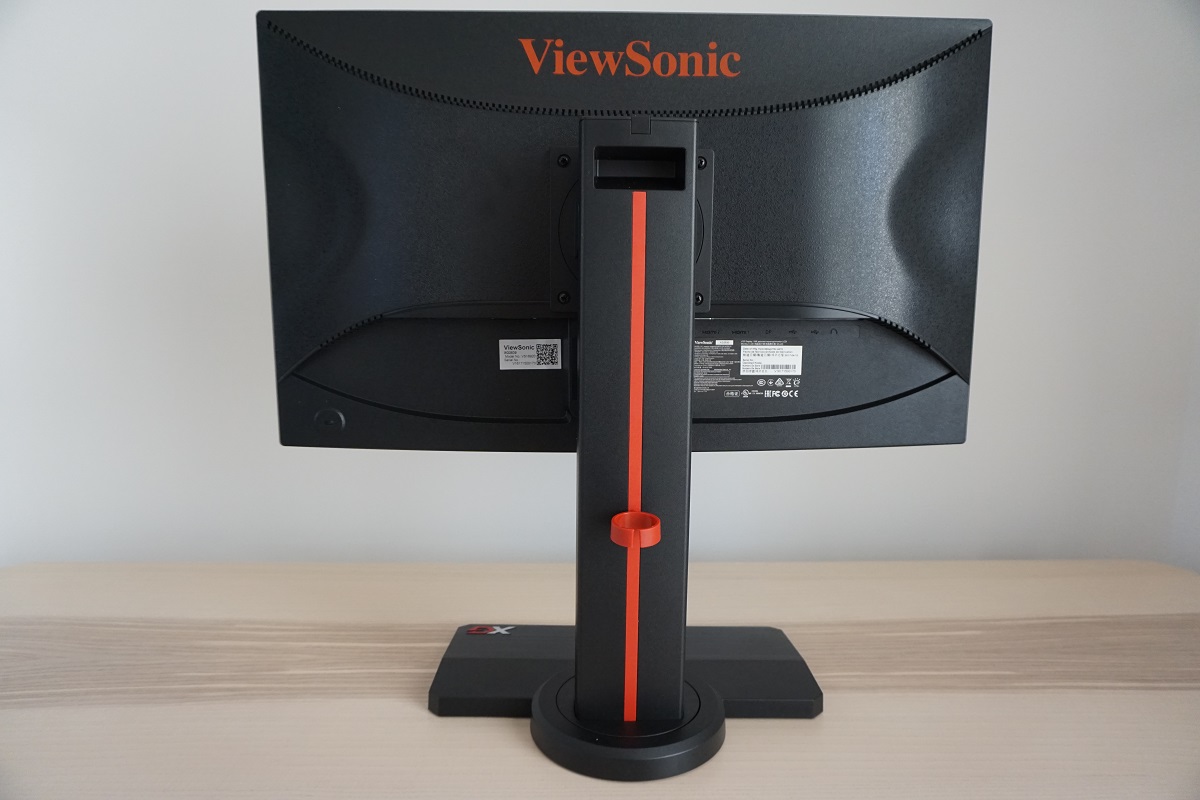
Features and aesthetics
The design language of the screen suggests ‘gaming monitor’, although not quite in the same loud and proud way associated with some models. There are a few dark red elements (in addition to some white, for the ‘X’ of ‘XG’ to identity the monitor series on the stand base) but it’s mostly matte black plastic. The stand base has a brushed texture for the most part, with an area at the rear which uses a grippier matte texture. The matte black plastic bezels are reasonably thin, with a single bezel covering pretty much all of the panel border; ~11mm (0.43 inches) at the top, ~12mm (0.47 inches) at the sides and ~26mm (1.02 inches) at the bottom in the slightly bulkier central region. The bottom bezel is curved, something of a ViewSonic signature these days. The screen surface is ‘regular’ (medium) matte anti-glare, as we explore shortly.
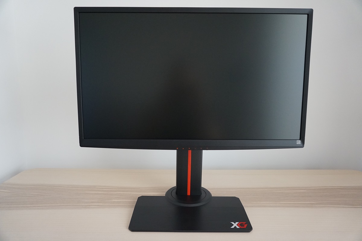
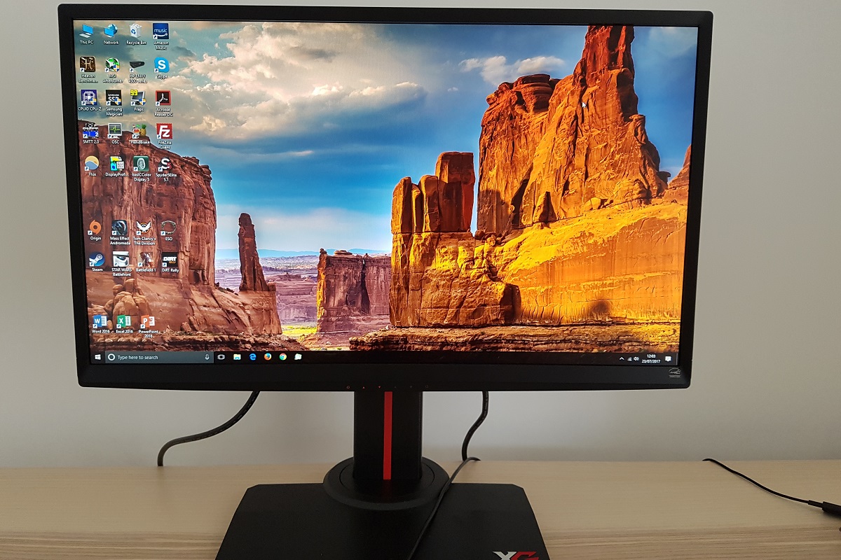
The OSD (On Screen Display) controls are pushable buttons found centrally, at the underside of the bottom bezel. The function of each button is clearly labelled at the front with painted orange labelling. There is a power LED that faces downwards and isn’t visible from a normal viewing position. This glows blue when the monitor is on and amber when it’s in a low power state. It can be disabled in the OSD, if you prefer. The following video runs through the OSD menu system.
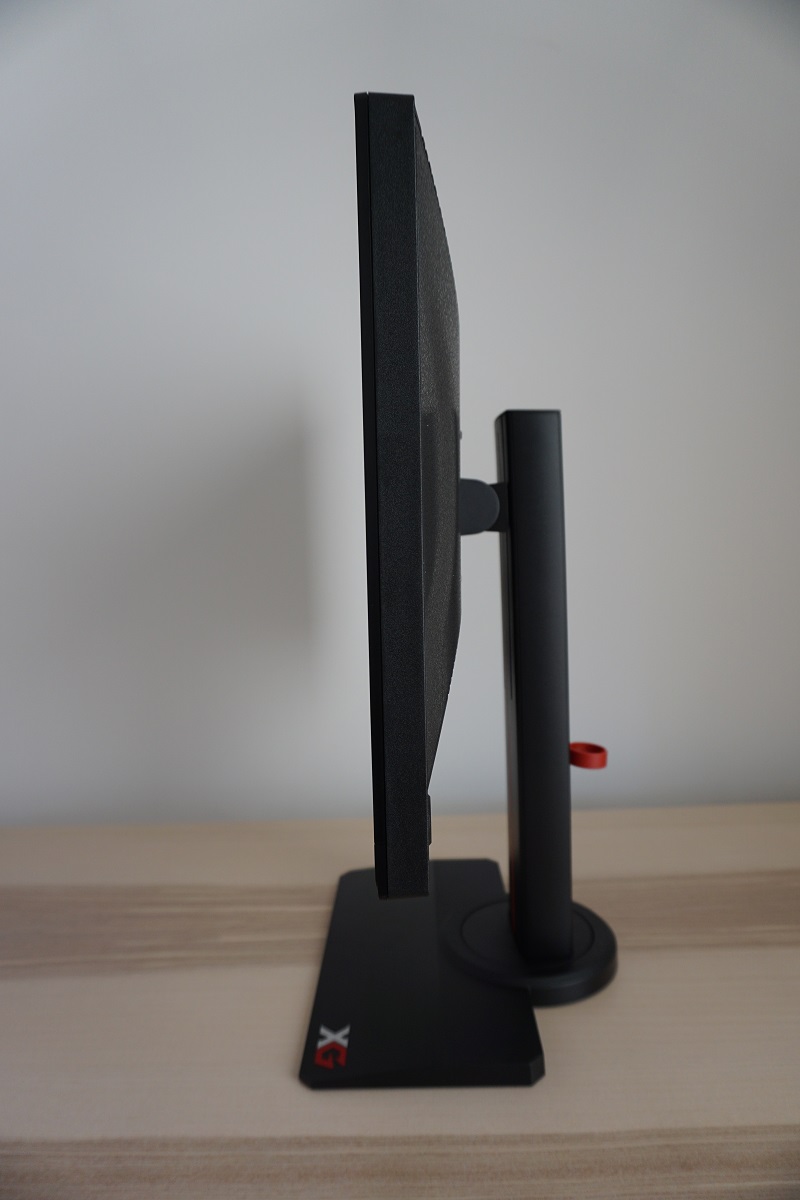
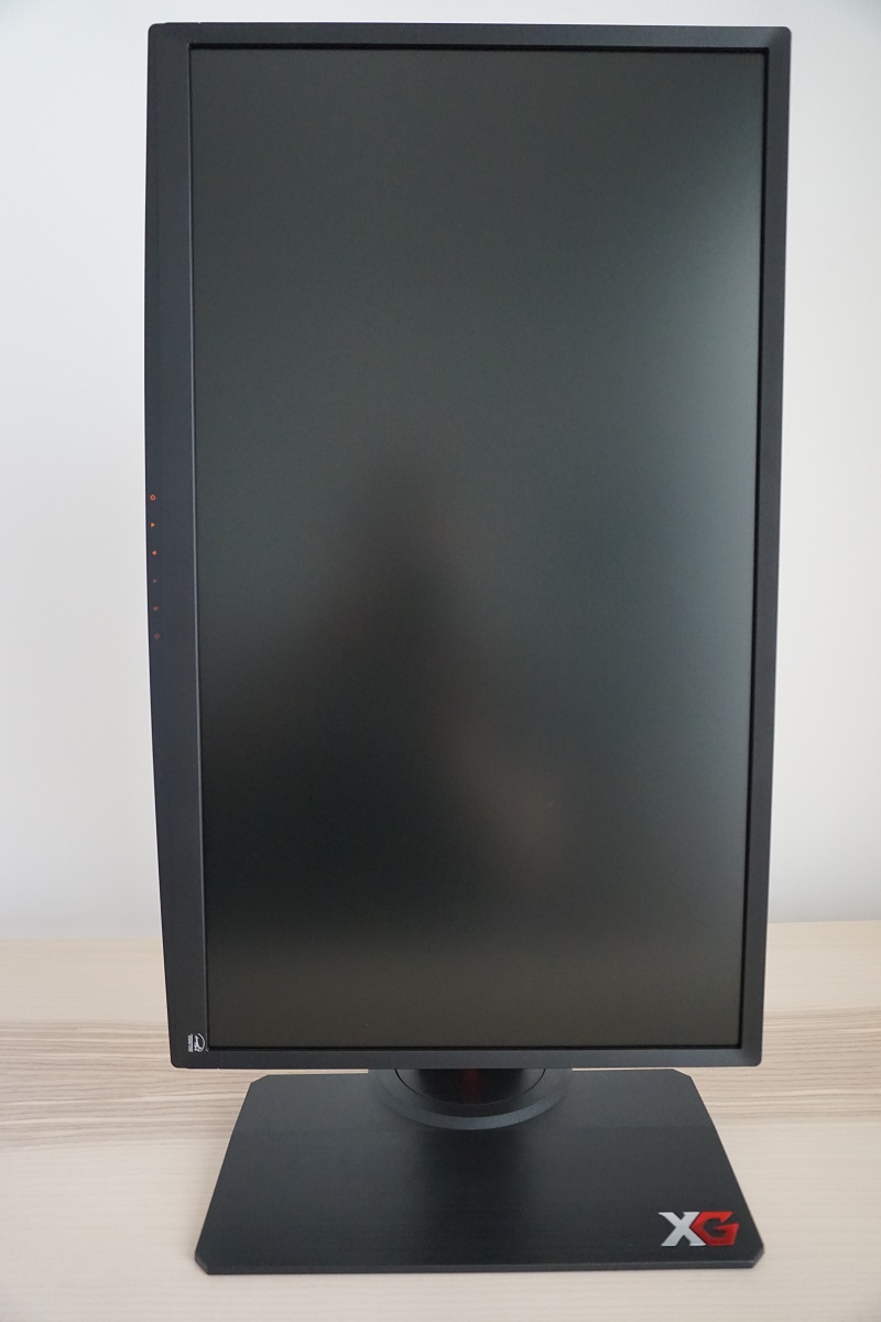
From the side the monitor is reasonably slender; ~25mm (0.98 inches) at thinnest point but thicker centrally. The fully adjustable stand can be seen from this perspective. This affords good ergonomic flexibility; tilt (15° backwards, 5° forwards), swivel (45° left, 45° right using a turntable at the base of the neck), height (120mm or 4.72 inches) and pivot (90° clockwise rotation into portrait). At lowest stand height the bottom of the monitor sits ~74mm (2.91 inches) above the desk, with the top of the screen ~415mm (16.33 inches) clear of the desk surface. The whole stand including base has a good solid feel to it, yet the stand depth has been cut down significantly compared to on the XG2401. This makes it more practical for users who wish to have the screen a bit further from the eyes or have desks that aren’t particularly deep. The total depth of the monitor from front to rear of the stand is ~240mm (9.45 inches).
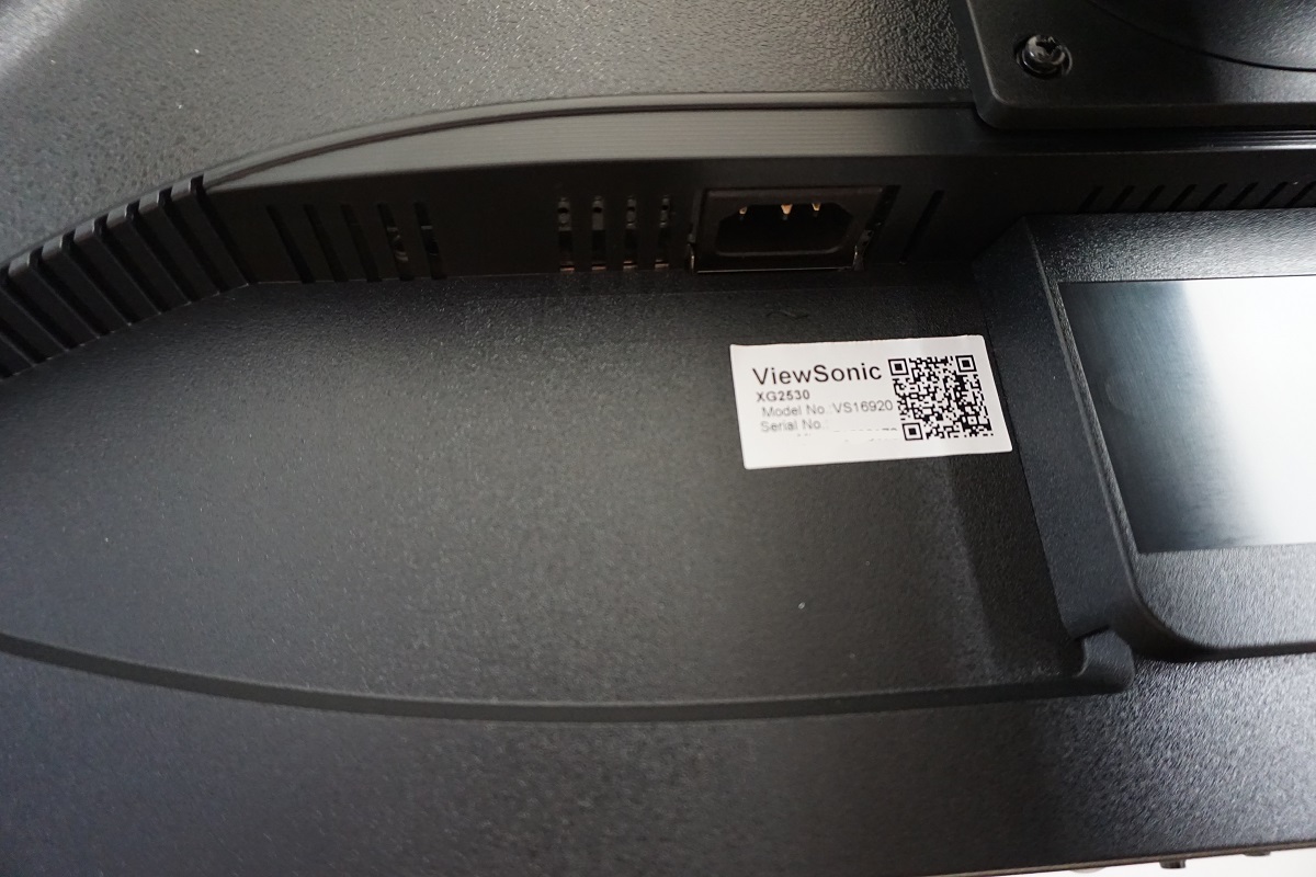
The rear of the monitor is mainly matte black plastic, with various textures used. There are also further red elements, including a long vertical stripe down the neck of the stand, a detachable cable-tidy loop and a ViewSonic logo. There is also a retractable headphone hook at the top of the stand –this isn’t particularly wide, especially for some gaming headphones, but is generally sufficient to keep the headphones in place at the rear of the monitor. There is a Kensington Lock socket towards the bottom left. The ports are down-firing and include; AC power input (internal power converter), HDMI 1.4, HDMI 2.0, DP 1.2a (supports Adaptive-Sync for AMD FreeSync), 2 USB 3.0 ports (plus upstream) and a 3.5mm audio output. There are also basic 2 x 3W up-firing speakers that provide.
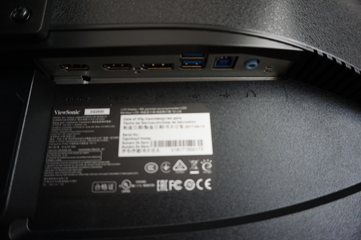
The full 1920 x 1080 @ 240Hz is supported by DP 1.2 or HDMI 2.0 on both Nvidia and AMD GPUs. The included stand attaches centrally via 100 x 100mm VESA and can be removed to make way for an alternative VESA-compatible solution. A DisplayPort cable, USB cable and power cable are included in the box.
Calibration
Subpixel layout and screen surface
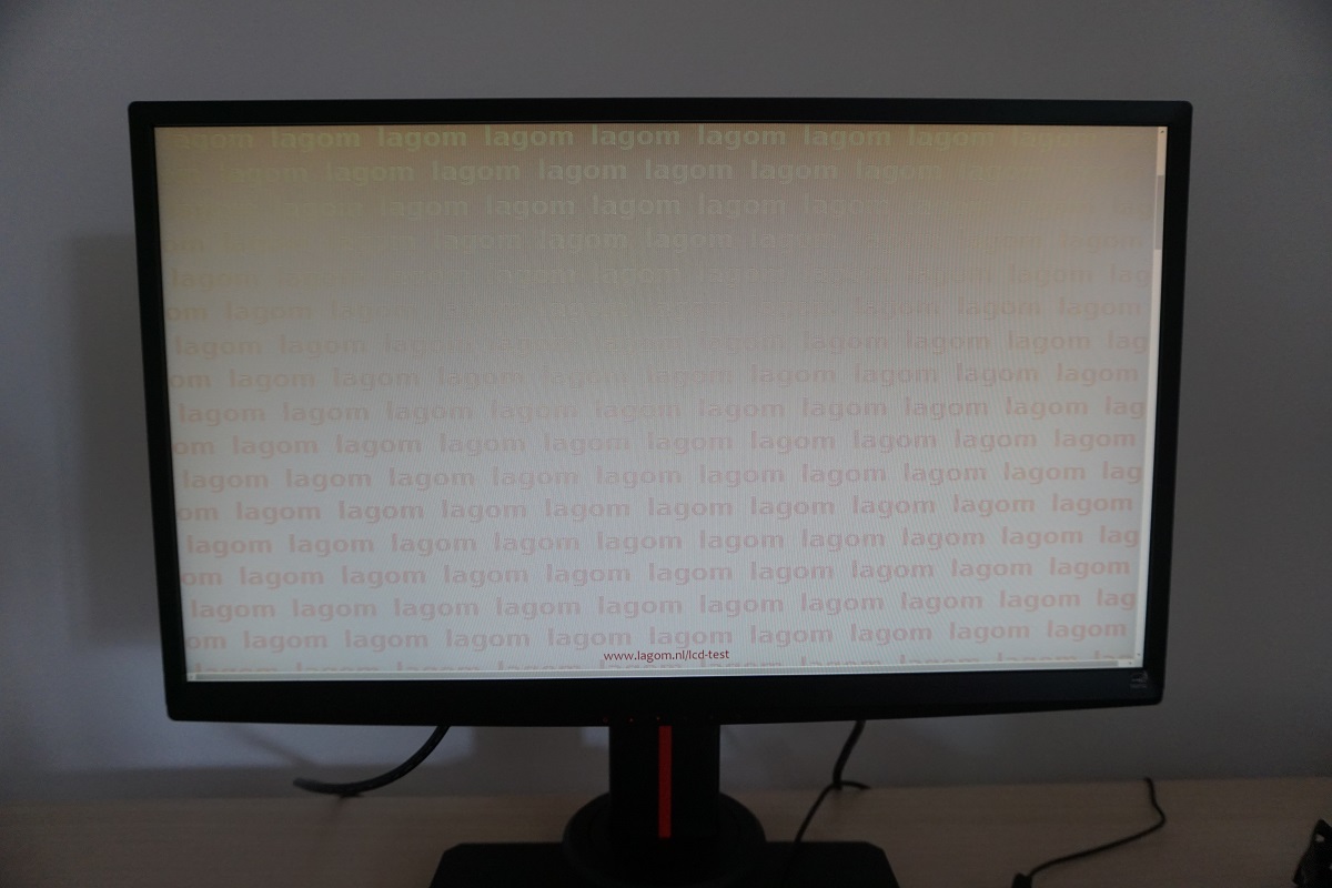
The image below is a macro photograph taken on Notepad with ClearType disabled. The letters ‘PCM’ are typed out to help highlight any potential text rendering issues related to unusual subpixel structure, whilst the white space more clearly shows the actual subpixel layout alongside a rough indication of screen surface. A ‘regular’ (medium) matte anti-glare surface is used on this screen, bringing with it good glare handling characteristics. It also diffuses light emitted from the monitor quite strongly, affecting the vibrancy and clarity potential compared to some lighter matte screen surfaces. There is a moderate degree of graininess when viewing white and other light shades, as we will explore later. It isn’t the same sort of heavy and smeary graininess observable on some models, but is more noticeable than on panels with smoother surface textures.
![]()
As shown in the image above, the monitor uses the standard RGB (Red, Green and Blue) stripe subpixel layout. This is the default expected by modern operating systems such as Microsoft Windows and Apple’s MacOS. There is therefore no need to run through the ClearType wizard as a Windows user (although you may want to adjust this according to preferences) and no need to worry about text fringing from non-standard subpixel layouts as a Mac user. The subpixel spacing and shape is quite normal and no issues were identified with respect to text rendering.
Testing the presets
The XG2530 features a range of presets and various other options related to these that can be tweaked in the OSD. There are ‘View Mode’ settings which can be thought of as basic presets; ‘Standard’, ‘Movie’, ‘Web’, ‘Text’, ‘MAC’ and ‘Mono’. There are also a range of ‘Gaming Settings’ which offer further customisation offers when selected. There are three fully customisable settings that are great if you like to tweak things to your liking (‘CUSTOM 1’, ‘CUSTOM 2’ and ‘CUSTOM 3’). There are some presets that configure these settings in various ways but allow no manual control of them; ‘ColorX’, ‘FPS’, ‘RTS’, ‘MOBA’, ‘Gaming Lite’ and ‘Console’. We won’t be looking at all of these as some of the specific settings that can be fine-tuned in the ‘CUSTOM’ presets are mentioned in the OSD video. We will instead be picking a range of settings that we feel are interesting or useful.
The table below shows some key readings taken using a Datacolor Spyder5ELITE colorimeter, namely central gamma and white point. We have also included some general observations and the ‘Extra OSD Features’ associated with certain presets or selected options. Our test system used a Club3D Radeon R9 290 royalAce FreeSync-compatible GPU connected via DisplayPort. Windows 10 was used on the system with the monitor set to its ‘plug and play’ state with no additional drivers or ICC profiles loaded. The monitor was left to run for over 2 hours before readings were taken. Aside from for our ‘Test Settings’, assume any settings not mentioned here were left at default except for the refresh rate being set to 240Hz, the main setting of interest for the review and this monitor more broadly. We also tested the monitor quite extensively on an Nvidia GTX 1070 via both DP and HDMI 2.0 just to make sure there weren’t any issues – there weren’t, everything worked much the same way aside from the lack of FreeSync support. When viewing the figures in this table, note that for most PC users ‘6500K’ for white point and ‘2.2’ for gamma are good targets to aim for.
| Monitor Settings | Gamma (central average) | White point (kelvins) | Extra OSD features | Notes |
| View Mode = Standard (Factory Defaults) | 2.3 | 6443K | Brightness, Contrast, sRGB (Color Temperature), Black Stabilization, Blue Light Filter | Very bright but decent balance and richness to the image overall. A slight green push and some shades deeper than intended centrally due to gamma tracking. The usual TN viewing angle related caveats apply. From a normal viewing position, things appear darker and more saturated (higher perceived gamma) higher up the screen and lighter and less saturated lower down the screen (lower perceived gamma). |
| View Mode = Text | 2.4 | 5827K | Brightness, Contrast, Black Stabilization, Blue Light Filter | A Low Blue Light (LBL) setting, giving a warm look to the image with weakened blue colour channel. Image overall deeper than intended due to gamma handling (gamma setting can be changed, however). |
| Gamma = 1.8 | 1.9 | 6451K | Brightness, Contrast, sRGB (Color Temperature), Black Stabilization, Blue Light Filter | Image appears washed out overall, particularly lower down the screen. Gamma too low. |
| Gamma = 2.0 | 2.1 | 6468K | Brightness, Contrast, sRGB (Color Temperature), Black Stabilization, Blue Light Filter | Image appears richer but still lacking in depth even centrally. |
| Gamma = 2.4 | 2.4 | 6449K | Brightness, Contrast, sRGB (Color Temperature), Black Stabilization, Blue Light Filter | Much richer look to the image, excessive depth in places and the top region of the screen looks particularly deep and too dark. |
| Gamma = 2.6 | 2.7 | 6444K | Brightness, Contrast, sRGB (Color Temperature), Black Stabilization, Blue Light Filter | As above, even deeper. |
| Gamma = 2.8 | 2.9 | 6450K | Brightness, Contrast, sRGB (Color Temperature), Black Stabilization, Blue Light Filter | As above, even deeper. Quite extreme in this respect, with shades represented in a much deeper way than intended. |
| Color Temperature = sRGB | 2.2 | 6586K | Brightness | Similar to factory defaults but significantly dimmer and a touch cooler in appearance with a slight green push. |
| Color Temperature = Warm | 2.2 | 5027K | Brightness, Contrast, Black Stabilization, Blue Light Filter | Another LBL setting, even warmer than the ‘Text’ setting with more significant blue light reduction. Suitable for relaxing evening viewing. |
| Color Temperature = Full Color Control | 2.3 | 6999K | Brightness, Contrast, Dynamic Contrast, Blue Light Filter | Very bright with a noticeable cool tint to the image, otherwise as factory defaults. |
| Blue Light Filter = 100 | 2.2 | 4525K | Brightness, Contrast, Dynamic Contrast, Blue Light Filter | The most effective LBL setting, cutting down blue light significantly and giving a much warmer appearance to the image (your eyes eventually adjust to this to an extent). |
| Gaming Settings = ‘CUSTOM 1’ | 2.4 | 6630K | Brightness, Contrast, Black Stabilization, Blue Light Filter, Gaming Settings (refer to OSD video) | Quite similar to factory defaults, but default ‘Gamma’ (adjustable) set to 2.4, giving a deeper and richer look to the image. ‘Color Saturation’ is set slightly above default and contrast slightly below default, crushing some shades at the high end. Note that ‘CUSTOM 2’ and ‘CUSTOM 3’ make slightly different changes by default. |
| Test Settings | 2.3 | 6486K | Brightness, Contrast, Black Stabilization, Blue Light Filter, Gaming Settings (refer to OSD video) | Similar to factory defaults, but brightness more comfortable plus more options available due to it being a modified ‘CUSTOM 1’ profile. A well-balanced look overall, save for the usual TN caveats. |
Straight from the box the monitor provided a bright but fairly well-balanced image. White point was within good range without obvious tints one way or another, whilst gamma setup provided a much richer look than many of the 24” 144Hz models we’ve seen give (gamma too low). We’ve seen considerable inter-unit variation with the 24” 144Hz models in terms of gamma handling, too. It is too early to say whether that’s the case with the 24.5” 240Hz panels, but at least ViewSonic provide a range of gamma options and good customisation in the OSD. For our ‘Test Settings’ we had the full suite of adjustment options available to us due to using ‘CUSTOM 1’ (‘CUSTOM 2’ and ‘CUSTOM 3’ would work all the same) with various corrections made. As shown below, the central gamma tracking bowed a bit from the 2.2 curve and averaged 2.3. There is significant perceived variation on TN panels such as this, though, and the slight bowing actually helped areas lower down the screen appear richer from a normal viewing position. The overall appearance of the image was far richer than on many of the 24” 144Hz models where central gamma is far too low without ICC profile intervention. As shown in the table there are also a range of Low Blue Light (LBL) settings available on this model. This includes a flexible ‘Blue Light Filter’ option, adjustable in single unit increments from ‘0’ (off) to ‘100’ (full effect). Confusingly, this is the reverse of what earlier models with this feature provided where ‘0’ meant the full effect was applied. This change was probably made as to most people it makes more sense for ‘0’ to mean ‘off’ and ‘100’ to mean ‘full’. The ‘Blue Light Filter’ overrides any other changes made to the colour channels, in the ‘Color Temperature’ section of the OSD for example. We prefer to quickly activate an LBL setting for relaxing evening viewing, where blue light output should be cut down to avoid disrupting sleep, and deactivate for our testing or during the daytime. For this we duplicated our settings for ‘CUSTOM 1’ (i.e. ‘Test Settings’) onto ‘CUSTOM 2’ except for applying a strong ‘Blue Light Filter’ setting – you can even rename the ‘CUSTOM’ settings in the OSD so that it is quite clear what they’re intended for. For our ‘Test Settings’ we used ‘CUSTOM 1’ and made various adjustments. For our main test system we activated AMD FreeSync in the OSD as well. As an Nvidia user you still have access this option but it doesn’t actually do anything aside from block off access to a few OSD settings (as per the OSD video). We found all of the other settings worked in much the same way using our Nvidia GTX 1070, so would recommend them all the same to Nvidia users. Note that individual units can vary and so do personal tastes, so these settings won’t necessarily be optimal and are just intended to be used as a guide. Anything not mentioned was left as default for ‘CUSTOM 1’ – we’ve also included the refresh rate used in Windows just for reference. Contrast= 70 Color Temperature= Full Color Control R= 100 G= 96 B= 96 Gaming Settings= CUSTOM 1 Rampage Response= Ultra Fast Black Stabilization= 11 (higher reduces contrast, too much lower noticeably eats away at dark detail) Color Saturation= 50 AMD FreeSync= On Refresh rate (Windows setting)= 240Hz A BasICColor SQUID3 (X-Rite i1Display Pro) was used to measure the luminance of black and white using a range of settings. From these values, static contrast ratios were calculated. This data is presented in the table below, with blue highlights indicating the results under our test settings. Black highlights indicate the highest white luminance, lowest black luminance and highest contrast ratio recorded. Assume that any setting not mentioned was left at default, with the exceptions already mentioned in the calibration section. Note that changing refresh rate did not impact contrast.

Gamma 'Test Settings'
Test Settings
Brightness= 32 (according to preferences and lighting)
Contrast and brightness
Contrast ratios
Monitor Settings White luminance (cd/m²) Black luminance (cd/m²) Contrast ratio (x:1) 100% brightness (Factory Defaults) 409 0.51 802 80% brightness 336 0.43 781 60% brightness 257 0.33 779 40% brightness 192 0.24 800 20% brightness 141 0.18 783 0% brightness 90 0.11 818 View Mode = Text 354 0.54 656 Gamma = 1.8 411 0.53 775 Gamma = 2.0 409 0.53 772 Gamma = 2.4 408 0.52 785 Gamma = 2.6 407 0.52 783 Gamma = 2.8 406 0.52 781 Color Temperature = sRGB 129 0.18 717 Color Temperature = Warm 346 0.51 678 Color Temperature = Full Color Control 423 0.51 829 Blue Light Filter = 100 291 0.5 582 Gaming Settings = ‘CUSTOM 1’ 385 0.48 802 Test Settings 163 0.21 776
The average contrast ratio with only brightness adjusted on the XG2530 was 794:1. The highest contrast ratio recorded was 829:1, but even this falls short of the 1000:1 specified. The difference in perceived contrast between ~800:1 and ~1000:1 isn’t particularly great, but it’s still interesting to see some weakness in this area. Under our ‘Test Settings’ we recorded 776:1, which is not a huge drop from the peak contrast of the monitor. The most significant drop occurred with the ‘Blue Light Filter’ all the way up; 582:1. The highest luminance was 423 cd/m² whilst the minimum white luminance recorded was 90 cd/m². This isn’t a particularly low minimum, although it should be fine for most users. This gives the monitor a 333 cd/m² luminance adjustment range.
There is also a ‘Dynamic Contrast’ setting that can be activated when using the ‘CUSTOM’ presets. This is called ‘Advanced DCR’ (Advanced Dynamic Contrast Ratio). This allows the backlight brightness to adjust according to the level of light or dark on the screen – the backlight is controlled as a single unit, there is no local dimming here. It’s an interesting implementation as you can set this between ‘0’ (off) and ‘20’ (maximum effect) in increments of 1. This doesn’t seem to have a noticeable impact on the maximum or minimum brightness used, but it increases the level of sharpness up to ridiculously over-sharp levels. We found the backlight tended to give an uncomfortably bright output even with mixed scenes where there were plenty of darker shades. The sharpness at higher settings was, in our view, a pointless and unattractive addition. We don’t like Dynamic Contrast modes at the best of times, but this is just a weird implementation that we’ve seen on a few ViewSonic models now.
PWM (Pulse Width Modulation)
The XG2530 does not use PWM (Pulse Width Modulation) at any brightness level, instead using DC (Direct Current) to regulate backlight brightness. The backlight is therefore considered ‘flicker-free’, which will come as welcome news to those sensitive to the side-effects of PWM or who prefer to know a flicker-free backlight is used.
Luminance uniformity
Whilst observing a black screen in a dark room, using our test settings, we noticed some backlight bleed and clouding, particularly lower down. This is shown in the image below. Remember that individual units vary when it comes to uniformity issues, which includes backlight bleed and clouding. A slight silver or golden sheen (depending on viewing angle) is visible from more extreme viewing angles. This is shown in a video deeper into the review and is nowhere near as pronounced as IPS glow, nor can it be observed from a normal viewing position.

We also used the Spyder5ELITE to assess the white uniformity of the monitor, represented by 9 equidistant quadrants running from the top left to bottom right of the screen. The table below shows the deviation between each point and the brightest recorded point. Note: the brightness setting was higher than for our ‘Test Settings’ as we were testing something and forgot to dial it back down. Everything else was set as per our ‘Test Settings’ – and the uniformity patterns appeared very similar at lower brightness values anyway. The luminance uniformity was variable, but quite decent overall. The brightest point recorded was ‘quadrant 5’ in the centre of the screen (207.1 cd/m²). The greatest deviation from this occurred at ‘quadrant 7’ towards the bottom left (177.1 cd/m², which is 14% dimmer than centre). A 14% deviation was also observed at ‘quadrant 4’ to the left of centre and an 11% deviation at ‘quadrant 1’ towards the top left of the screen. Elsewhere deviation was much lower, at 0 – 3%. Bear in mind that individual units vary when it comes to uniformity and that further deviation can be expected beyond the points measured here. Also note that the viewing angle limitations of the panel introduce differences in perceived luminance that aren’t accounted for in these measurements, with variation depending on which part of the screen you’re observing. For those who prefer a graphical representation, the contour map below shows these deviations in a graphical way. Here, darker greys represent lower luminance and hence greater deviation from the brightest point than lighter greys. The percentage deviation between each quadrant and the brightest point is also given. Due to the aforementioned viewing angle limitations, we will not be providing colorimeter-based analysis of the colour temperature uniformity of the monitor. The perceived colour temperature can vary significantly depending on which part of the screen you’re observing, from a normal viewing position. Any readings provided here have the potential to be highly misleading. On Battlefield 1 (BF1) the contrast performance was decent. There was an appropriate level of detail in dark scenes, at least centrally, without ‘IPS glow’ or anything like that affecting the viewing experience. However; the viewing angle restrictions typical of TN panels did come into play here. Perceived gamma changes such that it appears lower further down the screen (more ‘dark detail’ than intended) and higher further up the screen (less ‘dark detail’ than intended). The depth of black and dark shades was much as you’d expect from the contrast ratio, with the fact ~800:1 was measured vs. ~1000:1 being neither here nor there really. Brighter elements stood out fairly well against darker surroundings, although there was a slight graininess from the screen surface. This was most apparent when viewing brighter shades such as areas of daylight sky or snowy mountains. The graininess was not heavy or smeary, thankfully. We made similar observations on Dirt Rally, where contrast was decent despite the usual TN quirks. This game has quite dark night time scenes, which were delivered without ‘IPS glow’ or anything of that nature and reasonable but by no means impressive depth to dark shades. For lower regions of the screen we observed excellent detail levels, in fact more detail than was intended with clearly visible tire tread patterns and material textures inside the cars. Such details blended in increasingly well further up the screen. Bright elements stood out fairly well, with a little graininess from the screen surface but nothing extreme. We also made observations using the Blu-ray of Star Wars: The Force Awakens. This movie has plenty of scenes that call for a strong contrast performance, with bright special effects and objects such as light sabers lighting up much darker surroundings. Compared to models with significantly stronger static contrast, particularly VA panels, the cinematic feel wasn’t really there. Still, the monitor put in a reasonable performance in this respect with decent distinction between ‘bright’ and ‘dark’. Lagom’s tests for contrast were used to more closely analyse contrast performance, highlighting weaknesses in quite a specific way. The following observations were made from a normal viewing position, eyes around 70cm from the screen. The colour gamut of the XG2530 (red triangle) was compared with the sRGB colour space (green triangle), as shown in the image below. The monitor offers quite comprehensive sRGB coverage (99%), just shaving inside the sRGB triangle between the green and blue corners of this particular representation. There is also a bit of over-extension between the green and red corners of the diagram. This allows the monitor to output plenty of shades within the sRGB colour space with a little extra vibrancy potential on top. On Battlefield 1 (BF1) a fairly rich palette of colours was presented. There was considerably more depth overall than on models with worse gamma handling (many 24” 144Hz models included), although there was some excessive saturation and depth higher up the screen and too little of this lower down the screen. Some rich greens of vegetation, for example, were represented quite accurately centrally. The same shade appeared even deeper and arguably more lush further up the screen, whilst it appeared under-saturated and lighter towards the bottom of the screen. This is entirely typical for a TN model, regardless of how well calibrated it is. Earthy browns had good neutrality overall and skin tones appeared fairly well saturated (but not excessively so) on the whole, particularly in the central region of the screen. There were some decent vibrant oranges and yellows to enhance the look of fire end explosions, too, which are a prominent feature on this title. We made similar observations on Dirt Rally, where shades were generally represented in a fairly rich way but the usual TN caveats applied. The good gamma handling on this model helped give environments quite a lush look with some good vivid greens and nice strong earthy browns. These shades did appear more muted further down the screen and excessively deep near the very top of the screen in particular. Some of the car liveries looked quite appealing in terms of their vibrancy, although not to the same eye-catching degree you’d see on models with superior colour consistency (IPS-types), smoother screen surfaces or superior colour gamuts. Still, there were some nice highlighter greens and yellows, bright oranges and deep reds amongst others. The overall look distanced itself from the ‘washed out’ and faded appearance of some 144Hz models. We also assessed the colour performance using the Blu-ray of Futurama: Into the Wild Green Yonder. This is a very unforgiving title to use, particularly when considering colour consistency. It has large areas of a single shade and therefore highlights weaknesses in colour consistency very well indeed. There were no surprises here, with the aforementioned shifts in saturation at various points of the screen accentuated very clearly. The red of one of the key characters, the lobster-like creature Dr Zoidberg, appeared more or less as it should centrally. But appeared a darker crimson shade higher up the screen and more of a burnt-come-anaemic red lower down the screen. This lack of consistency affected the subtle variations of shade that exist when considering pastel colours such as skin tones on this title as well. Characters lost their ‘identity’ as their skin tone changed depending on the position on the screen. Still, there were some good vibrant neon shades and pastel shades looked appropriately muted for the most part. So the performance here was passable and due to the calibration quite reasonable for a TN model. We used Lagom’s tests for viewing angle to more closely analyse colour consistency and viewing angle performance. The following observations were made from a normal viewing position, around 70cm from the screen. A sensitive camera and a utility called SMTT 2.0 was used to assess the input lag of the XG2530. It was compared with a number of monitors of known latency, with over 30 repeat readings taken to try to maximise accuracy. Using this method we calculated 8.67ms (~ 2 frames at 240Hz) of input lag. This was with the monitor set up as per our test settings. Bear in mind that this value takes into account both the element of input lag you ‘see’ (pixel responsiveness) and the element you ‘feel’ (signal delay). It indicates a fairly low (but not ‘super low’) signal delay that shouldn’t bother most users, but that some sensitive users could take issue with. We have no way to accurately measure input lag when FreeSync is doing its thing. Our responsiveness article takes a detailed look at factors which affect responsiveness of a monitor. Chief amongst these is the concept of ‘perceived blur’, which the pixel responsiveness of the monitor is generally the more minor contributor to. The movement of your eyes as you track motion on the screen is generally a far more prominent contributing factor on modern monitors. Both aspects of perceived blur can be accurately captured using a photography technique explored in the article; ‘pursuit photography’. This uses a moving camera rather than a static one to capture a snapshot of motion on the screen, giving a good idea of what the eye actually sees at that given moment in time when observing motion on the screen. The images below are pursuit photographs taken using the UFO Motion Test for ghosting, with the test running at its default speed of 960 pixels per second. This is a practical speed to take such photographs at and demonstrates both attributes of perceived blur nicely. The UFOs move across the screen from left to right at a frame rate matching the refresh rate of the display. Three sets of photos are included, with the monitor set to 60Hz, 144Hz and 240Hz, respectively. All three rows of the test (dark, medium and light background) are used to showcase a range of different pixel transitions. All of the ‘Rampage Response’ (pixel overdrive) settings of the monitor are tested – this can be selected in the ‘CUSTOM’ presets as noted earlier. For 60Hz and 144Hz a capture from a reference monitor is shown, namely the Dell S2417DG, giving an indication of what things look like without pixel responsiveness really being a limiting factor. As this is the first 240Hz model we’ve reviewed, there is no 240Hz reference to compare to. The images above were captured with the monitor set to 60Hz. You can see that the object itself is quite soft and broad with blurred details. This indicates a moderate degree of perceived blur attributable to camera (eye) movement. There are also varying degrees of trailing behind the object caused by the pixel responses of the monitor. With the ‘Standard’ setting there is quite a bit of trailing behind the object, most noticeably for the dark and medium background. The ‘Fast’ setting increases the pixel overdrive effectiveness quite considerably, cutting down on this trailing significantly. The ‘Faster’ setting knocks things up another notch, reducing the trailing further so that it is barely visible. The ‘Ultra Fast’ setting provides a level of acceleration that is a bit too high, at this refresh rate. You can see noticeable inverse ghosting (overshoot) introduced for the medium background in particular – a bright blue trail is visible behind the object that does not blend in neatly. The ‘Fastest’ setting increases this overshoot and makes it somewhat more noticeable for the light background as well. With the refresh rate increased to 144Hz, as shown above, the perceived blur is massively reduced. You can see that the object itself is significantly narrower, with some sharper details visible on the UFO itself. The trailing has also changed in nature quite considerably. With the ‘Standard’ setting there is a bit of trailing behind the object, although this is quite faint compared to at 60Hz. The ‘Fast’ setting cuts this down a bit, although a very small amount remains. The ‘Faster’ setting makes very subtle changes, introducing a tiny trace of overshoot to the medium background. With the ‘Ultra Fast’ setting, this overshoot is increased slightly, but it replaces the small amount of conventional trailing that remained for the medium background. Some overshoot is also introduced for the dark background and a very small amount for the light background. The ‘Fastest’ setting further increases the overshoot levels for all backgrounds but does not introduce noticeable benefits here. Ramping up to 240Hz provides a further significant reduction in perceived blur, as shown above. The UFO is now sharply focussed, with good details visible on the body itself – this indicates a relatively low level of perceived blur attributable to camera (eye) movement. The trailing is now very short with differences between the transitions and ‘Rampage Response’ settings a lot less noticeable than at lower refresh rates. The middle row shows the changes most clearly, with ‘Standard’ showing a fair amount of conventional trailing behind the object. It appears subtle on this snapshot, but in practice it does significantly affect the perceived blur when gaming or viewing other moving content. The ‘Fast’ setting cuts this down quite substantially, with the ‘Faster’ setting offering only slight improvement here. The small amount of trailing for the light background is perhaps he most noticeable change, although even this is a subtle change. The ‘Ultra Fast’ setting again makes only slight changes to these transitions. There is a small amount of overshoot visible for the medium background, behind the lower region of the UFO cockpit. The ‘Fastest’ setting doesn’t really make any notable changes here. We appreciate there is a lot to take in from this assessment using TestUFO, but even then it is by no means a complete test. There are many more transitions between many different shade levels that are not assessed here, but which will crop up when gaming on the monitor. The pursuit photography shots clearly demonstrate significant reduction in perceived blur when increasing refresh rate. They also demonstrate that differences between the ‘Rampage Response’ settings become less pronounced at higher refresh rate. In practice we found the default ‘Faster’ setting quite well balanced, but there were some transitions that we felt ‘Ultra Fast’ gave a bit of an edge to at 240Hz. There was a small amount of additional overshoot (inverse ghosting) in places when using this setting, but we felt this was outweighed by the reduction in perceived blur elsewhere. This would definitely be something users should set according to preferences, but for our subjective testing below we set ‘Rampage Response’ to ‘Ultra Fast’. Note: We observed significant stuttering on ‘Test UFO’ when we changed presets on the monitor or changed other settings that caused the monitor to reactivate its signal (i.e. turn off briefly then back on) at 240Hz. This was removed by turning the monitor off then back on again using the power button and only affected this test – there was no frame skipping observed, so it seemed to be some sort of sync error linked to the web browser. Note that the monitor worked correctly at up to 240Hz without skipping frames and displayed similar response behaviour on our Nvidia GTX 1070. In fact we performed the subjective testing below on both GPUs and made similar observations. On Battlefield 1 (BF1), where the frame rate kept pace with the 240Hz refresh rate, the experience was exceptionally fluid. Although signal delay also affects how gaming on a monitor feels, to some people more than others, actually driving a 240Hz at suitably high frame rates gives a real edge in ‘connected feel’ as well. By delivering up to 4 times as much information every second as a 60Hz monitor and up to ~1.67 times as much as a 144Hz monitor, you sort of feel that bit closer to the game world as you interact with it. The other advantage of the monitor pumping out all of this information is the significant decrease in perceived blur, which is especially true when coupled with the sort of snappy pixel responses that the XG2530 demonstrates. The game world had a superb edge in sharpness and detail levels when moving around in it, especially noticeable at higher movement speeds, when compared to even the fastest 60Hz LCDs. The edge over a fast ~144Hz model was not as monumental but still noticeable. As with everything this is subjective and some users wouldn’t notice it as readily. We don’t feel it improved our performance on BF1 from a competitive point of view, but we did feel it was somewhat easier to focus on the action. And for competitive gamers playing fast-paced games, this could certainly give them an edge. So the general high frame rate and high refresh rate experience was very positive in terms of responsiveness. And this was thanks to the pixel responsiveness doing a really nice job at 240Hz, overall. There were some minor weaknesses if we looked out for them, but we really did have to look out for them as they did not jump out of us when just playing the game normally. There was a tiny bit of additional trailing for some transitions, such as those between very dark and very light shades but also some dark to medium transitions. Dark silhouetted trees against an overcast sky, for example, had a faint powdery trail behind them. For scenes involving very light shades in the background and thinner objects of medium or dark shades, there was a mild pink fringe to the trail. For example, a dark vehicle aerial moving against bright clouds. This was actually something that was easier to notice on the desktop with black text against a white background but even then didn’t make us want to claw our eyes out. It occurred regardless of the ‘Rampage Response’ setting and seems to be a slight native weakness of the panel. We didn’t notice any obvious overshoot, just a few traces of darker or partially transparent (slightly lighter) trails than the foreground or background colour. We didn’t find any of these weaknesses eye-catching and most users would probably need them specifically pointed out to notice them; we’re just mentioning this for completeness. Given the depth of analysis on BF1 above, we don’t have a lot to add about the experience on Dirt Rally. We didn’t find the increase in ‘connected feel’ compared to models with lower refresh rates to be particularly advantageous to us. Certainly not compared to on titles with character movement, such as BF1. This says more about the level at which we play the game (i.e. very low) – we could still notice a difference and could see how hardcore racing fans could benefit from the increased frame rate and refresh rated. Provided their system can hack it without them lowering the graphics settings so much that the game looks like a racing game from decades past, of course. We found the lower levels of perceived blur more noticeable, when compared to models with lower refresh rates. We again found the step up from 60Hz to 144Hz more rewarding than from 144Hz to 240Hz, but did still notice and appreciate the difference. The pixel responsiveness was clearly good enough to deliver a decent 240Hz performance, with the same sort of minor weaknesses (i.e. non-issues for most mere mortals) mentioned previously. These weaknesses didn’t significantly affect the overall level of perceived blur, which is a point reinforced by our recently updated responsiveness article. Our testing there confirms our subjective testing here; the monitor delivers a solid 240Hz performance in terms of perceived blur. We also tested our Blu-ray test titles. These run at ~24fps and therefore do not benefit from the snappy pixel responses nor the high frame rates that this model can display. That low frame rate limits the fluidity but also the pixel response requirements of the display for an ‘optimal viewing experience’. There were no weaknesses we could see related to pixel responsiveness. Because 24fps divides evenly into 240Hz, though, there was a bit of a reduction in juddering when compared to running on models without such a neat matching. This includes 144Hz models, which is why people sensitive to such things may prefer to watch such movies at 120Hz or another refresh rate matching or equally dividing into 24. 60fps movie content also divides nicely into 240Hz, of course. You can also run this model at 23Hz or 24Hz if you prefer the refresh rate to match your lower frame rate movie content exactly. Some models exhibit what we refer to as ‘interlace pattern artifacts’, particularly but by no means exclusively those with high refresh rates. These artifacts can also be referred to as ‘inversion artifacts’ or ‘scan lines’. Sometimes static interlacing patterns are visible, whereby shades are broken up into thin (usually vertical) lines that alternate between a slightly lighter and slightly darker than intended variant of the shade. Dynamic interlacing patterns may also be observed, which take many forms and sometimes appear as a sort of mesh, grid or lines or ‘interference’ when you observe motion on the monitor. The XG2530 did not exhibit any noticeable static interlace pattern artifacts, but did exhibit dynamic interlace patterns. If you observed movement on the screen, you could see the image appear to break up into a vertical pinstripe sort of effect. Although we noticed this, we didn’t find it distracting and soon forgot about it when absorbed in a game. This was the case at higher refresh rates, at least. At 60Hz the monitor suffered from very obvious dynamic interlace patterns. These even seemed to move on their own accord without your eyes scanning the screen and really stood out in quite a major way to us. How obvious a user would find these depends on the viewing distance, their eyesight and sensitivity to such things. But we did find the effect surprisingly pronounced at 60Hz, much less so (but still there) at higher refresh rates. Note that the ‘Rampage Response’ setting did not affect this. AMD FreeSync is a variable refresh rate technology, the red team’s alterative to Nvidia G-SYNC. Both of these articles explore the principles behind variable refresh rate technologies and the benefits that they bring to the experience, so we won’t be repeating too much of that here. The basic principle is that the monitor dynamically adjusts its refresh rate to match the frame rate being outputted by the GPU, where possible. This avoids the stuttering (VSync on) or tearing and juddering (VSync off) that is associated with refresh rate and frame rate mismatches. In the variable frame rate environment under which the technology is active, FreeSync also promises decreased latency compared to running with VSync enabled. FreeSync requires a compatible AMD GPU, which our test system had in the form of a Club3D Radeon R9 290 royalAce. A list of current GPUs which support the technology can be here, with the expectation that future AMD GPUs will support the feature too. The monitor itself must also support ‘VESA Adaptive-Sync’ for FreeSync to be usable. The XG2530 supports this via DP 1.2a only. AMD’s recent drivers include Radeon Software Crimson, which makes activation of the technology very straightforward. So straightforward, in fact, that it should be enabled automatically. You can check its status by opening ‘AMD Radeon Settings’ and clicking on ‘Display’. You should then ensure that the first slider, ‘AMD FreeSync’, is set to ‘On’. If you hover over this, it will also report the variable refresh rate display supported by the display. Note that the image below is for a different monitor and is just used as an example here. VSync is configured in the ‘Gaming’ section of ‘Radeon Settings’, where it is referred to as ‘Wait for Vertical Refresh’. You can either configure this globally under ‘Global Settings’ or for each game individually. The default is ‘Off, unless application specifies’ which means that VSync will only activate if you enable it within the game itself, if such an option exists. This option may be called ‘sync every frame’ or something similar rather than just ‘VSync’. We tested a range of game titles to see FreeSync in action on the XG2530, but it worked in much the same way on all of them (as you would hope). We will therefore simply be focusing on a single title for this section; Battlefield 1 (BF1). Given the flexibility in the graphics options, it’s possible to test a huge range of refresh rates (in-game frame rates) on this game. It was actually very difficult to maintain a solid 240fps with the Radeon 290 (a little easier but still challenging on our GTX 1070). Even when putting the graphics settings as low as they would go, including lowering resolution scale (rendering resolution) or indeed dropping the actual resolution, this was the case. At this point you really become limited by other components in the system, such as the CPU. Even if the frame rate rarely stuck at 240fps, using fairly low settings and the native Full HD resolution (no resolution scale adjustment), it did generally stay above 200fps. FreeSync therefore did its thing to ensure that the monitor’s refresh rate dynamically adjusted below its maximum 240Hz to match the frame rate. In doing so it removed the stuttering (VSync on) or tearing and juddering (VSync on) that exists with the technology disabled. At such high frame rates we actually found the effects of ‘tearing and juddering’ (VSync off) to be quite tolerable. Stuttering (VSync on) somewhat less so, but still far less jarring than at lower frame rates. So whilst we enjoyed the benefits that FreeSync brought, we really don’t feel the technology is so much of a game-changer at such high frame rates. You didn’t get eye-catching tear lines and the game still looked and felt rather smooth – although there was some juddering as different sections of the screen simultaneously displayed different frames. Sensitivity to tearing, stuttering and juddering does vary, but we feel the benefits of FreeSync are far less pronounced at these frame rates. If we increased the graphics settings so that the frame rate dipped below 200fps, but generally still stayed in the triple digits (i.e. 100 – 200Hz for the monitor refresh rate) we found the benefits of FreeSync more pronounced. The fluctuations in frame rate and the associated tearing and stuttering we found quite unpleasant at this sort of frame rate range, so it was certainly nice to have that eliminated. Compared to the higher frame rates (ideally 240fps) and corresponding refresh rates, there was an increase in perceived blur and a bit of a decrease in connected feel. The frame rate itself dictates this and FreeSync can’t make a relatively low frame rate higher than it actually is. Even so, we felt that the connected feel and perceived blur levels remained pleasing, particularly at the mid-high end of this frame rate range. Increasing the graphics settings further yielded a further increase in perceived blur and decrease in perceived blur, due to the resulting decrease in frame rate. Looking back and comparing this to the other end of the scale (i.e. the frame rates closer to 240fps), the difference in these two elements was really rather profound. Although FreeSync didn’t change this, it did indeed work its magic to rid the experience of tearing and stuttering associated with refresh rate and frame rate mismatches. And at these sorts of frame rates, such imperfections are much easier to notice than at significantly higher frame rates. As the frame rate fell, particularly as it dropped below 80fps, more noticeable overshoot was introduced. Fortunately, the pixel overdrive feature of the monitor (‘Rampage Response’) is very flexible and sticking with the default of ‘Faster’ rather than ‘Ultra Fast’ kept the overshoot levels quite low. We’d suggest ‘Ultra Fast’ only if your frame rate spends most of the time closer to the upper end of the FreeSync range, above 200fps really. If your frame rate spends most of its time below 100fps then ‘Faster’ is more appropriate. We did not observe the more noticeable interlace pattern artifacts that we saw at a static 60Hz, even when the frame rate (and hence refresh rate) hovered around this. The video below summarises some of the key points raised in this written review and shows the monitor in action. The video review is designed to complement the written piece and is not nearly as comprehensive. With its 240Hz refresh rate, the ViewSonic XG2530 is clearly designed for speed. But whilst this remained a key focus for the model, it doesn’t nullify the importance of other attributes such as contrast and colour reproduction. The contrast was much in line with other TN models we’ve tested recently, despite the contrast on our unit falling slightly short of the specified 1000:1 static contrast ratio. There was no ‘IPS glow’ or anything of that nature, naturally, but perceived gamma was dependent on viewing position. From a normal viewing position, this affected detail in dark scenes depending on which part of the screen you’re observing. The screen surface also had a bit of a grainy quality to it, which as with contrast characteristics was in line with expectation from our testing of comparable models. Colour reproduction was quite decent, within the constraints of the TN panel technology. The perceived gamma differences again game into play here, giving the image a deeper and more saturated look than intended towards the top of the screen. Towards the bottom of the screen, some saturation was lost and things appeared more muted. Unlike many high refresh rate TN models, though, the default image setup was actually quite pleasing. The monitor didn’t suffer from the plague of low average gamma that affects many of these models, meaning that it achieved a fairly rich look without requiring the intervention of ICC profiles. Furthermore, gamma was adjustable alongside a plethora of other settings the OSD. In fact this model had one of the most feature-rich OSDs we’ve seen for a while. Our unit also offered quite good white point balance out of the box, which was good to see. Responsiveness was very impressive overall, with the vast majority of pixel responses being snappy enough to support output at up to 240Hz (@240fps) without issue. The monitor achieved exceptionally low levels of perceived blur, superior to comparable 144Hz models. There were some minor weaknesses in pixel responsiveness here and there, alongside a small amount of overshoot, but nothing we found bothersome. The monitor also supported FreeSync well, with the technology getting rid of tearing and stuttering by keeping the refresh rate of the monitor synchronised with the frame rate outputted by the GPU. This worked across a very broad range of refresh rates, with LFC kicking in as intended and extending this below the 48Hz hardware floor of operation. A bit of a bugbear for some users is input lag. That was low on this model and shouldn’t present an issue to most users. However; it is not ‘extremely low’ and there is a slight signal delay that sensitive users could take issue with. Overall, then, the monitor performed largely as well as one could hope given the panel used. The monitor was nicely set up out of the box, offered excellent OSD flexibility as well as the sort of ergonomic flexibility many have come to expect from this class of monitor. There were no particularly eye-catching ‘gaming’ fashion statements externally, either, just a few red elements that blended in with the overall design quite well. Responsiveness was excellent overall, despite a signal delay that some sensitive users could take issue with. This is a monitor that many competitive and indeed non-competitive gamers would have a blast using. To make the most of it, though, you do need to be pushing very high frame rates. Whether gaming or otherwise you’re also restricted to a 1920 x 1080 (Full HD) maximum resolution. Quite a premium is put on the 240Hz refresh rate, with the product being pretty expensive for a Full HD TN panel. The bottom line; a very responsive monitor for both AMD and Nvidia users without any nasty image quality surprises – but the cost and slight signal delay could put some users off.

Luminance uniformity table

Luminance uniformity map
Contrast in games and movies
Lagom contrast tests
Colour reproduction
Colour gamut

Colour gamut test settings
Colour in games and movies
Viewing angles
The video below shows the results of the Lagom text test, a mixed desktop background and dark desktop background from a variety of viewing angles. Note that for the dark background there is a silver or golden sheen that blooms out more noticeably from sharp angles. This could be dubbed ‘TN glow’ and is not visible from a normal viewing position and is never as intense as ‘IPS glow’ from a given viewing position.
Responsiveness
Input lag
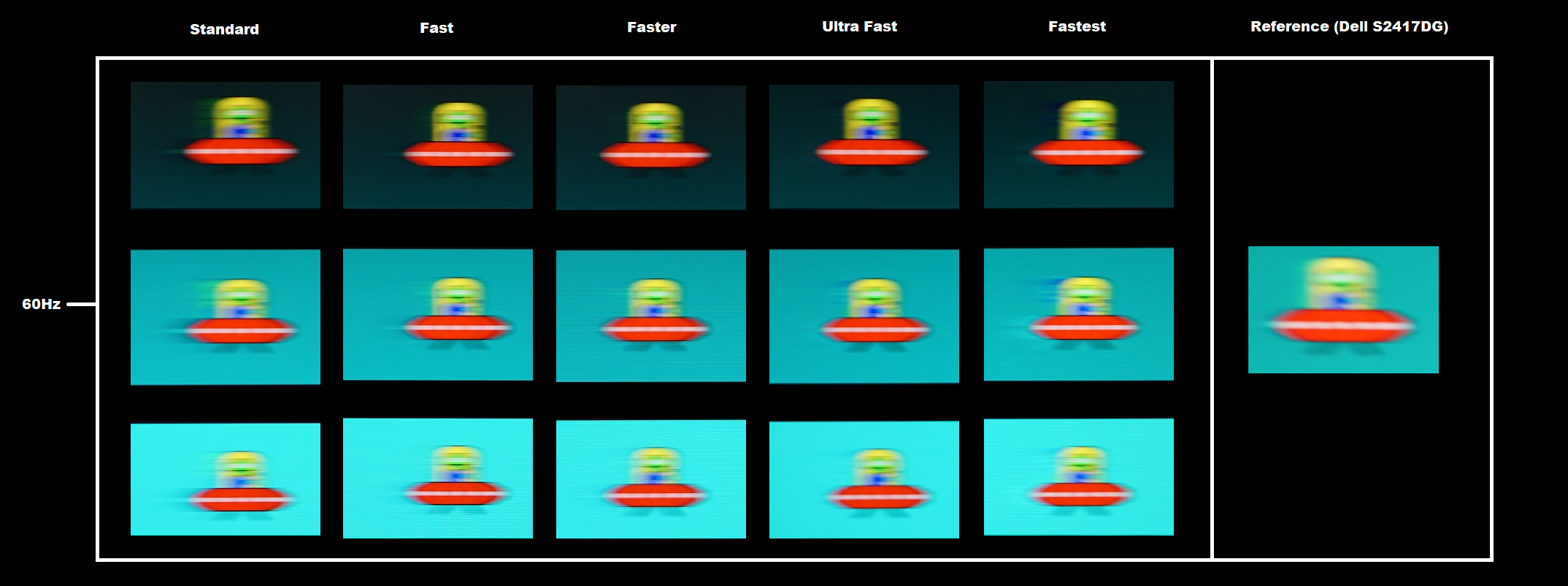
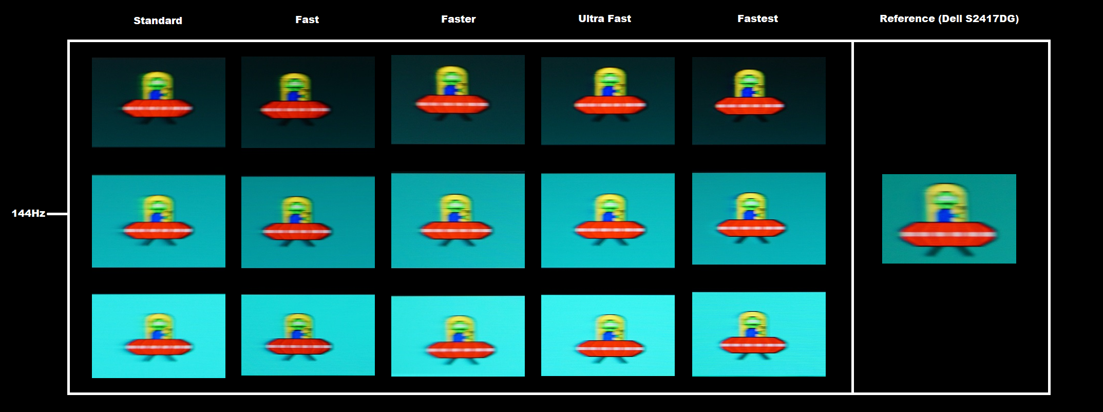
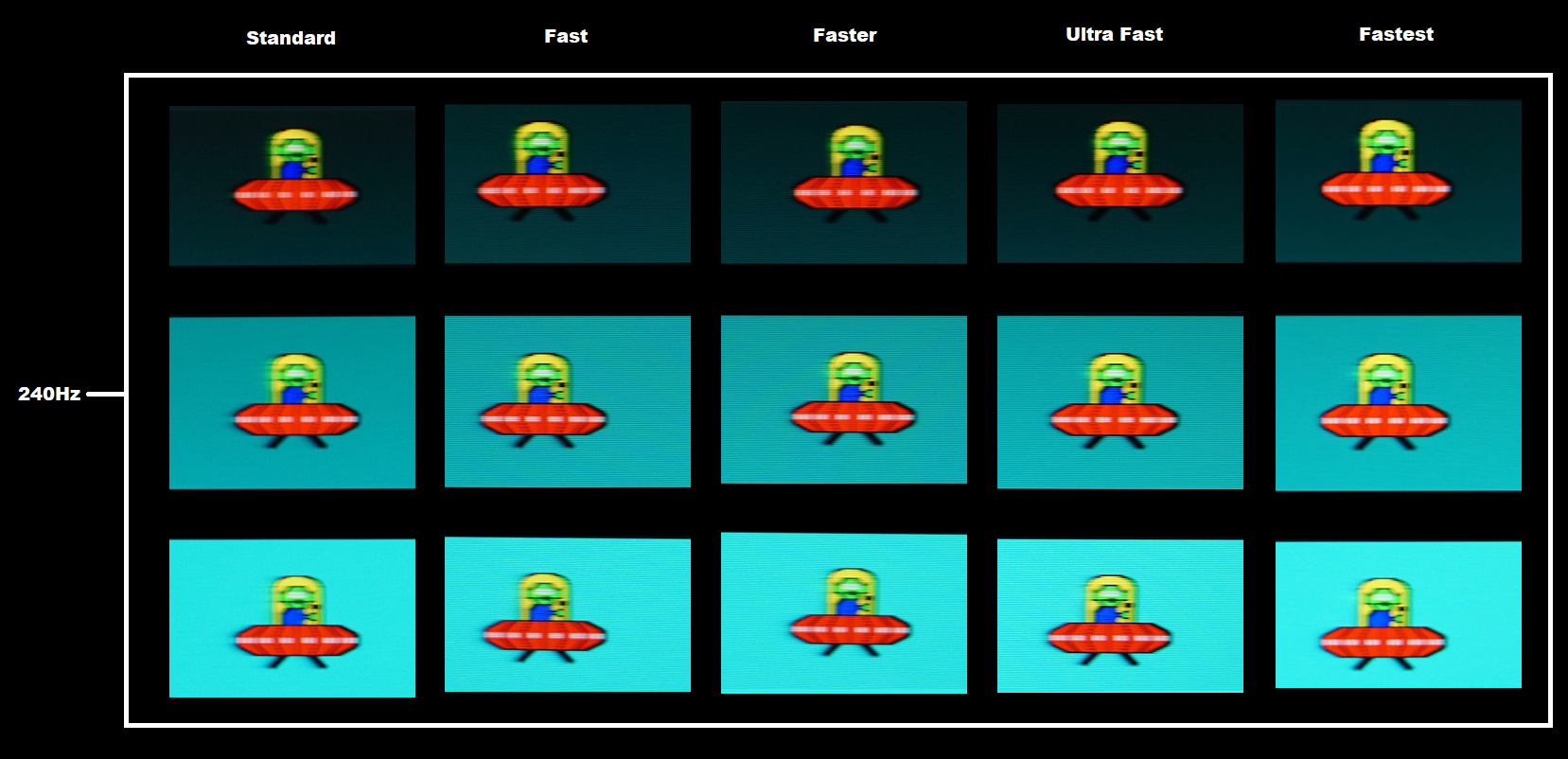
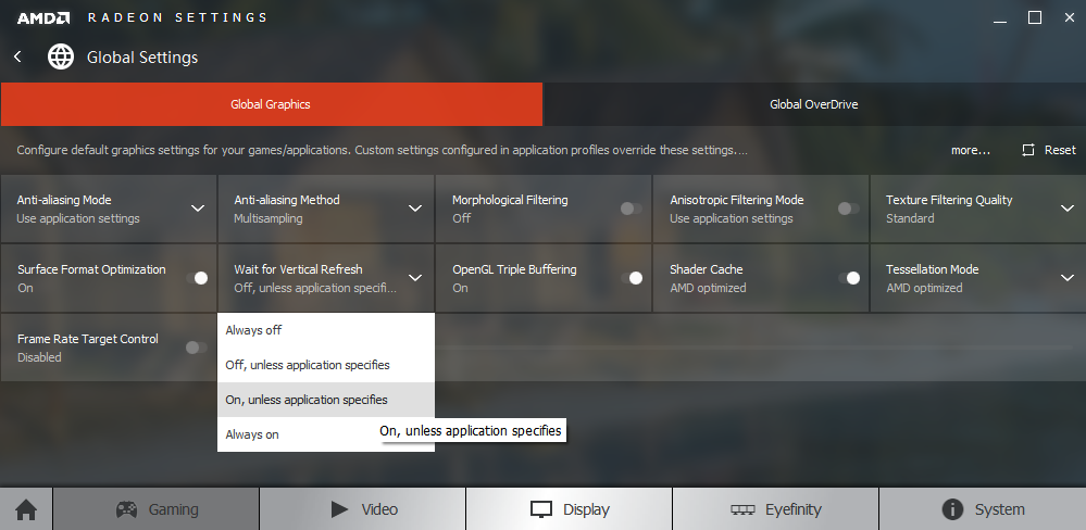
Perceived blur (pursuit photography)
Responsiveness in games and movies
Interlace pattern artifacts
FreeSync – the technology and activating it

If you don’t see this option and you have a FreeSync compatible GPU, make sure that ‘AMD FreeSync’ is set set to ‘On’ in the ‘Gaming Settings’ section of the monitor OSD. If the option still isn’t there, try reinstalling the graphics driver. The ViewSonic supports a variable refresh rate range of 48 – 240Hz. That means that if the game is running between 48fps and 240fps, the monitor dynamically adjusts its refresh rate to match the frame rate. When the frame rate rises above 240fps, the monitor will stay at 240Hz and the GPU will respect your selection of ‘VSync on’ or ‘VSync off’ in the graphics driver. With ‘VSync on’ the frame rate will not be allowed to rise above 240fps, at which point VSync activates and imposes the usual associated latency penalty. With ‘VSync off’ the frame rate is free to climb as high as the GPU will output (potentially >240fps). AMD LFC (Low Framerate Compensation) is also supported by this model, which means that the refresh rate will stick to multiples of the frame rate where it falls below the 48Hz (48fps) floor of operation for FreeSync. Say for example a game was running at 29fps, the monitor would set itself to 58Hz to keep tearing and stuttering at bay. LFC is used regardless of the VSync setting – so the VSync setting only makes a difference above the ceiling of operation (240fps in this case).
There are a couple of final points to note. Firstly, the application must be running in fullscreen mode, not a window (borderless or otherwise). Secondly, this monitor does not provide any obvious ‘at a glance’ indication that FreeSync is active, such as a change of power LED colour. As noted on the OSD video, there is an indication that this is working under ‘Setup Menu – Information’ Check for fluctuations in the vertical frequency listed here that correspond to frame rate fluctuations.
FreeSync – the experience
Video review
Conclusion
Positives Negatives Pleasing ‘out of the box’ image setup without sharing the ‘low gamma plague’ of many of its 144Hz counterparts, plus an excellent range of OSD adjustment options
The usual TN viewing angle limitations, affecting colour consistency and giving variable saturation and gamma levels at different points of the screen
Reasonable static contrast and a lack of ‘IPS glow’ help maintain a reasonable atmosphere and decent detail levels in dark scenes Static contrast slightly below that specified. The perceived gamma changes affect visibility in dark areas at different points of the screen. The slightly grainy screen surface also affected the apparent clarity of lighter shades Low input lag and well-tuned and flexible pixel overdrive, giving a convincing performance at up to 240Hz for both Nvidia and AMD users – plus AMD FreeSync support
There is a little bit of input lag due to there being a slight signal delay, which will escape the notice of most but not all users. There are also some minor weaknesses in pixel responsiveness – mentioned for completeness (we stress the ‘minor’ part) Excellent ergonomic flexibility and no particular eyesores in terms of design really
Rather a high price, particularly for a Full HD TN model
![]()

