Author: Adam Simmons
Date published: March 2nd 2023
Table of Contents
Introduction
Immersive content consumption, including gaming, is the top priority for some users. 34” 3440 x 1440 ultrawides can deliver such an experience, particularly attractive when coupled with a triple-digit refresh rate. The Philips Evnia 34M2C7600MV provides this and ratchets things up with a high level of HDR capability as well – with a high contrast VA panel, Mini LED backlight solution and VESA DisplayHDR 1400 certification. This is combined with a 165Hz refresh rate plus HDMI 2.1 support, with both PCs and new generation games consoles such as the PS5 and Xbox Series X in mind. We explore this model using our usual suite of tests, including usage on the desktop, gaming and movies.
Specifications
The monitor is based on a 34” CSOT VA (Vertical Alignment) panel with 1500R (moderately steep) curve. A 165Hz refresh rate and 3440 x 1440 resolution is supported, alongside 10-bit colour delivered via 8-bit + FRC dithering. A 2.5ms grey to grey response time is specified, but as usual you shouldn’t pay much attention to specified response times. Some of the key ‘talking points’ for this monitor have been highlighted in blue below, for your reading convenience.
The monitor offers unique and ‘clean-looking’ styling, including a marble effect matte plastic ‘penguin foot’ stand base (white with blue-grey speckles). The neck side pieces are coated metal, giving a weighty and premium feel. Silver-coloured plastic is used for the bottom bezel. Beneath the bottom bezel there are 14 RGB LEDs which form part of the relatively powerful ‘Ambiglow’ system, customisable in the OSD (On Screen Display). The bottom bezel is ~25mm (0.98 inches) thick. The top and side bezels are slimmer with a dual-stage design, including slender panel border flush with the rest of the screen and slim hard white plastic outer part. Including both components the top and side bezels are ~9mm (0.35 inches). The main feature of note from the front is the screen itself, which includes a light matte anti-glare finish and moderately steep (1500R) curve. Both aspects are explored deeper into the review. The OSD (On Screen Display) is controlled by a joystick at the rear of the screen, towards the right side as viewed from the front. A slim vertical strip style power LED is found towards the far right (to the left of the Philips logo), which glows white when the monitor is on and intermittently blinks white when it enters a low power state. The brightness can be set to 4 different levels in the OSD, or the LED can be disabled when the screen is in its on state if preferred. The video below runs through the menu system including PiP/PbP, KVM functionality and the ‘Ambiglow’ lighting system. It also touches upon ‘SmartControl’ which can be used for some basic adjustments and firmware updates – a future package called ‘Evnia P-Center’ will allow similar adjustments and more, including for the Ambiglow lighting system. As noted we didn’t find the menu system as intuitive or flexible as some joystick-based systems we’ve come across, but we wouldn’t put it in the ‘frustrating’ category like some menu systems. A lack of customisable ‘shortcut’ functions and a bit of latency, particularly when first entering the main menu, would be our main complaints. The monitor includes a small cooling fan, which we were not even aware of at all during normal use of the monitor under SDR. We could faintly hear the fan with an ear up to the top of the screen, but it’s a low-powered fan and we didn’t notice any hissing, mechanical noises or other bothersome frequencies of sound from the monitor. It also ramped up so it could be potentially more noticeable if the monitor runs at high brightness, including under HDR. Though we didn’t notice it in an obvious way over our system noise. Everybody’s hearing and sensitivity to various frequencies differs, some people will have particularly quiet systems and there’s the potential for inter-unit variation, however. It also includes 2 x 5W down-firing DTS speakers, which produce reasonably rich sound output with good volume. As shown in the OSD video there are a range of ‘Audio Mode’ presets, or you can keep this set to ‘Off’ and access the ‘EQ’ to make custom equalizer adjustments to suit your taste and listening environments. Regardless of setting used there isn’t a particularly bass-rich quality to the sound or the very crisp trebles which some systems achieve – and naturally directionality is very limited for gaming and movies. But the system is still above average for integrated monitor speakers. They also provide a good level of volume, though the minimum volume is only somewhat quiet rather than very quiet. Standard accessories with this model include; a power cable and adaptor, DP cable, Ultra High Speed HDMI cable, USB upstream cable and USB-C cable but may vary regionally. Note that for refresh rates listed in this section ‘HDMI Refresh Rate’ was set to ‘165Hz’ in the ‘System’ section of the OSD. The image below is a macro photograph taken on Notepad with ClearType disabled. The letters ‘PCM’ are typed out to help highlight any potential text rendering issues related to unusual subpixel structure, whilst the white space more clearly shows the actual subpixel layout alongside a rough indication of screen surface. This model adopts a light matte anti-glare screen surface with reasonably smooth surface texture. This offers decent glare handling without as much layering in front of the image as some matte surfaces, whilst better maintaining clarity or vibrancy potential. A ‘misty’ graininess is visible when observing lighter content rather than strong graininess. Light tends to be moderately diffused across the screen, with only particularly bright direct lighting causing sharper glare patches and slight reflection. Lighter matte surfaces than this provide more of these sharper glare patches with less diffusion and lower potential hazing of the image as a result. Glossy surfaces are prone to sharp reflections, without noticeable diffusion or hazing. Because of the curve to the screen, the glare is stretched out horizontally and when you view the screen from off-angle the image can be flooded by glare in brighter conditions. The Evnia 34M2C7600MV features a range of ‘SmartImage’ (or ‘SmartImage Game’) presets; ‘Standard’, ‘FPS’, ‘Racing’, ‘RTS’, ‘Movie’, ‘LowBlue Mode’, ‘Easy Read’, ‘Economy’, ‘SmartUniformity’, ‘Game 1’ and ‘Game 2’. Many of these presets simply adjust various settings in the OSD and don’t achieve anything you couldn’t achieve yourself with manual adjustment. You can use them as a base and make further manual adjustment to the image – the ‘SmartResponse’ setting is also remembered for each preset. A notable exception is ‘SmartUniformity’, explored here alongside a range of other manual adjustments. And ‘Easy Read’ which turns everything greyscale. Some of these presets unlock the ‘SmartFrame’ feature in the ‘Game Mode’ section of the OSD, which allows a section of the screen to be highlighted with different digital brightness and contrast levels. The ‘Gamer 1’ and ‘Gamer 2’ presets allow full flexibility and allow you to easily recall different sets of settings. We touch upon the presets briefly in the OSD video but for this section will mainly be focusing on various manual adjustments, the ‘LowBlue Mode’ settings and the ‘SmartUniformity’ setting. Under HDR these ‘SmartImage’ presets are replaced by HDR presets; ‘HDR Game’, ‘HDR Movie’, ‘HDR Photo’, ‘DisplayHDR 1400’, ‘Personal’ (and ‘Off’) which are touched upon in the HDR section. The table below shows gamma and white point readings taken using a Datacolor SpyderX Elite colorimeter, alongside general observations by eye. Our test system uses Windows 11 with an Nvidia RTX 3090 connected using the supplied DisplayPort cable. Additional testing was performed via HDMI and also using an AMD Radeon RX 580, though observations on this table didn’t differ significantly between inputs or GPUs. The monitor was left to run for over 2 hours before readings were taken and observations made, without any additional monitor drivers or ICC profiles specifically loaded. Aside from our ‘Test Settings’, where various adjustments were made, assume factory defaults were used with the monitor set to its ‘Standard’ preset. The refresh rate was set to 165Hz in Windows, although this didn’t significantly affect the values or observations in this table. When viewing the figures in this table, note that for most PC users ‘6500K’ for white point and ‘2.2’ for gamma are good targets to aim for. Individual targets depend on individual uses, tastes and the lighting environment, however. Out of the box (set to ‘Standard’), the monitor provided a vibrant look to things with quite good colour channel balance and gamma tracking. Gamma averaged ‘2.2’, but was slightly low for darker shades, raising them slightly. This was far from an extreme uplift and just slightly offset the ‘black crush’ and slightly increased ‘unintended dark detail’, mainly peripherally where perceived gamma is reduced further. We explore these concepts later on, but note that this isn’t an extreme uplift in gamma by any means. The ‘sRGB’ mode also averages ‘2.2’, but actually tracks the ‘sRGB’ gamma curve more closely, providing a more significant uplift to dark shades with reduced low-end gamma. The first graph below shows gamma tracking under our ‘Test Settings’ (very similar tracking to factory defaults) and the second graph shows gamma tracking using the ‘sRGB’ setting. Note that these graphs just give a general idea of gamma behaviour, but lack the precision or resolution to clearly show the low-end gamma uplifts we described. Each unit of the monitor includes a calibration report which shows the average gamma and colour accuracy (DeltaE deviation) of the ‘sRGB’ mode. It also includes uniformity data for brightness and colour using the ‘SmartUniformity’ setting. We prefer to analyse things in a more visual and qualitative way, but using the ‘sRGB Mode’ we can confirm an average DeltaE of 1.36 within the sRGB colour space recorded with our SpyderX Elite, using the same 24 test patches analysed visually deeper into the review (SpyderCHECKR 24). Note that shade 1F (cerulean) is usually always reported with a relatively high DeltaE by the Spyder device and software. Based on a visual assessment, as performed shortly using SpyderCHECKR 24, we would discount such a high DeltaE. The average DeltaE on the factory calibration report was lower at 0.46, but this was based on a different shade set and using a different measurement instrument and software. Either way, the DeltaE of 1.36 we measured was still within the manufacturer’s claim of ‘DeltaE <2’ (on product page and spec sheet - 'DeltaE <3' claimed on report itself) for this factory calibration. Given the intended uses for the monitor, inter-unit variation and performance of our unit with OSD tweaking alone we won’t be using any ICC profiles in this review or including any measurements or graphs using them. We wouldn’t recommend using them unless created for your specific unit using your own calibration device. But we appreciate some users still like to use profiles and some aspects such as gamut mapping for colour-aware applications can be useful. You can download our ICC profile for this model, which was created using our ‘Test Settings’ as a base. You can also download our sRGB profile which was created using and designed for the ‘sRGB’ preset (sRGB emulation mode). Amongst other things, this adjusted gamma to track the ‘2.2’ curve on our unit – but be aware of inter-unit variation. And note again that these ICC profiles are not used in the review. The monitor includes a few Low Blue Light (LBL) settings, with the main setting being the ‘Low Blue Mode’ preset. This significantly reduces blue light output from the monitor, minimising the blue colour channel whilst maintaining a fairly strong red channel and reasonably strong green channel. The resulting image is warm with a mild green tint, which your eyes may adjust to over time. An alternative is to set ‘Color Temperature’ to ‘5000K’, another effective LBL setting which maintains a strong red channel, significantly reduced blue channel and reduced green channel. The resulting image is warm with a somewhat amber tint. Your eyes should adjust to this over time so it becomes more ‘normal’. We prefer the visual balance of this ‘5000K’ setting and used it for our own viewing comfort in the evenings, but not for any specific testing beyond that involving the setting itself. This warm look to the image is considered more relaxing by some and can be particularly important in the hours leading up to sleep. The flexible preset arrangement of the monitor means it’s easy to associate either LBL setting to a particular preset such as ‘Game 1’ or ‘Game 2’. For our ‘Test Settings’ we lowered brightness and changed the ‘Color Temperature’ setting. Oddly this model lacks the usual ‘User Define’ setting which would allow manual colour channel adjustment. ‘Native’ (equivalent to RGB each at ‘100’) on our unit was fortunately well-balanced. ‘SmartControl’ software (shown in the OSD video) can be used for to adjust the colour channels of the monitor if required. Note that individual units and preferences vary, so these settings are simply a suggestion and won’t be optimal for all users or units. We’ve also included the refresh rate used in Windows and our preferred ‘SmartResponse’ setting used for most of the review, just for reference. These settings only apply to SDR, HDR has separate settings associated with it and is explored in the relevant section of the review. We left everything at default under HDR using ‘DisplayHDR 1400’, with ‘Local Dimming’ set to ‘Medium’. SmartImage = Game 1 (‘Game 2’, ‘Standard’ etc. could be used as a base if preferred) Brightness = 15 (according to preferences and lighting) Color Temperature = Native Adaptive Sync = Adaptive Sync On SmartResponse = Faster Refresh rate (Windows setting) = 165Hz Note that the firmware can be upgraded via ‘SmartControl’ and a future software package called ‘Evnia P-Center’. At time of review this feature (or new firmware) was not available. An X-Rite i1Display Pro Plus (Calibrite ColorChecker Display Plus) was used to measure the luminance of white and black using various settings, including those found in the calibration section. From these values, static contrast ratios were calculated. The table below shows these results. Blue highlights indicate the results under our ‘Test Settings’ and with HDR active. Black highlights indicate the highest white luminance, lowest black luminance and highest contrast ratio recorded under SDR. Assume any setting not mentioned was left at default, with the exceptions already noted here or in the calibration section. Some values in the table are approximate, designated with relevant symbols. This is due to a lack of precision from the measurement instrument for black luminance readings, which significantly affects the measured contrast in some cases, including if the black point is low. Although not documented in the table, HDR settings other than ‘DisplayHDR 1400’ were briefly tested and appeared to perform similarly here to ‘DisplayHDR 1400’. The exception was ‘HDR Game’ as this offered similar white luminance but had a consistently and significantly raised black point, diminishing contrast. **These readings were taken using the above test. A reading was taken using a white screen fill (‘all pixels’), 30 seconds after it was displayed. This is used to represent the sustained luminance level the monitor can provide under HDR, rather than the peak luminance achieved for smaller sections of the screen. Because the entire screen is white for this test, black luminance levels can’t be read and an HDR contrast reading can’t be ascertained. The average static contrast with only brightness adjusted was 3835:1 (excluding values affected too heavily by rounding precision), comfortably exceeding the specified 3000:1 and a good contrast level for a modern VA monitor. The maximum contrast recorded under SDR was 3933:1 and under our ‘Test Settings’ was >3480:1, which is respectable. The lowest contrast recorded was using ‘SmartUniformity’ at 2517:1, which is expected given the uniformity compensation applied using the setting. A reduction was also observed with the ‘Color Temperature = 5000K’ setting, due to the significant colour channel adjustments made – it remained >3029:1, however. The maximum white luminance recorded under SDR was 808 cd/m², whilst the minimum was 59 cd/m² – giving an impressive luminance adjustment range of 749 cd/m². This is a very bright maximum value for SDR and a reasonably low but not very low minimum which some sensitive users may find too bright. The monitor includes a 1152-zone Mini LED backlight solution, which can be used and configured under HDR with the ‘Local Dimming’ setting. You can’t use the ‘Local Dimming’ solution under SDR, so Philips is really missing a trick there – though this could potentially be added in a future firmware update. The ViewSonic XG341C-2K did allow this, although brightness was locked to very high levels which limited the practicality for SDR use as well. Under HDR a contrast as high as >154,100:1 was recorded, alongside a 1541 cd/m² brightness – impressively bright, slightly exceeding the VESA DisplayHDR 1400 certification and a touch higher than we recorded on the ViewSonic alternative (1422 cd/m²). The luminance level and contrast depends on the content being displayed and on the ‘Local Dimming’ level used. A range of readings were taken under HDR to reflect this, with further subjective reinforcement using more complex ‘real world’ examples later. The HDR data for the 3 ‘Local Dimming’ settings is shown below, for those preferring a graphical representation. The monitor includes a Dynamic Contrast setting called ‘SmartContrast’, found in the ‘SmartImage’ section of the OSD. Brightness can be adjusted with this setting, but this only has a short-lived effect and the monitor will eventually start making the same adjustments regardless of this setting. It dims and brightens at a gentle to moderate pace as the content changes and reaches very bright levels, even staying quite bright for mixed content with plenty of darkness. It will dim effectively only if very little bright content is present on the screen. It’s a compromised solution, as usual for such a setting, so we prefer manual control over brightness for SDR. The Evnia 34M2C7600MV does not use PWM (Pulse Width Modulation) to regulate backlight brightness at any brightness level, with DC (Direct Current) used to moderate brightness instead. PWM was avoided regardless of ‘Local Dimming’ being active under and the monitor didn’t exhibit the low amplitude oscillation we sometimes observe with local dimming solutions. The backlight is therefore considered ‘flicker-free’, which will come as welcome news to those sensitive to flickering or worried about side-effects from PWM usage. Whilst observing a black background in a dark room, using our ‘Test Settings’, we noticed some backlight bleed and moderate clouding, mainly near the bottom of the screen but a bit further up as well. It’s important to remember that individual units vary when it comes to all aspects of uniformity, including backlight bleed and clouding. The following image was taken a few metres back to eliminate ‘VA glow’. This is a mixture of a silver and reddish glow that appears towards the edges, particularly near the bottom of the screen from a normal viewing position. This ‘VA glow’ blooms out more noticeably from sharper angles, as demonstrated in the viewing angles video later on. The luminance uniformity using our ‘Test Settings’ was excellent. The maximum luminance was recorded at ‘quadrant 5’ in the centre of the screen (163.2 cd/m²). The greatest deviation from this occurred at ‘quadrant 2’ above the centre of the screen (157.2 cd/m², which is 4% dimmer). The average deviation between each quadrant and the brightest recorded point was 2.00%, which is exceptional. The ‘SmartUniformity’ setting offered weaker (but still reasonable) performance in this test. The maximum luminance was recorded at ‘quadrant 9’ towards the bottom right (304.4 cd/m²). The greatest deviation from this occurred at ‘quadrant 2’ above centre (273.3 cd/m², which is 10% dimmer). The average deviation between each quadrant and the brightest recorded point was reduced slightly to 5.88%, quite respectable but significantly higher than for our ‘Test Settings’. Even if the setting was optimised very carefully in the factory, uniformity can shift over time. Remember that individual units vary when it comes to uniformity and you can expect further deviation beyond the points measured. The contour map below shows these deviations graphically, with darker greys representing lower luminance (greater deviation from brightest point) than lighter greys. The percentage deviation between each quadrant and the brightest point recorded is also given. The top table shows the results under our ‘Test Settings’, the bottom using ‘SmartUniformity’ with default settings. The SpyderX Elite was also used to analyse variation in the colour temperature (white point) for the same 9 quadrants. The deviation between each quadrant and the quadrant closest to the 6500K (D65) daylight white point target was analysed and a DeltaE value assigned. Darker shades are also used on this map to represent greater deviation from 6500K. A DeltaE >3 represents significant deviation that may be readily noticed by eye. The top graphic shows results under our ‘Test Settings’ and the bottom using ‘SmartUniformity’ with default settings. Results here were reasonable using our ‘Test Settings’. Significant deviation was recorded towards the bottom of the screen (peaking at DeltaE 3.8 for the bottom central region), compared to the top central region which was recoded as closest to 6500K. The ‘SmartUniformity’ setting improved the colour temperature uniformity, with no significant deviation recorded. Note again that individual units vary when it comes to uniformity and that you can expect deviation beyond the measured points. Also be aware that there are some perceived deviations in both brightness and colour temperature that are typical on VA panels and aren’t reflected by these readings. In addition to the quantitative testing above, we performed a subjective assessment of the uniformity of a variety of ‘medium’ shades, including 50% grey. Some monitors exhibit uniformity issues such as splotches or striations when viewing screen fills of such shades, giving an inconsistent appearance that some users refer to as ‘DSE’ (‘Dirty Screen Effect’). VA models are particularly prone to this. We observed slight patchiness and minor striations in places, but no significant issues of concern such as clear striations or heavy patchiness. The monitor provided strong contrast on Battlefield 2042. Under our ‘Test Settings’ we recorded a static contrast of >3480:1, which provides a good atmosphere to darker scenes and good depth to darker shades within scenes. Some medium shades appeared a bit inkier and more ‘solid’ as a result of this relatively strong contrast, when compared to models with significantly weaker contrast. Compared to OLED monitors you don’t get the same absolute depth and inky look to things when observing in dim lighting, but performance amongst LCDs is strong. A moderate amount of ‘VA glow’ was observed, brightening shades up towards the bottom of the screen in particular from a normal viewing position. Depending on viewing position, it may be observed towards the top of the screen as well. This isn’t as widespread or intense as ‘IPS glow’ – it can be brought out more strongly (as with ‘IPS glow’) if you’re sitting closer to the screen, you’re using a high brightness setting or your unit has significant backlight bleed or clouding issues. A bit of ‘black crush’ was also observed, where dark shades (other than black) appear deeper than intended and blend into a dark mass. So perceived gamma for these shades is higher than intended. This is observed towards the centre of the screen or the area of screen directly in line with your eyes. It was offset just slightly by the gamma tracking of our unit – as explored in the calibration section, gamma was slightly lower for dark shades. Towards the extreme edges of the screen perceived gamma reduces a bit, revealing some ‘excess’ dark detail by lightening up darker shades (other than black) so they appear lighter than intended. The ’black crush’ and associated gamma shifts were not extreme from our preferred viewing position of ~70cm or slightly further back, but still something to note. Lighter shades stood out well against darker surroundings, with the screen surface imparting a bit of ‘misty’ graininess rather than a heavily smeary or sandy appearance – and with less clear layering in front of the screen than stronger matte surfaces. We made similar observations with respect to contrast on Shadow of the Tomb Raider. There are plenty of ‘high contrast’ scenes on this title, with dark passageways and suchlike illuminated by a few point sources of light. The relatively strong static contrast provided a good atmosphere and aided the structural definition of elements such as cracks in rocks and shadows cast amongst leaves and branches. Some medium shades had a bit more depth than on models with much weaker static contrast, too, making them appear a bit more solid. A moderate amount of ‘VA glow’ and slight ‘black crush’ was again observed. The overall depth and atmosphere here was certainly not comparable to OLED, particularly in a dim room, but better than many LCDs. If you do like to observe darker content on the monitor in a dimly lit room, the ‘Ambiglow’ lighting feature of the monitor can help by acting as bias lighting. Particularly if set to display a static shade at the highest brightness setting for the feature. This doesn’t perform miracles, but still enhances perceived contrast if the room isn’t well-lit. You may also find using the feature can improve viewing comfort. The screen surface again provided some ‘misty’ graininess without strong layering or a smeary appearance. The movie Star Wars: The Rise of Skywalker also reflected the relatively strong contrast performance. Many scenes include bright elements such as pulses of energy, flames and light sabers set against much darker backdrops. The experience here did not hold a candle to what an OLED can deliver in dimmer lighting, but was relatively strong as far as LCDs are concerned. There was again a moderate amount of ‘VA glow’. With this title being presented with black bars at the top and bottom, this is made more noticeable. A lot of content you’ll consume on streaming media platforms including Netflix, Amazon Prime Video and certainly YouTube is 16:9 so there will be large black bars at the sides (so it can again be observed there). We also observed ‘black crush’ and some gamma shifts as described earlier. Some extra detail was observed towards the sides and bottom of the screen, though this was not extreme from our normal viewing position. Highly compressed streamed content includes ‘compression artifacts’ which can be less masked than intended peripherally, because of this, giving a slightly ‘blocky’ or banded appearance in places. The Lagom tests for contrast allow specific weaknesses in contrast performance to be identified. The following observations were made in a dark room. The monitor uses a Quantum Dot (QD) backlight solution to enhance the gamut, employing blue LEDs layered with red and green Quantum Dots. This creates larger peaks of green and red light than you’d see on your typical standard gamut monitor. These relatively strong green and red peaks enhance the colour gamut whilst also creating a more balanced and less blue-biased spectral profile, potentially aiding viewing comfort. The colour gamut of the 34M2C7600MV is shown as a red triangle below. It was compared with the sRGB (green triangle) and DCI-P3 (blue triangle) reference colour spaces using our ‘Test Settings’. The gamut fully covers sRGB (100%) with some extension beyond – we recorded 95% DCI-P3 coverage which falls just below the specified 97% DCI-P3. The exact measured gamut can vary depending on measurement instrument and software, with slight inter-unit variation also possible. There’s significant extension beyond DCI-P3 for the red to blue edge of the gamut, covering certain red shades, pinks, purples and blues. Although not shown in the graphic, we recorded 90% Adobe RGB coverage, again a touch below the specified value (92.9%). This Adobe RGB coverage isn’t high enough for accurate reproduction within that colour space, but the DCI-P3 coverage provides decent potential with the DCI-P3 colour space in mind. For standard sRGB content outside a colour-managed environment, the significant extension beyond sRGB provides significant extra saturation and vibrancy, particularly for red-biased shades. The monitor offers an sRGB emulation setting, the ‘sRGB’ setting. Although it appears to be available in quite a few presets, it only performs its intended function when using ‘Standard’. This cuts down on the gamut effectively, with just a sliver of overextension for the red to blue edge and a little undercoverage for the green to blue edge, with 97% sRGB coverage recorded. You can adjust ‘Brightness’ and ‘SmartResponse’ with this setting active – whilst ‘Gamma’ and ‘Color Temperature’ does not appear to be blocked off, if you change either setting it will disable ‘sRGB’ (so you can’t make such adjustments). To maximise colour accuracy within the sRGB colour space, for colour-managed workflows, full calibration and profiling with a colorimeter or similar device using the full native gamut is recommended. You may try the ICC profile featured in the calibration section which includes gamut mapping for colour-aware applications, but best results are always obtained by calibrating your own unit with your own hardware. Instead of using this ‘sRGB’ setting and putting up with the associated restrictions, AMD users can activate a flexible sRGB emulation setting via the graphics driver. This is done by opening ‘AMD Software’, clicking ‘Settings’ (cog icon towards top right) and clicking on ‘Display’. You should then ensure that the ‘Custom Color’ slider to the right is set to ‘Enabled’ and ‘Color Temperature Control’ set to ‘Disabled’. It may appear to be set this way by default, but the native rather than restricted gamut is likely in play. If that’s the case, simply switch the ‘Color Temperature Control’ slider to ‘Enabled’ then back to ‘Disabled’ to leverage the sRGB emulation behaviour. This setting is shown in the image below. The gamut below shows results using our ‘Test Settings’ with this driver tweak applied. The colour gamut now covers 96% sRGB with a sliver of extension beyond for the red to blue edge and a little undercoverage in the green corner and for the green to blue edge. This setting offers decent sRGB tracking and helps to cut down on the colour gamut without profiling, including in applications that aren’t colour managed. And you don’t have to put up with restrictions associated with the monitor’s sRGB emulation setting such as locked colour channels. Whilst Nvidia doesn’t have a similar option in their graphics driver, a third party tool called ‘novideo_srgb’ can be used. This provides a similarly effective GPU-side gamut clamp to the AMD driver option. The resulting gamut was very similar to that shown above with the AMD tweak – this is expected given it uses the same data from the EDID of the monitor. The tool and its usage is covered in our sRGB emulation article. The monitor provided a good level of vibrancy on Battlefield 2042. As with most content observed under SDR, whether it’s a game or on the desktop, the creators have the sRGB colour space in mind. If you’re using the full native gamut of a monitor with a wider gamut than this, it oversaturates and provides extra vibrancy as a result. With its 95% DCI-P3 coverage and significant extension beyond for the red to blue edge, that’s certainly the case here. There was significant extra vibrancy for shades located in that region of the gamut, with definite extra ‘pop’ to bright red paints and some vibrant orangey red flames for example. Some of the yellows for the flames verged on orange and orange on red as a result. Skin tones are also given extra richness, in some cases looking a bit sun-kissed. Woody shades and earthy browns had any red component brought out too strongly as well, affecting neutrality. There were some rather eye-catching greens as well, with some areas of vegetation looking less muted than intended or a brighter than intended shade – with some overly yellowish greens as well. This was less extreme than on models with more generous Adobe RGB coverage (more extension for that section of the gamut) and we wouldn’t describe these natural greens as ‘neon’, however. Such a gamut would also provide extra vibrancy for cyans compared to what we observed here, giving a cartoonish look to some areas of sky for example. There was still significant extension beyond sRGB in this case, but as it’s more constrained it gave some extra ‘pop’ without the same surreal look. We made similar observations on Shadow of the Tomb Raider. Lara Croft’s skin and other character skin tones in the game appeared richer and more tanned than intended, whilst woody and earthy browns had a red or copper hue (depending on the shade observed). The extra pop to greens was also observed, with vegetation appearing quite lush overall with some shades displayed in a brighter and less muted than intended fashion. Again, we wouldn’t describe this as a ‘neon’ look. Sky blues were also displayed in a more vivid than intended way. On both titles the most vibrant look with strongest saturation covered the central region of the screen, whilst some saturation losses were observed peripherally. Mainly the side edges and further down, from our normal viewing position. This was due to perceived gamma shifts and lower perceived gamma peripherally vs. centrally – this is always observed to a degree on VA models. These shifts were quite typical for a ~34” VA ultrawide, from our preferred viewing distance of ~70cm. We also observed various episodes of the animated TV series Futurama, which is a particularly unforgiving test for colour consistency. There are large areas of individual shade which makes any saturation shifts at different points of the screen particularly obvious. The shifts here were not extreme, but were certainly still there. Pastel shades tended to look punchier than intended, with a bit of that extra saturation lost peripherally so arguably a more appropriate look there. There were some rather eye-catching neon greens, bright yellows, deep purples and strong reds as well – particularly if shown against darker backgrounds, where the strong contrast also comes into play. Character skin tones tended to appear oversaturated centrally and more appropriate if a touch undersaturated peripherally. Particularly near the sides and further down the screen from our regular viewing position. Whether you’re watching video content, simply on the desktop or watching video content, some people will enjoy the sort of extra vibrancy and saturation given by the wide gamut. But for those seeking a more muted and toned-down appearance, more ‘as the creators intend’, the sRGB emulation setting (‘sRGB’) may be preferred. The image below shows a printed reference sheet of 24 ‘sRGB’ shades, included as part of the Datacolor SpyderCHECKR 24 package. The screen is displaying reference photographs of this printed sheet, in both the same order as printed (right side) and reverse order (left side). The camera is mounted slightly above centre so that the image is representative of what the eye sees from an ergonomically correct viewing position. This, coupled with the inclusion of a flipped version of the shade sheet, allows both accuracy and colour consistency to be visually assessed. Bracketed numbers in our analysis refer to shades on the printed sheet or right side of the screen if they’re ordered consecutively from top left to bottom right. Note that there is always some disparity between how emissive objects (monitor) and non-emissive objects (printed sheet) appear. The monitor is set to a very low brightness to help minimise this disparity. The representation of shades in this image depends on the camera and your own screen, it’s not designed to show exactly how the shades appear in person. It still helps demonstrate some of the relative differences between the original intended sRGB shade and what the monitor outputs, however. Full profiling and appropriate colour management on the application would provide a tighter match, our intention here is to show what can be expected in a non colour-managed environment. Black (21) is interesting to observe as it highlights some of the perceived gamma shifts. The photograph shown on the screen is of the actual printed sheet, which has a slight material texture to it. This is well-blended and barely visible when viewed on most of the screen, but it’s more visible lower down the screen (or towards the sides) due to the aforementioned perceived gamma shifts. This is clearer by eye than in the photo. Overall the performance here is superior to TN models, vertically, but not up to IPS levels. It’s somewhat stronger than we’ve seen on some VA models, though not quite up there with the best VA performer we’ve seen in that respect, which is the AOC CQ32G3SU with its AUO VA panel. The photograph below shows the monitor running its sRGB emulation mode (‘sRGB’ enabled in the ‘Standard’ preset’). Lagom’s viewing angle tests help explore the idea of colour consistency and viewing angle performance. The following observations were made from a normal viewing position, eyes ~70cm from the screen. The shifts observed are more readily apparent if sitting closer and less apparent if sitting further away. On some monitors, particularly but not exclusively those with high refresh rates, interlace patterns can be seen during certain transitions. We refer to these as ‘interlace pattern artifacts’ but some users refer to them as ‘inversion artifacts’ and others as ‘scan lines’. They may appear as an interference pattern, mesh or interlaced lines which break up a given shade into a darker and lighter version of what is intended. They often catch the eye due to their dynamic nature, on models where they manifest themselves in this way. Alternatively, static interlace patterns may be seen with some shades appearing as faint horizontal or vertical bands of a slightly lighter and slightly darker version of the intended shade. In this case we observed some extremely faint static interlace patterns at ~144Hz and above, with some shades (including some greys, blues and oranges) appearing with very fine lines of a very slightly darker and lighter variant of the intended shade. As faint as we’ve seen them whilst still being able to observe them. We also observed slight dynamic interlace patterns. More specifically, a fine polygonal mesh could be observed during movement at lower refresh rates. These were difficult to spot rather than obvious, even at relatively low refresh rates such as 60Hz and not observed above ~120Hz. They occurred regardless of VRR status. Neither artifact type was obvious on this monitor and aren’t something most will notice or find eye catching from a normal viewing distance at any refresh rate – but we like to note their existence for completeness. A sensitive camera and a utility called SMTT 2.0 was used to analyse the latency of the Evnia 34M2C7600MV, with ‘Low Input Lag’ enabled in the ‘Game Mode’ section of the OSD. Similar values were recorded with Adaptive-Sync enabled, which greys out the ‘Low Input Lag’ setting. Over 30 repeat readings were taken to help maximise accuracy. Using this method, we calculated 3.11ms (around ½ a frame at 165Hz) of input lag. This figure is influenced by both the element of input lag you ‘see’ (pixel responsiveness) and the main element you ‘feel’ (signal delay). It indicates a low signal delay which most users should find acceptable. Note that we don’t have the means to accurately measure input lag with VRR technology active in a VRR environment or HDR active in an HDR environment. In our responsiveness article, we explore the key concepts surrounding monitor responsiveness. One of these is the concept of ‘perceived blur’, contributed to by both the movement of your eyes as you track motion on the screen and the pixel responses of the screen. This first factor is dominant on modern monitors, but both elements are important. A photography technique called ‘pursuit photography’ is also covered, using a moving rather than stationary camera to capture motion performance in a way that reflects both aspects of perceived blur. The images below are pursuit photographs taken using the UFO Motion Test for ghosting, with the test running at its default speed of 960 pixels per second. This is a good practical speed to take such photographs at and highlights both elements of perceived blur well. The UFOs move across the screen from left to right at a frame rate matching the refresh rate of the display. All three rows of the test are analysed to highlight a range of pixel transitions. The monitor was tested at 60Hz (directly below), 120Hz and 165Hz using all ‘SmartResponse’ settings. The two final columns show reference screens, set to what we consider their optimal response time setting for a given refresh rate. The AOC CQ32G3SU, which is another 165Hz VA model. This one provides quite an average pixel response performance for the panel type. And the Gigabyte M27Q, which is an IPS model offering a decent but not outstanding pixel response experience – one which most are perfectly happy with. At 60Hz, above, the UFO appears soft and unfocused without clear internal detailing. This reflects a moderate amount of perceived blur due to eye movement. Significant weaknesses are observed related to pixel response behaviour, including some clear ‘smeary’ trailing for the dark background (top row) in particular and less extensive but still ‘smeary’ trailing for the medium background (middle row). Performance for the light background (bottom row) is somewhat stronger. The ‘Fast’ setting reduces this trailing slightly compared to ‘Fast’, mainly for the dark background, with another slight improvement using the ‘Faster’ setting. The ‘Fastest’ setting replaces most of this ‘smeary’ trailing with overshoot (inverse ghosting), with a bold and inky appearance and some bright ‘halo’ trailing – this is unsightly and very eye-catching in practice. We therefore consider the ‘Faster’ setting optimal for 60Hz – though both reference screens offer superior performance here. If comparing to the ViewSonic XG341C-2K using its optimal ‘Faster’ setting, it appears that the Philips has reduced (less extended) ‘smeary’ trailing for the dark background. Below you can see what things look like with refresh rate doubled to 120Hz. At 120Hz, above, the UFO appears significantly narrower with clearer internal detail. This reflects a significant decrease in perceived blur due to eye movement. To the eye the black lines which separate the segments of the UFO are less blended than they appear in the photos, so segmentation is more distinct – though the white notches still blend together. There’s a significant increase in the pixel response requirements for a strong performance here. The ‘smeary’ trailing is more distinct now, bolder and extending further back. The relative improvement with the various overdrive settings is slightly subtler, but there’s still slight improvement (mainly for the dark background). The ‘Fastest’ setting exhibits very obvious and colourful overshoot, so we again consider ‘Faster’ optimal here just like at 60Hz. The reference screens again outperform, particularly the IPS reference. Even the VA reference shows less extended and bold ‘smeary’ trailing, however. Below you can see things with a further boost in refresh rate up to 165Hz. The M27Q IPS reference runs at 170Hz, but this makes a negligible difference compared to 165Hz. At 165Hz, above, the UFO appears a bit narrower with improved definition. To the eye the segmentation is quite distinct now, though the white notches still appear blended together as they appear in the photos. This reflects a further reduction in perceived blur to eye movement – less significant than the initial doubling from 60Hz to 120Hz. The pixel response requirements for a strong performance are also increased with this boost in refresh rate, with the ‘smeary’ trailing a bit bolder and extending slightly further back. There’s now marginal improvement for these transitions moving from ‘Off’ to ‘Fast’ and just slight further improvement moving up to ‘Faster’. In practice, observing a broader range of transitions, ‘Faster’ did offer some improvement without introducing unsightly overshoot. Unlike the ‘Fastest’ setting – so we again consider ‘Faster’ optimal here. Performance is again a fair bit weaker than the VA reference and significantly weaker than the IPS reference, particularly for the dark and medium backgrounds. Remember that these references are far from the fastest examples for their respective panel types. It’s very much in-line with what we observed on the XG341C-2K at 165Hz for the transitions shown here. Unlike on the ViewSonic, we found the ‘Faster’ setting optimal under HDR as well as SDR without obvious overshoot being introduced. On various Battlefield titles, at a frame rate keeping pace with the 165Hz refresh rate, the monitor gave a fluid feeling. Compared to a 60Hz monitor or this monitor running at 60Hz (or 60fps), up to 2.75 times as much visual information is presented every second. This significantly improves the ‘connected feel’, describing the precision and fluidity felt when interacting with the game world. This is also aided by the low input lag. The high refresh rate and frame rate combination also decreases perceived blur due to eye movement. This was demonstrated earlier using pursuit photographs – but these also highlight significant pixel response time weaknesses which significantly increase perceived blur. Not all transitions show distinct weaknesses – where brighter and medium shades dominate, you can observe a slight mask of additional perceived blur due to ‘powdery’ trailing. The more distinct weaknesses occur where darker shades are involved in the transition, where there’s a definite ‘smeary’ look during motion. Highly saturated shades against medium shades (such as a bright red barrel against a concrete wall) can also trigger this sort of ‘smeary’ trailing. Similar to and in some cases more obvious than shown using Test UFO earlier. Dark shades may contain small amounts of colour (dark brown, purple, red etc.) rather than being pure greyscale shades, and these colours can leach out due to the weaknesses – like you’re wetting a page with water soluble ink on it. A ‘flickering’ effect can also be observed in places where certain dark and somewhat lighter shades combine, such as a bush with leaves or branches casting internal shadows. During movement the brighter shades blend into the darker shades and they brighten back up to appropriate levels when the motion ceases. The weaknesses in pixel responses can be even more apparent under HDR, which naturally involves a lot of ‘high contrast’ scenarios with very dark shades surrounded by brighter to significantly brighter shades. Under either SDR or HDR, we have little to complain about in the way of overshoot. Slight traces in places, including a little ‘halo’ trailing that’s very slightly brighter than the background and ‘dirty’ trailing that’s very slightly darker than the background. But this was well-blended and weak rather than eye-catching overshoot. The section of the video review below highlights some of these weaknesses as they can appear both in-game and on the desktop. As an Amazon Associate I earn from qualifying purchases made using the below link. Where possible, you’ll be redirected to your nearest store. Further information on supporting our work. AMD FreeSync is a variable refresh rate technology, an AMD-specific alternative to Nvidia G-SYNC. Where possible, the monitor dynamically adjusts its refresh rate so that it matches the frame rate being outputted by the GPU. Both our responsiveness article and the G-SYNC article linked to explore the importance of these two elements being synchronised. At a basic level, a mismatch between the frame rate and refresh rate can cause stuttering (VSync on) or tearing and juddering (VSync off). FreeSync also boasts reduced latency compared to running with VSync enabled, in the variable frame rate environment in which it operates. FreeSync requires a compatible AMD GPU such as the Radeon RX 580 used in our test system. The monitor itself must support ‘VESA Adaptive-Sync’ for at least one of its display connectors, as this is the protocol that FreeSync uses. The Evnia 34M2C7600MV supports FreeSync via DP and HDMI on compatible GPUs and systems. Note that HDR can be activated at the same time as FreeSync and ‘Local Dimming’ (HDR only) can be used. You need to make sure ‘Adaptive Sync’ is set to ‘Adaptive Sync On’ in the ‘Game Mode’ section of the OSD. On the GPU driver side recent AMD drivers make activation of the technology very simple. You should ensure the GPU driver is setup correctly to use FreeSync, so open ‘AMD Software’, click ‘Settings’ (cog icon towards top right) and click on ‘Display’. You should then ensure that the first slider is set to ‘Enabled’ as shown below. The top image shows the monitor connected by DP and the bottom image by HDMI. The setting is referred to as ‘Adaptive Sync Compatible’ via DP and ‘VRR’ via HDMI, although the exact wording may depend on the driver version and GPU you’re using. To configure VSync, open ‘AMD Software’. Click ‘Settings’ (cog icon towards top right) and click ‘Graphics’. The setting is listed as ‘Wait for Vertical Refresh’. This configures it globally, but if you wish to configure it for individual games click ‘Game Graphics’ towards the top right. The default is ‘Off, unless application specifies’ which means that VSync will only be active if you enable it within the game itself, if there is such an option. Such an option does usually exist – it may be called ‘sync every frame’ or something along those lines rather than simply ‘VSync’. Most users will probably wish to enable VSync when using FreeSync to ensure that they don’t get any tearing. You’d therefore select either the third or fourth option in the list, shown in the image below. Above this dropdown list there’s a toggle for ‘Radeon Enhanced Sync’. This is an alternative to VSync which allows the frame rate to rise above the refresh rate (no VSync latency penalty) whilst potentially keeping the experience free from tearing or juddering. This requires that the frame rate comfortably exceeds the refresh rate, not just peaks slightly above it. We won’t be going into this in detail as it’s a GPU feature rather than a monitor feature. As usual we tested a range of game titles using AMD FreeSync and found the experience similar on all titles. Any issues which affect one title but not others would suggest a GPU driver issue or game issue rather than a monitor issue. For simplicity we’ll just focus on Battlefield titles for this section. These games offer sufficient flexibility to allow the full VRR range of the monitor to be tested with our Radeon RX 580. Because this isn’t a powerhouse of a GPU, it was common to see dips below 165fps. Without a VRR technology like FreeSync, these dips would lead to frame and refresh rate mismatches which cause tearing (VSync off) or stuttering (VSync on). FreeSync keeps things synchronised, removing these issues – a very nice thing if you’re sensitive to tearing or stuttering. The reduced frame rate still impacts the ‘connected feel’ and increases perceived blur, however. The monitor provided fairly low levels of overshoot as refresh rate dipped, even to ~60Hz (~60fps on the game). A touch of ‘halo’ trailing that’s a bit brighter than the background, but not so bright in comparison that it stands out too much. It’s possible a degree of variable overdrive is used, with slight re-tuning (slackening off) as refresh rate dips to avoid strong overshoot. We feel most of this can be attributed to the acceleration simply not being aggressive enough to cause significant overshoot even at lower refresh rates, however. Even at these reduced refresh rates (frame rates), the more noticeable weaknesses stemmed from pixel response times. They were somewhat less distinct given the decrease in pixel response requirements, but there was still definite ‘smeary’ trailing where darker shades were involved. This was slightly lower than on the XG341C-2K, reflecting what we saw at a static 60Hz refresh rate using Test UFO earlier. Interestingly, overshoot levels were also lower so there appeared to be some tuning differences here which were less apparent at higher refresh rates. An issue which requires some discussion with VRR active on this model is ‘VRR flickering’. Monitors with particularly strong contrast (such as this one) are prone to flickering for some shades during heavy frame rate fluctuations. These are due to slight gamma changes at the lower end of the curve for certain refresh rate changes in a VRR environment and are not visible on models with relatively weak contrast. VA models like this are also particularly sensitive to the voltage changes that occur under VRR and particularly during heavy refresh rate fluctuation, which can cause flickering not just for darker shades but elsewhere as well. We observed some flickering with VRR active, mainly but not exclusively during heavy fluctuations in refresh rate. There was mild to moderate flickering at times if frame rate remained stable or if it there was only slight fluctuation, even for relatively high (triple digit) refresh rates. This was not as obvious or obnoxious as the VRR flickering we sometimes observe on VA models – the flickering was more minor than we observed on the ViewSonic XG341C-2K. For significant fluctuations in frame rate, the flickering became more pronounced (this was the case on both models). It was particularly obvious if the LFC boundary was crossed in either direction, for example, which involves a significant sudden increase or decrease in refresh rate. Loading screens in some games and some in-game maps or menus could trigger moderately strong flickering. Any flickering was generally easier to notice at higher brightness, including under HDR where high brightness is part of the experience. Overall, this model wasn’t the worst offender in terms of ‘VRR flickering’, but it was certainly still an issue and something to consider if you’re sensitive to flickering and like to use VRR technologies like FreeSync. As noted earlier, AMD FreeSync makes use of Adaptive-Sync technology on a compatible monitor. As of driver version 417.71, users with Nvidia GPUs (GTX 10 series and newer) and Windows 10 or later can also make use of this Variable Refresh Rate (VRR) technology. When a monitor is used in this way, it is something which Nvidia refers to as ‘G-SYNC Compatible’. Some models are validated as G-SYNC compatible, which means they have been specifically tested by Nvidia and pass certain quality checks. With the Evnia 34M2C7600MV you can connect it up using either DisplayPort 1.4 or HDMI 2.1 to use ‘G-SYNC Compatible Mode’, with the latter technically making use of HDMI 2.1’s integrated VRR functionality rather than Adaptive-Sync. You need to make sure ‘Adaptive-Sync’ is switched on in the ‘Game’ section of the OSD to use the technology via DP. When you open up Nvidia Control Panel, you should then see ‘Set up G-SYNC’ listed in the ‘Display’ section. Ensure the ‘Enable G-SYNC, G-SYNC Compatible’ checkbox and ‘Enab le settings for the selected display model’ is checked as shown below and press ‘OK’. If you’ve enabled ‘G-SYNC Compatible’ and it was previously disabled, the monitor should re-establish its connection with the system and the technology should now be active. HDMI 2.1 includes Variable Refresh Rate (VRR) support as part of the specification. This is an integrated technology, which unlike FreeSync does not rely on VESA Adaptive-Sync to function. As such it be used by devices such as the PS5 that don’t support Adaptive-Sync. It can also be leveraged via ‘G-SYNC Compatible Mode’ on compatible Nvidia GPUs. You don’t need to have ‘Adaptive Sync’ active in the OSD of the monitor to use this technology. Based on our testing of ‘G-SYNC Compatible Mode’ using HDMI 2.1 VRR, the experience was very similar to the Adaptive-Sync experience under SDR and HDR. On an ideal monitor, HDR (High Dynamic Range) involves the simultaneous display of very deep dark shades and brilliant bright shades, with an excellent range of shades between these extremes. Including highly saturated shades with strong vibrancy and appropriately muted pastel shades. Ideally the monitor would offer per-pixel illumination (e.g. self-emissive displays such as OLED), or for LCDs a very large number of precisely controlled dimming zones would be used. An FALD (Full Array Local Dimming) solution such as Mini LED with a generous zone count, for example. This sort of solution would allow some regions of the screen to remain nice and deep for inky-looking dark shades, whilst at the same time others are very bright for brilliant light shades. Colour reproduction is also a key part of the HDR experience, with the ultimate goal being support for a huge colour gamut, Rec. 2020. A more achievable near-term goal is support for at least 90% DCI-P3 (Digital Cinema Initiatives standard colour space) coverage. Finally, HDR makes use of at least 10-bit precision per colour channel, so its desirable that the monitor supports at least 10-bits per subpixel. HDR10 is the most widely supported standard used in HDR games and movies and what is supported here. For games and other full screen applications that support HDR, the Evnia 34M2C7600MV automatically switches to its HDR operating mode if an HDR signal is provided. Some game titles will activate HDR correctly when the appropriate in-game setting is selected. Others that support HDR will only run in HDR if ‘Use HDR’ is turned on in Windows, too. Related Windows HDR settings are found in the ‘Windows HD Color settings’ (Windows 10) or ‘HDR’ (Windows 11) section of ‘Display settings’ (right click the desktop). If you want to view HDR movie content, ensure ‘Stream HDR Video’ (Windows 10) or ‘Play streaming HDR video’ (Windows 11) is active. Also note that there’s an ‘HDR/SDR brightness balance’ (Windows 10) or ‘SDR content brightness’ (Windows 11) slider that allows you to adjust the overall balance of SDR content if HDR is active in Windows. This is really just a digital brightness slider that only makes changes for SDR content, and you lose contrast by adjusting it. Image balance is upset when viewing SDR content under HDR, with a lack of depth in places – though not to the extent of some models. Adjustments are also greatly restricted in the OSD. As usual, we’d recommend only activating HDR in Windows if you’re about to use an HDR application that specifically requires it. To keep things simple, we’ll use Shadow of the Tomb Raider as the main example in this section, though a range of games were tested. We’ve tested this title extensively on a broad range of monitors under HDR and we know it has a good implementation which is limited by the screen itself. It highlights strengths and weaknesses in a screen’s HDR capability nicely. Although our testing focuses on HDR PC gaming using DisplayPort on an RTX 3090, similar observations were made when viewing HDR video content on the Netflix app. As with games, some HDR video content makes better use of HDR than others. There are some additional points to bear in mind if you wish to view such content. We also made similar observations using HDMI, which would be used when viewing HDR content on an HDR compatible games console for example. Testing on both our Nvidia and AMD GPUs showed that the HDR implementation was similar in both cases, too. The exception was with Adaptive-Sync active on our AMD GPU via DP with 165Hz selected, which made everything appear much more muted and less vivid than it should look under HDR. Things looked correct with 144Hz or below selected or with Adaptive-Sync disabled – this could be a limitation with the port on our AMD GPU as the GPU is a few generations old now. As usual for HDR, many of the settings are locked off – including brightness, gamma and colour temperature. There are a range of HDR presets available; ‘HDR Game’, ‘HDR Movie’, ‘HDR Photo’, ‘DisplayHDR 1400’ and ‘Personal’. The ‘HDR Game’ preset appears completely flooded with poor contrast and significant oversaturation. ‘HDR Movie’ looks flooded in places with increased dark shade visibility, with significant oversaturation also observed. The remaining presets appear similar to one another by default, with ‘Personal’ giving access to a ‘Light Enhance’ setting which can be set to ‘1’, ‘2’ or ‘3’ (or ‘0’ for disabled). Increasing this setting floods and oversaturates the image, but increases visibility. We stuck to our preferred setting of ‘DisplayHDR 1400’ for most of our testing here. Another setting of interest is ‘Local Dimming’, found in the ‘System’ section of the OSD. As explored earlier in the contrast section there are three ‘levels’; ’Weak’, ‘Medium’ and ‘Strong’. The zones were nice and reactive regardless of settings used (i.e. there weren’t clear blooming trails left behind after a transition for a zone from light to dark), but they change the dark and light biasing levels as explained earlier. ‘Weak’ sometimes failed to brighten up reasonably small bright areas as much as we’d like and ‘Strong’ tended to overbrighten some elements – but it was very scene dependent. We settled for some way between, with the ‘Medium’ setting being our preference for ‘Local Dimming’. The Philips Evnia 34MC7600MV is VESA DisplayHDR 1400 certified. This is the highest level of certification that VESA offers for LCDs. Focusing first on the colour gamut, this certification level requires a minimum 95% DCI-P3 coverage. In this case the QD LEDs of the backlight provided 95% DCI-P3 with a fair bit of extension beyond DCI-P3 in the red to blue region – meaning a bit more encroachment onto Rec. 2020 than pure DCI-P3 would provide, but by no means full or near full Rec. 2020 coverage. This is a somewhat more generous gamut than we typically see on VA models, but falls short of some of the OLED models and moreover Mini LED IPS models (e.g. PG32UQX). The gamut is shown in the representation below, where the red triangle shows the monitor’s colour gamut, the blue triangle DCI-P3 and green triangle sRGB. The monitor also supports 10-bit colour, which can be used efficiently for HDR10 content like this to facilitate the enhanced luminance and shade mapping precision expected under HDR. This enhances the nuanced shade variety, allowing the monitor to put its gamut to good use. And also allowing it to present an excellent array of closely matching dark shades – in theory at least (more about this later) – which can help bring out extra detail in a natural way. This uplift in detail due to the enhanced shade range is different to what a gamma enhancement would achieve under SDR, for example. For brighter shades 10-bit colour used appropriately helps provide smoother gradients and more natural-looking shade progressions for certain particle and weather effects, for example. This advantage is more noticeable on some titles and some scenes than others, depending on the level of detail the developer is going for with such effects. The image below shows one of our favourite scenes from Shadow of the Tomb Raider for HDR. Remember that the photo is purely for illustrative purposes and in no way represents how the monitor appeared running HDR in person. This scene showcases the 10-bit precision advantages well overall, with a good intricate mixture of shade depths. Dark shaded areas showcased a good array of closely matching medium and darker shades, whilst some of the brighter areas such as the light streaming in from above showcased smooth gradients with natural-looking shade progressions. In scenes with larger areas of dark and medium-dark shades, the monitor was unable to show appropriate distinction and detail levels. This is expected to some extent where you don’t have a truly massive number of dimming zones (or ideally per-pixel illumination) and have an algorithm that dark biases to maintain ‘depth and atmosphere’. It can also be more of an issue with VA models where ‘black crush’ comes into play. But it was extreme in this case and heavily masked detail – it’s not something we observed to this extent on the ViewSonic XG341C-2K, based on the same panel. Although given the pixel response time weaknesses, such details can be masked due to ‘smearing’ during movement as well. The ‘Movie’ setting provided an uplift of detail, but this went too far and flooded the image in places – in addition to massively upsetting colour balance due to oversaturation. There could be some tone-mapping issues at play, but given that it doesn’t occur with sufficient bright content mixed in it’s more of a local dimming algorithm issue. Regardless of the level of local dimming used, it dimmed zones to levels that were too extreme and would better match black or very near-black than the palette of shades presented. And that isn’t something that any tweaking or calibration by the user would be able to correct. Pushing this masked detail for large darker areas aside, the local dimming solution provided light and dark shade mixtures well at a more general level. Shadowy areas were presented with good depth, superior to what would be observed under SDR unless the monitor brightness was set extremely low. Bright shades were shown with impressive brightness as well, such as the glint of light on the water surface in the scene above. This showed good ‘pop’ – with a peak luminance >1500 cd/m², as recorded earlier, the monitor was certainly able to provide some good bursts of brightness under HDR. Even in a reasonably well-lit room, some of the bright elements stood out very well. The compromises described under SDR still exist when you’ve got 1152 dimming zones vs. ~5 million pixels and because peak luminance is increased, they can be more apparent in places as well. You don’t get OLED-like precision where shadow details would be even deeper and darker and any shade right next to that could be brilliantly bright or anywhere in between. But the overall representation was still good in terms of depth and atmosphere with good neighbouring bright shades. Again, caveats apply where darker shades dominate and detail levels become crushed more than we’d expect. The local dimming solution provided some extra depth to various medium shades as well – not to the extent of OLED technology, again, but a significant improvement compared to having local dimming disabled or indeed models with more limited local dimming. Although not applicable to this specific scene, some ‘halos’ or ‘blooming’ could be observed around bright objects surrounded by much darker shades, including bright in-game HUD elements and small flames and embers. This can also occur where brighter shades are set against medium backgrounds. Given the respectable number of dimming zones and the strong native contrast of the VA panel, this was not an extreme amount of ‘haloing’ or ‘blooming’. In most scenes we didn’t find they really jumped out – some scenes just show them more clearly than others. They could be reduced slightly in some cases by reducing ‘Local Dimming’ to ‘Weak’, but this didn’t eliminate them – just made them somewhat weaker in some cases. The monitor handled bright daylight scenes and other scenes where bright shades dominated very well. Unlike competing OLED models (like the AW3423DW), there was not a noticeable dimming for such scenes and changes to the brightness as you moved around so the balance of dark vs. light shade changed. This gave bright daylight scenes a more natural look, with bright highlights including the sun its reflection on shiny surfaces. Clouds can also be given a glowing silver lining, with large areas of bright blue sky also having a nice luminous appearance – without being flooded or overdone. Even when observing in a reasonably well-lit room, this strong brightness was apparent and bright highlights still stood out. The monitor wasn’t quite as impressive as the PG32UQX in this respect, but it came closer to that sort of experience than current OLED models do. The section of video review below runs through the HDR experience using various scenes in Shadow of the Tomb Raider and a scene from Battlefield V for a bit of variety. We’ve got an article exploring the 3440 x 1440 resolution and 21:9 (ultrawide) aspect ratio on the desktop, whilst watching movie content and gaming. Like the screen used in the article, this one has a 34” screen size. A 27” 2560 x 1440 (QHD or 1440p) screen offers a very similar pixel density and vertical screen size to this one – you get extra horizontal screen space and pixels in this case, however. This enhances the horizontal ‘desktop real estate’, which is useful for multi-tasking or applications which provide a lot of horizontal data. A key distinction between the Philips and the screen used in the article is the inclusion of a 1500R (moderately steep) curve in this case. This draws you into the experience a bit and enhances the feeling of depth. It also brings the edges of the screen a bit closer to your eyes compared to a flat screen positioned in the same way, potentially enhancing viewing comfort. We found the addition of the screen entirely natural and it didn’t take long to adapt to it – we largely forgot it was even there after a few days using the screen. It wasn’t as noticeable as a similar curvature on a 16:9 screen of up to 32” and is certainly exaggerated in images and videos of the monitor, which give a central ‘pinching’ effect that isn’t observed in person. With exaggeration of the curve in mind, the images below show the desktop and some multi-tasking on the screen. Any banding and patchiness on solid backgrounds are artifacts in the image, not observed in person. Some compatibility concerns may arise, but as covered in the article most titles natively support the 3440 x 1440 resolution and 21:9 aspect ratio. A minority of titles may have minor issues such as odd HUD placement, whilst some may not support the resolution at all. For titles which don’t support the resolution a good fallback is to run them at a 16:9 resolution such as 1920 x 1080 (or preferably 2560 x 1440) with black bars at the sides. We explore this in the subsequent section of the review. We tested various game titles including; various Battlefield titles (including BF 2042), Shadow of the Tomb Raider, Call of Duty: Modern Warfare II, Cyberpunk 2077 and The Outer Worlds. Cut scenes and in some cases menus before entering the main game were presented with black borders, but most of these game titles worked correctly in 21:9 whilst in-game. The exception was The Outer Worlds, which didn’t support 21:9 at all. The photos below are again just for illustrative purposes, exaggerate the curve and are not indicative of how the monitor would look in person. They show various titles running the native 3440 x 1440 resolution (21:9) and the same scenes shown with 2560 x 1440 (16:9) to give you an idea of the extra horizontal FOV offered. Note that Cyberpunk 2077 enforced full screen (stretch to fit) GPU scaling, distorting the image as shown when running at the QHD resolution. It may be necessary or desirable to run the monitor at a resolution other than its native 3440 x 1440. This could be for performance reasons or alternatively because you’re using a system (such as games console) that doesn’t support it. The monitor supports scaling functionality via any of its display inputs for the 1920 x 1080 (Full HD or 1080p) resolution at up to 120Hz. Scaling is not handled by the monitor for the ‘PC’ resolution list explored in the ‘Features and aesthetics’ section. As explored there the monitor also includes a 3840 x 2160 (‘4K’ UHD) downsampling mode, allowing it to output a ‘4K’ UHD signal at up to 60Hz. To ensure the monitor rather than GPU is handling the scaling process, you need to make sure the GPU driver is set up correctly. For AMD GPU users the monitor will handle the scaling by default, when gaming at non-native resolutions. Nvidia users should open the Nvidia Control Panel and navigate to ‘Display – Adjust desktop size and position’. They should ensure that ‘No Scaling’ is selected and ‘Perform scaling on:’ is set to ‘Display’ as shown below. For 2560 x 1440 (QHD or 1440p) the monitor doesn’t support scaling, but if left with the default ‘34”W’ setting or ‘1:1’ with appropriate GPU scaling settings it will give an undistorted and unscaled 27” QHD experience. With large black borders at the sides for unused horizontal pixels. Running FHD (up to 120Hz) with ‘Screen Size’ set to ‘27”W’ forces the monitor to use interpolation and this gives a somewhat softer look to things compared to a native 27” FHD screen. Bumping up the sharpness to ‘70’ offset this somewhat, without giving an obviously oversharpened look. This still didn’t look exactly like a native 27” FHD screen, but it was quite useable and a decent interpolation performance really. With the monitor set to 3840 x 2160 (‘4K’ UHD), the downsampling mode worked much as we’ve seen on other models with the feature. It doesn’t appear like a native 27” UHD model (using the ‘27” W’ setting to match that size) as this monitor doesn’t benefit from the same tight pixel density. But it does look quite crisp, as if very strong anti-aliasing and a bump up in texture resolution has been applied to the game. As usual, if you’re running the monitor at 3440 x 1440 and viewing lower resolution content (such as a 1920 x 1080 Full HD video) then it is the GPU and software that handles the upscaling. That’s got nothing to do with the monitor itself – there is a little bit of softening to the image compared to viewing such content on a native Full HD monitor, but it’s not extreme and shouldn’t bother most users. The video below shows the monitor in action. The camera, processing done and your own screen all affect the output – so it doesn’t accurately represent what you’d see when viewing the monitor in person. It still provides useful visual demonstrations and explanations which help reinforce some of the key points raised in the written piece. The Philips Evnia 34M2C7600MV offers an immersive 3440 x 1440 (21:9) experience, with a moderate curve adding a bit to the sense of depth. We found this curve entirely natural feeling and easy to adapt to, largely forgetting it’s even there at all after a few days of use. The monitor includes HDMI 2.1 and has a ‘4K’ UHD downsampling setting to appeal to console gaming, though this is only intended to be a secondary use for ultrawide models like this. The setting was also limited to 60Hz, rather than allowing 120Hz which the monitor has the bandwidth to support. The monitor offers good ergonomic freedom and has a refreshingly different design to many others on the market. It felt nice and solid, with metal stand neck and reasonably weighty ‘marble-effect’ base. The OSD was fairly comprehensive with quite a few options to tweak the image – but notably lacking was the ability to adjust colour channels. This sort of restriction is expected with an ‘sRGB’ mode active – and this model did include such a setting, with adjustable brightness (a new addition for this manufacturer) – but this restriction existed even outside of that mode. The main strength of this model was certainly contrast, with relatively strong static contrast aided by 1152 local dimming zones. Philips missed a trick by not allowing this to be used under SDR, though it’s something they’re looking into as a future possibility in a future firmware version (this model includes user-upgradeable firmware). Under HDR the local dimming solution is put to good use, providing both excellent deep dark shades and brilliant bright light shades on screen simultaneously. The sustained brightness levels even where bright shades dominate were impressive, clearly surpassing competing OLED models in that respect. The monitor was sometimes too keen to dim its zones to extreme low levels, masking dark detail where darker shades dominated without intertwining brighter shades. This is expected to some extent with Mini LED solutions, but in this case the masking and loss of detail this caused was more extreme and noticeable than we’d expect. More pronounced than on the ViewSonic XG341C-2K which shares the panel, for example. It’s therefore an algorithmic tuning issue rather than a physical limitation. The monitor provided good and well-balanced HDR output on the colour side with quite strong SDR vibrancy, for those who like that sort of thing. In terms of pixel responsiveness the monitor failed to impress, with some significant weaknesses related to slower than optimal pixel responses including ‘smeary’ trailing. This was apparent to some extent even at relatively low refresh rates such as 60Hz – needless to say, the weaknesses were certainly readily apparent by 165Hz. The monitor still provided low input lag and its high refresh rate gave a good ‘connected feel’ when gaming or simply interacting with the desktop – and there are some perceived blur advantages even without strong pixel responses. The monitor also provided a VRR solution that worked consistently on both our AMD and Nvidia GPUs, with support via HDMI 2.1 as well for systems such as the PS5 that lacks Adaptive-Sync support. That isn’t to say consistently perfect, either – there was a moderate amount of ‘VRR flickering’. It was less of a continuous and ‘extreme’ annoyance compared to the ViewSonic alternative, but it was rather noticeable at times and existing to some extent even if the refresh rate remained fairly stable. A few points of comparison with the ViewSonic XG341C-2K were made throughout the review but to summarise there were some things we preferred about the Philips version. There was no weird brightness lock with Adaptive-Sync active, there’s an ‘sRGB emulation’ mode, lower levels of ‘VRR flickering’ and improved pixel response tuning for lower refresh rates or with HDR active. In our view, the Philips also offers a more unique design with a more practical and compact stand (less of a desk depth hog) as well. But the Philips also lacks SDR ‘Local Dimming’ (locked brightness on the ViewSonic also made this less than ideal), offers poorer dark shade distinctions under HDR, has an odd lack of colour channel adjustment and doesn’t include a 120Hz ‘4K’ UHD downsampling mode (limited to 60Hz max on the Philips). As with the ViewSonic, we couldn’t help but compare to the experience offered by the Dell Alienware AW3423DW with its 34” QD-OLED panel. The Philips offers superior brightness for SDR and HDR (including where bright shades dominate), has normal RGB subpixels without any fringing issues, doesn’t include OLED ‘burn-in’ or image retention concerns and offers a matte screen surface which some will prefer. Others will prefer the glossy screen surface of the Alienware – or its vastly superior pixel responsiveness, far better dimming precision, superior contrast for dimmer lighting and greater colour consistency and viewing angle performance. It has higher vibrancy potential and also includes a dedicated G-SYNC module, with significantly less ‘VRR flickering’ and various other benefits whilst retailing for a significantly lower price (~$700 less in the US). Although this is a monitor that may scratch the itch for some users, it’s not an easy one to recommend more generally. As an Amazon Associate I earn from qualifying purchases made using the below link. Where possible, you’ll be redirected to your nearest store. Further information on supporting our work.
*10-bit can be selected in the graphics driver at any refresh rate, up to the native resolution using DP 1.4 (with DSC) or HDMI 2.1 under SDR or HDR. 12-bit can also be selected when using HDMI 2.1; this includes an additional 2-bit dithering stage applied by the monitor’s scaler to facilitate viewing 12-bit depth content. The bit depths listed here are using a Full Range RGB signal.
As an Amazon Associate I earn from qualifying purchases made using the below link. Where possible, you’ll be redirected to your nearest store. Further information on supporting our work.

Features and aesthetics


The monitor has a somewhat chunky look from the side, accentuated by the curve – it’s ~21mm (0.83 inches) at thinnest point with more central bulk. The stand offers; tilt (5° forwards, 20° backwards), swivel (20° left, 20° right) and height adjustment (150mm or 5.91 inches). These adjustments felt quite smooth rather than overly stiff and grabby. At lowest stand height the bottom of the screen clears the desk by ~29mm (1.14 inches) with the screen ~396mm (15.60 inches) above the desk. The stand pokes up an additional 2 inches or so with the screen this low, however. The total depth of the monitor including stand and headphone hook integrated into the top is ~325mm (12.80 inches). The centre of the screen sits ~60mm (2.36 inches) back from the frontmost point of the stand. So it takes up a moderate amount of desk depth and is not the most compact design, but is significantly better in that respect than the competing model from ViewSonic.

The rear of the monitor is dominated by matte white plastic, a geometric design composed of squares. Further ‘Ambiglow’ LEDs are located towards the top, running down towards the sides and vertically down the centre. This system is powerful enough to illuminate the wall and create a good halo of light around the monitor, illuminating a broad section of wall behind it. It’s visible even in a moderately bright room – this brightness means it can act as a bias light which can improve perceived contrast in dimmer conditions. The included stand can be removed and the included VESA bracket used for 100 x 100mm VESA mounting. As usual, refer to the product manual for instructions. A headphone hook is included at the top central region, with the same marble effect as the stand base. The stand neck is mainly separated into two segments, allowing you to use the central gaps as a cable tidy. An additional cable tidy clip is found towards the bottom. The ports face downwards and include; DC power input (external ‘power brick’), 2 HDMI 2.1 ports, DP 1.4, USB-C (90W PD, DP Alt Mode, upstream data), 4 USB 3.2 Gen 1 ports (plus Type-B upstream) and a 3.5mm audio output. The yellow-coloured USB ports include BC 1.2 fast charging. A K-Slot is located to the right of the ports.


3440 x 1440 @165Hz plus HDR and Adaptive-Sync can be leveraged via DP 1.4 (with DSC) and HDMI 2.1. AMD FreeSync and Nvidia’s ‘G-SYNC Compatible’ is supported on compatible GPUs and systems via suitable versions of DP and HDMI. Compatible Intel graphics hardware can also leverage Adaptive-Sync. HDMI 2.1 includes integrated VRR (Variable Refresh Rate) capability which doesn’t rely on Adaptive-Sync and can be used via ‘G-SYNC Compatible’ and the PS5 which doesn’t support Adaptive-Sync. The image below shows the refresh rates supported for the native 3440 x 1440 (UWQHD) resolution via suitable versions of DP and HDMI, with the same refresh rates listed for 2560 x 1440 (QHD or 1440p).

The images below show the refresh rates supported for 1920 x 1080 (Full HD or 1080p), with the same options available via DP and HDMI. The first image shows the resolutions categorised in the EDID of the monitor as ‘TV’ resolutions and listed here under ‘Ultra HD, HD, SD’. The second image shows the resolutions categorised in the EDID and listed here as ‘PC’ resolutions.


A ‘4k x 2k, 3840 x 2160’ downsampling mode is included via HDMI at up to 60Hz. In the case of the Xbox Series X this also allows HDR to be used as that console doesn’t support HDR at lower resolutions. The HDMI 2.1 ports of this model offer a bandwidth of 24Gbps, so there’s no bandwidth related reason 3840 x 2160 @120Hz isn’t supported, at least with 4:2:0 reduced chroma – this could potentially be added in a future firmware update, but we can’t promise it will be. If you’re intending to use the monitor with the PS5 or Xbox Series X/S, be aware that a small settings tweak may be required to ensure 120Hz is selectable for supported resolutions. Details can be found in this article. As explored in the ‘Interpolation and upscaling’ section the monitor does not provide scaling capability for the 2560 x 1440 (QHD) resolution so it will not accept a ‘1440p’ signal.

Calibration
Subpixel layout and screen surface
![]()
As shown above the standard RGB (Red, Green and Blue) stripe subpixel layout is used. This is the default expected by modern operating systems such as Microsoft Windows. Apple’s MacOS no longer uses subpixel rendering and therefore doesn’t optimise text for one particular subpixel layout to the detriment of another. You needn’t worry about text fringing from non-standard subpixel layouts and won’t need to change the defaults in the ‘ClearType Text Tuner’ as a Windows user. You may still wish to run through the ClearType wizard and adjust according to preferences, however. The subpixels are slightly ‘squat’ with slightly larger gaps above and below than some models will show. In some cases this contributes to ‘static interlace pattern artifacts’ and can affect text and fine-edge clarity. In this case we observed no issues of concern here. Unlike some VA models, this model avoids the use of partial subpixel illumination (split subpixels), which negatively affects text and fine edge clarity on models which use it. We therefore had no subpixel-related concerns related to sharpness or text clarity on this model.
Testing the presets
Preset Mode Gamma (central average) White point (kelvins) Notes Gamma = 1.8 1.8 6376K Lack of depth and ‘flooded’ appearance in places due to low gamma, with significant unintended dark detail revealed. As usual for VA technology there are some perceived gamma shifts, reducing perceived gamma and saturation towards the edges of the screen. Things otherwise look vibrant overall with good white point balance – just a touch warmer than the target with a good neutral green channel. Gamma = 2.0 2.0 6378K As above, slightly improved depth due to higher gamma. Gamma = 2.2 (Factory Defaults) 2.2 6375K As above, more appropriate depth due to gamma tracking. Gamma = 2.4 2.4 6373K As above, further increase in depth due to raised gamma. Gamma = 2.6 2.6 6363K As above, further gamma increase giving quite a ‘contrasty’ look and some significant crushing of dark detail. Low Blue Mode = On 2.2 5274K A highly effective Low Blue Light (LBL) setting. This includes a heavily reduced blue channel which greatly reduces blue light output. Reducing brightness enhances this effect. Slight but not extreme green tint due to green channel remaining reasonably strong. Color Temperature = 5000K 2.2 4795K Another highly effective LBL setting. The blue channel is again diminished, but green channel is also reduced somewhat and red channel very strong. This gives a warm and somewhat amber look to the image. Color Temperature = Native 2.2 6455K May not be present on all units, but is equivalent to ‘User Define’ with all colour channels set to ‘100’. Another ‘Color Temperature’ option on our unit called ‘Preset’ seemed to do exactly the same thing. This gave a somewhat cooler (closer to 6500K target) white point compared to the ‘6500K’ setting on our unit. sRGB = On 2.2 6305K An sRGB emulation setting which clamps the gamut closer to sRGB, significantly reducing saturation. There’s a lack of depth to darker and some medium shades due to gamma tracking and tuning of this setting. Brightness can be adjusted, gamma locked and ‘Color Temperature’ can’t be adjusted. SmartUniformity 2.2 6388K Similar to factory defaults, but uniformity compensation applied to try to even out brightness and colour temperature at different points of the screen at the expense of contrast. Test Settings 2.2 6480K A vibrant look overall, with particular pop to red-biased shades. Well-balanced with white point closer to our target than defaults.

Gamma 'Test Settings'
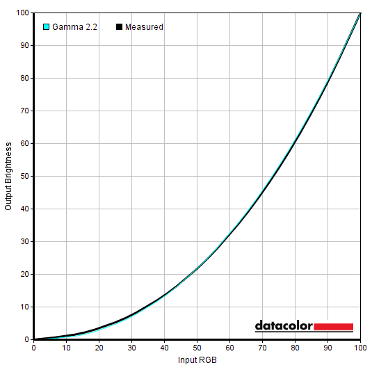
Gamma 'sRGB'
Test Settings
Contrast and brightness
Contrast ratios
Monitor Settings White luminance (cd/m²) Black luminance (cd/m²) Contrast ratio (x:1) 100% brightness 791 0.21 3767 80% brightness 645 0.17 3794 60% brightness 500 0.13 3846 40% brightness 354 0.09 3933 20% brightness 206 <0.06 >3433 0% brightness 59 <0.02 >2950 25% brightness (Factory Defaults) 243 <0.07 >3471 DisplayHDR 1400, Local Dimming = Weak / Medium / Strong (1% white, peak)* 737 / 815 / 943 <0.01 >73,700 / >81,500 / >94,300 DisplayHDR 1400, Local Dimming = Weak / Medium / Strong (4% white, peak)* 1352 / 1353 / 1355 <0.01 >135,200 / >135,300 / >135,500 DisplayHDR 1400, Local Dimming = Weak / Medium / Strong (9% white, peak)* 1541 / 1541 / 1541 <0.01 >154,100 / >154,100 / >154,100 DisplayHDR 1400, Local Dimming = Weak / Medium / Strong (25% white, peak)* 1216 / 1216 / 1216 <0.01 >121,600 / >121,600 / >121,600 DisplayHDR 1400, Local Dimming = Weak / Medium / Strong (49% white, peak)* 1178 / 1178 / 1178 <0.01 >117,800 / >117,800 / >117,800 DisplayHDR 1400, Local Dimming = Weak / Medium / Strong (100% white, sustained)** 1106 / 1106 / 1106 N/A N/A DisplayHDR 1400, Local Dimming = Off (1% white, peak)* 720 0.20 3600 DisplayHDR 1400, Local Dimming = Off (100% white, sustained)** 721 N/A N/A Gamma = 1.8 242 <0.07 >3457 Gamma = 2.0 243 <0.07 >3471 Gamma = 2.4 242 <0.07 >3457 Gamma = 2.6 241 <0.07 >3443 Low Blue Mode = On 241 <0.07 >3443 Color Temperature = 5000K 212 <0.07 >3029 sRGB = On 203 <0.06 >3383 Color = Native 248 0.07 >3543 Color = Native (100% brightness) 808 0.21 3848 SmartUniformity 302 0.12 2517 Test Settings 174 <0.05 >3480
*HDR measurements were made using this YouTube HDR brightness test video, running full screen at ‘1440p HDR’ on Google Chrome. A browser extension discussed in our 3440 x 1440 article was used to scale the patches to the 21:9 aspect ratio. The maximum reading using the patch size (measurement area) specified in the table was used. The black luminance was taken at the same point of the video with the colorimeter offset to the side of the white test patch, equidistant between the test patch and edge of the monitor bezel.

The local dimming settings adjust the level of dark biasing or bright biasing that occurs. So how likely the monitor is to dim vs. brighten zones when they have to account for mixtures of light and dark content. ‘Weak’ provides the greatest dark biasing, ‘Strong’ the greatest bright biasing and ‘Medium’ some way between. You can see in the graph that most values are identical or very close together, with the separation occurring at a white patch size of ‘1%’ where the bright or dark biasing comes into play. Whilst ‘1%’ sounds like a very small number, it’s still just shy of 50,000 pixels on this monitor. Some of the more complex shade mixtures you might observe in ‘real world’ testing can separate the settings even more clearly. The Dell Alienware AW3423DW QD-OLED is also included for reference, using its ‘HDR Peak 1000’ setting. This highlights the superior brightness capability of the Philips and much improved ability to sustain this even for larger patch sizes. It also highlights the improved brightness precision of the Alienware, which allows it to display small bright highlights at full brightness.
PWM (Pulse Width Modulation)
Luminance uniformity

The SpyderX Elite was used to assess the uniformity of lighter shades, represented by 9 equally spaced white quadrants running from the top left to bottom right of the screen. The tables below show the luminance recorded at each quadrant as well as the percentage deviation between each quadrant and the brightest recorded point. The first table shows the results under our ‘Test Settings’, whilst the second table shows results using ‘SmartUniformity’ with default settings.
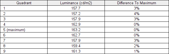
Luminance uniformity table
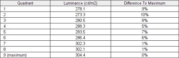
Luminance uniformity table 'Smart Uniformity'
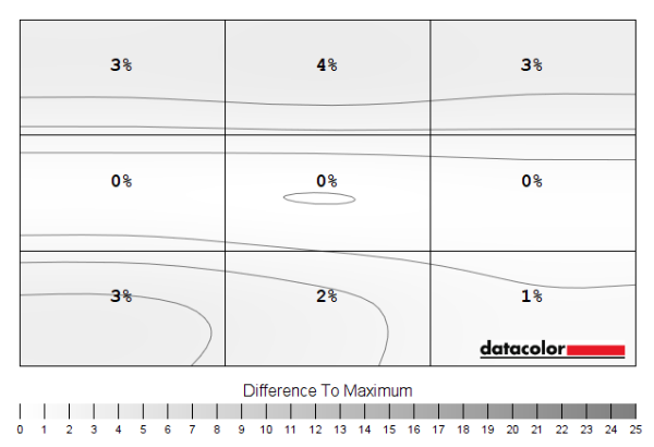
Luminance uniformity map
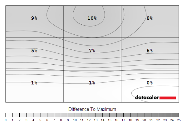
Luminance uniformity map 'Smart Uniformity'
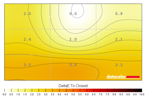
Colour temperature uniformity map
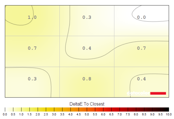
Colour temperature uniformity map 'Smart Uniformity'
Contrast in games and movies
Lagom contrast tests
Colour reproduction
Colour gamut
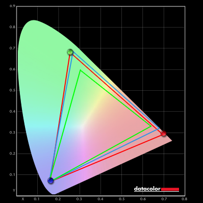
Colour gamut 'Test Settings'
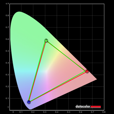
Colour gamut 'sRGB'

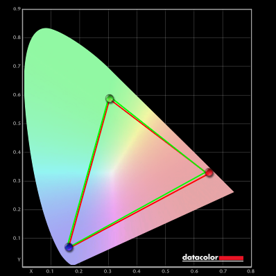
Colour gamut AMD 'CTC disabled'
Colour in games and movies
Shade representation using SpyderCHECKR 24

The monitor displays most shades with quite a bit of extra saturation and vibrancy, largely thanks to the generous gamut extending far beyond sRGB. The extension is particularly large for the red to blue edge of the gamut, covering red-biased shades plus some pinks and purples. Shades such as medium orange (3), tango pink (11) and candy apple red (14) are good examples of shades which are displayed in an overly vivid way. Peach pink (20) and light chocolate brown (24) show a bit of a red push or warmer than intended appearance. The extension beyond sRGB elsewhere in the gamut also brings out some other shades too strongly, such as dark lime green (18). This doesn’t appear as ‘neon’ as it might on models with even more extension for the green to blue edge (stronger Adobe RGB coverage), however. There are also saturation losses lower down the screen – these are far from extreme from a VA panel but can be seen with shades such as medium orange (3) which appears slightly closer to the intended shade due to saturation loss further down the screen. This is clearer by eye than in the image. And neighbouring aquamarine (4), which look more of an icy (slightly pastel) shade lower down. Persian pink (6) also highlights a saturation shift well, appearing with extra saturation further up (more central relative to the camera and ‘normal’ eye position). This effect would be exaggerated for that shade it was displayed closer to the edges of the screen. Saturation losses towards the sides of the screen can’t be assessed with this shade arrangement – and could potentially appear towards the top of the screen depending on viewing position, too.

The saturation levels are cut down very effectively now, with a more accurate representation overall and many shades faithfully represented. You can see a much more appropriate appearance to shades such as tango pink (11) and candy apple red (14) which were quite strongly oversaturated using the native gamut, for example. The saturation losses at some points of the screen are also highlighted. For example, medium orange (3) is represented well further up the screen (more in-line with camera or expected eye position) but undersaturated lower down. Aquamarine (4) appears more of an icy and pastel shade than intended further up the screen and to an even greater extent further down the screen. As usual, we’d recommend profiling the monitor with your own calibration device using the native gamut if you require the highest level of colour accuracy.
Viewing angles

The following video shows the Lagom text test, a mixed desktop background, a game scene and dark desktop background from various viewing angles. For the mixed image and game scene you can see noteworthy shifts in contrast and colour – quite a ‘washed out’ look as angles become relatively steep. Or overly deep and crushed together if viewed from below. These shifts are not as extreme vertically as you’d observe on a TN model (there’s no ‘colour inversion’, for example) and somewhat weaker than on certain VA models – but more pronounced than on IPS and certainly OLED alternatives. The final section of the video shows a dark desktop background and highlights the ‘VA glow’ mentioned earlier. This blooms out more noticeably from sharper viewing angles but is not as strong from centralised viewing angles.
Interlace pattern artifacts
Responsiveness
Input lag
Perceived blur (pursuit photography)


Responsiveness in games and movies
We made similar observations on Shadow of the Tomb Raider, where plenty of ‘high contrast transitions’ are present which the monitor struggles with. So ‘smeary’ trailing is quite widespread. It might not be something all people find bothersome, particularly for casual gaming, but we found it rather obvious in this case and perhaps a bit weaker than average for the panel type. We also observed video content at a range of refresh rates, including ~24 – 30fps content on platforms such as Netflix and 60fps YouTube content. For the 60fps content some fairly distinct weaknesses remained where darker shades were present. The ‘smeary’ trailing here was less extreme than that observed at significantly higher frame rates, but still ‘smeary’ in appearance. There was no particularly obvious or extreme overshoot, just a touch here and there. Even for the lower frame rate content (~24 – 30fps), some weaknesses were observed where darker shades were included in the scene. The trailing here was not exactly ‘smeary’ because it stuck close to the object, but it still created a bit of a mask of additional perceived blur that ideally wouldn’t be there.
VRR (Variable Refresh Rate) technology
FreeSync – the technology and activating it


The Philips supports a variable refresh rate range of 48 – 165Hz. That means that if the game is running between 48fps and 165fps, the monitor will adjust its refresh rate to match. When the frame rate rises above 165fps, the monitor will stay at 165Hz and the GPU will respect your selection of ‘VSync on’ or ‘VSync off’ in the graphics driver. With ‘VSync on’ the frame rate will not be allowed to rise above 165fps, at which point VSync activates and imposes the usual associated latency penalty. With ‘VSync off’ the frame rate is free to climb as high as the GPU will output (potentially >165fps). AMD LFC (Low Framerate Compensation) is also supported by this model, which means that the refresh rate will stick to multiples of the frame rate where it falls below the 48Hz (48fps) floor of operation for FreeSync. If a game ran at 33fps, for example, the refresh rate would be 66Hz to help keep tearing and stuttering at bay. LFC usually activated at slightly higher refresh rates, typically ~55Hz (55fps) – this slightly different floor of operation makes little difference in practice. This feature is used regardless of VSync setting, so it’s only above the ceiling of operation where the VSync setting makes a difference.

Some users prefer to leave VSync enabled but use a frame rate limiter set a few frames below the maximum supported (e.g. 162fps) instead, avoiding any VSync latency penalty at frame rates near the ceiling of operation or tearing from frame rates rising above the refresh rate. The ‘Refresh Rate’ listed at the bottom of the OSD updates in real time to reflect the frame rate of the content, if the monitor is within the main VRR window. Finally, it’s worth noting that FreeSync only removes stuttering or juddering related to mismatches between frame rate and refresh rate. It can’t compensate for other interruptions to smooth game play, for example network latency or insufficient system memory. Some game engines will also show stuttering (or ‘hitching’) for various other reasons which won’t be eliminated by the technology.
FreeSync – the experience
Nvidia Adaptive-Sync (‘G-SYNC Compatible’)
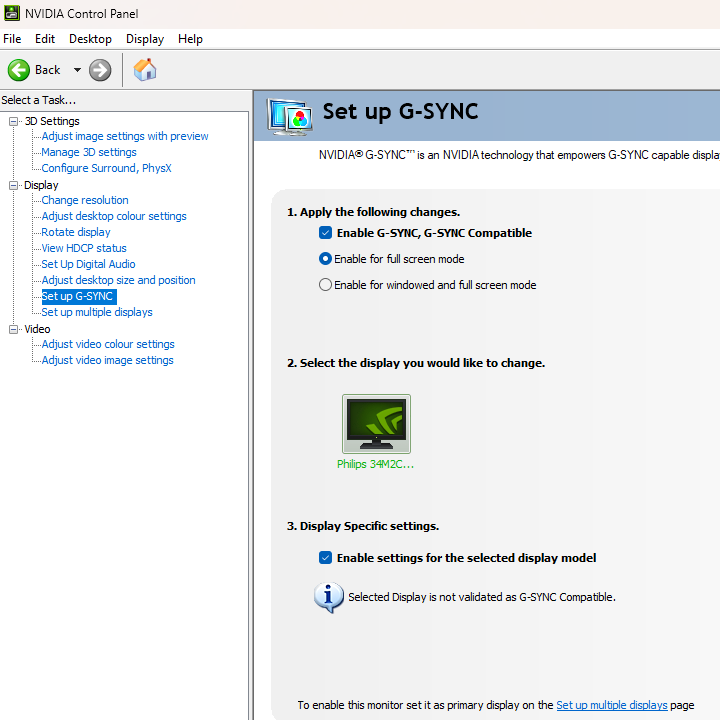
You will also see in the image above that it states: “Selected Display is not validated as G-SYNC Compatible.” This means Nvidia hasn’t specifically tested and validated the display, not that it won’t work. On our RTX 3090 the experience was very similar to what we described with FreeSync. With the technology getting rid of tearing and stuttering from what would otherwise be frame and refresh rate mismatches, within the VRR range. Similar VRR flickering behaviour was observed, most intense during heavy fluctuations in frame rate and hence refresh rate. The floor of operation again appeared to be 55Hz (55fps) most of the time, so 55 – 165Hz. Though an LFC-like frame to refresh multiplication technology was employed below that to keep tearing and stuttering from frame and refresh rate mismatches at bay. There was again a subtle momentary stuttering and obvious flickering as the boundary was crossed, as we observed with our AMD GPU as well. Our suggestions regarding use of VSync also apply, but you’re using Nvidia Control Panel rather than AMD Software to control this. The setting is found in ‘Manage 3D settings’ under ‘Vertical sync’, where the final option (‘Fast’) is equivalent to AMD’s ‘Enhanced Sync’ setting. You’ll also notice ‘G-SYNC Compatible’ listed under ‘Monitor Technology’ in this section, as shown below. Make sure this is selected (it should be if you’ve set everything up correctly in ‘Set up G-SYNC’).

The ‘Refresh Rate’ listed at the bottom of the OSD updates in real time to reflect the frame rate of the content, if the monitor is within the main VRR window. And as with AMD FreeSync, HDR can be used at the same time as ‘G-SYNC Compatible’ and ‘Local Dimming’ (HDR only) can be used.
HDMI 2.1 VRR
HDR (High Dynamic Range)
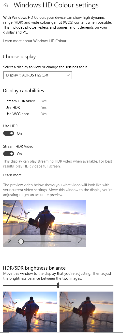
Colour gamut 'Test Settings'
This gamut allows the monitor to pump out a good amount of vibrancy where the developers want it. And because the developers have these wide gamuts in mind rather than sRGB, you don’t have the same oversaturation that you get using the native gamut under SDR. As we noted earlier there are some saturation losses towards the bottom and side edges from a normal viewing position, but there was still a vivid overall look to some shades. Some deep reds and rich oranges were observed, giving a good warming look to flames – without the overdone red push observed under SDR. Earthy browns, woody tones and skin tones looked appropriately rich but neutral, if a touch undersaturated peripherally due to those VA gamma shifts. A pleasing array of natural-looking greens was observed, including some good pastel shades alongside deep and lush shades. Some of the lush greens weren’t as vibrant as we’ve seen on some models, with an even more generous gamut, but were still quite vibrant. Golden artifacts, purple flowers and bright blue or red painted objects were good examples of vibrant-looking shades. The enhanced dimming precision, which we’ll come onto shortly, also helped inject extra depth to many shades.

The curve and resolution


The monitor provided a good level of immersion for gaming, with the curve complementing the significant width of the screen well. Even for games where the eyes frequently scan between the centre and edges of the screen, we didn’t find the curve really jumped out as an obvious feature. A significant Field of View (FOV) advantage is also provided for most game titles, whilst it also allowed an undistorted screen-filling experience for appropriate video content. Much as explored in more detail in our article covering the topic. As noted there, most games use ‘HOR+’ scaling – so you gain horizontal FOV (can see more of the game at once) compared to a 16:9 model whilst the vertical FOV remains the same. We felt this added to immersion by engaging peripheral vision nicely and in some cases it could be considered a competitive advantage.


Interpolation and upscaling

A range of scaling options are available, found in the ‘System’ – ‘SmartSize’ section of the OSD, provided ‘Adaptive-Sync’ is disabled. It is accessible when using HDMI 2.1 VRR, but with Adaptive-Sync in use it will stick to the default ‘Screen Size’ – ’34”W’ behaviour. The ‘Screen Size’ option simulates a range of screen sizes, including the native 34”W setting which is designed to fill up the entire screen space regardless of the resolution and aspect ratio. There’s ‘1:1’, a pixel mapping feature that will only use the pixels required by the source resolution, without distortion or loss of sharpness. And ‘Aspect’ which should use as many pixels on the screen as possible whilst sticking to the aspect ratio of the chosen resolution. Any unused pixels remain as a black border around the image. This ‘Aspect’ setting seemed to squish things up, even for FHD where scaling is supported by the monitor. If you want to maximise the screen space used without any distortion (stretching or squishing) for FHD at up to 120Hz, you can select ‘27”W’ for ‘Screen Size’ and it will fill up a 27” diagonal space. Because there isn’t a 1:1 pixel match in the case of FHD, an interpolation process is used.
Video review
Timestamps:
The Curve and Resolution
Features & Aesthetics
Contrast
Colour reproduction
HDR (High Dynamic Range)
Responsiveness (General)
Responsiveness (VRR)
Conclusion
Positives Negatives Vibrant colour output with a generous gamut, particularly in the red region – an effective sRGB emulation setting also included with adjustable brightness
Adobe RGB coverage insufficient for work within that colour space, no RGB adjustment and some colour consistency weaknesses related to the VA technology Relatively strong static contrast and a lively HDR experience with good deep dark shades and excellent sustained brightness, even where bright shades dominate Moderate ‘VA glow’ and a touch of ‘black crush’. No SDR local dimming, some ‘blooming’ and other issues with dimming precision due to much smaller zone vs. pixel count – poor dark shade distinction under HDR partly due to tuning Low input lag, VRR available via HDMI 2.1 and via Adaptive-Sync for both ‘AMD FreeSync Premium Pro’ and ‘Nvidia G-SYNC Compatible’ Significant pixel response time weaknesses, moderately strong VRR flickering particularly during heavy frame rate fluctuation A refreshingly different design with solid feel, effective RGB lighting and good ergonomics, good horizontal ‘desktop real-estate’ and 21:9 FOV plus HDMI 2.1 and USB-C support Premium pricing is difficult to justify, particularly when comparing to competing QD-OLED models available for significantly less
