Author: Adam Simmons
Date published: June 13th 2019
Table of Contents
Introduction
Many users are excited about HDR (High Dynamic Range), a technology recently brought to monitors that promises advantages such as appropriate use of a wider colour gamut, greater bit depth and enhanced contrast. In practice many screens that tout ‘HDR’ capability do so at a low level, and tick a few but not all boxes for a solid HDR experience. The Philips 326M6VJRMB, of the company’s Momentum lineup, boasts support for VESA DisplayHDR 600. A sort of mid-tier HDR experience with some potential benefits far beyond what more ‘basic’ HDR displays will provide. This model is an evolution of the 328P6VUBREB we reviewed earlier, with reworked aesthetics and some new features such as Adaptive-Sync. We put this model through its paces in our usual gauntlet of tests, to see how the monitor performs for both HDR and regular (SDR) viewing.
Specifications
This monitor employs a 60Hz CELL (panel with custom backlight) based on an Innolux AAS (Azimuthal Anchoring Switch) VA type panel. This is accompanied by a 3840 x 2140 (‘4K’ UHD) resolution, 10-bit colour support and a 4ms grey to grey response time (approach with caution). Some of the key ‘talking points’ of the specification have been highlighted in blue below, for your reading convenience.
The monitor has a modern look, with a sculpted ‘triangle mesh’ style metal stand. The bezels are moderately thick compared to some recent models, with glossy black plastic used. They are ~14mm (0.55 inches) at the top and sides and ~23mm (0.91 inches) at the bottom. The screen itself dominates from the front, however. This has a medium (‘relatively light’) matte anti-glare screen surface, as explored shortly. There are some downwards-facing ‘Ambiglow’ RGB LEDs underneath the bottom bezel. The image below is a macro photograph taken on Notepad with ClearType disabled. The letters ‘PCM’ are typed out to help highlight any potential text rendering issues related to unusual subpixel structure, whilst the white space more clearly shows the actual subpixel layout alongside a rough indication of screen surface. A medium (or ‘relatively light’, depending on how you classify it) screen surface is used. This screen surface offers good glare handling, whilst allowing more direct emission of light than ‘stronger’ matte screen surfaces. There is more diffusion of light emitted compared to lighter matte or glossy screen surfaces, however. The screen surface texture is also quite rough, giving a bit of a grainy appearance to lighter shades such as white. This wasn’t the sort of ‘heavy’ or ‘smeary’ graininess imparted by some matte screen surfaces, however. It’s something we’re quite sensitive to, but not everyone would find it bothersome or necessarily noticeable. The Philips 326M6VJRMB offers a range of ‘SmartImage Game’ presets; ‘FPS’, ‘Racing’, ‘RTS’, ‘Gamer 1’, ‘Gamer 2’, ‘LowBlue Mode’ and ‘Smart Uniformity’ (plus ‘Off’ – the factory defaults). These settings mainly change settings that you could manually adjust yourself in the OSD. There are a few exceptions, such as the ‘Bright Frame’ feature that highlights a specific area of the screen which is available in the first 5 presets. We touch upon these presets in the OSD video and won’t be focusing on most of them here. The ‘Gamer 1’ and ‘Gamer 2’ presets are potentially useful as they allow you to easily save and recall two different sets of settings. The sharpness appeared to be slightly lower under ‘Game 1’ and ‘Gamer 2’ than using equivalent settings outside of those modes, however. And increasing sharpness one step up to ‘60’ simply made things over-sharp. The table below provides key readings (gamma and white point) taken using a DataColor Spyder5ELITE and white point measurements taken using an X-Rite i1Display Pro, alongside general observations. The monitor was left in its ‘Plug and Play’ state without additional drivers or ICC profiles specifically loaded. It was connected to a Windows 10 PC using Nvidia GTX 1080 Ti, using the supplied DisplayPort cable. Additional testing was performed using an AMD Radeon RX 580. The screen was left running for over 2 hours before readings were taken or observations made. Unless stated otherwise, assume default settings were used. When viewing the figures in this table, note that for most PC users ‘6500K’ for white point and ‘2.2’ for gamma are good targets to aim for. Individual targets depend on individual uses, tastes and the lighting environment, however.
As an Amazon Associate I earn from qualifying purchases made using the below link. Where possible, you’ll be redirected to your nearest store. Further information on supporting our work.

Features and aesthetics


The OSD (On Screen Display) is controlled by a joystick at the rear of the monitor, towards the right side as viewed from the front. This system and the ‘Ambiglow’ lighting feature are explored in the video below.
From the side the monitor is quite slender, ~16mm (0.63 inches) at thinnest point and lumping out further centrally, where the stand attaches. The included stand offers tilt (5° forwards, 20° backwards) and height adjustment (110mm or 4.33 inches). At lowest height the bottom of the screen sits ~178mm (7.01 inches) above the desk, with the top of the screen ~610mm (24.02 inches) above the desk surface. The screen is therefore mounted quite high up on the stand, so alternative mounting may be advisable for some users for ergonomic reasons. The total depth of the monitor including stand is ~285mm (11.22 inches) with the screen sitting ~40mm (1.57 inches) back from the front end of the stand. The stand is therefore not the biggest desk depth hog out there and the screen isn’t as ‘in your face’ as with some models if you don’t have a very deep desk. But it’s not the most compact design, either.

The rear of the monitor is mainly glossy black plastic with a central matte black plastic region. The stand attaches centrally and can be easily removed using a quick-release button beneath the attachment point. It can be replaced by an alternative 100 x 100mm VESA compatible stand or mount, if preferred. The ports are down-firing and include; DC power input (external ‘power brick’), 3 HDMI 2.0 ports, DP 1.4, 4 USB 3.0 ports (2 with fast-charging), 3.5mm audio input and 3.5mm headphone jack. 2 x 5W DTS sound speakers are included for good measure. These offer fairly rich sound output, with reasonable (although not overly crisp) treble and a bit more bass than most integrated speakers. Not the cleanest and more bass-rich sound we’ve heard, but certainly well above average for monitor speakers. You can either enable DTS (which make certain optimisations to the sound) or adjust the EQ manually, depending on your preferences. Note that with DTS enabled, we could hear a low frequency static noise when no sound was playing. Not everyone will notice this as it wasn’t particularly loud or obnoxious to us, but if it annoys you and you wish to use DTS then you’d need to mute the speakers via the OSD when not in use. Remember that volume is easily controlled by tapping the joystick down – setting this to ‘0’ is the same as muting.


The full resolution, HDR capability and Adaptive-Sync is supported via HDMI 2.0 and DP 1.4 on compatible systems. A power cable and adaptor, HDMI cable and DP cable are included as standard.
Calibration
Subpixel layout and screen surface
![]()
As shown above, the monitor uses the standard RGB (Red, Green and Blue) stripe subpixel layout. This is the default expected by modern operating systems such as Microsoft Windows and Apple’s MacOS. Mac users needn’t worry about text fringing from less usual subpixel layouts, whilst Windows users don’t necessarily need to run through the ClearType wizard. They may still wish to run through the ClearType wizard and adjust according to preferences, however. The subpixel layout and arrangement is normal and we had no subpixel-related concerns related to sharpness or text clarity on this model.
Testing the presets
Monitor Settings Gamma (central average) White point (kelvins) Notes Gamma = 1.8 1.8 6757K Bright and flooded-looking. Severe lack of depth with a slightly cool tint to the image. Gamma = 2.0 1.9 6754K As above, a touch more depth. Gamma = 2.2 (Factory Default) 2.1 6754K As above with significantly boost in depth and saturation. Image appears quite bright and vibrant overall. There are some moderate depth and saturation losses at the edges of the screen (not specific to this setting, just a general observation). This is related to perceived gamma shifts from viewing angle weaknesses – more pronounced than on some VA models but not extreme from a reasonable viewing distance (~70cm+). Gamma = 2.4 2.3 6756K As above, a further additional injection of depth and saturation. Gamma = 2.6 2.5 6755K As above with a yet more depth and saturation. A striking but overly deep and highly saturated appearance overall. Low Blue Mode = 1 2.2 5982K A mild Low Blue Light (LBL) setting. The blue channel is weakened moderately, reducing blue light output somewhat and creating a warmer-looking image. The green channel remains strong, so there’s a bit of a greenish yellow tint as well. Low Blue Mode = 2 2.2 5107K As above but significantly more effective. An effective LBL setting. Low Blue Mode = 3 2.2 4985K As above but slightly warmer and with increased sharpness by default. This can be manually adjusted and then the setting preference is remembered for next time. Low Blue Mode = 4 2.2 4764K As above with further reduction in blue channel strength and blue light output. This is the most effective LBL setting on the monitor. Color Temperature = 5000K 2.1 5226K An alternative LBL setting. This is an effective LBL setting, but the green channel is also reduced so the image appears better-balanced without a greenish yellow tint. Color = sRGB 2.1 6782K An sRGB emulation setting. The colour gamut is restricted significantly. The image appears quite cool and washed-out overall with a significant lack of saturation – as we explore later, there is significant undercoverage of the sRGB gamut in this mode. Color = User Define 2.2 6853K Similar to factory defaults, although marginally cooler. The gamma is also slightly higher, giving a little extra dose of saturation in places. The image is bright and vibrant overall. SmartImage = SmartUniformity 1.9 7005K Somewhat dimmer than factory defaults and significant undersaturation in places (partly down to gamma curve being ‘wonky’ – see below). This is a UC (Uniformity Compensation) setting designed to even out luminance across the screen, as we explore later. Test Settings (see below) 2.2 6546K Much more comfortable brightness, minor colour channel corrections. The image appears fairly vibrant and well-balanced overall.
Straight from the box the image produced by the monitor was bright with quite a vibrant look overall. The colour channels were fairly well-balanced, with the white point only slightly above our preferred target. Following adjustments made to our ‘Test Settings’, gamma was raised slightly so it averaged 2.2 and colour balance was brought into line. The gamma curve under our ‘Test Settings’ is shown below – it tracks to desired ‘2.2’ curve quite closely, with a little deviation either side but nothing severe. The monitor includes a Uniformity Compensation (UC) setting called ‘SmartUniformity’ (SU), which had very funky gamma handling by default. The ‘Gamma’ settings are unlocked, though, and setting this to ‘2.4’ brought things a bit closer to the desired curve. There were still some significant deviations. Since the SU calibrations are specific to each unit, ‘2.4’ wont’ necessarily be optimal in all cases. The first graph below shows the gamma of the monitor with SU enabled and ‘Gamma’ set to ‘2.2’. The second graph shows the results with ‘Gamma’ set to ‘2.4’ under SU. The monitor also included a range of Low Blue Light (LBL) settings. This included ‘Low Blue Mode’ settings that can be set to ever-increasing levels of effectiveness between ‘1’ and ‘4’. These settings do not significantly lower the green channel, to preserve contrast as much as possible. So the image ended up with a greenish yellow tint. The eyes adjusted to this to some extent, but we preferred the alternative LBL setting that gave a better balance to the image. Setting ‘Color Temperature’ to ‘5000K’. As with some of the higher ‘Low Blue Mode’ settings in particular, this mode was effective in reducing stimulating blue light output from the monitor. This can be more restful and is particularly important in the hours leading up to bed. As blue light affects sleep hormones and keeps the body ‘alert’ even if it should be winding down. We used the ‘5000K’ setting (with ’25’ brightness) for our own viewing comfort in the evening, but not for any specific testing beyond that involving this particular setting. Our ‘Test Settings’ involved a significant reduction in brightness and switching to the ‘User Define’ setting for ‘Color’ and making some minor changes to colour channel. If using HDMI as an Nvidia user, you’ll also need to correct the colour signal from the default ‘Limited Range’ to ‘Full Range’ RGB as explored in this article. Assume that any setting not mentioned here was left at default in the OSD, including ‘Contrast’. We’ve also included our preferred ‘SmartResponse’ setting, just for reference. Note that these settings only apply to SDR testing, which is the bulk of our review. HDR has separate settings associated with it – we explore HDR separately in the designated section. The ‘HDR’ setting in the ‘Picture’ settings of the OSD had no effect on SDR content so we simply left this at the default value (‘VESA HDR 600’). Brightness= 25 (according to preferences and lighting) SmartResponse= Fast Color Temp. = User Define Red= 100 Green= 99 Blue= 99 We used an X-Rite i1Display Pro to measure white and black luminance levels, from which static contrast ratios were calculated. The table below shows this data with various settings including those covered in the calibration section considered. Black highlights indicate the highest white luminance, lowest black luminance and maximum contrast ratio recorded. Blue highlights show the results with HDR active and the results using our ‘Test Settings’. Assume any setting not mentioned was left at default, except for the changes already mentioned in the calibration section.
Gamma 'Test Settings'
Gamma 'Smart Uniformity'
Gamma 'Smart Uniformity' (Gamma = 2.4)
Test Settings
SmartImageGame = Off
Contrast and brightness
Contrast ratios
Monitor Settings White luminance (cd/m²) Black luminance (cd/m²) Contrast ratio (x:1) 100% brightness 537 0.15 3580 80% brightness 397 0.12 3308 60% brightness 302 0.09 3356 40% brightness 228 0.07 3257 20% brightness 155 0.04 3875 0% brightness 75 0.02 3750 90% brightness (Factory Defaults) 408 0.12 3400 HDR 'Normal'* 390 0.1 3900 HDR 'VESA HDR 600'* 723 0.18 4017 Gamma = 1.8 409 0.12 3408 Gamma = 2.0 409 0.12 3408 Gamma = 2.4 409 0.12 3408 Gamma = 2.6 409 0.12 3408 Low Blue Mode = 1 496 0.15 3307 Low Blue Mode = 2 512 0.15 3413 Low Blue Mode = 3 325 0.1 3250 Low Blue Mode = 4 326 0.1 3260 Color Temperature = 5000K 376 0.12 3133 Color = sRGB 409 0.12 3408 Color = User Define 415 0.12 3458 SmartImage = SmartUniformity 357 0.15 2380 Test Settings 169 0.05 3380
*HDR measurements were made using this YouTube HDR brightness test video, running full screen at ‘2160p 4K HDR’ on Google Chrome. The maximum reading from the smallest patch size (measurement area) that comfortably covered the entire sensor area and colorimeter housing was used for the white luminance measurement, which was ‘4% of all pixels’ in this case. The black luminance was taken at the same point of the video with the colorimeter offset to the side of the white test patch, equidistant between the test patch and edge of the monitor bezel.
The average contrast ratio with only brightness adjusted was 3504:1, which is pleasing and slightly beyond the specified 3000:1. This provided superior depth to deep shades and dark text compared to non-VA LCDs and indeed some VA models with weaker contrast. The maximum contrast recorded under SDR was an impressive 3875:1 – but this was perhaps helped a bit by some favourable rounding of the black luminance. Except for using the ‘SmartUniformity’ setting, where contrast dropped to 2380:1 (a drop is usual with a Uniformity Compensation setting like this active), contrast was beyond 3000:1 under all settings tested. This included the ‘Low Blue Mode’ settings (3250:1 – 3413:1) and the ‘Color Temperature = 5000K’ setting (3133:1) which is quite aggressive with its colour channel changes. Under our ‘Test Settings’ contrast remained strong at 3380:1, although that is less surprising given the minor colour channel adjustments made. The highest white luminance recorded under SDR was 537 cd/m², whilst the minimum was 75 cd/m². This gave a luminance adjustment range of 462 cd/m², which is good. The minimum may be somewhat higher than some users would like – it could be reduced further by minimising ‘Contrast’ or reducing the colour channels, although this would come at the expense of contrast. The monitor also has a ‘SmartContrast’ Dynamic Contrast setting, which allows the backlight brightness to adjust (as a single unit) according to the levels of light and dark on the screen. The monitor remained (often uncomfortably) bright even with a lot of dark content displayed. The brightness control is active rather than greyed out, but the monitor soon ignores this setting and does its own thing.
The monitor’s backlight is split into 16 dimming zones, in an edge-lit array with 8 LED clusters on the left and 8 on the right side of the screen. These 16 dimming zones are active and separately controlled under HDR, whereas under SDR the backlight acts as a single unit without local dimming. The monitor offers 2 HDR settings; ‘Normal’ and ‘VESA HDR 600’. Both settings yielded a slight but not dramatic increase in static contrast, to 3900:1 (‘Normal’) and 4017:1 (‘VESA HDR 600’). Although the boost in static contrast compared to SDR was not dramatic, the peak luminance was raised to 723 cd/m². This measurement methodology, as typical for contrast measurement, involves measuring white and black at various points of the screen. In reality, scenes are far more complex and you wouldn’t just have a pure white square surrounded by total darkness. So the edge in contrast and advantage of local dimming can be more pronounced in some scenarios and less so in others than these contrast measurements might suggest. We explore this experience later on in the review.
PWM (Pulse Width Modulation)
The 326M6VJRMB does not use PWM (Pulse Width Modulation) to regulate backlight brightness, instead using DC (Direct Current) at all brightness levels. The backlight of the monitor is therefore considered ‘flicker-free’, which will come as welcome news to those sensitive to flickering or worried about side-effects from PWM usage.
Luminance uniformity
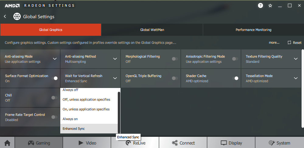
Whilst observing a black screen in a dark room, using our ‘Test Settings’, we observed some backlight bleed and clouding, particularly towards the corners of the screen. Note that individual units vary when it comes to all aspects of uniformity, including backlight bleed and clouding. The below image was taken a few metres back to eliminate so-called ‘VA glow’. This is a silverish-purple glow that appears towards the edges of the screen and particularly the bottom corners, from a normal viewing position. It blooms out in a more noticeable way from sharper angles as demonstrated in the viewing angles video deeper into the review. As we explore, it’s not a major issue on this model and is less obtrusive than on some VA models we’ve used. Under our ‘Test Settings’, the luminance uniformity was quite good overall. The brightest point recorded was ‘quadrant 3’ towards the top right of the screen (151.7 cd/m²). The maximum deviation from this occurred at ‘quadrant 7’, towards the bottom left (132.8 cd/m², which is 12% dimmer). The average uniformity deviation between each quadrant and the brightest point was 6.63%, which is good. Using the ‘SmartUniformity’ offered further improvement to luminance uniformity, at significant contrast expense as explored earlier. The brightest point recorded was again ‘quadrant 3’ towards the top right of the screen (334.7 cd/m²). The maximum deviation from this occurred at ‘quadrant 4’ to the left of centre (312.5 cd/m², which is 7% dimmer). The average uniformity deviation between the quadrants was 3.38%, which is very good. Note that uniformity varies between individual units and you can also expect variation beyond the points measured. Also be aware that the ‘SmartUniformity’ mode is calibrated using and designed to work best using the factory defaults for the mode (as tested above). Changes made beyond this can affect results – although we did test this setting at reduced brightness (not documented here) and found the setting effective. The contour maps below show these deviations graphically, with darker greys representing lower luminance and hence greater deviation from the brightest recorded point than lighter greys. Percentage deviations between each quadrant and the brightest point are also given. The first graphic shows results under our ‘Test Settings’ whilst the bottom graphic shows results with ‘SmartUniformity’ enabled. The Spyder5ELITE was also used to analyse variation in the colour temperature (white point) for the same 9 quadrants. The deviation between each quadrant and the quadrant closest to the 6500K (D65) daylight white point target was analysed and a DeltaE value assigned. A DeltaE >3 represents significant deviation that most users would readily notice by eye. The top graphic shows the results using our ‘Test Settings’ and the bottom graphic with ‘SmartUniformity’ enabled. Using our ‘Test Settings’ the colour temperature uniformity was reasonable. Significant deviation was recorded in the top left (DeltaE 3.7) and top right (DeltaE 3.4) corners, but no significant deviation was recorded elsewhere. With ‘SmartUniformity’ enabled, the colour temperature uniformity improved slightly in some regions although was somewhat worse in others. Not a massive change either way. Significant deviation was recorded towards the top left (DeltaE 3.3) and borderline significant deviation below that (DeltaE 3.0). It’s again worth noting that individual units vary when it comes to uniformity and that deviation beyond measured points can be expected. Also note that there are some perceived deviations in both brightness and colour temperature that are typical on VA panels and aren’t reflected by these readings. In addition to the quantitative testing above, we performed a subjective assessment of the uniformity of a variety of ‘medium’ shades, including 50% grey. Some monitors exhibit uniformity issues such as splotches or striations when viewing screen fills of such shades, giving an inconsistent appearance that some users refer to as ‘DSE’ (‘Dirty Screen Effect’). VA models are particularly prone to this and we observed it to some extent on our 326M6VJRMB sample. Fortunately, we didn’t observe any extreme variation including strong striations or an obvious blotchy appearance, as some of the worst offenders exhibit. But there was certainly patchiness and some minor striations in places when observing some shades. The photo below shows an example of this, although it’s very difficult to accurately represent. The image shows a medium grey screen fill taken from a central position a sufficient distance back to eliminate viewing angle influences. As above, note that uniformity varies between individual units. On Battlefield V the monitor provided a strong contrast performance. This provided dark areas such as dimly lit building interiors and shaded areas of forest a good atmospheric look, one which non VA LCD panels don’t capture. There were some imperfections related to perceived gamma shifts and viewing angle weaknesses. As typical for the panel type, there was ‘black crush’ whereby the region of the screen you’re looking at directly (e.g. central area) will have much higher perceived gamma. Dark shades therefore appear even darker than intended, and the darkest shades blend into one another – so you lose some detail for this reason. Towards the periphery of the screen, particularly near the side edges, perceived gamma was lower than ideal as well. This was not extreme, although did reveal a bit of unintended detail (a slightly ‘blocky’ appearance in places) which was more pronounced if you moved your head away from the area being observed or sat closer to the screen. Finally, there was a bit of ‘VA glow’ towards the bottom of the screen – so darker shades here appeared slightly lighter than intended. This was about as low as we’ve seen from a VA model of this size, though, and didn’t significantly affect the atmosphere in dark areas. Very different to ‘IPS glow’. Finally, the screen surface imparted a somewhat grainy appearance to lighter shades such as the daylight sky or light sources at night, but not everyone would find this bothersome. Shadow of the Tomb Raider told a similar story when it came to contrast. There were clear advantages to the VA panel and strong static contrast. This was particularly welcome on this title as there are many dimly lit caves, tombs and passageways that crave good depth to dark shades. This monitor delivered that depth. There was again the issue of ‘black crush’ centrally (from a normal viewing position) and this was somewhat higher than we’ve observed on some VA models of this size (with curved panels). And also a bit of unintended detail peripherally, more noticeable if you’re sitting relatively close to the screen (<70cm). These shifts either way in perceived gamma were not as obvious as the shifts you observe up and down a TN panel. For example, climbable rock textures were always visible (even if fainter than intended, due to black crush) and the extra detail peripherally was less pronounced than what you observed lower down on TN models. The screen surface again gave a bit of a grainy look to lighter shades, which not everyone would mind but is something we are sensitive to and therefore readily notice. We also made some observations on the film Star Wars: The Last Jedi. The strong static contrast and relatively low level of ‘VA glow’ provided the sort of atmosphere this film craved. A good contrasty look to the many high-contrast scenes of this movie. Bright light sabers and explosions with dim interiors or dark space in the background, for example, stood out very nicely. The weaknesses observed in our in-game testing related to perceived gamma shifts and some graininess of the screen surface applied here as well, but they didn’t really detract much from the overall atmosphere or our enjoyment of the film. They were easy enough to forget about when engrossed in the action, in other words. The Philips 326M6VJRMB’s colour gamut (red triangle) was compared with the sRGB (green triangle) and Adobe RGB (purple triangle) reference spaces, as shown below. Our ‘Test Settings’ were used here, which make use of the full native gamut of the monitor. The colour gamut measured covers sRGB (100%), with significant extension beyond. It extends beyond Adobe RGB is some regions as well – note that sRGB and Adobe RGB overlap at the red and blue corners of this diagram. There is some under-coverage of Adobe RGB, particularly in the green region of the diagram as well (89% Adobe RGB). This model does not target Adobe RGB specifically – it targets strong DCI-P3 coverage, with Philips specifying 98.61% DCI-P3. Our colorimeter software doesn’t allow comparison with DCI-P3, but what we have measured here seems to coincide with such a coverage level. Note as well that the Spyder5 tends to under-report slightly in the blue corner of this diagram for gamuts this wide. This generous DCI-P3 coverage is useful for HDR content (explored later) and allows the monitor to output all shades within the sRGB space with an extra dose of saturation and vibrancy. On Battlefield V the monitor outputted quite a vibrant and varied palette of shades. The in-game environments showcased a nice array of very rich-looking earthy browns and luscious deep greens. With a nice range of more muted shades. Due to the generous colour gamut (and this being your typical SDR content, designed with the sRGB colour gamut in mind) there was extra saturation. This created a more vibrant appearance, but also one less faithful to the original source. Some red hues in reddish earthy brown tree trunks and patches of earth were a bit strong, for example, and some greens appeared brighter with more of a saturated yellowish quality to them than intended. Nonetheless, shades at least maintained appropriate spacing on the gamut and therefore a strong variety was maintained. This contrasts with digital saturation enhancement (such as Nvidia Digital Vibrance), which simply pulls shades closer to the edge of the gamut – without expanding the gamut itself. Some shades that were intended to look vibrant such as brightly painted object and vivid orange flames certainly did. The flames showcased a nice range of yellow, orange and red shades – again, with more saturation than intended but still pleasing variety. The colour performance was similar on Shadow of the Tomb Raider. The natural environments again appeared quite vivid, with strong saturation but pleasing variety. There were some pleasing lush greens and good deep earthy browns. Even if some of the reddish and yellow hues were pushed a bit far. Lara’s skin (and indeed the skin tones of other characters in the game) reflected this extra saturation. Appearing a bit too tanned overall, but at least not sunburnt or completely from the wrong group of shades. Both of these game titles also highlighted some weaknesses in colour consistency, with changes in perceived gamma when comparing the central region of screen to the periphery. Particularly the bottom and sides of the screen, from a normal viewing position. Shades appeared noticeably less saturated here, compared to the central mass of the screen. The shifts in saturation were more pronounced than on some VA models (including the curved panels of this size we’ve tested), but not extreme. And certainly less severe than the vertical saturation shifts you see on TN models. We also tested the Blu-ray of Futurama: Into the Wild Green Yonder. This is a ruthless test for colour consistency as it features large areas of individual shade. As such, it highlighted the issues with gamma and saturation shifts readily. This meant that some shades lost their identity – with closely matching shades appearing different depending on their on-screen position. Nonetheless, a good variety of shades was still maintained overall. And shades were presented in quite a vibrant way, particularly when observing deep or neon shades such as deep purples or bright greens. Even more impressive was when these were set against a dark background, with the strong contrast helping to give them a nice ‘pop’. The extra saturation made some of the more muted shades appear less pastel than intended, although they still appeared pastel relative to the more vibrant and deeper shades. This sort of maintenance of shade variety, again, is something that distinguishes extra saturation from a wider colour gamut vs. digital saturation enhancement. Lagom’s tests for viewing angle tests help explore the idea of colour consistency and viewing angle performance. The following observations were made from a normal viewing position, eyes 70 – 80cm from the screen. On some monitors, particularly but not exclusively those with high refresh rates, interlace patterns can be seen during certain transitions. We refer to these as ‘interlace pattern artifacts’ but some users refer to them as ‘inversion artifacts’ and others as ‘scan lines’. They may appear as an interference pattern, mesh or interlaced lines which break up a given shade into a darker and lighter version of what is intended. They often catch the eye due to their dynamic nature, on models where they manifest themselves in this way. Alternatively, static interlace patterns may be seen with some shades appearing as faint horizontal or vertical bands of a slightly lighter and slightly darker version of the intended shade. We did not observe either artifact type on this monitor. A small utility called SMTT 2.0 was used alongside a sensitive camera to analyse the latency of the 326M6VJRMB, by comparison with a screen of known latency. To help maximise accuracy, over 30 repeat readings were taken. Using this method, we calculated 4.32ms (a bit over 1/4 of a frame at 60Hz) of input lag. The monitor was connected via DP with Adaptive-Sync active (‘Low Input Lag’ greyed out) for these measurements. We briefly tested via HDMI with ‘Low Input Lag’ enabled and results were similar. This input lag value reflects both the element of input lag you ‘feel’ (signal delay) and that which you see (pixel responsiveness). It indicates a low signal delay which shouldn’t bother even sensitive users. We don’t have the means to accurately measure input lag with Adaptive-Sync active in a variable refresh rate environment or with HDR active in an HDR environment. In our article on responsiveness, we explore key concepts surrounding monitor responsiveness. A particularly important concept explored there is ‘perceived blur’. This is contributed to by both eye movement as you track motion on the screen and by pixel responsiveness. Eye movement is actually the predominant cause of perceived blur on modern monitors, but weaknesses in pixel responsiveness are also important to consider. A photography method called ‘pursuit photography’ is also explored, using a moving rather than stationary camera to capture motion on a monitor in a way that reflects both key elements of perceived blur. This contrasts with static photography or videos, which only reflect pixel responsiveness. The images below are pursuit photographs taken using the UFO Motion Test for ghosting, with the test running at 960 pixels per second. This is a good practical speed for capturing such photographs and highlights both elements of perceived blur nicely. The UFOs move across the screen from left to right at a frame rate matching the refresh rate of the display. All background shade levels (dark, medium and light) were used with the monitor set to all its ‘SmartResponse’ pixel overdrive settings; ‘Off’, ‘Fast’, ‘Faster’ and ‘Fastest’. The final column is a reference, the ViewSonic XG240R set to its optimal response time setting. This is a fast TN panel, so the reference gives an idea of how things look where pixel responsiveness isn’t really a limiting factor. This is particularly true for the dark background (top row) of the reference shots. Note that we will not be including a section on overclocking, as the monitor did not provide a stable image when set much above 60Hz at its native resolution or indeed lower resolutions such as Full HD. On Battlefield V there was a moderate amount of perceived blur. Most of this was linked to eye movement and the constraints of the 60Hz refresh rate. There were some weaknesses related to issues with pixel responsiveness, however. Most transitions, particularly for medium and lighter shades, were performed fast enough for a good 60Hz performance without much additional trailing. There was some ‘powdery’ trailing in places. For these faster transitions it was light, if there at all, so only had a relatively minor impact on overall perceived blur. There were some more obvious weaknesses where darker shades were involved in the transition, however. There were instances of ‘heavy powdery’ trailing – some transitions were slow enough to produce a ‘smeary’ quality to the trailing. There were instances of what we call ‘break-up’ trailing, whereby very dark shades contained on the object or background appear to separate out. A bit like a watercolour painting or wetting a page with water soluble ink on it. Observing saturated orange life rings on a white painted boat, for example, provided some orangey-red ‘break-up’ trailing. Considering these more obvious weaknesses, though, they were not as extensive or as widespread as we’ve seen on some VA models. Such as the Philips BDM4037UW and AOC Q3279VWF. There was some minor overshoot in places, including some trailing that was slightly lighter (mild ‘halo’ trailing) or slightly darker (mild ‘dirty’ trailing) than the background or object colour. This was faint and we didn’t find it eye-catching, however. The section of the video review below highlights some of these weaknesses, using Battlefield V as an example. Shadow of the Tomb Raider reflected these findings. Again, most transitions were fast enough for a good 60Hz performance or there were minor issues such as slight ‘powdery’ trailing. Where darker shades were involved in the transition – which is quite common in the shadowy areas or dimly lit caverns of this game – there were some more pronounced weaknesses. ‘Heavy powdery trailing’ and some trailing with a ‘smeary’ appearance (including ‘break-up’ trailing) could be observed. But these weaknesses were certainly not as extensive or distracting as we’ve seen on some VA models. There wasn’t the sort of widespread extensive smeary trailing or trailing with a smoke-like appearance that can be observed with some models. Likewise, there was no obvious overshoot – just some subtle hints in places. Overall, we didn’t find the pixel responsiveness issues distracting on this title. The main constraint was really the 60Hz refresh rate itself, seeing as we’re quite accustomed to significantly higher refresh rates. But it’s important to remember that individual preferences and sensitivities vary. We also observed the responsiveness on a range of video content at a range of frame rates, including ~24-30fps content and 60fps content. There were no clear weaknesses imparted from the pixel response behaviour of the monitor for the lower frame rate content. The higher frame rate content revealed similar weaknesses to our gaming observations above. Overall we didn’t observe anything we found particularly distracting (and certainly not for lower frame rate content, such as your typical Netflix video) and enjoyed the overall video-watching experience on this model. As an Amazon Associate I earn from qualifying purchases made using the below link. Where possible, you’ll be redirected to your nearest store. Further information on supporting our work. AMD FreeSync is a variable refresh rate technology, an AMD-specific alternative to Nvidia G-SYNC. Where possible, the monitor dynamically adjusts its refresh rate so that it matches the frame rate being outputted by the GPU. Both our responsiveness article and the G-SYNC article linked to explore the importance of these two elements being synchronised. At a basic level, a mismatch between the frame rate and refresh rate can cause stuttering (VSync on) or tearing and juddering (VSync off). FreeSync also boasts reduced latency compared to running with VSync enabled, in the variable frame rate environment in which it operates. FreeSync requires a compatible AMD GPU such as the Radeon RX 580 used in our test system. There is a list of GPUs which support the technology here, with the expectation that future AMD GPUs will support the feature too. The monitor itself must support ‘VESA Adaptive-Sync’ for at least one of its display connectors, as this is the protocol that FreeSync uses. The 326M6VJRMB supports FreeSync via DP and HDMI on compatible GPUs and systems. Note that HDR can be activated (at the same time as FreeSync) via DP 1.4 or HDMI 2.0. If fully installed, AMD drivers feature Radeon Settings, which makes activation of the technology very simple and something that usually occurs automatically. First make sure that you have ‘FreeSync’ set to ‘ON’ in the ’Gaming section of the OSD. You should then make sure the GPU driver is setup correctly to use FreeSync, so open ‘AMD Radeon Settings’ and click on ‘Display’. You should then ensure that the first slider, ‘AMD FreeSync’, is set to ‘On’. If you hover over this, it will also report the variable refresh rate display supported by the display. VSync is configured in the ‘Gaming’ section of ‘Radeon Settings’, where it is referred to as ‘Wait for Vertical Refresh’. You can either configure this globally under ‘Global Settings’ or for each game individually. The default is ‘Off, unless application specifies’ which means that VSync will only be active if you enable it within the game itself, if there is such an option. Such an option does usually exist – it may be called ‘sync every frame’ or something along those lines rather than simply ‘VSync’. Most users will probably wish to enable VSync when using FreeSync to ensure that they don’t get any tearing. You’d therefore select either the third or fourth option in the list, shown in the image below. The final option, ‘Enhanced Sync’, is a relatively new addition to the driver. This is an alternative to VSync which allows the frame rate to rise above the refresh rate (no VSync latency penalty) whilst potentially keeping the experience free from tearing or juddering. This requires that the frame rate comfortably exceeds the refresh rate, not just peaks slightly above it. We won’t be going into this in detail as it’s a GPU feature than a monitor feature. We ran various game titles on this monitor, with FreeSync enabled, and found the technology worked in much the same way on all of them. Any issues identified on one title but not another would suggest an issue with the game or GPU driver rather than the monitor. We’ll therefore simply focus on a single title for this section; Battlefield V. This offers a good range of flexibility with its graphics options, allowing the full variable refresh rate monitor of the monitor to be tested. With the Radeon RX 580 used here, it was very difficult to maintain a solid 60fps even with graphics settings lowered significantly. There were frequent dips below this. Even if those dips were just of a few FPS, without the technology enabled this produced obvious (to us) tearing if VSync was disabled or stuttering if VSync was enabled. Individual sensitivity to such issues varies, but for us the difference between the technology being active and not active was very clear and we very much appreciated what the technology delivered. As the frame rate dipped further, either due to action intensifying or due to using higher graphics settings, the ‘connected feel’ ebbed away and the level of perceived blur increased. Comparing ~40fps to ~60fps, this difference was clear to us. And it’s purely down to the frame rate itself, with lower frame rates remaining lower frame rates regardless. Having the experience free from tearing and stuttering caused by frame rate and refresh rate mismatches was very nice, however. As usual for Adaptive-Sync (FreeSync), we found the technology well-tuned for 60Hz in terms of the pixel overdrive. But this didn’t ‘re-tune’ the voltage surges of the overdrive for lower refresh rates (i.e. as frame rate dropped), as variable overdrive is not used. Overshoot (such as ‘dirty trailing’ and a bit of brighter ‘halo trailing’) became more pronounced as frame rate dropped closer to 40fps. Although we didn’t notice any extreme overshoot at any refresh rate, even if it was quite strong near 40fps. What was very easy to notice, though, was when the technology deactivated below 40fps. The ‘connected feel’ and perceived blur levels much below this frame rate become intolerable for sensitive users like us regardless of whether a variable refresh rate technology is used. But the sudden introduction of tearing or stuttering was even more incentive to try to keep frame rates above 40fps where possible. As noted earlier, AMD FreeSync makes use of Adaptive-Sync technology on a compatible monitor. As of driver version 417.71, users with Nvidia GPUs (GTX 10 series and newer) and Windows 10 can also make use of this Variable Refresh Rate (VRR) technology. When a monitor is used in this way, it is something which Nvidia refers to as ‘G-SYNC Compatible’. Some models are specifically validated as G-SYNC compatible, which means they have been specifically tested by Nvidia and pass specific quality checks. With the 326M6VJRMB, you need to connect the monitor up via DisplayPort and enable ‘FreeSync’ in the ‘Game Settings’ section of the OSD. When you open up Nvidia Control Panel, you should then see ‘Set up G-SYNC’ listed in the ‘Display’ section. Ensure the ‘Enable G-SYNC, G-SYNC Compatible’ checkbox and ‘Enable settings for the selected display model’ is checked as shown below. Press OK, then turn the monitor off then on again so that it re-establishes connection – the technology should now be active. Note again that if you go to ‘Setup’ – ‘Information’ in the OSD, you will see the refresh rate listed there change in real time alongside the frame rate of the content, if it’s within the variable refresh rate range of the display. Our suggestions regarding use of VSync also apply, but obviously you’re using Nvidia Control Panel rather than Radeon Settings to control this. The setting is found in ‘Manage 3D settings’ under ‘Vertical sync’, where the final option (‘Fast’) is equivalent to AMD’s ‘Enhanced Sync’ setting. You’ll also notice ‘G-SYNC Compatible’ listed under ‘Monitor Technology’ in this section, as shown below. Make sure this is selected (it should be if you’ve set everything up correctly in ‘Set up G-SYNC’). HDR (High Dynamic Range) on a monitor involves simultaneous output of very deep dark shades alongside very bright light shades. And also the display of a large gamut of shades between these, from very muted pastel shades to highly saturated and eye-catching shades. For this task, the monitor would ideally be able to control the illumination of each pixel individually, a capability reserved for backlightless technologies such as OLED. For LCDs, a complex backlight solution with a very large number of dimming zones (hundreds if not more) is desirable – referred to as FALD (Full Array Local Dimming). By controlling illumination with high precision, the monitor can correctly display intricate mixtures of dark and light content. Some parts of the screen can be illuminated to high brightness levels so that bright shades have good ‘pop’ and stand out nicely, whilst other sections of the screen displaying darker shades would be illuminated to much lower levels. Keeping the black depth nice and low and the deeper shades appearing suitably ‘inky’. In addition to strong contrast performance, HDR encompasses the ability to display a very large range of colours. The ultimate goal with this in mind is coverage of a massive colour gamut known as Rec. 2020. A more achievable near-term aim is for a monitor to offer 90% DCI-P3 (a Digital Cinema Initiatives standard colour space). Finally, HDR makes use of 10-bit+ precision per channel, so it’s desirable for the monitor to support (at least) 10-bits per subpixel. It is specifically the HDR10 pipeline which is currently used on monitors at the moment and the common standard supported most widely in games and other applications. For most games and other full screen applications that support HDR, the Philips 326M6VJRMB will automatically switch into its HDR operating mode. You’ll know HDR is active on the monitor as you’ll see that many options are greyed out in the men, plus it will briefly display ‘HDR Mode’ in the centre of the screen. As of the latest Windows 10 update, relevant HDR settings in Windows are found in ‘Windows HD Color settings’ which can be accessed via ‘Display settings’ (right click the desktop). Most game titles will activate HDR correctly when the appropriate in-game setting is selected. A minority of game titles that support HDR will only run in HDR if the setting is active in Windows as well. Specifically, the toggle which says ‘Play HDR games and apps’. If you want to view HDR movies on a compatible web browser, for example, you’d also need to activate the ‘Stream HDR Video’ setting. These settings are shown below. Also note that there’s a slider that allows you to adjust the overall balance of SDR content if HDR is active in Windows. However; regardless of the settings used here, SDR content never appeared correct if HDR was active in Windows. It always appeared bleached and overly sharp. Users should therefore only activate HDR in Windows if they’re about to specifically use an HDR application that requires it, and have it deactivated when viewing normal SDR content on the monitor. The Philips 326M6VJRMB is VESA DisplayHDR 600 certified. This level of certification is something of a ‘mid-range’ HDR solution, offering some significant improvement over the more basic DisplayHDR 400 certification standard. A particularly important aspect of the VESA DisplayHDR 600 certification that’s lacking with DisplayHDR 400 is that it necessitates local dimming on the backlight. The monitor is able to dim some sections of the screen whilst brightening others, improving contrast ratio. The Philips uses an edge-lit arrangement with 8 LED clusters running down both side edges of the screen. This is combined with light guides to split the screen into 16 separate zones, with independent luminance control. The monitor doesn’t offer any local dimming support under SDR. As explored in the contrast section earlier on in the review, the local dimming capability allowed for elevated contrast. The screen was also able to a peak luminance of 723 cd/m² which exceeds the VESA DisplayHDR 600 specifications. This is illustrated in the image below (this is just a representation of the LED clusters, not entirely accurate). Another area necessitated by the VESA DisplayHDR 600 standard is a generous colour gamut of at least 90% DCI-P3. DCI-P3 is the near-term standard game developers and HDR movie directors have in mind when creating HDR content, so having good coverage of this colour space is important for HDR. The Philips comfortably exceeds this, with a specified 98.61% DCI-P3 – we have no reason to doubt this from our own measurements. A representation of the gamut we recorded is shown below, taken from earlier on in the review. Remember that the colorimeter software we use does not allow direct comparison with DCI-P3. The red triangle below shows the monitor’s colour gamut, whilst the green triangle is the sRGB reference space and purple triangle the Adobe RGB reference space. This scene also separated out the ‘Normal’ and ‘VESA HDR 600’ operating modes of the monitor. The former simply didn’t offer the peak luminance (localised or otherwise) to give the brighter elements in the scene the sort of eye-catching pop that’s desirable under HDR. The ‘VESA HDR 600’ mode, on the other hand, made these elements stand out very nicely. The light streaming in from above, the reflection on the water and glint from the surface of the shiny waxy leaves all stood out in a beautiful way. With the local dimming helping keep some of the darker elements appearing with much better depth than they otherwise would. It’s important to be aware of some of the limitations of this local dimming solution, however. It only offers 16 dimming zones spanning a 31.5” diagonal screen area. It therefore can’t account for subtle mixtures of light and dark. Where zones are strongly illuminated because they contain some of those very bright elements, any deeper shades contained there don’t have the sort of depth they should. And the exceptional brightness of those highly ‘lit up’ dimming zones affects adjacent dimming zones as well. That’s why, although we measured a boost in contrast under HDR compared to SDR, it wasn’t a phenomenal boost. It doesn’t just require super-bright shades in the scene to lighten up darker shades more than is desired, though. The same observations are made when considering typical mixed content in predominantly darker shades. On Battlefield V, for example, building interiors didn’t have the sort of shadowy and inky depth you might like. The same applied to outside areas at night. The monitor isn’t just displaying pure black so it can’t just shut the dimming zones off completely. A few bright or moderately bright areas (candles, gunfire, the moon in the sky, a bookcase reflecting some light from outside) will raise luminance levels for much of the scene beyond ideal levels. Especially when observing in a reasonably well-lit room. In a dimly lit room the raised luminance levels for dark content become more noticeable – at times you can even see distinct outlines of the LED clusters, which ruins the atmosphere in dark scenes. But particularly when observing in a fairly well-lit room, we enjoyed the overall contrast performance provided by the monitor under HDR. The bright elements still stood out very nicely, whilst the imperfections for dark shades were less obvious than in a dimly lit room. It’s also worth mentioning that viewing HDR content with bright elements can fatigue the eyes, and this is accelerated in poor room lighting. Another aspect of HDR, which we touched upon earlier, is colour reproduction. As demonstrated, the monitor’s colour gamut corresponds quite closely with the DCI-P3 colour space which is targeted for HDR10 content. For normal SDR content, designed with the sRGB colour space in mind, things appear more strongly saturated than they should on models with such a generous colour gamut. For HDR content, with the content designed to fit around DCI-P3, saturation levels are theoretically much more appropriate whilst the developers can inject a nice dose of vibrancy where they want it. We say theoretically as the monitor itself still needs to implement HDR in a way that uses the gamut appropriately; and this was largely the case with the Philips. On both of our game test titles the natural environments appeared with a lovely array of lush greens and more muted dusty shades. The extra ‘bright yellow’ appearance of some vegetation when observed under SDR was no more. Earthy browns appeared rich but without an overdone red hue and flames appeared with wonderful vibrant orange and yellow hues – without yellow verging onto orange and some oranges into red. Skin tones appeared very natural but again very varied, with Lara Croft’s skin appearing as it should rather than a bit too tanned. When you account for the saturation losses described previously towards the edges of the screen and the lower saturation levels of some shades coming from SDR, the HDR representation can certainly appear somewhat muted. Especially if comparing to SDR. But the variety and maintenance of a more natural appearance with vibrant elements where the developers intend is really the aim here. The video below runs through the HDR performance of this monitor, considering both game titles discussed here. Our dedicated article exploring the 3840 x 2160 ‘4K’ UHD resolution focuses on the resolution as it applies to a ~28” screen, with a further reading section looking at ‘4K’ screens of various other sizes. The Philips has a pixel density of ~139.87 PPI (Pixels Per Inch), which gives a distinctly ‘4K’ appearance to suitably high-resolution content. Such content appears crisp and clear with an excellent level of detail. In this respect, the screen is very much like the smaller screen size explored in the article. The 31.5” screen size is beneficial when it comes to readability and usability without relying on a high level of scaling, if any at all. We found the screen very usable without any scaling or application-specific zoom, at our preferred viewing distance of 70 – 80cm. Individual preferences vary and some users may wish to employ a small amount of scaling or application-specific zoom. This level will generally be lower than the level required on a smaller UHD screen, such as a 27” model. This monitor provided an excellent level of on-screen ‘real-estate’, which was great for productivity purposes and multi-tasking. The images below give an indication of the level of workspace available. The first image shows the desktop, whilst the second image shows off some of the multi-tasking potential. Although, naturally, not reflected in the image – the text appears sharp and readable, benefiting from the high pixel density. The 3840 x 2160 (‘4K’ UHD) resolution is graphically demanding, requiring significant GPU horsepower to run smoothly. Some users may therefore consider using a lower resolution for some games and applications. And some systems, including older games consoles and Blu-ray players, may not support the native ‘4K’ UHD resolution anyway. It may therefore be necessary to run at a lower resolution, such as 1920 x 1080 (‘1080p’ or Full HD). The monitor can then use an interpolation (scaling) process to fit the image to its 3840 x 2160 pixels. You need to ensure, as a PC user, that the GPU is not trying to take over scaling duties. For AMD GPU users the monitor will handle the scaling by default, when gaming at non-native resolutions. Nvidia users should open the Nvidia Control Panel and navigate to ‘Display – Adjust desktop size and position’. They should ensure that ‘No Scaling’ is selected and ‘Perform scaling on:’ is set to ‘Display’ as shown below. The ‘SmartSize’ section of the OSD has various settings that control the monitor’s scaling behaviour. There’s ‘Panel Size – 31.5”W (16:9)’ which will ensure all pixels of the monitor are illuminated and the full screen space is used. There’s ‘1:1’, a pixel mapping feature that will display the source resolution without any distortion or ‘stretching’ and fill up the remaining pixels as a black border. And there’s ‘Aspect’, which is designed to use interpolation in one direction (e.g. vertically) but not the other (e.g. horizontally), therefore maintaining the geometry of the intended aspect ratio. When running the monitor at a non-native resolution such 1920 x 1080 or 2560 x 1440, there was significant softening to the image compared to viewing that resolution natively on a screen of similar size. This was curtailed to a degree by increasing ‘Sharpness’ in the OSD to ‘60’. That gave a somewhat artificially over-sharpened look to the image with edges appearing too well-defined, although this was less obvious at 2560 x 1440. It was also less obvious if sitting some distance from the screen (significantly beyond arms length). We’d say this monitor is certainly usable at non-native resolutions, particularly 2560 x 1440. But if you’re sitting at the desk within arms reach of the monitor (or thereabouts), it’s best to avoid lower resolutions such as 1920 x 1080. As usual, if you’re running the monitor at 3840 x 2160 and viewing 1920 x 1080 content (for example a video over the internet or a Blu-ray, using movie software) then it is the GPU and software that handles the upscaling. That’s got nothing to do with the monitor itself – there is a very small amount of softening to the image compared to viewing such content on a native Full HD monitor, but it’s slight and shouldn’t bother most users. The video below summarises some of the key points raised in this written review and shows the monitor in action. The video review is designed to complement the written piece and is not nearly as comprehensive. We consider the 31.5” screen size, as used by the Philips 326M6VJRMB, to be a very nice size for the ‘4K’ UHD resolution. It delivers a strong pixel density that gives a distinct ‘UHD’ look to suitably high resolution content, whilst keeping the size of desktop elements comfortable without necessitating high levels of scaling. The large screen also adds to the immersion factor, which some users will appreciate. The design of the monitor was modern, certainly more so than the 328P6VUBREB which adopts the same panel with a different chassis and feature-set. The joystick for controlling the OSD was a bit of a stretch, although the system itself was quite intuitive and feature-rich. The downwards-facing Ambiglow RGB LEDs were quite a nice touch as well, although not as useful as the stronger ‘bias-light’ style solution found at the rear of some models. The monitor put in a strong contrast performance, a key strength of the panel type. Even following adjustments made to our ‘Test Settings’, static contrast slightly exceeded specifications. There were some perceived gamma shifts, leading to ‘black crush’ centrally and some extra detail peripherally plus a small amount of ‘VA glow’. The strong contrast still delivered a good atmospheric look to dark scenes, with bright elements there standing out nicely. Albeit, with a slightly (but not excessively) grainy look from the screen surface. This is an aspect we’re particularly sensitive to and prone to moaning about, but even with our sensitivities it certainly wasn’t the worst screen we’ve seen in that respect. The monitor outputted shades in a fairly vibrant and varied way. The generous colour gamut certainly helped inject a good dose of vibrancy. There were some losses of saturation peripherally, due to perceived gamma shifts, which were somewhat higher than we’ve seen on some VA models of this size (especially with curved screens). These were still less pronounced than the vertical gamma and saturation shifts you’d see on TN models vertically, however. The expansive colour gamut was combined with a 16 dimming zone backlight and 10-bit colour reproduction to deliver a VESA DisplayHDR 600 experience. And this experience was largely good, especially when viewing brighter content and the room was quite well lit. The mere 16 dimming zones was not sufficient to deliver compelling and atmospheric dark scene performance, though, with brighter elements significantly raising the depth of dark elements. The HDR performance was certainly more dynamic and less superficial than most implementations, though, and it brought an extra level of enjoyment to the experience. When it came to responsiveness, the monitor improved on its predecessor in a few ways. Firstly, it had significantly lower input lag – with a signal delay that even sensitive users should find just fine. Secondly, it added support for Adaptive-Sync. This worked well to rid the experience of tearing and stuttering from frame rate and refresh rate mismatches on both our Nvidia (‘G-SYNC Compatible Mode’) and AMD (FreeSync) GPUs. The range of operation, as usual for a 60Hz model with Adaptive-Sync, was quite limited – 40 – 60Hz in this case. And overshoot became stronger towards the bottom of this range. It was still much nicer having the technology than not. The monitor didn’t support HDR at the same time as ‘Nvidia G-SYNC Compatible Mode’, though, but did support HDR alongside FreeSync on the AMD GPU. The pixel responsiveness was decent overall, especially for the panel type. There were certainly weaknesses, including ‘powdery’ trailing and some with a smeary appearance. But it was far from the worst we’ve observed in both respects in VA form. Overall, the monitor (as ever) did not deliver an experience that was polished in all areas. But it’s all about picking compromises when it comes to monitor selection. The combination of relatively vibrant colour output, strong bright scene HDR performance, strong contrast and reasonable overall responsiveness should certainly appeal to some. The relatively strong perceived gamma shifts (compared to some panels of the type and size), somewhat grainy screen surface and deficiencies in dark scene HDR performance won’t win over everyone, however.

The Spyder5ELITE was used to assess the uniformity of lighter colours, represented by 9 equidistant white quadrants. The luminance of each quadrant was measured and compared to the brightest measured quadrant. The tables below show these values as well as the percentage deviation between each quadrant and the brightest point measured. The top table shows the results under our ‘Test Settings’, whereas the bottom table shows the results with ‘SmartImage’ set to ‘SmartUniformity’. This is the factory-calibrated Uniformity Compensation (UC) mode mentioned previously.

Luminance uniformity table 'Test Settings'
Luminance uniformity table 'SmartUniformity'
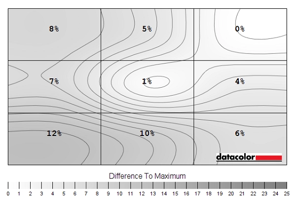
Luminance uniformity map 'Test Settings'
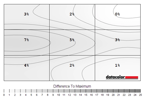
Luminance uniformity map 'SmartUniformity'
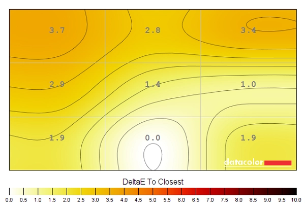
Colour temperature uniformity map 'Test Settings'
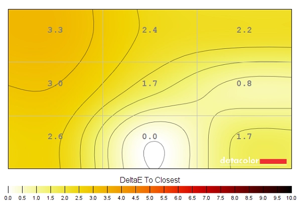
Colour temperature uniformity map 'SmartUniformity'

Contrast in games and movies
Lagom contrast tests
The Lagom tests for contrast allow specific weaknesses in contrast performance to be identified. The following observations were made.
Colour reproduction
Colour gamut
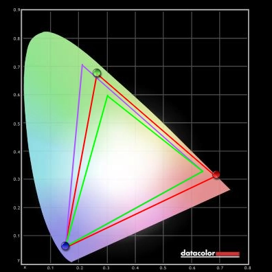
Colour gamut 'Test Settings'
For models with a colour gamut this wide, it can be beneficial if a flexible and well-calibrated sRGB emulation setting is available. A mode which will cut down the colour gamut significantly and therefore restrict saturation for colour-critical work or viewing within the sRGB space. This monitor offers an sRGB emulation setting, activated by setting ‘Color’ to ‘sRGB’ in the OSD. This cuts down the colour gamut significantly, but unfortunately goes a bit too far and gives significant under-coverage (92% sRGB) as shown below. It also locks off control of the colour channels and brightness, which is locked at a high value. Full calibration using the native gamut of the monitor would be recommended on this model, using a calibration device, if colour accuracy is important.

Colour gamut 'sRGB'
Colour in games and movies
Viewing angles

The following video shows the Lagom text test, a mixed desktop background and dark desktop background from a variety of viewing angles. For the mixed image you can see some shifts in colour and contrast, more pronounced at steeper angles. There is no ‘colour inversion’ as you’d observe on a TN model vertically and the shifts are not as extreme. The final third of the video shows a dark desktop background and highlights ‘VA glow’ which blooms out from more extreme angles. The ‘VA glow’ is certainly not extreme on this model and only really ‘blooms out’ from particularly steep viewing angles.
Interlace pattern artifacts
Responsiveness
Input lag
Perceived blur (pursuit photography)

The UFO appears unfocused without clear detailing, reflecting a moderate amount of perceived blur due to eye (camera) movement. There are also various degrees of trailing behind the UFO, plus some extra blending of details found on the UFOs beyond what you can see on the reference shots. This reflects weaknesses in pixel responsiveness. These weaknesses are clearest with ‘SmartResponse’ set to ‘Off’, where you can see bold ‘powdery’ trailing, particularly for the dark background (top row) where it has an extended and ‘smeary’ appearance. The ‘Fast’ setting speeds up pixel transitions somewhat, cutting down on the trailing a bit. The trailing for the dark background remains extended with a somewhat ‘smeary’ appearance, although it is cut down compared to the ‘Off’ setting. The medium background (middle row) has a fairly bold but short trail behind it, whilst the light background (bottom row) is free from obvious trailing. The ‘Faster’ setting yields minimal improvement for the dark background, whilst cutting down trailing elsewhere at the expense of introducing some overshoot (inverse ghosting). This is visible as dark ‘shadowy’ trailing behind the UFOs plus a bit of bright (halo) trailing for the light background. The ‘Fastest’ setting ramps things up significantly, introducing obvious colourful overshoot for all transitions, particularly the medium and light backgrounds. From this analysis and broader analysis, we consider ‘Fast’ to be optimal and use this for our subjective testing that follows. Some users might like the ‘Faster’ setting, although we found some of the overshoot too strong – some transitions show this more clearly than those analysed above.
Responsiveness in games and movies
FreeSync – the technology and activating it

The Philips supports a variable refresh rate range of 40 – 60Hz. That means that if the game is running between 40fps and 60fps, the monitor will adjust its refresh rate to match. When the frame rate rises above 60fps, the monitor will stay at 60Hz and the GPU will respect your selection of ‘VSync on’ or ‘VSync off’ in the graphics driver. With ‘VSync on’ the frame rate will not be allowed to rise above 60fps, at which point VSync activates and imposes the usual associated latency penalty. With ‘VSync off’ the frame rate is free to climb as high as the GPU will output (potentially >60fps). LFC (Low Frame Rate Compensation) is not supported by this monitor, as that requires the upper limit (ceiling) to be at least 2x the lower limit (floor) of FreeSync operation. FreeSync is therefore deactivated if the frame rate falls below 40fps, with the monitor then respecting your choice of VSync and presenting you with either stuttering (VSync on) or juddering and tearing (VSync off).
Some users prefer to leave VSync enabled but use a frame rate limiter set a few frames below the maximum supported (e.g. 57fps) instead, avoiding any VSync latency penalty at frame rates near the ceiling of operation or tearing from frame rates rising above the refresh rate. If you go to ‘Setup’ – ‘Information’ in the OSD, you will see the refresh rate listed there change in real time alongside the frame rate of the content, if it’s within the variable refresh rate range of the display. Finally, it’s worth noting that FreeSync only removes stuttering or juddering related to mismatches between frame rate and refresh rate. It can’t compensate for other interruptions to smooth game play, for example network latency or insufficient system memory. Some game engines will also show stuttering (or ‘hitching’) for various other reasons which won’t be eliminated by the technology.
FreeSync – the experience
Nvidia Adaptive-Sync (‘G-SYNC Compatible’)

You will also see in the image above that it states: “Selected Display in not validated as G-SYNC Compatible.” This means Nvidia hasn’t specifically tested and validated the display, not that it doesn’t work. Indeed the technology did work, it delivered an experience that was very similar to FreeSync, getting rid of tearing and stuttering in much the same way as frame rate fluctuated between 40 and 60 fps. Something to note, though, is that HDR did not work at the same time as ‘G-SYNC Compatible Mode’ on this model. It gave intense flickering which was very distracting and rather uncomfortable, so you’d need to choose one or the other as an Nvidia GPU user.

HDR (High Dynamic Range)


Colour gamut 'Test Settings'
Although our testing is focused on HDR PC gaming, our observations below also apply to HDR movie content and running HDR on a compatible games console written with the HDR10 pipeline in mind. The experience is dictated and, in many respects limited, by the capabilities of the screen itself. We also found the experience very similar whether using our AMD or Nvidia GPU. We tested a range of game titles but will simply be focusing on Battlefield V and Shadow of the Tomb Raider for this section. We have tested these and similar titles on a broad range of HDR capable monitors and know that the games themselves offer good HDR implementations that offer a good test of the monitor’s own HDR capabilities. There are two ‘HDR’ operating modes in the ‘Picture’ section of the OSD; ‘Normal’ and ‘VESA HDR 600’. Both options allowed the monitor to leverage 10-bit colour support, which is used for HDR10 content to enhance the shade precision. On monitors like this with local dimming capabilities, that’s coordinated with local dimming on the backlight. This enhanced precision gave a very different look to HDR, compared to observing the same scenes in SDR. Shadow detail was enhanced, but not in an unnatural way (as you’d get if you simply raised gamma under SDR) but by way of a much greater variety of subtly different dark shades. The improved precision was also evident on lighter shades, again presenting an exceptional variety of nuanced shads. This allowed smooth and gentle gradients to be displayed, for example when observing mist, smoke and fog or the suns rays in the sky. There is one particular scene on Shadow of the Tomb Raider which highlighted this capability very nicely. The light streaming in from an opening above showcased these very fine gradients. Whilst some of the shaded areas of vegetation and light striking waxy leaves highlighted the excellent precision at both the low and high ends. The image below is just to illustrate the elements being discussed and set the scene. It in no way reflects how things actually look first-hand on the monitor.

The ‘4K’ UHD experience


The 31.5” screen also provides a nice experience when gaming, immersive due to the size but delivering a nice pixel density. We didn’t find the size overwhelming from our normal viewing position, although this is subjective and not all users will adjust to the size in the same way as others. The strong pixel density delivered pleasing detail and clarity to the content. Even with the games running at relatively low settings, there was a certain crispness and definition that was lacking on models with significantly lower pixel density. Being able to observe this over such a large screen area was nice as well. With settings ramped up, the crispness and detail levels helped textures and particle effects appear rather more realistic than on models with significantly lower pixel density. This aspect, again, is very similar to what we explored in the article linked to at the start of this section. The images below show the monitor running various game titles. They’re purely for illustrative purposes and in no way indicate how the monitor appears in person.


Interpolation and upscaling

Video review
Timestamps:
Features & Aesthetics
Contrast
Colour reproduction
HDR (High Dynamic Range)
Responsiveness
Conclusion
The bottom line; fairly vibrant colour output, low input lag and strong contrast with a convincing bright-scene HDR performance– less impressive for dark scenes under HDR, particularly in dimmer room lighting.
Positives Negatives Quite vibrant and varied colour output overall, with strong DCI-P3 coverage and appropriate use of the gamut under HDR
Gamma and saturation shifts, more pronounced than on some ~32” VA screens Strong static contrast and appropriate HDR luminance levels plus local dimming for convincing bright-scene HDR performance – plus a relatively low level of ‘VA glow’ Screen surface imparts a slightly grainy look to lighter elements, moderate ‘black crush’ and less convincing dark-scene HDR performance Decent pixel responsiveness for the panel type overall and low input lag, plus Adaptive-Sync working well to get rid of frame and refresh rate mismatches
Some weaknesses in pixel responsiveness and a limited refresh rate won’t appeal to everyone A modern design putting the 3840 x 2160 resolution to good use Limited ergonomic flexibility and no local dimming support for SDR
As an Amazon Associate I earn from qualifying purchases made using the below link. Where possible, you’ll be redirected to your nearest store. Further information on supporting our work.
