Author: Adam Simmons
Date published: October 27th 2023
Table of Contents
Introduction
For both work and play on the PC as well as console gaming, 3840 x 2160 (‘4K’ UHD) models with 120Hz+ refresh rate can be attractive. The Gigabyte M27U provides this experience – and like other members of the ‘M’ series is aims to offer a good price to performance ratio. With console gaming in mind, it includes HDMI 2.1 to provide ‘4K’ UHD @120Hz plus VRR for devices such as the PS5 and Xbox Series X. PC users can push the monitor up to 160Hz, a slight boost from the more common 144Hz. We put this monitor to the test with our usual suite of tests, including a mixture of gaming, video watching and general desktop usage.
Specifications
The monitor uses a 27” IPS (In-Plane Switching) type panel – more specifically an AHVA (Advanced Hyper-Viewing Angle) panel from AUO with 3840 x 2160 resolution. A 160Hz refresh rate and 10-bit colour (8-bit + FRC dithering) is also supported. A 1ms MPRT response time is specified using the included strobe backlight setting, without a grey to grey response time specified. Either way, you shouldn’t pay much attention to such figures. Some of the key ‘talking points’ for this monitor have been highlighted in blue below, for your reading convenience.
*10-bit can be selected in the graphics driver at any refresh rate, up to the native resolution using DP 1.4 (with DSC) or HDMI 2.1 under SDR or HDR. 12-bit can also be selected when using HDMI 2.1; this includes an additional 2-bit dithering stage applied by the monitor’s scaler to facilitate viewing 12-bit depth content. The bit depths listed here are using a Full Range RGB signal.
**’DP Refresh rate’ in the ‘Display’ section of the OSD can be set to 160Hz rather than the default 150Hz, which is a mild overclock. It’s set to 150Hz by default for broader compatibility with some GPUs. The monitor has simple and slightly ‘gamery’ styling, with lots of matte black plastic without any colourful elements. The stand base has a stepped low-profile appearance, with glossy black plastic used between steps and for the central column running up the front of the stand neck. The base is hollowed-out plastic with metal backplate, so it doesn’t have the premium feel of some stands, though the monitor itself feels quite solid with a good firm attachment to the stand. The bottom bezel is black matte plastic with medium grey central branding, with the bezel ~23mm (0.91 inches) thick. The top and side bezels have a dual-stage design, with slim panel border flush with the rest of the screen and slim hard plastic outer part – ~8mm (0.31 inches) including both elements. The point of interest from the front is naturally the screen itself, which has a light to very light matte anti-glare finish which we explore a bit later. The images below show the refresh rates supported for the native 3840 x 2160 (‘4K’ UHD) resolution. The first two images show the resolutions categorised in the EDID of the monitor as ‘TV’ resolutions and listed here under ‘Ultra HD, HD, SD’ for DP and HDMI, respectively. The third and fourth images show resolutions categorised in the EDID and listed here as ‘PC’ resolutions for DP and HDMI, respectively. This includes 3840 x 2160 @120Hz, which can be used by the Xbox Series X and PS5 via HDMI 2.1. *Note that ’Display’ – ‘DP Refresh Rate’ is set to 160Hz in all cases for these images. If this is left at 150Hz, the maximum refresh rate listed will be 150Hz. For resolution lists which include 150Hz as an option via HDMI but appear limited to 144Hz via DP in these images, note that 150Hz will also be listed if 150Hz is selected for ‘DP Refresh Rate’. The image below is a macro photograph taken on Notepad with ClearType disabled. The letters ‘PCM’ are typed out to help highlight any potential text rendering issues related to unusual subpixel structure, whilst the white space more clearly shows the actual subpixel layout alongside a rough indication of screen surface. This model uses a light to very light matte anti-glare screen surface, delivering decent glare handling without as much layering in front of the image as some matte screen surfaces, alongside better maintenance of clarity and vibrancy potential. In brighter conditions and particularly with bright light striking the screen directly, sharper glare patches can sometimes be observed which gives a ‘glassy’ look to the screen. The monitor doesn’t diffuse light as heavily as most matte screen surfaces, so there isn’t as much ‘hazing’ or ‘flooding’ of the image – though this can still occur in bright conditions and isn’t avoided entirely as it can be with glossy screen surfaces. The screen surface has a slightly grainy finish, but it isn’t an obvious course sandy graininess or a ‘smeary’ graininess. The M27U features a range of ‘Picture Mode’ presets; ‘Standard’, ‘FPS’, ‘RTS/RPG’, ‘Movie’, ‘Reader’, ‘sRGB’, ‘Custom 1’, ‘Custom 2’ and ‘Custom 3’. As usual most of these presets simply alter various OSD settings that you could instead manually adjust yourself, but you can make adjustments which are remembered for each preset and they’re recalled when you next select that preset. The exception is that individual colour channel changes made with ‘Color Temperature’ set to ‘User Define’ are applied universally. The numbered ‘Custom’ modes are identical to ‘Standard’ by default and allow an additional 3 separate sets of settings to be used. The ‘sRGB’ setting is unique in that it restricts access to most settings and restricts the colour gamut as explored shortly. The table below shows gamma and white point readings taken using a Datacolor SpyderX Elite colorimeter, alongside general observations by eye. Our test system uses Windows 11 with an Nvidia RTX 3090 connected using the supplied DisplayPort cable. Additional testing was performed via HDMI with similar observations made on this table. The monitor was left to run for over 2 hours before readings were taken and observations made, without any additional monitor drivers or ICC profiles specifically loaded. Aside from our ‘Test Settings’, where various adjustments were made, assume factory defaults were used. The refresh rate was set to 160Hz, although this didn’t significantly affect the values or observations in this table. When viewing the figures in this table, note that for most PC users ‘6500K’ for white point and ‘2.2’ for gamma are good targets to aim for. Individual targets depend on individual uses, tastes and the lighting environment, however. Out of the box the monitor provided quite a vibrant image, with a mild to moderate green and just slightly cool tint. Gamma tracked ‘2.3’ on average – we tested various gamma and ‘Black Equalizer’ settings but the best balance was still achieved with the factory default gamma setting. The ‘sRGB’ setting also averaged ‘2.3’ but dipped significantly for some dark and medium-dark shades. The first gamma graph below shows the results under our ‘Test Settings’ (very similar gamma to factory defaults) and the second graph shows the ‘sRGB’ setting. Note that the graphs just give a general idea of gamma behaviour but lack the precision or resolution to clearly show some of the dark to medium-dark shade deviations mentioned for the sRGB setting. The monitor includes a ‘Low Blue Light’ (LBL) setting, which can be set between ‘0’ (disabled) and ‘10’ (maximum reduction). This provides an increasingly warm look to the image due to diminishing the blue colour channel. It also maintains quite a strong green channel, imparting a green tint which is quite noticeable with higher settings. Your eyes adjust to this to an extent, but we preferred to use an alternative LBL setting on this monitor – setting ‘Color Temperature’ to ‘Warm’. This provides a warmer look to the image with significantly weakened blue channel, slightly weakened green channel and relatively strong red channel. As such it doesn’t have a clear green tint and appeared better balanced to our eyes, whilst still acting as an effective LBL setting. Reducing brightness further minimises blue light output – and indeed all light output from the monitor. Reducing exposure to blue light can aid viewing comfort, whilst the warmer look to the image can be useful for relaxing viewing. Something that could be particularly beneficial in the hours leading up to sleep. We used the ‘Warm’ setting with reduced brightness for our own viewing comfort in the evenings, although not for any specific testing beyond that involving the setting itself. For our ‘Test Settings’ we switched over to the ‘Custom 1’ preset and made adjustments to brightness and minor tweaks to colour channels. ‘Standard’, ‘Custom 2’ and ‘Custom 3’ are set up the same way as this by default, so could be used as a base instead if preferred. The colour channel adjustments seem imprecise on this model. For example – if we dropped the blue channel 1 point from ‘100’ to ‘99’, the colour temperature dropped by ~350K and a moderate green tint was introduced. We settled for a marginally higher white point than usual as otherwise we’d have to make more significant adjustments to all colour channels which ate away at contrast. Greys had a mild green tint which couldn’t be removed without either dropping contrast to ‘49’ or reducing red and blue channels (perhaps counter-intuitively), but we didn’t feel either correction was worth it given the impact on contrast and mildness of the neutrality issue. Note that individual units and preferences vary, so these settings are simply a suggestion and won’t be optimal for all users or units. We’ve also included the refresh rate used in Windows and our preferred ‘Overdrive’ setting used for most of the review, just for reference. These settings only apply to SDR, HDR has separate settings associated with it (is far more restrictive) and is explored in the relevant section of the review. We used the defaults under HDR with ‘Local Dimming’ set to ‘High’. Picture Mode = Custom 1 Brightness = 30 (according to preferences and lighting) Color Temperature = User Define R = 100 G = 99 B = 100 Overdrive = Picture Quality AMD FreeSync Premium Pro = Enable DP Refresh Rate = 160Hz Refresh rate (Windows setting) = 160Hz
As an Amazon Associate I earn from qualifying purchases made using the below link. Where possible, you’ll be redirected to your nearest store. Further information on supporting our work.

Features and aesthetics


The OSD (On Screen Display) is controlled by a joystick at the rear, towards the right side as viewed from the front. Above this there’s a dedicated KVM button. A very small circular (‘pin prick’ style) power LED is located towards the bottom right, facing forwards. This glows white when the monitor is on and flashes white when the monitor enters a low power state. The following video runs through the menu system including PiP and PbP functionality, KVM and the accompanying ‘Sidekick’ portion of the ‘Gigabyte Control Center’ software that can be used to control it. It also explores the changes we made for our ‘Test Settings’, covered later in the review.
The screen is fairly slim at thinnest point (~18mm or 0.71 inches), bulking out more towards the centre and lower down. The stand offers tilt (5° forwards, 20° backwards) and height adjustment (130mm or 5.12 inches). At lowest stand height the bottom of the screen sits nice and low, ~22mm (0.87 inches) above the desk with the top of the screen ~394mm (15.52 inches) clear of the desk – plus ~20mm (0.79 inches) extra for the top of the stand neck in that position. The total depth of the monitor including stand is ~170mm (6.69 inches) with the screen ~30mm (1.18 inches) back from the frontmost point of the stand. So it’s a fairly compact design which allows you to place the screen relatively close to the wall – useful if you don’t have a very deep desk. The base also has a central ‘cut out’ section in the middle with diagonally sloped sides, if you wish to use your keyboard at an angle.

The rear of the monitor is mainly matte black plastic, with a glossy section further up and a few glossy details elsewhere. The stand attaches centrally with a quick-release catch beneath the attachment point allowing it to be easily removed. This reveals provision for 100 x 100mm VESA mounting. A cable-tidy loop is found towards the bottom of the stand neck. The ports face downwards and include; AC power input (internal power converter) with K-Slot to the right, 2 HDMI 2.1 ports, DP 1.4 (with DSC and HBR3), USB-C (18W PD, DP Alt Mode, upstream data), 3 USB 3.2 Gen 1 ports (plus Type-B upstream) and a 3.5mm headphone jack. 2 x 3W speakers are included, offering basic sound output. The monitor reaches a passable though not particularly loud maximum volume with a good quiet minimum volume. The sound output isn’t quite as hollow sounding as some integrated speakers but isn’t overly rich or bassy either. These speakers are there if you need them but won’t replace standalone speakers or headphones for most people. Standard accessories include; a power cable, DP cable, Ultra High Speed HDMI cable and USB cable but may vary regionally.


3840 x 2160 @160Hz plus HDR and Adaptive-Sync can be leveraged via DP 1.4 (with DSC), whilst 3840 x 2160 @150Hz plus HDR and Adaptive-Sync can be leveraged via HDMI 2.1. AMD FreeSync Premium Pro and Nvidia’s ‘G-SYNC Compatible Mode’ is supported on compatible GPUs and systems via suitable versions of DP and HDMI. Compatible Intel graphics hardware can also leverage Adaptive-Sync. HDMI 2.1 includes integrated VRR (Variable Refresh Rate) capability which does not rely on Adaptive-Sync and can be used via ‘G-SYNC Compatible’ and the PS5 which doesn’t support Adaptive-Sync. With HDMI 2.1, games consoles like the Xbox Series X and PS5 are able to run 3840 x 2160 @120Hz. The HDMI 2.1 ports of this model offer a bandwidth of 24Gbps with DSC (Display Stream Compression) used to extend its effective bandwidth further. For example, enabling Full Range RGB or ‘4:4:4’ without chroma subsampling at the maximum refresh rate. Unlike many PC GPUs or the Xbox Series X, the PS5 doesn’t support DSC – so it would require a higher uncompressed bandwidth for its maximum supported ‘4:2:2’ signal for ‘4K’ UHD @120Hz. As that isn’t available here, a ‘4:2:0’ reduced chroma signal is instead used for ‘4K’ UHD @120Hz on the PS5. In practice this works very well for ‘4K’ gaming or movie content with minimal visual impact in either SDR or HDR. Many people would struggle to see a difference even with a direct side by side comparison, so it isn’t something we’d worry about. But we appreciate some people would ideally like to be able to leverage the full capability of their system without a reduced chroma signal.


The images below show the refresh rates listed for the 2560 x 1440 (QHD or 1440p) resolution via DP and HDMI, respectively.


The images below show the refresh rates supported for 1920 x 1080 (Full HD or 1080p). The first two images show the ‘TV’ resolution lists for DP and HDMI, respectively. The third and fourth images shows the ‘PC’ list via DP and HDMI, respectively.


If you’re intending to use the monitor with the PS5 or Xbox Series X/S, be aware that a small settings tweak may be required to ensure 120Hz is selectable for supported resolutions. Details can be found in this article.
Calibration
Subpixel layout and screen surface
![]()
As shown above the standard RGB (Red, Green and Blue) stripe subpixel layout is used. This is the default expected by modern operating systems such as Microsoft Windows. Apple’s MacOS no longer uses subpixel rendering and therefore doesn’t optimise text for one particular subpixel layout to the detriment of another. You needn’t worry about text fringing from non-standard subpixel layouts and won’t need to change the defaults in the ‘ClearType Text Tuner’ as a Windows user. You may still wish to run through the ClearType wizard and adjust according to preferences, however. The subpixel layout and arrangement is normal and we had no subpixel-related concerns related to sharpness or text clarity on this model.
Testing the presets
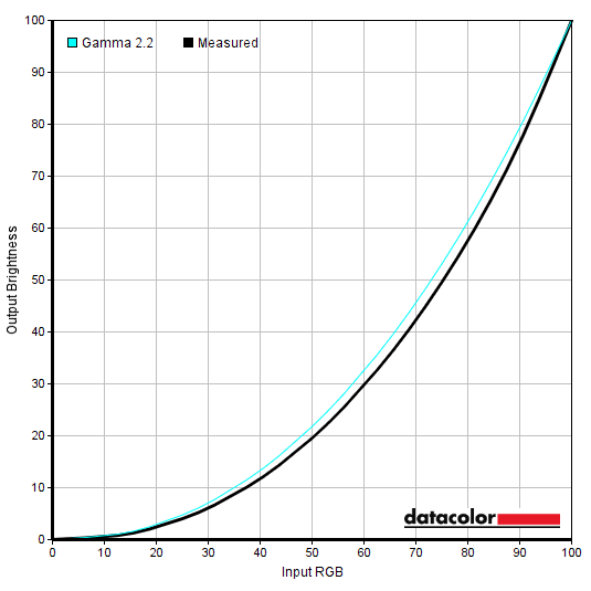
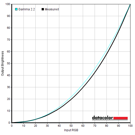
Monitor Settings Gamma (central average) White point (kelvins) Notes Gamma OFF 2.3 6667K Quite vibrant with mild to moderate green tint and gamma too high (extra depth) for many medium shades. Gamma is also too high for dark shades, crushing some dark detail. Gamma 1.8 1.9 6773K As above but significantly reduced gamma giving a more faded appearance overall with excessive dark detail. Gamma 2.0 2.1 6782K As defaults with lower gamma, less depth. Standard, Gamma 2.2 (Factory Defaults) 2.3 6762K As ‘OFF’ but gamma curve has more of a central bow (extra depth for some medium shades), though tracks closer to the ‘2.2’ curve for darker shades, avoiding the same crushing there. Gamma 2.4 2.5 6808K As above with raised gamma, adding depth and masking some dark detail. Gamma 2.6 2.7 6816K As above with further increase to gamma, very ‘contrasty’ and overly deep appearance overall. Low Blue Light = 10 2.3 5115K An effective Low Bue Light (LBL) setting, with significantly weakened blue channel and hence reduced blue light output. The image appears warm but with a strong yellowish green tint. Color Temperature = Warm 2.3 4984K Another effective Low Blue Light (LBL) setting, but the image appears warm and slightly amber. We found this visually better balanced and easier to adjust to. Color Temperature = User Define 2.3 6582K As factory defaults but better-balanced colour temperature and milder green tint. Picture Mode = sRGB 2.3 6442K An sRGB emulation setting which clamps the gamut closer to sRGB, significantly reducing saturation. Gamma dips noticeably for darker to medium-dark shades. It more closely follows the ‘sRGB’ gamma curve for the darkest shades but is too low for some medium shades as well, giving insufficient depth and a hazy look in places. Brightness can be adjusted, gamma, colour channels and overdrive setting can’t. Test Settings (see below) 2.3 6606K A fairly vibrant look with good variety and decent colour channel balance. Gamma invites a little extra depth for some medium shades in particular and white point is slightly higher than usual target, explained shortly.
Gamma 'Test Settings'
Gamma 'sRGB'
Given the intended uses for the monitor, inter-unit variation and performance on our unit with OSD tweaking alone we won’t be using any ICC profiles in this review or including any measurements or graphs using them. We wouldn’t recommend using them unless created for your specific unit using your own calibration device. But we appreciate some users still like to use profiles and some aspects such as gamut mapping for colour-aware applications can be useful. You can download our ICC profile for this model, which was created using our ‘Test Settings’ as a base. You can also download our sRGB profile which was created using and designed for the ‘Picture Mode = sRGB’ setting. Amongst other things, this adjusted gamma to track the ‘2.2’ curve on our unit – but be aware of inter-unit variation. We prefer to analyse things in a more visual and qualitative way, but using the ‘sRGB’ mode we can confirm an average DeltaE of 1.74 within the sRGB colour space recorded with our SpyderX Elite, using the same 24 test patches analysed visually deeper into the review (SpyderCHECKR 24). Note that shade 1F (cerulean) is often recorded with a high error in this test and here it was the maximum recorded error (dE 3.63). Other moderate errors were recorded for some ‘bluish’ shades such as 6F (royal blue, dE 2.52) and 4G (grape purple, dE 2.74). The kink in the blue region of the gamut, explored later, might be partly to blame for this – though these aren’t extreme errors by any means.
Test Settings
Contrast and brightness
Contrast ratios
An X-Rite i1Display Pro Plus (Calibrite ColorChecker Display Plus) was used to measure the luminance of white and black using various settings, including those found in the calibration section. From these values, static contrast ratios were calculated. The table below shows these results. Blue highlights indicate the results under our ‘Test Settings’ and with HDR active. Black highlights indicate the highest white luminance, lowest black luminance and highest contrast ratio recorded under SDR. Assume any setting not mentioned was left at default, with the exceptions already noted here or in the calibration section.
Measurements using ‘Aim Stabilizer Sync’ were taken at 160Hz – brightness levels were similar at lower refresh rates, so we didn’t feel it was worthwhile documenting these observations on the table.
| Monitor Settings | White luminance (cd/m²) | Black luminance (cd/m²) | Contrast ratio (x:1) |
| 100% brightness | 424 | 0.43 | 986 |
| 80% brightness | 344 | 0.35 | 983 |
| 60% brightness (Factory Defaults) | 264 | 0.27 | 978 |
| 40% brightness | 199 | 0.20 | 995 |
| 20% brightness | 132 | 0.13 | 1015 |
| 0% brightness | 66 | <0.07 | >943 |
| HDR, Local Dimming = High (1% white, peak)* | 598 | 0.15 | 3987 |
| HDR, Local Dimming = High (4% white, peak)* | 597 | 0.15 | 3980 |
| HDR, Local Dimming = High (9% white, peak)* | 591 | 0.15 | 3940 |
| HDR, Local Dimming = High (25% white, peak)* | 596 | 0.16 | 3725 |
| HDR, Local Dimming = High (49% white, peak)* | 598 | 0.18 | 3322 |
| HDR, Local Dimming = High (100% white, sustained)** | 606 | N/A | N/A |
| HDR, Local Dimming = Medium (1% white, peak)* | 595 | 0.2 | 2975 |
| HDR, Local Dimming = Medium (100% white, sustained)** | 606 | N/A | N/A |
| HDR, Local Dimming = Low (1% white, peak)* | 594 | 0.4 | 1485 |
| HDR, Local Dimming = Low (100% white, sustained)** | 605 | N/A | N/A |
| HDR, Local Dimming = Off (1% white, peak)* | 600 | 0.64 | 938 |
| HDR, Local Dimming = Off (100% white, sustained)** | 605 | N/A | N/A |
| HDR, Local Dimming = High, Game Scene 1 (SOTTR water glint)*** | 245 | N/A | N/A |
| HDR, Local Dimming = High, Game Scene 2 (BFV mountain sun)*** | 557 | N/A | N/A |
| Gamma = Gamma OFF | 267 | 0.27 | 989 |
| Gamma = Gamma 1.8 | 265 | 0.27 | 981 |
| Gamma = Gamma 2.0 | 265 | 0.27 | 981 |
| Gamma = Gamma 2.4 | 264 | 0.27 | 978 |
| Gamma = Gamma 2.6 | 264 | 0.27 | 978 |
| Low Blue Light = 10 | 255 | 0.27 | 944 |
| Color Temperature = Warm | 230 | 0.27 | 852 |
| Color Temperature = User Define | 272 | 0.27 | 1007 |
| Color Temperature = User Define (100% brightness) | 431 | 0.43 | 1002 |
| Picture Mode = sRGB | 181 | 0.2 | 905 |
| Aim Stabilizer Sync | 246 | 0.25 | 984 |
| Test Settings | 165 | 0.17 | 971 |
*HDR measurements were made using this YouTube HDR brightness test video, running full screen at ‘2160p 4K HDR’ on Microsoft Edge. The maximum reading using the patch size (measurement area) specified in the table was used. The black luminance was taken at the same point of the video with the colorimeter offset to the side of the white test patch, equidistant between the test patch and edge of the monitor bezel.
**These readings were taken using the above test. A reading was taken using a white screen fill (‘all pixels’), 30 seconds after it was displayed. This is used to represent the sustained luminance level the monitor can provide under HDR, rather than the peak luminance achieved for smaller sections of the screen. Because the entire screen is white for this test, black luminance levels can’t be read and an HDR contrast reading can’t be ascertained.
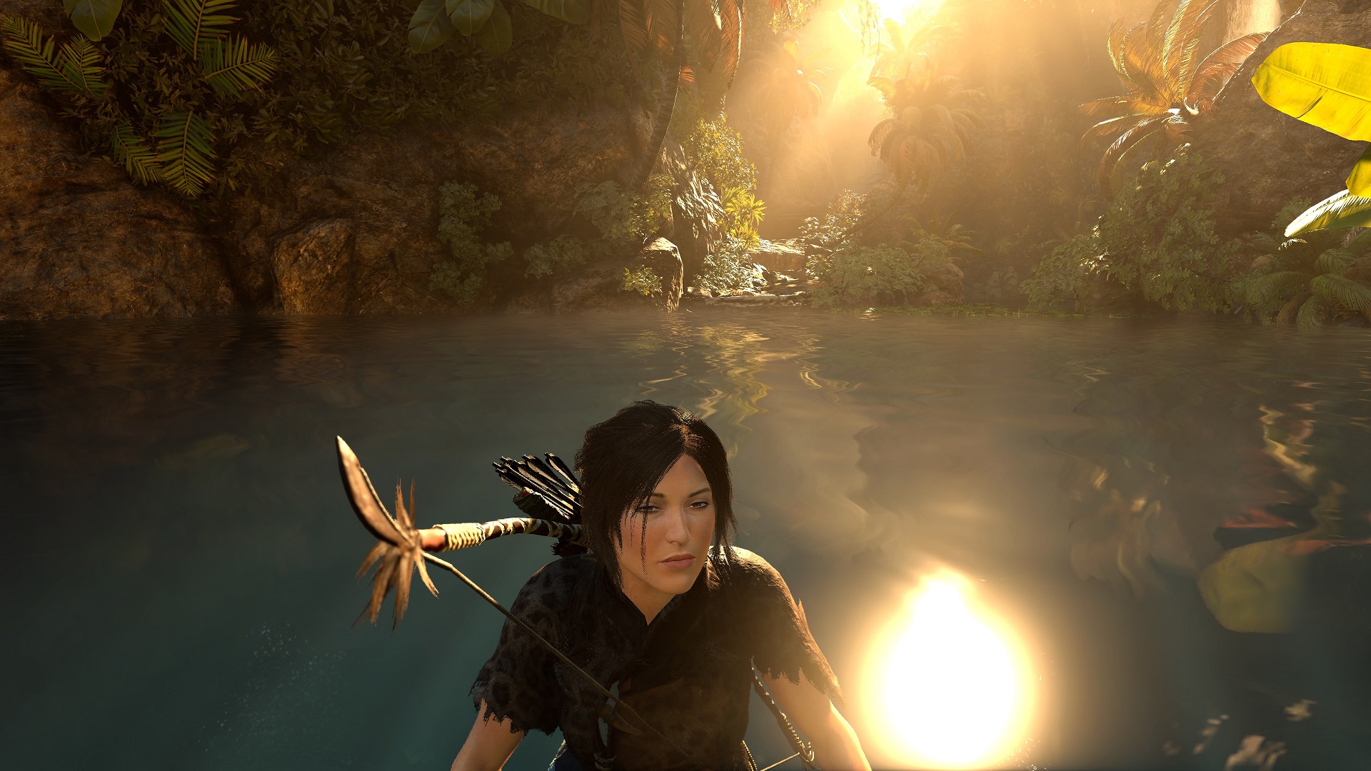
***These are the highest readings taken for the sun glint on the water surface of this scene from Shadow of the Tomb Raider and the sun in the sky on this scene from Battlefield V. For practicality and to ensure a good peak reading with maximal sensor area coverage, we allowed slight repositioning of the character and perspective change from what is shown in the screenshots. The overall makeup of the scene remained roughly as shown, which is particularly important on models such as OLEDs where brightness can vary significantly depending on the overall levels of light and dark shade in the scene.
The average contrast ratio with only brightness adjusted was 991:1, close to the specified 1000:1 and within normal range for a model with IPS-type panel. This excludes the value for ‘0% brightness’ where rounding throws off the precision too much. The peak contrast recorded under SDR was 1015:1, with 971:1 recorded using our ‘Test Settings’. Contrast was reduced using the ‘Low Blue Light’ setting to 944:1, with a further reduction using ‘Warm’ (includes significant green channel reduction) to 852:1. The highest white luminance recorded under SDR was 431 cd/m², whilst the minimum white luminance recorded was 66 cd/m². This provides a luminance adjustment range of 365 cd/m² with a reasonably low minimum and fairly bright maximum – though some sensitive users would prefer a lower minimum.
Under HDR the monitor provides local dimming with 8 edge-lit zones running as vertical bands running from left to right with each band extending from the top to bottom of the screen. This setting is controlled by the ‘Local Dimming’ setting, which can be set to ‘Low’, ‘Middle’ or ‘High’ (or ‘OFF’). ‘High’ is the most reactive setting with zones more willing to dim to lower levels and for some content brighten up a bit more. ‘Middle’ is a touch less reactive and ‘Low’ significantly less reactive, taking a much gentler approach with zones less likely to dim or in some cases brighten as significantly as with higher settings. The greatest contrast advantage is therefore gained using the ‘High’ setting and in the patch size testing in this table that yielded quite consistent brightness which was close to the expected 600 cd/m² (591 – 605 cd/m²). It provided a somewhat enhanced contrast experience, with 3322:1 – 3980:1 recorded. The backlight didn’t dim all the way down for the pure black in this test, though in practice most content has complex mixtures of light and dark which are too intricate for such a solution to handle anyway. What you see for white squares against a black background aren’t really representative of such ‘real world’ content. We explore this subjectively later – in the game scenes we recorded 245 cd/m² on ‘Scene 1’ due to the dimming solution holding back its brightness. For reference (not included in table) we recorded 460 cd/m² for this element under HDR with local dimming disabled. Using the local dimming solution we recorded a much more respectable 557 cd/m² on ‘Scene 2’ where backgrounds shades were brighter so the dimming solution was happy to brighten up more.
PWM (Pulse Width Modulation)
The M27U does not use PWM (Pulse Width Modulation) to regulate backlight brightness at any level. Instead, DC (Direct Current) is used to moderate brightness. The backlight is therefore considered ‘flicker-free’, which will come as welcome news to those sensitive to flickering or worried about side-effects from PWM usage. The exception to this is with ‘Aim Stabilizer Sync’ active, a strobe backlight setting which causes the backlight to flicker in sync with the refresh rate of the display.
Luminance uniformity
Whilst observing a black background in a dark room, using our ‘Test Settings’, we noticed slight backlight bleed and associated clouding. It’s important to remember that individual units vary when it comes to all aspects of uniformity, including backlight bleed and clouding. The following image was taken a few metres back to eliminate ‘IPS glow’. This was observed as a cool slightly bluish silver or warm golden (slightly orange) haze, depending on angle, which emanates from the corners of the screen. This ‘IPS glow’ blooms out more strongly from steeper angles, as demonstrated in the viewing angles video later. The luminance uniformity was good. The maximum luminance was recorded at ‘quadrant 1’ towards the top left of the screen (160.6 cd/m²). The greatest deviations from this jointly occurred at ‘quadrant 6’ to the right of centre and ‘quadrant 7’ towards the bottom left (145.6 cd/m², which is 9% dimmer). The average deviation between each quadrant and the brightest point was 7%, which is decent. Remember that individual units vary when it comes to uniformity and you can expect further deviation beyond the points measured. The contour map below shows these deviations graphically, with darker greys representing lower luminance (greater deviation from brightest point) than lighter greys. The percentage deviation between each quadrant and the brightest point recorded is also given. The SpyderX Elite was also used to analyse variation in the colour temperature (white point) for the same 9 quadrants. The deviation between each quadrant and the quadrant closest to the 6500K (D65) daylight white point target was analysed and a DeltaE value assigned. Darker shades are also used on this map to represent greater deviation from 6500K. A DeltaE >3 represents significant deviation that may be readily noticed by eye. Results here were variable, with significant deviations recorded towards the bottom left (DeltaE 4.2) and bottom right (DeltaE 3.3) corners. Note again that individual units vary when it comes to uniformity and that you can expect deviation beyond the measured points. On Battlefield 2042 the monitor offered a reasonable contrast experience. A contrast ratio of 971:1 was measured using our ‘Test Settings’, in-line with our expectations of the panel and quite a standard measurement for an IPS-type panel. ‘IPS glow’ was also as expected, if not slightly lower than average, generally observed as a cool and slightly bluish silver haze emanating from the bottom of the screen from a normal viewing position. And with a warmer golden and slightly orange tone towards the top corners, depending on viewing position. This ate away at detail of darker shades in affected regions. Be aware that ‘IPS glow’ is brought out more strongly with a higher brightness setting on the monitor, if you’re sitting closer to the monitor or if your unit has significant backlight bleed or clouding issues. All in all, the monitor was not able to provide good depth and atmosphere for darker content, particularly when observed in a dim room. Again, a typical IPS experience and as usual if you’re sitting in an otherwise dim room we’d recommend considering bias lighting or lighting behind the monitor to aid perceived contrast and potentially improve viewing comfort. The screen allowed quite direct light emission from the screen without obvious layering in front of the image, but with slight graininess from the screen surface. Similar contrast observations were mode on Shadow of the Tomb Raider. This title features many high-contrast scenes with dimly lit areas with interspersed lighter elements. The monitor again failed to provide strong depth or atmosphere here, particularly in a dimly lit room. With limited static contrast and ‘IPS glow’ coming into play. A key advantage of IPS models like this observed on both titles and more broadly is strong gamma consistency. Some detail is lost for darker shades peripherally due to ‘IPS glow’, but aside from that is maintained appropriately throughout the screen, with the higher average gamma not heavily affecting darker shades. For other LCD panel types there are pronounced shifts vertically (TN) or comparing the centre to peripheral regions (VA). The screen surface again impeded the image less than some matte surfaces and imparted a bit of graininess without a clear layered or smeary appearance. We made further observations on the film Star Wars: The Rise of Skywalker. In a similar way to Tomb Raider, this title craves a strong contrast performance as it features many scenes featuring dark areas illuminated by point light sources. Bright pulses of energy, lightsabers, fire and suchlike. The monitor again didn’t provide the intended look to such scenes on the contrast side, especially in dimmer lighting – not the worst we’ve seen from an IPS model, but not the best either. Without a complex FALD backlight the experience on IPS models is never significantly beyond what we observed in this case. The film is presented in a ‘letterboxed’ format with a black border above and below the image. The weaknesses in contrast could again be readily observed for that border, though if the room was well lit these shortcomings were far less apparent. And most content streamed on platforms such as Netflix, Disney Plus, Amazon Prime Video and certainly YouTube will be presented in 16:9 without these bars. The Lagom tests for contrast allow specific weaknesses in contrast performance to be identified. The following observations were made in a dark room. The colour gamut of the M27U is shown as a red triangle below. It was compared with the sRGB (green triangle) and DCI-P3 (blue triangle) reference colour spaces using our ‘Test Settings’, as shown in the first image below. The gamut covers sRGB quite comprehensively (99%), with a bit of a skew in the blue region causing the slight undercoverage. We recorded 91% DCI-P3 coverage, falling short of the specified 95%. The exact measured gamut can vary depending on measurement instrument and software, with slight inter-unit variation also possible. There’s significant extension beyond sRGB towards the green to blue edge and towards the red region. Although not shown in the graphic, we recorded 87% Adobe RGB coverage. This DCI-P3 and Adobe RGB coverage isn’t high enough for accurate reproduction within those colour spaces. For standard sRGB content outside a colour-managed environment, the moderate extension beyond sRGB provides extra saturation and vibrancy without the strong push of extra saturation seen on models with an even more generous gamut. The monitor includes an sRGB emulation setting, the ‘sRGB’ preset in the ‘Picture’ section of the OSD. This cuts down on the gamut very effectively, though the skew in the blue region remains with 97% sRGB coverage recorded. So a bit of underextension there (and elsewhere) plus just a touch of overextension. Brightness can be adjusted with this setting active, though many other settings are locked off. As usual you can’t adjust gamma or colour channels, you can’t activate ‘Aim Stabilizer Sync’ and ‘Overdrive’ is locked and set to ‘Off’. To maximise colour accuracy within the sRGB colour space, for colour-managed workflows, full calibration and profiling with a colorimeter or similar device using the full native gamut is recommended. You may try the ICC profile featured in the calibration section which includes gamut mapping for colour-aware applications, but best results are always obtained by calibrating your own unit with your own hardware. Instead of using this ‘sRGB’ setting and putting up with the associated restrictions, AMD users can activate a flexible sRGB emulation setting via the graphics driver. This is done by opening ‘AMD Software’, clicking ‘Gaming’ and clicking on ‘Display’. You should then ensure that the ‘Custom Color’ slider to the right is set to ‘Enabled’ and ‘Color Temperature Control’ set to ‘Disabled’. It may appear to be set this way by default, but the native rather than restricted gamut is likely in play. If that’s the case, simply switch the ‘Color Temperature Control’ slider to ‘Enabled’ then back to ‘Disabled’ to leverage the sRGB emulation behaviour. This setting is shown in the image below. Whilst Nvidia doesn’t have a similar option in their graphics driver, a third party tool called ‘novideo_srgb’ can be used. This provides a similarly effective GPU-side gamut clamp to the AMD driver option. The tool and its usage is covered in our sRGB emulation article. The gamut below shows results using our ‘Test Settings’ with this tweak applied. We’d expect the AMD tweak to provide similar performance given it should be using the same data from the EDID of the monitor. The colour gamut now covers 99% sRGB with a little undercoverage in places, including in the blue region where the gamut has a natural skew. There’s a bit of overcoverage in the red region and a little for the green to blue edge. Overall, this tweak offers respectable tracking of sRGB and helps to cut down on the colour gamut without profiling, including in applications that aren’t colour managed. And you don’t have to put up with restrictions associated with the monitor’s sRGB emulation setting such as locked colour channels. Colour output was vibrant overall on Battlefield 2042. As with most content observed under SDR, including gaming and on the desktop, the content creators have the sRGB colour space in mind. When using a wider gamut than this on a monitor, extra saturation and vibrancy is introduced which goes beyond these intentions. With a gamut of 91% DCI-P3 there was an extra dose of saturation and a vivid look overall, but not to the extent of models with an even more generous gamut. There were some fairly lush-looking green shades, though some shades appeared less muted than they should with some brighter greens and sometimes a stronger than intended yellowish green appearance. Woody tones, earthy browns and some skin tones had a bit of a red push so appeared richer and less neutral than intended – this was not as strong as on some wide gamut models, but still significant. Sky blues and some painted blue crates also looked quite eye-catching, but not to an extreme or ‘cartoonish’ degree. We made similar observations on Shadow of the Tomb Raider. There was a clear dose of extra vibrancy and saturation, with a vivid look to the natural environments and similar red pushes and certain overly eye-catching greens that were also observed on Battlefield. Lara Croft’s skin looked richer than intended but didn’t have a strongly sun-kissed or potentially sunburnt look as some models with an even more generous gamut might show. There were some eye-catching brightly painted red artifacts and flowers, with fires also appearing with some very rich-looking reddish oranges. They appeared oversaturated but with both ‘pop’ and variety rather than a cartoonish or crushed look. On both titles the strong colour consistency helped ensure vibrancy was well-maintained throughout the screen. Unlike on VA models where there are saturation losses peripherally and TN models where there are clear vertical shifts. Some people will like the level of vibrancy provided here, without the more extreme oversaturation some even wider gamut models can provide. Others may want to tone things down and have a more ‘as intended’ look to things, constrained to the more restrictive sRGB colour space. So sRGB emulation may appeal, such as setting ‘Picture Mode’ set to ‘sRGB’. We also observed various episodes of the TV series Futurama. This title features large areas of individual shade and is therefore a particularly unforgiving test for colour consistency. The monitor provided a good performance here, without obvious saturation shifts. Minor shifts could be observed in places, for example Leela’s purple hair appearing with a bit more of a pink tint peripherally and some deep reds appearing very slightly duller towards the extreme side edges. But such shifts were significantly lower than you’d observe on VA or TN models and also lower than some IPS models. A vibrant but varied shade palette was presented, giving bright and neon shades such as neon pinks, bright greens and oranges quite an eye-catching look. More muted pastel shades appeared muted relative to these shades, though less muted than intended. sRGB emulation may again be preferred for a more toned down appearance. The image below shows a printed reference sheet of 24 ‘sRGB’ shades, included as part of the Datacolor SpyderCHECKR 24 package. The screen is displaying reference photographs of this printed sheet, in both the same order as printed (right side) and reverse order (left side). The camera is mounted slightly above centre so that the image is representative of what the eye sees from an ergonomically correct viewing position. This, coupled with the inclusion of a flipped version of the shade sheet, allows both accuracy and colour consistency to be visually assessed. Bracketed numbers in our analysis refer to shades on the printed sheet or right side of the screen if they’re ordered consecutively from top left to bottom right. Note that there is always some disparity between how emissive objects (monitor) and non-emissive objects (printed sheet) appear. The monitor is set to a very low brightness to help minimise this disparity. The representation of shades in this image depends on the camera and your own screen, it’s not designed to show exactly how the shades appear in person. It still helps demonstrate some of the relative differences between the original intended sRGB shade and what the monitor outputs, however. Full profiling and appropriate colour management on the application would provide a tighter match, our intention here is to show what can be expected in a non colour-managed environment. The monitor outputs shades in quite a vibrant way using its native gamut, with its significant extension beyond sRGB. The generous gamut in the red region provides extra vividness to various shades. Medium orange (3), tango pink (11) and candy apple red (14) have extra depth and saturation, for example. Peach pink (20) and light chocolate brown (24) show a bit of a red push, too. The generous gamut elsewhere also provided a lively look to other shades, such as dark lime green (18) and yellow green (19), though these didn’t have the neon appearance of models with more generous Adobe RGB coverage. Cerulean (2), Persian blue (7) and to some extent grape purple (15) appeared with a bit of a stronger blue tone than intended, with the skew to the gamut in this region likely contributing. Royal blue (22) was presented as a slightly brighter than intended shade, too. Colour consistency is strong overall, without the clear saturation shifts observed on VA or TN models depending on the on-screen position of the shade. There are slight shifts in places due to minor uniformity issues or glare patches, as it’s very difficult to appropriately illuminate the printed sheet without a bit of glare on the screen. The image below shows how things appeared with ‘Picture Mode’ set to ‘sRGB’. Things are now toned down, overall. Some shades such as medium orange (3), Persian pink (6) and aquamarine (4) appear a touch undersaturated and more pastel than intended. Lemon yellow (9) and Gamboge (23) appear a bit muted with very low monitor brightness, as captured in the image – without a rich yellow and golden saffron quality, respectively. This was improved though still just slightly lacking with brightness more in line with our ‘Test Settings’. Cerulean (2), Persian blue (7) and grape purple (15) maintain their slight blue push, with the gamut skew in the blue region contributing. Royal blue (22) was again a bit of a brighter than intended shade without quite the intended depth. Most of the remaining shades are displayed quite faithfully. As usual, we’d recommend profiling the monitor with your own calibration device if you require the highest level of colour accuracy – this won’t correct slight undercoverage for some blue shades but will correct any overcoverage and simply tighten things up elsewhere. Lagom’s tests for viewing angle tests help explore the idea of colour consistency and viewing angle performance. The following observations were made from a normal viewing position, eyes ~70cm from the screen. On some monitors, particularly but not exclusively those with high refresh rates, interlace patterns can be seen during certain transitions. We refer to these as ‘interlace pattern artifacts’ but some users refer to them as ‘inversion artifacts’ and others as ‘scan lines’. They may appear as an interference pattern, mesh or interlaced lines which break up a given shade into a darker and lighter version of what is intended. They often catch the eye due to their dynamic nature, on models where they manifest themselves in this way. Alternatively, static interlace patterns may be seen with some shades appearing as faint horizontal or vertical bands of a slightly lighter and slightly darker version of the intended shade. We did not observe either artifact type on this monitor. A sensitive camera and a utility called SMTT 2.0 was used to analyse the latency of the M27U. Over 30 repeat readings were taken to help maximise accuracy. Using this method, we calculated 3.80ms (above 1/2 a frame at 160Hz) of input lag and recorded similar values at lower refresh rates including 60Hz. This figure is influenced by both the element of input lag you ‘see’ (pixel responsiveness) and the main element you ‘feel’ (signal delay). It indicates a low signal delay which most users should find acceptable. Note that we don’t have the means to accurately measure input lag with VRR technology active in a VRR environment or HDR active in an HDR environment. Our article on responsiveness explores various factors affecting monitor responsiveness. A key concept explored is ‘perceived blur’, contributed to by both the pixel responses of the monitor and movement of your eyes as you observe motion on the screen. This second factor dominates on modern monitors, but both factors play an important role. A photography technique called ‘pursuit photography’ is also described, using a moving rather than stationary camera to capture motion on the screen in a way that reflects both parts of perceived blur. Rather than only reflecting the pixel response element. The images below are pursuit photographs taken using the UFO Motion Test for ghosting, with the test running at its default speed of 960 pixels per second. This is a good practical speed to take such photographs at and highlights both elements of perceived blur well. The UFOs move across the screen from left to right at a frame rate matching the refresh rate of the display. All three rows of the test are analysed to highlight a range of pixel transitions. The monitor was tested at 60Hz (directly below), 120Hz and 160Hz using various ‘Overdrive’ settings; ‘Off’, ‘Picture Quality’, ‘Balance’ and ‘Speed’. The final column shows the Acer XV282K KV for reference, where possible, which is quite fast and provides a competent performance at 120Hz+. Intermediate refresh rates (144Hz and 150Hz) were also tested on the M27U and they were some way between 120Hz and 160Hz as you might expect – with 150Hz rather similar to 160Hz. So if the 160Hz OC doesn’t work well with your system, you can expect a very similar experience to what is covered here at 160Hz. An additional overdrive setting called ‘Smart OD’ is included which switches over to different overdrive settings depending on refresh rate. We found this stop to inappropriately high levels in most cases, for example ‘Speed’ at some higher refresh rates and ‘Balance’ at some lower refresh rates. It would’ve been much better if this stuck to ‘Picture Quality’ for most of the range and perhaps ‘Off’ for double digit refresh rates, or at least below 80Hz or so. Note that wavy patterns surrounding some UFOs in the background are slight image retention. This was only observed during this test and is something we’ve seen on various monitors before. It soon disappeared when using monitor normally. At 60Hz, above, the UFO appears soft and unfocused without clear internal detailing. This reflects a moderate amount of perceived blur due to eye movement. Trailing is observed in places behind the UFO, due to weaknesses in pixel response time or overshoot (inverse ghosting) from aggressive pixel overdrive. With overdrive ‘Off’ there’s a bit of ‘powdery’ trailing, visible mainly behind the red UFO body for the dark background (top row) and medium background (middle row). And to a lesser extent, for the light background (bottom row). The ‘Picture Quality’ setting eliminates this for the transitions shown here, replacing it with mild to moderate overshoot (inverse ghosting). Which stands out a bit due to being slightly brighter than the background shade (‘halo trailing’) – and with a somewhat inky quality behind the cockpit for the dark background (‘dirty trailing’). This overshoot is intensified significantly using ‘Balance’ and even more so using ‘Speed’. The reference screen appears some way between ‘Picture Quality’ and ‘Balance’ in terms of overshoot levels. We consider ‘OFF’ optimal for 60Hz, but depending on overshoot sensitivity ‘Picture Quality’ might be preferred. Below you can see how things appear with refresh rate doubled to 120Hz. At 120Hz, above, the UFO appears significantly narrower with clearer internal detail. This reflects a significant decrease in perceived blur due to eye movement. To the eye the black lines which separate the segments of the UFO are less blended than they appear in the photos at 120Hz and above, so segmentation is more distinct. The pixel response requirements for a good performance here are significantly increased. With the ‘OFF’ setting the ‘powdery’ trailing behind the UFO is quite distinct, including a reasonably bold but not massively extended trail behind the red UFO body for the dark and medium backgrounds but also some trailing behind the UFO body there. The ‘Picture Quality’ setting cuts this down quite effectively, with a little remaining and a touch of overshoot introduced. Observing a broader range of transitions (as we do shortly) there were some transitions showing somewhat stronger overshoot than shown here, but nothing particularly eye-catching. The ‘Balance’ setting provides a further pixel response speed boost but intensifies overshoot – for some transitions not shown here it’s rather bright and eye-catching. The ‘Balance’ setting performs quite similarly here to the reference screen. The ‘Speed’ setting further intensifies the overshoot. We consider ‘Picture Quality’ optimal for 120Hz, though again personal preferences vary. At 160Hz, above, the UFO appears a bit narrower with somewhat improved definition. Remember the segmentation is more distinct than it appears in the photos to the eye – to the eye there are distinct black lines, but the white notches can’t be counted. This reflects a slight reduction in perceived blur to eye movement – not as significant as the initial boost from 60Hz to 120Hz as this is not a further doubling of refresh rate. There’s a bit of an increase in pixel response requirements coming from 120Hz, though relative performance of the overdrive settings is similar. We consider ‘Picture Quality’ optimal at 160Hz, though some may prefer ‘Balance’ depending on overshoot sensitivity as it slightly cuts down on ‘powdery’ trailing (though does not eliminate it) with increased overshoot levels. The monitor includes a setting called ‘Aim Stabilizer Sync’, which can be used with VRR active as well if you wish (hence the ‘Sync’ part). This is a strobe backlight setting which forces the backlight to flicker in sync with the refresh rate of the monitor. 100Hz, 120Hz, 144Hz and 160Hz (or 150Hz if not using the OC) can be selected. This acts as the static refresh rate, or if using VRR as the ceiling of operation. Sensitivity to the flickering of the backlight varies and some will find it bothersome whilst others may notice accelerated eye fatigue, even if the flickering isn’t actively bothersome to them. The pursuit photographs below were taken with the monitor set to 100Hz, 120Hz and 160Hz using ‘Blur Reduction’. Intermediates (144Hz and 150Hz) were again assessed and performed some way between 120Hz and 160Hz as you might expect but overall quite close to what is shown at 160Hz. ‘Overdrive’ is locked and can’t be adjusted with ‘Aim Stabilizer’ in use. We tested ‘Aim Stabilizer Sync’ with VRR enabled and disabled (including in the OSD and graphics driver) and didn’t observe any differences in this test. Including during careful side by side assessment of pursuit photos. With ‘Aim Stabilizer Sync’ active, above, the main object appears significantly narrower with more detail apparent, particularly as refresh rate is increased. By 160Hz the white notches are particularly distinct and easy to count – by eye the segmentation is more distinct and the black lines are clearer than shown here at all refresh rates. But still sharpest at 160Hz. There are some repetitions of the object which can broadly be termed ‘strobe crosstalk’, clearest for the dark background. It appears in front at 100Hz and 120Hz, but only behind at 160Hz. It’s important to note that strobe crosstalk varies at different areas of the screen. Not all areas refresh simultaneously, so its appearance can differ depending on how high up or low down on the screen movement is being observed. This repetition of the object has a distinct magenta to red fringe, very clear for the dark background, somewhat visible for the medium background and fainter but still there for the light background. This is linked to the use of KSF phosphors, which is extremely common on wide gamut LCDs, and their relatively slow rate of decay. Additional trailing can be observed behind the UFO, mainly as conventional trailing at 160Hz and more as overshoot at lower refresh rates. Considering the experience using ‘Aim Stabilizer Sync’ more broadly with VRR disabled, at a static 160Hz, we observed moderate strobe crosstalk in places. Quite bold repetitions of the object were visible for brighter shades against darker to medium backgrounds. This was strong for quite a few transitions just above centre, so within the central region of the screen you’ll mainly observe when playing FPS games for example. It was even stronger towards the top and bottom of the screen. There was also moderate overshoot in places, stronger for some transitions than observed using Test UFO with quite bright ‘halo’ trailing observed. This became more prominent at reduced refresh rates. Brighter objects with straight edges against a contrasting background and small bright objects, including in-game text, invited obvious fringing and colourful flashes. This included magenta to red and sometimes other shades such as cyan creating a distinct fringe and flashes when observing movement. These colourful flashes were observed more broadly when simply moving the eyes across the screen when brighter content was present, not just for brighter objects with straight edges against a contrasting background or smaller bright objects. The colourful fringes and flashes are linked to the use of KSF phosphors on the backlight. We didn’t find ‘Aim Stabilizer Sync’ worked reliably, with VRR enabled. VRR would sometimes deactivate completely, particularly if the frame rate dipped even briefly into the double digits – even if it returned to a good sustained high number. We observed tearing when this occurred. Outside of this, we observed intense flickering at times, beyond that just from the strobe nature of the backlight. And even if it happened to work ‘correctly’, reduced refresh rates were met with significant increases in overshoot, more obvious colourful flashes (related to KSF phosphors – explored shortly) and associated artifacts as well as some stronger strobe crosstalk. More noticeable than what we’d observe at a similar refresh rate using ‘Aim Stabilizer’ and no VRR. We certainly feel the technology worked better without VRR, but even then we found the weaknesses both distracting and uncomfortable, with the locked moderate brightness adding insult to injury. This is an inflexible setting that doesn’t really perform as well as it should in our view, so even for those who usually like such a setting this might not appeal. For those reasons we won’t be performing further assessment of this setting such as visual strobe crosstalk analysis at different points of the screen. On various Battlefield titles, with the frame rate keeping up with the 160Hz refresh rate, the monitor offered a fluid experience. With the monitor outputting up to 2.67 times as much visual information as a 60Hz monitor (or this monitor running at 60Hz or 60fps), there was a definite improvement to ‘connected feel’. This describes the precision and fluidity that’s felt when interacting with the game world, which is also aided by the low input lag of the screen. The combination of relatively high frame and refresh rate also greatly decreases the perceived blur due to eye movement, as demonstrated with pursuit photos earlier. This provides a nice competitive edge when gaming, making it easier to keep track of enemies for example. And some will simply find the experience more comfortable when gaming or just using the monitor more broadly. It also complements the excellent pixel density nicely, with a better preservation of detail during motion than at 60Hz. Pixel responsiveness is also an important factor when it comes to perceived blur, with minor weaknesses highlighted earlier using pursuit photography. This is echoed by a broader range of transitions. Some of the weakest pixel transitions performed by this monitor include bright or highly saturated shades against darker backgrounds and to a lesser extent dark shades against medium-bright backgrounds. We observed ‘powdery trailing’ for such transitions, though this wasn’t extensive or particularly bold. Even these ‘slow’ pixel transitions were performed at reasonable speed, certainly compared to typical VA transitions for similar shades. And faster than some IPS models, too. There was a lighter ‘powdery’ trailing in places for other transitions against more closely matching shades, but this just added a small mask of additional perceived blur. Overall, the monitor provided a competent 160Hz performance – and it was one of low overshoot using our preferred ‘Picture Quality’ setting. The ‘Balance’ setting was a bit more in-line with what we saw on the 28” models, with increased overshoot but reduced ‘powdery’ trailing. This ‘powdery’ trailing was not eliminated, though, and for some transitions we found the overshoot to be a bit eye-catching, so preferred the ‘Picture Quality’ setting. We made similar observations on Shadow of the Tomb Raider. Here there are lots of darker shades with interspersed bright shades, so the weakest pixel transitions performed by the monitor were observed. The weaknesses were quite minor and there was very little to complain of in the way of overshoot, just slight traces of it here and there. We also observed video content at a range of refresh rates, including ~24 – 30fps content on platforms such as Netflix, Disney Plus and Amazon Prime Video as well as 60fps content on YouTube. There were no real weaknesses from the pixel responses of the monitor, with the main barrier to fluidity being the frame rate of the content itself. As an Amazon Associate I earn from qualifying purchases made using the below link. Where possible, you’ll be redirected to your nearest store. Further information on supporting our work. AMD FreeSync is a variable refresh rate technology, an AMD-specific alternative to Nvidia G-SYNC. Where possible, the monitor dynamically adjusts its refresh rate so that it matches the frame rate being outputted by the GPU. Both our responsiveness article and the G-SYNC article linked to explore the importance of these two elements being synchronised. At a basic level, a mismatch between the frame rate and refresh rate can cause stuttering (VSync on) or tearing and juddering (VSync off). FreeSync also boasts reduced latency compared to running with VSync enabled, in the variable frame rate environment in which it operates. FreeSync requires a compatible AMD GPU and the monitor itself must support ‘VESA Adaptive-Sync’ for at least one of its display connectors, as this is the protocol that FreeSync uses. The M27U supports FreeSync Premium Pro via DP and HDMI on compatible GPUs and systems. Note that HDR can be activated at the same time as FreeSync. You need to make sure ‘AMD FreeSync Premium Pro’ is enabled in the ‘Gaming’ section of the OSD. You should also ensure the GPU driver is setup correctly to use FreeSync – so open ‘AMD Software’, click ‘Gaming’ and click on ‘Display’. You should then ensure that the first slider is set to ‘Enabled’ as shown in the below, which is an example from another monitor. The exact wording used for the toggle in the graphics driver may vary depending on the graphics driver version and input, with references including ‘AMD FreeSync’, ‘Adaptive Sync Compatible’ or ‘VRR’. If running the monitor at 160Hz and you notice screen blanking, try disabling ‘FreeSync’ in the graphics driver and re-enabling it (or vice-versa if you wish to disable VRR). If this doesn’t work, try doing the same with the ‘AMD FreeSync Premium Pro’ setting in the OSD. To configure VSync, open ‘AMD Software’. Click ‘Gaming’ and click ‘Graphics’. The setting is listed as ‘Wait for Vertical Refresh’. This configures it globally, but if you wish to configure it for individual games click ‘Game Graphics’ towards the top right. The default is ‘Off, unless application specifies’ which means that VSync will only be active if you enable it within the game itself, if there is such an option. Such an option does usually exist – it may be called ‘sync every frame’ or something along those lines rather than simply ‘VSync’. Most users will probably wish to enable VSync when using FreeSync to ensure that they don’t get any tearing. You’d therefore select either the third or fourth option in the list, shown in the image below. Above this dropdown list there’s a toggle for ‘Radeon Enhanced Sync’. This is an alternative to VSync which allows the frame rate to rise above the refresh rate (no VSync latency penalty) whilst potentially keeping the experience free from tearing or juddering. This requires that the frame rate comfortably exceeds the refresh rate, not just peaks slightly above it. We won’t be going into this in detail as it’s a GPU feature rather than a monitor feature. As noted earlier, AMD FreeSync makes use of Adaptive-Sync technology on a compatible monitor. As of driver version 417.71, users with Nvidia GPUs (GTX 10 series and newer) and Windows 10 or later can also make use of this Variable Refresh Rate (VRR) technology. When a monitor is used in this way, it is something which Nvidia refers to as ‘G-SYNC Compatible’. Some models are validated as G-SYNC compatible, which means they have been specifically tested by Nvidia and pass certain quality checks. With the M27U you can connect the monitor up via either DisplayPort 1.4 or HDMI 2.1 to use ‘G-SYNC Compatible Mode’, with the latter technically making use of HDMI 2.1’s integrated VRR functionality rather than Adaptive-Sync. You need to make sure ‘FreeSync Premium Pro’ is set to ‘Enable’ in the ‘Gaming’ section of the OSD to use the technology via DP (this enables Adaptive-Sync). When you open up Nvidia Control Panel, you should then see ‘Set up G-SYNC’ listed in the ‘Display’ section. Ensure the ‘Enable G-SYNC, G-SYNC Compatible’ checkbox and ‘Enable settings for the selected display model’ is checked as shown below and press ‘OK’. If you’ve enabled ‘G-SYNC Compatible’ and it was previously disabled, the monitor should re-establish its connection with the system and the technology should now be active. If running the monitor at 160Hz and you notice screen blanking, try disabling ‘G-SYNC Compatible’ in the graphics driver and re-enabling it (or vice-versa if you wish to disable VRR). If this doesn’t work, try doing the same with the ‘AMD FreeSync Premium Pro’ setting in the OSD. As usual we tested various game titles using ‘G-SYNC Compatible’ and found the experience very similar in all cases. Issues affecting one title but not others would suggest a problem with the game or GPU driver rather than the monitor. For simplicity we’ll just focus on Battlefield titles here. They offer a good range of graphics settings, allowing the full VRR range to be analysed on our GeForce RTX 3090. This is quite a powerful GPU, but the ‘4K’ UHD resolution is demanding and depending on settings it’s common to see dips below 160fps. Without the technology active tearing (VSync off) or stuttering (VSync on) were observed due to a lack of synchronisation between frame and refresh rate. ‘G-SYNC Compatible’ removed such issues by ensuring the two were synchronised, where possible, which is certainly beneficial if you’re sensitive to tearing or stuttering. Regardless of a VRR technology like this being used, reduced frame rates are still seen and felt due to the increase in perceived blur and decrease in ‘connected feel’. The monitor doesn’t use tightly tuned variable overdrive which would carefully re-tune the pixel overdrive and significantly slacken off acceleration levels as refresh rate drops to avoid increased overshoot. Using the ‘Picture Quality’ setting we prefer to higher refresh rates, there was a distinct increase in overshoot as refresh rate dropped. Particularly as it dropped well into the double digits, for example 50 – 80Hz (50 – 80fps content). Even then, the overshoot levels weren’t extreme – so some will be happy to use the ‘Picture Quality’ setting. But we did find it moderately strong in places with some noticeable ‘halo’ trailing that was quite a bit brighter than the background, so if you’re sensitive to overshoot and frequently running double digit frame rates the ‘Off’ overdrive setting may be preferred. The monitor still offers reasonable pixel responsiveness for such refresh rates using this setting, too. This essentially overshoot-free experience is not something offered by the M28U and similar models we’ve looked at such as the XV282K KV and VG28UQL1A. ‘G-SYNC Compatible’ worked down to the floor of operation of a claimed 48Hz (48fps), below which LFC (Low Framerate Compensation) kicked in. Or at least Nvidia’s version of that, which works in the same way to keep tearing and stuttering at bay be ensuring the refresh rate sticks to a multiple of the frame rate. In our testing LFC sometimes kicked in as high as 55Hz, depending on the frame rate fluctuations occurring. We’ve observed this on quite a few models under VRR and it makes little difference to the experience in practice compared to a strict 48Hz LFC boundary. There was a subtle momentary stuttering when LFC activated or deactivated, something we always observe and not specific to this model. It was much less noticeable than traditional stuttering from frame and refresh rate mismatches, but if you’re sensitive to it and frequently passing the boundary it could be annoying. HDR (High Dynamic Range) on an ideal monitor involves very deep dark shades and brilliantly bright light shades being simultaneously displayed. As well as a broad range of shades between these extremes, including muted pastel shades alongside very vibrant saturated shades. Ideally, per-pixel illumination would be provided (e.g. self-emissive displays such as OLED), or for LCDs a very large number of precisely controlled dimming zones used. A solution such as FALD (Full Array Local Dimming) with a generous number of dimming zones, for example. Such a solution would allow some areas of the screen to remain very dim whilst others show brilliantly high brightness. Colour reproduction is also an important part of HDR, with the ultimate goal being support for a huge colour gamut, Rec. 2020. A more achievable near-term goal is support for at least 90% DCI-P3 (Digital Cinema Initiatives standard colour space) coverage. Finally, HDR makes use of at least 10-bit precision per colour channel, so its desirable that the monitor supports at least 10-bits per subpixel. HDR10 is the most widely supported standard used in HDR games and movies and what is supported here. For games and other full screen applications that support HDR, the Gigabyte M27U automatically switches to its HDR operating mode if an HDR signal is provided. Some game titles will activate HDR correctly when the appropriate in-game setting is selected. Others that support HDR will only run in HDR if ‘Use HDR’ is turned on in Windows, too. Related Windows HDR settings are found in the ‘Windows HD Color settings’ (Windows 10) or ‘HDR’ (Windows 11) section of ‘Display settings’ (right click the desktop). If you want to view HDR movie content, ensure ‘Stream HDR Video’ (Windows 10) or ‘Play streaming HDR video’ (Windows 11) is active. Also note that there’s an ‘HDR/SDR brightness balance’ (Windows 10) or ‘SDR content brightness’ (Windows 11) slider that allows you to adjust the overall balance of SDR content if HDR is active in Windows. This is really just a digital brightness slider that only makes changes for SDR content, and you lose contrast by adjusting it. The settings in the OSD are greatly restricted under HDR and the gamma and general balance to the image is off when viewing SDR content, so we’d only recommend activating HDR in Windows if you’re about to use an HDR application that specifically requires it. For simplicity we’ll mainly be focusing on Shadow of the Tomb Raider here. This is a title we’ve tested on many monitors under HDR and we know it has a good HDR implementation which highlights the strengths and weaknesses of a screen’s HDR capability well. Although our testing focuses on HDR PC gaming with an RTX 3090 connected using DP, similar observations were made when viewing HDR video content on the Netflix app. There are some additional points to bear in mind if you wish to view such content. We also made similar observations using HDMI, which would be used when viewing HDR content on an HDR compatible games console for example. The monitor includes three ‘Picture’ presets under HDR; ‘HDR’, ‘HDR Game’ and ‘HDR Movie’. These perform identically, but you can customise the available settings differently for each of these presets. The usual settings you’d see under SDR such as brightness, gamma and contrast can’t be adjusted. Colour channels are also locked. You can adjust ‘Overdrive’ as usual. There are some unique adjustments available under HDR instead; ‘Dark Enhance’, ‘Color Enhance’, ‘Light Enhance’ and ‘Local Dimming’. We explore these settings in the OSD video and ‘Best Settings’ video (taken from the full OSD video). Our preference is to use the defaults under the ‘HDR’ preset with ‘Local Dimming’ set to ‘High’. The M27U is VESA DisplayHDR 600 certified, which means it gives a slightly enhanced HDR experience compared to many models – though that isn’t saying much. In terms of colour gamut, 90% DCI-P3 coverage is the minimum required for this HDR certification level. The monitor slightly exceeded this, with a measured 91% DCI-P3. This is shown in the representation below, where the red triangle shows the monitor’s colour gamut, the blue triangle DCI-P3 and green triangle sRGB. This gamut allows for a respectable vibrancy level under HDR, with elements such as fires, red lava, brightly painted artifacts and rich forest vegetation looking quite lively. More generous Rec. 2020 coverage (more extension beyond DCI-P3) and superior dimming precision would help add extra depth and saturation, however. Because game developers have extended colour spaces beyond sRGB (namely DCI-P3 and Rec. 2020) in mind, you don’t observe the same oversaturation that you do when using the native gamut of the monitor under SDR. Skin tones, overdone reddish browns, overly bright greens and other elements that were oversaturated under SDR are toned down under HDR. This scene helps highlight the aforementioned advantages of the 10-bit precision nicely, with a good mixture of shade depths and good variety. The VESA DisplayHDR 600 level requires local dimming and as covered earlier in the contrast and brightness section, that’s provided here with 8 dimming zones running as vertical bands from the left to right side of the screen. Not to beat around the bush, this is a small number of dimming zones. Tiny when compared to the ~8.3 million pixels of the screen (as a ‘4K’ OLED would have) and very small compared to FALD (Full Array Local Dimming) solutions with typically 336 – 2048 dimming zones. The dimming precision is therefore very limited and the monitor simply can’t handle the intricate mixtures of light and dark shade that are common under HDR. Or add proper definition to closely matching dark and bright shades and really accentuate that nuanced shade variety, either. It still provides a situational boost in contrast to some scenes and is ‘better’ than having universal control of the backlight as one unit. Disabling the setting and having the entire backlight stay at a high level revealed that this setting is certainly useful in many scenes, including the one above. As covered earlier there are a few different levels for the ‘Local Dimming’ setting, with ‘High’ being the most reactive – we set ‘Local Dimming’ to ‘High’ for our subjective testing here. The solution was generally reactive and willing to brighten up or dim down as the overall brightness of content covering the zone changed significantly. If a lot of bright content covered a zone and it suddenly became very dark, the transition was a bit more leisurely. In practice we didn’t find the local dimming here ‘distracting’ in most scenes, but that is certainly dependent on content and sensitivity to the lighting changes. The peak luminance we recorded (605 cd/m²) was decent by HDR standards and sufficient for the VESA DisplayHDR 600 level, but far from exceptional. For the glint of light on the water surface in the scene above, we measured 245 cd/m² (460 cd/m² with local dimming disabled) with the dimming algorithm holding back due to the shades surrounding the glint. In practice there would’ve been a distinct lack of depth for some of these shades if the monitor brightened up that zone completely. This element shouldn’t be at the absolute maximum a monitor can output as that’s not what the game calls for here, but it certainly highlights the limitation of a small number of dimming zones. Considering the areas to the left including shaded areas of vegetation and rocks, with lots of darker and medium shades, the limited precision was also apparent. The dimming zones did indeed dim here by a reasonable amount and there was less of a ‘flooded’ appearance than with local dimming disabled. But it was still a compromise, with the darker shades given insufficient depth as the zones covering both those and the medium or somewhat brighter content can’t just dim to super low levels. The section of video review below runs through the HDR experience using various scenes from Shadow of the Tomb Raider plus a scene from Battlefield V, for a bit of variety. That’s another game we’ve used extensively on monitors under HDR and know has a good HDR implementation. Our article on the ‘4K’ UHD resolution explores the experience on the desktop, watching video content and gaming. The Gigabyte M27U is a similar size to the screen in the article, featuring a 27” rather than 28” panel with UHD resolution yielding a pixel density of 163.18 PPI (Pixels Per Inch). This is a tight pixel density so without scaling various elements on the desktop including text and UI elements will appear very small. We were happy to use the monitor without scaling and enjoyed that experience from our usual viewing distance of ~70cm, with an excellent level of ‘desktop real estate’ provided. But it certainly took some getting used to and this simply won’t be practical or enjoyable for some people. It’s likely that at least some degree of scaling will be desirable – we found 125% scaling offered a good balance as well, maintaining superior desktop real estate to a 27” 2560 x 1440 (QHD or 1440p) model. Everybody will have their own preferences for scaling level, but for elements that scale cleanly (most content now does) applying scaling or using application-specific zoom doesn’t negatively affect the clarity or crispness provided by the tight pixel density. The following images show the screen on the desktop natively (100%, no scaling) and a small amount of scaling applied (125%). The article linked to earlier includes further analysis using a broader range of scaling settings. Note that these images are just for illustrative purposes and don’t accurately reflect how the monitor appears in person. Any banding and patchiness on solid backgrounds are artifacts in the image, not observed in person. The 3840 x 2160 (‘4K’ UHD) resolution is graphically demanding and not all systems can run it, so it may be desirable or necessary to run at a lower resolution. The monitor is able to use interpolation (scaling) to display lower resolutions such as 1920 x 1080 (‘1080p’ or Full HD) using all 3840 x 2160 pixels of the display, at various refresh rates including 120Hz and 144Hz. To ensure the monitor rather than GPU is handling the scaling process, as a PC user, you need to ensure the GPU driver is correctly configured so that the GPU doesn’t take over the scaling process. For AMD GPU users the monitor will handle the scaling by default, when gaming at non-native resolutions. Nvidia users should open the Nvidia Control Panel and navigate to ‘Display – Adjust desktop size and position’. They should ensure that ‘No Scaling’ is selected and ‘Perform scaling on:’ is set to ‘Display’ as shown below. When running the monitor at either 1920 x 1080 (Full HD or 1080p) or 2560 x 1440 (QHD or 1440p), the interpolation process of the monitor provided moderate softening. This was quite pronounced for the Full HD resolution, less so for the QHD resolution. It’s possible to counteract this to an extent by increasing ‘Super Resolution’ in the ‘Gaming’ section of the OSD. However; we found even setting this to ‘1’ gave an unnatural look to the image with obvious over-sharpening and a rough appearance to some aspects. We instead preferred increasing ‘Sharpness’ in the ‘Picture’ section of the OSD to ‘7’ – preferences will vary and some may prefer a different value, such as ‘6’ or ‘8’. This didn’t make things look like a 27” screen running the resolution natively, but it was well balanced and very usable in our view for these non-native resolutions. As usual, if you’re running the monitor at 3840 x 2160 and viewing 1920 x 1080 content (for example a video over the internet or a Blu-ray, using movie software) then it is the GPU and software that handles the upscaling. That’s got nothing to do with the monitor itself – there is a very small amount of softening to the image compared to viewing such content on a native Full HD monitor, but it’s slight and shouldn’t bother most users. The video below shows the monitor in action. The camera, processing done and your own screen all affect the output – so it doesn’t accurately represent what you’d see when viewing the monitor in person. It still provides useful visual demonstrations and explanations which help reinforce some of the key points raised in the written piece. 27” ‘4K’ UHD models are very diverse, providing an excellent pixel density and ‘desktop real estate’ potential in a size many are comfortable with and can accommodate on their desk. The detail and clarity benefits of the resolution can be appreciated for both work and play. The monitor offers the usual unassuming look of the series, with lots of matte black plastic plus a few glossy elements – then ‘angular’ stand design is perhaps the most adventurous stylistic element, but it’s still quite compact. Ergonomic adjustment is good but not great, with tilt and height satisfying most people’s needs but lacking swivel or pivot. Though 100 x 100mm VESA mounting is facilitated as an alternative. The OSD is comprehensive and includes the usual adjustments plus a few extras, whilst HDMI 2.1 support and USB-C with well-integrated KVM functionality (albeit with limited power delivery) are also attractive additions. Colour consistency was strong as expected from the IPS-type panel, combined with quite a generous colour gamut for a good but not extreme dose of extra vibrancy. The gamut didn’t quite reach the advertised spec for DCI-P3 and fell short of what would be required for colour-accurate wide gamut work, however. Gamma tracking wasn’t quite on point, regardless of any reasonable OSD adjustments made, but was certainly ‘good enough’ for general purpose and entertainment usage. An sRGB emulation mode provided closer sRGB gamut tracking but was rather inflexible, including the overdrive mode being locked into ‘OFF’ for no apparent reason. Contrast fell in-line with expectation, with static contrast sitting close to the specified 1000:1 and the expected if not slightly lower than expected ‘IPS glow’. The monitor provided a good brightness adjustment range and boosted itself ‘above average’ for HDR, in-line with the DisplayHDR 600 level it’s certified for. This plus rudimentary local dimming provided a situational contrast enhancement but wasn’t sufficient for a ‘true’ HDR experience. The colour gamut is also somewhat limited by HDR standards, but still sufficient for the HDR tier and beyond what some models with the most basic HDR performance provide. The monitor proved capable in terms of responsiveness, with low input lag and fairly rapid pixel responses. 160Hz is supported, but this relies on a factory OC which can be flaky with some GPUs and systems and cause signal dropouts – though 150Hz is supported as a good fallback and that offers a similar experience anyway. Unlike for 28” alternatives such as the Acer XV282K KV, ASUS VG28UQL1A and Gigabyte M28U, the monitor provides a low overshoot experience with the right settings. VRR support worked as we’d hope on the Adaptive-Sync side (‘G-SYNC Compatible’ via DP) and using HDMI 2.1 VRR. A strobe backlight setting (‘Aim Stabilizer Sync’) also featured, but the implementation was buggy with VRR active and even without VRR active where performance was more consistent, there were some definite limitations. Overall we feel the M27U is a competent performer that’s priced very well – and with the slight boost to HDR capability and lower overshoot experience compared to many of its 28” counterparts, it’s worth careful consideration. As an Amazon Associate I earn from qualifying purchases made using the below link. Where possible, you’ll be redirected to your nearest store. Further information on supporting our work.

The SpyderX Elite was used to assess the uniformity of lighter shades, represented by 9 equally spaced white quadrants running from the top left to bottom right of the screen. The table below shows the luminance recorded at each quadrant as well as the percentage deviation between each quadrant and the brightest recorded point.
Luminance uniformity table
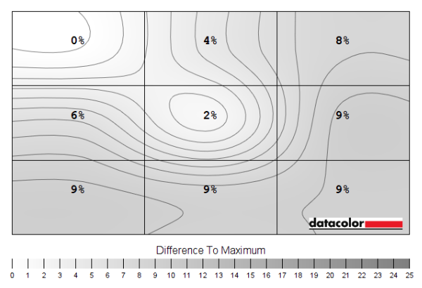
Luminance uniformity map
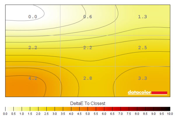
Colour temperature uniformity map
Contrast in games and movies
Lagom contrast tests
Colour reproduction
Colour gamut
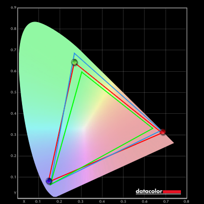
Colour gamut 'Test Settings'
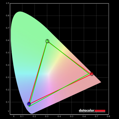
Colour gamut 'sRGB'
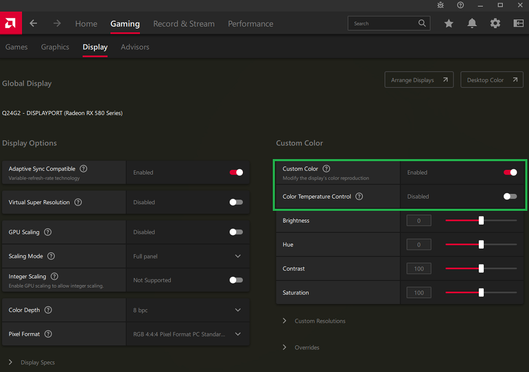
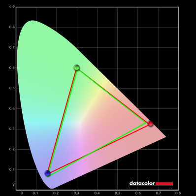
Colour gamut 'novideo_sRGB'
Colour in games and movies
Shade representation using SpyderCHECKR 24


Viewing angles

The video below shows the Lagom text test, a mixed desktop background, game scene and dark desktop background from various viewing angles. The colour shifts for the mixed desktop background and game scene are relatively minor, significantly lower than you’d observe on VA or TN models. There’s some ‘hazing’ (contrast loss) from sharper angles, mainly horizontally. This is at quite a typical level for an IPS-type panel, though a bit higher than the strongest IPS performers. The dark desktop background highlights ‘IPS glow’, which blooms out as viewing angle increases. This appears as a cool and slightly bluish silver or warmer golden (slightly orange) haze, depending on angle.
Interlace pattern artifacts
Responsiveness
Input lag
Perceived blur (pursuit photography)


Responsiveness in games and movies
VRR (Variable Refresh Rate) technology
FreeSync – the technology and activating it

The Gigabyte supports a variable refresh rate range of 48 – 160Hz (48 – 150Hz via HDMI). That means that if the game is running between 48fps and 160fps, the monitor will adjust its refresh rate to match. When the frame rate rises above 160fps, the monitor will stay at 160Hz and the GPU will respect your selection of ‘VSync on’ or ‘VSync off’ in the graphics driver. With ‘VSync on’ the frame rate will not be allowed to rise above 160fps, at which point VSync activates and imposes the usual associated latency penalty. With ‘VSync off’ the frame rate is free to climb as high as the GPU will output (potentially >160fps). AMD LFC (Low Framerate Compensation) is also supported by this model, which means that the refresh rate will stick to multiples of the frame rate where it falls below the 48Hz (48fps) floor of operation for FreeSync. If a game ran at 33fps, for example, the refresh rate would be 66Hz to help keep tearing and stuttering at bay. This feature is used regardless of VSync setting, so it’s only above the ceiling of operation where the VSync setting makes a difference.

Some users prefer to leave VSync enabled but use a frame rate limiter set a few frames below the maximum supported (e.g. 157fps) instead, avoiding any VSync latency penalty at frame rates near the ceiling of operation or tearing from frame rates rising above the refresh rate. If you go to ‘Game Assist’ and activate the ‘Refresh Rate’ feature, the monitor will display the refresh rate. This will coincide with the frame rate of the content if the monitor is within the main VRR window. Finally, it’s worth noting that FreeSync only removes stuttering or juddering related to mismatches between frame rate and refresh rate. It can’t compensate for other interruptions to smooth game play, for example network latency or insufficient system memory. Some game engines will also show stuttering (or ‘hitching’) for various other reasons which won’t be eliminated by the technology.
Nvidia Adaptive-Sync (‘G-SYNC Compatible’)

You will also see in the image above that it states: “Selected Display is not validated as G-SYNC Compatible.” This is an example from another monitor, but it’s also the case with the Gigabyte. This means Nvidia hasn’t specifically tested and validated the display, not that it won’t work. And indeed the technology did work as we’d expect it to on our RTX 3090, as explored shortly. Our suggestions regarding use of VSync apply in much the same way as they did with AMD FreeSync, but you’re using Nvidia Control Panel rather than AMD Software to control this. The setting is found in ‘Manage 3D settings’ under ‘Vertical sync’, where the final option (‘Fast’) is equivalent to AMD’s ‘Enhanced Sync’ setting. You’ll also notice ‘G-SYNC Compatible’ listed under ‘Monitor Technology’ in this section, as shown below. Make sure this is selected (it should be if you’ve set everything up correctly in ‘Set up G-SYNC’).

Note again that you can use the ‘Refresh Rate’ feature in the ‘Game Assist’ section of the OSD to display the current refresh rate of the monitor. This will reflect the frame rate if it’s within the main variable refresh rate window. And as with AMD FreeSync, HDR can be used at the same time as ‘G-SYNC Compatible’.
G-SYNC Compatible – the experience
HDR (High Dynamic Range)
Colour gamut 'Test Settings'
The monitor also supports 10-bit colour, which can be used efficiently for HDR10 content like this to facilitate the enhanced luminance and shade mapping precision expected under HDR. It helps the monitor put its wide gamut to good use and also enhances the nuanced shade variety. When observing dark shades, for example, there’s a natural uplift in detail that’s very different to the unnatural uplift you can get with an SDR gamma enhancement. When observing brighter shades there are smoother transitions and more natural shade progressions, aiding elements such as smoke, weather effects and various gradients in the game. This enhanced nuanced shade variety really requires strong dimming precision to be properly accentuated, though, and that’s not offered here. The image below shows one of the scenes we particularly like from Shadow of the Tomb Raider under HDR. Remember that the photo is purely for illustrative purposes and in no way represents how the monitor appeared running HDR in person.

The ‘4K’ UHD experience

This excellent pixel density delivered a pleasing level of detail and clarity to suitably high resolution image content, ‘4K’ UHD video content and certainly games. Even older games or games where graphics settings are turned right down benefit from the resolution in terms of the edge clarity and overall defined look, maintained well as you look into the distance on the game. More graphically rewarding games or where graphics options are turned up, you can benefit from a very crisp and detailed look to high resolution textures, particle effects and lighting for example. We found the difference between this experience and a monitor with significantly lower pixel density (such as 27” QHD) easy to notice, though the initial boost from 27” Full HD to 27” QHD is even more significant. The refresh rate also ensured these benefits were maintained to a better degree during motion than a 60Hz monitor (or this monitor running at 60fps). Some will consider the distinctiveness of enemies from the backgrounds and in particular the maintenance of this distinctiveness even in the distance to be a competitive advantage. The images below show the monitor in action on various game titles. Again, the images are just for illustrative purposes and don’t accurately reflect how the monitor appears first hand.


Interpolation and upscaling

The monitor includes various ‘Display Mode’ settings in the ‘Gaming’ section of the OSD, as explored in this section of the OSD video. These are only accessible if ‘AMD FreeSync Premium Pro’ is disabled in the OSD and therefore VRR isn’t used (the option is also greyed out when using HDMI 2.1 VRR). The default ‘Full’ setting uses interpolation to map the source resolution onto all 3840 x 2160 of the display – this is the setting used under VRR. There’s also ‘Aspect’, which will use as much screen space as possible without changing the aspect ratio, avoiding any stretching or distortion for non-16:9 resolutions. There’s ‘1:1’ which is a pixel mapping feature that will only use the pixels called for in the source resolution and fill out the remaining pixels as black space around the image. And finally, a range of settings which will squish the image up and simulate different screen sizes and aspect ratios (22” 16:10 plus 23”, 23.6” and 24” 16:9).
Video review
Timestamps:
Features & Aesthetics
Contrast
Colour reproduction
HDR (High Dynamic Range)
Responsiveness (General)
Responsiveness (VRR)
Conclusion
![]()
Positives Negatives Good vibrancy and strong colour consistency from the IPS-type panel with fairly generous gamut
Gamma a bit off ‘2.2’ target, imprecise colour channel adjustment, no true wide gamut support and sRGB emulation mode rather restrictive Reasonable static contrast in-line with expectation with a light to very light matte screen surface preserving clarity and vibrancy relatively well, decent but not exceptional HDR brightness Moderate ‘IPS glow’ (perhaps slightly lower than average), 8-zone local dimming offers limited HDR contrast enhancement A well-rounded response experience for up to 160Hz with low input lag, pretty snappy pixel responses without strong overshoot and good plus flexible VRR support Some slightly slower than optimal pixel transitions, not a true ‘single overdrive mode experience’ (though it might work as such for some), middling strobe backlight implementation Excellent pixel density for strong detail and clarity plus good ‘desktop real estate’ potential, HDMI 2.1 and USB-C with KVM functionality – and priced very competitively Construction rather ‘plasticky’ (we prefer a bit of coated metal for the stand, at least), stand lacks pivot and swivel adjustment
