Author: Adam Simmons
Date published: December 16th 2021
Table of Contents
Introduction
The combination of 27” – 28” screen size and 3840 x 2160 (‘4K’ UHD) resolution offers an excellent pixel density and high ‘desktop real-estate’ potential. The Dell S2722QC offers this, focusing on productivity and general usage primarily with a 60Hz refresh rate. Whilst not designed as a gaming monitor specifically, it features Adaptive-Sync to help reduce tearing and stuttering from traditional frame and refresh rate mismatches. Basic HDR support is also included for a bit of variety. We put this model through its paces in our usual testing suite, which encompasses general usage on the desktop, movies and gaming.
Specifications
The monitor uses a 27” IPS (In-Plane Switching) type panel. A 60Hz refresh rate is supported alongside 10-bit colour (8-bit + FRC dithering). A 4ms grey to grey response time is specified, but as usual don’t put too much weight on this figure. Some of the key ‘talking points’ for this monitor have been highlighted in blue below.
*10-bit can be selected in the graphics driver when using a DP signal at any refresh rate, up to the native resolution. 10-bit and 12-bit can be selected when using HDMI at up to 30Hz for the native resolution. Or at up to 60Hz for lower resolutions such as WQHD and Full HD. 12-bit includes an additional 2-bit dithering stage added by the monitor’s scaler to facilitate work with higher bit depth content.
As an Amazon Associate I earn from qualifying purchases made using the below link. Where possible, you’ll be redirected to your nearest store. Further information on supporting our work. The monitor has a modern home-office design with ‘platinum silver’ (satin finish silver plastic) stand neck and base. And a matte plastic bottom bezel, ~23mm (0.91 inches) thick including the downwards diagonal slope or ~19mm (0.75 inches) for the front face alone. With a central slightly shiny silver brand logo. The top and side bezels adopt a dual-stage design, with slim panel border flush with the rest of the screen plus a thin hard plastic outer part. Including both components the bezels are ~7mm (0.28 inches). The screen surface is light to very light matte anti-glare, as explored a bit deeper into the review. The image below is a macro photograph taken on Notepad with ClearType disabled. The letters ‘PCM’ are typed out to help highlight any potential text rendering issues related to unusual subpixel structure, whilst the white space more clearly shows the actual subpixel layout alongside a rough indication of screen surface. This model has a light to very light matte anti-glare screen surface, offering reasonable glare handling with fairly direct emission of light. There isn’t the same distinct layering in front of the image as with stronger matte screen surfaces, whilst clarity and vibrancy is better maintained. Sufficiently bright light striking the screen surface can give a ‘glassy’ look, particularly when observing darker content. But the glare handling is far superior to a glossy surface or even lighter matte screen surfaces. The screen surface texture is not as smooth as it could be, providing a bit of a grainy look to lighter content. This isn’t the same ‘smeary’ or heavy graininess we’ve seen on some models of this size and resolution, but still something sensitive users such as ourselves can notice. Most users should find this level of graininess fine or not really notice it. The S2722QC features various ‘Preset Modes’; ‘Standard’, ‘ComfortView’, ‘Movie’, ‘FPS’, ‘RTS’, ‘RPG’, ‘Warm’, ‘Cool’ and ‘Custom Color’. The latter is the most flexible as you’re able to adjust colour channels, whilst the Movie, FPS, RTS and RPG presets give you access to the ‘Hue’ and ‘Saturation’ sliders. They will also make various changes to gamma and colour output which can’t be corrected in the OSD and goes against accurate output. A sharpness filter (separate from the main ‘Sharpness’ control) is also applied by some presets. We’ll explore these briefly in the OSD video but will mainly focus on manual adjustments and some of the presets we see more practical use for here such as ‘ComfortView’ and ‘Warm’. Adjustments made in the ‘Color’ section for any of these presets are remembered for that preset, whereas settings such as ‘Brightness’ and anything from the ‘Display’ section are applied universally. Most changes made in any section of the OSD when connected via HDMI will not carry over when using USB-C (DP Alt Mode) or vice-versa. So you can have different brightness and colour setups for different devices, for example. The table below includes gamma and white point readings taken using a Datacolor SpyderX Elite colorimeter. General observations on the image are also provided. Our test system uses Windows 10 with an Nvidia RTX 3090 connected using a bidirectional DP to USB-C cable (technically DP to USB-C in this case). Additional testing was performed with an AMD Radeon RX 580 and also using HDMI, but our observations on this table were not significantly affected by this. An important step also had to be performed in the graphics driver if connected to an AMD or Nvidia GPU via HDMI. The colour signal had to be corrected to a ‘Full Range RGB’ signal as detailed in this article. This action will need to be performed again under HDR for Nvidia GPUs, but should be remembered once you’ve done that even when you switch between HDR and SDR. No additional monitor drivers or ICC profiles were specifically loaded. The monitor was left to run for over 2 hours before readings were taken or observations made. Aside from our ‘Test Settings’ where various adjustments are made, assume factory defaults are used. When viewing the figures in this table, note that for most PC users ‘6500K’ for white point and ‘2.2’ for gamma are good targets to aim for. Individual targets depend on individual uses, tastes and the lighting environment, however.

Features and aesthetics


If you observe the panel border edge from a sharp angle or when sitting close enough to the screen you can see a reflection of the panel border which makes it look like the panel border sits quite a bit in front of the image. This is clearest for lighter content where the reflection is easiest to see. Whilst the panel border is very slightly in front of the rest of the image, as LCDs have various layers and the panel border is an outer layer, it’s only a very small inset compared to how it appears due to this reflection. It’s quite common to see this to some degree on models with a dual-stage bezel design and we’re very used to it so it’s not something we generally comment on. In this case the perceived inset was a bit more noticeable than it sometimes is. If you’re sitting close to the screen or off-angle you may observe this when observing content very close to the side edges of the screen. It’s not something we found obtrusive or generally noticeable during normal use from our preferred viewing distance (~70cm or a bit further back) but we tried to capture it from a steeper angle in the image below to emphasise the effect. We describe this as a ‘shadowy border’, which seems quite an apt way to describe it if viewed from a sharper angle but makes it sound worse than it really is during normal viewing.

The OSD (On Screen Display) is controlled by buttons which face downwards towards the right side of the screen. A power button is included with the manufacturer’s signature vertical slit power LED design, glowing a gentle white when the monitor is switched on and blinking white when it enters a low power state. You can disable this LED in the OSD, if preferred. This control system including PiP and PbP functionality plus Dell Display Manager software is covered in the video below.
From the side the monitor is slim at thinnest point, ~16mm (0.63 inches). There’s a bit more bulk in the central region, towards the stand attachment point. The stand offers full ergonomic flexibility; tilt (5° forwards, 21° backwards), swivel (30° left, 30° right), height adjustment (110mm or 4.33 inches) and pivot into portrait (90° clockwise or anti-clockwise rotation). We found the height adjustment quite stiff, but our unit was new and that could loosen up over time. The screen had a solid feel to it overall, reassuringly well-constructed despite the exterior stand materials being plastic rather than metal. The base is weighted with an internal metal plate, providing a good stable platform for the monitor. At lowest stand height the bottom of the monitor sits ~41mm (1.61 inches) above the desk, with the top of the screen ~401mm (15.79 inches) above the desk. The total depth of the monitor including stand is ~175mm (6.89 inches) with the screen sitting ~45mm (1.77 inches) back from the front edge of the stand base. This is a compact design which allows you to place the screen relatively close to the wall if you wish.


The rear of the monitor is textured light grey plastic with a shiny silver brand logo at the top central region. Below this, the stand attaches via a quick-release mechanism – detached by pressing a button beneath the attachment point. Provision for 100 x 100mm VESA mounting is included (M4 x 10mm screws can be removed to reveal VESA holes). The ports face downwards with a K-Slot and AC power input (internal power converter) towards the left. Towards the right the remaining ports are located; 2 HDMI 2.0 ports, USB-C (65W PD, DP 1.4 Alt Mode, upstream data), 3.5mm audio output and a USB 3.2 Gen1 port. If you wish to connect the monitor to your GPU via DisplayPort, this functionality (up to DP 1.4) is provided by using a bidirectional USB-C to DP cable. This cable is not included and it must be a bidirectional cable (most will advertise this if they are). This will only provide DP Alt Mode capability and the monitor will not be able to nor attempt to provide Power Delivery (PD) or additional data transfer. That means you will also lose access to the single USB upstream port of the monitor. An additional USB 3.2 Gen1 port with ‘power charging’ is located at the bottom of the screen, outside the main port area for each access. Towards the left side of the screen as viewed from the front. 2 x 3W speakers are included, which face downwards and produce basic sound output. The output was somewhat less distorted and slightly clearer than some integrated speakers – but they don’t produce a particularly pure, deep or rich sound. Good adjustment was provided for quieter levels, though peak volume wasn’t particularly loud. These are no substitute for decent standalone speakers or headphones, but there if you need them.


3840 x 2160 @60Hz can be leveraged using suitable versions of HDMI and using a DP signal, with HDR also supported. Adaptive-Sync is supported via AMD FreeSync (HDMI and DP signal) and Nvidia’s ‘G-SYNC Compatible Mode’ (DP signal). A power cable and 1m USB-C cable is included as standard. The first image below shows the refresh rates supported for the native 3840 x 2160 (‘4K’ UHD) via HDMI. The same refresh rates are listed for 1920 x 1080 (Full HD or 1080p), except 30Hz is removed and 50Hz plus 59Hz added. These are all categorised in the EDID of the monitor as ‘TV’ resolutions and listed in Nvidia Control panel under ‘Ultra HD, HD, SD’; they can also be accessed by other devices such as the PS5 and Xbox Series X.

When using a DP signal the same refresh rates are listed for the Full HD and for the ‘4K’ UHD resolution. The only difference is that for the ‘4K’ UHD resolution 60Hz is separated out into a 2nd list. It’s categorised in the EDID of the monitor and listed in Nvidia Control Panel as a ‘PC’ resolution. The first image below shows the ‘Ultra HD, ‘HD, SD’ (‘TV’ in EDID) list and second image the ‘PC’ list for DP. For the 2560 x 1440 (WQHD or 1440p) resolution, 60Hz is listed in the ‘PC’ section and is the only refresh rate selectable via either HDMI or DP.


Calibration
Subpixel layout and screen surface
![]()
As shown above the standard RGB (Red, Green and Blue) stripe subpixel layout is used. This is the default expected by modern operating systems such as Microsoft Windows. Apple’s MacOS no longer uses subpixel rendering and therefore doesn’t optimise text for one particular subpixel layout to the detriment of another. You needn’t worry about text fringing from non-standard subpixel layouts and won’t need to change the defaults in the ‘ClearType Text Tuner’ as a Windows user. You may still wish to run through the ClearType wizard and adjust according to preferences, however. The subpixels are quite ‘squat’ with relatively large gaps above and below. On some models this contributes to ‘static interlace pattern artifacts’ and can affect text and fine-edge clarity. On this model we observed no such issues, likely as the pixel density is so high that the gaps above and below the subpixels are still tiny. We therefore had no subpixel-related concerns related to sharpness or text clarity on this model.
Testing the presets
Preset Mode Gamma (central average) White point (kelvins) Notes Standard (Factory Defaults) 2.3 6307K Quite vibrant and varied, a touch of extra depth in places due to gamma handling but decent overall balance. ComfortView 2.3 5139K An effective Low Blue Light (LBL) setting. Gives a warm look to the image with a bit of a green tint – not an extreme one. Significantly reduces blue light output from the screen, more so if brightness is also reduced. Warm 2.3 5804K A mild LBL setting with a very slight green tint. Custom Color 2.3 6291K As ‘Standard’ but green channel slightly stronger, imparting a very mild green tint (easily corrected). Test Settings (see below) 2.3 6516K Well balanced overall, a bit of extra depth in places due to gamma handling.
Straight from the box the monitor provided quite a vibrant image with good variety. Colour temperature was just slightly below target, but overall balance was good in that respect. The gamma sat at ‘2.3’ on average, with some bowing away from the ‘2.2’ curve (higher gamma) for mid to bright tones in particular. Adding some extra depth there. For dark and very bright shades tracking was closer to the ‘2.2’ curve. Although it isn’t clear given the resolution of the graph, gamma is actually a touch below the ‘2.2’ curve for the darkest shades. This provided a slight uplift to dark shades, but nothing extreme. Overall, this gamma tracking isn’t ideal with accurate output and the ‘2.2’ curve in mind nor is the inability to adjust it in the OSD. But it’s not so far off base that it clearly upsets the overall image balance either – the deviations tend to just add a touch of richness in places, which many will enjoy for general content consumption. The graph below shows the gamma tracking under our ‘Test Settings’, with similar observations made straight from the box. Given inter-unit variation and good enough output for general purpose usage as it is, we will not be using any ICC profiles in this review or including any measurements or graphs using them. We wouldn’t recommend using them unless created for your specific unit using your own calibration device. But we appreciate some users still like to use profiles and some aspects such as gamut mapping for colour-aware applications can be useful. You can download our ICC profile for this model, which was created using our ‘Test Settings’ as a base. Amongst other things, this shifts gamma so it adheres to our usual target of the ‘2.2’ curve. Be aware of inter-unit variation and note again that this ICC profile is not used in the review. The monitor includes a ‘ComfortView’ Low Blue Light (LBL) setting. This is effective in reducing the blue colour channel and hence blue light output from the monitor, providing a warmer look to the image. Blue light output is minimised further by reducing brightness. The green channel remains reasonably strong, so you’re left with a bit of a green tint – but not as strong as what we’ve seen with some implementations. Our eyes adjusted to this quite readily. An alternative ‘Warm’ setting is available that only has a mild LBL effect. We used the ‘ComfortView’ setting with reduced brightness for our own viewing comfort in the evenings, but not for specific testing aside from that involving the setting itself. Cutting out stimulating blue light is important in the hours leading up to bed as it affects sleep hormones and keeps the body ‘alert’ even if it should be winding down. The setting is easy to activate or deactivate using the ‘Shortcut Key’ system of the OSD. For our ‘Test Settings’ we made some adjustments to the colour channels in ‘Custom Colour’ and lowered brightness. The colour channel adjustments weren’t as precise as some models as a change of just ‘1’ made quite significant changes to the image, but the precision wasn’t terrible either. Just go easy on any adjustments you make here! Note that individual units and preferences vary, so these settings are simply a suggestion and won’t be optimal for all users or units. These settings only apply to SDR, HDR has separate settings associated with it (is far more restrictive) and is explored in the relevant section of the review. Preset Mode= Custom Color R= 99% G= 99% B= 100% Brightness= 60 (according to preferences and lighting) Response Time= Normal

Gamma 'Test Settings'
Test Settings
Contrast and brightness
Contrast ratios
An X-Rite i1Display Pro Plus was used to measure the luminance of white and black using various settings, including those found in the calibration section. From these values, static contrast ratios were calculated. The table below shows these results, with blue highlights indicating the results with HDR active and under our ‘Test Settings’. Black highlights indicate the highest white luminance, lowest black luminance and highest contrast ratio recorded under SDR. Assume any setting not mentioned was left at default, with the exceptions already noted here or in the calibration section.
| Monitor Settings | White luminance (cd/m²) | Black luminance (cd/m²) | Contrast ratio (x:1) |
| 100% brightness | 391 | 0.32 | 1222 |
| 80% brightness | 236 | 0.19 | 1242 |
| 60% brightness | 164 | 0.13 | 1262 |
| 40% brightness | 121 | 0.10 | 1210 |
| 20% brightness | 78 | 0.06 | 1300 |
| 0% brightness | 35 | <0.03 | >1167 |
| 75% brightness (Factory Defaults) | 196 | 0.16 | 1225 |
| Smart HDR = Desktop* | 406 | 0.31 | 1310 |
| Smart HDR = Movie HDR* | 406 | 0.31 | 1310 |
| Smart HDR = Game HDR* | 406 | 0.31 | 1310 |
| ComfortView | 191 | 0.17 | 1124 |
| Warm | 191 | 0.16 | 1194 |
| Custom Color | 205 | 0.16 | 1281 |
| Custom Color (100% brightness) | 409 | 0.32 | 1278 |
| Test Settings | 162 | 0.14 | 1157 |
*HDR measurements were made using this YouTube HDR brightness test video, running full screen at ‘2160p 4K HDR’ on Google Chrome. The maximum reading from the smallest patch size (measurement area) that comfortably covered the entire sensor area and colorimeter housing was used for the white luminance measurement, which was ‘4% of all pixels’ in this case. The black luminance was taken at the same point of the video with the colorimeter offset to the side of the white test patch, equidistant between the test patch and edge of the monitor bezel.
The average contrast ratio with only brightness adjusted was 1247:1, excluding the result at ‘0%’ brightness where the black luminance reading is not precise enough. This exceeds the specified 1000:1 and is quite respectable for the panel type. The maximum recorded was 1300:1 with brightness set to ‘20%’, though this was largely due to rounding. Under our ‘Test Settings’ we recorded 1157:1, which is decent for an IPS-type panel after OSD-level calibration. The ‘ComfortView’ setting made the most significant changes to colour channels, but even then 1124:1 was maintained. The monitor doesn’t provide local dimming and therefore provides no contrast advantage under HDR. The somewhat higher contrast recorded (1310:1) was down to the adjusted measurement point used where the screen was slightly dimmer and therefore black depth was slightly lower. The peak luminance recorded under HDR was 406 cd/m², so no luminance advantage compared to SDR and quite low by HDR standards. Sustained luminance levels were similar to this and were not documented. The maximum luminance recorded on the table was 409 cd/m², whilst the minimum white luminance was 35 cd/m². This provides a 374 cd/m² luminance adjustment range with fairly bright maximum and quite low minimum.
PWM (Pulse Width Modulation)
The S2722QC does not use PWM (Pulse Width Modulation) to regulate backlight brightness at any level. Instead, DC (Direct Current) is used to moderate brightness. The backlight is therefore considered ‘flicker-free’, which will come as welcome news to those sensitive to flickering or worried about side-effects from PWM usage.
Luminance uniformity
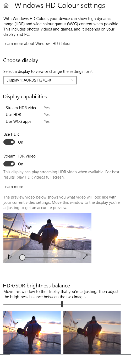
Whilst observing a black background in a dark room, using our ‘Test Settings’, we noticed some backlight bleed and clouding towards the corners of the screen. It’s important to remember that individual units vary when it comes backlight bleed and clouding. The following image was taken a few metres back to eliminate ‘IPS glow’. This is a mainly cool or slightly warm-tinted (depending on angle) haze emanating from the corners of the screen, particularly the bottom corners from a normal viewing position. This ‘IPS glow’ blooms out more strongly from steeper angles, as demonstrated in the viewing angles video later. The luminance uniformity was variable. The maximum luminance was recorded at ‘quadrant 5’ in the centre of the screen (158 cd/m²). The greatest deviation from this occurred at ‘quadrant 9’ towards the bottom right of the screen (135.1 cd/m², which is 14% dimmer). The average deviation between each quadrant and the brightest recorded point was 8.25%, which is reasonable. Remember that individual units vary when it comes to uniformity and you can expect further deviation beyond the points measured. The contour map below shows these deviations graphically, with darker greys representing lower luminance (greater deviation from brightest point) than lighter greys. The percentage deviation between each quadrant and the brightest point recorded is also given. The SpyderX Elite was also used to analyse variation in the colour temperature (white point) for the same 9 quadrants. The deviation between each quadrant and the quadrant closest to the 6500K (D65) daylight white point target was analysed and a DeltaE value assigned. Darker shades are also used on this map to represent greater deviation from 6500K. A DeltaE >3 represents significant deviation that may be readily noticed by eye. Results here were variable. The central point was recorded as closest to 6500K, with significant deviation recorded towards the right side. DeltaE 4.2 being the maximum recorded towards the top right. These 3 right side quadrants aside, no significant deviation was recorded. Note again that individual units vary when it comes to uniformity and that you can expect deviation beyond the measured points. The monitor put in a reasonable contrast performance on Battlefield 2042. Its static contrast sits at 1157:1 under our ‘Test Settings’, so quite reasonable for this panel type. But by the same token, not enough to give the sort of depth and atmosphere to darks scenes or dark elements within the scene as much stronger performers in that department (such as VA models, generally). ‘IPS glow’ was also present, at a typical level, creating a haze which originates from the corners of the screen and is most readily observed lower down the screen from a normal viewing position. It appears as a cool-tinted grey towards the bottom left and slightly warmer brownish grey towards the bottom right. These contrast deficiencies are clearest in a dim room, whereas they’re much less apparent when sitting in a brighter environment. The gamma calibration of our unit provided just a slight uplift of detail for dark areas, but certainly not enough to reveal significant unintended detail or create a ‘blocky’ or banded appearance. The screen surface imparted a bit of graininess to lighter content, but without a smeary appearance or clear layering in front of the image. Similar observations were made on Shadow of the Tomb Raider. This title demands a strong contrast performance to look its best, given that dark interiors and passageways are common. The monitor didn’t provide a deep and atmospheric look to such scenes, particularly if the room was dim. There was again a moderate but typical amount of ‘IPS glow’, eating away at atmosphere and dark detail in affected regions of the screen. With just a slight detail uplift to some dark shades due to out unit’s gamma handling. On the flipside, gamma consistency is a key advantage of the IPS-type panel which was evident on both titles. This prevented the clear dark detail shifts you’d get with TN (top to bottom) or VA (centre vs. edges) panels. The screen surface again imparted a light graininess, but didn’t give a clear layered appearance. We also observed the film Star Wars: The Rise of Skywalker. This is another title which looks its best if contrast performance is strong, with plenty of pulses of energy and flashes of light against much darker backgrounds. The look given by the monitor wasn’t particularly cinematic, especially in dimmer light, but was within expectation for the panel type and slightly better than some IPS-type panels. A moderate amount of ‘IPS glow’ was again observed – this was quite clear at the top and moreover bottom of the screen, as this film is shot in a letterboxed format with black bars above and below the image. Most content on platforms including Netflix, Amazon Prime Video and YouTube does not have this issue as it fills the screen under 16:9. The strong gamma consistency was again apparent whilst the screen surface provided a bit of graininess to lighter content, without a smeary or layered look. The Lagom tests for contrast allow specific weaknesses in contrast performance to be identified. The following observations were made in a dark room. The colour gamut of the S2722QC (red triangle) was compared with the sRGB (green triangle) and DCI-P3 (blue triangle) reference colour spaces using our ‘Test Settings’, shown in the image below. The gamut fully covers sRGB with some extension beyond in places – we recorded 86% DCI-P3 coverage. You can see that the red corner falls just shy of DCI-P3 and the red to green edge covers most of DCI-P3. The gamut falls short of DCI-P3 elsewhere, particularly in the green to blue region. Although not shown in the graphic, we recorded 78% Adobe RGB coverage. This DCI-P3 and Adobe RGB coverage isn’t high enough for accurate reproduction within those colour spaces. For standard sRGB content outside a colour-managed environment, things are represented with a bit of extra richness and saturation – though not an extreme amount. The monitor doesn’t offer an sRGB emulation setting to clamp the colour gamut closer to sRGB. Although this is more important for models with an even more generous gamut than this, such settings still allow more faithful representation of content within the sRGB colour space even in non colour-managed applications and without profiling of the monitor. To maximise colour accuracy within the sRGB colour space, for colour-managed workflows, full calibration and profiling with a colorimeter or similar device using the full native gamut is recommended. You may try the ICC profile featured in the calibration section which includes gamut mapping for colour-aware applications, but best results are always obtained by calibrating your own unit with your own hardware. Whilst a well-calibrated and flexible sRGB emulation setting would’ve been a nice addition, there are ways to achieve sRGB emulation via the graphics driver. AMD users can activate a flexible sRGB emulation setting found by opening ‘AMD Radeon Software’, clicking ‘Settings’ (cog icon towards top right) and clicking on ‘Display’. You should then ensure that the ‘Custom Color’ slider to the right is set to ‘Enabled’ and ‘Color Temperature Control’ set to ‘Disabled’. It may appear to be set this way by default, but the native rather than restricted gamut is likely in play. If that’s the case, simply switch the ‘Color Temperature Control’ slider to ‘Enabled’ then back to ‘Disabled’ to leverage the sRGB emulation behaviour. This setting is shown in the image below. The gamut below shows results using our ‘Test Settings’ with this driver tweak applied. The colour gamut still covers 100% sRGB, but the over-extension is cut down. A bit remains in the green to red region, but much less than without the setting active. This therefore offers a reliable way to cut down on the colour gamut without profiling, including in applications that aren’t colour managed. And you retain full control of the monitor settings. Remember not to use this tweak under HDR, though, or the image will appear significantly oversaturated. The monitor gave a varied and fairly vibrant look to Battlefield 2042. This game and most other content you consume is designed with the sRGB colour space in mind and if the colour gamut of the monitor extends beyond this it injects extra vibrancy and saturation. But departs from the intentions of the developers. In this case the gamut stuck close to sRGB in some regions and extended a bit beyond in others. A bit of extension for some red shades and in the red to green edge of the gamut. A good range of distinct green shades were displayed, including some muted shades and some good lush-looking deeper shades. Some yellowish greens were brought out a bit too strongly. Earthy browns and woody shades showed reasonable neutrality. A touch of extra richness and a slight red push in places due to the gamut and gamma tracking, but less so than models with a wider gamut. Sky blues appeared neutral rather than the more saturated and eye-catching look some models provide. Shadow of the Tomb Raider provided a similar colour experience, with a rich and varied look. Whilst a bit of extra saturation was observed in places, it wasn’t the sort of strong extra saturation that some models provide so didn’t impart a clearly neon look to vegetation. A fairly neutral to slightly red-biased look was provided to earthy browns, so a touch of extra richness. Roaring flames appeared reasonably vivid without yellows verging strongly on orange and oranges verging heavily towards red. Lara’s skin and the skin of other characters in the game appeared just a touch richer than intended, rather than heavily tanned or sunburnt. Some will prefer the stronger saturation and heavier dose of vibrancy offered by a model with even wider gamut than this, but the milder uplift of saturation might hit the spot for others. The monitor doesn’t offer an sRGB emulation setting, which would cut down the gamut so it tracks sRGB more closely and reduce the extra saturation. It isn’t required in the same way it would be for a model with wider gamut, but is still a nice flexibility to have. GPU-level emulation can be used as an alternative, covered earlier. On both titles the monitor showcased strong colour consistency, with a given shade appearing largely the same regardless of on-screen position. Without the significant shifts in depth and saturation associated with VA and moreover TN models. Further observations were made using the animated TV series Futurama. There are large areas of individual shade covering a significant portion of the screen, revealing weaknesses in colour consistency very readily. The monitor put in a strong performance here, without the sort of saturation shifts you’d see on VA or TN models. Some shades appeared very slightly deeper towards the extreme edges of the screen, such as the red of Dr Zoidberg, but this was a relatively subtle shift. Things were presented in a varied way with just a touch of extra richness in places, generally for green-biased and red-biased shades. Pastel shades still appeared relatively muted, with some shades showing a bit of extra depth but without a strong push of oversaturation. Neon shades such as bright greens, pinks and yellows were shown in quite a vibrant way – though not as eye-catching as on models with an even more generous colour gamut. The image below shows a printed reference sheet of 24 ‘sRGB’ shades, included as part of the Datacolor SpyderCHECKR 24 package. The screen is displaying reference photographs of this printed sheet, in both the same order as printed (right side) and reverse order (left side). The camera is mounted slightly above centre so that the image is representative of what the eye sees from an ergonomically correct viewing position. This, coupled with the inclusion of a flipped version of the shade sheet, allows both accuracy and colour consistency to be visually assessed. Bracketed numbers in our analysis refer to shades on the printed sheet or right side of the screen if they’re ordered consecutively from top left to bottom right. Note that there is always some disparity between how emissive objects (monitor) and non-emissive objects (printed sheet) appear. The representation of shades in this image depends on the camera and your own screen, it’s not designed to show exactly how the shades appear in person. It still helps demonstrate some of the relative differences between the original intended sRGB shade and what the monitor outputs, however. Full profiling and appropriate colour management on the application would provide a tighter match, our intention here is to show what can be expected in a non colour-managed environment. Lagom’s viewing angle tests help explore the idea of colour consistency and viewing angle performance. The following observations were made from a normal viewing position, eyes ~70cm from the screen. On some monitors, particularly but not exclusively those with high refresh rates, interlace patterns can be seen during certain transitions. We refer to these as ‘interlace pattern artifacts’ but some users refer to them as ‘inversion artifacts’ and others as ‘scan lines’. They may appear as an interference pattern, mesh or interlaced lines which break up a given shade into a darker and lighter version of what is intended. They often catch the eye due to their dynamic nature, on models where they manifest themselves in this way. Alternatively, static interlace patterns may be seen with some shades appearing as faint horizontal or vertical bands of a slightly lighter and slightly darker version of the intended shade. We did not observe either artifact type on this monitor. A small utility called SMTT 2.0 was used alongside a sensitive camera to analyse the latency of the S2722QC, with over 30 repeat readings taken to help maximise accuracy. Using this method, we calculated 4.10ms (under 1/4 of a frame at 60Hz) of input lag. A similar value was recorded with a DP signal (DP to USB-C) and using an HDMI signal – plus if ‘SmartHDR’ was selected in the OSD. The input lag measured here is influenced by both the element you ‘see’ (pixel responsiveness) and the main element you ‘feel’ (signal delay). It indicates quite a low signal delay which most users should be happy with. Note that we don’t have the means to accurately measure input lag with Adaptive-Sync active in a VRR environment or HDR active in an HDR environment. Our article on responsiveness explores various concepts surrounding monitor responsiveness. An important idea explored is ‘perceived blur’, contributed to by both the pixel responses of the monitor and the movement of your eyes as you track motion of the screen. This second factor is generally dominant on modern monitors, although both factors play an important role. We also explore a photography technique called ‘pursuit photography’, which uses a moving rather than stationary camera to capture motion on a monitor in a way that reflects both elements of perceived blur. Rather than just reflecting pixel response behaviour. The images below are pursuit photographs taken using the UFO Motion Test for ghosting, with the test running at its default speed of 960 pixels per second. This is a good practical speed to take such photographs at, highlighting both elements of perceived blur well. The UFOs move across the screen from left to right at a frame rate matching the refresh rate of the display, 60fps and 60Hz in this case. All three rows of the test are analysed to show a range of pixel transitions and all ‘Response Time’ settings were tested. Reference shots are included in the final columns for comparison, with those screens set to their optimal pixel overdrive setting. The first reference is the Philips 288E2UAE (288E2E), quite a competent 60Hz IPS-type performer. The second reference is the Philips 328E1CA, a larger and relatively well-tuned ‘4K’ VA model. Note that some wavy patterns surrounding UFOs in some cases are slight image retention. We observed a fair amount of image retention during this test when using the ‘Fast’ and ‘Extreme’ settings. It soon disappeared when using monitor normally and wasn’t something we observed outside of tests like this. The UFO appears soft and unfocused without clear internal detailing. This reflects a moderate amount of perceived blur due to eye movement, something also reflected in the reference shots. Varying degrees of trailing can also be seen behind the UFOs, due to weaknesses in pixel responsiveness. The ‘Normal’ setting shows ‘powdery’ trailing, mainly for the dark background (top row) and a lesser extent the medium background (middle row). There’s just a small touch of this for the light background (bottom row). Performance here is quite decent overall, with just a touch more of this ‘powdery’ trailing behind the UFO for the dark and medium backgrounds compared to the IPS reference screen (288E2UAE). This isn’t a dramatic difference, however. Performance is clearly superior to the VA reference screen (328E1CA), with that model showing bolder trailing which manifests as ‘smearing’ for the dark background and is quite heavy in appearance for the medium background. The ‘Fast’ and ‘Extreme’ settings eliminate any ‘powdery’ trailing but instead introduce strong and extreme overshoot, respectively. Colourful inverse ghosting that’s very eye-catching in practice. We consider the ‘Normal’ setting optimal here and this provides an experience most will be happy with. Ideally the ‘Fast’ setting would’ve been better tuned, taking the panel a little further than the ‘Normal’ setting rather than being tuned so aggressively that it introduces obvious overshoot. Note that we will not be including a section on overclocking, as the monitor refused to display an image above 60Hz. On various Battlefield titles a moderate degree of perceived blur was observed, with the game running at a consistent 60fps to get the most from the screen in this respect. This was mainly caused by eye movement and linked with the 60Hz refresh rate. There were some weaknesses on top of this as demonstrated earlier using Test UFO. ‘Powdery’ trailing which was most pronounced (though still not extreme) where dark shades are involved in the transition. And also very light shades – such as white in-game text against a medium to dark background. This wasn’t the same as the ‘smeary’ trailing you’d observe on VA alternatives, even relatively well-tuned ones like the Philips 328E1CA used as a reference earlier. These weaknesses were a bit more apparent and slightly more widespread than on the 288E2UAE (288E2E), but the difference wasn’t dramatic and the monitor still offered decent performance within the confines of the 60Hz refresh rate. In other words, our broader observations in-game mirrored the earlier testing with Test UFO. We made similar observations on Shadow of the Tomb Raider. This title offers up plenty of ‘high contrast’ transitions, the ones where the weaknesses are most readily apparent. Again, these were not extreme weaknesses – just some ‘powdery’ trailing that adds a bit of extra perceived blur in places. The monitor also provided very little overshoot on both of our test titles, which should please anybody sensitive to such things. To round things off we made some observations using video content of a range of frame rates, including ~24 – 30fps Netflix content and 60fps YouTube content. For the high frame rate content the same weaknesses were apparent as when gaming at 60fps, so a bit of ‘powdery’ trailing in places. For the lower frame rate content where pixel response requirements for optimal performance are lower, the monitor performed very well without any noteworthy weaknesses. As an Amazon Associate I earn from qualifying purchases made using the below link. Where possible, you’ll be redirected to your nearest store. Further information on supporting our work. AMD FreeSync is a variable refresh rate technology, an AMD-specific alternative to Nvidia G-SYNC. Where possible, the monitor dynamically adjusts its refresh rate so that it matches the frame rate being outputted by the GPU. Both our responsiveness article and the G-SYNC article linked to explore the importance of these two elements being synchronised. At a basic level, a mismatch between the frame rate and refresh rate can cause stuttering (VSync on) or tearing and juddering (VSync off). FreeSync also boasts reduced latency compared to running with VSync enabled, in the variable frame rate environment in which it operates. FreeSync requires a compatible AMD GPU such as the Radeon RX 580 used in our test system. The monitor itself must support ‘VESA Adaptive-Sync’ for at least one of its display connectors, as this is the protocol that FreeSync uses. The S2722QC supports FreeSync via a DP or HDMI signal on compatible GPUs and systems. Note that HDR can be activated at the same time as FreeSync. There’s no setting related to ‘Adaptive-Sync’ or ‘FreeSync’ in the OSD, it’s handled automatically. On the GPU driver side recent AMD drivers make activation of the technology very simple. You should ensure the GPU driver is setup correctly to use FreeSync, so open ‘AMD Radeon Software’, click ‘Settings’ (cog icon towards top right) and click on ‘Display’. You should then ensure that the first slider is set to ‘Enabled’ as shown below. The top image shows the monitor connected by DP and the bottom image by HDMI. The setting is referred to as ‘Adaptive Sync Compatible’ for DP and ‘VRR’ for HDMI, although the exact wording may depend on the driver version you’re using. To configure VSync, open ‘AMD Radeon Software’. Click ‘Settings’ (cog icon towards top right) and click ‘Graphics’. The setting is listed as ‘Wait for Vertical Refresh’. This configures it globally, but if you wish to configure it for individual games click ‘Game Graphics’ towards the top right. The default is ‘Off, unless application specifies’ which means that VSync will only be active if you enable it within the game itself, if there is such an option. Such an option does usually exist – it may be called ‘sync every frame’ or something along those lines rather than simply ‘VSync’. Most users will probably wish to enable VSync when using FreeSync to ensure that they don’t get any tearing. You’d therefore select either the third or fourth option in the list, shown in the image below. Above this dropdown list there’s a toggle for ‘Radeon Enhanced Sync’. This is an alternative to VSync which allows the frame rate to rise above the refresh rate (no VSync latency penalty) whilst potentially keeping the experience free from tearing or juddering. This requires that the frame rate comfortably exceeds the refresh rate, not just peaks slightly above it. We won’t be going into this in detail as it’s a GPU feature rather than a monitor feature. As usual we tested a range of titles using AMD FreeSync and found the technology similar in all cases. Any issues affecting one title but not another suggests a game or GPU driver issues rather than a monitor issue. For that reason we’ll simply focus on our experience on Battlefield titles for this section, which offer good graphical flexibility and allow the full VRR range to be analysed using our Radeon RX 580. This resolution is rather demanding for what is far from a powerhouse of a GPU, so it was common to see dips below 60fps. These dips would result in tearing (VSync off) or stuttering (VSync on) if VRR technologies like FreeSync aren’t used. FreeSync removed these interruptions, which is something sensitive users will appreciate. A decrease in frame rate still negatively impacted ‘connected feel’ and increased perceived blur, however. The technology worked down to the floor of operation of 40Hz (40fps) and below that point deactivated with the monitor returning to its normal 60Hz operation. A bit of overshoot was introduced in places (or strengthened) compared to at higher refresh rates as the monitor doesn’t employ variable overdrive. Nonetheless, the fairly low level of acceleration under the ‘Normal’ setting meant that none of this was extreme or eye-catching overshoot. Subtle enough to escape most people’s notice, even if they’re quite sensitive to overshoot. As noted earlier, AMD FreeSync makes use of Adaptive-Sync technology on a compatible monitor. As of driver version 417.71, users with Nvidia GPUs (GTX 10 series and newer) and Windows 10 or 11 can also make use of this Variable Refresh Rate (VRR) technology. When a monitor is used in this way, it is something which Nvidia refers to as ‘G-SYNC Compatible’. Some models are validated as G-SYNC compatible, which means they have been specifically tested by Nvidia and pass certain quality checks. With the S2722QC, you need to be using a DP signal to leverage ‘G-SYNC Compatible’ technology. There is no setting related to Adaptive-Sync on the monitor, that’s handled automatically. This enables Adaptive-Sync on the monitor and will unlock the appropriate settings in Nvidia Control Panel. When you open up Nvidia Control Panel, you should then see ‘Set up G-SYNC’ listed in the ‘Display’ section. Ensure the ‘Enable G-SYNC, G-SYNC Compatible’ checkbox and ‘Enable settings for the selected display model’ is checked as shown below and press ‘OK’. If you’ve enabled ‘G-SYNC Compatible’ and it was previously disabled, the monitor should re-establish its connection with the system and the technology should now be active. HDR (High Dynamic Range) on an ideal monitor involves the simultaneous display of very deep dark shades and brilliantly bright light shades. With a very broad spectrum of shades between these extremes also distinctly displayed, including vibrant and strongly saturated shades plus much more muted ones. Ideally, per-pixel illumination would be provided as it is with self-emissive displays such as OLED. For LCDs it’s desirable to have a very large number of precisely controlled dimming zones used. A solution such as FALD (Full Array Local Dimming) with a generous number of dimming zones, for example. With this, some areas of the screen can remain very dim whilst others are brilliantly bright. Colour reproduction is also an important part of HDR, with the ultimate goal being support for a huge colour gamut, Rec. 2020. A more achievable near-term goal is support for at least 90% DCI-P3 (Digital Cinema Initiatives standard colour space) coverage. Finally, HDR makes use of at least 10-bit precision per colour channel, so its desirable that the monitor supports at least 10-bits per subpixel. HDR10 is the most widely supported standard used in HDR games and movies and what is supported here. With the Dell S2722QC, you need to have one of the ‘Smart HDR’ settings selected and then it will switch into its HDR operating mode if an HDR signal is provided. Some game titles will activate HDR correctly when the appropriate in-game setting is selected and the monitor is running with ‘Smart HDR’. Other titles that support HDR will only run in HDR if ‘Use HDR’ is turned on in Windows, too. Related Windows HDR settings are found in the ‘Windows HD Color settings’ (Windows 10) or ‘HDR’ (Windows 11) section of ‘Display settings’ (right click the desktop). If you want to view HDR movie content, ensure ‘Stream HDR Video’ (Windows 10) or ‘Play streaming HDR video’ (Windows 11) is active. These settings are shown below for Windows 10 and covered under ‘Option four’ in this forum post for Windows 11. Also note that there’s an ‘HDR/SDR brightness balance’ (Windows 10) or ‘SDR content brightness’ (Windows 11) slider that allows you to adjust the overall balance of SDR content if HDR is active in Windows. This is really just a digital brightness slider that only makes changes for SDR content, and you lose contrast by adjusting it. Though the image appears better balanced than some models for SDR content under HDR, the settings in the OSD are greatly restricted including brightness being inaccessible. So we’d recommend only activating HDR in Windows if you’re about to use an HDR application that specifically requires it. Though we viewed a broad range of HDR content on this monitor, we’ll just focus on Shadow of the Tomb Raider for simplicity. This is a title we’ve tested extensively on a wide range of monitors under HDR and we know it’s an excellent test for HDR capability. The experience we explore here is very much dictated and indeed limited by the screen itself. Although our testing here focuses on HDR PC gaming using DisplayPort (USB-C port of monitor) on an Nvidia RTX 3090, we made similar observations when viewing HDR video content on the Netflix app. There are some additional points to bear in mind if you wish to view such content. We made similar observations using HDMI, which would be used when viewing HDR content on an HDR compatible games console for example. Testing on both our Nvidia and AMD GPUs showed that the HDR implementation was similar in both cases, too. Provided the signal was corrected to ‘Full Range RGB’ in the graphics driver as advised in the calibration section. The monitor includes three ‘Smart HDR’ settings; ‘Desktop’, ‘Movie HDR’ and ‘Game HDR’. When an HDR signal is detected, they act as different HDR presets. The ‘Movie HDR’ setting applies a sharpness filter and causes some whacky gamma changes and moderate oversaturation with shade crushing. The ‘Game HDR’ setting provides a gentler saturation boost (via gamma changes) and also applies a sharpness filter. The ‘Desktop’ setting is more neutral without the additional sharpness filter or artificial saturation and gamma tweaks – this is the mode we settled in for further testing, though a lot of what we cover will apply regardless of the mode used. You can adjust ‘Sharpness’ with any of these modes in the OSD, but the sharpness filter applied to ‘Movie HDR’ and ‘Game HDR’ is separate to this. You can’t attain the same sort of neutral sharpness with these modes as with the ‘Desktop’ setting. Regardless of the ‘Smart HDR’ mode used and as usual for a monitor under HDR some settings are inaccessible including brightness and colour channels (you can’t change the ‘Preset Mode’). The Dell S2722QC falls short of even the lowest level of VESA DisplayHDR certification, so only a very basic HDR experience is offered. For colour gamut, we measured just 86% DCI-P3 as shown in the representation below. Remember that the red triangle shows the monitor’s colour gamut, the blue triangle DCI-P3 and green triangle sRGB. This falls some way shy of the near-term DCI-P3 gamut target for HDR and a long way off the ideal Rec. 2020 gamut – it’s really more of an ‘sRGB+’ gamut than anything. As a result, the saturation levels are rather limited and some elements such as brightly painted objects, some lush areas of vegetation and colourful flowers and berries don’t have the vividness or intensity they could have. That isn’t to say things look ‘washed out’, but the shade range and saturation peaks were rather limited by HDR standards. The overall saturation levels weren’t dramatically different to SDR, though some of the extra richness and saturation was curtailed slightly. A bit of toning down to some green shades so they appeared more natural in places, with less of a yellow push. A good neutral if slightly warm and rich look was provided for earthy brown shades and skin tones, too, with a bit of a reduced red push compared to SDR. There’s also a tight link between luminance levels and shade output under HDR. So it’s not just a broader gamut but also more precise luminance control (e.g. effective local dimming) that would help add some extra depth to some shades and extra ‘pop’ to others. Whilst the scene highlighted the 10-bit advantages nicely, the monitor doesn’t include local dimming for the backlight. The peak luminance of 406 cd/m² is also rather limited by HDR standards. This means that bright elements such as light streaming up from above and the glint of light on the water surface were not eye-catching like they should be. And surrounding darker shades (including medium shades) didn’t have the depth they should have. The monitor doesn’t employ Dynamic Contrast, so the backlight just stays at a very high level, which saps depth and brings out ‘IPS glow’ even for predominantly dark scenes. So in summary, it certainly doesn’t give the sort of look HDR is supposed to give on the contrast side. And on the colour reproduction side it’s also rather limited, though not the worst we’ve seen from a monitor ‘supporting’ HDR. The section of video review below runs through the HDR experience using various scenes in Shadow of the Tomb Raider. Our article on the ‘4K’ UHD experience looks at the benefits and potential drawbacks of the resolution across a range of applications – including general desktop usage, movies and games. A 28” ‘4K’ UHD model is used as an example in the article, offering a very similar pixel density and resolution experience to the Dell. The pixel density provided by the 27” ‘4K’ screen is 163.18 PPI (Pixels Per Inch), which will mean many users will want to use some degree of scaling. We found the monitor usable without any scaling and enjoyed this experience from our preferred viewing distance of ~70cm or a bit further back. It took some getting used to, particularly given the small size of a lot of text and other elements, but after an adaptation period we enjoyed it and the excellent ‘desktop real estate’ provided. We also found a relatively low scaling level of 125% to be a well-balanced alternative, still providing an excellent level of ‘desktop real estate’. There’s a certain crispness to text and UI elements which is lacking on models with a lower pixel density. This edge in clarity is maintained even if you use a higher scaling level or opt to increase the zoom in your applications, provided the elements scale cleanly – and in most cases they do. The following images show the screen on the desktop natively (100%, no scaling) and a small amount of scaling applied (125%). The article linked to earlier includes further analysis over a broader range of scaling settings, but everyone will have their own preferences for scaling levels. Note that these images are just for illustrative purposes and don’t accurately reflect how the monitor appears in person. Any banding and patchiness on solid backgrounds are artifacts in the image, not observed in person. The 3840 x 2160 (‘4K’ UHD) resolution is graphically taxing, so it might be desirable to run at a lower resolution for gaming performance or other graphically intensive applications. This may also be required due to the use of a system such as games console that might not support the ‘4K’ UHD resolution. The monitor can use an interpolation (scaling) process to map lower resolutions such as 1920 x 1080 (‘1080p’ Full HD) onto all 3840 x 2160 pixels. To ensure the monitor rather than GPU is handling the scaling process, as a PC user, you need to ensure the GPU driver is correctly configured so that the GPU doesn’t take over the scaling process. For AMD GPU users the monitor will handle the scaling by default, when gaming at non-native resolutions. Nvidia users should open the Nvidia Control Panel and navigate to ‘Display – Adjust desktop size and position’. They should ensure that ‘No Scaling’ is selected and ‘Perform scaling on:’ is set to ‘Display’ as shown below. When running the monitor at the 1920 x 1080 (Full HD or 1080p) resolution, the image was presented in a somewhat softer way than it would be on a native Full HD screen of the size. This could be offset somewhat by increasing ‘Sharpness’ in the OSD. It was never possible to get it looking like native Full HD, although we found the balance with the amount of softening and oversharpening quite good with ‘Sharpness’ set to ‘70%’ (preferences will vary). The 2560 x 1440 (WQHD or 1440p) resolution was handled well with the monitor’s interpolation process. Whilst things were a touch softer than a native 1440p resolution and you don’t get quite the same detail and clarity, the difference wasn’t as stark is it sometimes is. Some may like to increase the ‘Sharpness’ level a bit, which gives a fairly gentle sharpness increase with each level. But we found the default level of ‘50%’ fine for WQHD without a clearly oversharpened or overly soft look. Overall quite a good interpolation performance from this monitor with the adjustable sharpness coming in handy to adjust a bit according to preferences. As usual, if you’re running the monitor at 3840 x 2160 and viewing 1920 x 1080 content (for example a video over the internet or a Blu-ray, using movie software) then it is the GPU and software that handles the upscaling. That’s got nothing to do with the monitor itself – there is a very small amount of softening to the image compared to viewing such content on a native Full HD monitor, but it’s slight and shouldn’t bother most users. The video below shows the monitor in action. The camera, processing done and your own screen all affect the output – so it doesn’t accurately represent what you’d see when viewing the monitor in person. It still provides useful visual demonstrations and explanations which help reinforce some of the key points raised in the written piece. The Dell S2722QC combines a 3840 x 2160 (‘4K’ UHD) resolution with 27” screen size. This provides excellent ‘desktop real estate’ potential and a strong pixel density that can be enjoyed for both work and play. The monitor offers a modern home-office design with surprisingly weighty stand and good ergonomics. The minimalism also extends to the port selection, without a conventional DisplayPort included. USB-C functionality is included with support for a DP 1.4 signal, regardless of whether you wish to (or indeed can) make use of the other aspects of USB-C. Our unit was quite well tuned when it came to white point though missed the ‘2.2’ target for gamma. There were no alternative gamma settings included, though the gamma tracking worked well for general consumption and just added a touch of extra richness in places. It was also closer to ‘2.2’ for darker shades, avoiding unwanted masking of detail. When it came to contrast things were in-line with our expectations, whilst being just a touch better than some IPS models by sustaining >1150:1 even after colour channel rebalancing. A moderate level of ‘IPS glow’ was present as well, again in-line with expectation and eating away at depth and atmosphere in affected regions of the screen. Colour consistency from the IPS panel was strong, whilst the colour gamut extended some way beyond sRGB. Though fell some way short of full DCI-P3 and far shy of full Adobe RGB coverage. No sRGB emulation was included – arguably less important than on ‘true wide gamut’ models, but still something that would’ve been nice to see. Coupled with the gamma tracking, profiling is strongly advised for colour-critical content creation within the sRGB colour space. The monitor also offered basic HDR support, which was enough to give a different look to things and certainly not the worse HDR implementation we’ve seen. But very far from a true HDR experience in terms of both contrast and colour reproduction. The 60Hz refresh rate was the main limiting factor when it came to responsiveness. Whilst pixel response tuning wasn’t perfect, the ‘Normal’ mode still provided a decent experience within the confines of the refresh rate with very little overshoot to worry about. Input lag was also low, whilst Adaptive-Sync worked as you’d hope with both AMD and Nvidia graphics hardware. Overall this monitor offered a well-rounded experience, coupled with (subjectively) attractive styling and a solid-feeling package. We can’t help but compare it to the Philips 288E2UAE (288E2E/288E2A) which is another model in the segment we recommend. The Dell offers USB-C support, superior ergonomics, a better brightness adjustment range and basic HDR support. It has the more solid stand of the two and some may prefer the styling – though that is always going to remain subjective. The Philips we tested offered better gamma calibration with adjustable gamma settings, better pixel response time tuning (though not a huge difference there) and is the cheaper offering. Ultimately, most people in the market for this sort of model would be perfectly happy with either offering. As an Amazon Associate I earn from qualifying purchases made using the below link. Where possible, you’ll be redirected to your nearest store. Further information on supporting our work.

The SpyderX Elite was used to assess the uniformity of lighter shades, represented by 9 equally spaced white quadrants running from the top left to bottom right of the screen. The table below shows the luminance recorded at each quadrant as well as the percentage deviation between each quadrant and the brightest recorded point.

Luminance uniformity table

Luminance uniformity map

Colour temperature uniformity map
Contrast in games and movies
Lagom contrast tests
Colour reproduction
Colour gamut

Colour gamut 'Test Settings'


Colour gamut AMD 'CTC disabled' setting
Whilst Nvidia doesn’t have a similar option in their graphics driver, a third party tool called ‘novideo_srgb’ can be used. This provides very similar functionality to the AMD driver option and is a similarly effective GPU-side gamut clamp. The resulting gamut was very similar to that shown above with the AMD tweak – this is expected given it uses the same data from the EDID of the monitor. The tool and its usage is covered in our sRGB emulation article.
Colour in games and movies
Shade representation using SpyderCHECKR 24

The monitor shows most shades quite faithfully, with some appearing a touch richer than intended. The consistency is strong, without the clearer shifts in saturation at different points of the screen observed on TN or VA models. The extra richness for some shades is partly due to the gamma handling of our unit and partly down to the colour gamut extending beyond sRGB for its green to red edge and red region more generally. On the red-biased side medium orange (3) has just a touch more pop to it, whilst candy apple red (14) looks a bit livelier than it should – but verges less towards the neon end than models with even more extension in the red region of the gamut. Light chocolate brown (24) looks a bit richer with slightly more of a red tone than intended. For green-biased shade some extra ‘pop’ is evident for dark lime green (18) and yellow green (19) which verge a bit towards neon – though not to an extreme degree. Cerulean (2) and lilac (8) appear a touch undersaturated. Most of the remaining shades are represented well. As usual, we’d recommend profiling the monitor with your own colorimeter or spectrophotometer using the native gamut if you require the highest level of colour accuracy. The monitor doesn’t include an sRGB emulation setting to clamp the gamut closer to sRGB outside of colour-managed applications.
Viewing angles

The video below shows the Lagom text test, a mixed desktop background, game scene and dark desktop background from various viewing angles. Relatively minor colour shifts are observed for the mixed desktop background and game scene, certainly less than for VA or TN models. There’s a touch more horizontal ‘hazing’ (contrast loss) from sharper angles compared to some of the strongest IPS-type performers, but less of this compared to others. The dark desktop background highlights ‘IPS glow’, which blooms out as viewing angle increases. This appears a cool to mildly greenish grey shade or sometimes a warmer brownish grey depending on angle.
Interlace pattern artifacts
Responsiveness
Input lag
Perceived blur (pursuit photography)

Responsiveness in games and movies
VRR (Variable Refresh Rate) technology
FreeSync – the technology and activating it


The Dell supports a variable refresh rate range of 40 – 60Hz. That means that if the game is running between 40fps and 60fps, the monitor will adjust its refresh rate to match. When the frame rate rises above 60fps, the monitor will stay at 60Hz and the GPU will respect your selection of ‘VSync on’ or ‘VSync off’ in the graphics driver. With ‘VSync on’ the frame rate will not be allowed to rise above 60fps, at which point VSync activates and imposes the usual associated latency penalty. With ‘VSync off’ the frame rate is free to climb as high as the GPU will output (potentially >60fps). LFC (Low Frame Rate Compensation) is not supported by this monitor, as that requires the upper limit (ceiling) to be at least 2x the lower limit (floor) of FreeSync operation. FreeSync is therefore deactivated if the frame rate falls below 40fps, with the monitor then respecting your choice of VSync and presenting you with either stuttering (VSync on) or tearing (VSync off).

Some users prefer to leave VSync enabled but use a frame rate limiter set a few frames below the maximum supported (e.g. 57fps) instead, avoiding any VSync latency penalty at frame rates near the ceiling of operation or tearing from frame rates rising above the refresh rate. As a useful indicator that the technology is active, the refresh rate displayed in the OSD under ‘Others’ – ‘Display Info’ is updated in real time to reflect the frame rate of the content whilst within the VRR window (40 – 60Hz). Finally, it’s worth noting that FreeSync only removes stuttering or juddering related to mismatches between frame rate and refresh rate. It can’t compensate for other interruptions to smooth game play, for example network latency or insufficient system memory. Some game engines will also show stuttering (or ‘hitching’) for various other reasons which won’t be eliminated by the technology.
FreeSync – the experience
Nvidia Adaptive-Sync (‘G-SYNC Compatible’)

You will also see in the image above that it states: “Selected Display is not validated as G-SYNC Compatible.” This means Nvidia hasn’t specifically tested and validated the display, not that it won’t work. On our RTX 3090 the experience was very similar to what we described with FreeSync. With the technology getting rid of tearing and stuttering from what would otherwise be frame and refresh rate mismatches, between 40 – 60Hz (40 – 60fps). Our suggestions regarding use of VSync also apply, but you’re using Nvidia Control Panel rather than AMD Radeon Software to control this. The setting is found in ‘Manage 3D settings’ under ‘Vertical sync’, where the final option (‘Fast’) is equivalent to AMD’s ‘Enhanced Sync’ setting. You’ll also notice ‘G-SYNC Compatible’ listed under ‘Monitor Technology’ in this section, as shown below. Make sure this is selected (it should be if you’ve set everything up correctly in ‘Set up G-SYNC’).

Note again that the refresh rate displayed in the OSD under ‘Others’ – ‘Display Info’ is updated in real time to reflect the frame rate of the content whilst within the VRR window (40 – 60Hz). This is a useful indication that the technology is active. And as with AMD FreeSync, HDR can be used at the same time as ‘G-SYNC Compatible Mode’.
HDR (High Dynamic Range)
Colour gamut 'Test Settings'
The HDR10 pipeline makes use of 10-bits per colour channel, which is supported on the monitor via 8-bit + FRC for DP with the monitor handling the dithering. 8-bit + GPU dithering is used via HDMI at 60Hz, for bandwidth reasons. We’ve carefully observed a range of content (including fine gradients) on a broad range of monitors where 10-bit is supported monitor side (usually 8-bit + FRC) and where the GPU handles the dithering under HDR. Including comparisons with a given model where the monitor handles the dithering at some refresh rates and the GPU handles it at others. Regardless of the method used to achieve the ’10-bit’ colour signal, the visual output at the end of it all is very similar. It’s possible some subtle differences might be picked up during a careful side by side comparison of very specific content, but the difference really isn’t clear. The enhanced precision aids the nuanced shade variety and provides some benefits for predominantly dark content as well as brighter content. A superior variety of closely matching dark shades gives a natural uplift to detail – very different to the artificially brightened look a gamma enhancement under SDR could provide. For brighter shades, gradients are smoothed out with more natural shade progressions. This gives a more natural appearance to weather and particle effects, for example. Tighter luminance control would’ve helped accentuate this advantage at both the low and high end. The image below is taken from one of our favourite scenes to test HDR on Shadow of the Tomb Raider. Remember that the photo is purely for illustrative purposes and in no way represents how the monitor appeared running HDR in person.

The ‘4K’ UHD experience


The tight pixel density provides benefits to suitably high resolution image and video content as well as games running at 3840 x 2160. Some games make better use of the high resolution than others, particularly if they include high resolution textures and detailed particle effects. Even if you play graphically simpler titles or lower your graphics settings (aside from resolution), there’s a certain definition afforded by the high pixel density. Particularly noticeable if you view distant parts of the game world, where objects and characters in the game have a certain distinctness from their surroundings and a clarity that isn’t found at significantly lower pixel densities. The images below show the monitor in action in a selection of game titles. They’re again just for illustrative purposes and don’t accurately reflect how the monitor appears in person.


Interpolation and upscaling

The monitor features a range of scaling options listed under ‘Aspect Ratio’ in the ‘Display’ section of the OSD; ’16:9’, ‘Auto Resize’, ‘4:3’ and ‘1:1’. The default ’16:9’ setting will use all 3840 x 2160 pixels of the screen when displaying an image. The ‘Auto Resize’ option uses as many pixels as possible but respects the aspect ratio of the source resolution. ‘4:3’ enforces a 4:3 aspect ratio regardless of the resolution and ‘1:1’ is a pixel mapping feature that only uses the pixels called for in the source resolution, without distorting the image or using interpolation and instead displaying a black border for unused pixels. These settings are demonstrated in this section of the OSD video.
Video review
Timestamps:
Features & Aesthetics
Contrast
Colour reproduction
HDR (High Dynamic Range)
Responsiveness (General)
Responsiveness (VRR)
Conclusion
![]()
Positives Negatives Strong colour and gamma consistency with a fairly generous colour gamut providing quite a rich and vibrant image
DCI-P3 and Adobe RGB coverage insufficient for work within those colour spaces, no sRGB emulation and gamma a touch high for some shades on our unit Decent contrast and a light to very light screen surface providing fairly direct emission of light without an obvious layered appearance Moderate ‘IPS glow’ ate away at detail and atmosphere, with a bit of graininess to the screen surface when observing brighter content A decent low-overshoot 60Hz experience, low input lag and Adaptive-Sync working properly on both AMD and Nvidia side Some weaknesses in pixel responsiveness and a ‘Fast’ and ‘Extreme’ setting essentially unusable due to overshoot Modern styling with a weighty feel and good ergonomics. An excellent pixel density and strong ‘desktop real estate’ potential DP signal via USB-C rather than conventional DP port, requires bidirectional cable (not included) to connect to DP port of GPU
