Author: Adam Simmons
Date published: July 10th 2020
Table of Contents
Introduction
The high refresh rate and frame rate combination can be particularly attractive for competitive gamers, but also appreciated by fans of less competitive fast-paced action. The Dell Alienware AW2521HF (now designated AW2521HFA in UK and EU) aims to find a nice balance between speed and image quality, combining a 240Hz refresh rate with the superior colour quality of an IPS-type panel. Adaptive-Sync support is included, allowing AMD FreeSync Premium and Nvidia’s ‘G-SYNC Compatible Mode’ to be used. We put this monitor through its paces, seeing how it compares to the more common TN options such as the impressively responsive Acer XN253Q X.
Specifications
The monitor uses a 24.5” 240Hz AHVA IPS-type (In-Plane Switching type) panel from AUO. True 8-bit colour is supported and a 1ms grey to grey response time. As usual, pay little attention to this figure as it’s highly misleading. We’ve highlighted some of the key ‘talking points’ of this model in blue below, for your reading convenience.
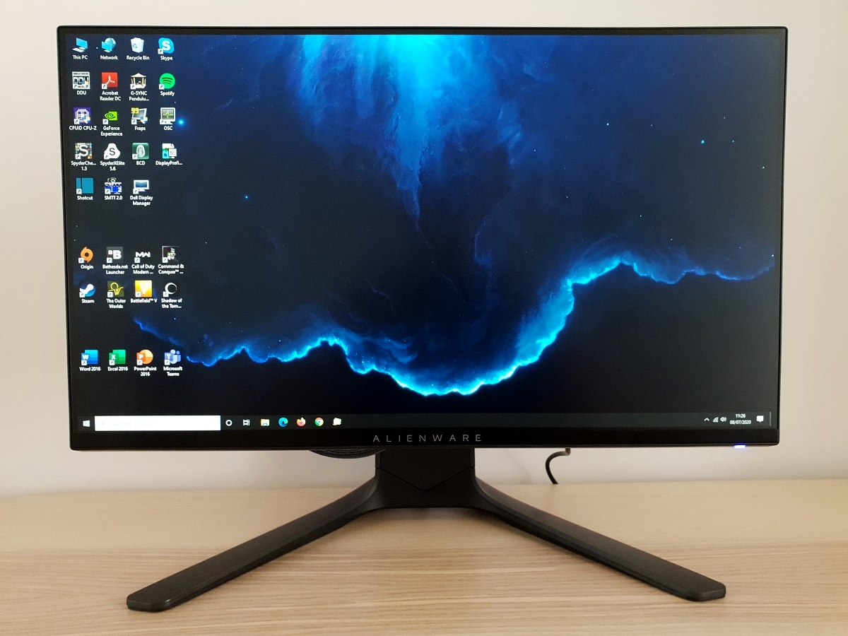
The monitor has distinctive Alienware styling. Quite ‘gamery’, but in in a less aggressive and sharp-lined or flashy colourful way than usual. And more of a futuristic prop from a sci-fi movie kind of way. The stand has a ‘penguin-foot’ design with flattened feet and a wide neck piece. The front-face of this is matte black plastic, with a satin-finish ‘Dark Side of the Moon’ (dark grey) plastic upper surface that continues at the rear of the stand. The AW2521HFL is also available, differing only due to this dark grey shade being replaced with a much lighter ‘Lunar Light’ shade. The top and side bezels are slender with a dual-stage design, including a panel border that’s flush with the rest of the screen and a slim hard plastic outer component. Including both components, the bezels are ~6mm (0.24 inches) at the top and sides. The bottom bezel is thicker with only a sliver of visible panel border, ~16mm (0.63 inches) at thinnest point, dropping down further towards the back in a diagonal downwards slope. It is satin black plastic with a blended light grey ‘Alienware’ logo in the centre, the same width as the stand neck. The main feature from the front, as usual, is the screen face. A medium matte anti-glare screen surface is used, as explored shortly. From the side the screen itself is quite slim – ~16mm (0.63 inches) at thinnest point, lumping out centrally where the stand attaches. The stand has a robust sculpted appearance, designed to look stylish without sacrificing ergonomics; tilt (5° forwards, 21° backwards), swivel (20° left, 20° right), height (130mm or 5.12 inches) and pivot (90° clockwise or anti-clockwise rotation into portrait) adjustment is included. It includes blended grey height markers on the inside of the stand neck, from ‘1’ to ‘8’ with each number approximately 2cm apart. At lowest stand height, the bottom of the screen sits ~70mm (2.76 inches) above the desk and the top of the screen ~396mm (15.59 inches). In this position the top of the stand neck pokes up an additional ~40mm (1.57 inches) above the top edge of the screen surface. The total depth of the monitor including stand is ~252mm (9.92 inches) with the screen sitting just under an inch from the front edge of the stand. So it’s a relatively deep design for a screen of this size, a bit of a desk depth hog although not as bad as some models. The image below is a macro photograph taken on Notepad with ClearType disabled. The letters ‘PCM’ are typed out to help highlight any potential text rendering issues related to unusual subpixel structure, whilst the white space more clearly shows the actual subpixel layout alongside a rough indication of screen surface. This model uses a ‘regular’ (medium) matte anti-glare surface. Strong glare-handling is provided due to significant diffusion of ambient light. This diffusion also affects light emitted from the monitor, with a negative impact on the clarity and vibrancy potential of the screen. The screen surface has a bit of graininess to it when observing lighter shades, a very slightly ‘sandy’ look to it, if you like. It doesn’t show strong graininess or a heavily smeared appearance, however. The surface texture is quite similar if not a touch lighter than the surface texture used on most high refresh rate ~24” Full HD TN models. As shown in the image above, the monitor uses the usual RGB (Red, Green and Blue) stripe subpixel layout. This is the default expected by modern operating systems such as Microsoft Windows and Apple’s MacOS. As a Windows user you don’t need to run through the ClearType wizard, although you may still wish to adjust this according to your preferences. As a Mac user there’s no need to worry about text fringing from non-standard subpixel layouts. The subpixel layout and arrangement is normal and we had no subpixel-related concerns related to sharpness or text clarity on this model. The monitor includes a range of ‘Preset Modes’; ‘Standard’, ‘FPS’, ‘MOBA/RTS’, ‘RPG’, ‘SPORTS’, ‘Game 1’, ‘Game 2’, ‘Game 3’, ‘ComfortView’, ‘Warm’, ‘Cool’ and ‘Custom Color’. The numbered ‘Game’ presets and ‘Custom Color’ are most flexible as they allow you to adjust the colour channels and saturation levels. The remaining presets make specific adjustments to those and can’t be manually altered. The numbered ‘Game’ presets can have unique ‘Brightness’ and ‘Contrast’ levels assigned to them as well, whereas this is set universally for the remaining presets. Many of the presets make further adjustments, such as ‘FPS’, ‘MOBA/RTS’, ‘RPG’ and ‘SPORTS’ adding a sharpness filter which can’t be disabled or counteracted effectively in the OSD aside from by selecting a different preset. These were briefly explored in the OSD video, but for the purposes of this table we’ll be looking at manual adjustments and settings we feel have more utility. Our test system uses an Nvidia GTX 1080 Ti connected using the supplied DP cable and runs Windows 10. Additional testing was performed using an AMD Radeon 580 and using HDMI, although observations for this table didn’t significantly vary between GPUs or inputs. The monitor was left to run for over 2 hours before readings were taken and observations were made. No additional monitor drivers or ICC profiles were specifically loaded for the review. Aside from for our ‘Test Settings’, where various adjustments were made, assume factory defaults were used. The refresh rate was set to 240Hz in Windows, although this didn’t significantly affect the values or observations on this table. When viewing the figures in this table, note that for most PC users ‘6500K’ for white point and ‘2.2’ for gamma are good targets to aim for. Individual targets depend on individual uses, tastes and the lighting environment, however.
As an Amazon Associate I earn from qualifying purchases made using the below link. Where possible, you’ll be redirected to your nearest store. Further information on supporting our work.

Features and aesthetics

The OSD (On Screen Display) is controlled by a joystick and pressable buttons running down the right side of the monitor, as viewed from the rear. There’s a customisable power indicator LED towards the bottom right, part of the ‘AlienFX’ RGB lighting system. This is explored alongside the OSD itself in the video below.


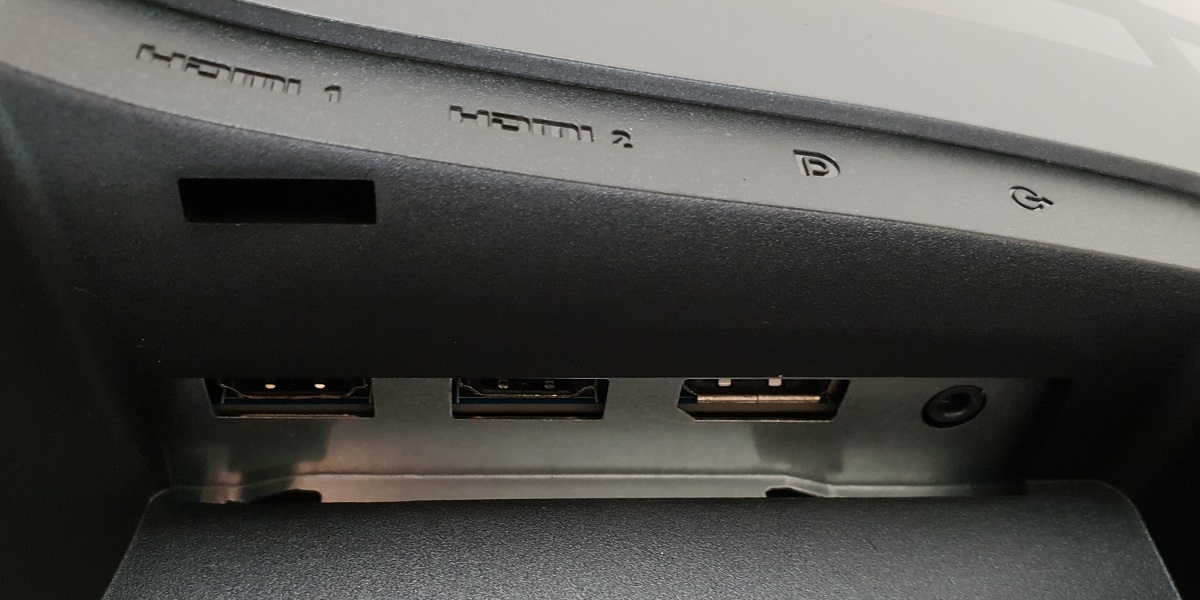
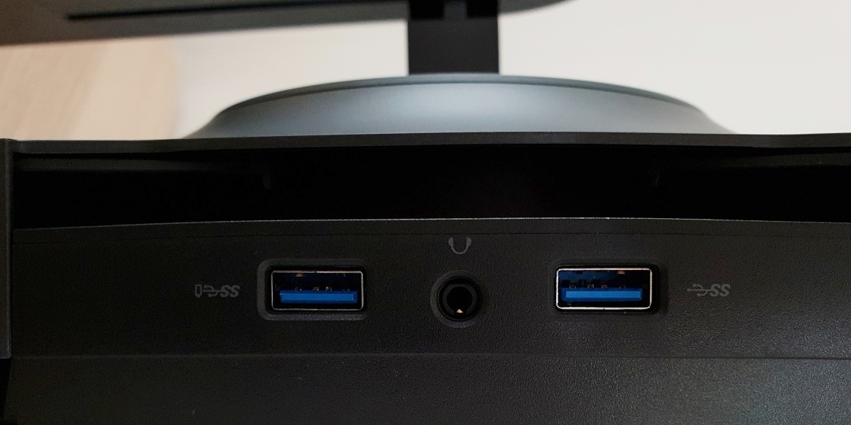
The rear of the screen continues the Alienware aesthetic, with the creatively named ‘Dark Side of the Moon’ shade used extensively (or ‘Lunar Light’ for the ‘HFL’ model). The OSD controls are located towards the bottom left. There are some further customisable ‘AlienFX’ RGB LED features – an alien motif towards the top left and a large oval running along the inside of the stand neck. There are a few black printed elements as well – ‘25’ (identifying the screen size, with a bit of rounding) towards the right side and a broad Alienware logo at the left of the stand neck. The included stand can be removed using a hexagonal quick-release button beneath the attachment point and replaced with an alternative 100 x 100mm VESA compatible solution, if preferred. The ports are concealed beneath a removable plastic cover, facing downwards and include; AC power input (internal power converter), 2 USB 3.0 ports (plus upstream), 2 HDMI 2.0 ports, DP 1.2a and a 3.5mm audio line-out. Outside of the concealed port area, further down and in the centre, there are 2 further USB 3.0 ports and a 3.5mm headphone jack. This gives easy access to the ports from the front as well. The USB port to the left, as viewed from the rear, supports fast-charging.


The full capabilities of the monitor including 1920 x 1080 @240Hz and Adaptive-Sync for AMD FreeSync can be leveraged via DP 1.2 or HDMI 2.0. Nvidia’s ‘G-SYNC Compatible Mode’ is only supported via DisplayPort. Standard accessories include a power cable, DP cable, HDMI cable and USB 3.0 upstream cable. The images below show the refresh rates available in the native Full HD resolution. Note that if the monitor is running at a refresh rate from the first list, including 60Hz, steps must be taken to correct the colour signal on Nvidia GPUs. The driver setting change noted in the article – setting ‘Output dynamic range’ to ‘Full’ is the simplest method. Also note that the listed refresh rates are the same via suitable versions of HDMI and DP and that a ‘4k x 2k, 3840 x 2160’ downsampling mode is not included.


Note that 120Hz is listed as a ‘PC’ resolution, rather than in the ‘Ultra HD, HD, SD’ list. Resolutions and refresh rates from the ‘Ultra HD, HD, SD’ list are referenced internally by monitors (in their EDID) as ‘TV’ resolutions. According to user feedback the monitor runs at 120Hz on the PS5, as of the April 2021 update for the console. If you’re intending to use the monitor at 120Hz with the PS5 or Xbox Series X/S, be aware that a small settings tweak may be required to ensure 120Hz is selectable. Details can be found in this article.
Calibration
Subpixel layout and screen surface
![]()
Testing the presets
Preset Mode Gamma (central average) White point (kelvins) Notes Standard (Factory Defaults) 2.1 7948K An obvious cool (blue) almost icy-looking tint due to very high colour temperature. Some shades brightened up just slightly due to gamma handling, but not by a huge amount. Strong consistency due to IPS-type panel, without the perceived gamma and saturation shifts associated with TN or VA panels. Game 1 2.1 7942K Similar to above, as with ‘Game 2’ and ‘Game 3’. Greater flexibility offered in the OSD than the ‘Standard’ setting. ComfortView 2.1 6336K Intended as a Low Blue Light (LBL) setting, but very ineffective. The colour temperature is warmer by default but the blue channel remained strong on our unit and green channel very strong. This gave an unbalanced image with clear green tint, without achieving its key goal. Warm 2.1 7053K Warmer than factory defaults, but far from ‘Warm’ on our unit with a high colour temperature and cool tint to the image. Relaxing evening viewing (see below) 2.1 4314K We created out own LBL setting as described below. This provides effective blue light reduction and can easily be assigned to a numbered ‘Game’ preset for easy activation and deactivation. Custom Color 2.1 7287K As factory defaults but somewhat warmer with a slight green tint and slightly higher brightness. Test Settings (see below) 2.1 6498K The image appears ‘rich and natural’ overall, with good variety. The gamma is slightly below target, brightening up some shades just a little, but the overall image balance is very respectable.
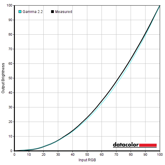
Out of the box the monitor produced an image with a clear cool tint, but with strong consistency and pleasing shade variety. Following some tweaking in the OSD, things were brought more in-line with our target white point. The overall balance to the image was good and things had a ‘rich and natural’ appearance. The gamma curve is shown below for our ‘Test Settings’, with similar performance here to the factory defaults. There is some central ‘sagging’ with an average ‘2.1’ gamma – a bit below the ‘2.2’ target, slightly brightening up some shades but nothing dramatic by any means. Given the intended uses for monitor, inter-unit variation and decent performance following OSD tweaking alone we will not be using any ICC profiles for this review or including any measurements or graphs using them. We wouldn’t recommend using them unless created for your specific unit using your own calibration device. But we appreciate some users still like to use profiles and some aspects such as gamut mapping for colour-aware applications can be useful. And slight gamma corrections, assuming the unit behaves like our sample in that respect. You can download our ICC profile for this model, which was created using our ‘Test Settings’ as a base. Note again that this ICC profile is not used in the review. The monitor also includes a Low Blue Light (LBL) setting called ‘ComfortView’. It’s important to reduce blue light exposure in the hours leading up to sleep, as it’s stimulating to the body and affects sleep hormones. Whilst this setting did tone down the blue channel from the factory defaults and reduce blue light output as a result, it was far from an effective LBL setting. At least on our unit, where the default colour temperature was far too high. It also imparted an obvious green tint, with a relatively strong green channel. This is quite common on LBL settings as reducing the green channel negatively impacts contrast, but in this case it was rather noticeable and you were left with a warmish but very green image. Almost alien-like, you could say. We created our own LBL setting by making manual adjustments to the ‘Game 1’ profile. This was used for our own viewing comfort in the evenings but not for specific testing of the monitor – we therefore refer to these as our ‘Relaxing evening viewing’ settings. You could assign such settings to ‘Game 2’ or ‘Game 3’ as well as they’re identical – it’s easy to flick between these presets and another one by assigning them to a ‘Shortcut Key’ in the OSD. These are just a suggestion, anything not mentioned was left at its default value for ‘Game 1’. R Gain= 100% G Gain= 88% B Gain= 68% Brightness= 38% (according to preferences and lighting)
Gamma 'Test Settings'
Relaxing evening viewing
Preset Mode= Game 1
Test Settings
We made various changes to the ‘Custom Color’ preset for our ‘Test Settings’. The numbered ‘Game’ presets could also be used as a base as they offer the same flexibility. However; the ‘Gain’ controls required different adjustments. The numbered ‘Game’ presets gave a significantly higher white point and somewhat stronger green channel with everything set to ‘100%’ than under ‘Custom Color’. Achieving the same colour balance and white point we achieved here with ‘Custom Color’ required more significant adjustments and came with a greater contrast hit. Note that individual units and preferences vary, so these settings are simply a suggestion and won’t necessarily be optimal in all cases. Assume any setting not mentioned, including ‘Contrast’, was left at default. We’ve also included our preferred ‘Response Time’ setting and the refresh rate used in Windows for most of the review, just for reference.
R Gain= 100% G Gain= 98% B Gain= 92% Response Time= Fast FreeSync= On Brightness= 38% (according to preferences and lighting) Refresh rate (Windows setting)= 240Hz
Preset Mode: Custom Color
Contrast and brightness
Contrast ratios
An X-Rite i1Display Pro was used to measure the luminance of black and white using a range of settings. From these values, static contrast ratios were calculated. The following table shows this data, with blue highlights indicating the results under our ‘Test Settings’. Black highlights indicate the highest white luminance, lowest black luminance and highest contrast ratio recorded. Assume that any setting not mentioned was left at default, with the exceptions already noted in the calibration section.
| Monitor Profile | White luminance (cd/m²) | Black luminance (cd/m²) | Contrast ratio (x:1) |
| 100% brightness | 405 | 0.38 | 1066 |
| 80% brightness | 315 | 0.30 | 1050 |
| 60% brightness | 242 | 0.23 | 1052 |
| 40% brightness | 174 | 0.17 | 1024 |
| 20% brightness | 103 | 0.10 | 1030 |
| 0% brightness | 33 | 0.03 | 1100 |
| 75% brightness (Factory Defaults) | 294 | 0.27 | 1089 |
| Game 1 | 293 | 0.27 | 1085 |
| ComfortView | 207 | 0.20 | 1035 |
| Warm | 306 | 0.28 | 1093 |
| Relaxing evening viewing | 133 | 0.16 | 831 |
| Custom Color | 310 | 0.28 | 1107 |
| Custom Color (100% brightness) | 427 | 0.39 | 1095 |
| Test Settings | 170 | 0.16 | 1063 |
The average contrast ratio with only brightness adjusted was 1054:1, a hair above the specified 1000:1 and as expected for the panel. With our ‘Test Settings’ we recorded a perfectly respectable 1063:1. The highest contrast ratio recorded on the table was 1107:1, using ‘Custom Color’ with all colour channels at their neutral position of ‘100’. The lowest contrast ratio recorded was 831:1, following the significant adjustments made for our ‘Relaxing evening viewing’ settings. The maximum luminance recorded in this table was 427 cd/m², whilst the minimum white luminance recorded was 33 cd/m². This yielded a 394 cd/m² luminance adjustment range with a good bright maximum and dim minimum.
PWM (Pulse Width Modulation)
The AW2521HF does not use PWM (Pulse Width Modulation) to regulate the backlight at any brightness level. Instead, DC (Direct Current) dimming is used for the backlight. The backlight is therefore considered ‘flicker-free’, which will come as welcome news to those sensitive to flickering or worried about side-effects from PWM usage.
Luminance uniformity
Whilst observing a black screen in a dark room, using our ‘Test Settings’, we noticed a small amount of backlight bleed and minor clouding. This is shown in the image below, but remember that individual units vary when it comes to uniformity issues such as this. The image was taken far enough back to eliminate ‘IPS glow’. This is most noticeable towards the bottom corners of the screen, from a normal viewing position. It appears as a cool-tinted silverish haze towards the bottom left. Towards the bottom right it has a slightly warm greenish tint to it, which is somewhat more subdued compared to the right side. It blooms out more noticeably from sharper viewing angles, with the hue varying depending on angle – this is shown in the viewing angles video later on.

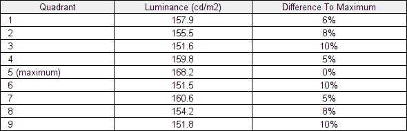
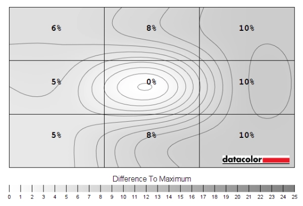
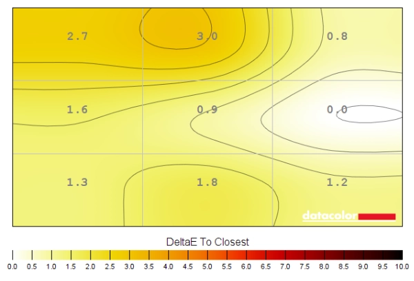
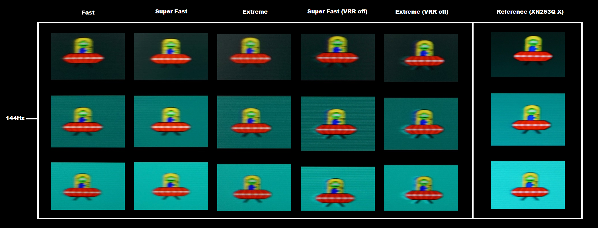
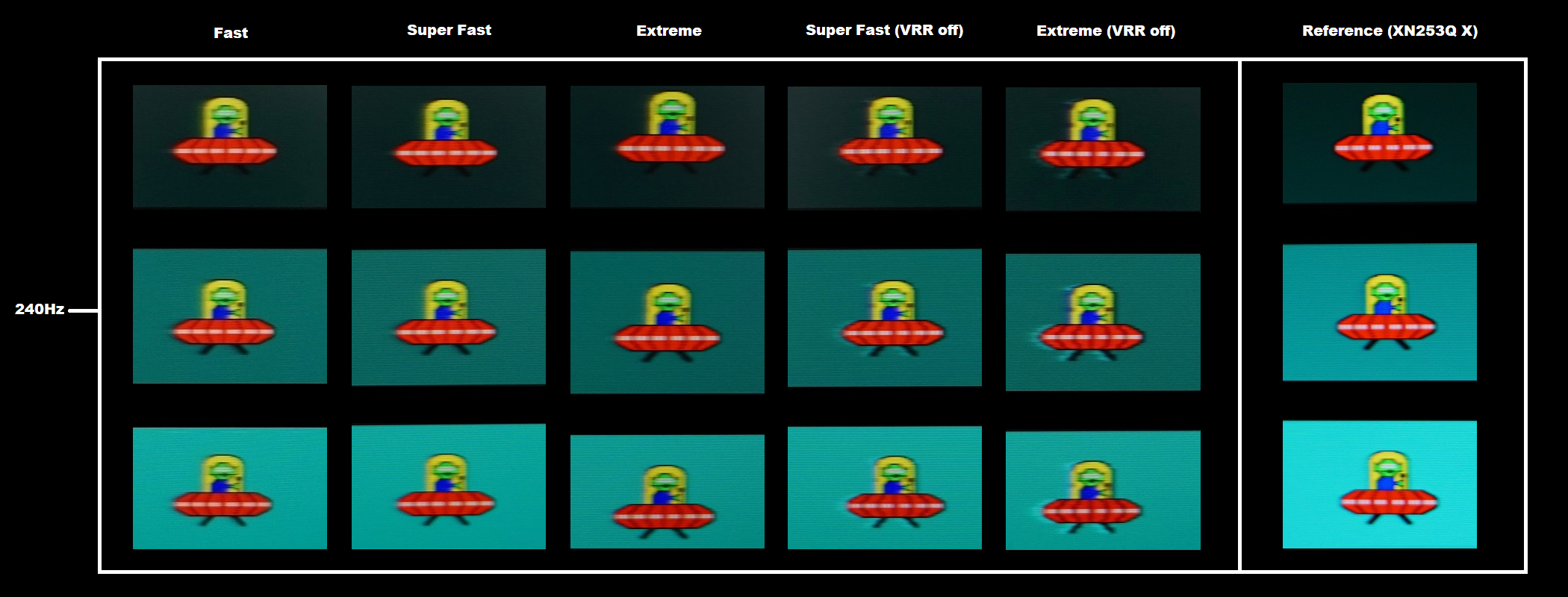
The SpyderX Elite was used to assess the uniformity of lighter shades, represented by 9 equidistant white quadrants. The luminance of each quadrant was measured and compared to the brightest measured quadrant. The table below shows these values as well as the percentage deviation between each quadrant and the brightest point measured. The luminance uniformity was quite good. The brightest point recorded was ‘quadrant 5’ in the centre of the screen (168.2 cd/m²). The greatest deviation from this occurred at ‘quadrant 6’, to the right of this (151.5 cd/m², which is 10% dimmer). The average deviation between each quadrant and the brightest point was 7.75%, which is decent. It must be remembered that uniformity varies between individual units and you can also expect variation beyond the points measured. The contour map below shows these deviations graphically, with darker greys representing lower luminance and hence greater deviation from the brightest recorded point than lighter greys. Percentage deviations between each quadrant and the brightest point are also given. The SpyderX Elite was also used to analyse variation in the colour temperature (white point) for the same 9 quadrants. The deviation between each quadrant and the quadrant closest to the 6500K (D65) daylight white point target was analysed and a DeltaE value assigned. A DeltaE >3 represents significant deviation that most users could readily notice by eye. The colour temperature uniformity was good. There was borderline significant deviation above the central region (DeltaE 3.0), with no significant deviation recorded elsewhere. It’s again important to note that individual unit vary when it comes to uniformity and that deviation beyond the measured points can be expected. The monitor provided a reasonable contrast performance on Battlefield V. Darker regions on this title include dark tunnels, dimly lit building interiors and some darker exterior locations. The depth of the dark shades and overall atmosphere created was certainly not as impressive as on models with much stronger static contrast. The ~1000:1 static contrast being somewhat limiting in that respect. Still there are some weaker IPS performers out there in that respect. There was also a moderate amount of ‘IPS glow’, particularly towards the bottom corners of the screen. More pronounced at the left side due to the ‘glow’ taking on a cool tint rather than the subtler warmer tint towards the right side. This ate away at detail and lightened dark shades up in this region, but wasn’t extreme. It’s something that will be more pronounced if you’re sitting closer to the screen, are using a high brightness setting or have strong backlight bleed or clouding which can bring it out more noticeably. Gamma consistency was good, ensuring detail levels were largely appropriate (‘IPS glow’ affected regions aside) throughout the screen. On TN models you have things looking far too masked higher up the screen due to high perceived gamma. And not blended enough (‘blocky’ or banded) lower down due to low perceived gamma. VA models have ‘black crush’ centrally which masks some detail, whilst some excessive detail can be observed towards the bottom and side edges from a normal viewing position. The screen surface imparted a bit of graininess to lighter content, so it wasn’t as smooth as it could’ve been. But there wasn’t a strong coarse graininess nor a strong ‘smeary’ appearance, either. Shadow of the Tomb Raider told a similar story. Dark areas with just a few point sources of light illuminating are common on this title, including dark tombs and passageways. The monitor didn’t provide excellent depth and atmosphere here due to the static contrast and ‘IPS glow’ limiting things in that respect. Nonetheless, we wouldn’t describe the atmosphere as poor in an appropriately well-lit room either. Brighter elements stood out well against darker surroundings, complete with a bit of graininess from the screen surface but nothing extreme. We also observed the contrast performance of Star Wars: The Rise of Skywalker. This title has a lot of ‘high contrast’ scenes, with very dingy backgrounds and pulses of energy, explosions and lightsabers offering some illumination here and there. The experience wasn’t as cinematic as on models with much stronger static contrast, particularly in a dimly lit room. ‘IPS glow’ also featured, but appropriate room lighting took the edge off this. Brighter elements stood out well against darker surroundings and the detail levels for most of the screen were appropriate. Subtle details such as dark-coloured irises would be more distinct with stronger static contrast and appropriate perceived gamma, but they were still as visible as we’d expect for most of the screen given the static contrast. Considering video content more broadly, including streamed and heavily compressed content, there was suitable masking of ‘compression artifacts’. So things didn’t have a ‘banded’ or ‘blocky’ appearance as you’d see if gamma was far too low. Including at some regions of TN and to a lesser extent VA screens due to the perceived gamma shifts – as we described earlier using Battlefield V as an example. The Lagom tests for contrast allow specific weaknesses in contrast performance to be identified. The following observations were made. The colour gamut of the AW2521HF (red triangle) was compared with the sRGB reference colour space (green triangle), as shown in the image below. The monitor offers fairly comprehensive sRGB coverage (99%), with a very small amount of under-coverage. Plus a bit of overextension, in the green to red region. This gives the monitor the potential to output most shades within the sRGB colour space, with just a touch of extra vibrancy. To maximise colour accuracy within the sRGB colour space, for colour-managed workflows, full calibration and profiling with a colorimeter or similar device is recommended. The monitor provided a rich and natural appearance to Battlefield V. The monitor provides comprehensive sRGB colour gamut coverage and a bit of extension beyond, but stays well short of extended colour spaces such as DCI-P3. As such shades appear much as the developers intend, with a bit of extra saturation in places and a bit of extra vibrancy for some shades. But not the strong saturation levels you’d see from models with more generous gamuts. The strong colour consistency ensured shades maintained appropriate richness throughout the screen, without the saturation shifts you’d see on VA or TN models. Vegetation showed appropriate variety and included some reasonably rich-looking forest greens alongside a good variety of more muted shades. Earthy browns appeared with good neutrality – a little extra richness and a slight orange-red push in places but not the sort of stronger red hue that a wider gamut would provide. Vibrant elements such as roaring flames and brightly painted objects looked quite rich and far from ‘washed out’, but not as eye-catching as they’d appear with a significantly increased gamut. Some appreciate the extra saturation and strong vibrancy of a more generous gamut, but we feel a decent balance is struck here with a bit of extra saturation and good richness throughout the screen. On Shadow of the Tomb Raider things were also presented in a rich and natural way. The environments looked in-place, with good variety and some good earthy browns and rich green shades. Some of the deep greens weren’t as lush as they could be, nor were things like bright purple flowers, red painted artifacts and some of Lara’s ornate dresses as eye-catching as we’ve seen. But they were still closer to the ‘vibrant’ vs. ‘washed out’ end of the spectrum in our view. Lara’s skin also appeared much as it should, without the overly tanned appearance that a wider gamut would provide. The strong consistency was also very evident when considering Lara’s glowing and all-too-perfect complexion. Even the best VA performers show quite pronounced shifts in saturation for such pastel shades when they’re shown towards peripheral sections of the screen rather than centrally. TN models show obvious saturation shifts vertically. In this case appropriate richness and saturation was maintained throughout. We also observed various episodes of the animated TV series Futurama. This further reinforces the idea of strong colour consistency, with large areas of individual shade. The monitor performed well here, without clear shifts in saturation or colour tone. Slight changes could be observed at the very edges for some shades, such as the purple of Leela’s hair gaining a bit of an extra red vs. blue hue to the purple – more pronounced if sitting close to the screen. Most shades appeared very consistent indeed, with any slight deviation due more to uniformity than any viewing angle related weakness. This contrasted starkly with competing TN models that would show an obvious ‘gradient’ of saturation vertically and VA models which show shifts from centre to bottom and sides. For a wide range of shades. The pastel shades of this movie were suitably varied and muted, whilst vibrant shades such as neon reds and greens appeared fairly eye-catching. Not to the extent seen on models with a more generous colour gamut, but enough to stand out and have the intended look overall. The image below shows a printed reference sheet of 24 ‘sRGB’ shades, included as part of the Datacolor SpyderCHECKR 24 package. The screen is displaying reference photographs of this printed sheet, in both the same order as printed (right side) and reverse order (left side). The camera is mounted slightly above centre so that the image is representative of what the eye sees from an ergonomically correct viewing position. This, coupled with the inclusion of a flipped version of the shade sheet, allows both accuracy and colour consistency to be visually assessed. Bracketed numbers in our analysis refer to shades on the printed sheet or right side of the screen if they’re ordered consecutively from top left to bottom right. Note that there is always some disparity between how emissive objects (monitor) and non-emissive objects (printed sheet) appear. The representation of shades in this image depends on the camera and your own screen, it’s not designed to show exactly how the shades appear in person. It still helps demonstrate some of the relative differences between the original intended sRGB shade and what the monitor outputs, however. Full profiling and appropriate colour management on the application would provide a tighter match, our intention here is to show what can be expected in a non colour-managed environment. Lagom’s viewing angle tests help explore the idea of colour consistency and viewing angle performance. The following observations were made from a normal viewing position, eyes ~70cm from the screen. On some monitors, particularly but not exclusively those with high refresh rates, interlace patterns can be seen during certain transitions. We refer to these as ‘interlace pattern artifacts’ but some users refer to them as ‘inversion artifacts’ and others as ‘scan lines’. They may appear as an interference pattern, mesh or interlaced lines which break up a given shade into a darker and lighter version of what is intended. They often catch the eye due to their dynamic nature, on models where they manifest themselves in this way. Alternatively, static interlace patterns may be seen with some shades appearing as faint horizontal or vertical bands of a slightly lighter and slightly darker version of the intended shade. We didn’t readily observe either artifact type at high or relatively high refresh rates (100Hz+). We observed some faint vertical dynamic interlace patterns at ~60Hz and below, but these were not particularly obtrusive in our view. Sensitivity to such things varies, however. The ‘Response Time’ setting or Adaptive-Sync status didn’t affect these observations. A sensitive camera and a utility called SMTT 2.0 was used assess the latency of the Dell Alienware AW2521HF. Over 30 repeat readings were taken to help maximise accuracy. Using this method, we calculated 2.63ms (under 2/3rds of a frame at 240Hz) of input lag. At 60Hz we measured a slightly higher but still reasonable 6.47ms. This figure is influenced both by the element of input lag you ‘see’ (pixel responsiveness) and the element you ‘feel’ (signal delay). It indicates a very low signal delay at 240Hz which even sensitive users shouldn’t find bothersome. Note that we have no way to accurately measure input lag with Adaptive-Sync active in a variable refresh rate and frame rate environment. Our article on responsiveness analyses the key factors affecting monitor responsiveness. One of the most important concepts raised in that article is ‘perceived blur’, contributed to by the movement of your eyes as you track motion on the screen as well as pixel responsiveness. Whilst both elements are important, eye movement is usually the dominant factor on modern monitors. The article also covers a technique called ‘pursuit photography’, using a moving rather than stationary camera to capture motion in a way that reflects both elements of perceived blur. Rather than simply reflecting the pixel response elements. The images below are pursuit photographs taken using the UFO Motion Test for ghosting, with the test running at its default speed of 960 pixels per second. This is a good practical speed to take such photographs at, highlighting both elements of perceived blur nicely. The UFOs move across the screen from left to right at a frame rate matching the refresh rate of the display. All three rows of the test are analysed (dark, medium and light background) to show a range of pixel transitions. The monitor was tested at 60Hz (directly below), 144Hz and 240Hz using all available ‘Response Time’ settings; ‘Fast’, ‘Super Fast’ and ‘Extreme’. Pixel response behaviour was similar under the ‘Fast’ setting whether Adaptive-Sync was active or not both in this test and more broadly. There were some significant differences when Adaptive-Sync was disabled using the ‘Super Fast’ and ‘Extreme’ settings – these are documented as ‘VRR off’ (Variable Refresh Rate off). The monitor can also be set to 120Hz – although not documented in this testing, results were very much comparable to 144Hz. The final column includes a reference screen, the Acer XN253Q X which is a very fast 240Hz TN model with well-tuned pixel overdrive. Note that wavy patterns surrounding some UFOs in the background are slight image retention. This was only observed during this test and is something we’ve seen on various monitors before. It soon disappeared when using monitor normally. At 60Hz, above, the UFO appears soft without sharp focus or clear internal detailing. This reflects a moderate amount of perceived blur due to eye movement and is something shared with the reference screen. There is various degrees of trailing behind the UFOs due to pixel response time weaknesses. In this case, overshoot (inverse ghosting) including some colourful bright ‘halo’ trailing due to aggressive pixel overdrive. The ‘Fast’ setting only showed a relatively small amount of this, whilst the ‘Super Fast’ and ‘Extreme’ settings ramped this up. ‘Extreme’ in particular showed very strong and eye-catching overshoot. ‘VRR off’ did not significantly affect the pixel response behaviour at this refresh rate. The ‘Fast’ setting was quite close to the reference here, with slightly stronger but still by no means extreme overshoot. We therefore consider ‘Fast’ the optimal setting at 60Hz. The image below shows how things look with refresh rate bumped up to 144Hz. At 144Hz, above, the UFO appears narrower and more sharply focused, with better internal detailing. This reflects a significant reduction in perceived blur due to eye movement. There are again varying levels of trailing behind the UFOs due to weaknesses in pixel responsiveness, but this takes a different form to at 60Hz. With the ‘Fast’ setting, there’s just a faint hint of ‘powdery’ trailing, sticking very close to the UFO and very light in appearance. The ‘Super Fast’ setting just slightly reduces this, replacing it with a very small amount of overshoot. A very slight ‘shadowy’ trail behind the UFO, but overall rather similar to the ‘Fast’ setting in appearance. The ‘Extreme’ setting increases the overshoot so it’s more noticeable, particularly for the medium background (middle row). Disabling VRR now has a more pronounced effect on pixel response behaviour, with both the ‘Super Fast’ and ‘Extreme’ settings introducing very obvious bright and colourful overshoot. We consider either ‘Fast’ or ‘Super Fast’ optimal here, both being very well-tuned and difficult to distinguish from one another in practice. They also come surprisingly close to the reference screen, with just a hint of ‘powdery trailing’ for the dark background (top row) that isn’t there on the reference. But less of this behind the UFO cockpit for the medium background. We again consider ‘Fast’ or ‘Super Fast’ to be optimal – ‘Fast’ becomes the clear winner with ‘VRR off’, though. Below you can see how things appear with refresh rate ramped up to 240Hz. At 240Hz, above, the UFOs again appear more sharply focused again with clearer internal detailing. The segments are now quite distinct. This reflects another significant reduction in perceived blur due to eye movement. There are again varying degrees of trailing behind the object due to pixel response weaknesses. The ‘Fast’, ‘Super Fast’ and ‘Extreme’ settings are all rather similar here. There is a little ‘light powdery’ trailing behind the UFOs, particularly for the dark and medium backgrounds. The pixel response requirements for optimal performance have increased significantly due to the significant bump up in refresh rate. Things aren’t quite up to the level of the TN reference, but there are no particularly pronounced weaknesses either. This reference screen shows no noticeable ‘powdery’ trailing but a little overshoot instead. With ‘VRR off’ the ‘Super Fast’ and moreover ‘Extreme’ settings show strong overshoot in the form of bright ‘halo’ trailing. And additional overdrive artifacts with parts of the UFO appearing displaced or ‘over-aliased’. Considering a broader range of pixel transitions, all ‘Response Time’ settings were fairly similar at 240Hz with Adaptive-Sync in use (VRR on). A slight reduction in powdery trailing at the expense of a bit of overshoot being introduced was the trade-off when stepping up the level, but the differences were not too profound. The optimal setting here depends on your own preferences in this respect. The stronger overdrive settings are certainly worth exploring if you can consistently maintain a very high frame rate but still use Adaptive-Sync. The ‘Fast’ setting shows a clear lack of overshoot at 240Hz and relatively low overshoot at much lower refresh rates, though, whilst still providing rapid pixel responses overall. For users who wish to disable Adaptive-Sync they can just stick with ‘Fast’ without worrying about strong overshoot, too. We stuck with the ‘Fast’ setting for the subjective testing below. On Battlefield V the monitor provided a very fluid experience, where the frame rate kept pace with the 240Hz refresh rate. Compared to at 60Hz, or indeed a 60Hz monitor, you’re getting up to 4 times as much visual information pumped out every second. And twice as much when compared to 120Hz or 1.67 times as much compared to 144Hz. This gives an excellent ‘connected feel’, which describes the precision and fluidity felt when interacting with your character and the game world. The very low signal delay of this model also aided the ‘connected feel’, but the very high frame and refresh rate combination also helped. The perceived blur due to eye movement was also greatly reduced, much as demonstrated with the pursuit photos earlier on. The improvement in ‘connected feel’ and reduction in perceived blur was still noticeable to us and would be to sensitive users going up from 144Hz to 240Hz. Although not nearly as pronounced or obvious as stepping up from 60Hz to 144Hz (or even 120Hz). For the lowest levels of perceived blur it’s also important that the monitor performs its pixel responses rapidly. And this monitor put in a very respectable performance in that respect. Most pixel transitions were performed fast enough for a solid 240Hz experience, with either no additional trailing or just a little ‘light powdery’ trailing in places. The perceived blur was therefore dominated by eye movement and the monitor put its 240Hz refresh rate to good use. There were some slightly more pronounced weaknesses for a minority of pixel transitions, for example when observing white or very light objects such as in-game text against a dark and shadowy background. This resulted in a more noticeable ‘powdery’ trailing with a greater effect on perceived blur. Not ‘smeary’ in appearance, but it extended out a bit more and had a greater effect on perceived blur compared to the ‘light powdery trailing’ described earlier. In the example of white text against a shaded backdrop, this only occurred at certain grey levels for the background, so not all dark shades would trigger it. This could be reduced by turning up the ‘Response Time’ setting, but as explored earlier with Test UFO you’d need Adaptive-Sync enabled and suitably high frame rates to avoid strong overshoot if doing that. This more pronounced ‘powdery’ trailing was still less pronounced than some of the weaknesses we’ve observed observe for similar transitions on many 240Hz TN models, including the predecessor to this model (AW2518H/HF), ViewSonic XG2530 and AOC AG251FG. The new generation TN panels such as the Acer XN253Q X don’t show any noticeable weaknesses in terms of ‘powdery’ trailing and offer impressively rapid pixel responses across the board. However; that also comes with a bit of overshoot, whereas the AW2521HF is entirely free from any noticeable overshoot at 240Hz and very high refresh rates. Overall it put in a respectable performance for the panel type and will keep a broad spectrum of gamers happy, from casual to competitive. Given the extensive analysis above, we don’t much to add from Shadow of the Tomb Raider. The competitive advantage of the 240Hz refresh rate was irrelevant on this title, although we still noticed an edge in ‘connected feel’ and perceived blur on the rare occasions frame rate got up high enough. The monitor delivered a very competent 240Hz performance, with only minor weaknesses as described earlier. Even on this title where there are lots of ‘high contrast’ transitions, with bright objects against much darker backgrounds, there was nothing that really caught the eye as a clear weakness. Some isolated weaknesses such as bright markers or strongly illuminated objects against some shaded backgrounds leaving a ‘powdery’ trail – but as with our observations in BFV this wasn’t really a major weakness. We also tested movie content, which was much more limited in frame rate (generally 24fps, 30fps or 60fps). The pixel response requirements are slacker at such frame rates and the visual fluidity is greatly limited by the frame rate itself. Perhaps unsurprisingly, the monitor provided an excellent performance in all cases, with no noticeable weaknesses. The 240Hz refresh rate also allows even division of 24fps, 30fps and 60fps which reduces juddering for such content – the lack of overshoot at 240Hz worked nicely as well. As an Amazon Associate I earn from qualifying purchases made using the below link. Where possible, you’ll be redirected to your nearest store. Further information on supporting our work. AMD FreeSync is a variable refresh rate technology, an AMD-specific alternative to Nvidia G-SYNC. Where possible, the monitor dynamically adjusts its refresh rate so that it matches the frame rate being outputted by the GPU. Both our responsiveness article and the G-SYNC article linked to explore the importance of these two elements being synchronised. At a basic level, a mismatch between the frame rate and refresh rate can cause stuttering (VSync on) or tearing and juddering (VSync off). FreeSync also boasts reduced latency compared to running with VSync enabled, in the variable frame rate environment in which it operates. FreeSync requires a compatible AMD GPU such as the Radeon RX 580 used in our test system. There is a list of GPUs which support the technology here, with the expectation that future AMD GPUs will support the feature too. The monitor itself must support ‘VESA Adaptive-Sync’ for at least one of its display connectors, as this is the protocol that FreeSync uses. The AW2521HF supports FreeSync Premium via DP 1.2a and HDMI 2.0 on compatible GPUs and systems. You need to make sure ‘FreeSync’ is set to ‘On’ in the ‘Game’ section of the OSD. On the GPU driver side recent AMD drivers make activation of the technology very simple and something that usually occurs automatically. You should ensure the GPU driver is setup correctly to use FreeSync, so open ‘AMD Radeon Software’, click ‘Settings’ (cog icon towards top right) and click on ‘Display’. You should then ensure that the first slider, ‘Radeon FreeSync’ is set to ‘Enabled’ as shown below. The screenshot below is for a different model, but the settings and layout of the page are the same. To configure VSync, open ‘AMD Radeon Software’. Click ‘Settings’ (cog icon towards top right) and click ‘Graphics’. The setting is listed as ‘Wait for Vertical Refresh’. This configures it globally, but if you wish to configure it for individual games click ‘Game Graphics’ towards the top right. The default is ‘Off, unless application specifies’ which means that VSync will only be active if you enable it within the game itself, if there is such an option. Such an option does usually exist – it may be called ‘sync every frame’ or something along those lines rather than simply ‘VSync’. Most users will probably wish to enable VSync when using FreeSync to ensure that they don’t get any tearing. You’d therefore select either the third or fourth option in the list, shown in the image below. Above this dropdown list there’s a toggle for ‘Radeon Enhanced Sync’. This is an alternative to VSync which allows the frame rate to rise above the refresh rate (no VSync latency penalty) whilst potentially keeping the experience free from tearing or juddering. This requires that the frame rate comfortably exceeds the refresh rate, not just peaks slightly above it. We won’t be going into this in detail as it’s a GPU feature rather than a monitor feature. As usual we tested a broad range of game titles using FreeSync and found the experience similar across the board. Any issues identified with FreeSync that were isolated to a specific title would indicate an issue with the game or GPU driver rather than the monitor as well. We’ll therefore just focus Battlefield V for this section. This title offered suitable graphics options to test the full gamut of refresh rates supported by the monitor. Our RX 580 is far from a powerhouse of a graphics card, so maintaining 240fps was very tricky. It requires huge visual sacrifices and very specific content to be shown on the screen. Dips below this were common. Even if such dips were very slight, without FreeSync active and VSync enabled they’d cause obvious stuttering. Without FreeSync active and VSync disabled, you’d get obvious tearing from the lack of synchronisation between frame and refresh rate. When we say obvious, it’s very subjective – sensitive users can certainly notice such things and it can be very nice indeed having them gone. But some users don’t find such issues as noticeable and won’t benefit as much from FreeSync. As frame rate dropped further, well below 200fps, the ‘connected feel’ and perceived blur was noticeably impacted. But far from poor. And the lack of tearing and stuttering was very nice indeed, if you’re sensitive to such things. With respectable graphics settings and more intense action it wasn’t uncommon to see dips below 100fps, perhaps closer to 60fps on average. The ‘connected feel’ and perceived blur took a real hit here, but the technology did its thing to get rid of tearing and stuttering all the same. As the frame rate dropped we noticed an increase in overshoot. It started to creep in a little bit even at the high double digit to very low triple digit frame rates. With some more noticeable ‘halo’ trailing by about 80fps (80Hz). This was by no means extreme and not everyone will notice it – many Adaptive-Sync models have much stronger overshoot than this following such refresh rate drops, in fact. Nonetheless it is still there as the overdrive is tuned for strong 240Hz performance rather than strong <100Hz performance. In contrast to models with G-SYNC modules, which feature variable overdrive that re-tunes things dynamically to a wide range of different refresh rates. As things dipped even further, below the 48fps (48Hz) floor of operation for FreeSync, the monitor employed LFC (Low Framerate Compensation). This worked exactly as it’s designed to, removing tearing and stuttering by ensuring the refresh rate stuck to a multiple of the frame rate. The slight caveat to LFC is that there’s a very brief stutter when it activates or deactivates. This isn’t a strong stuttering and isn’t something you’ll generally notice or find bothersome unless you’re frequently passing the boundary. As noted earlier, AMD FreeSync makes use of Adaptive-Sync technology on a compatible monitor. As of driver version 417.71, users with Nvidia GPUs (GTX 10 series and newer) and Windows 10 can also make use of this Variable Refresh Rate (VRR) technology. When a monitor is used in this way, it is something which Nvidia refers to as ‘G-SYNC Compatible’. Some models are specifically validated as G-SYNC compatible, which means they have been specifically tested by Nvidia and pass specific quality checks. With the AW2521HF, you need to connect the monitor up via DisplayPort and enable ‘FreeSync’ in the ‘Game’ section of the OSD. When you open up Nvidia Control Panel, you should then see ‘Set up G-SYNC’ listed in the ‘Display’ section. Ensure the ‘Enable G-SYNC, G-SYNC Compatible’ checkbox and ‘Enable settings for the selected display model’ is checked as shown below. Press OK, then turn the monitor off then on again so that it re-establishes connection – the technology should now be active. Our suggestions regarding use of VSync also apply, but you’re using Nvidia Control Panel rather than AMD Radeon Software to control this. The setting is found in ‘Manage 3D settings’ under ‘Vertical sync’, where the final option (‘Fast’) is equivalent to AMD’s ‘Enhanced Sync’ setting. You’ll also notice ‘G-SYNC Compatible’ listed under ‘Monitor Technology’ in this section, as shown below. Make sure this is selected (it should be if you’ve set everything up correctly in ‘Set up G-SYNC’). The video below shows the monitor in action. The camera, processing done and your own screen all affect the output – so it doesn’t accurately represent what you’d see when viewing the monitor in person. It still provides useful visual demonstrations and explanations which help reinforce some of the key points raised in the written piece. For those who play a variety of games, some competitive and some casual, having a screen that offers a 240Hz refresh rate and good colour quality can be very attractive. This is exactly what the Dell Alienware AW2521HF delivered. Whilst its 24.5” screen with Full HD resolution doesn’t deliver a staggering pixel density or the same useful ‘desktop real-estate’ as some models, it’s a relatively easy resolution to drive at high frame rates. The design of the monitor is in keeping with the ‘Alienware’ aesthetics of other recent additions to the series and indeed their other peripherals and systems. A futuristic ‘sci-fi prop’ look which some will find quite endearing. The ‘AlienFX’ lighting system allowed some degree of customisation and some elements are visible from the front, but it was our wall who got the most enjoyment out of the light show. We prefer stronger RGB LEDs at the rear, producing a strong glow around the monitor that can help enhance perceived contrast. But being able to change the power LED colour to suit your mood is a nice little touch. The monitor didn’t put form over function, either, and was solidly built with good ergonomic flexibility and VESA mounting options. The contrast performance was much as we were expecting. Around 1000:1 even following adjustments to our ‘Test Settings’. So better than some IPS-type models, weaker than others but very much as specified. ‘IPS glow’ also came with the territory. Together, the monitor certainly didn’t provide a deep and atmospheric look to dark scenes and is more suited to viewing in a well-lit room. The screen surface was a touch on the grainy side when viewing lighter content, although this wasn’t a strong ‘layered’ graininess or excessively sandy appearance thankfully. It’s something we’re sensitive to, as long-time readers of our website will be well aware. The IPS-type panel of the Dell Alienware certainly provided a key contrast advantage over VA and TN models, though. And that was its excellent gamma consistency. It was free from the sort of shifts in perceived gamma that can significantly mask dark detail in some regions of the screen whilst revealing too much detail elsewhere. Competing TN models certainly have something of a vertical detail gradient going on for dark content vertically, whilst VA models have ‘black crush’ centrally and a bit of extra detail peripherally. The colour reproduction was a relative strength of this monitor and a good step up from competing models with other panel types. The colour gamut provided just a bit of extension beyond sRGB, injecting some extra vibrancy without the strong saturation of a much more generous colour gamut. We’d describe the image as ‘rich and natural’, with a richness maintained throughout the screen thanks to the strong colour-consistency. No saturation losses towards the bottom or edges as you’d see from other panel types. The responsiveness of the monitor was also quite impressive – which is a good thing given that it’s a key focus of 240Hz models like this. The refresh rate was put to very good use overall; fairly strong pixel responsiveness, low input lag and no noticeable overshoot. There were slight weaknesses for some transitions, though these were fairly minor and aren’t something everyone would find bothersome. Adaptive-Sync also worked well on both our AMD and Nvidia GPU to get rid of tearing and stuttering. Using VRR improved pixel response behaviour for very high refresh rates, too, allowing the ‘Extreme’ overdrive setting to be used without strong overshoot. There’s no strobe backlight mode on this model, but they come with their own compromises that not everyone is willing to make. Given the pleasing responsiveness and colour performance, nice overall build and (subjectively speaking) styling we feel this is an excellent 240Hz Full HD model overall. In our view the price is also very reasonable and highly competitive given what’s on offer. The bottom line; strong responsiveness and colour performance from a stylish and well-priced monitor.
Luminance uniformity table
Luminance uniformity map
Luminance uniformity map
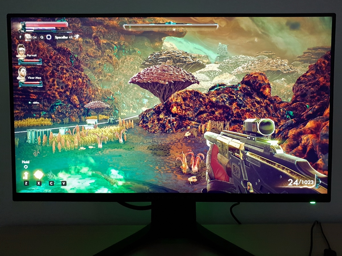
Contrast in games and movies
Lagom contrast tests
Colour reproduction
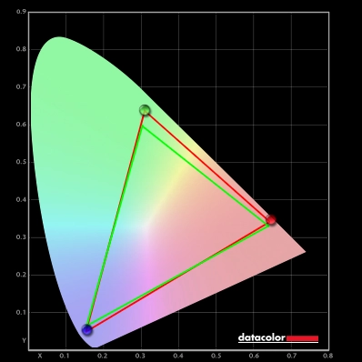
Colour gamut
Colour gamut 'Test Settings'
Colour in games and movies
Shade representation using SpyderCHECKR 24

The monitor produced most shades here quite faithfully, accounting for the natural differences related to emissive vs. non-emissive objects noted above. Some shades appear a touch oversaturated due primarily to the slight extension in the gamut, the most noticeable being dark lime green (18) which appeared a touch more ‘neon’. On models with a significantly wider gamut, this shade and candy apple red (14), to name but a few, tend to look significantly more ‘neon’ than they appear here. Candy apple red appeared with a bit of an orange-red tone due to extension in the red to green edge of the gamut. Some shades, such as cerulean (2) and lilac (8), appear somewhat undersaturated. Gamboge (23) verged too much on a mustard yellow without a suitably warm golden hue, too. Medium orange (3), Persian pink (6) and looked slightly undersaturated in person, but they appear much less saturated and overly bright in the image compared to how they actually looked on the monitor. The consistency is also very good in most cases, superior to VA models and far superior to TN models (references here). Aquamarine (4) is particularly good at highlighting this relative strength. Medium chocolate brown (24) is also good for highlighting colour consistency, which like Aquamarine is positioned at the extremities of the screen. Medium chocolate brown and some neighbouring shades appear a touch more saturated and warmer in tone on the AW2521HF when displayed at the bottom vs. top of the screen. But this is due more to uniformity on our sample than viewing angle behaviour. Although this won’t correct uniformity issues, profiling the monitor with your own colorimeter or spectrophotometer is always advised for best results if the strongest colour accuracy is desired.
Viewing angles

The video below shows the Lagom text test, a mixed desktop background, game scene and dark desktop background from a variety of viewing angles. You can see relatively minor shifts in contrast and colour for the mixed desktop background and game scene. Less pronounced than you’d see on TN or VA models. The dark desktop background highlights ‘IPS glow’, which creates an obvious ‘bloom’ as viewing angles become steeper. Depending on angle, the glow may take on a subtle cool-silver appearance or slightly warm green hue.
Interlace pattern artifacts
Responsiveness
Input lag
Perceived blur (pursuit photography)

Responsiveness in games and movies
FreeSync – the technology and activating it

The Dell Alienware supports a variable refresh rate range of 48 – 240Hz. That means that if the game is running between 48fps and 240fps, the monitor will adjust its refresh rate to match. When the frame rate rises above 240fps, the monitor will stay at 240Hz and the GPU will respect your selection of ‘VSync on’ or ‘VSync off’ in the graphics driver. With ‘VSync on’ the frame rate will not be allowed to rise above 240fps, at which point VSync activates and imposes the usual associated latency penalty. With ‘VSync off’ the frame rate is free to climb as high as the GPU will output (potentially >240fps). AMD LFC (Low Framerate Compensation) is also supported by this model, which means that the refresh rate will stick to multiples of the frame rate where it falls below the 48Hz (48fps) floor of operation for FreeSync. If a game ran at 34fps, for example, the refresh rate would be 68Hz to help keep tearing and stuttering at bay. This feature is used regardless of VSync setting, so it’s only above the ceiling of operation where the VSync setting makes a difference.

Some users prefer to leave VSync enabled but use a frame rate limiter set a few frames below the maximum supported (e.g. 237fps) instead, avoiding any VSync latency penalty at frame rates near the ceiling of operation or tearing from frame rates rising above the refresh rate. If you activate the ‘Frame Rate’ feature under ‘Game’ – ‘Game Enhance Mode’ in the OSD, this will display the refresh rate of the display and therefore indicate the frame rate if ‘FreeSync’ is active and the frame rate is within the variable refresh rate range of the display. The final point to note is that FreeSync only removes stuttering or juddering related to mismatches between frame rate and refresh rate. It can’t compensate for other interruptions to smooth game play, for example network latency or insufficient system memory. Some game engines will also show stuttering (or ‘hitching’) for various other reasons which won’t be eliminated by the technology.
FreeSync – the experience
Nvidia Adaptive-Sync (‘G-SYNC Compatible’)

In the image above you can see that the monitor is validated as ‘G-SYNC Compatible’ (or you could, if Nvidia Control Panel displayed the entire text instead of cutting it off). This indicates that the monitor has been specifically tested by Nvidia and passes specific quality checks. The monitor is also listed as such on Nvidia’s website. The technology worked well and offered a very similar experience to AMD FreeSync. A slight difference was that the floor of operation was 80Hz (80fps) on our Nvidia GPU. Nvidia’s website lists a 48 – 240Hz VRR, which would match AMD FreeSync. It’s possible newer Nvidia GPUs, including their RTX series, support this expanded range or it may have just been misreported on the website. Either way, where the frame rate drops below the floor of operation a frame to refresh multiplication technology (what AMD refers to as LFC) kicked in to keep tearing and stuttering at bay. As with AMD FreeSync this technology worked very well, although there was a momentary stutter when it activated or deactivated. Unless you’re frequently passing this boundary it’s not something you’re likely to notice or care about, though.

Finally, note again that you can go to ‘Game Enhance Mode’ in the ‘Game’ section of the OSD to activate the ‘Frame Rate’ feature. This displays the current refresh rate of the monitor and will reflect the frame rate if it’s within the main variable refresh rate window (e.g. 80 – 240fps).
Video review
Timestamps:
Features & Aesthetics
Contrast
Colour reproduction
Responsiveness (General)
Responsiveness (Adaptive-Sync)
Conclusion
![]()
Positives Negatives Strong colour consistency and slight extension beyond sRGB, giving a ‘rich and natural’ image without potentially overbearing saturation
Slight deviation from preferred ‘2.2’ gamma, without gamma settings in OSD. Some would prefer a wider gamut for extra vibrancy
Reasonable contrast, in-line with expectation, strong gamma consistency and a pleasing luminance adjustment range ‘IPS glow’ eats away at detail, particularly near bottom corners. Screen surface imparts a bit of graininess to lighter content Strong pixel responsiveness overall, low input lag and Adaptive-Sync working well with both our AMD and Nvidia GPU
Slight pixel responsiveness weaknesses for some transitions, a bit of overshoot creeps in at reduced refresh rates and no strobe backlight setting A ‘gamery’ but in our view tasteful aesthetic, good ergonomics, competitive pricing and a relatively easy to drive resolution
Full HD resolution is quite limiting in some respects, stand reasonably deep which could be an issue if you have a shallow desk (VESA mounting is an option)
As an Amazon Associate I earn from qualifying purchases made using the below link. Where possible, you’ll be redirected to your nearest store. Further information on supporting our work.
