Author: Adam Simmons
Date published: December 24th 2016
Table of Contents
Introduction
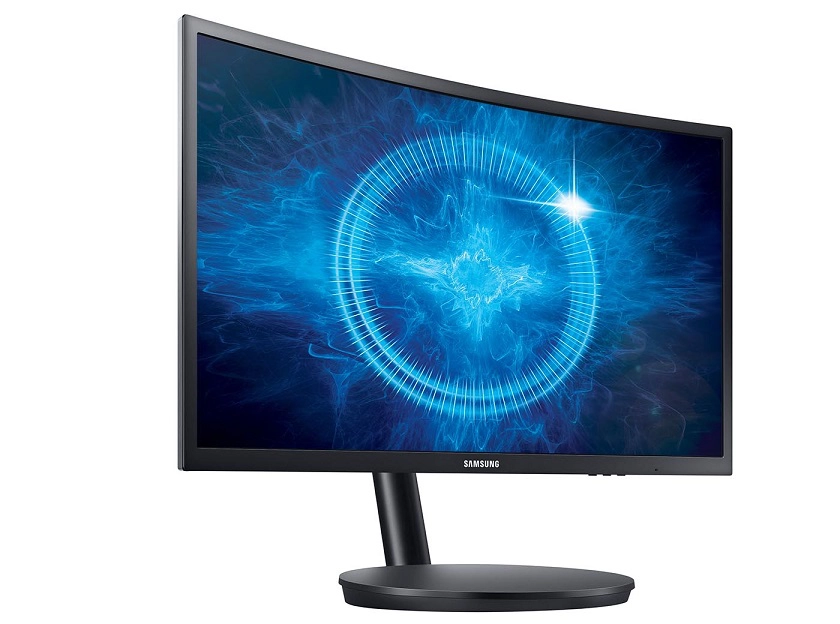
There are a number of ~24” 144Hz+ gaming monitors available. Whilst some are slightly better configured ‘from the factory’ than others, they all share the same TN (Twisted Nematic) panel type. The Samsung C24FG70 (also referred to as the C24FG70FQ with various regional suffixes) is a 23.5” member of the CFG70 series, offering a high refresh rate VA (Vertical Alignment) rather than TN panel. This is complemented by a reasonably steep 1800R curve to the screen and support for Adaptive-Sync (and hence AMD FreeSync). We take a look at these features and indeed the general image quality and performance characteristics in our usual suite of tests.
Specifications
This model features a 144Hz 23.5” SVA (‘Super’ Vertical Alignment) panel, with a curvature of 1800R. True 8-bit colour is supported alongside a specified 1ms MPRT (Moving Picture Response Time), achieved using the ‘Impulsive Scanning’ strobe backlight mode. A key feature related to the backlight is the use of Quantum Dot technology, courtesy of Nanosys, which widens the colour gamut. Some of the key ‘talking points’ have been highlighted in blue below.
Features and aesthetics
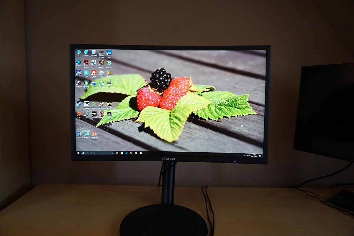
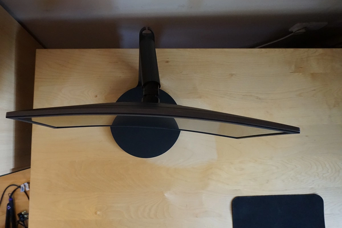
From the front the monitor has a homely look without any overly showy design elements. Matte black plastics are used for the bezels and stand base, with the bezels being reasonably slender at all edges – ~17mm (0.67 inches) at the top and sides and ~20mm (0.79 inches) at the bottom. The panel border is almost entirely hidden by this bezel, so in that respect the design differs from the likes of the C27F591FD. As with the CF591, the stand base is dish-shaped, which is a bit unconventional and takes up more desk space than is necessary. It looks like it should have an integrated QI charger (it doesn’t), but could perhaps be a handy place to put your phone when not in use. The screen surface is light matte anti-glare whilst there is also a noticeable curvature to the screen of 1800R. These features are explored in greater depth later on.
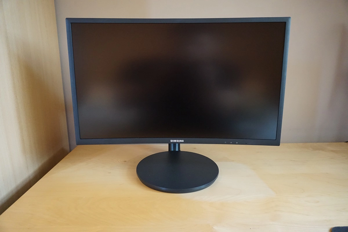
The OSD (On Screen Display) is controlled by a joystick (JOG button) located at the rear of the monitor, towards the right side as viewed from the front. There are some additional controls on the underside of the bottom bezel. Towards the centre of the bottom bezel, facing downwards, there are light blue LEDs which Samsung dub ‘Arena Lighting’. These pulse according to audio output from the monitor (i.e. anything connected via the 3.5mm headphone jack) or can be set to pulse continuously or disabled if you prefer. There is a power state indicator facing forwards, towards the right of the bottom bezel. This glows blue when the monitor is on or on standby (depending on OSD settings). If set to switch on when the monitor is on, it will still flash intermittently when the monitor enters a low power state. Once the system is switched off, you can turn the monitor ‘off’ and disable the LED by holding the JOG button in for a few seconds then releasing. The OSD, ‘Arena Lighting’ and various other features are explored in the video below.
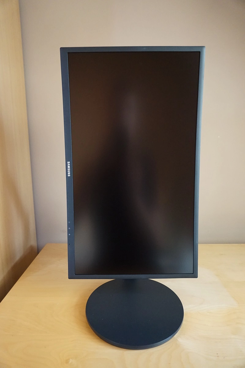
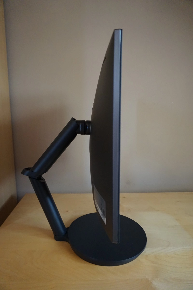
From the side the monitor is dominated by its flexible dual-hinged arm stand design with a cable-tidy loop at the joint. There is a brushed metal rim around the edge of the screen as well to add a little variety to the matte black plastic used elsewhere. The stand provides good ergonomic flexibility; tilt (2° forwards, 17° backwards), height adjustment (140mm or 5.52 inches), swivel (15° left, 15° right) and pivot (90° clockwise rotation into portrait). As you can see in the photo, the stand is also quite deep – and the depth depends on the height that you wish to have the screen, as the hinged arm sticks further back at lower heights. At lowest height the screen clears the desk by ~60mm (~2.36 inches) with the total depth from front of stand base to rear of arm ~340mm (~13.39 inches). The top of the screen is ~378mm (~14.89 inches) above the desk. If you raise the screen to its maximum height, which is ~140mm above this, the total depth of the monitor including all components is ~375mm (~14.76 inches) as the cable tidy protrudes backwards rather than facing upwards.
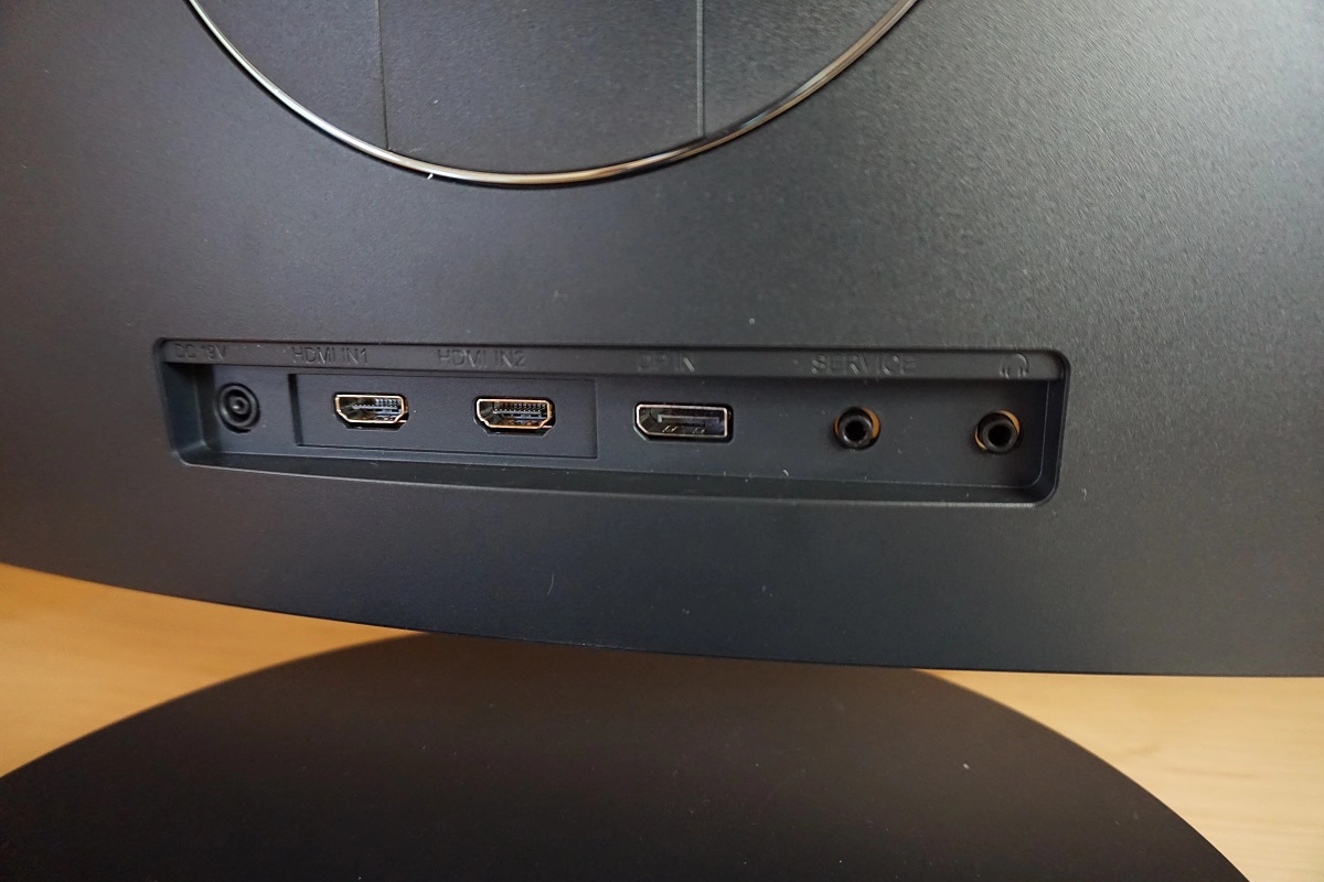
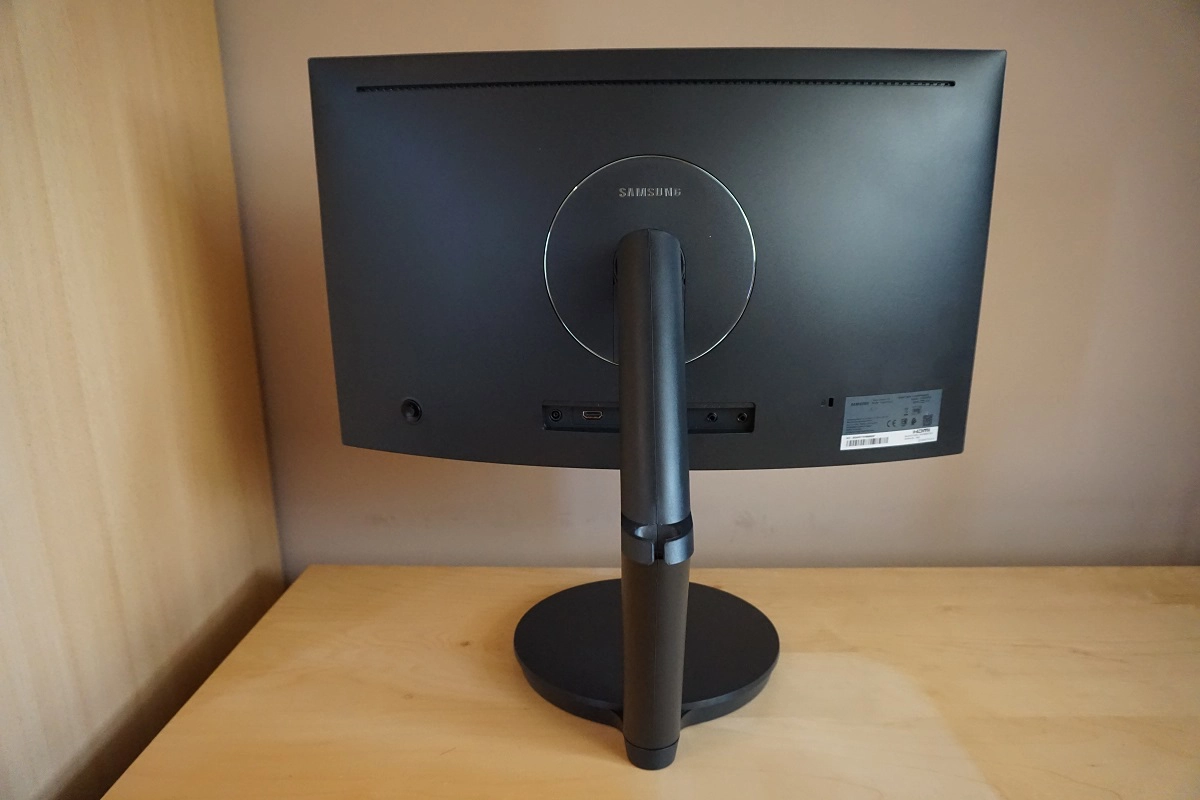
The rear of the screen again sports matte black plastic. The stand attaches centrally and can be removed along with some of the surrounding plastic to attach the included VESA plate. This gives 100 x 100mm VESA compatibility for alternative mounting. There is a shiny silver plastic ring around the attachment point. The ports are rear-facing, located towards the bottom in the central region. These are; DC power input (external power brick), 2 HDMI 1.4a ports (supports Adaptive-Sync), DP 1.2a (supports Adaptive-Sync), a service port (service centre use) and a 3.5mm headphone jack. HDMI supports up to 120Hz and DP up to 144Hz on this monitor on both AMD and Nvidia GPUs, with AMD GPUs potentially benefiting from their FreeSync feature, explored later. A power cable and adaptor, HDMI cable and DP cable are included as standard accessories.
Calibration
Subpixel layout and screen surface
This monitor uses a light matte anti-glare screen surface, as mentioned earlier. This has quite a smooth surface texture, keeping the image free from obvious graininess regardless of how light the content being viewed is. This surface also handles glare effectively, but regardless of this it’s best to avoid light striking the screen surface directly.
![]()
As shown above, the monitor uses the usual RGB (Red, Green and Blue) stripe subpixel layout. As this is the default expected by modern operating systems such as Microsoft Windows and Mac OS, there is no need to run ClearType as a Windows user or worry about text fringing from non-standard subpixel layouts as a Mac user. Windows users may still wish to run through the ClearType wizard to adjust according to preferences, however. As is common on many VA panels (particularly Samsung SVA panels), the subpixels are a bit squat. That is to say they are relatively wide but short, with relatively large gaps between rows. This has a slight impact on text clarity, making some text appear somewhat softer than it might on models with other panel types but similar pixel density. This can be alleviated to an extent by running through ClearType but not cured. Although it’s not something we found problematic when reviewing the model and many users would find the text clarity just fine, it does have an impact and is something that some users would find bothersome.
Testing the presets
This monitor features several ‘Picture Mode’ presets; ‘Custom’, ‘High-Brightness’, ‘FPS,’ ‘RTS’, ‘RPG’, ‘AOS’, ‘sRGB’ and ‘Cinema’. There are also a number of other settings that can be configured, including 3 ‘Gamma’ settings, an ‘Eye Saver’ mode and various ‘Color Tone’ settings. Rather than going through every conceivable set of settings (indeed, regardless of preset, you gain full flexibility with other settings) we’ll pick some out which we feel are particularly appealing or interesting. The table below includes key readings taken using a Datacolor Spyder5ELITE colorimeter alongside general observations done by eye. Readings and observations were taken after the monitor was left to run for at least 2 hours. Assume any setting not mentioned in the table was left at default, except for our ‘Test Settings’ where various adjustments were made.
The monitor was kept in its ‘plug and play’ state without additional drivers or ICC profiles loaded. The test system used a Club3D Radeon R9 290 royalAce FreeSync-compatible GPU connected via DisplayPort. We also tested with an Nvidia GTX 1070 and found that the monitor worked in much the same way (aside from the lack of FreeSync support). Likewise, we tested using HDMI on both GPUs and noted similar performance, provided the colour signal was corrected as detailed in this article. In addition to ensuring the graphics driver is doing the right thing, there’s an additional setting in the ‘Picture’ menu of the monitor’s OSD called ‘HDMI Black Level’. Once you’ve got the graphics driver using the correct ‘Full Range 0-255 RGB’ signal you should change ‘HDMI Black Level’ from its default of ‘Normal’ to ‘Full’. Games console users should refer to the section of this article under the heading ‘How do I set up my monitor for console gaming’.
| Monitor Settings | Gamma (central average) | White point (kelvins) | Notes |
| Gamma = Mode1 (Factory Defaults) | 2.2 | 6479K | The image is very bright and vivid with good balance overall. There is strong saturation, but not to the extent seen on a wide gamut (Adobe RGB or similar) model. Some saturation is lost towards the edges and bottom of the screen, but this occurs to a relatively low degree for this panel type and the image appears quite rich throughout the screen. |
| Gamma= Mode2 | 2.0 | 6479K | As above, but saturation and overall depth weakened somewhat due to lower gamma. Visibility of dark shades ‘enhanced’ (i.e. they appear lighter than they should), which could interest gamers interested in a ‘competitive edge’. |
| Gamma = Mode3 | 2.4 | 6486K | As above, but now the gamma is raised and things appear deeper and even more saturated. The distinction of very dark shades from one another is poor – a visually ‘impressive’ mode for some uses but for general usage we’d recommend sticking to ‘Mode1’. |
| Color Tone = Warm2 | 2.2 | 5192K | This is an effective ‘Low Blue Light’ (LBL) setting, which significantly weakens the blue colour channel and leaves a much warmer-looking image. This is appropriate for evening viewing when blue light levels should be restricted to help your body and mind relax (yes – we’re still talking about a monitor setting here, not a bath soak). |
| Eye Saver Mode | 1.7 | 5192K | This is a different LBL setting, which not only creates a warmer image with weakened blue colour channel, but also significantly reduces contrast. Things look flooded due to very low contrast, but this is intended as it can reduce the amount of your eyes spend accommodating varying light levels (assuming ambient light level isn’t changing too much). |
| Picture Mode = High-Brightness | 2.2 | 6446K | Very similar to factory defaults, with a slight weakening of the green channel and a marginally higher (not detectable by eye) brightness. |
| Picture Mode = sRGB | 2.2 | 6506K | This is an effective sRGB emulation mode, which restricts the colour gamut so that it is very close to sRGB. Strong contrast is maintained and you maintain full control over brightness, colour channel and gamma mode settings. Saturation is noticeably weaker, giving a more accurate representation of certain shades at the expense of things looking less vivid. In terms of colour accuracy, this is a useful mode, but be aware of VA colour consistency limitations. |
| Response Time = Faster @144Hz | 2.2 | 6202K | A strobe backlight mode is active, so the screen flickers at a frequency of 144Hz. This mild flicker may bother some users, but others wouldn’t find it bothersome. The image is rather bright and brightness control is locked. Balance otherwise similar to factory defaults. |
| Response Time = Fastest @144Hz | 2.2 | 6226K | As above, but screen slightly dimmer (still bright). |
| Response Time = Faster @120Hz | 2.2 | 6221K | The screen now strobes at 120Hz, so the flicker is slightly more obvious. The brightness is also increased marginally. |
| Response Time = Fastest @120Hz | 2.2 | 6213K | As above but brightness slightly lower (still bright). |
| Response Time = Faster @100Hz | 2.2 | 6217K | The screen strobes at 100Hz, with a similar brightness to 144Hz using the ‘Faster’ setting. The flicker is a bit more noticeable. |
| Response Time = Fastest @100Hz | 2.2 | 6198K | As above, slightly dimmer but still bright. |
| Test Settings (modified as below) | 2.2 | 6482K | Simply factory defaults with reduced brightness. The image retains its vivid and varied look, with excellent balance and pleasing central gamma tracking, but brightness is more comfortable. |
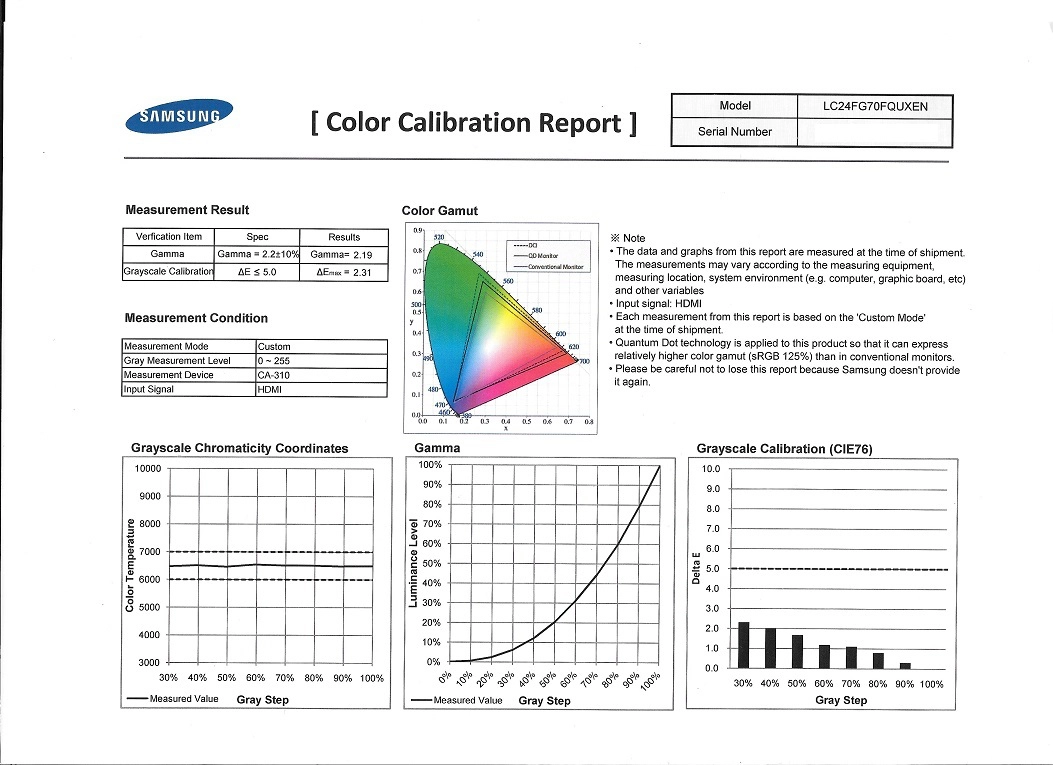
Straight from the box, the C24FG70 produced a well-balanced (albeit retina-scorchingly bright) image. Gamma tracked close to the ‘2.2’ curve and although many shades appeared slightly more saturated than they should, the image was devoid of garish oversaturation or range-crushing ‘artificial saturation’. We explore this later. There was also a praiseworthy ‘sRGB’ setting included, which cut down on this saturation effectively, without loss of contrast or flexibility in the OSD controls. The images below show a factory calibration report, which all units include, and the gamma curve for our ‘Test Settings’.
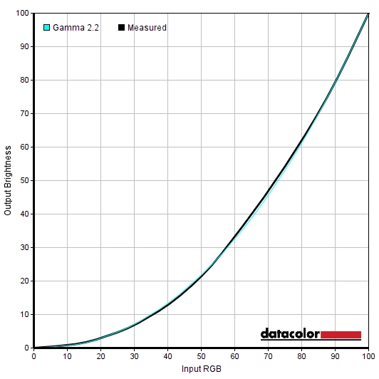
Gamma 'Test Settings'
It’s also worth mentioning that some Low Blue Light (LBL) settings are included, such as the ‘Warm2’ setting and ‘Eye Saver Mode’. The former is quite conventional in that it provides a warmer image with weakened blue colour channel. The latter provides this but also massively restricts contrast, something that is intended to reduce the changes in light levels and hence reduce the variable dilation and constriction of your pupils. In practice we found ‘Warm2’ to be perfectly comfortable for evening viewing and much preferred the richer image compared to ‘Eye Saver Mode’, but for some users it would be worth considering the latter mode.
Test Settings
Our ‘Test Settings’ were really very simple, as the monitor was nicely balanced except for the overly high luminance. We simply lowered the luminance and ensured the refresh rate was set to 144Hz. We’ve also included the ‘Response Time’ setting used for most of the testing (except the strobe backlight mode, explored separately) and the ‘FreeSync’ setting used. On our Nvidia GPU we were of course not able to use FreeSync, but the settings otherwise remained the same. Anything not mentioned here, including ‘Contrast’, ‘Color Tone’ and ‘Gamma’ was simply left at default. Response Time= Standard FreeSync= Ultimate Engine Refresh rate= 144Hz
Brightness= 42 (according to preferences and lighting)
Contrast and brightness
Contrast ratios
We used a BasICColor SQUID 3 (X-Rite i1Display Pro) to measure white and black luminance levels, from which static contrast ratios could be calculated. The table below shows this data with various settings used, including those explored in the calibration section. Assume any setting not mentioned was left at default, save for the changes already mentioned in the calibration section and for our ‘Test Settings’. Black highlights here indicate the highest white luminance, lowest black luminance and maximum contrast ratio recorded. Blue highlights show the results using our ‘Test Settings’.
| Monitor Settings | White luminance (cd/m²) | Black luminance (cd/m²) | Contrast ratio (x:1) |
| 100% brightness | 356 | 0.12 | 2967 |
| 80% brightness | 296 | 0.10 | 2960 |
| 60% brightness | 233 | 0.08 | 2913 |
| 40% brightness | 169 | 0.06 | 2817 |
| 20% brightness | 104 | 0.04 | 2600 |
| 0% brightness | 41 | >0.01 | <4129 |
| Gamma = Mode2 | 357 | 0.12 | 2975 |
| Gamma = Mode3 | 356 | 0.12 | 2967 |
| Color Tone = Warm2 | 338 | 0.12 | 2817 |
| Eye Saver Mode | 89 | 1.38 | 64 |
| Picture Mode = High-Brightness | 362 | 0.12 | 3017 |
| Picture Mode = sRGB | 321 | 0.11 | 2918 |
| Response Time = Faster @ 144Hz | 252 | 0.09 | 2800 |
| Response Time = Fastest @ 144Hz | 221 | 0.08 | 2763 |
| Response Time = Faster @ 120Hz | 270 | 0.09 | 3000 |
| Response Time = Fastest @ 120Hz | 225 | 0.08 | 2813 |
| Response Time = Faster @ 100Hz | 258 | 0.09 | 2867 |
| Response Time = Fastest @ 100Hz | 218 | 0.08 | 2725 |
| Test Settings | 171 | 0.06 | 2850 |
The average contrast ratio with only brightness adjusted was 2851:1, excluding at ‘0%’ brightness where black point was lower than our instrument could accurately measure. This is close to the specified 3000:1, so good but largely as expected. This level of contrast helps provide better depth to blacks and other deep shades (an ‘inkier look’) compared to IPS-type or TN panels. Since our ‘Test Settings’ only involved adjusting brightness, it is unsurprising that contrast remained much the same at 2850:1. The ‘sRGB’ emulation mode did not have a significant impact on contrast, with 2918:1 recorded. Strong contrast levels were also maintained across all other settings tested, including the strobe backlight modes (‘Faster’ and ‘Fastest’ settings for ‘Response Time’) and the ‘Warm2’ Low Blue Light setting. The exception to this was the Eye Saver Mode, which purposefully diminishes contrast – 64:1 was recorded under this mode. The highest luminance recorded in the table was 362 cd/m² and the lowest was 41 cd/m², yielding an impressive brightness adjustment range of 321 cd/m².
There is also a dedicated ‘MagicBright’ preset called ‘Dynamic Contrast’, which allows the backlight to adjust its intensity based on the overall level of light or dark on screen. The backlight adjusts as one individual unit, as usual, so just works on averages across the screen. This setting tended to provide excessive brightness even during mixed scenes, even where plenty of dark shade were included. It did dim fairly effectively for predominantly dark content. We don’t like such settings and prefer manual control of the backlight, but it’s there if you wish to use it.
PWM (Pulse Width Modulation)
This monitor does not use PWM (Pulse Width Modulation) and instead uses DC (Direct Current) modulation to dim the backlight. The backlight is therefore considered flicker-free, which will be welcomed by those sensitive to the effects of PWM. The exception to this is with the monitor set to its ‘Faster’ or ‘Fastest’ settings for ‘Response Time’, which causes the monitor to flicker as part of a strobe backlight mode.
Luminance uniformity
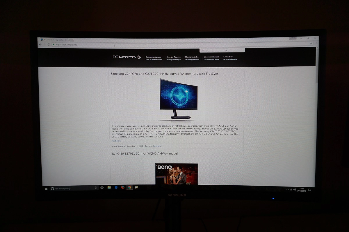
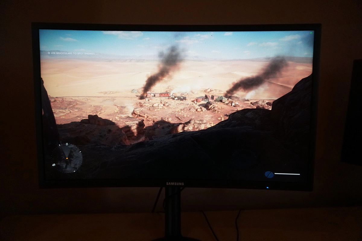
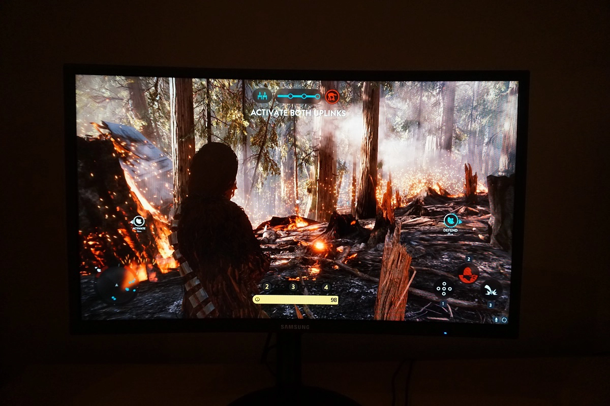
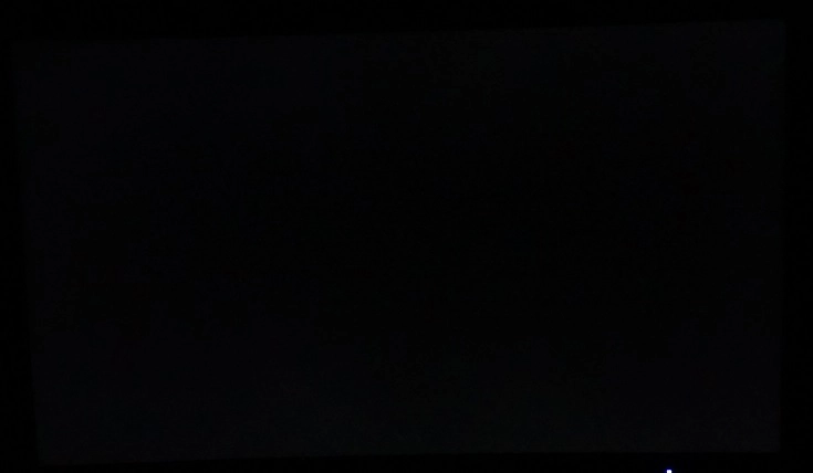
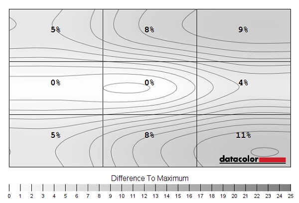
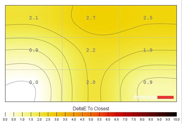
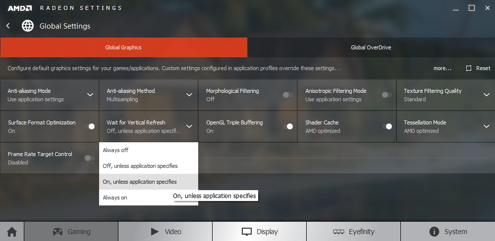
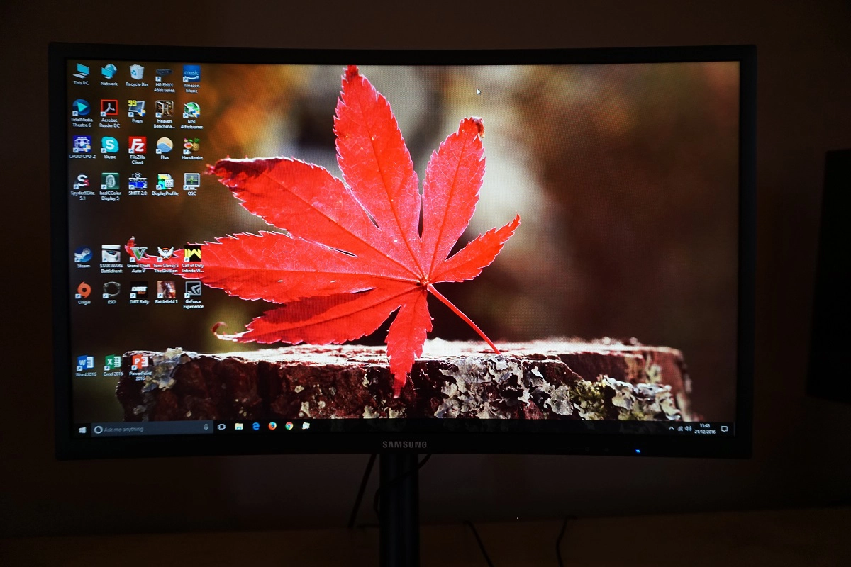
We observed a black background in a dark room and observed no obvious backlight bleed. There was a small amount of clouding at the very bottom of the screen, but this was minor. It’s important to remember that individual units vary when it comes to backlight bleed, although given their light-blocking prowess VA models are generally relatively strong in this area. The image below show the bleed, but was taken from a sufficient distance to eliminate so-called ‘VA glow’. This is a silverish and from some angles slightly purple glow that is visible towards the bottom corners of the screen from a normal viewing angle. It blooms out more noticeably from sharper viewing angles, as shown later on in the review. This is very subtle compared to ‘IPS glow’ and does not have anywhere near the same detrimental impact on the atmosphere or detail levels in dark scenes. The luminance uniformity of the screen was very good overall. The brightest point recorded was ‘quadrant 5’ in the centre of the screen (162.3 cd/m²). The greatest deviation from this occurred at ‘quadrant 9’ towards the bottom right (144.9 cd/m², which is 11% dimmer than centre). Elsewhere recorded brightness was within 4 – 9% of the brightest point, which is pleasing. It’s worth remembering that individual units vary when it comes to uniformity and that there may be further deviation beyond the points measured. The contour map below gives a graphical representation of this deviation. Here, darker greys represent lower luminance and hence greater deviation from the brightest point than lighter greys. We also measured the colour temperature (white point) uniformity of the same 9 quadrants. Deviations here are assigned DeltaE values, with higher values showing greater deviation from the 6500K (D65) daylight white point target than lower values. A value above DeltaE 3 is considered significant deviation that some users would readily notice by eye. The results here were strong, without any significant deviations recorded. The highest deviation recorded was DeltaE 2.7 towards the bottom right. You can expect some deviation between individual units and there may also be deviation beyond the 9 points measured. Also bear in mind that there can be some slight shifts in perceived colour temperature based on viewing angle weaknesses on VA panels such as this. On Battlefield 1 (BF1) strong contrast was displayed, which enhanced the atmosphere of the game. This gave objects a more distinct structure than you’d see on non-VA panels, with elements such as cracks in rocks, deep wood grain and shaded areas of vegetation appearing nice and deep and allowing lighter elements of such objects to stand out well. Dark areas of the game appeared quite atmospheric as well, without ‘IPS glow’ or weak static contrast impeding the experience. There was a little bit of ‘VA glow’ (slight lightening) towards the bottom, but this was subtle compared to gamma changes on TN models and ‘IPS glow’. There was a little detail lost for some of the darkest shades due to the gamma behaviour and so-called ‘black crush’, as these near-black shades blended into each better than they ideally would. The visibility of such details improved when viewing the screen from an angle. This is as low a level of ‘black crush’ as we’ve seen on a VA monitor, however. The relatively smooth screen surface aided brighter shades, keeping them free from obvious graininess. The contrast performance was also pleasing on Dirt Rally. The monitor provided a good experience when racing in the dark, with superior depth to the ubiquitous dark shades than non-VA models. There was a small amount of ‘VA glow’ towards the very bottom of the screen, but nothing alarming and certainly nothing as ‘atmosphere-breaking’ as IPS glow or TN gamma shifts. Bright elements such as car headlights and lamps around the track stood out very nicely, with good ‘pop’ and a relative smoothness aided by the screen surface. The level of subtle detail was good overall, with a little lost due to ‘black crush’ but nothing severe and overall an impressive level of dark detail. Finally, we assessed contrast performance on the Blu-ray of Star Wars: The Force Awakens. This film showcased the strong contrast performance of the monitor nicely, with plenty of scenes where very bright and very dark elements combined. The classic lightsabre battles in darkness looked particularly impressive, with the darkness having a good atmospheric depth to it and the bright elements looking quite bright and pure. Lagom’s contrast tests were used to analyse specific weaknesses in contrast performance which may not have been identified during other testing. The following observations were made. The Samsung C24FG70’s colour gamut (red triangle) was compared to the sRGB colour space (green triangle). This is shown in the graphic below. The monitor completely covers sRGB (100%) with a fair bit of extension beyond this. This means that the monitor can output all shades within the sRGB colour space with some extra saturation in places. The colour gamut does not extend as far as wide gamuts such as ‘Adobe RGB’, particularly in the green corner of the diagram. This avoids the excessive oversaturation associated with viewing sRGB content on a wide gamut monitor, but provides extra vibrancy which many users would quite like for general usage and entertainment purposes. The monitor also offers an ‘sRGB’ setting, analysed in the calibration section. This is an sRGB emulation mode that significantly cuts down the colour gamut of the monitor so that it closely follows sRGB. It actually provides 99% sRGB coverage and as reported earlier has little effect on contrast, plus allows the user full control over brightness and colour channels. It’s therefore an excellent and praiseworthy sRGB emulation mode. A good array of vibrant and varied colours were displayed on Battlefield 1 (BF1). The environments looked rich but natural, with some impressively lush (but not garishly oversaturated) greens alongside some more muted minty shades. Earthy browns and khaki colours were displayed in appropriately muted and neutral way. There was a bit of a red bias towards some of the earthy brown shades, but this wasn’t as obtrusive as the obvious red hue that wide gamut models might display in such situations. Explosions were lively with rich orange and yellow hues, standing out brilliantly well against darker backgrounds in particular – something that was aided by the relatively strong contrast of the screen. On Dirt Rally the vibrant but still natural-looking colours provided a pleasing look to the racing environments. The variety of green and brown shades aided this aesthetic, with minor saturation loss towards the extreme edges not really getting in the way of the experience. The monitor certainly produces some attractive vibrant shades for the car liveries and advertising around the track, with some electric blues, deep purples and bright greens being particularly eye-catching. This was especially the case where bright or ‘neon’ colours were painted on with darker background colours, with the strong contrast and colour gamut combining to give strong ‘pop’. The image certainly looked vivid, but not in the sort of garish oversaturated way that would be portrayed on an untamed wide gamut display. Or the horribly crushed and artificial way achieved using ‘Digital Vibrance’ or a similar saturation enhancement function. We also tested the Blu-ray of Star Wars: The Force Awakens. There were plenty of impressive flashes of vibrancy here, aided by the strong contrast and the fact there were many scenes with bright shades cast against dark backgrounds. Intense blues and reds from lightsabers stood out particularly well here, as did explosions ripping through dark corridors or dark skies. The skin tones appeared slightly more saturated than intended, but not disturbingly so. Some shades, such as desert browns and yellows, lost some saturation towards the extreme edges and bottom of the screen but this was not extreme. Finally, we assessed colour performance on the Blu-ray of Futurama: Into the Wild Green Yonder. This is a particularly effective and unforgiving test of colour reproduction, as there are large areas of individual shades shown at once on the screen. The monitor showcased an excellent variety of shades and some very impressive deep and neon shades, which feature quite heavily in this animated film. There were plenty of more muted colours – things certainly didn’t appear ‘out of place’ as they might on a wide gamut model on this title, even if some shades had a bit of extra saturation. The richness was good throughout the screen, but again there was slight saturation loss towards the extreme bottom and side edges. Again, this was quite minor really. We used Lagom’s tests for viewing angle to more closely analyse colour consistency and the influence of viewing angle. The following observations were made from a normal viewing position, eyes around 70cm from the screen. Using a sensitive camera and small tool called SMTT 2.0, we compared the latency of the C24FG70 with a range of monitors of known latency. By taking over 30 repeat readings to enhance accuracy, we measured 4.14ms (over 1/2 of a frame @144Hz) of input lag. This was with ‘Low Input Lag’ enabled, which had no noticeable negative side-effects. No significant difference was recorded when setting the ‘Response Time’ to ‘Faster’ or ‘Fastest’ and therefore activating the strobe backlight feature. This value is influenced both by the element of input lag that you ‘feel’ (signal delay) and the element that you ‘see’ (pixel responsiveness). It indicates a very low signal delay that even sensitive users should find absolutely fine. However; we have received reports from multiple users that they do find that the monitor ‘feels laggy’. It’s possible that whilst tweaking the overdrive control of different revisions Samsung also introduced a higher signal delay with some revisions, introducing something of an input lag lottery. We don’t have the means to accurately measure input lag whilst FreeSync is active, but as explored the felt responsiveness with this enabled was excellent. In this article we explore monitor responsiveness and various key concepts surrounding this. One of the most relevant of these, for this particular section of the review, is the idea of perceived blur. This is contributed to not only by the pixel responsiveness of the monitor, but also the movement of your eyes as you track movement on this screen. It’s actually this eye movement that’s often the key cause of perceived blur on modern monitors. We also introduce a photography technique called ‘pursuit photography’. This involves using a moving camera to capture motion on a monitor in a way that reflects both the pixel responsiveness and eye (camera) movement and hence gives a realistic idea of perceived blur. The images below are pursuit photographs taken using the UFO Motion Test for ghosting. The test is set to run at its default speed of 960 pixels per second, which is a practical speed for such photographs and sufficient to help highlight key weaknesses. The monitor was tested at 60Hz, 100Hz, 120Hz and 144Hz with all three ‘Response Time’ settings. The middle row of the test (medium cyan background) was used. Various reference shots are also included for the sake of comparison. The 60Hz reference screen is a Samsung S27A750D (set to 60Hz, 100% brightness to avoid PWM) which shows how things should look at 60Hz with little or no response time weaknesses in play. The 144Hz ‘normal’ (non-strobe), 100Hz strobe (ULMB) and 120Hz strobe (ULMB) references show the test performed on a Dell S2716DG, which offers very rapid pixel responses. Note that any interlacing lines are moiré from the camera and were not visible on the monitor itself. At 100Hz, with the ‘Standard’ setting, you can see that the pixel responses are rapid enough to prevent noticeable conventional trailing behind the object. There is noticeable and fairly strong overshoot, though, with a bright inverted trail behind all sections of the UFO. With the ‘Faster’ and ‘Fastest’ setting the strobe backlight mode is active, and unlikely at 60Hz it actually has the desired effect. The main object appears significantly sharper and better-defined, with perceived blur due to eye movement massively reduced by the backlight strobing. There is a fair bit of overshoot behind the object, slightly stronger with the ‘Fastest’ setting but not too much stronger than the ULMB reference screen really. At 120Hz, with the ‘Standard setting’, the overshoot is weakened quite a bit but is still there. There is no noticeable conventional trailing, though, so the tuning of the pixel overdrive is actually better at this refresh rate compared to 100Hz. The object is marginally thinner and better defined, indicating a slight decrease in perceived blur due to eye movement. With the ‘Faster’ and ‘Fastest’ settings the clarity of the object is excellent with some good well-defined details. There is a bit of overshoot visible, slightly stronger with the ‘Fastest’ setting. This is actually reduced somewhat compared to at 100Hz – and again isn’t too dissimilar to the reference display. At 144Hz, with the ‘Standard’ setting, the overshoot is perhaps marginally reduced again. The clarity is actually quite similar to the reference display for these transitions. With the ‘Faster’ and ‘Fastest’ setting the strobe backlight mode is activated. The clarity of the main object is excellent, but there is again a little overshoot that is reduced slightly compared to lower refresh rates. The ‘Faster’ and ‘Fastest’ modes are fairly similar, although the overshoot is more noticeable with a more obvious woven texture with the ‘Fastest’ setting. With the ‘Faster’ setting you can see a slight trail in front of the object, which indicates that the pixel responses weren’t quite able to keep up with the requirements for ‘clean’ 144Hz strobing. This is quite faint and also visible to some extent at 120Hz. Overall, we feel that the monitor performed quite well both with and without the strobe backlight mode in these tests at 120Hz and 144Hz, but the overshoot introduced at 100Hz was quite strong and noticeable. It’s also worth bearing in mind that pixel transition behaviour changes depending on the shades involved in the transition, especially on VA models such as this. We will be analysing the pixel response behaviour over a more complete range of pixel transitions and discussing the implications for overshoot of a dynamic refresh environment (i.e. FreeSync active) in the proceeding sections. On some monitors, generally high refresh rate models, there are artifacts that can be seen when observing moving content on the screen. These may appear as a sort of mesh or interference, with woven or interlaced lines of alternating shade that’s slightly lighter or darker than that which is intended. No such artifacts were visible on this monitor during motion. We did observe some static interlacing patterns, though, which were much less obvious. This occurred in the bottom left region of the screen, whereby a given shade had very thin horizontal bands of a marginally lighter than intended shade running through it. They were visible regardless of FreeSync status or refresh rate, but really rather faint and not something most users would notice in normal use unless sitting particularly close to the screen (<50cm). On Battlefield 1 (BF1), where the frame rate kept pace with the 144Hz refresh rate (i.e. 144fps), things felt very much as we’d hope from a 144Hz monitor. The ‘connected feel’ upon interacting with the game world was excellent, with controller input translating to fluid movement on the screen very rapidly. This is not only due to the low input lag of the display, but also due to the fact it’s pumping out 2.4 times as much visual information every second as on a 60Hz display. This also massively reduced eye movement and hence decreased perceived blur through the mechanisms described in our responsiveness article. But to really make good use of the 144Hz refresh rate, pixel responsiveness also has to be strong. And in this respect the C24FG70 impressed, looking decidedly unlike any VA panel monitor we’ve seen. Other high refresh rate VA models we’ve tested, like the Acer Z35, are let down by the fact many pixel responses are very slow and provide obvious ‘smeary’ trailing. This is something we’ve also seen from 60 – 75Hz models including the Samsung C27F591FD. The 23.5” CFG70 instead performed the majority of pixel transitions in such a way that there was very little if any trailing visible at 144fps – looking quite comparable to the S2716DG sitting next to it. A very fast 144Hz TN model. There were some slight weaknesses, however. Whereas most transitions either provided no visible trailing or just a very fine, short-lived and barely visible mist of additional trailing, there were some that provided more obvious trailing. This was particularly true for transitions between darker and somewhat lighter (medium) shades. Shadows cast on vegetation and other objects and fine objects such as cracks in rocks, for example, were generally a fair bit darker than the object itself or the rest of the object. You can see a slightly more pronounced trail in such instances, which increases perceived blur. This is particularly the case if you move the character around rapidly or drive a vehicle. The trailing here is not the sort of smeary (and sometimes ‘smoke-like’) trailing you’d typically get on VA models, though, and is actually more like the slightly slower than optimal transitions you might see on a 144Hz AHVA (IPS-type) model like the AOC AG271QG or ViewSonic XG2703-GS. It was quite clear that the Samsung used highly effective grey to grey acceleration, which is required to speed up some of these natively rather sluggish pixel transitions. There were some side-effects in the form of overshoot (inverse ghosting), something we have already pointed out using the UFO Motion Test for ghosting. For most transitions where overshoot was present, it appeared as a very faint ‘snail-slime’ type trail, which was very short and barely visible – not something that really catches the eye. Some transitions produced slightly more visible overshoot which included some slight hints of purple, blue or green. This was most visible where dark objects moved against a significantly lighter background – for example dark gunmetal greys against a grey, foggy sky. Even then, it’s not something most users would find bothersome. Some users have referred to this overshoot as ‘purple trailing’ or ‘purple ghosting’ and it’s something that was far more prominent on early revisions. It has actually been reduced on more recent revisions, such as our review sample which was manufactured in November 2016, to far more tolerable levels at 144Hz. Whether or not you’re actually interested in using FreeSync, we’d urge you to take a look at the video in the FreeSync section which captures this overshoot and explains how it’s actually relatively faint at 144Hz compared to some other refresh rates (particularly 100Hz). Speaking of other refresh rates, we also also analysed performance at 60Hz. This should give an idea of what to expect on systems (such as games consoles) that are limited to lower refresh rates such as 60Hz. There was significantly more perceived blur and a loss of connected feel, as you’d expect given the drop in frame rate. However; even the dark-medium transitions which are relatively slow on this monitor were performed fast enough for pretty much optimal 60Hz performance. There were no stand-out sluggish response times imparting obvious trailing on top of the perceived blur due to eye movement. The overshoot was again present and somewhat more pronounced than at 144Hz, particularly the ‘snail-slime’ trails which were now somewhat brighter. This was far less distracting than the overshoot at 100Hz, though, and for most users shouldn’t be particularly bothersome. It isn’t usual that we would tell users to consider 144Hz monitors like this for console gaming, as they are limited to 60Hz, but in this case it’s certainly a viable option for users. Particularly for console gamers who can stomach a bit of overshoot but in return benefit from the strong contrast and colour performance of the monitor without the usual VA side-effect of ‘smeary’ trailing. Given the depth of analysis above, we don’t have much to add from observations in Dirt Rally. Still, it’s nice to talk about the experience on this game just for a bit of variety. Again, the connected feel and levels of perceived blur was excellent where the frame rate kept up with the 144Hz refresh rate. The racing environments, track itself and other cars remained much clearer than at lower frame rates with better-defined details. There was some overshoot here and there, but nothing particularly eye-catching at 144Hz. The monitor also performed well at 60Hz on this title with observations similar to BF1. We also tested some Blu-ray film titles on the monitor – it performed well without any noticeable trailing or overshoot. The fluidity and pixel response demands were limited by the 24fps or so at which these titles ran. Setting the monitor to a multiple of the refresh rate (such as 144Hz) decreased juddering due to the even division of frame rate into refresh rate, although the 24fps was still the main limiting factor in terms of smoothness here. AMD FreeSync is a variable refresh rate technology supported by certain AMD GPUs (such as these and future models). Unlike Nvidia G-SYNC, which uses a proprietary board integrated into the monitor, AMD FreeSync uses VESA Adaptive-Sync. This is a capability integrated into some DP 1.2a and HDMI 1.4a port controllers, such as those found on the DP and HDMI ports of the C24FG70. The premise of this technology, like G-SYNC, is to allow the GPU to communicate the current frame rate of the content to the monitor. In turn, the monitor can dynamically alter its refresh rate to match. The advantages this brings to the table are explored in the G-SYNC article linked to previously, but on a basic level this eliminates stuttering (VSync on) or tearing and juddering (VSync off) associated with frame rate and refresh rate misalignment. There is also a reduction in input lag compared to running with VSync on – although we aren’t able to accurately measure this. Our test system uses a Club3D Radeon R9 290 royalAce, which is compatible with AMD FreeSync. AMD drivers currently include Radeon Software Crimson, which makes activation of the technology rather straightforward. It should be automatically activated when you connect up the monitor, provided you have the ‘FreeSync’ option enabled in the ‘Game’ section of the monitor’s OSD set appropriately. There are two settings which will enable the technology; ‘Standard Engine’ and ‘Ultimate Engine’. We’ll come onto these in a little bit. To check that the graphics driver is using FreeSync, open ‘AMD Radeon Settings’ and click ‘Display’. You should then ensure that the first slider, ‘AMD FreeSync’, is set to ‘On’. If you hover over this, it will also report the variable refresh rate display supported by the display. Note that the image below is for a different monitor and is just used here for reference. Coming back to the two ‘FreeSync’ settings in the monitor OSD, they differ in the variable refresh rate range that they support. ‘Standard Engine’ supports 90 – 144Hz (90 – 119Hz via HDMI) whilst ‘Ultimate Engine’ gives a broader variable refresh rate range of 70 – 144Hz (62 – 119Hz via HDMI). We didn’t notice any adverse effects when using ‘Ultimate Engine’, so we’d suggest users simply stick to that option. According to user feedback on early CFG70s, this option was initially missing and the FreeSync range was somewhat limited by default. We tested a November 2016 build and can confirm that everything was working correctly as far as FreeSync goes. The only issue we did have was some intermittent flashes at the very bottom of the screen, on the desktop, near the taskbar icons. This is captured in the video below. This occurred regardless of whether FreeSync was enabled in the AMD driver, but did not occur if FreeSync was set to ‘Off’ in the OSD. We did not observe such flashes whilst gaming. Above the refresh rate ceiling for FreeSync (144Hz on this model, corresponding to 144fps in a game), the GPU respects your selection of ‘VSync on’ or ‘VSync off’ in the graphics driver. With ‘VSync on’ the frame rate will not be allowed to rise above 144fps, where VSync automatically activates and imposes the usual latency penalty when it does so. With ‘VSync off’ the frame rate can rise above 144fps, deactivating FreeSync and causing tearing and juddering which some users would dislike. Below the floor of operation for FreeSync (e.g. 70Hz if using ‘Ultimate Engine’ and DP) the monitor acts in exactly the same way regardless of the VSync setting, at least when using DP and the ‘Ultimate Engine’. A technology called AMD LFC (Low Framerate Compensation) comes into play, whereby the monitor’s refresh rate will stick to multiples of the frame rate to eliminate the tearing or stuttering that would otherwise occur. If for example the game is running at 50fps, the monitor will set itself to 100Hz rather than simply stay at 70Hz (or whatever the floor is with the connection or settings you’re using). Likewise, if the frame rate drops really low (20fps, for example) the monitor set itself to a multiple of this with its refresh rate, such as 80Hz. As we explore, though, low frame rates are still low frame rates and in this extreme example the playability of the game would likely be very poor indeed. This technology requires that the ceiling is at least twice the floor for FreeSync operation, so only works via DP and with ‘Ultimate Engine’ enabled. With other settings or ports the monitor respects your choice of VSync on or off and you get either stuttering or tearing, respectively. VSync is configured in the ‘Gaming’ section of ‘Radeon Settings’, where it is referred to as ‘Wait for Vertical Refresh’. This can either be set globally under ‘Global Settings’, or alternatively for each game title on its own. The default is ‘Off, unless application specifies’ which means that VSync is only active if you enable it within the game itself, if such an option exists (it usually does). It might not be called ‘VSync’ but may be referred to as ‘sync every frame’ or something along those lines. Most users will likely want to enable VSync when using FreeSync to ensure that they don’t get any tearing. One of the final two options in the list, shown in the image below, would therefore be preferable. Note that the monitor doesn’t provide any indication that FreeSync is active (although, provided everything is set up as above, it should be). Finally, bear in mind that FreeSync can only remove stuttering or juddering from frame and refresh rate mismatches, it can’t compensate for other interruptions to smooth gameplay such as network latency or insufficient system memory. For this section we will focus on our experiences on BF1. Although we tested a broad range of titles and they all benefited from FreeSync, BF1 provides sufficient flexibility in its graphics settings to fully test this technology. Using the ‘Auto’ settings determined for our system (which includes a Radeon 290 FreeSync-capable GPU), the frame rate fluctuated quite considerable between around 70 – 130fps. With FreeSync disabled and the monitor set to a static 144Hz, there was noticeable tearing and juddering (VSync off) or stuttering (VSync on). To eliminate the stuttering, the graphics settings had to be lowered so that a consistent 144fps could be achieved. With FreeSync, the dips were far more palatable due to the lack of tearing or stuttering that would otherwise occur. The ‘flow’ of the game was therefore much better. It is worth remembering, though, that low frame rates remain low frame rates. The level of perceived blur is increased and ‘connected feel’ decreased as the frame rate drops, regardless of whether FreeSync is active. The connected feel and level of perceived blur was good overall with relatively high frame rates (generally triple digits) but was noticeably hampered as the frame rate dropped. If the graphics settings and in particular ‘Resolution Scale’ setting was bumped up, the frame rate dipped further to anywhere between about 20fps and 60fps. This is actually lower than the hardware floor of operation for FreeSync (70fps via DP, as we were using). Fortunately LFC, mentioned earlier, did its thing to keep tearing and stuttering at bay. But the loss of connected feeling and obvious increase in perceived blur still hampered the experience. If you recall, we observed a greater level of overshoot (inverse ghosting) in the UFO Motion Test with the monitor set to 100Hz that at higher refresh rates or indeed 60Hz. Because FreeSync allows the monitor to dynamically adjust its refresh rate, you do actually enter this ‘zone of more obvious inverse ghosting’ at certain frame rates. The extent of this varies depending on the transitions and it certainly isn’t universal, but generally we found the overshoot most pronounced at around 80 – 110fps (80 – 110Hz). Although in some cases it was more obvious a bit either side of this compared to at 144Hz. This is related to the refresh rate, specifically, so if you are not using FreeSync and the monitor is set to a static 144Hz you will not see this extent of overshoot regardless of frame rate. This is not an issue that everyone will notice, but is highlighted and explained in the video below. Note that even overshoot that appears relatively slight to the eye is often exaggerated in videos and that is the case here with the monitor set to 144Hz. The video is quite representative of how things looked at 100Hz in terms of overshoot, however. This monitor features a strobe backlight feature called ‘Impulsive Scanning’ that is activated by setting the monitors ‘Response Time’ to either ‘Faster’ or ‘Fastest’. This causes the backlight to strobe on and off at a frequency matching the refresh rate of the monitor, reducing eye movement and hence reducing perceived blur via the mechanisms explained in this article. It can be activated at 60Hz, 100Hz, 120Hz or 144Hz – although as pointed out earlier, it’s as good as useless at 60Hz due to image duplication (crosstalk). As is entirely usual for strobe backlight technologies, it can’t be used in conjunction with FreeSync either. We would also like to stress that the feature works regardless of GPU vendor, it is a Samsung feature that is not associated specifically with Nvidia (like ULMB) nor AMD. As described earlier, activating this setting induces a mild flickering that is much like running a CRT at the same refresh rate. Not everyone will notice this or find it at all bothersome. As we explored in the ‘Contrast and brightness’ section, the brightness control is locked off. We found that we adjusted to the brightness, but preferred the slightly dimmer ‘Fastest’ setting to ‘Faster’ particularly in the evening where ambient lighting levels were lower. This is the opposite problem that users often face with such settings, which tend to be too dim for some users regardless of settings used. You can actually reduce brightness at the expense of static contrast, if you need to, by lowering the ‘Contrast’ slider which is not locked off. You can also activate ‘Warm2’ which is generally more relaxing on the eyes due to reduced blue light output, even if brightness isn’t really reduced. We tested the setting on a range of game titles and found that it certainly did its thing to massively reduce perceived blur, in much the same way that was demonstrated with the UFO Motion Test for ghosting earlier. In BF1, for example, the environment and objects within it remained very sharply focused even during the most rapid movement. The caveat here, though, is that you absolutely need to be running the game at a frame rate that matches the refresh rate for this to work. If you don’t, then there is very little motion blur to mask the stuttering or juddering that ensues – things look, quite simply, messy and wrong. This blur reduction was effective at 100Hz, 120Hz and 144Hz. However; we preferred 144Hz because of the superior ‘connected feel’ (higher frame rate) and lower flickering. We also found 144Hz preferable due to it having the lowest levels of overshoot. In fact we’d go as far as to say the overall clarity (including overshoot levels) was superior to what we’ve seen with any monitor with ULMB (even fast TN models) and even the likes of the BenQ XL2420Z and XL2730Z with BenQ’s ‘Blur Reduction’. This was the case even in the ‘Fastest’ mode, which we preferred to ‘Faster’ due to the lower brightness. It also had a slight edge in motion clarity due to it lacking the frame repetition (crosstalk) of ‘Faster’ whilst offering quite comparable overshoot in practice. Due to the strobe behaviour this overshoot appeared as very faint repetitions of the original object rather than a smooth trail behind it. This was in places a little more noticeable due to being bright (as observed without the strobe backlight active as well). At 120Hz this brighter overshoot was a bit brighter still and more eye-catching whilst the faint repetitions were in places slightly bolder. At 100Hz the overshoot was more noticeable again, although not as noticeable as at 100Hz without ‘Impulsive Scanning’ enabled. In summary, ‘Impulsive Scanning’ provided an excellent level of motion clarity at 100Hz, 120Hz and 144Hz with relatively low overshoot levels, the least flicker and the best ‘connected feel’ at 144Hz. This required that the frame rate consistently matched the refresh rate and also locked control of the brightness. So it’s definitely a nice option to have, but for most users probably won’t replace the usual ‘Standard’ (normal flicker-free backlight) option. In our reviews of the Samsung C27F591FD we’ve shared some thoughts on the curve of the monitor and what it brings to the table. The curvature of this model is the same, at 1800R, and despite the difference in screen size (23.5” vs. 27” diagonal) the experience of using the monitor and the effect of the curve is much the same. We’d therefore recommend users refer to ‘The curve’ section towards the end of the C27F591FD review. The key message here is that the curve is not particularly noticeable during normal use of the monitor, it doesn’t make the experience feel weird by distorting things and it is something most users would find very natural. It has the potential to improve viewing comfort by creating a more uniform distance from the eye when comparing the centre to edges of the screen – and we certainly found it comfortable, but also find many flat monitors perfectly comfortable. We felt it added a little bit of extra depth to the gaming and movie-watching experience, but again this was quite subtle. Below there are some pictures showing the monitor in action in a range of different applications. Note any interlacing or interference patterns are moiré from the camera rather than a problem with the monitor. These images are only for illustrative purposes and give a poor (generally exaggerated) view of how things would be when actually sitting in front of the monitor and using it. Monitors with VA panels are generally the slowest of the three main panel types, with some pixel transitions being performed noticeably slowly. Coupling this panel type with a 144Hz refresh rate is quite ambitious – it’s something we’ve seen done quite half-heartedly in the past with the likes of the Acer Z35 and AOC C3583FQ. It’s certainly nice to see Samsung back in the high refresh rate monitor game and indeed focusing on gaming monitors more generally – these have been noticeably absent from their line-up for some years now. Samsung have also been pushing towards curved monitors recently, starting with a fairly gentle curve and getting gradually steeper. The 1800R curve of this model was certainly noticeable but by no means obtrusive nor particularly revolutionary in what it brought to the table. It added a little bit of extra depth to the experience, but kept things seeming natural rather than weird and distorted. One of the key strengths of this monitor is contrast, both on paper and in practice. The static contrast ratio remained strong across a broad range of settings, providing a depth to blacks and dark colours that simply isn’t matched by current non-VA LCD panels. Bright elements stood out nicely against darker surroundings, whilst the clarity of such elements was aided by the screen surface which was free from obtrusive graininess. The monitor also provided a rich and vibrant palette of colours, with the Nanosys Quantum Dots aiding the colour gamut. This did give a bit of extra saturation compared to what is technically supposed to be displayed within the sRGB colour space, but this was not as extensive as that seen on models with wide colour gamuts such as Adobe RGB. An excellent ‘sRGB emulation’ mode was also present, which cut down on this saturation without loss of contrast, any real sRGB under-coverage or locked image controls. The panel itself also provided pleasing colour consistency for a VA panel, with some slight loss of saturation towards the extreme edges and bottom of the screen but nothing as pronounced as you’d generally see on a VA model of this size. It’s fair to say that anybody expecting a 144Hz VA model to perform like a decent 144Hz TN panel would be setting themselves up for disappointment. But in many respects the responsiveness of the C24FG70 was rather impressive. At 144Hz and suitably high frame rates the ‘connected feel’ was excellent, aided by the high frame rate and very low input lag. The levels of perceived blur were also very low. There was a noticeable absence of the sort of ‘smeary’ trailing you’d generally see on VA models, even for the often problematic ‘high contrast’ transitions. There were a few transitions that were a bit slower than optimal, but this was similar to what we’ve seen on 144Hz AHVA (IPS-type) panels and beyond what we’ve seen from VA models thus far. The level of pixel overdrive (grey to grey) acceleration required to achieve this was quite considerable. Unlike earlier revisions (October 2016 and earlier) of the monitor, there wasn’t particularly obtrusive overshoot at 144Hz. There was some here and there and it did include some hints of colours such as purple and green in places, but it isn’t something we feel would bother most users. The monitor also provided a largely impressive performance at 60Hz, which is good news for games console users who are limited to this refresh rate at maximum. The overshoot was a bit more pronounced, but not to levels most users would find troubling. The overall perceived blur was much as you’d see on the fastest 60Hz LCDs and again much better than we’ve seen on other VA models. There were some weaknesses, though, particularly at around 100Hz. Overshoot was brighter and more obvious, standing out quite readily in places. This was purely dependent on refresh rate rather than frame rate. Unfortunately, FreeSync involves dynamic adjustment of the refresh rate to match the frame rate. If the frame rate matched this ‘zone of obvious overshoot’ (around 80 – 110fps ish and to some extent a bit beyond) then it was more clearly visible than at higher or lower frame rates. That and the slight flickering on the desktop we observed with the feature active put to one side, FreeSync worked as it should on this monitor. It eliminated tearing and stuttering from traditional frame rate and refresh rate mismatches and did this at frame rates much lower than the hardware limited (i.e. LFC was supported). For users who want the lowest level of perceived blur and can maintain consistently high frame rates, there is also a strobe backlight featured called ‘Impulsive Scanning’. This worked as intended to greatly reduce perceive blur at 100Hz, 120Hz and 144Hz. At 144Hz in particular it did so without inducing annoying or obtrusive overshoot (sensitivity to both aspects varies). The brightness when using this setting was remarkably high but also locked, so you’re left with the opposite problem that usually accompanies strobe backlight modes. They tend to be too dim for some users. The brightness could be adjusted at the expense of contrast, with the strobe backlight mode, and least there was plenty of that to play with. Overall this monitor provided a rich and unique gaming experience, with strong contrast and vibrant colour output. As with all screens on the market, it was not flawless in all areas. We feel that it lends itself best to users who can maintain consistently high frame rates and therefore happily keep the monitor at a static 144Hz. Rather unusually for a high refresh rate monitor, it’s also one that’s worth considering as a console gamer due to a rather strong 60Hz performance, particularly given the panel type. FreeSync is certainly a nice feature and did work as it should, but between the flickering issue and overshoot being particularly noticeable at certain refresh rates made it a less than stellar implementation of the technology. It isn’t a cheap monitor, especially given the resolution, but it does offer a unique experience that will be a refreshing alternative to the 144Hz TN alternatives for PC gamers with either Nvidia or AMD GPUs. It’s also quite a compelling option for console gamers given the combination of strong image quality and 60Hz responsiveness. The bottom line; a monitor with pleasing image quality and surprisingly good responsiveness for the panel type, despite some quirks here and there.
The Spyder5ELITE was used to analyse the uniformity of lighter colours, represented by 9 equidistant white quadrants running from the top left to bottom right of the screen. The table below shows the luminance recorded at each quadrant alongside the percentage deviation between each quadrant and the brightest point recorded.

Luminance uniformity table
Luminance uniformity map
Colour temperature uniformity map
Contrast in games and movies
Lagom contrast tests
Colour reproduction
Colour gamut

Colour gamut 'Test Settings'
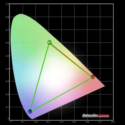
Colour gamut 'sRGB'
Colour in games and movies
Viewing angles
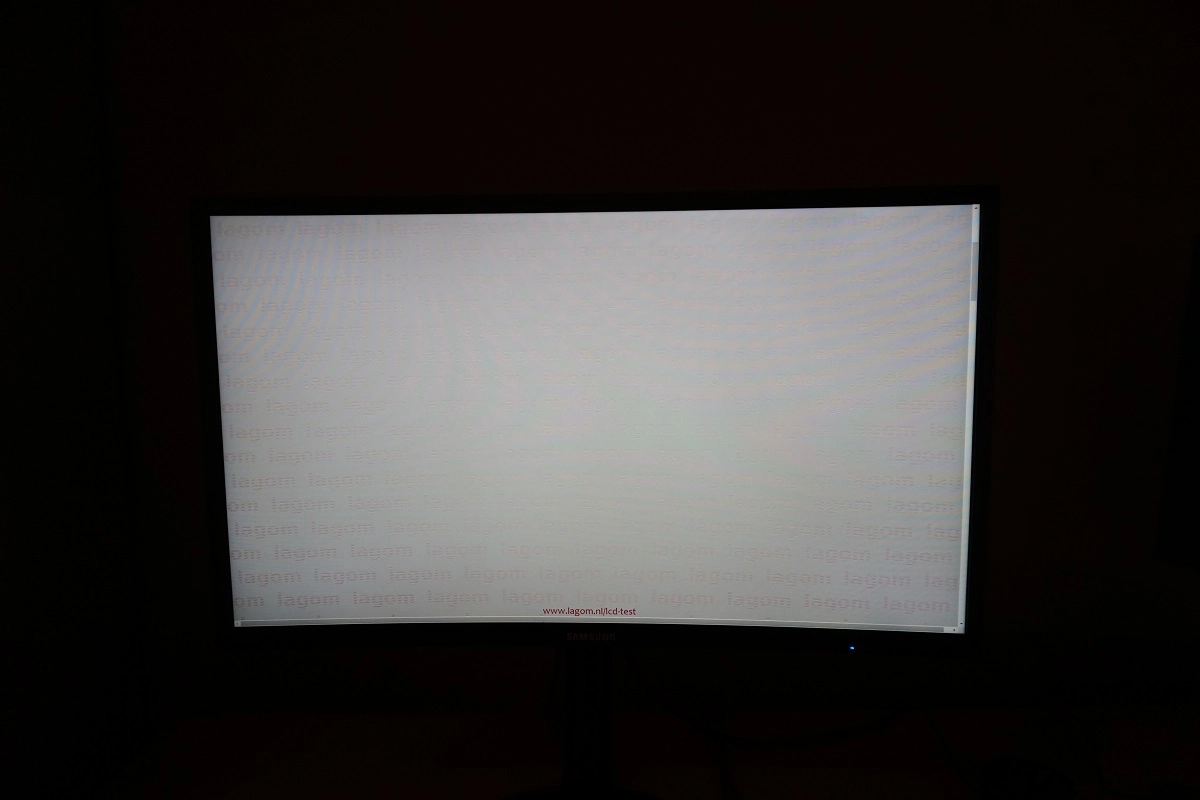
The video below shows this text test, a mixed desktop background and dark desktop background from a variety of viewing angles. Note the ‘VA glow’ mentioned previously, which appears to bloom out a bit off angle. It does not do this to anywhere near the same extent that ‘IPS glow’ would.
Responsiveness
Input lag
Perceived blur (pursuit photography)
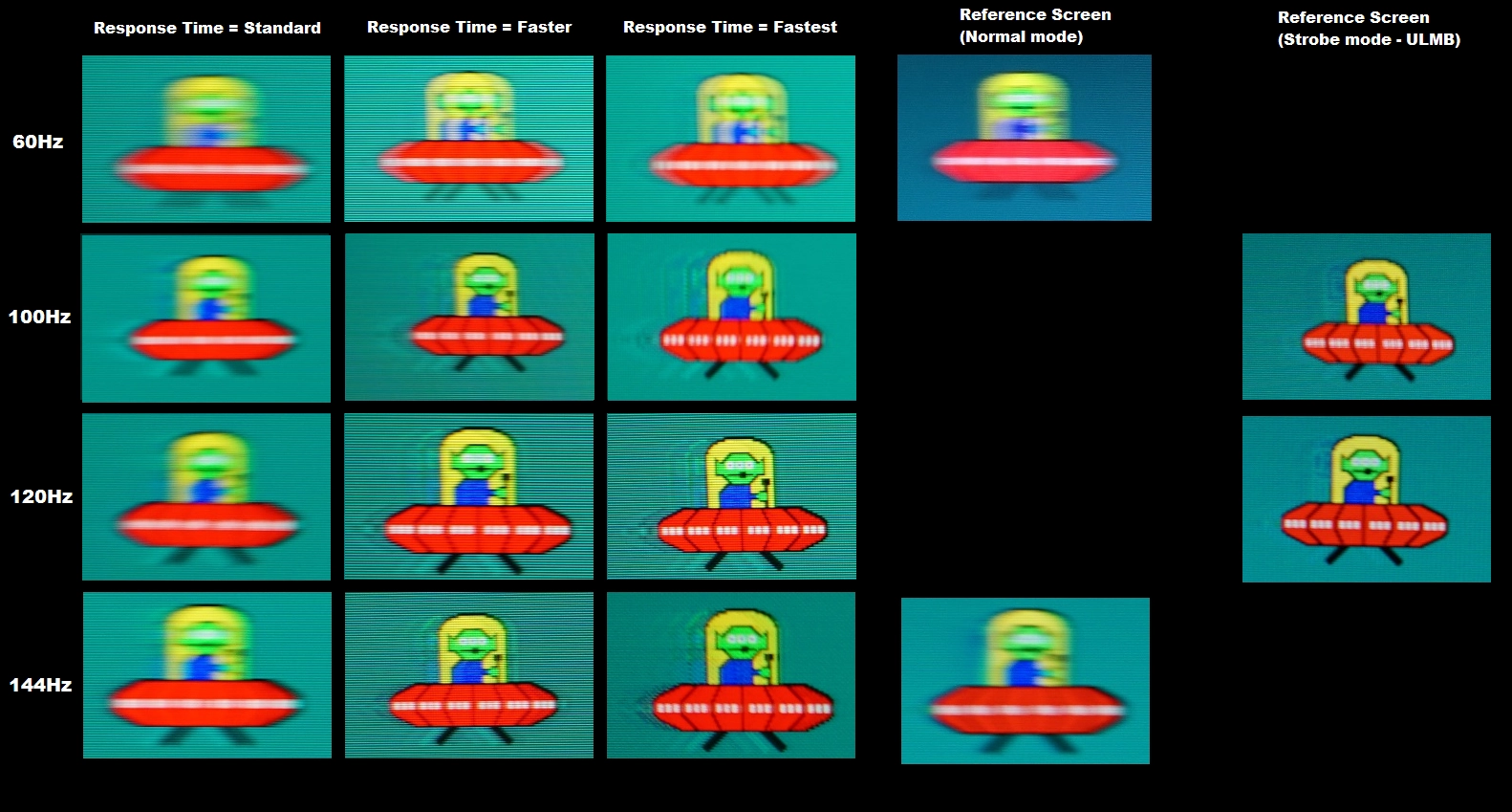
At 60Hz, with ‘Response Time’ set to ‘Standard’, the UFO appears soft and blurry. This is due to perceived blur from eye movement. There is just a slight fringe of inverse ghosting (overshoot) – a bright trail behind the object, to the left on the image – which isn’t visible on the reference screen. Overall this is very close to the reference shot for these pixel transitions, though. With the ‘Faster’ and ‘Fastest’ setting the strobe backlight mode activates, something which is explored a little later. Unfortunately, the strobe is poorly synchronised with the 60Hz refresh rate and therefore the monitor is essentially unusable with this feature at 60Hz. You can see that the object is displayed multiple times, which is really not a pleasant or practical viewing experience and not an attractive alternative to the ‘Standard’ setting.
Interlace pattern artifacts
Responsiveness in games and movies
FreeSync – the technology and activating it
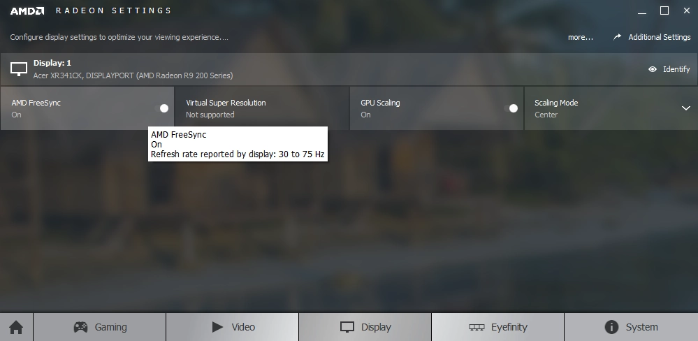
FreeSync – the experience
Impulsive Scanning (strobe backlight)
The curve
Conclusion
Positives Negatives Excellent out of the box setup with vivid and varied shade representation – the QD technology provided a generous colour gamut without entering true wide gamut territory. The sRGB emulation mode is also excellent
Some loss of saturation towards edges and bottom of screen – but a relatively minor amount for a VA panel of the size
Good static contrast over a range of settings, including with the ‘Warm2’ Low Blue Light setting active which provided good depth to dark shades. The screen surface was light and free from obtrusive graininess, helping brighter shades appear relatively smooth Minor ‘black crush’, but a level of detail maintained throughout the screen that puts non-VA panels and in fact many VA panels to shame Impressively strong pixel responsiveness overall and very low input lag made good use of the 144Hz refresh rate. An effective strobe backlight mode and FreeSync capability also features whilst strong 60Hz pixel responsiveness is good for console gamers
Some overshoot, particularly noticeable at or around 100Hz. This plus some flickering on the desktop with FreeSync active made for a less than stellar implementation of the technology
The curve added to the experience in a subtle way, without being unusual or difficult to adapt to. The stand offered good ergonomic flexibility and the OSD was nicely laid out with a good range of features
Somewhat redundant ‘dish’ stand base and quite some depth to the monitor due to the hinged stand neck design. The ‘Arena Lighting’ feature was gimmicky and incomplete (no static ‘always on’ option) and the monitor is quite expensive for a Full HD model currently
