Author: Adam Simmons
Date published: April 6th 2016
Table of Contents
Introduction
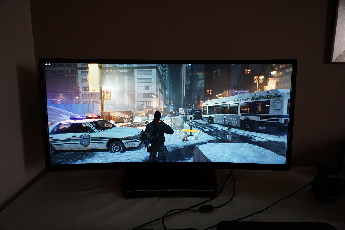
The BenQ XR3501 was the first monitor to offer the rather unconventional combination of steeply curved 35” VA panel, 144Hz refresh rate and 2560 x 1080 resolution. It was and still remains quite a controversial combination given the much higher pixel density offered by many displays now on the market. It was also criticised for its high price and lack of any sort of variable refresh rate technology. The Acer Z35 addressed some of these criticisms with the inclusion of Nvidia G-SYNC. It also added support for up to 200Hz, although that doesn’t come without a negative impact on image quality. The AOC C3583FQ combines this 35” VA panel with Adaptive-Sync (and hence support for AMD FreeSync), whilst also supporting up to 160Hz and coming in at a significantly lower price than the aforementioned competing models. We put this monitor through our usual set of tests to see how it all plays out in practice.
Specifications
The monitor uses a 35” VA (Vertical Alignment) panel with support for a 160Hz refresh rate. A typical contrast ratio of 2000:1 is specified alongside a fairly steep curve to the screen of 2000R. True 8-bit colour is supported without dithering and a 4ms grey to grey response time is specified. This specified response time should, as always, be approached with caution. Some of the key ‘talking points’ of this monitor have been highlighted in blue below for your reading convenience.
Features and aesthetics
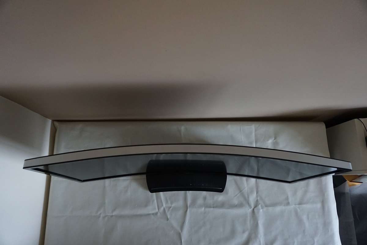
From the front you can see that the most striking aspect of the monitor is its physical presence; with a large panoramic 21:9 screen. You will also notice the fact that it is curved, an aspect which is perhaps easiest to show photographically from a top-down perspective as in the third image below. The bezels are reasonably slender with a glossy black plastic finish – ~19mm (0.75 inches) at the top and sides and ~23mm (0.91 inches). This includes a sliver of panel border – this is not a ‘dual-stage’ design, so the hard bezel actually covers virtually all of the panel border and this aspect therefore appears similar whether the monitor is on or off. The screen surface is fairly light matte anti-glare as explored later.
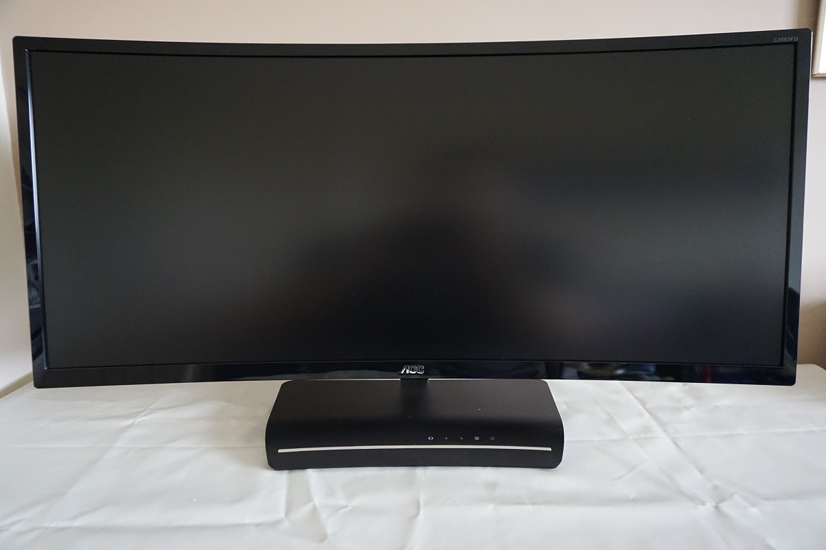
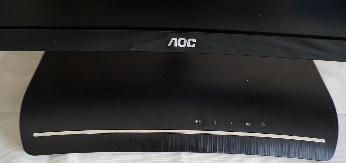
You may also notice the quite interesting stand base (above), which uses black plastic with a brushed texture underneath a layer of transparent glossy plastic varnish. This base is actually an integral part of the monitor and can’t simply be removed. It houses many of the monitor’s electronics and also the OSD (On Screen Display) controls, which face upwards to the right of centre. These are touch-sensitive and rather responsive. There is also a small power LED below and to the left of these buttons, on the silver-coloured strip. This glows a fairly dim and unobtrusive blue when the monitor is switched on and orange when the monitor stops receiving a signal from the computer. The video below runs through the functionality of this OSD menu system.
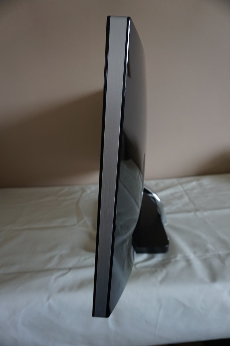
From the side the monitor appears quite rounded. You can see the side of the screen has a silver plastic surround, sandwiched between two layers of glossy black plastic (as used for the front and rear of the screen). You can also see the curvaceous stand neck from this angle. The screen itself is reasonably slender – ~28mm (1.10 inches) at thinnest point, bulking out a bit more in places. The stand only offers tilt (3º forwards, 15º backwards) with no further ergonomic flexibility – and as noted earlier is a permanent feature of the monitor and can’t simply be removed or replaced. The bottom of the screen clears the desk by 76.2mm (3.00 inches) with the top ~460mm (18.11 inches) above the desk surface. This means that the screen sits quite low to the desk and can’t be adjusted, which could be less than ideal depending on user height and desk height.
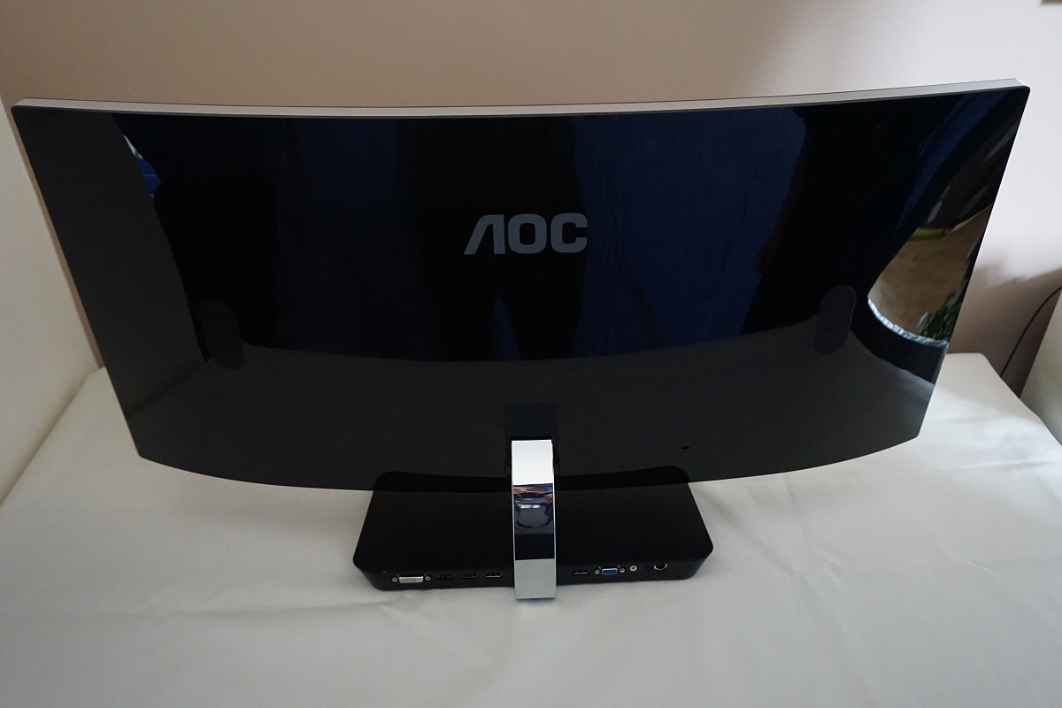
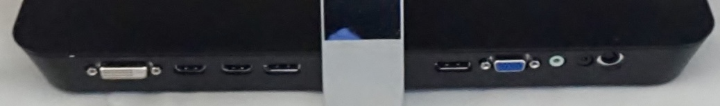
The rear of the screen is dominated by glossy black plastic, with a glossy chrome-coloured plastic used for the stand neck. There are 5W stereo speakers, rear facing with grills visible. These provided quite reasonable sound output with plenty of volume and a more bass-rich ‘punchiness’ than many integrated speakers. The clarity of treble and mid-tones wasn’t as good as it could be, though, with mild distortion even at low volumes. Certainly usable, but don’t expect these to replace a decent standalone speaker or headphone set if you’re interested in high-quality audio. There are of course no VESA holes, unsurprising given what has been said about the integrated stand design. The ports are rear-facing on the stand base either side of the stand neck; DVI-D, 2 HDMI 1.4 ports (with MHL), 2 DP 1.2a ports (supports VESA Adaptive-Sync), VGA, 3.5mm line-in, 3.5mm headphone jack and DC power input (external power brick).
The full capabilities of the monitor, including the full refresh rate at native resolution and the use of AMD FreeSync on a compatible GPU requires DisplayPort to be used. HDMI does not support FreeSync nor any higher than 2560 x 1080 @60Hz on this model and is there for compatibility with other devices such as games consoles. A VGA cable, HDMI cable, DP cable and 3.5mm audio cable is included in the box alongside power adaptor and cabling.
Calibration
Subpixel layout and screen surface
A fairly light matte anti-glare screen surface is used on the monitor. This offers superior clarity and vibrancy to some matte screen surfaces, but is not as light as the surface used on the 34” 3440 x 1440 models. Good glare-handling characteristics are maintained and the surface texture itself is relatively smooth, free from obvious graininess even when viewing light content.
![]()
The subpixel layout is RGB (Red, Green and Blue) strip, which is the default layout expected by modern operating systems such as Microsoft Windows and Apple’s MacOS. This means that MacOS users don’t need to worry about text fringing issues from less common subpixel layouts and Windows users needn’t worry about adjusting ClearType settings. Windows users may still wish to run through the ClearType wizard to fine-tune according to preferences, though.
Testing the presets
The monitor has a few ‘presets’, although none of these achieve something that can’t be achieved by manual tweaking in the OSD. There are various ‘Eco Mode’ settings, but these simply set the brightness to various predefined valued. There are also a range of ‘GameMode’ settings which you can cycle through by pressing the left arrow before entering the OSD. These are explored a bit in the video earlier in the review, they include; ‘FPS’, ‘RTS’, ‘Racing’, ‘Gamer1’ and ‘Gamer2’. They make various adjustments to the OSD, which could be achieved manually. They also lock off access to key settings – they all grey out the ‘Color Setup’ menu, but bizarrely whatever settings you’re using here before activating the ‘GameMode’ are taken into account anyway and will therefore have a significant impact on the image. The ‘FPS’, ‘RTS’ and ‘Racing’ presets also lock off the ‘Luminance’ menu and force you to use full brightness, which is uncomfortable to say the least.
More useful are manual adjustments, for which there are a range of settings that can be adjusted according to user taste such as ‘Gamma’ and ‘Color Temp.’ In the table below we test a range of settings on the monitor, provide some readings (gamma and white point) using a DataColor Spyder5ELITE colorimeter and also share our general observations on the image. The monitor was kept in its ‘Plug and Play’ state, without additional drivers and ICC profiles loaded, connected to a Windows 10 system. DP 1.2 was used to connect it to a Club3D Radeon R9 290 royalAce FreeSync-compatible GPU, with the monitor running for over 2 hours before readings were taken. We also briefly tested using an Nvidia GPU and noted similar image characteristics.
Unless otherwise stated, assume that settings were left at default with the exception of 160Hz being used. The refresh rate did not noticeably or quantifiably affect the static image quality of the monitor. Also note that if you manually adjust the colour channels by setting ‘Color Temp.’ to ‘User’ and making changes, these will not be reset even if you perform a factory reset of the monitor. The neutral position for each colour channel is ‘50’ – so for the purposes of the table below, assume ‘50’ was used for each colour channel when testing the ‘User’ setting.
| Monitor Settings | Gamma (central average) | White point (kelvins) | Notes |
| Gamma1 (Factory Defaults) | 2.3 | 6246K | The image is very bright but quite well-balanced overall with good depth and richness. The gamma tracking is such that there is a little bit of extra depth to some shades, although this is counteracted somewhat by the weakening peripheral saturation. This weakening saturation towards the edges and bottom of the screen is typical for a VA panel, even from a normal viewing position when they’re large screens, and is related to viewing angle restrictions. |
| Gamma2 | 2.0 | 6203K | As ‘Gamma1’ a noticeable lack of saturation and inappropriate richness overall. |
| Gamma3 | 2.6 | 6302K | As ‘Gamma1’ but considerable extra depth due to gamma tracking. This is completely excessive and gives significant crushing of dark shades so that they become completely indistinct. |
| Color Temp. Normal | 2.3 | 7432K | This is again bright with decent gamma tracking, as per factory defaults, but the image also has an extreme cool tint (blue bias). |
| Color Temp. sRGB | 2.1 | 6533K | Some shades look a bit undersaturated, but the image is quite well balanced aside from that. The brightness is very high, though, and can’t be adjusted as control of this and other adjustments such as contrast and gamma is locked off. |
| Color Temp. User | 2.3 | 6077K | Similar to the factory defaults but a bit of a warmer tint to the image. |
| Test Settings (see below) | 2.2 | 6502K | As factory defaults with a much more comfortable brightness level and a white point that is better balanced for the 6500K target. |
| Relaxing evening viewing (see below) | 2.3 | 4940K | This is the equivalent of a Low Blue Light (LBL) setting, with a significant reduction in the blue colour channel translating to a warmer image and a reduction in blue light emitted from the monitor. The image appears warm and relaxing to our eyes, preferred to more stimulating settings with a higher white point when it’s time to relax and unwind. |
Out of the box, the monitor was very bright but quite well balanced overall. Shades appeared rich and varied overall, with the viewing angle restrictions of the VA panel causing a fair bit of saturation loss towards the edges and bottom of the screen. Gamma measured centrally was 2.3 (below), with a little bit of a droop in the curve in places. This made some shades appear just slightly deeper than they should centrally but also counteracted some of the saturation loss peripherally as well. Overall things appeared well-balanced, as mentioned earlier, so given the intended uses for the monitor the setup was quite good really. The default ‘Warm’ preset provided an image that was only slightly warm, whereas ‘Normal’ provided an excessive blue tint that is far from normal. There is no ‘Low Blue Light’ (LBL) or equivalent setting on the monitor, so we improvised with some ‘Relaxing evening viewing’ settings that are mentioned in the table and explored a bit later. These essentially act as an LBL setting by doing what many settings of that nature do anyway – reducing the strength of the blue colour channel and therefore lowering the white point and cutting out blue light emission from the screen. For our ‘Test Settings’ we made manual adjustments to the colour channels (with ‘Color Temp.’ set to ‘User’) and significantly reduced brightness. We also nudged the refresh rate up to 160Hz and set ‘Overdrive’ to ‘Medium’ – these changes had no impact on the static image quality but are included just for reference. Any setting not mentioned below was left at default. Brightness= 38 (according to preferences and lighting) Overdrive= Medium Color Temp= User R= 45 G= 45 B= 50 Refresh rate= 160Hz As mentioned earlier we created a setting for ‘Relaxing evening viewing’ with a significantly less intense blue colour channel and warmer look to the image. For the sake of simplicity, the reduction to the blue colour channel was the only change we made from the ‘Test Settings’, as it made it easier to switch between the two. This is just a suggestion and users might like to experiment with their own alternative settings for relaxing evening viewing. We used these settings for our own viewing pleasure later in the evening but not for any of our testing. Overdrive= Medium Color Temp= User R= 45 G= 45 B= 28 Refresh rate= 160Hz We used a Konica Minolta CS-200 luminance meter to measure the luminance of white and black using a range of monitor settings, from which static contrast ratios were calculated. The data is shown in the table below, with blue highlights indicating the results for our ‘Test Settings’ and ‘Relaxing evening viewing’ settings. Black highlights indicate the highest white luminance, lowest black luminance and highest contrast ratio recorded. Assume any setting not mentioned here was left at default, with the exceptions already covered in the calibration section.

Gamma test settings
Test Settings
Relaxing evening viewing
Brightness= 38 (according to preferences and lighting)
Contrast and brightness
Contrast ratios
Monitor Settings White luminance (cd/m²) Black luminance (cd/m²) Contrast ratio (x:1) 100% brightness 360 0.17 2118 80% brightness 299 0.14 2136 60% brightness 233 0.11 2118 40% brightness 170 0.08 2125 20% brightness 110 0.05 2200 0% brightness 46 0.02 2300 Factory defaults (90% brightness) 282 0.13 2169 Gamma2 332 0.15 221 Gamma3 321 0.16 2006 Color Temp. Normal 282 0.17 1659 Color Temp. sRGB 255 0.21 1214 Color Temp. User 315 0.15 2194 Test Settings 160 0.08 2000 Relaxing evening viewing 154 0.08 1925
The average static contrast with brightness only adjusted was 2176:1, which is comfortably within ‘VA only’ territory (for LCDs). Although it’s quite close to the 2000:1 specified, so you can’t really grumble, the measured contrast on our Z35 sample (using the same panel) exceeded this by some margin. It’s possibly something to do with variability between individual panels or something else in the monitor itself, but we still consider the contrast on the C3583Q to be quite strong. Interestingly the contrast was not really elevated by using the ‘User’ setting and having all channels in their neutral ‘50’ position, but by the same token it didn’t drop much when the blue channel was altered. It remained at a strong 1925:1 for our ‘Relaxing evening viewing’ settings where the blue channel was dropped significantly. For the minor adjustments made to the other colour channels, as per our ‘Test Settings’, contrast was measured at 2000:1. The highest white luminance recorded on the table was 360 cd/m² and the lowest white luminance was 46 cd/m², providing a strong 314 cd/m² luminance adjustment range with plenty of useful values.
The monitor includes a Dynamic Contrast setting called ‘DCR’ (Dynamic Contrast Ratio), which allows the backlight to brighten or dim according to the overall levels of light or dark on the screen. The backlight is, as usual, controlled as a single unit so the monitor can’t account for intricate mixtures of bright and dark with this setting. An interesting (and useful) quirk to this setting is that the brightness level you set before enabling the setting has an influence on how bright the monitor will go with the ‘DCR’ mode active. The brightness control is greyed out once the setting is active, so you have to make this change prior to activating the mode. The backlight in this mode changes its intensity at a moderate pace, dimming quite effectively for predominantly dark content. It also becomes relatively bright for lighter content, but again this can be restricted by choosing a lower brightness setting before activation. Although we are not fans of Dynamic Contrast at the best of times, this is quite a good implementation.
PWM (Pulse Width Modulation)
The monitor uses DC (Direct Current) to dim the backlight and does not use PWM (Pulse Width Modulation) at any brightness setting. The backlight is therefore classed as ‘flicker-free’, as advertised, which will please users sensitive to flickering or the effects of PWM.
Luminance uniformity
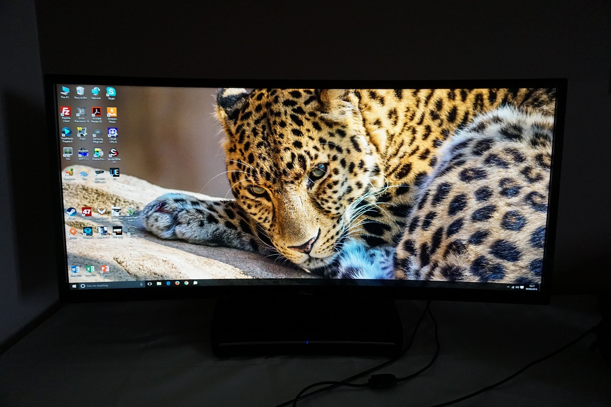
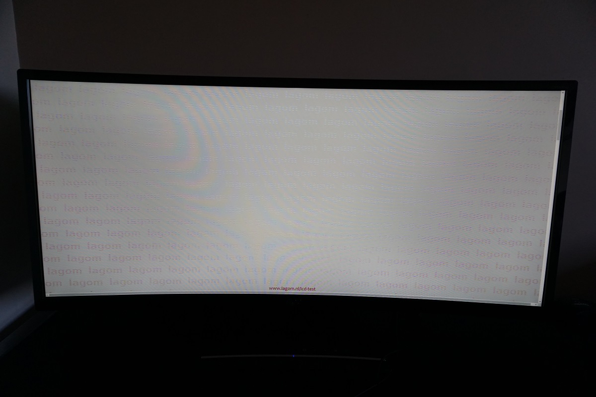
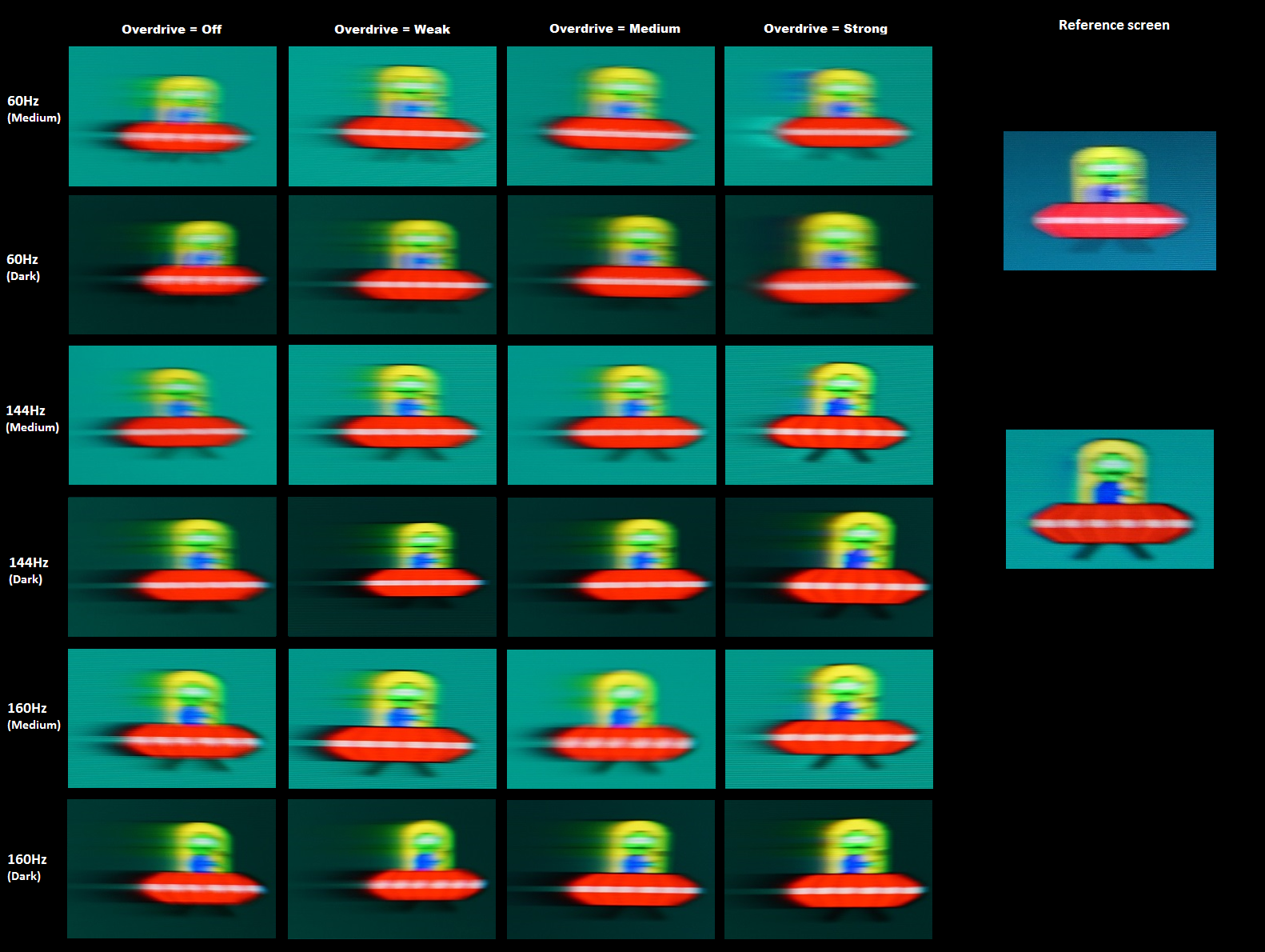
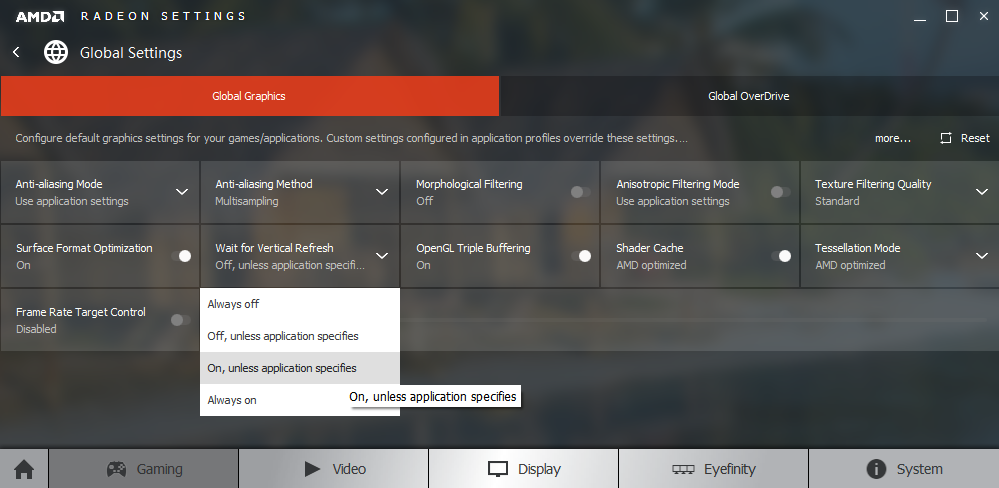
Whilst observing a black screen in a dark room we observed a no noticeable backlight bleed. The image below shows this, with the photo taken a few metres back from the screen to eliminate ‘VA glow’. This glow (not shown in the image below) is very subtle compared to ‘IPS glow’ and appears as a slightly purple-grey or golden-grey sheen depending on viewing angle. It’s present towards the bottom corners of the screen in particular from a normal viewing position, but it’s very faint indeed. It blooms out a bit more from various angles as shown in the viewing angles video later on in the review. The luminance uniformity was poor overall. The maximum luminance was recorded at ‘quadrant 9’ below the central region (164.1 cd/m²). The greatest deviation from this occurred at ‘quadrant 4’ to the left of centre (122.8 cd/m², which is 25% dimmer). 3 of the remaining 7 quadrants were also significantly dimmer than centre (21% – 25% deviation). The other 4 quadrants showed 6 – 13% deviation from the brightest point which is pretty decent. It’s important to note that individual units can vary when it comes to uniformity and also that you can expect further deviation beyond the points measured. Interestingly, though, this problematic uniformity corresponded quite closely with what we observed on the Acer Z35 we tested as well. Below you will find a contour map, for those who prefer a graphical representation of these results. Darker greys here indicate lower luminance and hence greater deviation from the brightest point than lighter greys. The percentage deviation between each quadrant and the brightest point recorded is also given. The Spyder5ELITE was also used to analyse variation in the colour temperature (white point) of the same 9 quadrants. The contour map below shows this, with deviation between each quadrant and the point closest to 6500K (D65) provided. Deviations are represented as DeltaE values, where a DeltaE value of >3 represents significant deviation that most users would notice quite readily by eye. Lighter colours on this map represent lower DeltaE values than darker colours and hence lower deviation from 6500K. The results here were quite good without any significant deviation measured – although the bottom right is borderline, with a DeltaE of 3. As above, individual units can vary when it comes to uniformity and there may also be further deviation beyond the measured points. It’s also worth noting that the viewing angle weaknesses of this panel lead to some perceived shifts in colour temperature that aren’t reflected by such measured values. On Battlefield 4 (BF4) the contrast performance was pleasing. Dark shades including black and near-black shades appeared quite deep; not to the extent that we’ve seen on some VA models, but certainly above what other LCD panel types can display. This helped give definition to shadows, cracks in rocks, vegetation structure etc. Bright elements contrasted very nicely with this, standing out nicely in darker surroundings. They also appeared fairly smooth without obvious graininess from the screen surface. As is usual for a VA model there was a bit of ‘black crush’ whereby near-black shades appear to blend into black rather than appearing distinct. This only affected fairly minor details and was only apparent in a fairly small section towards the centre of the screen – it didn’t affect the overall game atmosphere and most darker shades were visible regardless. On Dirt Rally the contrast was quite strong. The night stages highlighted this nicely, with a good dark atmosphere maintained throughout the screen. There was a small amount of glow towards the edges of the screen, but this was subtle and in a different league to ‘IPS glow’. Bright elements contrasted well with these darker surroundings. Fireworks in the sky, car headlights and other artificial light sources around the track had a good ‘pop’ to them and appeared quite smooth without obvious graininess from the screen surface. There was again a little ‘black crush’ in places, but detail levels were still strong overall. Tyre tread patterns were less distinct towards the middle of the screen compared to peripheral regions due to this, but was still faintly visible even centrally. Unfortunately, we were unable to test our usual Blu-ray for this section, Skyfall, due to the disc not being read. We will get this replaced with another title for future reviews (apologies to our contrast-loving film fans). Lagom’s contrast tests were used analyse specific strengths and weaknesses in contrast performance. The following observations were made. The colour gamut of the C3583FQ (red triangle) is compared with the sRGB colour space (green triangle) in the image below. You can see from this representation of the gamut that the monitor offers full sRGB coverage (100%) with a bit of extension beyond this. This extension provides a bit of extra vibrancy to the image without the sort of obvious oversaturation potentially brought about by wide gamut models. On BF4 colours appeared rich and natural overall, with a good variety of earthy brown and green shades. There was a bit of saturation lost lower down the screen and at the sides, as expected due to the VA panel and its gamma handling, but things were on the vivid rather than ‘washed out’ end of the spectrum overall. There were some quite strikingly vivid shades in places as well, such as roaring orange flames, red neon lights and the bright blue of the engineer’s repair tool. These elements stood out nicely in darker surroundings thanks to the strong contrast performance of the monitor, too. Dirt Rally also showcased a rich variety of colours, with pleasing depth overall. The main focal area of the screen (more central regions) benefited from a good vibrant look with some pleasingly lush greens, rich earthy browns and a good range of more muted green and brown shades. These shades did lose saturation towards the bottom and flanks of the screen, with what should be rich earth appearing a bit more of a clay-like colour. This isn’t something most users would likely notice, especially given that these regions of the screen are generally observed using peripheral vision anyway. The car liveries are also worth mentioning for their lively look overall – some really nice vivid oranges and pinks there, amongst others. Where brighter shades such as these were set against much darker background colours, including black, they really had a nice ‘pop’ to them. We also tested the Blu-ray of Futurama: Into the Wild Green Yonder. This is an excellent test for colour consistency due to there being large areas of various individual shades on screen at once. This title again highlighted the weakening saturation towards the edges and bottom of the screen, which is typical for VA panels. One of the key characters on this film, a lobster-like monster called Dr Zoidberg, looked an appropriate red centrally whereas when he was displayed towards the bottom or far edges of the screen looked overly pale. The overall richness and depth to shades was good, though. There was also a decent variety of pastel shades displayed, despite this being reduced slightly by the aforementioned inconsistencies in saturation. There were also some impressive bright ‘neon’ shades such as green, yellow and pink which stood out particularly nicely against darker backgrounds. Lagom’s tests for viewing angle tests were used to analyse colour consistency and viewing angle performance in a more specific way. The following observations were made from a normal viewing position, 70-80cm from the screen. A small utility called SMTT 2.0 was used alongside a very sensitive camera to analyse the latency of the C3583FQ. To ensure good levels of accuracy, we took 30 repeat readings using a range of monitors of known latency to compare. Using this method, we calculated 5.88ms (under 1 frame at 160Hz) of input lag. This value is influenced both by the element you ‘see’ (pixel responsiveness) and the element you ‘feel’ (signal delay). It indicates a low signal delay which contributes to the ‘connected feel’ of the monitor, as we explore later. In this article we explore the key factors that affect the responsiveness of a monitor, chief amongst which is the concept of ‘perceived blur’. The movement of your own eyes as you track motion on the screen is actually the most significant contributor to this, whilst the pixel responsiveness of the monitor generally plays a more minor role. How minor this role is does of course vary between different models, with VA panels such as this one generally held back most in this regard. Both constituents of ‘perceived blur’ can be captured by using a photography method explored in the article called ‘pursuit photography’, which uses a moving camera to simulate eye movement whilst also reflecting the pixel transitions of the monitor. The following images are pursuit photographs taken using the UFO Motion Test for ghosting. The test is set to run at 960 pixels per second, a practical speed for taking such photos. The monitor is set to various refresh rates (60Hz, 144Hz and 160Hz) with its ‘Overdrive’ setting at all possible positions; ‘Off’, ‘Weak’, ‘Medium’ and ‘Strong’. The middle row of the test (medium cyan background) and top row (dark cyan background) are both used to demonstrate the influence that the grey level of the shade can have on pixel transition speed. The final column in the image shows some reference shots. The first of these is a Samsung S27A750D set to 60Hz, full brightness (eliminates PWM) and using its optimal response time setting. The second reference shot is taken from a Dell S2716DG running at 144Hz, using its optimal response time setting. Both images show what things look like at a given refresh rate where pixel responsiveness isn’t a limiting factor, save for a little overshoot (inverse ghosting) on the Dell. At 60Hz, shown in the top two rows, there is a significant amount of blur. The object itself (UFO) appears soft, blurred and relatively wide due to limitations in refresh rate and hence greater perceived blur from eye movement. There is also a fairly bold trail behind the object itself (the UFOs move from left to right on the screen) from sluggish pixel responses. The trailing is more pronounced for the dark background, as the pixel responses are slower here. There’s also obvious overshoot due to excessive voltage surges to speed up pixel transitions using the ‘Strong’ setting. This manifests itself as an obvious bright trail for the medium cyan background and a dirty trail behind the UFO cockpit in particular for the dark cyan background. At 144Hz there is a significant decrease in the perceived blur that would be attributed to eye movement, with the object itself appearing sharper and narrower. There is quite a bold and extended trailing behind the objects as well, which is weakest using the ‘Strong’ setting and strongest using the ‘Off’ setting for ‘Overdrive’. There is also a bit of overshoot (a slightly dirty trail) when using the ‘Strong’ setting. The trailing is very pronounced with the dark background and here the overdrive doesn’t seem to make much difference for these transitions. The extent of trailing in all respective settings is greater than at 60Hz, which reflects the fact that the pixel responses simply can’t keep pace with the 6.94ms delay between frames here. The 160Hz setting doesn’t really make any significant changes here, which is perhaps unsurprising given that you’re only getting an extra 16Hz. The delay between frames is now cut to 6.25ms, so the pixel responsiveness certainly can’t ‘keep up’, so to speak. From this analysis it would be fair to assume that setting the monitor to 160Hz and using the ‘Strong’ setting is optimal. In practice, though, there is obvious overshoot for some of the transitions that are not used here. The light background of this test (bottom row) actually highlights this to a degree as you can see from the image below. This can be seen at any refresh rate, although the image below was taken at 160Hz. In games this sort of overshoot and even more obvious examples are rather widespread and as such we found the ‘Medium’ setting to be optimal, despite some pixel transitions being noticeably slower. We therefore used ‘Medium’ at 160Hz for our testing. It’s clear from the analysis above that the monitor struggles with its pixel responsiveness and can’t really make full use of the high refresh rates. That was also the case with the Acer Z35, a comparison we will be drawing upon a bit in the subjective analysis below. As we will also explore you do still feel the advantage of the higher refresh rates, where frame rate is also high. Under similar conditions there is still a reduction in overall perceived blur due to a reduction in eye movement, as can be seen in the images above where the object itself is narrower and sharper at 144Hz and 160Hz compared to 60Hz. We will not be including a section on ‘overclocking’ this monitor; setting the refresh rate more than a couple of Hz above 160Hz causes the screen to lose signal with an ‘input not support’ message, regardless of timings. On BF4 the monitor was able to bring a visual fluidity and level of felt responsiveness that is far beyond what any 60Hz LCD could deliver, especially where the frame rate kept pace with the 160Hz refresh rate. Interactions with the game world felt very smooth, with an excellent ‘connected feel’ that is much like you’d hope for from a high refresh rate model with low latency. The high frame and refresh rate combination also brought with it a significant reduction in perceived blur, which helped keep the game world more focused even during fast movements. There were definite weaknesses in pixel responsiveness on top of this, though, which gave rise to a ‘mask’ of blur on top. This was most noticeable where darker shades were involved, for example on some of the darker maps or for darker interior areas. Here there was an obvious ‘smeary’ quality to the trailing that was almost dizzying in places and had something of a ‘smoke-like’ quality to it. The monitor did fare better where lighter shades were involved, which was most of the time on this title. But even then there was a degree of trailing and hence additional blur on top of what you’d ideally see from a high refresh rate monitor. We’d been quite used to the Dell S2716DG, used extensively both prior to reviewing this model and alongside it. And the AOC was noticeably weaker in terms of trailing. Perhaps a fairer comparison, though, would be with the Acer Z35. The AOC uses weaker pixel overdrive using its optimal ‘Medium’ setting compared to the Acer using its optimal setting. Even when comparing the Acer at 120Hz or 144Hz where the overdrive is a little more relaxed, there is a higher degree of overshoot on the Acer but also a bit less trailing for some of these common mid-tone transitions. There was actually no obvious overshoot on the AOC, which was nice to see, unless you used the ‘Strong’ overdrive setting. As we noted earlier this introduced obvious overshoot, although it also cut down on some of the stronger conventional trailing in places. We would have ideally liked to have seen a balance for pixel responsiveness on the AOC that is some way between the ‘Medium’ and ‘Strong’ setting. Dirt Rally also benefited from the refresh rate in terms of the connected feel and reduction in perceived blur. The 160Hz refresh rate gave just a little benefit in this regard over 144Hz, but was certainly noticeably better than even the fastest 60Hz LCDs. There was again a fair degree of trailing in places for the ‘medium’ transitions that were common when racing during the daytime, even during fairly gentle cornering. This added a reasonably faint (but to sensitive users still noticeable) additional trail behind objects and hence an additional degree of blur. Where darker shades were involved, most notably when driving at night or in overcast conditions, there were some particularly leisurely pixel transitions that cropped up. This provided some smeary ‘smoke-like’ trails in places – although not measured with any sort of instrument other than our eyes, we’d say these could easily be over 10 times as slow as the specified 4ms grey to grey response time (i.e. 40ms+). There was again no obvious overshoot, just slight traces here and there that would easily escape notice. We also observed the responsiveness of the monitor when viewing some Blu-rays. Obviously you aren’t interacting with these, so the low latency isn’t of any benefit. And the fluidity of the motion is also restricted by the ~24fps at which the films run. There was actually a slight reduction in ‘juddering’ if you run the monitor at 144Hz instead of 160Hz, too, as 24fps divides evenly into 144Hz but not 160Hz. For the most part things looked as they would even on models with technically much faster pixel responsiveness. There were some weaknesses here in there with some of the darker shades, providing brief after-images in places. These were faint, not particularly widespread and not something we found distracting, however. AMD FreeSync is a variable refresh rate technology that is similar in its principles of operation to Nvidia G-SYNC. The refresh rate of the display is dynamically altered so that it matches, where possible, the frame rate of the content. Both of the articles linked to above explore why this is important, but on a basic level it prevents frame rate and refresh rate mismatches. Such mismatches cause stuttering (VSync on) or tearing and juddering (VSync off). Compare to running your games with VSync enabled, there is also a reduction in latency (not something we can accurately measure with our equipment, however). The use of FreeSync requires a compatible AMD GPU and also a monitor that makes use of ‘VESA Adaptive-Sync’, which is a capability integrated into some DP 1.2a and HDMI 1.4a port controllers. As Adaptive-Sync is an optional extension you’ll sometimes see ports that support it labelled as ‘DP 1.2a+’ or ‘HDMI 1.4a+’. The existing scaler and electronics of a monitor is used rather than a proprietary ‘G-SYNC board’ (or similar bit of technology), with the key advantage of this being that it reduces the cost to the manufacturer and hence the user. Unsurprisingly, the number of monitors supporting this technology is far greater than those that support G-SYNC. The AOC C3583FQ uses DP 1.2a with Adaptive-Sync support and therefore supports AMD FreeSync over DisplayPort. You need a compatible GPU (some current models are listed here – future AMD GPUs should also support this). Our test system uses the Club3D Radeon R9 290 royalAce, which is compatible with the technology. AMD’s recent drivers include Radeon Software Crimson, which makes activation of the technology very straightforward. It should be enabled automatically, but you can check its status by opening ‘AMD Radeon Settings’ and clicking on ‘Display’. You should then ensure that the first slider, ‘AMD FreeSync’, is set to ‘On’. If you hover over this, it will also report the variable refresh rate display supported by the display. Note that the image below is for a different monitor and is just used as an example here. VSync is configured in the ‘Gaming’ section of ‘Radeon Settings’, where it is referred to as ‘Wait for Vertical Refresh’. You can either configure this globally under ‘Global Settings’ or for each game individually. The default is ‘Off, unless application specifies’ which means that VSync will only be active if you enable it within the game itself, if there is such an option. Such an option does usually exist – it may be called ‘sync every frame’ or something along those lines rather than simply ‘VSync’. Most users will probably wish to enable VSync when using FreeSync to ensure that they don’t get any tearing. You’d therefore select either the third or final option in the list, shown in the image below. BF4 is by no means as demanding as some modern game titles, but frame rate fluctuations are still something of an inevitability on most systems. Using the settings we’re happy to use this was certainly the case, with the frame rate generally averaging around 100fps but very rapidly fluctuating between around 80 – 120fps a lot of the time. Without FreeSync active this provides a jarring experience, with obvious tearing with VSync disabled and a ‘juddering’ effect which was quite unpleasant. With VSync enabled there was obvious stuttering, providing a significant loss of ‘flow’ to the onscreen action. With FreeSync enabled these fluctuations were far more palatable. The side-effect of dropping from the maximum frame rate that’s useful to the monitor (160fps) and around 100fps was that there was an increase in perceived blur and bit of an increase in felt-latency. However; the monitor still felt nice and responsive and there was a definite reduction in perceived blur compared to lower frame rates such as 60fps. The absence of tearing or stuttering from the traditional frame rate and frame rate mismatches was something that to many users would be quite game-changing. For us, although it’s the case of ‘the higher the better’ as far as frame rate goes, the experience was simply much more enjoyable with FreeSync enabled. We also tested Tom Clancy’s The Division, which is quite a graphically demanding title. Using what we feel are fairly modest graphical settings, which allows the game to look pleasant without hammering the Radeon 290 too hard, the frame rate still remained relatively low given the optimal 160fps ceiling. Without FreeSync, stuttering (VSync on) or tearing and juddering (VSync off) was rife in these variable refresh rate environments. This title also seemed to have an issue with ‘Fullscreen’ not working when the game is first started up – it was obvious FreeSync wasn’t working when we entered the game. This was fixed by simply alt+tabbing out of the game and then going back in. Following this, FreeSync did its thing and made the experience flow much better without annoying interruptions from stuttering or tearing. The frame rate was generally around 40 – 80fps on The Division, which certainly lacked the ‘connected feel’ and perceived blur reduction of higher frame rates even with FreeSync. Sometimes the frame rate dropped further to under the 45fps hardware floor for FreeSync on the monitor itself. AMD’s LFC technology, which we mentioned earlier, kicked in to keep tearing and stuttering at bay and certainly seemed to work as intended. Given that the frame rates are so low at this point, though, the movements within the game world were far from fluid. There was a sort of juddering (as if textures ‘vibrated’ when moving) that persisted simply due to the low frame rate rather than anything else. Preferable to the stuttering or tearing you’d get without FreeSync, but reinforcing the fact that low frame rates are always going to be low frame rates. This article focuses on the 2560 x 1080 resolution on a 29” monitor and the 21:9 aspect ratio more generally. We’ve also taken a look at the 3440 x 1440 resolution on a 34” screen in this article, revisiting the 21:9 experience. The AOC C3583FQ combines the 2560 x 1080 resolution with a 35” screen size. It also brings with it quite a steep curve, at 2000R. As we’ve already shared our thoughts on this in the same section of our Acer Z35 review, a model which uses the same panel, we will not be repeating this. Instead we’d encourage users to look at the relevant section of that review. The analysis there not only looks at what the screen size, aspect ratio, resolution and curve bring to the table but also mentions interlaced interference patterns. These were present and manifested themselves in the same way on the AOC. There is also some talk of DSR (Dynamic Super Resolution), which Nvidia users can make use of. Obviously this model is more aimed at AMD GPU users, and their alternative technology (VSR – Virtual Super Resolution) does not currently support 21:9 resolutions. In-game implementations which achieve similar results, such as ‘resolution scale’ features, do still work. However; as noted in the Z35 review the advantages of using this sort of technology doesn’t really outweigh the disadvantages in our view. To round off this section we will simply leave some images of the C3583FQ in action – the images below are for illustrative purposes and are not a good representation of the actual image quality seen first-hand on the monitor. Any strange interference patterns on these images are moiré from the camera and were not observed on the monitor. Having reviewed the Acer Z35 not long before the AOC C3583FQ, we had a fair idea of what to expect from the 35” screen with its steep curve and 2560 x 1080 resolution. In that respect, the concave and panoramic screen helped provide an engrossing gaming experience. This added to the sense of depth when gaming. The overall image quality was, unsurprisingly, quite similar to the Acer overall. Out of the box the monitor was far too bright and a touch on the warm side compared to the 6500K daylight white point target. It was quite well-balanced in terms of gamma, with a bit of deviation from the often desired ‘2.2’ curve but nothing troubling at all for entertainment or general usage. Colours were rich overall, although saturation levels did weaken a bit towards the edge and bottom of the screen. Another limitation came from the 2560 x 1080 resolution being spread across a 35” screen – a fairly low pixel density, in other words. The detail and clarity when gaming and the desktop real-estate was certainly limited by this – something some users will dislike but others will find perfectly satisfactory. The real strength of VA panels, such as that used by the Z35, is contrast. In this respect the monitor did very well, exceeding the specified 2000:1 quite comfortably and coming closer to 3000:1 using a range of settings. The monitor was able to give dark scenes in games and movies a good atmosphere, whilst on the desktop text had a fairly bold and inky look. Bright elements in any application stood out nicely with darker surroundings as well. There was a degree of ‘black crush’ which hid some of the subtlest details from a normal viewing position, but no obtrusive immersion-breaking glow. Although not the lightest screen surface we’ve seen on an UltraWide monitor, the surface texture was still quite smooth and did not introduce obtrusive graininess to the image. The generous colour gamut, good gamma handling and overall panel characteristics also combined to give fairly rich colour output overall. There was some loss of saturation towards the side edges and further down the screen, though, which is expected given the panel type and size. The responsiveness of the monitor was a mixed affair really. To its credit, the monitor did support 160Hz as promised and did so without introducing any artifacts that weren’t present at lower refresh rates. When coupled with the low input lag of the screen, games certainly had a nice ‘connected feel’ when played at high frame rates. FreeSync also worked as one would hope, putting an end to stuttering and tearing from refresh rate and frame rate mismatches. Pixel responsiveness was quite weak, overall, even using the optimal ‘Overdrive’ setting. There was obvious trailing in places as a result of this, even if some pixel transitions were snappy enough to make decent use of the high refresh rate. In this respect we found things somewhat slower than on the Acer Z35 (also using its optimal overdrive setting), although if a user finds one of these monitors troublesome for this reason then they’d likely find the other troublesome as well. Still, it’s worth remembering that this is subjective and regardless of the less than optimal pixel responsiveness, the monitor does still bring plenty of benefits to the user with its 160Hz refresh rate and FreeSync support. When coupled with a large and engrossing screen and a significantly lower price than the competition, this might be just the gaming experience some users are after. The bottom line; a screen that delivers an engrossing and responsive-feeling gaming experience, but some definite weaknesses in pixel responsiveness.

The Spyder5ELITE was also used to assess the uniformity of lighter colours, or more specifically pure white. 9 equidistant white quadrants were spread out across the screen from top left to bottom right and analysed using the colorimeter. The following table provides the luminance recorded at each quadrant as well as the deviation between a given quadrant and the brightest point recorded.

Luminance uniformity table

Luminance uniformity map

Colour temperature uniformity map
Contrast in games and movies
Lagom contrast tests
Colour reproduction
Colour gamut

Colour gamut test settings
Colour in games and movies
Viewing angles
The video below shows the results of this test from a variety of viewing angles, alongside a mixed and dark desktop background. The final section of the video highlights the aforementioned ‘VA glow’ which blooms out slightly as viewing angle is altered.
Responsiveness
Input lag
Perceived blur (pursuit photography)

Overshoot with 'Strong' setting
Responsiveness in games and movies
FreeSync – the technology and activating it

The AOC supports a variable refresh rate range of 45 – 160Hz. Outside of this range, the GPU respects your selection of ‘VSync on’ or ‘VSync off’ in the graphics driver. With ‘VSync on’ the frame rate will not be allowed to rise above 160fps – VSync will activate at this point, imposing the usual latency penalty associated with it. With ‘VSync off’ the frame rate is allowed to climb above the refresh rate ceiling of the monitor (>160fps), although the frame rate will obviously not be able to match it (160Hz). A fairly recent AMD feature called LFC (Low Framerate Control) is supported as well, which means that the monitors refresh rate will stick to multiples of the frame rate where it falls below the 45Hz (45fps) floor of operation. If the game was running at 30fps, for example, the refresh rate would be 60Hz to keep tearing and stuttering in check. This feature is used regardless of VSync setting.
Two final things to note related to the technology. Firstly, the application must be running in fullscreen mode, not a window (borderless or otherwise). Secondly, this monitor does not provide any indication that FreeSync is actually active. There are no changes to the power LED colour, no additional lights and nothing on the OSD saying when it’s using FreeSync and when it isn’t. You’ll therefore just have to assume that if you’ve set everything up correctly, as above, that it will be working. Hopefully the difference it makes to the experience, due to its effect on tearing and stuttering, will be quite obvious to many anyway.
FreeSync – the experience
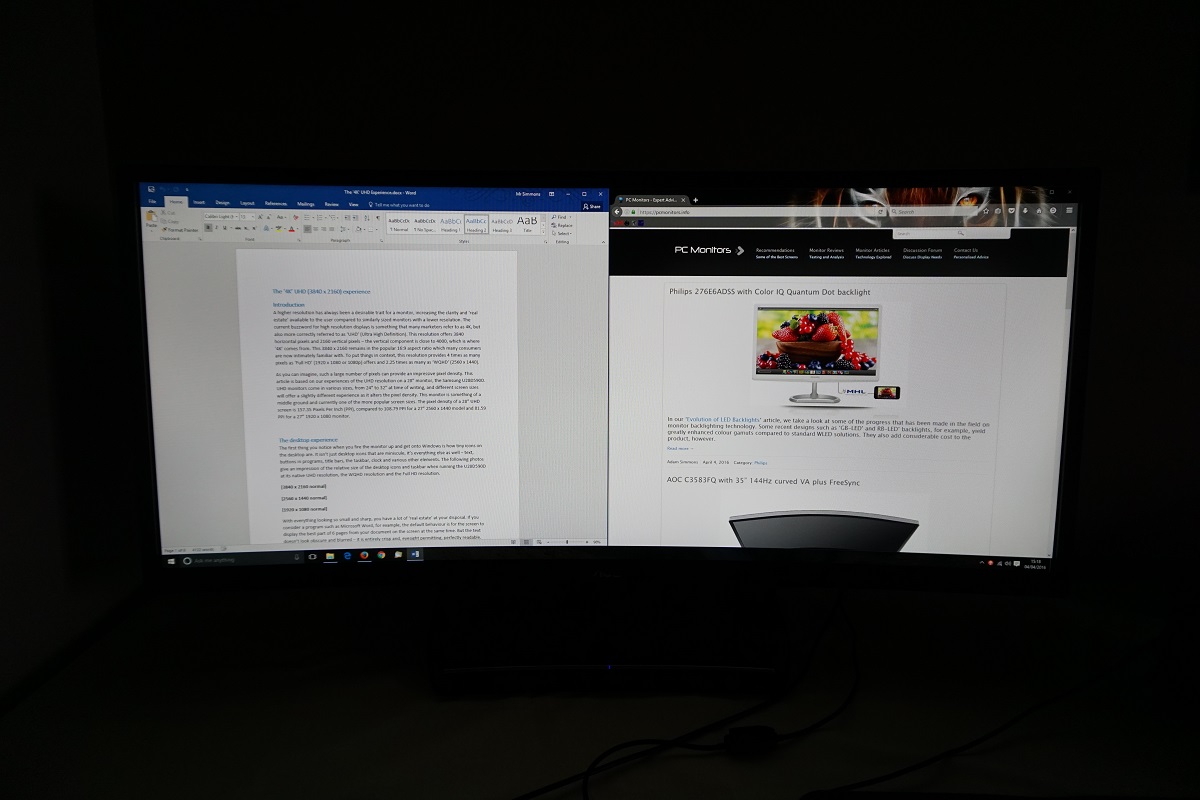
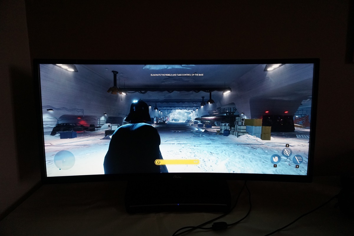
The 35″ 2560 x 1080 curved ‘UltraWide’ experience
Conclusion
Positives Negatives The decent out of the box setup, high-contrast VA panel and generous colour gamut provided a rich look to the image with some good vibrant elements
There was some saturation loss (lower richness) towards the side and bottom edges of the screen – amongst the viewing angle limitations expected from a large VA panel
Very good contrast hitting the specified 2000:1, a lack of ‘IPS glow’ and a fairly smooth screen surface free from obvious graininess Static contrast weaker than on the Z35 we reviewed (may be down to inter-unit variation) and some ‘black crush’ in places Input lag was very low and the 160Hz refresh rate worked without noticeable negative implications, delivering a very responsive feel to gaming. Adaptive-Sync (AMD FreeSync) support was also welcome and worked as it should
Some obvious weaknesses in pixel responsiveness, with obvious ‘smeary’ trails in places. The monitor also lacks a strobe backlight feature (G-SYNC alternatives feature ‘ULMB’ to help further minimise motion blur and cut out a lot of the smeary trailing)
The large curved screen provided an engrossing experience, helping draw the user into the game world. The price is quite a bit more attractive than competing models
The 2560 x 1080 resolution spread across a 35” screen is a bit limiting in terms of pixel density and overall pixel real-estate. The monitor lacks any ergonomic adjustability beyond tilt and does not support VESA mounting
![]()

