Author: Adam Simmons
Date published: September 25th 2020
Table of Contents
Introduction
For both work and pleasure, 27” WQHD (2560 x 1440) models with high refresh rate can be attractive propositions. There are models available using all three LCD panel type categories, with more emphasis recently on the VA and IPS-type panels. The ViewSonic XG270QC, of the ELITE series, takes the VA route with an emphasis on contrast. This is coupled with features such as a curved screen, Adaptive-Sync (including AMD FreeSync Premium Pro), 165Hz refresh rate and HDR support. We put this monitor through its paces to see how it performs in our usual suite or ‘real world’ tests.
Specifications
The monitor uses a 27” Samsung SVA (‘Super’ Vertical Alignment) with 1500R curve, or more specifically a Samsung CELL with custom backlight. A 165Hz refresh rate and 2560 x 1440 (WQHD) resolution is provided. True 8-bit colour is supported, whilst a 3ms grey to grey response time is specified. A 1ms MPRT (Moving Picture Response Time) is specified using the included strobe backlight setting. You should put very little weight on these specified response times, however. Some of the key ‘talking points’ for this monitor have been highlighted in blue below, for your reading convenience.
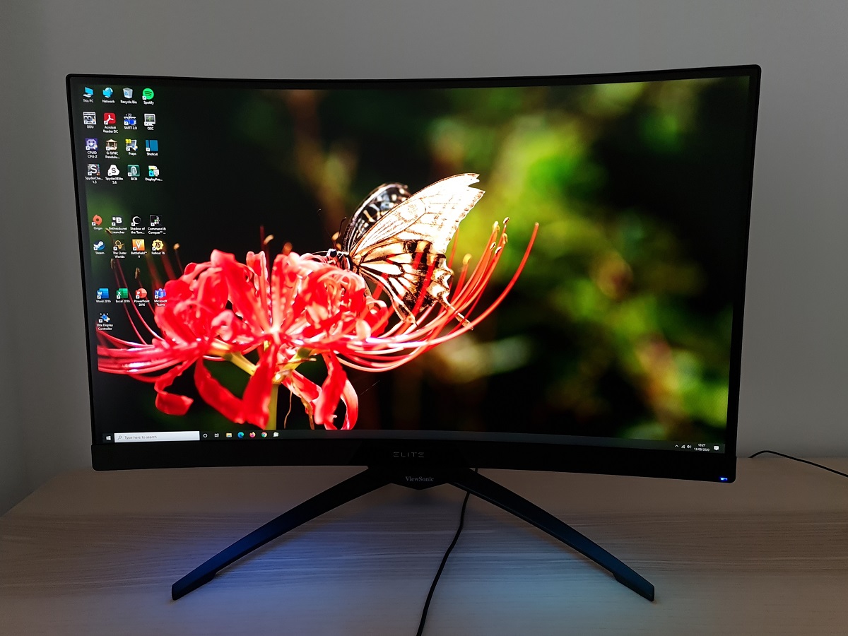
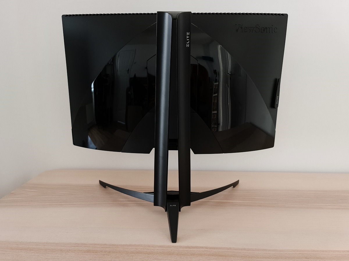
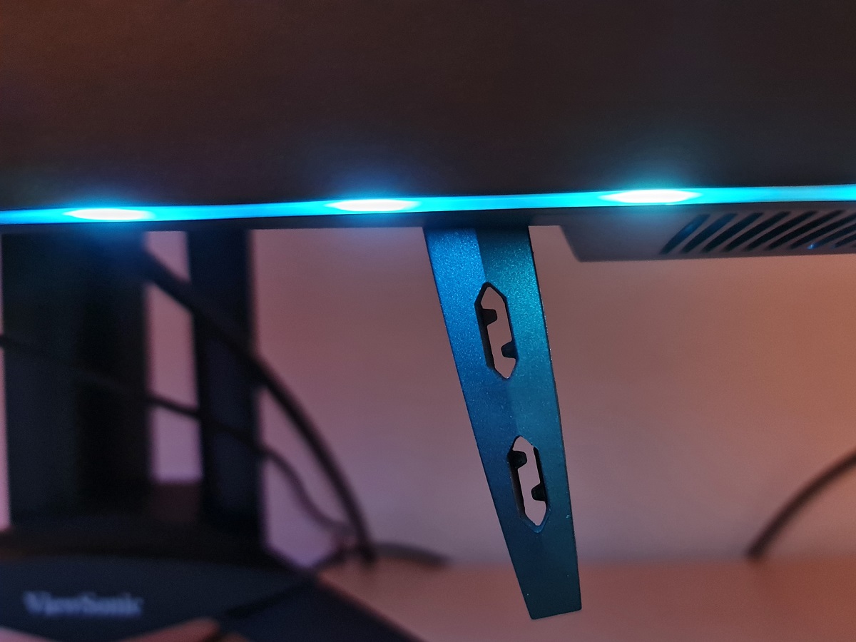
The monitor follows the ‘stealthy’ gamer aesthetic that the ELITE series is known for. Black is the shade of choice here, with a thick matte plastic bottom bezel with central glossy black plastic area containing a white ELITE logo. This bezel is ~26mm (1.02 inches) thick excluding the joystick used to control the OSD (On Screen Display). There’s a black powder-coated metal stand with a tripod design for the base with two curvy front feet and a central white ViewSonic logo. The underside of the bottom bezel includes two strips of 5 LEDs either side of the central ‘notch’, forming part of the ‘ELITE RGB’ lighting feature that’s explored shortly. The top and side bezels are dual stage, with a fairly slim panel border that’s flush with the rest of the screen and a slender hard plastic outer component. Including both components, the bezels are ~9mm (0.35 inches). Most of the frontal area is taken up by the screen itself, with a light matte anti-glare finish and 1500R curvature. Both aspects are explored deeper into the review. The OSD (On Screen Display) is controlled by a central joystick on the bottom bezel, facing downwards beneath the central ELITE logo. There’s a front-facing rectangular power LED towards the bottom right corner, glowing blue when the monitor is on and amber when it enters a low power state (signal to the system is lost). It can be disabled in the OSD, if preferred. The video below runs through the OSD and shows the ‘Elite Display Controller’ software that can be used to control this plus the ‘ELITE RGB’ lighting feature. The image below is a macro photograph taken on Notepad with ClearType disabled. The letters ‘PCM’ are typed out to help highlight any potential text rendering issues related to unusual subpixel structure, whilst the white space more clearly shows the actual subpixel layout alongside a rough indication of screen surface. This model employs a light matte anti-glare screen surface with reasonably light surface texture. This gives decent glare handling without affecting clarity or vibrancy potential as much as stronger matte screen surfaces. The light nature of the screen surface also avoids an obvious ‘layered’ appearance in front of the image. Meanwhile, the reasonably light surface texture imparts just a light graininess in places, with what could be referred to as a slight ‘sandiness’. But not a ‘heavy’ or ‘smeary’ graininess, so most users won’t find this obnoxious and many won’t really notice it. The XG270QC features various presets, referred to as ‘Game Modes’; ‘Standard’, ‘Custom 1’, ‘Custom 2’, ‘FPS’, ‘MOBA’, ‘Battle Royale’, ‘Realistic’, ‘Vibrant’, ‘Console Speed’ and ‘Console Color’. The first 3 modes offer full flexibility in the OSD, with the remaining presets setting things to various values but also blocking off various key controls (including gamma, colour temperature and sharpness). We ran through these briefly in the OSD video, but for this section will be mainly focusing on other settings and manual adjustments that can be made. The table below shows gamma and white point readings taken using a Datacolor SpyderX Elite colorimeter as well as general observations. Our test system runs Windows 10 with an Nvidia GTX 1080 Ti connected using the supplied DP cable. Additional testing was performed using an AMD Radeon 580 and using HDMI, although observations for this table didn’t vary significantly between GPUs or inputs. The monitor was left to run for over 2 hours before readings were taken and observations were made. No additional monitor drivers or ICC profiles were specifically loaded for the review. Aside from for our ‘Test Settings’, where various adjustments were made, assume factory defaults were used. The refresh rate was set to 165Hz in Windows, although this didn’t significantly affect the values or observations on this table. When viewing the figures in this table, note that for most PC users ‘6500K’ for white point and ‘2.2’ for gamma are good targets to aim for. Individual targets depend on individual uses, tastes and the lighting environment, however.
*10-bit can be selected in the graphics driver at 120Hz or below when using DP and running at the native resolution. 12-bit can be selected at 60Hz when using HDMI at the native resolution. The panel used is only an 8-bit panel, but the monitor’s scaler can add a dithering stage to facilitate work with higher bit depth content.
As an Amazon Associate I earn from qualifying purchases made using the below link. Where possible, you’ll be redirected to your nearest store. Further information on supporting our work.

Features and aesthetics
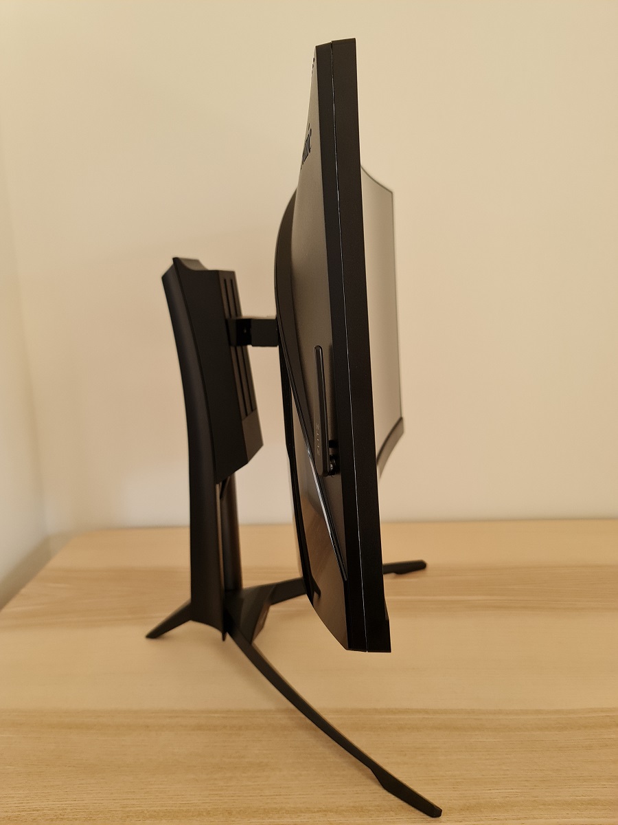
From the side the screen is fairly slim, with its curved nature quite apparent from this angle. It’s ~21mm (0.83 inches) at thinnest point and lumps out towards the centre, where the stand attaches. The quite robust stand design is visible from this angle, offering decent ergonomic flexibility to the monitor; tilt (5° forwards, 23° backwards), height adjustment (120mm or 4.72 inches), swivel (25° left, 25° right). At lowest stand height, the bottom of the screen sits ~112mm (4.41 inches) above the desk with the top of the screen ~484mm (19.06 inches) clear of the desk surface. The total depth of the monitor including stand is ~360mm (14.17 inches) with the centre of the screen just a couple of cm back from the front edge of the stand base. So it’s a rather deep design, bringing the screen quite close to your eyes if you don’t have a particularly deep desk.
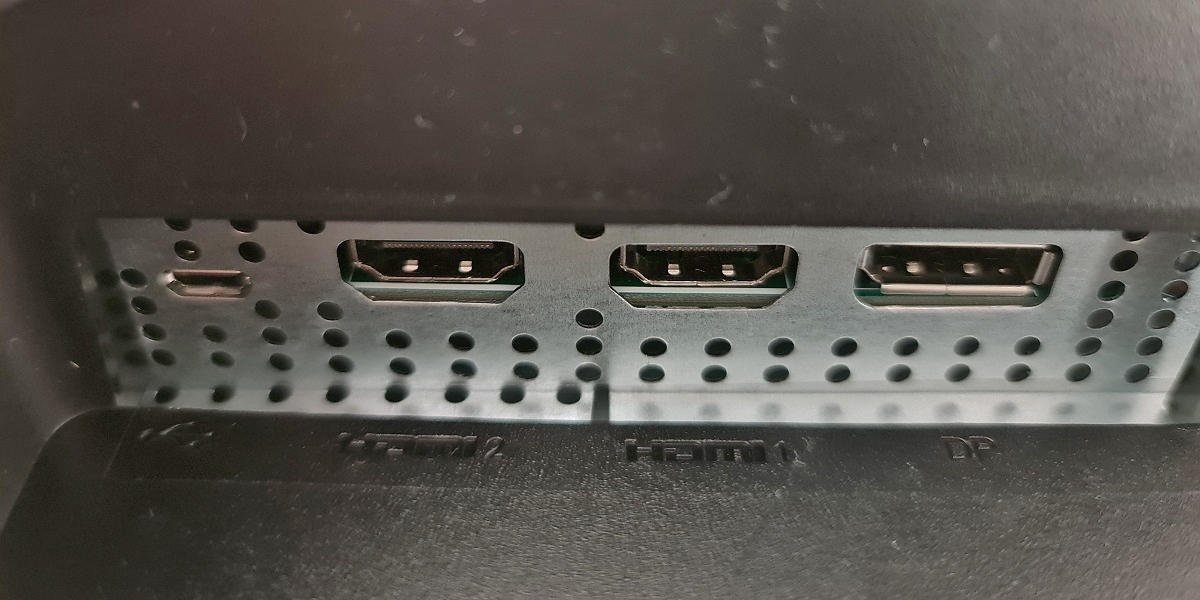
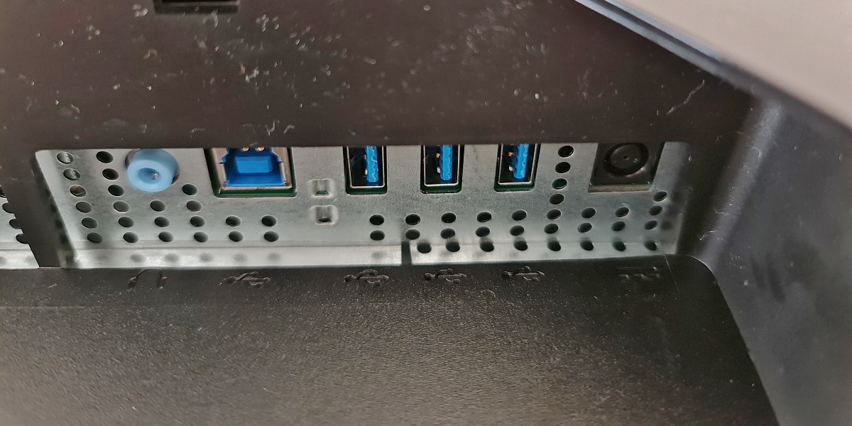
The rear of the monitor features a mixture of matte black plastic towards the top and glossy black plastic towards the bottom and central region. An accordion-like chevron of ‘Elite RGB’ LEDs is found near the top of the glossy region. There’s a flip-down headphone hook towards the right side (left side if viewed from the front) and a ‘mouse bungee’ or flip-down mouse cable anchor at the bottom. This has a grippy rubber texture and small ‘teeth’ to grasp a mouse cable, helping keep that in place and out of the way a bit for those who prefer their mouse wired rather than wireless. The stand attaches centrally and can be removed by pressing a quick-release switch upwards. This reveals 100 x 100mm VESA holes for alternative mounting. The ports face downwards, beneath a removable port cover, and include; Mini USB (for ‘Elite ally’ controller – not included), 2 HDMI 2.0 ports, DP 1.4, 3.5mm audio output, 3 USB 3.2 ports (plus upstream) and a DC power input (external ‘power brick’). 2 x 3W down-firing speakers are also included, located beneath the bottom bezel. These offer quite powerful sound output with surprisingly strong (but suitably adjustable) volume. They also offer crisper trebles and slightly punchier bass than your average integrated monitor speakers. Whilst they won’t stand up to a good set of headphones or strong set of standalone speakers, they’re certainly amongst the better integrated monitor speakers we’ve come across.
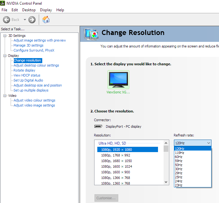
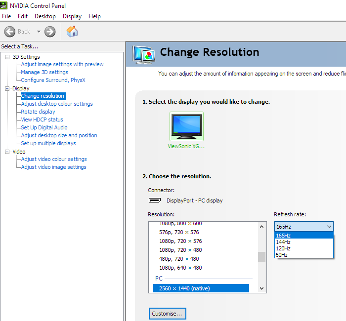
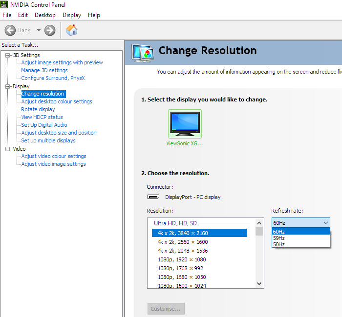
The full capability of the monitor including 2560 x 1440 @165Hz plus HDR and Adaptive-Sync can be leveraged via DP 1.4. HDMI 2.0 limited to 144Hz and supports AMD FreeSync but not Nvidia’s ‘G-SYNC Compatible Mode’. A power cable and adaptor, DP cable and USB 3.2 cable are included as standard. The monitor supports a wide range of refresh rates when running in ‘1080p, 1920 x 1080’ (Full HD), including 24Hz. This is shown in the first image with identical refresh rates listed for suitable versions of DP and HDMI. The second image shows the refresh rates supported at the native 2560 x 1440 (WQHD) resolution, up to a maximum of 165Hz (144Hz using HDMI). If you enable the ‘OverClocking’ feature in the ‘Display’ section of the OSD, 165Hz becomes 166Hz – which is admittedly rather gimmicky and pointless. This setting also adds a ‘4k x 2k, 3840 x 2160’ downsampling mode at up to 60Hz. This is shown in the final image and it’s a potentially useful mode for games consoles that don’t support a 2560 x 1440 signal but would accept a 3840 x 2160 signal. Note that the ‘OverClocking’ feature can only be used with DisplayPort, although this ‘4K’ downsampling setting is available anyway when using HDMI.
If you’re intending to use the monitor with the PS5 or Xbox Series X/S, be aware that a small settings tweak may be required to ensure 120Hz is selectable. Details can be found in this article.
Calibration
Subpixel layout and screen surface
![]()
As shown above, the monitor uses the standard RGB (Red, Green and Blue) stripe subpixel layout. This is the default expected by modern operating systems such as Microsoft Windows and Apple MacOS. You needn’t worry about text fringing from non-standard subpixel layouts as a Mac user and don’t need to run ClearType as a Windows user. You may still wish to run through the ClearType wizard and adjust according to preferences, however. The subpixels are slightly squat as is fairly typical for Samsung SVA panels, with relatively thick vertical gaps between subpixels. This can lead to or exacerbate issues such as static ‘interlace pattern artifacts’, although this model didn’t have such issues as explored shortly. It can also make some text or fine edges appear just a touch softer, but only to a minor degree. The subpixels do not show partial illumination as some VA models do, which would lead to more obvious text and fine-edge clarity issues. The subpixel layout and arrangement is therefore considered normal and we had no major subpixel-related concerns with respect to sharpness or text clarity on this model.
Testing the presets
Monitor Settings Gamma (central average) White point (kelvins) Notes Game Mode = Custom 1 (Factory Defaults, Gamma = 2.4) 2.5 6815K The image appears overly sharp, slightly cool-tinted and oversaturated with some shade variety loss. Extra depth and a bit of a cinematic appearance due to high gamma. As is typical for a VA panel there are some perceived gamma shifts, with saturation losses and some shades appearing somewhat duller towards the bottom and sides of the screen. Not as pronounced as on some VA models, but still there. Game Mode = Standard 2.3 6847K As above but gamma more appropriate and shade variety loss (excessive oversaturation) curtailed due to different default OSD settings. Gamma = 1.8 1.9 6862K Similar to factory defaults but significantly less depth due to low gamma. Things look ‘flooded’ overall. Gamma = 2.0 2.1 6834K As above but extra depth – still slightly less than ideal in places. Gamma = 2.2 2.3 6820K Another bump up in depth. Quite a pleasing look overall, in terms of gamma. Gamma = 2.6 2.7 6815K A significant boost to depth, a rather striking look but significant loss of distinction between dark shades. Gamma = 2.8 2.9 6812K Another boost, gamma now far too high and many darker shades blend together too readily. Color Temperature = sRGB 2.3 6465K As factory defaults but dimmer and better balanced in terms of white point. This is not an sRGB emulation setting, so native colour gamut is still used and saturation is relatively strong. Color Temperature = Warm 2.5 5155K An effective Low Blue Light (LBL) setting, equivalent to setting the ‘Blue Light Filter’ to ‘70’. The blue colour channel is significantly reduced, giving a warm appearance to the image and significantly reducing blue light output from the monitor. Most effective when coupled with a decrease in brightness. The red channel is relatively strong, whilst the green is relatively weak to avoid an obvious green tint. Color Temperature = Full Color Control 2.5 6986K Similar to factory defaults but somewhat cooler tint to the image. Blue Light Filter = 100 2.5 4559K An even stronger LBL setting, providing a very large reduction in blue light output. The strongest LBL setting available on the monitor - the filter can be set between ‘0’ (off) and ‘100’ (most effective) in signal unit increments. Test Settings 2.3 6501K The image appears fairly vibrant overall with good depth, variety and balance.
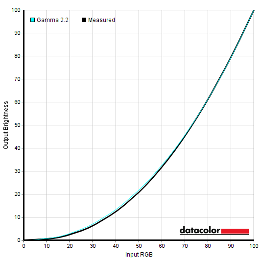
Out of the box the monitor provided an image that was quite bright and striking, but in need of a few adjustments. In particular, things were overly sharp, somewhat cool-tinted, oversaturated in a bad way (i.e. loss of shade variety) and gamma was a bit on the high side. Fortunately the OSD provided the necessary options to correct this, including a range of gamma settings. Our recorded measurements were always just above the intended target for the gamma settings, mainly due to some mid-tone deviation. Following the adjustments made to our ‘Test Settings’, gamma was reasonably close to the desired target as shown below. A bit above on average due to some uplift for mid-tones, but nothing drastic that necessitated further correction. Given the intended uses for monitor, inter-unit variation and strong performance following OSD tweaking alone we will not be using any ICC profiles for this review or including any measurements or graphs using them. We wouldn’t recommend using them unless created for your specific unit using your own calibration device. But we appreciate some users still like to use profiles and some aspects such as gamut mapping for colour-aware applications can be useful. You can download our ICC profile for this model, which was created using our ‘Test Settings’ as a base. Note again that this ICC profile is not used in the review. The monitor also includes some Low Blue Light (LBL) settings, with the most flexible being the ‘Blue Light Filter’ option. You can set this between ‘1’ (very mild effect) and ‘100’ (strongest effect) in single unit increments. Unlike some LBL settings, the green channel is weakened somewhat relative to the red channel, which is strengthened alongside a weakening blue channel. The image therefore appears warmer, which your eyes adjust to somewhat over time, but doesn’t have the obvious and potentially unsightly green tint that some LBL settings provide. An alternative LBL setting is found by switching ‘Colour Temperature’ to ‘Warm’ – this is still very effective and equivalent to setting the ‘Blue Light Filter’ to ‘70’. Minimising exposure to stimulating blue light in the hours leading towards bed is particularly important to aid a restful night’s sleep. We used the ‘Warm’ setting with reduced brightness for our own viewing comfort in the evenings, but not for specific testing beyond that involving the setting. We would’ve happily set the ‘Blue Light Filter’ to ‘100’ instead, but our ‘Test Settings’ involve setting this to ‘5’ and it’s difficult to switch between the full filter and a level of ‘5’. You can assign the setting to the ‘Quick Access’ button (beside power button, covered in OSD video) so you can very quickly activate it at a level of ‘100’ and deactivate it completely. We used this same ‘Quick Access’ button to switch between our ‘Test Settings’ (modified ‘CUSTOM 1’) and ‘Relaxing Evening Settings’ (modified ‘CUSTOM 2’) which were the same as ‘Test Settings’ aside from the ‘Warm’ setting being used. Our ‘Test Settings’ involved various changes, including a significant brightness reduction, sharpness reduction to correct the obvious over-sharpened default look and very mild ‘Blue Light Filter’. Reducing brightness on this model significantly impacted colour temperature, with that becoming progressively warmer as brightness is reduced. We had to lower things just a touch more for our preferred brightness setting using the ‘Blue Light Filter’. We avoided using the ‘Full Color Control’ setting and adjusting colour channels there because it affects how the ‘Fastest’ response time setting reacts – we explore this later. Fortunately the green channel was well-balanced on our unit, so further refinement wasn’t necessary. We used ‘CUSTOM 1’ as a base for the calibration, but ‘Standard’ and ‘CUSTOM 2’ would work equally well provided everything was set the same. Be aware, for example, that ‘Contrast’ is set to the correct neutral point of ‘70’ by default (‘CUSTOM 1’ and ‘Standard’) but ‘60’ under ‘CUSTOM 2’. Assume any setting not mentioned below, including ‘Contrast’, was left at default. We’ve also included the refresh rate used in Windows and preferred ‘Response Time OD’ setting used for most of the review, just for reference. These settings only apply to SDR, HDR has separate settings associated with it (is far more restrictive) and is explored in the relevant section of the review. FreeSync Premium Pro= Off (On for AMD GPU) Response Time OD= Fastest (Ultra Fast recommended if using Full Color Control) Blue Light Filter= 5 Color Temperature= Native Brightness= 32 (according to preferences and lighting) Sharpness= 25 Refresh rate (Windows setting)= 165Hz An X-Rite i1Display Pro was used to measure the luminance of white and black using various setting on the monitor, including those found in the calibration section. From these values, static contrast ratios were calculated. The table below shows these results, with blue highlights indicating the results with HDR active and under our ‘Test Settings’. Black highlights indicate the highest white luminance, lowest black luminance and highest contrast ratio recorded (PureXP deactivated). Assume any setting not mentioned was left at default, with the exceptions already noted here or in the calibration section.
Gamma 'Test Settings'
Test Settings
Gaming Settings= CUSTOM 1
Contrast and brightness
Contrast ratios
Monitor Settings White luminance (cd/m²) Black luminance (cd/m²) Contrast ratio (x:1) 100% brightness (Factory Defaults) 577 0.21 2748 80% brightness 464 0.17 2729 60% brightness 347 0.13 2669 40% brightness 227 0.08 2838 20% brightness 119 0.04 2975 0% brightness 69 <0.03 >2300 HDR* 572 0.19 3011 Standard 577 0.21 2748 Gamma = 1.8 574 0.21 2733 Gamma = 2.0 576 0.21 2743 Gamma = 2.2 576 0.21 2743 Gamma = 2.6 571 0.21 2719 Gamma = 2.8 568 0.21 2705 Color Temperature = sRGB 131 0.05 2620 Color Temperature = Warm 494 0.21 2352 Color Temperature = Full Color Control 603 0.20 3015 Blue Light Filter = 100 447 0.20 2235 PureXP Light @ 120Hz 418 0.15 2787 PureXP Ultra @ 120Hz 105 0.04 2625 PureXP Light @ 144Hz 435 0.16 2719 PureXP Ultra @ 144Hz 107 0.04 2675 PureXP Light @ 165Hz 447 0.17 2629 PureXP Ultra @ 165Hz 106 0.04 2650 Test Settings (see below) 172 0.06 2867
*HDR measurements were made using this YouTube HDR brightness test video, running full screen at ‘1440p HDR’ on Google Chrome. The maximum reading from the smallest patch size (measurement area) that comfortably covered the entire sensor area and colorimeter housing was used for the white luminance measurement, which was ‘4% of all pixels’ in this case. The black luminance was taken at the same point of the video with the colorimeter offset to the side of the white test patch, equidistant between the test patch and edge of the monitor bezel.
The average static contrast with only brightness adjusted was 2817:1, which is good. This excludes the reading at ‘0’ brightness where the rounding up of the black point caused clear underestimation of the static contrast. The highest recorded contrast ratio was 3015:1, close to the specified 3000:1, using ‘Full Color Control’ which sets all colour channels to their neutral position. The monitor offers no local dimming and therefore provides no contrast advantage under HDR, although the fairly powerful backlight pumped out 572 cd/m² in this test. Static contrast remained strong following the adjustments made to our ‘Test Settings’, at 2867:1. Contrast was reduced somewhat by the Low Blue Light (LBL) settings, which is expected given the colour channel adjustments made. Brightness for the ‘PureXP’ setting averaged 106 cd/m² using the dimmest setting (‘Ultra’) and an impressively bright 433 cd/m² using the brightest setting (‘Light’). Although not documented on the table, we recorded ~216 cd/m² using the ‘Normal’ setting and ~320 cd/m² using the ‘Extreme’ setting. The brightness control is greyed out when using ‘PureXP’. The highest white luminance recorded was a rather bright 603 cd/m², exceeding the specified 550 cd/m², whilst the lowest white luminance recorded was 69 cd/m². This gives an impressive luminance adjustment range of 534 cd/m² with a reasonably but not exceptionally dim minimum and bright maximum.
The monitor includes a Dynamic Contrast setting called ‘Advanced DCR’ (Advanced Dynamic Contrast Ratio). This allows the backlight to adjust as a single unit (global dimming) to changed in overall light and dark on the screen. The setting can be set between ‘1’ and ‘20’ in single unit increments, but increasing this just applies an ever-stronger sharpness filter. The Dynamic Contrast on this monitor was certainly dynamic, reacting rapidly to scene brightness. It dimmed effectively for predominantly dark content and brightened up strongly for predominantly brighter content. We found it significantly brighter than we’d like for most mixed content and there is no manual control over brightness using this setting. Dynamic Contrast is also employed automatically under HDR, enhanced by HDR meta data. Meaning it can respond more precisely to the scene being shown – this is explored in the HDR section. Remember there’s no local dimming, so it’s just changing the entire backlight brightness according to the overall makeup of the scene.
PWM (Pulse Width Modulation)
The XG270QC does not use PWM (Pulse Width Modulation) to regulate backlight brightness at any level. Instead, DC (Direct Current) is used to moderate brightness. The backlight is therefore considered ‘flicker-free’, which will come as welcome news to those sensitive to flickering or worried about side-effects from PWM usage. The exception to this is with ‘PureXP’ active, a strobe backlight setting which causes the backlight to flicker at a frequency matching the refresh rate of the display.
Luminance uniformity
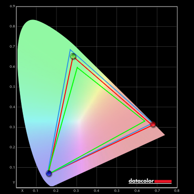
Whilst observing a black background in a dark room, using our ‘Test Settings’, we noticed some backlight bleed and moderate clouding, particularly lower down the screen. It’s important to remember that individual units vary when it comes to all aspects of uniformity, including backlight bleed and clouding. The following image was taken a few metres back to eliminate ‘VA glow’. This is a silverish to purple glow that appears towards the edges, particularly near the bottom corners of the screen from a normal viewing position. This ‘VA glow’ blooms out more noticeably from sharper angles, as demonstrated in the viewing angles video later on. The luminance uniformity was variable. The maximum luminance was recorded at ‘quadrant 3’ towards the top right of the screen (185.4 cd/m²). The greatest deviation from this occurred at ‘quadrant 7’ towards the bottom left (151.4 cd/m², which is 19% dimmer). The average deviation between each quadrant and the brightest recorded point was 10.75%, which is moderate. Remember that individual units vary when it comes to uniformity and you can expect further deviation beyond the points measured. The contour map below shows these deviations graphically, with darker greys representing lower luminance (greater deviation from brightest point) than lighter greys. The percentage deviation between each quadrant and the brightest point recorded is also given. The SpyderX Elite was also used to analyse variation in the colour temperature (white point) for the same 9 quadrants. The deviation between each quadrant and the quadrant closest to the 6500K (D65) daylight white point target was analysed and a DeltaE value assigned. Darker shades are also used on this map to represent greater deviation from 6500K. A DeltaE >3 represents significant deviation that may be readily noticed by eye. Results here were strong, with no significant deviations recorded. Remember again that individual units vary when it comes to uniformity and that you can expect deviation beyond the measured points. Also be aware that there are some perceived deviations in both brightness and colour temperature that are typical on VA panels and aren’t reflected by these readings. In addition to the quantitative testing above, we performed a subjective assessment of the uniformity of a variety of ‘medium’ shades, including 50% grey. Some monitors exhibit uniformity issues such as splotches or striations when viewing screen fills of such shades, giving an inconsistent appearance that some users refer to as ‘DSE’ (‘Dirty Screen Effect’). VA models are particularly prone to this. We observed faint striations and minor patchiness in some regions of the screen. There were no obvious issues such as strong patchiness or clear striations, thankfully. The contrast performance on Battlefield V was very good overall. Darker scenes had respectable atmosphere, with superior depth to dark shades compared to non-VA (and indeed some VA) LCDs. There was a slight bloom of ‘VA glow’ which was most noticeable towards the bottom of the screen from a normal viewing position. This was at a fairly typical if not slightly lower than expected level for curved 27” VA models like this. It’s worth noting that ‘VA glow’ can be brought out more strongly by uniformity issues such as clouding and backlight bleed, if you’re sitting closer to the screen or using a high brightness setting. We observed some ‘black crush’, whereby some darker shades in the central region of the screen (or the region roughly in-line with your eyes) appear darker than intended due to increased perceived gamma. So they blend into an almost black mass, with some subtle details appearing more blended than intended. There was as little ‘black crush’ as we’ve observed on a VA model before. There was also a touch of extra detail towards the very side edges and bottom of the screen due to the perceived gamma being slightly lower than intended there, but this was only slight from our preferred viewing distance (~70cm). Significantly lower than the vertical shifts on TN models and indeed lower than the shifts on some VA models. Brighter content stood out nicely against darker surroundings, with a slight graininess from the screen surface but not a ‘heavy’ or ‘smeary’ graininess. Shadow of the Tomb Raider showcased a similar strong contrast performance. This title has plenty of dark areas to enjoy, including dimly lit caves and passageways. Whilst there was again some ‘VA glow’ which ate away at this atmosphere towards the bottom of the screen, this was much less atmosphere-destroying than ‘IPS glow’. And somewhat lower than on certain other VA models we’ve observed, including the Samsung C27HG70. The remaining bulk of the screen provided good depth to dark shades, whilst brighter shades such as fires and torches stood out nicely. With a slightly ‘sandy’ quality to them from the screen surface, which many users wouldn’t really notice. Some ‘black crush’ was again observed, masking some subtle details – for example, Lara’s hair strands were slightly less distinct in darker scenes centrally than they should be. There was no major loss of detail from this, though, and again there was slight extra detail peripherally but nothing extreme. To round off, we made some observations on the film Star Wars: The Rise of Skywalker. As with Tomb Raider, this title craves a strong contrast performance. With plenty of ‘high-contrast’ scenes – explosions, flames and lightsabers lighting up dim locations, that sort of thing. These bright elements stood out well against their darker surroundings. And ‘VA glow’ aside, which wasn’t as intense as we’ve seen on some models, the overall atmosphere for these darker scenes was good. With the ~3000:1 static contrast, we wouldn’t call the darkest shades ‘deep and inky’, especially if viewed in a dimly lit room. But they were much closer to that than you’d observe on a non-VA LCD without very effective local dimming. Nothing you’d come across for this sort of price, in other words. Subjective as always, but we didn’t find the ‘black crush’ strong enough to impede our enjoyment of this title. Looking more broadly at video content, including heavily compressed streamed content, the monitor kept ‘compression artifacts’ quite well-blended from our preferred viewing distance. That’s important to prevent a ‘banded’ or ‘blocky’ appearance. On some VA models these would be too visible towards the bottom and sides of the screen and on TN models you’d typically see these towards the bottom far too clearly. The Lagom tests for contrast allow specific weaknesses in contrast performance to be identified. The following observations were made. The ViewSonic XG270QC’s colour gamut (red triangle) was compared with the sRGB (green triangle) and DCI-P3 (blue triangle) reference colour spaces using our ‘Test Settings’, as shown below. The gamut fully covers sRGB with some extension beyond, particularly towards the red and green corners of this gamut representation. We measured 90% DCI-P3 overage and although not shown in the graphic, 84% Adobe RGB coverage. This gives the monitor the potential to output all shades within the sRGB colour space, with some extra vibrancy and saturation in places. The monitor does not include an sRGB emulation setting that would cut down on the colour gamut effectively so it coincides more closely with the sRGB reference. AMD users can activate a flexible sRGB emulation setting via the graphics driver. This is done by opening ‘AMD Radeon Software’, clicking ‘Settings’ (cog icon towards top right) and clicking on ‘Display’. You should then ensure that the ‘Custom Color’ slider to the right is set to ‘Enabled’ and ‘Color Temperature Control’ set to ‘Disabled’. This is shown in the image below. The gamut below shows results using our ‘Test Settings’ with this driver tweak applied. The colour gamut now offers strong sRGB coverage (99%) with less extension beyond compared to natively. This is a useful setting if you’re an AMD user and wish to gain closer tracking of the sRGB gamut without profiling, including in applications that aren’t colour-managed. The monitor provided a fairly vibrant look to things on Battlefield V. With the colour gamut extending beyond sRGB there was an extra dollop of vibrancy. For content like this, a game running in SDR, sRGB is the colour space the developers have in mind and extension beyond this provides extra saturation. This extra saturation is not the same as a digital saturation boost, such as increasing the ‘Color Saturation’ slider in the OSD. Such digital boosts just pull things closer to the edge of the gamut without expanding the gamut itself, crushing things together and negatively impacting shade variety. There were some fairly eye-catching vibrant reds and oranges, with flames and certain painted elements and in-game markers standing out in quite a vivid way. The natural environments showcased a good palette of rich as well as more muted greens. Some of the yellowish greens had the yellow elements brought out a bit strongly by the gamut and some reddish browns had an overly red hue. But this was not extreme as indeed the colour gamut doesn’t offer extreme extension beyond sRGB. The fairly vibrant and varied look is one that many will look, but it’s not for everyone. As usual for a VA panel there were some saturation losses towards the bottom and side edges, with some shades appearing a bit more muted and some a bit duller. This was relatively minor for the panel type from our preferred viewing distance (~70cm) and very minor compared to the vertical saturation shifts observed on TN models. The shifts are more pronounced if sitting closer to the screen. Colours on Shadow of the Tomb Raider were presented in a similar way, quite vibrant overall but with good variety. Roaring flames were again quite eye-catching as were certain blue and purple flowers and colourful artifacts (of the archaeological variety). The environments appeared largely natural, with a bit of extra vibrancy in a similar vein to Battlefield V. Lara’s skin appeared a touch too tanned centrally, although more correct when displayed further down the screen or near the sides. This again highlights some of the perceived gamma and saturation shifts associated with the panel technology – which were far from extreme, but not up to IPS levels of consistency. We made further observations using the TV series Futurama. With large areas of individual shade, this is a very good test for colour consistency. The monitor provided a good palette of shades, including some fairly eye-catching neon reds, pinks and cyans. And a good array of more muted pastel shades, such as pale pinks, blues and purples. There was again more saturation than intended due to the colour gamut, but suitable range was maintained so that pastel shades didn’t encroach on the deeper or more saturated ‘neon’ shades. There were some saturation losses towards the sides and bottom of the screen, with some of the pastel shades appearing slightly undersaturated rather than slightly oversaturated by this point. The consistency here was as good as we’ve seen outside of IPS in the LCD world, though. The image below shows a printed reference sheet of 24 ‘sRGB’ shades, included as part of the Datacolor SpyderCHECKR 24 package. The screen is displaying reference photographs of this printed sheet, in both the same order as printed (right side) and reverse order (left side). The camera is mounted slightly above centre so that the image is representative of what the eye sees from an ergonomically correct viewing position. This, coupled with the inclusion of a flipped version of the shade sheet, allows both accuracy and colour consistency to be visually assessed. Bracketed numbers in our analysis refer to shades on the printed sheet or right side of the screen if they’re ordered consecutively from top left to bottom right. Note that there is always some disparity between how emissive objects (monitor) and non-emissive objects (printed sheet) appear. The representation of shades in this image depends on the camera and your own screen, it’s not designed to show exactly how the shades appear in person. It still helps demonstrate some of the relative differences between the original intended sRGB shade and what the monitor outputs, however. Full profiling and appropriate colour management on the application would provide a tighter match, our intention here is to show what can be expected in a non colour-managed environment. The black square (21) is interesting to observe as. The photograph shown on the screen is of the actual printed sheet, which has a slight material texture to it. This is well-blended and barely visible when viewed on most of the screen, but it’s more visible lower down the screen (or towards the sides) due to the aforementioned perceived gamma shifts. Some shades appear somewhat neon in their representation due to extra saturation. Candy apple red (14) and dark lime green (18) are good examples of this. The monitor doesn’t include an sRGB emulation setting to cut down on the colour gamut. So to accurately tone down saturation you’d need to profile the monitor with a colorimeter or similar device and be using colour-managed applications. Lagom’s viewing angle tests help explore the idea of colour consistency and viewing angle performance. The following observations were made from a normal viewing position, eyes ~70cm from the screen. The shifts observed are more readily apparent if sitting closer and less apparent if sitting further away. On some monitors, particularly but not exclusively those with high refresh rates, interlace patterns can be seen during certain transitions. We refer to these as ‘interlace pattern artifacts’ but some users refer to them as ‘inversion artifacts’ and others as ‘scan lines’. They may appear as an interference pattern, mesh or interlaced lines which break up a given shade into a darker and lighter version of what is intended. They often catch the eye due to their dynamic nature, on models where they manifest themselves in this way. Alternatively, static interlace patterns may be seen with some shades appearing as faint horizontal or vertical bands of a slightly lighter and slightly darker version of the intended shade. If we looked closely we could see some textures break up into a very fine polygonal mesh during movement, a bit more noticeable at lower refresh rates. But this was very faint and difficult to spot from a normal viewing distance. Even for those sensitive to ‘dynamic interlace patterns’, it’s probably not something they’ll notice or find bothersome. A small utility called SMTT 2.0 was used alongside a sensitive camera to analyse the latency of the XG270QC, with over 30 repeat readings taken to help maximise accuracy. Using this method, we calculated 4.77ms (just over 3/4s of a frame at 165Hz) of input lag. At 60Hz we measured a slightly higher but still respectable 7.35ms. The input lag measured here is influenced by both the element you ‘see’ (pixel responsiveness) and the element you ‘feel’ (signal delay). It indicates a low signal delay at 165Hz which most users should find acceptable. Note that we don’t have the means to accurately measure input lag with Adaptive-Sync active in a variable refresh rate environment or with HDR active in an HDR environment. Our article on responsiveness explores some of the key concepts related to monitor responsiveness. A key concept explored in the article is perceived blur. This is contributed to by both the pixel responsiveness of the monitor and the movement of your eyes as you track motion on the screen. Perceived blur due to eye movement is the dominant form of perceived blur observed on a modern monitor, but both factors play an important role. We also explore a technique called ‘pursuit photography’ in the article, using a moving camera to capture motion in a way that reflects both aspects of perceived blur. This contrasts with static photos or videos which only reflect weaknesses in pixel responsiveness. The images below are pursuit photographs taken using the UFO Motion Test for ghosting, with the UFO moving across the screen from left to right at a frame rate matching the refresh rate of the display. The test is set to run at its default speed of 960 pixels per second, which is a practical speed for such photographs and sufficient to highlight any weaknesses. The monitor was tested at 60Hz (directly below), 120Hz, 144Hz and 165Hz. We tested the following ‘Response Time OD’ (pixel overdrive) settings: ‘Standard’, ‘Ultra Fast’ and ‘Fastest’. The ‘Fast’ and ‘Faster’ settings were excluded from this analysis for simplicity, as there was just a very gentle progression rather than distinct differences between the settings. All rows of the UFO Motion Test were used, highlighting a range of pixel transitions between various shades. The final columns show some reference screens for comparison, where possible, using what we deem to be their optimal pixel response time settings. The first reference screen is the AOC CQ27G2(U), a VA model offering similar performance in many respects to this one but limited to 144Hz. The second reference is the ViewSonic XG270QG, a responsive IPS model. Note that the ‘Fastest’ setting is influenced by the ‘Color Temperature’ setting selected in the OSD and gives very strong overshoot (inverse ghosting) if ‘Full Color Control’ is used. For this analysis we have this set to ‘Native’, per our ‘Test Settings’. We show the result of using the ‘Full Color Control’ setting at 165Hz shortly, although similar observations were made across all refresh rates. This only affects the ‘Fastest’ setting, the others behave the same way as shown in this analysis regardless of the ‘Color Temperature’ setting used. As well as increasing refresh rate to minimise perceived blur due to eye movement, an alternative way to minimise this can be found in the form of the ‘PureXP’ (Pure Experience) strobe backlight setting. With this enabled, the backlight pulses at a frequency matching the refresh rate of the display – either 120Hz, 144Hz or 165Hz. Sensitivity to this flickering varies and some may find it bothersome whilst others will notice accelerated eye fatigue when using the setting, even if the flickering isn’t actively bothersome to them. The pursuit photographs below were taken with the monitor set to 120Hz using PureXP. The ‘Response Time OD’ settings are greyed out with this active and so is the normal brightness control. The brightness is controlled by adjusting the PureXP setting itself, which more specifically alters the pulse width or how long the backlight spends in its ‘on’ phase. A higher setting means a shorter pulse width, decreasing brightness whilst potentially enhancing clarity. We just test the ‘Light’ and ‘Normal’ settings here, because any higher setting (‘Extreme’ or ‘Ultra’) appeared dimmer without but didn’t further improve clarity. A few reference screens are also shown for comparison, where possible, using their respective strobe backlight settings at 120Hz. The AOC C24G1 using MBR (Motion Blur Reduction) and set to what we consider its optimal setting for that. And the Dell S2417DG or AOC AG251FG using ULMB (‘Ultra Low Motion Blur’). On Battlefield V, at frame rates keeping pace with the refresh rate, the monitor provided quite a fluid 165Hz experience. The monitor is outputting up to 2.75 times as much visual information per second as a 60Hz monitor, or indeed this monitor running at 60Hz. This improves the ‘connected feel’, which describes the precision and fluidity that’s felt when interaction with the game world. The low signal delay also helped in this respect. The high refresh rate and frame rate combination also reduced perceived blur due to eye movement, much as we demonstrated on Test UFO earlier. It was also shown that there were some weaknesses related to pixel responsiveness which affect overall perceived blur. That was certainly observed on Battlefield V, with some transitions affected a lot more noticeably than others. Where bright and medium shades dominated, there was some ‘powdery’ trailing, generally light and sticking close to the object. So not majorly affecting perceived blur for those transitions. The 165Hz refresh rate was put to quite good use here. For some medium-dark shades this takes on a slightly ‘smeary’ appearance or at least a ‘heavy powdery’ appearance – trailing which extends further back behind objects during movement. We observed this sort of behaviour for very bright shades such as white in-game text against medium backgrounds, where a powdery off-white trail (mixture of text and background colour) was observed. Where dark shades were introduced some more distinct weaknesses were observed. There was some ‘smeary’ trailing which was displaced a fair bit from the object and significantly added to overall perceived blur during those transitions. There was also some ‘break-up’ trailing for some transitions, whereby some of the shades contained in the object or background colour leach out. A bit light wetting a page with water soluble ink on it. Observing a dark rock against a twilight sky, for example, produced a ‘smeary’ trailing with a blue to purple hue to it. There was also some overshoot in places, such as some ‘halo’ trailing, but this was not overly bright or strong overshoot. It was mainly for the light to medium shades described earlier and wasn’t something we found particularly eye-catching. Overall, we consider this model to be quite middling in terms of its pixel response performance for the panel type. It was a quite comparable experience to what we had with the AOC CQ27G2(U), with a slight boost in refresh rate. This shouldn’t come as too much of a surprise given the panel similarities. In the linked section of the AOC review we draw a few comparisons with other models – there are certainly worse VA performers out there, but some that are better as well. It’s ultimately very subjective and some users will be absolutely fine with these weaknesses. It was certainly a departure from the other ViewSonic ELITE models we’ve looked at, though, which in many respects set the benchmark for responsiveness in their class – the XG240R and XG270QG. The section of video review below runs through the response performance of the monitor and includes some examples of the weaknesses discussed here. We made similar observations on Shadow of the Tomb Raider. The 165Hz refresh rate again had its benefits at suitably high frame rates, improving ‘connected feel’ and reducing perceived blur. The competitive edge isn’t really important here, but it was still nice to have. There are many dark shades on this title, with dimly lit areas common. Even for the outside environments, there are many shadowy areas which introduce dark shades into the mix. The more pronounced weaknesses including some ‘smeary’ trailing and ‘break-up’ trailing were observed. This wasn’t as widespread or as pronounced as on some VA models, where a clear ‘smoke-like’ appearance can be introduced. But it was sufficient to significantly affect perceived blur, which some users would find bothersome. It’s also worth being aware that the weaknesses described on both titles here don’t always manifest as distinct trailing. Intricate mixtures of light and dark, such as certain well-defined foliage with an alternation between green leaf and dark shadow or blades of grass, can introduce a sort of ‘flickering’ effect. The pixel response weaknesses mean that the shades blend together during movement and the overall object appears dimmer than it should. When the movement ceases, they brighten up again. We also observed some fairly isolated examples of overshoot, but nothing too eye-catching really. We made observations on video content at a range of refresh rates, too. This included ~24-30fps Netflix content and YouTube content at up to 60fps. The higher refresh rate content highlighted some of the weaknesses we observed when gaming, although the reduced pixel response requirements meant they were somewhat less distinct in general. For the lower frame rate content the weaknesses were really rather minor and the overall fluidity was largely limited by the frame rate itself. Really the monitor felt quite at home overall when watching this sort of content, it was quite easy to enjoy its contrast benefits whilst there weren’t any real ‘stand out’ weaknesses. Certainly not to the extent observed during higher frame rate gaming. As an Amazon Associate I earn from qualifying purchases made using the below link. Where possible, you’ll be redirected to your nearest store. Further information on supporting our work. AMD FreeSync is a variable refresh rate technology, an AMD-specific alternative to Nvidia G-SYNC. Where possible, the monitor dynamically adjusts its refresh rate so that it matches the frame rate being outputted by the GPU. Both our responsiveness article and the G-SYNC article linked to explore the importance of these two elements being synchronised. At a basic level, a mismatch between the frame rate and refresh rate can cause stuttering (VSync on) or tearing and juddering (VSync off). FreeSync also boasts reduced latency compared to running with VSync enabled, in the variable frame rate environment in which it operates. FreeSync requires a compatible AMD GPU such as the Radeon RX 580 used in our test system. There is a list of GPUs which support the technology here, with the expectation that future AMD GPUs will support the feature too. The monitor itself must support ‘VESA Adaptive-Sync’ for at least one of its display connectors, as this is the protocol that FreeSync uses. The ViewSonic XG270QC supports FreeSync Premium Pro via DP 1.4 and HDMI 2.0 on compatible GPUs and systems. Note that HDR can be activated (at the same time as FreeSync) via DP 1.4 or HDMI 2.0. You need to make sure ‘FreeSync Premium Pro’ is set to ‘On’ in the ‘Display’ section of the OSD. On the GPU driver side recent AMD drivers make activation of the technology very simple and something that usually occurs automatically. You should ensure the GPU driver is setup correctly to use FreeSync, so open ‘AMD Radeon Software’, click ‘Settings’ (cog icon towards top right) and click on ‘Display’. You should then ensure that the first slider, ‘Radeon FreeSync’ is set to ‘Enabled’ as shown below. To configure VSync, open ‘AMD Radeon Software’. Click ‘Settings’ (cog icon towards top right) and click ‘Graphics’. The setting is listed as ‘Wait for Vertical Refresh’. This configures it globally, but if you wish to configure it for individual games click ‘Game Graphics’ towards the top right. The default is ‘Off, unless application specifies’ which means that VSync will only be active if you enable it within the game itself, if there is such an option. Such an option does usually exist – it may be called ‘sync every frame’ or something along those lines rather than simply ‘VSync’. Most users will probably wish to enable VSync when using FreeSync to ensure that they don’t get any tearing. You’d therefore select either the third or fourth option in the list, shown in the image below. Above this dropdown list there’s a toggle for ‘Radeon Enhanced Sync’. This is an alternative to VSync which allows the frame rate to rise above the refresh rate (no VSync latency penalty) whilst potentially keeping the experience free from tearing or juddering. This requires that the frame rate comfortably exceeds the refresh rate, not just peaks slightly above it. We won’t be going into this in detail as it’s a GPU feature rather than a monitor feature. *48 – 165Hz is the official range claimed, but LFC seemed to kick in below 52Hz in our testing. As usual we tested a range of game titles with AMD FreeSync active and found the experience similar on all of them. Any particular issues affecting one title but not another indicates a game or GPU driver issue rather than monitor issue. We’ll therefore just focus on a single title for this section; Battlefield V. This title offers sufficient flexibility with its graphics settings to allow the full range of refresh rates supported by the monitor to be assessed. Our RX 580 is far from a powerhouse of a GPU, so maintaining a solid 165fps is very tricky even with heavily reduced graphics settings. Often the frame rate will dip closer to 100fps, with lots of fluctuation between those two points. Without FreeSync active, such dips cause obvious tearing (VSync off) or obvious stuttering (VSync on). Obvious to us, at least, and users sensitive to such things – sensitivity does vary. There’s a drop off in ‘connected feel’ and increase in perceived blur coinciding with the reduction in frame rate. FreeSync can’t compensate for that element, but the lack of tearing and stuttering from frame and refresh rate mismatches is certainly pleasant. With graphics settings turned up more or where the action becomes more intense, it’s common for frame rates to dip into the double digits. With that comes a further drop off in ‘connected feel’ and increase in perceived blur. But the lack of tearing and stuttering due to tight synchronisation of frame and refresh rate is certainly nice to have. Using our preferred ‘Fastest’ overdrive setting provides a relatively small amount of overshoot at high refresh rates, but this increases as refresh rate decreases. As usual for an Adaptive-Sync model, variable overdrive isn’t used – so the overdrive doesn’t automatically re-tune and slacken off appropriately for reduced refresh rates. This never reached levels we’d call extreme, but below above 80fps there was some fairly noticeable and reasonably bright ‘halo’ trailing introduced. This is reduced or eliminated by reducing the overdrive setting, without a huge impact on the overall experience elsewhere at these relatively low refresh rates. Obviously it’s nice if the monitor automatically optimises things without you having to manually adjust the overdrive setting according to your approximate refresh rate range. But this sort of thing (variable overdrive) is rare outside of models with a G-SYNC module. Where frame rate dipped below ~52fps, the monitor stuck to a multiple of the frame rate with its refresh rate. This is LFC (Low Framerate Compensation) and as usual it works effectively to combat tearing and stuttering by strictly sticking to these multiples. There is noticeable stuttering when LFC activates or deactivates and also some brief accompanying flickering. If you only occasionally pass the LFC boundary that’s unlikely to be a cause for concern. But if you happen to be passing it frequently then it could potentially be annoying. It’s certainly not unique to this monitor, it’s something we observe a lot more broadly when using Adaptive-Sync. We also observed some flickering at times during significant fluctuations in frame rate, which is typical for a VA model in a VRR environment due to their voltage sensitivity. Some models show this quite intensely but on this one it was relatively mild. As noted earlier, AMD FreeSync makes use of Adaptive-Sync technology on a compatible monitor. As of driver version 417.71, users with Nvidia GPUs (GTX 10 series and newer) and Windows 10 can also make use of this Variable Refresh Rate (VRR) technology. When a monitor is used in this way, it is something which Nvidia refers to as ‘G-SYNC Compatible’. Some models are specifically validated as G-SYNC compatible, which means they have been specifically tested by Nvidia and pass specific quality checks. With the XG270QC, you need to connect the monitor up via DisplayPort and enable ‘FreeSync Premium Pro’ in the ‘Display’ section of the OSD. When you open up Nvidia Control Panel, you should then see ‘Set up G-SYNC’ listed in the ‘Display’ section. Ensure the ‘Enable G-SYNC, G-SYNC Compatible’ checkbox and ‘Enable settings for the selected display model’ is checked as shown below. Press OK, then turn the monitor off then on again so that it re-establishes connection – the technology should now be active. Earlier in the review, we introduced the ‘PureXP’ strobe backlight feature and its principles of operation. As well as how it performs in specific tests. When using PureXP or a similar strobe backlight feature, it’s important that the frame rate of the monitor matches the refresh rate of the display. And you can’t use Adaptive-Sync at the same time to help with this. If there are mismatches between the two, there is very obvious juddering or stuttering which stands out very clearly as there’s very little perceived blur due to eye movement to mask it. We tested various game titles using the feature, but we’ll just be focusing on Battlefield V running at a solid 165fps. With the monitor set to 165Hz and the PureXP feature set to ‘Ultra’. Broadly similar observations were made using other PureXP settings and at different refresh rates. The setting certainly reduced perceived blur due to eye movement, meaning that objects and textures retained superior clarity during even rapid movement. This was quite clear when turning the character quickly or manoeuvring in a vehicle, for example. It would therefore deliver a competitive edge for users who can stomach the downsides. The lack of Adaptive-Sync and needing to keep the frame rate matching the refresh rate quite religiously are part of it. But there’s also a reduction in flexibility for brightness settings and the fact that the backlight flickers at a frequency matching the refresh rate of the display. Sensitive users might notice this quite actively, with it being more pronounced at lower refresh rates, but even if it isn’t ‘actively’ noticed it the effect of accelerated visual fatigue can still be felt. There were some further issues of note. We saw some bright cyan and magenta flashes, particularly when observing relatively slender white objects and moving our eyes. This was more pronounced at lower refresh rates, but even at 165Hz we could notice it in places. There was also some colourful overshoot, particularly where light to medium shades met (such as a light-coloured wall against a bright sky). Bright cyan ‘halo’ trailing which we found quite eye-catching. There was also the strobe crosstalk to contend with, as we identified earlier. Whilst the main object clarity was good and the reduction in perceived blur due to eye movement could certainly be appreciated, the strobe crosstalk created distinct repetitions during many transitions. This occurred fairly strongly at all regions of the screen, including centrally where your main focus for most gaming (especially competitive FPS gaming). The PureXP setting was therefore far from the ‘cleanest’ strobe backlight setting we’ve used. But it is at least useable without restricting the brightness to obviously low (or super high) levels as some such settings do. It certainly has some utility, but most users will find the normal flicker-free operation of the monitor more practical. On an ideal monitor, HDR (High Dynamic Range) involves very bright light shades and very deep dark shades being displayed on the screen at the same time. The monitor should also be able to display an excellent range of shades between the two extremes, including highly saturated and vibrant shades alongside muted shades. The monitor would ideally support per-pixel illumination (backlightless technology such as OLED, for example) or failing that offer a very large number of precisely controlled dimming zones. A solution such as FALD (Full Array Local Dimming) with a good number of dimming zones, for example. This sort of solution allows some areas of the image to remain very dim whilst others show brilliant high luminance levels. Colour reproduction is also an important part of HDR, with the ultimate goal being support for a huge colour gamut, Rec. 2020. A more achievable near-term goal is support for at least 90% DCI-P3 (Digital Cinema Initiatives standard colour space) coverage. Finally, HDR makes use of at least 10-bit precision per colour channel, so its desirable that the monitor supports at least 10-bits per subpixel. The HDR10 pipeline is the most widely supported HDR standard used in HDR games and movies. This is the form of HDR supported here. For most games and other full screen applications that support HDR, the ViewSonic automatically switches into its HDR operating mode. Provided ‘HDR’ is set to ‘Auto’ in the ’Display’ section of the OSD. As of the latest Windows 10 update, relevant HDR settings in Windows are found in ‘Windows HD Color settings’ which can be accessed via ‘Display settings’ (right click the desktop). Most game titles will activate HDR correctly when the appropriate in-game setting is selected. A minority of game titles that support HDR will only run in HDR if the setting is active in Windows as well. Specifically, the toggle which says ‘Play HDR games and apps’. If you want to view HDR movies on a compatible web browser, for example, you’d also need to activate the ‘Stream HDR Video’ setting. These settings are shown below. Also note that there’s a slider that allows you to adjust the overall balance of SDR content if HDR is active in Windows. This is really just a digital brightness slider, so you lose contrast by adjusting it. When viewing SDR content with HDR active in Windows things appear generally bright and over-sharpened with some noticeable undersaturation. As we explore shortly, you also lose access to many adjustments in the OSD including brightness. We’d recommend only activating HDR in Windows if you’re about to specifically use an HDR application that requires it, and have it deactivated when viewing normal SDR content on the monitor. For the sake of simplicity, we’ll just focus on a couple of game titles; Battlefield V and Shadow of the Tomb Raider. We’ve tested both titles on a wide range of HDR-capable monitors and we know they offer a good HDR experience on monitors that are suitably capable of offering one. The experience we describe here is largely dictated and limited by the screen itself. Although our testing here is focused on HDR PC gaming using DisplayPort, we made similar observations when viewing HDR video content on the Windows 10 Netflix app. We also made observations using HDMI, which is naturally how you’d hook the monitor up when using an HDR compatible games console for example. Using HDMI, the gamma was somewhat higher under HDR, so things appeared generally deeper with some extra saturation in places. This masked some of the low-end detail a bit and made some of the pastel shades appear somewhat deeper than they should, but gives a more cinematic look to things and extra ‘pop’ to various shades which some would like. In terms of contrast and brightness regulation, this worked in much the same way over HDMI. As usual for HDR, the settings available in the monitor are greatly restricted, including brightness, gamma and colour channels being inaccessible. A sharpness filter is applied, which is not extreme and designed to slightly accentuate the improved tone mapping capabilities and (doesn’t apply here) enhanced contrast under HDR. This can’t be disabled or adjusted. The ViewSonic XG270QC is VESA DisplayHDR 400 certified. This is the lowest level of certification that VESA certifies for and therefore means that only a basic HDR experience is offered. There are very loose criteria for colour gamut, with low coverage of DCI-P3 being acceptable for this ‘tier’ compared to 90%+ for higher tiers. Fortunately, the ViewSonic offers reasonable DCI-P3 coverage, which as noted earlier is the near-term target for HDR that developers have in mind. In this case, we recorded 90% DCI-P3. This is shown in the representation below, with the red triangle showing the monitor’s colour gamut, the blue triangle DCI-P3 and green triangle sRGB. This decent match between the colour gamut and the developer’s intentions created a look that was more natural and toned down in some respects than under SDR. The oversaturated elements we observed under SDR were toned down, giving a more natural look to the environments. This included some browns being overly reddish and some yellowish greens having an overtly yellow cast under SDR, with both shades now appearing more appropriately neutral. Some skin tones, including the impeccable visage of Lara Croft, were also toned down under HDR so they looked more appropriate on the whole. There were certain elements such as rich roaring golden and orange fires, deep purple flowers and ornate blue dresses that showcased a variety of shades well beyond the sRGB colour space. The vibrancy wasn’t as high as we’ve seen in some cases, where the gamut is more generous or on IPS-type panels where saturation is better maintained peripherally. So some shades did appear somewhat less intense than they ideally would – but the overall look was varied. A decent dose of vibrancy was still there where the developers wanted it to be, whilst natural shades were displayed in a more natural and accurate way. With a touch of undersaturation towards the bottom and sides due to the perceived gamma shifts of the VA panel. The monitor employs effective Dynamic Contrast, with precision that’s enhanced by HDR meta data. This was very dynamic indeed on this monitor, responsive to overall shade brightness levels. This worked well for predominantly bright scenes as it pumped out very high luminance levels for some eye-catching bright elements. And for predominantly dark scenes, the backlight dimmed effectively and provided some nice depth for darker shades. Many models without effective local dimming fall flat in these predominantly dark scenes as they don’t dim effectively enough, so it was nice to see this model making suitable adjustments. It’s still a compromise, though, and no substitute for effective local dimming. Most scenes contain complex mixtures of light and dark. And in such scenes the black level and depth of the dark shades is dragged up by the need for the backlight to pump out relatively high brightness. Many times the scene would rapidly change from bright-biased to dark-biased, too, and the entire backlight reacting to this quite dramatically is a potential distraction. In the Shadow of the Tomb Raider waterfall scene above, for example, the powerful backlight certainly helped bring some much-needed brightness to the glint on the water surface and the rays of light from the sky above. But this sapped some depth from the rest of the scene, where dimmer backlight levels would be preferable – the natively strong contrast of the VA panel still helped a bit, but effective local dimming would hate stepped things up a notch. And even higher luminance could’ve been delivered locally for the very bright elements. That’s the sort of thing that’s needed for bright elements to really ‘pop’ and give a distinct contrast-rich HDR appearance. That’s quite a different look to the universally high brightness that was delivered here. The section of the video review below focuses on the HDR performance of the monitor and runs through various examples on Shadow of the Tomb Raider. We’ve now reviewed a broad range of curved monitors of various sizes and levels of curvature. The XG270QC offers a 27” screen with 1500R curve, which is a moderate curve. We found this easy to adapt to and before long largely forgot it was even there. It creates a slight feeling of extra depth when viewing the monitor, drawing you in a little bit, but doesn’t feel unnatural or make everything look weird and distorted. It’s easy to get put off curved monitors if you haven’t sat down at a desk and used one for a while. Photos and videos tends to exaggerate the curve and give a very poor idea of the viewing experience when you’re sitting in front of the monitor using it. The curve also has the potential to slightly enhance viewing comfort. Some users have legitimate reasons for chasing geometric perfection or may spend a lot of time viewing the monitor from a decentralised angle, in which case a flat model could make more sense. For everyone else we’d recommend embracing the curve and seeing it for yourself – don’t get put off the exaggerated look of the curve in photos and videos. The 2560 x 1440 (WQHD) resolution is most commonly found on 27” screens. Here, it provides a comfortable pixel density which is quite high but not extreme. It gives a good amount of desktop ‘real-estate’, provides respectable detail and clarity to text and suitably high resolution content including games and images. The size is somewhat more enveloping and immersive than smaller screens, but it’s usually something that can be adapted to quite readily. The images below in no way represent the actual viewing experience provided by the monitor and as mentioned above greatly exaggerate the curve. They’re purely for illustrative purposes, giving you an idea of how the desktop appears on the monitor and showcasing some of its multitasking potential. It may be desirable or indeed necessary to run the monitor at a lower resolution than the native 2560 x 1440 (WQHD). Perhaps to gain extra performance, or because you’re using a system such as a games console that might be unable to output the native resolution. The monitor provides scaling functionality via both DP and HDMI. The monitor can use an interpolation process to display a non-native resolution (such as 1920 x 1080 Full HD) using all 2560 x 1440 pixels of the screen. The refresh rates supported when using the monitor’s interpolation were covered at the end of the ‘Features and aesthetics’ section – a maximum of 120Hz. As noted there a ‘4K’ UHD downsampling mode is also offered when using HDMI (or DP if ‘OverClocking’ is enabled), at up to 60Hz. If you wish to make use of the monitor’s scaling rather than GPU scaling, you need to ensure the GPU driver is correctly configured so that the GPU doesn’t take over the scaling process. If you’ve got an AMD GPU, the driver is set up correctly by default to allow the monitor to interpolate where possible. Nvidia users should open Nvidia Control Panel and navigate to ‘Display – Adjust desktop size and position’. Ensure that ‘No Scaling’ is selected and ‘Perform scaling on:’ is set to ‘Display’ as shown in the following image. The monitor offers a range of ‘ViewScale’ scaling settings in the ‘Display’ – ‘Image Adjust’ section of the OSD. These are explored in the OSD video. Key settings are ‘Full’, ‘Aspect’ and ‘1:1’. The ‘Full’ setting uses an interpolation process to ensure all pixels are used to display the image. The ‘Aspect’ setting uses as many pixels as possible whilst at the same time maintaining the correct aspect ratio (so black borders in some cases). The ‘1:1’ setting is a pixel mapping mode that will only use the pixels called for in the source resolution, presenting an undistorted and unscaled image with black borders around. Observing the 1920 x 1080 (Full HD) resolution and letting the monitor fill up the screen using interpolation, there was a degree of softening compared to viewing a native 27” Full HD monitor. This could be counteracted somewhat by upping the sharpness setting. We actually found setting this to ‘100’ worked well, whilst our preferred setting for the native resolution (‘25’) was now far too soft. With the boosted sharpness, we’d consider it one of the better interpolation processes we’ve come across on a WQHD monitor. Some elements appeared somewhat oversharpened and things didn’t really have the same look as a native Full HD display, but the overall clarity was respectable for interpolated Full HD and the resolution was quite useable if you need to. As usual, if you’re running the monitor at 2560 x 1440 and viewing 1920 x 1080 content (for example a video over the internet or a Blu-ray, using movie software) then it is the GPU and software that handles the upscaling. That’s got nothing to do with the monitor itself – there is a little bit of softening to the image compared to viewing such content on a native Full HD monitor, but it’s not extreme and shouldn’t bother most users. The video below shows the monitor in action. The camera, processing done and your own screen all affect the output – so it doesn’t accurately represent what you’d see when viewing the monitor in person. It still provides useful visual demonstrations and explanations which help reinforce some of the key points raised in the written piece. The combination of 2560 x 1440 (WQHD) resolution and 27” screen size is a popular one. The pixel density and ‘desktop real estate’ lends itself well to productivity and web browsing, whilst also providing respectable clarity and detail for suitably high resolution content. The XG270QC delivers this, adding a 165Hz refresh rate into the mix and marketed towards gamers as a member of the ELITE series. The branding and styling was very distinct, with a ‘stealthy’ gamery aesthetic that some will find quite endearing. The stand was quite prominent, eating up quite a bit of depth on the desk. But it was also very solid and provided good ergonomics, with powder-coated metal used for most of the base and neck to give a premium look and feel to things. RGB LED lighting was also included, with the down-firing LEDs at least bringing a bit of visual flare to the front of the monitor. We’d have preferred a good strong light behind the monitor that could act as a perceived contrast boosting bias light or at least create an aura around the monitor, but some will still like the system as it stands. As usual, we found the 1500R curve of the monitor easy to adapt to. It draws you into the experience a little but once you start using the monitor you soon forget it’s even there. Not something you might think if you haven’t used such a screen and you’re judging it from what you see in pictures and videos. Contrast was a key strength here, as expected for a VA panel. Our measurements lined up well with the specifications, even following suitable adjustments – which isn’t something we always see. This gave dark scenes improved depth and atmosphere. ‘VA glow’ was present which ate away at this a bit, particularly lower down. And there was some ‘black crush’ and perceived gamma shifts that affected dark detail levels. But we still appreciated the strong contrast and found the monitor on a different level to competing IPS-type and TN models in that respect. The screen surface imparted a touch of graininess, but it avoided a heavily ‘smeary’ or ‘layered’ appearance. The backlight on the ViewSonic was also nice and powerful, which should appeal to those who like strong brightness. Colour output from the monitor was quite vibrant overall, with a fairly generous colour gamut covering the specified 90% DCI-P3. There was no sRGB emulation setting, which some users will find frustrating. And there were some losses of saturation and some shades appearing a little duller towards the bottom and sides of the screen, due to perceived gamma shifts. These were as low as we’ve seen on a VA model and significantly improved compared to vertical TN shifts, but still present and a departure from what you’d see on IPS-type models. The monitor also offers basic HDR support, responding to HDR10 content with VESA DisplayHDR 400 certification. As far as HDR models of this level go, this was one of the better ones we’ve come across. The powerful backlight easily exceeded the 400 cd/m² required for this ‘level’ of HDR and actually closed in on 600 cd/m². The monitor provided very effective Dynamic Contrast under HDR, with the precision enhanced by HDR metadata. This was highly reactive and helped bring decent atmosphere to predominantly darks scenes, whilst brighter elements in brighter scenes had good ‘pop’. But this was far from a ‘full fat’ HDR experience and no substitute for effective local dimming. Having the whole backlight adjust according to the average brightness levels of a scene is always a compromise and the constant fluctuations could be bothersome to some. The monitor was also able to put its colour gamut to good use under HDR, toning down some of the oversaturation observed under SDR. With some quite vibrant elements where the developers wanted them to be – not as striking as we’ve seen on models with an even more generous gamut, but still quite vivid. 10-bit precision was also employed with the help of GPU dithering, providing the usual enhancement to nuanced shade variety and providing more natural-looking gradients and particle effects in games. One thing we’ve come to appreciate from ViewSonic’s ELITE series in the past is very strong responsiveness. This model certainly provided a nice refresh rate, which in itself reduced perceived blur and aided ‘connected feel’ at suitably high frame rates. It was accompanied by low input lag, with a low signal delay in particular, which also aided this connected feeling. The pixel responsiveness was quite a mixed bag, which is quite usual for a model with a VA panel but a bit of a divergence from what we’ve seen from other models in the series. Some pixel responses made good use of the refresh rate, but there were some distinct weaknesses as well. Not too much in the way of overshoot, if optimal settings are used, but certainly some ‘smeary’ trailing where darker shades were involved. Adaptive-Sync did its thing with our AMD GPU, allowing FreeSync to be used to get rid of tearing and stuttering from frame and refresh rate mismatches. We had less luck with our Nvidia GPU, as Nvidia’s ‘G-SYNC Compatible Mode’ had a plethora of issues including deal-breaking screen blanks. This may not occur with newer GPUs; we admit our GTX10 Series GPU is rather dated now, but didn’t have access to anything newer at time of review. Overall, we feel the monitor will hit the spot for users who are after something of an all-rounder with an emphasis on strong contrast. Monitors are very subjective, so whilst the weaknesses in pixel responses or VA-related gamma inconsistencies could be deal-breakers for some, they won’t impede the experience at all for others. A key model we’d compare this to is the AOC CQ27G2(U), which can be thought of as a significantly cheaper but cut-down version of this model. The AOC has a much less powerful backlight, no HDR capability, worse integrated speakers, a slightly lower maximum refresh rate, more ‘basic’ build quality and no RGB LED lighting feature. But it offers a similar core performance in terms of contrast, colour reproduction and responsiveness (144Hz vs. 165Hz aside). The AOC was at least usable at higher frame rates using ‘G-SYNC Compatible Mode’ on our GTX 10 series GPU, too. Whether it’s worth paying more for the extra features of the ViewSonic is open for debate, but some will find the overall package and feature set of the XG270QC very attractive.

The SpyderX Elite was used to assess the uniformity of lighter shades, represented by 9 equally spaced white quadrants running from the top left to bottom right of the screen. The table below shows the luminance recorded at each quadrant as well as the percentage deviation between each quadrant and the brightest recorded point.
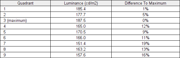
Luminance uniformity table
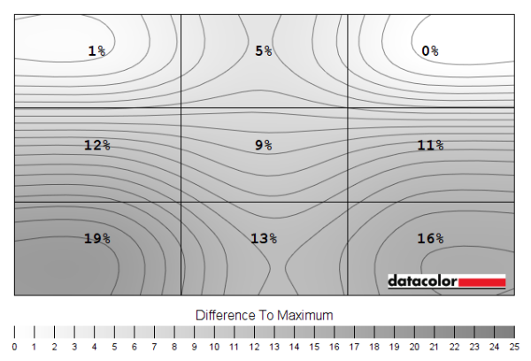
Luminance uniformity map
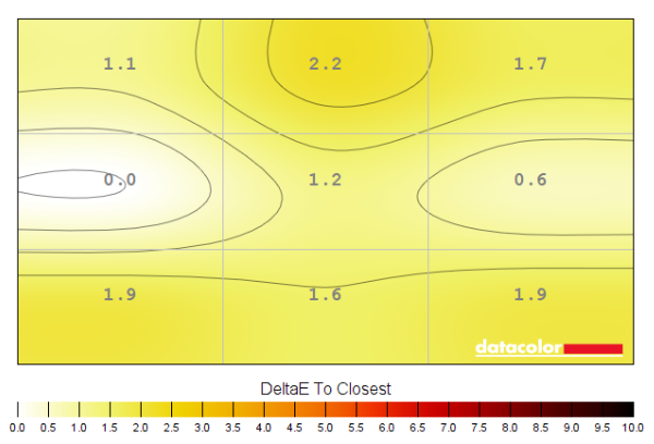
Colour temperature uniformity map
Contrast in games and movies
Lagom contrast tests
Colour reproduction
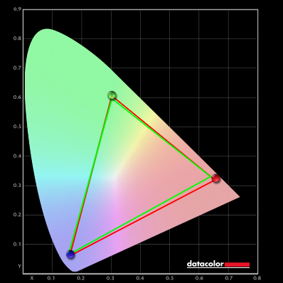
Colour gamut
Colour gamut 'Test Settings'

Colour gamut AMD 'CTC disabled' setting
Colour in games and movies
Shade representation using SpyderCHECKR 24
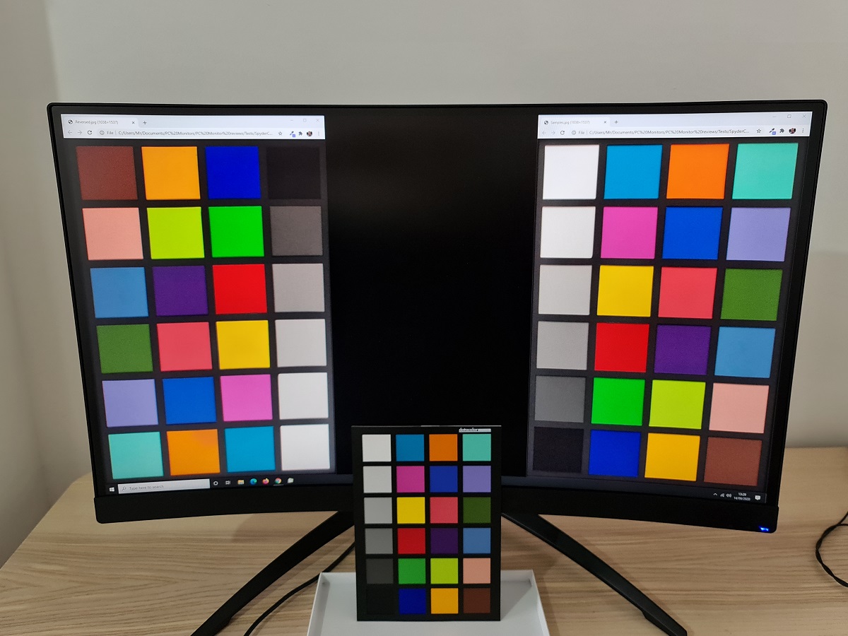
The monitor generally presents these shades in a slightly more vivid and saturated way than intended, mainly due to the colour gamut extending some way beyond sRGB. The stronger saturation is more apparent when shades are displayed further up the screen and therefore closer to the line of sight. As noted elsewhere in the reviews, perceived gamma shifts mean that some saturation is lost lower down the screen (and also to the sides – although that can’t be assessed with the shade layout here). These saturation losses are much lower than the vertical shifts observed on TN models. Aquamarine (4), for example, is quite well-represented if a touch oversaturated towards the top. Towards the bottom of the screen it appears slightly more aqua due to a touch of undersaturation. But this difference is nowhere near as pronounced as the TN example in the panels type article. The same can be said for medium orange (3) and Persian pink (6) which appear somewhat oversaturated further up and slightly undersaturated further down. But the shifts are less pronounced than for the TN example where there are dramatic differences in shade depth comparing the top vs. bottom of the screen.
Viewing angles
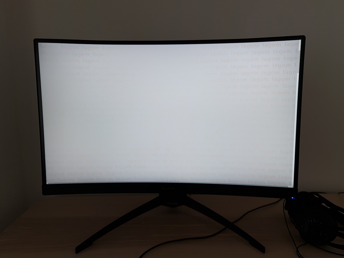
The following video shows the Lagom text test, a mixed desktop background, a game scene and dark desktop background from various viewing angles. For the mixed image and game scene you can see some shifts in colour and contrast. They’re most pronounced at steeper angles, although losses of saturation can be observed quite following gentler viewing position shifts. Especially horizontally. There is no ‘colour inversion’ as you’d observe on a TN model vertically and the shifts vertically are not as extreme. The final section of the video shows a dark desktop background and highlights ‘VA glow’ mentioned earlier. This blooms out more noticeably from sharper viewing angles but is not as strong from centralised viewing angles.
Interlace pattern artifacts
Responsiveness
Input lag
Perceived blur (pursuit photography)
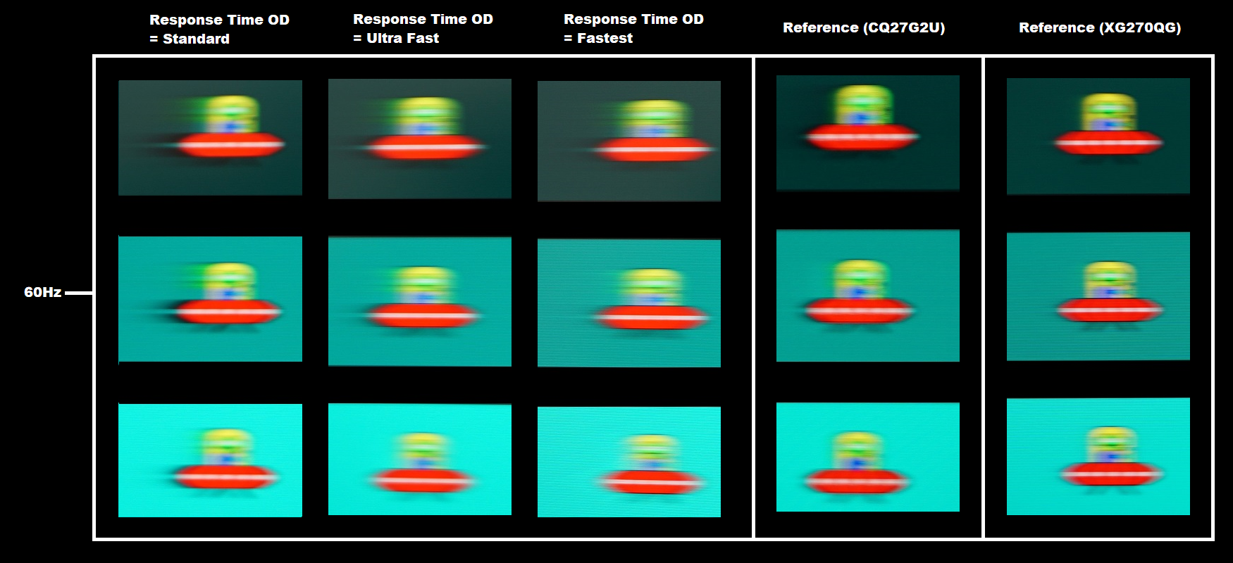
At 60Hz, shown above, the UFO appears relatively broad without clear internal details. This reflects a significant degree of perceived blur due to eye movement and is tied to the 60Hz refresh rate. There are also varying amounts of trailing behind the UFOs due to weaknesses in pixel responsiveness. These are strongest with the ‘Standard’ setting, whilst ‘Ultra Fast’ cuts it down quite a bit and ‘Fastest’ provides another reduction. You can see a significant reduction in trailing behind the UFO body for the dark background (top row) and medium background (middle row) when comparing ‘Standard’ to ‘Fastest’. The dark background provides more noticeable trailing than either reference shot, although the CQ27G2U shows a little ‘inky’ inverse ghosting (overshoot) in its place. The ‘Fastest’ setting on the ViewSonic introduces some overshoot as a bright ‘halo’ trail behind the UFO for the light background, although this isn’t too strong. Some transitions provide more noticeable overshoot than shown here, as we explore in the context of Adaptive-Sync at relatively low refresh rates later on. For this reason some might consider ‘Ultra Fast’ the optimal setting, whereas others may be happy sticking with ‘Fastest’. The pursuit photographs below show how things looked with refresh rate doubled, to 120Hz.
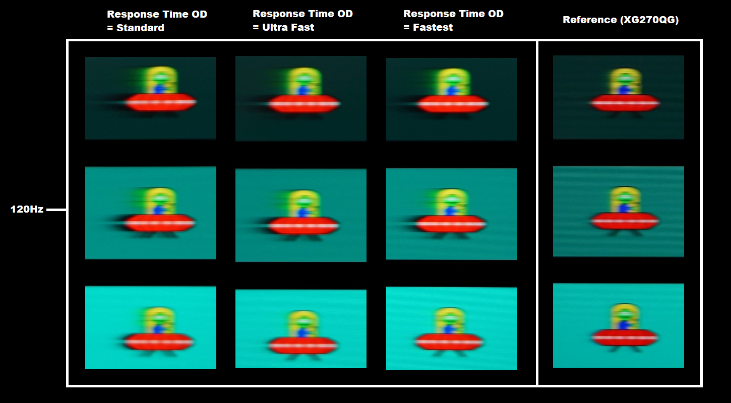
At 120Hz, shown above, the UFO now appears significantly narrower with somewhat clearer internal detailing. There are again varying degrees of trailing behind the UFOs due to weaknesses in pixel responsiveness. This trailing remains quite bold or ‘smeary’ for the dark and medium backgrounds even as the ‘Response Time OD’ setting is increased all the way up to ‘Fastest’ which we consider optimal at 120Hz. The pixel response time requirements for optimal performance here are far greater than at 60Hz and the pixel responses of the monitor just can’t keep up. The XG270QG reference is much cleaner, as expected, due to its significantly faster panel – although the XG270QC does well with the light background here. The pursuit photographs below show how things look increased further, to 144Hz.
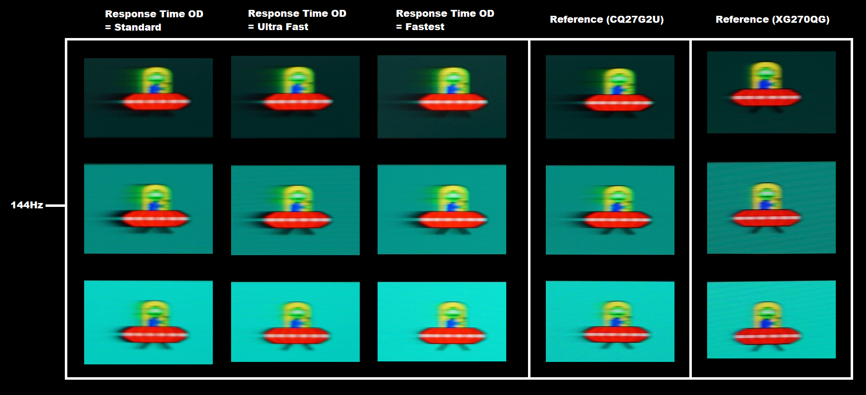
At 144Hz, shown above, the UFO appears slightly narrower and more sharply detailed. An extra 24Hz so not the sort of dramatic change when comparing 60Hz to 120Hz. But a further progression. The trailing behaviour is quite similar to at 120Hz, just a touch bolder in places due to the further increased pixel response requirements for optimal performance. Now we have the CQ27G2U reference back in the mix to compare with. The ‘Fastest’ setting on the ViewSonic is quite comparable to this AOC reference and we consider this to be the optimal setting at 144Hz. The trailing behind the UFO cockpit for the dark background is a touch lighter on the AOC, but there’s a little more trailing for the light background. In practice some transitions are slightly faster and some slightly slower but the overall pixel responsiveness, considering a broad range of transitions, is really quite comparable. The XG270QG again shows its strength in terms of pixel responsiveness, with just a few whiffs of powdery trailing. The pursuit photographs below show another bump up in refresh rate, to 165Hz.
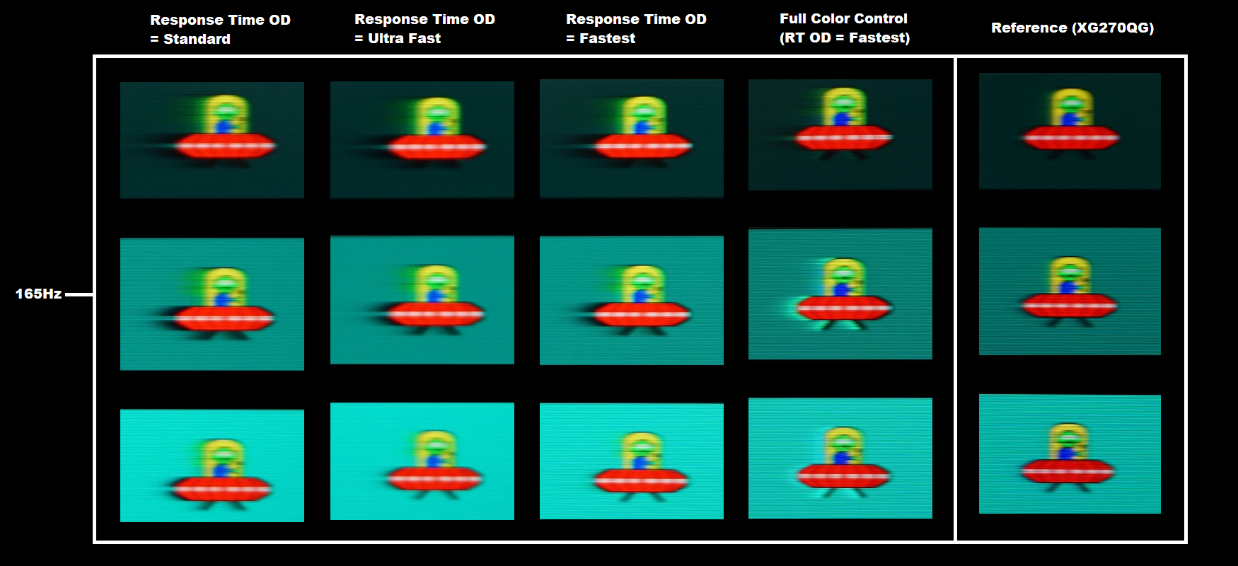
At 165Hz, shown above, the UFOs appear just slightly narrower again with slightly clearer internal detailing. A slight bump up again, nothing dramatic. The overall trailing behaviour is similar to 144Hz, just a touch bolder in places due to the slightly increased pixel response requirements but not a major difference. The ‘Fastest’ setting again appears optimal. The exception to this is where ‘Full Color Control’ is used, leading to the behaviour described earlier. There’s huge overshoot now with obvious bright and colourful ‘halo’ trailing that’s really quite dramatic for the medium background. If you need to use the ‘Full Color Control’ setting, regardless of refresh rate, we’d recommend sticking to the ‘Ultra Fast’ setting. This behaves as shown here, so not massively different to the ‘Fastest’ setting without ‘Full Color Control’.
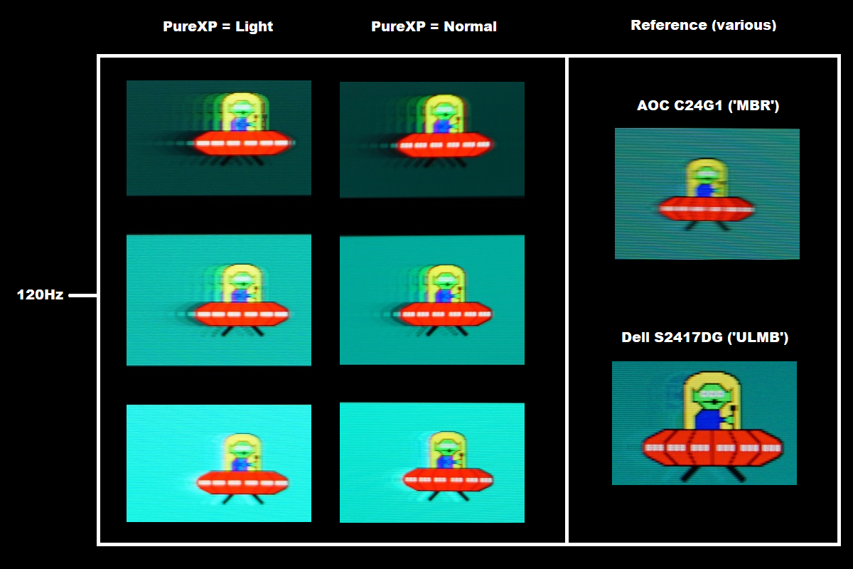
With PureXP active at 120Hz, above, the UFO is narrower with clearer internal detailing. This is particularly noticeable using the ‘Normal’ setting, where even the small white notches are distinct and can be counted. The segmentation isn’t as clear as in the reference shots, however. The narrower and sharper focus of the main object when compared with PureXP disabled indicates a significant reduction in perceived blur due to eye movement, the main purpose of this setting. There is a significant degree of trailing behind the object, however. The trailing is fragmented rather than a single smooth trail, due to the strobe nature of the backlight. The fragments appear as distinct repetitions of the object for the dark and medium backgrounds are due to the pixel responses not keeping up with the rigorous demands of the refresh cycle. You can also see a repetition in front of the object for the dark background. The all-encompassing term ‘strobe crosstalk’ is used to describe this fragmented trailing around the main object. Because not all areas of the screen refresh simultaneously, the appearance of strobe crosstalk can vary depending on how high up or low down the screen the movement is being observed. The reference shots don’t show this behaviour and instead show some overshoot. The light background on the ViewSonic shows overshoot as well, but it’s quite bright and noticeable ‘halo trailing’ and less blended than on the reference screens. The image set below shows results with a slight bump up in refresh rate to 144Hz, PureXP again active.
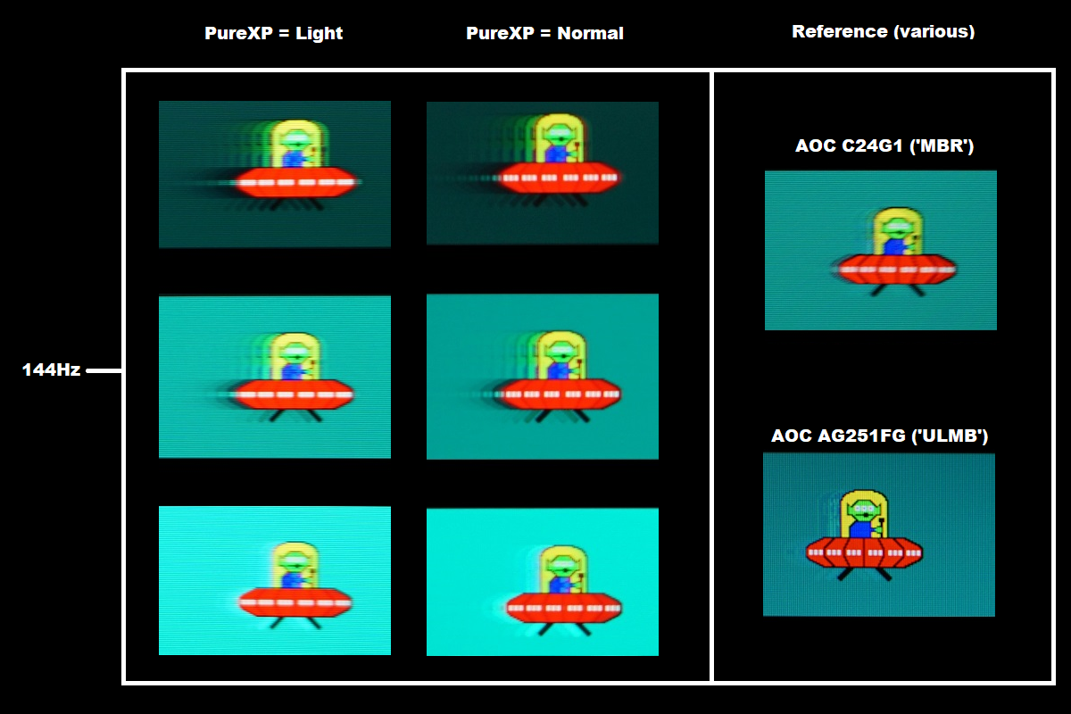
As you might expect the slight bump up in refresh rate to 144Hz doesn’t make dramatic differences. Although the notches are a bit more distinct for each respective ‘PureXP’ setting compared to at 120Hz, indicating a slight further reduction in perceived blur due to eye movement. The strobe crosstalk manifests in a similar way, with fragments packed together a little more tightly due to the increased refresh rate. This is again more distinct than what’s shown on the reference screens. The C24G1 shows lower strobe crosstalk, whilst the AG251FG shows some overshoot instead but it’s more blended than what is observed with the light background on the ViewSonic. The image set below was taken with a further increase in refresh rate, to 165Hz with PureXP active.
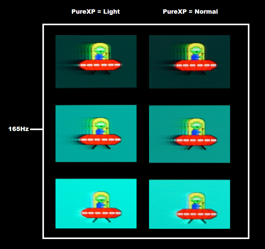
At 165Hz, above, things appear quite similar to 144Hz. There’s another slight bump up in clarity with each respective setting when compared to 144Hz and more so when compared to 120Hz. Using the ‘Normal’ setting gives good distinction for the white notches and slightly enhanced distinction for the segments – they’re actually more visible in practice than in the photos as well. There’s again considerable strobe crosstalk, with the fragments packed together a touch more tightly again but a greater number of fragments – due to the increased refresh rate. It’s important to note that strobe crosstalk varies at different areas of the screen. Not all areas refresh simultaneously, so its appearance can differ depending on how high up or low down on the screen movement is being observed. The images below show pursuit photographs running from the top to bottom regions of the screen, with the screen set to 165Hz and ‘PureXP = Normal’. Strobe crosstalk variation at different points was also observed at 144Hz and 120Hz and using other ‘PureXP settings – but the end result was quite similar and we didn’t feel it was worthwhile documenting these observations.
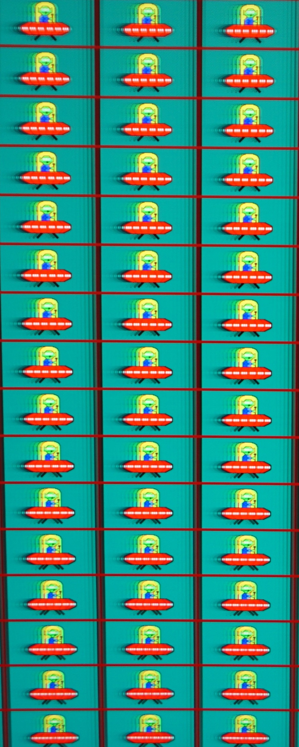
You can see quite strong strobe crosstalk throughout the screen. Further up it is visible in front of the UFOs as well as behind. Towards the middle it’s only visible behind, with a greater number of fragments. The initial fragment is so bold that it essentially melds into the main object. Lower down the screen, this occurs both behind and in front of the object, although the number of fragments behind decreases. Whilst this strobe crosstalk doesn’t make the PureXP setting useless, it does negatively impact the overall clarity of the setting and makes it less effective than it could be. We explore this and some other aspects to consider using in-game examples at the end of this section.
Responsiveness in games and movies
FreeSync – the technology and activating it
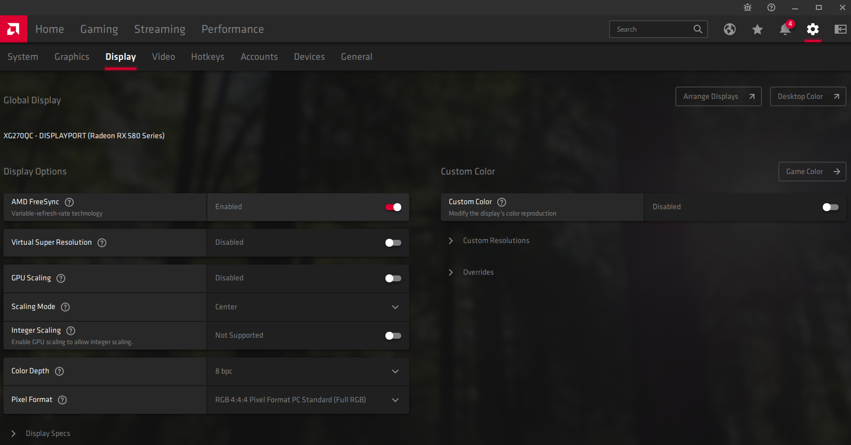
The ViewSonic supports a variable refresh rate range of 52 – 165Hz*. That means that if the game is running between 52fps and 165fps, the monitor will adjust its refresh rate to match. When the frame rate rises above 165fps, the monitor will stay at 165Hz and the GPU will respect your selection of ‘VSync on’ or ‘VSync off’ in the graphics driver. With ‘VSync on’ the frame rate will not be allowed to rise above 165fps, at which point VSync activates and imposes the usual associated latency penalty. With ‘VSync off’ the frame rate is free to climb as high as the GPU will output (potentially >165fps). AMD LFC (Low Framerate Compensation) is also supported by this model, which means that the refresh rate will stick to multiples of the frame rate where it falls below the 52Hz (52fps) floor of operation for FreeSync. If a game ran at 33fps, for example, the refresh rate would be 66Hz to help keep tearing and stuttering at bay. This feature is used regardless of VSync setting, so it’s only above the ceiling of operation where the VSync setting makes a difference.

Some users prefer to leave VSync enabled but use a frame rate limiter set a few frames below the maximum supported (e.g. 162fps) instead, avoiding any VSync latency penalty at frame rates near the ceiling of operation or tearing from frame rates rising above the refresh rate. If you go to ‘Setup Menu’ – ‘Information’ in the OSD, you’ll see ‘V’ (vertical frequency) change according to frame rate changes if FreeSync is working correctly. This will coincide with the frame rate if the display is within the VRR range. The final point to note is that FreeSync only removes stuttering or juddering related to mismatches between frame rate and refresh rate. It can’t compensate for other interruptions to smooth game play, for example network latency or insufficient system memory. Some game engines will also show stuttering (or ‘hitching’) for various other reasons which won’t be eliminated by the technology.
FreeSync – the experience
Nvidia Adaptive-Sync (‘G-SYNC Compatible’)
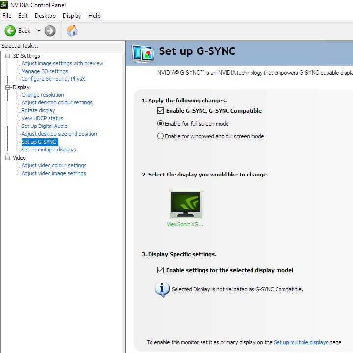
You will also see in the image above that it states: “Selected Display is not validated as G-SYNC Compatible.” This means Nvidia hasn’t specifically tested and validated the display. Unfortunately the technology didn’t work for us, giving clear flickering, stuttering and frequent screen blanks over a broad range of refresh rates. This was the case with our GTX 10 Series GPU (GTX 1080 Ti), at least. Unfortunately, we didn’t have access to a newer GPU (RTX 20 or RTX 30 series) at time of review to confirm if they behave similarly. On some models newer Nvidia GPUs are free from some of these issues that the older GPUs like ours exhibit.
PureXP (Pure Experience)
HDR (High Dynamic Range)
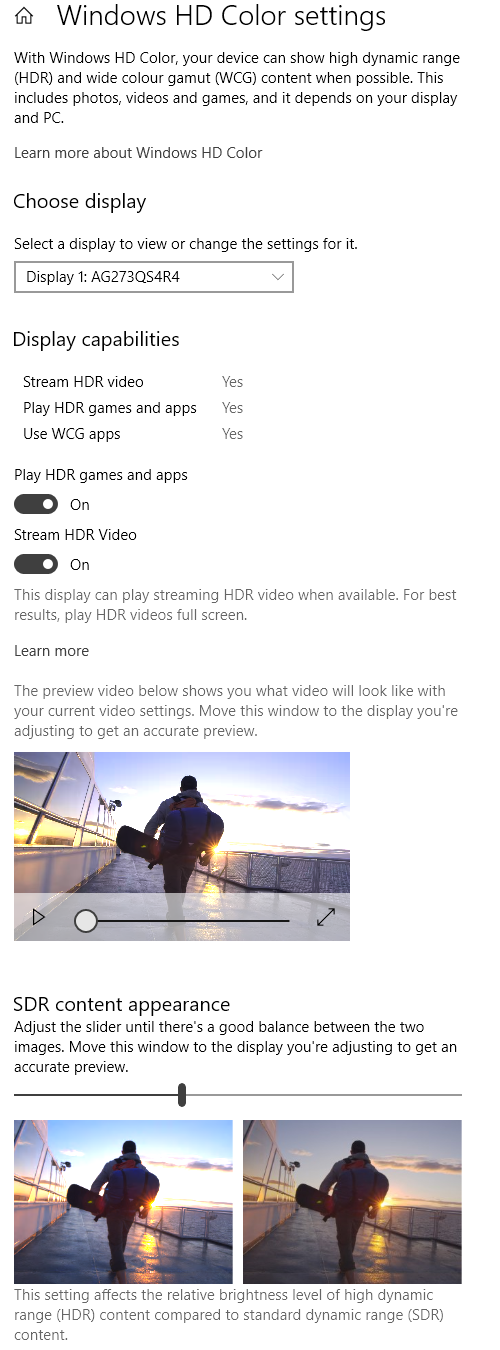
Colour gamut 'Test Settings'
The HDR10 pipeline makes use of 10-bits per colour channel, which the monitor supports via 8-bit + FRC. At some refresh rates (144Hz+ for DP, 120Hz+ for HDMI) the dithering stage is offloaded to the GPU at the native resolution, for bandwidth reasons. We’ve carefully observed a range of content (including fine gradients) on a broad range of monitors where 10-bit is supported monitor side (usually 8-bit + FRC) and where the GPU handles the dithering under HDR. Including comparisons with a given model where the monitor handles the dithering at some refresh rates and the GPU handles it at others, due to bandwidth limitations. Regardless of the method used to achieve the ’10-bit’ colour signal, we find the result very similar. Some subtle differences may be noticed during careful side by side comparison of very specific content, but things are really handled very well even if GPU dithering is used. The enhanced precision of the 10-bit signal aids your nuanced shade variety. In dark scenes you can appreciate a superior variety of very closely matching dark shades, providing a more natural look to things. Uplifting detail in a natural way, giving a very different look to simply decreasing gamma for those dark shades so they’re more visible. At the high end you can see much smoother gradients. Mist, smoke and weather effects for example now showcase a superior range of very closely matching brighter shades. The image below shows one of our favourite scenes for showcasing a decent HDR performance, from Shadow of the Tomb Raider. Remember that the photo is purely for illustrative purposes and in no way represents how the monitor appeared running HDR in person.
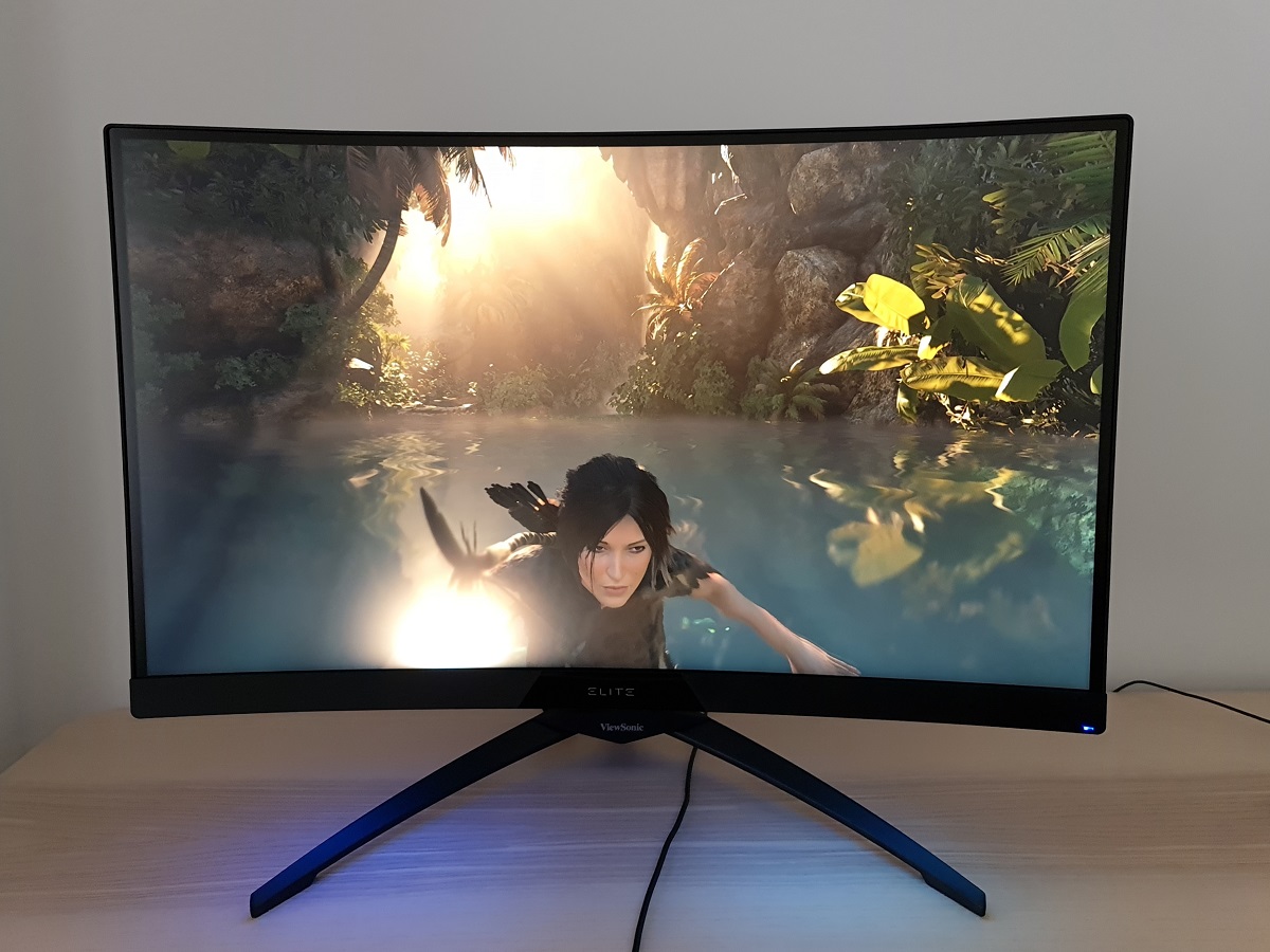
The curve and resolution
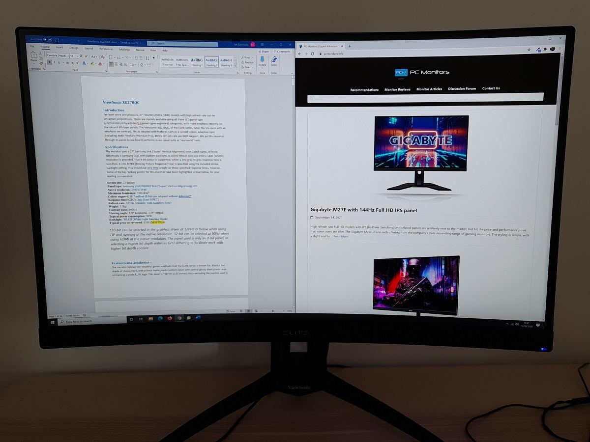
The curve brings a similar experience to games, slightly drawing you in without feeling uncomfortable – in fact some would find it enhances comfort. The effect is more pronounced on larger screens, particularly UltraWides, but can still be appreciated in a relatively subtle way on a screen like the ViewSonic. As with desktop viewing, we found the curve so easy to adapt to that it was easy to forget you were even gaming on a curved screen. It just becomes normal. The images below showcase a range of game title running on the monitor and in no way accurately show how the monitor looks in person. They’re there to fire up the imagination.
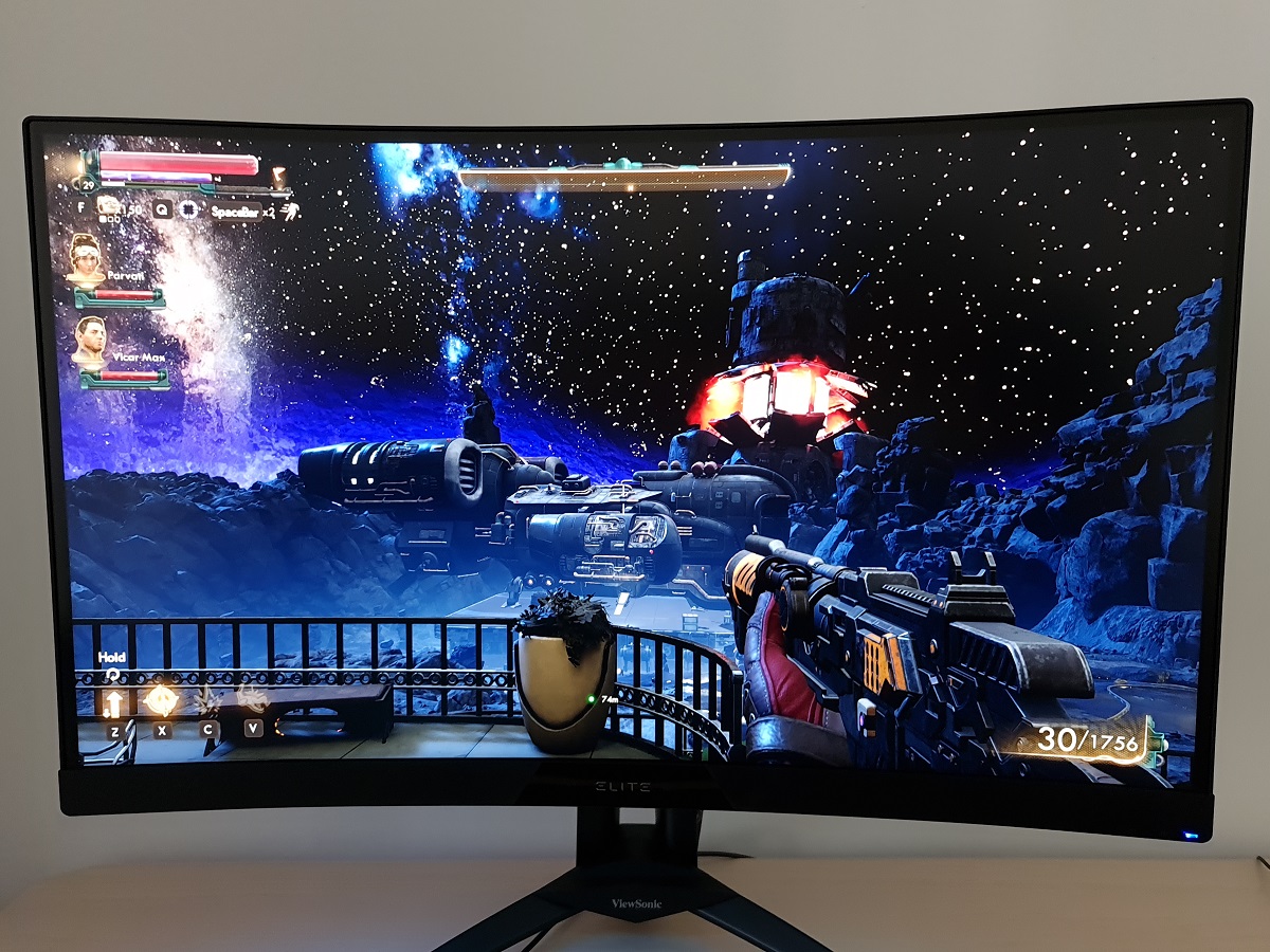
Interpolation and upscaling

Video review
Timestamps:
Features & Aesthetics
Contrast
Colour reproduction
HDR (High Dynamic Range)
Responsiveness (General)
Responsiveness (Adaptive-Sync)
Conclusion
The bottom line; a solidly built monitor that delivers quite vibrant colour output and strong contrast – but don’t expect ELITE-level pixel responsiveness.
Positives Negatives Respectable ‘out of the box’ gamma with good OSD flexibility, fairly vibrant colour output due to extension beyond sRGB without heavy oversaturation
No sRGB emulation mode, colour gamut not as generous as some models and minimum luminance a touch higher than ideal for sensitive users Strong static contrast, powerful backlight and one of the better VESA DisplayHDR 400 implementations we’ve seen ‘VA glow’ affects atmosphere in dimmer lighting, particularly further down the screen. A little ‘black crush’ and slight graininess to the screen surface, plus no local dimming for a true HDR experience A 165Hz refresh rate and low input lag, plus FreeSync working nicely to get rid of tearing and stuttering
Some pixel response time weaknesses, with ‘smeary’ trailing in places. A bit of overshoot at lower refresh rates in particular. Issues using Adaptive-Sync on our GTX 10 series GPU A solid built with good ergonomic flexibility and an RGB LED lighting feature that can be appreciated from in front of the screen – a comfortable size and resolution for many, too Quirky pixel overdrive behaviour if ‘Full Color Control’ is used (colour channels manually adjusted), rear-facing RGB LEDs too weak to be seen from the front
As an Amazon Associate I earn from qualifying purchases made using the below link. Where possible, you’ll be redirected to your nearest store. Further information on supporting our work.
