Author: Adam Simmons
Date published: April 29th 2014
Table of Contents
Introduction
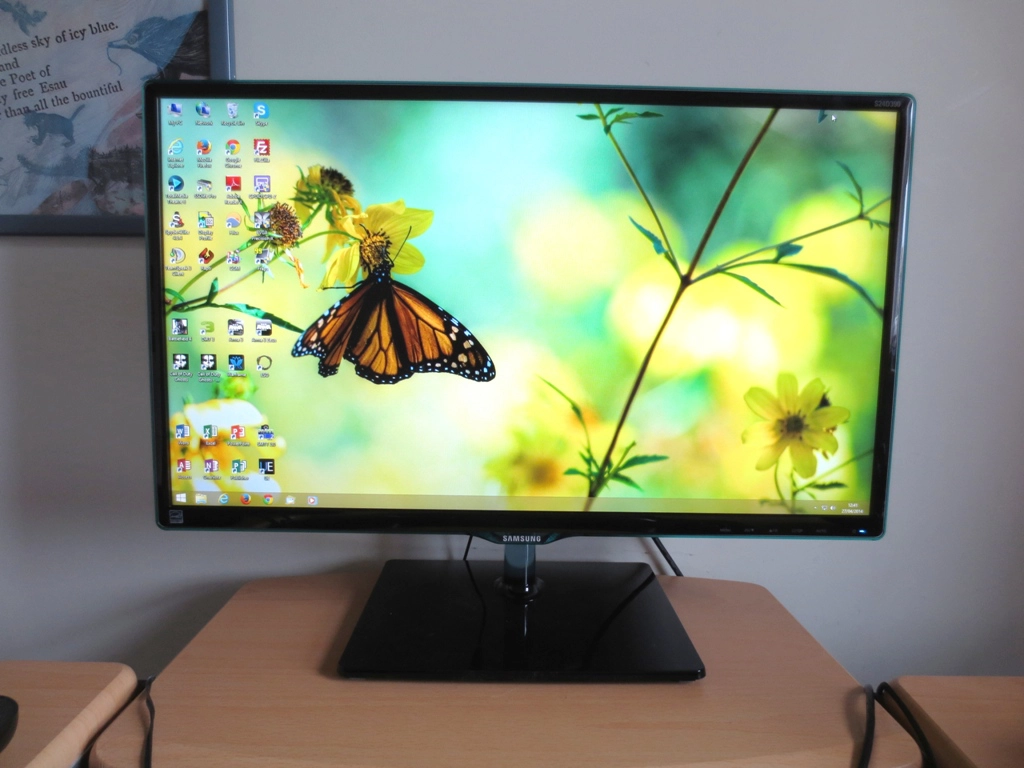
Samsung’s AD-PLS (Advanced Plane to Line Switching) panels are designed to compete with LG’s increasingly widespread AH-IPS (Advanced High-Performance In-Plane Switching) panels. The aim is to bring enhanced colour and viewing angle performance into an attractively priced package without compromising on responsiveness. The Samsung S24D390HL combines an AD-PLS panel with unmistakable Samsung styling. We never judge a book by its cover, and whilst this monitor may have a rather unique and to some people inspiring design we’re more interested to see how it actually performs in a range of applications.
Specifications
This monitor uses a 60Hz Full HD AD-PLS panel, which includes the usual 6-bits + FRC dithering colour handling. A 5ms grey to grey response time is quoted, indicating the now common use of pixel overdrive to enhance response times. For your reading convenience the key ‘talking points’ of the specification have been highlighted in blue below.
Features and aesthetics
The SD390 series has a unique style. As is common amongst Samsung’s ‘entertainment’ (home) monitor range, glossy black plastics prevail. The bezels are surrounded by Perspex with turquoise ‘Touch of Colour’ accents. The stand neck is made from a similar acrylic material with a glacial blue accent. The bezels are quite slender – 12mm (0.47 inches) at the top and sides and 18-25mm (0.71 – 0.98 inches) at the bottom. The screen surface is light matte anti-glare as evident in the first picture below with strong direct light striking the screen. This is slightly lighter (lower haze value) than that seen on comparable IPS models. It is not quite as light or smooth-looking as so-called ‘semi glossy’ surfaces. Once the screen is switched on in more sensible lighting conditions (second picture) the effective anti-glare properties become apparent.
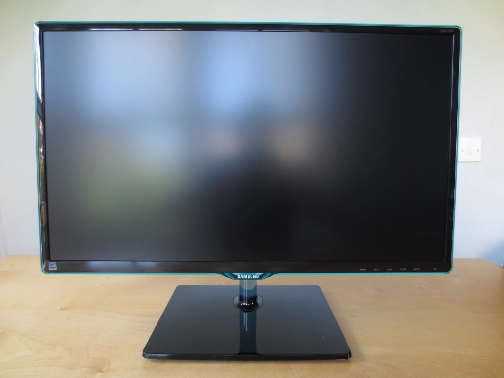
At the right of the bottom bezel are the monitor’s touch-sensitive controls, activated by touching the front-facing surface. These control the OSD (On Screen Display) of the monitor and proved fairly responsive and frustration-free. They were not bad as far as touch sensitive controls go. The functions of the buttons are; ‘Menu/Exit’, ‘Game Mode/Down’, ‘Volume/Up’, ‘Source/Enter’, ‘Auto (for analogue connections)’ and ‘Power’. The power is a small reasonably dim dark blue oblong that blinks when the monitor enters standby. The buttons have fixed functions and are not ‘Custom Keys’, meaning that you can’t assign them to other functions. The video runs through the features available on the OSD.
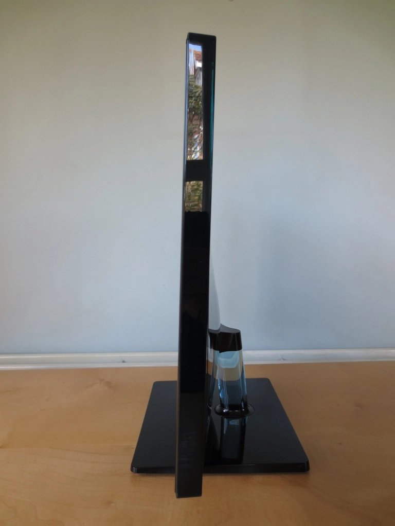
The side of the monitor is basically dark black glossy plastic coated in the same turquoise Perspex visible from the front. The monitor is 19mm (0.75 inches) thick at thinnest point, lumping out a bit where the stand attaches. The ergonomic flexibility of the stand is limited to tilt only, and as usual for a Samsung monitor the tilt adjustment is fairly stiff. Thankfully the monitor doesn’t feel particularly delicate so will withstand the reasonably firm adjustments required to tilt the screen.
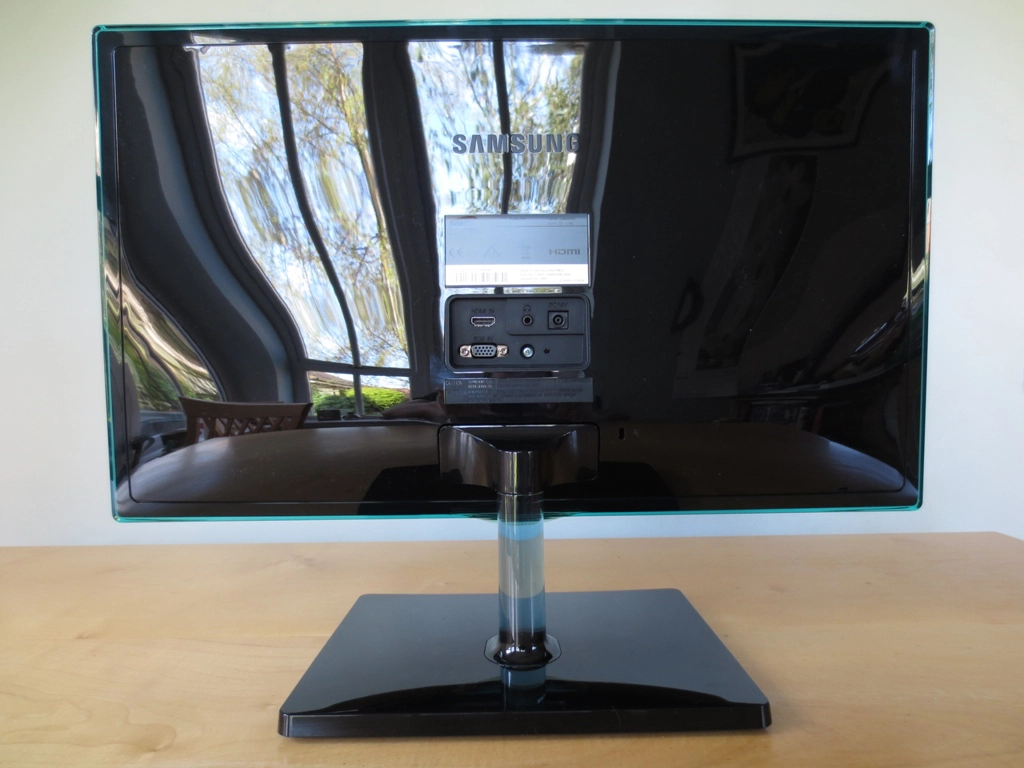
At the rear the monitor is fairly barren. Glossy black plastic dominates in all its dust-loving glory. The ‘Touch of Colour’ accents are also quite clear from this angle. The ports are very limited; HDMI, VGA (RGB in), 3.5mm audio output and a DC power input (external ‘power brick’ included). In typical Samsung fashion there are no VESA holes. There is a Kensington lock socket though, a fairly standard but for some users important feature.
Calibration
Correcting the colour signal
Our test system used an Nvidia GTX 780 connected using the single HDMI port (only digital input) of the monitor. Usually when you connect a monitor up to an Nvidia GPU via HDMI everything looks a bit washed out and flooded. The Samsung has a built in setting to counteract this called ‘HDMI Black Level’ which is set to ‘Low’ by default. This allows PC users with Nvidia GPUs to plug in the monitor via HDMI and experience nice saturated colours and the correct contrast – so good work by Samsung here.
Although the image looks ‘nice’ and many users would undoubtedly be happy leaving things as they are, it is possible to improve things further. By ensuring the graphics card is using a ‘Full Range RGB 0-255’ colour signal (designed for PCs) rather than a ‘Limited Range RGB 16-235’ signal (designed for HDTVs) and setting ‘HDMI Black Level’ to ‘Normal’ you get rid of some of the fairly noticeable dithering on certain shades. Things will look superficially similar regarding the richness of colours and contrast but the dithering is much improved – certain grey shades in particular appeared to ‘crawl’ using the default Limited Range RGB signal.
Enforcing the correct ‘Full Range RGB 0-255’ signal is straightforward using one of two methods. Firstly you can set up a custom resolution in Nvidia Control Panel with a 59.999Hz refresh rate. This is treated by most applications as 60Hz but uses the correct ‘Full Range RGB 0-255’ colour signal. The process for setting this up is shown in the video below.
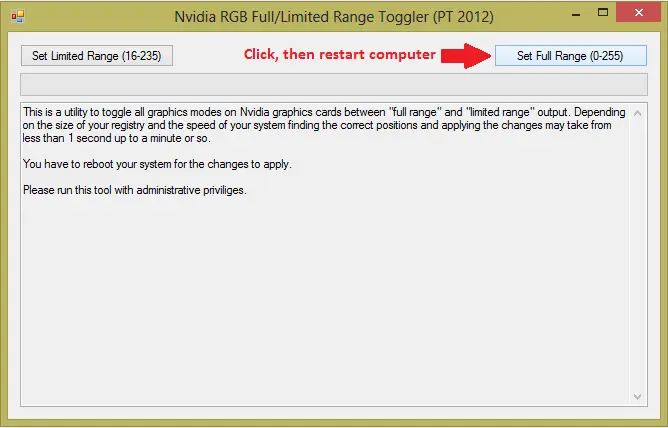
A select few games ignore custom resolutions and will instead use the default ‘1080p’ resolution of the monitor complete with the ‘Limited Range 16-235’ colour signal. The preferred method for correcting the colour signal is therefore to use this utility. You simply run the .exe file included in the .zip and click the button at the top right which is labelled ‘Set Full Range (0-255)’, as shown below.
AMD GPU users shouldn’t have any issues on this monitor. The ‘HDMI Black Level’ option should be greyed out for AMD users by default. There is a ‘Pixel Format’ setting which AMD users can experiment with in Catalyst Control Centre. It is sometimes possible to gain a little bit of extra contrast and slightly reduce dithering by changing from the default ‘YCbCr 4:4:4 Pixel Format’ to ‘RGB 4:4:4 Pixel Format PC Standard (Full RGB)’ as detailed in the calibration section of our GW2760HS review. You should also ensure that the ‘HDMI Black Level’ option is set to ‘Normal’ as Nvidia users are advised to do after switching on their ‘Full RGB’ setting.
Testing the presets
The S24D390HL has quite a range of presets available. The standard ‘MagicBright’ presets include; ‘Custom’, ‘Standard’, ‘Cinema’ and ‘Dynamic Contrast’. There are also 3 ‘Gamma’ settings and a ‘Game Mode’ that will block out access from the ‘MagicBright’ presets and ‘Color’ menu. Rather than going through every setting we will select a few which we think users will find most appealing or be particularly interested in (for example the new ‘Game Mode’). The table below shows key readings taken using a Spyder4Elite colorimeter, an overview of some OSD options available in certain presets and some notes on the overall image using a range of monitor settings. The observations and readings in the table were made after correcting the HDMI colour signal using the method detailed above on our GTX 780.
| Monitor Profile | Gamma (central average) | White point (kelvins) | Extra OSD settings | Notes |
| Magic Bright = Custom (Factory Defaults) | 2.2 | 6467K | Brightness, Contrast, Sharpness, Magic Upscale, ‘Color’ menu | Image a bit too bright (but not overwhelmingly so) and some shades could do with just a touch more depth but otherwise rich and well balanced with a pleasing variety of shades. |
| Magic Bright = Standard | 2.0 | 6490K | Brightness, Contrast, Sharpness, Magic Upscale, ‘Color’ menu | As ‘Custom’ but dimmer with a very slight (and easily correctable) green tint visible on whites. |
| Color Tone = Warm 2 | 2.1 | 4558K | Brightness, Contrast, Sharpness, Magic Upscale, ‘Color’ menu | This setting is essentially like a ‘Reading’ or ‘Low Blue Light’ mode. The image appears very warm; the blue channel is hugely diminished whilst red dominates. You can set the brightness to a comfortable level as well, you still have access to that setting. |
| Game Mode | 2.0 | 6479K | Brightness | This mode introduces very heavy oversaturation, greatly diminishes shade variety and applies excessive sharpness. Not at all appealing to the discerning viewer and a big waste of the AD-PLS panel’s potential. |
| Gamma = Mode2 | 1.8 | 6465K | Brightness, Contrast, Sharpness, Magic Upscale, ‘Color’ menu | As ‘Custom’ but image appears quite washed out owing to gamma being too low. |
| Gamma = Mode3 | 2.2 | 6486K | Brightness, Contrast, Sharpness, Magic Upscale, ‘Color’ menu | As ‘Custom’ but some shades are given extra (appropriate) depth. The image is rich, well balanced and generally very appealing. |
| Test Settings (modified as below) | 2.2 | 6500K | Brightness, Contrast, Sharpness, Magic Upscale, ‘Color’ menu | As ‘Gamma = Mode 3’ with slight corrections to white point. |
Samsung does a very good job at providing an appealing image straight from the box. Even using the default ‘Limited Range RGB’ colour signal as an Nvidia user provides full contrast and rich colours rather than the usual washed out affair. Some improvements are made, which keen-eyed viewers will appreciate, by forcing the correct ‘Full Range RGB’ colour signal to be used by the GPU and monitor instead. Following this the image is quite bright (not overwhelmingly so) but nicely balanced with only a few minor tweaks required to make things optimal. For this Samsung provides some useful options which not all monitors have, such as the ability to change ‘Gamma’ between one of three modes. Simply switching this to ‘Mode3’, altering the colour channels ever so slightly and lowering brightness a bit achieved very pleasing results.
As is common there are a number of other settings to play around with. There is no dedicated ‘Reading’ or ‘Low Blue Light’ preset, at least nothing labelled as such, but a simple adjustment to ‘Warm2’ for ‘Color Tone’ provides exactly this functionality. There is a new feature added to Samsung’s 2014 line-up called ‘Game Mode’. There is no polite way of putting this; it destroys the image quality of this monitor by massively reducing shade variety through extreme oversaturation and applies excessive and un-correctable sharpness. It is designed to give something of a competitive edge, primarily by skewing the gamma curve in a way that makes enemies more visible in dark areas and suchlike. This skewed gamma curve, tracking like an inverted golf club, is shown below. Under our test settings the gamma tracking is very good indeed, as shown below. With performance like this the only improvement you’re going to get is by fully calibrating your own unit with your own colorimeter or spectrophotometer. Given how well Samsung has things set up ‘from the box’ using somebody else’s ICC profile will likely make things worse rather than better due to inter-unit variation. To that end we will not be providing any ICC profiles for this monitor. As noted above the monitor didn’t really need too much adjusting to give an image that appealed even to the trained eye. We used the following settings on our unit – anything not mentioned below was either kept at default or is not a setting that will directly affect the colour quality or contrast of the monitor and therefore not relevant to this section. Be aware that individual units will vary and these settings should only be used as a suggestion. Brightness= 66 (according to preferences and lighting) Contrast= 75 Gamma= Mode3 R= 49 G= 48 B= 50 We used a KM CS-200 luminance meter to measure the brightness of white and black using various settings and from these reading calculated static contrast ratios. These readings and calculations are shown in the table below with blue highlights indicating the highest white luminance, lowest black luminance and maximum static contrast ratio recorded. Black highlights indicate the readings and contrast ratio calculation for our ‘Test Settings’. Aside from our test settings assume default settings were used aside from the alterations specifically mentioned in the table. The average contrast ratio with only brightness adjusted was 1193:1. This is excellent and about as good as we’ve seen from a non-VA LCD panel. Contrast performance remained strong following the minor adjustments made to our test settings, at 1143:1. A drop to 1090:1 was observed when running ‘Game Mode’ and a further drop following the significant colour channel alterations made to ‘Color Tone = Warm2’, where 989:1 was recorded. The maximum brightness of the monitor was 230 cd/2 which is quite low and a bit below the specified 250 cd/m2. This is still brighter than most users would find comfortable during normal use, however. The minimum brightness was exceptionally low at 26.2 cd/m2, which sensitive users will really appreciate. The contrast here was recorded as 1300:1 with a black level of 0.02 cd/m2 which is exceptional for a PLS panel. The luminance adjustment range is therefore 203.8 cd/m2 using the settings we tested. As usual Samsung includes an extremely ‘dynamic’ Dynamic Contrast mode. This gives the backlight of the monitor the freedom to dim and brighten as it pleases in accordance with the level of ‘light’ or ‘dark’ on the image. The backlight reacts extremely quickly to changes in scene brightness, hence the ‘dynamic’ comment earlier. It dims very effectively in situations where the content is predominantly dark but tends to overdo the brightness a bit during mixed scenes with plenty of lighter elements. Because the maximum luminance of the monitor is not outlandishly high this isn’t as much as an eyesore as it could be, though, and you never feel it’s assaulting your retinas in the same way that some monitors do. As is standard on any LCD monitor the backlight must adjust as one unit, so this works on average scene brightness with no zonal control. We personally prefer to leave this setting disabled, but feel that Samsung have implemented a very effective Dynamic Contrast feature here which reacts quickly and for the most part appropriately to changes in brightness. Another bonus is that it doesn’t employ any garish oversaturation or excessive sharpness in the process and the image maintains its rich and varied look. Unlike some other manufacturers Samsung do not specifically market this monitor as ‘flicker free’ or anything else to that effect. A nice bonus, though, is that this monitor does not use PWM (Pulse Width Modulation) to regulate its backlight brightness at any brightness and instead employs a Direct Current (DC) adjustment method. The backlight is therefore considered ‘flicker free’ which will be welcome news for users who are sensitive to PWM or worry about flicker on monitor backlights. Using our test settings we observed a black screen in a dark room. As shown in the picture below there was no obvious backlight bleed. There was the slightest hint of some along the bottom edge and far left edge but this was very minor as demonstrated in the image. The picture was taken a few metres back from the monitor to ensure only backlight bleed was captured rather than PLS glow. This ‘glow’ is a characteristic of the panel type and appears as a silvery-blue sheen towards the edges of the monitor. This moves as you move your head, something demonstrated in a video later in the review. Using a Spyder4Elite we assessed the uniformity of lighter colours, represented by 9 equally spaced white quadrants running from the top left to bottom right of the screen. The values recorded and percentage deviation between a given quadrant and the brightest point of the screen are shown in the table below. The monitor had pleasing luminance uniformity overall. The brightest point measured was the central quadrant, ‘quadrant 5’ (159.8 cd/m2). The greatest deviation from this occurred at the bottom left of the screen (135.5 cd/m2 which is 15% dimmer). Elsewhere the screen was within 2-10% of the brightest luminance which is very good. The contour map below shows these deviations visually. Here percentage deviations are provided for each quadrant with darker grey colours representing greater deviation from the brightest point. We also considered another aspect of uniformity – colour temperature uniformity. The Spyder4Elite was used to measure variation in white point across the screen. The graphic below shows deviations in DeltaE between the 9 quadrants analysed previously. A Delta E >3 represents a significant deviation which some users would be able to spot quite readily. The darkest colours on this map show the greatest deviation from the 6500K (D65) daylight white point target. There are no significant deviations in the areas of the screen assessed here which is pleasing. The point measured closest to 6500K in this instance was ‘quadrant 3’ at the upper right of the screen. The greatest deviation from this occurred at ‘quadrant 1’ at the upper left of the screen. As with other aspects of uniformity it’s important to note that individual units can and do vary in this regard, but it’s good to see a strong performance here. Aside from near the edges of the screen, where some detail was lost to PLS glow, dark detail was quite impressive on this screen on Battlefield 4. Some fairly minor details, such as the driver controls of unlit train carriages on Operation Metro 2014, were visible. Bright details such as artificial lights, areas of bright sky etc. contrasted well. These elements had a slight graininess to them from the matte screen surface without having the ‘smeared’ look of some older IPS panels. On Dirt 3 the only notable loss of detail occurred on dark areas of the image towards the edges of the screen. This is again due to the PLS glow characteristic of the panel. Elsewhere detail levels were quite respectable with pleasing contrast between bright and dark elements. Bright shades such as white headlights and the moon lacked the same smoothness you’d see on a lighter matte (‘semi glossy’) or glossy screen surface, but didn’t look ‘dirty’ or heavily grainy either. On the Blu-ray of Skyfall the monitor gave a good contrast performance overall. Some detail was lost towards the edges of the screen due to PLS glow, but this affected a relatively small portion of the screen. Detail levels elsewhere were quite pleasing with some fairly minor details visible in dark scenes (creases in clothing, brickwork in dark passages etc.) Bright neon lights and candle flames penetrated the darkness nicely, giving a good atmosphere to such scenes. Lagom’s contrast tests are good at highlighting weaknesses in a monitor’s contrast performance which may not become immediately apparent during other testing. We made the following observations. The Samsung S24D390HL’s colour gamut sticks quite closely to sRGB. There is a little under-coverage and some over-coverage in certain green and orange shades in particular on this representation of the gamut but nothing alarming. The rich depth and variety of colours on Battlefield 4 was impressive. Everything looked very much as it should – rich and varied green and earthy brown vegetation, vibrant orange fires and rich blue skies. A given shade appeared the same regardless of its on-screen position, aiding the apparent shade variety and playing to the strengths of the PLS panel. The rich and fairly vibrant colours produced by the monitor gave the car liveries on Dirt 3 the lively look they crave. Deep blues, rich reds and bold yellows were particularly strong. The racing environments also benefited from the competent colour reproduction of the monitor with an excellent variety of natural-looking shades. The range of subtly different khaki colours on the dusty Kenyan rally tracks was particularly impressive. The colour performance was very pleasing on the Blu-ray of Skyfall with everything looking as it should. Skin tones and buildings in the background appeared appropriately saturated with an excellent variety of different closely matched shades. The bright colourful lights of the Shanghai night scenes showed off the monitor’s ability to provide some fairly striking shades – strong blues, deep purples and bright icy light blues stood out well. The Samsung gave a good vibrant look to the Blu-ray of Futurama: Into the Wild Green Yonder. There were plenty of pleasing strong shades such as deep reds and blues alongside some quite striking neon yellows, pinks and greens. This film showed off the strong colour consistency of the monitor, too. There were plenty of closely matched shades, each displayed appropriately regardless of on-screen position. The pastel shades used for various character skin tones demonstrated this particularly well. Various white shades with slightly different colour temperature displayed similar distinction and consistency – something you can’t take for granted even on an IPS or PLS panel. The strong colour consistency of the monitor was highlighted quite specifically by Lagom’s tests for viewing angle. The following observations were made. The following video demonstrates some changes that occur in this text test as you view the monitor from a variety of viewing angles. A mixed desktop and dark desktop background is also displayed from various viewing angles, with the dark desktop showing how the aforementioned PLS glow manifests itself from decentralised viewing angles. We used SMTT 2.0 and a sensitive camera to compare the S24D390HL’s latency with a range of other monitors of known latencies. Over 30 photographs were taken and an average input lag calculated. On this monitor we recorded 5.4ms (under half a frame) of input lag, indicating that the signal delay of the monitor is very low and shouldn’t be an issue for gamers. Some gamers may of course prefer even lower latency and a faster experience for their gaming – but for that you’d really need to look at a completely different monitor with a higher refresh rate. Also note that ‘Game Mode’ had no recordable impact on input lag. A small utility called PixPerAn (Pixel Persistence Analyser) was used alongside a sensitive camera to help assess the pixel responsiveness of the monitor. For this the highest ‘tempo’ (movement speed) was selected on PixPerAn and the results captured on camera with the monitor set to various ‘Response Time’ settings. The images below show the results with ‘Response Time’ set to ‘Standard’, ‘Faster’ and ‘Fastest’, respectively. Set to ‘Standard’ (top image), you can see a fairly bold primary trail and a slight secondary trail. This is typically what you see on a panel of this type when very weak pixel overdrive (grey to grey acceleration) is used, if any is used at all. Using the ‘Faster’ setting (middle image) weakens the secondary trail significantly so it is barely visible and appears to slightly weaken the primary trail. The ‘Fastest’ setting (bottom image) gives a dirty appearance to the primary trail, an artifact associated with the pixel overdrive being too aggressive. In practice the ‘Fastest’ setting introduced a range of other artifacts when gaming, again related to the acceleration being too strong using this setting. There were instances of reasonably mild ‘inverse ghosting’ (overshoot) in places – usually trails that were slightly brighter than either the colour of either the background or moving object. The ‘Faster’ setting, which is the default, provided more moderate acceleration and didn’t suffer from any particularly noticeable inverse ghosting whilst still providing a good reduction in visible trailing. We therefore used the ‘Faster’ setting for further testing. Aside from things looking overly sharp, ‘Game Mode’ didn’t appear to affect the pixel responsiveness of the monitor. We kept this disabled as per the calibration section. It’s important to consider a broader range of pixel transitions (between a greater variety of shades) than those shown in the PixPerAn test. It’s also essential to recognise that the natural movement of the eye when tracking movement on the screen has a significant influence on the level of motion blur a user sees. This concept, explored alongside other important aspects of responsiveness in this article, isn’t something that a static photograph can ever represent. This section of the review focuses on our experiences with the visual responsiveness of the monitor when playing some game titles and also when viewing movies. Whilst running about on foot, strafing and quickly moving the mouse around on Battlefield 4 there was a fair degree of motion blur. This was similar to what you’d see on even the fastest 60Hz monitors, linked to refresh rate limitations and created primarily by eye movement. There was no conspicuous trailing from sluggish pixel responsiveness nor any troublesome ‘inverse ghosting’ or overshoot. If you strafed past the gunmetal grey rotor blades of a grounded helicopter or a dark brown tree truck (for example) with blue sky in the background you could see a very slight transparent trail. This is mild overshoot, but was really quite faint you had to look out for it and not something that’s worth worrying about really. Picking up the pace of action by driving or flying in an agile vehicle increased the level of blur. Again this was comparable to what you’d see on even the fastest 60Hz models. There was a moderate degree of blur evident in the background whilst driving on Dirt 3. This was most noticeable when spinning around rapidly on the Gymkhana mode, related largely to the refresh rate rather than slow pixel response times. There was no problematic overshoot, either. The only notable example of inverse ghosting occurred in the night sky of this game. Where the bright silver moon was cast against a medium grey sky you could see a faint dark grey after-image of the moon at times due to overshoot. As with Battlefield 4 this was too faint to prove distracting or to capture on video. We also tested the film titles and are pleased to say they were free from any issues with trailing from slow pixel response times. No inverse ghosting was observed, either. There were underlying limitations with the fluidity of the action caused by the frame rate at which they run, which is around 24fps. This is not down to the monitor, though, so we can hardly blame the Samsung for that. The Samsung S24D390HL is certainly an intriguing monitor to look at, with some unique Samsung touches bringing a bit of individuality to the screen. There’s nothing worse than having a monitor tempt you in with its inviting styling only to be greeted by utter disappointment when you turn it on. Thankfully that didn’t apply at all in this case, as this monitor was even more pleasing on the eyes once it was switched on. Although we didn’t think much of the various presets (including the much harped about ‘gaming mode’ which simply oversharpened and oversaturated), the default settings were actually rather good. Samsung even made provisions for using the ‘Limited Range RGB’ colour signal that Nvidia GPUs use by default over HDMI by offering an ‘HDMI Black Level’ option set to ‘Low’ by default. This provided a good deep image with appropriate contrast rather than the usual washed out affair. Once we corrected the colour signal and applied a few minor tweaks the image was really very pleasing – easily the best we’ve seen from a small IPS or PLS monitor. The contrast performance of the monitor was also impressive with static contrast that is as good as we’ve seen on a non-VA LCD. Brightness also reached an incredibly low value of 26 cd/m2 without any flickering from the backlight. The usual caveats related to ‘PLS glow’ did apply, but the uniformity of our unit when viewing both dark and light content was otherwise very impressive. Another key factor to consider here is the screen surface, for which Samsung used a reasonably light matte anti-glare surface. This had no trouble tackling glare in even fairly bright viewing conditions and gave a less grainy appearance to the image than older IPS panels. We would have liked to have seen an even lighter matte surface (‘semi-glossy’) used as seen on 27” 2560 x 1440 PLS panels but feel most users will be comfortable with the current surface. Responsiveness was also fairly niggle-free, with enough acceleration in the default ‘Faster’ mode to provide a performance that is largely comparable to even the fastest 60Hz LCDs out there. There were a few isolated cases of overshoot (‘inverse ghosting’) but nothing bold or really all that noticeable except to the trained eye that knows what it’s looking for. Input lag wasn’t a problem for this monitor, either. Overall this was an impressive and enjoyable monitor to use. Some users will lament the lack of VESA mounting and a stand that only allows tilt adjustment but this doesn’t change the core performance of the screen. Both this and the 27” S27D390H (as well as the alternatively-styled SD590 series) should certainly be added to the shortlist for anybody after a great all-round Full HD monitor.
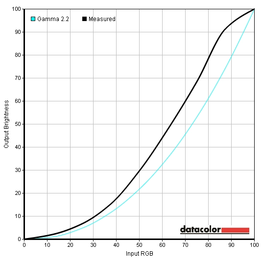
Gamma 'Game Mode'
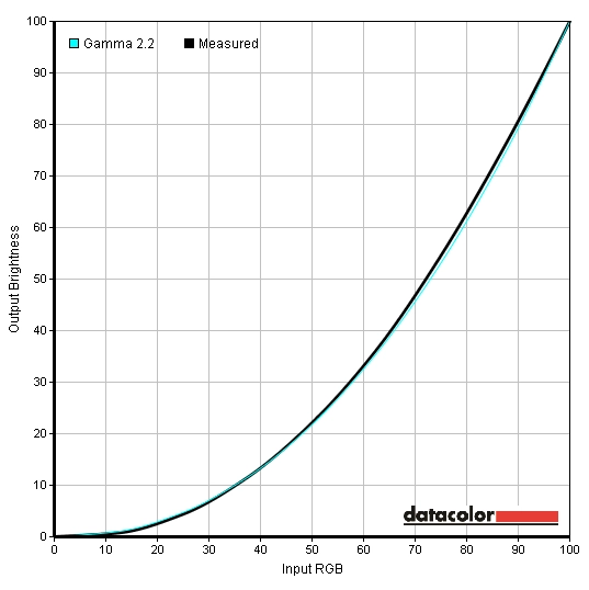
Gamma test settings
Test Settings
Magic Bright= Custom
Contrast and brightness
Contrast ratios
Monitor Profile White luminance (cd/m2) Black luminance (cd/m2)) Contrast ratio (x:1) 100% brightness 230 0.19 1211 80% brightness 192 0.16 1200 60% brightness 152 0.13 1169 40% brightness 113 0.10 1150 20% brightness 69 0.06 1150 0% brightness 26 0.02 1300 Magic Bright= Standard 143 0.12 1192 Color Tone= Warm2 178 0.18 989 Game Mode 229 0.21 1090 Gamma= Mode2 230 0.19 1211 Gamma= Mode3 230 0.19 1211 Test Settings 160 0.14 1143
PWM (Pulse Width Modulation)
Luminance uniformity

Luminance uniformity table
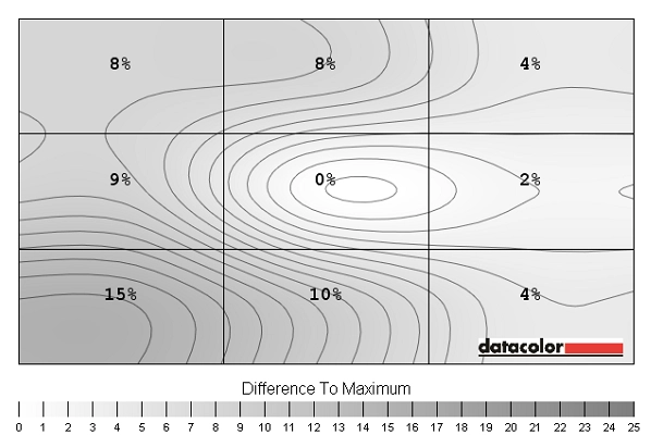
Luminance uniformity map
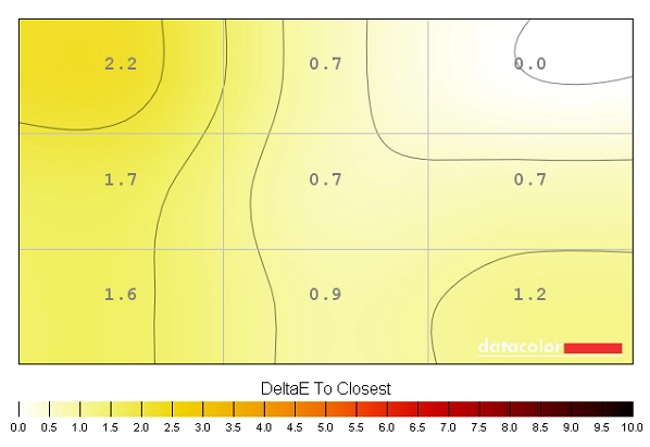
Colour temperature uniformity map
Contrast in games and movies
Lagom contrast tests
Colour reproduction
Colour gamut
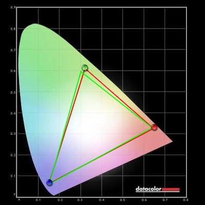
Colour gamut test settings
Colour in games and movies
Viewing angles
Responsiveness
Input lag
Pixel responsiveness

Trailing 'Response Time= Standard'

Trailing 'Response Time= Faster'

Trailing 'Response Time= Fastest'
Responsiveness in games and movies
Conclusion
Positives Negatives Strong out of the box performance with impressive richness, balance and shade consistency after some minor tweaks A few undesirable presets including the much-hyped ‘Game Mode’ Static contrast that’s as good as we’ve seen from non-VA LCDs and pleasing uniformity on our unit PLS glow ate away at some detail in dark scenes, but this is a characteristic of the panel type Good level of responsiveness with no significant hindrances in terms of pixel responses or input lag 60Hz refresh rate may limit appeal for some users. Some mild overshoot in places, not worth worrying about in our opinion though A characterful design and the inclusion of an ‘HDMI Black Level’ option to prevent washed out look on Nvidia GPUs without tweaking Limited range of inputs and a tilt-only stand without VESA holes for alternative mounting

