Author: Adam Simmons
Date published: August 10th 2013
Table of Contents
Introduction
VA (Vertical Alignment) panels are largely overshadowed by the increasingly popular IPS (In-Plane Switching) and IPS-like technologies (such as Samsung’s PLS). Colour consistency, accuracy and viewing angles may be pretty decent on some VA panels, but they still can’t really compete with IPS in this regard. VA panels also tend to offer slower pixel transitions than the other panel types. When it comes to contrast performance, though, VA clearly leads the way.
The BenQ GW2760HS combines a high-contrast AMVA panel with a technology called ‘Color Shift-free’. This is designed to improve viewing angles and colour consistency at different points of the screen, and in theory bring things a bit closer to IPS in that regard. In this review we’ll be putting this exciting and quite novel display through its paces on a range of games, movies and other tests and seeing if it lives up to the hype.
Specifications
The monitor uses an AU Optronics AMVA panel. The static contrast figure of 3000:1 is a little lower than the 5000:1 seen on some similar panels, possibly due to the aforementioned ‘Color Shift-free’ technology that is perhaps not entirely penalty free. A 4ms grey to grey response time is specified indicating that quite strong grey to grey acceleration (pixel overdrive) can be enforced. The asking price is typically around £215 in the UK which is very decent for a monitor of this type (especially one with some unique features). The monitor is not currently available in the United States unless imported from Europe.
The key ‘talking points’ of the specification have been highlighted in blue.
Features and aesthetics
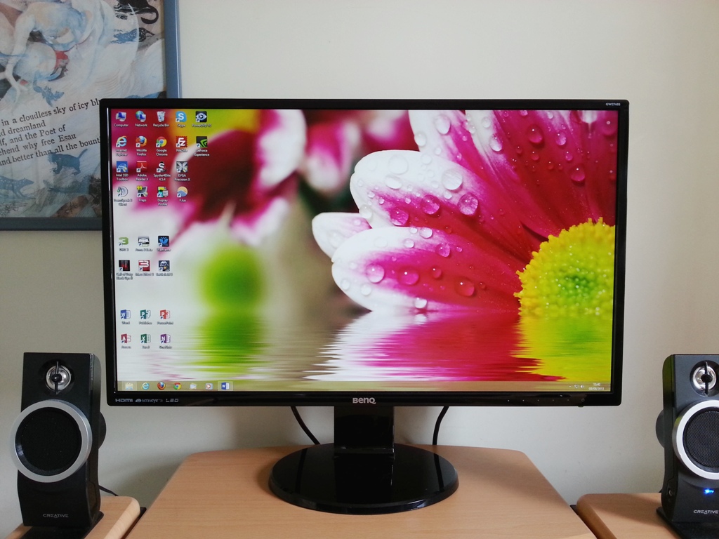
At the front the monitor has a lot of glossy plastics going on – for both the stand and bezel. The bezels themselves are strikingly slender, particularly at the sides (9mm or 0.35 inches) and top (10mm or 0.39 inches). The bottom bezel is 16mm (0.63 inches) thick and features a faint green power LED with accompanying power symbol proceeded by 5 dots to mark out the position of the controls. The power LED hangs down at the bottom of the bezel and isn’t bright enough to be distracting even in a dim room. You can see from the fairly well defined outline on the picture below that this is a very light matte (‘semi glossy’) screen surface which helps retain a good level of clarity and vibrancy.

When the monitor is switched on and displaying an image, even in reasonably bright conditions, the good glare handling characteristics of this screen surface also become apparent.
The monitor’s OSD (On Screen Display) controls and power button are located at the back of the screen in line with the marketing on the front of the bezel. Navigating through the menus was a bit awkward. The buttons themselves were responsive and gave a good audible click when pressed, but the menu was a little laggy. Before entering the main menu the buttons have the following functions; ‘Picture Mode’, ‘Input’, ‘Volume’, ‘Menu’, ‘Exit’ and ‘Power’. These are labelled on-screen once any button other than power is pressed.
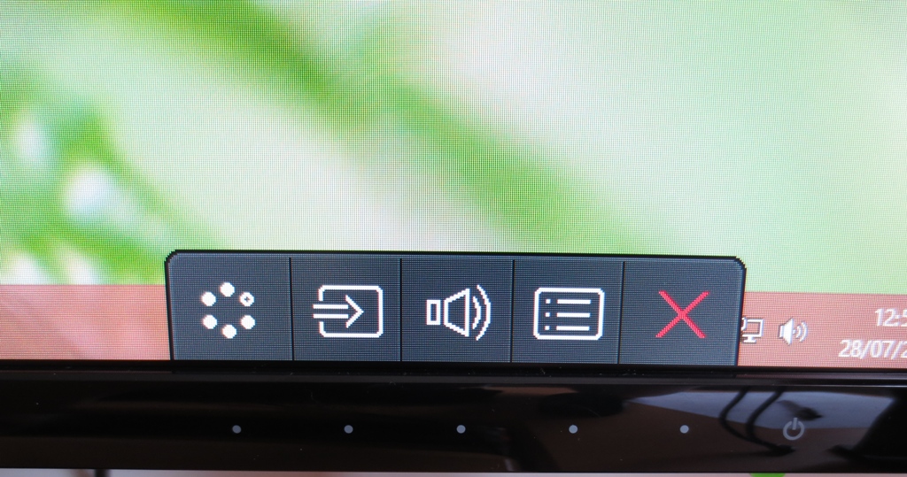
Upon entering the menu the buttons now control the menu navigation, again labelled on screen.
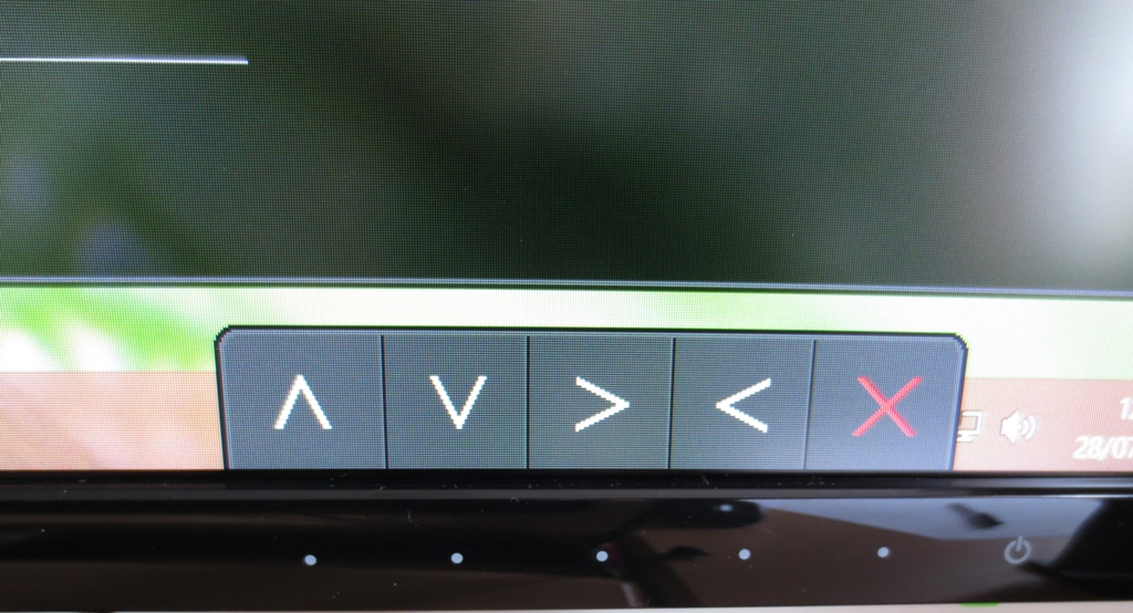
The functions change slightly when you enter deeper into the menu and need to select an option (with ‘right’ becoming ‘enter’ as marked by a blue tick). As you will notice in the image above ‘right’ is followed by ‘left’ which some people may find awkward and counter-intuitive; the reverse of what you might expect to find. This is the usual way BenQ do things but runs contrary to what most other manufacturers do.
Once you get over the awkward navigation system the menu itself has a range of useful functions. Some of these will be mentioned at various points in the review. One thing we particularly like is the ability to customise the functions of the first three buttons, before you enter the menu and they become navigational. Instead of the defaults you can assign each button to one of several functions; ‘Picture Mode’ (presets), ‘Display Mode’ (scaling for non-native resolutions), ‘Brightness’, ‘Contrast’, ‘Volume’, ‘Mute’ and ‘Input’. The video below gives a rundown of the OSD. Note that some settings are greyed out as they only apply when using a VGA connection or when using certain Senseye presets.
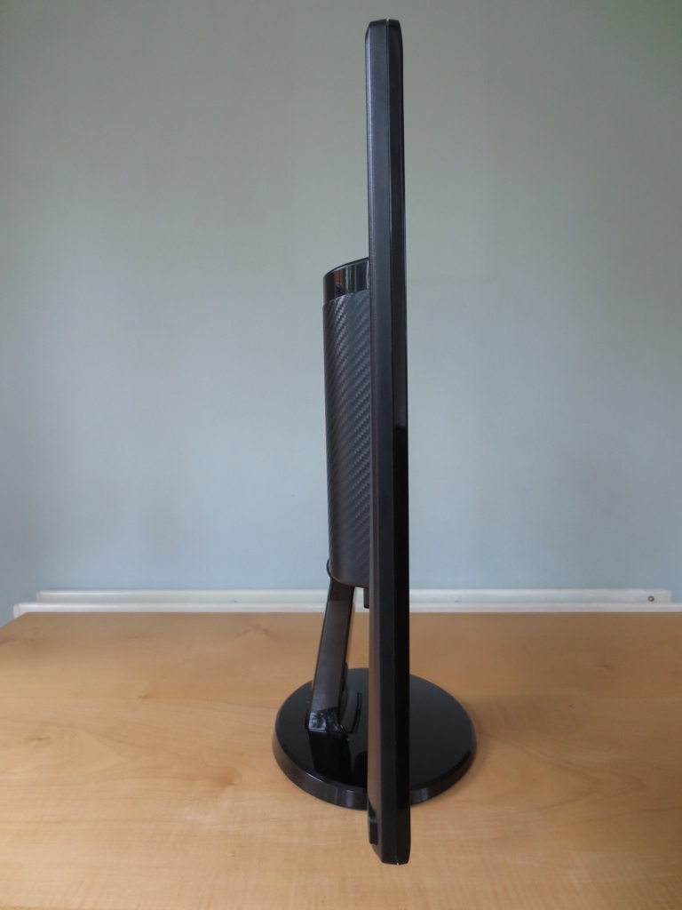
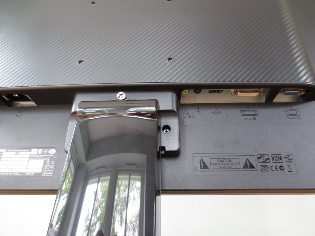
From the side the monitor has two definite layers. The LED backlight allows the screen itself to remain rather thin (around 16mm). There is some extra central bulk at the rear to hold the ports, internal power supply and provide space for VESA screws.
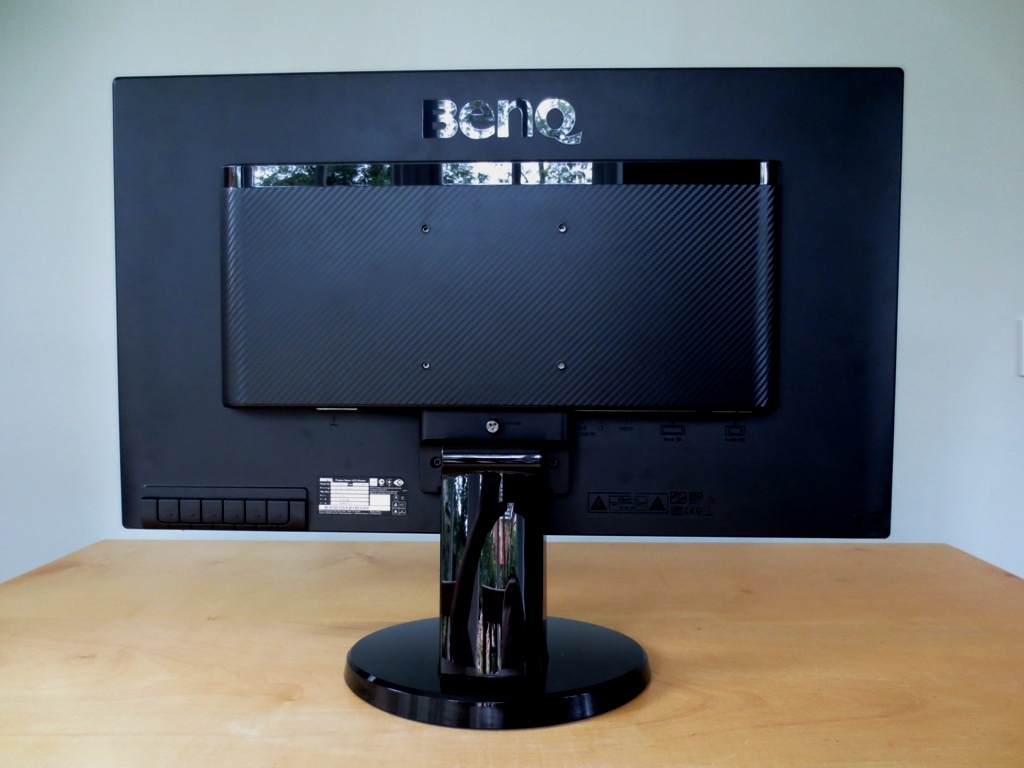
At the rear you can see some VESA holes surrounded by a zig-zag patterned matte plastic. There is a glossy black plastic strip and BenQ logo above this. There are some simple 1W stereo speakers which provide basic and fairly low quality sound output. These face upwards beneath the manufacturer logo. Aside from the logo, plastic strip and the glossy plastic stand everything else is plain matte black plastic. At the bottom left you will find the buttons and at the bottom right a Kensington lock socket. In the middle you’ll find the stand neck and quick release button to detach the stand.
The ports are downward facing, which allows you to wall mount the monitor with minimal wall clearance. There is an AC power input to the left of the stand with the remaining ports to the right; line-in, headphone jack, HDMI, DVI-D and VGA.
Calibration
Testing the presets
BenQ provides several ‘Senseye 3’ presets; ‘Standard’, ‘Movie’, ‘Game’, ‘Photo’, ‘sRGB’, ‘Reading’, ‘Eco’ and ‘User’. The ‘Movie’, ‘Game’ and ‘Photo’ presets over-sharpnen, oversaturate, crush shade range and present a generally rather inaccurate and frankly ugly image. They are the only presets which work with dynamic contrast, which sort of fits as it’s not something you’d enable if you cared about an accurately represented image, anyway. To put it bluntly, ‘Eco’ messes up the image in similar ways but doesn’t allow dynamic contrast to be used as this would increase brightness (an ‘eco no-no’). The brightness used by Eco mode could be lower and thus more eco-friendly – except you have no access to brightness control in this mode. So we focused on the remaining presets; ‘Standard’, ‘sRGB’, ‘Reading’ and ‘User’. There are also 5 gamma modes available in the ‘Standard’ and ‘User’ presets which were assessed. We used familiar images, the Lagom website and our test applications to subjectively scrutinise the image and a Spyder4Elite colorimeter to provide closer analysis.
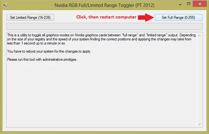
An Nvidia GTX 780 was used on our test system, hooked up to the monitor using the supplied HDMI cable. Unfortunately Nvidia GPUs treat this monitor as an HDTV and send out the incorrect (limited range) colour signal – giving the image a washed out look and distinctly ‘non-VA’ blacks on a PC. The easiest way to remedy the situation is to download this small utility. You simply run the executable in the zip file and click on the ‘Set Full Range (0-255)‘ button at the top right. The utility then modifies the registry entries that control the HDMI shade range in the graphics driver so that when you restart your computer and the graphics driver loads up again and will send the monitor the wonderful and correct shade range. The last thing to do is to open the monitor’s main menu and navigate to ‘Picture Advanced’ -> ‘HDMI RGB PC Range’ and set this to ‘RGB (0~255)’. Remember to re-run the utility when you install a new graphics driver. AMD users should have a nice image out of the box and should find that the ‘HDMI RGB PC Range’ option is greyed out. Observe Lagom’s contrast gradients, paying particular attention to any blending in at the far right or lack of visibility at the far left of each bar. It may be possible to improve the image slightly by enabling a Full Range RGB signal. Unlike on Nvidia GPUs, you can do this through the graphics driver. Open Catalyst Control Centre and Navigate to ‘My Digital Flat-Panels’ -> Pixel Format’. Change from the default ‘YCbCr 4:4:4 Pixel Format’ to ‘RGB 4:4:4 Pixel Format PC Standard (Full RGB)’ as shown below. You should then be able to select the appropriate option on the monitor’s OSD menu. Open this up and go to ‘Picture Advanced’ -> ‘HDMI RGB PC Range’ and set it to ‘RGB (0~255)’. If you observe an improvement on Lagom’s contrast gradient then it is worth sticking with these new settings. If things are worse now revert back to ‘YCbCr 4:4:4 Pixel Format’ in Catalyst Control Centre. If you don’t want to have to faff around with these sorts of settings then use a DVI cable! These will give you a properly optimised digital Full Range RGB PC signal without you having to change any settings. The GW2760HS offers a DVI port but does not come with a DVI cable in its box – they are fairly inexpensive and you may have one lying around anyway. The table below shows the gamma and white point readings alongside subjective observations of image quality using various settings on the BenQ. The options available to modify in the monitor’s ‘Picture’ menu are also included as these depend on the preset you’re using. These observations were made using our primary Nvidia-based test setup with the correct Full Range RGB signal running through HDMI (which gives an identical image to DVI). The GW2760HS was blindingly bright out of the box – something we’ve come to expect from modern monitors. Aside from that the image was rich and fairly well balanced, needing only some quite minor adjustments in the OSD. The monitor provides a range of gamma modes, although the default setting of ‘3’ seemed to provide the best gamma performance, closest to the desirable 2.2 curve (especially once brightness was reduced). Our test settings essentially involved a significant reduction in brightness and slight adjustment of colour channels. Following those adjustments (and of course making sure the graphics card was giving out the right colour signal, as mentioned earlier) the image become very nicely balanced, rich and varied – much as it should be. The strong contrast characteristics of the VA panel were also apparent with good inky blacks and strong shadow definition. The following settings make up the ‘test settings’ used throughout this review. Each individual monitor, even of the same model, will vary slightly. These should therefore be used as a starting point but aren’t necessarily going to be optimal for everybody. Contrast= 50 Gamma= 3 Color Temperature= User Define Red= 99 Green= 100 Blue= 95 We used a KM CS-200 to measure the luminance of white and black using a variety of settings. From these readings a static contrast ratio was calculated. Aside from the aforementioned changes to correct the HDMI colour signal and alterations mentioned in the table, default settings were used. The peak white luminance, lowest black luminance and highest static contrast ratio yielded are highlighted in black and the results from our test settings in blue. The BenQ GW2760HS gave an excellent contrast performance, giving an average under ‘Standard’ settings with only brightness adjusted of 3483:1. Applying different gamma modes and using the ‘Movie’, ‘sRGB’ or ‘Eco’ presets did little to upset the contrast where it comfortably exceeded the specified 3000:1. Under our test settings, where fairly minor adjustments were made, we recorded a very pleasing contrast ratio of 3580:1. Blacks were visibly deep and inky and shadow definition was good. The contrast performance was less impressive in the remaining presets, with ‘Reading’ mode giving the lowest value of 2060:1. The peak luminance recorded was an exceptionally bright 380 cd/m2 (far exceeding the specified 300 cd/m2) whilst the lowest was a moderate 101 cd/m2. This gives a pleasing luminance adjustment range of 279 cd/m2, although it would have been nice to see a lower minimum white luminance in standard mode for some users. A Dynamic Contrast function is available in the ‘Movie, ‘Game’ and ‘Photo’ presets. This allows the brightness of the monitor to adjust itself in relation to how light (or dark) the image is overall. Its luminance adjustment range or ‘dynamicness’ can be adjusted between 1 and 5. This does not affect the reaction speed (i.e. how quickly it adjusts to changes in image brightness), though, which is always rather rapid. The backlight tends towards uncomfortably high brightness even in mixed images and it’s a shame that users are stuck to using fairly lacklustre Senseye presets. Then again it does do what it’s supposed to do and dims to an impressively low level for the darkest content. Some users may like to make use of this mode in certain circumstances and it’s there if they want it – personally we feel superior image quality with strong static contrast outweighs the potential benefits of dynamic contrast. BenQ were very specific in their marketing of the GW2760HS as a ‘flicker free monitor’. True to their word, our testing revealed that the monitor is free from PWM (Pulse Width Modulation) flicker at any brightness. BenQ are currently making a big push towards ‘flicker free’ backlighting across their entire range of monitors as part of their ‘Eye-Care’ initiative, so expect to see more ‘PWM free’ models from them in the future. This will come as a relief to users who are sensitive to such flickering and prefer not to worry about such a thing on their monitor. When looking at a black screen in a darkened room, using our test settings, there was no observable backlight bleed. There was some very minor clouding at the left side of the screen and the tiniest trace at the right side as well but this was difficult to see even in a darkened room. Needless to say this is not something that would cause any bother to users in the ‘real world’. Because each individual unit is subjected to different pressures during and after manufacturing some may have more obvious uniformity issues when displaying black, others maybe less. VA panels are the best LCD technology out there for blocking light and are the least likely panel type to suffer from such issues. One factor that remains constant is something we dub ‘VA glow’, a sort of mild purple glow that is visible from decentralised angles. This can be seen in the viewing angles video featured later on in the review and unlike ‘IPS glow’ is quite mild and not observable from a normal seated position. It’s also important to consider the luminance uniformity of brighter colours. To do this we used a Spyder4Elite to record the white luminance of 9 equidistant ‘quadrants’, laid out across the screen from top left to bottom right. The luminance of each quadrant and deviation between each quadrant and the brightest point is given in the table below. The luminance uniformity was reasonable. The brightest point, ‘quadrant 5’ (centre of the screen), had a brightness of 180.7 cd/m2. The maximum deviation from this was observed at ‘quadrant 1’ (top left) where 152.9 cd/m2 (a 15% deviation) was recorded. A 13% deviation was recorded at ‘quadrant 3’ (top right) and ‘quadrant 4’ (left of centre). Elsewhere deviation was in the single digit range, between 4% and 9% different to centre. For general use and even some hobbyist colour manipulation these variations are not critical, but for some users a lower deviation may be preferred. You should expect a degree of variation between individual units of the same model, though, and you would have to pay considerably more for a monitor with a uniformity compensation feature if tight luminance uniformity is essential. Below is a fancy little contour map to represent the deviations in luminance (both recorded and extrapolated) visually. The lighter the grey in this case the higher the luminance and hence the lower the deviation from centre. The excellent static contrast performance was immediately obvious on Battlefield 3. Strong inky blacks brought out excellent definition for various textures and environmental elements (such as brickwork and vegetation). The level of detail in dark areas was truly exceptional – even for a VA panel. Usually the gamma behaviour would cause certain minor dark detail to become ‘crushed’ from a normal viewing position, with details revealing themselves if you viewed the screen from the side instead. The GW2760HS only exhibited this behaviour to a relatively minor degree, allowing many minor details to be seen from the front as well. Bright elements such as fires, explosions and lights contrasted beautifully with these dark surroundings. Whilst such elements didn’t have the absolute ‘pure’ look you might see on a glossy display they were rather smooth (not overtly grainy) and had nice ‘pop’ to them. On Dirt 3 the strong contrast performance reflected in much the same way. The level of detail in dark areas both inside and outside the car was excellent whilst blacks and dark colours had a good bold quality to them. Bright elements also stood out nicely and looked relatively clean and pure (for a matte screen). We also tested the contrast performance on the Blu-ray film Skyfall. On this film there was an excellent contrast performance with strong shadow definition and a very good level of detail in dark areas. Some quite minor details, such as creases in a dark jacket, were visible and didn’t seem significantly affected by the usual VA gamma behaviour. At the high end things were also strong. Lights at night, such as neon lights in Shanghai and candles in Macau had good intensity and pierced the surrounding darkness. Lagom’s tests for contrast were used to help highlight specific strengths and weaknesses in contrast performance. The following was observed. The GW2760HS has a colour gamut which conforms quite closely to sRGB. There is some slight under-coverage of some green shades but slight extension beyond sRGB elsewhere. The image below compares the monitor’s colour gamut (red triangle) with the sRGB colour space (green triangle). Overall this is more generous coverage than we’ve seen on many modern VA panels and helps provide a relatively vibrant but still well-represented image. Battlefield 3 had a nice rich and varied look, within the constraints of the intended game aesthetic. Vibrant elements such as vivid orange fires and the red, green and blue in-game markers stood out well. The cyan of the engineer’s repair tool wasn’t quite as intense in colour as it could have been but still stood out nicely. The car paintjobs on Dirt 3 looked suitably lively and varied with a good range of deep colours and some quite impressive neon-looking shades (pinks and oranges being most noteworthy). Some of the lighter blue, green and cyan shades could have done with a touch more saturation. The racing environments looked rich and natural with good shade variety. The range of muted khaki colours and subtle golden brown tones, in fact, looked more like something you’d see on an IPS rather than VA in terms of their depth and variety. A minor criticism is that some of the deeper greens, such as those in the Finnish forest, could have done with a touch more depth. These observations seemed to fit with the colour gamut being a bit less generous in this region. We also tested the colour reproduction on two Blu-ray film titles. First up was Skyfall. Colours were well represented, looking natural and in-place. Skin tones appeared appropriately saturated regardless of their position on the screen. Some of the vibrant oranges from flames, deep reds of dresses and a variety of neon lights were particularly pleasing in their vividness. Some deep greens could have done with a touch more saturation, however. The second Blu-ray tested was Futurama: Into the Wild Green Yonder. Some of the bright neon colours on this movie really popped out nicely. Bright pinks and greens with dark star fields in the background were particularly impressive. Although colours didn’t have quite the same painted on ‘pop’ you might see on a glossy screen they weren’t held back by excessive graininess, either. Pastel shades were also well represented with strong variety and consistency. There was a degree of shift in a given shade (for example if a character’s skin tone fills up a lot of the screen) but this was relatively minor. As a result some subtle variations, such as different character skin tones, were not as distinct as they could be and changed slightly depending on on-screen position. Despite this, overall shade variety was excellent. Whilst not quite on par with IPS or PLS technology in this respect it was much closer to this than we’ve seen from a VA before. To explore colour consistency and viewing angle performance more closely we used Lagom’s tests specifically designed for this. We observed the following. Input lag was measured using a modified ‘camera and stopwatch’ method described in some of our other recent reviews. The modifications we make are designed to improve the consistency and reliability of our results using what this potentially rather crude input lag measurement method. We use an array of monitors of LCD monitors of known input lag as milestones to compare against, taking over 120 readings in total to get a fairly representative figure. On the GW2760HS we measured just over 4ms (1/4 of a frame) of input lag. This means there is very little latency; input lag, specifically, is not going to affect the gaming experience on this monitor. PixPerAn (Pixel Persistence Analyser) was used to assess the pixel response performance using a range of typical grey to grey transitions. The tool is set to its highest tempo and a sensitive camera used to take a snapshot of the moving cartoon car image. This test only focusses on a specific set of grey to grey transitions at a specific tempo and doesn’t take into account how our eyes see the image (perceived motion blur). Further analysis of the monitor’s overall motion performance in a range of games and movies is therefore included in the subsequent section. The images below show the PixPerAn test, captured as described above. The monitor’s configurable grey to grey acceleration (AMA, Advanced Motion Acceleration) was set to ‘Off’, ‘High’ and ‘Premium’, respectively. With AMA ‘Off’ there is a bold and discrete primary trail and very faint secondary trail. Setting AMA to ‘High’ weakens the primary trail somewhat and reduces the secondary trail so it’s practically invisible. There is nothing particularly premium about the ‘Premium’ AMA setting. There is inescapably in-your-face overdrive artifacts (overshoot) manifesting as palpable bright trails of inverse ghosting. This is very obnoxious in practice, making the ‘Premium’ setting of little practical use. Needless to say we adopted ‘AMA High’ for the following subjective testing. To tie everything together we subjectively assessed the visual responsiveness of the GW2760HS. This ‘real world testing’ involves a greater array of pixel transitions than shown by PixPerAn and also takes into account important human perception factors missed in static camera shots. Movement of our eyes as we watch moving images is a significant source of blur, something that is reduced by refresh rate but not pixel response times. On some monitors it is this that is the overriding cause of the apparent blur you’ll see when gaming, meaning the overall visual fluidity is limited by factors such as refresh rate rather than pixel response times. With some clear pixel response limitations in places, this was not one of those monitors. On Battlefield 3, whilst on foot, there was a moderate but not excessive level of trailing. Moving the mouse caused textures to lose sharpness to a greater degree than you’d see on faster 60Hz monitors. There was no evidence of any of the extended smeary trails that plagued older VA monitors, although here were some ‘high contrast transitions’ where trailing was fairly pronounced. For example; strafing past a dark object with a lighter grey background (such as a gunmetal grey turret set upon a light grey-blue sky). Driving about in a fast vehicle increased the level of blur, as you would expect. This again went beyond the level you’d see on a faster 60Hz monitor, indicating that response time is contributing to the perceived blur here. During the main (racing) game modes on Dirt 3 there was a moderate blur even during gentle cornering. Again this was not a smeary mess like on some older VA panels, but there was a noticeable loss of sharpness. The track itself remained distinct enough so that the game remained playable. Some slower ‘high contrast’ transitions made their appearance at night in particular. Moving past some lights with dim grey skies in the background produced a particularly noticeable trail. The Gymkhana mode was even more of a dizzying experience than usual. Colours blended together quite readily and there was significant blur. Objects still remained somewhat distinct, though, so it was still playable. We also tested our Blu-ray movie test titles to see if there were any observable limitations from pixel responses. There weren’t, with the fluidity limited by the 24 (ish) frames per second at which the movies run. Whilst this limits fluidity compared to higher frame rates it also breaks up the motion and allows the monitor to duplicate frames (around 2.5 times each as it’s a 60Hz monitor). The pixel response times are good enough at this sort of frame rate that they aren’t a limiting factor – and thankfully there were any overdrive artifacts to ruin the experience, either. The BenQ GW2760HS has been in the pipeline for a very long time, with a release that was greeted with seemingly endless delays. On paper it set itself aside from other monitors by offering a ‘flicker free’ backlight and also an intriguing technology that BenQ called ‘Color Shift-free’. Despite the delays, this monitor has delivered on its promises and put in what is in many respects one of the most impressive image performances we’ve ever seen from a VA panel monitor. The backlight of the monitor is indeed free from PWM (Pulse Width Modulation) regulation, meaning that it doesn’t ‘flicker’ – some users are sensitive to this, others simply like to know the backlight isn’t flickering. The most impressive and innovative feature seen on this monitor is the ‘Color Shift-free’ technology which also delivered on its promises. Contrast on this monitor was already strong, complimented nicely by a ‘semi-glossy’ screen surface for good clean whites and bright colours as well as inky blacks. But a nice side effect of the improved viewing angle performance was a reduction in the usual VA gamma shift characteristic. There is a common affliction with VA panels that some people call ‘black crush’, where certain near-black shades are more visible when viewing the screen off-angle than from directly in front. This was there to a degree on the BenQ but was reduced compared to ‘regular’ VA panels – a really nice thing to see as it makes the strong contrast performance even more meaningful. The colour gamut was also fairly generous for a VA monitor, never straying too far from sRGB with some slight extra coverage in some reasons and under-coverage in others. Coupled with the very light matte screen surface and panel characteristics the image was rich, vibrant and generally very pleasing. The image also took relatively little tweaking, offering quite a decent setup straight from the box. The enhanced viewing angle technology (this ‘Color Shift-free’ malarkey) also helped aid colour consistency beyond what is usual for a VA panel and brought in a level of subtle shade variety that’s really a bit more IPS/PLS like in nature. This also does what it says on the tin when viewing the monitor from off-centre viewing angles, again offering performance some way between traditional VA and IPS. We’ve seen some real improvements in VA response times and overall motion smoothness in recent times. The Samsung S27C750P really sets the standard here, giving the user an experience that (with the exception of some high-contrast transitions) is really as fluid as you get on a 60Hz monitor. The GW2760HS certainly provides a reasonable degree of grey to grey acceleration and distances itself from the old ‘smeary trail’ producing VA panels of yesteryear. But unlike the S27C750P there are some weaknesses that stem beyond just those high-contrast transitions. The fastest level of acceleration (‘AMA Premium’) is sadly completely overdone and makes things worse rather than better – in contrast with the Samsung’s very usable ‘Fastest’ setting. One area that really isn’t weakened in any way, though, is input lag – which is pretty much non-existent. So BenQ have created a monitor that offers a rich and rewarding image experience that can appeal to many people. Some gamers will probably be put off by the pixel responsiveness, but there is still a reasonable enough performance here to appeal to other gamers. Sensitivity to this sort of thing differs greatly amongst individuals so there are no hard and fast rules here. Coupling these positives with the compelling price, flicker free backlight and very slender bezels; this monitor certainly has a lot going for it.
Nvidia RGB Full Range Toggler
![]()
Changing to RGB for AMD GPUs
Settings
Gamma (central average)
White point (kelvins) Extra OSD features Notes ‘Standard’, Gamma 1
1.8 6381K Brightness, Contrast, Sharpness, Gamma, Color Temperature (Normal, Bluish, Reddish), Reset Color, AMA. Very bright with a fairly washed out look. ‘Standard’, Gamma 2
2.0 6329K As above. Image is still very bright but colours are richer and less washed out than when using Gamma 1.
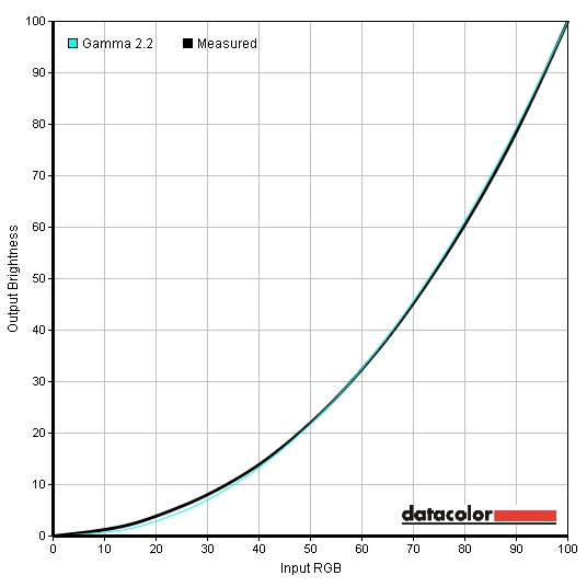
‘Standard’, Gamma 3 2.2 6277K As above. Bright again but colours are nice and rich. They’re quite well balanced with only a very minor warm tint. ‘Standard’, Gamma 4 2.3 6276K As above. Colours are even deeper than Gamma 3 without looking overly dull or dark. The extreme brightness certainly helps there. ‘Standard’, Gamma 5 2.5 6186K As above. Colours look too deep and heavily saturated in places despite the piercing brightness. ‘sRGB’
1.8 6344K Brightness, Contrast, Sharpness, Reset Color, AMA. Things look dull but reasonably well balanced without any overriding tints or oversaturation. ‘Reading’
2.0 4622K As ‘sRGB’. Image is dim and has a warm and somewhat green tint. More restful on the eyes – nothing you can’t achieve in the other more flexible presets though. Test Settings (‘User’ modified as below).
2.2 6483K Brightness, Contrast, Sharpness, Gamma, Color Temperature (Normal, Bluish, Reddish, User Define), Hue, Saturation, Reset Color, AMA. Image looks rich, rather vibrant and well balanced. Fine detail is good too with good gradation performance and shade distinction.
Gamma Test Settings
Test Settings
Brightness= 25 (according to preferences and lighting)
Contrast and brightness
Contrast ratios
Monitor Profile White luminance (cd/m2) Black luminance (cd/m2) Contrast ratio (x:1) ‘Standard’, 100% brightness 380 0.11 3455 ‘Standard’, 80% brightness 329 0.09 3656 ‘Standard’, 60% brightness 277 0.08 3463 ‘Standard’, 40% brightness 222 0.06 3700 ‘Standard’, 20% brightness 163 0.05 3260 ‘Standard’, 0% brightness 101 0.03 3367 Test settings
179 0.05 3580 ‘Standard’, Gamma 1
379 0.11 3445 ‘Standard’, Gamma 2
380 0.11 3455 ‘Standard’, Gamma 4
378 0.11 3436 ‘Standard’, Gamma 5
378 0.11 3436 ‘Movie’
377 0.11 3427 ‘Game’
295 0.11 2682 ‘Photo’
247 0.11 2245 ‘sRGB’
247 0.07 3529 ‘Reading’
103 0.05 2060 ‘Eco’
135 0.04 3375
PWM (Pulse Width Modulation)
Luminance uniformity
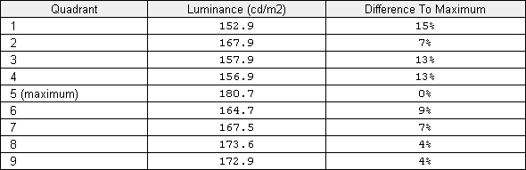
Luminance uniformity table
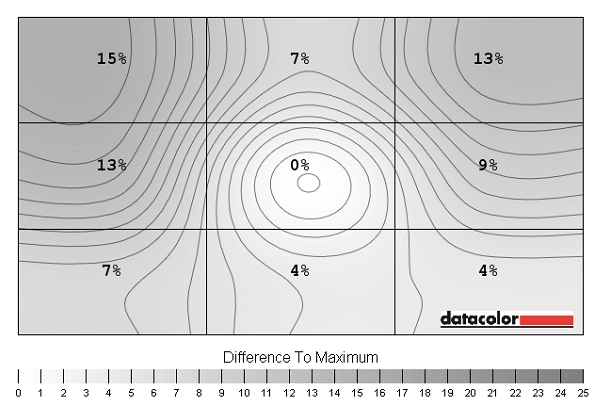
Luminance uniformity map
Contrast in games and movies
Lagom contrast tests
Colour reproduction
Colour gamut
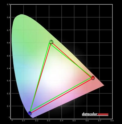
Colour gamut test settings
Colour in games and movies
Viewing angles
The video below shows the monitor’s viewing angle performance from a variety of angles. Overall the shifts in contrast and colour from acute angles, which are most easily observed on the mixed desktop background, are less pronounced than usual for a VA panel. Performance here largely mirrors what was observed across the screen in terms of colour consistency – not quite IPS but some improvements over usual VA. The final section of the video shows the slight off-angle ‘VA glow’ as described earlier.
Responsiveness
Input lag
Pixel responsiveness

Trailing AMA 'Off'

Trailing AMA 'High'

Trailing AMA 'Premium'
Responsiveness in games and movies
Conclusion
Positives Negatives A rich and varied colour experience with improvements in consistency and viewing angles over ‘regular VA’, a decent colour gamut and a pleasing ‘semi-glossy’ screen surface that helps aid vibrancy
Colour consistency still not up to IPS/PLS standards, reducing subtle shade variety in places and making it less suitable for colour-critical uses
A strong contrast performance with relatively clean (non-grainy) light colours and deep inky blacks and dark colours. Gamma shift is reduced compared to ‘traditional VA’ Still a degree of gamma shift remaining and not quite the same purity and ‘pop’ as on a glossy screen Very low input lag and reasonable grey to grey acceleration makes the monitor suitable for some gaming
Some pixel responses hinder the overall motion performance – a greater degree of acceleration is offered by ‘AMA Premium’, but there is nothing premium about the obvious motion artifacts prevalent using that setting
A DVI port to give the correct (full range) PC colour signal without fiddling in the graphics drivers and strikingly slender top and side bezels
Stand adjustability is limited to tilt only, although there is VESA mounting
A good price tag
No local availability in the US at time of review
![]()

