Author: Adam Simmons
Date published: February 6th 2019
Table of Contents
Introduction
The Dell S2716DG set the bar for responsiveness. Indeed its 23.8” brother has been used as a responsiveness reference in many of our reviews. Out of the box colour performance left a lot to be desired, though, and even after calibration some issues remain. The S2719DGF is an evolution of this model, offering support for FreeSync (via Adaptive-Sync) and offering slight bump up in refresh rate to 155Hz. We put this monitor through its paces to see how it stacks up against its original G-SYNC cousin, using our usual gauntlet of ‘real world’ tests.
Specifications
The monitor employs a 27” AU Optronics TN (Twisted Nematic) panel with support for a 155Hz refresh rate and true 8-bit colour (without dithering). A 1ms grey to grey response time is specified, quite usual for monitors of this panel type and refresh rate. Some of the key ‘talking points’ for this monitor have been highlighted in blue below.
Key talking points of the specifications are highlighted in blue below.
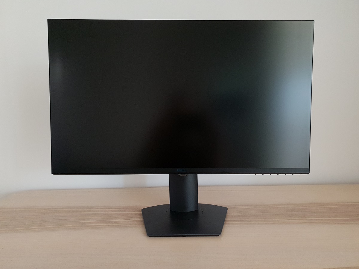
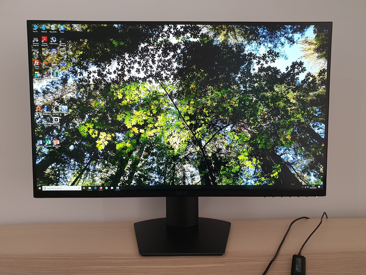
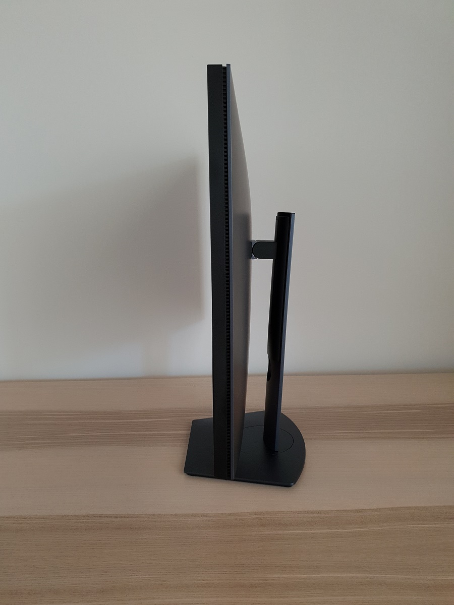
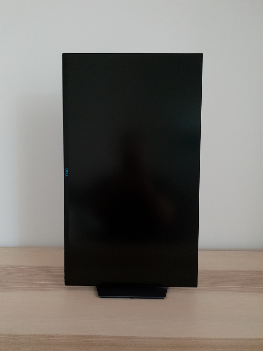
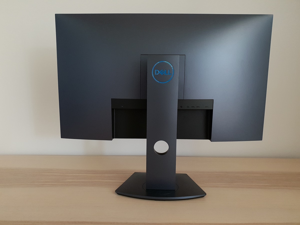
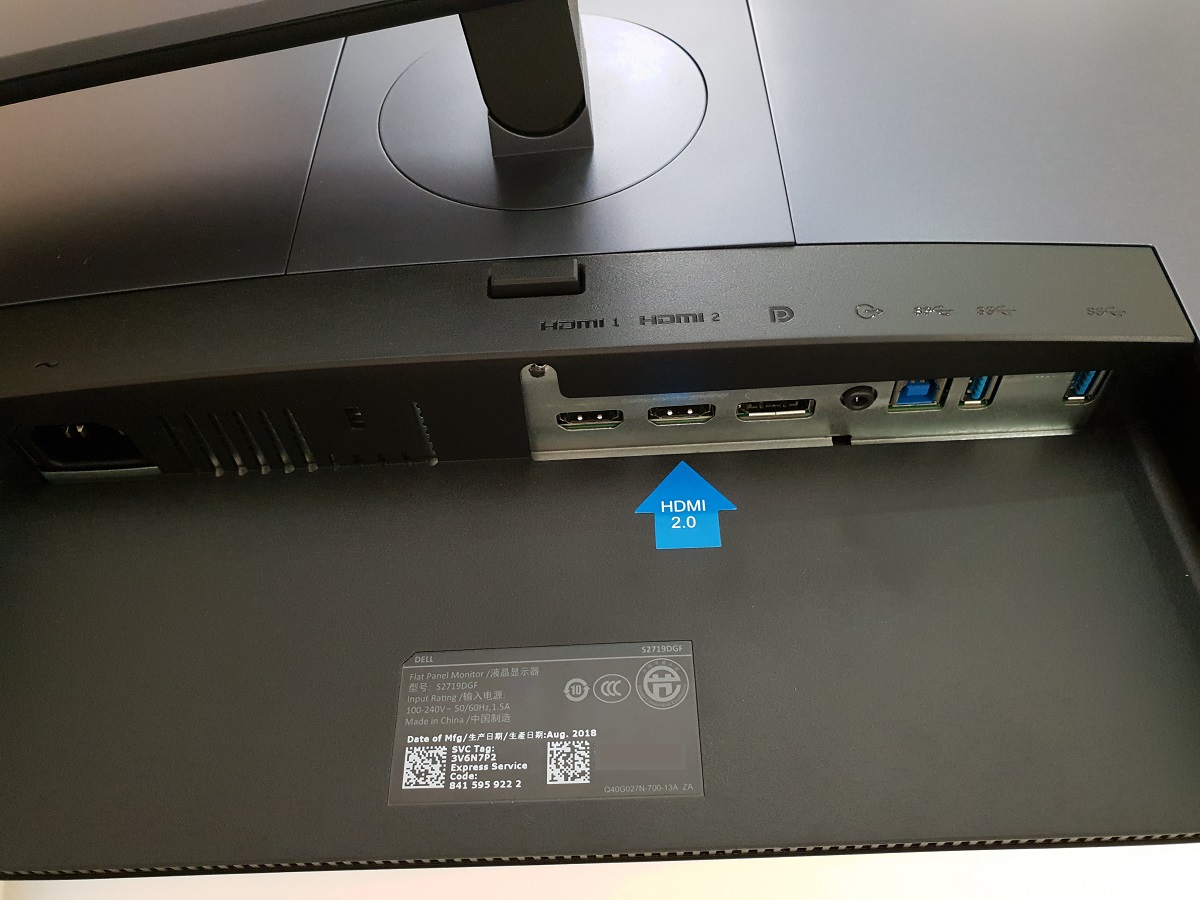
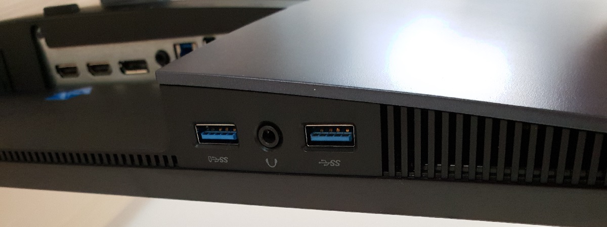
The monitor features the smart and understated look Dell monitors are known for, without the sort of flashy design elements that some users dislike about many gaming monitors. The stand is a dark blue-grey colour Dell refer to as ‘Recon blue’. The ‘flashiest’ element is probably the shiny metallic-effect blue Dell logo, although this is quite subdued unless light strikes it from the right angle. The bezels are matte black plastic with a dual-stage or ‘3-side borderless’ design. This comprises a slim panel border that blends in well when the monitor is switched off and a thin hard outer component. Including both components, the bezels are ~6.5mm (0.26 inches) at the top and sides and ~22mm (0.87 inches) at the bottom. This includes the diagonal slope backwards at the bottom and not just the front-facing area. The stand base has a curved rear edge, straight front edge and sloped sides with a small overall footprint. The screen itself is of course the main feature from the front and this has a light matte anti-glare finish, as explored later. The OSD (On Screen Display) is controlled by pressable buttons on the underside of the bottom bezel, towards the right side. There is also a power button, with Dell’s signature ‘vertical slit’ power indicator, which glows white when the monitor is on and flashes when it enters a low power state (signal to the system is lost). The video below runs through the OSD menu system. From the side the screen is fairly slim, ~19mm (0.75 inches) at thinnest point and lumping out more centrally. The included stand offers full ergonomic flexibility; tilt (5° backwards, 21° forwards), height adjustment (130mm or 5.12 inches), swivel (45° left, 45° right) and pivot (90° clockwise rotation into portrait). At lowest height, the screen clears the desk surface by ~28mm (1.10 inches) with the top of the screen ~402mm (15.83 inches) above the desk. The total depth of the monitor including stand is ~190mm (7.48 inches), so it has quite a compact design that’s less of a space hog than many gaming monitors. The rear of the monitor is mainly the same dark blue-grey ‘Recon blue’ shade found on much of the stand. There is another shiny blue Dell logo towards the top, lighter and less metallic-looking than the one on the front The stand attaches using a quick-release mechanism, allowing the screen to quickly be released from the included stand. This reveals 100 x 100mm VESA holes for alternative mounting. The ports of the monitor are down-firing and include; AC power input (internal power converter), HDMI 1.4, HDMI 2.0, DP 1.2a, 3.5mm audio output and 2 USB 3.0 ports (plus upstream). There is an additional port cluster to the right of this, at the very bottom of the monitor and hence easily accessible from the front (left of the Dell logo). This includes 2 further USB 3.0 ports (4 total) and a 3.5mm headphone jack – the first USB 3.0 port on this mini-cluster supports BC 1.2 fast-charging. The full capability of the monitor including the 155Hz refresh rate and Adaptive-Sync (includes AMD FreeSync) can be leveraged using DisplayPort. HDMI 2.0 is limited to 144Hz and supports AMD FreeSync. A power cable, HDMI cable and USB 3.0 cable is included as standard. The images below are macro photographs taken on Notepad with ClearType disabled. The letters ‘PCM’ are typed out to help highlight any potential text rendering issues related to unusual subpixel structure, whilst the white space more clearly shows the actual subpixel layout alongside a rough indication of screen surface. This model uses a light matte anti-glare screen surface with relatively smooth surface texture. This offers good glare handling characteristics without diffusing light emitted from the screen surface as strongly as some matte screen surfaces. This helps preserve image clarity and vibrancy, giving a relatively smooth look to the image without obvious graininess. This is the same screen surface employed on later revisions of the older G-SYNC models. As shown above, the monitor uses the usual RGB (Red, Green and Blue) stripe subpixel layout. This is the typical layout expected by modern operating systems such as Microsoft Windows and Apple MacOS. You needn’t worry about text fringing from non-standard subpixel layouts as a Mac user and don’t need to run ClearType as a Windows user – although you may wish to run through the ClearType wizard and adjust according to preferences. The subpixel layout and arrangement is normal and we had no subpixel-related concerns related to sharpness or text clarity on this model. The monitor includes a range of ‘Preset Modes’; ‘Standard’, ‘FPS’, ‘RTS’, ‘RPG’, ‘Game 1’, ‘Game 2’, ‘Game 3’, ‘ComfortView’, ‘Warm’, ‘Cool’ and ‘Custom Color’. The numbered ‘Game’ presets and ‘Custom Color’ are most flexible as they allow you to adjust the colour channels and saturation levels. The other presets make specific adjustments to those and can’t be manually altered. Some also make further adjustments, such as upsetting sharpness levels in a way that is impossible to correct with any OSD controls. We’ve explored these presets briefly in the OSD video and will be taking a look at some of them in more detail here. The table below includes gamma readings taken using a DataColor Spyder5ELITE, white point measurements taken using a BasICColor SQUID 3 (X-Rite i1Display Pro) alongside general observations. Our test system runs Windows 10 and uses an Nvidia GTX 1080 Ti, connected by DisplayPort. Additional testing was performed using an AMD Radeon RX 580. We also made observations using HDMI 2.0 and did not note any significant differences to static image quality. No additional monitor drivers or ICC profiles were specifically loaded and the monitor was left to run for over 2 hours before readings were taken or observations made. Aside from our ‘Test Settings’ where various adjustments are made, assume factory defaults are used. The first exception to this was the refresh rate, which was set to 155Hz in Windows following setting ‘OverClock Enable’ to ‘On’ in the ‘Gsync Setting’ section of the OSD. Note that this did not significantly impact the readings or observations in this table. The second exception was that ‘Dynamic Contrast’ was disabled for ‘Game 1’ (it is enabled by default). When viewing the figures in this table, note that for most PC users ‘6500K’ for white point and ‘2.2’ for gamma are good targets to aim for. Individual targets depend on individual uses, tastes and the lighting environment, however.
Features and aesthetics
Calibration
Subpixel layout and screen surface
![]()
Testing the presets
Preset Mode Gamma (central average) White point (kelvins) Notes Standard (Factory Defaults) 2.0 6282K Bright with a cool and somewhat green tint. The image appears fairly rich in places, but some undersaturation due to gamma handling. As is usual for a TN model, perceived gamma is higher further up the screen (image appears deeper) and lower further down the screen (image is less saturated). The perceived gamma shifts and changes in saturation are about as low as you’ll see on a TN model, though, and less pronounced than on your typical 24” Full HD 144Hz TN model (regardless of size difference). Game 1 2.0 6000K As above but image appears somewhat warmer and green tint reduced. ‘Game 2’ and ‘Game 3’ are identical. As is ‘Custom Color’, but ‘Dynamic Contrast’ is disabled by default for that whereas for the numbered ‘Game’ presets it’s enabled by default. ComfortView 2.0 5077K This is an effective Low Blue Light (LBL) setting, significantly reducing the strength of the blue colour channel and reducing brightness (set to 75% by default, can be adjusted). This significantly reduces blue light output from the screen. The image appears warm and has a moderately strong green tint as well. Warm 2.0 5538K An alternative LBL setting. This isn’t as effective at cutting out blue light, but still gives a reasonable reduction compared to factory defaults. The image appears warm and bright but does not have a noticeable green tint. Relaxing evening viewing (see below) 2.0 4314K We created out own LBL setting as described below. This is more effective in reducing blue light even compared to ‘ComfortView’ and doesn’t have a noticeable green tint. Custom Color 2.0 6003K As ‘Game 1’. Optimal OSD Settings (see below) 2.0 6494K Similar to factory defaults but the white point and overall colour balance is better and brightness more comfortable. The gamma is not where we want it to be, so image appears less saturated than ideal in places but we certainly wouldn’t describe it as ‘washed out’. Test Settings (see below) 2.2 6498K As above but a full calibration with ICC profile is included, correcting gamma and making some other adjustments to the image. Things are rich and varied overall, as good as we’ve seen from a TN model.
Straight from the box the monitor provided an image that was bright with a somewhat warm and slightly green tint. The gamma tracking meant that things were a bit undersaturated in places, especially further down the screen where perceived gamma is even lower on TN models. The screen surface and some extension beyond sRGB from the colour gamut helped avoid the ‘washed out’ look you might expect on some models with this sort of gamma tracking, though. It was not possible to properly correct the gamma through the OSD without unwanted consequences. Annoyingly enough, the ‘RTS’ preset had excellent ‘2.2’ gamma tracking on our unit, but it had an unsightly sharpness filter that couldn’t be overcome regardless of the ‘Sharpness’ setting used. The top graph below shows gamma tracking with what we deep the ‘Optimal OSD Settings’, where you can see some bowing (reduced gamma) for much of the central curve area. The bottom graph shows the gamma curve under our ‘Test Settings’ (same OSD settings, ICC profile also applied) with close adherence to the ‘2.2’ curve. The monitor provided two LBL settings, the most effective of which was ‘ComfortView’. We preferred the overall colour balance of ‘Warm’, though, which provided a weaker blue light reduction but didn’t have the unsightly green tint we observed on ‘ComfortView’. Reducing exposure to blue light output is particularly important in the hours leading up to bed as blue light keeps the body alert and disrupts sleep hormones – not what you need before sleeping. We were able to make adjustments to one of the ‘Game’ presets and simply use that as an LBL setting that could be easily activated and deactivated. For this we copied our ‘Optimal OSD Settings’ but changed the colour channel gain controls to R= 100%, G=80%, B=70%. You’d have to adjust this according to your own units and preferences, but it was very effective in reducing blue light output from the monitor. It gave a warmer look to the image but the green channel was well-balanced to avoid a noticeable green tint. We used this for our own viewing comfort in the evening, but not for any specific testing beyond the setting itself. It can be used in conjunction with the ICC profile as well, this doesn’t significantly change the effectiveness of this as an LBL setting. We made various changes to the ‘Custom Color’ preset for our ‘Optimal OSD Settings’. The numbered ‘Game’ presets could also be used as a base as they offer the same flexibility. The gamma wasn’t quite where we wanted it, which is where the ICC profile applied for our ‘Test Settings’ comes in. But overall image balance was as good as we could achieve on our unit using OSD adjustments alone. Note that individual units and preferences vary, so consider this a suggestion that won’t necessarily be optimal for all users. Assume any setting not mentioned, including ‘Contrast’, was left at default. R Gain= 94% G Gain= 92% B Gain= 100% Overclock= On Response Time= Fast Brightness= 40 (according to preferences and lighting) AMD FreeSync = On Refresh rate= 155Hz (Windows setting) We created an ICC profile using our Spyder5ELITE colorimeter to improve gamma tracking and make further refinements to the image beyond what could be done with OSD tweaking alone. The ‘Optimal OSD settings’ above were used as a base, over which our ICC profile was applied. Note that the ICC profile is specific to our unit and, along with the OSD settings, it may not be optimal for all units. We know from user feedback already that some units are closer to ‘2.2’ gamma out of the box than ours was, so if you find things look too dark with this profile it’s likely your unit has higher gamma than our test sample. You can use the profile in combination with whatever brightness or colour channel adjustments you require. To make use of our profile do the following:

Gamma 'Optimal OSD Settings'

Gamma 'Test Settings'
Optimal OSD Settings
Preset Mode= Custom Color
Test Settings (ICC profile)
2) Set the monitor up according to the ‘Optimal ‘OSD settings’, although further adjustments can be made if desired. Using a brightness of ‘40%’ provided ~165 cd/m² on our unit with the ICC profile applied.
3) This article provides instructions on activating the profile as well as some limitations to be aware of when gaming in particular. Games do generally respond to the profile or at least apply the gamma correction – even without the profile, the image appears richer than you might expect from a model tracking ‘2.0’ gamma on average. The screen surface and colour gamut helped lift up the image a bit, but having gamma corrected gave it a nice edge in saturation as well.
4) Some web browsers have colour management issues when ICC profiles like this are used. We observed messed up gamma, with gamma being far too low leading to detail that should be blended and masked instead appearing too distinct. This gave a somewhat blocky appearance to dark scenes on Netflix content, for example. This is easy to correct on Google Chrome. You simply type the following into the address bar: chrome://flags/#force-color-profile and change from ‘Default’ to ‘sRGB’ then restart your browser. You only have to do this once (set and forget), although what the setting is called may differ depending on the version of Chrome you’re using.
Contrast and brightness
Contrast ratios
A BasICColor SQUID 3 (X-Rite i1Display Pro) was used to measure the luminance of white and black using a range of monitor settings, including those analysed in the calibration section. From these values, static contrast ratios were calculated. Results are show in the table below. Blue highlights indicate the results under our ‘Optimal OSD Settings’ and ‘Test Settings’. Black highlights indicate the highest white luminance, lowest black luminance and maximum contrast ratio recorded. Assume any setting not mentioned was left at default, with the exceptions already noted here or in the calibration section.
| Monitor Profile | White luminance (cd/m²) | Black luminance (cd/m²) | Contrast ratio (x:1) |
| 100% brightness | 397 | 0.45 | 882 |
| 80% brightness | 311 | 0.35 | 889 |
| 60% brightness | 243 | 0.27 | 900 |
| 40% brightness | 177 | 0.2 | 885 |
| 20% brightness | 106 | 0.12 | 883 |
| 0% brightness | 34 | 0.04 | 850 |
| 75% brightness (Factory Defaults) | 291 | 0.32 | 909 |
| Game 1 | 314 | 0.32 | 981 |
| ComfortView | 175 | 0.21 | 833 |
| Warm | 279 | 0.32 | 872 |
| Relaxing evening viewing | 136 | 0.19 | 716 |
| Custom Color | 314 | 0.32 | 981 |
| Custom Color (100% brightness) | 427 | 0.43 | 993 |
| Optimal OSD Settings | 168 | 0.19 | 884 |
| Test Settings | 166 | 0.19 | 874 |
The average static contrast with only brightness adjusted was 888:1, which is decent for a TN model. Note that the refresh rate did not impact this value. Following the adjustments made to our ‘Optimal OSD Settings’, contrast remained quite strong at 884:1 (874:1 for our ‘Test Settings’, ICC profile applied). The lowest contrast ratio recorded on the table was 716:1, following significant adjustments made for our ‘Relaxing evening viewing’ settings. The highest value recorded was 993:1, using the ‘Custom Color’ preset. As with ‘Game 1’ and the other numbered ‘Game’ presets, this keeps the colour channel gain values in their neutral position (100%) to maximise contrast. The highest white luminance recorded was 427 cd/m², whilst the lowest white luminance was 34 cd/m². This gave a luminance adjustment range of 393 cd/m² without loss of contrast, with quite a bright maximum and a good dim minimum.
The monitor also has a Dynamic Contrast setting which can be activated in some presets included the numbered ‘Game’ modes. This setting adjusts the backlight brightness, as a single unit (no local dimming), according to the level of bright and dark being displayed on the screen. This tended towards an uncomfortably high brightness even for mixed content with plenty of darker elements. It adjusted backlight brightness at a reasonable pace and dimmed fairly effectively for predominantly dark content. As usual we see this sort of setting as a distraction and a compromise and prefer manual control of brightness.
PWM (Pulse Width Modulation)
The monitor uses DC (Direct Current) to dim the backlight and does not use PWM (Pulse Width Modulation) at any brightness setting. The backlight is therefore considered ‘flicker-free’, which will be welcomed by users who are sensitive to flickering or worried about the side-effects of PWM usage.
Luminance uniformity
Whilst observing a black background in a dark room, using our ‘Test Settings’, we noticed moderate backlight bleed and clouding, particularly towards the bottom of the monitor. This is shown in the image below. It’s important to note that individual units vary when it comes to all aspects of uniformity, including backlight bleed and clouding. You can also observe a slight silver or golden sheen, depending on angle, if you view the monitor from a sharp angle. We dub this ‘TN glow’, which appears to ‘bloom out’ from sharper viewing angles. However; this is very different to ‘IPS glow’ and isn’t readily observed from a normal viewing position. The viewing angle video later on illustrates the ‘TN glow’ blooming out at sharp viewing angles. The luminance uniformity was very good. The maximum luminance was recorded at ‘quadrant 5’ in the centre of the screen (149.8 cd/m²). The greatest deviation from this occurred at ‘quadrant 2’ above centre (139.0 cd/m², which is 7% dimmer). The average deviation between each quadrant and the brightest recorded point was just 5.25%, which is impressive. Note that individual units vary when it comes to uniformity and you can expect further deviation beyond the points measured. Also note that there are perceived brightness shifts due to TN viewing angle limitations that aren’t accounted for by colorimeter measurements. The contour map below shows these deviations graphically, with darker greys representing lower luminance (greater deviation from brightest point) than lighter greys. The percentage deviation between each quadrant and the brightest point recorded is also given. Due to viewing angle limitations of the TN panel technology, we will not be providing colorimeter-based analysis of the colour temperature uniformity of the monitor. The perceived colour temperature can vary significantly depending on which part of the screen you’re observing, from a normal viewing position. Any readings provided here have the potential to be highly misleading. The monitor provided a decent contrast experience overall on Battlefield V. The visibility of dark areas was good overall, largely as it should be in the centre of the screen. This alone was a positive change from Dell’s older G-SYNC models, which reveal too much detail centrally even when calibrated to ‘2.2’ gamma in this region (giving a ‘blocky’ or ‘banded’ appearance in places). Further down the screen some extra detail was revealed due to the perceived gamma being reduced here – a TN quirk rather than some specific fault of this model. Further up the screen perceived gamma was elevated, masking detail too effectively. Brighter elements were nicely presented, contrasting quite well with darker surroundings and having a smooth rather than grainy appearance. The light matte screen surface with smooth finish really helped in that respect. We made similar observations on Shadow of the Tomb Raider. This title has plenty of dark scenes which crave strong contrast. This model didn’t give the depth or atmosphere you’d see here from a model with much stronger contrast, such as a VA model. But as far as TN models it was decent and the appropriate detail levels for the central bulk of the screen helped in that regard. The masking of detail further up the screen was somewhat noticeable on this title in that it masked porous rock textures. That’s a cue on this game that a wall is climbable, so we found ourselves raising our head slightly or adjusting the ‘camera’ position on the game to confirm if some walls had this texture. Simply observing them at the top of the screen didn’t always reveal this porous texture in a clear way. Brighter elements such as flames, torches and daylight sky appeared smooth without any obvious graininess from the screen surface. A positive change from models from manufacturers other than Dell using a similar panel to this one, such as BenQ XL2730. We also made observations on the film Star Wars: The Last Jedi. The monitor again provided a decent contrast performance, without a clear grainy look to it or any massive ‘atmosphere breaking’ elements such as ‘IPS glow’ or excessive central detail levels in dark scenes. The static contrast was hardly sufficient to give a fantastic cinematic look, though, especially in dimmer lighting. Thinking about film content more broadly, particularly but not exclusively when it is streamed, it’s important to consider so-called ‘compression artifacts’. These exist on the content and if revealed in an obvious way (due to gamma issues or other shade processing issues) can make dark scenes in such content appear clearly ‘blocky’ and unnatural. As with our observations in games, details like this were well-masked centrally and further up the screen so didn’t jump out at you. This contrasts with Dell’s G-SYNC models and some others, particularly with TN panels, where these elements are far more visible than intended. The Lagom tests for contrast allow specific weaknesses in contrast performance to be identified. The following observations were made. The colour gamut of the S2719DGF (red triangle) is compared with the sRGB colour space (green triangle) in the image below. The monitor offers good sRGB coverage (98%), with a silver of under-coverage in some regions and some over-extension in the green to red region of this diagram. This gives the monitor to output most shades within the sRGB colour space, with some extra vibrancy in places. This extra dose of saturation and vibrancy will be welcomed by some users, although it isn’t as significant as on models with much more generous colour gamuts. On Battlefield V the monitor provided quite a vibrant and varied look to the image. The extension beyond sRGB in some regions of the colour gamut, light matte screen surface and (as per our ‘Test Settings’) appropriate central gamma certainly helped give some ‘pop’ in places. Glowing orange fires and some lush forest greens were quite eye-catching and certainly had a vibrant look beyond what you’d typically see on a TN model. There was a loss of saturation lower down the screen, making some of these shades appear more muted than centrally or in particular further up the screen. Where things appeared too deep, dark and somewhat oversaturated. The loss of saturation lower down the screen was not sufficient to impart a ‘washed out’ appearance, though, and for a TN model of this size was quite tame actually. On Shadow of the Tomb Raider the monitor again presented things in a fairly vibrant way. The natural environments showcased a nice palette of lush greens alongside some more muted shades. Earthy brown colours and character skin tones appeared rich and appropriate centrally, although deeper than intended further up and more muted further down. Due, again, to perceived gamma shifts related to viewing angle differences when viewing different areas of the screen. The saturation losses were not too pronounced for a TN model, particular of this size, however. Overall this game and game titles more broadly looked about as lively and varied as we’ve seen on a TN model. Not in a garish way, but in a natural but in places quite eye-catching way. The screen surface, colour gamut and colour setup all helped deliver that sort of look which many models (TN in particular) miss out on. To round off this section, we made observations using the Blu-ray of Futurama: Into the Wild Green Yonder. This is a notoriously unforgiving test for colour consistency, with large patches of individual shade being shown on the screen. This did highlight the sort of colour consistencies issues highlighted earlier in other testing. The red of Dr Zoidberg, for example, appeared appropriate centrally but too deep further up and fairly faded lower down the screen. The fading towards the bottom was certainly noticeable, to us, but not as extreme as we’ve seen on some models. These inconsistencies affected the subtle shade variety as closely matching shades appeared different depending on where on the screen they were displayed. But the monitor was able to present the broad categories of colour nicely. Pastel shades always appeared appropriately muted, neon shades looked quite striking (some impressive neon pinks, greens and purples) and deep shades looked relatively deep. Lagom’s tests for viewing angle tests were used to further explore colour consistency and viewing angle performance. The following observations were made from a normal viewing position, eyes around 70cm from the screen. On some monitors, particularly but not exclusively those with high refresh rates, interlace patterns can be seen during certain transitions. We refer to these as ‘interlace pattern artifacts’ but some users refer to them as ‘inversion artifacts’ and others as ‘scan lines’. They may appear as an interference pattern or mesh or interlaced lines which break up a given shade into a darker and lighter version of what is intended. They often catch the eye due to their dynamic nature, on models where they manifest themselves in this way. Alternatively, static interlace patterns may be seen with some shades appearing as faint horizontal or vertical bands of a slightly lighter and slightly darker version of the intended shade. We did not observe any static interlace pattern artifacts, although we did observe some dynamic interlacing patterns in places. They were generally most noticeable when observing lighter shades such as when moving past smoke or sky in a game or observing an explosion or muzzle flash. They can also be noticed when scrolling past certain images on web pages. They aren’t specifically linked to refresh rate or Adaptive-Sync being active or not, although they do tend to catch the eye more at lower refresh rates due to changes in how your eye tracks motion on the screen. Most users shouldn’t find them bothersome and some won’t even notice them, but some users are bothered by these ‘interlace pattern artifacts’. We used a small tool called SMTT 2.0 and a sensitive camera to compare the S2719DGF’s latency with a screen of known latency. To help maximise accuracy, over 30 repeat readings were taken. Using the method, we measured 3.19ms (~ ½ a frame @155Hz) of input lag. A similar value was recorded at 144Hz, whilst we measured 8.09ms at 60Hz. This value is influenced both by the element of input lag you ‘feel’ (signal delay) and the element you ‘see’ (pixel responsiveness). It indicates a low (high refresh rate) signal delay which shouldn’t bother even sensitive users. We don’t have the means to accurately measure input lag with FreeSync active in a variable refresh rate environment, but input lag still felt low to us with the technology active. In our article on the topic, we explore the key factors affecting PC monitor responsiveness. Chief amongst these is the concept of perceived blur, which is contributed to not only by the monitor’s pixel responsiveness, but also the movement of our eyes as we track motion on the screen. This second factor (eye movement) is the predominant contributor to perceived blur on modern monitors, although pixel responsiveness also plays an important role. A method of photography called pursuit photography is also explored. This uses a moving rather than static camera to capture motion on a monitor in a way that simulates both eye movement and pixel responsiveness. This allows both elements of perceived blur to be highlighted, rather than simply capturing pixel responsiveness. The following images are pursuit photographs taken using the UFO Motion Test for ghosting. The test was set to run at its default speed of 960 pixels per second, which is a good practical speed for taking such photographs and allows both key elements of pursuit blur to be demonstrated. The UFOs move across the screen from left to right at a frame rate matching the refresh rate of the display. All three rows of the test are analysed (dark, medium and light cyan background), allowing analysis of a range of pixel transitions and helping to highlight the effect of different shades (grey levels) on pixel response speeds. The monitor was tested at 60Hz (directly below), 144Hz and 155Hz using all of the available ‘Response Time’ settings. Note that we aren’t testing other refresh rates such as 120Hz as the monitor does not include intermediate refresh rates such as this as listed resolutions. Where possible we’ve included pursuit photographs taken on a Dell S2417DG and S2716DG as useful references to compare to. At 60Hz (above) the UFO appears soft and unfocused, reflecting a significant level of perceived blur attributable to eye (camera) movement. There is also a fair degree of ‘powdery’ trailing behind the object due to slower than optimal pixel responses. There is little evidence that changing the ‘Response Time’ setting really does much to improve the pixel response speed at 60Hz, as this powdery trailing remains similar regardless of what this is set to. This contrasts with the reference images, which show very little in the way of trailing behind the object. They’re more in line with the light cyan background on the S2719DGF (bottom row), although they’re actually showing the middle row (medium cyan) of the test which shows significantly more trailing on this model. The image below shows how things look at the significantly higher refresh rate of 144Hz. At 144Hz (above), the object is significantly more sharply focused and significantly narrower, indicating a large decrease in perceived blur due to eye movement. There is some trailing behind the object, but the nature of this trailing is very different and the ‘Response Time’ setting is now having an effect. With the ‘Normal’ setting, there is a short but still fairly bold ‘powdery trail’ behind the object for the dark (top row) and medium (middle row) backgrounds with just a trace of this for the light background (bottom row). The ‘Fast’ setting gets rid of this and replaces it with overshoot (inverse ghosting). You can see bright trailing behind the object, particularly for the medium background and to some extent for the light background. This is stronger than the S2417DG reference and brighter (but less ‘dirty looking) than the S2716DG reference. Considering a broader range of transitions, overshoot was generally stronger and more widespread on the S2716DG, however. The ‘Super Fast’ setting ramps up the pixel overdrive significantly, bringing with it no benefit and simply giving ridiculous levels of overshoot. You can see very strong bright and colourful trailing behind the object for all rows of the test, in particular the medium background. Although none of the settings are optimal, we’d consider ‘Fast’ optimal here and we’ll discuss this with reference to the 155Hz refresh rate shortly. This is shown below. At 155Hz (above), things are not massively different to 144Hz. The object is very slightly narrower, although there’s only a difference of 11Hz here so the difference in perceived blur due to eye movement (which this demonstrates) is not significant. The trailing is slightly different now. There is still a fringe of ‘powdery’ trailing using the ‘Normal’ setting, although this is shortened slightly at this increased refresh rate and a bit less distinctive. The ‘Fast’ setting again introduces overshoot, although this is slightly weaker than at 144Hz. The ‘Super Fast’ setting has slightly weaker overshoot compared to at 144Hz as well, but that’s not saying much as it’s still extreme. We again deem the ‘Fast’ setting to be optimal here, at 155Hz. In practice some transitions showed more obvious ‘powdery’ trailing than shown in this example. This was sufficient to noticeably affect perceived blur, particularly during rapid movements in gameplay as we explore shortly. The image was noticeably sharper to us (lower perceived blur) using the ‘Fast’ setting and we felt not using it was a waste of potential for such a fast TN panel. Although not perfect by any means, we therefore settled on the ‘Fast’ setting. Individual users will have their own preferences in this respect and should certainly try both settings. On Battlefield V the monitor made very good use of its 155Hz refresh rate, at suitably high frame rates. With the monitor pumping out ~2.6 times as much information every second as a 60Hz model (at 60fps), there was an excellent ‘connected feel’ when interacting with the game world. There was a definite precision and fluidity to interactions which is simply lacking on a 60Hz model or at significantly lower frame rates, regardless of how low input lag may or may not be. In this case the input lag certainly is low, which aids the overall ‘connected feel’ as well. Another advantage of the monitor pushing out so much information to the user is that it significantly decreases perceived blur due to eye movement, as explained and demonstrated earlier. When coupled with the very fast pixel responses of this monitor, it delivered a nice competitive advantage in games like Battlefield V enemies were significantly easier to spot and track than on models with significantly lower refresh rate. And the environment remained more focused and detailed. There were no noticeable weaknesses in terms of pixel responses being slower than optimal for the 155Hz refresh rate, which was pleasing. Although we wouldn’t say the edge compared to running the monitor at 144Hz (and 144fps) was anything to write home about, most users would have a difficult time distinguishing between the two. There were some weaknesses in pixel responsiveness in terms of overshoot, however. There was a moderate amount of this in places using the ‘Fast’ setting, which we deem optimal. Whilst overshoot was very low using the ‘Normal’ setting, perceived blur was increased by fairly widespread ‘powdery trailing’. We didn’t feel this was an acceptable trade-off for such a fast TN model and was a waste of its potential, so we opted for some overshoot instead. Individual users will have their own sensitivities and preferences, though, and perhaps our expectations were set too high seeing as we had just been testing the superbly responsive ViewSonic XG240R. Using our preferred ‘Fast’ setting on the S2719DGF, the overshoot at 155Hz and suitably high frame rates was not as noticeable or as widespread as on the Dell S2716DG. But it was certainly more of a feature than on the S2417DG. There were some fairly eye-catching bright trails in places, for example where dark tree trunks were set against a bright sky or when observing aircraft moving against bright sky. The trailing produced there was brighter than the background colour so it stood out, with some blue and cyan shades also included (brighter variants of shades found in the sky). It was not extreme, but sensitive users might find it bothersome. This overshoot became significantly stronger and more noticeable at lower refresh rates (e.g. reduced frame rates with FreeSync enabled, as explored shortly). On Shadow of the Tomb Raider the monitor, again, clearly made excellent use of the 155Hz refresh rate and delivered a very fluid and ‘connected’ experience. There were again some noteworthy examples of overshoot, with some trailing that was brighter than the object or background. This could be observed where you moved past rocks or trees with bright sky in the background, for example. And sometimes there were elements of warmer tones mixed in with the overshoot, such as when observing white in-game markers with warm flame-lit passageways in the background. There was a reddish hue to the overshoot that was a brighter variant of some of the shades involved in that transition. We didn’t find any of this overshoot annoying enough to distract us from gameplay, however. But sensitivity to this does vary and it certainly became more noticeable at significantly reduced refresh rates, which includes frame rate drops with Adaptive-Sync (e.g. ‘FreeSync’) active. Finally, we observed a variety of movie content at various frame rates. With the monitor running at 155Hz, there were no obvious weaknesses here. Some minor overshoot in places, but nothing we found eye-catching even for 60fps content. For the 24fps and 30fps content in particular, the frame rate itself was a huge barrier to fluidity. The monitor therefore provided a good level of responsiveness for any film content (Netflix, YouTube, Blu-rays etc.) AMD FreeSync is a variable refresh rate technology, an AMD-specific alterative to Nvidia G-SYNC. With this technology, the monitor adjusts its refresh rate dynamically, where possible, to match the frame rate being outputted by the GPU. Both the responsiveness article and the G-SYNC article linked to previously explore the importance of these two elements being synchronised. Essentially, a mismatch between the frame rate and refresh rate can cause stuttering (VSync on) or tearing and juddering (VSync off). An additional benefit of FreeSync is reduced latency compared to running with VSync on, within the variable frame rate environment in which it operates. FreeSync requires a compatible AMD GPU such as the Radeon RX 580 used in our test system. There is a list of GPUs which support the technology here, with the expectation that future AMD GPUs will also support the feature. The monitor must support ‘VESA Adaptive-Sync’ for at least one of its display connectors, as this is the protocol that FreeSync uses. The S2719DGF supports FreeSync via DP 1.2a (‘DP 1.2a+’) as well as HDMI on compatible GPUs. AMD’s recent drivers include Radeon Settings, which makes activation of the technology very simple. It should be automatically enabled once the monitor is connected and ‘AMD FreeSync’ is set to ‘On’ on the ‘Gaming Settings’ section of the OSD. You can check its status by opening ‘AMD Radeon Settings’ and clicking on ‘Display’. You should then ensure that the first slider, ‘AMD FreeSync’, is set to ‘On’. If you hover over this, it will also report the variable refresh rate display supported by the display. VSync is configured in the ‘Gaming’ section of ‘Radeon Settings’, where it is referred to as ‘Wait for Vertical Refresh’. You can either configure this globally under ‘Global Settings’ or for each game individually. The default is ‘Off, unless application specifies’ which means that VSync will only be active if you enable it within the game itself, if there is such an option. Such an option does usually exist – it may be called ‘sync every frame’ or something along those lines rather than simply ‘VSync’. Most users will probably wish to enable VSync when using FreeSync to ensure that they don’t get any tearing. You’d therefore select either the third or fourth option in the list, shown in the image below. The final option, ‘Enhanced Sync’, is a relatively new addition to the driver. This is an alternative to VSync which allows the frame rate to rise above the refresh rate (no VSync latency penalty) whilst potentially keeping the experience free from tearing or juddering. This requires that the frame rate comfortably exceeds the refresh rate, not just peaks slightly above it. We won’t be going into this in detail as it’s a GPU feature than a monitor feature. We used FreeSync on a range of game titles and found the technology worked reliably on all of them. Any issues that may crop up on some titles but not others would likely be a GPU driver or game issue rather than a monitor-specific issue. We’ll therefore be focusing on Battlefield V for this section. This title offers good flexibility with its graphics options, allowing us to test a good range of frame rates (and hence refresh rates) with our Radeon RX 580. Even when using fairly modest graphics settings, it was rare to see the frame rate stick to a solid 155fps. There were frequent dips below this and significant fluctuations. Even the slightest dips is frame rate would ordinarily cause tearing (VSync off) or stuttering (VSync on), which to sensitive users like ourselves is quite jarring and unpleasant. With FreeSync active, though, the refresh rate was dynamically adjusted to match the frame rate. The tearing or stuttering from frame rate and refresh rate mismatches was therefore eliminated, giving a better ‘flow’ to the experience. As the frame rate dropped significantly, though, the loss of ‘connected feel’ and increase in perceived blur was something we noticed quite readily. FreeSync in no way compensates for reduced frame rate, but it certainly made the dips easier to stomach. Turning the graphics settings up and driving the frame rate down further certainly hammered home just how much better the ‘connected feel’ and perceived blur levels are at high frame rates. But the lack of tearing and stuttering from frame rate and refresh rate mismatches was still very welcome indeed. As frame rate dropped, particularly into the double digits, we observed an ever-increasing level of overshoot in proportion to the frame rate drop. This is a common issue with FreeSync monitors, with the pixel overdrive being tuned for relatively high refresh rates. As the frame rate and hence refresh rate drops, this same (relatively strong) overdrive is used, with voltage levels that are completely overkill for the reduced refresh rates. The result is much more noticeable overshoot. The alternative, as adopted by Nvidia G-SYNC models, is to have the pixel overdrive weakened as refresh rate drops (so-called variable overdrive). And tuned to a broad range of refresh rates, keeping overshoot in check and helping minimise conventional trailing as well. Interestingly, the pixel overdrive tuning on the S2719DGF was very different at a static 60Hz refresh rate vs. having the monitor run at 60Hz due to 60fps content with FreeSync active. The static 60Hz behaviour was demonstrated with Test UFO earlier. The pixel overdrive is toned down significantly at a static 60Hz, as good as eliminating overshoot. But there are instead some issues with a bit of conventional trailing in places, instead, so some way between the two implementations would’ve been preferable. Using the ‘Normal’ setting instead of ‘Fast’ is recommended if you’re sensitive to overshoot, although this does give some slight weaknesses similar to those shown at a static 60Hz with TestUFO. As noted earlier, AMD FreeSync makes use of Adaptive-Sync technology on a compatible monitor. As of driver version 417.71, users with Nvidia GPUs (GTX 10 series and newer) and Windows 10 can also make use of this Variable Refresh Rate (VRR) technology. When a monitor is used in this way, it is something which Nvidia refers to as ‘G-SYNC Compatible’. Some models are specifically validated as G-SYNC compatible, which means they have been specifically tested by Nvidia and pass specific quality checks. With the S2719DGF, you need to connect the monitor up via DisplayPort and enable ‘AMD FreeSync’ in the ‘Gaming Settings’ section of the OSD. When you open up Nvidia Control Panel, you should then see ‘Set up G-SYNC’ listed in the ‘Display’ section. Ensure the ‘Enable G-SYNC, G-SYNC Compatible’ checkbox and ‘Enable settings for the selected display model’ is checked as shown below. Press OK, then turn the monitor off then on again so that it re-establishes connection – the technology should now be active. The 2560 x 1440 (WQHD) is relatively demanding, particularly if you wish to run at high frame rates. And some systems (such as games consoles) don’t output at this resolution. You may therefore wish to run the monitor at a lower resolution, such as 1920 x 1080 (Full HD) and allow the monitor to use its scaling process (interpolation) to map this resolution onto its 2560 x 1440 pixels. If you wish to make use of the monitor’s scaling rather than (inferior quality) GPU scaling, you need to ensure the GPU driver is correctly configured so that the GPU doesn’t take over the scaling process. For AMD GPU users that are using this monitor, the driver is set up correctly by default to allow the monitor to interpolate where possible. Nvidia users should open Nvidia Control Panel and navigate to ‘Display – Adjust desktop size and position’. Ensure that ‘No Scaling’ is selected and ‘Perform scaling on:’ is set to ‘Display’ as shown in the following image. Note that interpolation will only be used at a maximum refresh rate of 60Hz regardless of the resolution selected. Note that the monitor includes an ‘Aspect Ratio’ setting in the ‘Display’ section of the OSD, as shown in the video earlier in the review. This includes a ‘1:1’ pixel mapping feature that will only use the pixels called for in the source resolution to present an undistorted, unstretched and unsoftened image with black border around. If you keep things at default and use ‘Wide 16:9’ or alternatively use ‘Auto Resize’, the monitor will use its interpolation process. When running the monitor at 1920 x 1080 (Full HD), the interpolation process provided a somewhat softer look to the image when compared to a native 27” Full HD display. This softening was by no means extreme, though, with texture detail levels and edges appearing reasonably sharp and detailed. Some users might also like to slightly increase the ‘Sharpness’ in the OSD when running a non-native resolution such as this. It can help offset the softening slightly and adjust according to preferences, although you’ll not reach the native clarity of a decent Full HD display of this size and it’s easy to give the monitor an over-sharpened look instead. The interpolation process used here is therefore very usable if you’re forced to due to needing to use a games console that doesn’t support the native resolution, for example. As usual, if you’re running the monitor at 2560 x 1440 and viewing 1920 x 1080 content (for example a video over the internet or a Blu-ray, using movie software) then it is the GPU and software that handles the upscaling. That’s got nothing to do with the monitor itself – there is a little bit of softening to the image compared to viewing such content on a native Full HD monitor, but it’s not extreme and shouldn’t bother most users. The video below summarises some of the key points raised in this written review and shows the monitor in action. The video review is designed to complement the written piece and is not nearly as comprehensive. Dell’s WQHD G-SYNC monitors have received a lot of praise for their responsiveness and bringing forth the advantages of high refresh rate at a decent resolution, with reasonable pricing for G-SYNC models. The Dell S2719DGF again pushes a high refresh rate WQHD experience, coupling it instead with ‘FreeSync’. The design of the monitor was tweaked slightly from the G-SYNC models, with slightly different colour and material texture choices plus a different stand base shape. The overall look remained ‘sensible’ as far as gaming monitors go and that’s something many users will appreciate. The ergonomic flexibility and relatively compact stand design was maintained, allowing users to position the monitor appropriately even if they’re quite short on desk space. The usual quick-release mechanism and 100 x 100mm VESA holes were also provided, so you’re not stuck with the included stand if it’s not what you’re after. Design aside, the monitor provided a decent contrast performance overall. Largely in line with our expectations for the panel type. Things dropped a little below the specified 1000:1 following the adjustments made to our ‘Test Settings’. But a very pleasant light and smooth matte screen surface was employed, keeping the image appearing relatively smooth even when observing lighter shades. And there was no ‘IPS glow’ (naturally), although the usual perceived gamma shifts associated with TN technology did apply. The G-SYNC models also had issues with excessive detail being displayed, even after full calibration, leading to ‘blockiness’ or ‘banding’. This model did not. Our unit did however have some issues with gamma which were not correctable in the OSD, so an ICC profile was required. Because individual units differ, users should be aware that they may not have this problem or they may have gamma issues that can’t simply be fixed by using our ICC profile. It’s always worth trying just in case, but either way we would’ve preferred to have seen various gamma modes in the OSD. Colour reproduction was about as good as we’ve seen from a TN panel. There was a little extension beyond sRGB in the gamut, but nothing dramatic. Enough to breath a bit of extra vibrancy into the image, but not the strong extra saturation provided by a significantly more generous gamut. The light matte screen surface aided perceived vibrancy and whilst there were saturation shifts (particularly vertically) as typical for a TN panel, the saturation losses lower down weren’t as extreme as on some models. Even some with smaller screens than this. The overall result was an image that was quite rich and lively, far from looking ‘washed out’ even before full calibration with extra depth and vibrancy following that. The monitor proved to be very responsive, overall, bringing a 155Hz refresh rate to the table. The difference between this and 144Hz was slight, although the monitor was still able to make very good use of these high refresh rates using its optimal response time setting. What a user deems optimal there will vary depending on taste, but we found the moderate overshoot introduced using the ‘Fast’ setting preferable to the noticeable (to us) increase in perceived blur just settling for the ‘Normal’ setting. We would’ve preferred to have seen the benefits of both settings combined, of course, which is something the Dell S2417DG achieved very well. And, to an even greater extent, the ViewSonic XG240R we recently reviewed). The overshoot was at least less obvious and widespread than on the Dell S2716DG. The monitor provided good low input lag at high refresh rates, too, somewhat increased (but still decent) at 60Hz. Adaptive-Sync is supported as well, allowing users with compatible AMD GPUs and systems to use ‘FreeSync’ and compatible Nvidia GPU users to make use of ‘G-SYNC compatible’ mode. Both solutions provided a similar performance overall and achieved their main goal of removing tearing and stuttering from frame rate and refresh rate mismatches. There were the unfortunately all too common issues with excessive overshoot at reduced frame refresh rates with the technology active, making lower frame rates an even less enjoyable place to be. Overall, we felt this monitor delivered a nice blend of image quality and responsiveness. It had its quirks and it was unfortunate that our unit had some gamma issues that persisted regardless of OSD settings or input used. Nonetheless, it’s keenly priced and delivers a nice gaming experience for both competitive and more relaxed gameplay as either an Nvidia or AMD user. It puts TN technology to the best use we’ve seen, particularly when screen surface and post-calibration colour quality is taken into account. The improvement to low-end shade handling compared to the older G-SYNC models (i.e. lack of distinct ‘banding’ or ‘blockiness’) will really sweeten the deal for many users, too. Although the issues with imperfect pixel overdrive and inability to achieve appropriate gamma through OSD adjustment alone will prevent us giving this model our coveted ‘recommended badge’, it certainly won’t stop us urging users to strongly consider it. You do get a lot of monitor for your money and if you feel you can live with the potential quirks (all monitors have them) then it could be just what the doctor ordered. The bottom line; a pleasing mix of image quality and responsiveness with improved dark shade handling compared with the older G-SYNC models, but some gamma issues on our unit which were uncorrectable in the OSD.

The Spyder5ELITE was used to assess the uniformity of lighter colours, represented by 9 equally spaced white quadrants running from the top left to bottom right of the screen. The table below shows the luminance recorded at each quadrant as well as the percentage deviation between each quadrant and the brightest recorded point.

Luminance uniformity table

Luminance uniformity map
Contrast in games and movies
Lagom contrast tests
Colour reproduction
Colour gamut

Colour gamut test settings
Colour in games and movies
Viewing angles
The following video shows the Lagom text test, a mixed desktop background and dark desktop background from various viewing angles. It demonstrates significant contrast and colour changes from steeper viewing angles, particularly vertically. There is some colour inversion beyond a point vertically as well. The final section of the video highlights some ‘TN glow’ observed from steeper viewing angles, with a silverish or golden sheen (depending on viewing angle). This isn’t clearly observed from a regular viewing position, however.
Interlace pattern artifacts
Responsiveness
Input lag
Perceived blur (pursuit photography)
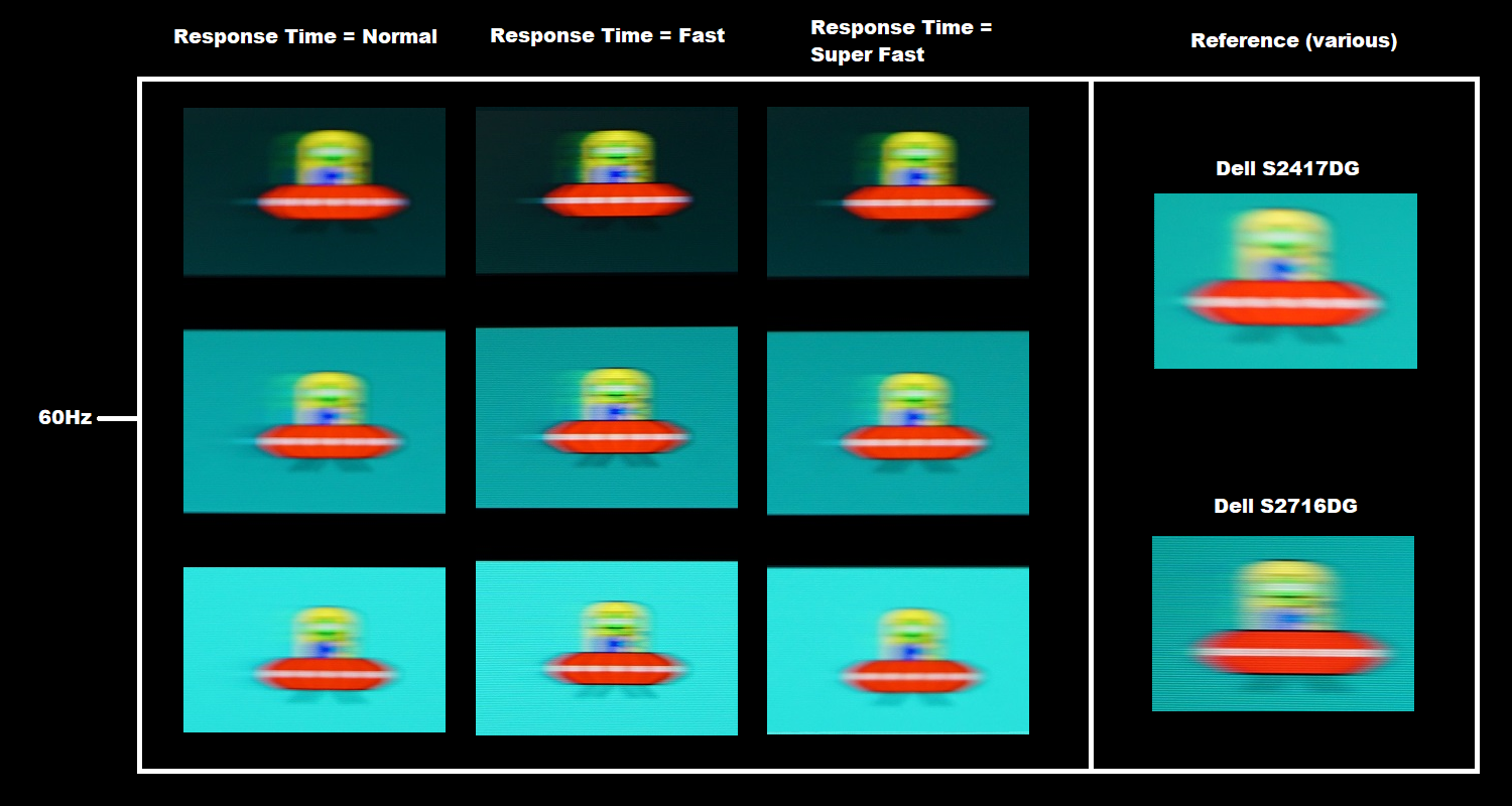
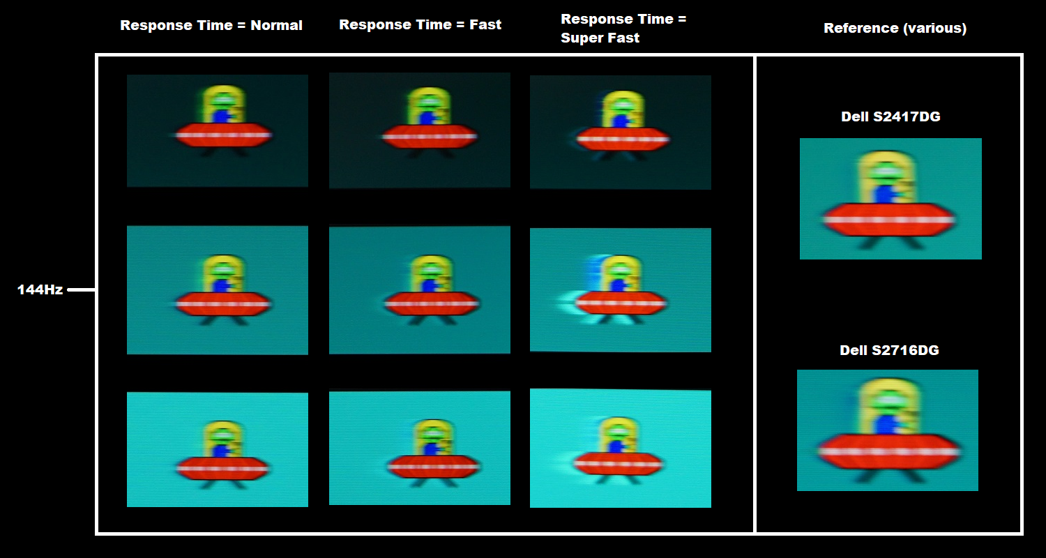
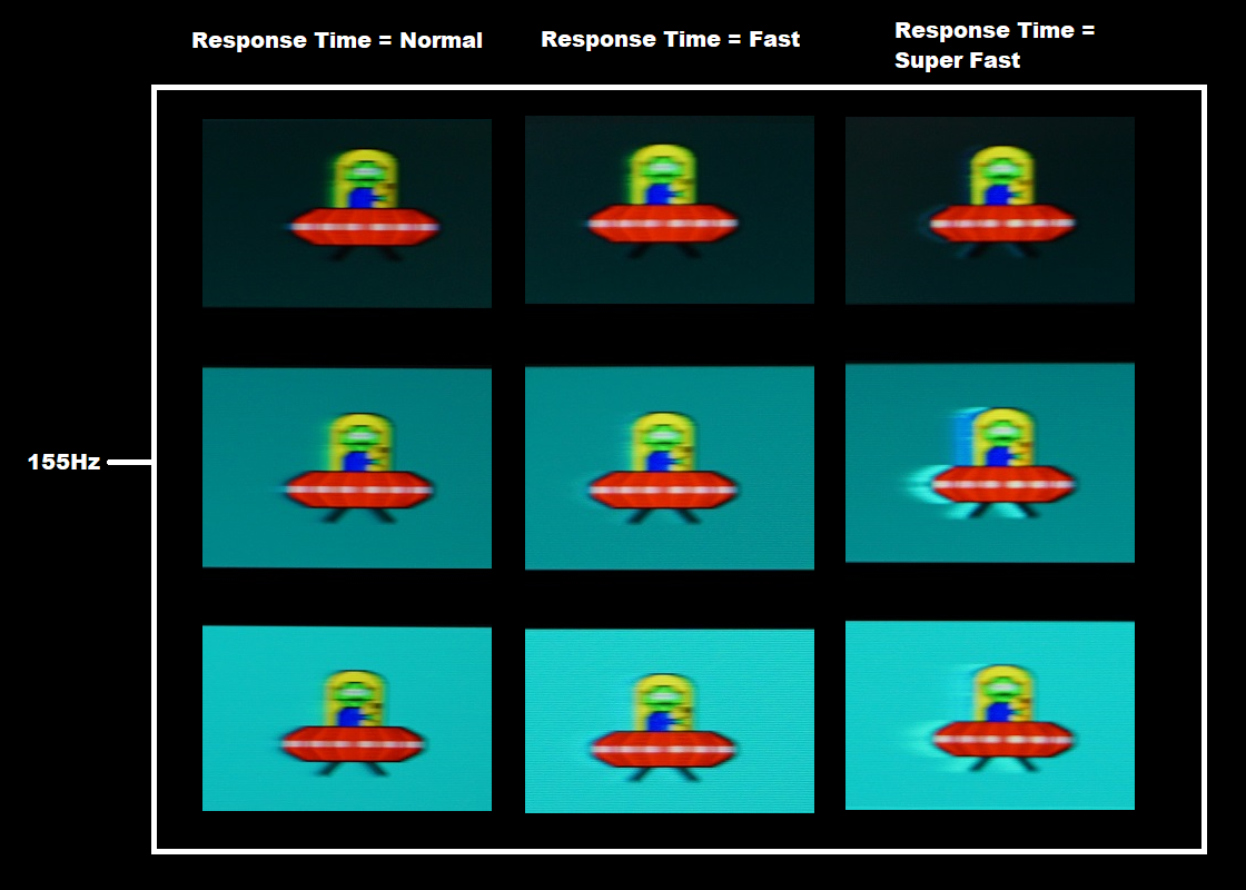
Responsiveness in games and movies
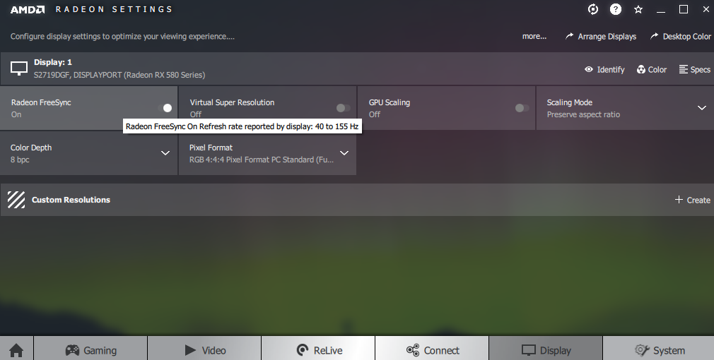
FreeSync – the technology and activating it
The Dell supports a variable refresh rate range of 40 – 155Hz. That means that if the game is running between 40fps and 155fps, the monitor will adjust its refresh rate to match. When the frame rate rises above 155fps, the monitor will stay at 155Hz and the GPU will respect your selection of ‘VSync on’ or ‘VSync off’ in the graphics driver. With ‘VSync on’ the frame rate will not be allowed to rise above 144fps, at which point VSync activates and imposes the usual associated latency penalty. With ‘VSync off’ the frame rate is free to climb as high as the GPU will output (potentially >155fps). AMD LFC (Low Framerate Compensation) is also supported by this model, which means that the refresh rate will stick to multiples of the frame rate where it falls below the 40Hz (40fps) floor of operation for FreeSync. If a game ran at 32fps, for example, the refresh rate would be set to 64Hz to help keep tearing and stuttering at bay. This feature is used regardless of VSync setting, so it’s only above the ceiling of operation where the VSync setting makes a difference.
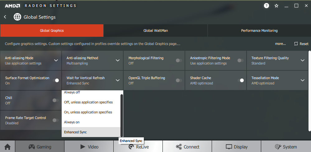
Some users prefer to leave VSync enabled but use a frame rate limiter set several frames below the maximum supported (e.g. 152fps) instead, avoiding any VSync latency penalty at frame rates near the ceiling of operation or tearing from frame rates rising above the refresh rate. Note that if you go to ‘Others – Display Info’ in the OSD, the refresh rate reported there will match what the monitor was running at when you entered that part of the menu. So if you’re within the variable refresh rate range and are using FreeSync, this should reflect the frame rate at that time and is a good indication the technology is working. Alternatively, you can use the integrated ‘Frame Rate’ counter in the OSD, which is actually a refresh rate display and therefore acts as an FPS counter with FreeSync active. Finally, it’s worth noting that FreeSync only removes stuttering or juddering related to mismatches between frame rate and refresh rate. It can’t compensate for other interruptions to smooth game play, for example network latency or insufficient system memory. Some game engines will also show stuttering (or ‘hitching’) for various other reasons which won’t be eliminated by the technology.
FreeSync – the experience
Nvidia Adaptive-Sync (‘G-SYNC Compatible’)
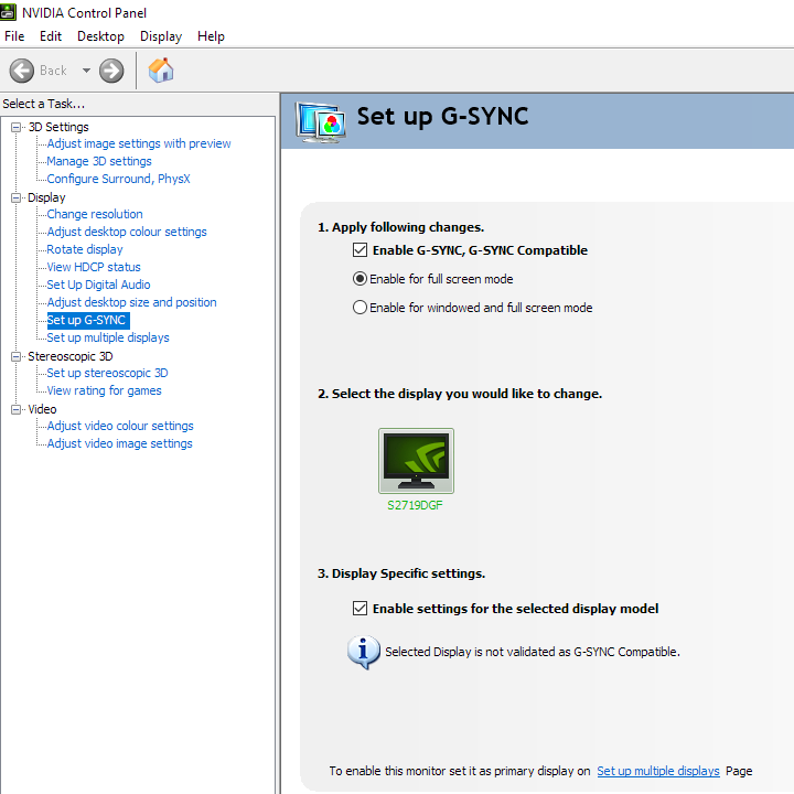
You will also see in the image above that it states: “Selected Display in not validated as G-SYNC Compatible.” This means Nvidia hasn’t specifically tested and validated the display, not that it doesn’t work. This model worked properly using Adaptive-Sync (G-SYNC compatible mode) on our Nvidia GTX 1080 Ti, offering an experience that was very similar to using AMD FreeSync. The exception was that the floor of operation was 55Hz (55fps) rather than 40Hz (40fps). Below this, though, an LFC-like technology was used which kept refresh rate at a multiple of the frame. All of our remaining observations regarding different refresh rate and frame rate ranges, increased overshoot as refresh rate reduces etc. therefore applies. Our suggestions regarding use of VSync also apply, but obviously you’re using Nvidia Control Panel rather than Radeon Settings to control this. The setting is found in ‘Manage 3D settings’ under ‘Vertical sync’, where the final option (‘Fast’) is equivalent to AMD’s ‘Enhanced Sync’ setting. You’ll also notice ‘G-SYNC Compatible’ listed under ‘Monitor Technology’ in this section, as shown below. Make sure this is selected (it should be if you’ve set everything up correctly in ‘Set up G-SYNC’).

Finally, note again that if you go to ‘Others – Display Info’ in the OSD, the refresh rate reported there will match what the monitor was running at when you entered that part of the menu. So if you’re within the variable refresh rate range and are using Adaptive-Sync, this should reflect the frame rate at that time and is a good indication the technology is working. The ‘Frame Rate’ counter in the OSD will also change according to the frame rate (i.e. actually work) if the technology is active, too.
Interpolation and upscaling

Video review
Timestamps:
Features & Aesthetics
Contrast
Colour reproduction
Responsiveness
Conclusion
Positives Negatives Decent sRGB colour space coverage and a pleasingly smooth and light matte screen surface, giving quite a rich look to the image overall with good vibrancy in places TN related viewing angle and colour consistency weaknesses (less so than some models) and gamma too low on our unit requiring an ICC profile to fully remedy Decent static contrast, no ‘IPS glow’ and a smooth appearance even to lighter shades thanks to the smooth and light matte anti-glare screen surface Static contrast slightly lower than specified, particularly after full calibration and the usual TN perceived gamma shifts Low input lag and strong pixel responsiveness making good use of the 155Hz refresh rate, plus Adaptive-Sync doing its thing to get rid of tearing and stuttering from frame and refresh rate mismatches Moderate overshoot using the optimal setting, particularly strong when refresh rate drops in the variable refresh rate environment A sensible design with some subtle but interesting features and a good practical resolution for many users to game at and for productivity purposes Many gaming monitors and products more generally incorporate RGB lighting for a bit of ambience – not this one 