Author: Adam Simmons
Date published: September 5th 2015
Table of Contents
Introduction
For those wanting an IPS-type panel with a 2560 x 1440 (WQHD) resolution, they had to learn to love 27” as a screen size. Whilst this combination works nicely, some people simply want a slightly smaller screen due to space restrictions or personal preferences. A bit of a higher pixel density can also be nice – and many users don’t want to make the jump to ‘4K’ UHD (3840 x 2160) due to the extreme leap in pixel density on relatively small screens. The AOC Q2577PWQ offers something a little different, combining a 25” AH-IPS panel with the WQHD resolution. We find out how this combination works out, and of course what the monitor itself has to offer when it comes to image performance.
Specifications
This model features a 60Hz 25” AH-IPS (Advanced High Performance In-Plane Switching) panel from LG. This boasts true 8-bit colour reproduction without dithering and a 2560 x 1440 resolution. A 5ms grey to grey response time is specified, which as always should be approached with a degree of scepticism. Key ‘talking points’ of the specification have been highlighted in blue below.
Features and aesthetics
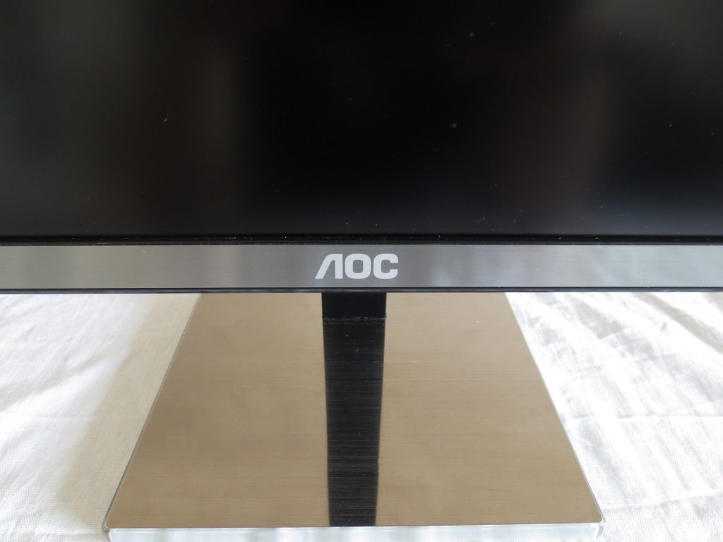
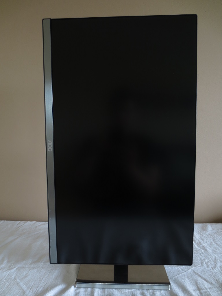
The front of the monitor showcases the ‘Cinema Screen’ design common on many LG AH-IPS panels. There is a very slender dark outer bezel component and a slim dark grey panel border, at the top and sides, which is only readily visible when the screen is switched on. The total bezel width at the top or either side, including both components, is a mere 8mm (0.31 inches) or so. The bottom bezel has a strip of brushed metal, a material also used on the base of the stand. The screen surface is light matte anti-glare, explored a little later.
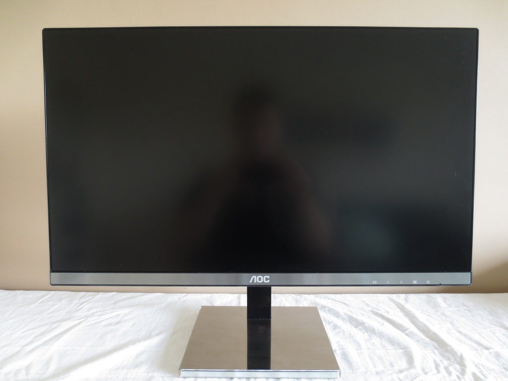
At the right side of the bottom bezel there are white button labels. The buttons themselves are found on the underside of the screen in this region and are tactile rather than touch-sensitive. They control the power state of the monitor, with a small front-facing LED indicating the power state. This glows blue when the monitor is on and red when it is on standby or in a low power state. The OSD (On-Screen Display) is also controlled using these buttons. The functionality of this is shown in the video below.
From the side you can see that the screen is reasonably thin (~16mm or 0.63 inches) at thinnest point, but protrudes further back where the stand attaches. The total depth, including stand base, is 199mm (7.83 inches). The stand neck and attachment joint is not the most robust design we’ve seen and the screen does wobble a little whilst using the control buttons. But it does afford full ergonomic flexibility to the screen; tilt (5° forwards, 23° backwards), swivel (165° left and 165° right using a turntable underneath the stand base), height adjustment (130mm or 5.12 inches) and pivot (rotation 90° into portrait). At lowest height the bottom of the screen is ~30mm (~1.18 inches) above the desk surface with the top of the screen ~373mm (~14.69 inches) clear of the desk.
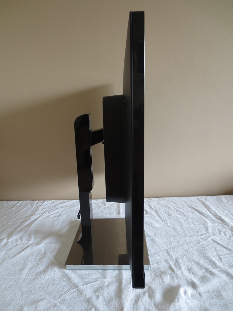
The rear is dominated by matte black plastic, with the exception of the stand neck and attachment point where glossy black and matte silver plastics are used. The stand attaches centrally by 100 x 100mm VESA and is attached using screws (included). An alternative VESA-compatible solution can therefore be used. There is a K-Slot at the button right and towards the bottom of the stand neck there is a small cable-tidy clip.
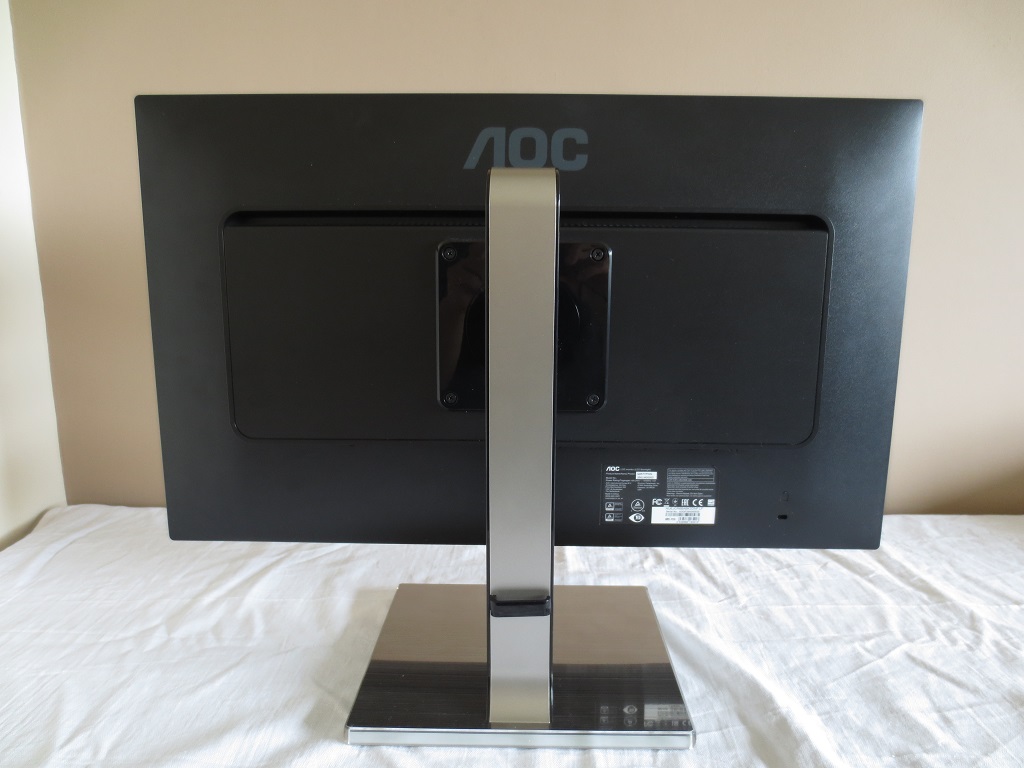
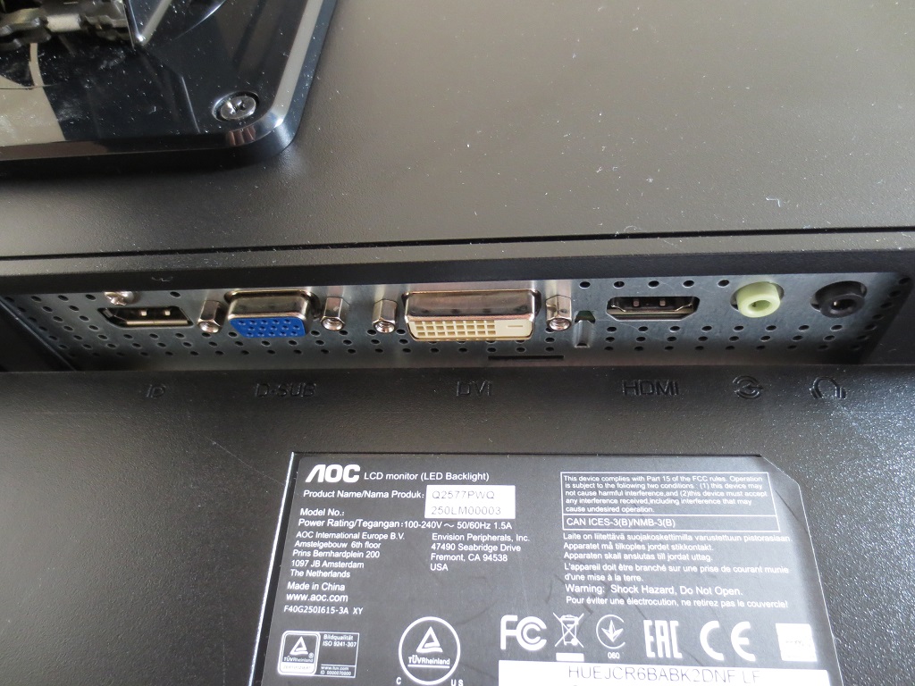
There are some simple 3W up-firing stereo speakers at the rear as well. These provide a reasonable sound output – not particularly bass-rich and a bit distorted in the treble range, but not as ‘tinny’ as some integrated solutions. The ports of the monitor are down-firing and shown in the image below. There is an AC power input (internal power converter) to the left of the stand neck, not shown in the image. The remaining ports, to the right of the stand neck, are; DP 1.2, D-Sub (VGA), Dual-link DVI, HDMI 1.4, 3.5mm line-in and 3.5mm headphone jack. Standard accessories include a VGA cable, Dual-Link DVI cable, DP cable, 3.5mm audio cable and power cable. All digital connections on the monitor support 2560 x 1440 @ 60Hz, provided the GPU does as well (i.e. has HDMI 1.4 ports, Dual-Link DVI ports or DP).
Calibration
Subpixel layout and screen surface
This model has a light matte anti-glare screen surface, as noted previously. This provides a good balance between glare handling and image clarity, providing only a light ‘misty’ graininess to the image rather than any obvious graininess or smearing. It provides a smooth appearance overall, preserving vibrancy and clarity better than ‘stronger’ matte screen surfaces but not providing the absolute smoothness or ‘pop’ of a glossy screen.
![]()
The monitor uses the standard RGB (Red, Green and Blue) stripe subpixel layout, shown above. This is the usual layout expected by modern operating systems such as Windows and MacOS. You don’t need to worry about fringing on text as a Mac user nor should you need to run ‘ClearType’ on Windows, unless you’ve previously messed around with this for a previous monitor. You may like to run the ‘ClearType’ utility simply to fine-tune your preferences, however.
Testing the presets
As is usual for an AOC monitor, there aren’t actually any ‘Presets’ to test, per se. There are a number of ‘Eco Mode’ settings, but these simply alter brightness. There are also several other settings that can be altered in the OSD, such as ‘Gamma’ mode and ‘Color Temp.’. The table below shows our observations alongside some key readings (gamma and white point) taken using a Datacolor Spyder5ELITE colorimeter, using a variety of monitor settings. The monitor was kept in its ‘plug and play’ state, connected to a system running Windows 10. No additional drivers or ICC profiles were specifically loaded and any setting not mentioned in the table below was left at default. We had the monitor hooked up to an Nvidia GTX 970 using DP 1.2, but observed similar image behaviour using Dual-Link DVI and HDMI 1.4 on both our Nvidia GPU and a modern AMD GPU.
| Monitor Settings | Gamma (central average) | White point (kelvins) | Notes |
| Gamma1 (Factory Defaults) | 2.0 | 6501K | The image is very bright indeed, with a vibrant look to some shades but a lack of depth overall. The white balance is very pleasing, without an overriding cool or warm tint or a green bias or weakness. |
| Gamma2 | 1.8 | 6514K | As ‘Gamma1’ but a washed out look. An obvious lack of depth and clear under-saturation of many shades. |
| Gamma3 | 2.1 | 7640K | An exceptionally cool tint is introduced, which when combined with the high brightness is really quite uncomfortable and not ‘Normal’ unless perhaps you’re viewing the screen outside in a snowy field. |
| Color Temp. Normal | 1.9 | 6893K | A cool tint is introduced, otherwise similar to the factory defaults. |
| Color Temp. sRGB | 2.2 | 7499K | The gamma is very nicely balanced with this setting, but unfortunately the screen is locked at very high brightness and there is a very strong cool tint (blue bias). |
| Color Temp. User | 2.1 | 6504K | As ‘Gamma1’, with the ability to manually configure the RGB channels. |
| Test Settings (see below) | 2.1 | 6522K | As ‘Gamma3’ with much more comfortable brightness. Shades are well represented overall with a rich look and good natural variety. There is a little bit more depth in places than there should be, but nothing of concern for general use. This actually invites a bit of extra vibrancy without making things look garishly oversaturated, which some users would really appreciate. |
| Relaxing evening viewing (see below) | 2.1 | 4746K | This simulates the sort of ‘Low Blue Light’ setting seen on some models. The blue colour channel is weakened significantly and the image appears significantly warmer. We found these settings good for relaxing evening viewing. |
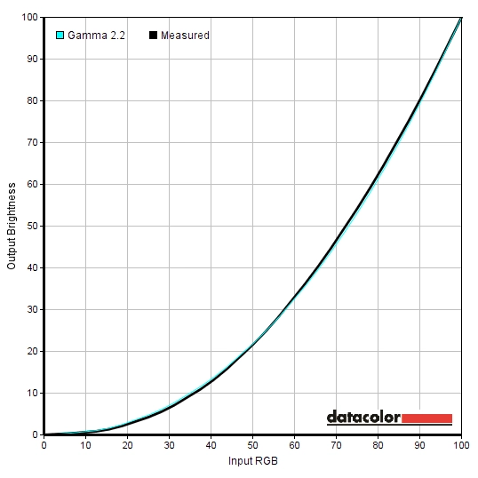
| Calibrated settings (ICC profile applied, see below) | 2.2 | 6501K | This corrects the gamma conformity of the screen so that the gamma curve tracks very close to the standard ‘2.2’ curve. This decreases the depth of some shades to make their representation a bit more accurate. On our unit this profile also introduced some extra banding in places and caused some minor grey neutrality issues (produced a mild green tint in places). |
The image straight from the box on the Q2577PWQ was exceptionally bright with a vibrant look in some places but a lack of depth in others. The white point was bang on the 6500K daylight white point target, so that was good. The gamma curve was slack and tracked in a rather unconventional manner. The only setting that really satisfied the colorimeter when it came to gamma was the ‘sRGB’ setting, which provided very good tracking of the common ‘2.2’ curve as shown below. Unfortunately brightness was fixed at a retina-scorching brightness using this setting and the blue channel was far too strong without ability to compensate for that in the OSD. The best balance was struck in ‘Gamma3’, more so once brightness was reduced as per our test settings. The colorimeter was certainly not smiling when it came to gamma, which was quite unconventional, but the overall representation of shades was pleasing and worked nicely for general purpose and ‘entertainment’ use. The white balance was spot on where it should be really, so no adjustments were required on that front. The first curve below shows the gamma tracking using our ‘Test Settings’ whilst the second curve shows the gamma behaviour with the ICC profile applied. We will come onto both of these in the preceding section. We also take a look at some settings for ‘relaxing evening viewing’, in lieu of the lack of ‘Low Blue Light’ setting or equivalent preset on this monitor. Again we would really like to see AOC stick to using a ‘Warm’ preset that is actually warm and change the ‘Normal’ preset so it is actually normal. As noted above, the white point was very nicely balanced straight from the box. No manual adjustments were required to the colour channels of our unit, but be aware of inter-unit variation and the fact that some units may require slight tweaks to the colour channels. We changed to ‘Gamma3’, the richest gamma setting, and significantly reduced the brightness to a more comfortable level. Any setting not mentioned below was left at default. Although the ‘Medium’ Overdrive setting is also the default value, we’re including that here just for reference. Gamma= Gamma3 Overdrive= Medium Some monitors have ‘Low Blue Light’ settings or something to that effect such as a ‘Reading’ or ‘Paper’ setting. This typically reduces blue light output from the monitor and creates a warmer look to the image, which is useful for relaxing evening viewing in particular. This monitor lacks such a feature, but we were able to replicate this with some manual adjustments to the colour channels. The settings suggested below are simply a guide of what you could use to simulate your own ‘Low Blue Light’ setting. Rather conveniently the factory default ‘Color Temp.’ (‘Warm’) on our unit was suitable for daylight viewing, making it a simple case of switching to our customised ‘User’ setting. We used these settings for our own viewing pleasure later in the evening but not for any of our testing. Brightness= 26 (according to preferences and lighting) Gamma= Gamma3 Overdrive= Medium Color Temp.= User R= 50 G= 40 B= 34 We feel the ‘Test Settings’ alone provided a pleasing image that most users will enjoy for general purpose use (browsing the internet, playing games, watching movies etc.) The gamma tracking was a bit unconventional, however. The ICC profile below straightens out the gamma curve of the monitor so that it conforms more closely to the standard ‘2.2’ curve. This could be of benefit to those who like to use their monitor for colour-critical tasks such as photo editing and design work. Be aware that you can expect inter-unit variation which means this profile won’t necessarily be optimal for all units. If you feel this profile is necessary in the first place, because colour accuracy is particularly important, then we’d advised that you create your own ICC profile specific to your unit using your own calibration device. Also be aware that applications such as games don’t fully use ICC data. Since our testing is dominated by such usage and the colour reproduction without any ICC profile was pleasing, this ICC profile is not applied during our testing. We simply use the ‘Test Settings’ noted previously. These limitations aside, if you would like to try our ICC profile please do the following: A highly accurate light meter (KM CS-200) was used to measure the luminance of white and black on the screen using a range of settings. From these readings, static contrast ratios were calculated. This data is shown in the following table. Unless otherwise stated assume settings were left at default, with the exception of the ‘Test Settings’, ‘Relaxing evening viewing’ and ‘Calibrated Settings’. Blue highlights on the table indicate the results of these, whilst black highlights on the table indicate the highest white luminance, lowest black luminance and highest static contrast ratio recorded.
Gamma sRGB mode
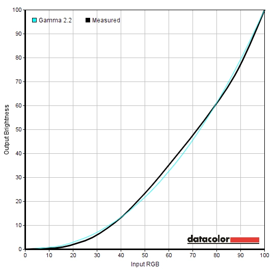
Gamma test settings
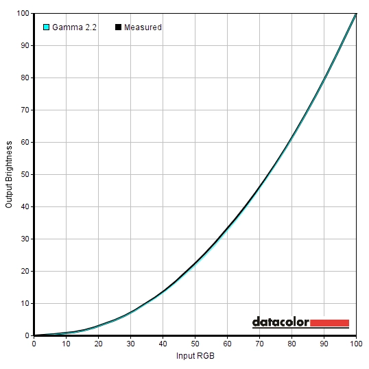
Gamma ICC profile
Test Settings
Brightness= 26 (according to preferences and lighting)
Relaxing evening viewing
ICC profile
2) Set the monitor up according to the ‘Test Settings’, but feel free to adjust the brightness if desired. Using a brightness of ‘26’ provided 161 cd/m² on our unit with the ICC profile applied.
3) This article provides instructions on how to activate the profile as well as some limitations to be aware of when gaming in particular.
Contrast and brightness
Contrast ratios
Monitor Settings White luminance (cd/m²) Black luminance (cd/m²) Contrast ratio (x:1) 100% brightness 385 0.36 1069 80% brightness 326 0.30 1087 60% brightness 267 0.25 1079 40% brightness 205 0.19 1079 20% brightness 143 0.13 1100 0% brightness 80 0.07 1143 Factory defaults (90% brightness) 356 0.33 1079 Gamma2 356 0.33 1079 Gamma3 355 0.33 1076 Color Temp. = Normal 303 0.34 891 Color Temp. = sRGB 310 0.35 886 Color Temp. = User 356 0.33 1079 Test Settings 162 0.15 1080 Relaxing evening viewing 126 0.15 840 Calibrated Settings 161 0.15 1073
With only brightness adjusted, the contrast ratio averaged a respectable 1091:1. Our ‘Test Settings’ did not involve any adjustments to the colour channels, so contrast was unaffected with a reading of 1080:1. Similarly, the various ‘Gamma’ settings had no effect on contrast nor did the application of our ICC profile. Contrast did drop when the colour channels were adjusted, as is done when ‘Color Temp.’ is set to ‘sRGB’ or ‘Normal’ (a drop to around 890:1). A further drop came from the fairly extreme adjustments made under our ‘Relaxing evening settings’, to 840:1. The maximum brightness recorded was a retina-scorching 385 cd/m², whilst the minimum white luminance was a reasonably low 80 cd/m². This provided a very good luminance adjustment range of 305 cd/m², although some users with particularly sensitive eyes may prefer a lower minimum luminance without having to sacrifice contrast.
The monitor has a Dynamic Contrast mode called ‘DCR’ (Dynamic Contrast Ratio), which locks off access to the brightness, contrast and gamma settings. The backlight is allowed to dynamically adjust in intensity to reflect the overall levels of ‘light’ and ‘dark’ on the image being displayed at a given time. We found that this mode made good use of the exceptional brightness of the display, tending to become uncomfortably bright during mixed images. It did dim effectively where predominantly dark content was displayed, though. We don’t personally like these modes, particularly as they set the whole backlight based on the overall scene and can’t compensate for complex mixtures of ‘light’ and ‘dark’. This mode does do what you’d expect from a Dynamic Contrast setting, though, and is there for those who want to try it out.
PWM (Pulse Width Modulation)
The Q2577PWQ does not use PWM (Pulse Width Modulation) to regulate backlight brightness to any level. Instead, DC (Direct Current) modulation is used to regulate backlight brightness. This model is therefore considered ‘flicker-free’, as advertised. This will be appreciated by users who are sensitive to flickering, find PWM-modulated backlights fatiguing on the eyes or simply dislike PWM artifacts.
Luminance uniformity
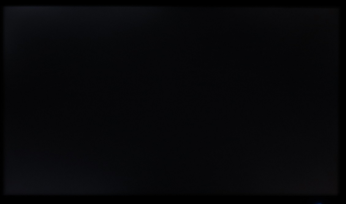
Observing a black screen in a dark room revealed slight backlight bleed. This was most pronounced but still minimal towards the top left region of the screen. It is worth remembering that individual units can and do vary when it comes to backlight bleed. The image below was taken from a central viewing position a few metres back from the screen, to eliminate ‘IPS glow’. This glow can be observed whilst viewing the screen from a normal viewing position, as a silvery blue or golden sheen that is most noticeable in the bottom corners of the screen (or the top corners if you view from lower down). This sheen appears to ‘bloom out’ if you move your head and in particular if you view the screen from a steep angle. There is a video deeper into the review that shows this blooming out.
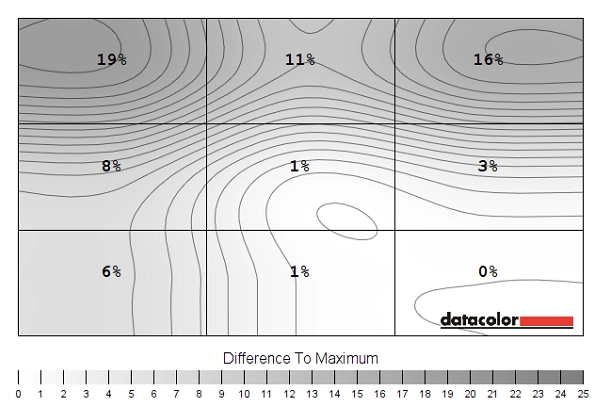
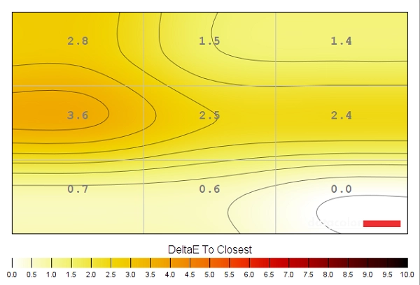
The Spyder5ELITE colorimeter was used to analyse the uniformity of lighter colours, represented by 9 equally spaced white quadrants running from top left to bottom right. The table below shows the luminance recorded at each quadrant and the deviation between a given quadrant and the brightest quadrant. The luminance uniformity of the screen was variable, with relative weakness towards the top. The brightest point recorded was ‘quadrant 9‘, towards the bottom right (163 cd/m²). The greatest deviation from this point occurred at ‘quadrant 1’ towards the top left of the screen (133 cd/m², which is 19% dimmer). Deviation was also moderately high at ‘quadrant 2’ in the upper central region (146 cd/m², 11% dimmer) and ‘quadrant 3’ towards the top right (138 cd/m², which is 11% dimmer). The rest of the screen, which encompasses the central quadrants and remaining bottom quadrants, showed low deviation of 1-8% from the brightest point. The contour map below shows these deviations graphically, with darker greys representing lower luminance and therefore greater deviation from the central point than lighter greys. The colour temperature deviations for the same 9 quadrants were also analysed by the colorimeter. Deviations are assigned DeltaE values, with higher values representing the greatest deviation from the D65 (6500K) daylight white point target. The contour map below shows this, along with stronger colour to indicate greater deviation from the 6500K target. A DeltaE of <3 here is considered deviation that most users would not readily notice by eye, therefore not considered significant. The results here were pleasing overall. The point closest to 6500K was the bottom right corner. The region left of centre showed the highest deviation from this, with a significant deviation of DeltaE 3.6. Elsewhere no significant deviation was recorded, which is good. It’s important to note that, as with other aspects of uniformity, individual units vary and not all will behave as our sample did. There may also be deviations beyond the 9 points measured on the screen. The contrast performance was pleasing overall on Battlefield 4 (BF4). Bright elements appeared fairly smooth and ‘un-grainy’ thanks to the light matte screen surface and stood out very nicely in darker surroundings. The gamma behaviour of the monitor provided some extra depth to some dark shades, aiding this contrast further. On the flip-side, there was some slight loss of detail in dark areas resulting from this – although it was fairly minor and didn’t really affect playability. Some greater detail loss could be observed peripherally, particularly towards the bottom corners, due to ‘IPS glow’. Dirt 3 was well represented overall from a contrast perspective. Bright elements again contrasted strongly with surrounding dark elements. These light shades (car headlights, sky, certain buildings etc.) had only a fairly slight graininess to them rather than anything course and ‘heavy’, which is good. There was some loss of detail, particularly in peripheral sections affected by ‘IPS’ glow. It meant that wrinkly leather, car tread patterns and fan ventilation grills inside the car didn’t look as distinct as they could. But it certainly wasn’t severe enough to affect the truly outstanding racing performance during our testing of this title. We also used the Blu-ray of Skyfall to assess contrast performance. Bright elements again stood out nicely against darker backgrounds. The candles lighting up the river at night in Macau, for example, were particularly eye-catching. The 2.40:1 (16:9 letterbox) format of the film also meant that black bars absorbed most of the IPS glow. Detail levels in dark scenes were generally good, with only minor and largely inconsequential detail loss for the most part. A little IPS glow did persist in the bottom corners, but it only affected a small portion of the image. The Lagom tests for contrast allow specific weaknesses in a monitors contrast performance to be identified. The following observations were made. The AOC Q2577PWQ’s colour gamut (red triangle) was compared to the sRGB reference colour space (green triangle), as shown below. The first image shows the colour gamut using our test settings, with comprehensive (100%) sRGB coverage and a bit of extension beyond this for a bit of extra vibrancy. The second image shows the results when ‘Color Temp.’ is set to ‘sRGB’. It appears that the colour gamut is purposefully restricted under this setting, tracking closer to the sRGB reference to prevent native oversaturation, so this is actually a sRGB emulation mode. As noted earlier brightness can’t be adjusted in the sRGB setting (without going into the service menu, which we can’t endorse). However; with a colorimeter the level of native over-coverage even outside of the sRGB emulation mode can largely be corrected for so shouldn’t be considered a serious issue. Colour reproduction was pleasing on BF4. Things had a vibrant and varied look, looking largely as they should with a little extra depth in places for an extra dose of vividness. There were some pleasingly deep lush greens set alongside a very pleasing array of more muted green and brown shades. Certain elements also stood out in a rather eye-catching way due to their highly vibrant (but not garish or obviously oversaturated) look. Burning fires, for example, showcased some impressively rich yellows, oranges and reds. Perhaps a little deeper than they should be (i.e. oranges having a bit of a red hue) but pleasing to the eye. In-game markers also stood out very nicely, particularly the light blue ones, looking appropriately ‘neon’ without looking misplaced. As with BF4, colours on Dirt 3 had an inviting look to them. From the lush greens of the Finnish rainforest to the dusty khaki shades of the Kenyan rally tracks, everything looked very much in-place. Again, some shades appeared a touch deeper than they should but not alarmingly so and not enough to give the natural environment an unnatural look. There were a lot of paler pastel colours as well, looking appropriately muted in comparison to richer shades. The car paint jobs were very pleasing, looking lively but not overdone. Some exceptionally deep blues and reds were observed as well as very striking bright purples and cyans. Colour representation was pleasing on the Blu-ray of Skyfall. Environments and skin-tones looked rich but natural, with appropriate saturation overall and excellent consistency. A given shade was represented in largely the same way regardless of its on-screen position. Fire had a particularly vivid quality to it, without looking unrealistic. The neon lights of the Shanghai night scenes also stood out in a vibrant way, particularly the neon light blue lights. Finally, we tested the Blu-ray of Futurama: Into the Wild Green Yonder. The monitor provided a dazzling array of vibrant colours on this film. It is difficult to pick ‘stand out’ shades as many were quite impressive, but some that stood out included – neon greens and pinks as well as some very strong deep reds, purples and blues. Again, some shades were a little deeper than they should be, for example some deep oranges took on a slight red hue. Pastel shades retained an appropriate look, much more muted than these striking deep or neon shades. The variety of subtly different shades was also excellent due to the strong colour consistency of the monitor. This movie is excellent for highlighting strengths or weaknesses in that area, with large areas of individual shades filling large portions of the screen. We used Lagom’s tests for viewing angle to help explore the idea of colour consistency and viewing angle performance. The following observations were made from a normal viewing position, sitting around 70cm from the screen. We used a piece of software called SMTT 2.0 alongside a sensitive camera to compare the latency of the Q2577PWQ with a range of monitors of known input lag. We took over 30 repeat readings using this method to measure 18.68ms (just over 1 frame) of input lag. This is influenced both by the element you see (pixel responsiveness) and that which you feel (signal delay). This indicates that the monitor has a moderate signal delay that will bother some users sensitive to input lag but not others. You shouldn’t worry about this unless you specifically know you are particularly sensitive to input lag. Our responsiveness article explores some important concepts related to the responsiveness of a monitor. It is important to realise that it isn’t just pixel responsiveness that dictates how much motion blur you see on a monitor. In fact the movement of your own eyes as you track motion is the most significant contributor to perceived blur on modern monitors. By using a method of photography known as ‘pursuit photography’, you can accurately capture motion on a monitor in a way that indicates what your eye sees when tracking motion. A moving camera is used to capture images, showing not just ‘trailing’ from sub-optimal pixel responses but also highlighting blur that is caused by eye (in this case camera) movement. Additional imperfections such as inverse ghosting (overshoot or Response Time Compensation errors) are also highlighted. The following images are pursuit photographs taken using the UFO Motion Test for ghosting, with the test running at 960 pixels per second. This rate is practical for such photographs and highlights the pixel response elements and eye (camera) movement elements of motion blur. The ‘medium cyan’ background (middle row) of the test is used with the monitor set to various ‘Overdrive’ settings; ‘Off’, ‘Weak’, ‘Medium’ and ‘Strong’. The final picture shows a 60Hz reference monitor, a Samsung S27A750D set to full brightness (this eliminates PWM) and 60Hz, using its ‘Faster’ response time setting. This reference shows motion blur that would be caused almost entirely by eye movement if you were observing movement on the monitor, without pixel responsiveness being a limiting factor. With ‘Overdrive = Off’, you can see a significant amount of trailing beyond what is seen on the reference screen. This indicates weaknesses in pixel responsiveness, influencing perceived blur. The ‘Weak’ setting decreases this somewhat, particularly behind the UFO itself. A significant improvement can be had by using the ‘Medium’ setting, which is actually the factory default. For the transitions analysed here there is only a little bit of trailing from slower than optimal pixel responses – it doesn’t look a million miles from the reference screen really. The ‘Strong’ setting introduces a moderate amount of overshoot (inverse ghosting), which can be seen in the image as an inverted bright trail behind the object. From this analysis it is clear that the ‘Medium’ setting is optimal. In our game testing that follows we consider a broader range of pixel transitions and indeed it is readily apparent in this testing the ‘Medium’ is the best setting to use. Overshoot using the ‘Strong’ setting is readily apparent and fairly off-putting, without any obvious benefit elsewhere. The ‘Weak’ setting meanwhile gives a fair degree of additional trailing from sluggish pixel response times compared to the ‘Weak’ setting. We will not be including a section on ‘overclocking’ in this review as we were only able to set the monitor as high as 65Hz comfortably, without significant frame skipping or other negative consequences. This was the case regardless of connection used, and we don’t feel setting the monitor to 65Hz provides any palpable benefit over 60Hz anyway. Whether stalking your prey on foot or zipping around in a nimble vehicle on BF4, the perceived blur was very much as you’d see on even the fastest 60Hz monitors. There was really very little weakness in the way of pixel responsiveness, with just the slightest (and fairly rare) whiff of trailing on top of what is observed due to eye movement alone. There was no noticeable overshoot, either, with just the lightest trace during a small minority of transitions. These involved light and medium-light shades moving against each other, for example when strafing past light metal posts with snow in the background. The overshoot was very difficult to spot and actually blending in quite well anyway, it’s not something even those with trained eyes will have an easy time spotting. It is clear that AOC have done an excellent job of fine-tuning the pixel overdrive in the default ‘Medium’ setting. This is really about as good as it gets with respect to perceived blur on a 60Hz LCD and one of the best performances we’ve seen from a 60Hz WQHD model. Dirt 3 told a similar story – one of pixel responses doing little to hold things back. Whether cruising along rally tracks or spinning around like a lunatic on Gymkhana, there was a moderate to strong degree of blur that was caused almost exclusively by eye movement. There was no obvious trailing on top of this nor any noticeable overshoot, with mere traces of both that are barely worth a mention. Obviously the refresh rate itself holds things back in this respect, but by now you should be well aware that you’re reading a review of a 60Hz monitor here. We also tested our Blu-ray movie test titles, which did not highlight any weaknesses in pixel responsiveness. The fluidity was limited by the low frame rate at which the films run (~24fps), but was not impeded by pixel responsiveness; there was no trailing or overshoot related to imperfections in that department. Most models with a 2560 x 1440 (WQHD) resolution have those pixels spread across a screen measuring 27” diagonally, providing a pixel density of 108.79 PPI (Pixels Per Inch). With its 25” screen, the AOC Q2577PWQ yields a slightly tighter pixel density of 117.49 PPI – roughly 8% higher. This isn’t a monumental difference, but it is a difference nonetheless. It does, amongst other things, make text and various other elements on this screen just a little bit smaller in comparison to 27” WQHD screens. The images below show the AOC beside a Philips 272P4APJKHB, a 27” WQHD model. Note that this is a wide gamut monitor and therefore looks very different, especially on camera, in terms of white point and colour balance. Ignore those differences – this demonstration is simply to give a rough idea of the different screen sizes and the relative size of text and graphical elements on the 25” vs. 27” screen. We found the 25” screen and 2560 x 1440 resolution combination very comfortable to use for text-based work, reading websites and other such tasks. The amount of real-estate was pleasing, although obviously not as high as on 3840 x 2160 (‘4K’ UHD) models. On the plus side, we found the screen very much useable without relying on scaling, which isn’t something we can really say for UHD screens of this sort of size. The images below show the Q2577PWQ (which we will affectionately call the ‘Q25’) on its own displaying a ‘blank desktop’ and running the Microsoft Edge web browser and Microsoft Word simultaneously. This should give you an idea of the sort of ‘real-estate’ you have at your disposal on this model, without scaling and 100% zoom on each application. When it comes to gaming, the slightly tighter pixel pitch doesn’t bring anything revolutionary to the experience over a 27” screen with the same resolution. If you consider 32” or smaller ‘4K’ UHD (3840 x 2160) screens, you get an obvious jump up in clarity and detail compared to a 27” 2560 x 1440 screen. Provided they are of sufficient resolution to start with, textures in games appear much more detailed whilst there is an obvious change to the clarity and sharpness as you stare into the distance on your game world. There are some definite ‘wow’ moments there. Comparing 25” to 27” WQHD screens, though, the differences are much more subtle. Things do look just a touch sharper in general, but really don’t look too dissimilar to on a 27” model with such a resolution and similar screen surface. This isn’t necessarily a bad thing, though, as the 2560 x 1440 resolution on both 25” and 27” screens provides a nice level of detail and clarity when gaming. It gives a significant bump up in these aspects compared to a 1920 x 1080 (Full HD), without being anywhere near as taxing as the 3840 x 2160 resolution. We will round off this section by providing some images of various games running on the monitor; obviously giving no indication of what it actually looks like in person but simply setting the scene(s). With the monitor running at its native 2560 x 1440 (WQHD) resolution, everything appears clear and sharp. You may wish to run the monitor at a lower resolution, such as 1920 x 1080. Perhaps if your GPU lacks the horsepower to play a particular game title in WQHD or if you’re connecting the monitor to another device such as a games console. When you do this, the monitor uses an interpolation process to fill its 2560 x 1440 pixels with the 1920 x 1080 image. There is no 1:1 pixel mapping feature on the monitor, so if you wish to have the lower resolution centres without any sort of interpolation used you would need to select the appropriate option in the graphics driver. When running the monitor at 1920 x 1080, things look somewhat softer than they would on a monitor displaying 1920 x 1080 natively on a monitor of similar size. The sharpness is a lot better than we’ve seen on many monitors when using interpolation, however. Text appears a bit softer and images do not appear quite as defined as they should, but they still maintain a decent degree of sharpness. A similar experience is had whilst gaming, with textures not appearing as sharp or detailed as they should – a moderate but not excessive softening. If you are viewing 1920 x 1080 content such as movies but have the monitor resolution at its native 2560 x 1440 then the loss of sharpness is again not all that pronounced. The monitor itself doesn’t actually influence what’s going on there, it’s the GPU or software that upscales the image. As usual there is a slight softening compared to running the movie on a native 1920 x 1080 screen of similar size and screen surface, but it’s quite subtle and certainly far removed from what is seen when the monitor interpolates. You certainly can’t counteract this by using the ‘Clear Vision’ function, but you shouldn’t really feel the need to either – the monitor is a fine choice for Full HD movie watching, overall. The 2560 x 1440 (WQHD) resolution is nothing new, but until relatively recently monitors which used the resolution came at a huge premium over lower resolution models. The AOC Q2577PWQ makes use of a slightly smaller panel compared to the usual for the resolution, at 25” rather than 27”. This has allowed the manufacturer to price this model very aggressively, making it one of the most affordable 2560 x 1440 models on the market. Despite its price tag and cut down screen size, image quality is just as good as on many of its larger and more expensive counterparts. The image did look extremely bright and somewhat bleached out of the box, but this was easy to rectify with some very simple tweaks of the OSD. Once brightness was lowered and the gamma mode was changed, the image was rich, varied and appealing. The white point of our unit was right where it should be according to the 6500K daylight target right from the box, so there was no need for us to modify colour channels for our ‘Test Settings’. Gamma tracking was a bit off compared to the conventional 2.2 curve, but this didn’t detract from the experience for general usage (including games, movies, ‘work’ and browsing the internet) and if anything added a bit to it. Given the colour consistency of the AH-IPS panel, the light matte screen surface and generous (but still not ‘wide’) colour gamut, the image was pleasing in both depth and variety. The contrast performance was very much as expected from a modern IPS panel, fairly good but with the usual ‘IPS glow’. There was also a little bit of extra detail lost due to the gamma behaviour of the monitor, but nothing substantial. Responsiveness was also pleasing overall, especially from a pixel responsiveness perspective where there were no real weaknesses for a 60Hz monitor. The input lag moderate, which may put some off but shouldn’t deter most users. All in all this was a solid monitor with pleasing performance and an even more pleasing price tag – one that’s well worth the money.
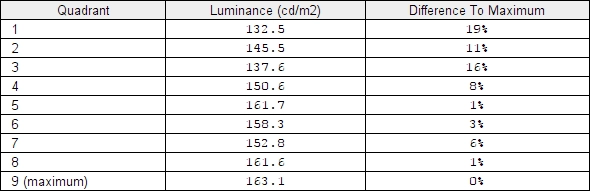
Luminance uniformity table
Luminance uniformity map
Colour temperature uniformity map
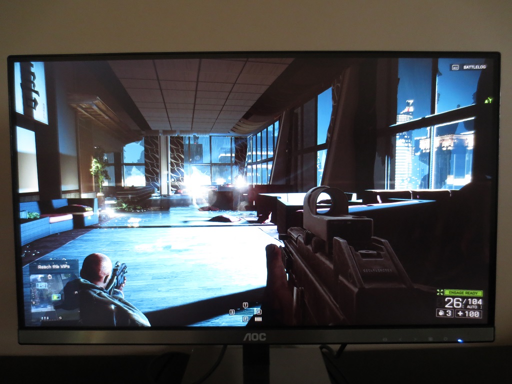
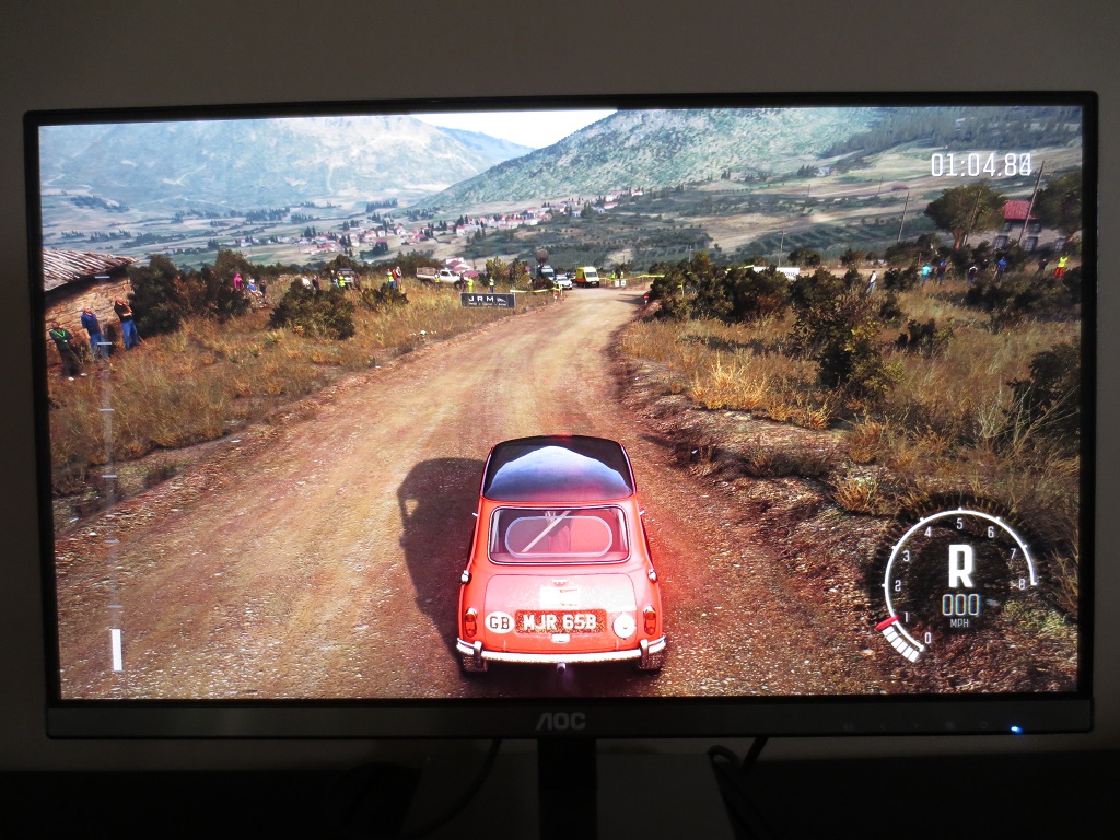
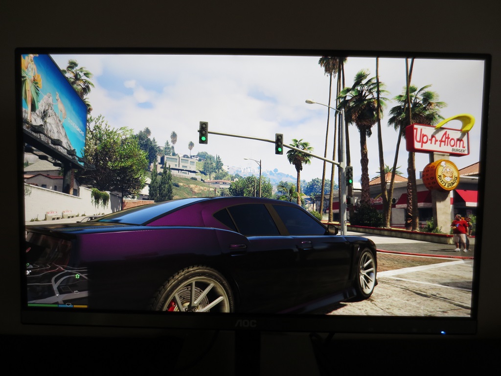
Contrast in games and movies
Lagom contrast tests
Colour reproduction
Colour gamut
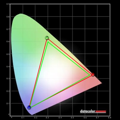
Colour gamut test settings

Colour gamut sRGB mode
Colour in games and movies
Viewing angles
Responsiveness
Input lag
Perceived blur (pursuit photography)
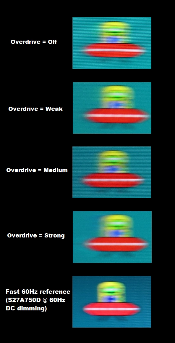
Perceived blur with various settings
Responsiveness in games and movies
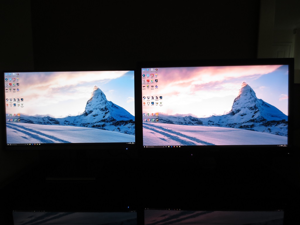
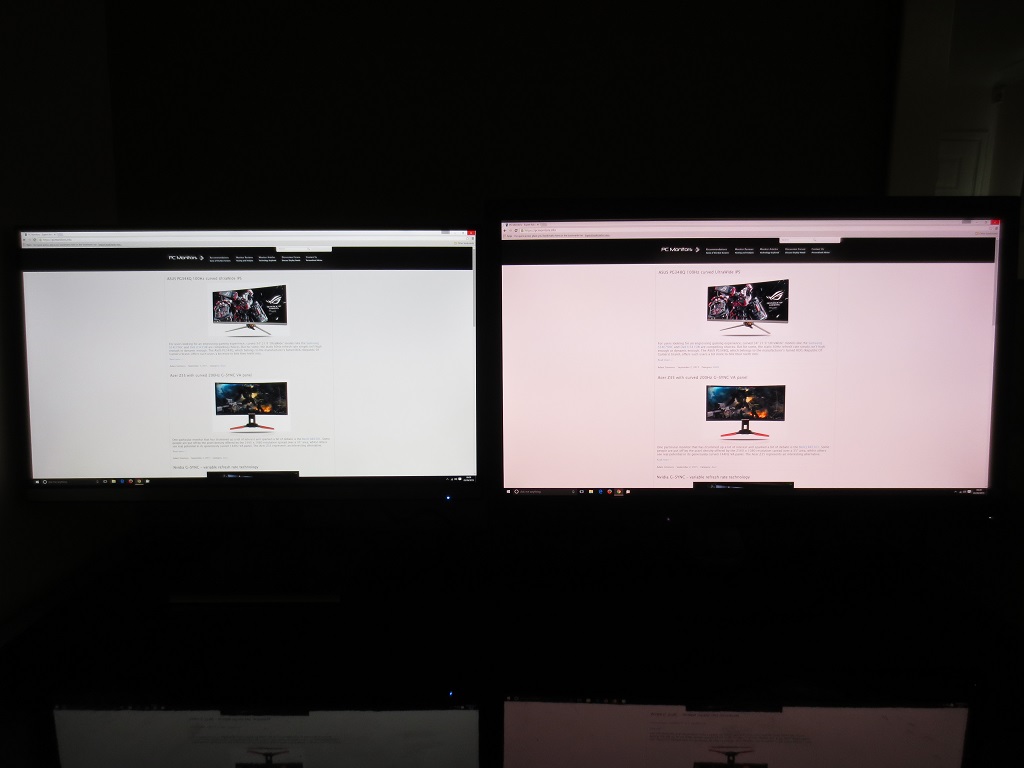
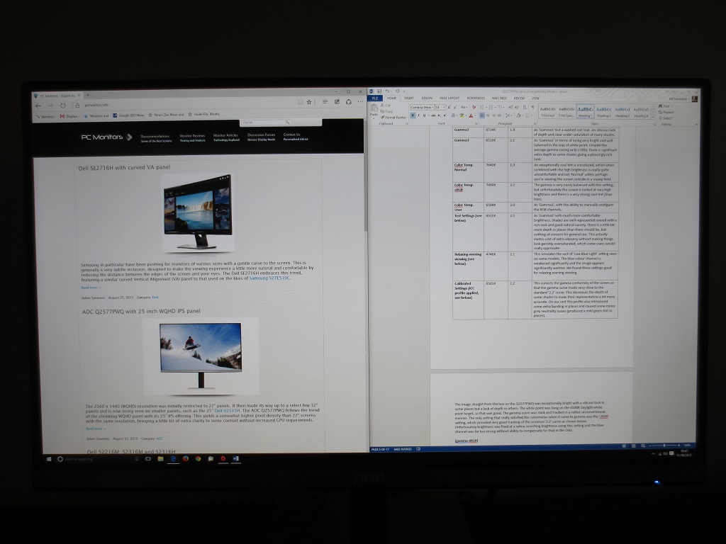
The 2560 x 1440 (WQHD) experience on a 25” screen
Interpolation and upscaling
Conclusion
![]()
Positives Negatives Generous colour gamut, strong colour consistency from the AH-IPS panel and light matte screen surface provide a good vibrant and varied look to the image. White point very close to the 6500K target out of the box
Gamma tracking was only truly adherent to the 2.2 curve in the sRGB setting, which has key adjustments such as brightness and colour channels locked
Static contrast ratio is much as expected for a modern IPS panel, providing good distinctions between bright and dark – something also aided by the gamma behaviour under our test settings The usual ‘IPS glow’ is present, which eats away at some detail peripherally. There was a little additional detail loss in places due to the gamma behaviour, but nothing of particular concern The pixel responsiveness was strong enough for very pleasing 60Hz performance, without it being poorly balanced and introducing noticeable overshoot
Moderate input lag and 60Hz refresh rate could put some users off
The screen size and resolution provided a good mixture of image quality and performance on a range of applications without necessitating scaling or heavy image quality setting cutbacks on moderately powerful systems. The current retail price is excellent for this monitor
The pixel density difference between this and 27” is rather modest – it doesn’t bring the sort of ‘wow’ factor to the gaming experience that a <32” ‘4K’ UHD (3840 x 2160) screen would
![]()

