Author: Adam Simmons
Date published: August 25th 2014
Table of Contents
Introduction
For those wanting a fast and fluid gaming experience, refresh rate is a key consideration. By increasing the amount of visual information outputted every second, monitors with higher refresh rates than the usual 60Hz both look and ‘feel’ more responsive to the user. The AOC g2770Pqu is the company’s first 27” 144Hz gaming monitor, designed to take on some more expensive models with perhaps a more basic feature set but also a lower price tag (region dependent). We’ll be analysing the responsiveness of the monitor, which is of course a key selling point, as well as the image quality. Many recent 144Hz models have been fairly disappointing when it comes to image quality, so it will be interesting to see if this model offers a refreshing change (no pun intended).
Specifications
The monitor uses a 27” uses a TN panel with 144Hz refresh rate, sporting a 1920 x 1080 resolution and ‘up to 1ms’ response time. It’s nice to see AOC acknowledge that response times vary depending on the shades involved in the transition and also the overdrive settings of the display. We’ve highlighted some key ‘talking points’ from the basic specification in blue below. Note that the price at time of writing is somewhat cheaper than the competition in the US, but in other markets (such as the UK) that isn’t the case.
Features and aesthetics
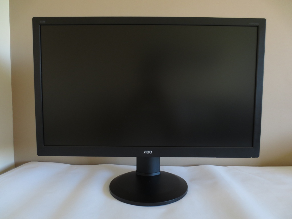
From the front you can see the home-office look that AOC have adopted on a number of their recent models. The bezels use a brushed metal effect matte black plastic. They’re moderately thick; 21mm (0.83 inches) at the top and sides and 30mm (1.18 inches) at the bottom. The US model also has a dark red band beneath the AOC logo, running along most of the length of the bottom bezel. The screen surface is medium-light matte anti-glare, typical of many modern TN and Full HD AH-IPS panels. This provides a clearer look to the image than some ‘heavier’ surfaces, but provides a bit more graininess compared to lighter surfaces.
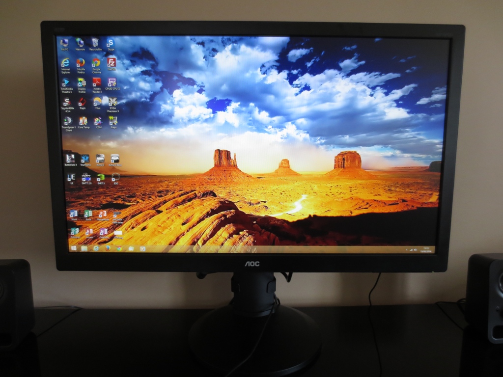
The stand is fully adjustable, allowing; tilt (5° forwards, 25° backwards), swivel (270° using a turntable mechanism at the bottom of the base) and height adjustment (130mm or 5.12 inches). At its lowest height the bottom edge sits 45mm (1.77 inches) above the desk whilst the top of the monitor is 432mm (17.00 inches) above the desk. You can also rotate (pivot) the screen 90° clockwise into portrait, but be aware of the viewing angle limitations of the TN panel which become very apparent in this orientation.
On the underside of the bottom bezel, on the right side, there are some buttons control the menu system and power state of the monitor. These have a satisfying click when pressed and are quite well arranged and spaced to minimise frustration during operation. The functions of the buttons are; ‘Source Select/Back’, ‘Clear Vision/Left’, ‘Volume/Right’ and ‘Menu/Enter’.
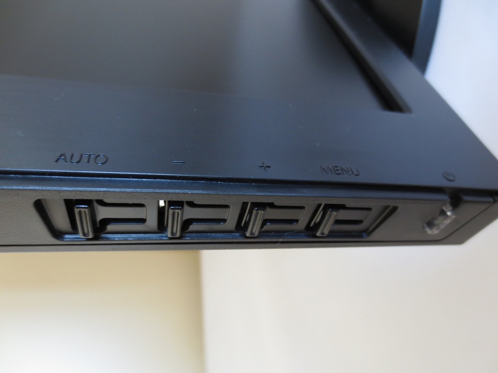
The power button is found to the right of this and is a small transparent rectangle. It glows green when the monitor is on and amber when in a reduced power state. The downward facing design and LED being not overly bright stops the light from being quite as intrusive as some designs. There is a small cut-out section of the bezel so that it is still visible from the front, however. The OSD (On Screen Display) itself is laid out in a now familiar widescreen style with decent functionality. The video below runs through the menu system of the monitor.
At the right side of the monitor are 2 USB 3.0 downstream ports, the bottom of which is yellow to signify fast charging capabilities. The screen is reasonably slender at 22mm (0.87 inches) at thinnest point. It extends back further and is thicker at the central point where the fairly robust stand attaches.
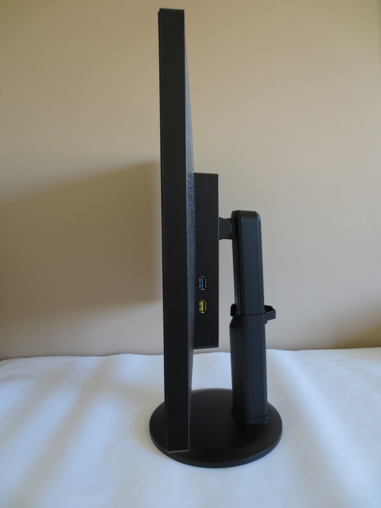
The rear of the monitor uses a woven-textured matte black plastic on the screen and regular matte black plastic for the stand. To the right of the stand attachment, the ‘bulky’ central region, the screen curves in slightly at the top corner. The stand can be unscrewed to reveal 100 x 100mm VESA holes. There is a Kensington lock socket (K-Slot) at the bottom right. A clip-on cable tidy is also included, mounted to the stand neck. This is black on the European model we tested and dark red on the US model.
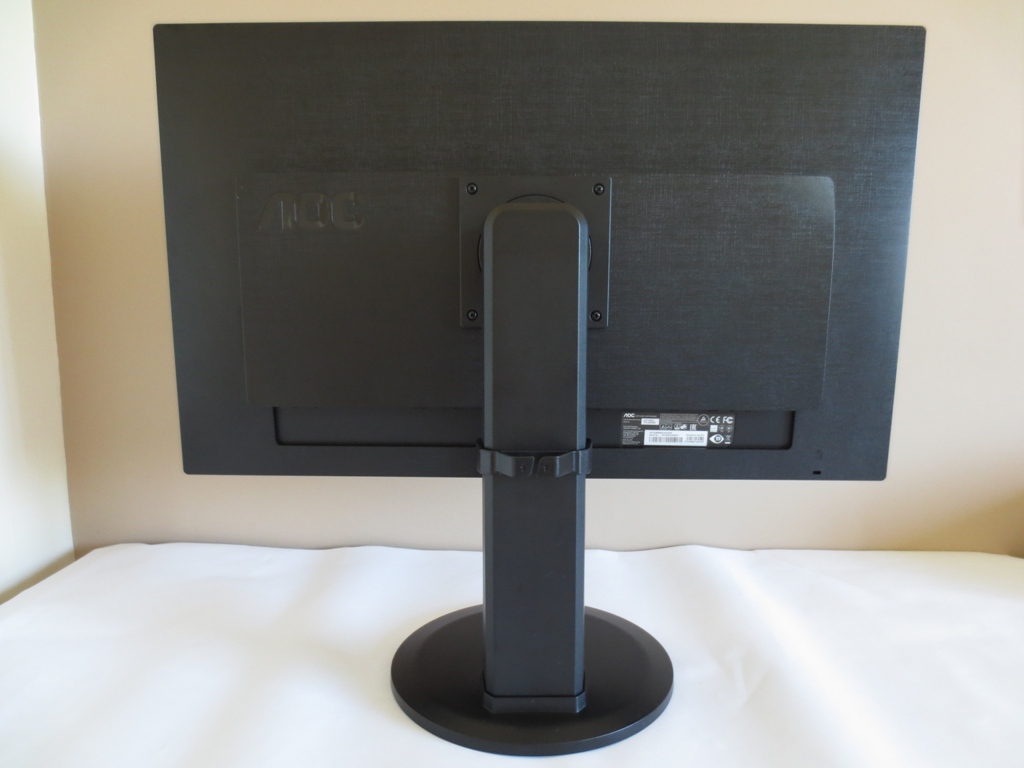
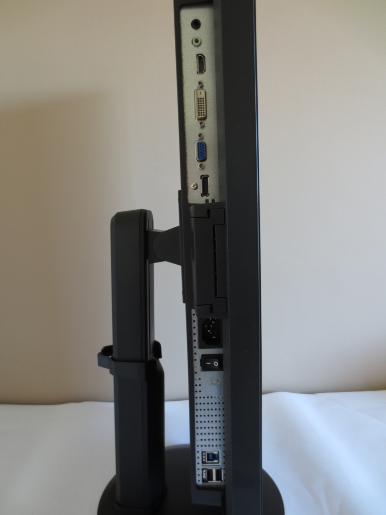
Also included at the rear are 2W up-firing stereo speakers. These produce fairly basic sound with reasonable clarity but a lack of bass and range compared to more powerful speakers. There are also a number of ports, which face downwards. These are shown in the image below and from left to right are; 2 USB 2.0 downstream ports, USB 3.0 upstream, zero watt power switch, AC power input (internal power converter), DisplayPort 1.2, Dual-Link DVI, HDMI 1.4, 3.5mm audio input and 3.5mm headphone jack. A nice range of cables are included in the box – power cable, VGA cable, Dual-Link DVI cable, DP cable, 3.5mm audio cable and USB upstream cable. This is for our EU model, models in other regions may come with different accessories.
Calibration
Correcting the colour signal
We used an Nvidia GTX 780 connected using DisplayPort 1.2 for our testing. Unlike the AOC g2460Pg we tested a while back, this monitor does fully support 144Hz out of the box using DP. By default the monitor uses a 60Hz ‘1080p’ resolution with Limited Range RGB colour signal when using either DP or HDMI. This is the sort of undesirable behaviour we’ve seen from a number of recent 60Hz Full HD monitors when using DisplayPort and Nvidia GPUs. This article looks at the various methods which you can use to correct this issue, whether using DisplayPort or HDMI. In this case you’d have to use a Custom Resolution to sort the issue out over DisplayPort – to put it bluntly, the monitor does not like using a YCbCr444 colour signal at all. It creates a hugely flooded green look with extremely poor contrast.
When using DisplayPort or Dual-Link DVI you also have the option to select a higher refresh rate from the ‘PC’ resolution list; ‘100Hz’, ‘120Hz’ and ‘144Hz’. To make full use of the monitor’s capability we selected 144Hz, which was used throughout this review except where it is stated otherwise. This had no specific ‘colour signal’ issues associated with it. Furthermore, raising the refresh rate didn’t have the sort of negative impact on gamma and colour depth that can be observed on some 144Hz models. The image was similar when using a modern AMD GPU.
Testing the presets
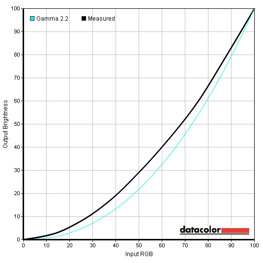
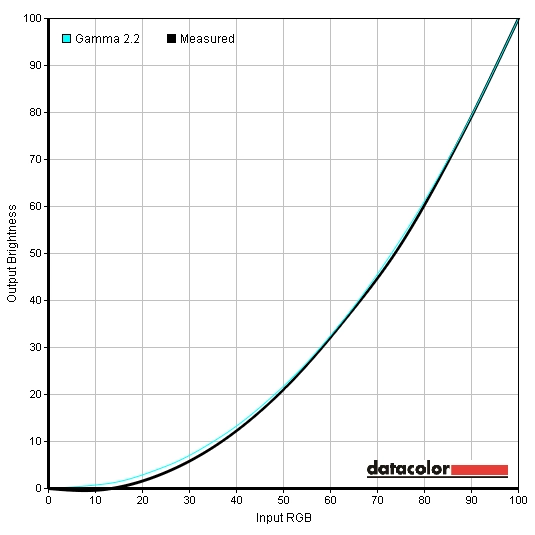
The g2770Pqu is typical for an AOC monitor in that it don’t have any traditional presets. Instead it has a number of ‘Eco Mode’ settings which simply alter brightness, some ‘Color Temp.’ settings and some ‘Gamma’ modes. We tested a number of these settings, including the 3 ‘Gamma’ modes and some of the ‘Color Temp.’ settings. The table below shows some key readings and observations taken using a Spyder4Elite colorimeter and a keen eye. Any setting not specifically mentioned in the table was left at default, but note as above that the monitor was running at 144Hz.
| Monitor Profile | Gamma (central average) | White point (kelvins) | Notes |
| Gamma1 (Factory Defaults) | 1.9 | 6301K | Image is exceptionally bright with a fairly washed out look in places and a bit of oversaturation as well. White point is quite appropriate to the eye, overall. |
| Gamma2 | 1.6 | 6408K | As ‘Gamma1’ but with a flooded look and an obvious lack of depth. |
| Gamma3 | 2.0 | 6302K | As ‘Gamma1’ with a bit of a green tint. This change in colour balance is more obvious than any gamma-related change. |
| Color Temp. Normal | 1.9 | 6779K | A cool tint is introduced, otherwise similar to ‘Gamma1’. |
| Color Temp. sRGB | 1.8 | 6553K | As ‘Gamma1’ but white point is even better balanced. Some shades are faded, though, and you lose access to settings such as ‘Contrast’, ‘Brightness’ and ‘Gamma’. The ‘Brightness’ is uncomfortably high and can’t be changed in other words. |
| Color Temp. User | 2.0 | 6349K | Similar to ‘Gamma1’ really. |
| Test Settings | 2.0 | 6500K | As ‘Gamma1’ but much more comfortable on the eyes. A slight lack of depth to some shades (particularly towards the bottom of the screen – a TN viewing angle limitation) but some quite vibrant shades in the mix without widespread oversaturation. Pretty pleasing balance overall. |
| Calibrated Settings (ICC profile) | 2.3 | 6500K | As ‘Test Settings’ but extra depth to some shades bringing extra richness. Gamma now slightly exceeds the 2.2 target in the centre of the screen. Shades towards the top of the screen actually appear slightly too dark, from an ergonomically correct viewing position, due to viewing angles. |
The image was extremely bright and quite poorly balanced out of the box, white point aside. The alternative gamma modes did little to improve things, with ‘Gamma2’ giving a flooded look and ‘Gamma3’ introducing a green tint and doing little to improve shade depth. Some of the ‘Color Temp.’ settings were also interesting, particularly ‘sRGB’ which had a noticeable impact on colours – making them faded and locking out access to key controls such as brightness. Unfortunately being locked to a retina-scorchingly high brightness is not much use. Another minor criticism is that this monitor, like many AOCs, lacks a ‘Low Blue Light’ setting or equivalent which is good for relaxing evening viewing. If they made ‘Normal’ the default colour preset and instead replaced ‘Warm’ with an obvious warm tint that would be preferable.
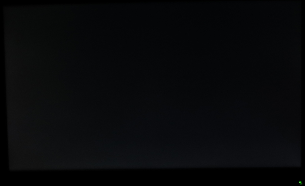
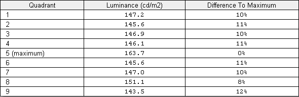
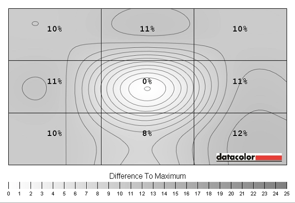
Once brightness was reduced, the monitor was much more comfortable to look at. In addition to reduced brightness, we made some alterations to colour channel for our ‘Test Settings’. With these settings the image still lacked a little depth in places but had a more pleasing richness than we’ve seen on comparable 24” models such as the BenQ XL2420Z and ASUS VG248QE. In this respect it was more similar to the AOC g2460Pqu – although the gamma was a little off target at an average of 2.0. An extra shot of depth could be injected into many shades by applying an ICC profile. This actually caused the monitor’s gamma to rise a bit above the common 2.2 target, to 2.3. Being a TN monitor, though, there is significant variation in perceived gamma at different points of the screen from a normal viewing position. Some shades towards the top of the screen were noticeably deeper than they should be, particularly with the ICC profile applied. Shades towards the centre and a little lower down had largely appropriate depth, however. One issue to note with image quality at 144Hz is that there is a slight banding pattern evident. Some shades have some thin lines of a slightly lighter shades mixed in, so faint horizontal bands can be seen. This is reduced greatly at 120Hz and is not visible at all at 100Hz or lower refresh rates. It is by no means unique to this monitor and occurs to some degree on all 144Hz monitors we’ve tested. 144Hz pushes the panels very close to their limits and there seems to be this small compromise along the way. The following adjustments were made to the monitor for our testing. Again we must stress that each individual unit is different and that these may not be optimal for all units. We have included the ‘Overdrive’ setting used as well. This has no bearing on the static image quality but users have said they like to see our preferences all in one place. Contrast= 50 Gamma= Gamma1 R= 48 G= 46 B= 50 Overdrive= Weak Overall we feel that this was one of the better 144Hz models out there for reproducing an image more on the rich than washed out side of the spectrum following simple OSD adjustments. We are also acutely aware from our broader testing that there is significant variation between individual units of the same model. For that reason and those explored in this article we will not be using an ICC profile for our testing and will instead be sticking to our ‘Test Settings’. These limitations aside, if you would like to try our ICC profile please do the following: A Konica Minolta CS-200 luminance meter was used to measure the luminance of white and black in the centre of the screen. Using these values a static contrast ratio was calculated. The table below shows these results and calculations with the monitor set to a range of settings. The results from our our ‘Test Settings’ and ‘Calibrated Settings’ (ICC profile applied) are highlighted in black. The peak white luminance, lowest black luminance and highest static contrast ratio are highlighted in blue. Other than for the modifications made for the ‘Test Settings’ and ‘Calibrated Settings’ and any settings explicitly mentioned in the table, assume default values were used. The contrast averaged 1019:1 with brightness only adjusted, which is very close to the 1000:1 specified. The highest contrast could be obtained by switching to ‘User’ mode and having all colour channels at their neutral position of ‘50’. This gave 1097:1 and also provided the peak luminance output of the monitor at 329 cd/m². In contrast to this the lowest luminance we recorded was 81 cd/m², giving the monitor a pretty reasonable 248 cd/m² luminance adjustment. The contrast remained above 1000:1 using our test settings (1019:1) and with the ICC profile applied on top of that (1013:1) which was good to see. There is also a Dynamic Contrast setting called ‘DCR’ (Dynamic Contrast Ratio) which allows the backlight to dim or brighten depending on how light or dark the content being displayed is. We found this quite dynamic but tended to produce an uncomfortably high brightness even during mixed images with plenty of dark content. Because the backlight is controlled as a single unit, as with all current LCD monitors, the monitor can’t account for intricate mixes of dark and light in a scene. In case you couldn’t tell we’re not fans of Dynamic Contrast settings at the best of times. This mode is there if you like to use it, but keep a pair of sunglasses handy if you do. This monitor does not use PWM (Pulse Width Modulation) to moderate its brightness, instead opting for Direct Current (DC) modulation at all brightness levels. This means the backlight can be considered ‘flicker free’. This is something we’ve seen on many recent AOC models and is good news for users who are sensitive to flicker. Using our test settings and looking at a black screen fill in a dark room revealed slight backlight bleed in the bottom left corner. There was also a bit of clouding towards the bottom of the screen and in the bottom left corner but nothing that caused any issues during normal use. The image below shows how the screen appeared in a dark room. Note that this picture was taken from a normal viewing position, around 70cm from the screen. There is no ‘glow’ to speak off as you would see from such a position on IPS-type models. There is a golden and silver-grey sheen that appears as you view the monitor from different angles, however. This is shown in the viewing angles video further into the review. A Spyder4Elite was used to analyse the uniformity of lighter colours, represented by 9 equally spaced white quadrants running from the top left to bottom right of the screen. The values recorded and percentage deviation between a given quadrant and the brightest point of the screen are shown in the table below. Luminance uniformity was reasonable overall. The brightest point of the screen was ‘quadrant 5’ at the centre (163.7 cd/m²). The greatest deviation from this occurred at ‘quadrant 9’ at the bottom right of the screen (143.5 cd/m² which is 12% dimmer). Elsewhere there was an 8-11% deviation from the central value. The contour map below represents the deviation with darker greys representing lower luminance and hence greater deviation from the central value. A bit of artistic license is also exercised here as the graphic includes both actual recorded values and extrapolated data. Being a TN panel there is also a degree of variation in perceived brightness that isn’t reflected in these readings, particularly when comparing the top and bottom of the screen. Perhaps more significant is the variation in colour temperature that can occur as well. These variations are generally more pronounced than natural deviations in colour temperature that could be recorded by a colorimeter. We will therefore not be concluding this section with an assessment of colour temperature uniformity. Also be aware that individual units vary and not all g2770Pqu units will perform as ours did in these uniformity tests. On Battlefield 4 there was good distinction between light and dark shades. At a finer level there were some issues which are commonly seen on 144Hz monitors, however. The detail in dark areas was excellent and even very minor detail were visible. A degree of extra ‘unintended’ detail was also revealed due to the gamma behaviour of the monitor. Some near-black (very dark) shades appeared too light. Although this affected the atmosphere of the game in places, it was not anywhere near as problematic as we’ve seen on many other 144Hz monitors. Dark areas didn’t look flooded and artificial as they do under BenQ’s Black eQualizer, for example. Light colours stood out quite nicely against darker backgrounds. There was a degree of graininess to such elements due to the screen surface but nothing particularly heavy or ‘smeary’. Dirt 3 showed a respectable contrast performance. The distinction between light and dark was good, as was the level of detail in dark areas. Due to the game design there were no truly dark environments, so everything looked quite appropriate there. On some monitors artificial detail enhancements give some dark areas such as wheel arches, car dashboards and the underside of bridges a flooded and patchy look. That was not evident here. Bright elements were not as ‘pure’ and brilliant as on monitors with lighter screen surfaces but were not grainy either. They certainly had a bright look and some very light shades were not as distinct from pure white as they should be. This gave some bleaching on snowy tracks, for example, but was quite minor really. The overall contrast performance on the Blu-ray of Skyfall was pleasing. There were good distinctions between light and dark and a good level of detail remained at all points of the screen. There was no peripheral loss of detail from ‘IPS glow’ or anything of that nature. Some near-black shades appeared a bit lighter than they should. The black hair of some characters had dark black shadow detail but the hair itself appeared lighter than it should, giving a slightly patchy appearance. This was, again, less pronounced than on some monitors. We used Lagom’s test for contrast to help highlight weaknesses in the contrast performance which aren’t always obvious during other testing. The following observations were made on Internet Explorer 11. Note that Firefox uses Mozilla’s colour management and displays some of these tests differently to most other web browsers, so we recommend using other web browsers to compare results. The colour gamut of the g2770Pqu followed sRGB quite closely. There is some slight under-coverage and some over-coverage, particular in the green area of this gamut representation. Given the intended market of the monitor this is of little real consequence. You could argue that a little extension to the colour gamut would be preferable for the slight hint of extra vibrancy it would bring, but that’s subjective. On Battlefield 4 shades appeared a bit lighter than they should, on the whole. The overall image still had a certain depth and richness that many 144Hz models miss out on, however. There were some good vibrant colours in the mix such as bright red lights, roaring orange flames and good bright cyan in-game markers. Some greens of vegetation had quite a respectable lush richness to them, although this was lost somewhat further down the screen due to viewing angle limitations. Overall this game looked more rich than it did ‘washed out’, which is good to see on a 144Hz monitor in particular. Colour representation was quite decent on Dirt 3. Some shades could have been a little deeper, particularly further down the screen. Some deeper reds, for example, looked slightly anaemic towards the bottom of the screen. There was a fairly rich look to many shades, however. Some fairly vivid greens and golden browns gave some of the racing environments quite an inviting look. Similarly some of the more dashing colours found on car liveries and advertising around the tracks had a pretty vibrant look to them. Bright cherry reds, strong yellows and neon pinks were quite impressive. The Skyfall Blu-ray looked largely as it should really. Some skin tones and red roofs appeared such a touch undersaturated, but not to the extent of looking washed out. Some quite vibrant reds, yellows and greens were also evident. Scenes such as the Shanghai night scenes didn’t have the same vibrant ‘pop’ you’d see on some monitors, but had some decent vibrancy in places. The Blu-ray of Futurama: Into the Wild Green Yonder provided quite a mixed experience. Some shades were evidently lighter than they should be, particularly towards the bottom of the screen. With its large blocks of solid colour such things are quite evident. Light purples appeared pink and reds appeared somewhat faded further down the screen. There were plenty of vibrant colours to go some way to making up for those things, though. Bright pinks and yellows, deep purples and neon greens were particularly appealing. We observed Lagom’s tests for viewing angle on Internet Explorer 11 whilst sitting 70cm and made the following observations. We were sitting 70cm from the screen. A sensitive camera was used alongside a small program called SMTT 2.0 to compare the latency of the g2770Pqu with a range of monitors of known latencies. Because this is a visual method that relies on the visual output displayed by the monitor it is affected by both signal delay (what you ‘feel’) and pixel response times (what you ‘see’). We recorded 8.4ms (just over 1 frame at 144Hz) of input lag on this monitor. That indicates a fairly low signal delay which most users won’t notice. Some highly sensitive users may prefer even lower input lag but we don’t feel this is something that most people will have to worry about. We used the UFO Motion Test for ghosting to analyse the pixel responsiveness of the monitor. A sensitive camera was used to capture still images of this test, focusing on the middle row of the test with the medium cyan background. The test was set to a speed of ‘1920 Pixels Per Sec’, meaning that the UFO traversed the screen rapidly, in 1 second. The image below compares the results at both 60Hz and 144Hz using the full range of ‘Overdrive’ settings on the monitor; ‘Off’, ‘Weak’, ‘Light’, ‘Medium’ and ‘Strong’. We have also included a ‘Fast 120Hz Reference’ for the sake of comparison. This is a Samsung S27A750D running in its ‘Faster’ mode which is generally considered to provide an excellent balance to its pixel overdrive at 120Hz. A key thing to note in this comparison is that altering the refresh rate does not have a huge effect on the pixel responsiveness in this test – a given ‘Overdrive’ setting doesn’t really change the nature of the trailing to a large degree. It does significantly change how often the screen updates its visual information, however. This is very obvious when observing the monitor first hand and is hinted at in the photos by a greater separation between the original object and each trail when running at 60Hz vs. 144Hz. With overdrive ‘Off’ there is a bold primary trail, fairly faint secondary trail and a faint to very faint tertiary trail. With this setting the monitor isn’t employing any real grey to grey acceleration and the level of trailing is quite high. The ‘Weak’ setting massively cuts down on the trailing. The primary trail is weakened slightly and the primary trail becomes very weak. It is actually inverted (inverse ghosting) due to a small amount of overshoot, but it’s very faint really. The ‘Light’ setting, which is the monitor default, appears to weaken the primary trail slightly in the 144Hz shot but regardless of refresh rate introduces a more case of inverse ghosting. The ‘Medium’ setting brings out quite obvious inverse ghosting whilst the ‘Strong’ setting creates something of an artifact disco on the screen. In the real world we found that the ‘Light’ setting provided just the right level of acceleration. Overshoot was very weak whilst the conventional trailing was no more apparent than on any of the stronger settings. The performance here was also closest to the ‘Fast 120Hz Reference’, incidentally, which is something of a benchmark for how pixel overdrive should be implemented on fast TN panels. When testing game titles the monitor has to carry out a much broader range of transitions, between a huge range of different shades (at different ‘grey levels’). It also ties everything together, reflecting how the eye perceives motion – something that is not captured in a static photograph. As this article explores, the movement of the eye itself actually creates a significant level of motion blur when viewing moving content. This is reduced at high refresh rate and is one of the key reasons 144Hz can look so smooth, visually – provided the pixel overdrive solution is well implemented. Battlefield 4 revealed that the pixel overdrive solution was indeed well implemented, using our preferred ‘Weak’ setting. Whether running about on foot or zipping around in a nimble vehicle, the level of motion blur was low at high frame rates. There was no perceptible trailing on top of the motion blur created by eye movement, nor any obvious overshoot (inverse ghosting). This helped make tracking and engaging enemies easier and helped you spot them in the first place during high-speed manoeuvres in vehicles. Another benefit of this high frame rate high refresh rate combination is the feeling of connectedness that you get with the game world. The relatively low input lag coupled with the fact that the monitor is refreshing at 144Hz really helps with this. Essentially the monitor is presenting 2.4 times as much of your game world to you every second as it would be at 60Hz, which greatly enhances visual fluidity. On Dirt 3 the ‘connected feeling’ wasn’t really such an issue as you aren’t interacting with the game world in the same way. It was nice to have a significant reduction in motion blur at high frame rates, however. This was particularly beneficial in the ‘Gymkhana’ mode as the objects and the track remained a bit more sharply focused, making for a less dizzying experience than at 60Hz. It was also a nice little bonus during the normal race modes with the tracks and objects in the environment blurring less as you zoom past and corner in particular. At lower frame rates you’re not presented with as much visual information every second. As a result, the motion blur increases (in proportion to the frame rate) and you don’t get the same connected feeling. With frame rates it’s certainly a case of the higher the better (up to 144fps), but even at 60fps there is a slight benefit for those who choose to use VSync as the ‘latency penalty’ is reduced compared to a 60Hz monitor. Speaking of low frame rates, we also assessed the responsiveness on our film titles. These are quite different to games as you aren’t interacting with them, so ‘connectedness’ and latency isn’t an issue. Furthermore the frame rate on our Blu-ray film titles was limited to around 24fps, which is very common for such movies. As a result the visual fluidity is limited somewhat by the refresh rate. There was some benefit to be had compared to running the film at 60Hz, however. Because 144Hz is a multiple of 24, each of those frames is duplicated 5 times by the monitor. This reduces the ‘juddering’ that some users find particularly apparent when viewing such movies at 60Hz. The pixel responsiveness didn’t hold things back at all on the films, as you might expect given performance in the more demanding game titles as well. There was no noticeable overshoot, either. The AOC g2770Pqu is a functional monitor. Whilst it may not have the same individual style, impossibly slender bezels and artistic flair of some models out there it does offer ‘sensible’ matte bezels, a fully adjustable stand and a good port selection. Understated looks aside, this monitor is designed for fun – it’s a gaming monitor. And as such it provided an enjoyable experience. Whilst the out of the box image wasn’t particularly appealing, it was possible to achieve fairly good results after a little tweaking in the OSD. A lot of these 144Hz monitors are plagued by a washed out look to colours regardless of what you do in the OSD, so it was good to be able to achieve decent results here. Due primarily to the monitor missing the gamma target, some shades did appear less deep than they should. That was reflected both on the desktop and in games. This was also accentuated by the TN panel technology, as shades became weaker (lighter) lower down the screen. There were lots of shades in the mix that had a pleasing vibrancy to them, though. When gaming you didn’t feel that the image was washed out as you might on many 144Hz monitors. The contrast performance was also a little better, not in terms of static contrast (which was bang on target) but in terms of AOC not going completely mad with special gamma enhancements. The gamma behaviour of the monitor was such that some dark areas looked lighter than they should, but thankfully not to the extent of looking completely flooded and artificial. Responsiveness is of course a key area of a gaming monitor. And in that respect the g2770Pqu was very pleasing. Input lag was not astonishingly low nor astronomically high, but was at a level that most gamers would find imperceptible. The monitor provided an excellent range of ‘Overdrive’ levels, including our favoured setting labelled ‘Weak’. There was nothing weak about this setting. Yes the acceleration was weaker than in stronger settings (hence the name), but it was still enough to banish noticeable trailing from the pixel responses themselves. Furthermore it wasn’t strong enough to introduce obvious inverse ghosting, which some users are particularly sensitive to. The balance here was as good as we’ve seen on any 120Hz+ monitor. A lot of attention has been diverted away from ‘conventional’ 144Hz monitors. More expensive 27”+ models with G-SYNC, UHD resolutions or UltraWide aspect ratios have all come onto the scene now. At time of review the price in the North American market in particular makes this model a relatively attractive proposition. It’s those users who just want a simple 144Hz monitor for a decent price that will not only be responsive but also offer a decent image who should very carefully consider this model. If you’re willing to forgo extras such as Nvidia 3D Vision, G-SYNC and a strobe backlight mode then the g2770Pqu makes a thoroughly decent gaming monitor.
Gamma test settings
Gamma ICC profile
Test Settings
Brightness= 33 (according to preferences and lighting)
ICC profile
2) Set the monitor up according to the ‘Test Settings’, but feel free to adjust the brightness if desired. On our unit the brightness setting of ‘33’ yielded a brightness of 162 cd/m².
3) Take a look at this article for instructions on how to install the profile as well as some of the limitations to be aware of when gaming in particular. There is also a link to a useful ‘Display Profile’ utility which allows you to quickly enable and disable the profile.
Contrast and brightness
Contrast ratios
Monitor Profile White luminance (cd/m²) Black luminance (cd/m²)) Contrast ratio (x:1) 100% brightness 322 0.32 1006 80% brightness 280 0.28 1000 60% brightness 235 0.23 1022 40% brightness 186 0.18 1033 20% brightness 135 0.13 1038 0% brightness 81 0.08 1013 Factory defaults (90% brightness, Gamma1) 301 0.30 1003 Gamma2 301 0.3 1003 Gamma3 299 0.29 1031 Color Temp. = Normal 283 0.28 1011 Color Temp. = sRGB 293 0.29 1010 Color Temp. = User 329 0.30 1097 Test Settings 163 0.16 1019 Calibrated Settings (ICC profile) 162 0.16 1013
PWM (Pulse Width Modulation)
Luminance uniformity
Luminance uniformity table
Luminance uniformity map
Contrast in games and movies
Lagom contrast tests
Colour reproduction
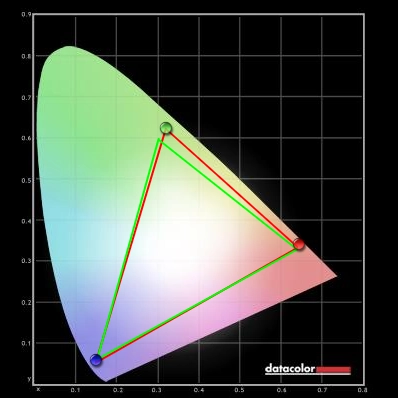
Colour gamut
Colour gamut test settings
Colour in games and movies
Viewing angles
Responsiveness
Input lag
Pixel responsiveness
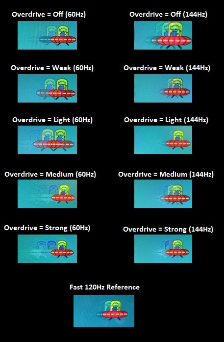
Trailing (various overdrive settings)
Responsiveness in games and movies
Conclusion
Positives Negatives Decent colour performance overall with some vibrant shades in the mix and a much less ‘washed out’ look than most 144Hz models provide Out of the box settings not ideal. Gamma fell below the 2.2 target regardless of OSD tweaking which sapped some shades of depth. The usual TN colour inconsistencies applied Static contrast was as you’d expect from a decent TN panel – near 1000:1 and no ‘IPS glow’ to contend with Some extra detail was visible in some dark areas, but not to the extent of most other 144Hz monitors Pixel responsiveness was excellent after adjusting the highly flexible ‘Overdrive’ setting by providing just the right amount of acceleration for 144Hz without obvious overshoot The input lag is marginally higher than some other models but significantly lower than others – a level many will be very comfortable with but that will put some users off Excellent price in North America, a fully adjustable stand and a decent range of ports Not the stylish centrepiece some users will be after for their desk and a bit of a high price in some regions at time of writing
![]()

