Author: Adam Simmons
Date published: July 27th 2013
Table of Contents
Introduction
The current ‘high refresh rate’ gaming monitor market is dominated by two players; ASUS and BenQ. By focusing on refresh rate as a means of improving the fluidity of the 2D experience, rather than simply facilitating 3D, they have created some compelling products. AOC have released their first ‘high refresh rate’ entry in the form of the g2460Pqu. Using the same panel as the XL2411T and VG248QE, there’s certainly potential for very high levels of responsiveness. But there is more to a monitor than just the panel. We feel that the current 24” super-speedy offerings could offer a more refined and well-tuned viewing experience. Can AOC’s latest offering deliver something a bit different in that regard? We shall find out.
Specifications
As with the models it is competing against, key specifications include a ‘Full HD’ TN panel with 144Hz refresh rate and ‘up to 1ms’ grey to grey response time specified. It’s nice to see AOC use the word ‘up to’ to highlight that different transitions actually occur at different speeds and not all will be as fast as the 1ms specified. At time of writing the monitor is not available in the US (unless imported), so a typical US retail price is not included. The key ‘talking points’ of the specification have been highlighted in blue for your reading convenience.
Features and aesthetics
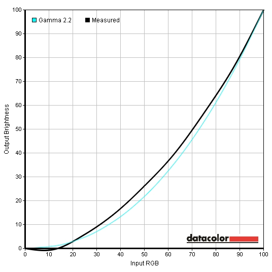
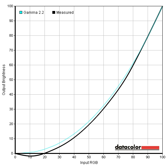
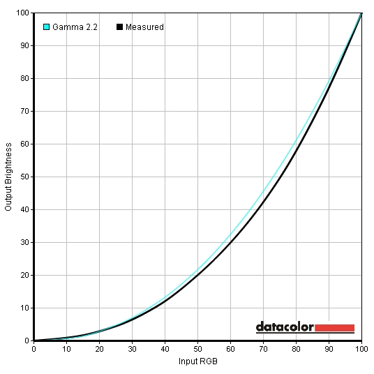
The g2460Pqu has a ‘sensible’ design. The bezels are matte black with a wood grain texture and are of moderate thickness (around 16mm at the top and sides and 25mm at the bottom). There is also an ‘i-Care sensor’ at the bottom left which adjusts the screen brightness automatically to reflect ambient light (if enabled on the monitor’s menu). The screen surface is regular matte similar to that seen on other 144Hz monitors. It is effective at combating glare but also has an impact on the image. The buttons are found on the underside of the monitor, at the right, with a small front facing power LED. The buttons are tactile rather than touch-sensitive, which may please some users who find touch sensitive buttons a bit fiddly. The power LED is a fairly inconspicuous small green square facing towards the front (this turns amber to indicate the monitor is in a low power state). The buttons have engraved labels on the front which aren’t particularly easy to see except for in good light. Fortunately they are logically laid out, from left to right; Source Select/Back, EcoMode/Left, Volume/Right, Menu/Enter and Power. The OSD (On Screen Display) is nicely laid out, making good use of the screen space with a sort of wide screen layout. The video below shows the main functionality of the OSD. Many of these features are referenced or discussed elsewhere in the review but there are little extra features we didn’t use. The ‘Picture Boost’ part of the menu allows you to enable ‘Bright Frame’, a rectangle on the screen of specified size which has its brightness and contrast controlled independently of the rest of the screen. Useful for highlighting particular aspects of the image. There is also an ‘Image Ratio’ feature in the ‘Extra’ part of the menu that allows the image to mimic various screen sizes and aspect ratios that would fit inside the actual 24” 16:9 screen. You can select; 17” (4:3), 19” (4:3), 19” (16:10), 21.5” (16:9), 22” (16:10), 23” (16:9) or ‘Wide’ which is 24” 16:9. The image loses a fair bit of sharpness as the pixels themselves don’t magically change size to accommodate the new smaller and sometimes different shaped screen area. But it’s still a feature that some users might appreciate. From the side the g2460Pqu is not overly bulky, being 21mm at thinnest point and bulking out centrally. The central ‘bulk’ allows firm attachment of the quite robust and ergonomically flexible stand. There are also 2 USB 2.0 ports on the right side. The top one sports ‘fast-charge’ to rapidly charge up connected devices such as smartphones. The stand offers 130mm (around 5 inches) of height adjustment with the screen clearing the desk by 60mm in the lowest position. There is 20° of backwards tilt and 5° of forwards tilt. The stand also has a turntable rotation mechanism that allows a rather impressive field of rotation of around 270°. You can also pivot the screen (rotate it) 90° into portrait mode – although the practicalities of this are somewhat limited by the viewing angle performance. The rear of the monitor features matte black plastic throughout, with the central region offering the same ‘wood grain’ texture as the bezels. The stand attaches by 100 x 100mm VESA and can be removed to make way for an alternative VESA mounting solution if desired. Towards the top there are some basic low power stereo speakers. These give a sort of ‘radio quality’ output that is bettered by even a basic standalone speaker set. Towards the bottom you will find the downward facing ports both to the left and right of the stand neck. There is also a Kensington lock socket. The ports, from left to right (bottom to top on this photograph) are; USB upstream, 2 USB 2.0 downstream ports (giving 4 in total), power switch and AC input, DisplayPort input, VGA, Dual-Link DVI, HDMI, 3.5mm line-in (audio in) and 3.5mm headphone jack (audio out). AOC include a 3.5mm audio cable, USB upstream cable, AC power cable, VGA cable and Dual-Link DVI cable in the box. As an added bonus they’re also including a copy of the game Shootmania: Storm up until Christmas 2013. We used an array of familiar images and applications (including the Lagom website and our game test titles) to subjectively assess the image performance using various settings on the AOC g2460Pqu. To provide a more thorough quantitative assessment we also used a Spyder4 Elite colorimeter. There are no true presets on this monitor so instead we analysed performance using the 3 ‘gamma modes’ of the monitor. Where only gamma mode is adjusted all other OSD settings were kept at default – aside from DPS (Dynamic Power Saving), which is a sort of dynamic contrast mode. This is enabled by default but we disabled this for consistency during analysis. The test system used for this review uses an Nvidia Geforce GTX 780 connected to the monitor using the Dual-Link DVI cable provided by AOC. The image provided by DisplayPort is very similar on this monitor and it should also support the maximum (144Hz) refresh rate. Unfortunately that was not the case during our testing on the GTX 780. The following screenshot shows the options that were available to us using a good quality DisplayPort cable (that has been used to run other monitors at 120Hz and 144Hz). Note: this has now been fixed with newer revisions of the monitor. As you can see ‘1080p’ is listed as an HD/SD resolution which is limited to 60Hz. The PC resolutions below this should feature 1920 x 1080 with 100Hz, 120Hz and 144Hz selectable – but that isn’t the case. Creating a custom resolution for 144Hz (we also tried 120Hz and 143Hz) caused a bouncing box to appear on the monitor that read ‘Input not support’. We reported this to AOC and they have now confirmed that new revisions of the monitor (2014) have a fully functioning DisplayPort at 144Hz. Regardless of revision HDMI is only supposed to support 60Hz on this monitor and although you may be able to go higher using a ‘custom resolution’ the bouncing box of doom will thwart your efforts. Just stick with Dual-Link DVI as we did and you’ll be fine, or use DP if you prefer on the new revisions. There will be no difference in image quality or performance between DL-DVI and DP connections on the new revisions. The table below gives our subjective assessment as well as key measurements such as gamma and white point using various settings. These include the ‘test settings’ we settled for in the end as well as the results after applying a custom calibrated ICC profile. There aren’t any major differences in the image outputted by AMD and Nvidia GPUs over DVI or DisplayPort – so our observations can be appreciated by users with AMD GPUs as well. We know from testing other monitors that use the same or a similar panel (including the XL2420T, XL2411T and VG248QE) that the image is likely to be quite unsatisfying out of the box. There are clearly limitations with this panel that impair its performance in key areas such as gamma tracking and shade variety – and this goes far beyond ‘TN panel limitations’. Fortunately AOC provide some relief, allowing the user to use the OSD (On Screen Display) to improve balance and deepen the image. One of the most impactful settings you can adjust is ‘Gamma’, selecting one of three preset gamma modes. The images below show the gamma curves for ‘Gamma1’, ‘Gamma2’ and ‘Gamma3’, respectively – all other settings are at their default values (aside from DPS being disabled). As you can see the gamma curve is somewhat unpredictable and tracks in a different but equally strange way in all ‘Gamma’ modes. ‘Gamma3’ provides the best tracking for mid and light tones, but for dark tones it doesn’t quite do what it should. You can see such strange values at the start of the curve (dark values), in fact, that the interpolated curve actually swoops down below the axis. We adopted the following for our ‘test settings’. These settings were used during our testing without applying the ICC profile provided below. Contrast= 50 Gamma= Gamma 3 Color Temp= User Red= 50 Green= 48 Blue= 47 The gamma curve looks more like it should than when ‘Gamma’ mode alone is adjusted. The gamma behaviour was still a bit iffy, though, causing some loss of shade distinction in places. But credit where credit is due – it was much improved over the ‘out of the box’ experience. The overall image was certainly more pleasing than what could be achieved by OSD adjustment on the ASUS and BenQ models tested previously. By way of comparison the ASUS VG248QE provided two extremes of noticeably washed out or oversaturated with some quite incorrect colours at 144Hz. The image on the AOC g2460Pqu is also deeper and more vivid than on the XL2420T and XL2411T. The deepest and most saturated colours can be achieved on the BenQ models by using ‘Standard’ mode with ‘Gamma 4’ or ‘Gamma 5’ as used in our reviews. Even then, though, users craved more vibrancy and tended to make adjustments in the graphics driver (such as increasing Nvidia Digital Vibrance etc.) despite this reducing shade range and unrealistically oversaturating colours. Most users, particularly when gaming, should find that this monitor hits the spot following OSD adjustments alone. Some users like to make further adjustments or iron out imperfections that may be perhaps most noticeable on the desktop rather than when playing games. The most comprehensive changes that can made outside of the monitor settings is by using a hardware calibration device, such as a colorimeter, to create an ICC profile. We have written a short article about ICC profiles and how to activate them, as well as some limitations that you should be aware of (particularly for games). To use our ICC profile, do the following. Using a Konica Minolta CS-200 ‘Chroma Meter’ we measured the brightness of white and black using a range of monitor settings and calculated the resulting contrast ratio. Unless specifically stated assume default settings were used, aside from DPS being disabled. The results from our test settings and ICC profile are highlighted in blue whilst the highest white luminance, lowest black luminance and highest contrast ratio recorded are highlighted in black. There are two dynamic contrast modes on the AOC. The first is called ‘DCR’ (Dynamic Contrast Ratio) which is a fairly classic implementation. The backlight dims and lightens as one unit (BLU or Backlight Unit) according to how bright or dark the image is. We found this setting made the backlight far too bright the vast majority of the time, even during mixed images. The changes in brightness were fairly gradual but still bothersome at times. The second dynamic contrast mode is one that has more utility, we feel, and is actually enabled by default (called ‘DPS’ or Dynamic Power Saver). The user sets the brightness as normal, but instead of the backlight staying as it is at a given brightness it is allowed to change. The specified brightness acts as a maximum, with the backlight dimming slightly to reflect the ‘darkness’ of the image. The changes in brightness are fairly subtle and many users will not actually realise this is enabled by default – its primary purpose is to save a bit of energy when darker content is being displayed. Both modes have limited appeal for a gaming monitor given that the whole backlight must dim or brighten as a single unit and that most images are mixed. You wouldn’t necessarily want the monitor to dim when you enter a dark room in a game such in a way that will affect the brilliance of your HUD and any explosions and gunfire, for example. The AOC g2460Pqu uses PWM (Pulse Width Modulation) to dim the backlight below 100%. That means that the backlight switches on and off extremely rapidly to produce lower brightness levels. A minority of users are sensitive to this flickering and can suffer from visual discomfort (headaches etc.) when viewing a monitor that uses PWM. Aside from the BenQ XL2420TE, which is expensive and restricted to certain regions currently, all modern 120Hz+ LCDs use PWM and it isn’t something most users have to worry about. The video below shows the existence of PWM on this monitor as captured by a sensitive camera – nobody detects such a pronounced strobing, that’s just to demonstrate its existence. Note the lack of strobing in the video at 100% brightness, where PWM is not used as the backlight is not being dimmed. Looking at a black screen in a dark room highlighted a few imperfections. There was minor bleed at the bottom right and quite a patchy appearance at various points of the screen due to clouding. The bleed manifested itself as a slight blue-grey glow and the clouding as lighter grey patches. This did not prove to be problematic during regular testing and was far from the worst case of poor black uniformity we’ve seen. There was also a mild golden glow that could be seen if you viewed the monitor from off-centre. This is typical of a TN panel and is far less noticeable than ‘IPS glow’ or ‘PLS glow’ – it can’t be seen from directly in front of the monitor, either. It is also important to consider the luminance uniformity of lighter colours. To analyse this, a Spyder4Elite was used to measure the luminance of 9 white ‘quadrants’ running across the screen from top left to bottom right. The luminance recorded at each quadrant and the percentage difference between each quadrant and the brightest point is given in the table below. The luminance uniformity was quite good overall. The brightest point was ‘quadrant 5’, the centre of the screen, where 164 cd/m2 was recorded under our test settings. The highest deviation from this occurred at ‘quadrant 1’ at the top left (141.7 cd/m2, 14% dimmer than centre) and ‘quadrant 4’ to the left of centre (142.8 cd/m2, 13% dimmer than centre). Elsewhere deviation was 10% or lower, with a mere 4% deviation at ‘quadrant 9’ (bottom left) and under 1% deviation at ‘quadrant 2’ (above centre). There are certainly perceptive differences beyond this due to the characteristic limitations of TN panels but this is a decent result really. As with the uniformity of black, mileage can be expected to vary between individual units. The graphic below shows the luminance uniformity for white in a different way, with lighter greys representing higher luminance and hence lower deviation from the central maximum. On Battlefield 3 the g2460Pqu exhibited excellent level of low-end (dark) visibility with even minor details noticeable. This was partly down to gamma enhancements for deep shades, common on gaming monitors. The effect was slightly more subtle than BenQ’s ‘Black eQualizer’ (even with the BenQ in its ‘Standard Mode’ setting) and the ASUS VG248QE’s gamma enhancements. It did reveal some unintended detail, such as blocky texturing, by raising the tone of very dark greys so that they appear a bit too light. At the high end there was a good bright look to whites and light colours but also a grainy and ‘unpure’ quality due to the matte screen surface. On Dirt 3 there was an excellent level of dark detail but also a noticeable elevation of grey level. When looking around inside the car cockpit, for example, small details such as material textures and air conditioning fan grills were all very visible. Near-black shades, such as very dark greys, appeared lighter than they should. This revealed such minor details at the expense of some depth and a ‘contrasty’ look in such areas. The high end showed good relative intensity, but again lacked the purity and pop you can get from a much lighter matte or glossy screen surface. We also tested the Blu-ray Skyfall. On this title there was excellent dark detail but some elevation of near-black shades in places, revealing unintended detail. There was plenty of brightness at the high end and good contrast between bright elements and darker ones. The matte screen surface again gave a visible grain which affected the purity of such elements. To finish off our contrast testing we looked at Lagom’s test for contrast, making the following observations on the g2460Pqu. The AOC g2460Pqu uses a standard WLED backlight offering coverage of the sRGB colour space. The image below shows the colour gamut of the monitor under our test settings (red triangle) compared to the sRGB colour space (green triangle). The colour gamut matches sRGB fairly closely, with slight under-coverage of some green shades and slight extension beyond sRGB for others. This is fairly typical for a standard WLED backlight. Colours never look overly lush on Battlefield 3, but the AOC did represent them with a decent degree vibrancy. Bright orange flames and some of the yellow and blue signs on some maps had particularly decent depth to them. In contrast to this the bright cyans of the engineer repair tool and the bright neon colours of the in-game markers could have done with a bit more intensity. Whilst the screen surface and colour gamut stopped the image looking as vivid and lively as it could there was good depth in places and a look that’s a bit less washed out than we’ve seen on similar monitors. On Dirt 3 the racing environments looked natural with mostly appropriate saturation. The subtle shade variety was good enough for a TN panel but you didn’t get the same distinctions that you’d see on an IPS or PLS monitor. A given shade of vegetation (‘shade A’), for example, typically appears deeper towards the top of the screen than the bottom on a TN monitor. The effect of this is such that what is actually supposed to be a darker shade of vegetation (‘shade B’) will appear lighter at the bottom of the screen than ‘shade A’ does further up. This is something we call ‘shade crossover’. The overall balance was still quite good though. There were no gaudy emerald greens or overly red browns, though some of the deeper forest greens could have done with a little extra depth. Car paints looked pretty vibrant. Whilst their ‘pop’ and vividness was at the mercy of the screen surface and colour gamut they certainly didn’t looked washed out. Some of the bright yellows, deep blues and purples were actually quite striking, whilst some oranges and cyans could have done with a bit more depth. The Blu-ray of Skyfall had a natural and largely appropriate look. Skin tone saturation was mostly appropriate without a sunburns or overly pale aesthetic. The saturation did vary slightly depending on the on-screen position; a TN panel limitation. The same applied to other shades, with slight variation but an appropriate representation overall. The scenes set in Shanghai at night have some highly saturated neon lights, making them good at highlighting how a monitor handles the most vivid shades. These were displayed with decent depth (particularly dark reds and deep purples) but didn’t quite have the vibrant pop they could have. We also tested the Blu-ray of Futurama: Into the Wild Green Yonder. There was a decent variety and intensity of colours. There was a definite distinction between bright neon shades (such as bright green and yellow), deep shades (particularly blues and purples) and more muted pastel colours. What we referred to in our testing of Dirt 3 as ‘shade crossover’ was very much apparent on this title. With good solid patches of individual colour it certainly highlighted the typical TN panel colour consistency issues that eat away at subtle shade variety. To reinforce the notion of colour consistency limitations we used Lagom’s tests for viewing angle. The following observations were made. To help demonstrate how the monitor performs at various viewing angles and not just under direct viewing from in front we took a quick video. This shows the sort of shifts that can be observed on the Lagom text, a mixed desktop background and a dark desktop background. Note in particular the more pronounced contrast shifts vertically in particular. For the dark background you will also notice the aforementioned golden glow. We calculate input lag using a modified ‘camera and stopwatch method’. A camera set to high shutter speed takes a snapshot of an on-screen stopwatch displayed both on the monitor being tested and a monitor of known input lag. Traditionally you compare with a single CRT monitor that is accepted to have ‘0’ input lag. To improve accuracy we compare input lag values with an array of monitors of known input lag and take an average from over 120 readings. This sort of testing is really the best you can manage without specialist equipment such as a photodiode and oscilloscope and seems to give quite representative input lag values comparable to those actually measured using said specialist equipment. We measured around 13ms (<2 frames at 144Hz) of input lag on the g2460Pqu. This is a value that will deter some gamers but shouldn’t bother others. It is certainly more input lag than you’ll find on competing 144Hz models and is quite similar to Samsung’s SA750 and SA950 series of 3D monitors (which many people find great for gaming). The g2460Pqu supports a 144Hz refresh rate, which allows it to output 2.4 times as many frames of information to the user each second. If your GPU can support it this means a true 144fps gaming experience. Each frame is displayed for under half as long as on a 60Hz monitor and the level of apparent blur during fast motion is greatly reduced. At lower frame rates this ‘blur reduction’ doesn’t apply, but the visual information is always updated over twice as frequently as at 60Hz. This gives a more ‘connected feel’ to the game world or even just the desktop as you move your mouse, increasing the fluidity of interactions in a way that you don’t get on a 60Hz monitor – even if this 60Hz monitor has ‘zero’ input lag. We used a small utility called PixPerAn (Pixel Persistence Analyser) to help assess the pixel response performance of the monitor during some typical grey to grey transitions. The tempo (movement speed of the car) was set as high as possible to help highlight weaknesses during fast motion. A highly sensitive camera was used to take a snapshot of the action. The pictures above were taken at 60Hz with the monitor’s overdrive (grey to grey acceleration) set to ‘Off’, ‘Weak’, ‘Light’, ‘Medium’ and ‘Strong’, respectively. With overdrive disabled there is a bold primary trail and a faint secondary trail visible. Enabling the overdrive at its lowest setting, ‘Weak’, gets rid of the secondary trail but does little to improve the primary trail. Using the next setting up, ‘Light’, weakens the primary trail but imparts a bit of a checkerboard appearance to the trail which is a sort of mild ‘overdrive artifact’ (overshoot) – one that would escape your notice in practice. The ‘Medium’ overdrive setting uses a level of acceleration that is quite clearly too aggressive. There is obvious and bright inverse ghosting (a less mild overdrive artifact). The ‘Strong’ setting does what it says on the tin and intensifies this inverse ghosting to levels that couldn’t possibly escape your notice during normal usage. So at 60Hz it seems that the ‘Weak’ and ‘Light’ settings are favourable. If you use a 120Hz or 144Hz refresh rate (or indeed any refresh rate greater than 60Hz) the ‘Overdrive’ setting is greyed out and no longer user-configurable. The monitor takes over! The images below show a snapshot from PixPerAn at 120Hz and 144Hz, respectively. The good news is that there isn’t any sign of the nasty inverse ghosting that reared its ugly head at 60Hz using some of the stronger overdrive settings. There isn’t even any mild to moderate overshoot as you might see on some other 144Hz monitors. The bad news is that the level of acceleration seems too weak, if anything. In these snapshots from PixPerAn the pixel response seems comparable to overdrive set to ‘Off’ or ‘Weak’ at 60Hz. The sort of in-between news is that, as mentioned previously, the level of perceived blur is still reduced (at high frame rates) by the refresh rate alone. Each frame is displayed for a fraction of the time it would be at 60Hz and things definitely look more fluid. On this particular test the car is actually moving 2.4 times as rapidly across the screen as well. The upshot of all of this is that these snapshots don’t accurately reflect what the human eye sees, especially not at higher refresh rates. They do indicate weaknesses in pixel response time, however. This is reflected in our ‘real world testing’ that follows where certain transitions simply didn’t seem as snappy as you would expect from a finely tuned 144Hz monitor running at 144fps. Monitor response times vary significantly depending on the actual transition occurring (how ‘light’ or ‘dark’ the start point is relative to the end point). Because game worlds tend to feature a broad variety of different shades moving against one another at various speeds, you can expect a broad variety of different pixel transitions to occur and hence a range of different pixel response times to be observable. Being interactive environments at potentially high frame rates, game worlds also bring the 144Hz refresh rate into play. On Battlefield 3 the game world moved fluidity as you move the mouse – you feel quite ‘connected’ to the game in a way you don’t even on the fastest 60Hz monitors. The monitor does not respond instantaneously to movements (due to the input lag) so the connected feel will not be complete for some users. But with the latency still being reasonably low others won’t actually notice this and will feel that it is responding in a very natural and fluid way. The high refresh rate also reduces trailing significantly if you’re running at high frame rates (ideally 144fps). For the most part textures retained a good degree of sharpness whilst racing around on foot and even when manoeuvring in a vehicle – making enemies just that bit easier to spot when moving. There was no inverse ghosting, which is good, but there did appear to be a degree of trailing in places that could be attributed to some slightly slower pixel response times. Observing dark gunmetal greys as you strafe past with a light grey sky in the background, for example. At high frame rates on Dirt 3 the tracks retained a decent degree of sharpness, even when cornering. You could certainly tell you weren’t using a 60Hz monitor. Having said that there was a greater degree of trailing than we’ve seen on other 144Hz monitors. It was certainly not obnoxious and there was no inverse ghosting, which is nice. Slightly stronger acceleration would not go amiss, though. The insane fast-paced spinning antics of Gymkhana are always an interesting test for a monitor’s motion performance. 60Hz monitors suffer from pronounced blur regardless of pixel response times. Even on 120Hz+ monitors there is a degree of blur that’s visible. This is partly created by our eyes themselves moving about to track motion, a concept explored in more detail in the ‘LightBoost’ section of this review. On the g2460Pqu there was definitely greater fluidity and sharpness than on even the fastest 60Hz monitors – but there was also a degree of trailing from the inadequate speed of certain pixel transitions. We also tested our Blu-ray movies at 144Hz. The benefit of the refresh rate is far more subtle than in games. You don’t interact with movies, so you don’t feel any more connected. They also run at just under 24fps which severely limits their fluidity and makes them feel somewhat disconnected. This frame rate (~24fps) divides into 144 quite neatly (6*24=144) compared to 60 (2.5*24=60) so there things are perhaps a little bit smoother, but it’s nothing ground breaking and it is no substitute for higher frame rate content. There wasn’t any noticeable trailing as a result of pixel response times being inadequate nor any artifacts from overly strong acceleration, which is nice. Having used 2 monitors (BenQ XL2411T and ASUS VG248QE) that use this 24” 144Hz panel already, we weren’t expecting anything mind-blowing in the way of image quality on the AOC g2460Pqu. Out of the box everything was too bright the colours were washed out, cool-tinted and bleached. Following OSD adjustments we were actually able to achieve a better balanced and more vibrant image at 144Hz than on other similar monitors, however. As usual with a TN panel the colour consistency and subtle shade variety was somewhat limited. There were also certain shades that could have done with a bit more richness – not helped by the strong matte anti-glare screen surface and colour gamut being a bit restrictive in places. The overall representation of colour was good, though, and there was a good rich but natural look to the image. Contrast performance was good from the traditional ‘numbers’ perspective, with high static contrast readings and a good level of detail in dark scenes. As is common on gaming monitors and seen to an even greater extent on other 144Hz models, there are certain enhancements made to gamma which set out to raise the visibility of dark places to give a competitive edge in games. It does what it’s supposed to, but certain dark shades become lighter than they should be which introduces some unintended and slightly unnatural looking detail in places. At the high end the monitor offered buckets of brightness, if you want it. White and other light shades didn’t really appear particularly crisp and pure, though; again the monitor was at the mercy of the high haze matte screen surface. There has been good movement away from these ‘strong’ and grainy matte screen surfaces for other panel types (IPS, PLS and in some cases VA) and it would be nice for the 144Hz models to follow suit. What many users are going to be particularly interested with for a high-Hertz gaming monitor, of course, is the responsiveness. This monitor doesn’t have any 3D capabilities, does not support Nvidia 3D Vision (1 or 2) or LightBoost. The refresh rate is purely about giving extra fluidity in 2D. It did that, giving a more connected feel and reducing motion blur compared with even the fastest 60Hz monitors. The pixel responsiveness was not quite able to make the best use of this refresh rate, however. There was evident trailing in places as a result of pixel transitions occurring slower than they should. On the plus side there was absolutely no hint of overdrive trailing. For some reason AOC provided configurable ‘Overdrive’ settings if the monitor is running in 60Hz but not for higher refresh rates – and we feel that slightly higher acceleration would have been beneficial. The input lag was also not as low as we’ve seen on similar models. At around 13ms there’s enough input lag there to deter some users, but it isn’t really an astronomically high amount of input lag at all. As with the pixel responsiveness some users will find things really snappy and will feel that the increased refresh rate alone justifies the purchase – especially when coupled with the best image quality of all current 144Hz 24 inchers.
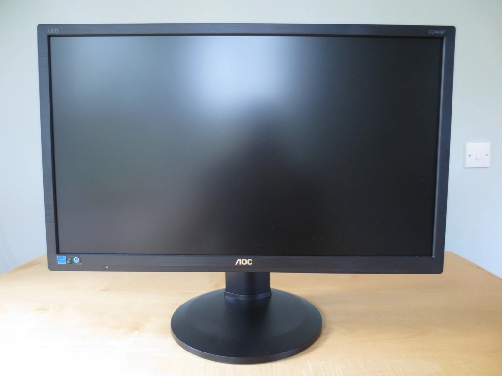
Front view
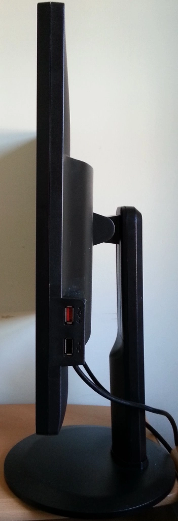
A side view
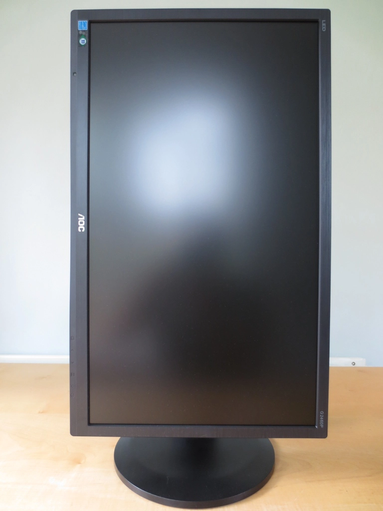
Standing tall
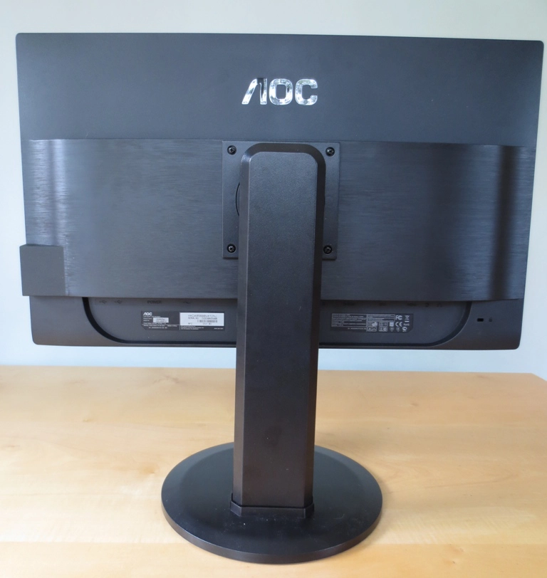
Textured matte rear
Calibration
Testing the presets
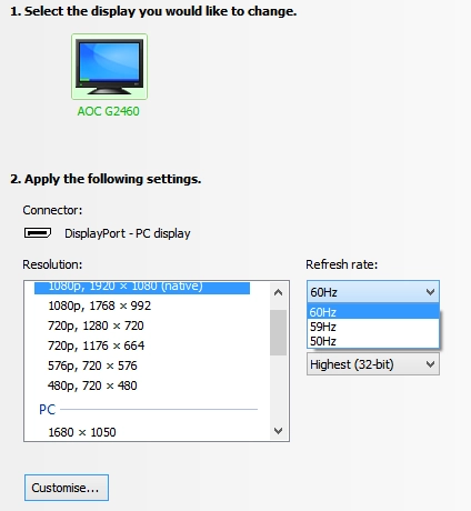
No 144Hz over DisplayPort
OSD Settings
Gamma (central average)
White point (kelvins) Notes Gamma 1 (144Hz)
2.0 7126K Image is extremely bright with a cool tint and looks fairly washed out. Some brighter shades are oversaturated with poor high-end shade distinction (crushing). Gamma 2 (144Hz)
1.9 7133K Image is equally bright and cool tinted, looking even more washed out and actually quite bleached.
Gamma 3 (144Hz) 2.4 7135K Image is still very bright and has a cool tint, but shades appear fuller. Shade crushing is reduced at the high end but some deep shades in particular appear darker than they should. Test Settings (see below) 2.3 6499K Image is better balanced and more restful on the eyes. There is some slight residual bleaching and high-end shade crushing. Overall the image has respectable vibrancy and looks more pleasing than the more washed out alternatives. Calibrated settings (ICC profile applied, see below) 2.2 6500K Deeper with more even gamma tracking and less bleaching. Overall colours are not profoundly different to test settings, which ties in with the fairly well-balanced look of the test settings. Gamma 1 (60Hz)
2.1 7130K Slightly deeper than equivalent settings at 144Hz with less high-end bleaching. Gamma 1 (120Hz)
2.0 7124K Fairly similar to 144Hz defaults, a touch deeper and slightly less bleaching.

Gamma 1
Gamma 2
Gamma 3
Test Settings
Brightness= 24 (according to preferences and lighting)
Using these settings there were still some issues at both the high and low end, as mentioned more specifically in the table at the start of the calibration section. The graph below shows the gamma curve using our ‘test settings’.
Gamma test settings
ICC profiles
2) Set the monitor up according to our test settings. Brightness can be adjusted according to preferences and lighting, but we used ‘24’ which yielded 160 cd/m2 on our unit.
3) Follow the instructions provided on this article which covers activating ICC profiles and some of their limitations. Also be sure to download the utility mentioned towards the end of the article, ‘Display Profile’, which lets you easily enable or disable the ICC profile.
As mentioned in the table at the start of this section, the image appeared a bit deeper with better gamma tracking using the ICC profile. The overall representation of colours was quite similar, though, so users shouldn’t feel compelled to use this profile just because it’s there. No amount of tweaking will change some inherent limitations of the panel itself and indeed the high-haze matte screen surface. Each individual unit and system is slightly different so be aware of this and the limitations mentioned in the linked article.
Contrast and brightness
Contrast ratios
Monitor Profile White luminance (cd/m2) Black luminance (cd/m2)) Contrast ratio (x:1) ‘Gamma 1’, 100% brightness 413 0.37 1116 ‘Gamma 1’, 80% brightness 343 0.31 1106 ‘Gamma 1’, 60% brightness 281 0.25 1124 ‘Gamma 1’, 40% brightness 204 0.18 1074 ‘Gamma 1’, 20% brightness 153 0.14 1093 ‘Gamma 1’, 0% brightness 89 0.08 1113 Test Settings
161 0.15 1073 ICC calibration 160 0.16 1000 ‘Gamma 2’
376 0.34 1106 ‘Gamma 3’
374 0.34 1100
The AOC g2460Pqu averaged a contrast ratio of 1104:1 in ‘Gamma1’ which is excellent – on the upper end of what non-VA LCDs are capable of. Changing the ‘Gamma’ mode had no negative effect on static contrast. The highest luminance value recorded far exceeded the specified 350 cd/m2, at an eye-piercing 413 cd/m2. The minimum white luminance recorded, meanwhile, stood at 89 cd/m2. This is nice and low and similar to what was seen on the VG248QE but not the XL2411T. The luminance adjustment range this provided is excellent, at 324 cd/m2. Static contrast dropped just slightly to 1073:1 under our test settings, which is still strong. The ICC profile provided further corrections and dropped the contrast a little further to a still respectable and on-target 1000:1.
PWM (Pulse Width Modulation)
Luminance uniformity
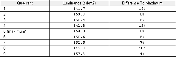
Luminance uniformity table
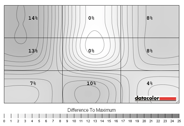
Luminance uniformity map
Contrast in games and movies
Lagom contrast tests
Colour reproduction
Colour gamut
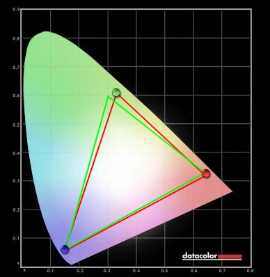
Colour gamut test settings
Colour in games and movies
Viewing angles
Responsiveness
Input lag
Refresh rate
Pixel responsiveness

Trailing 60Hz Overdrive Off

Trailing 60Hz Overdrive Weak

Trailing 60Hz Overdrive Light

Trailing 60Hz Overdrive Medium

Trailing 60Hz Overdrive Strong

Trailing 120Hz

Trailing 144Hz
Responsiveness in games and movies
Conclusion
Positives Negatives Good contrast performance exceeding specification and no loss of detail in dark areas
Some dark shades are lighter than they should be, revealing some unintended detail. Our review unit also had some uniformity issues, particularly when viewing black in a dark room
The matte screen surface showed off its anti-glare properties nicely, reducing glare and preventing reflections The matte screen surface is grainy and doesn’t preserve as much vibrancy and clarity as lighter matte or semi-glossy solutions seen on other (primarily 60Hz) monitors Following some OSD tweaking colours were quite good with impressive depth in places and quite a vibrant look overall
A slightly more generous colour gamut and better screen surface would improve things here. TN panel technology also limits colour consistency, variety and viewing angles
The 144Hz refresh rate offers a refreshing (pardon the pun) level of fluidity beyond that of a 60Hz monitor, adding something extra to games
Grey to grey acceleration was a bit weaker at 144Hz than it could have been and not configurable, giving trailing in places from slightly sub-par pixel response times
A good solid construction with fully adjustable stand and a nice selection of ports (including USB, DisplayPort and audio ports) The DisplayPort didn’t seem to work at over 60Hz at the native resolution, leaving DVI as the only option for 144Hz output. This has been fixed on newer revisions
![]()

