Author: Adam Simmons
Date published: March 2nd 2014
Table of Contents
Introduction
When it comes to contrast performance nothing beats a good VA (Vertical Alignment) panel. We’ve been really impressed by the latest generation of so-called ‘AMVA+’ (Advanced Multi-domain Vertical Alignment+) panels from manufacturer AU Optronics, seen on monitors like the very likeable BenQ GW2760HS. The Philips 284E5QHAD makes use of a 28” MVA panel by manufacturer CMO (Chimei Innolux). We’ll be putting this monitor through its paces and seeing how it compares to the impressive new 27” AMVA+ models.
Specifications
The monitor makes use of an unusually sized 28” MVA panel sporting ‘true 8-bit’ colour and a 3000:1 static contrast ratio. Philips specifies a 4ms grey to grey response time, which we know from experience is not going to be a reliable indicator of real-world performance. At time of writing the monitor is not available from major UK retailers but is expected to retail for around £245 when it is. The monitor is not available outside of Europe, such as on the US market, either.
The key ‘talking points’ of the specification have been highlighted in blue below.
Features and aesthetics
The monitor features moderately thick glossy black plastic bezels; 14mm (0.55 inches) at the top and sides and 21mm (0.83 inches) at the bottom. The bottom bezel features a brushed metal textured plastic strip at the edge. A radial (vinyl-like) texture is used on the circular stand base. The most striking aspect from the front is the large glossy-looking screen. This doesn’t have a mirror-like finish and is technically ‘semi-glossy’, but is still on the glossy side. The reason the reflections are cut down somewhat compared to glossy monitors with ‘untreated’ tempered glass covers in particular is the use of a 3.4% haze matte anti-glare surface. This is just enough to cut down on reflections but not enough to have an observable negative effect on image vibrancy or clarity. As you can see below the reflections have a somewhat soft and muted quality to them. With the monitor switched on, set to our test settings and with no windows behind the user reflections are not particularly troublesome. Such viewing conditions minimise the amount of light hitting the screen surface directly. The images below show what the screen looks like on a moderately bright day with light coming in from the window at the side. The top image shows a fairly light desktop background whereas the bottom image shows darker content. You can see that in both cases you don’t get overly distracting sharp reflections, but reflections are there. They are definitely weaker when the monitor is displaying brighter content as light from the monitor is competing with the reflected light. As with other glossy monitors you do still have to control your lighting environment as much as possible. The monitor has pressable buttons on the underside of the bottom bezel, at the right. The functions from left to right are as follows; ‘SmartImage Lite/Left’, ‘Input/Down’, ‘Volume/Up’, ‘Menu/OK’ and ‘Power’. Unlike some monitors there are no customisable shortcut keys – so you can’t quickly adjust brightness without entering the main menu. That minor gripe aside, the power LED on this monitor is nicely thought out. It’s a simple small white dot that isn’t too bright and not in the least distracting. When the monitor is on standby it flashes intermittently. The video below shows the main menu system used by the monitor. Because the control area is not illuminated and there are no on-screen labels to assist you, navigating the menu in a dark room is difficult as you can clearly see in the video (irony intended). Further information on the control system, and OSD can be found on pages 5 and 6 of the PDF manual. At the side the monitor has a sort of triangular appearance. It’s 12mm (0.47 inches) at thinnest point right at the top, lumping out to a maximum of around 50mm (~2 inches) a little way from the bottom. Glossy black plastics dominate here. The rear of the monitor is predominantly brushed metal textured plastic with a black glossy surround. There are 100 x 100mm VESA holes if you want to use an alternative mounting solution for the monitor. There is a removable cover over the stand hinge (where it connects to the screen). This reveals four screws that can be removed to detach the stand neck. There are two large slots either side of the stand neck which house 7W stereo speakers. The clarity and bassy quality of the sound can’t compare to a decent set of standalone speakers, certainly. But they provide a more powerful and dynamic sound than usual for integrated monitor speakers. They provided a good volume adjustment range with quite surprising volume at maximum. The sound was also less tinny and distorted than usual for integrated speakers – a decent performance overall, putting those 7 watts per speaker to good use. The monitor ports have a multimedia focus and are oriented perpendicular to the monitor. They are recessed to ensure most standard cable heads can still fit without disrupting wall mounting. The ports are; 2 HDMI ports (one with MHL), D-Sub (VGA), 3.5mm audio in, 3.5mm headphone jack and AC power input (external ‘power brick’ included). A K-slot is also included for Kensington security locks. An Nvidia GTX 780 was used on our test system connected by HDMI – which is the only digital input available on this monitor. As is usual when connecting an Nvidia GPU via HDMI (whether using an HDMI or DVI to HDMI cable) to a 1920 x 1080 monitor, the GPU decides to send out the incorrect colour signal. Specifically a ‘Limited Range RGB 16-235’ signal designed for most HDTVs rather than a ‘Full Range RGB 0-255’ signal designed for monitors like this one. This gives a washed out image with very poor contrast – certainly a shock to the system if you don’t know how to get around the problem and have read about how great the contrast is on VA panels. There are two simple ways to rectify this problem. Firstly you can create a custom resolution with a 59.999Hz refresh rate. This will be treated by most applications as 60Hz but uses the correct ‘Full Range RGB 0-255’ colour signal. The process for setting this up is shown in the video below. AMD GPU users shouldn’t have any particularly pressing issues with the image and should provide good vibrant colours and strong contrast straight from the box. It is sometimes possible to gain a little bit of extra contrast by changing from the ‘YCbCr 4:4:4 Pixel Format’ to ‘RGB 4:4:4 Pixel Format PC Standard (Full RGB)’ as detailed in the calibration section of our GW2760HS review. Philips has kept it pretty simple with the presets on the 284E5 with 3 ‘SmartImage Lite’ settings; ‘Standard’, ‘Internet’ and ‘Game’. There aren’t any specific settings locked to each preset, but they do make some adjustments (to saturation, for example) that can’t be specifically adjusted manually in the OSD. Regardless of the preset used there are 5 ‘Gamma’ settings available. We used an Nvidia GTX 780 GPU connected by HDMI (signal corrected as above) on our test system to assess some key criteria including white point, gamma and general image characteristics using a range of settings. We assessed each ‘SmartImage Lite’ mode using the defaults and also explored the effect of different ’Gamma’ and ‘Color’ (colour temperature) settings in the Standard preset. We used familiar images and applications (including the Lagom.nl website) and a Spyder4Elite colorimeter to assess overall image characteristics as shown in the table below. The 284E5QHAD produced a bright but very well balanced image straight from the box. The white point was very close to the 6500K daylight target and there was no particular tint visible to the image. The gamma curve lay just shy of the 2.2 target, averaging a still respectable 2.1. Fortunately Philips provide a good range of ‘Gamma’ settings to play with – and setting this to ‘2.4’ actually got things very close to the desirable 2.2 curve in the centre of the screen. We rarely see this sort of strong ‘out of the box’ performance from IPS or PLS monitors, let alone VA models – so much credit to Philips here. For users who prefer a more saturated look (even if colour range is restricted and things don’t really look as they should) there are two further ‘SmartImage Lite’ modes available; ‘Internet’ and ‘Game’. We like the fact that you are able to adjust the colour channels and gamma modes in all of the presets as well as access every other feature in the OSD – this is something other manufacturers could certainly learn from. Although the image was really very nicely balanced after a simple brightness reduction and changing gamma to ‘2.4’ we wanted to see if we could get improve things further by making manual adjustments. We were able to nudge things just a little closer to the 6500K (D65) target at the centre of the screen whilst actually gaining a (very) small amount of contrast and maintaining a pleasing gamma performance. The gamma curve using our test settings, revealed in the following section, is shown below. We were really quite pleased with the performance of this monitor even using its default ‘Color Temperature: 6500K’ setting. Nonetheless we decided to make a few minor manual adjustments for our test settings which are shown below. Brightness= 45 (according to preferences and lighting) Contrast= 50 Color= User Define Gamma= 2.4 Red= 100 Green= 95 Blue= 99 Using a highly sensitive KM CS-200 light meter we measured the white and black luminance levels using a range of settings (including those discussed in the calibration section). From this a contrast ratio was recorded. The table below shows these results with blue highlights indicating the results using our test settings and black highlights showing the highest white luminance, lowest black luminance and highest contrast ratio recorded. Unless stated otherwise assume default settings were used. The contrast performance of the Philips 284E5QHAD was excellent, averaging 4355:1 when only brightness was adjusted. The highest contrast ratio recorded was a phenomenal 6600:1 at ‘0%’ brightness. Increasing the gamma mode caused the white luminance to drop just slightly without black point changing, causing just a minor drop in contrast. Under our test settings the monitor also performed very impressively, with a static contrast ratio of 4550:1. Because our luminance meter can only measure to the nearest 0.01 cd/m2 there was a bit of rounding going on in some cases– but that shouldn’t take anything away from the consistently strong contrast performance seen here. You didn’t need figures to tell you that this monitor was a strong performer in this area. Blacks on the screen looked truly inky, particularly if they were surrounded by lighter colours. The glossy screen surface also gave them a wet look in some lights, making it look like ink on a glossy magazine. The luminance adjustment range of 273 cd/m2 (from 66 cd/m2 at lowest to 339 cd/m2 at highest) was also impressive. There is a Dynamic Contrast setting called ‘SmartContrast’ which allows the monitor to adjust its backlight brightness according to what is being shown on screen. It can dim when predominantly dark content is displayed and get brighter when lighter content is displayed. As we’ve seen on some other Philips monitors the brightness control isn’t greyed out with ‘SmartContrast’ enabled. If you change brightness with this setting enabled, the backlight will set itself as usual to the brightness you specify. Shortly afterwards the Dynamic Contrast setting will then completely override any brightness setting you selected. The Dynamic Contrast setting tended to make mixed images a bit bright for our liking, but this is a common complaint with such settings. It did dim effectively when most of the screen was dark. Given the strong static contrast performance of the monitor, the distracting nature and at times visually uncomfortable of Dynamic Contrast and the fact most scenes are an intricate mixture of light and dark – we prefer leaving ‘SmartContrast’ off. The 284E5QHAD uses PWM (Pulse Width Modulation) to adjust the backlight brightness to anything below maximum (100). This is shown in the video below – note that our eyes don’t see flickering in the same way that the camera picks it up in the video. This is simply to demonstrate that PWM use used by the monitor below full brightness. When observing a black screen in a darkened room there no observable backlight bleed. There was the slightest hint of clouding in some of the corners (particularly at the left side) but this was difficult enough to see even in a dark room using our test settings and shouldn’t present a problem. The photo below shows how the monitor appeared in a dark room. There is also a slight silver-purple sheen that is visible if you view the monitor from off-angle. We would refer to this as ‘VA glow’, but unlike the glow you see from IPS-type panels this isn’t noticeable from a normal viewing position – even on a 28” screen like this one. It’s also not as intense off-angle. It can be seen in the final third of the ‘Viewing angles’ video that features later in the review. It should be noted that individual units can vary in their dark uniformity performance, but the strong performance observed here is not unusual for a VA panel. The uniformity of lighter colours was assessed using the reporting functionality of our Spyder4Eite colorimeter. 9 equidistant white ‘quadrants’ were measured, running across the screen from top left to bottom right. The luminance at each quadrant and percentage deviation between a given quadrant and the brightest measured point is shown in the table below. The luminance uniformity of the screen was variable. The brightest point measured was ‘quadrant 3’ at the top right of the screen (201.2 cd/m2). There was 21% deviation from this at ‘quadrant 7’ at the bottom left of the screen (158.7 cd/m2). Overall the highest deviations occurred at the left of the screen, which includes ‘quadrant 1’ (17% deviation at 167.3 cd/m2) and ‘quadrant 4’ (15% deviation at 170.4 c/m2) as well as ‘quadrant 7’ mentioned previously. The lowest deviation was observed at ‘quadrant 6’ (right of centre) and ‘quadrant 9’ (bottom right) at 6%. The central region showed 8% deviation. This deviation was not something users should really worry about for general purpose use and watching films etc. and there will be a degree of variation between individual units as well. The graphic below represents these deviations in white luminance as a contour map. Percentage deviation is shown alongside a grey shading – darker greys represent lower luminance and therefore greater deviation from the brightest point. We also analysed the consistency of colour temperature for these 9 white quadrants. Deviations here are shown as DeltaE values. This indicates the variation between a given quadrant and the point closest to the 6500K (D65) daylight white point target. In this graphic darker colours indicate greater deviation. Anything below DeltaE 3 is generally considered to be minor deviation that would escape notice ‘by eye’ during normal use. The monitor was free from significant deviation here and gave good results. ‘Quadrant 1’ at the bottom left was closest to 6500K, whilst the central point deviated by a mere Delta E of 0.2. The greatest deviations occurred above centre (‘quadrant 2’) and the top right (‘quadrant 3’) where a DeltaE of 2.3 was recorded. Elsewhere DeltaE was between 0.5 and 1.3 which is very pleasing. Simply observing the screen reflected this strong level of colour temperature consistencies – with whites appearing as they should throughout the screen really. Again there can be a degree of variation between individual units, but this was good to see on our unit and helped make up for the less than stellar brightness uniformity. On Battlefield 4 dark areas looked appropriately dark and gloomy, contrasting very well with lighter elements. In the centre of the screen there was a degree of what is sometimes referred to as ‘black crush’. This is where some of the darkest shades appear to blend into each other, hiding some of the subtle detail. This is typical for a VA panel and slightly more pronounced than we’ve seen on AUO’s new ‘AMVA+’ panels. Really we felt that the depth of dark shades, the atmosphere this created and the definition brought out by the screen’s exceptional contrast made up for this ‘black crush’. It made for some spectacular elements – fires and explosions pierced the darkness on levels like ‘Operation Metro 2014’ superbly. The glossy screen surface also gave the monitor an extra edge ere, with some of the smoothest and most brilliant whites and light colours we’ve seen on a monitor. A good example of this was when aiming down the ACOG sights in a dark area – the contrast between the pure glowing red reticule and the surrounding darkness was exceptional. Aside from some subtle detail being lost towards the centre of the screen due to the gamma behaviour, the overall contrast performance was excellent on Dirt 3. Artificial lights at night pierces the surrounding darkness beautifully and had a good pure look to them. The deep blacks and dark shades also helped give shadows and other dark elements a really well-defined look. Vegetation structures, rock cracks and various man-made structures showed this particularly nicely. On the Blu-ray film Skyfall there was a very good atmospheric look with excellent depth in dark scenes. There was some loss of detail due to the gamma behaviour but all key details and many fairly minor details were still visible – even if a little less distinct than they should be in places. Some users would find this fairly trivial given the strong blacks and dark colours and the brighter details that were brought out superbly well. The 284E5QHAD provided a very enjoyable viewing experience on this film. The contrast gradients were mostly good. The first two blue bands were difficult to distinguish from the background, unless you viewed them from the side slightly. The other bands were visible with distinct brightness steps. The Philips 285E4QHAD’s colour gamut closely matches sRGB. There is the tiniest hint of under-coverage. There is also a little over-coverage, particularly in the green region of the gamut as measured below. This is nothing to be concerned about and will invite just a touch of extra vibrancy without significantly affecting sRGB colour accuracy. Battlefield 4 had a good rich and vibrant look. The consistency and hence variety and individuality of closely matching shades (greens of vegetation for example) was not as good as on IPS-type panels and a bit weaker than on ‘AMVA+’ panels due to the ‘gamma shift’ behaviour. It was stronger than on TN panels, though, particularly when comparing a given shade at the top vs. bottom of the screen. The lush and rewarding look to shades was very impressive overall, though. Some really deep greens were mixed with a range of lighter shades to give the environments a good natural look. The in-game markers, cyan and purple glow of the engineer repair tool and roaring orange flames all had excellent ‘pop’ to them. This was most impressive in dark areas where they penetrated the darkness beautifully. Colours appeared vibrant and well-represented on Dirt 3. The consistency of shades was again fairly good but not excellent, with some shades tending to get slightly lighter towards the left and right flanks of the screen. The overall depth, vibrancy and variety of shades was pleasing, however. The lush greens of the Finnish forests, muted khaki and sun-kissed browns and reds of Kenya all looked natural and as they should. The car liveries and advertising around the track exhibited excellent vibrancy and a smooth look, appearing almost wet and painted on when ambient light struck the screen surface. Some of the deep oranges, dark reds and bright blues and greens stood out particularly well. Shades looked natural and mainly as they should on the Skyfall Blu-ray. Skin tones showed appropriate saturation and respectable variety on the whole, losing just a bit of saturation towards the flanks of the screen. There were some very impressive red, orange, blue and purple neon lights during the Shanghai night scenes. Equally impressive were the flames and fireworks lighting up the night in Macau. The strong contrast performance and glossy screen surface helped these elements stand out brilliantly well. On the Blu-ray of Futurama: Into the Wild Green Yonder the strong vibrancy and contrast really accentuated the bright neon colours and contrasting bright shades against darker backgrounds. The ‘pop’ to many of the colours on this film was exceptional. The paler pastel shades were also represented well, although not quite hitting the individuality seen on AMVA+ or moreover IPS-type panels. A given shade, such as the orange of Fry’s hair, appeared slightly lighter on some parts of the screen than others. This was particularly true towards the left and right edges. We analysed colour consistency more closely using the Lagom viewing angle tests. The following observations were made. Input lag was measured using SMTT 2.0, a sensitive camera and a range of monitors of known latencies to which the 284E5 was compared. We measured 29.7ms (just under 2 frames) of input lag. Some people won’t have an issue with this, but it indicates a moderately high signal delay and an overall latency that will bother some users. We used a small tool called PixPerAn (Pixel Persistence Analyser) and a highly sensitive camera to capture trailing (also referred to as ‘ghosting’) that is caused by the monitor’s pixel response behaviour. We upped the tempo of PixPerAn (which dictates the car movement speed) as much as possible – so consider this to be the worst case scenario as far as this particular test goes. The images below show the results with the monitors ‘SmartResponse’ setting set to ‘Off’, ‘Fast’, ‘Faster’ and ‘Fastest’, respectively. With ‘SmartResponse Off’, there is a strong primary trail and weaker secondary trail – quite a lot of trailing indicated here, in other words. Using the ‘Fast’ setting weakens both trails. The ‘Fastest’ setting appears to have only a minor effect in these snapshots with the primary trail becoming slightly ‘dirty’ in appearance, indicating a degree of overshoot (inverse ghosting) from strong grey to grey acceleration. With the ‘Fastest’ setting there is extremely strong overshoot and an obvious sharpening of the original object – not a pretty sight at all. As noted in this article it’s important to note that VA panels in particular show considerable variation in response times, depending on the shades involved in the transition. When gaming you generally experience a much broader range of pixel transitions than shown by PixPerAn. You also see things differently to a static camera – with your eye movement creating a level of motion blur that essentially hides some of the pixel response behaviour. To put this all together we will give our subjective impressions when playing the two ‘test titles’ seen elsewhere in the review. We actually tested a much broader range of games but felt that the experience on our test titles was quite similar to those other titles overall. When on foot on Battlefield 4 there was a fairly high degree of blur. This went beyond what could be attributed to refresh rate alone – there were clearly some slow pixel responses to blame here. Getting into a vehicle and driving about intensified this blur. It was most apparent where fairly dark shades were involved, for example deep greens and browns from rocks and vegetation. Some modern VA panels have some fairly slow transitions between contrasting shades but some fairly snappy transitions in the mix too. On this monitor the ‘smeary’ look from sluggish transitions was far more widespread. It didn’t make the game unplayable but it did still affect playability. The experience on Dirt 3 was similar, with widespread and quite obvious trailing from slow pixel responses. Again it didn’t make the game unplayable but it did affect our enjoyment of the title. It seems that Philips have provided as much grey to grey acceleration as is really possible without introducing obvious and extremely widespread overshoot with their ‘Faster’ setting. If you use the ‘Fastest’ setting you get all sorts of funky colours and extreme sharpening all over the place – it looks like some sort of strange ‘posterisation’ filter from a graphics software package. Some people would undoubtedly find this monitor fine for gaming, but from a critical perspective CMO’s latest 28” MVA panel just isn’t as responsive as AUO’s new AMVA models. The good news is that the slow pixel responses and fairly high input lag had no real negative impact on the movie watching experience. Because the movies only run at around 24fps, there is 41.7ms between unique frames. That inherently limits the fluidity of action on even the fastest monitors – and gives slower monitors like this more breathing space. There were some small hints of trailing (possibly also overdrive trailing) in places due to the pixel response behaviour but even to our sensitive eyes this was not really an issue. It came in extremely brief flashes – sort of like a faint outline of moving objects in there ‘old’ position. This wasn’t really distracting and was very different to what you see when gaming at much higher frame rates. We have been very impressed by the advances made in VA panels recently, particularly in AU Optronics (AUOs) latest generation of semi-glossy ‘AMVA+’ panels used on models like the BenQ EW2740L. The Philips 284E5QHAD takes a different route, opting for a glossy CMO MVA panel. As you’ll always find with monitors, especially when looking at them critically as we do, there are good points and bad points about this monitor. We were actually very impressed with how Philips set this monitor up ‘out of the box’. There were a few minor tweaks that could be applied to keep the colorimeter happy, but really the eyes of most users would be happy with what they saw after just turning down the brightness a bit. Nvidia users also have to take the additional step of correcting the colour signal, as detailed in our calibration section. Philips are simply following a common trend on this kind of monitor by offering only HDMI as the only digital input – it’s really up to Nvidia to sort their drivers out so that they stop treating anything connecting by HDMI as a TV. The contrast performance was excellent on this monitor. Blacks and dark colours were rich and inky and whites and other light shades were bright and pure. There was a degree of detail lost due to the gamma shift behaviour that’s typical on VA panels (so called ‘black crush) – an area slightly improved on AUO’s AMVA+ panels compared to regular MVA panels like this. But the combination of high-contrast VA panel and glossy screen surface really made for an atmospheric and in places quite stunning experience. The colour performance was also very good, especially if you’re after vibrant colours with plenty of ‘pop’ – and many users are. This monitor can’t compete toe to toe with IPS-type panels when it comes to colour consistency and is a bit weaker in this area than AMVA+ panels as well, but the colours do have an undeniable ‘pop’ to them. Another area that we’ve seen good progress made by AUO’s recent VA panels is responsiveness. Unfortunately the Philips was up against it in that respect, using a panel that’s native responsiveness is clearly not up there with the latest AUO panels. All VA panels have some transitions that are clearly slower than others, regardless of how good the grey to grey acceleration is. But in this case the transitions seemed to range from slow to very slow – unless you fancied using the ‘Fastest’ setting nickname ‘disco mode’ for the funky artifacts it creates. Input lag was also moderately high on this model, again seeming to reflect what we’ve seen on some older VA panels. So as ever the 284E5QHAD is a bit of a mixed bag. This won’t be the first choice for gamers, that’s for sure. But some users may find it perfectly fine for some light gaming. And for those who are looking for a nice glossy general purpose monitor with a particular interest in films or streaming movie content then this model has a lot going for it.
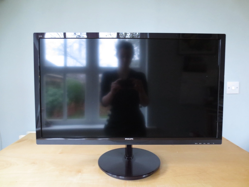
A soft reflection on the glossy screen
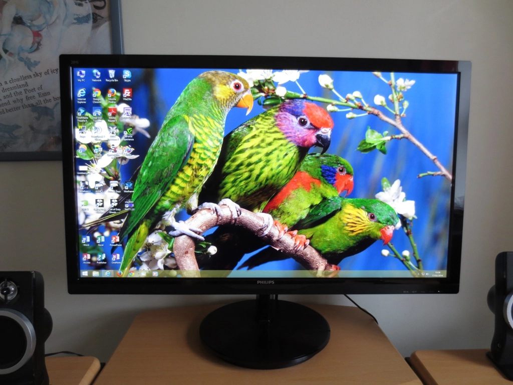
A light desktop
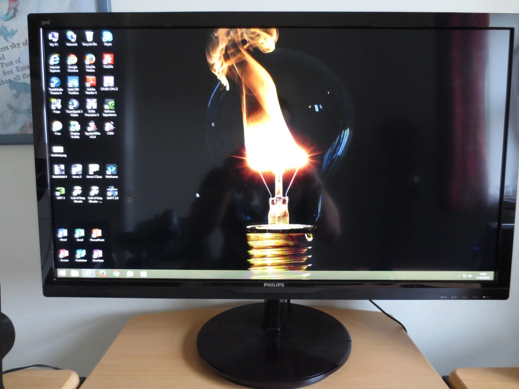
A dark desktop
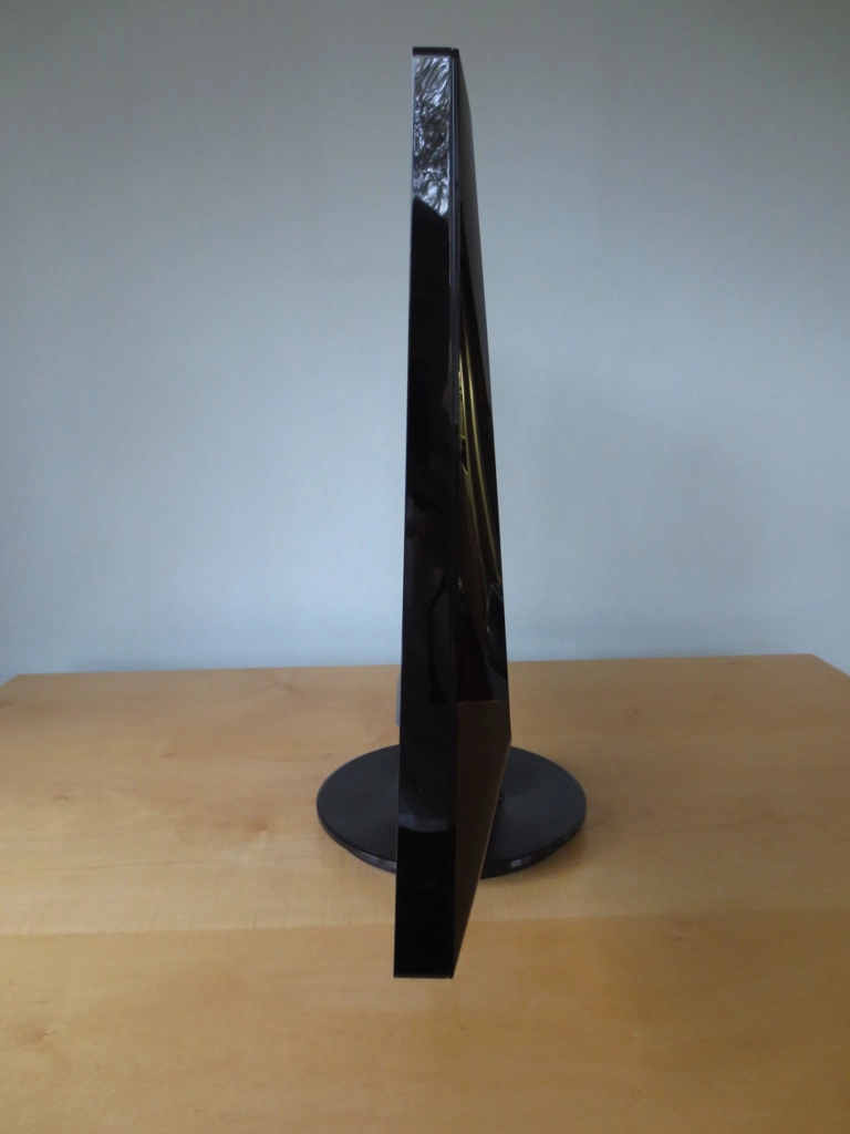
A triangular side aspect
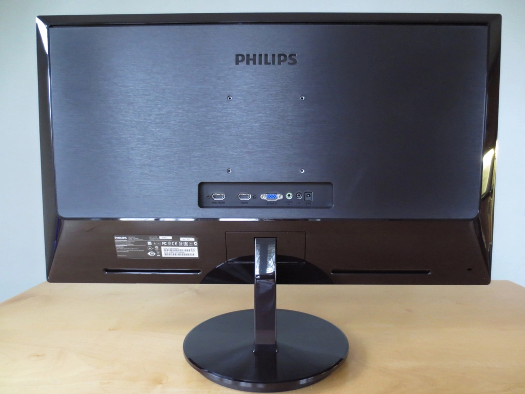
A textured back with VESA holes
Calibration
Correcting the colour signal
A minority of game titles actually ignore custom resolutions and will instead revert to using the default 60Hz ‘1080p’ resolution with ‘Limited Range 16-235’ colour signal. The preferred method for correcting the colour signal is therefore to use this utility. You simply run the .exe file included in the .zip and click the button at the top right which is labelled ‘Set Full Range (0-255)’, as shown below.
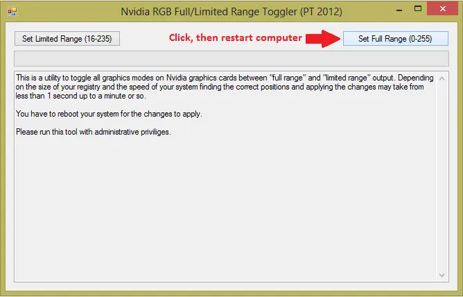
Nvidia RGB Full Range Toggler
Testing the presets
Monitor Profile
Gamma (central average)
White point (kelvins) Notes ‘Standard’ (Factory Default)
2.1 6590K Very bright but otherwise a nicely balanced image. Good depth to shades, a vibrant look and quite pleasing shade variety with appropriate saturation overall. ‘Standard’ (Color= sRGB)
2.1 6601K No discernible difference between factory defaults. ‘Standard’ (Color= User Define)
1.9 6457K Gamma bumped down, meaning some shades lack appropriate depth. Otherwise a decent balance retained. ‘Standard’ (Gamma= 1.8) 1.7 6599K Quite a washed out look but no particular unwanted tint. ‘Standard’ (Gamma= 2.0) 1.9 6616K Very similar to ‘Standard’ (Color= User Define) ‘Standard’ (Gamma= 2.4) 2.2 6604K Similar to factory defaults but a tiny bit of extra depth to some shades. Very nicely balanced overall with strong vibrancy. No real complaints here. ‘Standard’ (Gamma= 2.6)
2.4 6595K Good balance retained without unwanted tints. Some shades appear slightly deeper than they should but the image has excellent vibrancy. ‘Internet’
2.1 6673K This mode introduces a fair degree of oversaturation. Shades become less distinct as a result. ‘Game’
2.1 6457K This mode introduces heavy oversaturation alongside a green tint. Test Settings (‘Standard’ modified as below)
2.2 6504K Essentially similar to ‘Standard’ (Gamma= 2.4) but with lower brightness and manual adjustments to colour channels to bring things even closer to the 6500K target.
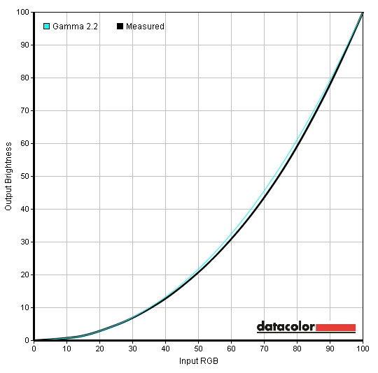
Gamma test settings
Test Settings
Preset= Standard
Contrast and brightness
Contrast ratios
Monitor Profile White luminance (cd/m2) Black luminance (cd/m2) Contrast ratio (x:1) ‘Standard’ 100% brightness 319 0.08 3988 ‘Standard’ 80% brightness 268 0.07 3829 ‘Standard’ 60% brightness 217 0.06 3617 ‘Standard’ 40% brightness 168 0.04 4200 ‘Standard’ 20% brightness 117 0.03 3900 ‘Standard’ 0% brightness 66 0.01 6600 Test settings 182 0.04 4550 ‘Standard’ (Color= sRGB) 318 0.07 3975 ‘Standard’ (Color= User Define) 339 0.07 4843 ’Standard’ (Gamma= 1.8) 321 0.08 4013 ’Standard’ (Gamma= 2.0) 314 0.08 3925 ’Standard’ (Gamma= 2.4) 309 0.08 3863 ’Standard’ (Gamma= 2.6) 308 0.08 3850 ‘Internet’ 288 0.07 4114 ‘Game’ 205 0.05 4100
PWM (Pulse Width Modulation)
Some individuals experience visual discomfort from the flickering associated with PWM use, others don’t have any issues with it. PWM is still fairly common amongst monitors (and indeed other screens on TVs and mobile devices) but there are an increasing number of monitors that use DC (Direct Current) modulation instead to eliminate this potentially problematic flickering. The alternative ‘AMVA+’ panels we refer to throughout this review, for example, are ‘flicker free’. This is a feature BenQ were first to promote widely and other manufacturers are now starting to adopt as well.
Luminance uniformity
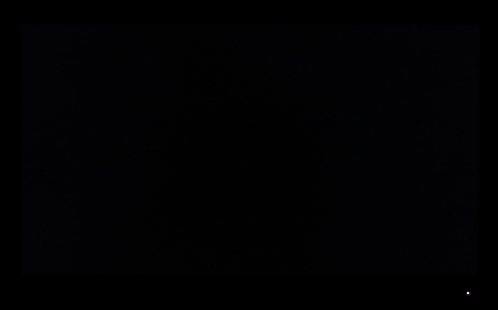
Monitor displaying black in a dark room

Luminance uniformity table
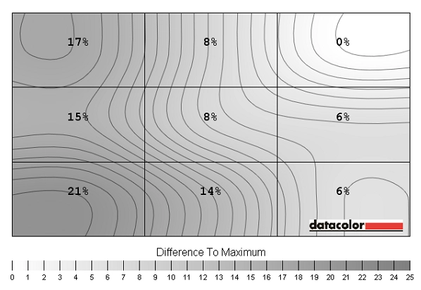
Luminance uniformity map
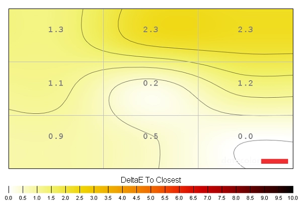
Colour temperature uniformity map
Contrast in games and movies
Lagom contrast tests
Colour reproduction
Colour gamut
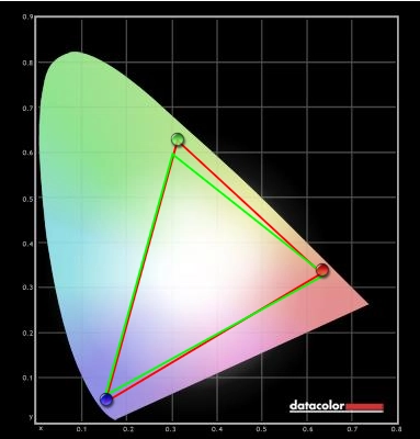
Colour gamut test settings
Colour in games and movies
Viewing angles
Responsiveness
Input lag
Pixel responsiveness

Trailing on PixPerAn (SmartResponse 'Off')

Trailing on PixPerAn (SmartResponse 'Fast')

Trailing on PixPerAn (SmartResponse 'Faster')

Trailing on PixPerAn (SmartResponse 'Fastest')
Responsiveness in games and movies
Conclusion
Positives Negatives Pleasing colour performance out of the box, more so after a few simple tweaks. The glossy screen and VA panel combine to give very good vibrant ‘pop’ to the image
Some limitations in colour consistency due to the panel technology used – some weaknesses evident compared to competing panel manufacturer AUO’s ‘AMVA+’ technology as well
Excellent contrast performance with good solid inky blacks and dark colours and bright and brilliant white colours. The screen surface gives good purity to light shades Some detail is lost centrally due to the ‘gamma shift’ behaviour of the panel. Some users will find the glossy screen surface too reflective, although the extremely light anti-glare treatment helps reduce those sharp mirror-like reflections Configurable pixel overdrive and good enough responsiveness for movies and some light gaming
Widespread sluggish pixel responses creates some quite obvious trailing whilst moderately high input lag will deter some users
Some users will admire the uniqueness of this monitor with its 28” glossy screen and high contrast VA panel
The 1920 x 1080 resolution has a limited pixel density on a screen of this size. The lack of stand adjustability will frustrate some users – although there is VESA mounting

