Author: Adam Simmons
Date published: July 7th 2017
Table of Contents
Introduction
There has been a lot of interest in ‘4K’ UHD screens (3840 x 2160), with users keen to make use of the pixels for both work and play. As we explore in this article, there is a lot to like about the resolution. But there are also some issues, particularly when it comes to relying on scaling on the desktop, something that is more pertinent with smaller screens. The BenQ PD3200U spreads its pixels out across a 32” screen area, potentially reducing the reliance on scaling whilst still providing an excellent pixel density. We certainly had a lot of positives things to say about the predecessor to this model, the BL3201PT/PH, so it will be interesting to see how this one performs in similar test scenarios.
Specifications
The monitor features a 32” IPS-type panel, specifically an AUO AHVA model with 3840 x 2160 resolution. This features 10-bit colour (8-bit + FRC dithering) and has a specified 4ms grey to grey response time, which should as usual be treated with a degree of scepticism. We will paint a more accurate picture of its responsiveness during our testing, of course. Some of the key ‘talking points’ of the monitor have been highlighted in blue below.
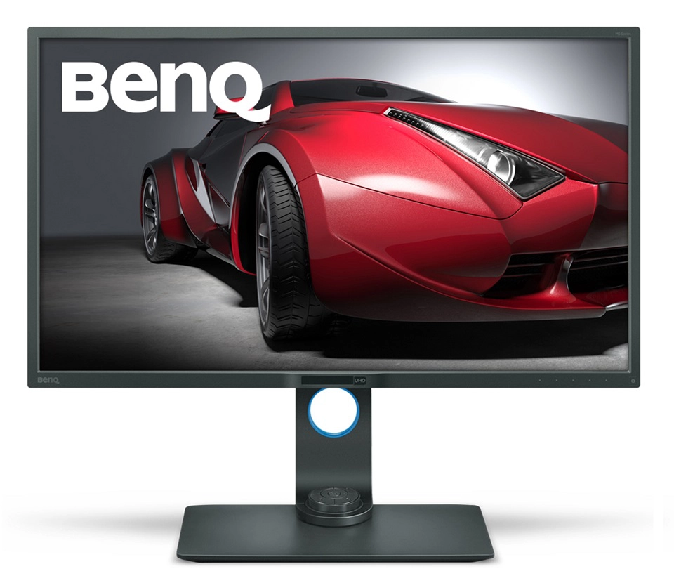
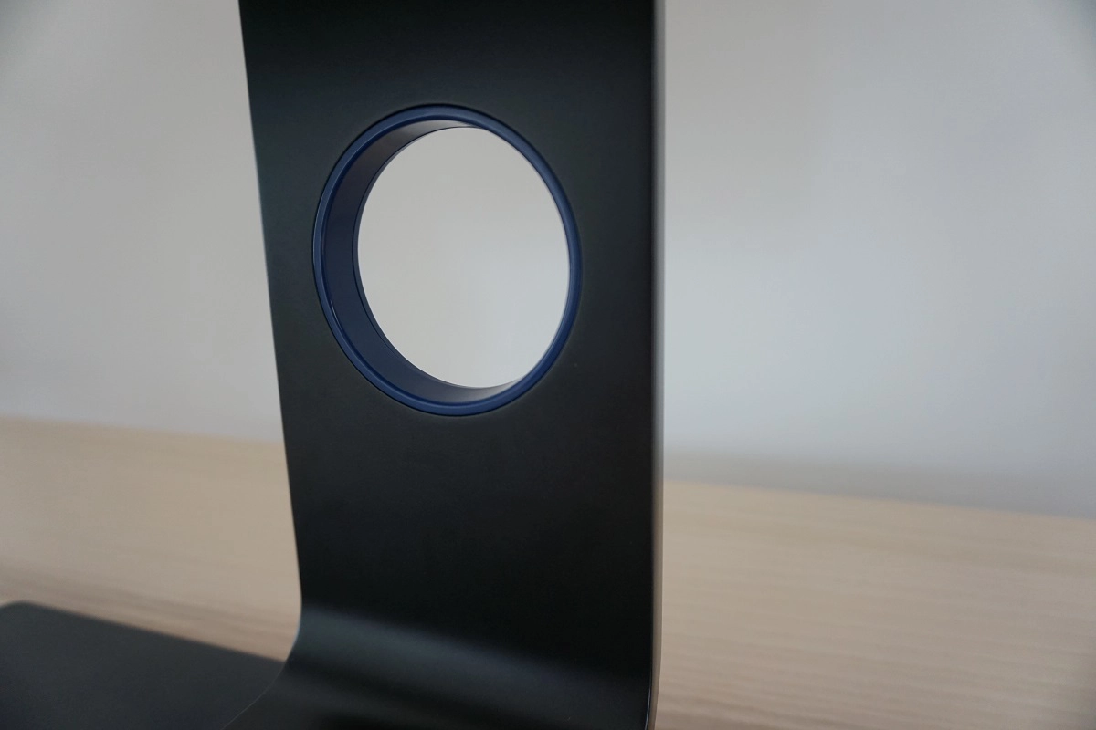
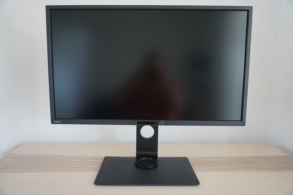
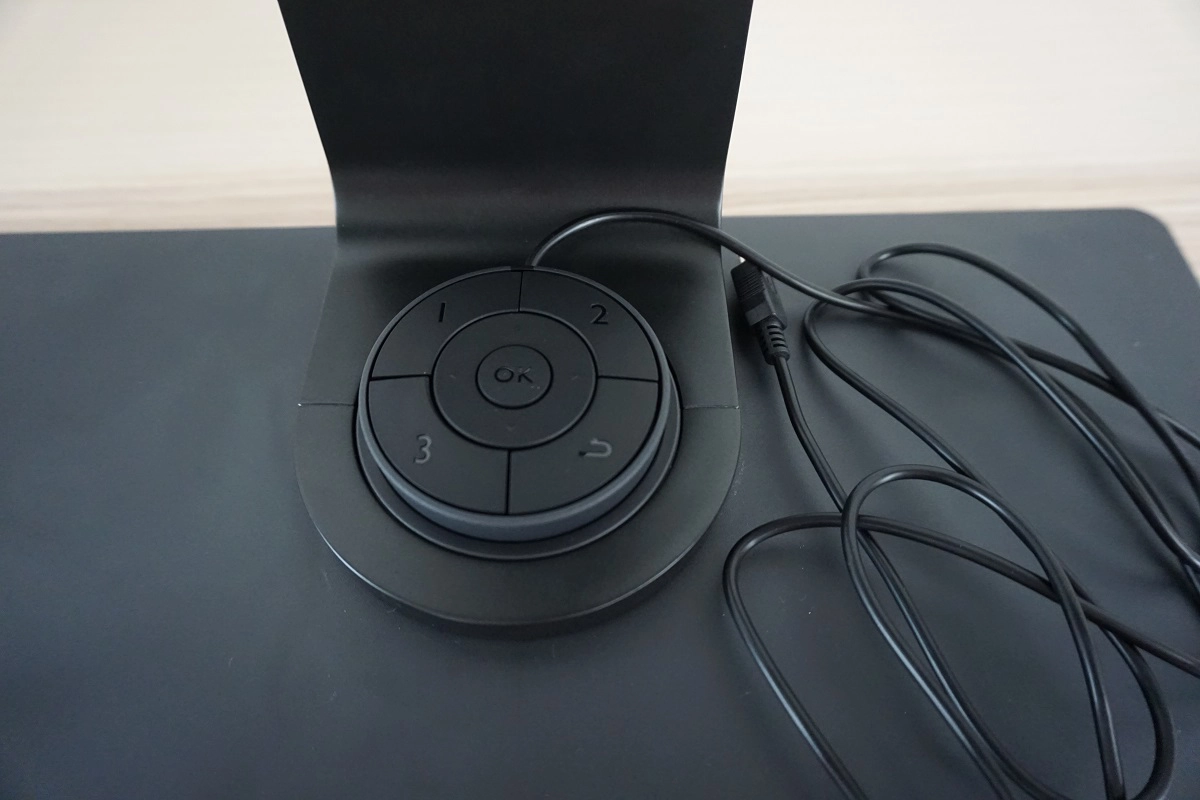
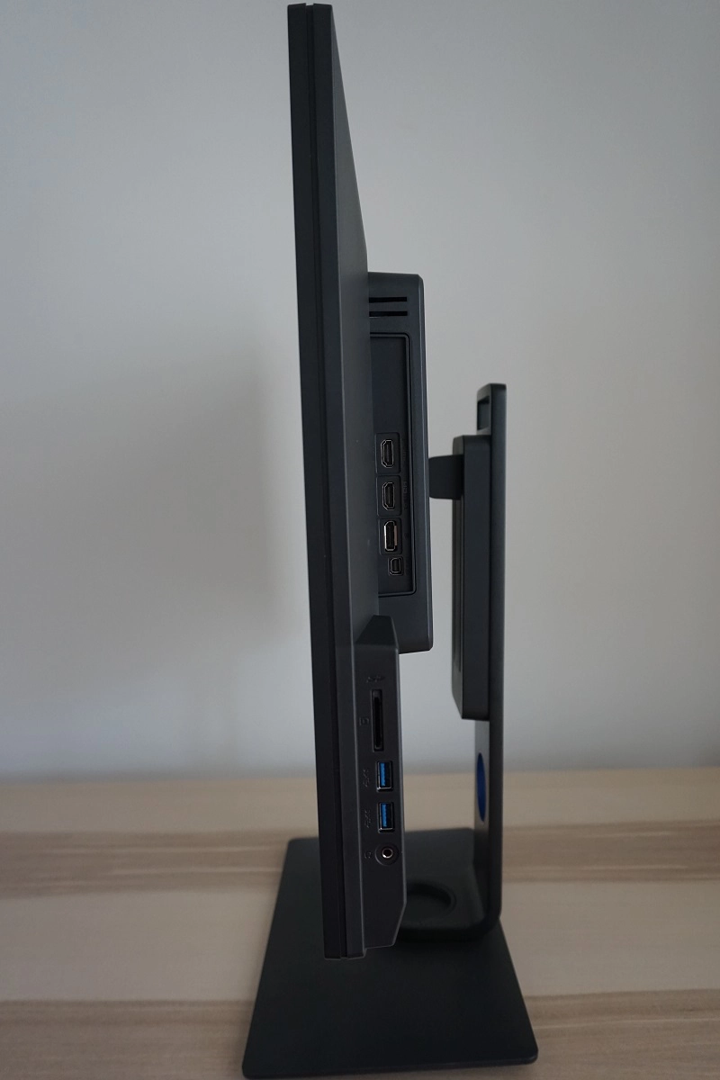
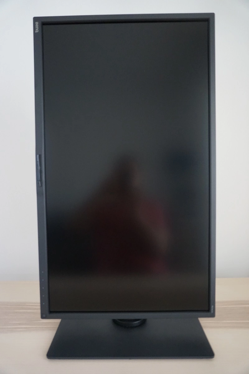
The monitor has a smart but sleek look, not at all dissimilar to its predecessor. The bezels are pretty slender at ~0.9mm (0.35 inches) at the top and sides and ~20mm (0.79 inches) at the bottom. The bottom bezel features a central sensor suite, including the ‘Eye Protect’ ambient light sensor and ‘Eco’ proximity sensor explored in the OSD video. The bezels and base are matte black plastic, whilst powder-coated metal with a satin black finish is used for the stand neck. This is a change in aesthetic from the silver-coloured stand neck of the older model. There is also a blue plastic interior ‘ring’ on the stand neck, which is an integrated cable-tidy feature. The most noticeable thing when you’re actually sitting in front of the monitor, though, is its large 32” screen with very light matte anti-glare finish. This is explored later. The OSD (On Screen Display) is controlled by either touch sensitive controls towards the right of the bottom bezel, or a remote control (puck). The touch-sensitive control area illuminates in an inviting way once your fingers come very close, with a gentle white glow. The puck, meanwhile, connects to the monitor via Mini-USB and has a small central recess which it neatly rests in. The cable allows you to place the puck up to a little over a meter (45 inches) in front of the screen, so gives good flexibility with placement. The functionality of the OSD and the aforementioned sensor suite is highlighted in the video below. From the side the monitor goes for the smart and functional look rather than the wafer-thin aesthetic adopted by some models. There are several ports featured here, which from top to bottom are; 2 HDMI 2.0 ports, DP 1.2, mDP 1.2, SD card slot, 2 USB 3.0 ports and a 3.5mm headphone jack. The presence of HDMI 2.0 is a key upgrade from the older model, allowing this model to be used at 3840 x 2160 at up to 60Hz via either HDMI or DP on a PC. It also means it can be used with ‘4K’ games consoles such as the PS4 Pro and Xbox One X at up to 60Hz. The stand is robust and fully adjustable, offering; tilt (5° forwards, 20° backwards), height adjustment (150mm or 5.91 inches), swivel (45° left and 45° right) plus pivot (90° clockwise rotation into portrait). At lowest stand height the bottom of the stand sits ~59mm (2.32 inches) above the desk with the top of the screen ~495mm (19.48 inches) above the desk. The total depth of the monitor plus stand is ~214mm (8.43 inches), allowing you to keep the screen a reasonable distance from your face even if your desk isn’t particularly big. A very light matte screen surface is employed, with a reasonably low haze value. This allows fairly direct emission of light from the monitor, as far as matte screen surfaces go, for reasons explored in this article. This is good for the vibrancy potential of the monitor and means the image appears fairly ‘close to the surface’ rather than appearing underneath an obvious layer of screen surface. The surface texture itself is actually grainier than that on the BL3201PT/PH that we tested, which is a bit disappointing. Although there is only a light ‘misty’ graininess on the PD3200U, which is certainly preferable to a heavy or smeary grain, it still doesn’t have the smoothness when observing whites and other light shades that its predecessor had. Most users will likely find this level of graininess just fine and will still be able to appreciate the ’very light matte’ nature of the screen surface and lack of obvious layering in front of the image, however. The BenQ PD3200U features a number of ‘Picture Mode’ presets; ‘Rec. 709’, ‘sRGB’, ‘CAD/CAM’, ‘Animation’, ‘Standard’, ‘Low Blue Light’, ‘Darkroom’ and ‘User’. There are also a number of setting that can be adjusted manually, including ‘Gamma’ which can be set to various values between ‘1.8’ and ‘2.6’. Unlike on the BL3201PT/PH and many other BenQ models, these values have been given specified gamma values rather than being numbered sequentially. We won’t go through all of the preset modes and setting individually, as that would be quite tedious. If you’d like a better idea of what some of the modes like ‘Animation’ and ‘CAD/CAM’ do then refer to the calibration section of our BenQ BL3200PT review where these are looked at in a bit of detail. The table below shows our general observations alongside key readings (gamma and white point) taken using a Datacolor Spyder5ELITE colorimeter, for various settings on the monitor. The monitor was left in its ‘Plug and Play’ state without additional drivers or ICC profiles specifically loaded and was left to run for over 2 hours prior to readings being taken. It was connected to an Nvidia GTX 1070 using the included DP – MiniDP cable, on a system running Windows 10. We made similar observations when connecting to an AMD GPU (Radeon 290) and also connecting to our Nvidia GPU via HDMI 2.0. Unless otherwise stated, assume default settings were used. When viewing the figures in this table, note that for most PC users ‘6500K’ for white point and ‘2.2’ for gamma are good targets to aim for.
As an Amazon Associate I earn from qualifying purchases made using the below link. Where possible, you’ll be redirected to your nearest store. Further information on supporting our work.

Features and aesthetics
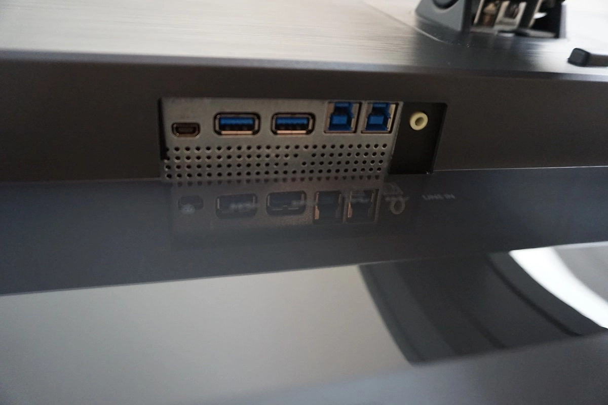
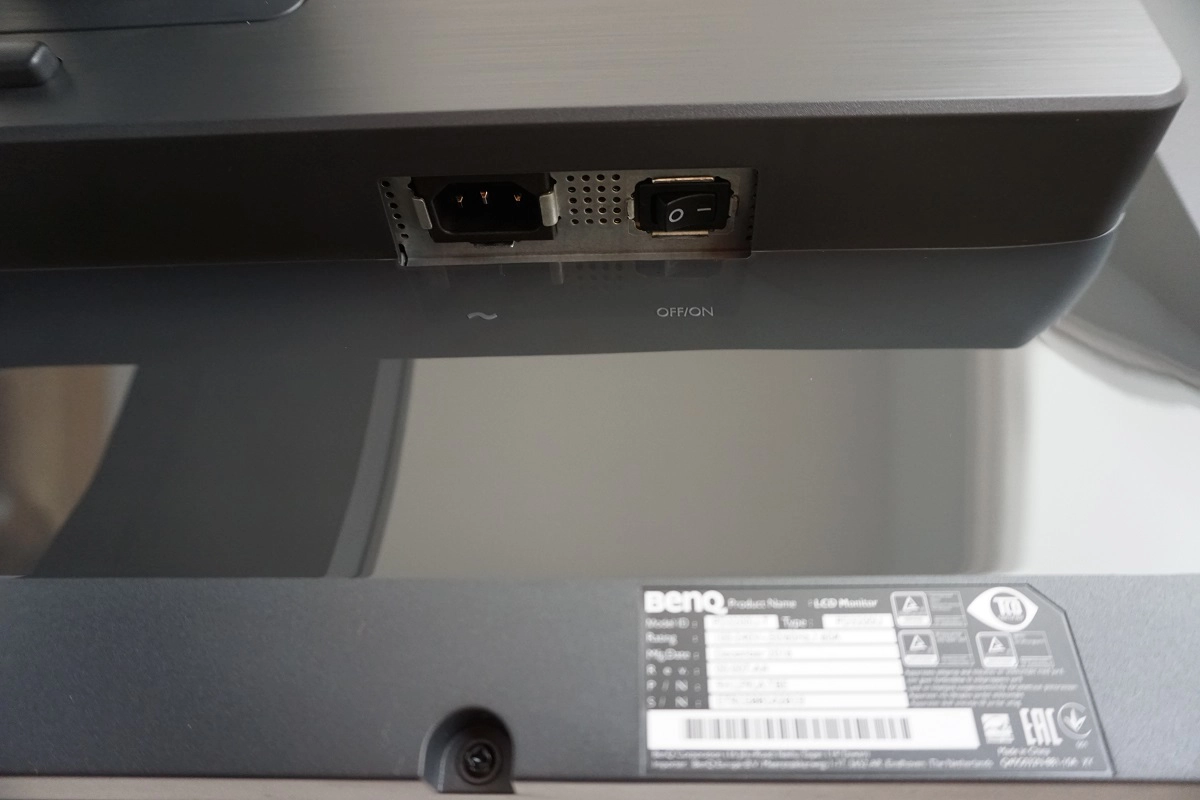
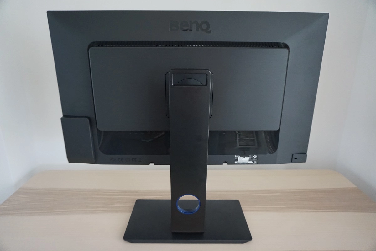
The rear of the monitor uses textured matte plastic, with the stand attaching centrally using a quick-release bracket. Removing this is simple – you just press a button located beneath the attachment point, hiding behind the stand neck in the image. There are then 100 x 100mm VESA holes there for alternative mounting. The monitor features 2 x 5W speakers which provide basic sound output. It has plenty of volume but isn’t particularly bassy or dynamic in its sound – certainly not a replacement for a decent pair of standalone speakers or headphones. The remaining ports of the monitor are down-firing and are, from left to right; Mini-USB (for puck), 2 USB 3.0 ports (plus 2 upstream for KVM functionality), 3.5mm audio input, AC power input (internal power converter) and a zero-watt power switch. There is also a Kensington lock slot located to the far right. Standard accessories in the box include a DP – MiniDP cable, HDMI cable, USB cable and a power cable. A standard DP cable and DVI cable may be included in some regions.
Calibration
Subpixel layout and screen surface
![]()
The standard RGB (Red, Green and Blue) stripe subpixel layout is used, which is the default expected by modern operating systems such as Microsoft Windows. Users of Windows therefore don’t need to worry about running through ClearType, although they may still wish to do so to adjust according to preferences. Mac users do not need to worry about text fringing which is a common complaint on the OS where non-standard subpixel layouts are used.
Testing the presets
Preset Mode Gamma (central average) White point (kelvins) Notes Rec.709 2.4 6483K Very dim with strong shade depth and excellent variety. As the name implies, specifically set up for work within Rec. 709. sRGB 2.2 6498K Bright with excellent balance to the image. Varied, vivid and accurate shade representation. Standard (Factory Defaults) 2.2 6636K As above with slightly cooler look to the image (marginal) and more flexibility with image controls. Although ‘2.2’ average gamma is achieved in both cases, the sRGB mode is targeted for better distinction of very dark shades as explained shortly. Gamma = 1.8 1.8 6590K As above but a more faded and ‘washed out’ appearance to the image, due to gamma handling. Gamma = 2.0 2.0 6614K As above with more depth but still a noticeable lack in this area. Gamma = 2.4 2.4 6568K As per factory defaults, but the gamma target has been raised. This gives many shades a deeper than intended look, that’s quite striking and may be appropriate for some users (hence this is an option rather than an enforcement). Gamma = 2.6 2.6 6590K As above with even stronger shade depth. Striking certainly, but not accurate for most uses. Low Blue Light = Multimedia -30% 2.2 6256K This is the weakest Low Blue Light (LBL) setting. It is not particularly effective, although it does reduce blue light output compared to defaults and give a slightly warmer look to the image. Low Blue Light = Web Surfing -50% 2.2 5767K As above but more effective in reducing blue light. The image appears noticeably warmer, especially when you first change to this mode and your eyes haven’t adapted. Low Blue Light = Office -60% 2.2 5143K A highly effective LBL setting, with a significant blue light reduction. Low Blue Light = Reading -70% 2.2 4896K As above, but another reduction in blue light output. The blue colour channel has been weakened massively – this is an effective mode for users with sensitive eyes or anybody wishing to minimise blue light exposure before bed. User 2.2 6728K Similar to factory defaults, but brighter and ‘cooler’ in tint – plus RGB channels now unlocked. Test Settings (as below) 2.2 6493K Simply sRGB with reduced brightness, as we found this preset to be very pleasing.
Out of the box the monitor was bright but impressively well balanced. Gamma tracking was right as promised and commonly targeted (i.e. ‘2.2’) whilst the white point was quite close to the often desirable 6500K (D65) daylight target. The overall colour representation was very good. In this mode users also have the flexibility to select an alternative ‘Gamma’ setting, should they wish to. There was also an ‘sRGB’ setting that we were so impressed with that we opted to use this as a base for our ‘Test Settings’. Gamma tracked extremely close to the ‘2.2’ curve overall, as shown below. You can’t see due to the resolution of this image (lack of precision with the graph), but at the very low-end gamma was purposefully lowered slightly. Correct sRGB gamma tracking, as seen here, differs slightly from the regular ‘2.2’ curve. This raises the visibility of dark shades slightly, helping counteract ‘IPS’ (AHVA) glow. Many users will approve of this as it doesn’t give an artificial look to the image – everything is in proportion, unlike the ‘Black eQualizer’ feature found on some BenQ gaming monitors. Moreover, it provides a more appropriate setup for image editing and suchlike where you may have to deal with such shades and need them to be distinct against pure black. A range of useful ‘Low Blue Light’ settings also featured, which are easy to activate and deactivate. They are integrated as ‘Preset Modes’ which can be accessed outside of the main menu. You can also assign them to a custom key so that they can be activated without scrolling through other presets or assigned to a ‘Controller key’ on the control puck. This is shown in the OSD video from the previous section. These settings proved effective, particularly the stronger ones, and are something we personally made use of for our own viewing comfort in the evening. We certainly appreciated how easy they were to activate and deactivate given that we only use them for a few hours, disabling them during daylight or for any of our testing. For our ‘Test Settings’ we simply used the ‘sRGB’ preset and lowered brightness. On our unit this was very nicely calibrated with respect to colour temperature and overall colour balance and indeed gamma as explored earlier. Note that individual units may differ – the ‘User’ mode which allows you to access the individual colour channels is fortunately very nicely set up in terms of gamma as well. And indeed you have good flexibility in that respect should you need it with this mode. Any settings not mentioned below were left at default. We have also included the AMA (Advanced Motion Acceleration) pixel overdrive setting used in the review just for reference. AMA= High Picture Mode= sRGB We observed frequent intermittent flickering when connected via DP to our AMD Radeon 290, which persisted despite trying a range of ‘high quality’ and relatively short DP cables. It persisted whether using DP-DP or DP-mDP. At times this became so persistent and distracting that we had to take action to rid the screen of this flickering. Simply turning the monitor on and off did not remedy this, we had to change the refresh rate to something other than 60Hz and then back again. We didn’t observe this on our GTX 1070, using either DP or HDMI 2.0, although we did observe very occasional and very brief flickering using DP that we didn’t find at all bothersome. This issue was widely reported with the predecessor of this model (BL3201PT/PH) and seems to affect older GPUs to a greater extent. We did not have a newer AMD GPU to test, although we’ve tested a number of other UHD models on that GPU some time ago without such issues occurring. If you do own an older AMD GPU (possibly Nvidia as well) – as in, pre HDMI 2.0 – be aware of this issue. A BasICColor SQUID 3 (X-Rite i1Display Pro) was used to measure the luminance of black and white using several different monitor settings. From these values static contrast ratios were calculated. This data is shown in the table below, with black highlights the highest white luminance, lowest black luminance and peak contrast ratio recorded. Blue highlights show the results under our ‘Test Settings’. Aside from the exceptions already mentioned in the calibration section, assume factory defaults were used.
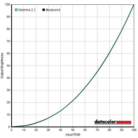
Gamma test settings
Test Settings
Brightness= 41 (according to preferences and lighting)
A note on flickering
Contrast and brightness
Contrast ratios
Monitor Profile White luminance (cd/m²) Black luminance (cd/m²) Contrast ratio (x:1) 100% brightness 299 0.30 997 80% brightness 253 0.26 973 60% brightness (Factory Defaults) 208 0.21 990 40% brightness 158 0.16 988 20% brightness 108 0.11 982 0% brightness 54 0.06 900 Rec. 709 77 0.08 963 sRGB 211 0.22 959 Gamma = 1.8 208 0.21 990 Gamma = 2.0 208 0.21 990 Gamma = 2.4 208 0.21 990 Gamma = 2.6 208 0.21 990 Low Blue Light = Multimedia -30% 187 0.26 719 Low Blue Light = Web Surfing -50% 161 0.24 671 Low Blue Light = Office -60% 141 0.21 671 Low Blue Light = Reading -70% 121 0.19 637 User 296 0.31 955 Test Settings 163 0.17 959
The average static contrast on the BenQ PD3200U with only brightness adjusted was 972:1, which is quite good and in line with expectation based on the specifications. Under our ‘Test Settings’ we recorded 959:1, which is quite pleasing. The contrast dropped somewhat following the application of the ‘Low Blue Light settings’, to 637:1 – 719:1 depending on the setting used. This is more pronounced than the drop we measured on the BL3201PT/PH (981:1 minimum) but quite acceptable given that these modes serve their purpose well regardless of the contrast dropping a bit. The maximum luminance recorded on the table was 299 cd/m², whilst the minimum white luminance was 54 cd/m². This gives a luminance adjustment range of 245 cd/m² with plenty of usable values to choose from for a range of lighting conditions and preferences.
There is a ‘Dynamic Contrast’ setting that can be activated in the ‘Standard’ preset mode. This can be set between ‘1’ and ‘5’, with higher numbers increasing the speed of response to changes in scene brightness. Dynamic Contrast settings such as this allow the backlight to brighten or dim depending on the overall level of light of dark displayed on the screen. The backlight is controlled as an individual unit, so this just works on average brightness levels across the whole screen rather than specifically dimming or brightening different sections of the screen. We found the screen rather bright even with mixed content displayed, with the dimming only moderate even in the darkest scenes. We prefer manual control of brightness even when better Dynamic Contrast implementations than this are available.
PWM (Pulse Width Modulation)
The monitor does not use PWM (Pulse Width Modulation) at any brightness level and instead uses DC (Direct Current) to regulate brightness. The backlight is therefore considered flicker-free, which will come as welcome news to some users
Luminance uniformity
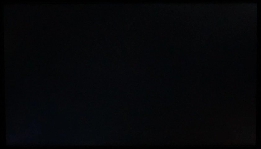
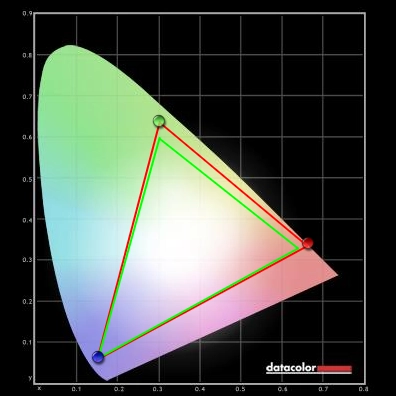
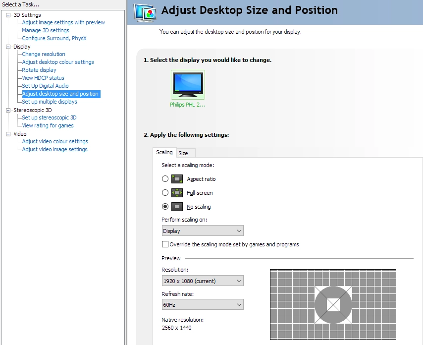
Whilst observing a black screen in a dark room, using our test settings, we could see slight backlight bleed and clouding towards the corners of the screen. This is shown in the image below, which was taken some distance back to eliminate ‘AHVA glow’ (or ‘IPS glow’). This is visible as a slight silvery-blue or golden sheen towards the edges of the screen and most noticeably bottom corners from a normal viewing position. It also ‘blooms out’ more noticeably at sharper viewing angles, as shown in a video deeper into the review. The level of ‘AHVA glow’ observed was slightly reduced compared to some IPS-type models of this size, as we explore shortly. The luminance uniformity was variable but quite reasonable overall. The brightest point recorded was ‘quadrant 5’ at the centre of the screen (156.8 cd/m²). The maximum deviation occurred at ‘quadrant 1’, towards the top left (133.4 cd/m², which is 15% dimmer). Elsewhere, deviation between the brightest point and each quadrant was 6 – 14%. The average uniformity deviation between each quadrant and the brightest point was 11.75%. It’s important to remember that uniformity varies between individual units and you can also expect variation beyond the measured points. For those who prefer things to be represented graphically, the contour maps below represent these deviations in a different way. Here, darker greys represent lower luminance and hence greater deviation from the brightest recorded point than lighter greys. Percentage deviations between each quadrant and the brightest point recorded are also given. The Spyder5ELITE was also used to analyse variation in colour temperature (white point) for these same 9 quadrants. The deviation between each quadrant and the the 6500K (D65) daylight white point target was analysed and a DeltaE value assigned. Here, a DeltaE <3 represents deviation that most users would not readily notice by eye, whereas a DeltaE >3 represents significant deviation that would be more readily noticed. No significant deviations were recorded, although the maximum deviation was pretty much borderline at DeltaE 2.9 (bottom right). It’s again important to remember that individual units vary when it comes to uniformity and to expect further deviation beyond the points measured. The monitor provided a decent contrast performance on Battlefield 1 (BF1). Dark and shaded areas had reasonable depth to them, with good detail levels maintained across most of the screen. Some of this detail was lost due to ‘AHVA glow’, particularly near the bottom corners of the screen as observed from our normal viewing position. As noted previously this was a bit less extensive and a bit weaker than you might expect from an IPS-type panel of this size, but it was definitely still there and created a bit of a ‘flooded’ look to dark shades in affected regions. Lighter shades had a slight graininess to them due to the screen surface texture, but no heavy or smeary graininess thankfully. These bright areas contrasted quite well with darker surroundings – explosions, gunfire and torch lights in the night stood out well, for example. We also observed the monitor on Dirt Rally, where the contrast performance was again decent overall. The level of detail in dark areas was respectable on the whole, with even relatively subtle details such as car tyre tread patterns visible. There was some detail lost towards the edges of the screen, in particularly near the bottom corners, due to ‘AHVA glow’. This was by no means extreme and again a bit subdued compared to some screens of this size. Lighter elements such as car headlights appeared with a light graininess to them rather than an obvious ‘layering’ from the screen surface, helping them ‘pop’ quite nicely in some respects and stand out well against darker surroundings. Finally, we assessed the contrast performance of Star Wars: The Force Awakens. This film contains many scenes where strong contrast is called upon, with bright lightsabers and explosions lighting up much darker surroundings. The monitor again put in a decent performance. It didn’t capture the atmosphere in the way that a model with significantly stronger contrast might (such as a VA model), but it didn’t appear washed out in a reasonably well-lit room either. We used Lagom’s contrast tests to further analyse contrast performance, highlighting issues that might not be readily apparent during other testing. The following observations were made. The colour gamut of the PD3200U (red triangle) was compared with the sRGB colour space (green triangle) in the image below. The monitor offers full (100%) sRGB coverage and a bit of extension beyond in the green and red regions of this particular diagram. This allows the monitor to faithfully reproduce all shades within the sRGB colour space. It produces a little extra vibrancy to some shades natively, but nothing alarming. For users who wish to further enhance colour accuracy, full calibration using a colorimeter or similar device will be able to compensate effectively for the slight gamut extension. Colour reproduction was very pleasing on Battlefield 1 (BF1). The environments appeared rich, natural and suitably varied with an excellent palette of varied greens and browns. Colour consistency was also strong, allowing colours to appear quite consistent in their saturation levels and aiding subtle shade variety. There was also a nice dose of vibrancy where it was warranted, for example lively-looking yellow and oranges flames and some quite lush-looking vegetation. Dirt Rally also showcased the colour reproduction capabilities of the monitor nicely, with a healthy variety of earthy browns and a vivid but natural-looking palette of greens. Different environments appeared distinct due to the particular shades showcased there – and we’re not just talking desert vs. forest here, either. Meanwhile more vibrant shades such as electric pinks, bright blues and neon greens stood out quite nicely on the car liveries. In that respect things didn’t have the same ‘pop’ or arresting vibrancy we’ve seen on some models, but only those with a more generous colour gamut (causes oversaturation) or glossy screen surface. To more closely analyse colour reproduction and the idea of colour consistency we tested the Blu-ray of Futurama: Into the Wild Green Yonder. This movie features large blocks of single shade and therefore highlights weaknesses in colour consistency very well. In this respect the monitor put in a strong performance, much as you’d expect from a decent IPS-type panel. This gave real individuality to characters, with even subtle variations in skin tone distinctly visible. It also allowed the monitor to showcase an excellent range of pastel shades alongside good distinct ‘neon’ and deep shades. This title looked much as it should due to this strong colour reproduction, with an appropriate aesthetic for different shades and an accurate representation of this animated world. Lagom’s tests for viewing angles were used to analyse colour consistency and viewing angle performance more closely. The following observations were made from a normal viewing position, around 70cm from the screen. On some monitors faint interlace patterns can be seen during certain transitions, particularly noticeable where light shades (muzzle flashes, explosions etc.) briefly pop up on the screen. These are sometimes referred to as ‘inversions artifacts’. Alternatively, static interlace patterns can be seen with some shades appearing as faint horizontal bands of a slightly lighter and slightly darker version of the intended shade. We did not observe any such artifacts on this monitor. A sensitive camera and a small tool called SMTT 2.0 was used to measure input lag for the PD3200U. The monitor was compared to various screens of known latency, taking over 30 repeat readings to maximise accuracy. Using this method, we calculated 7.05ms (under 1/2 a frame) of input lag. This value is influenced both by the signal delay (element you ‘feel’) and pixel responsiveness (element you ‘see’). It indicates a low signal delay, which will come as welcome news to users sensitive to this sort of thing. In our responsiveness article, we look at the key factors affecting monitor responsiveness. Chief amongst these is the concept of ‘perceived blur’, which is caused primarily by movement of your eyes as you track motion on the screen. Pixel responsiveness also influences this, to a lesser degree on most modern monitors. We also take a look at ‘pursuit photography’, a special photography technique that uses a moving rather than static camera to capture motion on a monitor. This more accurately reflects what the eye sees when observing motion on a monitor, capturing both of the aforementioned elements of perceived blur rather than just pixel responsiveness. The following images show pursuit photographs taken using the UFO Motion Test for ghosting, with the test running at its default speed of 960 pixels per second. This is a good practical speed for taking such photographs and one which represents both elements of perceived blur nicely. The monitor was set to its various ‘AMA’ (Advanced Motion Acceleration) pixel overdrive settings, with all rows of the test shown to demonstrate a range of different pixel transitions. The final column shows a reference screen, specifically a Dell S2417DG, showing how this test should look where eye (camera) movement is the only significant contributor to perceived blur. Note that this test runs at a frame rate matching the monitor’s refresh rate (i.e 60fps), with the UFO moving from left to right across the screen. Note that we will not be including a section on overclocking, as the monitor simply loses signal when set much above 60Hz at its native resolution. On Battlefield 1 (BF1) there was a fair degree of perceived blur. However; this was attributable almost entirely to eye movement and much as you’d see on even the fastest 60Hz LCDs. The vast majority of pixel transitions were performed fast enough for optimal 60Hz @ 60fps performance, without imparting any obvious trailing that would add to perceived blur. There was some faint additional ‘powdery’ trailing in places, particularly where very light shades were involved in the transition, but this was faint and short-lived. There was also a small amount of light overshoot. When certain medium shades moved against one another (for example moving past a house with blue sky in the background) you could see a partially transparent trail that was slightly brighter than the shades involved in the transition. As with the powdery trailing, this was very faint and something the vast majority of users wouldn’t even pick up on. We actually found the pixel overdrive to be slightly better balanced than on the older BL3201PT/PH, with even less obvious overshoot than what was already a fairly low level. We made similar observations on Dirt Rally. There was little to complain about, with just a faint trace of overshoot and powdery trailing in places but nothing we found remotely distracting. In terms of perceived blur things were really as you could hope for from any 60Hz LCD, so certainly an impressive performance in this regard. We also made some observations when viewing our Blu-ray movie test titles. Here, there were no noticeable weaknesses attributable to either slower than optimal pixel responses or overly aggressive pixel overdrive. The pace of action here is limited by the 24fps or so at which the content runs – which limits fluidity and also reduces the pixel responsiveness requirements. We also observed some higher frame rate movie content (60fps), which as you’d expect highlighted exactly the same sort of behaviour that our game testing did. There were again no obvious weaknesses, just a whiff of faint powdery trailing or overshoot here and there. Certainly nothing we found distracting and nothing that should bother even sensitive users. If it does, they’d likely be unhappy with any 60Hz sample and hold monitor. In our BL3201PT/PH review, in the section entitled ‘The ‘4K UHD experience’, we take a look at how the 3840 x 2160 (‘4K’ UHD) resolution works out on a 32” screen. We also look more generally at the sort of advantages and potential disadvantages to expect from the resolution in our experience article on the topic. We won’t be repeating too much of that here, so would advise reading these articles if you aren’t familiar with the resolution or the sort of experience it can provide. We will give a quick summary, however. In our view, a 32” screen is something of a ‘sweet spot’ for the UHD resolution. We’re able to comfortably view text and interact with programs without relying on any scaling whatsoever. This avoids the scaling related pitfalls highlighted in our aforementioned article, which looks at the resolution as it applies to a 28” screen. This does depend on personal preferences and eyesight, but we feel many users would either be able to accept no scaling or low levels of scaling. Perhaps simply using application-specific zoom to increase text size on some applications and therefore not needing to rely on ‘scaling’ more broadly. This leaves an excellent amount of useful space on the desktop, providing great flexibility when it comes to multi-tasking or simply seeing a lot of information in a single application at once. For users who find the 3840 x 2160 resolution too demanding or are simply using a system that doesn’t support it (an older PC, games console or Blu-ray player for example), it might be necessary to run the monitor at a lower resolution such as 1920 x 1080 (Full HD). The monitor has an integrated scaler which allows it to handle such non-native resolutions. There are two ‘Display Mode’ mode options of particular interest when displaying native resolutions, found in the ‘Picture Advanced’ section of the OSD. The first of these is ‘Full’, which maps the resolution onto the full native 3840 x 2160 resolution of the monitor using an interpolation process. The second is ‘1:1’, which displays using the exact number of pixels called for by the source resolution. For Full HD, for example, the image is displayed as a 16” diagonal area of the screen with large black borders all around. PC users need to make sure that the monitor is handling the scaling rather than the GPU, ensuring optimal results in addition to having access to the ‘Display Mode’ options. AMD GPUs will automatically get the monitor to handle the scaling when gaming, by default. Nvidia GPU users should open Nvidia Control Panel and navigate to ‘Display – Adjust desktop size and position’. They should then ensure that ‘No Scaling’ is selected and ‘Perform scaling on:’ is set to ‘Display’ as illustrated below. The monitors interpolation process (i.e. ‘Full’ selected for ‘Display Mode’) gives significant softening to the image. Things are slightly sharper than when relying on GPU scaling and the softening is by no means the most extreme we’ve seen, but it is nowhere near as sharp as running the resolution natively on a screen of similar size. Contrary to popular belief, the monitor does not display 1920 x 1080 perfectly by 1:4 mapping onto the 3840 x 2160 pixels of the screen. Instead, exactly the same interpolation process is used as is used at other resolutions. This is the case regardless of the input used (HDMI, DP or MiniDP). The softening was more noticeable than on this model’s predecessor, unfortunately, although would potentially be a lot less noticeable if you’re sitting some distance from the screen. For example, using a games console with a controller. Even so, it seems this model is much better suited to running its native resolution on a range of devices (including new games consoles, via HDMI 2.0) than it is to running any non-native resolution. The BenQ PD3200U always seemed a curious evolution of the BL3201PT/PH, without obvious changes ‘on paper’. As usual with monitors, there’s a lot more to the story than just what is specified or listed on a manufacturer’s website. The aesthetic refinements on the outside were minor, but we don’t feel that’s a bad thing – this is a very solidly built monitor with excellent ergonomic flexibility. It doesn’t like showy nor does it look ‘ugly’ or dated in our view, so it strikes a comfortable balance in that respect. After turning the monitor on and performing some basic testing, we quickly recalled a lot of what we liked about the older model. The size and resolution worked really nicely for both work and play, giving a nice useful work area without necessitating scaling and good detail and clarity for games and image content. One particular change that struck us from the older model, at least one of the earlier revisions that we tested, was that the impeccably smooth (non-grainy) matte screen surface has been changed. The haze value remains similar and the screen surface is very light anti-glare – so the glare handling characteristics, vibrancy potential and lack of obvious layering of graininess ‘above’ the image fortunately remains. However; the surface texture had a light misty graininess to it that was not observable on the older model. This certainly isn’t something most users would notice or find bothersome, but it is clearly something we noticed and a change that puzzles us. Another thing we noticed was that the factory calibration seemed tighter this time around. The ‘sRGB’ mode in particular was very impressive both in terms of its gamma handling and white point. When combined with 100% sRGB coverage (without extreme over-extension), this allowed the monitor to output rich but rather accurate shade representation. The consistency of these shades was aided by the AHVA (IPS-type) panel as well, which performed as well as we had anticipated in this regard. We were pleased to see that the ‘Gamma’ settings in the OSD had been changed from arbitrary numbers (1-5) to actual gamma values, and that tracking to the promised values was pleasing. The monitor retained other useful settings and OSD features, including the controller puck itself, which now has a more subdued look with matte grey rim rather than chrome-effect silver rim. There were also a range of easy to activate and deactivate Low Blue Light (LBL) settings, which worked as intended. The monitor also put in a good contrast performance, much in line with its predecessor. The static contrast was close to what was specified, perhaps just a touch lower than the predecessor but within expected inter-sample variation anyway. Plus, the tighter factory calibration may come into play in that respect. There was certainly noticeable ‘AHVA glow’, but as with the older model this was somewhat subdued compared to what you might expect from an IPS-type model of this size. It was definitely still there and still a ‘feature’, though, eating away at some of the detail for dark shades in the affected regions. Particularly near the bottom corners of the screen. Responsiveness was also similar if not slightly improved over the older model, with low input lag and a convincing 60Hz performance. Pixel responsiveness was good enough to provide a pretty much optimal 60Hz experience, without obvious overshoot or trailing adding significantly to perceived blur. There were light traces of each here and there, but added a small fraction to the moderate perceived blur that exists on any 60Hz sample and hold LCD. There was one particular issue we came across with this model that we understand could put some people off. This issue is certainly shared with its predecessor, but isn’t something we commented on simply because it’s GPU-specific and not something we came across during our earlier testing. There was intermittent flickering when using DisplayPort on this monitor, even using relatively short and fat (‘high quality’) cables. This was quite rare on our Nvidia GPU (GTX 1070) and just occurred for a split second then stopped. On our AMD GPU (Radeon R9 290) this was more frequent and when it happened basically rendered the monitor unusable, until refresh rate was changed to something else and then back to 60Hz. This issue did not occur when using HDMI 2.0, which the older model lacked and which still allows you to leverage the full 3840 x 2160 @60Hz capability of the monitor. We would therefore advise caution if you have an older GPU (without HDMI 2.0) as this could be a deal-breaker otherwise. Overall, then, there was plenty to like about the PD3200U. We would say that the tighter factory calibration and inclusion of HDMI 2.0 were nice additions and a lot of what we liked about the older model was retained. We still don’t understand the change of screen surface texture to a grainier one, given the haze value and hence glare-handling characteristics seem very similar. But then, we still feel many users would find the new screen surface agreeable. This is perhaps a moot point given that the older model is discontinued in most regions, but certainly something that BenQ should reconsider for future models. It isn’t a cheap monitor, but the overall build quality and image quality is solid as is the feature-set.
The Spyder5ELITE was used to assess the uniformity of lighter colours, represented by 9 equidistant white quadrants running from the top left to bottom right of the screen. The luminance of each quadrant was measured and compared to the brightest quadrant measured. The table below shows these values as well as the percentage deviation between each quadrant and the brightest point measured.

Luminance uniformity table
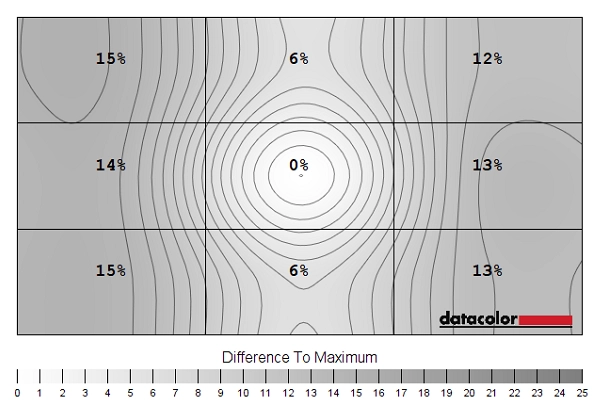
Luminance uniformity map
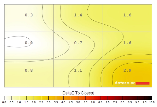
Colour temperature uniformity map
Contrast in games and movies
Lagom contrast tests
Colour reproduction
Colour gamut
Colour gamut test settings
Colour in games and movies
Viewing angles
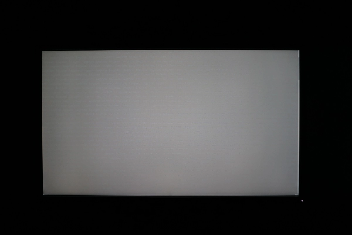
The following video shows the results of the Lagom text test, a mixed desktop background and a dark desktop background from a variety of different viewing angles. You can see how the ‘AHVA glow’ mentioned earlier, becoming particularly prominent and blooming out as the sharpness of viewing angle increases.
Interlace pattern artifacts
Responsiveness
Input lag
Perceived blur (pursuit photography)
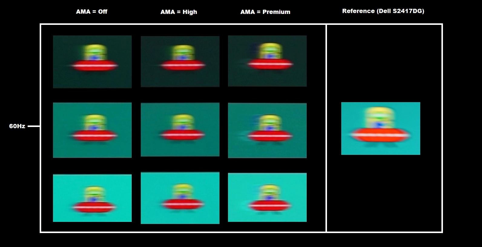
With ‘AMA’ set to ‘Off’, you can see that the UFO appears soft and blurry. This reflects perceived blur due to eye movement and is similar to the 60Hz reference – the pixel response time does not influence this particular element. There is also a faint powdery trailing behind the UFO for the dark and medium background and to a lesser extent the light background. Despite AMA being set to ‘Off’, it’s quite clear that pixel response times are already suitably rapid and undoubtedly a decent degree of pixel overdrive is being employed anyway. The ‘High’ setting didn’t really make any significant changes, perhaps reducing trailing a little behind the UFO cockpit for the medium background. There is no obvious overshoot (inverse ghosting), which is a definite positive, unlike for the ‘Premium’ setting which introduces bright and very obvious inverse ghosting due to overdone pixel overdrive. This is most noticeable for the medium and light backgrounds. During broader testing it’s apparent that the ‘High’ setting strikes the best balance between ‘fast enough’ pixel responsiveness and lack of obvious overshoot, reducing conventional trailing and hence lowering perceived blur just a bit compared to the ‘Off’ setting.
Responsiveness in games and movies
The ‘4K’ UHD experience
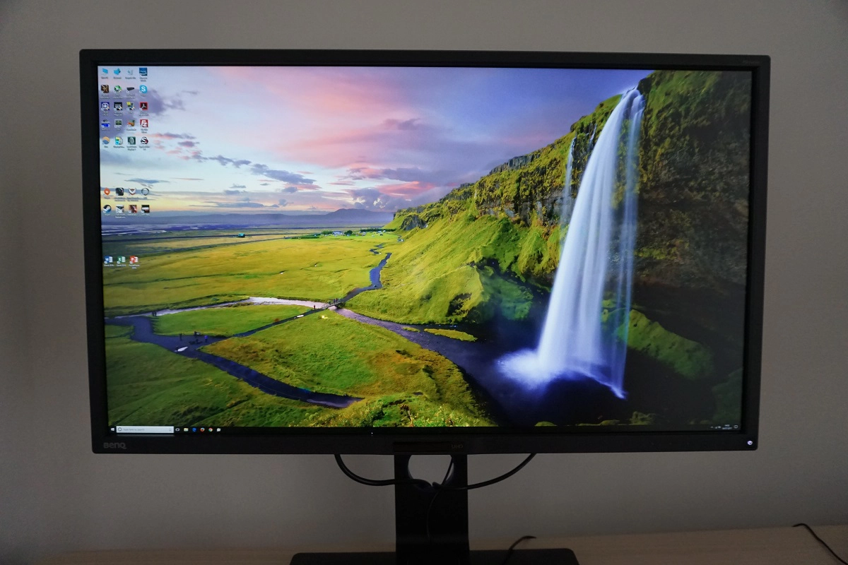
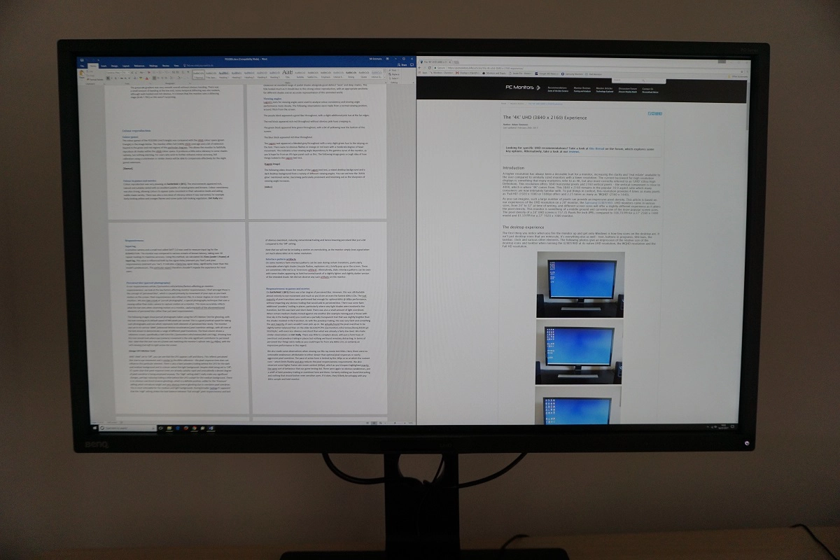
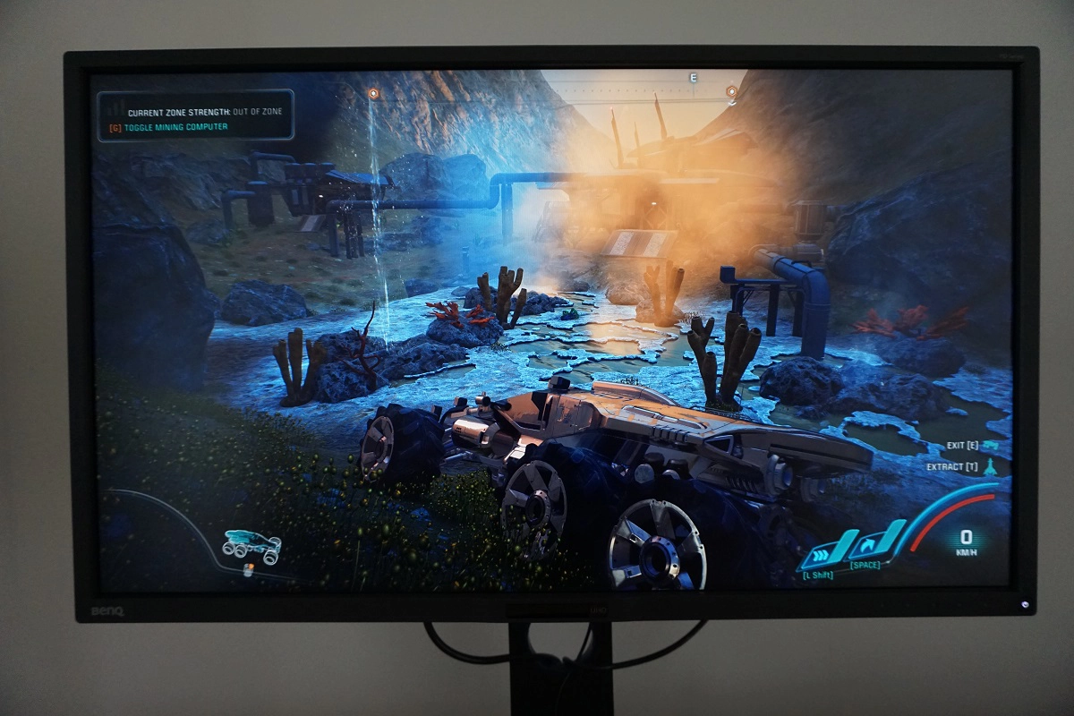
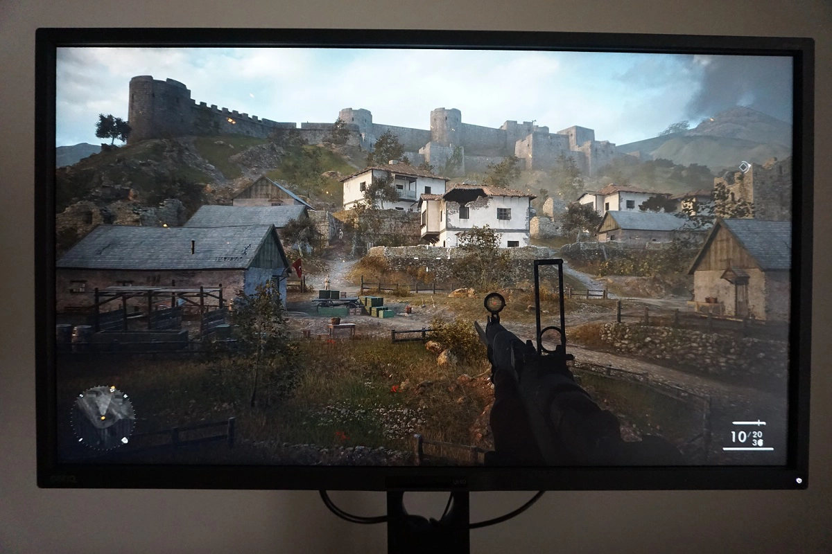
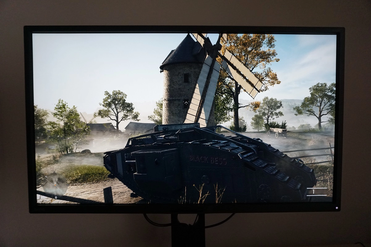
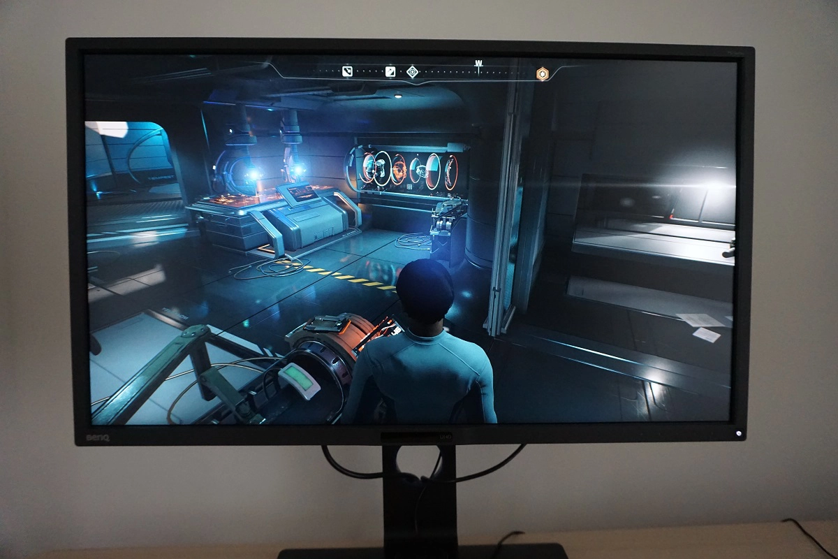
The UHD resolution on a 32” screen also brings with it a very pleasing pixel density of 139.87 PPI (Pixels Per Inch). This brings with it excellent clarity and detail when viewing images or indeed when playing games. As with images, getting the best out of this requires that the game itself offers suitably high-resolution content. You always benefit from extra clarity, a reduced need for anti-aliasing and that sort of thing anyway – but truly admiring game content at this resolution requires suitably high-resolution textures and particle effects as well. This is something we explore in more detail in the aforementioned article and indeed in our BL3201PT/PH review. Although they are in no way representative of what you see first-hand when using the monitor, we’ve included a few photos of the monitor running a range of game titles. Particularly with the details cranked up (which brought out GTX 1070 to its knees, unfortunately), these titles looked quite stunning in many respects and certainly benefited from the high resolution and pixel density on offer here.
Interpolation and upscaling
Conclusion
The bottom line; a solidly built screen with a convincing performance in key areas, but some issues that could prove problematic to some users depending on their GPU and sensitivity to screen surface texture.
Positives Negatives Excellent factory calibration, strong sRGB coverage and good flexibility in the OSD, with a range of useful ‘Gamma’ modes delivering what’s promised
No wide gamut support Good contrast performance overall, with static contrast as expected and a slight reduction in ‘AHVA glow’ compared to what you might expect from such a screen ‘AHVA glow’ still there and something that affects peripheral detail for dark shades, the screen surface also imparts slight graininess to the image despite being ‘very light matte’ Low input lag and well-optimised pixel overdrive allowed the monitor to put in a convincing 60Hz performance
60Hz will limit the appeal to some users and there were slight traces of trailing and overshoot here and there A good screen size and resolution combination in our view (3840 x 2160 and 32”), plus HDMI 2.0 and an ergonomically flexible and solidly built stand DP flickering could limit appeal for users of older GPUs
As an Amazon Associate I earn from qualifying purchases made using the below link. Where possible, you’ll be redirected to your nearest store. Further information on supporting our work.
