Author: Adam Simmons
Date published: July 2nd 2014
Table of Contents
Introduction
The 2560 x 1440 (WQHD) resolution is something of a sweet spot for many computer users. It offers a good deal of ‘pixel real estate’ for desktop tasks and delivers a good dose of detail to games without being overly taxing on mid-high end GPUs. But some people like much stronger contrast than the current crop of WQHD monitors offer and others are starting to find even 27” monitors a bit on the small side. The BenQ BL3200PT offers a unique alternative, featuring a large VA (Vertical Alignment) panel with an appealing WQHD resolution. We take a look at this unique monitor and to see how it performs on a range of applications, including movies and games.
Specifications
The monitor uses a 32” AMVA+ panel with 2560 x 1440 resolution and a high 3000:1 specified static contrast. This features 8-bits per subpixel plus 2-bit FRC dithering to bring it up to 10-bits. Some users would have preferred to see a true 10-bit panel used, but our testing reveals that dithering is still used but very finely controlled indeed. Users should be aware that properly using ’10-bit colour’ on monitors which do support it requires a very specific software and hardware workflow which most will not be using, so in some respects 8-bit + FRC is more accessible anyway. A 4ms grey to grey response time is specified as are 178 degrees horizontal and vertical viewing angles. So there are plenty of attractive figures on paper (highlighted in blue for your convenience below), but that doesn’t generally paint the complete picture.
Features and aesthetics
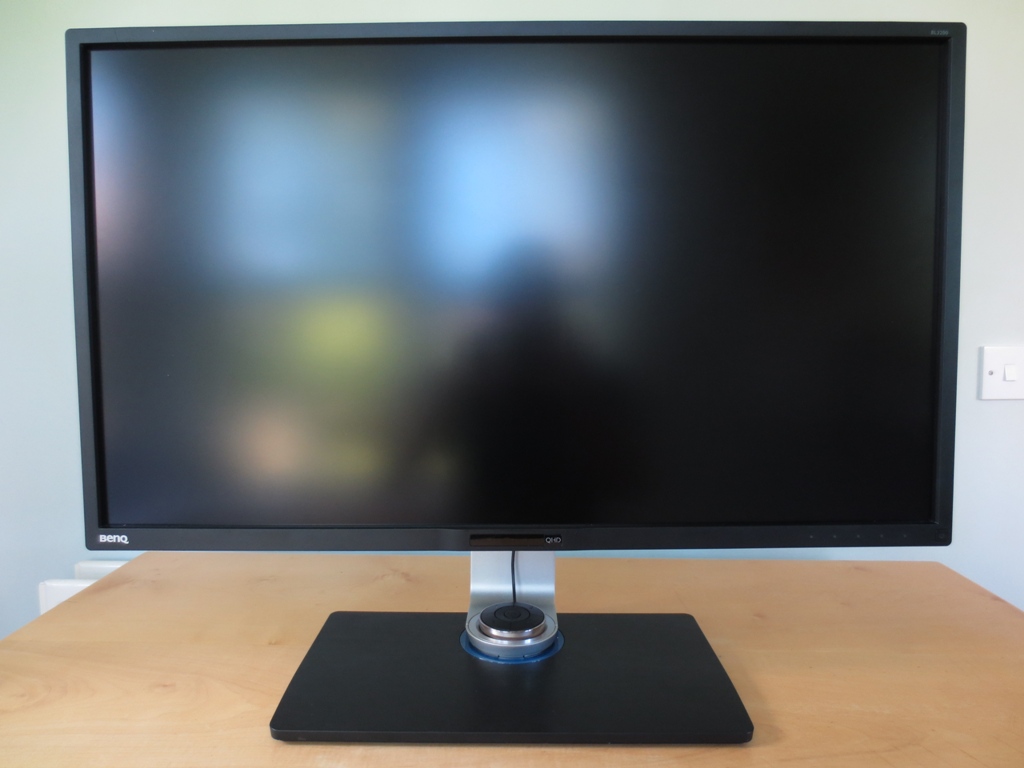
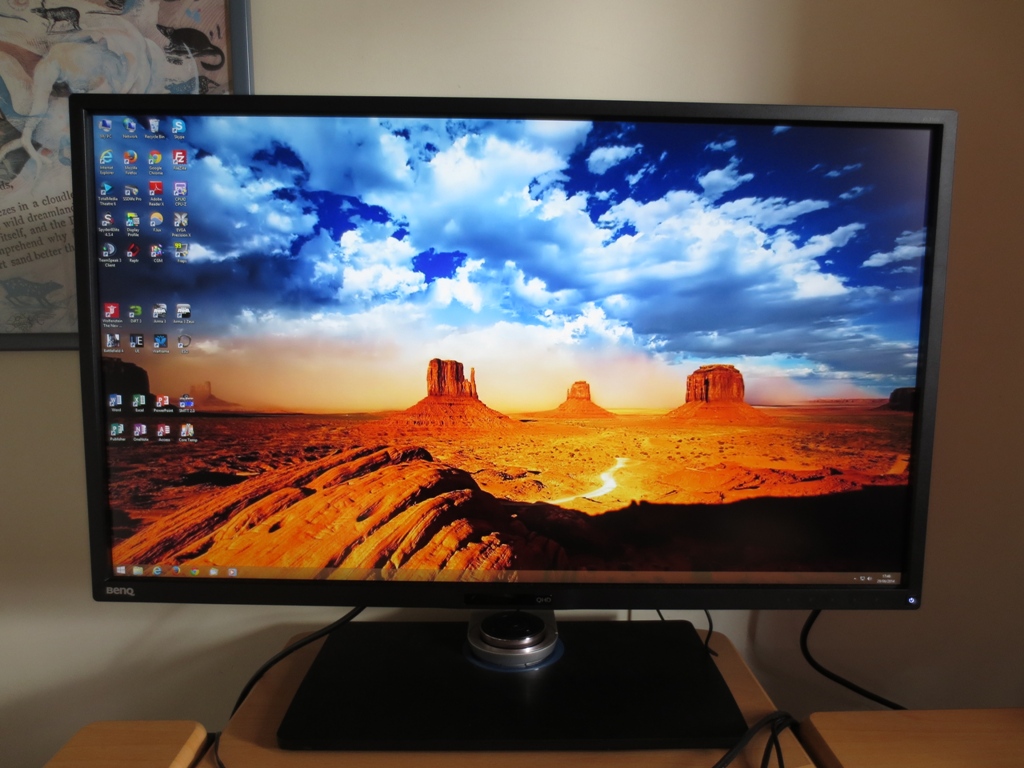
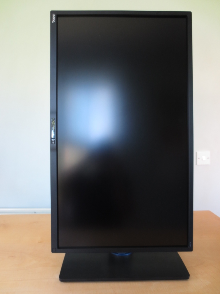
From the front the monitor is dominated by a truly massive screen with a very light matte anti-glare (‘semi glossy’) screen surface. This helps preserve more of the vibrancy and clarity of a glossy screen than stronger anti-glare solutions whilst maintaining a good degree of glare-busting. These glare-defeating properties are particularly apparent in the second picture, where the screen is switched on and doesn’t have light pouring onto it from large kitchen windows on a bright day. Despite the large screen area the matte black plastic bezels are reasonably thin at the top and sides (14mm or 0.55 inches). The bottom bezel is thicker (20mm or 0.79 inches) as it houses the ‘Eye Protect’ ambient light sensor and ‘Eco Sensor’ proximity sensor as well as the OSD (On Screen Display) and power controls.
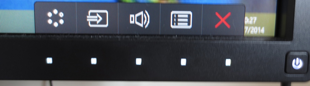
The OSD can be controlled by one of two methods. Firstly there are the proximity and touch-sensitive buttons at the bottom right, with the following functions; ‘Picture Mode (Custom key 1)/ Up’, ‘Input (Custom key 2)/Down’, ‘Volume/Right’, ‘Menu/Left’ and ‘Exit’. The power button is pressable rather than touch sensitive. When the monitor is on it glows a cool white, blinking the same cool white when the monitor enters standby and then blinking a dark amber colour when the monitor is deep into standby (i.e. signal from the PC is lost completely). Each touch sensitive area of the OSD is illuminated by a small cool white square which light up when your finger comes near. Once a button is pressed they remain illuminated and the function of each button is labelled on-screen just above the control area. We found this system responsive and easy to use.
Alternatively you can use the remote OSD controller, which is a neat little circular device that sits in a small holder in the middle of the stand base. The remote is shown in its holder in the first two images of this section. The controller is surrounded by a fingerprint resistant chrome-effect plastic that we feel looks quite classy rather than tacky. It allows you to operate the OSD with directional arrows surrounding an ‘OK’ (enter) button. This is then surrounded by four further buttons – a ‘back’ button at the bottom right and three numbered buttons as shown below.
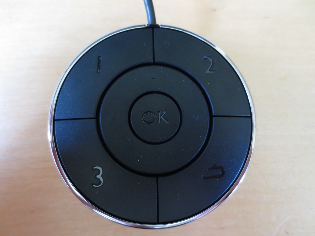
These numbered buttons allow rapid access to three preset image modes; ‘sRGB’, ‘CAD/CAM’ and ‘Low Blue Light’. Alternatively you can set each one to another customisable preset or an alternative user-customised function which is a nice addition. If you prefer not to have this sitting on the dedicated monitor stand, which it fits on perfectly and grips nicely with little rubber feet, you can take it out and place it somewhere more convenient. The controller is connected via a cable to a dedicated ‘mini USB’ port at the back of the monitor, allowing you to place the controller up to 13 inches (33cm) or so in front of the edge of the monitor stand nearest the user. We found this controller and the OSD system in general very intuitive. The rather long video below runs through this system and some of its key features.
The side of the monitor shows off the fully adjustable stand. This is very solidly constructed, using metal rather than plastic for the silver-coloured parts. It is fairly heavy, keeping the monitor firmly rooted into the base. The base has a fingerprint-resistant brushed metal effect black plastic cover and has quite a large footprint to help support the screen – around 38cm/15 inches long and 21cm/8.27 inches deep. The screen can be adjusted in height by around 150mm (6 inches), tilted 5° forwards and 20° backwards, swivelled 45° left and right or pivoted 90° clockwise into portrait. At lowest height the bottom of the monitor clears the desk by 5cm (2 inches) whilst the top sits around 48.5cm (19 inches) above the desk.
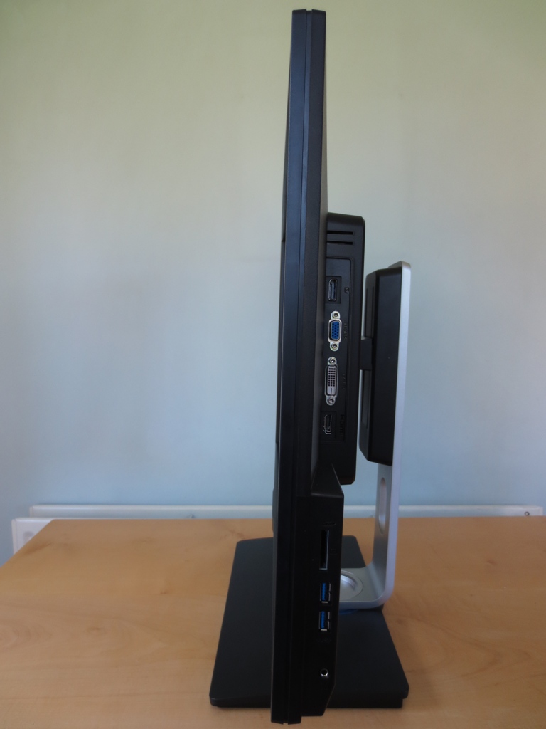
At the right side of the monitor you will see a number of ports. From top to bottom they are; DP 1.2, VGA, Dual-Link DVI-D, HDMI 1.4, SD card reader, 2 USB 3.0 ports and a 3.5mm headphone jack. The rear of the monitor houses the stand attachment, surrounded by a faux brushed metal (like the stand base) and then glossy black plastic and matte black plastic. The stand can be quickly detached using a button beneath the attachment point to make way for an alternative 100 x 100mm VESA solution.
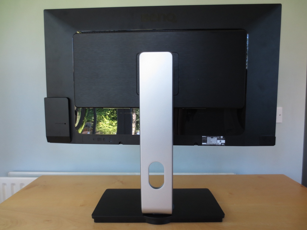
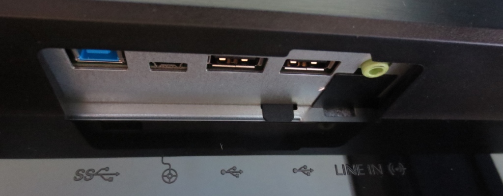
Also at the rear you will find 5W up-firing stereo speakers and some additional downwards facing ports not visible from the sides. These are shown in the image below; USB 3.0 upstream, OSD controller port, 2 USB 2.0 ports and a 3.5mm line-in. Towards the right of the stand you’ll find an AC power input (no external ‘power brick’) and a ‘zero watt’ power switch to completely shut off power to the monitor. There is also a Kensington lock socket at the bottom right.
The speakers offer quite a good audio experience as far as integrated monitor speakers go. The sound is fairly punch with pretty decent bass and quite good balance overall. There is also plenty of volume available if you need it. The sound isn’t quite as clear or pure as decent dedicated speaker setup but is still quite crisp. We’re sure many users would be happy to use these fairly powerful speakers as their main audio output for their system. Quite useful given how much desk space the monitor takes up.
Calibration
Correcting the colour signal
The BL3200PT features an HDMI 1.4 port which outputs an image at the native 2560 x 1440 resolution of the monitor. This is treated as a PC resolution by Nvidia GPUs so there is no need to make any alterations in the graphics driver if using HDMI. You should enter the OSD and navigate to ‘Picture Advanced’ – ‘HDMI RGB PC Range’ and set this to ‘RGB (0~255)’ rather than leaving it at the default ‘RGB (16~235). This will ensure the full shade range is displayed and ensure that the monitor uses its full contrast potential.
AMD GPU users may need to correct the scaling if using HDMI and may wish to enforce the ‘Full Range RGB (0-255)’ colour signal rather than letting the GPU use its default of ‘YCbCr 4:4:4’. Full instructions to correct both the scaling and pixel format (colour signal) can be found in this article. Most users should be happy to make use of the included DisplayPort or DVI cable instead which will automatically use the correct scaling and colour signal – and there will be no ‘HDMI RGB PC Range’ settings in the monitor to worry about either.
Testing the presets
The BL3200PT includes a very generous range of ‘Picture Mode’ presets. There is of course ‘Standard’, which as the name suggests is the default operating mode for the monitor. Other options include; ‘sRGB’, ‘CAD/CAM’, ‘Animation’, ‘Presentation’, ‘Low Blue Light’, ‘Movie’, ‘Photo’, ‘Eco’, ‘M-book’ and ‘User’. Some of these presets are clearly geared towards very specific uses. ‘Presentation’ mode, for example, uses a very low gamma value and is designed to mirror a projector. ‘M-book’ on the other hand is designed to adjust the gamma and white point to more closely mimic a modern MacBook display (we can’t verify how useful this is). Some presets are more flexible than others, giving access to refinements such as ‘Gamma’ settings and indeed provide a nicer image for normal PC use.
Rather than going through each preset individually we will be looking at the ones we feel have the most potential for normal PC users or that are something a bit different (like the ‘CAD/CAM’ and ‘Animation’ presets). We will also be exploring the five different ‘Gamma’ settings. The table below shows some key readings such as gamma and white point, general observations on the image and any preset-specific options available using a range of different OSD settings. The observations and readings were taken on our test system which uses an Nvidia GTX 780 connected by DisplayPort. For reference Windows 8.1 was used with no additional drivers or ICC profiles installed – like all modern displays it is ‘plug and play’ and has everything it needs to function integrated into its firmware. With the exception of our ‘Test Settings’ any monitor setting not explicitly mentioned in the table was left at default.
| Monitor Profile | Gamma (central average) | White point (kelvins) | Extra OSD settings | Notes |
| Standard (Factory Defaults) | 2.7 | 6858K | Brightness, Contrast, Sharpness, Gamma, Color Temperature, Eye Protect Sensor, Eco Sensor | The image is very bright with a moderate blue dominance. There is a fair degree of oversaturation in places but an undeniably vibrant look. |
| Gamma = 1 | 2.3 | 6862K | Brightness, Contrast, Sharpness, Gamma, Color Temperature, Eye Protect Sensor, Eco Sensor | This cuts down on the oversaturation apparent in the default ‘Gamma 3’ mode and presents a better balance to the image. The blue tint still remains, however. Things still have a good vibrancy to them. |
| Gamma = 2 | 2.5 | 6859K | Brightness, Contrast, Sharpness, Gamma, Color Temperature, Eye Protect Sensor, Eco Sensor | As ‘Gamma 1’ with a bit of excessive depth in places but respectable balance overall. |
| Gamma = 4 | 2.9 | 6859K | Brightness, Contrast, Sharpness, Gamma, Color Temperature, Eye Protect Sensor, Eco Sensor | The oversaturation in this mode is pronounced – it can create a look some users will enjoy, but accuracy certainly suffers. |
| Gamma = 5 | 3.0 | 6861K | Brightness, Contrast, Sharpness, Gamma, Color Temperature, Eye Protect Sensor, Eco Sensor | As ‘Gamma 4’ with even more saturation. |
| sRGB | 2.3 | 6867K | Brightness, Contrast, Sharpness, Eco Sensor | Essentially quite similar to ‘Standard’ with ‘Gamma = 1’ |
| CAD/CAM | 2.6 | 6965K | Brightness, Contrast, Sharpness, Eco Sensor | More comfortable brightness with strong oversaturation. The oversaturation is intentional as this mode is supposed to help wireframe meshes etc. stand out for modelling and design work. |
| Animation | 2.9 | 6865K | Brightness, Sharpness, Eco Sensor | Very bright with significant crushing of dark shades. This mode gives has a digital brightness control slider (numbered 0-10 and set to 1 by default) associated with it and is designed to allow the user to artificially enhance the level of detail at the expense of contrast and accurate deep shade representation. |
| Low Blue Light (Multimedia -30%) | 2.5 | 5633K | Brightness, Contrast, Sharpness, Eco Sensor | As the name implies this mode reduces the blue colour channel, reducing blue light output from the monitor. This gives a warm tint and slightly reduced brightness which is a bit more comfortable on the eyes. Obviously brightness can be lowered further if desired. |
| Low Blue Light (Web Surfing -50%) | 2.5 | 5204K | Brightness, Contrast, Sharpness, Eco Sensor | As above with further decreases to blue light output and brightness. |
| Low Blue Light (Office -60%) | 2.4 | 4700K | Brightness, Contrast, Sharpness, Eco Sensor | This mode again further decreases brightness and blue light output. The tint is now obviously warm, although as ‘f.lux’ users will know your eyes do adapt to this somewhat. |
| Low Blue Light (Reading -70%) | 2.4 | 4426K | Brightness, Contrast, Sharpness, Eco Sensor | The greatest ‘Blue Light Reduction’, very restful on the eyes and quite appropriate as a ‘reading’ setting we feel, especially at night. Further brightness reduction is of course possible. |
| User | 2.7 | 6865K | Brightness, Contrast, Sharpness, Gamma, Color Temperature (including ‘User Define’), Hue, Saturation, Eco Sensor | Very similar if not identical to factory defaults. The colour channels, hue and saturation can be manually adjusted in this setting – great flexibility. |
| Test Settings (modified as below) | 2.2 | 6512K | Brightness, Contrast, Sharpness, Gamma, Color Temperature (including ‘User Define’), Hue, Saturation, Eco Sensor | The image is nicely balanced with a good variety of rich shades and a particularly vibrant look where contrasting dark and light shades mix together. |
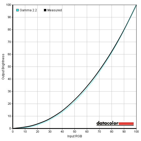
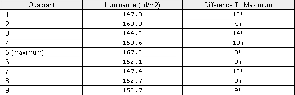
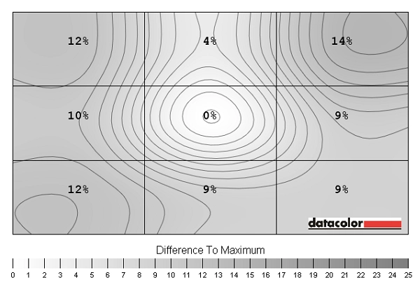
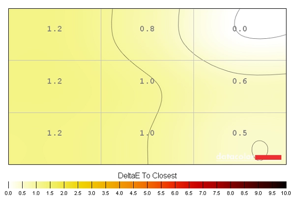
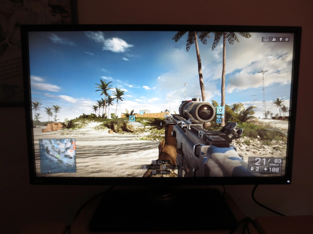
Out of the box the monitor is strikingly bright with a vibrant look to the image. There is a fair degree of oversaturation in places and a slight blue tint. Fortunately BenQ provides a comprehensive range of presets as well as plenty of fine-tuning possibilities. Of particular use, we found, were the 5 ‘Gamma’ settings. Whacking this down to ‘Gamma 1’ and slightly lowering brightness instantly cut back the oversaturation. For our ‘Test Settings’ we made use of the ‘User’ mode which also allowed the colour channels to be manually configured, just to get rid of the slight blue tint. The gamma tracking was actually very good following these adjustments, averaging 2.2 and following fairly close to the desired curve in the centre of the screen. The other ‘Picture Modes’ we tested were also interesting, some of them having quite particular functions. We really like BenQ’s ‘Low Blue Light’ implementation on this monitor. Although a similar effect can be achieved on other monitors with manual adjustments to colour channels and brightness it’s very nice having a range of presets available with this in mind. When combined with the OSD controller it really make switching between your preferred daylight settings and something more relaxing for evening viewing a breeze. We made a couple of straightforward adjustments for our test settings. This helped get more accurately represented colours out of the monitor with good balance and appropriate saturation. Being a VA panel of considerable size the gamma does shift a bit at different points of the screen, as we explore later, but the general colour representation using these settings was pleasing on our unit. Please note that individual units can and will vary so bear that in mind if things don’t look quite right on your unit if you adopt these settings. Due to this variation and pleasing performance without profiling we won’t be providing any ICC profiles for this monitor. Brightness= 40 (according to preferences and lighting) Contrast= 50 Gamma= 1 R= 100 G= 100 B= 97 We used a KM CS-200 luminance meter to measure the brightness of white and black using a range of monitor settings (those looked at in the calibration section). From this a static contrast ratio was calculated. The table below gives these readings and contrast ratios with blue highlights indicating the results of our ‘Test Settings’ and black highlights indicating the highest white luminance, lowest black luminance and highest contrast ratio recorded. With the exception of our test settings all settings not explicitly mentioned were left at default on the monitor. With an average contrast where only brightness was adjusted of 2758:1 the BL3200PT gave an excellent performance. This is very close to the 3000:1 specified – in fact at 0% brightness we calculated a 3050:1 contrast ratio which just edges past this figure. The minor modifications made to our test settings had no significant impact on contrast, with a ratio of 2717:1 recorded using them. Contrast ratio was reduced somewhat by some of the presets, most notably the ‘Low Blue Light’ settings. That’s because they modify the colour channels significantly in order to reduce blue light output from the monitor, a process which always eats away at contrast on any monitor. Even then contrast ratio was safely in the ‘VA only’ zone at 1983:1 minimum with the impressive 70% blue light reduction offered by the ‘Reading’ setting. The maximum luminance recorded was 298 cd/m² and the minimum a rather low 61 cd/m², giving an excellent luminance adjustment range of 237 cd/m². It’s best not to ponder too long over the contrast figures presented above, even though they’re quite clearly only obtainable in the land of LCD screens where Vertical Alignment panel technology is used. It was quite clear to us when using the monitor that the contrast performance was strong. Blacks were deep and inky and light colours jumped out from their darker surroundings in a way that you simply don’t see on other LCD panel types. We don’t really advise anybody even consider wasting this monitor’s strong static contrast potential or insult its colour reproduction capabilities by enabling ‘Dynamic Contrast’, but there is such a setting available in both the ‘Photo’ and ‘Movie’ picture modes. These presets were excluded from our analysis in the calibration section because they both provide unrealistic, oversaturated and gaudy colours which really don’t do the monitor’s panel capabilities any justice. Ignoring that for the moment, BenQ includes the usual intensity adjustments for the ‘Dynamic Contrast’ setting between 1 and 5, with 5 giving the most intense and ‘dynamic’ experience (i.e. dimming the most for dark scenes, raising brightness the most for light scenes). Even with the lowest setting of ‘1’ we felt brightness was uncomfortably high at times during mixed images. The monitor certainly reacted to changes in scene brightness, and very rapidly at that. Unfortunately, as with all currently LCD monitors, the backlight acts as one unit and can’t account for the intricate mixture of light and dark you usually see simultaneously in games, movies and the desktop. For these reasons we wouldn’t recommend this mode, but it’s there if you want to use it. BenQ are very open about their use of ‘Flicker-free’ backlights on their latest ‘Eye-care’ models which the BL3200PT is one of. We can confirm that the monitor does not use PWM (Pulse Width Modulation) to regulate its backlight brightness at any brightness and instead employs Direct Current (DC) modulation. The screen is therefore considered ‘flicker free’ as advertised, good news for those that worry about possible viewing comfort issues if the alternative regulation method (PWM) were used. Observing a black screen in a dark room, using our test settings, revealed no noticeable backlight bleed. There was some very minor clouding in the bottom right but this was very faint and not noticeable during normal use (even when viewing dark content in a dim room). The picture below shows roughly how the screen appeared when viewed from 80cm with the viewer central to the screen. As you can see the dark uniformity is impressive with no problems jumping out at you. If you moved closer to the screen there is a mild glow (something dubbed ‘VA glow’) towards the peripheral sections of the screen. This moves almost like a slight sheen if you move your head. It’s much fainter and less obtrusive than so-called ‘IPS glow’ and far less of an issue during normal use. Even on a screen of this size it doesn’t have a significant effect on the image from a normal viewing position. The Spyder4Elite was used to assess the luminance uniformity of 9 white quadrants running from the top left to bottom right of the screen. This gives an indication of the sort of brightness uniformity to expect from the screen when lighter colours are displays. The table below shows the percentage deviation between each quadrant and the brightest pint of the screen as well as the luminance recorded at each quadrant. The uniformity of the monitor was fair overall. The brightest point on the screen was ‘quadrant 5’ in the centre (167.3 cd/m²). The greatest deviation from this occurred at ‘quadrant 3’ towards the top right (144.2 cd/m² which is 14% dimmer). A 12% deviation was observed at ‘quadrant 1’ towards the top left and ‘quadrant 7’ towards the bottom left (147.8 cd/m² and 147.4 cd/m², respectively). Elsewhere the screen deviated between 4-10% from the central peak which is good. For those that prefer a graphical representation of this variation, the contour map below shows the deviations with darker greys representing greater departure from the peak luminance than lighter greys. The colour temperature uniformity was also assessed using the same 9 white quadrants. The graphic below shows deviation in DeltaE between each quadrant and the point closest to 6500K (D65, the common daylight white point target). Here a Delta E >3 represents a significant deviation which some users would be able to spot quite readily. The darkest colours on this map show the greatest deviation from the 6500K. On the points analysed there was no significant deviation from 6500K. The point closest to the 6500K target was ‘quadrant 3’ at the top right. The greatest deviation from this was a mere 1.2 DeltaE. If you looked at this at a finer scale and also took into account deviation in overall colour balance (not just colour temperature) you might see a bit of deviation in places but it’s really good to see such a strong performance here. As with all aspects of uniformity it’s worth remembering that individual units can vary. The contrast performance was excellent on Battlefield 4. There was a bold and contrasting look that only a good VA panel can deliver, with excellent distinction between deep dark colours and lighter surrounding colours. Shadows on the undersides of vehicles and the leaf structures of vegetation, for example, were very deep and dark, which helped define the overall image. On VA panels like this the gamma behaviour is such that some minor detail can be lost due to so-called ‘black crush’ when the monitor is viewed head on (i.e. from a normal viewing position). The effect on this AMVA+ panel was quite slight and as such a lot of minor detail remained visible which was really good to see. The visibility remained consistently good at all points of the screen (no off-putting ‘glow’ to get in the way of things). Bright colours such as artificial lights and gunfire stood out exceptionally well against darker surroundings. Due to the very light matte screen surface light colours looked rather smooth rather than grainy which was also good to see. On Dirt 3 the strong contrast again shone through. Some very minor details such as the vertical slats inside some of the cars’ air conditioning vents and interior fabric patterns could be seen. Blacks and dark colours had a good inky depth to them which helped lighter colours stand out very nicely. This was particularly noticeable when driving at night as car headlights pierces the surrounding darkness brilliantly. The smooth screen surface texture also ensured there was no obvious graininess so they looked quite ‘pure’. The strong contrast performance was also evident on the Blu-ray of Skyfall, giving the film an excellent atmosphere. Detail levels were excellent with all of the intended details visible and no extra unintended detail revealed. Bright elements contrasted beautifully with darker surroundings. Some scenes that particularly stood out were those at night where the stark contrast brought bright elements such as candles and neon lights to life against their darker backgrounds. Because this film was shot and mastered in an ‘Ultra wide’ aspect ratio there are fairly thick black bars at the top and bottom. These looked a fairly solid inky black – and due to the size of the screen there was plenty of image area to look at. We used the Lagom contrast tests to help highlight weaknesses in the screen’s contrast performance. These weaknesses may not be obvious during other testing. We used Internet Explorer 11 for this test. Due to its colour management system Firefox outputs these tests differently to other web browsers (including Internet Explorer, Safari and Chrome) so we’d recommend you avoid using Firefox when drawing comparisons. The following observations were made. The BenQ BL3200PT’s colour gamut comprehensively covers sRGB (100% sRGB coverage). There is a little extension beyond this for some shades but nothing too significant. This will be just enough to invite a little extra vibrancy to the image but not enough to upset accurate colour representation too much. Users who are particularly interested in accurate colours would want to calibrate the monitor using a hardware device such as a colorimeter or spectrophotometer. The corrections made by such a device would essentially ‘cancel out’ this slight over-coverage whilst still allowing the monitor to reproduce shades within the entire sRGB gamut. On Battlefield 4 colours were vibrant and inviting without looking unnatural. Vibrant elements, particularly lighter ones with darker surroundings stood out extremely well. A good example of this were the roaring flames surrounded by dirty plumes of thick black smoke on ‘Operation Firestorm 2014’. They looked very lively indeed, helped by both strong bold colours and excellent contrast. The environments were full of rich and varied colours, giving them a look that was both aesthetically pleasing and natural. The environments were also rich, natural and suitably varied on Dirt 3. The forests of Finland, for example, had a very nice mixture of lush and vibrant deep greens and a variety of lighter shades. The distinction between closely matched shades was also pleasing and it’s fair to say the overall shade variety the best we’ve seen on a VA panel. The car liveries and advertising around the track was suitably ‘loud’ with a very pleasing vibrancy. It is hard to pick ‘stand out colours’ because they all ‘stood out’ in one way or another. There were some beautifully deep reds, blues and yellows as well as some excellent bright neon greens. Some of the liveries where strong colours were surrounded by black paint were particularly impressive due to the contrast. Colours looked rich and natural on the Skyfall Blu-ray with appropriate saturation and a pleasing diversity. Skin tones looked as they should with good subtle shade variation, as did natural environments. Some vibrant elements within the film were displayed with excellent vivacity – the neon lights of Shanghai at night and candles lit by the Riverside in Macau for example. We are usually quite impressed by how VA panels represent animated film content such as the Blu-ray of Futurama: Into the Wild Green Yonder. The BL3200PT did not disappoint, with striking neon colours, good deep colours and plenty of varied muted shades as well. Bright neon colours surrounded by the dark depths of space were particularly impressive here, but the consistency of shades was also pleasing. If you observe a single colour, for example the face of Fry (one of the main characters in the film), you can see that even when it fills most of the screen the variation in tone is not massive. There is a bit of variation due to the gamma behaviour of VA panels but this AMVA+ gives much less variation than you’d see on older VA technologies. Given the size of the screen this was particularly noteworthy. This consistency isn’t up to the level of IPS-type panels and the discerning eye may spot slightly less distinction between closely matching shades as a result. Even so there was a very pleasing array of individual shades each with their own unique identity. Coupled with the liberal lashings of vibrancy the overall colour experience on this title was excellent. To study the idea of colour consistency more specifically we used Lagom’s tests for viewing angle. The observations below were made from a viewing distance of 80cm which we feel is within an appropriate range for a monitor of this size. Some people will be sitting closer, others further away. The viewing distance can have quite an impact on the degree of ‘colour shift’ observed at different parts of the screen as the viewing angle of peripheral areas of the screen essentially shifts. The observations we made reinforce what we saw in our game and film testing. This monitor is not up to the levels of IPS-type panels when it comes to colour consistency, but it’s easily the best performance we’ve seen from a VA panel (including other recent ‘AMVA+’ panels). The video below shows the results of the Lagom text test, a light desktop background and dark desktop background as viewed from a variety of viewing angles. Results here are good for a VA panel and in some respects look more you’d expect to see on an IPS-type panel. There is a slight brightness, gamma and contrast shift evident in the video but this isn’t as pronounced as you’d usually see from a monitor with this panel type. The dark desktop background reveals a slight glow in places, especially from fairly sharp angles. This is the aforementioned ‘VA glow’ which is in no way as obtrusive as ‘IPS glow’, ‘PLS glow’ or anything similar. The BL3200PT provides a rather unique viewing experience, in that it combines a 2560 x 1440 (WQHD) resolution with a 32” screen size. The WQHD resolution provides around 1.77 times as many pixels as a Full HD (1920 x 1080 or 1080p) resolution, giving you more ‘pixel real estate’ which translates to a good deal more useful desktop ‘space’ to work (and play) with. A traditional benefit to this resolution on a 27” monitor is the fairly good pixel density that accompanies it – 108.79 PPI (Pixels Per Inch) compared to 81.59 PPI for a 1080p screen of the same size. When you ramp things up to 32” but keep that 2560 x 1440 resolution you gain a pixel pitch of 91.79 PPI, so you don’t get the same sharpness or clarity potential as the 27” WQHD models. Interestingly this pixel pitch is exactly the same as a 24” 1920 x 1080 monitor, something many users are quite comfortable using. The best way to think about the overall viewing experience, in terms of the relative size of everything on the screen, is therefore like a 24” Full HD screen. The screen is of course considerably larger, but the same sort of clarity is maintained whilst extra information (pixel real estate) is also there. If you wish to connect a games console or a less powerful PC to the monitor then a lower resolution such as 1920 x 1080 may be your only option. Because the pixels are a fixed size on LCD monitors the monitor has to use an interpolation process to accommodate the lower resolution. If using HDMI or DisplayPort on an Nvidia GPU you will notice a significant drop in contrast and washed out look to the colours. You will have to take action to correct the colour signal, or alternatively use the included DVI cable (or another Dual-Link DVI cable) instead. For the Full HD resolution there are two main options you can choose on this screen, available in ‘Picture Advanced’ – ‘Display Mode’ of the OSD. The first of these is ‘Full’ which is the default mode shown below. It isn’t really clear in the image above, but using this setting the image looks noticeably soft. This is partly because of the 32” screen and 1920 x 1080 resolution, which gives a rather poor pixel pitch of 68.84 PPI. Moreover; it’s due to the interpolation process used by the monitor which essentially ‘stretches’ the image so that all of the pixels are used. The alternative is to use the ‘1:1’ option which is a pixel mapping function available on this monitor. This gives a large black border around the image and ensures that only 1920 x 1080 pixels are used to display the image, as shown below. The image fills a space on the screen that is 24” diagonally and appears just as sharp as running the full screen at 2560 x 1440. If you are forced to run at this ‘Full HD’ resolution then it’s really up to you which option you select. If gaming on a console and you’re able to sit a bit further from the monitor the softness of the ‘Full’ option should not be so noticeable. If you’re playing PC games that you feel work better for you at this resolution then it may be more prudent to use the 1:1 feature. The good news for Blu-ray fans that use their PC and movie software to play films is that you can run the monitor at its native 2560 x 1440 resolution without any noticeable drop in quality compared to a Full HD display. In fact the sharpness and clarity of Blu-ray content on this monitor is surprisingly good. The overall experience (including the contrast and colours) really makes watching Blu-rays and movies from other sources such as YouTube and Netflix very enjoyable. To calculate input lag on the BL3200PT we used a tool called SMTT 2.0 and a sensitive camera to compare the overall display lag of the monitor with a range of other monitors of known latencies. 23.4ms (just under 1.5 frames) of input lag was recorded. This figure includes both the signal delay (element of lag you ‘feel’) and an element of pixel responsiveness (the element you ‘see’). This level of latency is quite comparable to many other WQHD models overall. It will bother some users but not others – it’s a very subjective thing and not something to worry about unless you know you are particularly sensitive to lag. If you are then you will probably want to look beyond 60Hz LCDs anyway. We used the UFO Motion Test for ghosting and a highly sensitive camera to assess the pixel responsiveness of the monitor. The speed of this test was set to ‘2560 Pixels Per Sec’ so that the UFO travelled rapidly, traversing the breadth of the screen in 1 second. In order to highlight the fact that VA panels in particular show quite some variation in pixel responsiveness depending on the shades involved in the transition (i.e. how light or dark they are) we used both the first and second rows of the test. The image below shows snapshots taken from the top row (relatively dark cyan background) and middle row (medium cyan background) with the monitor set to ‘AMA Off’, ‘AMA High’ and ‘AMA ‘Premium’. With AMA (Advanced Motion Acceleration) ‘Off’ the monitor does not use any grey to grey acceleration and as such relies on the native panel responsiveness in an un-accelerated state. In other words the pixel transitions are relatively sluggish. This is particularly evident with the darker background as there is a very bold primary trail, a slight secondary trail and even a faint tertiary trail. For the medium background (lower image) the primary trail is somewhat fainter, as is the secondary trail. In reality the trailing appears to the eye as a smooth blur, seen in addition to the motion blur created by the movement of your own eyes. The level of perceived blur is greater where the darker background is involved as the pixel responses are slower. Using ‘AMA High’ makes the trailing slightly fainter for the darker background. With the medium background the primary trail takes on a slightly strange pattern in places, despite being arguably weaker than with ‘AMA Off’. This is because the monitor uses quite strong grey to grey acceleration (strong voltage surges) to speed up these particular pixel transitions and actually overshoots the desired end point. This gives a small degree of ‘overshoot’ or inverse ghosting, fairly minor and not too obvious in this instance. The secondary trail has as good as vanished and indeed the level of motion blur is clearly improved by eye when using this setting. ‘AMA Premium’ ramps up the grey to grey acceleration massively. You will not fail to notice that the trailing here takes on a completely different appearance. For the darker cyan background the trails appear almost ghostly and monochromatic. For the medium cyan background the trails appear bright and almost neon in places. This is very strong overshoot (inverse ghosting) caused by the acceleration being too aggressive. It’s worth noting that some users may prefer this setting because despite these trailing artifacts the overall motion blur is reduced somewhat by the relatively rapid pixel transitions. We personally preferred the default ‘AMA High’ setting which was used for our subsequent ‘real world’ testing. As our testing above revealed there was a fair degree of trailing captured by camera as a result of some relatively slow pixel response times. This also varied depending on the shades involved in the transition (i.e. darker vs. lighter background). In our subjective game testing we were able to look at an even broader range of pixel transitions and also consider how the human eye rather than a camera perceives the motion. A particularly important consideration is that a significant degree of motion blur you see on a monitor like this one is linked to the movement of your own eyes, which itself creates what is sometimes called ‘retinal blur’. This concept is explored amongst others in this article, well worth a read if you’re interested in the technical side of things. On Battlefield 4 the overall motion experience was much better than on older AUO VA panels (particularly prior to the GW 50 series) and indeed modern VA panels from other manufacturers such as CMO. There were some noticeably slower transitions, particularly between contrasting shades. These were particularly noticeable when driving quickly in a nimble vehicle and passing objects where dark and light elements mix together. Mixed green foliage with dark shaded areas, for example, would blur a fair bit. Some slightly smeary trails could be seen in certain indoor areas in particular, where very dark and slightly lighter colours moved against each other. A black fire extinguisher handle against a wall painted medium-dark green for example. We didn’t notice any of the very obvious ‘smoke-like’ smeary trailing that you can see on slower VA monitors, thankfully, nor any obvious overshoot. On Dirt 3 there was a moderate degree of blur even when cornering fairly gently. This was predominantly down to eye movement and is as you would expect from a 60Hz LCD. There was a degree of trailing on top of this but it wasn’t particularly obtrusive. The slowest pixel transitions on this monitor involve contrasting colours and instances where very dark and slightly lighter shades move against each other. Driving at night on this game created such conditions, introducing a slight smearing in places. This was still not overly distracting and was quite different to the ‘smoke-like’ trails seen on slower VA panels. It was also far less obtrusive than the obvious inverse ghosting that some other monitors suffer from (as does this model when set to ‘AMA Premium’). Overall we feel the pixel responsiveness of this monitor was decent when gaming and generally users who find this bothersome might take issue with 60Hz LCDs more broadly. We also tested our movie titles and didn’t notice any issues with trailing or overshoot caused by overly sluggish or excessively accelerated pixel transitions. The 24fps or so at which the Blu-ray titles run limit the overall fluidity, but that’s not a fault of this particular monitor. Subjectivity always plays an important role with monitors, none more so than the BenQ BL3200PT. There are some rather unique aspects to the panel the monitor uses, not least the combination of 32” screen size (itself a rarity) and a 2560 x 1440 resolution. Although this combination may not be to everyone’s taste it’s one we felt quite comfortable using. The pixel density is equivalent to a 24” 1920 x 1080 monitor – something that many users will find quite comfortable. VA panels are something of a forgotten third son as far as many users are concerned – in fact many users don’t even know that they exist, even if they’re somewhat familiar with IPS and TN LCD technologies. Not only did this monitor play to the strengths of VA technology, it also gave the most pleasing image we’ve seen from a VA panel. The static contrast was strong, coming close enough to the specified 3000:1 that we wouldn’t grumble. Blacks appeared relatively bold and inky whilst light colours stood out very nicely against their darker surroundings. The screen surface was also very agreeable, featuring an effective but light matte anti-glare surface with a very smooth texture. This is something some users would refer to as ‘semi glossy’ and it maintains a relatively non-grainy and vibrant appearance to the image whilst preventing glare issues in most light. As is usual for VA panels there was a degree of ‘gamma shift’ and the associated ‘black crush’, but this was fairly minor and didn’t prevent the monitor from displaying an appropriate level of detail and maintaining a good atmosphere in dark scenes. The colour performance was also pleasing. Despite the size of the screen, colours remained surprisingly consistent. The ‘gamma shift’ associated with VA panels did cause a degree of variation for some shades, making them appear slightly lighter towards the edges of the screen. From a comfortable viewing position (we tested at 80cm) we observed the lowest levels of ‘colour shift’ we’ve seen from a VA panel. The subtle shade variety this invited to the image was closer to what you might expect from an IPS-type panel. The monitor also handled vibrant shades beautifully, displaying them with great richness, putting its 100% sRGB gamut and light screen surface to good effect. Responsiveness is something of an Achilles heel for VA panels and the BL3200PT was no exception. Some transitions were noticeably slower than others, causing a degree of trailing that was noticeable on top of the usual ‘60Hz motion blur’. Thankfully the monitor distanced itself comfortably from some of the slower VA panels that some manufacturers still produce. There were very few ‘smeary’ trails and none of the obtrusive smoke-like trailing that slower VA monitors produce. It’s fair to say that most of the motion blur was caused by eye movement and would still apply on much faster 60Hz LCDs anyway. The input lag is again one of those factors that some users will be bothered by but others won’t be. The signal delay of the monitor (what you ‘feel’ when interacting with the monitor) was very much comparable to most other 2560 x 1440 models which many users game quite happily on. Not only was the core performance of the monitor quite impressive, the overall build quality and features included really rounded off the experience. The monitor has a decidedly solid feel to it (something the 13kg weight and metal stand elements assist with). It offers excellent ergonomic flexibility, plenty of ports and a very intuitive remote control system for the menu system. The On Screen Display was packed full of features, leading us to produce the longest and probably dullest OSD video yet. All things considered, including what we feel is a fair asking price, this screen has a lot to offer. We really enjoyed using and reviewing it and feel that it’s one of those models you really need to try for yourself.
Gamma test settings
Test Settings
Picture Mode= User
Contrast and brightness
Contrast ratios
Monitor Profile White luminance (cd/m2) Black luminance (cd/m2)) Contrast ratio (x:1) 100% brightness 296 0.11 2691 80% brightness 255 0.10 2550 60% brightness 212 0.08 2733 40% brightness 164 0.06 2733 20% brightness 115 0.04 2875 0% brightness 61 0.02 3050 Gamma = 1 298 0.11 2709 Gamma = 2 296 0.11 2691 Gamma = 4 295 0.11 2682 Gamma = 5 294 0.11 2673 sRGB 295 0.11 2682 CAD/CAM 182 0.09 2022 Animation 295 0.11 2682 Low Blue Light Multimedia -30% 233 0.10 2330 Low Blue Light Web Surfing -50% 208 0.09 2311 Low Blue Light Office -60% 181 0.09 2011 Low Blue Light Reading -70% 159 0.08 1983 User 296 0.11 2691 Test Settings 163 0.06 2717
PWM (Pulse Width Modulation)
Luminance uniformity

Luminance uniformity table
Luminance uniformity map
Colour temperature uniformity map
Contrast in games and movies
Lagom contrast tests
Colour reproduction
Colour gamut
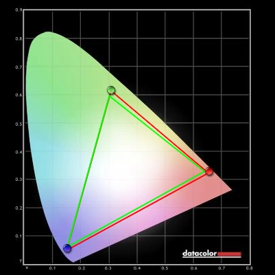
Colour gamut test settings
Colour in games and movies
Viewing angles
Interpolation
Full scaling
![]()
1:1 scaling
Responsiveness
Input lag
Pixel responsiveness
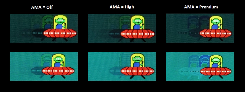
Trailing with various AMA settings
Responsiveness in games and movies
Conclusion
Positives Negatives After minor OSD adjustments colours were vibrant and varied. Coupled with the full sRGB colour gamut, 10-bit colour processing and quite strong viewing angles this provided the best VA colour experience we’ve witnessed Colour consistency not quite up to IPS levels. Some minor OSD tweaks required to improve the colour accuracy and provide a more comfortable image, but nothing major Excellent contrast complimented by a pleasingly ‘smooth’ look to the image from the very light matte screen surface. Great depth and atmosphere to dark scenes in particular A minor degree of ‘black crush’ but still appropriate detail maintained overall. The static contrast wasn’t as high as we’ve seen on some VA models but was still firmly in ‘VA only’ territory Much improved responsiveness compared to older AUO VA panels and current VA panels from other manufacturers such as CMO. Good balance to the ‘AMA High’ solution without obtrusive overdrive artifacts A moderate degree of input lag may deter some users as may some of the slightly slower transitions that all VA panels suffer from and 60Hz refresh rate. These transitions can only be sped up by artifact-inducing voltage surges (i.e. ‘AMA Premium’) A very solid build with good ergonomic flexibility, VESA mounting, plenty of ports and an intuitive OSD system with useful ‘Low Blue Light’ modes and remote controller Not the cheapest monitor out there, but quite a good price for the quality on offer really
![]()

