Author: Adam Simmons
Date published: March 5th 2018
Table of Contents
Introduction
When it comes to a combination of high pixel density and a good amount of useful screen ‘real-estate’, ~32” UHD models stand out as excellent choices. The ASUS PA32UC adopts a 32” ‘4K’ UHD IPS-type panel and couples it with a number of attractive features, including support for wide colour gamuts and HDR for both AMD and Nvidia users to enjoy. For users with compatible AMD GPUs, Adaptive-Sync and hence AMD FreeSync variable refresh rate technology can also be used. As a member of the ProArt series, a key focus is on its colour reproduction characteristics. We’ll explore this alongside the other performance and external characteristics of the monitor in this review.
Specifications
This monitor uses a 60Hz AHVA (IPS-type) panel, with a resolution of 3840 x 2160 (‘4K’ UHD). 10-bit colour is supported, with a hardware-addressable 14-bit LUT included for enhanced mapping precision and flexibility. A 5ms grey to grey response time is also specified. Some key ‘talking points’ of the specification have been highlighted in blue below, for your reading convenience.
Features and aesthetics
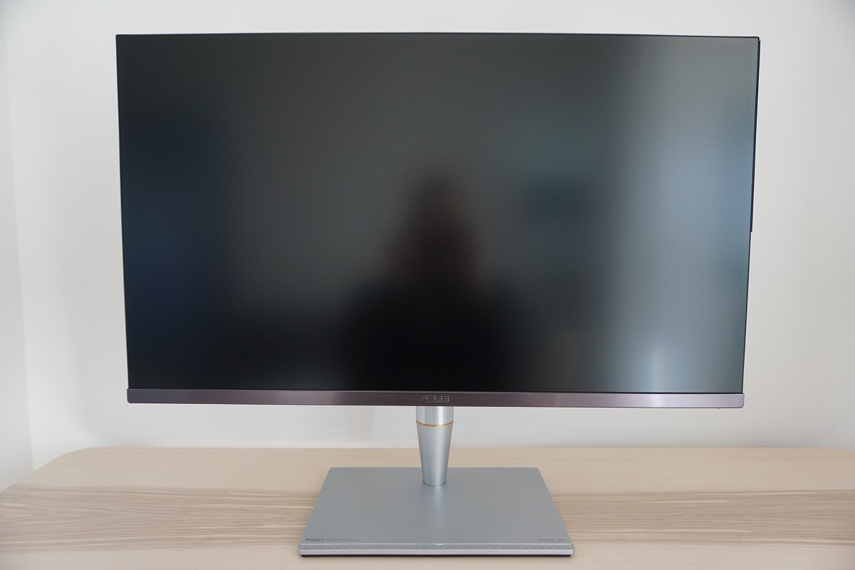
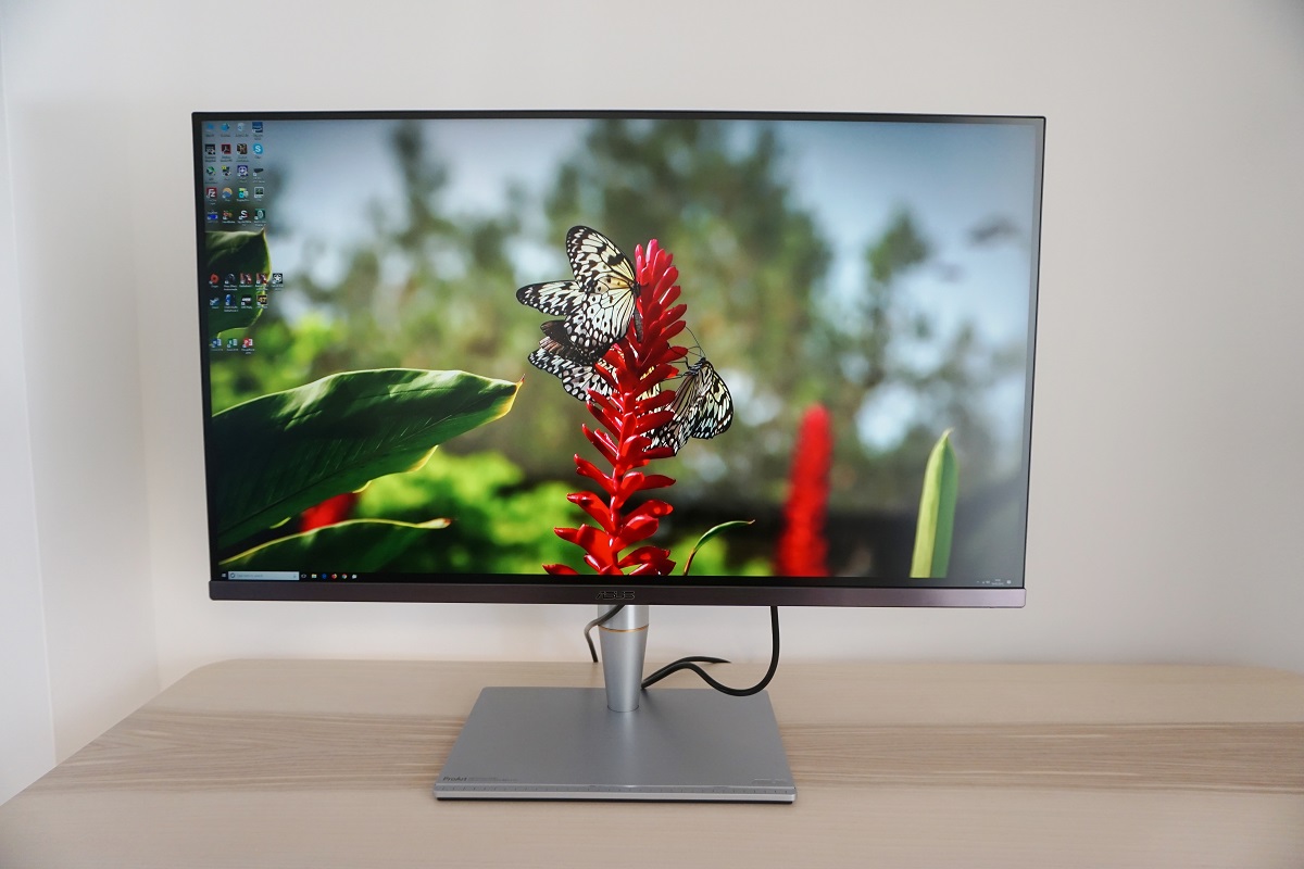
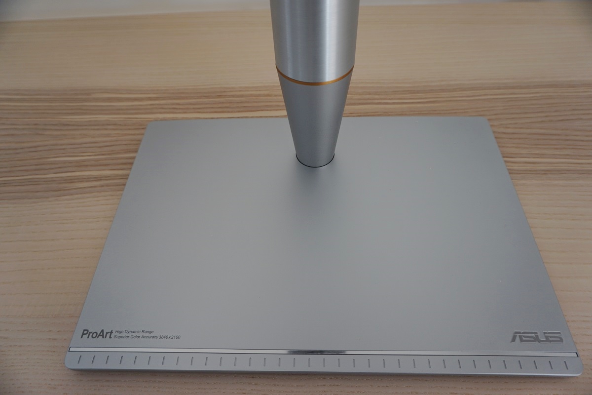
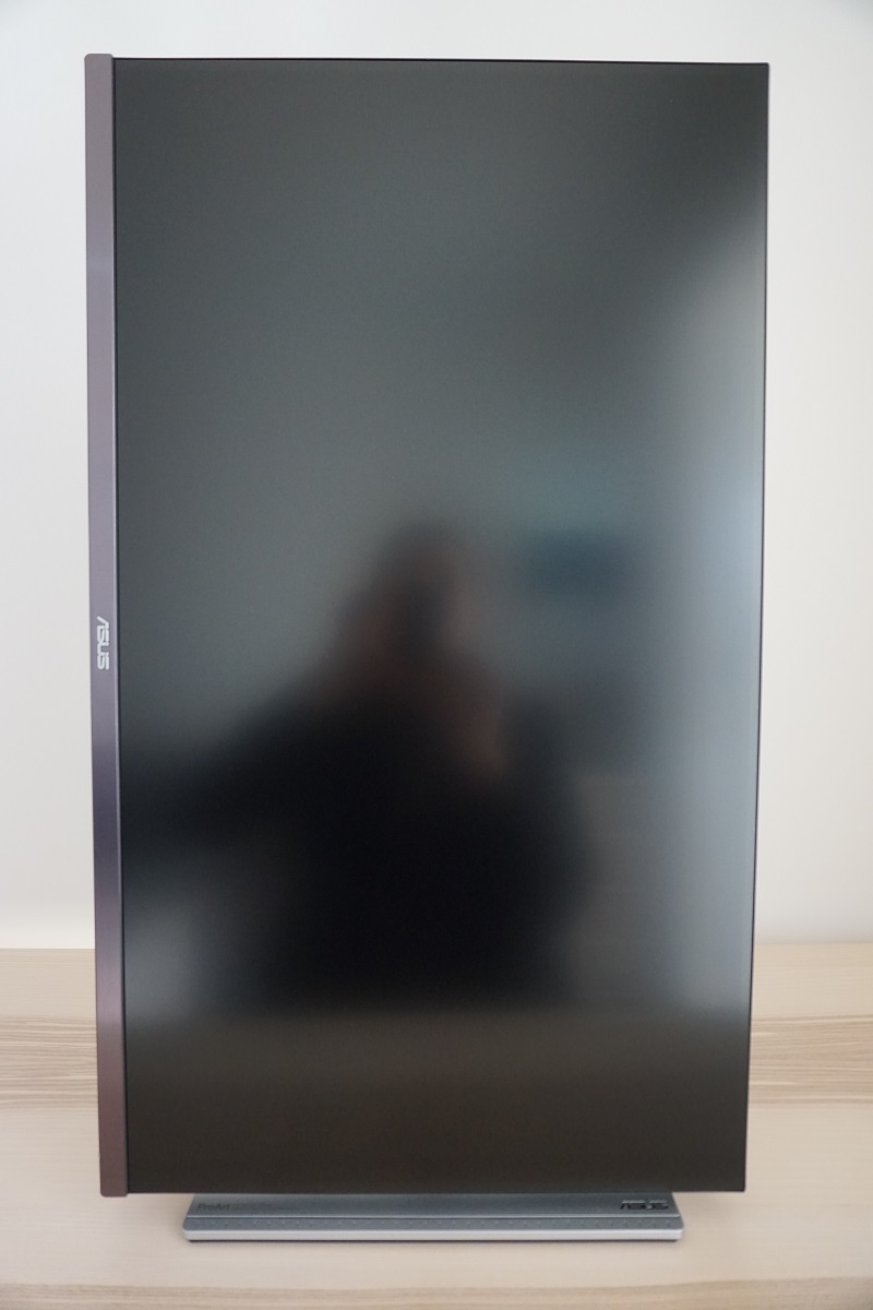
From the front the monitor looks sleek and modern, with brushed metal used on the stand base and neck for a high-quality look and feel. Further up the neck, below the screen line depending on stand height, there is what ASUS refers to as an ‘icicle gold ring’. This separates the stand neck out into a straight-sided cylindrical upper section and a sloped lower section. The upper section is brushed metal, whilst the lower section is powder-coated metal. The stand base is also powder-coated metal, with cm scale markings at the front of the upper surface. The bezels are very slim with a dual-stage design comprising a very slim hard outer section and a slender panel border. With both elements considered, the total bezel width is ~8.5mm (0.33 inches) at the top and sides and ~18.5mm (0.73 inches) at the bottom. The bottom bezel has a dark grey brushed metal finish. The screen itself dominates most of the monitor area, with a very light matte anti-glare screen surface. This is explored later.
The OSD (On Screen Display) is controlled by a combination of pressable buttons and a joystick at the rear of the monitor, running vertically down the right side (as viewed from the front). The video below runs through the functionality of the menu system.
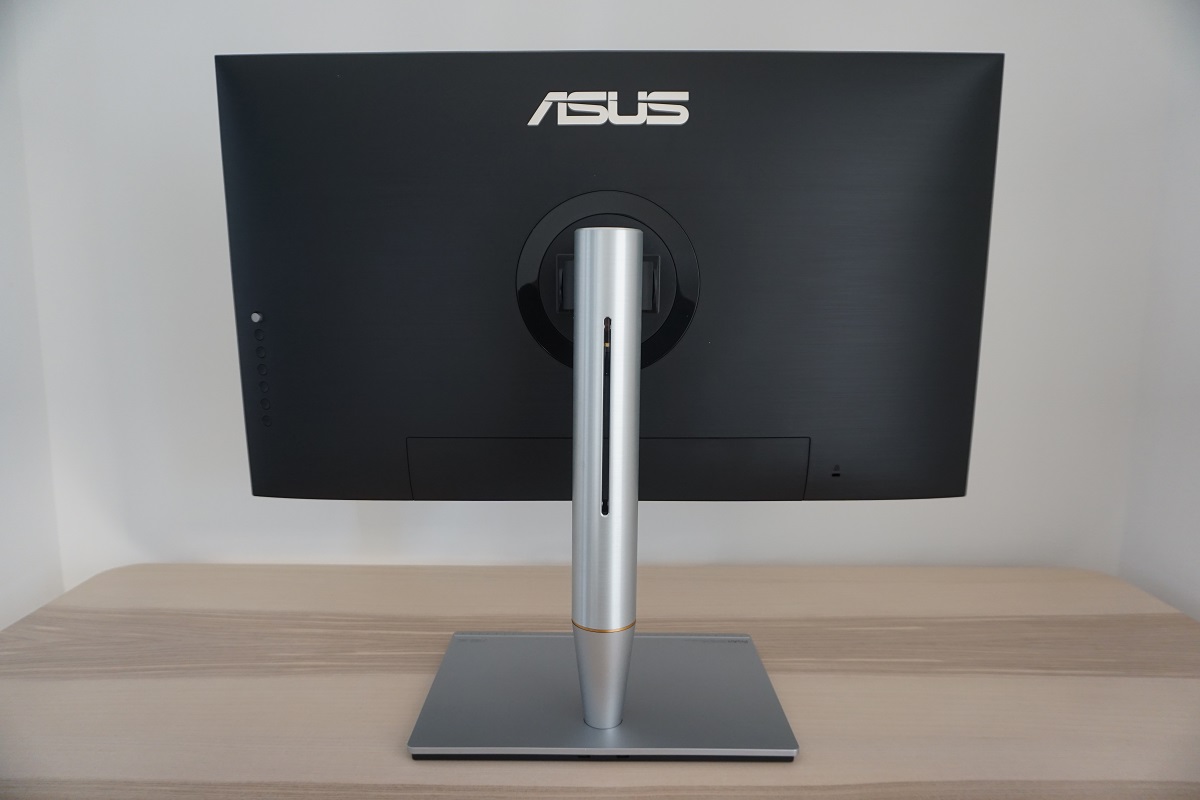
From the side the monitor is reasonably slim, ~31mm (1.22 inches) at thinnest point and lumping out centrally towards the stand attachment point. The solid-looking stand is really the key feature here. As well as looking solid, it feels solid due to the use of metal rather than plastic for the outer materials. The stand provides good ergonomic flexibility; tilt (-5° to 23°), height (130mm or 5.12 inches), swivel (60° left, 60° right) and pivot (90° clockwise and anti-clockwise rotation into portrait). At lowest height the screen clears the desk by ~51mm (2.00 inches), with the top of the screen ~476mm (18.74 inches) above the desk surface. The total depth of the monitor is ~230mm (9.06 inches), with the screen itself sitting just a few cm back from the front edge of the stand base. This means the monitor is reasonably deep and can’t be pushed too close to the wall using the included stand, so bear that in mind if you don’t have a deep desk.
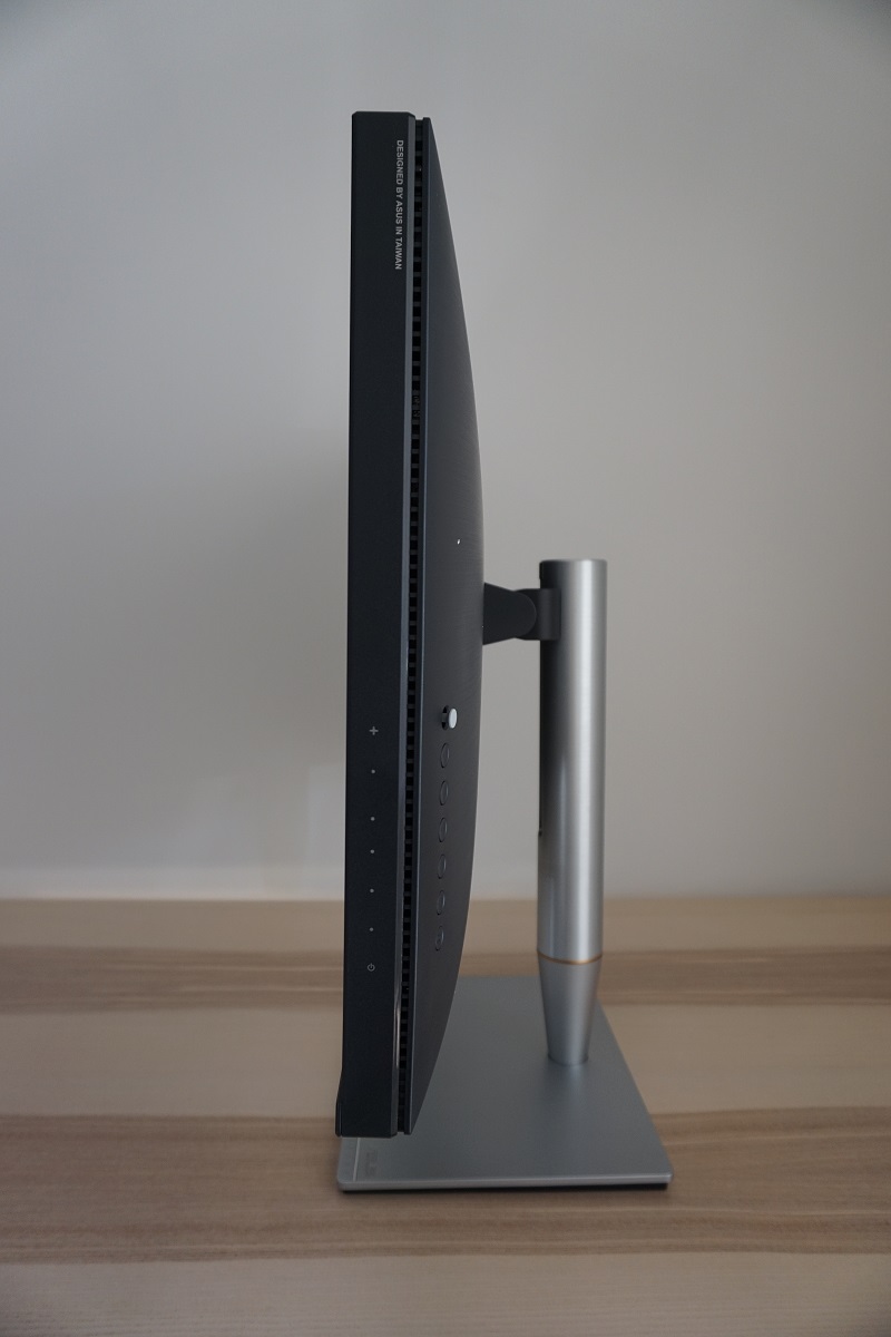
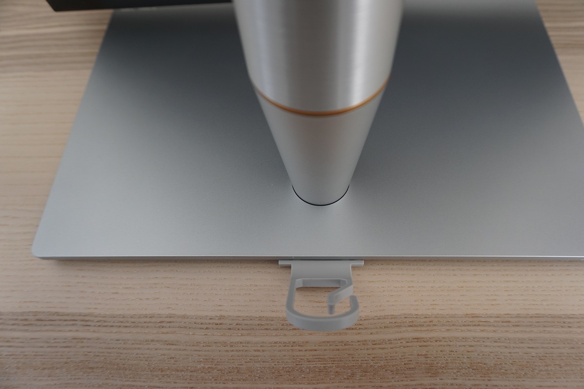
The rear of the monitor gives another view of the shiny stand, with the rear of the screen itself covered with a brushed-textured matte black plastic. The stand attaches using a quick-release mechanism (button faces downwards just in front of the DisplayPort input) and can be removed to make way for an alternative 100 x 100mm VESA compatible solution if preferred. Towards the left side you can see the OSD controls explored earlier. Towards the bottom right there is a K-Slot. The ports face downwards? in the bottom central region, beneath a removable port cover. They include a generous selection of modern standards; AC power input (internal power converter), on/off switch, 4 HDMI 2.0b ports, DP 1.2a, 2 Thunderbolt 3 ports (1 input, 1 output), USB-C, 2 USB 3.0 (Type A) ports (plus upstream) and a 3.5mm headphone jack. The monitor also includes two up-firing 3W speakers. These provide a reasonably rich sound output that is less tinny that some integrated speakers, although not as full and bass-rich as some higher power speakers. The ‘ASUS SonicMaster’ speakers found on some larger Designo models, for example.
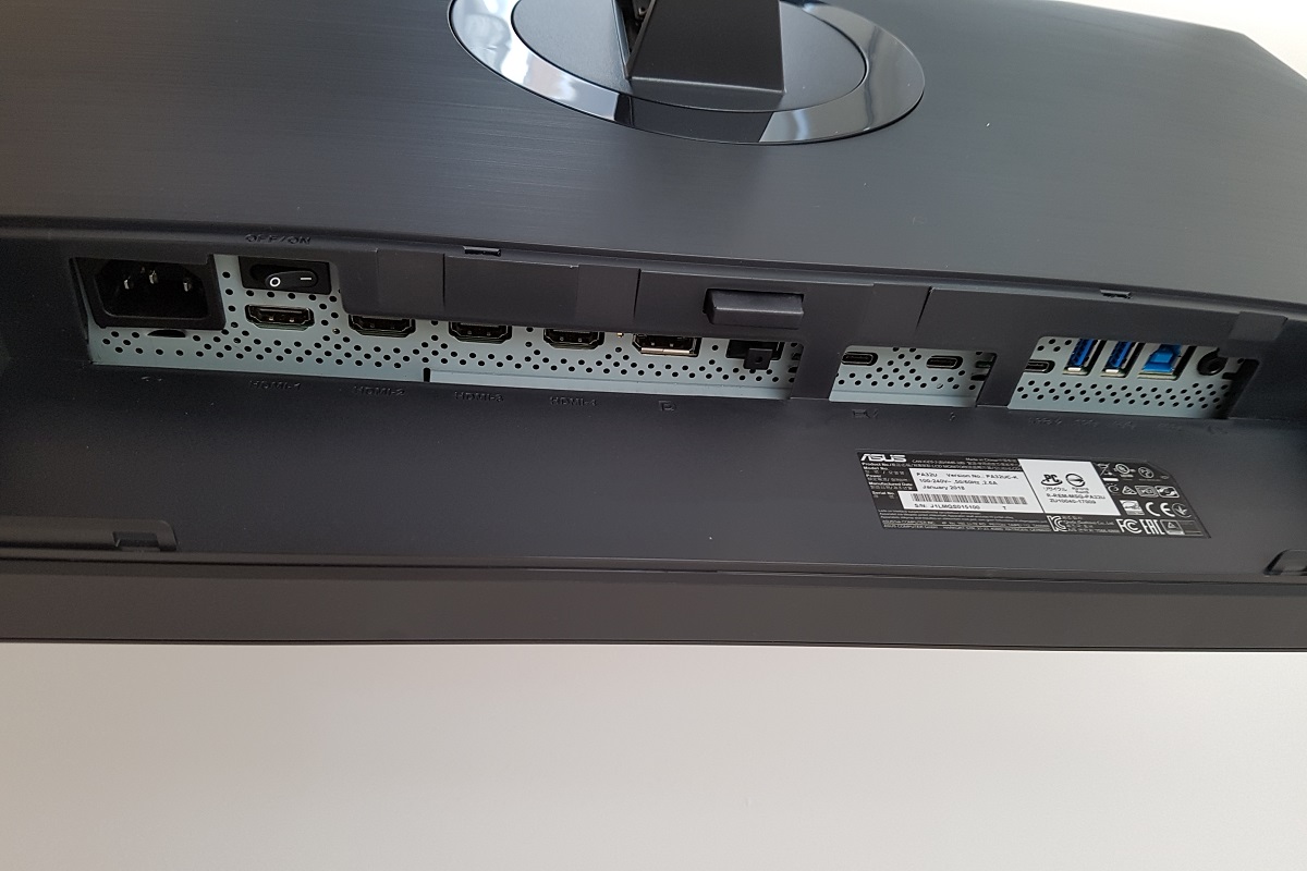
Adaptive-Sync (and hence AMD FreeSync) is supported for compatible GPUs and systems via DisplayPort 1.2a and Thunderbolt 3 on this monitor. HDCP2.2 is supported via DP, HDMI and Thunderbolt 3 as well. All of the inputs support HDR on compatible systems. Standard accessories include a DP cable, HDMI cable, USB 3.0 cable, Thunderbolt 3 cable and a power cable. There is also a model sold in a limited number of regions that includes an X-Rite i1Display Pro as an accessory, the PA32UC-K.
Calibration
Subpixel layout and screen surface
The image below is a macro photograph taken on Notepad with ClearType disabled. The letters ‘PCM’ are typed out to help highlight any potential text rendering issues related to unusual subpixel structure, whilst the white space more clearly shows the actual subpixel layout alongside a rough indication of screen surface. A very light matte anti-glare screen surface is used here, which some users may refer to as ‘semi-glossy’. This provides decent glare handling characteristics whilst also allowing fairly direct emission of light from the monitor, as far as matte surfaces go (refer to this article). This helps retain a good degree of clarity and vibrancy. The screen surface texture is fairly smooth, although not the smoothest we’ve seen. There is a light misty graininess visible when viewing light shades, in particular white, which is still preferable to the heavy/smeary graininess associated with some matte screen surfaces.
![]()
As shown above, the monitor uses the standard RGB (Red, Green and Blue) stripe subpixel layout. This is the default expected by modern operating systems such as Microsoft Windows and Apple MacOS. You needn’t worry about text fringing from non-standard subpixel layouts as a Mac user and don’t need to run ClearType as a Windows user – although you may wish to adjust this according to preferences. We did not identify any issues related to text rendering on this model and indeed text clarity is an obvious strength of this screen.
Testing the presets
This monitor comes with various ‘Splendid’ presets; ‘Standard Mode’, ‘sRGB Mode’, ‘Adobe RGB Mode’, ‘Rec.2020 Mode’, ‘DCI-P3 Mode’, ‘HDR Mode’, ‘User Mode 1’ and ‘User Mode 2’. A range of other settings can be configured in the OSD, as explored in the video earlier. We will be testing these (with the exception of ‘User Mode 2’, as it is identical to ‘User Mode 1’ by default) and a range of other settings for this section. The following table shows some key readings taken using a Datacolor Spyder5ELITE colorimeter, alongside general observations and a list of ‘Extra OSD Settings’ which are available in some presets but not others. The monitor was left to run for at least 2 hours before readings were taken. It was connected via DP, using the supplied cable, to a Windows 10 system using a Club3D Radeon R9 290 royalAce FreeSync-compatible GPU. HDR testing deeper into the review was performed using an Nvidia GTX 1070, again connected via DP. For the purposes of this table, our observations were very similar using GPUs from either vendor. We also tested using HDMI and the observations were similar once the colour signal was corrected (as directed in this article). The monitor was left in its ‘plug and play’ state, without additional drivers or ICC profiles specifically loaded. Unless otherwise stated, assume factory defaults were used, with the exception of ‘Dynamic Dimming’ being disabled. This is explored separately later on. When viewing the figures in this table, note that for most PC users ‘6500K’ for white point and ‘2.2’ for gamma are good targets to aim for.
| Preset Mode | Gamma (central average) | White point (kelvins) | Extra OSD features | Notes |
| Standard Mode | 2.2 | 7863K | Color (Brightness, Contrast, Saturation, Hue, Color Temp., Gamma, Advanced Setting), Image (Sharpness, Trace Free, Uniformity Compensation*, VividPixel, Motion Sync), PIP/PBP | Image is bright, cool-tinted, heavily saturated and overly sharp (can be corrected in this mode). Normal sRGB content appears heavily oversaturated due primarily to the wide colour gamut in this mode. This achieves more extreme saturation than standard gamut models can display, even if digital saturation is increased (e.g. using Nvidia Digital Vibrance Control). An excellent variety of shades is also represented as there is no compression within the gamut. Workflows that leverage such a colour gamut appear with appropriate saturation levels. |
| sRGB Mode | 2.2 | 7818K | Image (Trace Free, Uniformity Compensation*, VividPixel, Motion Sync), PIP/PBP | This is an sRGB emulation mode. The image appears far less saturated and in some respects ‘washed out’. Especially when compared to factory defaults, but also compared to many modern monitors with standard colour gamuts. We explore the colour gamuts of various modes deeper into the review. The cool tint and excessive sharpness remains and since you have no control over sharpness or colour channels in this mode, it limits its appeal. |
| Adobe RGB Mode | 2.2 | 7862K | Color (Brightness, Contrast, Saturation, Hue, Advanced Setting), Image (Sharpness, Trace Free, Uniformity Compensation*, VividPixel, Motion Sync), PIP/PBP | This is an Adobe RGB emulation mode. You get lower saturation than factory defaults but still heavy saturation of common (sRGB) content. The cool tint and excessive sharpness remains, both correctable in this mode. |
| Rec.2020 Mode | 2.2 | 7861K | Color (Brightness, Contrast, Saturation, Hue, Color Temp., Gamma, Advanced Setting), Image (Sharpness, Trace Free, Uniformity Compensation*, VividPixel, Motion Sync), PIP/PBP | This is a Rec.2020 emulation mode (although 85% Rec.2020 is specified). Similar to factory defaults in terms of sharpness (correctable), overall shade saturation and white point balance. Some shades appear slightly more saturated and some slightly less. |
| DCI-P3 Mode | 2.9 | 6517K | Color (Brightness, Contrast, Saturation, Hue, Advanced Setting), Image (Sharpness, Trace Free, Uniformity Compensation*, VividPixel, Motion Sync), PIP/PBP | This is a DCI-P3 emulation mode. The gamut is cut down compared to native to bring it more in line with the DCI-P3 standard. The gamma is very high, so coupled with the still generous colour gamut sRGB content looks noticeably deeper and more saturated than usual. At 2.9 average recorded gamma, it overshoots the ‘2.6’ associated with the DCI-P3 standard as well. White point balance is better, but the image remains excessively sharp (correctable). |
| HDR Mode | 3.7 | 7568K | Image (Trace Free, Uniformity Compensation*, VividPixel, Motion Sync) | The image looks completely overblown and unpleasant to look at. As if a weird photoshop filter has been applied. Can’t really see the point in this setting given that it looks completely wrong when displaying any content imaginable (except for pure black or white). And when the monitor detects HDR content, it automatically switches to a proper HDR mode anyway. |
| User Mode 1 | 2.3 | 7558K | Color (Brightness, Contrast, Saturation, Hue), Image (Sharpness, Trace Free, VividPixel, Motion Sync) | Similar to factory defaults, although slightly looser calibration (especially with respect to gamma). These ‘User Mode’ settings are primarily designed to be overwritten using the hardware calibration capabilities of the display, however. |
| Gamma = 1.8 | 1.8 | 7874K | Color (Brightness, Contrast, Saturation, Hue, Color Temp., Gamma, Advanced Setting), Image (Sharpness, Trace Free, Uniformity Compensation*, VividPixel, Motion Sync), PIP/PBP | As factory defaults but gamma significantly lower. This doesn’t make everything look ‘washed out’ as it usually would, because the colour gamut and saturation levels remain strong. It does knock off grey shades most noticeably and upset overall shade balance, lightening some shades up. |
| Gamma = 2.0 | 2.0 | 7873K | Color (Brightness, Contrast, Saturation, Hue, Color Temp., Gamma, Advanced Setting), Image (Sharpness, Trace Free, Uniformity Compensation*, VividPixel, Motion Sync), PIP/PBP | As above but slightly more depth to the affected shades. |
| Gamma = 2.4 | 2.4 | 7875K | Color (Brightness, Contrast, Saturation, Hue, Color Temp., Gamma, Advanced Setting), Image (Sharpness, Trace Free, Uniformity Compensation*, VividPixel, Motion Sync), PIP/PBP | As per factory defaults with extra depth and a deeper look. |
| Gamma = 2.6 | 2.6 | 7862K | Color (Brightness, Contrast, Saturation, Hue, Color Temp., Gamma, Advanced Setting), Image (Sharpness, Trace Free, Uniformity Compensation*, VividPixel, Motion Sync), PIP/PBP | As above but extra depth – a strikingly deep look to many shades. |
| Blue Light Filter = Level 1 | 2.2 | 6666K | Color (Brightness, Contrast, Saturation, Hue, Color Temp., Gamma, Advanced Setting), Image (Sharpness, Trace Free, Uniformity Compensation*, VividPixel, Motion Sync), PIP/PBP | This is (supposed to be) a Low Blue Light (LBL) setting. Rather ominously, we measured 6666K as the white point. The blue light emission from the monitor is still relatively high, even if reduced compared to the factory defaults. There is also a slight green tint. |
| Blue Light Filter = Level 2 | 2.2 | 6445K | Color (Brightness, Contrast, Saturation, Hue, Color Temp., Gamma, Advanced Setting), Image (Sharpness, Trace Free, Uniformity Compensation*, VividPixel, Motion Sync), PIP/PBP | As above but image appears slightly warmer. Again, we wouldn’t consider this an effective LBL setting. |
| Blue Light Filter = Level 3 | 2.2 | 6242K | Color (Brightness, Contrast, Saturation, Hue, Color Temp., Gamma, Advanced Setting), Image (Sharpness, Trace Free, Uniformity Compensation*, VividPixel, Motion Sync), PIP/PBP | As above but warmer still. A mild LBL effect here. |
| Blue Light Filter = Level 4 | 2.2 | 5140K | Color (Contrast, Saturation, Hue, Color Temp., Gamma, Advanced Setting), Image (Sharpness, Trace Free, Uniformity Compensation*, VividPixel, Motion Sync), PIP/PBP | This mode is an effective LBL setting, significantly reducing the white point and giving a warm (and noticeably green) look to the image. The brightness is also reduced significantly, and the brightness control locked off. Reduced screen brightness is an important part of reducing blue light emission, which is why this has been done. |
| Color Temp. = 5000K | 2.2 | 5859K | Color (Brightness, Contrast, Saturation, Hue, Color Temp., Gamma, Advanced Setting), Image (Sharpness, Trace Free, Uniformity Compensation*, VividPixel, Motion Sync), PIP/PBP | An alternative LBL setting, giving a warmer look to the image. Compared to the ‘Blue Light Filter’ settings it is better balanced in terms of the green channel. Also, this setting is independent of colour channel ‘Gain’ controls, potentially enhancing the effect (see commentary below). |
| Test Settings (as below) | 2.2 | 6497K | Color (Brightness, Contrast, Saturation, Hue, Color Temp., Gamma, Advanced Setting), Image (Sharpness, Trace Free, Uniformity Compensation*, VividPixel, Motion Sync), PIP/PBP | An edge has been taken off the saturation compared to factory defaults, although saturation is still strong. Things look lively and vibrant, whilst the white point is well-balanced and gamma handling remains strong. |
*Uniformity Compensation can only be activated with ‘Dynamic Dimming’ disabled. The Uniformity Compensation setting, as explored later, is set in the factory. The exceptions are ‘User Mode 1’ and ‘User Mode 2’, where a colorimeter can be used to setup the Uniformity Compensation during hardware calibration (see below).
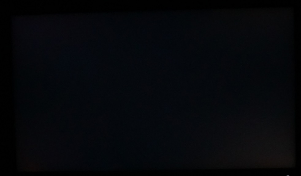
The monitor comes factory calibrated with a range of colour space emulation modes included as ‘Splendid presets’. A 2-page report specific to the ‘sRGB’ and ‘Adobe RGB’ modes is included with each unit, as shown below. What we would say is that we were a bit surprised to see the white point so far from the 6500K (D65) daylight target in all the Splendid presets bar one (DCI-P3). We tested using DP and HDMI using both our AMD and Nvidia GPUs. We also performed testing using our basICColor SQUID 3 (X-Rite i1Display Pro) to see if the Spyder5ELITE was throwing out spurious values. No significant changes to colour temperature were observed and it was nowhere near 6500K – this was clear from a visual assessment as well, without any instrument being used. Nonetheless, with appropriate tweaks this was quite easy to change. Furthermore, the gamma tracking was impressive for the most part and the colour gamut emulation (explored later) also worked well in most cases. Ironically, the mode with the white point as we’d expect it to be (DCI-P3, 6517K recorded) had the wonkiest gamma. Missing the ‘2.6’ target set for DCI-P3 significantly, with a ‘2.9’ average gamma. Regardless of how good any presets may or may not be out of the factory, colour balance changes over time. And to get the best out of the product, full calibration and frequent re-calibration of your own unit using your own colorimeter is desirable. Traditional ‘software calibration’ relies on making changes at the GPU level, for example using ICC profiles to modify the GPU’s LUT and gamma tables. Hardware calibration makes changes to the monitor itself and making use of these changes is as generally as simple as selecting a preset on the monitor. You don’t need to worry about software incompatibilities (games can be annoying in this respect) and the results at a fine level are generally superior. The PA32UC supports hardware calibration, with a 14-bit LUT that can be addressed using ‘ASUS ProArt Calibration Software’ and a compatible colorimeter (Datacolor Spyder5 or X-Rite i1Display Pro). Everything you need to get started with this, included relevant downloads, can be found on this ASUS support article. We won’t be delving into this in too much depth, but we did have a play with the software using our X-Rite i1Display Pro and both our Nvidia GTX 1070 and AMD Radeon R9 290. The process itself can be a bit frustrating, as there are times when you will be told that data is being sent to the monitor and it could take a while. With no indication of how long – sometimes you may even think the program has crashed. The worst example of this is if you wish to re-apply specific profiles you’ve saved to the ‘User Modes’ or re-jig them. You aren’t given an ounce of feedback during the ‘uploading’ process from the program itself. You’ll know it’s still busy as you’ll get a ‘loading’ style mouse cursor when you hover over the program and you’ll see the monitor switch between various ‘image states’ during the process. We’d advise making yourself a cup of tea or preferred beverage of choice during this process. The calibrations themselves were generally accurate in our testing via DP on both our AMD Radeon R9 290 and Nvidia GeForce GTX 1070, via both DP and HDMI. Having said that, sometimes the accuracy was significantly better than other times. During some calibration runs, using the ‘Standard’ setup for the software (2.2 gamma, 6500K whitepoint, sRGB gamut) the DeltaE values were significantly tighter (<2 max vs. >3.5 max). In some cases gamma tracking was also better (~2.2 vs. ~2.3) and so was white point (~6300K vs. ~6500K). So you will probably want to run through the calibration process multiple times until you get the desired results. It’s quite usual for any calibration process to throw in a bit of variation, with some calibration runs offering better results than others, although the variability here did seem a bit extreme in some cases. And with such inconsistencies it becomes rather time-consuming and can put users off wanting to re-calibrate in the future. Also, just make sure that you press ‘Save’ rather than ‘Finish’ after you have completed the calibration (see image below). We also tested out some non-standard parameters. We were able to overwrite one of the ‘User Mode’ presets with a convincing calibration that included our preferred ‘2.2’ gamma and 6500K white point targets but targeted the DCI-P3 colour space. This is really our preferred level of saturation (personal preference) as it’s less overblown than the native gamut of the monitor whilst offering superior vibrancy and colour range to sRGB. It’s also fairly similar to some standard gamut monitors using Quantum Dot backlights. You can of course set things according to your own needs and, if desired, perform ‘Uniformity Compensation’ (UC) using either a 3×3 or 5×5 grid pattern. We performed this process using the above targets and a 5×5 grid, with results are included in the ‘Luminance uniformity’ section. As with the calibration process itself, we found the luminance uniformity process a bit inconsistent. Sometimes it clearly didn’t work as the screen would appear with obvious bands of dimness and generally off colours. Having to repeat this process multiple times to get good results isn’t ideal as it’s quite a long process that involves constant attention (and moving of the colorimeter to various points of the screen). Also note that you need to disable scaling in Windows (use 100%) when performing UC or the test patches will appear off the screen. We couldn’t work out how (or even if it’s possible to) export a saved profile and allow users to apply it to their own monitors. Given this, we decided to focus our ‘Test Settings’ on changes that could be made in the OSD alone without any additional calibration. We preferred the (slightly more constrained) saturation levels of our hardware calibration over this but found our ‘Test Settings’ to be a decent compromise. Things certainly looked closer to the ‘lively’ rather than ‘washed out’ end of the spectrum, and the balance elsewhere (gamma and white point) was pleasing. The graph below shows gamma tracking under our ‘Test Settings’ – tracking for all of the presets that average ‘2.2’ gamma was similar to this. To round this section of, we feel it’s right to mention something about the Low Blue Light (LBL) settings of the monitor. Activating a ‘Blue Light Filter’ setting resets colour channel ‘Gain’ to 50 per channel, and they remain that way even if the setting is then deactivated. Which is annoying if you like to quickly activate them and deactivate them but have made changes to the colour channels for your regular daytime use. Fortunately setting ‘Color Temp.’ to ‘5000K’ proved an effective LBL setting and is a change applied on top of any changes to ‘Gain’. We used this as an LBL setting for our own viewing comfort in the evenings, over the top of our ‘Test Settings’. And simply changed ‘Color Temp.’ to ‘6500K’ to deactivate it. Used in conjunction with our ‘Test Settings’ (which target 6500K), the ‘5000K’ colour temperature option did actually bring the colour temperature to ~5000K which is appropriate for an LBL setting. For added convenience you can assign the ‘Color Temperature’ option to one of the OSD shortcut keys as well, as explored in the OSD video. As noted previously, our ‘Test Settings’ involved various changes to the OSD settings alone. Brightness was lowered and changes were made to the RGB gain controls plus the ‘Six-axis Saturation’ sliders. The sharpness was also lowered to ‘0’, which made things look as they should without fringing or a filtered look. We have no idea why ASUS opted for ‘50’ as the default sharpness setting as it clearly looked ugly and wrong. Note that it’s possibly this will change in future firmware revisions, so be sure to set this according to what you see and prefer on your own unit. The same goes for other settings; these are not to be considered optimal for all units or tastes. Ideally users should make use of the hardware calibration functionality of the monitor as mentioned previously. Anything not mentioned here was left at default in the OSD, including ‘Contrast’ and ‘Gamma’. Aside from the HDR section, all of our testing was performed with applications and the monitor running in their normal SDR state. Brightness= 44 (according to preferences and lighting) Six-axis Saturation R= 48 Six-axis Saturation G= 35 Six-axis Saturation B= 45 Six-axis Saturation C= 45 Six-axis Saturation M= 40 Six-axis Saturation Y= 50 R Gain= 50 G Gain= 43 B Gain= 39 Sharpness= 0 Trace Free= 60 Adaptive-Sync= On (AMD GPU only) We used a BasICColor SQUID 3 (X-Rite i1Display Pro) to measure white and black luminance levels, from which static contrast ratios could be calculated. The table below shows this data with a range of settings used, including those covered in the calibration section and a few extras. Assume any setting not mentioned was left at default, except for the changes already mentioned in the calibration section. Black highlights indicate the highest white luminance, lowest black luminance and maximum contrast ratio recorded without ‘Dynamic Dimming’ or HDR active. Blue highlights show the results with HDR active and also under our ‘Test Settings’. The average contrast ratio with only brightness adjusted was 842:1, which is a touch below the specified 1000:1 but perfectly acceptable given the level of calibration included. The peak contrast ratio (without ‘Dynamic Dimming’) was recorded using the ‘HDR’ preset (but still displaying SDR content) at 1170:1 – likely because it uses a much weaker calibration. Following the changes made to our ‘Test Settings’, contrast dipped slightly to 765:1 – still decent given the extent of the tweaks made. The lowest contrast ratio recorded was 648:1, with the ‘Uniformity Compensation’ setting enabled. A drop in contrast is typical for such modes as white levels are digitally adjusted to compensate for brightness variation. The ‘Blue Light Filter’ had only a minor effect on contrast, as did the ‘5000K’ LBL setting. The highest white luminance recorded without ‘Dynamic Dimming’ was 316 cd/m², whilst the lowest white luminance recorded was 36 cd/m². This gave a 280 cd/m² luminance adjustment range. With HDR active using the most dynamic ‘HDR 2’ setting, we measured an exceptionally bright (for a monitor) white luminance of 1122 cd/m² (778 cd/m² using ‘HDR 1’) and contrast ratio of >112,200:1 (>77,800 using ‘HDR 1’). The methodology is not rigorously scientific and the measurements were taken under optimal conditions, with just the right amount of pure white and pure black with no other shades interfering. Nonetheless it shows that the monitor slightly exceeded the 1000 cd/m² specified by ASUS and provided very strong HDR contrast under the right conditions. We also tested the monitor using its ‘Dynamic Dimming’ feature without HDR active, with both features explored later. This controls the backlight not just as a single unit, as in its regular operation, but splits it into 384 dimming zones with independent luminance control for each. We tested 4 different patch (square measurement zone) sizes with the colorimeter and this setting enabled, using the default brightness for the monitor (‘50’); 60mm², 120mm², 180mm² and 240mm². Note that 60mm² is the smallest patch size possible whilst correctly covering the sensor area of the colorimeter. The dimming certainly worked, as you can see from the table. It’s important not to get too carried away with the very low black luminance where a black background was used and the very high resulting contrast ratio. A black patch and black background simply equals a black screen fill – it’s nice to see the monitor dim extremely effectively for that, but not very useful in the real world. What’s more interesting are the other results. The white luminance recorded was increased with increasing patch size and where a white rather than black background was used. This is because that creates a relatively large area of very light shade (white), allowing the dimming zones to brighten up nicely. An increasing (black) patch size with white background yielded an ever-impressive reduction in the measured black point and increase in measured contrast ratio. This also increased the contrast ratio measured, with a 120mm² patch yielding 2210:1 which is far beyond what an IPS-type panel without local dimming is capable of. The 180 mm² patch yielded a 5525:1 contrast ratio, beyond many VA LCDs, without local dimming. The 240 mm² patch yielded a 11050:1 contrast ratio which far outclasses any LCD monitor without local dimming technology. It was certainly nice to see the ‘Dynamic Dimming’ feature perform well here, but obviously in the real-world scenes comprise a far more intricate mixture of shades. We explore how the technology works out in practice (both with and without HDR enabled) a little later. The PA32UC does not use PWM (Pulse Width Modulation) to regulate backlight brightness at any level and instead uses DC (Direct Current). However; at a brightness level of ‘80’ or below, low amplitude and high frequency oscillation is present at a frequency of ~2kHz. This was detectable using an oscilloscope. Unlike PWM, this does not involve the backlight switching ‘on’ and ‘off’ or exhibiting significant brightness changes. Rather, it means there are slight fluctuations in brightness, at a recordable frequency, rather than there being a constant and smooth oscilloscope trace. This occurs regardless of whether ‘Dynamic Dimming’ is active or not. Due to the high frequency and low amplitude of these oscillations, it’s very unlikely to be bothersome to users even if they are moderately sensitive to flicker. It is still acceptable for ASUS to market this monitor as ‘flicker-free’ and users should really consider it as such. The exception to this is with ‘Motion Sync’ active where the backlight has distinct ‘on’ and ‘off’ cycles at 120Hz. This always occurs at a frequency of 120Hz when using this feature, regardless of whether you select ‘24p’, ‘120Hz’, ‘240Hz’, ‘480Hz’ or ‘960Hz’. Observing a black screen in a dark room under our ‘Test Settings’ revealed some backlight bleed and clouding, particularly towards the bottom right corner of the screen. This is shown in the image below, taken in a dark room using camera settings that quite accurately represent what the eyes see when observing the screen. The image was also taken a sufficient distance back to eliminate any ‘AHVA glow’. This silvery or golden glow (depending on viewing angle) is visible most noticeable towards the bottom corners of the screen from a normal viewing position and ‘blooms out’ as viewing angle is sharpened. Note that individual units vary when it comes to backlight bleed and clouding. Also note that the ‘Dynamic Dimming’ feature was disabled, as per our ‘Test Settings’. With this setting enabled, all zones of the backlight pretty much shut off completely and it looks quite like the monitor is off when viewing an all-black screen. Not really very interesting to show in a photo nor very useful to represent how things will look ‘in the real world’ – unless you like to stare at black screen fills. Under our ‘Test Settings’ (top table), the luminance uniformity was very good, with a 7% maximum deviation recorded and a 3.88% average deviation. Applying the factory UC setting (middle table) actually provided worse results here, with a 11% maximum deviation and 6.25% average deviation. The calibrated UC setting (bottom table), on the other hand, provided the strongest results. Note that individual units vary when it comes to uniformity. Furthermore, note that you can expect further deviation beyond the measured points. Here there was a 4% maximum deviation and 2.38% average deviation, which is excellent. The contour maps below give a graphical representation of the deviations. Darker greys represent lower luminance and therefore greater deviation from the central point than lighter greys. Deviations in colour temperature (white point) were also assessed, using the same 9 quadrants. Deviations here are assigned DeltaE values, with higher values representing greater deviation from the D65 (6500K) daylight white point target than lower values. The contour map below shows this, with stronger shades indicating greater deviation from the 6500K target. A DeltaE of >3 here is considered significant deviation that most users could notice quite readily by eye. The results here were good in all cases. Under our ‘Test Settings’ (top graphic) the maximum deviation recorded was DeltaE 2.4. With the factory UC setting (middle graphic) the maximum deviation dropped to Delta E 1.5 and with the calibrated UC setting (bottom table) to 1.2. As with other aspects of uniformity, individual units vary – but it was nice to see a good performance here on our unit and that UC did its thing. Also note that you can expect further deviation beyond the measured points. Because it is such a large screen, even though colour consistency is relatively strong, you may notice slight perceived deviations at the far edges. If you’re sitting fairly close to the monitor (<60cm or so) you may notice the extreme edges appearing a bit cooler and dimmer. This effect was minimal on our unit from our preferred viewing distance (70cm+). Note that the observations below were made using our ‘Test Settings’ with ‘Local Dimming’ off. This feature is analysed separately in a later section of the review. On Battlefield 1 (BF1) the contrast performance was decent overall. White and other light shades had a light misty graininess to them due to the screen surface, but no obvious ‘layering’ or graininess. These bright elements, such as explosions, contrasted nicely with darker surroundings. The level of detail for dark and shaded areas of the game was good across most of the screen, although reduced peripherally (particularly near the bottom corners of the screen) due to ‘AHVA glow’. We made similar observations on Dirt Rally, with bright elements such as car headlights contrasting nicely with darker surroundings. The darkness of the night time race courses is designed to be particularly deep and dark on this title. The ‘AHVA glow’ really prevented that sort of look coming through, although decent and largely appropriate detail levels were present for dark areas in the central areas of the screen. Here subtle details such as creases in leather and car tire tread patterns were visible, less so in the regions affected by the ‘glow’. For a bit of variety, we also assessed the contrast performance using the Blu-ray of Star Wars: The Force Awakens. There are plenty of high-contrast scenes in this film, with bright elements such as light sabers contrasting nicely with the depths of space in the background. The depth of the dark shades and overall atmosphere wasn’t as good as on VA monitors (or indeed with ‘Dynamic Dimming active, as explored shortly) but was reasonable overall. Especially if you are happy to watch films like this in a moderately well-lit room rather than a darkened cave. The Lagom tests for contrast allow specific weaknesses in contrast performance to be identified. The following observations were made with eyes around 70cm from the screen. The ASUS PA32UC’s colour gamut (red triangle) was compared to the sRGB (green triangle) and Adobe RGB (purple triangle), as shown below. This was using the ‘Standard’ mode, the factory defaults for the monitor. You can see that the colour gamut is very wide and covers 100% of sRGB and 100% of Adobe RGB in this representation. Note that the Spyder5 tends to under-report slightly in the blue corner of this diagram as well, for gamuts this wide. Note that the Adobe RGB colour space in this representation overlaps sRGB in the red and blue corners. This colour gamut allows strongly saturated shades to be displayed, including all within the Adobe RGB colour space and beyond. On Battlefield 1 (BF1) colours were represented in an unmistakably vibrant but varied way. Due to how we had the monitor set up under our ‘Test Settings’, it retained a wide colour gamut and quite strong saturation levels. It was toned down a bit from factory defaults, making things look less ‘cartoonish’ with the saturation less garish overall. There were some impressively lush and deep green shades of vegetation shown alongside a good variety of more muted shades. The more muted shades appeared somewhat more saturated and less ‘pastel’ than they should, but the relative distinctions were still there. Many areas of blue sky also looked noticeably vivid and eye-catching whilst earthy browns had an overly strong red hue. Character skin tones shared this reddish hue but were toned down compared to factory defaults where they tended to look sunburnt. The monitor does of course offer better options for viewing sRGB content like this more accurately, although we found the sRGB preset too subdued and faded. We feel users should do a hardware calibration with a slightly more generous gamut for this sort of content (to many people’s eyes, DCI-P3 works well – but as explored earlier the DCI-P3 preset has some gamma issues). Dirt Rally shared this vibrant and varied look. The natural environments did have some extra saturation in places, but were complete with a nice mixture of relatively lush greens and more muted pastel shades. The browns of some earth patches and the bark of trees looked overly red in places, but not distractingly so we feel. The car liveries looked very lively and had good ‘pop’ to them, with some impressively eye-catching neon greens and oranges and some excellent deep blues and purples. In general orange shades appeared deeper (and redder) than intended and red shades overly vibrant and saturated, but the relative distinctions were there and saturation was less extreme than under the factory defaults. We also tested the Blu-ray of Futurama: Into the Wild Green Yonder. This is a good test for colour consistency as there are large areas of individual shade filling significant portions of the screen. In terms of colour consistency, the monitor performed well and was clearly an IPS-type panel in this regard. You didn’t get the sort of saturation losses you’d see on other panel types, such as VA and more notably TN. And saturation levels were clearly strong, as with our game testing. This meant that shades were represented in a deeper and more saturated way than intended. More muted ‘pastel’ shades therefore looked a bit deep and some mid-tones appeared like darker variants of the intended shade. But this aesthetic worked nicely for the eye-catching neon shades and some of the deepest shades on this title. And the distinction of individual shades and their look relative to other shades remained strong. Lagom’s tests for viewing angle help explore the idea of colour consistency and viewing angle performance. The following observations were made from a normal viewing position, eyes around 70cm from the screen. On some monitors faint interlace patterns can be seen during certain transitions, particularly noticeable where light shades (muzzle flashes, explosions etc.) briefly pop up on the screen. These are sometimes referred to as ‘inversions artifacts’. Alternatively, static interlace patterns can be seen with some shades appearing as faint horizontal bands of a slightly lighter and slightly darker version of the intended shade. We did not observe any such patterns, either dynamic or static, on this model. A small utility called SMTT 2.0 was used alongside a sensitive camera to analyse the latency of the PA32UC, with over 30 repeat readings taken to maximise accuracy. Using this method, we calculated 23.67ms (just under 1.5 frames at 60Hz) of input lag. Note that there were no significant differences in this value when ‘Adaptive-Sync’ was set to ‘ON’ or ‘OFF’ in the OSD. We have no way to accurately measure input lag in the variable refresh rate and frame range environment under which FreeSync would be active, however. We don’t have the means to accurately measure the input lag in an HDR environment, either, but this value was not significantly different when ‘Dynamic Dimming’ was enabled vs. disabled. Note that the input lag value is influenced by the element you ‘see’ (pixel responsiveness) and the element you ‘feel’ (signal delay). It indicates a moderate signal delay, which some users would take issue with but others wouldn’t find bothersome. In our article on responsiveness, we explore the key concepts related to monitor responsiveness. One of the most important concepts explored here is ‘perceived blur’, contributed to in part by the pixel responsiveness of the monitor but generally in larger part by eye movement as you track motion on the screen. We discuss a photography method called ‘pursuit photography’, which uses a moving rather than static camera to capture snapshots of motion on a monitor in a way that reflects both elements of perceived blur. So not just pixel responsiveness but also eye movement. The images below are pursuit photographs taken using the UFO Motion Test for ghosting, with the test running at 960 pixels per second. This is a practical speed for capturing such photographs and highlights both elements of perceived blur nicely. The UFOs move across the screen from left to right at a frame rate matching the refresh rate of the display. All background shade levels (dark, medium and light) were used with the monitor set to all its ‘Trace Free’ (TF) pixel overdrive settings; ‘0’, ‘20’,’ 40’, ‘60’, ‘80’ and ‘100’. The final image shows a 60Hz reference monitor, a Dell S2417DG, which gives an idea of how things should look where pixel responsiveness isn’t really a limiting factor. The image below shows pursuit photographs taken using the ‘Motion Sync’ strobe backlight setting. This is a confusing setting in that it has various levels of ‘refresh rate’. But as we’ve already confirmed with an oscilloscope earlier in the review, it causes the backlight to strobe at 120Hz in all cases. The monitor itself always remains at 60Hz, which is its native refresh rate and pretty much the highest refresh rate it will run at without frame skipping. The result of this is that all of these settings look similar. Slight differences are down to the images being taken at slightly different points of the strobe cycle. Perceived blur is arguably reduced as the main body has sharper details. But really, you’re just replacing a smooth ‘blurred’ appearance with a sharp fragmented one. Compare this with the reference shot, that shows the Dell S2417DG running at 120Hz with ULMB (Ultra Low Motion Blur) active. We found the ‘Motion Sync’ setting visually very uncomfortable and simply messy when gaming. This was compounded by the fact that white and near-white shades appeared with flashes of green and cyan. It didn’t matter which setting was used, the experience was much the same. For these reasons we will not be providing any further analysis on this feature. Note that you cannot use this setting with FreeSync active. Note that we will not be including a section on overclocking, as the monitor displays artifacts or skips frames when set much above 60Hz at its native resolution or indeed lower resolutions such as Full HD. On Battlefield 1 (BF1) there was a moderate degree of blur visible at all paces of movement, particularly when rapidly moving the mouse or driving in a vehicle. This was caused predominantly by eye movement, with most of the perceived blur tied to the 60Hz refresh rate of the display and its ‘sample and hold’ nature. There were some minor weaknesses in pixel responsiveness here and there, but nothing particularly ‘in your face’. There was a bit of ‘powdery’ trailing in places due to slower than optimal pixel transitions. Where very light shades were involved in the transition (such as white) you could see this most clearly, with a slight trail which added to perceived blur. There was also a little bit of light overshoot in places. When moving against a tree with bright blue sky in the background, for example, there was a semi-transparent ‘snail slime’ type of overshoot trail. This was not bright or obvious shadowy dark overshoot as you see on some models, so as with the powdery trailing was not something we consider distracting. Most users are unlikely to be phased by this or even notice it at all. Dirt Rally echoed these experiences, with the vast majority of perceived blur linked to eye movement and the 60Hz refresh rate. There were minor weaknesses such as powdery trailing and overshoot. Some of the most pronounced powdery trailing occurred when racing at night, with very light shades from light sources cast against darker backgrounds. Even here, though, things were quite constrained. There was no obvious eye-catching overshoot, either, and to us things looked fairly similar to what they would even on the fastest ‘response time issue free’ LCDs. We also observed our Blu-ray test titles. Fluidity here is limited by the ~24fps at which they run. But the monitor itself did not present any obvious weaknesses from either slower than optimal pixel responses or overshoot. AMD FreeSync is a variable refresh rate technology, an AMD-specific alternative to Nvidia G-SYNC. The monitor dynamically adjusts its refresh rate so that it matches the frame rate being outputted by the GPU, where possible. Both our responsiveness article and the G-SYNC article linked to explore the importance of these two elements being synchronised. At a basic level, a mismatch between the frame rate and refresh rate can cause stuttering (VSync on) or tearing and juddering (VSync off). FreeSync also boasts reduced latency compared to running with VSync enabled, in the variable frame rate environment in which it operates. FreeSync requires a compatible AMD GPU such as the Club3D Radeon R9 290 royalAce used in our test system. There is a list of GPUs which support the technology here, with the expectation that future AMD GPUs will support the feature too. The monitor itself must support ‘VESA Adaptive-Sync’ for at least one of its display connectors, as this is the protocol that FreeSync uses. The PA32UC supports FreeSync via DP 1.2a (‘DP 1.2a+’) and Thunderbolt on compatible GPUs. If fully installed, AMD drivers feature Radeon Settings, which makes activation of the technology very simple and something that usually occurs automatically. Make sure you set ‘Adaptive-Sync’ to ‘ON’ in the ‘System Setup’ section of the OSD and you should be good to go. To make sure the GPU driver is setup correctly to use FreeSync, open ‘AMD Radeon Settings’ and click on ‘Display’. You should then ensure that the first slider, ‘AMD FreeSync’, is set to ‘On’. If you hover over this, it will also report the variable refresh rate display supported by the display. Note that the image below is for a different monitor and is just used as an example here. VSync is configured in the ‘Gaming’ section of ‘Radeon Settings’, where it is referred to as ‘Wait for Vertical Refresh’. You can either configure this globally under ‘Global Settings’ or for each game individually. The default is ‘Off, unless application specifies’ which means that VSync will only be active if you enable it within the game itself, if there is such an option. Such an option does usually exist – it may be called ‘sync every frame’ or something along those lines rather than simply ‘VSync’. Most users will probably wish to enable VSync when using FreeSync to ensure that they don’t get any tearing. You’d therefore select either the third or fourth option in the list, shown in the image below. The fourth and final option, ‘Enhanced Sync’, is a relatively new addition to the driver. This is an alternative to VSync which allows the frame rate to rise above the refresh rate (no VSync latency penalty) whilst potentially keeping the experience free from tearing or juddering. This requires that the frame rate comfortably exceeds the refresh rate, not just peaks slightly above it. We won’t be going into this in detail as it’s a GPU feature than a monitor feature. As usual we tested a broad range of game titles using FreeSync on the monitor and found the experience much the same on each. For this reason, we won’t be talking about experiences on a broad range of titles, we’ll instead be focusing on a single title as an example. For a bit of variety and you’ll be quite sick of hearing about BF1 by this point in the review, we’ll instead be using Star Wars: Battlefront II for this section. Even at fairly low settings, some dips below 60fps are inevitable on this title using our Radeon R9 290. With FreeSync disabled, even if the frame rate drops just 1fps below to 59fps, the tearing and juddering (VSync off) or stuttering (VSync on) is obvious. That is, obvious to us, as individual sensitivity to these things does vary – but they’re relatively noticeable at these sorts of frame rates (vs. triple digit frame rates on high refresh rate monitors). As the frame rate dropped further, closer to 50fps, we noticed extra perceived blur and a worse ‘connected feel’ compared to 60fps. This wasn’t what we’d call a dramatic difference, though, and we were much happier to game at that sort of framerate with FreeSync enabled vs. disabled. If we increased the graphics settings a bit, we experienced frequent drops to even lower frame rates. As things dropped closer to the 40fps (40Hz) floor of operation for FreeSync on the PA32UC, the ‘connected feel’ was significantly worse and perceived blur significantly higher compared to ~60fps. It’s also common to see more pronounced overshoot on FreeSync monitors, as the refresh rate drops without stuttering or tearing to help mask anything. G-SYNC monitors are specifically tuned to a broad range of refresh rates, where possible, so that the pixel responsiveness slackens off (and overshoot is less likely) at lower frame rates. You don’t need the same level of pixel responsiveness as you do at higher frame rates, so you might as well slow things down and reduce potential overshoot. With that said, the overshoot was only a little more pronounced as frame rate dropped below 60fps and as low as 40fps. We never found it distracting or particularly eye-catching, which is more than can be said for some FreeSync models. This is perhaps not surprising given that the FreeSync range is relatively limited here, with just 20Hz of range. As noted earlier, the technology disables below 40fps (40Hz) and LFC is not supported. It would have been nice to have a FreeSync range that is a bit broader, with a lower floor. For gaming we don’t feel it’s a huge issue, as from our perspective such low frame rates are always a sub-par experience regardless of FreeSync being active or not. It is quite nice having those lower refresh rates for the support of low frame rate movie content, though. For example 30fps or even 24fps content can run at the correct frame rate or a multiple of it if a FreeSync monitor supports LFC. This reduces juddering, which some users appreciate, even if the fluidity remains limited by the low frame rate. When it comes to displays, HDR (High Dynamic Range) describes the ability to distinctly display very deep dark shades and very bright light shades simultaneously. It is also necessary for a display to be able to display a large variety of shades in between, from weakly saturated to very heavily saturated shades. To achieve this, it would be attractive for a monitor to have hundreds if not more dimming zones on the backlight – something referred to as FALD (Full Array Local Dimming). In an ideal world it would be able to control the brightness of each pixel individually (OLED technology, for example). This capability would allow the monitor to correctly display intricate mixtures of bright and dark content. Some sections of the screen could display dark content with suitably low brightness luminance, whilst other sections of the screen display brighter shades with brilliant luminance. When it comes to colour reproduction on an HDR monitor, the ultimate goal is coverage of a huge colour gamut; Rec. 2020. A more achievable near-term aim is for a monitor to offer 90% DCI-P3 (a Digital Cinema Initiatives standard colour space). Finally, it is required that the display offers (at least) 10-bits per channel for colour processing, giving it the precision required to appropriately map shades for HDR content. A lot of displays out there claim to offer ‘HDR’ capability, but when you look at the specifications and test them out it becomes clear that they lack a lot or in some cases all of the capabilities outlined above. The Dell U2518D is a good example of this – it’s a perfectly decent monitor for SDR, but its HDR capabilities aren’t anything to shout about (unless in a cursive way). To help bring some clarity to the situation, VESA offer a certification programme called ‘DisplayHDR’ which broadly categorises the overall HDR capabilities of a display. You can read more about this on the DisplayHDR website. For the PA32UC, ASUS doesn’t specify adherence to any particular DisplayHDR standard at time of writing. That may simply be because it isn’t certified as it seems to tick the necessary boxes for ‘DisplayHDR 1000’ on paper. It fully complies with the ‘HDR10’ standard favoured for PC usage and also reaches the ‘UltraHD Premium’ standard set out by the UHD Alliance (we know – all of these ‘standards’ are confusing). It supports true 10-bit colour, has a specified 1000 cd/m² maximum luminance and has a colour gamut of 95% DCI-P3. Furthermore, it uses a FALD (Full Array Local Dimming) backlight solution with 384 dimming zones. ASUS refers to this as ‘Dynamically Local Dimming’ technology and state that it achieves 1 µs operation. This compares to a ‘normal’ monitor that simply has the backlight all controlled as one single Backlight Unit (BLU). The little graphic below demonstrates FALD backlight arrangement. Note that the dimming zones are closer together and more numerous in reality. As explored earlier, you can enable or disable this feature in the OSD (‘System Setup’ – ‘Dynamic Dimming’) regardless of whether you’re viewing HDR or SDR (Standard Dynamic Range) content. Just using the monitor for normal SDR content, we had mixed thoughts about the ‘Dynamic Dimming’ feature. On the desktop we found that some elements looked a bit unbalanced in terms of luminance. The monitor was clearly able to display reasonably large areas of individual shade at appropriate brightness and generally displayed very dark and very light shades (such as black and white) nicely. Where there were more intricate mixtures of shade with plenty of dark shades in the mix, the monitor often displayed things in a way that looked a bit dimmer than we’d like. The dimming zones tended to bias themselves towards the dark elements for the area of the image covering them, with the brighter and mid-tones looking somewhat dimmer than is ideal. This was most noticeable when browsing the internet and looking at pages with dark backgrounds. The surrounding light elements (text, icons, buttons etc.) had their luminance ‘dragged down’ by the neighbouring dark shades. This occurred even when brightness was raised as high as ‘100’, with the added drawback there being that some lighter content was uncomfortably bright. Where bright shades moved between dimming zones, surrounded by much darker shades, the opposite problem occurred. There was a ‘halo’ effect, where the surrounding dimming zones were much dimmer than the ‘active’ zones that were displaying the bright shades. The claimed 1 microsecond operation of the dimming zones may be true for some brightness changes. But for the extremes explored here, we found the halos persisted after the moving light shade was no longer covering that particular dimming zone. The bright area faded out over the course of a second or so, rather than instantly disappearing. The halos also existed for mixed static content, for dimming zones covering mixed content that included very dark shades (most notably black). If neighbouring dimming zones were covered by the same very dark shade, they were noticeably dimmer than the dimming zones that contained that shade plus lighter shades. The video below illustrates these points and also runs through ‘Dynamic Dimming’ in other scenarios, including gaming and with HDR active. This is also explored in the paragraphs proceeding the video. Whilst gaming or watching movies, we tended to find the ‘inconveniences’ described above easier to ignore. And, in fact, we found that the contrast advantage of using ‘Dynamic Dimming’ came into its own. You don’t tend to get big blocks of solid black that would conveniently cover an entire dimming zone when gaming, so dark colours (even black) don’t look as dark as the inky black bezel. Intricate mixtures of light and dark can’t be compensated for perfectly with the dimming zones being the size that they are, so you don’t get the same deep and inky look to shadow detailing. But things come a lot closer to that than without the ‘Dynamic Dimming’ feature active, especially when considering larger areas of darker shades. In dark rooms and shaded areas, where the darkest shades are dominant, the overall contrast is unmistakably enhanced. Here you get significantly deeper dark shades that really bring out subtle details and complement the excellent pixel density nicely. The black depth here surpasses what you’d see from any LCD with a regular backlight, even a high contrast VA panel. And because the backlight brightness for those zones is significantly reduced, the level of ‘AHVA’ glow is also reduced significantly. It’s still there to a degree, particularly if there are some lighter shades mixed in with the dark. Much like significantly reducing the backlight brightness on any IPS-type monitor with a normal backlight, though, the ‘glow’ becomes far more constrained. Bright elements such as fire, explosions and gunfire contrast nicely with these darker surroundings as well, with the dimming zones firing up as appropriate for such elements. When it comes to HDR, the capabilities of the monitor are one (crucially important) thing. But you’re also at the mercy of the content itself, with some developers implementing HDR better than others. Some recent games consoles like the Sony PS4 Pro and Microsoft Xbox One X offer widespread support for HDR and can leverage the HDR capabilities of this monitor nicely. For PC games things are slowly getting there, but a bit patchy in places. Our observations below are based on PC titles which leverage the full HDR capability of the monitor – we’re not saying they’re perfect implementations, but they show off the technology well and will give a good idea of what to expect as both a PC user or HDR console user. Hitman is an example of a game that puts HDR to good use. Using ‘HDR 1’, we found that dark scenes maintained a good atmosphere (in a moderately well-lit room). The scenarios involving the Paris mansion at night, for example, had plenty of dark and shaded areas that were displayed nicely. Bright elements such as camera flashes, incandescent bulbs and the moon stood out very well. Mid-tones looked a bit faded in some respects, probably because the luminance was more constrained than ideal – especially if they’re shared by dimming zones covering a lot of dark shades as well. This is something we’ll explore in more detail using Battlefield 1 as an example shortly. ‘HDR 2’ made these bright elements stand out with an almost blinding brilliance and also made some of the mixed shades appear more saturated and lively (but not excessively so). Because the dark areas aren’t just solid masses of black, though, and the brighter shades are given higher backlight intensity in ‘HDR 2’, the overall luminance for the dark shades was raised. They looked less bold, deep and impressive even when viewed in a moderately well-lit room. The image below in no way represents what the monitor looks like first-hand with HDR active, but sets the scene in Hitman that we will describe below. We’d now like to switch out attention to Battlefield 1 (BF1). This title also puts HDR to good use and is a title we have observed on multiple HDR-capable monitors and indeed feature in the video above. As with Hitman, there were compromises to both ‘HDR 1’ and ‘HDR 2’. With ‘HDR 1’, the dark areas appeared deeper, making such scenes far more atmospheric. As observed with ‘Dynamic Dimming’ alone, there were halos around some very bright shades surrounded by dark content. Because HDR unlocked potentially higher luminance for the bright shades, whilst keeping dark shades potentially rather deep, the halo effect was somewhat more pronounced. This was particularly noticeable for HUD elements such as the crosshair, map and ammo/health status. We actually preferred disabling the HUD for single player immersion when using HDR. ‘HDR 2’ made these light elements extremely bright and caused the very dark shades surrounding them to become flooded. For those who like to abuse their eyeballs with super-bright shades, don’t care so much about the ‘dark atmosphere’ or are gaming in quite a bright room this could be quite appealing. But we generally found ‘HDR 1’ preferable due to the better representation of dark shaded areas. As we mentioned with Hitman, medium-bright shades tended to look duller than with HDR disabled. These sorts of shades appear prominently on daytime maps. The ‘duller’ look is partly because ‘HDR 1’ limits the luminance somewhat and favours dark areas. Depending on room lighting, sensitivity (and once you let your eyes adjust) it isn’t so bad really. It’s also because HDR targets DCI-P3 (shown below with red triangle, monitor running DCI-P3 emulation mode) as the near-term target rather than being confined to ~sRGB (green triangle). And with monitors with proper HDR capability, like the PA32UC, developers are able to map shades with greater precision to this gamut due to 10-bit colour support and appropriate DCI-P3 coverage. Rather than shades appearing over-saturated during to be effectively stretched out beyond their natural sRGB-confined values, they can be accurately mapped to the desired location on the gamut. The green tones of vegetation tend to look more natural, whilst earthy browns have their red hue toned down to appear less like a Martian landscape. It works well for the gritty and dirty aesthetic that the developers are going for with this title. But they can still pump in some extra vibrancy where they want to. This makes elements such as fire, explosion and sparks stand out very nicely. The relatively high luminance of such elements under HDR really helps as well (especially ‘HDR 2’, where they’re particularly brilliant). What we would say is that we find ‘HDR 1’ and ‘HDR 2’ quite polarising as they both bring distinct advantages and disadvantages to bear. We would have preferred for the user to have more control over luminance levels or for there to be another HDR option some way between ‘HDR 1’ and ‘HDR 2’. In contrast, we found the ‘Dynamic Dimming’ feature on its own brought distinct advantages compared to having the feature disabled. Although the luminance was dragged down a bit in places (or up elsewhere) and therefore a per-pixel solution would be far superior, having the added atmospheric look to dark areas whilst brighter areas remained pretty punchy was an attractive thing. A final thing to be aware of is that the Windows 10 ‘Creator’s Update’ added a feature called ‘HDR and advanced colour’. Refer to the Dell U2518D HDR section for information about how to enable or disable this feature. Once most HDR content is detected, the monitor will put itself into its HDR mode and display a message on the screen. So you’d only need to enable this in Windows itself if you’re trying to run HDR content that the monitor isn’t detecting for itself or that requires the Windows setting to be enabled. We’ve taken a look at the ‘4K’ UHD resolution as it applies to a ~27” screen in our dedicated article on the topic. We’ve also looked more specifically at ~32” screens of this resolution In our BenQ BL3201PT/PH review. We won’t be repeating too much of what we’ve already covered in this article but will instead be reinforcing the main message. In our experience the ~32” screen size offers something of a ‘sweet spot’ for the ‘4K’ UHD resolution of 3840 x 2160 pixels. We say this because we find the combination offers excellent text clarity and readability even without scaling being used to make things larger (at the expense of ‘real-estate’). Mileage may vary in that respect, as it comes down to individual preferences and eyesight. We also feel that the pixel density is sufficient to bring about a level of detail and clarity that is distinctly’ in its appearance; with smaller screens and tighter pixel densities offering less of an improvement than coming from lower pixel densities to this screen. In terms of useful real-estate, whether reading a single document or multi-tasking (as below), the screen really delivers. The 3840 x 2160 (‘4K’ UHD) resolution requires a fair bit of horsepower to run on graphically intensive applications. And in some cases (some games consoles or Blu-ray players, for example) it may not be supported at all. It may therefore be required to run the monitor at a lower resolution, such as 1920 x 1080 (‘1080p’ Full HD). For this and most resolutions there are two main options that can be selected in the OSD under ‘Image’ – ‘Aspect Control’; ‘Full’ and ‘1:1’. There is an additional ‘5:4’ setting specific to certain resolutions, as covered in the OSD. ‘Full’ causes the monitor to use an interpolation process to map the image with all of its pixels active, whilst ‘1:1’ is a direct pixel mapping feature. This means that only the pixels demanded from the source resolution will be used, with a black border filling up the remaining pixels. For 1920 x 1080, you get a 16” diagonal image surrounded by a large black border. If you wish to use the monitor’s interpolation process (‘Full’ setting) you need to make sure that the GPU doesn’t take over scaling duties. For AMD GPU users this is automatically handled by the monitor when gaming, by default. Nvidia users should open the Nvidia Control Panel and navigate to ‘Display – Adjust desktop size and position’. They should ensure that ‘No Scaling’ is selected and ‘Perform scaling on:’ is set to ‘Display’ as shown below. The interpolation process used by the monitor via either HDMI or DP is excellent. There is only a relatively minor degree of softening when comparing the Full HD resolution on the PA32UC vs. a native Full HD screen of similar size. The overall detail in textures and definition of edges is quite similar to the native display. The same can be said for running other non-native resolutions, such as 2560 x 1440 (WQHD) – the degree of softening and detail loss is significantly lower than on many UHD monitors using interpolation. The flexibility you get to increase sharpness, should you wish to, will also be useful for some users – with both a ‘Sharpness’ and ‘Vivid Pixel’ setting offering some flexibility there. As usual, If you’re running the monitor at 3840 x 2160 and viewing lower resolution content (for example a video over the internet or a Blu-ray, using movie software) then it is the GPU and software that handles the upscaling. That’s got nothing to do with the monitor itself – there is a little bit of softening to the image compared to viewing such content on a monitor of that resolution, but it’s not extreme and shouldn’t bother most users. The ASUS PA32UC is an exciting and feature-packed monitor. To help settle users into the thought of having such an expensive monitor on their desk, it’s also important that it looks and feels like a premium product. In that respect, we feel ASUS did a good job. The monitor has a reassuring weighty metallic construction and good smoothness to its ergonomic adjustments (particularly height adjustment). As a member of the ProArt series, colour accuracy is a key focus with this model. The monitor includes a range of colour space emulation modes amongst its ‘Splendid’ presets that adjust colour gamut and various other attributes accordingly. Whilst they do have some utility, they were quite hit and miss with respect to gamma, white point and the gamut itself. For the highest levels of colour accuracy, a full calibration and frequent re-calibration is recommended, regardless of how good the presets of the monitor may or may not be. The hardware calibration capabilities of this model afforded good flexibility in that department, although the software itself was at times headache-inducing. With a bit of perseverance and numerous caffeinated beverages, we were able to achieve pleasing results. The static contrast performance was largely on-par with our expectations, just a little short of the specified 1000:1 but not worryingly so. Although the testing conditions were somewhat artificial, as they have to be for controlled testing to take place, the monitor had its contrast greatly enhanced by its FALD (Full Array Local Dimming) solution. The 384 dimming zones of the backlight allowed the screen to simultaneously display good deep blacks and very bright whites – and hence, provided strong contrast ratios. Enabling HDR took this to another level and alongside very low black points, we recorded literally brilliant brightness that even slightly exceeded the specified 1000 cd/m². In the real world scenes are a lot more complex than just patches of pure black and white. And as we fully expected, there were drawbacks to having ‘just’ 384 dimming zones rather than per-pixel illumination (think OLED etc.) With ‘Dynamic Dimming’ active on the desktop, we found that the luminance of mid-tones sometimes got dragged down by adjacent very dark shades – the dimming zones were dimmer than ideal for the mid-tones, in order to display decent black depth. The monitor couldn’t compensate for intricate mixtures of light and dark in the same way a per-pixel solution could, either, as there just isn’t that level of precision available. Very light shades surrounded by very dark shades also produces ‘halos’ of light. These halos did not instantly disappear if the light shade was moved, either, and seemed to fade out instead. In more dynamic environments such as gaming and watching movies, we didn’t really find these drawbacks noticeable. What we did notice is that dark scenes appeared far more atmospheric, with significantly reduced ‘AHVA glow’ and superior black depth. The dimming zones covering the very dark areas were able to dim effectively whilst dimming zones showing the main action (‘the bright stuff’) could stay pretty bright. This experience was unlike what you’d typically see from an IPS-type panel and in many respects outclasses what you’d see on a typical VA model as well. HDR added an extra layer of brilliance to the bright shades, with ‘HDR 1’ allowing for very high brightness that was very eye-catching indeed. Meanwhile, deep and dark shades remained ‘atmospheric’ in their depth – especially as HDR content tends to be created to really show off these extremes of contrast and have some really deep, dark shades. Mid-tones got dragged down a bit so that they could look a little less lively in places than we’d like, something more noticeable than with just ‘Dynamic Dimming’ enabled. ‘HDR 2’, meanwhile, gave truly retina-scorching brilliance to bright shades. But the black levels were lifted up too high by the higher luminance levels. Both HDR settings, with the more extreme contrast, also made ‘halos’ more noticeable where very bright content was surrounded by much darker content. We also disliked the inflexibility, with ‘HDR 1’ and ‘HDR 2’ being quite extreme in their differences and there not being the ability to tweak to a level between them both. Despite the imperfections, we did enjoy using ‘HDR 1’ in particular and found this to be the best monitor HDR implementation we’ve come across so far. Thanks in large part to the 384 dimming zones of the backlight, but also due to the very generous DCI-P3 coverage (as targeted by HDR10 content in the near-term) and 10-bit colour precision. When it came to responsiveness, the monitor put in a capable performance in terms of pixel responsiveness. There were only mild weaknesses using the optimal ‘TraceFree’ setting, with the refresh rate being more of a limiting factor for those who enjoy greater visual fluidity. The input lag was moderately high, which may bother some users but not perturb others. We should also give a (dis)honourable mention to the ‘MotionSync’ strobe backlight setting, which caused the backlight to strobe at 120Hz regardless of the setting selected. We found this uncomfortable and whilst it could be argued it reduced perceived blur, the obvious object repetitions (splitting up of the trailing into multiple instances) really limited its effectiveness. The monitor also supports FreeSync, and that worked much as we’d hoped it would. The variable refresh rate range wasn’t astonishing, but within that range things worked well on the monitor with tearing and stuttering kept at bay. Without obnoxious levels of overshoot creeping in at the lower end. We should also finish by mentioning the resolution and screen size, which we feel is something of an optimal combination in terms of clarity and useful on-screen real-estate. When coupled with the other attractive features of the monitor, it is fair to say there is a lot to like about the experience. Then again, it’s not a cheap product and there are imperfections – so that could leave a sour taste in some people’s mouths.
Factory calibration report (page 1)
Factory calibration report (page 2)
Press 'Save', not 'Finish'
Gamma 'Test Settings'
Test Settings
Splendid= Standard Mode
Contrast and brightness
Contrast ratios
Monitor Settings White luminance (cd/m²) Black luminance (cd/m²) Contrast ratio (x:1) 100% brightness 314 0.38 826 80% brightness 273 0.33 827 60% brightness 238 0.29 821 40% brightness 183 0.22 832 20% brightness 110 0.13 846 0% brightness 36 0.04 900 Factory defaults (50% brightness) 220 0.27 815 HDR 1* 778 <0.01 >77,800 HDR 2* 1122 <0.01 >112,200 Dynamic Dimming = On (60mm² patch, black background) 141 <0.01 >14100 Dynamic Dimming = On (60mm² patch, white background) 221 0.23 961 Dynamic Dimming = On (120mm² patch, black background) 182 <0.01 >18200 Dynamic Dimming = On (120mm² patch, white background) 221 0.1 2210 Dynamic Dimming = On (180mm² patch, black background) 209 <0.01 >20900 Dynamic Dimming = On (180mm² patch, white background) 221 0.04 5525 Dynamic Dimming = On (240mm² patch, black background) 211 <0.01 >21100 Dynamic Dimming = On (240mm² patch, white background) 221 0.02 11050 Uniformity Compensation = On 175 0.27 648 sRGB Mode 175 0.22 795 Adobe RGB Mode 221 0.27 819 Rec.2020 Mode 221 0.27 819 DCI-P3 Mode 198 0.27 733 HDR Mode (preset only - SDR content) 316 0.27 1170 User Mode 1 220 0.27 815 Gamma = 1.8 235 0.27 870 Gamma = 2.0 220 0.27 815 Gamma = 2.4 217 0.27 804 Gamma = 2.6 208 0.27 770 Blue Light Filter = Level 1 218 0.27 807 Blue Light Filter = Level 2 218 0.27 807 Blue Light Filter = Level 3 217 0.27 804 Blue Light Filter = Level 4 107 0.14 764 Color Temp. = 5000K 212 0.27 785 Test Settings 176 0.23 765
*HDR measurements were made using this YouTube HDR brightness test video, running full screen at ‘2160p 4K HDR’ on Google Chrome. The maximum reading from the smallest patch size (measurement area) that covered the entire sensor area was used for the white luminance measurement, which was ‘4% of all pixels’ in this case. The black luminance was taken at the same point of the video with the colorimeter offset to the side of the white test patch, equidistant between the test patch and edge of the monitor bezel.
PWM (Pulse Width Modulation)
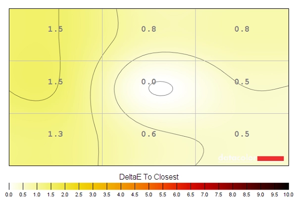
Luminance uniformity
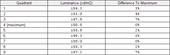
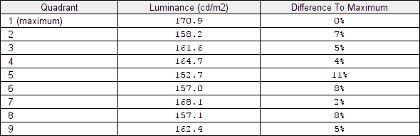
We used the Spyder5ELITE colorimeter to assess the uniformity of lighter colours, represented by 9 equidistant white quadrants running from the top left to bottom right of the screen. The tables below shows the luminance recorded at each quadrant and the deviation between a given quadrant and the brightest quadrant. The top table shows results under our ‘Test Settings’, whilst the middle and bottom tables show the results using the ‘Uniformity Compensation’ (UC) setting of the monitor. The monitor was tested with the factory pre-calibrated UC enabled (middle table), using factory defaults. We also tested with the UC calibrated (as per calibration section) using the ASUS ProArt Calibration Software and an X-Rite i1Display Pro (bottom table).
Luminance uniformity table 'Test Settings'
Luminance uniformity table 'UC default'
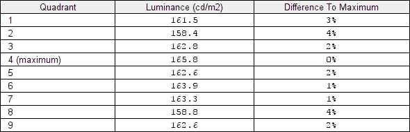
Luminance uniformity table 'UC calibrated'
Luminance uniformity map 'Test Settings'
Luminance uniformity map 'UC default'
Luminance uniformity map 'UC calibrated'
Colour temperature uniformity map 'Test Settings'
Colour temperature map 'UC default'
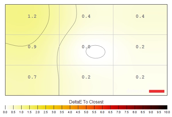
Colour temperature map 'UC calibrated'
Contrast in games and movies
Lagom contrast tests
Colour reproduction
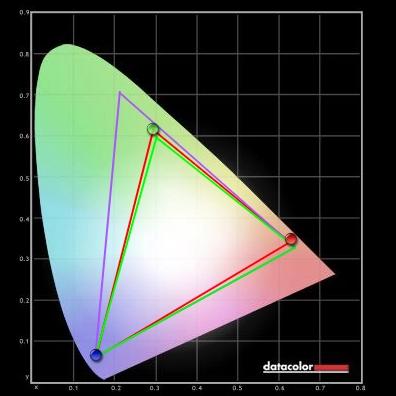
Colour gamut

Colour gamut 'Standard'
The monitor also provides a range of emulation modes to cut down the colour gamut to ranges which may be more suitable for specific content creation or viewing. These are, as shown below; sRGB, Adobe RGB, Rec2020 and DCI-P3. ‘sRGB’ offers reasonable sRGB coverage and cuts down the native gamut considerable, although there is some over-coverage and under-coverage was recorded (96% sRGB, 75% Adobe RGB). ‘Adobe RGB’ offers good approximation of the Adobe RGB colour space, although a little bit of under-coverage was recorded in the green region and slight under-coverage in red region was recorded (97% sRGB, 98% Adobe RGB). The ‘Rec2020’ setting simply uses the native gamut of the monitor (100% sRGB, 100% Adobe RGB) as that as the widest that this model can display. The gamut still falls some way short of actual Rec. 2020 and that’s expected from current technology – ASUS specifies 85% Rec.2020. The ‘DCI-P3’ setting cuts down on the native gamut a bit, particularly in the green region. There is some overlap of Adobe RGB, some over-coverage and some under-coverage (100% sRGB, 88% Adobe RGB). Although the Spyder software doesn’t draw in the gamut, this is a good approximation of the DCI-P3 space (95% DCI-P3 specified by ASUS).
Colour gamut 'sRGB'

Colour gamut 'Adobe RGB'

Colour gamut 'Rec2020'

Colour gamut 'DCI-P3'
Finally, we’ve included the gamut recorded under our ‘Test Settings’ as shown below. This is cut down slightly from the native gamut but note that the saturation levels were also adjusted, which keeps shades a bit further from the edge of the gamut than would otherwise occur. If you’re using the ProArt Calibration Software, you can work with any of the gamuts featured above as a base and customise things such as the gamma and white point to suit. Given some of the issues we had with the presets in that respect (including gamma being too high under DCI-P3), this is a useful flexibility to have.

Colour gamut 'Test Settings'
Colour in games and movies
Viewing angles
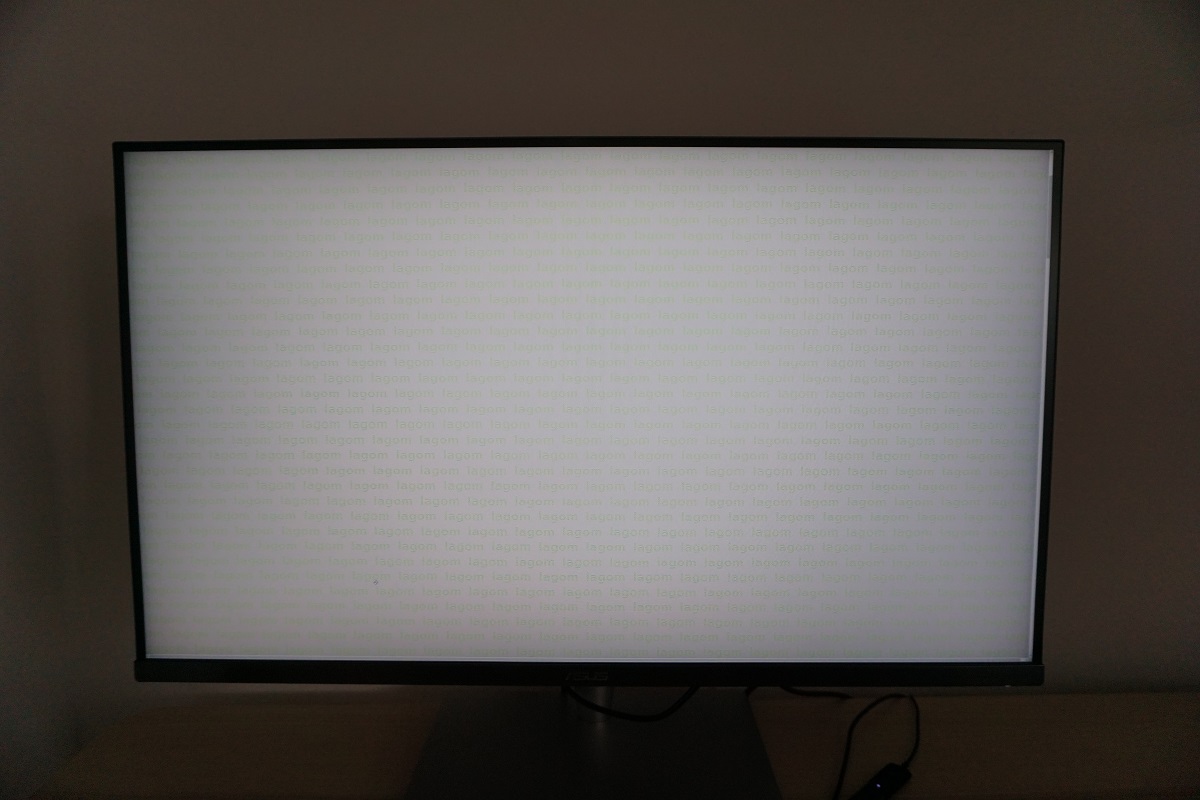
The following video shows the Lagom text test, a mixed desktop background and dark desktop background from various viewing angles. For the mixed image you can see that the monitor maintains its contrast and colour consistency well until the steepest viewing angles are reached. The dark desktop background is shown twice, with the ‘Dynamic Dimming’ feature active for the second run. This is explored more later – this section of the video is just to help highlight the ‘halo effect’ associated with some dimming zones being very bright and surrounding ones being very dark. You can see the aforementioned ‘AHVA glow’ which blooms out more noticeably from sharper angles. Although you can also see, with local dimming, that some regions of the image (with big masses of black) show very little of this as the dimming zones are doing their job and staying nice and dim.
Interlace pattern artifacts
Responsiveness
Input lag
Perceived blur (pursuit photography)
The object itself appears quite broad and blurry, without sharp detail on the UFO body or within the cockpit. This indicates a moderate amount of perceived blur caused by eye (camera) movement – you can see this in the reference image as well, as you would expect. With ‘TF = 0’ there is also a reasonably bold trail behind the object, particularly for the dark and medium backgrounds. This is caused by slower than optimal pixel transitions. With ‘TF = 20’, this trailing is cut down a bit but is still significant. ‘TF = 40’ cuts it down further, whilst ‘TF = 60’ cuts it down again. At this point there is very little trailing remaining, just a faint ‘powdery’ trail. There is also a very small amount of overshoot (inverse ghosting) visible with the light background, whereby the pixel overdrive is slightly too aggressive and has caused the monitor to ‘overshoot’ the desired end shade for the transition. With ‘TF = 80’ the overshoot becomes more noticeable and is also present for the medium and to a lesser extent dark background. ‘TF = 100’ really ramps up the pixel overdrive so it’s far too aggressive. You can now see obvious bright and colourful overshoot trails. It is clear from this analysis that ‘TF = 60’ (the default level) is optimal in terms of providing a sensible level of pixel overdrive without noticeable consequences. – this was reflected in broader testing, beyond the transitions considered here. Note that with HDR active, you can’t adjust ‘TraceFree’. It behaves as if it is locked to its optimal and default value of ‘60’, however.
Responsiveness in games and movies
FreeSync – the technology and activating it

The ASUS supports a variable refresh rate range of 40 – 60Hz. That means that if the game is running between 40fps and 60fps, the monitor will adjust its refresh rate to match. When the frame rate rises above 60fps, the monitor will stay at 60Hz and the GPU will respect your selection of ‘VSync on’ or ‘VSync off’ in the graphics driver. With ‘VSync on’ the frame rate will not be allowed to rise above 60fps, at which point VSync activates and imposes the usual associated latency penalty. With ‘VSync off’ the frame rate is free to climb as high as the GPU will output (potentially >60fps). LFC (Low Frame Rate Compensation) is not supported by this monitor, as that requires the upper limit (ceiling) to be at least 2x the lower limit (floor) of FreeSync operation. FreeSync is therefore deactivated if the frame rate falls below 40fps, with the monitor then respecting your choice of VSync and presenting you with either stuttering (VSync on) or juddering and tearing (VSync off).
Note that the top right of the OSD displays the current refresh rate of the display. This updates in real-time (or close enough) to reflect changes in the frame rate, within the FreeSync Window (40 – 60fps). With FreeSync active you’ll see this constantly changing along with frame rate rather than just displaying ‘60Hz’ or whatever static refresh rate you had selected. This information is also contained in the ‘System Setup’ section of the OSD, under ‘Information’. Finally, it’s worth remembering FreeSync only removes stuttering or juddering related to mismatches between frame rate and refresh rate. It can’t compensate for other interruptions to smooth game play, for example network latency or insufficient system memory.
FreeSync – the experience
HDR (High Dynamic Range) and ‘Dynamic Dimming’

With HDR disabled, the moon (towards the top right) appears as a giant glowing mass that blends in with the illuminated area around it. With HDR active, the moon itself is distinct and the glow is far more natural and progressive. This is one of the advantages of the more accurate shade display supported by HDR and the 10-bit precision supported by both HDR10 content (such as this game) and the PA32UC. The other noticeable difference (with ‘HDR 1’) is that night actually looks more like night with HDR enabled, even if ‘Local Dimming’ is enabled under SDR. In the scene above, the bushes to the left and the carpeted area towards the bottom have distinct details with HDR off. With HDR on, these areas appear deeper and things look more ‘night-like’ and atmospheric. That is quite typical of the striking and high-contrast look developers usually go for when working with the HDR pipeline. On the flip-side, the fact that they are intricate mixtures of dark and lighter shades means that they are not displayed perfectly without the use of per-pixel lighting on a monitor. The level of detail is lower than it should be as the dark areas would ideally be deeper and darker than they are, with the lighter elements standing out a bit better. Without per-pixel lighting or tiny dimming zones it’s not possible to achieve that; the precision in illumination simply isn’t there. As we observed with the ‘Dynamic Dimming’ feature alone active, ‘AHVA glow’ (‘IPS glow’) is reduced in scenes like this. If you observe the image above, though, you’ll note that the upper left corner and bottom right corner of the screen do exhibit some of this ‘glow’; it’s not eliminated completely. The edge is taken off it such that viewing in a moderately well-lit room makes it unnoticeable. But because mixed (even if mostly dark) content is being displayed, the backlight dimming zones can’t just dim to super-low levels.
Colour gamut 'DCI-P3'
The ‘4K’ UHD experience
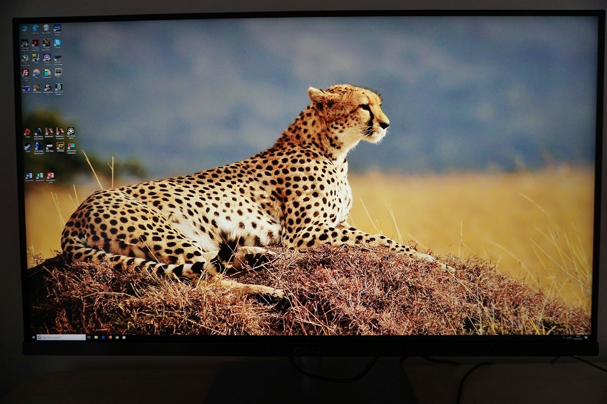
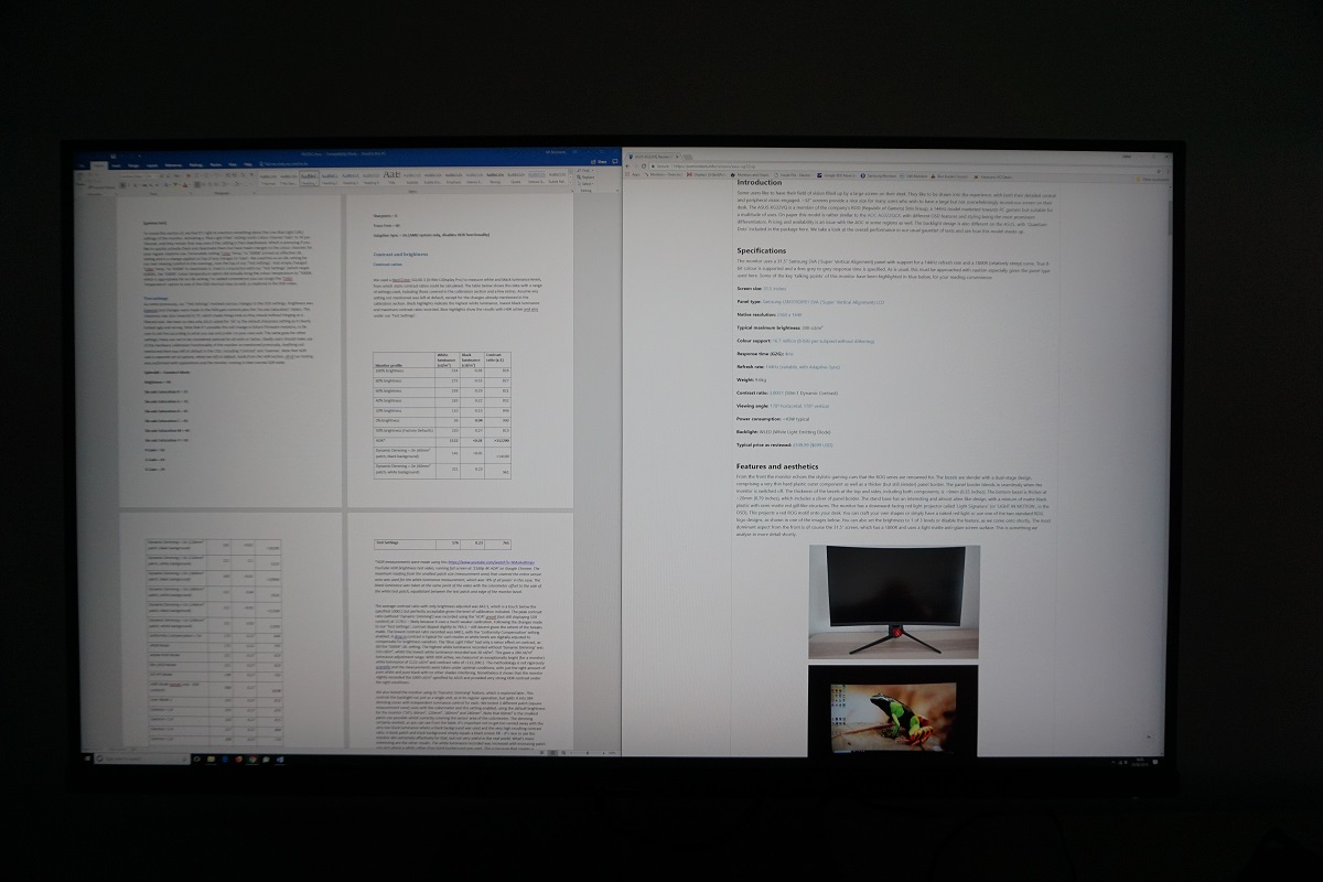
As noted in the previous paragraph, we find the pixel density of this screen attractive as well. The UHD resolution on a 32” screen provides a pixel density of 139.87 PPI (Pixels Per Inch). This takes things a step beyond 27” WQHD (2560 x 1440) models, which still offer a nice pixel density and overall experience but not at the same level as this. With a pixel density of 108.79 PPI, the 27” WQHD models offer a very similar pixel density to the ~40” UHD models. Again, this is a nice pixel density especially when spread across such a large screen, but we still feel this is a real step up and more noticeable than the steps up beyond that (27” or smaller UHD models, for example). Even if you have your game settings set to low values to conserve precious graphical horsepower, the resolution itself brings a certain sharpness and clarity that other resolutions simply can’t match. Once you bump the graphics settings up and add in higher resolution textures and particle effects, the screen really starts to shine. Especially on titles or elements within titles that really make use of the high resolution. In the case of our GTX 1070, though, it starts to struggle if graphics settings are increased all the way up on most titles. The smaller pixels and step up in clarity does at least reduce the need for anti-aliasing compared to screens with lower pixel densities, so you can usually get away with dialling that back a bit. The images below in no way represent how the screen looks when using it first hand and are limited by the camera and your own screen. Nonetheless, use them to fire up your imagination and ponder the beautiful sights that can grace users of the PA32UC first-hand.
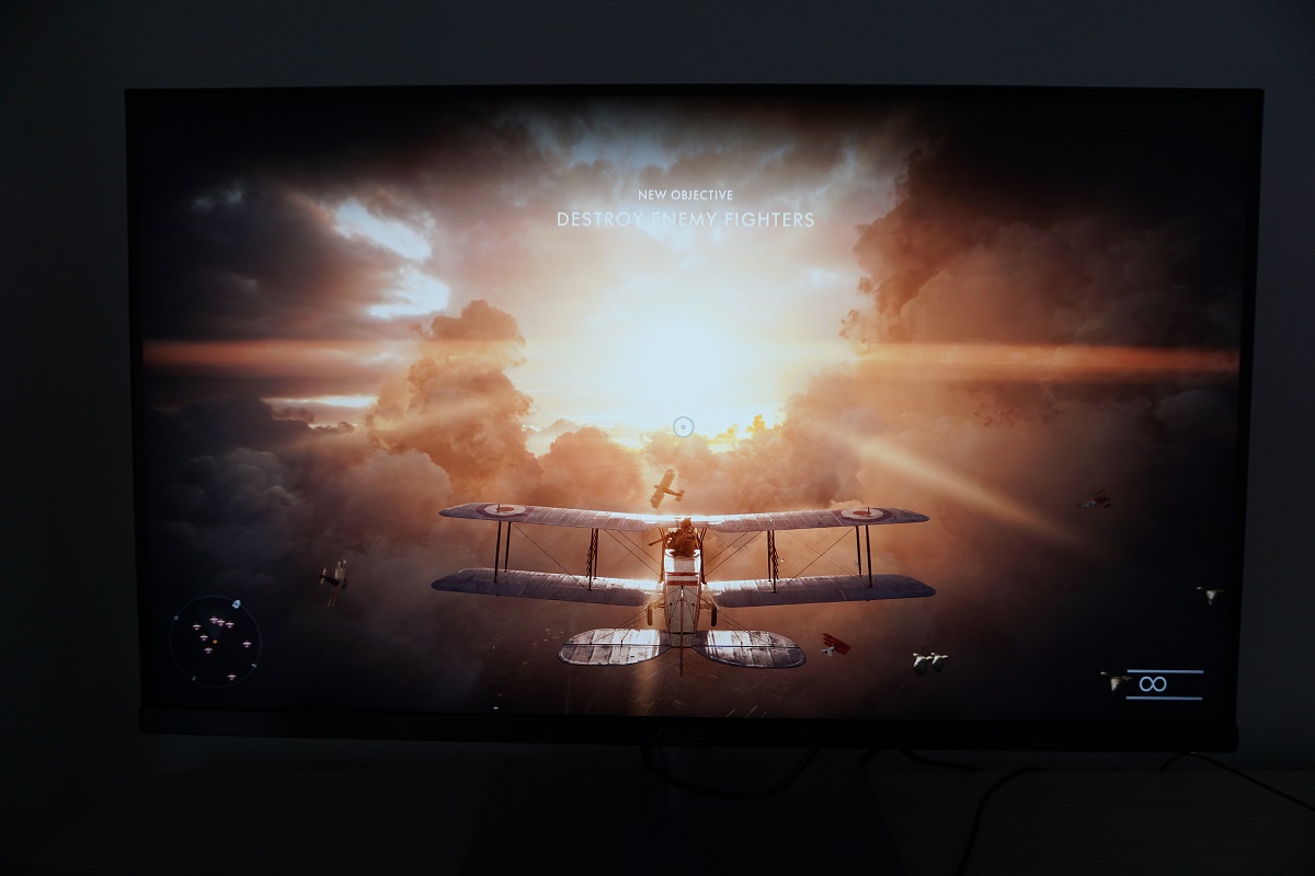
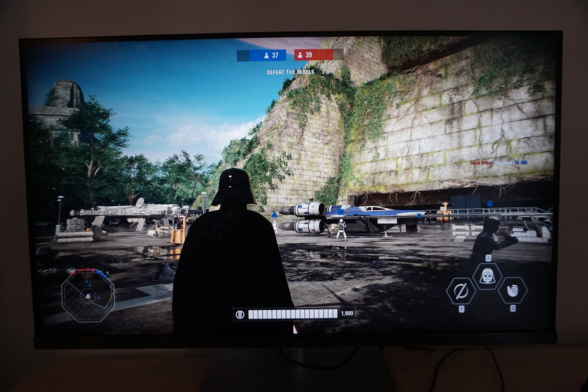
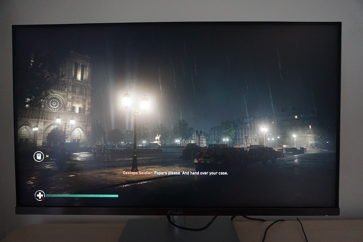
Interpolation and upscaling

Conclusion
The bottom line; a very capable monitor for both work and play, with some well-implemented features – but some quirks here and there.
Positives Negatives Strong gamma tracking and colour consistency, effective hardware calibration and a good selection of colour space emulation modes
White point off-target on our unit on most presets, with some gamma and gamut misses elsewhere. Hardware calibration was not as consistent as we’d like Decent static contrast performance and a very useful ‘Dynamic Dimming’ feature, plus an effective HDR implementation. Very light matte anti-glare screen surface aided clarity and kept obvious graininess at bay Per-pixel illumination would be superior as the monitor can’t compensate for intricate mixtures of light and dark with ‘Dynamic Dimming’ or HDR. Slight (misty) graininess to the screen surface and ‘AHVA glow’ Good pixel responsiveness for 60Hz without obvious weaknesses. FreeSync worked effectively to combat tearing and stuttering
Moderate input lag, FreeSync range limited and an ineffective ‘MotionSync’ (strobe backlight) setting Excellent detail, clarity and real-estate from the 32” ‘4K’ UHD screen, strong interpolation performance and a solid and premium-feeling product No Rec. 2020 support (same applies to all current models), expensive and limited availability at time of writing 
