Author: Adam Simmons
Date published: December 18th 2014
Table of Contents
Introduction
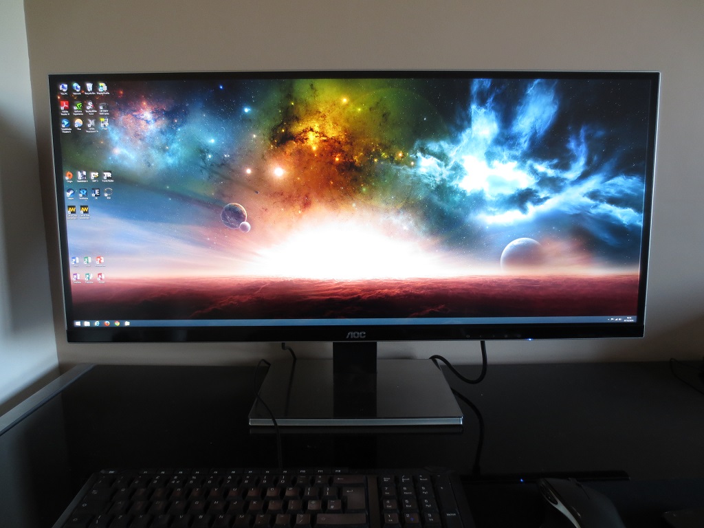
Many of us still remember when widescreen standards such as 16:10 and 16:9 really took off, replacing the rather square-looking monitors with something a bit wider. So-called ‘UltraWide’ (or super wide) monitors with a 21:9 aspect ratio took that one step further, starting with 29” models that gave a very panoramic look to the image. With the increased Field of View (FOV) that most games offer in 21:9 and the absolute screen filling (without black borders) of many movie titles this gave a nice experience. The UltraWide 21:9 experience is now available on models with 34” screen sizes, significantly boosting both the physical height and width of the monitor. The AOC u3477Pqu features such a screen, coupling it with a 3440 x 1440 resolution and an adjustable stand. We take a look at how this monitor performs in a range of games, movies and other applications. And of course what the 34” screen size and 21:9 aspect ratio brings to the table as well.
Specifications
This model features a 60Hz 34” AH-IPS (Advanced High Performance In-Plane Switching) panel which boasts 10-bit colour reproduction (8-bits per subpixel plus FRC dithering). A 5ms grey to grey response time is specified, which is fairly standard as a specified value for an IPS monitor and doesn’t really give a good indication of real-world performance. Key ‘talking points’ of the specification have been highlighted in blue below. Note that the prices are based on estimated street prices given by AOC as the monitor wasn’t from UK or US retailers at the time of review.
Features and aesthetics
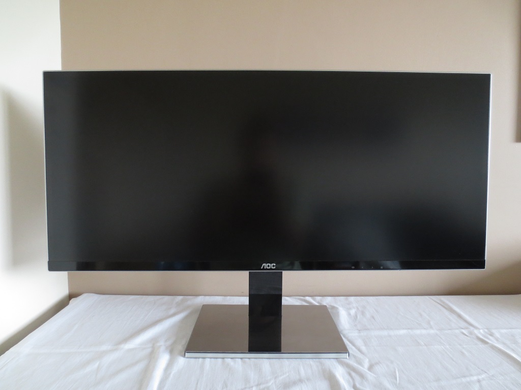
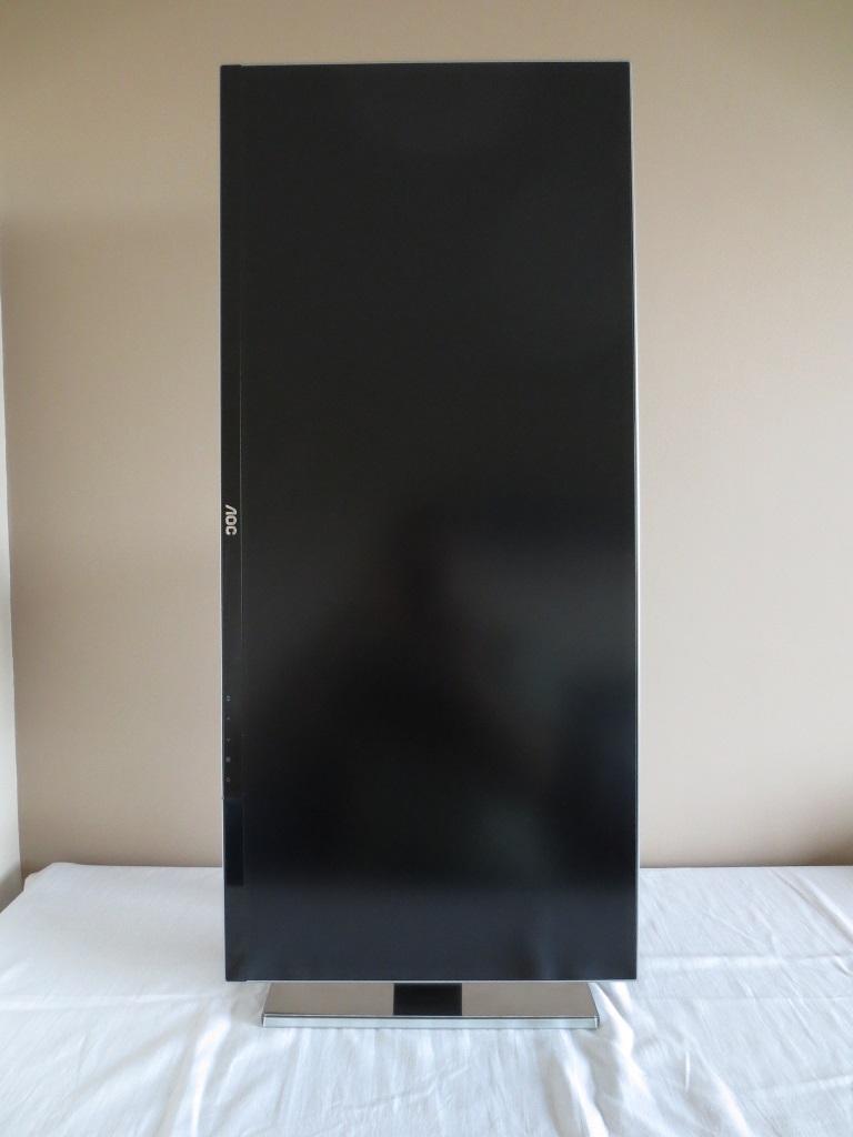
The monitor is dominated by the large (34”) ‘UltraWide’ screen at the front. This has a very light matte anti-glare screen surface, which is described in more detail a little later. There is a dark grey panel border around the screen itself, which is not clearly visible when the monitor is switched off. This is around 15mm (0.59 inches) at the top and sides. There is also a thin silver outer bezel. The total thickness of the area around the screen (including panel border and hard bezel) is around 18mm (0.71mm) at the top and sides. The bottom bezel has a black semi-matte plastic finish and is around 2.5mm (0.98 inches) thick if you include the silver of the outer bezel and the sliver of panel border here.
If you’re sitting a bit too close to the monitor (<45cm) or are sitting far off the central line (i.e. to the left or right rather than in the middle) then a slight 3D shadow can be seen running down the far left and right edge of the screen once the screen is switched on. This seems to go into the screen as shown below. This wasn’t visible from a normal viewing position and not something we found distracting, but just thought we’d point it out in case somebody sees it on their monitor and thinks it is some sort of defect.
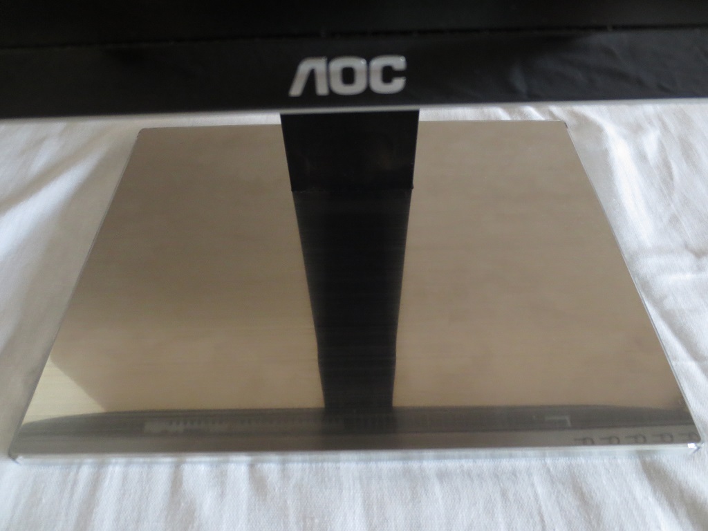
The stand base is quite attractive in our opinion, featuring a quite fetching shiny brushed metal foil coated in scratch-resistant transparent plastic. This is shown below, although we feel it looks more lustrous in real life.
The stand itself is highly adjustable, allowing; tilt (5° forwards, 24° backwards), height adjustment (130mm or 5.12 inches) and rotation clockwise (90° pivot into portrait). The bottom of the screen sits around 78mm (3.07 inches) clear of the desk surface at lowest height in landscape orientation. The top sits around 450mm (17.71 inches) above the desk. As you can see below, when rotated into portrait the screen has quite an overwhelming height to it.
In its normal landscape orientation, the controls of the monitor are found on the underside of the bottom bezel around ¾ of the way along from the left side. These are pressible buttons as shown below. There are no on-screen button labels or other illumination to indicate the function of each button. This can make navigating the menu system in the dark a little tricky at first.
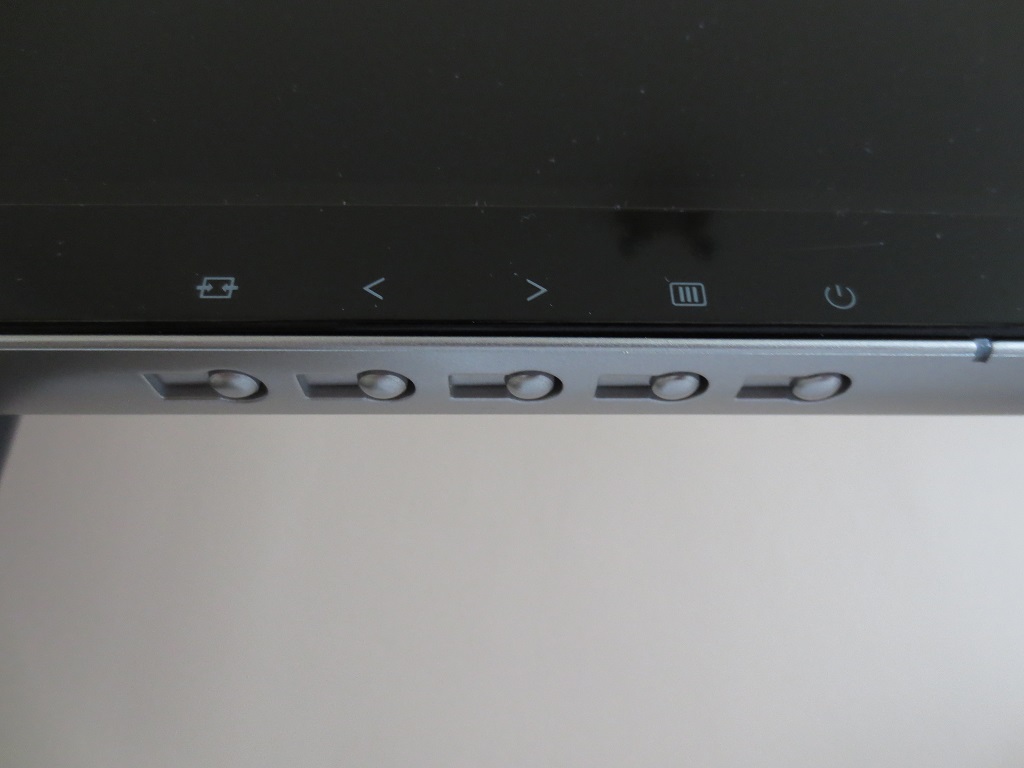
The buttons are, from left to right; ‘Source Select / Back’, ‘Clear Vision / Right’, ‘Volume / Left’, ‘Menu / Enter’ and ‘Power’. We found the menu system fairly straightforward to navigate through. The functionality is shown in the video below.
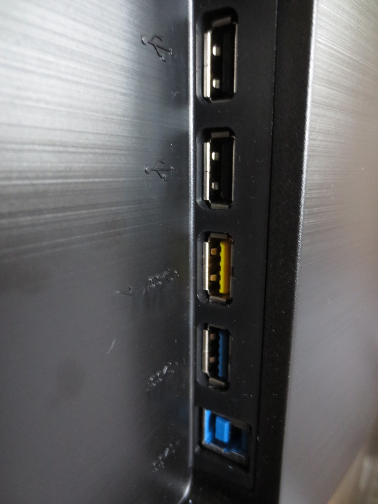
At the side you can see the fairly robust monitor stand, with glossy black plastic at the side of its ‘neck. This attaches to the ‘central bulk’ of the monitor. Facing to the right (if viewing from the front) are some USB ports. From top to bottom these are; 2 USB 2.0 downstream ports, 2 USB 3.0 downstream ports (yellow one = fast-charging capable) and USB 3.0 upstream.
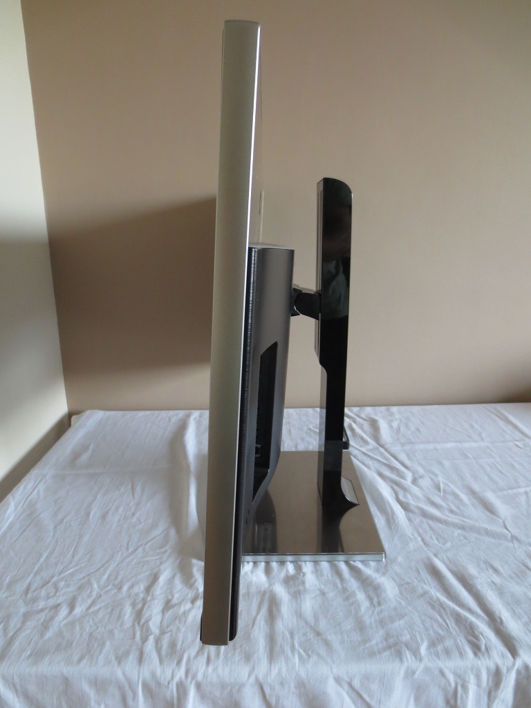
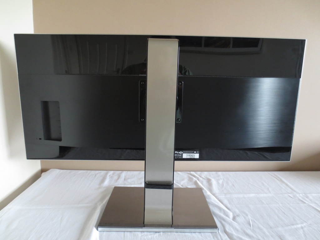
At the rear of the monitor there is quite a combination of materials used – glossy black plastic at the top and bottom, brushed black plastic for the ‘central bulk’ and matte silver plastic for the back of the stand neck. Towards the bottom of the stand neck is a simple cable tidy. The stand itself attaches to the screen by 100 x 100mm VESA. It is screwed on rather than using a quick release mechanism – an alternative 100 x 100mm VESA stand or mount can be used instead. The remaining ports of the monitor face downwards. To the left of the stand is an AC power input (internal power converter) and ‘zero power’ switch. To the right of the stand there are several ports; RS232, Dual-Link DVI, HDMI 1.4 (with MHL), DP 1.2, VGA, 3.5mm headphone jack and 3.5mm line-in. The monitor includes a VGA cable, Dual-Link DVI cable, DisplayPort cable, 3.5mm audio cable and USB cable in the box.
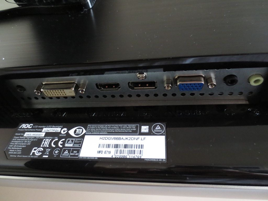
Note that only DP 1.2 natively supports 60Hz at 3440 x 1440 on this monitor. DP 1.1, Dual-Link DVI and HDMI are limited to 30Hz maximum at 3440 x 1440 by default. There are 7W up-firing stereo speakers built into the monitor. These delivered quite a powerful and dynamic sound. Better than most integrated speaker systems but not really a substitute for a good standalone pair. We also found the minimum volume level a bit loud, although the sound can of course be dimmed further using software volume control. These speakers went surprisingly loud as well – in fact we didn’t dare go past 60% volume in case it upset the neighbours.
Calibration
Subpixel layout and screen surface
The monitor uses a very light matte anti-glare screen surface, which some users might even refer to as ‘semi-glossy’. This handles glare effectively without creating the ‘dulling’ or ‘grainy’ appearance offered by ‘stronger’ matte screen surfaces. In terms of smoothness of the image (i.e. lack of grain or sparkle) this is one of the best matte surfaces we’ve come across.
![]()
This monitor employs an RGB (Red, Green and Blue) stripe subpixel layout, which is the most common type. This is the default type ‘expected’ by operating systems such as Windows and MacOS so no special configuration is required there. This is good news for Mac owners in particular as alternative subpixel layouts (for example BGR) give fringed text with poor sharpness and can’t be corrected for on the OS. Windows has a ‘ClearType’ option which can compensate, but using this will only be necessary if you have already customised the settings for another monitor or don’t feel text is rendered to your liking.
Testing the presets
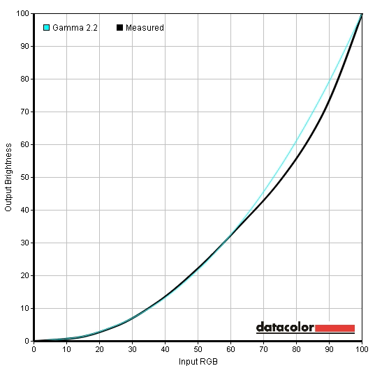
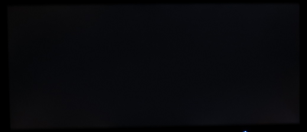
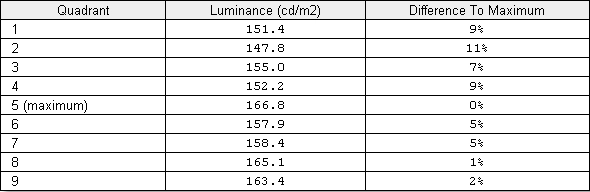
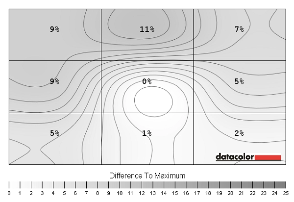
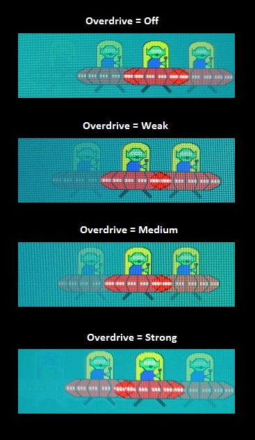
If there is one thing we particularly dislike on a monitor, it is a collection of useless presets. ‘Game’ modes which cause intense oversaturation and loss of shade variety and ‘Movie’ modes which give excessive sharpness and an excessive ‘cool’ tint to the image are amongst the worst offenders. The u3477Pqu doesn’t lead users astray with such misleading and sub-optimal presets and instead presents a number of settings which the user can tweak themselves, if desired. The table below shows some key readings taken on the monitor, using a Spyder4Elite colorimeter, alongside some general observations. A range of settings were tested including different ‘Gamma’ and ‘Color Temp.’ modes. Any setting not specifically mentioned in the table was left at default, with the exception of our ‘Test Settings’. Out of the box the u3477Pqu was very bright, something it’s certainly not alone in being. The white balance was very close to the desirable 6500K daylight target and the image was quite nicely balanced overall. The gamma tracked a little way off the 2.2 curve for some of the mid-tones, which made some shades appear a little lighter than they ideally would. Having said that, the fairly generous colour gamut and very light screen surface helped counteract this very well and produced excellent shade depth. The overall richness was actually a lot better than many monitors would produce even with much higher gamma (over 2.2) without visibility sacrifices at the low-end. The gamma curve appeared as below by default. The ‘Gamma2’ setting lowered gamma to an average of 1.8 and produced an odd criss-cross curve. The image wasn’t particularly inviting using this setting as it was sapped of depth in places. ‘Gamma3’ had the opposite problem. Although it averaged 2.1, just like ‘Gamma1’, the bow in the curve had shifted higher up. Some of the mid-tones now appeared too deep and the overall image wasn’t quite as nicely balanced as ‘Gamma1’. The colour temperature was also mildly affected by changing the ‘Gamma’ setting, dropping to around 6300K. The graphs below show ‘Gamma2’ and ‘Gamma3’, respectively. For our test settings we simply reduced the brightness of the monitor, quite significantly. There was no need to change anything else really – and we can’t stress enough how reassuring that should be to some users who want minimal fuss to get a pleasing image from a monitor. The gamma curve (below) didn’t really change from the factory defaults. As we’ve already noted the screen didn’t seem deprived of depth or vibrancy at all, despite the ‘2.1’ average gamma. Colours looked very appealing to our eyes – represented rather accurately on the whole with good depth. We performed a full calibration with our Spyder4Elite, with limited success. The gamma averaged 2.4 without the kink in the curve really being ironed out all that effectively. We also noticed increased banding in places, a slight drop in contrast and a cool green tint introduced to some of the shades that correspond to the bow of the gamma curve. If users do need to use this monitor for colour-critical work then we’d recommend investing in a more highly regarded colorimeter for profiling, such as the X-Rite i1Display Pro. We didn’t have one to hand to compare the success of the calibration, but feel that a proper profiling should be able to achieve good 2.2 gamma tracking. At any rate we don’t feel this is something that most users should worry about. After lowering the brightness the monitor displays an image that is pleasing with accurate shade representation on the whole. This should be absolutely fine for uses such as gaming, movies, general desktop work and hobbyist photography and design. The adjustments made to our ‘Test Settings’ were really very limited. All we did is lower the brightness. Everything else was kept at default – a pretty stress-free setup. Users should be aware that individual units can vary and that it may be desirable to switch ‘Color Temp.’ to ‘User’ and make some minor adjustments. That may not be necessary, as in our case. We’ve also included the ‘Overdrive’ setting used for our review, just for reference. Overdrive= Weak We also know that some users like to use a reduced colour temperature, particularly in the evening (like a ‘Low Blue Light’ setting, ‘Reading’ or ‘Paper’ mode). This monitor doesn’t have such a feature but you can of course manually lower the blue colour channel (perhaps green a bit as well) to get that sort of effect. Provided you’re happy with the defaults during the daytime you’d then use ‘Warm’ (or ‘sRGB’ – same settings) during the day and switch to your customised ‘User’ mode in the night. You can also use a different brightness setting for both of your modes, if you wish. The settings below are just a guide as to what you could use for more relaxing evening viewing. We used these for our own viewing pleasure later in the evening but not for any of our testing. As above, the factory default ‘Color Temp’ settings were fine for normal daylight viewing on our unit. Brightness= 25 (according to preferences and lighting) Overdrive= Weak Color Temp.= User R= 50 G= 41 B= 38 A Konica Minolta CS-200 light meter was used to accurately measure black and white luminance levels and allow static contrast ratios to be calculated. This data is shown in the table below with the monitor set to a number of settings, including those looked at in the ‘Calibration’ section of the review. Assume that any setting not explicitly mentioned was left at default, with the exception of our ‘Test Settings’ and settings for relaxing evening viewing. In this table, black highlights indicate the highest white luminance, lowest black luminance and peak contrast ratio recorded. Blue highlights indicate the results for our ‘Test Settings’ and relaxing evening viewing settings. The average static contrast ratio recorded on the u3477Pqu with brightness only adjusted was 1023:1, which is very close to the 1000:1 specified. Our ‘Test Settings’ didn’t involve any additional changes beyond brightness, so the contrast remained similar at 1025:1. Our relaxing evening settings involved significant changes to the blue and green colour channel and hence caused a slight drop in contrast to 860:1. This is still a very useable value, however. The highest white luminance recorded was 331 cd/m², which is quite high. The lowest white luminance recorded with only brightness adjustment (i.e. no loss of contrast) was 106 cd/m². This will be low enough for most users, but some who are particularly sensitive might find it a little bit high – it can be lowered further by making adjustments to contrast or colour channels. The luminance adjustment range of the monitor using these recorded values is 225 cd/m² which is reasonable. The monitor features a ‘DCR’ (Dynamic Contrast Ratio) Dynamic Contrast function, which can be activated on top of any other setting combination. The brightness of the backlight in this mode adjusts at a moderate pace to changes in the relative levels of ‘light’ and ‘dark’ in the content being displayed. We found the backlight tended to edge towards very (at times uncomfortably) high brightness even when quite a mixture of light and dark was displayed on the screen. When the screen was filled with predominantly dark shades the backlight did dim quite significantly. This isn’t a feature we are personally fond of, but it is there if you want to use it. The u3477Pqu does not use PWM (Pulse Width Modulation) to moderate backlight brightness at any brightness level. Instead it uses DC (Direct Current) to adjust the backlight brightness. In other words, the backlight is flicker-free which will come as welcome news to those who are sensitive to flickering or wish to minimise visual fatigue when using their monitor. When looking at a black screen fill in a dark room we observed a small degree of backlight bleed. As shown in the image below this was quite unsubstantial and was not even noticeable during normal use on our unit. As with all monitors, a degree of variation is to be expected in this regard. The image was taken from a central position a few metres back to eliminate ‘IPS glow’. This is a common characteristic of this and similar panel types, manifesting itself as an orange or silvery-blue sheen which blooms out as viewing angle is increased. It can also be seen from a normal viewing position, even if you are seated quite centrally and a reasonable distance from the monitor. The effects of this and a video showing how it manifests itself off-angle are included later on in this review. Note that this picture was taken from a normal viewing position, around 70cm from the screen. There is no ‘glow’ to speak off as you would see from such a position on IPS-type models. There is a golden and silver-grey sheen that appears as you view the monitor from different angles, however. This is shown in the viewing angles video further into the review. A Spyder4Elite was used to analyse the uniformity of lighter colours. The brightness of 9 equidistant white quadrants was analysed, which run from top left to bottom right. The following table shows the luminance measured at each quadrant alongside a percentage deviation each quadrant and the brightest measured point. The luminance uniformity of the screen was very good. The brightest point measured was ‘quadrant 5’ at the centre of the screen (166.8 cd/m²). The greatest deviation from this occurred at ‘quadrant 2’ at the top left (147.8 cd/m²), which is an 11% deviation. Elsewhere the luminance was within 1-9% of the central value which is excellent. For those who prefer a graphical representation, this is given below. In this contour map darker greys represent greater deviation from the brightest point than lighter greys. Percentage deviations between each point and the brightest point are also given. Using these 9 quadrants the consistency of colour temperature (white point) was also analysed. The graphic below represents any recorded deviation between each quadrant and the 6500K (D65) daylight white point target as a DeltaE value. Here a DeltaE of under 3 is considered deviation that most users won’t readily notice by eye. Darker colours on this map represent higher deviation from the central value (a higher DeltaE). The results here are good, with no significant deviation between the measured points and 6500K. The quadrant closest to 6500K was the upper central region (‘quadrant 2’) with the central region (‘quadrant 5’) showing a very small deviation from this of DeltaE 0.7. The greatest deviation occurred at the bottom left and right regions (a DeltaE of 2.5 and 2.4, respectively). It is important to remember that all aspects of uniformity on a monitor can vary between individual units of the same model, but these results are good to see. On Battlefield 4 the contrast performance was quite pleasing overall. There was some loss of detail in dark areas due to ‘IPS glow’, particularly towards the bottom corners of the screen. For a large central chunk of the screen detail levels in dark areas were good. Walls, floors and objects all had fairly distinct textures, even in dimly lit environments. Brighter shades pierces through this darkness very nicely. White and light shades appeared very smooth – unadulterated by the sort of graininess you’d usually see on matte screens. On Dirt 3 some detail was lost in certain peripheral sections of the screen due to ‘IPS glow’ again. For the most part detail levels in dark areas was good, however. Fairly minor details such as car tread patterns, radiator grills and material textures were visible in quite dim lighting on the game. The relative smoothness of whites and light shades was quite apparent as headlights penetrated the darkness, too. Whilst not giving the absolute purity of a glossy screen, there was no obvious graininess to detract from the relatively clean and pure look. We also assessed the contrast performance in the Blu-ray of Skyfall. There was again a bit of detail lost towards the bottom two corners in particular (from a normal viewing position) due to ‘IPS glow’. Overall detail levels were pleasing, though, and the film had a good atmosphere with respectable detail levels in dark scenes. Bright elements contrasted nicely and weren’t really impeded by the screen surface in the way you’d usually see with matte anti-glare layers. The Lagom tests for contrast help reveal weaknesses in a monitors contrast performance which other testing may not make so obvious. The following observations were made. The AOC u3477Pqu features a standard WLED backlight with enhanced phosphors, allowing it to cover sRGB completely and a little beyond. You can see below that it is still a standard gamut monitor, but offers comprehensive (100%) sRGB coverage and a little over-extension in some regions on this diagram. This allows the monitor to produce a vibrant image that remains natural and accurate without problematic oversaturation. Colours on Battlefield 4 (BF4) were inviting in both their variety and vividness. Everything looked much as it should, with excellent but not excessive depth and saturation. The environments had an inviting but natural look, with an impressive array of greens and browns. Despite the large screen size, shades remained consistent throughout the screen and appeared appropriately saturated regardless of on-screen position. This is something only IPS-type panels can achieve on LCD monitors. Roaring fires and explosions were stunningly vibrant whilst the red paint on some gun sights was as strong and deep as we’ve seen without looking oversaturated or out of place. Dirt 3 also gave a rewarding colour experience. The variety of green shades amongst vegetation was particularly impressive, from light ‘minty’ greens to impressively lush and deep greens. The racing environments looked both natural and inviting. There were some impressive and rather lively colours, displayed on car paintwork for example. Some exceptionally rich reds, deep blues and striking neon colours to name but a few. The smoothness of the screen surface helped give a nice degree of vibrant ‘pop’ to these colours, too. The monitor brought the fantasy world of The Elder Scrolls Online (ESO) to life with a wonderful array of lively and vibrant colours. Some of the spell effects were particularly eye-catching, showcasing some excellent fiery reds, electric blues and deep purples. The variety of subtly different shades was also excellent. This gave these ornate and intricately decorated buildings in the game a very pleasing look – with an excellent variety of wood, stone and paint colours. We also tested the Blu-ray of Skyfall, on which colours looked naturally vibrant and inviting. The environments appeared as they should with good earthy browns and some lush greens of vegetation, whilst the variety of subtle shades in various scenes was excellent. Skin tones appeared consistent and appropriately saturated throughout the screen. Impressively warming and glowing orange flames, superb neon reds and greens and some very nice deep purples were seen at various points in the film as well. The colour reproduction was also assessed using the Blu-ray of Futurama: Into the Wild Green Yonder. This is an interesting test for colour reproduction as it mixes bright neon shades with deep shades and some more muted pastel shades. These were all handle very nicely with an appropriately vivid and deep look where required and various subtle pastel shades which didn’t look oversaturated or crushed together. There were frequently large areas of a single shade filling the screen, for example the red of the giant lobster monster Dr Zoidberg as he performs some of his antics. Despite the large screen size the consistency of any given shade was excellent – a strong performance from the IPS panel there. Lagom’s viewing angle tests were used to analyse the colour consistency and viewing angle performance of the monitor in a more focused and specific way. The following observations were made from a normal viewing position (80cm from the monitor, sitting centrally). Please refer to this article for a detailed look at what the resolution, aspect ratio and screen size brings to the table. When the monitor runs at its native 3440 x 1440 resolution, everything appears crisp and clear – things are optimal. If you wish to run the monitor at a lower resolution, either because you’re connecting to a device that doesn’t support 3440 x 1440 or you don’t want to use that much GPU horsepower, you can always lower the resolution. As an LCD monitor the pixels are unable to physically alter their size to conform to this lower resolution and so an interpolation or scaling process is used instead. If you select 2560 x 1440, then there are no ‘Image Ratio’ (scaling) options offered by the monitor. By default, it automatically displays using 1:1 pixel mapping. In other words the image displays in the centre of the screen without distortion, covering an area of 27” diagonal. It is therefore equivalent to a 27” WQHD monitor, with black bars filling the remaining width as shown below. If you select ‘Full Screen’ for the scaling section of your graphics driver then it will stretch the image across the screen. This distortion is quite obvious in practice, even if it isn’t on the image below. Things look soft and stretched whether on the desktop or in a game. If you run the monitor at certain other resolutions, such as 1920 x 1080, then the ‘Image Ratio’ options are no longer greyed out in the OSD. By default this is set to ‘Full’ and the image is stretched to fit the screen. The end result is much the same as with the WQHD resolution (with less ‘real estate’ on the screen, of course). Things look soft and distorted, again quite obvious in person if not on the image below. The next ‘Aspect Ratio’ option in the OSD is ‘Wide’. This maintains the 16:9 aspect ratio and the image is centered in the screen so it looks like a 27” Full HD monitor but with black bars either side as shown below. It may not be obvious in the image, but an interpolation process is used here which softens the image. Obviously the vertical component of this monitor’s resolution is 3440 not 1920 pixels. There are three additional modes, two of which are specifically designed for movies in certain aspect ratios; ‘Movie1’ and ‘Movie2’. As noted in this article we didn’t find this helped in any way, it simply stretches the image and usually in a way that doesn’t entirely get rid of black borders. The final option available when running the 1920 x 1080 resolution is 1:1, which creates a black border all around the image and ensures only 1920 x 1080 pixels on the screen are use. There is therefore no distortion and things appear as they would on a theoretical ~20.5” Full HD display with black borders around it, as shown below. We’d recommend setting the monitor to 3440 x 1440 wherever possible. If you do need to use a lower resolution on your PC and don’t want any black borders then you can also create a custom resolution of 2560 x 1080. This can be done easily in the Nvidia Control Panel, or by using CRU (Custom Resolution Utility) regardless of your GPU or graphics chipset vendor. Details on how to set a custom resolution are found in the ‘First solution: setting a custom resolution’ section of this article. Using the 2560 x 1080 resolution maintains the 21:9 aspect ratio, so there is no geometric distortion. An interpolation process is then used to fit those 2560 x 1080 pixels to the 3440 x 1440 resolution of the monitor. Again the images don’t capture the softening effect of this interpolation process, but we will include one here just for reference. Although gaming in this resolution is preferable to any of the other ‘Full Screen’ non-native solutions, as there is no geometric distortion, the softening effect is fairly pronounced. Things do not look as sharp as they would on a monitor with the same panel type, pixel density and screen surface. Of course you may be wondering how movie content is handled, for example 1920 x 1080 streaming content or Blu-rays. You can happily keep the monitor running at its native 3440 x 1440 resolution and play such content without any obvious loss of sharpness. The softening is really very minor and the software and GPU handles the upscaling very nicely – we often see this with ‘1440p’ monitors, there’s really nothing to worry about. Further analysis on how movies are to watch on this monitor can be found here. Input lag was measured using a small tool called SMTT 2.0 and a sensitive camera. The latency of the u3477Pq was compared to a range of monitors of known input lag, with over 30 repeat readings taken. Using this method we calculated 20.6ms (around 1.25 frames) of input lag. This value is influenced both by the component of input lag you feel (signal delay) and also what you see (pixel responsiveness). This indicates a moderate signal delay which will bother some users who are sensitive to input lag but won’t bother others. It is quite in-line with what you generally see on monitors with higher resolutions than 1920 x 1080 and not something we’d worry about – unless you’re a highly competitive PC gamer, in which case 60Hz monitors aren’t really for you anyway. The UFO Motion Test for ghosting was used alongside a highly sensitive camera to assess the monitor’s pixel responsiveness. The test was set to run at ‘3000 Pixels Per Sec’, meaning that the UFO travelled rapidly across the screen. The image below shows snapshots taken using the various ‘Overdrive’ settings of the monitor; ‘Off’, ‘Weak’, ‘Medium’ and ‘Strong’, respectively. When set to ‘Off’ you can see a bold primary trail behind the main object and a weak secondary trail. Turning the pixel overdrive up a notch to ‘Weak’ weakened the primary trail and caused the secondary trail to disappear. This indicates that the pixel transitions performed in this test were sped up effectively, as you would hope. Results were fairly similar in this test using the ‘Medium’ setting. The ‘Strong’ setting, meanwhile, ramped up the grey to grey acceleration massively. These overly aggressive voltage surge caused the monitor to ‘overshoot’ the required pixel state, giving inverse ghosting (an inversely-coloured UFO for the final trail). This was a lot more obvious than in the picture during some transitions, even when simply moving the mouse on the desktop. In this analysis it seemed that both the ‘Weak’ and ‘Medium’ settings were optimal. Looking at the pixel transitions in a broader sense (a greater variety of shades, various motion speeds etc.) revealed some slight overshoot in places using the ‘Medium’ setting. We feel this is too light to become problematic for some users, but others would prefer that it wasn’t there. Fortunately the ‘Weak’ setting eliminated this slight overshoot without noticeably compromising the level of motion blur produced by the monitor. Having quick pixel responses (ideally without overshoot) is only one part of the responsiveness jigsaw. As the linked article highlights, the movement of your own eyes is the most significant contributor to motion blur on a modern monitor. This fact, coupled with the 60Hz refresh rate, really limits the need for super-fast pixel responses. We explore how this all works out in practice in our game test titles in the following subsection. In the real world we found that the ‘Light’ setting provided just the right level of acceleration. Overshoot was very weak whilst the conventional trailing was no more apparent than on any of the stronger settings. The performance here was also closest to the ‘Fast 120Hz Reference’, incidentally, which is something of a benchmark for how pixel overdrive should be implemented on fast TN panels. On Battlefield 4 there was a fair degree of motion blur, caused primary by eye movement and linked to the 60Hz refresh rate of the monitor. The pixel responsiveness was good enough to be mostly masked by this blur. There was a small degree of extra blur in places or trailing, if you prefer. This was very faint and difficult to spot even to our trained eyes in a direct side-by-side comparison with a very fast TN monitor running at 60Hz. When moving particularly rapidly in a ground or air vehicle, this is when the blur became most noticeable on this title. In these circumstances it was really very similar to even the fastest 60Hz models. Rapid and exaggerated mouse movements when controlling the soldier (‘spinning around’) could also illicit this sort of behaviour, again with a level of blur in line with much faster 60Hz models. On top of this there was no inverse ghosting, which is definitely a bonus. The experience was similar on Dirt 3, without anything that really stood out against even the fastest 60Hz monitors. Some pixel transitions involving a mixture particularly light shades against some considerably darker shades presented the ‘most noticeable’ trailing, but this was still inconsequential in the grand scheme of things. For example when moving past reflective road signs lit up by the car’s headlights at night you could observe a slightly greater degree of motion blur than you would on some faster 60Hz models. There was a very faint trail on top of the eye-movement related blur. This difference was again very slight, not enough to change the gaming experience and only for a select few pixel transitions anyway. Thankfully there was no noticeable inverse ghosting, and that’s something which can definitely affect the gameplay experience if it’s there. We also assessed the responsiveness in movies. We used our Blu-ray test titles but also a range of movies on Netflix and Amazon Instant Video which were used in our 3440 x 1440 experience article. There were no issues whatsoever with inverse ghosting or trailing that could be attributed to either overly aggressive or lax pixel responsiveness. The ~24fps-30fps at which these titles run is really the main barrier to fluidity but they weren’t held back by the responsiveness of the monitor itself. Sometimes when we review monitors it’s just a case of going through the motions. Getting on with testing in a rather clinical fashion, finding some things we quite like and others we’re not so hot on. Whilst reviewing the AOC u3477Pqu, things were a bit different. We genuinely enjoyed using this monitor both for work and for play and feel it really does have a lot to offer in both respects. The screen size seemed a little large at first, but it didn’t take long to adapt to that and start making the most of the 3440 x 1440 resolution. And once that happened the engrossing experience it provided in games, movies and on the desktop could be fully relished. Having the sort of detail you enjoy on a 27” 2560 x 1440 monitor with a greater Field of View and more physical width worked really nicely in games. And it gave many movies (those that filled the screen entirely) a wonderful cinematic feel. It also gave a good amount of room for desktop work and internet browsing – without necessitating potentially problematic scaling issues associated with greater pixel densities. Of course there is more to a monitor than its size and resolution. And elsewhere the AOC provided an equally well-rounded experience. Colours were vibrant and inviting, whilst maintaining strong consistency and an accurate look throughout the screen. The contrast performance was also good overall, with good distinction not only between ‘light’ and ‘dark’ but subtle nuances of shades in between. The usual ‘IPS glow’ was there in full force which did affect dark detail levels towards the corners of the screen, however. The very light matte screen surface aided both aspects of image quality, providing a smooth (ungrainy) appearance to light shades and helping colours ‘pop’ off the screen. Responsiveness was a bit mixed but generally good enough to provide a nice 60Hz gaming experience. The adjustable pixel overdrive was well-balanced in our preferred ‘Weak’ setting, giving about as little motion blur as you can expect from a 60Hz sample and hold monitor. Input lag was moderate – not disturbingly high and much in-line with other displays with greater than Full HD resolution. The inner beauty was complimented by what we feel is a well-built and stylish product on the outside as well. The stand provided a good level of adjustment and held the monitor firmly in position on the desk without excessive wobbling. It felt and looked like a high-quality product that matched the image quality on offer. The price tag is also one we feel reflects the quality and completeness on offer here. This is a model we can heartily recommend to users who want a large monitor for both work and play.
Monitor Settings Gamma (central average) White point (kelvins) Notes Gamma1 (Factory Defaults) 2.1 6339K The image is bright and vibrant, with strong saturation. The saturation levels are nowhere near as intense as ‘wide gamut’ (~Adobe RGB+) models displaying, though, which is a good thing. There is some weakening of saturation towards the flanks and bottom edge of the screen, which is typical behaviour for a VA panel. Having said that, this model has about as little saturation fading as we’ve seen from a VA model of anywhere near this size. Gamma2 2.3 6319K As above, but a bit of extra depth to some shades. This isn’t particularly obvious in terms of vibrancy, but it does cause some very dark shades to blend in too readily and appear less distinct than they should (a greater degree of so-called ‘black crush’). Gamma2 2.5 6340K As above, but far too much depth with extreme levels of ‘black crush’ and poor shade distinction and accuracy overall. Gamma3 2.1 3984K A highly effective ‘Low Blue Light’ setting, which creates a much warmer image with a significant reduction in the blue channel. This reduced blue light output is attractive for relaxing viewing, particularly in the evenings where stimulating blue light should be cut out as much as possible to aid a restful night’s sleep. Color Temp. Normal 1.7 5041K This is an alternative ‘Low Blue Light’ setting. This greys out the brightness control and sets the screen to quite a dim level, it makes the image appear much warmer (significant reduction in blue channel) and also reduces contrast to a fraction of the normal levels. This is designed to create an image that is very restful, at the expense of accurate or rich shade representation. Color Temp. sRGB 2.1 6602K This is an sRGB emulation mode which significantly reduces the colour gamut so that it falls closer to the sRGB reference. Things appear clearly less saturated, although as we explore later there are some gaps even in sRGB coverage using this setting. Color Temp. User 2.1 6687K Similar to the factory defaults, but a slightly cooler look to the image and some minor changes to gamma and shade handling. These differences are quite subtle, but essentially means the monitor is using a slightly looser calibration to maximise contrast and hence achieve maximum brightness at any given ‘brightness’ level in the OSD. Test Settings (see below) 2.1 6454K Similar to factory defaults with massively reduced brightness. This naturally improved the white point so that it lay close to the 6500K target on our unit, without imbalance in the green channel either. The image is less piercing due to the brightness being more comfortable, but it’s still very vivid with strong (but not excessive, in our view) saturation and nice balance and variety overall. Relaxing evening viewing (see below) 2.1 4746K This is effectively a ‘Low Blue Light’ setting. The significant changes in the colour channels yield a much lower white point, reduce the contrast and give the image a warmer and somewhat dimmer appearance. After your eyes adjust to this the balance of the image seems decent – colours still look rich.
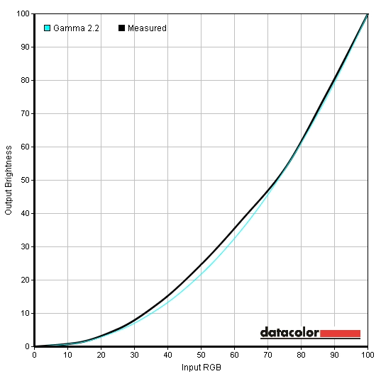
Gamma factory defaults
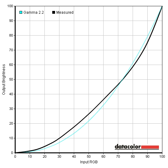
Gamma2
Gamma3

Gamma Test Settings
Test Settings
Brightness= 25 (according to preferences and lighting)
Relaxing evening viewing
Contrast and brightness
Contrast ratios
Monitor Settings White luminance (cd/m²) Black luminance (cd/m²) Contrast ratio (x:1) 100% brightness 331 0.33 1003 80% brightness 288 0.28 1029 60% brightness 244 0.24 1017 40% brightness 200 0.20 1000 20% brightness 154 0.15 1027 0% brightness 106 0.10 1060 Factory defaults (90% brightness) 307 0.30 1023 Gamma2 306 0.3 1020 Gamma3 304 0.30 1013 Color Temp. = Normal 282 0.28 1007 Color Temp. = sRGB 307 0.30 1023 Color Temp. = User 307 0.30 1023 Test Settings 164 0.16 1025 Relaxing evening viewing 129 0.15 860
PWM (Pulse Width Modulation)
Luminance uniformity
Luminance uniformity table
Luminance uniformity map
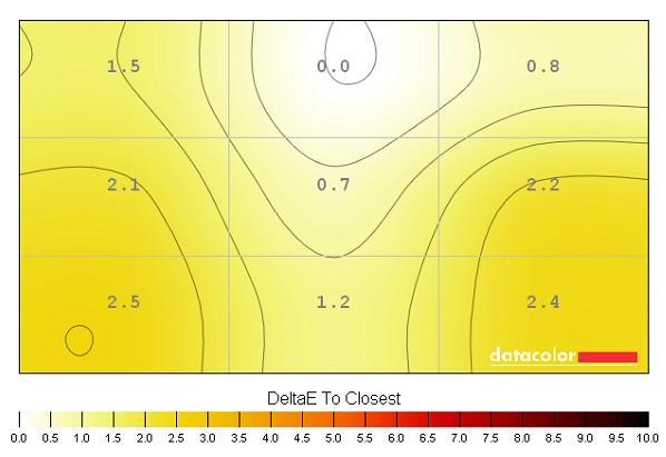
Colour temperature uniformity map
Contrast in games and movies
Lagom contrast tests
Colour reproduction
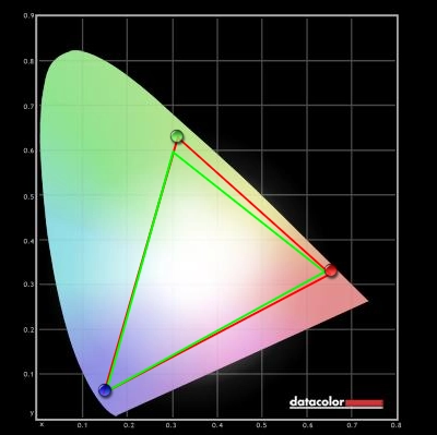
Colour gamut
Colour gamut test settings
Colour in games and movies
Viewing angles
The 34″ 3440 x 1440 ‘UltraWide’ experience
Interpolation and upscaling
Responsiveness
Input lag
Pixel responsiveness
Trailing (various overdrive settings)
Responsiveness in games and movies
Conclusion
Positives Negatives The monitor is set up nicely to provide accurately represented and naturally vibrant colours, aided by a generous but not excessive colour gamut, very light matte screen surface and high-performance AH-IPS panel Gamma didn’t quite follow the 2.2 standard using any ‘Gamma’ setting, but wasn’t far off using the defaults – and this slight deviation shouldn’t bother most users Quite a good contrast performance overall and a good smooth look to light shades thanks to one of the smoothest matte surfaces we’ve come across As usual for IPS models, IPS glow is present with eats away at some peripheral detail Pixel responsiveness is about as good as it needs to be for optimal 60Hz performance – an adjustable pixel overdrive solution with some well-balanced intermediate settings The 60Hz refresh rate will limit the appeal for some users and so will the moderate input lag An appealing mixture of style and ergonomic flexibility – and a screen whose size, aspect ratio and resolution provides an engrossing and productive experience Some users might like a slight curve to the screen. No HDMI 2.0 or Thunderbolt ports, only DP 1.2 providing 3440 x 1440 @ 60Hz natively
![]()

