Author: Adam Simmons
Date published: October 4th 2016
Table of Contents
Introduction
When it comes to affordable all-round performance with a comfortable screen size, ~24” Full HD models with IPS (In-Plane Switching) or similar panels remain popular. The ViewSonic VP2468 hits this ‘sweet spot’ by offering a 23.8” IPS-type panel, combined with a minimalistic but homely design and the promise of strong factory calibration. Additional ‘advanced’ features such as Uniformity Compensation (UC) and a hardware-addressable LUT (hardware calibration) are also found on this model, quite unusual given the price. We take this model for a spin and see if it is really as good as it seems on paper.
Specifications
This model features a 60Hz 23.8” AH-IPS panel. This employs the usual 6-bit + FRC dithering in addition to a 14-bit hardware-addressable LUT for extra precision. A 5ms grey to grey response time is specified. As usual we’ll point out what affect this all has in our testing, as you should never just compare the on-paper specifications. Some of the key ‘talking points’ have been highlighted in blue below.
Features and aesthetics
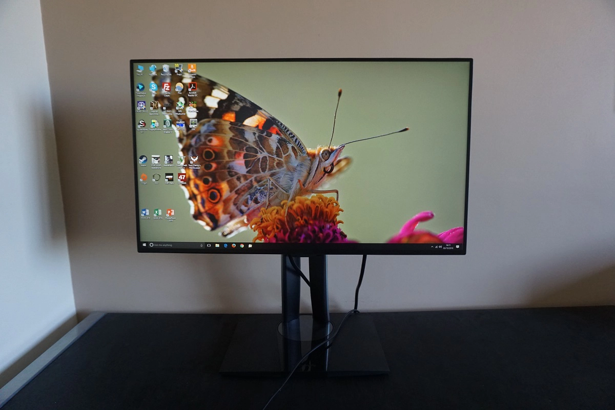
From the front the monitor has a minimalistic modern style. The stand base features a mixture of glossy black plastic centrally, with matte plastic surrounding it. The bezels are ‘dual-stage’, with a hard plastic outer component and a slim panel border that blends in seamlessly when the screen is switched off. The bezels are slender all around, with a total width (both components) of around 5mm (0.20 inches) at the top and sides and around 7.5mm (0.30 inches) at the bottom. The screen surface used on this model is relatively light matte anti-glare, as explored later.
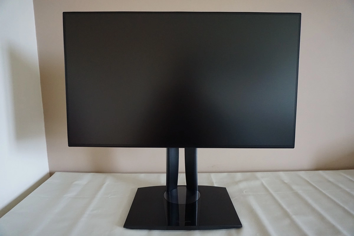
The OSD (On Screen Display) is controlled by pressable buttons on the rear of the screen, running vertically down the right side (as viewed from front). There is no power indicator LED on the front of this model, which most users see as a superfluous addition anyway. There is instead an illuminated power symbol on the power button itself, which glows blue when the monitor is on and amber when it’s in a low power state. The video below runs through the OSD menu system of the monitor.
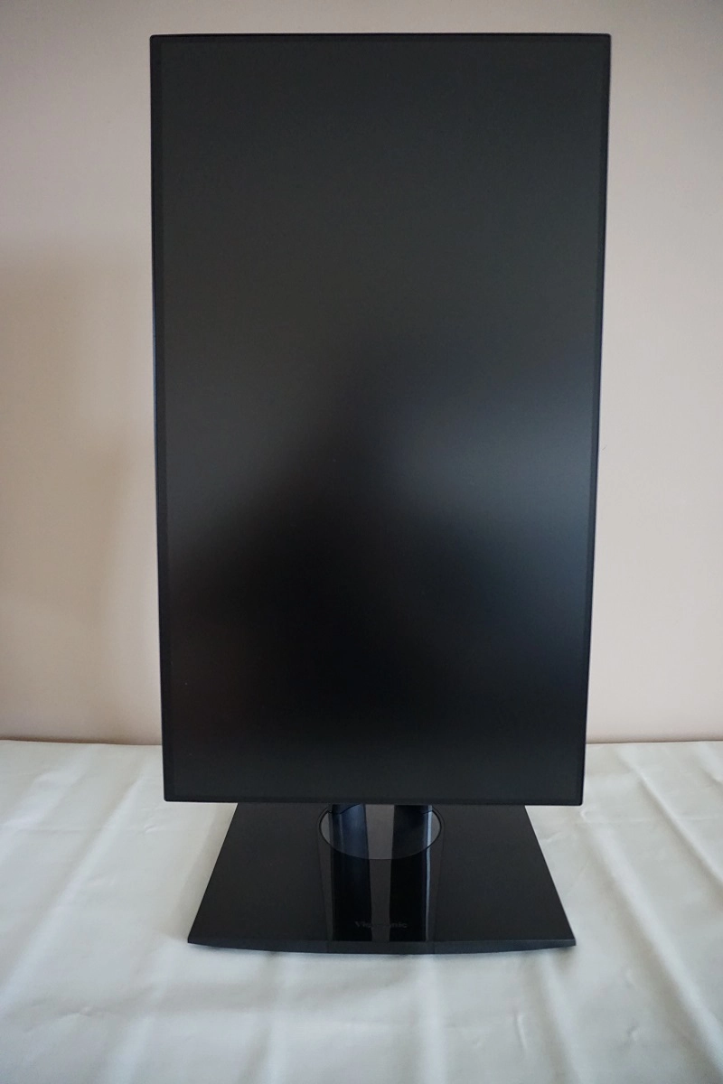
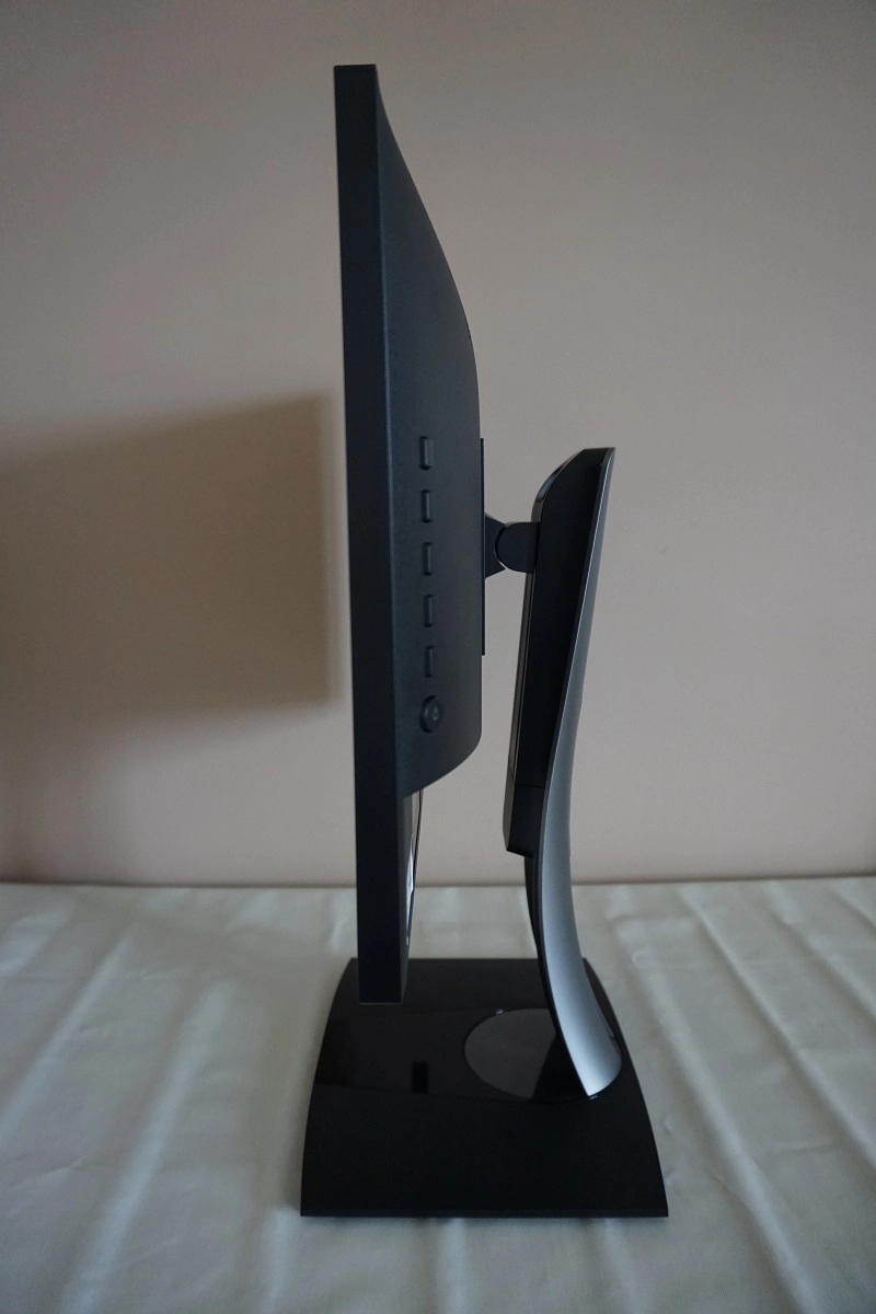
From the side the monitor appears quite svelte – ~19mm (0.75 inches) at thinnest point, lumping out further centrally. The included stand offers full ergonomic flexibility and is a solidly constructed piece with an interesting bowed-back design. This combines matte black plastic and silver matte plastic. The ergonomic flexibility offered by this stand includes; tilt (5° forwards, 21° backwards), height adjustment (130mm or 5.12 inches), swivel (60° left and 60° right) and pivot (90° rotation into portrait). The total depth of the monitor including stand is ~215mm (8.46 inches). At lowest stand height the bottom of the monitor sits ~82mm (3.23 inches) clear of the desk with the top edge of the screen ~398mm (15.67 inches) above the desk.
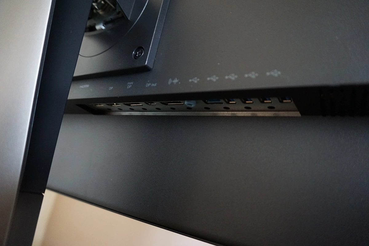
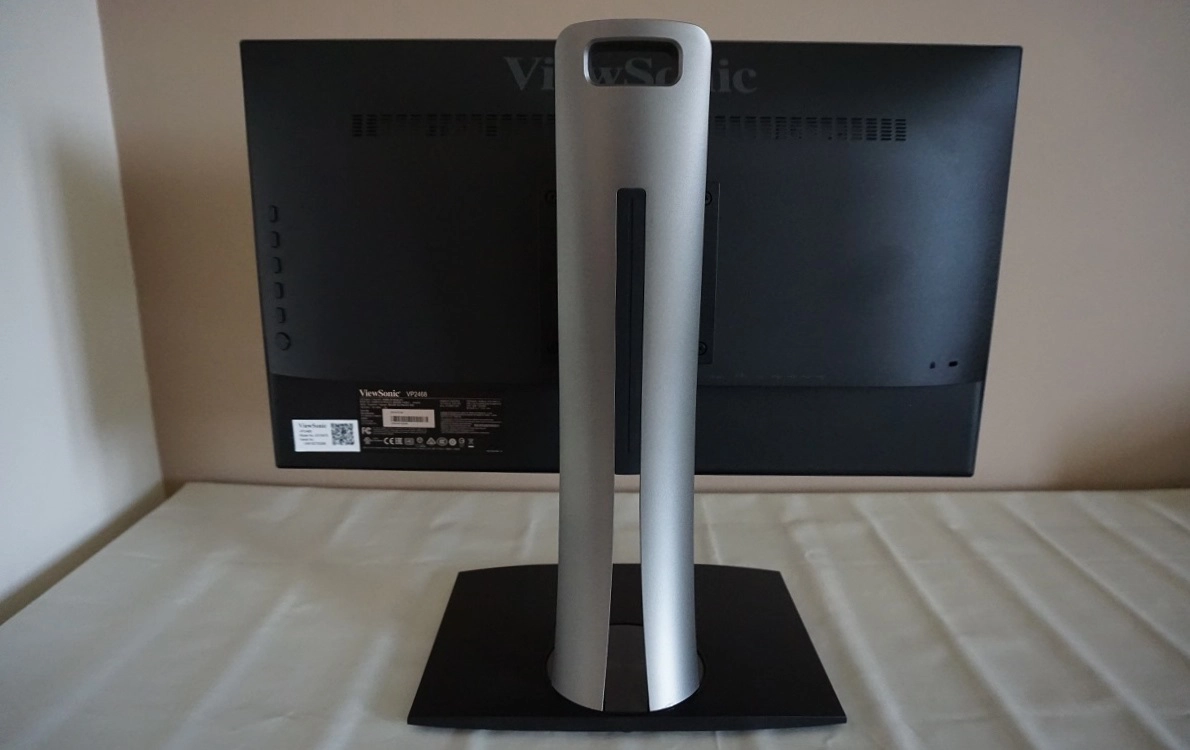
The rear of the screen features matte black plastic, whereas the stand neck Is silver matte plastic. A cable-tidy mechanism runs through the centre of the stand. The stand attaches to the screen by 100 x 100mm VESA and can be removed to make way for an alternative compatible stand or mount. At the left side you can see the OSD control buttons and power button. At the right side there is a K-slot. The ports are found centrally, facing downwards; AC power input (internal power converter), 2 HDMI ports, DP 1.2, MiniDP port, DP 1.2 output (for MST daisy chaining), 3.5mm audio output, 4 USB 3.0 ports (plus upstream). A MiniDP – DP cable, USB 3.0 cable and power cable are included in the box.
Calibration
Subpixel layout and screen surface
A medium (‘relatively light’) matte anti-glare screen surface is employed, offering good glare-handling without the level of graininess associated with some matte surfaces. There is some graininess observable on lighter content, but it’s fairly light rather than the sort of heavy or smeary grain you see on some surfaces. Particularly those used on older IPS models. This screen surface is not as light or smooth in surface texture as that seen on many higher resolution IPS-type panels in particular.
![]()
The monitor uses the usual RGB (Red, Green and Blue) stripe subpixel layout, which is shown in the image above. This is the usual layout and the default expected by modern operating systems such as Mac and Window. There’s therefore no need to run ClearType as a Windows user or worry about text fringing on Mac systems. Users may still wish to run the ClearType wizard to fine-tune according to preferences, however. The image below shows the individually lit subpixels of a model with a very similar sub-pixel structure to this model (specifically the LG Display LM238WF2-SSC used on the AOC I2481FXH).
![]()
You can see that the red and blue subpixels are slightly thinner with larger gaps to the left and right than the green subpixels. We observed some vertical interlacing patterns on certain shades on this monitor, for example certain yellow, orange and blue shades which appeared to have a faint pinstripe effect of a very slightly lighter and darker alternation of the intended shade. These were subtle and not something everyone would actually notice, at 60Hz. Curiously, exactly as with the AOC, they become much more obvious at higher refresh rates (such as 75Hz) which could be achieved at the native resolution by ‘overclocking’ the monitor. This suggests it isn’t purely the subpixel layout that causes this. It’s far from a ‘deal breaker’ as it’s so faint at 60Hz, but it’s a curious observation to note now on 2 different Full HD LG AH-IPS panels we’ve used recently.
Testing the presets
This monitor has a wide range of options that can be configured in the OSD. There are a wide range of ‘preset’ modes as well as other settings that will have a significant effect on the image quality. For the purposes of the table below, we will be selecting a few of these settings to focus on; it would be very tedious indeed to go through all of them here. The OSD video also covers some other settings not mentioned here, so refer to that if you’re interested. The table below includes key readings (central gamma and white point) taken using a Datacolor Spyder5ELITE colorimeter as well as observations by eye. The monitor was left to run for over 2 hours before this data was collected, and the monitor was left in its ‘plug and play’ state with no additional drivers or ICC profiles specifically loaded.
The system we connected it to was running Windows 10, and the monitor was connected via DP to an Nvidia GTX 1070 GPU. The colour signal was corrected in the Nvidia Control Panel (‘Output dynamic range’ was set to ‘Full’ in the ‘Change resolution’ section) as per our article on the topic article. Assume any monitor setting not mentioned in this table was left at default, with the exception of our ‘Test Settings’ where various adjustments were made.
| Monitor Settings | Gamma (central average) | White point (kelvins) | Notes |
| Preset Color Mode = Native (Factory Defaults) | 2.2 | 6335K | Bright but otherwise well balanced, with a rich and varied look and no particular unwanted tints or biases. |
| Preset Color Mode = sRGB | 2.2 | 6273K | As above but significantly dimmer and contrast noticeably weaker (really lacking, in fact). Image looks fairly dull overall. |
| Preset Color Mode = sRGB (Uniformity = Off) | 2.2 | 6290K | This is an effective ‘Low Blue Light’ setting (strongest on this monitor). The blue channel is weakened significantly and hence blue light output from the monitor significantly reduced. The image appears warm – this mode is suitable for relaxing evening viewing or other viewing for the hours leading up to sleep. |
| Blue Light Filter = 100 | 2.2 | 4561K | An alternative LBL setting that offers a slightly stronger blue light reduction and is very close to its target of ‘5000K’. You can also set the colour temperature to various other Kelvin values instead. |
| Test Settings (see below) | 2.2 | 6482K | As factory defaults with a much more comfortable brightness level and a reduction in white point. The green channel also falls into line following the adjustments made. |
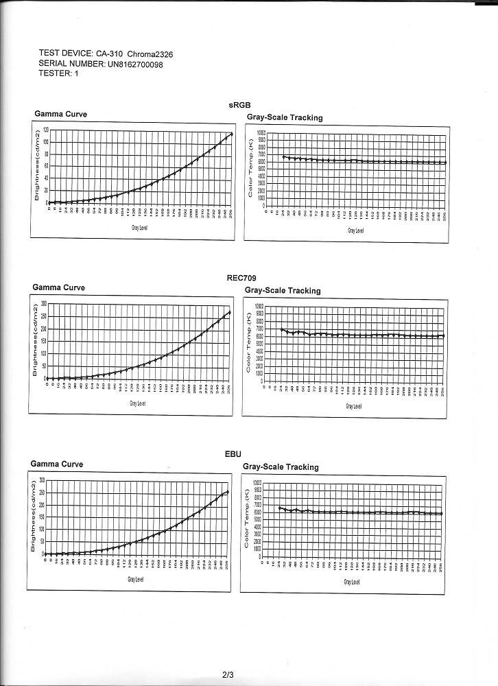
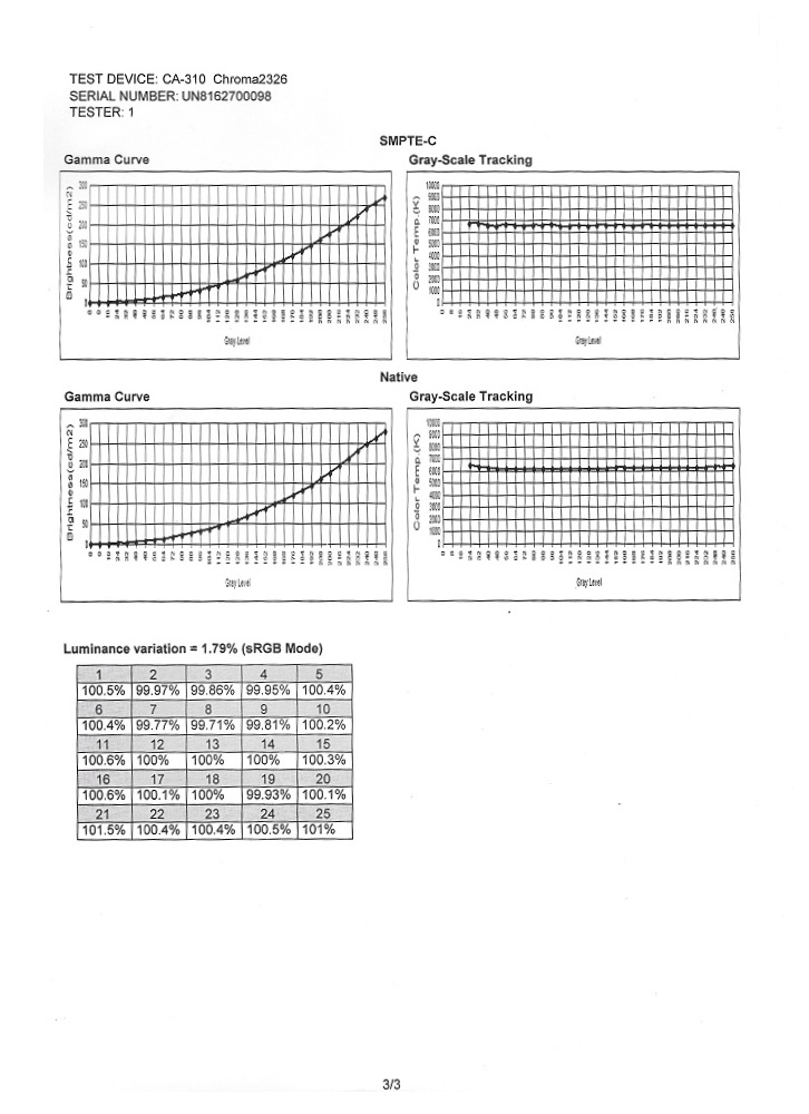
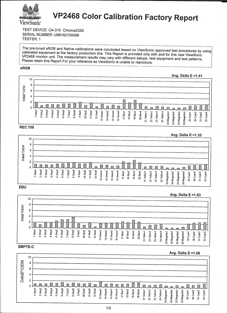
Straight from the box the ViewSonic VP2468 produced a bright but well-balanced image. The gamma tracking was excellent across all setting sets we tested, averaging ‘2.2’ and sticking to the desirable curve well. The monitor includes a broad range of settings which can be tweaked and includes a range of factory calibrated ‘Preset Color Mode’ settings. A factory calibration report is included to show the level of colour accuracy and gamma performance that ViewSonic found in these modes when assessed in their factory. The uniformity in the ‘sRGB’ mode with the ‘Uniformity’ setting enabled is also given – this is a Uniformity Compensation setting explored a little later. As per the table, the image is somewhat duller and contrast takes a visible hit in this setting – again, this is quantified later on in the review.
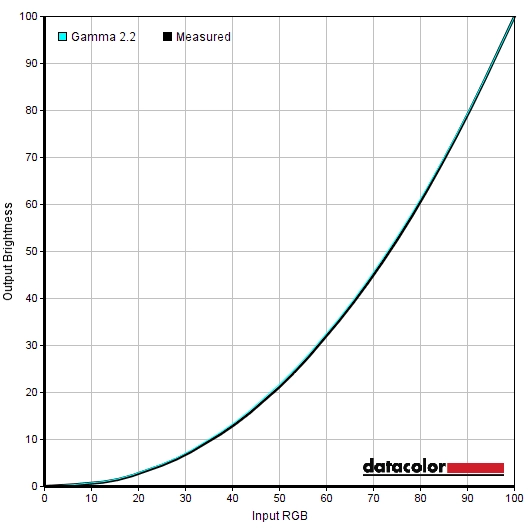
The white point ‘out of the box’ was good, despite not quite hitting the 6500K target. It came fairly close to this really, and even if ‘6500K’ was achieved in the factory, natural changes in this over time are to be expected. It’s also important to note that the white point that should be targeted depends on ambient lighting conditions as this affects colour perception (and hence target whitepoint) significantly. At around 6300K whites appear ‘neutral’ under many lighting conditions and following a short period of compensation as your eyes adjust, it’s unlikely that you’d actually notice a difference between this and 6500K. The image below shows the gamma curve under our ‘Test Settings’ – as you can see, it tracks close to where it should. An important point to note, at least on the ‘pre-release’ sample we tested, is that you can adjust the colour channels manually in the ‘Color Adjust’ menu. As noted in the OSD video, though, you can’t adjust these and also set a ‘ViewMode’ preset. This means you can’t use ‘Custom’ as the ‘ViewMode’ and therefore can’t adjust the ‘Response Time’ setting (the default, ‘Standard’, is sub-optimal) if you also wish to manually adjust colour channels. You can increase the ‘Blue Light Filter’ and hence lower the white point if desired, however. As also explored in the OSD video, this monitor has a hardware-addressable LUT and hence supports hardware calibration. This means that you calibrate the monitor directly, using a compatible colorimeter such as the X-Rite i1Display Pro, rather than calibrating the GPU’s LUT and gamma tables (software-level calibration). This is traditionally seen as a fairly ‘high-end’ feature, so it’s nice to see it included on a product in this price range. To make use of this feature, you need to use the included ViewSonic Colorbration software (available as a free download here). You can then save 3 individual calibrations to the monitor, in the ‘Color Calibration’ section of ‘Color Adjust’ in the OSD; ‘CAL 1’, ‘CAL 2’ and ‘CAL 3’. For our test settings we simply reduced monitor brightness and switched ‘ViewMode’ to ‘Custom’ in order to adjust the ‘Response Time’ setting. The changes we made in the OSD are summarised below. Note that these are just a suggestion – individual units and preferences vary. Anything monitor setting not mentioned here, including contrast, was left at default. Brightness= 45 (according to preferences and lighting) Response Time= Advanced A BasICColor SQUID 3 (X-Rite i1Display Pro) was used to measure white and black luminance levels, from which static contrast ratios were calculated. This data is shown in the following table – assume any setting not mentioned was left at default, aside from the exceptions already mentioned in the calibration section. Black highlights in the table indicate the highest white luminance, lowest black luminance and maximum contrast ratio recorded. Blue highlights indicate the results using our ‘Test Settings’.
Gamma 'Test Settings'
Test Settings
ViewMode = Custom
Contrast and brightness
Contrast ratios
Monitor Profile White luminance (cd/m²) Black luminance (cd/m²) Contrast ratio (x:1) 100% brightness 277 0.35 791 80% brightness 235 0.30 783 60% brightness 193 0.25 772 40% brightness 150 0.19 789 20% brightness 107 0.14 764 0% brightness 63 0.08 788 Preset Color Mode = sRGB 115 0.30 383 Preset Color Mode = sRGB (Uniformity = Off) 284 0.36 789 Blue Light Filter = 100 236 0.36 656 Test Settings 166 0.21 790
The average contrast ratio with only brightness adjusted was 781:1, which is somewhat weaker than we’ve seen on many recent IPS-type models. This could be partly down to the tight factory calibration that seems to exist on this monitor or perhaps down to the panel itself; we tested various settings not listed in the table and couldn’t achieve higher than ~800:1 for static contrast. Our ‘Test Settings’ simply involved adjustments in brightness and other settings which had no effect on contrast; 790:1 was recorded here. The highest luminance recorded was 277 cd/m² and the lowest white luminance recorded was 63 cd/m². This provides a luminance adjustment range of 214 cd/m², without loss of contrast. The minimum white luminance recorded is slightly higher than on some models but lower than others – fairly dim really.
A ‘Dynamic Contrast’ setting called ‘Advanced DCR’ (Advanced Dynamic Contrast Ratio) exists on this monitor and can be activated with ‘ViewMode’ set to ‘Custom’. This allows the backlight brightness to change according to the overall levels of ‘light’ and ‘dark’ being displayed on the screen. There are 5 options here; ‘0’ (off)’, ‘25’, ‘50’, ’75’ and ‘100’ (maximum). Increasing this value applies an ever-stronger sharpening filter to the image; even at ‘25’ the image appears overly sharp but this becomes extreme at higher settings. Increasing this beyond ‘25’ seems to have little influence on the brightness levels used by the monitor or how rapidly it reacts to changes in scene brightness. It’s always very ‘dynamic’, dimming quite readily for dark content but verging on uncomfortably bright for lighter content even if there are plenty of dark elements on screen. We are never fans of ‘Dynamic Contrast’ at the best of times, but the feature is there if you wish to use it.
PWM (Pulse Width Modulation)
This monitor does not use PWM (Pulse Width Modulation) to regulate the backlight at any brightness level. Instead, DC (Direct Current) dimming is employed. The backlight is therefore considered ‘flicker-free’, which will be appreciated by those sensitive to or worried about the effects of PWM usage.
Luminance uniformity
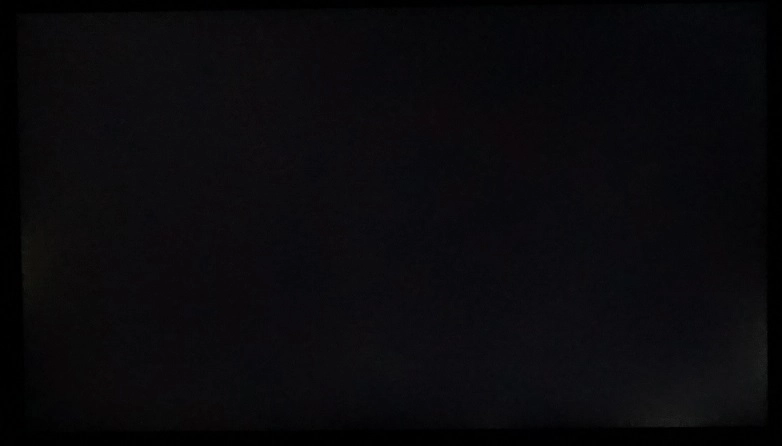
We observed a black background in a dark room and could see some backlight bleed towards the bottom right corner and central region of the left screen edge. Individual units vary when it comes to backlight bleed. The image below was taken from a few metres back to eliminate ‘IPS glow’ and make show only any underlying backlight bleed is visible. ‘IPS glow’ can be seen from a normal viewing position as a sort of silver or golden sheen, towards the bottom corners of the screen in particular. The effects of this and how it manifests itself is explored later on. If you move your head, particularly to sharper viewing angles, this glow appears to bloom out as demonstrated in the viewing angles video deeper into the review. Under our ‘Test Settings’, the luminance uniformity of the screen was very strong. The brightest point recorded was ‘quadrant 8’ below the central region of the screen (160.7 cd/m²). The maximum deviation occurred at ‘quadrant 9’, to the right of this (146.4 cd/m²). Brightness was always between 0 – 9% of the brightest point of the measured point, which is excellent. Enabling the ‘Uniformity’ mode improved this further, cutting the maximum deviation in measured brightness down to a mere 3%. Note that individual units can vary when it comes to uniformity, but it certainly seems that an effective Uniformity Compensation setting is employed by ViewSonic which should provide strong uniformity on other units regardless of their usual uniformity with the mode disabled. For those who prefer a graphical representation, these deviations are shown in the contour maps below. Here darker greys represent lower luminance values and hence greater deviation from the brightest point than lighter greys. The top graphic shows the results under our ‘Test Settings’ whilst the bottom graphic shows the results under the ‘Uniformity’ mode. Note that deviations beyond the points measured are also expected. The colour temperature (white point) uniformity for these 9 quadrants was also analysed, with deviations here assigned DeltaE values. Lower DeltaE values represent less deviation from the 6500K (D65) daylight white point than higher values. A value under DeltaE 3 is considered deviation that is not significant and that most users wouldn’t readily notice by eye. Again, the top graphic is for our ‘Test Settings’ and the bottom using the ‘Uniformity’ mode. Under our ‘Test Settings’ results are reasonable. Significant deviation (DeltaE 3.7) was recorded between the bottom left corner and the point closest to 6500K (bottom right corner). No further significant deviations were recorded. The ‘Uniformity’ setting provided exceptionally strong performance in this area, with all points showing < DeltaE 1 deviation from 6500K. Note that individual units can vary, but this certainly seems to be a very effective Uniformity Compensation setting that ViewSonic includes with this monitor. The contrast performance was reasonable on Battlefield 4 (BF4). As usual, detail was lost peripherally due to ‘IPS glow’. This was particularly true towards the bottom corners of the screen, when observed from a normal seated viewing position. There was also a degree of detail lost elsewhere, influenced by the slightly weak static contrast ratio. Near-black shades appeared indistinct from ‘black’, whilst black itself lacked a bit of depth. Lighter elements contrasted well in the darkness, however. Such elements were also reasonably smooth without heavy grain, with just a bit of a grainy look from the screen surface but nothing excessive. On Dirt Rally the contrast experience was similar, with slight detail loss centrally and more pronounced detail loss from ‘IPS glow’ peripherally. Lighter colours such as car headlights appeared reasonably smooth, without obvious graininess. Unfortunately we were unable to assess our Blu-ray test titles, due to some issues with our Blu-ray drive. We’re sure performance here would reflect what we saw in the game titles tested, though. We used Lagom’s tests for contrast to assess weaknesses in contrast performance in a more specific way. The following observations were made. The VP2468’s colour gamut (red triangle) was compared to the sRGB colour space (green triangle) using our ‘Test settings’. These settings use the full native gamut of the monitor, which covers sRGB entirely (100% coverage) with a little extension behind this in the red and green corners of this diagram. This gives the monitor good potential for accuracy colour reproduction within the sRGB colour space, with just a touch of extra vibrancy possible for some shades. The monitor also features a range of ‘Preset Color Mode’ settings, including ‘sRGB’. These are all factory calibrated try to fit certain standards as well as possible. The ‘sRGB’ setting gets rid of the slight over-extension in the gamut and introduces a small amount of under-coverage in the blue region of this diagram. Individuals who have their own colorimeter may want to consider using the full native colour gamut which offers 100% sRGB coverage instead. The colour gamuts under these settings are shown below; sRGB’, ‘EBU’, ‘SMPTE-C’, ‘Rec709’ and ‘DICOM SIM’. Colour reproduction was excellent on BF4, both in terms of the variety and richness of shades. Earthy browns looked very neutral whilst a good distinct range of minty greens and lush deep greens were also displayed. This helped the environments in the game look as they should. Vibrant elements, such as the brightly coloured in-game markets, vehicle HUD elements and roaring flames looked rich with good shade depth and a nice vivid quality to them. This rich, accurate and varied colour reproduction was also observed on Dirt Rally. Here, the racing environments again looked as they should with appropriate saturation and shade variety. The car liveries stood out nicely, with some particularly appealing yellows, oranges and reds. The monitor was able to give yellow a certain distinctness from even pale orange that some monitors struggle with – although such shades did show faint interlacing patterns as mentioned previously upon closer inspection. We used the Lagom tests for viewing angle to further analyse colour consistency and viewing angle performance. The following observations were made from a normal viewing position, around 70cm from the screen. We used a small tool called SMTT 2.0 and a sensitive camera to compare the latency of the VP2468 to a range of monitors of known latency, taking over 30 repeat readings to maximise accuracy. Using this method we calculated 4.40ms (under 1/3 of a frame @60Hz) of input lag. Note that the value here is influenced both by the element you see (pixel responsiveness) and that which you feel (signal delay). This indicates a low signal delay on the monitor which even sensitive users shouldn’t take issue with. Enabling the ‘Low Input Lag’ mode did not have a significant effect on this value, perhaps lowering it by a fraction of a ms simply due to the more aggressive pixel overdrive employed. In this article we explore some important concepts related to monitor responsiveness. Chief amongst these is the notion of ‘perceived blur’, which is influenced by both the pixel responsiveness of the monitor and the movement of our own eyes as we track motion on the screen. This second part is the more significant factor on modern LCDs. We also introduce ‘pursuit photography’, which uses a moving camera to capture motion on a monitor in a way that reflects not only the pixel responses of the monitor but also the movement of the eye (camera). This gives a much more accurately representation of what the eye sees at a given moment in time than any photography method which uses a static camera. The images below are pursuit photographs taken using the UFO Motion Test for ghosting, with the test running at its default speed of 960 pixels per second. This is a practical speed for such photographs to be taken. The monitor was set to run with ‘Response Time’ set to various settings; ‘Standard’, ‘Advanced’ and ‘Ultra Fast’. We’ve also included a shot taken with the monitor using ‘Advanced’ and also the ‘Low Input Lag’ setting, which alters pixel response behaviour. The medium cyan background (middle row of test) was used for these shots. The final shot is taken from a Samsung S27A750D running at 60Hz, full brightness (avoids PWM) and using its optimal response time setting for 60Hz. This represents how things should look where response time isn’t really a limiting factor and it’s only eye movement that would come into play for the perceived blur. Using ‘Standard’ provides a weak level of acceleration. There is significant blurring of the object itself due to eye movement and also a bold trail behind the object – remember that the object moves across the screen from left to right. The ‘Advanced’ setting reduces this bold trail significantly. There is now a small amount of overshoot (inverse ghosting) behind the cockpit in particular, but it’s very light and difficult to see. The ‘Ultra Fast’ setting is actually rather similar to this, with slightly stronger overshoot. When activating the ‘Low Input Lag’ mode, the level of overshoot increases considerably. For this example we’ve kept the Response Time in ‘Advanced’, where you can see a bright and colourful trail behind the object. If you use ‘Standard’ with this low input lag mode then performance is extremely similar, whilst using ‘Ultra Fast’ with this mode gives overshoot that is even stronger. Our analysis here suggests that the ‘Advanced’ setting (without ‘Low Input Lag’ active) is optimal. Indeed, the signal delay is already very low, so this mode is really just detrimental to image quality without any noticeable advantage. This is echoed by general testing as well. The ‘Ultra Fast’ setting provides only a little extra overshoot, but it doesn’t really provide any noticeable advantage either. So the ‘Advanced’ setting certainly seems best balanced on this monitor. Note that we will not be analysing the overclocking performance of this monitor, because as mentioned previously there were very obvious interlacing patterns on some shades when running the monitor at higher refresh rates such as 75Hz. On BF4 there was a moderate amount of blur. This was caused predominantly by eye movement and largely similar to what you’d observe on even the fastest 60Hz LCDs. The pixel responsiveness was largely fast enough for optimal 60Hz performance, with most pixel responses being masked by perceived blur from eye movement. There were some subtle weaknesses here and there, but nothing that really stood out. Some higher contrast transitions were performed a bit slower than optimally. This was particularly the case where light objects moved against a dark background, such as light metal against a stormy sky. Even then the additional trailing was quite light. Rapid movement involving such transitions (for example driving an ATV in dense shaded vegetation) produced a little extra perceived blur as a result. There was also a little bit of overshoot (inverse ghosting), particularly during some medium transitions such as tree trunks moving against a light blue sky. This produced some faint bright trails that were slightly lighter than either the object or background colour. These were not obvious, though, they were too subtle for most users to notice. On Dirt Rally there was a moderate degree of blur, again caused predominantly by eye movement and much as you’d see on even the fastest 60Hz LCDs. There were no obvious weaknesses imposed by slower than optimal pixel responses – just the little bit of extra trailing during some transitions that is barely noticeable really. When driving at night, for example, there were some slower than optimal pixel transitions which slightly increased perceived blur during rapid cornering. Even in a side by side comparison with a snappy TN model running at 60Hz, though, the difference can only be described as subtle. There was no obvious overshoot, either, just very light traces during a minority of transitions that wasn’t at all eye-catching. As noted earlier in the review our Blu-ray drive wasn’t working, so we couldn’t perform our usual responsiveness assessment using these. We did observe some movie trailers and Amazon Prime movie content, however. There were no obvious weaknesses here. The same subtle weaknesses could be seen as we observed for gaming, when viewing 60fps content; nothing to write home about. For typical content (24 – 30fps) these weaknesses weren’t even apparent, masked by imperfections in fluidity and overall pace of action imposed by the low frame rate itself. The ViewSonic VP2468 is a monitor marketed as a budget photography screen, and it certainly ticks a lot of boxes for such a screen. Straight from the box, the colour performance was pleasing. Gamma tracked tightly to the desirable ‘2.2’ curve and white point was within good range of the 6500K (D65) target. The AH-IPS panel also provided strong colour consistency, which when coupled with complete coverage of the sRGB space (and a little coverage beyond, natively) gave an excellent rich and varied look to the image. The VP2468 also included a rather comprehensive OSD, with many useful (and some not so useful) presets as well as various other settings to fine-tune according to preferences or taste. Some of these presets are factory calibrated ‘Color Mode’ setting and include a degree of colour space emulation as well as correction of gamma, white point and other key attributes. The ‘sRGB’ setting, for example, cut back on the native gamut a bit but actually gave a little under-coverage. Users may prefer to use the full native gamut (100% sRGB) when calibrating to ensure full shade coverage within the sRGB space. The monitor also includes a hardware-addressable LUT (i.e. supports hardware calibration) which can be addressed using a compatible X-Rite colorimeter such as the i1Display Pro. To further enhance potential desirability for those interested in tight colour accuracy, a Uniformity Compensation setting is also included. This certainly provided excellent luminance and colour temperature uniformity, according to our testing. It did come at a great expense of contrast, though, which may or may not be a worthy trade-off depending on your work. One slight niggle, and not one entirely unique to this panel, is that we could observe interlacing on some shades such as blues and oranges. This was fairly faint (at 60Hz), but still visible and could be a potential bugbear for users who like to closely inspect their work for noise or other artifacts. Or are simply sensitive to such things. The monitor put in a reasonable but not particularly special contrast performance. Obviously, as an IPS panel, we were fully expecting ‘IPS glow’ and reasonable contrast rather than anything outstanding. But the static contrast recorded even natively was somewhat lower than what we’ve seen on quite a few IPS-type panels recently and fell short of the specified 1000:1 (at closer to 800:1). In practice this doesn’t make a huge difference, but we could observe a bit of detail loss in dark scenes when gaming primarily as a result of this slight weakness. The screen surface didn’t impede our enjoyment of lighter shades to the extent that it did on some other models, particularly older IPS models and some recent TN models. There was still a bit of graininess (slightly more than competing PLS models, in fact) but nothing particularly obtrusive. The responsiveness of the monitor was pleasing overall, within the confines of the 60Hz refresh rate. Trying to ‘overclock’ this caused the aforementioned interlace pattern artifacts to become very pronounced. There were only some subtle weaknesses in pixel responsiveness, such as a little bit of extra trailing here and there and a small amount of light overshoot. None of this was eye-catching, though, and the performance was largely as you’d see on even the fastest and ‘best tuned’ 60Hz models. There was little input lag to speak of, too, despite the monitor including a largely useless ‘Low Input Lag’ mode. Enabling this had no significant positive effect on input lag and simply introduced obtrusive inverse ghosting instead. So in terms of its feature-set and overall performance, the monitor is not perfect but still ticks a lot of boxes. When you couple that with the rather decent asking price, it certainly becomes a more attractive proposition. Add to that the solid build and understated yet in some respects quite stylish design, and you do have a monitor that’s worth considering. The bottom line; a competent budget photography screen and all-round performer with plenty of settings to tweak and some good factory-calibrated presets for a variety of uses
The Spyder5ELITE was used to analyse the uniformity of lighter colours, specifically 9 white quadrants spaced equally across the screen and running from the top left to bottom right of. The luminance recorded at each quadrant and the percentage deviation between a given quadrant and the brightest recorded point is shown in the tables below. The top table shows the results under our ‘Test Settings’, whilst the second table shows results with the ‘Uniformity’ (Uniformity Compensation) setting enabled.

Luminance uniformity table 'Test Settings'

Luminance uniformity table 'Uniformity'
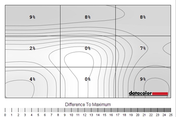
Luminance uniformity map 'Test Settings'
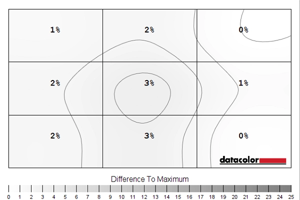
Luminance uniformity map 'Uniformity'
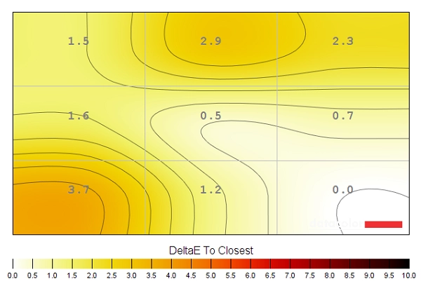
Colour temperature uniformity map 'Test Settings'
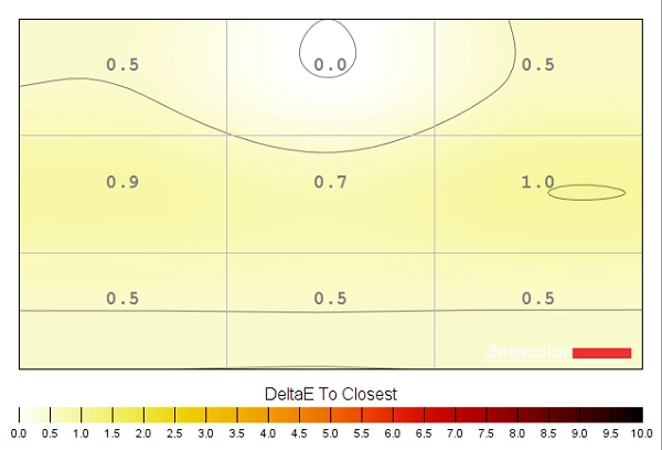
Colour temperature uniformity map 'Uniformity'
Contrast in games
Lagom contrast tests
The greyscale gradient appeared very smooth, free from obvious banding. There was some very well-masked temporal dithering evident in places.
Colour reproduction
Colour gamut

Colour gamut test settings

Colour gamut 'sRGB'

Colour gamut 'EBU'

Colour gamut 'SMPTE-C'

Colour gamut 'Rec709'
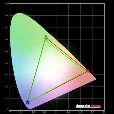
Colour gamut 'DICOM SIM'
Colour in games
Viewing angles
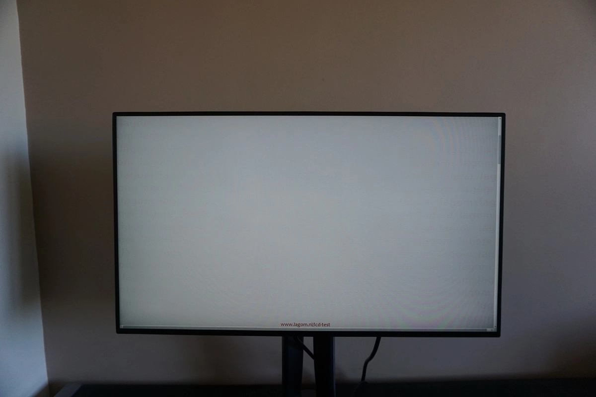
The video below shows this text test, a mixed desktop background and dark desktop background from a variety of viewing angles. Note the ‘IPS glow’ mentioned earlier, which appears to bloom out from increased viewing angles.
Responsiveness
Input lag
Perceived blur (pursuit photography)
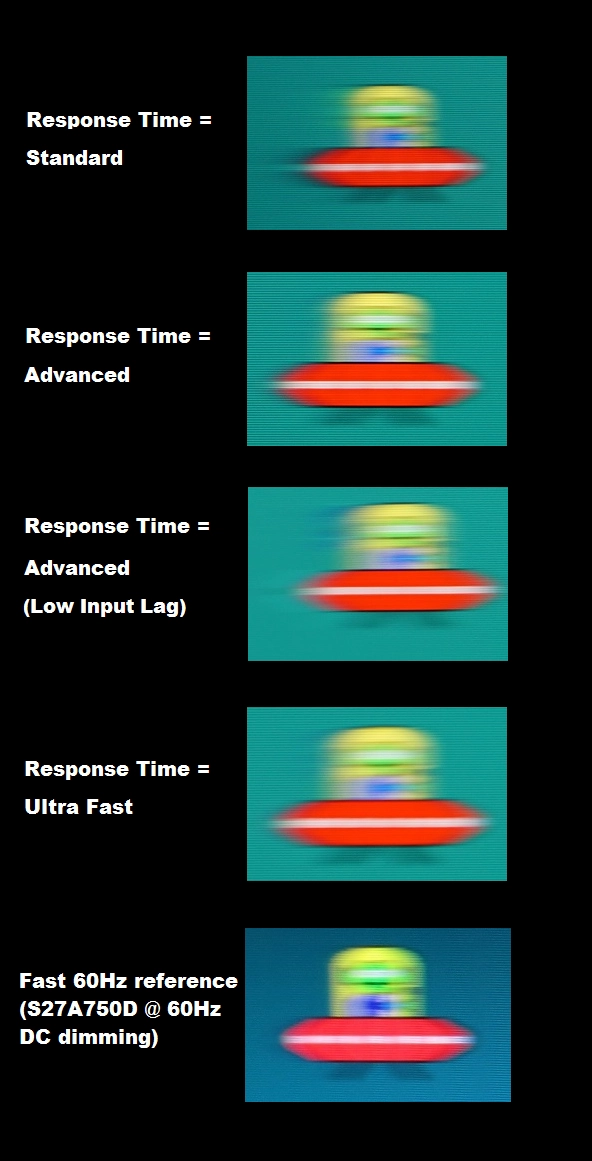
Perceived blur with various settings
Responsiveness in games and movies
Conclusion
Positives Negatives Strong image setup ‘out of the box’, with strong colour consistency, excellent gamma tracking and 100% sRGB coverage. A good range of image presets, hardware-addressable LUT and an effective Uniformity Compensation setting too
No support for wide colour gamuts and some faint interlacing patterns visible on certain shades
Reasonable static contrast performance and a screen surface that’s free from obtrusive graininess Static contrast a bit below par for a modern IPS-type panel, ‘IPS glow’ eats away at peripheral detail and a little bit of graininess from the screen surface Low input lag and rather well-tuned pixel responsiveness provides a competent 60Hz performance. Most perceived blur is linked to eye movement and largely as you’d see on even the fastest 60Hz LCDs
Some minor pixel responsiveness weaknesses and a little hint of overshoot in places (nothing obtrusive). Response Time setting can only be adjusted by setting ‘ViewMode’ to ‘Custom’ – which restricts some other adjustments, such as colour channels
Excellent stand adjustability, competitive pricing and a solid yet attractive design with extremely slender bezels
Glossy black plastic at rear of stand base is a dust magnet – but fortunately, most of the monitor uses matte plastics
![]()
