Author: Adam Simmons
Date published: February 12th 2016
Table of Contents
Introduction
With the slew of high resolution monitors, curved monitors and high refresh rate models it’s easy to forget some people are after something a bit simpler. The AOC I2481FXH may be just what the doctor ordered; a simple 60Hz Full HD model with an elegant and stylish design. We put this intriguing-looking monitor through its paces in our usual gauntlet of tests to see if the image performance can match its eye-catching looks.
Specifications
The monitor uses a 23.8” Full HD panel, specifically of the LG AH-IPS variety. This uses 6-bit + FRC dithering, as is usual for such models. The inevitably misleading but nonetheless specified grey to grey response time is 4ms. Some of the key ‘talking points’ of the monitor have been highlighted in blue below.
Features and aesthetics
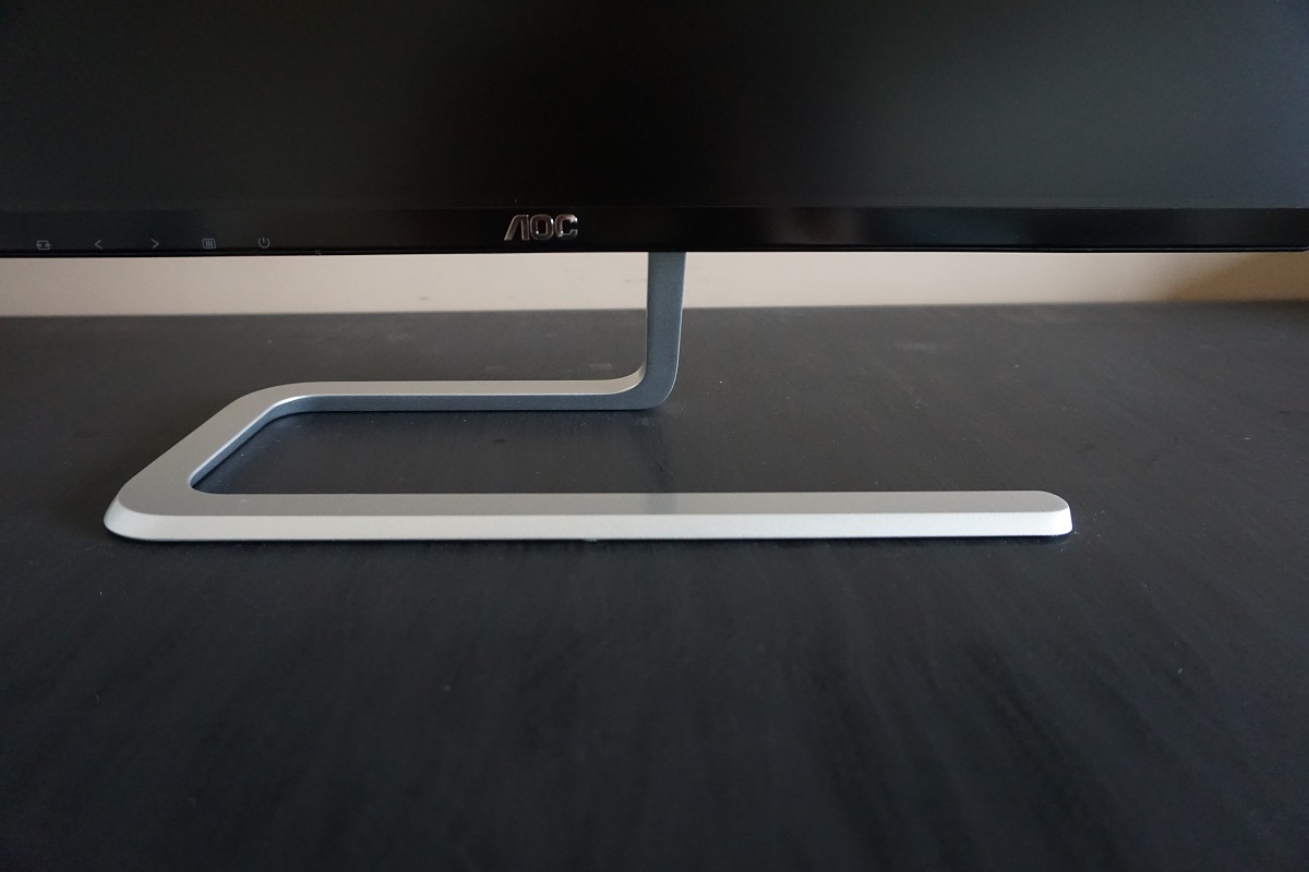
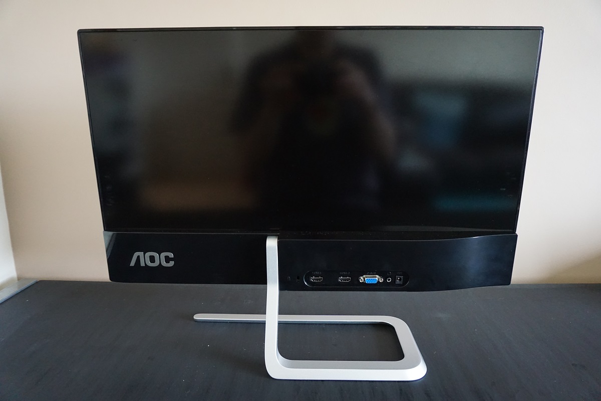
From the front the monitor has a rather artistic and many would say stylish look. The sinuous stand is made from metal and has a nice cold and solid feel to it. It also keeps the monitor firmly rooted on the desk – in terms of overall sturdiness this stand does an excellent job. The limitations there come in its adjustability, with tilt (3° forwards and 20° backwards) being the only ergonomic flexibility afforded to the user. The bezels are very slender, with a dual stage-design that comprises a very thin hard outer plastic section and a slim panel border. Together these make for a bezel thickness of a mere 7.5mm (0.30 inches) at the top and sides. The bottom bezel is somewhat thicker at ~19mm (0.75 inches) including both the bezel and thin panel border, with a semi-matte plastic finish. The screen surface is a medium matte anti-glare surface solution as explored later.
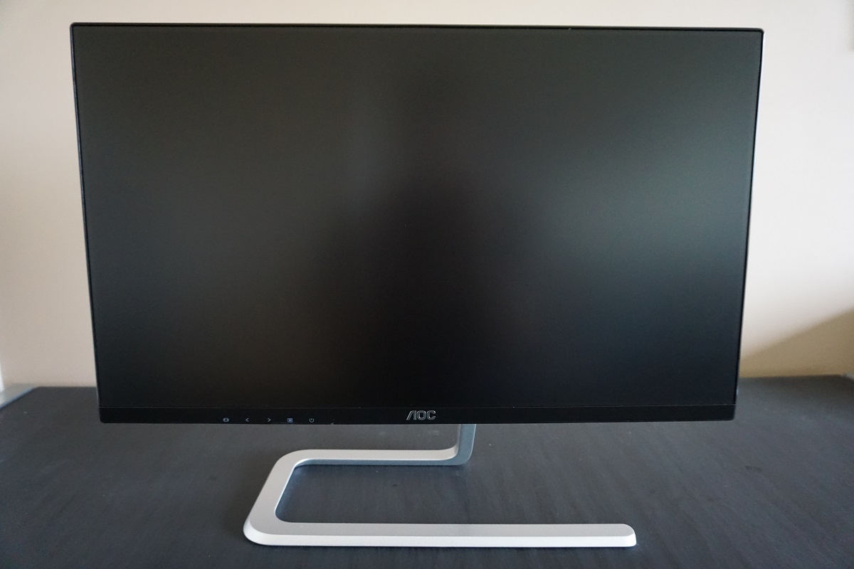
The OSD (On Screen Display) controls are tactile, placed on the underside of the bottom bezel, towards the left. This is quite a rare position to have them in, they’re usually found to the right on account of most users being right-handed. Given that this monitor isn’t massive and the button placement isn’t massively awkward, this wasn’t really particularly difficult to operate with either hand. The video below gives a run-through of the OSD menu system. There is also a small power LED here, facing forwards to the right of where the power button is. This glows a very dim and entirely unobtrusive white when the monitor is on and a fairly dim and dark amber colour when the screen is in standby.
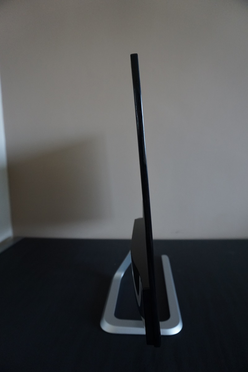
From the side the monitor is exceptionally slim; a mere 7.5mm (0.30 inches) at thinnest point. It is thicker towards the bottom, particularly on the left side where many of the ports and other monitor electronics are housed. It still maintains a sleek and quite striking profile overall. The total depth including the stand is 150mm (5.90 inches) with the front of the screen ~100mm (3.94 inches) from the rear of the stand. The bottom of the screen sits ~85mm (3.35 inches) above the desk surface with the top of the screen ~406mm (16.00 inches) above the desk.
The rear of the monitor has a minimalistic look, with a semi-matte black plastic used extensively. Unsurprisingly given how thin the screen is, there is no provision for VESA mounting. To the immediate right of the stand neck (when viewed from the rear) there is a K-Slot. The backwards-facing ports are also found here; 2 HDMI ports, VGA, 3.5mm headphone jack and DC power input (external power brick). An HDMI and VGA cable are included in the box alongside the necessary power adaptor and cable.
Calibration
Subpixel layout and screen surface
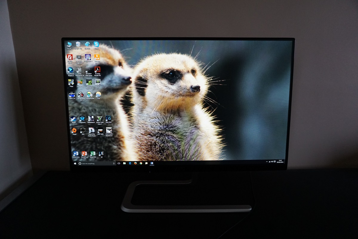
A medium (or ‘relatively light’) matte anti-glare screen surface is employed by the monitor. This provides strong glare handling characteristics without inducing the level of graininess associated with some matte screen surfaces. There was certainly a touch of graininess observable on light content, but this was fairly light and not heavy or smeary like older IPS models in particular. The screen surface is not quite as light as that seen on Samsung’s Full HD AD-PLS panels nor as light as most higher resolution IPS-type panels, however.
![]()
As you can see from the image above, the monitor uses an RGB (Red, Green and Blue) stripe subpixel layout. The image above shows the subpixel layout of the monitor, which is standard RGB (Red, Green and Blue) stripe. This is the most common layout and the default expected by modern operating systems such as Microsoft Windows and MacOS. There is therefore no need to worry about fringing of text as a Mac user or needing to run ClearType as a Windows user. You may still wish to run ClearType just to fine-tune according to preferences, however. The image below shows the subpixels lit individually.
![]()
We observed some interlacing patterns on this monitor when it was displaying certain shades, particularly some blue, yellow or orange shades. There appeared to be faint vertical stripes of a slightly darker shade than is intended. This can sometimes be caused by uneven spacing or arrangements of certain subpixels and you can see above that the red and blue subpixels do appear slightly thinner with larger gaps to the left and right than the green subpixels. However; we don’t feel this is strictly related to the subpixel layout because rather curiously the effect was as good as absent at 50Hz, fairly faint at 60Hz (default) and very obvious if the monitor was running much higher than this (e.g. 75Hz) as explored later on. It could be a combination of the subpixel structure and some odd form of static dithering which is used in a more obvious way at higher refresh rates. This isn’t something that most users will necessarily notice at 60Hz nor find bothersome but we felt it was worth mentioning for completeness.
Correcting the colour signal
As covered in this article, Nvidia GPUs default to using the incorrect ‘Limited Range RGB 16-235’ signal for any Full HD monitors connected via HDMI. AMD GPUs also use a sub-optimal signal. Fortunately, as explained in the article, this is easy to correct. The image was noticeably washed out using the incorrect signal on our Nvidia GTX 980 Ti and looked much fuller and richer following the necessary adjustments. The easiest way to correct this is simply to ensure you’re using a relatively recent Nvidia graphics driver (version 347.09 or later). When you open Nvidia Control panel you’ll see a drop-down menu option called ‘Output dynamic range’. This is set to ‘Limited’ by default, so simply set this to ‘Full’ and press ‘Apply’. Further details on this and other methods to correct the colour signal (including for AMD GPU users) can be found in our article on the topic.
Testing the presets
The monitor does not have any traditional presets, simply ‘Eco Mode’ settings that alter the brightness and nothing else. There are a few settings that you can adjust in the OSD which do impact the image quite noticeably, for example the ‘Gamma’ and ‘Color Temp.’ settings. In the table below we have some key readings (taken using a Spyder5ELITE colorimeter) and general observations using a range of different settings. These were taken after the monitor had been running for over 2 hours. The monitor was kept in its ‘plug and play’ state on a Windows 10 system, without additional drivers or ICC profiles loaded. Our system used an Nvidia GTX 980 Ti connected using HDMI, with the colour signal corrected as above. Unless otherwise stated assume default settings were used, with the exception of the ‘Optimal OSD settings’, ‘Test Settings’ and ‘Relaxing evening settings’ where various adjustments were made.
| Monitor Settings | Gamma (central average) | White point (kelvins) | Notes |
| Gamma1 (Factory Defaults) | 2.0 | 6591K | The image is rather bright and some shades could do with just a touch more depth, but things do look quite rich and vibrant overall. The overall colour balance is strong without any noticeable underlying tints. |
| Gamma2 | 1.6 | 6592K | As above but significantly reduced saturation levels, leaving an undesirable washed-out look. |
| Gamma3 | 2.5 | 6590K | As ‘Gamma1’ but significantly increased shade depth. Many shades appear oversaturated or simply far deeper than they should due to the gamma handling. |
| Optimal OSD settings (see below) | 2.0 | 6588K | As ‘Gamma1’ with decreased brightness. Overall the image is quite rich and well balanced, but there is a bit of a lack of depth in places. The image certainly appears far from ‘washed out’, but can be further improved with the use of an ICC profile to bring the gamma up a bit. |
| Relaxing evening viewing (see below) | 2.1 | 4998K | This is essentially a manually created ‘Low Blue Light’ setting, greatly decreasing blue light output from the monitor and making the image appear significantly warmer. These settings proved relaxing for evening viewing, but were not used for the purposes of testing the monitor. |
| Test Settings (ICC profile applied, see below) | 2.2 | 6496K | This corrects the gamma behaviour, increasing shade depth slightly whilst retaining the strong balance elsewhere. There was a little bit of banding induced on gradients (such as in the Lagom gradient test), but this is expected on such a monitor with an ICC profile applied and didn’t cause issues elsewhere in our testing. |
Out of the box the I2481FXH provided a bright but otherwise quite well balanced image. The gamma curve tracked at 2.0 on average, leaving some shades a bit brighter than they should be without quite enough depth. There were no unwanted tints and things looked quite rich overall, though. There were some settings that we didn’t document in the table, but that’s simply because they were essentially identical to some that we did document. The ‘User’ mode is exactly the same as the default ‘Warm’ setting but with manual adjustments of the RGB colour channels enabled. ‘sRGB’ is also exactly the same, but with key functionality locked off including brightness, contrast and gamma mode adjustment. The ‘Normal’ colour temp. setting, incidentally, is anything but – it’s obviously cool and has a white point that’s far too high for most viewing conditions.
The ‘Optimal OSD settings’ in the table above required the simplest of adjustments – lowering the brightness. Since no ‘Gamma’ setting on the OSD would track close to the desired ‘2.2 curve’ we created an ICC profile with our Spyder5ELITE colorimeter and applied this on top for our ‘Test Settings’. The graphs below show the gamma tracking using the ‘Optimal OSD settings’ and with our ‘Test Settings’ including ICC profile, respectively. We mention this on pretty much every AOC review and don’t wish to sound like a broken record, but we do like to see easily accessible ‘Low Blue Light’ settings or similar settings on monitors. There is no such functionality on this screen – as noted the ‘Normal’ colour setting is overly cool whilst the default ‘Warm’ is not actually warm but rather a decent daylight white point. Fortunately, we could simply use the ‘Warm’ setting with reduced brightness for testing purposes and general daylight viewing. The ‘User’ setting was then reserved for our ‘Relaxing evening viewing’ settings. This is covered in the proceeding sections. The white point was measured at around 6600K, which is an imperceptible difference from 6500K. And of course the actual value to strive for depends on lighting anyway. The default ‘Gamma’ setting also proved optimal as far as OSD settings went, so we simply reduced the brightness as below. Be aware of inter-unit variation – not all units will necessarily be as well balanced as our test sample. Note that any settings not mentioned were left at their default state in the OSD. We’ve also included the ‘Overdrive’ setting used just for reference. Brightness= 60 (according to preferences and lighting) Overdrive= Medium As above, we created a manual ‘Low Blue Light’ setting on the monitor which creates a warmer look to the image and significantly reduces blue light output from the monitor. This is useful for relaxing evening viewing in particular – or any time you’re trying to wind down before sleeping, essentially. The settings below are just to give you an idea of what you could use, you don’t need to follow these settings religiously. You can also use these in conjunction with the ICC profile if you wish. We used these settings for our own viewing pleasure later in the evening but not for any of our testing. Overdrive= Medium Color Temp.= User R= 50 G= 35 B= 25 As aforementioned we accompanied the ‘Optimal OSD settings’ with a custom ICC profile to correct the gamma behaviour. The image certainly wasn’t bad or ‘washed out’ by any stretch of the imagination without this, but do feel that the slightly enhanced depth with the profile was welcome in places. Note that this ICC profile is specific to our unit it won’t necessarily be optimal for all units. Since the white point was very close to ‘6500K’ anyway and there were no unwanted tints, the colorimeter didn’t have to make any major adjustments there. Feel free to accompany this profile with manual adjustments to the colour channels if required – this profile is primarily to correct gamma. To make use of our profile do the following: We used a KM CS-200 to measure the luminance of white and black using a variety of monitor settings. From these readings contrast ratios were calculated. This data is shown in the table below. On this table black highlights indicate the results for the ‘Optimal OSD settings’, ‘Relaxing evening viewing’ and ‘Test Settings’. Blue highlights indicate the highest white luminance, lowest black luminance and highest contrast ratio recorded. Assume any setting not mentioned in the table was left at default, with the exceptions mentioned in the calibration section.
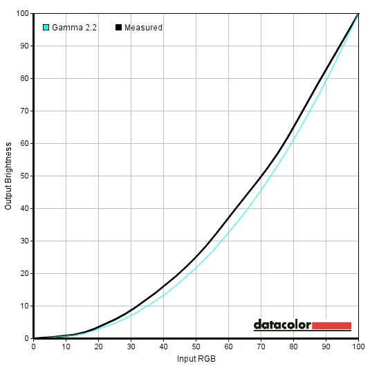
Gamma 'Optimal OSD settings'
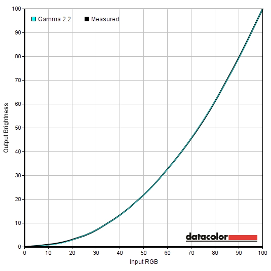
Gamma 'Test Settings'
Optimal OSD settings
Relaxing evening viewing
Brightness= 60 (according to preferences and lighting)
Test Settings (ICC profile)
2) Set the monitor up according to the ‘Optimal ‘OSD settings’, although further adjustments can be made if desired. Using a brightness of ‘60’ provided 162 cd/m² on our unit with the ICC profile applied.
3) This article provides instructions on activating the profile as well as some limitations to be aware of when gaming in particular. Because the image was still quite rich without the profile active, this shouldn’t really be of huge concern and you may not even notice that the profile has been deactivated when running a certain game.
Contrast and brightness
Contrast ratios
Monitor Settings White luminance (cd/m²) Black luminance (cd/m²) Contrast ratio (x:1) 100% brightness 265 0.21 1262 80% brightness 202 0.16 1263 60% brightness 165 0.13 1269 40% brightness 128 0.10 1280 20% brightness 87 0.07 1243 0% brightness 47 0.04 1150 Factory defaults (90% brightness) 220 0.18 1222 Gamma2 220 0.18 1222 Gamma3 220 0.18 1222 Optimal OSD settings 165 0.13 1269 Relaxing evening viewing 135 0.13 1038 Test Settings (ICC profile) 162 0.13 1246
An average static contrast ratio of 1244:1 was recorded on the I2481FXH with brightness only adjusted. This is a strong performance and about as good as we’ve seen from this panel type. The strong performance here was maintained following the addition of the ICC profile for our ‘Test Settings’, at 1246:1. The ‘Relaxing evening viewing’ settings involved significant alternations to the colour channels, dropping the contrast to a still respectable 1038:1. The peak luminance recorded was 265 cd/m² whilst the minimum white luminance recorded on the table was 46cd/m². This gives a luminance adjustment range of 219 cd/m² with good usable values.
A ‘Dynamic Contrast’ setting called ‘DCR’ (Dynamic Contrast Ratio) is included. Enabling this restricts access to key controls such as brightness, contrast and gamma settings. Instead, the backlight’s intensity is automatically adjusted based on the level of ‘light’ and ‘dark’ on the screen. As usual the backlight is controlled as one single unit (BLU – Backlight Unit) and so this works on average brightness across the screen rather than accounting for intricate mixtures of bright and dark simultaneously. This tended to provide strong brightness even during mixed scenes with plenty of dark content. It reacted at a moderate pace to changing brightness levels in the scene, although didn’t seem to dim particularly effectively even when the scene was predominantly dark. We are not fans of ‘Dynamic Contrast’ at the best of times, anyway.
PWM (Pulse Width Modulation)
The I2481FXH does not use PWM (Pulse Width Modulation) at any brightness and instead uses DC (Direct Current) regulation. The backlight is therefore ‘flicker-free’, as advertised, which will come as welcome news to those sensitive to flickering or who dislike ‘PWM artifacts’ during motion.
Luminance uniformity
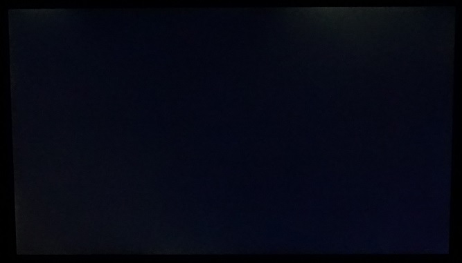
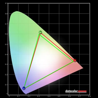
Observing a black screen in a dark room, using our test settings, revealed some backlight bleed. You could see this at various points near the left edge and also towards the right of the top bezel as a sort of ‘spotlighting’ effect of sorts. The image below shows this backlight bleed, taken a few metres back from the monitor to eliminate ‘IPS glow’. This phenomenon is entirely typical for this panel type, appearing as a sort of warm or cool grey haze (depending on where you’re observing) which is visible towards the bottom corners in particular from a normal viewing position. This ‘blooms out’ at sharper viewing angles, as demonstrated in a video later on in the review. The luminance uniformity was reasonable overall. The brightest point recorded was ‘quadrant 5’ in the centre of the screen (169.1 cd/m²). The greatest deviation from this occurred at ‘quadrant 3’, towards the top right of the screen (140.9 cd/m², 17% dimmer than maximum). There was a 14% deviation at ‘quadrant 6’, towards the right of centre (145.4cd/m²) whilst ‘quadrant 2’ was 13% dimmer than centre (147.4 cd/m²). In the three remaining quadrants there was a 8 – 9% deviation, which is good. Note that as with other aspects of uniformity, individual units can vary in this regard and there may be further deviation beyond the points measured. The contour map below gives a graphical representation of these deviations, with darker greys representing lower luminance (greater deviation from the brightest point) than lighter greys. The percentage deviation between each quadrant and the brightest point is also shown. The Spyder5ELITE was also used to analyse variation in the colour temperature (white point) for the same 9 quadrants analysed previously. The contour map below shows deviations between each quadrant and the point measured closest to 6500K (D65). Deviations here are assigned a DeltaE value, with a Delta E >3 representing significant deviation that most users would readily notice by eye. Darker colours on this map represent higher deviations from 6500K than lighter colours. The results here are good, with no significant deviations in white point recorded. As above note that individual units can vary and that there may be variation beyond the points measured. On Battlefield 4 (BF4) the contrast performance was quite good overall. The level of detail in dark scenes was good for the most part, with even fairly minor details visible. The exception to this was peripheral areas, particularly towards the bottom two corners of the screen, where IPS glow drowned this out. Plus a bit of detail lost near the aforementioned patches of backlight bleed on our unit. Light elements contrasted well with the darker surroundings, for example when considering tracer fire, flames and lights in dark tunnels or dimly lit interiors. These bright elements had a bit of a grainy look to them but were free from the obvious smeary grain associated with some models. On Dirt Rally the contrast performance was again quite pleasing. Whilst it was still there, the ‘PLS glow’ didn’t flood the screen as you might expect. It was not as intensive nor as intense as we’re used to seeing on ~24” IPS-type screens. The areas of our unit affected by backlight uniformity issues (namely bleed) did have quite a bit of the detail sapped from them in dark areas. If we/you have a sample without this issue, then you’d notice much stronger perceived contrast peripherally than you’d usually see for this size and panel type. The depth was certainly not up to the levels of a VA panel and it didn’t give the same depth and atmosphere when driving at night, however. Bright elements contrasted well with the darker surroundings, with a light graininess from the screen surface affecting white and other light colours (car headlights, areas of bright sky etc.) Unfortunately, we weren’t able to run our usual testing with the Blu-ray of Skyfall as our Blu-ray drive refused to read this disc at the time of review. We used Lagom’s test for contrast to look at the contrast performance of the monitor in a different way, one which highlights weaknesses which may not be obvious during other testing. The following observations were made using Google Chrome. Note that Mozilla Firefox uses its own colour management system which can conflict with ICC profiles and cause other issues on tests such as these. The colour gamut of the I2481FXH (red triangle) was compared with the sRGB colour space (green triangle), as shown in the image below. The monitor offers very good sRGB coverage, with just a sliver of under-coverage in the green region of this diagram. Some over-coverage in the red and green region of this diagram is also shown. This allows the monitor to provide quite faithful shade representation within the sRGB colour space, with just a touch of extra vibrancy in places. On BF4 the colour reproduction was pleasing overall. Whilst there wasn’t that same vibrant punch offered by some models with slightly more generous colour gamuts (even standard gamut models with enhanced phosphor backlights) or lighter screen surfaces, colours were still rich and varied. There was good warming depth to orange and yellow shades, seen for example in roaring flames and explosions, whilst the environments of the game appeared natural and in-place. There were some fairly lush-looking deep greens combined with a good range of more muted lighter green shades. Earthy browns and neutral greys were also good, with a nice consistency to them that helped aid the perceived shade variety and give shades their own unique identity. This pleasing shade range, consistency and richness was also observed on Dirt Rally. The car liveries looked quite vivid, with some particularly nice bright greens, oranges and blues. The environments also benefited from both the richness and variety of shades on offer. There were plenty of good and consistent muted khaki colours alongside some nice deeper shades of green and brown. This allowed different environments to have an appropriate look, maintained throughout the screen. Again, the vibrancy wasn’t quite at the level we’ve seen on some models but saturation levels were appropriate overall and things looked far from washed out. We also tested the Blu-ray of Futurama: Into the Wild Green Yonder. This film is an excellent test for colour reproduction, particularly consistency. That’s because large areas of individual shade are shown on the screen, making any loss of saturation or other changes in a shade’s appearance very much apparent. In this respect the monitor did very well, as you’d hope for from an AH-IPS panel. There was a pleasing variety of pastel shades, deep shades and bright neon shades. It was perhaps this last category that was most striking, particularly some of the bright pinks and neon greens. In this respect the colour gamut and screen surface did hold things back a little, but the way our unit was set up and the capabilities of the panel did help redeem plenty of richness here. We used Lagom’s tests for viewing angle to further explore the idea of colour consistency and viewing angle performance. The following observations were made from a normal viewing position, eyes around 70cm from the screen. A sensitive camera was used alongside a small utility called SMTT 2.0 to compare the latency of the I2481FXH with a range of models of known input lag. Using this method, we calculated 4.89ms (under 1/3 of a frame) of input lag. This value is influenced both by the pixel responsive (element you ‘see’) and signal delay (element you ‘feel’). It is indicative of a very low signal delay which shouldn’t in itself bother even sensitive users. In this article we explore various factors which affect how responsive a monitor looks and feels. Key amongst these concepts is ‘perceived blur’, which depends on only on pixel responsiveness but also eye movement. We also talk about ‘pursuit photography’, a technique of capturing motion on a monitor in a way that reflects not only pixel responsiveness but also eye movement. This uses a moving rather than stationary camera to accurate capture what the eye sees at a given moment in time when observing motion on the monitor. The images below are pursuit photographs taken using the UFO Motion Test for ghosting. The test is running at the default speed of 960 pixels per second, which is a practical speed for this sort of photography and one that reflects the perceived blur nicely. The monitor was set to its four different ‘Overdrive’ settings; ‘Off’, ‘Weak’, ‘Medium’ and ‘Strong’. The final image shows a fast 60Hz reference, which is a Samsung S27A750D set to full brightness (to ensure the backlight uses DC dimming) and 60Hz using the ‘Faster’ response time setting. This essentially shows how things should look where pixel responsiveness is not a limiting factor. Note that the horizontal interlacing effect that’s most noticeable on the third photograph down is from the camera and not the monitor. With ‘Overdrive = Off’ there is quite a blurred appearance to the object with a moderate degree of trailing behind. This is typical for an IPS panel with little to no grey to grey acceleration. Using the ‘Weak’ setting cuts down on this trailing a fair bit, but a bit does still remain. The ‘Medium’ setting as good as eliminates this trailing, but there is mild inverse ghosting (overshoot) behind the object instead. You can see a bright trail behind the UFO body and a dark trail behind the cockpit – remember, the image moves from left to right across the screen. The ‘Strong’ setting intensifies this overshoot massively, providing an extremely obvious and quite colourful inverse ghosting trail. It’s important to remember, as noted in the responsiveness article, that pixel transition speeds and behaviour varies depending on the shades involved in the transition. When considering a broader range of pixel transitions than those assessed here, it’s clear that the ‘Weak’ setting produces a fair bit of additional trailing. This is especially true where darker background colours are involved. The ‘Medium’ setting seems to provide the optimal balance between little if any conventional trailing and fairly low levels of overshoot. We therefore used the default ‘Medium’ setting for our testing. Note that there will not be a section on overclocking as the vertical interlacing pattern noted earlier on in the review became extremely obvious much above 65Hz. The monitor did run at up to ~75Hz without skipping frames, but the interlacing levels were an unacceptable trade-off. On Battlefield 4 there was a moderate degree of blur, caused predominantly by eye movement rather than sluggish pixel response times. This intensified during fast manoeuvres in vehicles or running about and turning rapidly whilst on foot, as you might expect. Even then, there was only a hint of trailing from slower than optimal pixel response times and this was by far the more minor factor compared to eye movement. There was a degree of overshoot, although it was quite mild really and didn’t jump out. This manifested itself as either a very faint ‘snail slime’ sort of trail or a faint semi-transparent dark trail depending on the shades involved in the transition. On Dirt Rally it was again eye movement that was the dominant factor, with a moderate degree of blur which was largely in line with what you’d see on even the fastest 60Hz LCDs. The additional trailing on top of this, from slower than optimal pixel responses, was usually so faint that it was virtually imperceptible. It was most obvious for high contrast transitions (brightly lit signs with a dark sky in the background) and even then wasn’t too far off what you’d observe on a well-tuned 60Hz TN model. There was some observable overshoot, though, which was generally faint and not at all ‘in your face’ in its nature. The most obvious examples of this were probably the occasional dark trails that presented themselves during some transitions when racing in dark overcast skies. The trail was somewhat darker than either the background (sky) or object (tree, house, rock etc.) colour but not still not particularly bold or obvious. We also tested our Blu-ray movie test title and didn’t observe any issues resulting from either slower than optimal pixel response times or excessive overshoot. The fluidity here was limited by the ~24fps at which the film ran, but that wasn’t the fault of the monitor. The AOC I2481FXH is certainly a stylish monitor, with a sinuous metal stand and bezels that are matched in their thinness by the screen itself. The aesthetics were also matched by the ‘feel’ of the monitor, which was remarkably solid. The tilt-only stand design and lack of VESA holes will reduce the appeal for some users, however. So perhaps a bit of style over substance in that respect. But what about the performance? Well this was quite decent overall, in a word or two. The AH-IPS panel provided consistent colours, although appropriate richness (and gamma tracking) required the intervention of an ICC profile. The colour balance of our unit was excellent straight from the box, though, which was certainly nice to see. The contrast performance was much as we’d expect from the panel type. Static contrast was about as good as we’ve seen from such a panel, but there was the usual ‘IPS glow’ that ate away at some of the peripheral detail. One peculiarity that we observed was the presence of faint vertical interlacing patterns on certain shades – blues, yellows and oranges in particular. This isn’t something everyone will notice or be bothered by, but an interesting thing to observe. The responsiveness of the monitor was pleasing for a 60Hz model, with very little input lag and fairly well-tuned pixel responsiveness. There was a bit of overshoot in places, but this was rather light and unobtrusive really. The contrast performance was very much as expected from a modern IPS panel, fairly good but with the usual ‘IPS glow’. There was also a little bit of extra detail lost due to the gamma behaviour of the monitor, but nothing substantial. Responsiveness was also pleasing overall, especially from a pixel responsiveness perspective where there were no real weaknesses for a 60Hz monitor. The input lag moderate, which may put some off but shouldn’t deter most users. All in all this was a solid monitor with pleasing performance and an even more pleasing price tag – one that’s well worth the money. The bottom line; a stylish monitor with pretty decent all-round performance, for an equally decent price.
The Spyder5ELITE was used to measure the luminance of 9 equidistant white quadrants running from the top left to bottom right of the screen. This provides an indication of how uniform the brightness is for the lightest shades, such as white. Table below shows the luminance recorded at each quadrant and the deviation between a given quadrant and the brightest recorded point.
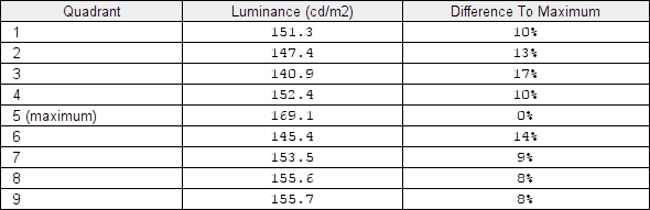
Luminance uniformity table
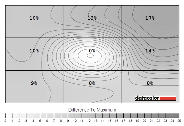
Luminance uniformity map
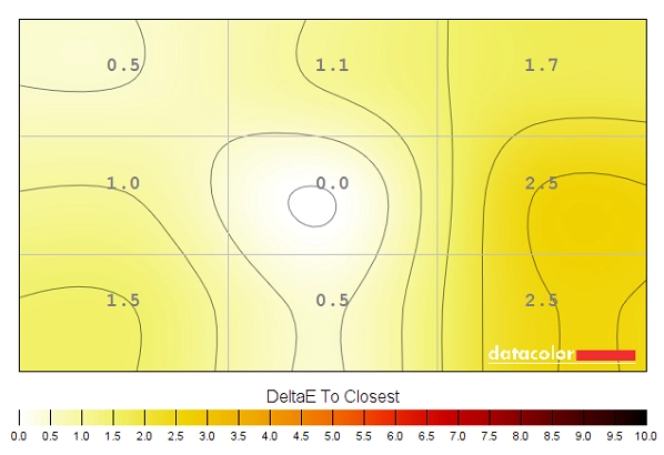
Colour temperature uniformity map
Contrast in games and movies
Lagom contrast tests
Colour reproduction
Colour gamut
Colour gamut test settings
Colour in games and movies
Viewing angles
The video below shows the results of the Lagom text test, a mixed desktop background and dark desktop background from a variety of different viewing angles. In the final section of this video you can see the aforementioned ‘IPS glow’ as it blooms out off-angle.
Responsiveness
Input lag
Perceived blur (pursuit photography)
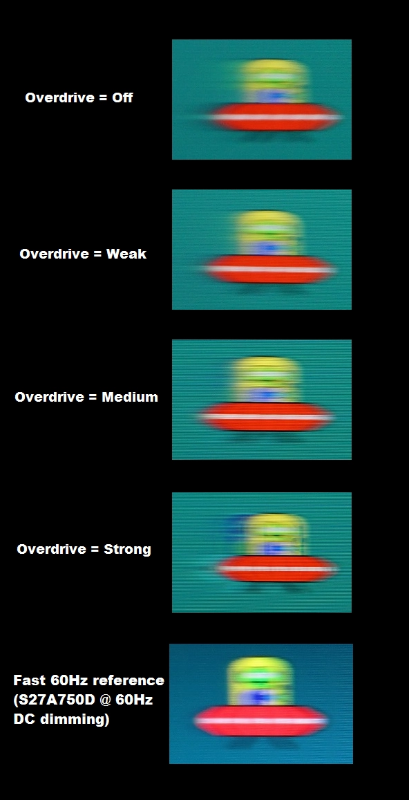
Perceived blur with various settings
Responsiveness in games and movies
Conclusion
Positives Negatives The AH-IPS panel gave a rich and varied look to the image with good colour consistency and pleasing daylight white point straight from the box
The gamma tracking was a bit off regardless of gamma mode, necessitating the use of an ICC profile for appropriate saturation. Some faint interlacing patterns observed
Good static contrast performance and a screen surface that is less grainy than on some models The usual ‘IPS glow’ was present and the screen surface was a bit grainier than on some models – including Full HD models using Samsung AD-PLS panels Low levels of input lag and fairly well-balanced pixel overdrive to deliver good 60Hz responsiveness Slight overshoot (inverse ghosting) in places using the optimal ‘Overdrive’ setting A refreshing style that not only looks attractive, but has a remarkably solid feel as well
Lack of ergonomic adjustability and not the greatest selection of ports
![]()

