Author: Adam Simmons
Date published: October 17th 2013
Table of Contents
Introduction
27” LG IPS (In Plane Switching) monitors are becoming increasingly popular, with an ever-expanding range of models. There has also been a renewed focus on more affordable ‘Full HD’ screens to offer users a cheaper alternative to pricier WQHD monitors. With high affordability, strong colour reproduction characteristics, good responsiveness and a range of styles they have a lot going for them. Samsung’s PLS (Plane to Line Switching) technology is a relatively recent alternative to IPS, offering largely comparable performance at a similar price. The Samsung S27C570H, which sometimes includes an additional ‘L’ prefix and ‘S’ suffix, uses their latest iteration of the technology designed for 23-24” and 27” 1080p screens; AD-PLS (‘Advanced’ PLS). AD-PLS is designed to compete specifically with LG’s ‘AH-IPS’ (Advanced High Performance IPS) which is quite widespread at the moment. Having tested a number of models using such panels and been largely impressed by their performance we feel that the Samsung has a lot to live up to. We put this monitor through its paces to see how it compares.
Specifications
The monitor uses an AD-PLS panel that employs the common 6-bit+ FRC (Frame Rate Control) dithering. Modern dithering algorithms are very capable and if AH-IPS models are anything to go by we expect faithful shade reproduction that will please the vast majority of users. A 5ms grey to grey response time is specified by Samsung, indicating the presence of grey to grey acceleration (pixel overdrive). 178 degree viewing angles are also specified and with a typical retail price of around £160 ($200) this model is largely comparable to the IPS competition in both price and specification.
The key ‘talking points’ of the specification have been highlighted in blue for your reading convenience.
Features and aesthetics
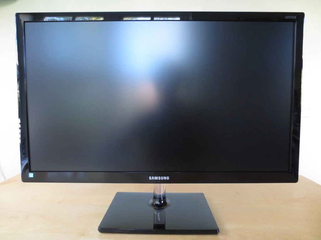
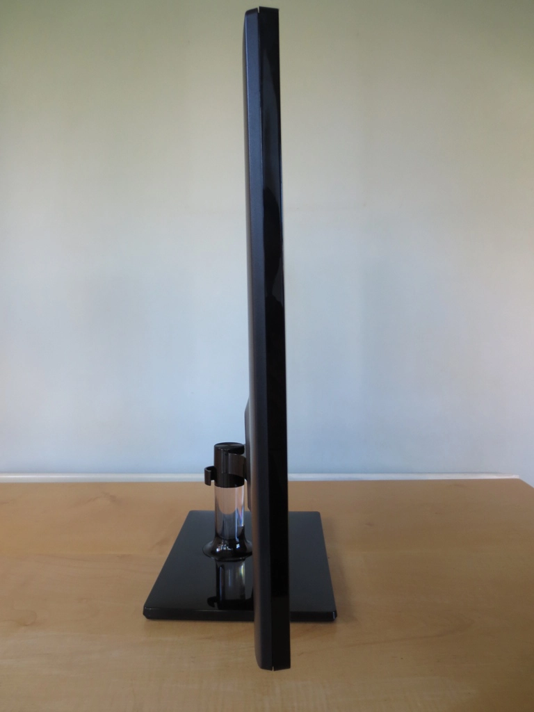
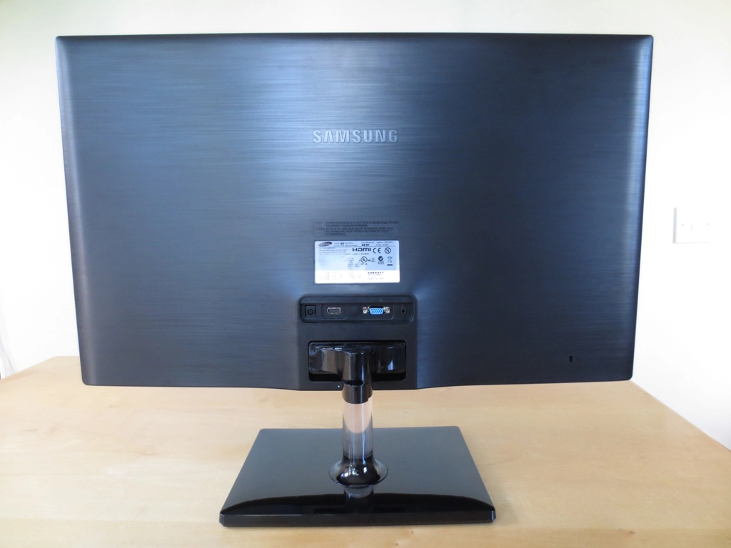
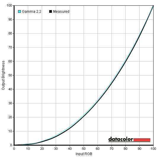
From the front the monitor has a fairly typical Samsung style. Plenty of glossy black plastics on the stand base and bezel and a Perspex ‘crystal design’ stand neck. The bezels are a moderate thickness; 21mm (0.83 inches) at the top and sides and 25mm (1 inch) at the bottom. The screen surface is fairly ‘light’ matte with a 25% haze value, similar to that seen on 60Hz Samsung TN panels and comparable ‘Full HD’ IPS models. This provides a clearer (less grainy) and potentially more vibrant image than the ‘heavier’ matte surfaces seen on some older IPS models (30% haze) and current 120Hz+ TN models. It is not as light or ‘grain free’ as the semi-glossy (13-18% haze) surfaces seen on some VA panels or WQHD IPS/PLS/AHVA panels, however. The controls take the form of a small joystick (JOG button) on the underside of the central region of the bottom bezel. The power light beneath the Samsung logo is peculiar as it only lights up, by default, if the monitor is switched off (but still plugged into the mains). It can be set to light up only when the monitor is switched on instead, as an option on the OSD (On Screen Display). The light itself is a tiny rectangular LED that glows a gentle and undistracting white. We found the joystick on the S27C570H intuitive and easy to use. A single press brings up a ‘JOG menu’ with four option corresponding to a movement of the joystick up, down, left or right. Up gives the main menu, down is power off (yes – powering off the monitor is a 2-step process), left is source select and right is for auto adjustment (VGA only). We found the joystick on the S27C570H intuitive and easy to use. A single press brings up a ‘JOG menu’ with four option corresponding to a movement of the joystick up, down, left or right. Up gives the main menu, down is power off (yes – powering off the monitor is a 2-step process), left is source select and right is for auto adjustment (VGA only). The main OSD menu is laid out in Samsung’s usual style. Some interesting features include Samsung’s relatively new ‘MagicUpscale’ feature which is really just a glorified sharpness enhancement setting designed to ‘improve’ lower than native resolution content. There is also a ‘Power LED on’ option that allows you to specify whether the power LED is on only when the monitor is on ‘Stand-by’ (which includes being turned off except at the mains) or ‘Working’ (when the monitor is on). When set to ‘Working’ the power light will flash when the monitor is in its reduced power state and light continuously when it is on. When the monitor is off the light is also off using this setting. The video below gives a run-through of the OSD options. Further details can be found on page 41 onwards of the PDF manual. From the side the monitor is rather thin and featureless. It is 20mm (0.79 inches) at thinnest point, lumping out where the stand attaches and the ports are located at the rear. The simple stand design can also be seen from this angle. The stand can be tilted a few degrees forwards and around 20 degrees backwards as the only ergonomic adjustment. As usual for a Samsung monitor with this sort of fixed stand design it is rather stiff, leading some users to think that it does not actually tilt at all. The rear of the monitor is also fairly barren. It uses matte black plastic with a wood grain texture. There is a Kensington lock socket at the bottom right and the stand attachment at the bottom central region. This has a small clip at the back which acts as a cable tidy. Above this are the monitor’s ports; DC (power) input for the included ‘power brick’ power adaptor to be attached to, HDMI (no MHL capability), VGA and a 3.5mm headphone jack. As is very common on slim Samsung monitors there are no VESA holes. As usual Samsung includes some ‘MagicBright’ presets which make adjustments to image attributes such as brightness and contrast; ‘Custom’, ‘Standard’, ‘Game’, ‘Cinema’ and ‘Dynamic Contrast’. If any manual adjustments are made to any setting then the monitor sets itself to the ‘Custom’ ‘MagicBright’ setting. Unlike with presets on monitors from some other manufacturers there aren’t specific settings locked to specific presets – with the exception of ‘Dynamic Contrast’ where key manual image adjustments (contrast, brightness, sharpness and colour settings) are disabled. Using ‘Cinema’ disables all such adjustments bar brightness. Because all changes made by the presets can be made manually in ‘Custom’ mode we won’t be spending much time commenting on how good the image does (or in this case doesn’t) look in various presets by default. Instead we will also be focusing primarily on the effects of changing ‘Gamma’ modes between the three settings available in the ‘Color’ menu; ‘Mode1’, ‘Mode2’ and ‘Mode3’. An Nvidia GTX 780 is used on our test system connected by HDMI. Unlike on many monitors connected by HDMI to Nvidia GPUs the correct colour signal is used by default. There is no need to mess around with custom resolutions or registry tweaks to enforce the correct ‘Full Range RGB’ signal as everything is optimal straight from the box. We saw similar behaviour on the Samsung S27C750P; other manufacturers could definitely learn from this. AMD GPU users should not have any issues with the default colour signal behaviour either. The table below shows values for white point, gamma and some observations using various presets and gamma settings. The S27C570H was far too bright out of the box and had a strong blue tint. Gamma behaviour was good and the overall richness of the image was respectable. The ‘Standard’ MagicBright preset did not eliminate the blue tint but did bring brightness down to a more comfortable level. Following slight brightness adjustments and some moderate colour channel adjustments the blue tint was eliminated and the overall image was quite pleasing. Samsung also offers their usual 3 gamma modes, although we found performance to be optimal in the default mode. Following the adjustments made to our test settings, detailed subsequently, the gamma was just a touch higher than the 2.2 standard but showed fairly close tracking to the desirable curve overall (shown below). The following settings provided a well-balanced, nicely varied and rich-looking image. All individual SC570s are slightly different so these settings should only be used as a guide. Brightness= 52 (according to preferences and lighting) Contrast= 75 Gamma= Mode1 Red= 50 Green= 48 Blue= 42 A Konica Minolta CS-200 was used to measure the luminance of white and black alongside the resulting contrast ratio using the monitor settings assessed in the calibration section. The table below shows the results. For ‘Standard’ mode readings where brightness was adjusted everything else was left at default, including gamma being set to ‘Mode1’. Black highlights indicate the highest white luminance, lowest black luminance and highest static contrast ratio recorded. Blue highlights show the results of our test settings. The average static contrast ratio (brightness only adjusted) was 1168:1 on the Samsung S27C570H, which is very pleasing and about as high as you’ll see from a non-VA LCD. Adjusting the gamma mode had no negative impact on the contrast performance. Under our test settings some moderate adjustments were made to colour channels which reduced contrast slightly to 1088:1 – still very good. The highest white luminance recorded was 354 cd/m2 which comfortably exceeded the specified 300cd/m2 whilst the lowest was 20 cd/m2 which is impressively dim. This gave an excellent luminance adjustment range of 334 cd/m2. As usual for a Samsung monitor there is a ‘Dynamic Contrast’ preset which allows the backlight to adjust its brightness according to the image being displayed. For a dark image the backlight will dim, whilst for a light image it will turn on to a bright setting. We found this setting reacted extremely quickly to changes in image brightness. The usual caveats applied; the backlight dims as one unit to reflect the overall lightness or darkness of the scene, but most scenes are an intricate mixture of light and dark. Furthermore the rapid changes in backlight brightness can prove distracting. Some users may like this setting, but to put it bluntly – we don’t. The S27C570H uses PWM (Pulse Width Modulation) to dim the backlight below full brightness (100). The video below shows how a camera picks up the PWM with a distinct strobing at brightness levels below 100. The monitor does not look like this to the eye, but some individuals are sensitive to flicker and may experience visual discomfort when viewing a monitor that uses PWM. Such users may prefer to seek monitors which do not use this method of backlight regulation, although the choice of such monitors is relatively slender at the moment. When looking at a black screen in a darkened room, under our test settings, there was some minor backlight bleed in the bottom right and top right corners. This was not very extensive at all and would escape your notice during actual use. So-called ‘PLS glow’ overshadows this minor bleed from normal viewing positions anyway. This phenomena manifests itself as a purple-grey glow towards peripheral areas of the screen which blooms out and becomes more distinct if you view the screen from non-central positions. This is demonstrated in a video that featured in the ‘Viewing angles’ section of the review. A Spyder4Elite’s reporting functionality was used to assess the uniformity of lighter colours, best exemplified by analysing changes in white brightness at different points of the screen. These ‘points’ are referred to as ‘quadrants’ and run across and down the screen from top left to bottom right. The brightness recorded at each quadrant and deviation between each quadrant and the brightest point of the screen is shown in the table below. The luminance uniformity was fairly poor overall. The highest luminance was recorded at ‘quadrant 5’ in the centre of the screen (182.8 cd/m2). The highest deviation from this occurred at ‘quadrant 1’ at the top left of the screen (148.2 cd/m2, a 19% reduction). 4 of the remaining 7 quadrants also showed double digit deviation from the centre. Whilst this sort of variation is not going to cause any major issues during general use some users will be able to see some deviation when displaying areas of solid white or light colour in particular. This would certainly cause problems for colour critical work where superior uniformity would be an advantage. The contour map below shows the differences visually with darker greys representing greater deviation from the central maximum than lighter greys. Another issue to consider, in addition to how brightness is affected by poor uniformity, is how the colour temperature may also be affected. The graph below is one we haven’t featured in our reviews thus far, but in this case it is particularly worthwhile. It shows deviation in white point for the same white quadrants analysed for luminance uniformity. Here darker colours (reds and dark oranges) on the graphic represent significant deviations from the target 6500K white point. In this case the centre is closest to the 6500K (D65) target as per the tweaking detailed in the calibration section. The numbers given are DeltaE values where lower values are more desirable. It’s a bit of a generalisation, but anything above a DeltaE of 3 in this case represents significant deviations that some users will notice during normal use. As you can see the bottom left of the monitor is particularly problematic, showing significant deviation in white point compared to the centre. If you look at a white screen fill you notice this area of the screen appearing to take on a bit of a warm (less blue) tint in comparison to the centre. Light colours such as greys and pastel colours also highlight this variation well – this isn’t ideal for a PLS panel whose major strength is supposed to be colour consistency. It is worth remembering that uniformity issues such as this (and indeed brightness variation and backlight bleed) do vary between individual units and not all SC570s will be as poor in this regard as our review sample. To ease into the inevitability of Battlefield 4 (BF4) replacing Battlefield 3 (BF3) as a test title we assessed contrast performance on the Battlefield 4 beta. Things were good overall with pleasing distinction between bright and dark shades. Bright elements such as flames, sparks and explosions contrasted well with darker surroundings. Brighter colours were not as ‘clean’ looking as on a monitor with a glossy (or to a lesser extent semi-glossy) screen surface but didn’t have the heavy grain you would see on ‘stronger’ (higher haze value) matte surfaces. Dark areas exhibited a good level of detail overall with some loss peripherally due primarily to PLS glow. On Dirt 3 the contrast performance was good overall with a respectable level of detail in dark areas and good contrasting bright elements. Some of the finer details such as different material textures inside the car were less distinct than they could be in places. This was particularly true near the bottom corners of the screen (from a normal ergonomically correct sitting position) due to the aforementioned PLS glow. Light colours such as artificial light sources at night lacked the absolute purity of a glossy screen and also appeared somewhat grainier than on the lightest matte (semi-glossy) screen surfaces. Thankfully they did not have the dirty and smeary look of some older IPS and some current TN panels, though. The Blu-ray movie Skyfall was also used to assess contrast performance. This featured plenty of dark scenes and elements such as car interiors and dark clothing. The level of detail here was largely good with even some quite subtle dark details visible. There was a slight weakening of such details peripherall due to PLS glow but nothing overly troublesome. The ‘ultra wide’ aspect ratio of this film actually produced black bars at the top and bottom of the screen which essentially covered much of the PLS glow’s main area of effect. In a dark room the glow is visible on the bars themselves but we didn’t find it distracting. At the high-end, bright elements such as lights and flames pierced the surrounding darkness nicely. They were not as ‘pure’ (grain free) as you’d see on a lighter screen surface but were not marred by overly heavy graininess or a smeared appearance either. The contrast tests features on the Lagom website are good at pinpointing specific strengths and weaknesses (even minor ones) in a display’s contrast performance. The following observations were made. The Samsung S27C570H roughly covers the sRGB colour space, as shown in the image below. There is some slight over-coverage in some areas and some slight under-coverage. Compared to the 27” Full HD AH-IPS panels there seems to be some green shades that the 27” AD-PLS panel is missing out on. For photography, design and similar work this under-coverage is not ideal but not extensive enough to make the monitor completely unsuitable, either. More generally it has a slight impact on the saturation of some shades as explored below. The Battlefield 4 beta is somewhat limited in shade variety by the single ‘Siege of Shanghai’ map featured. Nonetheless it had a rich and nicely varied look overall. The yellow road markings and red flags dotted around the map had particularly good depth and intensity. Roaring flames and the blue-red and green in-game markers also looked fairly vibrant – but not to the extent you’d see on a glossy monitor or some of the IPS and PLS models with slightly more generous colour gamuts. Vegetation was not exactly abundant on the map but the scant greenery did show a pleasing variety and decent depth of colour. The racing environments on Dirt 3 had the varied and natural look that they craved. Vegetation showed a very good variety of subtly different green and golden brown shades – although some of the more autumnal (orange and reddish) browns and deep greens could have done with slightly more intensity. The palette of vibrant colours on cars and adverts around the track was varied and quite vibrant. Strong yellows, pinks and purples stood out particularly well. Strong reds and blues also had pleasing depth. Some deeper greens and strong ambers could have done with a little more depth, however. Overall the colour representation was pleasing on this title, held back just a little in places by the screen surface and colour gamut. On the Skyfall Blu-ray colour performance was very good with everything looking much as it should. There was plenty of shade variety with even subtly different shades (similar skin tones, for example) showing appropriate distinction and saturation. Some of the more vibrant colours, such as deep red and purple lights were nice and intense with good depth to them. Some of the most vibrant colours in the film were showcased during the Shanghai night scenes. These did not have the same ‘pop’ you’d see on a decent glossy screen but were certainly far from lacklustre. We also used the Blu-ray of Futurama: Into the Wild Green Yonder to assess colour reproduction. With large blocks of individual shades this title is an excellent test for shade consistency. The Samsung performed very well in this regard, displaying a good variety of closely matching pastel shades. There was a bit of variation due not to a weakness in panel performance but rather the relatively poor uniformity of our unit. Such variation was far more subtle than the shifts you’d see on even the most uniform TN or VA panels. There were well represented deep and bright neon shades as well. Deep reds, blues and purples were particularly pleasing. To further explore colour consistency on the SC570 we used Lagom’s viewing angle tests. The following observations were made. We measured latency on the monitor using a similar method to that described in some of our other recent reviews, such as this one. On the S27C570H we measured around 3ms (under 1/4 of a frame) of input lag. This indicates that the signal delay of the monitor is very low indeed and won’t degrade the gaming experience. PixPerAn (Pixel Persistence Analyser) was used to assess the monitor’s pixel responsiveness. A highly sensitive camera was used to capture any trailing (ghosting) on the monitor that results from the monitor’s pixel transitions. The test was run at the highest tempo (movement speed) available. The images below show the results using the three different ‘Response Time’ settings; ‘Standard’, ‘Faster’ and ‘Fastest’, respectively. Using the ‘Normal’ setting gave results that are typical of a non-overdriven or very lightly overdriven PLS panel. There is a distinct primary trail and slight secondary trail visible in the snapshot. Using the ‘Faster’ setting weakens the primary trail significantly and makes the secondary trail very faint. The ‘Fastest’ setting gives the primary trail a dirty look, indicative of the pixel overdrive being too aggressive (i.e. too much acceleration). There is also inverse ghosting (overshoot) visible behind the primary trail using the ‘Fastest’ setting. These artifacts were not as blatant in practice as on some monitors we’ve used but we feel that the well accelerated but artifact-free ‘Faster’ mode is optimal. This mode was therefore used for our testing, it also happens to be the default monitor setting. We tested some game titles to introduce a broader range of pixel transitions than used by PixPerAn. This also introduces important factors which come into play when viewing moving content, such as eye movement. This eye movement, which we aren’t often even aware of, is actually a major contributor to the motion blur we see on a monitor. The first test title used was the Battlefield 4 beta. Whether on foot or zipping around in a vehicle the level of blur was quite comparable to the fastest 60Hz monitors. There were no overdrive artifacts visible and no distinct trailing from sluggish pixel response times – just a slight blur due to the movement of your eyes in response to the moving image. If you look fairly closely or are quite sensitive to trailing in general you can see that unless you are using a brightness of ‘100’ there are PWM artifacts during motion. You can see that the trails are fragmented rather than having a smooth and constant blur. This is most noticeable when strafing past straight edges. Most users shouldn’t mind this and many won’t even notice the effect. The video below gives a rough indication of what this fragmented trailing looks like. This is best viewed on YouTube at 1080p. Our second game test title was Dirt 3. No obvious limitations were imposed by the pixel responsiveness. Things looked about as smooth as they do on even the fastest 60Hz monitors with a mild to moderate blur even during gentle cornering. The Gymkhana mode didn’t reveal any obvious weaknesses in pixel responsiveness either and like the race modes were free from overdrive artifacts. PWM artifacts, such as those observed in the BF4 beta, were not at all easy to spot on this title. On the Blu-ray movie test titles there were no restrictions imposed by the monitor’s pixel responsiveness. There was no trailing resulting from sluggish pixel transitions and no overdrive artifacts visible. PWM artifacts were not problematic here, either. The real limiting factor to fluidity of motion here was the relatively low frame rate at which the movies run, around 24 fps. The S27C570H is Samsung’s take on the growing number of 27” ‘Full HD’ IPS panels. With its AD-PLS panel performance was largely comparable to monitors using LG’s latest AH-IPS panels. The strengths in viewing angle performance allowed for accurate colour representation all across the screen. Colours not only showed good consistency, they were also rich and well represented following some tweaking. Compared to AH-IPS models we’ve tested the out of the box setup was a little lacklustre on the Samsung, though, with significant alterations to the colour channels needed to correct the white point. There can of course be variation between units in this respect and some may provide a better balance out of the box. The colour gamut was also just slightly more restrictive in some regions than competing models. Not worryingly so, but enough to make some colours look a tad less saturated in comparison. Another area where variation can and does occur is backlight uniformity. Although the uniformity of dark colours (in particular black) was quite good on our unit, PLS glow aside, the uniformity of lighter colours was not great. There were some significant variations in both uniformity and white point at different points of the screen. Most users would probably not notice this but it would trouble some users. From a monitor of this price and calibre you shouldn’t expect perfection in that respect, but you shouldn’t necessarily expect such significant deviations either. The static contrast performance, though, was every bit as good if not slightly ahead of the AH-IPS rivals. One area that was fairly ‘niggle free’ was responsiveness. Whilst the monitor’s responsiveness is restricted by its 60Hz refresh rate, there were no real barriers beyond that. Pixel responsiveness using the default ‘Faster’ setting was as fast as it has to be for optimal 60Hz performance without introducing any troublesome inverse ghosting artifacts. Input lag was also impressively low, no complaints there. There were some PWM artifacts visible in places. Making a big thing about this would be a bit pedantic as it applies to many competing models as well but isn’t something we usually comment on. It’s also not something many users would take issue with or even notice for that matter. Overall this monitor provided a decent all-round experience with good suitability for tasks ranging from general work and a bit of hobbyist photo editing to movies and gaming. It’s definitely a model worthy of consideration and worth remembering that our review sample likely received some rough treatment that most units wouldn’t be subjected to. It had been transported all around the world and probably took a few beatings along the way. If it wasn’t for the poor uniformity of our unit then this would be a fairly safe recommendation.
Looks like a Samsung
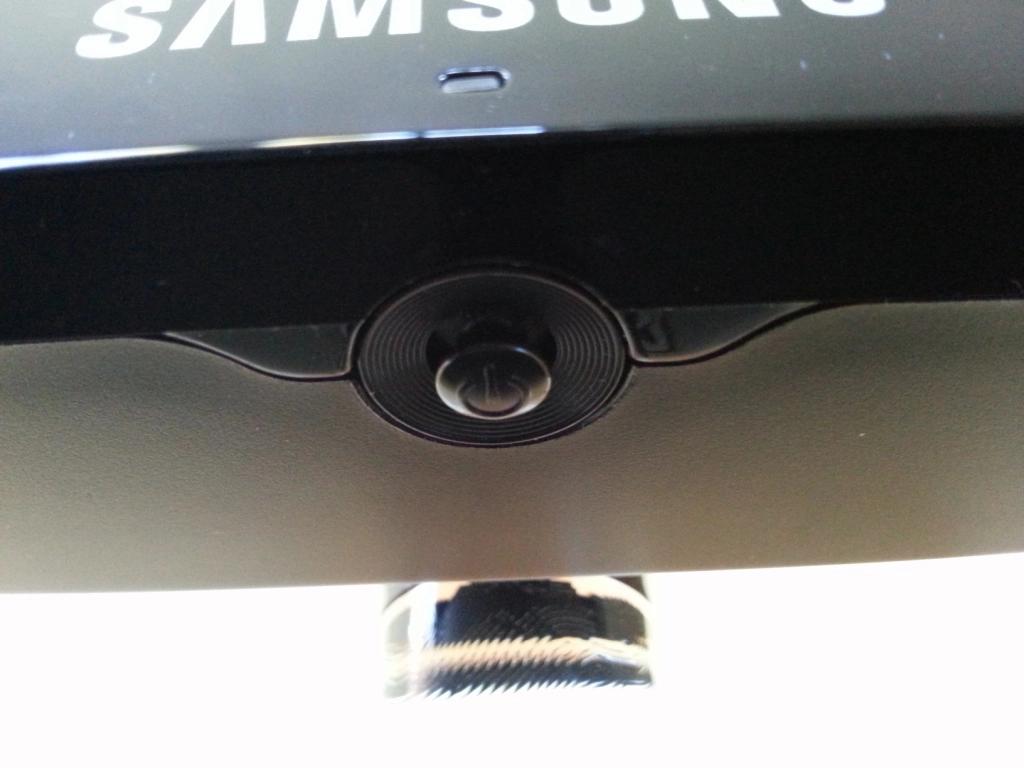
The JOG button
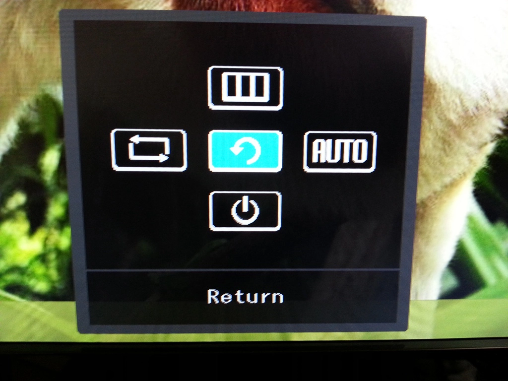
Menu after pressing JOG button
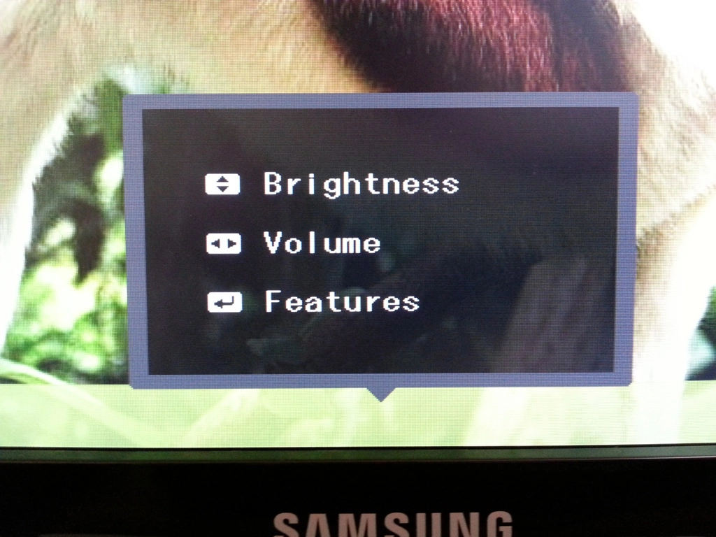
Menu after wiggling JOG button
Not much to it
The barren back
Calibration
Testing the presets
MagicBright (Preset)
Gamma (central average)
White point (kelvins) Notes ‘Custom’ (default)
2.2 7484K Excessively bright with a strong blue hue. ‘Standard’, Gamma= Mode1
2.3 7504K Blue hue remains but brightness much more comfortable. The overall richness of the image is decent (not a washed out nor heavily saturated look). ‘Standard’, Gamma= Mode2 2.1 7436K Colours appear slightly more muted in places but otherwise similar to ‘Standard’, Gamma= Mode1. ‘Standard’, Gamma= Mode3 2.5 7439K As ‘Standard’, Gamma= Mode1 with greater depth. Saturation too heavy in places and some shades are notably darker than they should be. Test Settings (‘Custom’ modified as below)
2.3 6469K The image is much better balanced without the blue tint. Things look rich, nicely varied and appropriately saturated overall.
Gamma Test Settings
Test Settings
MagicBright= Custom
Contrast and brightness
Contrast ratios
Monitor Profile White luminance (cd/m2) Black luminance (cd/m2) Contrast ratio (x:1) ‘Standard’ 100% brightness 354 0.30 1180 ‘Standard’ 80% brightness 284 0.24 1183 ‘Standard’ 60% brightness 220 0.18 1222 ‘Standard’ 40% brightness 153 0.13 1177 ‘Standard’ 20% brightness 87 0.07 1243 ‘Standard’ 0% brightness 20 0.02 1000 Test settings
185 0.17 1088 ‘Standard’ Gamma= Mode2 181 0.15 1207 ‘Standard’ Gamma= Mode3 181 0.15 1207
PWM (Pulse Width Modulation)
Luminance uniformity
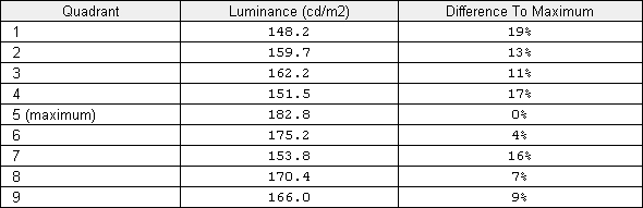
Luminance uniformity table
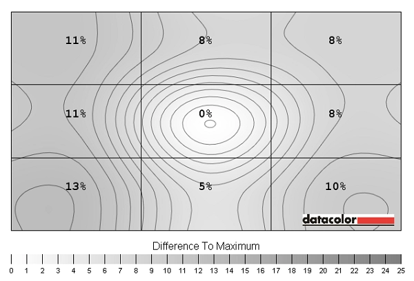
Luminance uniformity map
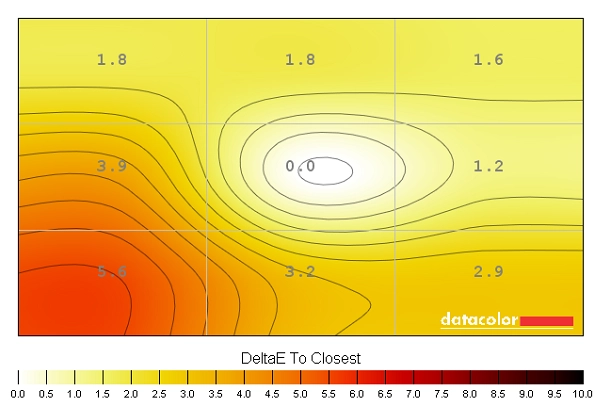
Colour temperature uniformity map
Contrast in games and movies
Lagom contrast tests
Colour reproduction
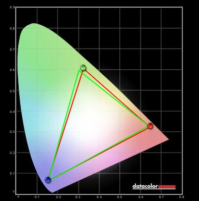
Colour gamut
Colour gamut test settings
Colour in games and movies
Viewing angles
The video below highlights extends the idea of strong colour consistency by showing relatively minor changes as the viewing angle itself (in this case camera relative to the monitor) is shifted. The final third of the video shows PLS glow in action, demonstrating how it can ‘bloom out’ as viewing angle is changed.
Responsiveness
Input lag
Pixel responsiveness

Trailing Response Time 'Standard'

Trailing Response Time 'Faster'

Trailing Response Time 'Fastest'
Responsiveness in games and movies
Conclusion
Positives Negatives Good colour representation after tweaking with a rich and varied look, good consistency overall and low viewing-angle influence
The default colour temperature strayed a bit far from the desirable 6500K target whilst a slightly more generous colour gamut (and to some extent a lighter screen surface) could have unlocked some more vibrancy potential
Static contrast performance was strong and the screen surface was free from heavy grain that would sap the image of much of its clarity PLS glow ate away at some peripheral detail. Dithering was also slightly more noticeable than on comparable AH-IPS models but not to a troubling degree. An even lighter matte screen surface (semi-glossy) would have been nice as well Good overdrive implementation and very low input lag provides a pleasing 60Hz gaming experience
Fluidity is limited by the 60Hz refresh rate, not unusual for this type of monitor though
An HDMI colour signal that is correct for PC users without any driver tweaks – other manufacturers should learn from this
Limited ergonomic flexibility, port selection and moderately thick bezels by today’s standards
