Author: Adam Simmons
Date published: June 22nd 2013
Table of Contents
Introduction
Some users really care about contrast. They like their blacks to look black and like their bright colours to really stand out amongst darker surroundings. For these users VA (Vertical Alignment) panels are the natural choice. But given their traditional weaknesses when it comes to responsiveness, they haven’t always jumped out as a viable choice for gamers. One of the main new Samsung monitor series displayed at CES this year was the SC750 which includes 24” and 27” models. These monitors are designed to appeal to home users primarily and combine ‘Samsung-esque’ style with high-contrast VA panels.
In this review we will be taking a look at the Samsung S27C750P, the 27” SC750 model. We will be seeing if its image performance can match its sleek looks and whether it’s responsive enough to be considered by gamers. Some recent monitors using AMVA panels, such as the BenQ GW50 and GW60 series, have shown that responsiveness doesn’t always have to be sluggish on VA panels and that gamers shouldn’t automatically rule them out. It will be interesting to see what Samsung have come up with here.
Specifications
The monitor uses what Samsung call a WVA (Wide Viewing Angle) panel, which is a very unspecific term they use to describe any VA or PLS panel they may be using. From the specifications and our testing this panel is characteristic of an AMVA panel with true 8-bit colour reproduction. The monitor includes grey to grey acceleration with Samsung stating 5ms here (as always, take with salt). With an asking price of £300 ($380) it isn’t the cheapest option out there but that isn’t unusual for Samsung.
The key ‘talking points’ of the specification have been highlighted in blue.
Features and aesthetics
The front of the monitor reveals a glossy black plastic bezel with gently rounded corners and a rectangular stand base with a matte silver metallic look (it’s actually plastic as well). It has quite an angular look overall and has very thin side bezels of just 10mm. The top bezel is just a fraction thicker at 11mm whilst the bottom bezel is around 18mm thick. You may also notice from the reflected outlines on the screen that it is so-called ‘semi-glossy’, similar to many of Samsung’s PLS (Plane to Line Switching) offerings.
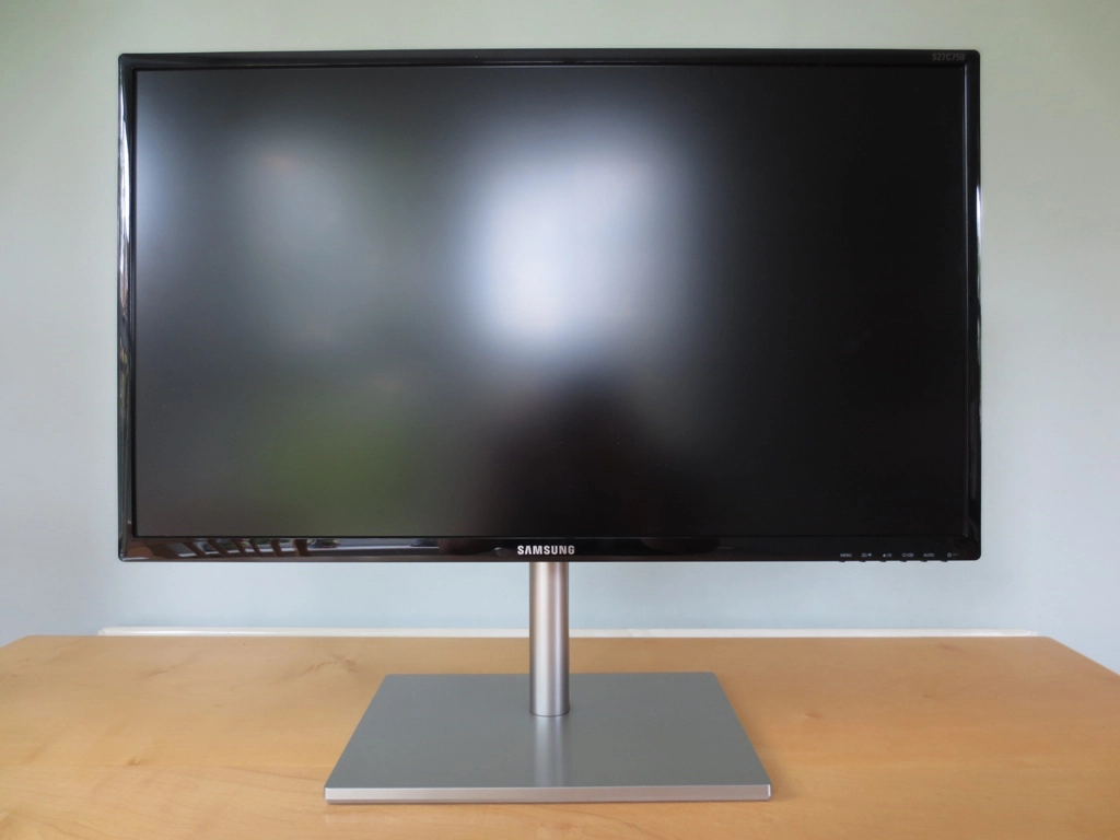
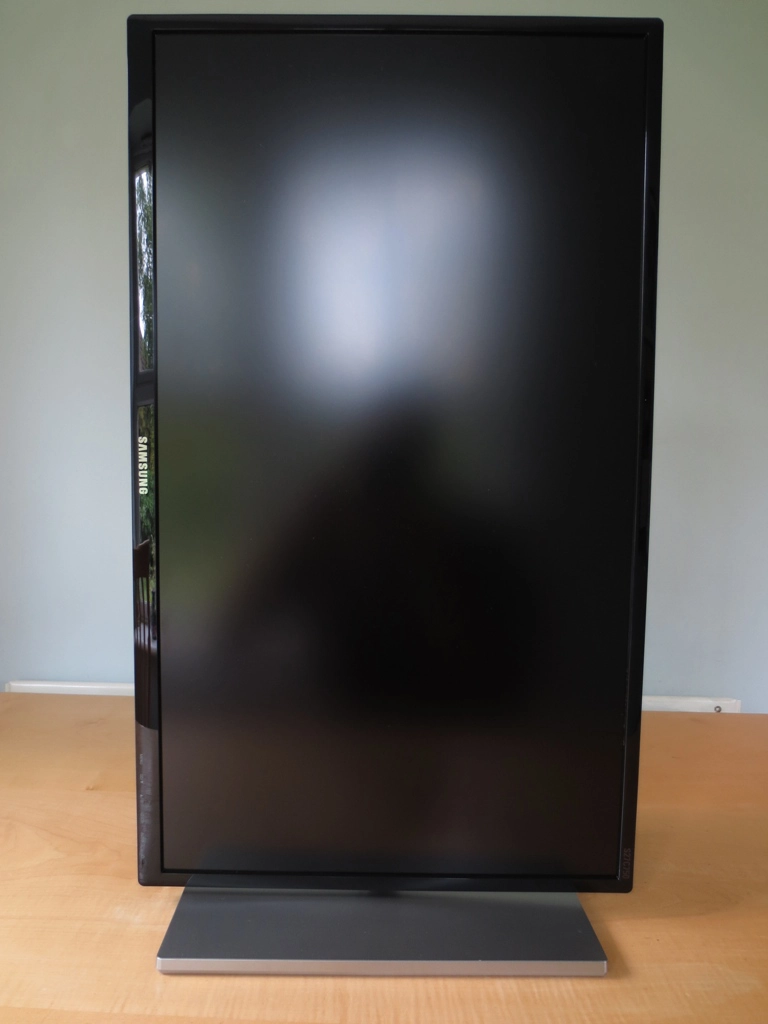
You may also notice that the screen is quite high up – 6 inches (~150mm) clear of the desk surface. This is a sort of compromise to allow the screen to pivot into portrait despite the stand lacking height adjustment (it can only be tilted and pivoted).
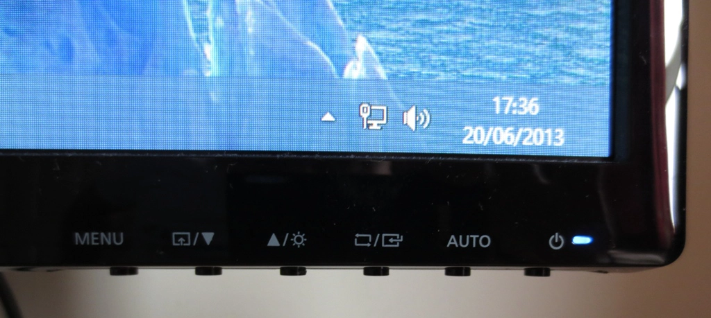
The monitor has 6 buttons on the underside of the bottom bezel, at the right side. These can be pressed physically and aren’t touch sensitive, which will please some people. The buttons are; ‘menu’, ‘MagicBright/down’, ‘up/volume (HDMI) or brightness (VGA)’, ‘source select/enter’ and ‘power’. All buttons are labelled on the monitor itself and in the on-screen menu, making their functions very clear. The power light is a reasonably unobtrusive and small dark blue rectangle. Our only gripe here is that it would be useful to be able to adjust brightness using the HDMI connection that most users will be using. The second button is customisable and can be toggled between MagicBright preset, Eco Saving (to quickly select a fairly dim or bright brightness setting) and Image Size (set this to ‘auto’ and non-native resolutions maintain their original aspect ratio). There isn’t much flexibility in customising this ‘customized key’, in other words.
The main menu of the OSD follows Samsung’s usual modern style. There is no ‘MagicAngle’ feature or ‘MagicColor’ as they are reserved for TN (Twisted Nematic) panels only. There is a new feature introduced to ‘SC’ monitors called ‘MagicUpscale’, however. This is basically a sharpness filter designed to enhance the clarity of low-resolution images. It doesn’t seem intelligent, selective or particularly magic – it really just increases sharpness and there’s already an option to adjust that. Far more useful is the ‘MagicRotation’ feature that works automatically in conjunction with the supplied software. It allows the monitor to detect when the screen is pivoted (rotated) and tell the computer (through the software) to rotate the image on the screen to match either the portrait or horizontal orientation. The video below goes through the OSD to give users an overview of the options available.
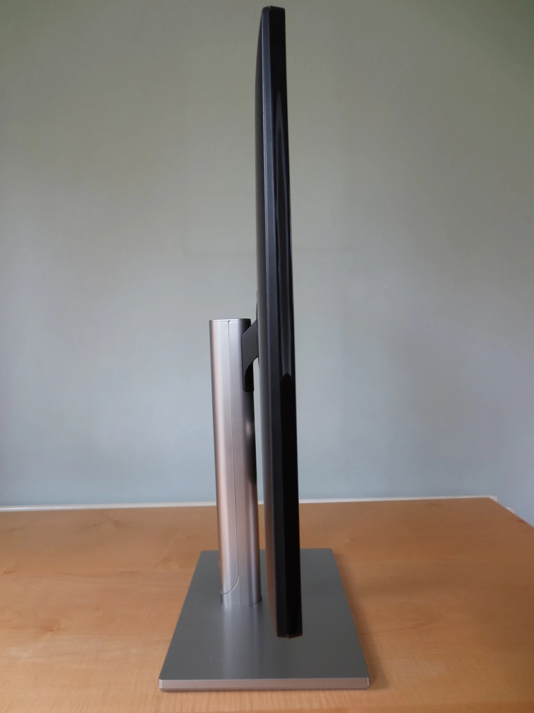
The monitor appears rather slender at the side – 15mm at thinnest point, becoming marginally thicker towards the centre.
The rear of the monitor uses a wood-grain textured matte black plastic. The stand neck is long and relatively thin, made from a metallic-looking silver plastic. The stand attaches using a proprietary mount with 2 bottom screws holding the stand neck in place – this is not a VESA mount, nor is VESA mounting supported by this monitor. Above this are the ports; headphone jack, 2 x HDMI, RGB in (VGA) and DC power input.
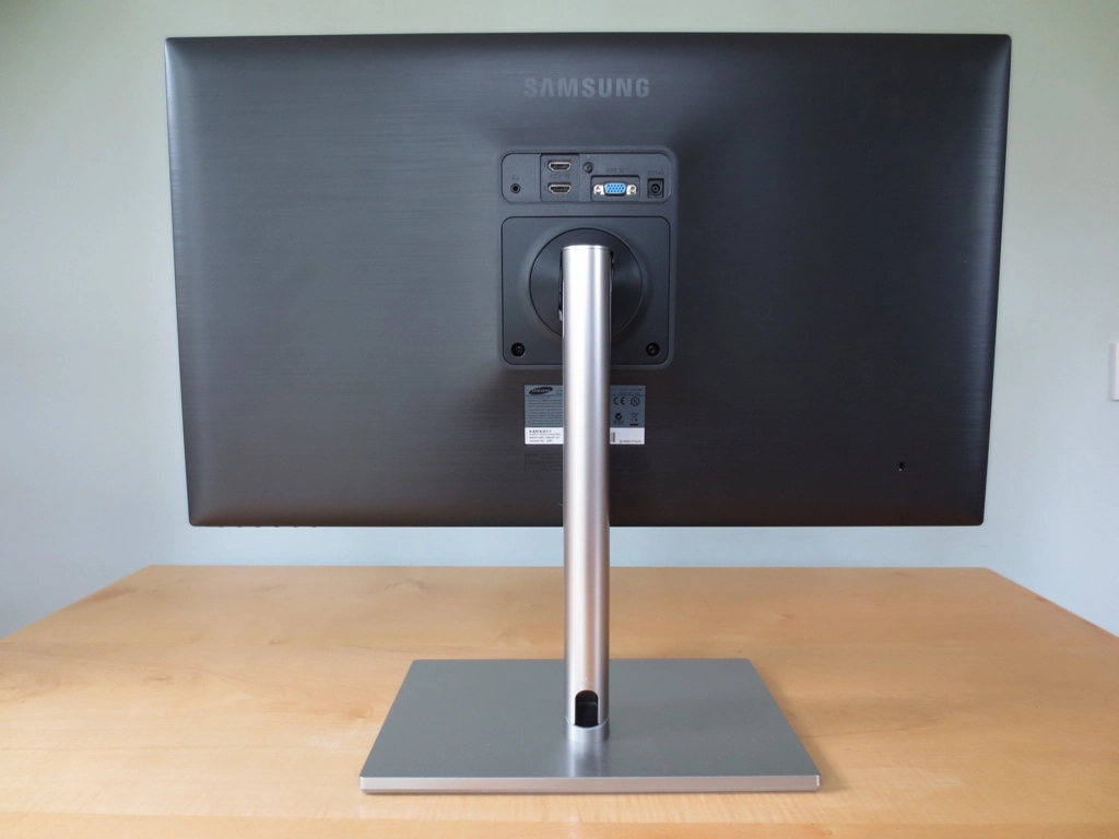
There is a cable-tidy routing system built into the stand. You can remove a cover on the stand neck and route the cables down through the stand.
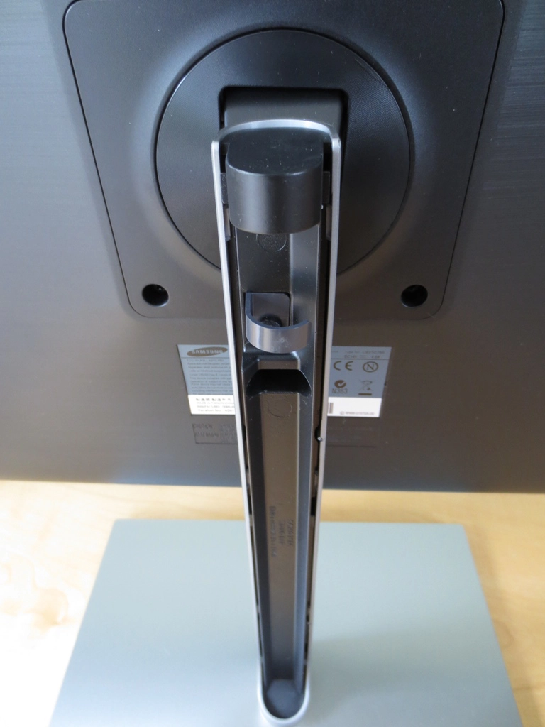
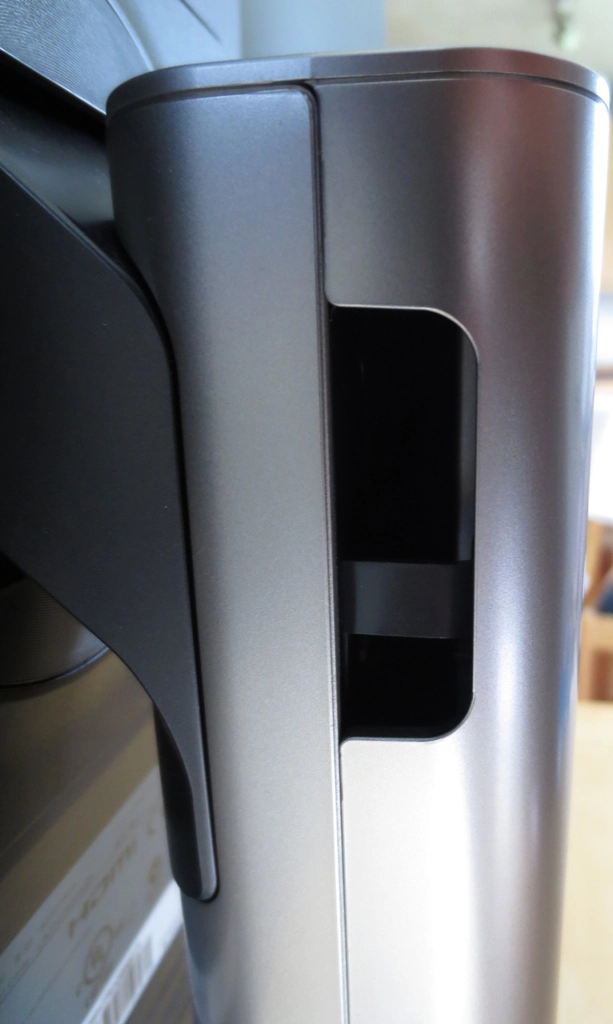
There is a gap at the top left of the stand cover which acts as an entry point for the cables and a central gap (exit point) at the bottom.
Calibration
Testing the presets
The Samsung has a few ‘MagicBright’ presets which alter contrast, brightness sharpness and colour channels. None of the presets really give a particularly pleasing image ‘out of the box’ so instead of going through these we will instead focus on the highly flexible ‘Custom’ preset. This is the default ‘MagicBright’ mode used by the monitor and allows individual control of all of the main image options. Of particular interest are the three ‘Gamma’ settings – ‘Gamma1’, ‘Gamma2’ and ‘Gamma3’, accessible through the ‘Color’ section of the menu. We assessed the overall image performance of these three gamma modes (with everything else left at default) and then our ‘test settings’ which we will be using for the review. The image was assessed subjectively using a range of familiar images, icons, games and movies as well as a useful website, ‘Lagom.nl’. A Spyder4Elite was used to analyse things more closely.
Our main test system’s GPU is an AMD Radeon 7950 which was connected to the monitor using the supplied HDMI cable. By default ‘HDMI Black Level’ in the main menu’s ‘Picture’ options is greyed out on AMD GPUs. They run by default using the ‘YCbCr 4:4:4’ Pixel Format. If you change this in Catalyst Control to ‘RGB 4:4:4 Pixel Format PC Standard (Full RGB)’ – see calibration section of this review for instructions – then you can access the ‘HDMI Black Level’ option. Setting this to ‘Low’ rather than ‘Normal’ makes shades look even more vibrant (and noticeably oversaturated in places) but introduces fairly significant shade crushing. The shade range, particularly at the low end, is reduced significantly. For that reason we avoided using this setting on our AMD GPU.
We also tested using a modern Nvidia GPU. This will run by default using an ‘RGB’ pixel format. ‘HDMI Black Level’ can be configured through the ‘Picture’ options in the main monitor menu and should be set to ‘Low’. In contrast to on AMD GPUs, this doesn’t oversaturate nor does it crush shade range – it in fact makes the image look very much like the AMD GPU running its default YCbCr 4:4:4 format with this option greyed out. Colour balance is just a touch different but overall things are very similar. There is no need to set a custom resolution or change pixel formats in the Nvidia control panel. Its high time more monitors worked in this way when connected to Nvidia GPUs via HDMI!
The table below gives some gamma and white point readings alongside some general observations using various gamma modes and our ‘test settings’, using our primary AMD setup.
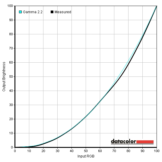
Gamma curve test settings
| Setting | Gamma (central average) | White point (kelvins) | Notes |
| ‘Custom’, Gamma=Mode1 | 1.9 | 6021K | Image is extremely bright. It has a bit of a washed out look overall with many shades lacking appropriate depth and saturation. Some brighter shades have a good vibrant look to them though. |
| ‘Custom’, Gamma=Mode2 | 2.1 | 6025K | Still overly bright with a touch more depth to some shades but others still lacking in that department. A bit of a richer look overall. |
| ‘Custom’, Gamma=Mode3 | 2.3 | 6028K | Very bright with even more depth and richness once again. Some darker shades appear a bit duller than they should but a good shade variety overall. |
| Test Settings (see below) | 2.3 | 6500K | Image looks richer and better balanced with good vibrancy and some quite striking shades. |
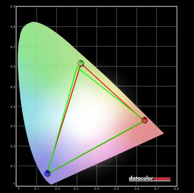
The S27C750P was clearly too bright out of the box, but that’s not particularly unusual. Gamma and colour temperature was some way off target on our unit but things started to fall into place after reducing brightness significantly. From a subjective point of view we preferred gamma ‘Mode3’ on our review unit and test system as colours appeared fairly washed out using ‘Mode1’ and were lacking some depth in places on ‘Mode2’ as well. The graphs below compare the gamma curves using these three gamma modes and leaving all other settings (including brightness) at default. For our test settings we not only used ‘Gamma Mode3’ and reduced brightness but also made some fairly significant modifications to the colour channels. It is not unusual for VA panels in particular to be quite variable when it comes to colour temperature, colour channel balance and sometimes even gamma ‘out of the box’. You may well find your own unit would need slightly different (if any) adjustments. Try to be as conservative as possible as you lose contrast and start to lose shade variety as you start to make more significant colour channel adjustments. The good news is that this monitor has plenty of contrast to play with and even after the adjustments made for our ‘test settings’ blacks were good and inky as you’d expect from a VA panel. Our test settings are as follows, with minor differences in colour balance on both the AMD and Nvidia GPU we tested. Contrast= 75 Gamma= Mode3 Color Temp.= User Red= 44 (42 for Nvidia) Green= 42 Blue= 52 (53 for Nvidia) Using a Konica Minolta CS-200 we measured the luminance of white and black using a range of settings. A static contrast ratio was then calculated. Unless otherwise stated assume default settings were used. The values recorded under our ‘test settings’ are highlighted in blue whilst the highest white luminance, lowest black luminance and highest contrast ratio recorded are highlighted in black. The contrast performance of the Samsung S27C750P was excellent. The average contrast ratio we recorded by just adjusting brightness (using MagicBright ‘Custom’) was 4702:1. If you exclude the measurement at 0 brightness that was too low for our light meter to read correctly, then the average was 4882:1. At any rate this far exceeds the 3000:1 specified (although Samsung do mention 5000:1 in some of their literature). Under our test settings some fairly significant modifications were made to colour channel but contrast remained strong at 4475:1. None of the ‘MagicBright’ presets really upset contrast performance, either. The luminance adjustment range of the monitor is also excellent with a 354 cd/m2 peak luminance (using ‘Game’ mode, just a couple of cd/m2 higher than ‘Custom’ at full brightness) and a 38 cd/m2 minimum white luminance recorded. This gives a luminance adjustment range of 316 cd/m2 with a really dim minimum and super bright maximum. There is also a ‘Dynamic Contrast’ MagicBright preset which allows the backlight to dim and brighten according to the image being displayed. This tends to be retina-scorchingly bright even when viewing a mixed image with plenty of dark elements. This mode is distracting at times and painful at others – it’s there if you want it, but we recommend relishing in this monitor’s superb static contrast performance instead. The Samsung S27C750P does not use PWM (Pulse Width Modulation) at any brightness. In other words it has a flicker-free backlight. This is good news for users sensitive to flickering who may show physiological symptoms on monitors that use PWM (rapid on off pulses of the backlight to modulate brightness). Observing a black screen in a dark room under our test settings revealed no obvious backlight bleed or clouding on our unit. There was a mild purple and blue glow that became visible if you observed the monitor from a non-central viewing angle. Unlike IPS glow this was relatively subtle and also required a fairly acute viewing angle before taking effect. It is certainly not visible from a normal viewing position. There is a ‘viewing angles’ video later on in the review which demonstrates this ‘VA glow’. We also considered the luminance uniformity of brighter colours by assessing brightness variation in white at various points of the screen. Using a Spyder4Elite the luminance was recorded for 9 equally spaced white ‘quadrants’. The brightness recorded at each of these quadrants and percentage deviation between each quadrant and the brightest point is given in the table below. The luminance uniformity was quite reasonable really. The brightest quadrant was ‘quadrant 5’ in the centre of the screen where 179.1 cd/m2 was recorded. The dimmest quadrant, a 14% deviation from this value, was ‘quadrant 1’ at the top right of the screen (154.2 cd/m2). Below this, at ‘quadrant 4’ there was 13% deviation (155.6 cd/m2). Elsewhere the screen was 5-12% dimmer than the centre. It should be noted that this only considers changes in brightness (white point) at various points of the screen, not changes in colour or gamma. It is also worth remembering that uniformity can vary between individual units of the same model. For those that prefer a graphical representation, feast your eyes on the contour map below. This shows the deviations described above (and estimated intermediate values) with lighter greys indicating higher luminance and hence less deviation from the central value. The strong static contrast performance was evident on Battlefield 3. This is particularly true in dark areas, such as the tunnels of the Paris Métro system. Black and other dark shades looked superbly deep and inky whilst bright lights, fires and gunfire looked very bright and stood out well. In-game markers really popped out and had the sort of neon look they crave. Lots of subtle detail was also visible thanks to the strong contrast. Even in shaded areas of lighter and more open maps there was a distinctly ‘contrasty’ look to things – plants, for example, had a very clearly defined structure. There was an element of ‘black crush’ visible in places. If you move your head to the side what appear to be very closely matched dark shades show a greater (and more correct) distinctiveness. Overall, though, a strong contrast performance on this title. Contrast was also impressive on Dirt 3. Some minor details again lacked a bit of distinction ‘head on’, whilst looking more distinct from a slight angle (a VA gamma characteristic). That was not really all that noticeable on this title, though. What stood out more clearly were the deep and inky dark shades and exceptional shadow and highlight details on vegetation, inside buildings, the car dashboard and under bridges (etc.). Subtle texture detail within the car, for example, was immaculately presented – whereas on most monitors it would simply look dull and blended. Lights shining at night and glare from the sun really stood out well. The screen surface also gave such elements a relatively smooth (non-grainy) appearance – not quite comparable to glossy in terms of purity but good for a matte surface. We also tested the monitor’s contrast performance on the Blu-ray of Skyfall. We observed excellent shade distinctions and a really good solid look to blacks and dark shades. A lot of scenes on this film were dark and dingy and really had an appropriate depth and atmosphere on the S27C750P. Bright elements stood out very well against darker surroundings – with the neon lights of Shanghai at night being a great example of this. We used Lagom’s contrast tests to highlight specific weaknesses in contrast performance that may not be entirely apparent during other testing. We observed the following. The Samsung S27C750P’s colour gamut fits reasonably closely to sRGB with some over-coverage in some areas and slight under-coverage in others The following image shows the monitor’s colour gamut (red triangle) compared to the sRGB reference (green triangle). The coverage meant that some shades were not as vibrant as you’d see on other recent WLED offerings which tend to comprehensively cover sRGB (and then some). As we explore, though, colours were pleasing on the whole. On Battlefield 3 there was a good vibrant but not too heavily saturated look. Orange and reds in particular looked lively with a warming richness in places (fires, for example). Some green shades lacked a bit of richness and saturation – but this title isn’t really the best test for such things. The piercing cyan glow of the engineer’s blowtorch and in-game markers stood out very well indeed – partly through intense contrast and partly due to good deep colours. On Dirt 3 the environments showed a good variety of shades and looked quite natural. Some of the greens in the Finnish forest were not as deep and lush as we’d like to see, but overall saturation and variety was good here. The Kenyan rally tracks also had a good natural look to them – plenty of dusty and muted khaki colours in this case. Some of the reddish and golden browns could have done with a little extra saturation but they were still represented quite well. The car paint jobs had a nice variety of lively colours with some really good rich reds, deep blues and bright pinks. Some of the darker greens, neon greens and golden yellows seemed to be lacking a bit of saturation, though. Although these ‘lively colours’ didn’t have the painted on look you might see on a glossy display, the semi-glossy screen and panel colour performance did give them a respectable ‘pop’. The Blu-ray of Skyfall looked largely as it should, with most shades showing a good variety and appropriate saturation. Some skin tones and green vegetation demanded just a bit more saturation, but overall things had a rich and natural look. There were some good deep and vibrant colours throughout the film, most notably bright blue neon lights in Shanghai. The second Blu-ray tested was Futurama: Into the Wild Green Yonder. There was a very good variety of muted pastel shades here and some impressively vibrant neon shades. Deep reds, dark blues and dark purples were particularly vivid. Subtle variations in shades, such as different character skin tones, weren’t quite up to IPS/PLS levels but weren’t bad either. This film is also a very good test for shade consistency, with large blocks of individual colours. In this respect there was a degree of shift at various points of the screen but nowhere near as much as you’d see on a 27” TN panel. We used Lagom’s tests for viewing angles to further explore colour consistency at different points of the screen. We observed the following. We used a similar method to that described in our other recent reviews. This is essentially a modified ‘camera and stopwatch method’, but rather than comparing input lag with just a single known entity (a CRT of zero input lag) we compare with an array of monitors where the input lag has been accurately measured. This gives a good set of baselines to work with and alongside taking 120 readings in total, gives a fairly accurate picture of the Samsung’s S27C750D’s input lag. We measured just over 4ms (1/4 of a frame) of input lag, which indicates a very short signal processing delay (latency) that shouldn’t worry gamers. We used a tool called PixPerAn (Pixel Persistence Analyser) to help analyse the pixel response performance over a range of typical grey to grey transitions. A highly sensitive camera was used whilst the tool was set to the maximum tempo (fastest movement speed) to allow this to represent a worst case scenario as far as this test goes. Be aware that this test only looks at a snapshot of motion as seen by a camera and doesn’t accurately reflect the overall perceived blur that a human will see – which is why we subjectively assess this separately. PixPerAn is particularly good for highlighting differences between different grey to grey acceleration settings, of which there are three on the Samsung; ‘Normal’, ‘Faster’ and ‘Fastest’. The images below show the results using these three ‘Response Time’ settings, respectively. Each setting is distinctly different. The ‘Normal’ setting essentially uses very little (if any) grey to grey acceleration. In the snapshot you can see the primary trail is very bold using this setting and there’s also a bit of a secondary trail. The ‘Faster’ setting increases the level of acceleration, reducing trailing as shown in the second picture. The ‘Fastest’ setting uses fairly aggressive grey to grey acceleration to speed up pixel responses as much as possible. In this snapshot some fairly obvious inverse ghosting artifacts (a trace-like halo trail) can be seen in place of conventional trailing. This is actually reasonably faint in practice and not too bad as far as such artifacts go. The snapshot exaggerates the effect. The ‘Fastest’ setting provided what we feel was the most pleasing gaming experience over a much broader range of pixel transitions than shown by PixPerAn. We therefore used this setting for the subjective testing below. The last Samsung VA panels we reviewed were the C24B750X last year the and F2380 some years back. The gaming experience on these could be described as a smeary mess, leaving a lot to be desired. Things have come a long way for VA monitors since then, it would seem. In most instances on Battlefield 3 it was easy to forget you’re using a VA panel at all. Whilst on foot trailing was moderate, manifesting itself as a slight vibration around textures – particularly when strafing quickly. Picking up the pace and driving around in a jeep, for example, caused the trailing to intensify. In most circumstances the overriding ‘motion blur’ was actually quite comparable to any 60Hz IPS or TN monitor with moderate pixel overdrive. There was a degree of inverse ghosting in places – on the minor and less noticeable side, though. There are certain ‘high contrast’ transitions that can’t be accelerated effectively on any VA panel and have a more noticeable ‘smeary’ trailing associated with them. These were relatively rare on this title but did crop up here and there. The trailing wasn’t as extended and smoke-like as we’ve seen on some other VA panels, though, which is good. Dirt 3 features a fairly broad range of pixel transitions of widely varying contrast levels. On the whole performance was decent and largely comparable to even much faster 60Hz LCDs. There was some minor inverse ghosting in places but nothing we found at all distracting or in-your-face. When driving at night the slower high contrast transitions kicked in. Again, these were not the ‘smoke-like’ trails that some VA panels display but did give a more blurred and smeary look to the racing environment. These slower transitions were also reasonably common on the Gymkhana mode, making the experience even more dizzying and blurred than usual. It was not exactly unplayable, though. On our Blu-ray titles things looked as they often do on 60Hz monitors. The fluidity was limited by the frame rate of the movies (around 24fps) and there weren’t any obvious barriers imposed by pixel response times. There was no obvious smearing, inverse ghosting or otherwise distracting response behaviour. So on the whole pixel responsiveness is decent and quite possibly the best we’ve seen on a VA panel. There are some niggling ‘high contrast’ transitions that the pixel overdrive can’t really accelerate as effectively. On games that are predominantly dark or feature bright and contrasting colours this can be an issue. Even these transitions seemed less obtrusive than on many other VA panels we’ve used, so as always it’s really down to the sensitivity of individual users. VA panels are often the forgotten third option between the kings of colour (IPS/PLS) and highly responsive TN panels. They’ve always offered a relatively strong contrast performance and decent colour performance – but responsiveness has often been their downfall. On the S27C750P things weren’t ideal out of the box on our test sample but Samsung offered the right OSD options to get that sorted. Given the abundance of static contrast (with values far exceeding the 3000:1 specified for the panel) you are able to tweak such settings and still have those nice deep and inky blacks at the end of it all. The semi-glossy screen surface complimented this strong contrast performance nicely and gave the image a relatively crisp and clean appearance. Colour gamut coverage was not quite as comprehensive as on some other modern WLED-backlit screens but the screen surface and panel performance meant that this was not a fatal flaw. Colours were nicely represented on the whole with good depth in places and a rich look overall. Bright neon colours on dark backgrounds were particularly impressive and really leapt off the screen. Responsiveness was pleasing overall, diverging from what you’d traditionally expect from a VA panel. Input lag was very low whilst most pixel transitions were fast sufficiently fast that it was refresh rate that really became the limiting factor in terms of perceived blur on the screen. To achieve these reasonably rapid pixel transitions fairly aggressive pixel overdrive was used. Using the ‘Fastest’ setting gave optimal results here, but did introduce some slight artifacts such as reasonably faint inverse ghosting at times. There were also some ‘troublesome’ high-contrast transitions that, like on all VA panels, can’t be sped up all that much by pixel overdrive. These were not anywhere near as bad as the traditional ‘smoky trails’ that some VA panels produce but certainly stood out as being noticeably slower than other transitions. The design of the monitor is something of a style over substance affair that has become all too familiar on recent Samsung monitors. With its very slender bezels, slim screen and matte metal effect stand it will be quite a stylish monitor in many people’s eyes. But the fact that the screen is mounted rather high up on the (non-height-adjustable) stand and that there is no VESA-mounting flexibility may bother some users. Despite this, we still liked what we saw from the Samsung S27C750P. It showcased what modern VA panels are capable of by combining exceptional contrast with good vivid colours and very decent responsiveness.
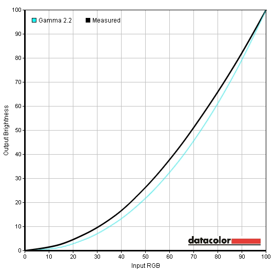
Gamma Mode1
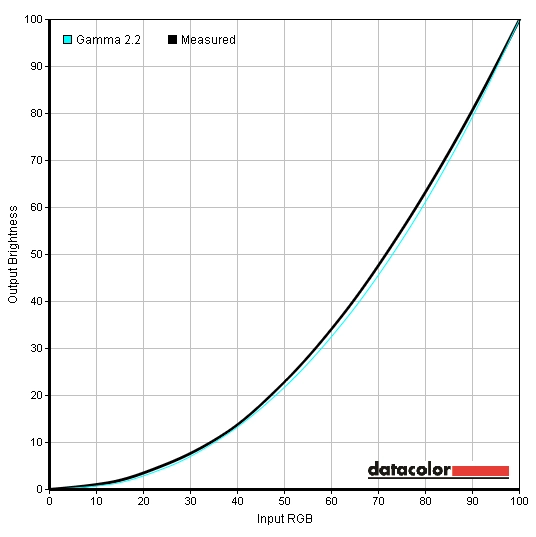
Gamma Mode2
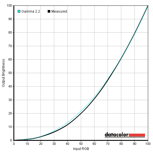
Gamma Mode3
Test Settings
Brightness= 44 (according to preferences and lighting)
Contrast and brightness
Contrast ratios
Monitor Profile White luminance (cd/m2) Black luminance (cd/m2) Contrast ratio (x:1) ‘Custom’, 100% brightness 352 0.07 5029 ‘Custom’, 80% brightness 295 0.06 4917 ‘Custom’, 60% brightness 242 0.05 4850 ‘Custom’, 40% brightness 167 0.04 4175 ‘Custom’, 20% brightness 109 0.02 5450 ‘Custom’, 0% brightness 38 <0.01 >3800 Test settings
179 0.04 4475 ‘Gamma Mode2’
352 0.07 5029 ‘Gamma Mode3’
350 0.07 5000 ‘Standard’
186 0.04 4650 ‘Game’
354 0.07 5027 ‘Cinema’
351 0.07 5014
PWM (Pulse Width Modulation)
Luminance uniformity

Luminance uniformity table
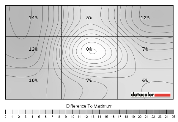
Luminance uniformity map
Contrast in games and movies
Lagom contrast tests
Colour reproduction
Colour gamut
Colour gamut test settings
Colour in games and movies
Viewing angles
The following video demonstrates the viewing angle performance of the monitor ‘off angle’ – apologies for the shoddy focusing, particularly in the middle of the video. It is difficult to capture subtle changes but the more pronounced changes can be seen. Note that the shifts in contrast and colour are a bit more pronounced than on an IPS/PLS panel but not as much, particularly vertically, as on a TN panel. The final third of the video shows a predominantly black desktop background where you can observe the relatively mild ‘VA glow’ mentioned earlier.
Responsiveness
Input lag
Pixel responsiveness

Trailing Response Time 'Normal'

Trailing Response Time 'Faster'

Trailing Response Time 'Fastest'
Responsiveness in games and movies
Conclusion
Positives Negatives Colours looked rich and vivid with a good degree of ‘pop’ on brighter shades in particular. The semi-glossy screen surface offered a good compromise between traditional matte and glossy
Our sample required a bit of tweaking to achieve respectable colour performance, but Samsung’s flexible OSD and the strong contrast made this relatively painless
Excellent contrast performance delivering good dark details and nice inky black and near-black shades with nice ‘popping’ bright shades Colours not as consistent as on IPS/PLS due to a degree of gamma shift. This also caused some detail loss that was not particularly problematic in our testing but that could bother some users Input lag is very low and the pixel responses were pleasing on the whole with configurable grey to grey acceleration and a performance that leaves most VA panels in the dust
Some overdrive artifacts are present (although relatively light) and there are certain high-contrast pixel transitions that remain relatively slow and produce more noticeable trailing
Thin bezels and an attractive design. HDMI actually works properly with Nvidia GPUs without users needing to fiddle with custom resolutions or pixel formats
You can only tilt the monitor and pivot into portrait – despite the stand height being fixed. As a result the screen is mounted rather high up and you’re stuck with that

