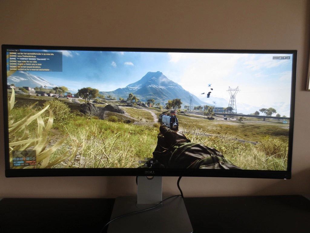
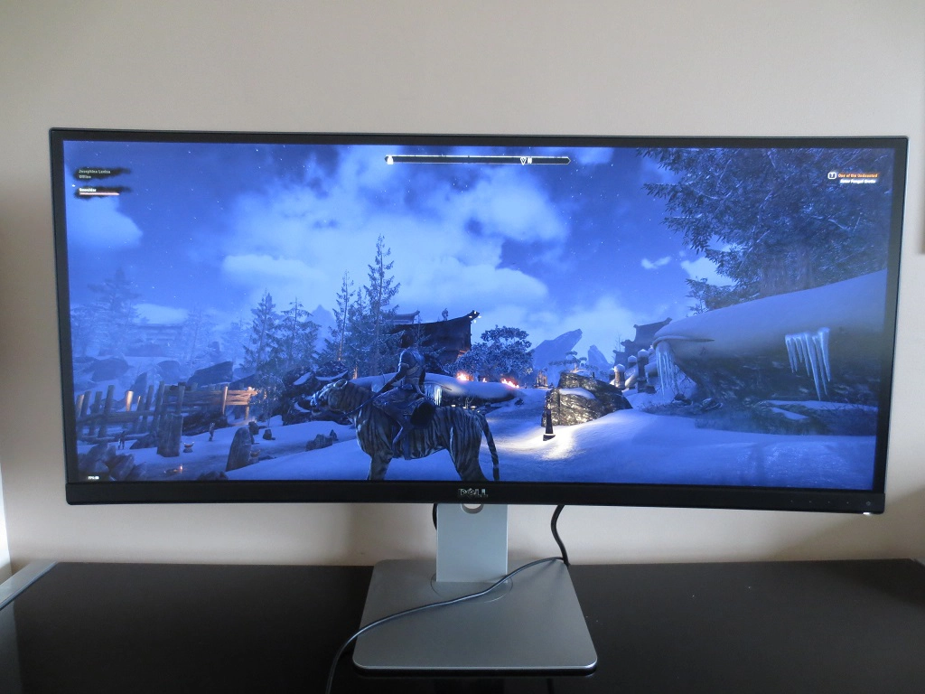
Author: Adam Simmons
Date published: March 22nd 2015
Table of Contents
Introduction
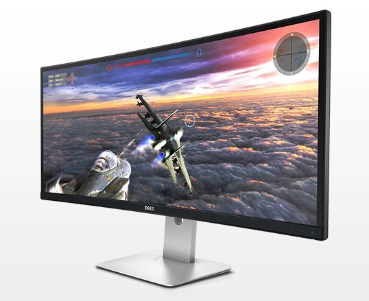
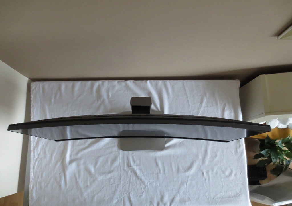
When it comes to immersion when gaming and watching films, the 34” ‘UltraWide’ 21:9 models with 3440 x 1440 resolutions really come into their own. These panoramic screens also provide a good amount of workspace, lending themselves particularly well to multi-tasking. The Dell U3415W not only features a 34” 21:9 screen with aforementioned resolution – it also provides gentle curve. The manufacturers suggest that this curve can increase viewing comfort when using the screen and help draw you into your content a bit more. In this review we see how this screen performs in a range of ‘real world tests’ and see what the curve brings to the table as well.
Specifications
This monitor uses a features a 60Hz AH-IPS (Advanced High Performance In-Plane Switching) panel. This has a gentle curve applied rather than being entirely flat. A 5ms grey to grey response time is specified in the ‘Fast’ mode, with 8ms specified in ‘Normal’ mode – note that Dell are generally more realistic with their figures quoted here than most other manufactures. The viewing angles reflect this desire for realistic rather than impressive but misleading figures as well, with an unusual 172°/178° horizontal/vertical viewing angles. This presumably takes the curve of the screen into account. We have highlighted key talking points of the specification in blue, below, for your reading convenience.
Features and aesthetics
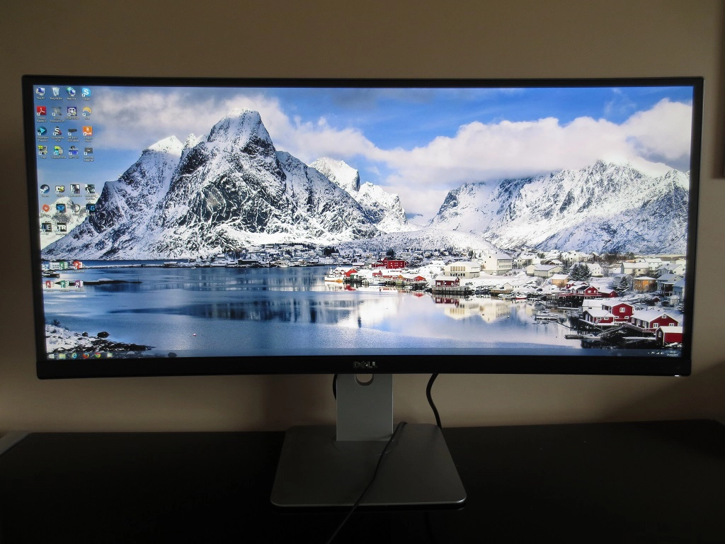
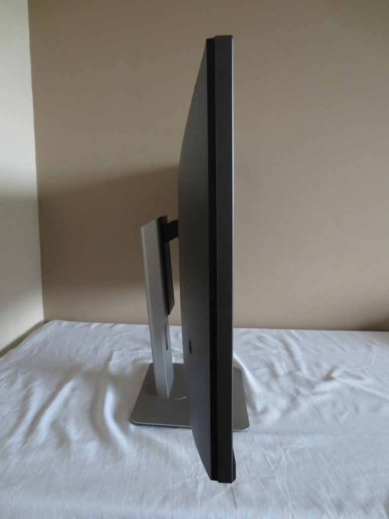
From the front the monitor shares a similar aesthetic to many modern Dell monitors. At the top and sides the bezels are comprised of an extremely thin outer component, which is space grey in colour, and a thicker black panel border. The panel border is only really visible once the monitor is switched on. Together these give the monitor a total bezel thickness of ~17mm (0.67 inches) at the top and ~18mm (0.71 inches) at each side. The bottom has a thick black matte plastic bezel and a sliver of panel border, pretty much exactly 1 inch (25.4mm) thick together. A key feature of the monitor, of course, is the gently curved screen. This has a very light matte (semi-glossy) surface to preserve a good amount of clarity and vibrancy whilst maintaining decent glare-handling characteristics. We explore both the curve and screen surface in more detail later.
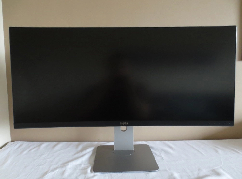
Also at the front you will find touch-sensitive controls for the monitor’s OSD (On Screen Display) and power state. These buttons are; ‘Shortcut Key 1 (Volume by default / Up’, ‘Shortcut Key 2 (Input Source by default) / Down’, ‘Menu / Enter’, ‘Exit / Back’ and ‘Power’. A small rectangular power LED is found at the bottom of the front bezel, facing slightly forwards. This glows white when the monitor is on and blinks when the monitor is on standby. You can ensure the LED remains off when the monitor is on, if you prefer. A run-through of the OSD is given in the video below.
From the side the monitor again shares some characteristics of many modern Dell monitors. There is a robust and highly adjustable stand, allowing you to; tilt the screen (5° forwards / 21° backwards), adjust height by 115mm (4.53 inches) or swivel the screen approximately 45° left or right. At lowest height the bottom of the screen clears the desk by around 40mm (1.57 inches) with the top of the screen around 410mm (16.14 inches) above the desk. The top of the screen is always above the top of the stand neck. The screen is around 21mm (0.83 inches) thick at thinnest point but lumps out to around 51mm (2.01 inches) centrally, excluding the stand.
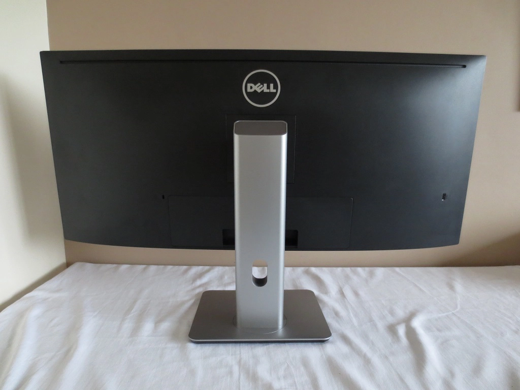
The rear of the monitor is again quite standard for a modern Dell, being fairly minimalist with plenty of matte black plastic. The stand attaches centrally using a quick-release proprietary bracket mechanism. You can detach the screen from the stand using the button below the attachment point and cam access 100 x 100mm VESA holes for an alternative stand or mount, if desired. At the right side of the screen, near the bottom, is a USB 3.0 downstream port with fast charging capability. There is a central port area. In the image below the port cover is attached, concealing the down-firing ports of the monitor. This clip-on cover is designed to neaten things up and help you route cables through the ‘cable tidy loop’ near the bottom of the stand neck. To the immediate left of the port area is a K-Slot.
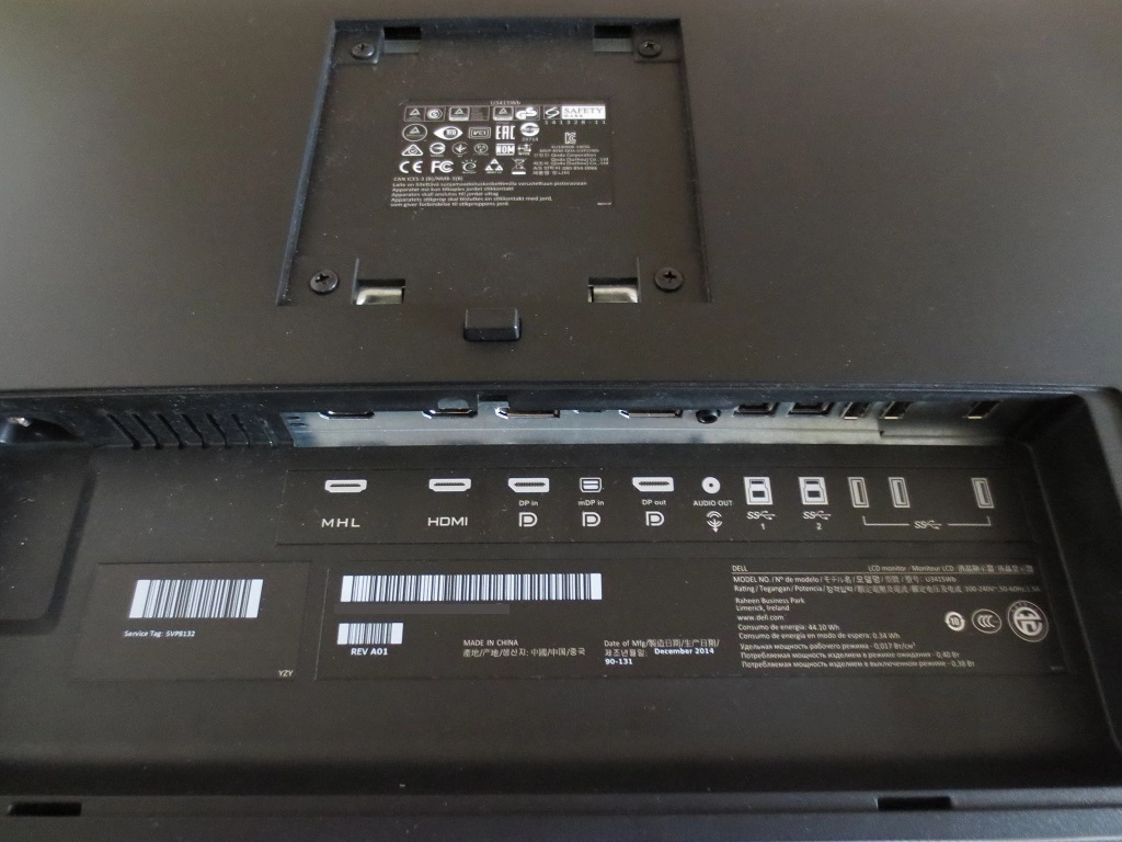
The ports and stand attachment point can be seen in the image below. The ports include; AC power input (internal power converter), MHL 2.0, HDMI 2.0, DP 1.2 input, mDP 1.2 input, DP output (for MST Daisy-Chaining), 3.5mm audio output, 2 USB 3.0 upstream ports (allowing USB peripherals from 2 separate systems to be used) and 3 further USB 3.0 downstream ports (4 in total). An HDMI cable, DP-Mini DP cable and USB 3.0 upstream cable is included in the box.
There are also down-firing 9W stereo speakers hidden underneath the monitor. These integrated speakers produce a clean sound with crisp treble and distinct mid-tones. The base is generally lacking a bit compared to more powerful standalone speakers and some integrated speakers, but the sound has a lot more punch than is usual for integrated monitor speakers. The sound wasn’t tinny or distorted even at fairly high volumes. We feel these are useful additions to the monitor for those who like everything integrated into one package, but separate speakers or headphones can still provide a richer and fuller sound.
Calibration
Subpixel layout and screen surface
The U3415W employs a very light matte anti-glare screen surface that some users might consider to be ‘semi-glossy’. The glare handling is good under a range of lighting conditions, whilst the ‘lightness’ of the matte surface helps preserve clarity and vibrancy. This is something it does very well and in fact is one of the smoothest matte surfaces we’ve seen – a far cry from some of the grainy alternatives out there.
![]()
An RGB (Red, Green and Blue) stripe subpixel layout is used by the monitor. The layout is fairly standard and shouldn’t pose problems on any modern Operating Systems. Windows users may wish to make use of ‘ClearType’ to alter the appearance of Windows-based text to their liking, but the defaults should work nicely on this model.
Testing the presets
This monitor has a number of ‘Preset Modes’, some of which allow further preset-specific ‘tweaks’ to be made to the image. The following table includes key readings taken using a Spyder4Elite colorimeter, observations taken by eye and preset-specific features using a range of settings. We didn’t test all of the ‘Preset Modes’ on the monitor as some give obviously poor image quality and are of no interest to us as reviewers and shouldn’t be of interest to users who want to get the most out of the monitor. Out test system used an Nvidia GeForce GTX 970 connected via DP 1.2. The monitor was kept in its ‘Plug and Play’ state without any additional drivers or ICC profiles applied. Unless otherwise stated assume all settings are kept at default. The exception to this was in ‘Game’ mode where ‘Dynamic Contrast’ was disabled, and of course our ‘Test Settings’ where a few changes were made.
We tested the monitor over HDMI 2.0 and found that it behaved much the same as over DP 1.2, supporting the native 60Hz refresh rate at 3440 x 1440 correctly. Over HDMI 1.4 the monitor is limited to 50Hz by default. Interestingly, when we disabled DP 1.2 in the OSD and enabled DP 1.1a we experienced significant flickering as showcased in the OSD video. The image quality when using DP 1.2 or HDMI on a modern AMD GPU that we tested was very similar, so the observations below are applicable for both AMD and Nvidia GPU users.
| Preset Mode | Gamma (central average) | White point (kelvins) | Extra OSD features | Notes |
| Standard (Factory Defaults) | 2.2 | 6285K | Uniformity Compensation | Very bright but otherwise a pleasing balance to the image. Shades appear quite deep and rich, where appropriate with good distinctions of closely matching shades. More muted shades are also displayed well without obvious oversaturation, perhaps a bit too punchy in places due to the brightness. |
| Game | 2.0 | 6817K | Hue, Saturation, Dynamic Contrast | The screen is very bright in this mode and there is noticeable widespread oversaturation. If you tone down the ‘Saturation’ control then some elements quickly become too muted whilst others appear oversaturated. |
| Paper | 2.1 | 5161K | The image is now a lot dimmer (brightness is adjustable, ‘75’ by default). The blue channel is now a lot weaker, as this setting is essentially a ‘Low Blue Light’ mode. The image has a warm look but also an unfortunate green tint which makes whites look like quite a sickly colour. | |
| Color Temp. (6500K) | 2.0 | 6687K | Uniformity Compensation, Colour temperature presets – 5000K, 5700K, 6500K, 7500K, 9300K, 10000K | A little cool-looking but nothing too extreme. Some shades lack a little bit of depth whilst others appear impressively deep. Overall the image looks pleasing and rich, however. |
| Color Temp. (5000K) | 2.0 | 4962K | Uniformity Compensation, Colour temperature presets – 5000K, 5700K, 6500K, 7500K, 9300K, 10000K | The image retains quite a high level of brightness (‘75’ by default, again adjustable) and appears warm. Fortunately this is a ‘Low Blue Light’ setting without the sickly green tint, as the green channel has also been reduced somewhat compared to red. |
| Custom Color | 2.3 | 6501K | Uniformity Compensation, Colour adjustments (Gain RGB, Offset RGB, Hue RGBCYM, Saturation RGBYM) | The image appears a bit dull with this setting overall, most likely due in part to the big hit in contrast when using this feature (as we explore later). You can’t adjust the brightness manually, either. |
| Custom Color (Uniformity Compensation Calibrated) | 2.3 | 6501K | Custom Color (Uniformity Compensation Calibrated) | The image appears a bit dull with this setting overall, most likely due in part to the big hit in contrast when using this feature (as we explore later). You can’t adjust the brightness manually, either. |
| Test Settings (as below) | 2.2 | 6298K | Uniformity Compensation | Simply ‘Standard’ with reduced brightness. The image maintains a good balance with pleasing shade depth overall and appropriate toning down of some of the slightly too punchy pastel shades. |
| Low Blue Light = Office -60% | 2.2 | 4796K | Brightness, Contrast | As above, but the image is now noticeably warmer without a green bias. This is a very effective Low Blue Light setting which does what it sets out to do. |
| Low Blue Light = Reading -70% | 2.2 | 4572K | Brightness, Contrast | As above but further blue light reduction. Even with this the gamma balance remains strong, which is pleasing. |
| User | 2.2 | 6487K | Brightness, Contrast, Gamma, Hue, Saturation, Color Temperature (Normal, Bluish, Reddish, User Define) | As ‘Standard’ but even brighter. The cool tint has also been subdued, although there is a bit of a green bias. |
| Test Settings (as below) | 2.2 | 6508K | Brightness, Contrast, Gamma, Hue, Saturation, Color Temperature ( Normal, Bluish, Reddish, User Define) | As ‘Standard’ with better D65 colour temperature conformity and much more comfortable brightness. The image looks rich and inviting with pleasing shade variation and consistency. |
The monitor comes factory calibrated in its ‘Standard’ mode, which the monitor is set to by default. A factory calibration report is included in the box and is individual for each unit. An image of the report for our unit is included below.
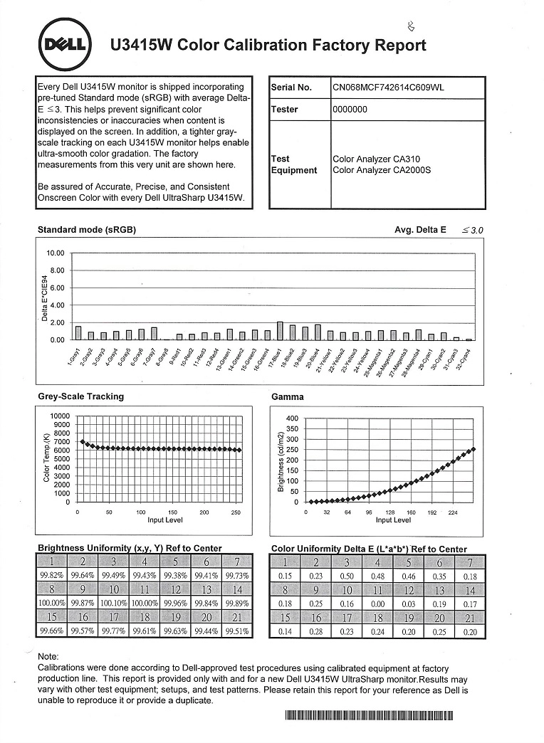
The readings we made echoed Dell’s readings. It seems that they didn’t aim for a 6500K central white point but rather one closer to 6000K. Our readings were some way between these values. There is of course nothing wrong with targeting a white point <6500K as the desirable value is highly dependent on ambient light. Things appeared nicely balanced as we’ve said, without unwanted tints or weaknesses in any particular shade. Although not included in our discussion here, we also analysed the colour accuracy using our Spyder4Elite and have no reason to doubt the reported values. The calibration report promises an average DeltaE of <3 and on our report most seemed to be comfortably below a DeltaE of 2 as well – reflected by our readings.
Because the ‘Standard’ mode was so well balanced, we adopted it for our ‘Test Settings’ by simply reducing the brightness. The ‘Custom Color’ preset, which gave the greatest image fine-tuning capabilities, was not quite as well balanced. In particular the gamma tracking was a bit off, which had some undesirable consequences. Under our ‘Test Settings’ the gamma tracking was rather pleasing as demonstrated in the graph below. It follows the 2.2 curve very closely on this representation. We tested a few settings on the monitor which acted as ‘Low Blue Light’ modes, for relaxing evening viewing. The ‘Paper’ setting did what it said on the tin, although unfortunately the white balance made it look like an old treasure map that a dog had urinated on. We found entering the ‘Color Temp.’ setting and selecting ‘5000K’ preferable – just as effective, without the green tint. As noted previously we found the factory calibration very pleasing on our unit. Given the inter-unit variation, using somebody else’s ICC profile is likely to be counter-productive. For that reason we will not be providing any for this monitor. We simply reduced the brightness as below. Any setting from the OSD not mentioned here was left at default. We’ve also included the ‘Response Time’ setting used for our review, just for reference. Brightness= 36 (according to preferences and lighting) Response Time= Normal We used a Konica Minolta CS-200 light meter to measure the luminance of black and white on the monitor and calculate static contrast ratios based on that. The following table shows this data, with the monitor set to a number of settings including those detailed in the ‘Calibration’ section. If a setting isn’t explicitly mentioned in the table, assume it was left at default. The exception to this is our ‘Test Settings’ where specific adjustments, detailed previously, were made. Blue highlights on the table indicate the results using these settings whereas black highlights indicate the peak white luminance, lowest black luminance and highest contrast ratio recorded.
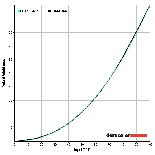
Gamma test settings
Test Settings
Preset Mode= Standard
Contrast and brightness
Contrast ratios
Monitor Profile White luminance (cd/m²) Black luminance (cd/m²) Contrast ratio (x:1) 100% brightness 319 0.27 1181 80% brightness 306 0.26 1177 60% brightness 250 0.21 1190 40% brightness 176 0.15 1173 20% brightness 99 0.08 1238 0% brightness 20 <0.02 >1000 Factory Defaults (75% brightness, Standard) 301 0.25 1144 Game 286 0.25 1144 Paper 144 0.15 960 Color Temp. (6500K) 285 0.24 1188 Color Temp. (5000K) 272 0.25 1088 Custom Color 254 0.20 1270 Custom Color (Uniformity Compensation Calibrated) 175 0.27 648 Test Settings 164 0.14 1171
An average contrast ratio of 1192:1 was recorded with brightness only adjusted, which is very good for an IPS panel. This excludes the reading for ‘0% brightness’, which lacks sufficient accuracy. Our ‘Test Settings’ only involved changes to brightness, so unsurprisingly contrast remained strong at 1171:1. The peak contrast was measured with the loose calibration provided in the ‘Custom Color’ preset, at 1270:1. The ‘Low Blue Light’ type settings knocked the contrast down a little to a still respectable 1088:1 and 960:1 for ‘Color Temp. (5000K)’ and ‘Paper’, respectively. Enabling the ‘Uniformity Compensation’ mode knocked down contrast significantly to 648:1. This mode can be enabled in either ‘Custom Color’ or ‘Standard’ mode but has a similar effect on contrast with each mode. The peak luminance recorded in this table was a good bright 319 cd/m² whilst the dimmest white luminance was a very dim 20 cd/m². That provides a strong luminance adjustment range of 299 cd/m², with an excellent range of useful values.
There is a ‘Dynamic Contrast’ mode that can activated in either the ‘Game’ or ‘Movie’ image modes. This allows the backlight to adjust its intensity based on the balance of ‘light’ vs ‘dark’ shades on the displayed image. The backlight reacts as one unit and therefore can’t account for intricate combinations of light and dark on the screen – that is the case with all current LCD monitors, however. This mode reacted at a moderate pace to changes in the ‘light’ and ‘dark’ makeup of the image, but tended to provide uncomfortably high brightness even during mixed images. In predominantly dark scenes the backlight stayed a bit brighter than it should, although it did seem dim relative to the intense brightness employed for brighter content. The backlight also did dim effectively for very dark content. This isn’t a mode we’re even fans of really, but the mode does ‘work’ on this monitor even if it’s not the best implementation we’ve seen even from Dell themselves.
PWM (Pulse Width Modulation)
The U3415W does not use PWM (Pulse Width Modulation) to regulate the backlight at any brightness level. It uses DC (Direct Current) modulation throughout its brightness adjustment range, so the backlight is considered ‘flicker-free’. This will be welcomed by users who are sensitive to flickering, dislike PWM motion artifacts or wish to reduce eye fatigue.
Luminance uniformity
Whilst using our test settings and observing a black screen in a dark room we could see moderate backlight bleed at the top left corner in particular. This was visible as a sort of gold-tinted ‘spotlighting’ effect when viewing dark content in a moderately dim to dark room. Note that these sort of uniformity issues can vary from unit to unit. The picture below shows the uniformity of our sample in a dark room, displaying black, using our test settings.
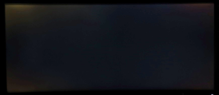
You can see the aforementioned backlight bleed, particularly the ‘spotlight’ at the upper left corner. The picture was taken a few metres back from a central position to eliminate ‘IPS glow’. The phenomenon of ‘IPS glow’ is something that applies equally to all units of this model and is very widespread amongst IPS panels in general. Due to the subtle curve and reduced angle between your eyes and the screen edges, it is reduced just slightly compared to a flat 34″ model. When viewing dark content in a dim to moderately dim room this glow manifests itself as a golden-grey or blue sheen towards the corners in particular. It blooms out quite noticeably if you change your viewing position relative to the monitor, as demonstrated in a video further on in the review. The curve did seem to reduce the extent of this from a normal viewing position, which is nice, but it’s still something that affects the monitor.
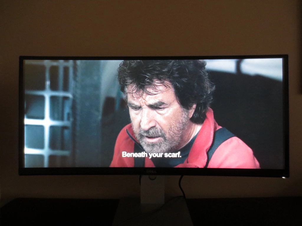
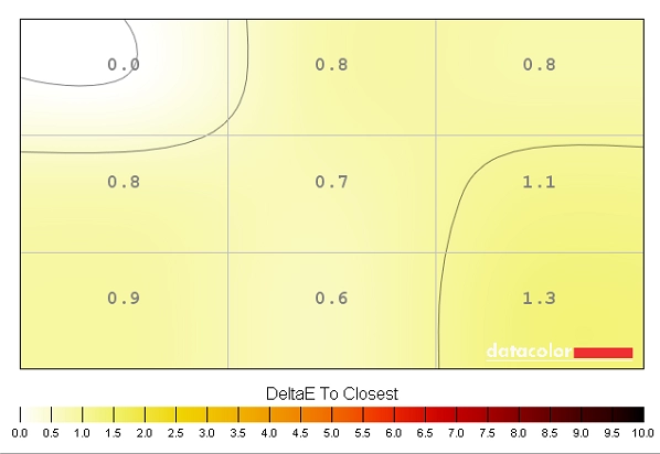
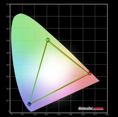
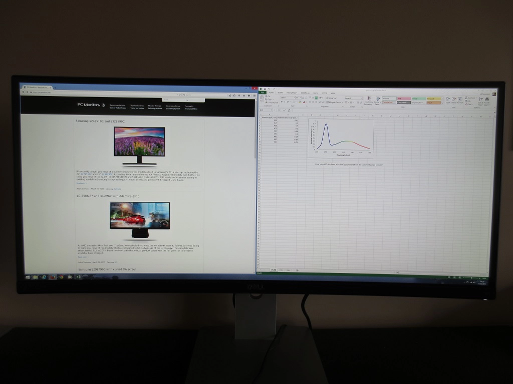
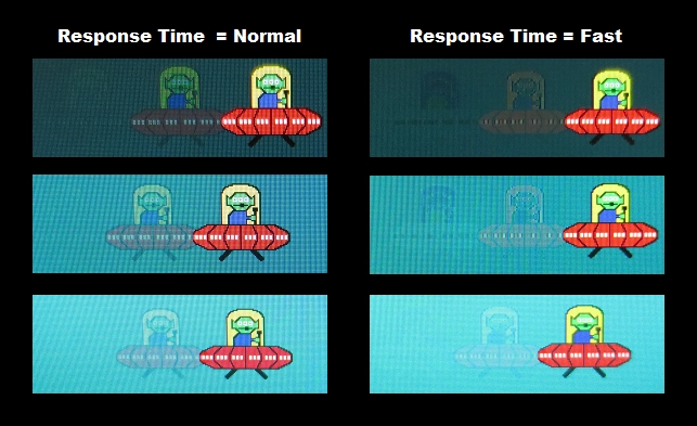
We also used the Spyder4Elite to assess the uniformity of lighter colours. In this case 9 equally spaced right quadrants which ran down the screen from top left to bottom right. The following tables provide the luminance recorded at each of these 9 quadrants as well as the percentage difference in brightness between each point and the brightest recorded quadrant. The top table uses our ‘Test Settings’ whereas the bottom table uses ‘Standard’ mode with ‘Uniformity Compensation’ (UC) set to ‘Calibrated’ (i.e. turned on). This feature is designed to improve the uniformity of the screen when it is set to the factory default brightness and contrast values – these cannot be adjusted when the feature is enabled. Also note that it has a detrimental impact to contrast as explored previously. The luminance uniformity was very good overall using our test settings. The maximum luminance was recorded at ‘quadrant 8’ below the centre of the screen (164.0 cd/m²). The central area (‘quadrant 5’) was very close to this, with 163.3 cd/m². The greatest deviation from the brightest point was recorded at ‘quadrant 1’, towards the top left of the screen (146 cd/m² which is 11% dimmer than ‘quadrant 8’). Elsewhere luminance was within 10% of the brightest point, which is pleasing. With the UC mode set to ‘Calibrated’ the uniformity went from very good to being exceptionally good. The brightest point of the screen remained as ‘quadrant 8’ at the bottom central region, where 174.1 cd/m² was recorded. The maximum deviation from this occurred at ‘quadrant 6’ to the right of centre (166.1 cd/m² which is just a 5% deviation). Elsewhere the screen was 0-4% dimmer than the brightest point, which is excellent. So the uniformity compensation feature, despite its aforementioned drawbacks, certainly did what it set out to do. These deviations are represented graphically in the contour maps below, with the first map showing the results of our test settings and the second map showing ‘Standard’ with the UC feature enabled. On these maps darker greys represent lower luminance than lighter greys. We also tested the consistency of colour temperature (white point) using the same white quadrants. The graphics below represent the deviation recorded between each quadrant and the 6500K (D65) daylight white point target. Deviations are given as a DeltaE value, with a DeltaE of under 3 being considered deviation that most users won’t readily notice by eye. The first map shows the results using our test settings and the second with ‘Uniformity Compensation’ enabled. Darker colours on this map represent higher deviation from the central value (a higher DeltaE). The results here are pleasing, with no significant deviation between the recorded points and the 6500K daylight target. ‘Quadrant 8’ (bottom centre) was closest to 6500K under our test settings and ‘quadrant 1’ (top left) was closest with UC enabled. The highest deviation recorded using our test settings was a DeltaE of 2.6 (‘quadrant 4’ left of centre and ‘quadrant 7’ towards the bottom left). Using UC improved the uniformity further, with the maximum deviation now standing at DeltaE of just 1.3 (‘quadrant 9’ towards the bottom right). The average (mean) DeltaE was ~ 1.49 using our test settings and ~0.88 with UC enabled. It seems that the ‘Uniformity Compensation’ setting works very well to improve the uniformity of the screen, correcting for both brightness and colour temperature deviations. Results using our test settings were still pleasing, and of course without the drop in contrast associated with the UC mode. The overall contrast performance was good on Battlefield 4 (BF4). The level of detail in dark areas was generally pleasing, with a good level of detail visible and some decent depth to dark colours. The exception to this was near the corners of the screen, where ‘IPS glow’ ate away at this detail a bit. The curve of the screen did seem to take a bit of an edge off this glow, though, and it didn’t seem as widespread or intense as on the flat 34” UltraWide models. The ‘spotlighting’ effect of the backlight bleed that our model suffered from made this somewhat difficult to assess, but we do feel the slightly reduced glow is a bit of a bonus. Brighter elements stood out nicely and appeared remarkably smooth for a matte screen surface without any real graininess. Elder Scrolls Online (ESO) was also quite good from a contrast perspective. There was pleasing distinction between bright and dark shades and also strong distinctions between the two extremes. Bright elements such as flames and spell effects penetrated the surrounding darkness nicely and appeared impressively clean thanks to the ‘light’ screen surface. As with BF4 there was a degree of detail loss near the corners (particularly the top) due to ‘IPS glow’ and backlight uniformity issues, but this was not extreme and actually quite restrained for a screen of this size. Dirt 3 told a similar story with its contrast. The distinction between light and dark was good, with bright elements appearing to have a good smooth look to them thanks to the unobtrusive screen surface. There was again a little bit of a flooded look towards the very edges of the screen and top corners in particular in some dark areas due to backlight uniformity issues and ‘IPS glow’. Fortunately this didn’t really spoil our enjoyment of this game. The Blu-ray of Skyfall was given a good contrast performance overall. Bright elements were distinct from dark elements, whilst the level of detail in dark scenes was strong. The distinction between various bright shades was also pleasing. There was a bit of detail lost due to ‘IPS glow’ and the aforementioned uniformity issues, but the film remained enjoyable to watch. The bright neon lights of Shanghai and fires and explosions ripping through the night sky stood out nicely as well. The Lagom tests for contrast helped to highlight weaknesses in the contrast performance of the monitor which aren’t always apparent during other testing. The following observations were made. The monitors colour gamut closely follows sRGB in its factory calibrated ‘Standard’ mode, which our test settings make use of. This is shown in the top picture, below. Here the red triangle represents the screen’s own gamut and the green triangle represents the sRGB space. There is just a hair of under-coverage in the blue region on the representation below but overall very close tracking to sRGB indeed. The native colour gamut of the monitor is used on all other preset modes, including ‘Custom Color’. This provides a bit of extension beyond sRGB in the green region and for some red shades in the diagram below whereas blue remains much as it does in ‘Standard’, with just a small amount of extension for some shades. In both cases the monitor produces some good vibrant shades, with accurate shade representation. The broader gamut used in ‘Custom Color’ here does invite just a bit of extra vibrancy in places but also means that some shades are not represented quite as accurately as a result. When it came to colour reproduction, the monitor did an excellent job on Battlefield 4. Things really looked very much as they should. Environments looked much as the game developers would have intended, with an excellent variety of subtle green and brown pastel shades. Some of these greens were nice and rich whilst others were far more muted – and there was pleasing variations between these two extremes. Colours maintained their richness throughout the screen, which is something that simply doesn’t happen on screens with other panel types that are anywhere near this size. There were some nice vibrant shades in the mix as well, such as rich and warming orange fires and brightly coloured blue, red and yellow painted objects throughout the game. The monitor showed superb colour consistency on Elder Scrolls Online. Environments looked natural (and in some cases supernatural – as they should), with a great variety of subtly different khaki shades. There was an excellent variety of wooden tones and stony greys as well, giving various structures throughout the game a fitting look. There were plenty of good vibrant colours, particularly bright green and orange spell effects. Various funky-coloured fires throughout the game also stood out nicely, including the more traditional rich orange and yellow flames. Some elements were just a little less vibrant than we’ve seen on models with stronger contrast and slightly more generous colour gamut, for example glowing blue and purple crystals and glowing objects with a violet hue lighting up the darkness. On Dirt 3 the monitor again excelled at creating natural-looking environments with an excellent variety of subtly different shades. There were plenty of good rich-looking greens and golden browns in the mix to liven things up, too. The car liveries and in-game advertising around the track really allows monitors to show off some of the more vibrant colours they can product. In this respect there were some really nice bright yellows, strong oranges and neon greens. Some shades didn’t quite have the pizazz that we’ve seen on other monitors (for example bright reds, deep greens and purples) but this is likely down to the monitor sticking closely to the sRGB colour gamut with its factory calibration. We also didn’t experience the same ‘pop’ to some of the colours where bright paints were combined with darker (often black) paints as you might on a model with even stronger contrast (*cough* Samsung S34E790C *cough*). It would be extremely misleading to describe these colours as washed out, even if they didn’t quite look as electrically vivid as we’ve seen. The Skyfall Blu-ray had an excellent array of closely matching shades, giving the environments a good natural look. Various woody textures and the brickwork of various buildings really benefited from this variety, showing great shade individuality and helping things look as they should. There were some good strong vibrant colours, too – most notably bright orange flames in the Macau night scenes. Some of the neon colours in the Shanghai night scenes didn’t quite have the zing that we’ve seen on some other models but still looked vivid. Futurama: Into the Wild Green Yonder, which was another Blu-ray we tested, highlighted the strengths in the monitor’s colour reproduction nicely. A given shade appeared as it should regardless of its on-screen position. This helped give shades an appropriate ‘identity’ and brought out subtly distinct variations – pastel skin tones, for example, unique to pretty much each character. There were some inviting vibrant-looking neon shades and good deep shades as well, helping to round off a good colour performance here. We used Lagom’s viewing angle tests to more closely analyse the strong colour consistency and viewing angle performance we’d seen demonstrated in our subjective testing. The following observations were made from a normal viewing position (70-80cm from the monitor, sitting centrally). We’ve already provided a detailed insight into how the 3440 x 1440 resolution and 34” 21:9 ‘UltraWide’ screen creates a compelling experience for both work and play. The overall experience here was very similar. If you’re expecting a detailed scientific analysis of how the curve revolutionises the experience, then prepare to be disappointed. It really is rather subtle – but in some ways, that’s a good thing. We didn’t find the screen alien or unusual to look at due to the curve and actually found it to provide a very comfortable and natural viewing experience. This is indeed one of the aspects that manufacturers including Dell like to promote; the edges are brought closer to your eyes (a ‘more uniform focal distance’) which reduces eye movement. We don’t generally find flat monitors uncomfortable, or it would make this job a bit tricky – but we did find this monitor very pleasing in terms of viewing comfort. We also feel that the curve added just a bit of extra depth to the already engrossing game playing and movie watching experience. As we’ve mentioned earlier on, it also slightly reduced the perceived ‘IPS glow’ – a nice bonus. It certainly doesn’t eliminate it, though, and our sample was ‘blessed’ with backlight bleed that sort of overshadowed that a bit in some cases. We found the curve absolutely fine for general productivity tasks, including browsing the internet (which can sometimes be less productive) and editing documents and spreadsheets. We could understand how those with a keen eye that are used to indulging in creative passions such as design work and photo editing may find the curve a little different. But we would suggest people see this for themselves and judge rather than ruling it out based on what may not turn out to be a complete non-issue for them. We’ll leave you with some pictures to show the monitor in action – nothing whatsoever like seeing it first hand, but we know people like seeing it anyway. As an LCD monitor, this one operates at a fixed native resolution at which everything looks its best; 3440 x 1440. If you keep the monitor at that resolution and watch video content using PC software or a web browser that is a lower resolution (such as a 1920 x 1080 Blu-ray) then the GPU or software handles everything just fine and there is no obvious loss of sharpness. If you would like to run the monitor at a lower resolution, either because your device doesn’t support the native resolution or performance or you don’t have the graphical grunt to do so on certain games, then you may want to use a lower than native resolution for the monitor itself. If you do wish to do that then the U3415W gives you a decent range of options to choose from. These options are found under ‘Display – Aspect Ratio’ in the OSD; ‘Wide 21:9’, ‘Wide 16:9’, ‘Auto Resize’ and ‘1:1’. These options are demonstrated using the 1920 x 1080 resolution in our OSD video. The relevant section of this video is shown below for your convenience. The ‘Wide 16:9’ option forces the monitor into a 16:9 aspect ratio, regardless of resolution. Non 16:9 resolutions therefore look distorted – this mode is clearly meant for 16:9 aspect ratio resolutions only. A 27” 16:9 diagonal screen space is used with large black borders flanking the image. The 1920 x 1080 resolution is therefore displayed ‘1:1’ horizontally but a vertical interpolation is used. Things look noticeably softer than they would running that resolution on a native Full HD 27” monitor. The monitor fairs better in this mode at 2560 x 1440, as the image is displayed 1:1. The sharpness is therefore excellent. The ‘Auto Resize’ option maintains the aspect ratio of the resolution, whatever that might be. So 21:9 resolutions fill the screen and 16:9 resolutions have the thick black borders either side of the image, just like in their respective dedicated aspect ratio modes. The 1920 x 1200 resolution (16:10), for example, has the correct 1200 pixels used horizontally and is stretched vertically, so again looks a bit soft but not distorted. Last but not least is the ‘1:1’ option. This ensures that the monitor will only use as many pixels as the monitor calls for, and no interpolation is used either horizontally or vertically. The 2560 x 1440 resolution looks as it does with the ‘Wide 16:9’ option (black borders at the side, no loss of sharpness). The 1920 x 1080 resolution has black borders all around it, filling a 20” diagonal space in the centre of the screen. The 2560 x 1080 resolution has borders all around it but fills a 25” diagonal space. So you get a little more width but no extra height compared to 1920 x 1080 in this 1:1 mode. So when it comes to the display of non-native resolutions on this monitor, there are a few simple things to remember. If you want to maintain the best levels of sharpness, it’s best to avoid using the monitor’s interpolation process – 1:1 is the way to go. If you want to use the entire screen area and don’t mind a bit of softening (but nothing horrific) then run the monitor in ‘Wide 21:9’ or ‘Auto Resize’ with a 2560 x 1080 resolution. If you want to run the monitor at 1920 x 1080 and fill the screen, then prepare for significant image softening. Input lag was assessed using a small tool called SMTT 2.0 and a sensitive camera. By comparing the U3415W with a number of other monitors of known latency, with over 30 repeat readings taken, it was possible to get a good idea of the latency of this screen. Using this method we calculated 22.5ms (around 1.35 frames) of input lag. This figure is influenced not only by signal delay (which is the element of input lag you ‘feel’) but also pixel responsiveness (which is the element you ‘see’). This indicates a moderate signal delay which is too low for some users to notice but that others may find noticeable. This is highly subjective, of course, so is something that must be assessed by each individual. Game mode had no effect on this value. The UFO Motion Test for ghosting was used alongside a highly sensitive camera to assess pixel responsiveness of the monitor. The test was set to run at ‘3840 Pixels Per Sec’, so that the UFO crossed the screen rapidly, in under 1 second. The following image shows the results of this test with ‘Response Time’ set to ‘Normal’ (left) and ‘Fast’ (right’). The three separate rows correspond to the rows of the test which test different transitions. There is a dark cyan background at the top, medium cyan background in the middle and light cyan background at the bottom. As with input lag, the ‘Game’ preset had no observable influence on pixel responsiveness. Using the ‘Normal’ response time setting, there is a very bold primary trail and faint secondary trail with the dark background. This indicates a relatively slow pixel transition. The pixel transitions are slightly more rapid for the medium background, with the primary trail weakening somewhat and the secondary trailing as good as eliminated. The light background is faster still, with the primary trail weakened again and no trace of a secondary trail. With the ‘Fast’ setting there is a moderate degree of overshoot (inverse ghosting) visible, which is actually quite noticeable in practice. On the image it appears as an inverted trace of the UFO for the secondary trail and the primary trail changing in appearance as well. For the medium background results are quite similar, although the primary trail becomes even odder-looking. For the light background there is a bright trail (halo) replacing the conventional, which is quite obvious when watching the monitor in motion but isn’t captured very well in this snapshot. It is clear from this analysis and even clearer when using the monitor that the ‘Normal’ setting is preferable. There are some obvious discrepancies in response time based on the transition being performed, with dark backgrounds in this test revealing slower performance. It is very important to remember that our eyes don’t see things as a camera does when it takes a static photograph, however. As explored in detail in this article, the movement of our own eyes is the most significant contributor to blur on a monitor like this. The pixel transitions could be extremely rapid and performed perfectly, but there would still be an underlying blur due to this eye movement. To take this into account and consider an even broader range of pixel transitions we took a look at how the monitor performed on a range of game and movie titles. On Battlefield 4, motion blur was quite similar to what you’d see on even the fastest 60Hz LCDs for the most part. Eye movement was the most significant contributor. There was some trailing beyond this in places, particularly where dark shades were involved. When cornering in an ATV through foliage, for example, the level of blur exceeded what you’d see on a faster 60Hz LCD by quite some margin. The dark shaded areas of vegetation move and lighter areas of vegetation caught up in the movement force the monitor to perform some of these slower transitions. The trailing isn’t a smeary mess like you see on some VA panels during similar transitions, but it is something sensitive users might notice. The same applies where buildings or other objects in the background have an intricate mix of lighter and darker regions. Although instances of overshoot (inverse ghosting) were generally few and far between, there were some instances where it was fairly noticeable. We observed moderate overshoot where some medium-dark and medium light shades were involved in the transition. For example a light wooden box with a darker wooden sheet in the background or a light wooden crate sitting in front of a medium-blue painted building. This gave a somewhat obtrusive black vapour-like trail rather than a neat blend of both shades. The experience was similar on Dirt 3. The game was very playable, with most of the motion blur being down to eye movement and linked to the 60Hz refresh rate. There was, again, some trailing on top of this in places. This was perhaps most noticeable in the Gymkhana mode, which is dizzying at the best of times on 60Hz LCDs. With some of the slower transitions cropping up where some darker shades were involved, the experience was a little more dizzying than it had to be. Driving at night also brought with it some problematic transitions, but for different reasons. The black ‘vapour trail’ inverse ghosting was quite obvious when driving at night on the game. Objects such as trees, road signs and other cars moved against the murky grey sky and medium grey concrete of the race track, putting these ‘medium-dark’ – ‘medium-light’ transitions into full swing. It wasn’t so horrendous that you’d want to stop playing the game and is nowhere near as bad as the overshoot we’ve seen from some monitors on this title, but it is still noteworthy. Overall, then the monitor did have some hiccups which impeded the gaming experience beyond just the 60Hz refresh rate. These hiccups wouldn’t be noticed by all users and not everyone would actually find them bothersome – it’s very subjective, of course. The good news for movie fans is that the pixel responsiveness did not impede the experience. There was no observable trailing from slow pixel responses nor any noticeable overshoot on the Blu-ray movie or ‘Amazon Instant Video’ titles that we tested. The relatively low frame rate at which these run (24-30fps) was really a key limiting factor when it came to fluidity and the monitor did absolutely fine there. As we’ve explored previously, the 3440 x 1440 resolution on a large 34” ‘UltraWide’ screen provides an engrossing experience with plenty of productivity potential. A key distinction of the Dell U3415W is of course that the screen is slightly curved in a concave fashion, rather than being flat. We found this curve to be rather subtle but a nice addition nonetheless. The experience was certainly not revolutionary, but it was comfortable and natural – which is what the manufacturers are going for. Looking beyond that at key image characteristics, the monitor has some obvious strengths. The colour reproduction is excellent, with a factory calibration that really helps get the most out of the screen if high levels of colour accuracy are required. Shades are consistent and well-represented regardless of their on-screen position. We were also impressed by how well the ‘Uniformity Compensation’ mode worked in ensuring the highest level of both luminance and colour temperature uniformity. This did come at the expense of contrast and flexibility in adjusting brightness, however. As with any monitor there were also weaknesses, however. Although static contrast was quite strong and ‘IPS glow’ was somewhat reduced compared to similarly sized models with flat screens, the black uniformity of our sample was less than stellar. Looking at user feedback more broadly, it certainly isn’t an isolated case. This wasn’t ideal for creating a good atmosphere during dark scenes in games and movies, but was generally not too obtrusive. This is of course highly subjective and something of that nature would bother some users more than others. Another area where weaknesses were apparent was when it came to responsiveness. Overall the monitor had decent pixel responsiveness, but it did struggle a bit during some transitions. The trailing was a bit beyond what you might expect from an optimally configured 60Hz LCD in places. Furthermore there were some instances of fairly obvious overshoot (inverse ghosting) on certain transitions. This wasn’t really picked up by artificial tests (Test UFO, PixPerAn etc.) but did crop up during actual use. Fortunately this didn’t affect the movie-watching experience for the Blu-rays and Amazon Instant Video titles we looked at, it just affected certain transitions when gaming. Overall, a mixed but mainly enjoyable experience from this monitor. Having just reviewed the Samsung S34E790C it is hard not to draw some comparisons. We were pleasantly surprised by the responsiveness of the Samsung, more so given its panel type. With the Dell, though, we were left wanting a little bit more. It was by no bad in its responsiveness, but there were some weaknesses which aren’t inherent to all IPS-type monitors. The contrast performance was also stronger on the Samsung, and in particular the black uniformity was noticeably superior. Not entirely unexpected given it uses a VA panel, but again some weaknesses on the U3415W were not inherent to the AH-IPS technology used. When it comes to colour reproduction, both models are a bit different. This is difficult to summarise in a few words, and we’d certainly recommend referring to the relevant sections of each review. In short, though, the colour consistency of the Dell is superior – and with its exceptional factory calibration, it lends itself very well to colour-critical work such as photography and design. Overall we see this as a particularly strong choice for users who appreciate the highest levels of colour accuracy and consistency (be it when gaming, browsing the internet, watching films or working) but not for those who prefer atmospheric dark scenes and stronger contrast.

Luminance uniformity table UC off

Luminance uniformity table UC on
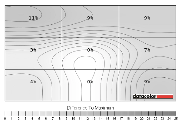
Luminance uniformity map UC off
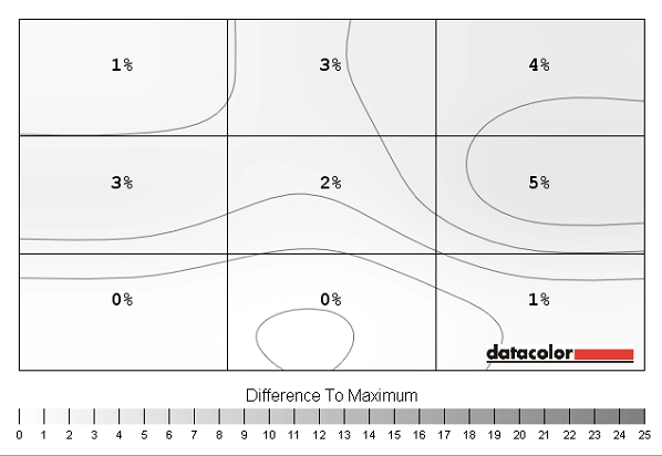
Luminance uniformity map UC on
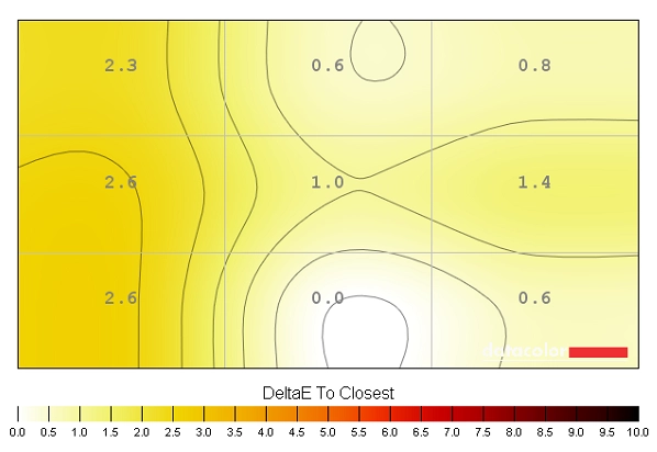
Colour temperature uniformity map UC off
Colour temperature uniformity map UC on
Contrast in games and movies
Lagom contrast tests
Colour reproduction
Colour gamut
Colour gamut test settings

Colour gamut Custom Color
Colour in games and movies
Viewing angles
The 34″ 3440 x 1440 curved ‘UltraWide’ experience
Interpolation and upscaling
The ‘Wide 21:9’ option essentially causes the monitor to interpolate any non-native resolution so that it fills the entire screen. In the case of resolutions such as 1920 x 1080 and 2560 x 1440, this makes everything look stretched horizontally (distorted) and a bit soft. Quite ugly really. For resolutions that are in the 21:9 aspect ratio things look better as they are not distorted. 2560 x 1080, for example, is actually displayed fairly well. Interpolation is still used as the display is filling up all its pixels, but the Dell handles this surprisingly well. Things look a bit softer than they would running that resolution natively, but it wasn’t a massive difference. When gaming, for example, it doesn’t look like you’re looking at things through a soft-focus lens. We do feel the 2560 x 1080 resolution is a decent fallback on this model for those game titles where you can’t comfortably drive the native resolution. It’s not perfect of course, but quite useable if you need it.
Responsiveness
Input lag
Pixel responsiveness
Trailing (various overdrive settings)
Responsiveness in games and movies
Conclusion
Positives Negatives An excellent factory calibration for accurate shade reproduction, with excellent consistency and a strong shade variety – good for both work and play in that respect
Some gamma issues outside of the ‘Standard’ preset, which is unfortunate given that these presets offer a slightly more generous colour gamut which some users might like for a little bit of extra vibrancy
An excellent smooth (non-grainy) matte screen surface and strong static contrast performance for a panel of this type ‘IPS glow’ still present despite slight reduction due to curve and some moderate backlight bleed on our unit Decent pixel responsiveness overall without any huge barriers to a smooth 60Hz experience
Moderate input lag and some weaknesses during certain transitions (giving some extra trailing in places and some observable overshoot in others)
An engrossing experience with good pixel real-estate from the curved 3440 x 1440 34” ‘UltraWide’ panel – and a nice range of ports and ergonomic freedom thrown in for good measure
The curve, although subtle, has the potential to cause some issues for those into photography or design work in particular
![]()
