Author: Adam Simmons
Date published: August 19th 2016
Table of Contents
Introduction
The Dell U2414H was and still remains a popular choice for users after an elegant monitor from a trusted brand, with strong all-round performance. The Dell UltraSharp U2417H is an evolution of this model, featuring even slicker bezels and an updated ‘InfinityEdge’ panel. We take a look at this monitor, or more specifically the U2417HA which is the same screen supplied with a monitor arm rather than conventional stand. We found out whether it lives up to or even exceeds the performance of its predecessor in key areas such as image quality, responsiveness and external features.
Specifications
This model features a 60Hz 23.8” Samsung PLS (Plane to Line Switching) panel, which is an IPS-type panel analogous to LG’s AH-IPS (Advanced High-Performance In-Plane Switching) technology. Some units actually come equipped with a similar AH-IPS panel instead. The usual 6-bit + FRC dithering colour processing is used, with a specified 6ms grey to grey response time. The specified response time is to be taken with a pinch of salt, as usual. Some of the key ‘talking points’ have been highlighted in blue below.
Features and aesthetics
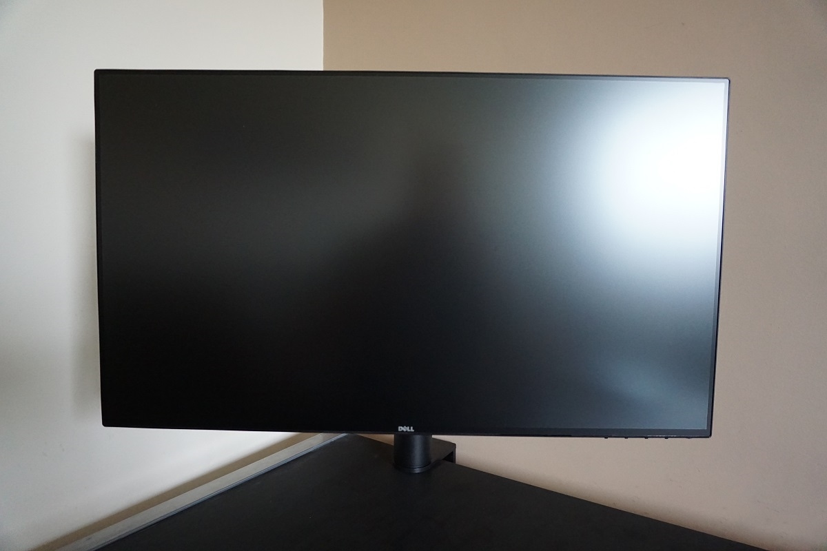
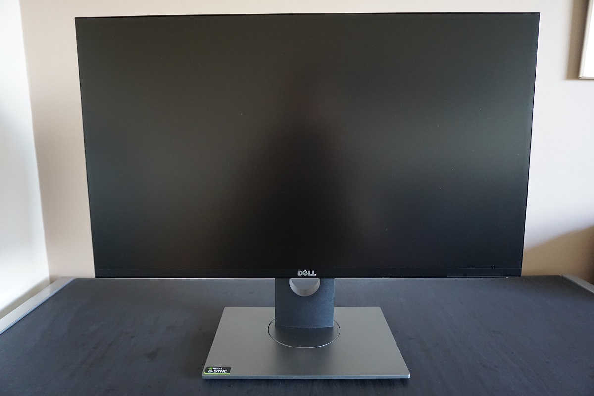
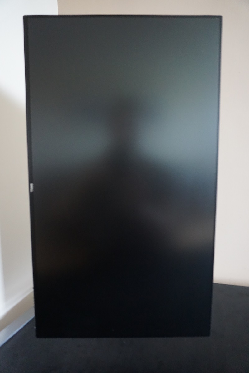
From the front you are greeted by a sleek and minimalistic screen, with a now rather popular ‘dual-stage’ bezel design. There is a very thin outer component alongside a very slim panel border – a total thickness of ~5.5mm (0.22 inches) at the top and sides and ~8.5mm (0.33 inches) at the bottom. This is part of the new ‘InfinityEdge’ design. The U2417HA which we have here includes a flexible monitor arm, whereas the U2417H features the same screen with a more conventional stand included instead. The stand design is identical to that used on other Dell models such as the Dell S2716DG, which we’ve included at the bottom just for reference. The screen surface is relatively light matte anti-glare, explored later.
The OSD (On Screen Display) is controlled by pressable buttons on the underside of the bottom bezel, towards the right side. The power button is also located here, to the far right, with a small slit-style LED to indicate power status. This glows a gentle and unobtrusive cool white when the monitor is switched on and flashes in this colour when the monitor is in standby (‘active-off’). If the power button is pressed, the monitor will turn ‘off’ (technically still standby) and the power LED will turn off. The video below shows the functionality of the OSD.
From the side the monitor is rather slender, at around 22mm (0.87 inches) at thinnest point. There are also two USB 3.0 ports located at the left side of the screen, with the bottom one supporting fast-charging for connected devices. The fully adjustable stand (‘H’ model) or monitor arm (‘HA’ model shown here) is really the key feature from this orientation. The included stand of the ‘H’ model offers; tilt (5° forwards, 21° backwards), height adjustment (130mm or 5.12 inches), swivel (45° left and 45° right) and pivot (90° rotation into portrait). The arm of the ‘HA’ model clamps to the back of the desk (or side, or wherever you wish to put it). Once in place, you can tilt the screen (~21° forwards, ~61° backwards), reposition it so that it is further or closer to your eyes (and in doing so alter its height), swivel it (45° left and 45° right) or pivot it (90° rotation into portrait). You can position the arm so that the screen is essentially touching the desk (impractical though this is). At greatest height the bottom of the screen clears the desk by ~185mm (7.28 inches) with the top of the screen ~500mm (19.69 inches) above the desk surface. You can of course adjust it anywhere between these values.
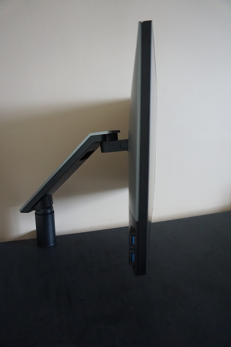
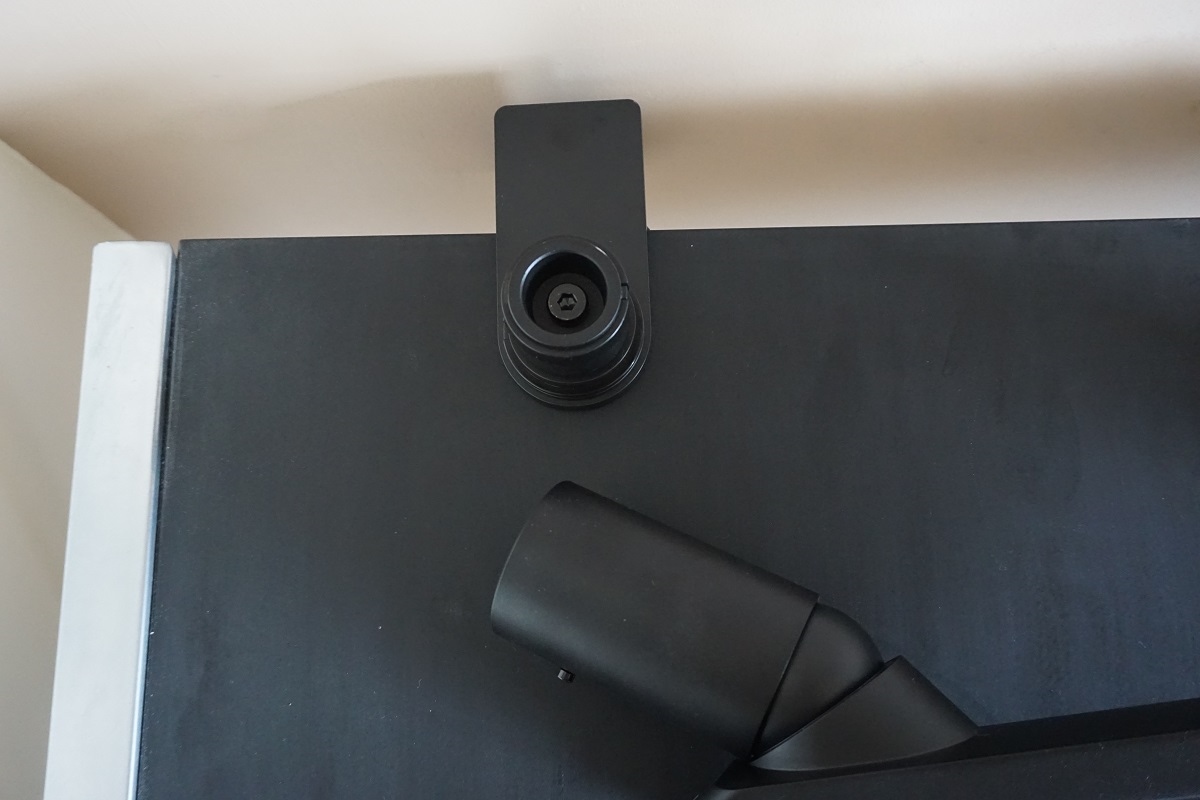
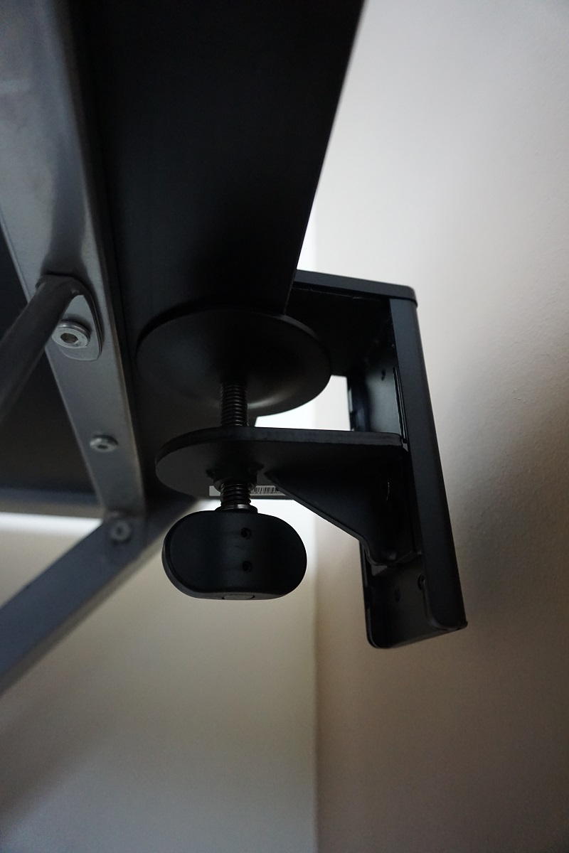
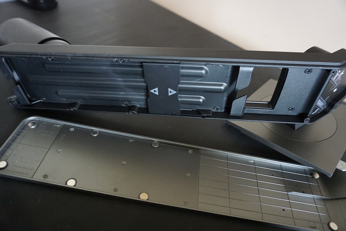
Depending on arm position the screen can be positioned so it is anywhere between ~200mm (7.87 inches) and ~400mm (15.75 inches) in front of the rear of the vice-grip. The rear of the screen has a two-tone appearance with silver semi-matte plastic for the most part and some matte black plastic towards the bottom. The rear of the stand of the ‘H’ model is also semi-matte silver and so is the cover for the monitor arm of the ‘HA’ model. You can remove the silver cover from the arm and route cables in – it functions as a cable tidy. The stand of the ‘H’ model has a cable tidy loop in it instead. There is a K-Slot towards the bottom left with the stand or arm attaching using a quick-release bracket mechanism to the centre of the screen. The quick-release button removes the screen from the mount and allows an alternative 100 x 100mm VESA compatible solution to be used.
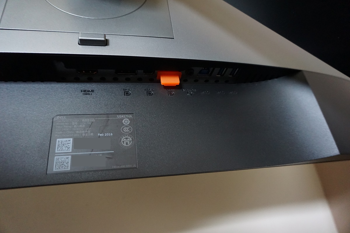
The ports are down-firing; AC power input (internal power converter), HDMI (plus MHL), DP 1.2a, mDP 1.2a, DP out (for MST Daisy Chaining), 3.5mm audio output, USB upstream and 2 further USB 3.0 downstream ports (4 total). There is an orange plastic port cover over the DP out port which must be removed if you wish to use it. This is to stop you mistaking it for a DP input and wondering why you don’t get a signal when everything is connected up. A DP – MiniDP cable is included in the box along with a power cable.
Calibration
Subpixel layout and screen surface
A relatively light matte anti-glare screen surface is used on this monitor. This has a marginally smoother surface texture than Full HD AH-IPS models such as the U2414H and is very similar indeed to that used on the Samsung S24E390HL and its brethren. This provides only a slight graininess to the image, far less than on older IPS models in particular and less than most current Full HD models. The surface is not quite as smooth as the likes of the U2515H when viewing lighter shades, however. External glare handling characteristics are strong. We explore the impact of this screen surface on the image in various parts of the review.
![]()
The monitor uses the usual RGB (Red, Green and Blue) stripe subpixel layout, which is shown in the image above. As this is the standard layout expected by both Mac and Windows machines, there’s no need to run ClearType as a Windows user or worry about text fringing on Mac systems. You may still wish to run the ClearType wizard to fine-tune according to preferences, however.
Testing the presets
This monitor has a number of ‘Preset Modes’ to choose from; ‘Standard’, ‘Multimedia’, ‘Movie’, ‘Game’, ‘Paper’, ‘Color Temp.’, ‘sRGB’ and ‘Custom Color’. Some of these presets are quite useful, whilst others simply provide a sub-par image without bringing any real benefits. We will be focusing on a few of these presets, specifically those which maintained strong image characteristics or had good utility for other reasons. The table below includes key readings taken using a Datacolor Spyder5ELITE colorimeter alongside general some performed by eye. This data was collated after the monitor was left to run for at least 2 hours. The monitor was left in its ‘plug and play’ state with no additional drivers or ICC profiles loaded.
You should assume any setting not mentioned was left at default with the exception of our ‘Test Settings’ where various adjustments were made. We also disabled ‘Dynamic Contrast’ when assessing the ‘Game’ preset. Our test system used an Nvidia GeForce GTX 1070 connected via DisplayPort. The colour signal was corrected in the Nvidia Control Panel (‘Output dynamic range’ was set to ‘Full’ in the ‘Change resolution’ section) as directed in this article. To ensure this is applied correctly the monitor has to be turned off then on again (using the power button is fine) after applying the setting in Nvidia Control Panel. Provided the colour signal was corrected appropriately, a very similar image was obtained via HDMI and also using an AMD GPU.
| Monitor Settings | Gamma (central average) | White point (kelvins) | Extra OSD features | Notes |
| Standard (Factory Defaults) | 2.2 | 6683K | Fairly bright but not to the extent seen by default on most monitors. A well-balanced image overall that is quite pleasing both to the colorimeter and the eye. A bit of extra depth in places due to the generous colour gamut, but no obtrusive oversaturation. | |
| Game | 2.2 | 6670K | Hue, Saturation, Dynamic Contrast | As above, but additional options available. |
| Paper | 2.2 | 5596K | This is an effective ‘Low Blue Light’ (LBL) setting. Unlike some settings of this nature, a green tint is not introduced. The image appears noticeably warmer and the blue light output significantly reduced as a result of the weakened blue colour channel. Suitable for relaxing viewing, for example in the evening before bed. | |
| Color Temp. = 5000K | 2.2 | 6645K | Colour temperature adjustment – 5000K, 5700K, 6500K, 7500K, 9300K, 10000K | An alternative LBL setting that offers a slightly stronger blue light reduction and is very close to its target of ‘5000K’. You can also set the colour temperature to various other Kelvin values instead. |
| sRGB | 2.2 | 6517K | The full factory calibration is used here. The difference between this and ‘Standard’ is not profound. The gamma handling is slightly different, although only marginally so (both 2.2 on average) and overall colour balance similar. The colour gamut is also adjusted slightly as explored later, restricting the vibrancy slightly. Overall a very good balance to the image with this setting and certainly a pleasing factory calibration. | |
| Custom Color | 2.2 | 6470K | Colour channel adjustments – R, G, B | There is a bit of a green tint in place of the cool (blue) tint seen elsewhere, but the colour channels are unlocked now so this can be remedied at the expense of contrast. Aside from colour temperature and balance, the image is much like the factory defaults with strong gamma handling and shade variety. |
| Test Settings (as below) | 2.2 | 6530K | This is simply ‘sRGB’ with reduced brightness. The image is very nicely balanced here with a strong variety and richness of shades – a vivid but natural look. |
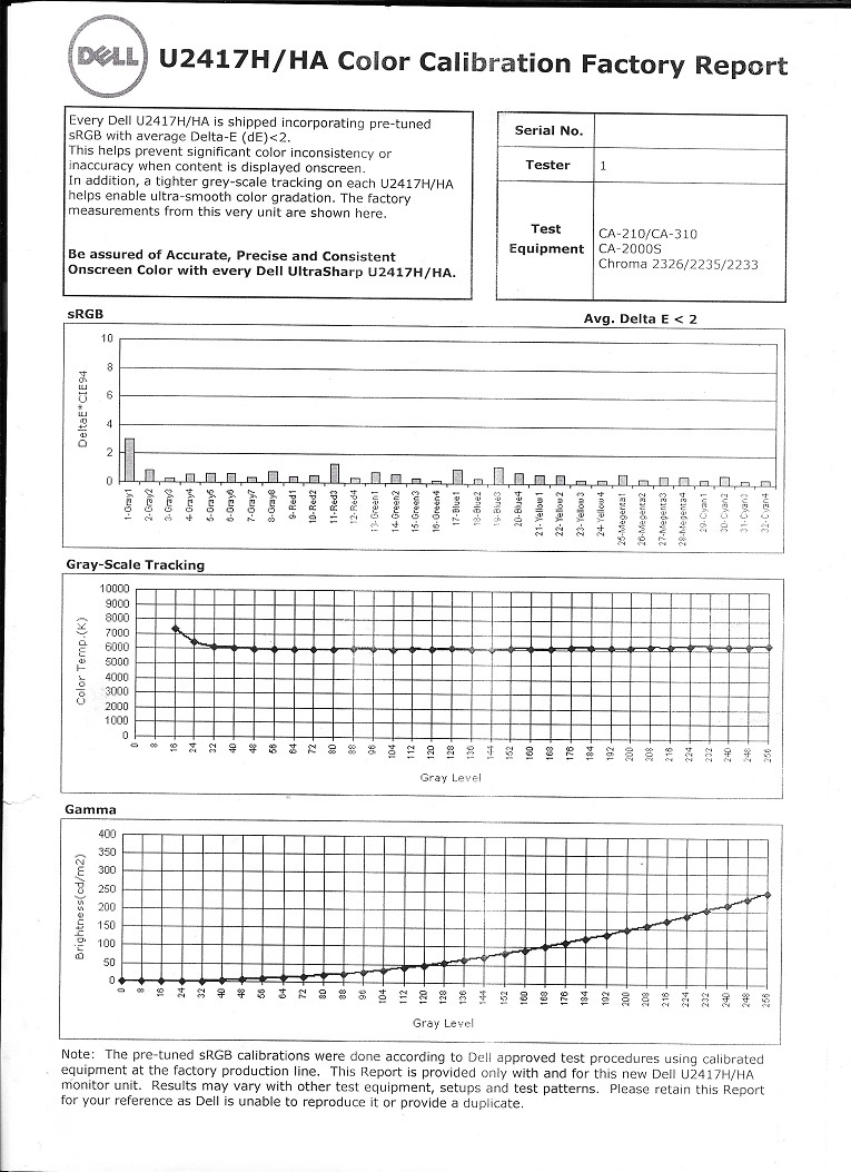
The out of the box performance of the U2417H (U2417HA) was very impressive. The white point was quite well balanced, with a subtle ‘cool tint’ compared to 6500K. In reality, your eyes readily adjust to that and the value you are targeting should really depend on ambient lighting. Gamma handling was very good, averaging 2.2 with close tracking of the desirable curve. The image was rich and varied overall. These strong image quality characteristics were maintained across other presets that we tested, including the ‘sRGB’ setting. This actually employs the full factory calibration of the monitor, with a report included with each unit to show this.
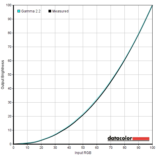
The monitor includes two useful ‘Low Blue Light’ (LBL) settings, which were both effective at reducing the blue colour channel and creating a potentially more relaxing image. The ‘Paper’ setting was quite impressive compared to that of some models, owing to the lack of green tint. For our ‘Test Settings’ we simply employed the ‘sRGB’ preset with reduced brightness. We felt that the sRGB setting and really the ‘Standard’ setting were more than adequate and many users would be happy with those. Perhaps just a slight reduction in brightness would be all that is required. We were keen to maximise contrast as much as possible whilst trying to achieve as close as possible to ‘6500K’ without a green tint. Whilst the ‘Custom Color’ mode could deliver the ‘6500K’ white point, to do so without a green tint required adjustments to the colour channels that were significant enough to eat away at contrast a bit. Given how close ‘sRGB’ was to key target parameters (bearing in mind points about white point made earlier) and how the image looked to our eyes we were quite happy to use this instead. The image below compares the gamma curve using factory defaults to our ‘Test Settings’. Both conform closely to curve, with the ‘Test Settings’ clinging even more tightly due to the full factory calibration.
Gamma 'Standard' (Factory Defaults)
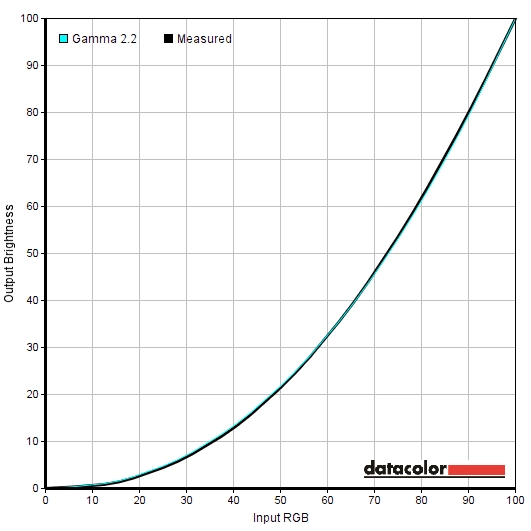
Gamma 'Test Settings'
Test Settings
We simply used the factory calibrated ‘sRGB’ setting with a minor reduction in brightness to form our ‘Test Settings’. The ‘Response Time’ setting is included here, just for reference. Anything not mentioned here, including contrast, was left at default. Brightness= 66 (according to preferences and lighting) Response Time= Normal
Preset Mode= sRGB
Contrast and brightness
Contrast ratios
A BasICColor SQUID 3 (X-Rite i1Display Pro) was used to measure white and black luminance levels. From these values, static contrast ratios were calculated. This data is shown in the table below, with various settings tested (including those covered in the calibration section). Assume any setting not mentioned was left at default, with the exception of changes already mentioned in the calibration section and for our ‘Test Settings’ where various adjustments were made. Black highlights here indicate the highest white luminance, lowest black luminance and maximum contrast ratio recorded. Blue highlights show the results using our ‘Test Settings’.
| Monitor Settings | White luminance (cd/m²) | Black luminance (cd/m²) | Contrast ratio (x:1) |
| 100% brightness | 245 | 0.22 | 1114 |
| 80% brightness | 192 | 0.17 | 1129 |
| 60% brightness | 150 | 0.14 | 1071 |
| 40% brightness | 111 | 0.10 | 1110 |
| 20% brightness | 70 | 0.06 | 1167 |
| 0% brightness | 29 | <0.02 | >967 |
| Standard (Factory defaults) | 180 | 0.16 | 1125 |
| Game | 180 | 0.16 | 1125 |
| Paper | 110 | 0.11 | 1000 |
| Color Temp. = 5000K | 161 | 0.16 | 1006 |
| sRGB | 183 | 0.16 | 1144 |
| Custom Color | 321 | 0.11 | 1206 |
| Custom Color (100% brightness) | 262 | 0.22 | 1191 |
| Test Settings | 165 | 0.15 | 1100 |
The average contrast ratio with only brightness adjusted was 1118:1, which is good. This excludes the reading at ‘0%’ brightness, where the black point readings provided insufficient accuracy. The highest contrast ratio recorded (under ‘Custom Color’) was 1206:1, which is about as good as you can expect from an IPS-type panel really. Under our ‘Test Settings’ 1100:1 was maintained and under the factory default brightness, using the same ‘sRGB’ preset, 1144:1 was yielded. This is an impressive contrast ratio to be maintained after a full factory calibration. The contrast ratio also remained quite strong under the two LBL modes tested (‘Paper’ and ‘5000K’), around 1000:1. The highest white luminance recorded on this table was 262 cd/m², whilst the lowest was 29cd/m². This provided a luminance adjustment range of 233 cd/m² with plenty of useful values.
A ‘Dynamic Contrast’ setting is present on this monitor, which can be activated under the ‘Game’ and ‘Movie’ presets. This allows the backlight brightness to adjust according to the relative levels of ‘dark’ and ‘light’ on the screen at a given time. The monitor reacted promptly to changes in scene brightness and dimmed to quite low levels for predominantly dark content. The luminance was fairly high for mixed or brighter content, although the maximum luminance of the screen isn’t really retina-scorching anyway. As usual we prefer leaving this setting disabled and dislike such settings, but it is there and does work if you want to use it.
PWM (Pulse Width Modulation)
This monitor does not use PWM (Pulse Width Modulation) to regulate the backlight at any brightness level. Instead, DC (Direct Current) dimming is employed. The backlight is therefore considered ‘flicker-free’, which will be appreciated by those sensitive to or worried about the effects of PWM usage.
Luminance uniformity
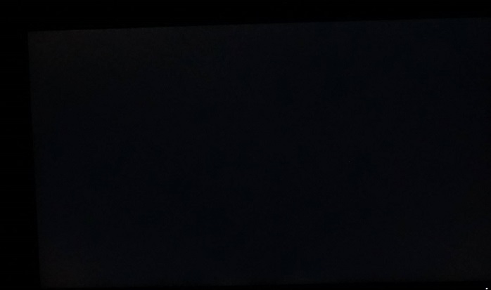
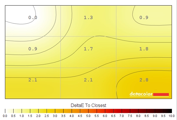
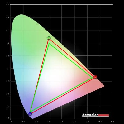
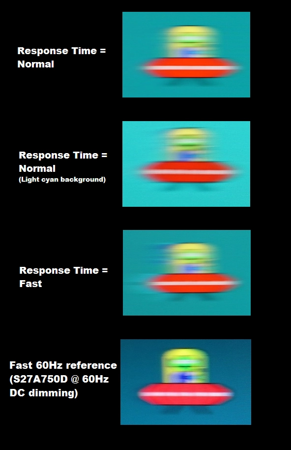
We observed a black background in a dark room and could see no obvious backlight bleed. There was a little bit towards the top edge of the screen, near the right, but nothing obtrusive. Note that individual units can vary in this respect. The image below was taken from a few metres back to eliminate ‘PLS glow’ and show only the remaining backlight bleed. ‘PLS glow’ can be seen from a normal viewing position towards the bottom corners of the screen in particular, as explored in the review. It also appears to bloom out if the screen is viewed from sharper viewing angles, as shown in a video later on. The luminance uniformity of the screen was very good. The brightest point recorded was ‘quadrant 2’ above the central region of the screen (166 cd/m²). The maximum deviation occurred at ‘quadrant 6’, to the right of centre (149.1 cd/m²). Elsewhere the screen brightness was within 0 – 9% of the brightest point, which is excellent. Note that individual units can vary when it comes to uniformity and also that there can be deviation expected beyond the points measured. For those who prefer a graphical representation, these deviations are shown in the contour map below. Here darker greys represent lower luminance values and hence greater deviation from the brightest point than lighter greys. The colour temperature (white point) uniformity of these quadrants was also analysed, with deviations assigned DeltaE values. A higher DeltaE value represents greater deviation from the 6500K (D65) daylight white point than lower values. A value greater than DeltaE 3 is considered significant deviation that some users would readily notice by eye. The results here are good, with no significant deviations recorded. The highest deviation recorded was DeltaE 2.8 towards the bottom right of the screen. Again uniformity between individual units can vary in this respect and you can expect deviation beyond the measured points. Still, it’s good to see a performance from our unit both in terms of luminance uniformity and white point uniformity. The contrast performance was quite pleasing on Battlefield 4 (BF4). When observing darker shades, particularly dark passages in the game such as tunnels and shaded interiors, there was a fair degree of detail lost due to ‘PLS glow’. This was most noticeable towards the bottom corners of the screen from a normal viewing position – the ‘bloom’ here was in line with what we’ve seen on other PLS models of this size and is slightly greater than observed on IPS models such as the U2414H. For the remaining areas of the screen, detail levels were very good in dark areas and much as they should be – aided by the consistent and correct gamma handling of the monitor. Brighter shades such as lights, explosions and the sky had a little graininess from the screen surface but still appeared relatively smooth. Slightly improved from the U2414H in fact. Dirt Rally provided a similar contrast experience. ‘PLS glow’ again ate away at peripheral detail in dark areas, most noticeable when driving at night. More central regions of the screen exhibited appropriate detail levels in dark areas without any unnatural ‘detail enhancement’ or masking of key details. The depth of blacks and other dark shades here was actually good for an IPS-type panel and was quite consistent in that respect – with the exception of the ‘glow affected’ areas. The screen surface imparted only a mild graininess to lighter colours, such as car headlights and bright sky. We also observed the contrast performance on the Blu-ray of Star Wars: The Force Awakens. The monitor lacked the sort of flair you’d see on models with stronger contrast (VA models) but there was still good distinction between dark and bright shades. Light sabers, explosions and suchlike stood out nicely in darker surroundings. This sort of contrast features heavily on this title. The black bars at the top and bottom of the screen (this is a 2.40:1 aspect film) also absorbed a fair bit of the PLS glow, meaning the image itself wasn’t affected by this as strongly as for full screen content. Lagom’s contrast tests were used to analyse specific weaknesses in contrast performance which may not have been identified during other testing. The following observations were made. The Dell U2417H (U2417HA)’s colour gamut (red triangle) was compared to the sRGB colour space (green triangle). The image below shows the results under our ‘Test Settings’, which uses the full factory calibration of the ‘sRGB’ setting. You can see that the monitor adheres very closely to the sRGB colour space, covering it entirely (100% coverage) with just a little over-extension. This gives the monitor the potential to faithfully reproduce all shades within the sRGB colour space and is very impressive as far as emulation modes go. The image below shows the native colour gamut of the monitor, under the ‘Standard’ setting. This again provides 100% sRGB coverage, but there is a greater degree of over-coverage. This brings a bit of extra vibrancy at the expense of accuracy – some users may prefer this, but it isn’t as if the monitor looks washed-out using the ‘sRGB’ restricted gamut. Colour reproduction was strong on BF4. The monitor delivered a great variety of shades in an accurate and highly consistent way – rich with appropriate depth throughout the screen. This helped the environments look vivid but natural with good variety – specifically, the variety of earthy browns and natural plant-like greens was impressive. The strength in colour reproduction also helped elements that are supposed to be vibrant (HUD elements, in-game markets, fires etc.) stand out in an appropriate way. The intensity of orange and red shades within fires and explosions, for example, left them looking vibrant but not overdone. The strengths in colour reproduction were also apparent on Dirt Rally, which was again displayed in a pleasingly vivid but natural way. Vegetation was displayed with appropriate richness and variety, with a good range of subtly different pastel hues alongside some lusher shades. Some of the deeper greens weren’t as deep as we’ve seen on some models, but really that is a reflection of the accurate sRGB colour reproduction of the monitor. The car paint jobs showcased a nice range of vibrant pinks, purples and reds. These didn’t have the arresting vibrancy of some models but were certainly vivid and inviting. On the Blu-ray of Star Wars: The Force Awakens things were presented as they should be. Some good intense red and light blue shades for light sabers and good and consistent representation of character skin tones and natural environments. The subtle variation in skin tones was also impressive and aided the natural appearance, with characters gaining an appropriate identity. This contrasts with models with VA or TN panels, whereby shifts in gamma at various points of the screen alter the perceived shade. We also observed the Blu-ray of Futurama: Into the Wild Green Yonder. The strong colour consistency was readily apparent on this title due to it having elements of individual shade that fills much of the screen. This aided the natural variety, with an excellent array of consistently displayed pastel shades. The U2417H (U2417HA) also displayed deep shades and neon shades with a good level of vibrancy – not as striking as we’ve seen on some models, but certainly vivid. We used the Lagom tests for viewing angle to further analyse colour consistency and viewing angle performance. The following observations were made from a normal viewing position, around 70cm from the screen. We used a tool called SMTT 2.0 and a sensitive camera to compare the latency of the U2417H (U2417HA) with a range of monitors of known latency. Over 30 repeat readings were taken to maximise accuracy. Using this method we calculated 5.15ms (under 1/3 of a frame @60Hz) of input lag. This value was not altered by using the ‘Game’ preset, but was significantly higher (>20ms) when the monitor was set to run at a non-native resolution. This explains the discrepancy between our reading readings on other reviews where the monitor was not running in its native resolution. The value here reflects both the element of responsiveness you feel (signal delay) and that which you see (pixel responsiveness). It indicates a low signal delay that shouldn’t specifically interfere with the experience even for sensitive users. In this article we explore the key concepts related to monitor responsiveness. One of the most important concepts explored here is ‘perceived blur’ and how it is influenced not only by pixel responsiveness but also eye movement as you track motion on the screen. Your eye movement is actually the most significant of the two factors for a modern sample and hold LCD monitor. We also explore ‘pursuit photography’, which is a technique that uses a moving camera to reflect not only the pixel response behaviour but also the influence of eye (camera) movement. The images below are pursuit photographs taken using the UFO Motion Test for ghosting, with the test running at its default speed of 960 pixels per second. This is a practical speed for such photographs to be taken and reflects perceived blur nicely. The monitor was set to run with ‘Response Time’ set to both ‘Normal’ and ‘Fast’. The medium cyan background (middle row of the test) was used for both response time settings. We’ve also included a capture of the light cyan background (bottom row of the test) with the ‘Normal’ setting just as a point of comparison. A shot is also included from a fast 60Hz reference – a Samsung S27A750D running at 60Hz and at full brightness (avoids PWM usage). This represents how things should look where pixel responsiveness isn’t really a limiting factor. Regardless of the ‘Response Time’ setting, you can see that the object itself is quite blurred and the details indistinct. This is also the case to a large degree with the reference screen. This reflects perceived blur due to eye movement and is strongly linked to the 60Hz refresh rate. Using the ‘Normal’ setting, you can also see a bit of trailing behind the object. This is from slower than optimal pixel responses. The slightly more noticeable trailing that is observed more strongly with the light cyan background takes on a bit of a dirty appearance, particularly behind the UFO cockpit. This is actually overshoot (inverse ghosting) due to fairly strong grey to grey acceleration being used to try to speed up these pixel transitions. The ‘Fast’ setting creates far more obvious overshoot, leaving a colourful inverted trail behind the object itself that is very obvious by eye. Needless to say the ‘Normal’ setting is optimal on this monitor. Note that this monitor skips frames if the refresh rate is set at all above 60Hz. We will therefore not be including a section on overclocking. On BF4 you could perceive a moderate amount of blur. This was predominantly down to eye movement and linked to the 60Hz refresh rate. There were also some slight weaknesses in pixel responsiveness evident, particularly where certain medium shades were involved in the transition. Many objects moving against a slightly gloomy sky, for example, were accompanied by a bit of trailing in addition to the blur perceived due to eye movement. This was by no means extreme and was quite different to the sort of extended or ‘smeary’ trail you’d typically see on a VA panel during some transitions. It was enough to intensify the already moderate blur when manoeuvring quickly in a vehicle. There was also a little overshoot (inverse ghosting) in places. For the transitions we observed on this title it was usually quite faint and appeared as a sort of mostly transparent ‘snail slime’ behind some objects. This sometimes had a slightly dirty quality to it similar to that seen in the UFO Motion Test for ghosting earlier. Certainly not the most obvious overshoot we’ve seen, but there nonetheless. On Dirt Rally there was again a fair amount of blur, caused predominantly but not entirely by eye movement. The was an additional ‘mask’ of blur from some slower than optimal pixel transitions – fairly subtle overall. There was no eye-catching overshoot, for example bold bright trails or very dark trails that were a significantly different shade to either the object or background colour. Instead the overshoot manifested itself as a slightly dirty looking blend of the object and background colour in places. So this was not particularly eye-catching as far as overshoot goes. We also tested the Blu-ray film titles and didn’t find any impedance from pixel responses or any obvious overshoot. The ~24fps at which the films run was the main limit to fluidity there and the monitor handled such content as well as any 60Hz monitor really. The slim-bezelled Dell U2414H was a popular choice and remains that way even today. With the UltraSharp U2417H (and U2417HA reviewed here), Dell have made some slight improvements and aesthetic tweaks. Most noticeably the bezels are now even thinner – as thin as we’ve seen on any screen, lending themselves very nicely to multi-display setups. There are also some improvements when it comes to core performance. The PLS panel used here offers a slightly lighter matte screen surface, which although not as smooth as some does provide a slightly smoother view of lighter shades such as white. When it comes to colour reproduction, there was really little to fault with the factory calibration. White point was within good range, there was no particular tint, gamma tracking was excellent and the overall richness and consistency of colours was very good. The contrast performance was largely in-line with the predecessor with static contrast that is about as good as you can expect from an IPS-type panel. The ‘PLS glow’ observed here ate away at some of the detail for dark shades peripherally and was a bit more obvious than the ‘IPS glow’ seen on the U2414H and some other models. This difference, we feel, isn’t something that’s worth stressing about though. Responsiveness was similar if a little weaker than the earlier model, too. There was little input lag to speak of, which is good, and overall the level of perceived blur was much as you would hope for from a 60Hz LCD. There were some weaknesses beyond that, such as a bit of extra blur due to slower than optimal pixel transitions and some slightly ‘dirty’ overshoot trailing in places. As with the ‘IPS glow’ vs. ‘PLS glow’, the predecessor had a slight edge but it isn’t something we think you should let put you off the newer model. All things considered the Dell U2417H (U2417HA) is a worthy follow-up to the U2414H and standing on its own merit offers good all-round performance. The factory calibration is very strong and colour reproduction within the sRGB colour space is a definite strength here. Useful ‘Low Blue Light’ type settings are also found and the backlight maintains flicker-free status throughout the brightness adjustment range. The design of the monitor is also simple yet endearing, particularly with respect to the exceptionally thin bezels that are barely there at all. We also think it’s nice that Dell are offering the monitor in a configuration with an arm rather than conventional stand, although we didn’t really find this advantageous for our uses. The stand includes all of the ergonomic flexibility we would need from a monitor already. Plus, there are a range of other options that you can mount the screen to anyway thanks to VESA compatibility. The bottom line; a screen with excellent colour performance straight from the box and attractive aesthetics, combined with good ergonomic flexibility.
The Spyder5ELITE was used to analyse the uniformity of lighter colours, represented by 9 equidistant white quadrants running from top left to bottom right. The table below shows the luminance recorded at each quadrant alongside the percentage deviation between a given quadrant and the brightest point recorded.
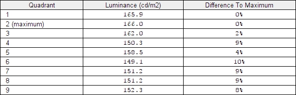
Luminance uniformity table
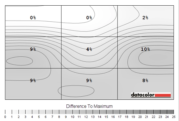
Luminance uniformity map
Colour temperature uniformity map
Contrast in games and movies
Lagom contrast tests
Colour reproduction
Colour gamut

Colour gamut test settings
Colour gamut 'Standard'
Colour in games and movies
Viewing angles
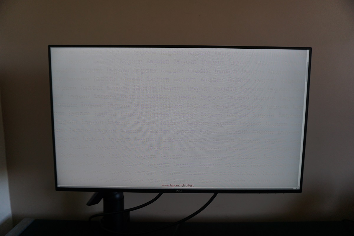
The video below shows this text test, a mixed desktop background and dark desktop background from a variety of viewing angles. Note the ‘PLS glow’ that we highlighted earlier, as it appears to bloom out from sharper viewing angles.
Responsiveness
Input lag
Perceived blur (pursuit photography)
Perceived blur with various settings
Responsiveness in games and movies
Conclusion
![]()
Positives Negatives Excellent colour reproduction straight from the box with a rich, well-balanced and varied look to the image
No support for wide colour gamuts, which will limit appeal for some users
Good static contrast and a screen surface that is relatively smooth and light, helping preserve image clarity and vibrancy ‘PLS glow’ eats away at peripheral detail and there are smoother screen surfaces out there (used on various higher resolution models) Decent 60Hz responsiveness with low input lag and fairly effective pixel overdrive
Some slower than optimal pixel responses alongside some overshoot (inverse ghosting), providing some extra trailing in places
Good ergonomic flexibility, an attractive design with exceptionally slender bezels and a decent complement of ports
The price is arguably a bit high for a Full HD model without ‘advanced features’ such as LUT hardware calibration or uniformity compensation
![]()

